August Sander

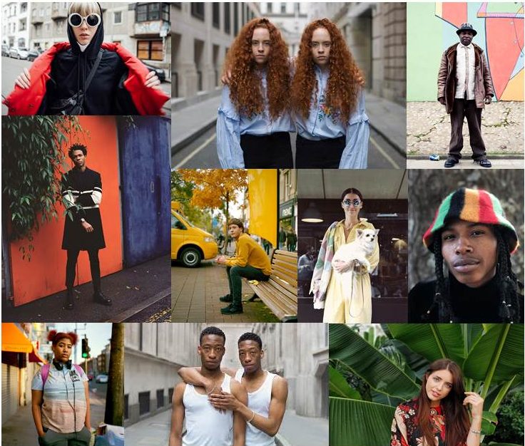
August Sander was a German photographer who was born November 17, 1876 in Germany and died April 20, 1964. He got his first camera in 1892, and began taking up photography as a hobby then, after completing his military service time he eventually took up photography professionally.  In the 20s, after his service in World War 1 his friendship circle included painters and photographers who were part of the “Neue Sachlichkeit”, which was the “new objectivity movement” where artists began to move away from expressionism to capture things more realistically. He was known for documenting different types of German people by capturing portraits that represented different groups of people rather than representing the individual. One of the most interesting parts of his portraits, is how each photo has interesting context and meaning behind it. When the Nazis came to power in 1933, Sanders work was disapproved. Much of his work including his negatives were ruined either by looters or by air raids. During this time he moved away from portraiture to things less controversial like landscapes.

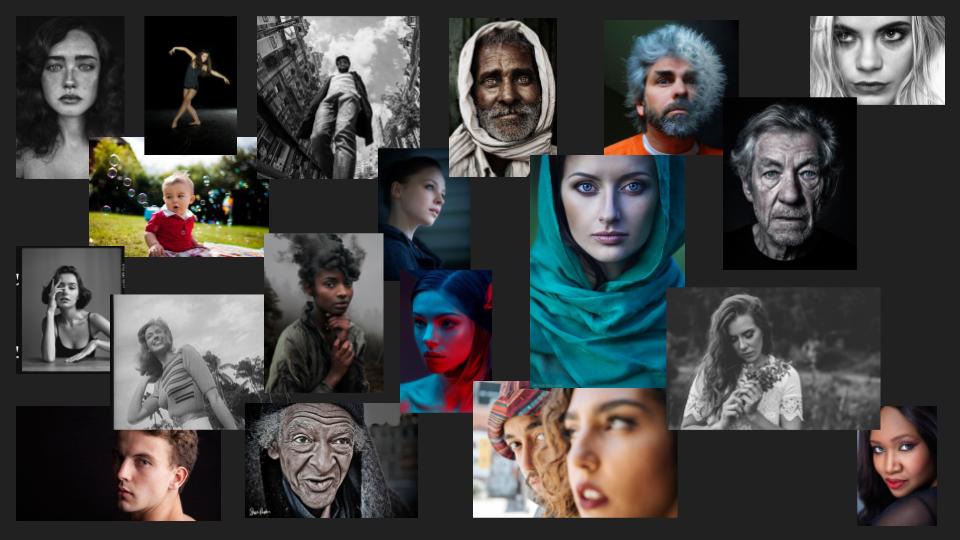
August Sander mood board
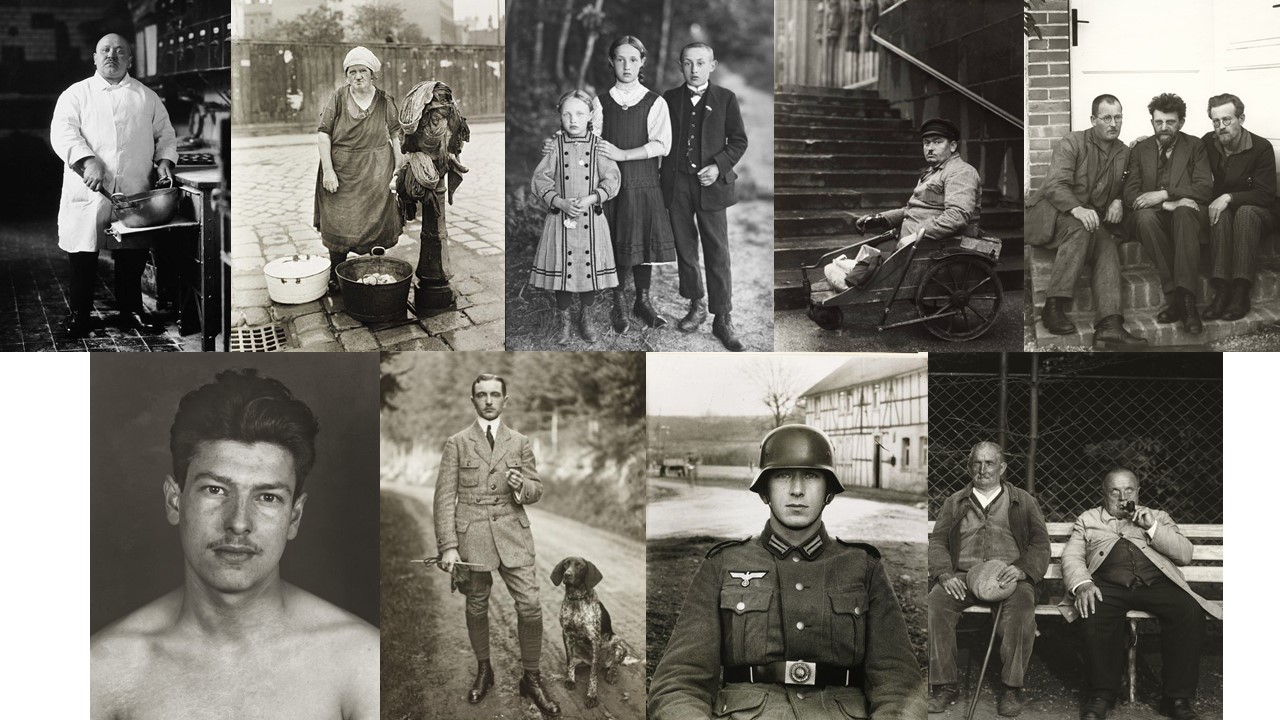
Image inspiration by August Sander.


Analysing his images

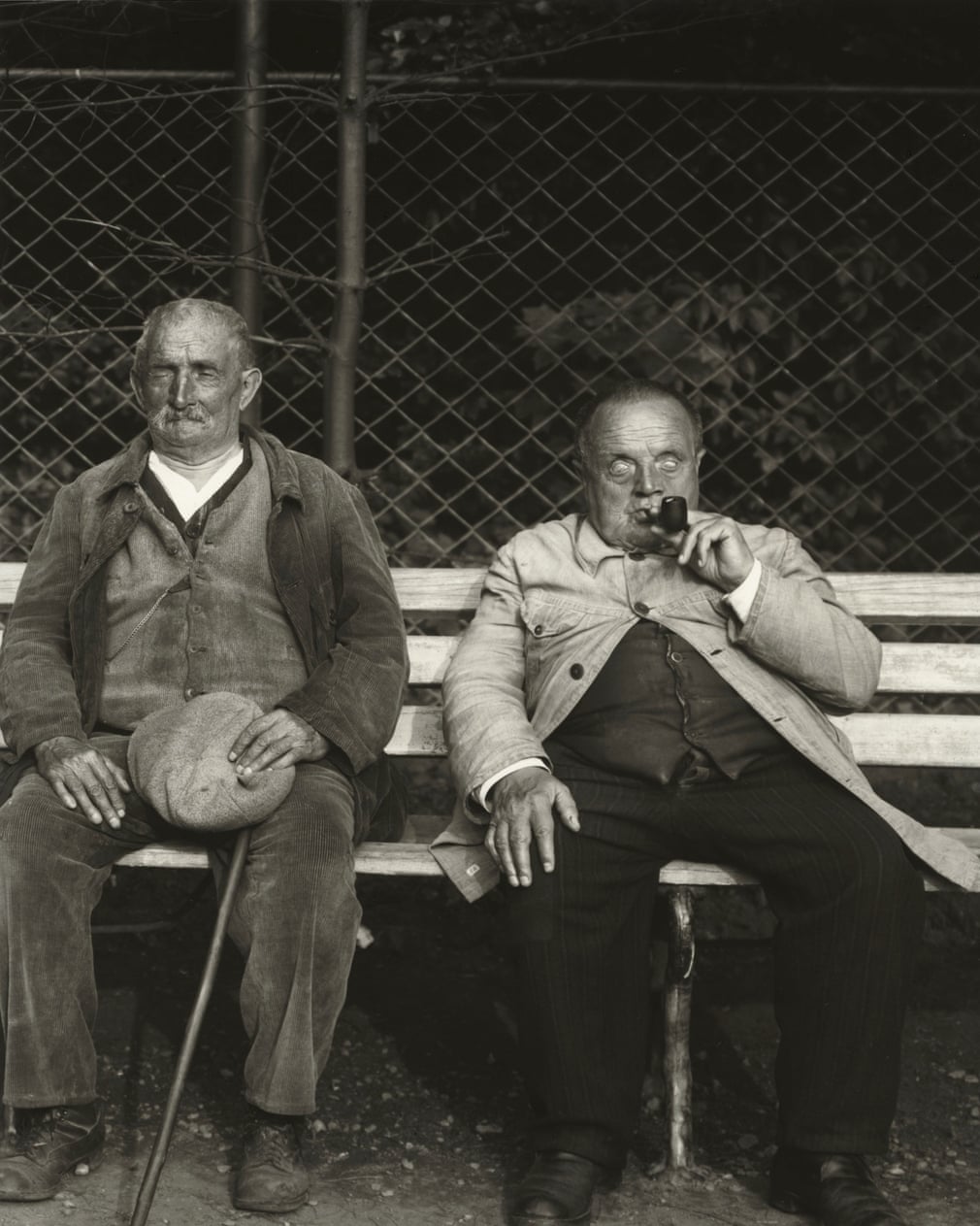
The context behind this image is what makes it stand out to me. This image was taken in the 1930s, and captures a blind miner and a blind soldier sitting on a bench. The context helps make this image really successful as it shows that Sander captured people in everyday and realistic situations, showing realism. The realism captured, helps attract the audience to the image as they can relate to it more.

The visual elements of the image are also really interesting. in the image we see 2 blind men sitting on a bench, as I mentioned previously but what makes this image visually interesting is the fact that it was not taken in a “perfect” setting, and it could be considered quite “messy”. The audience can clearly see how the wire gate behind the 2 men is quite scruffy, and also uneven, and you can also notice how the floor is also quite unclean. Normally, these qualities would mean that an image would be quite unattractive, but in this case it helps make the image very successful. Because the image doesn’t look perfectly polished and staged, it helps depict a real life situation, This helps make the photo more attractive to an audience because it allows them to see a real story behind an image and not a fake reality, which is something not normally seen in modern portraiture, where a lot of effort usually goes into making everything look picture perfect.

The technical elements, although not incredibly important, also help make this image further interesting. The image appears to be taken in a well lit area, which means that the image is very clear.
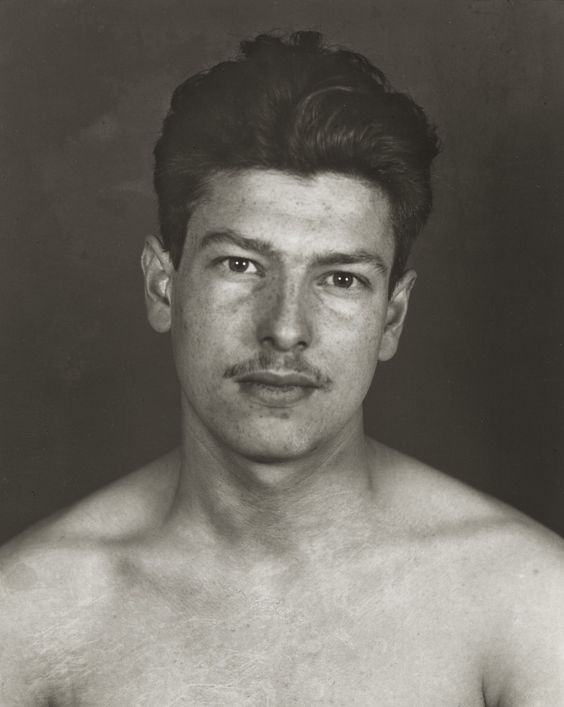


The context of this portrait is also very interesting. This is a portrait of a political prisoner that was taken in 1943, which would mean this was captured during World War 2. This portrait is very interesting because without the background information it would just be a regular photo of a man, however knowing information about who is in the image, instantly makes it more interesting. This is because learning about this person, means that we instantly feel more empathy toward the photo and it becomes more meaningful as it reveals a personality.

Visually, The image doesn’t do too much to attract attention as without the background information, it is just a regular photograph of a man. However, the subject is well placed in the frame so no unnecessary background is visible, meaning the audience can focus more on the person.

Conceptually, this picture is also very interesting. This photo shows how someone who looks so ordinary, can actually be very unique and have an interesting backstory. This photo could teach people not to be so judgemental and to not judge someone by how they look.

1st photoshoot intentions

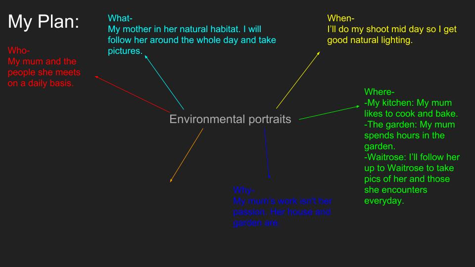
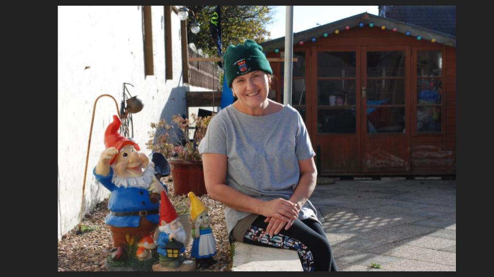
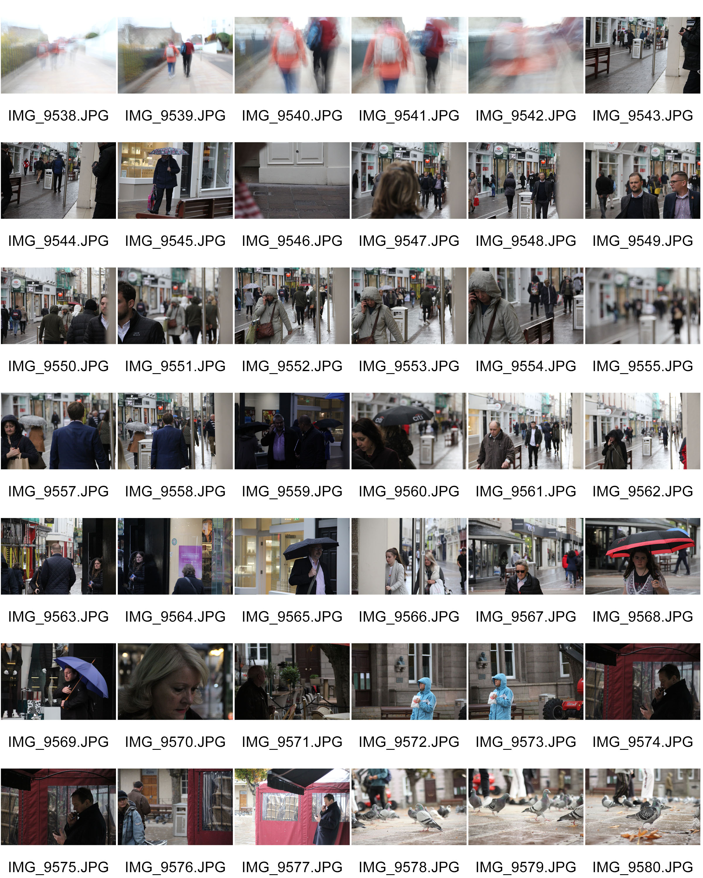
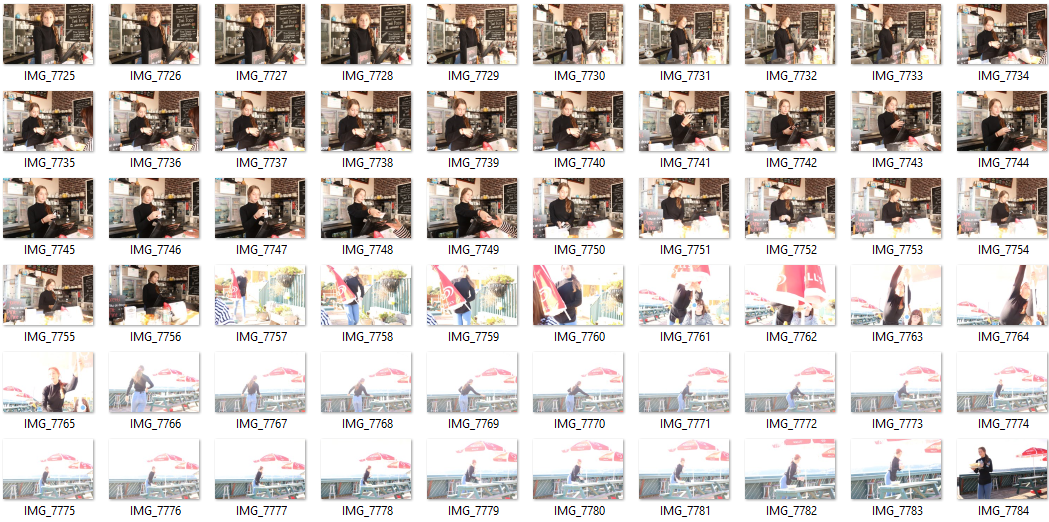
From Sanders’ images it has became clear that he captured people in their everyday environments. My intention for my photoshoot is to also capture someone in their regular environment, but in the modern day. I plan to take photographs of my friend while she is working. As I want the images to look realistic -like Sanders’ photos- I will need to be using a quick shutter speed as I wont be able to stop her to pose. I will also have to capture a large amount of images, as it is likely that not very many of them will be too successful as they will be taken quickly and on the spot. I also plan on not making the images look very polished, and perfect in regards to the background and things in the frame, as I like how Sanders’ images look more realistic when they haven’t been perfectly planned.

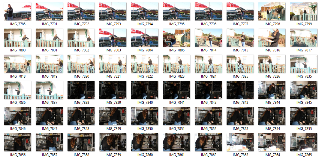
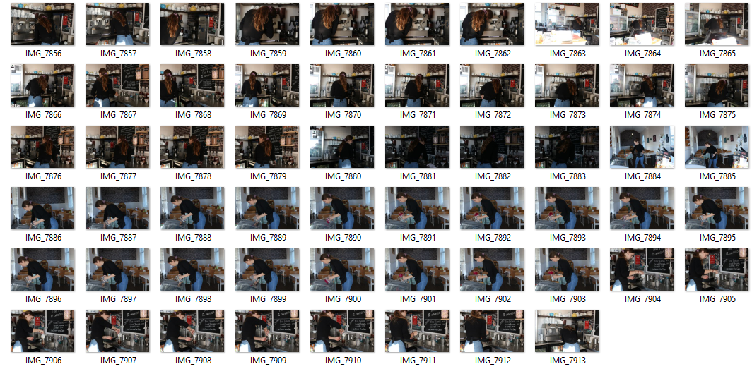
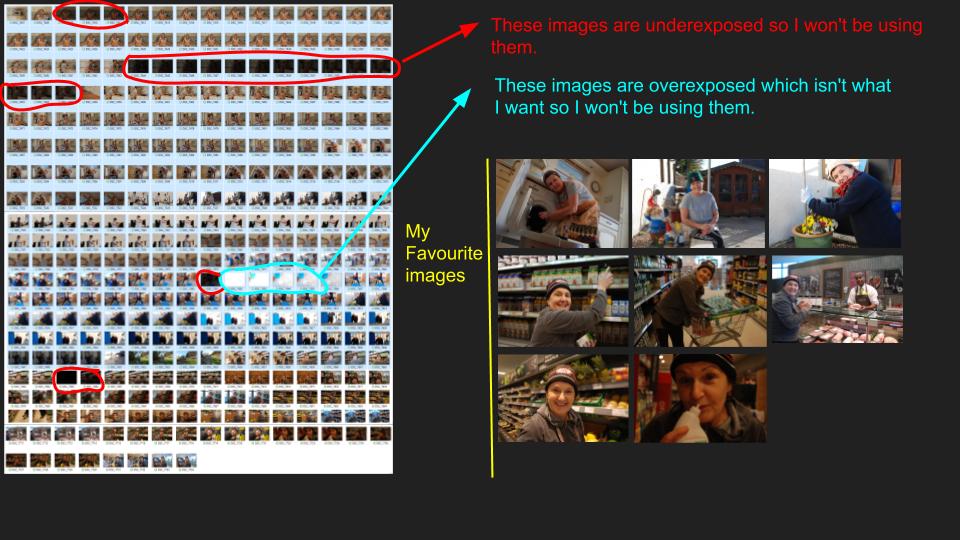
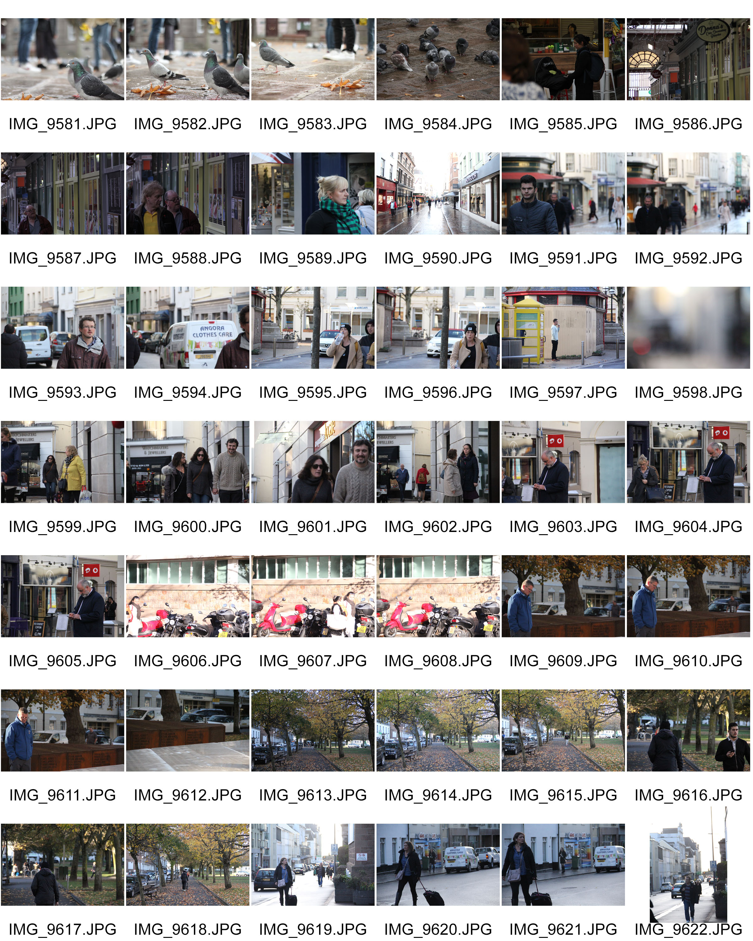
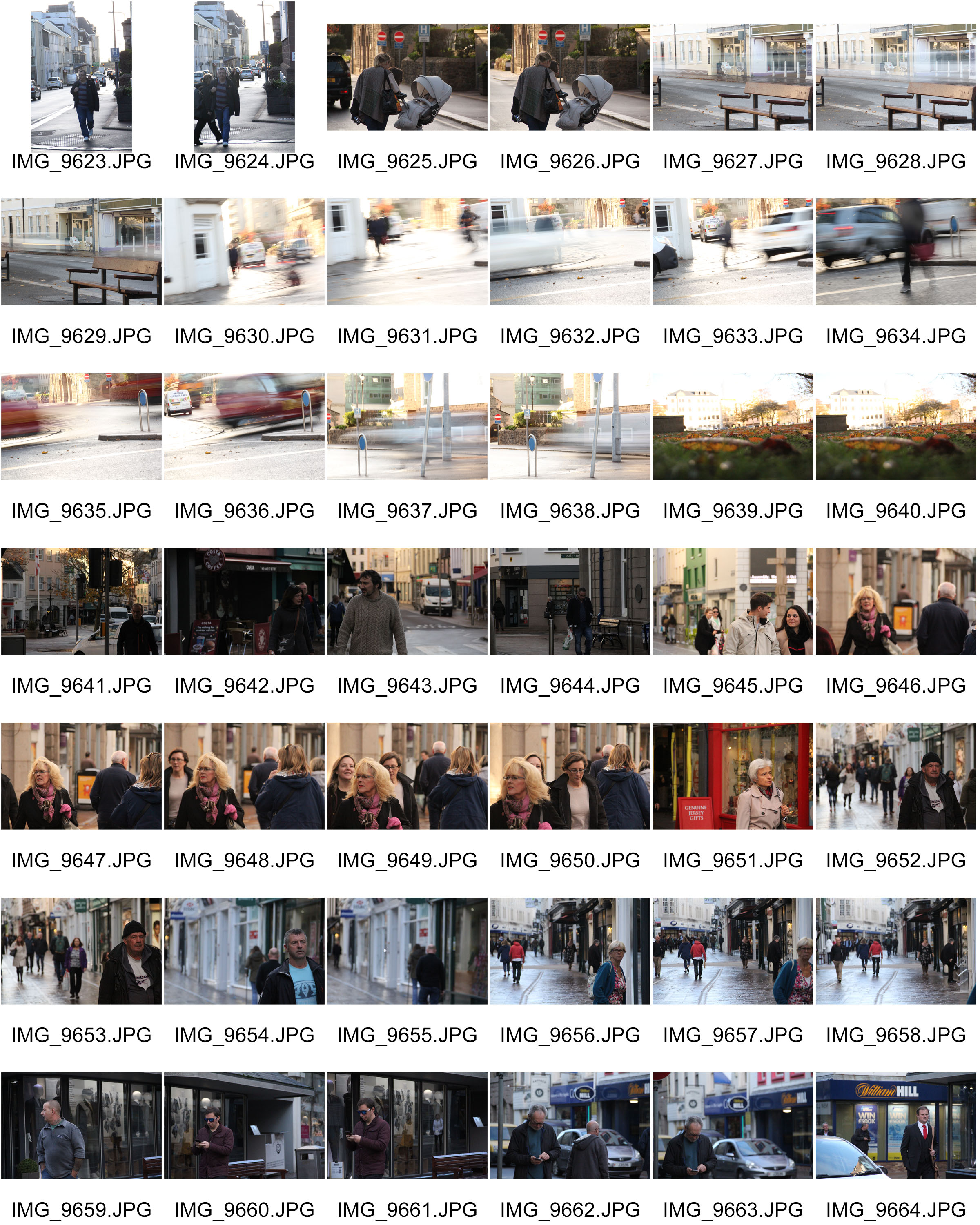
Contact sheet
Best outcomes
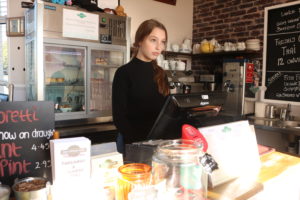


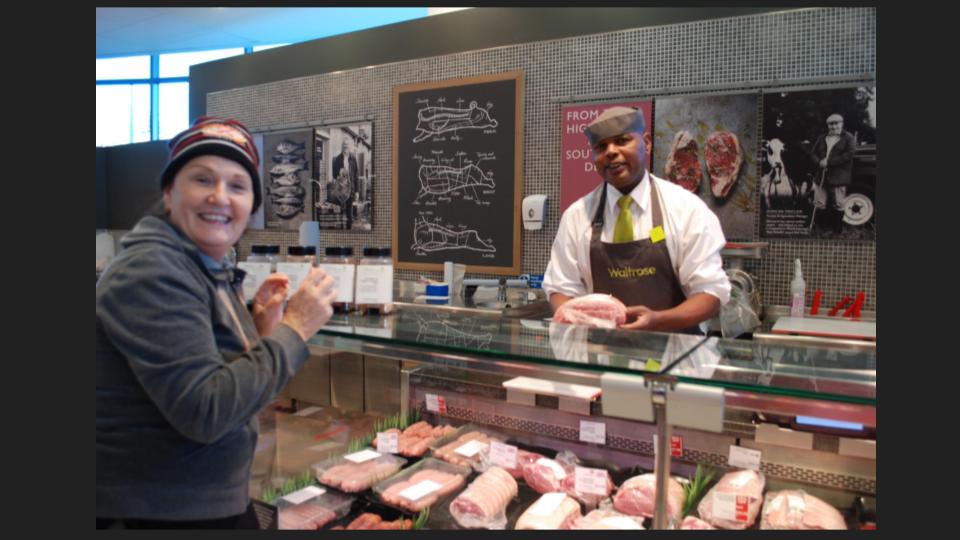
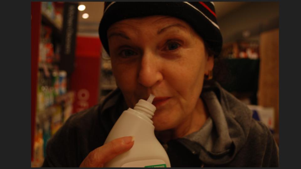
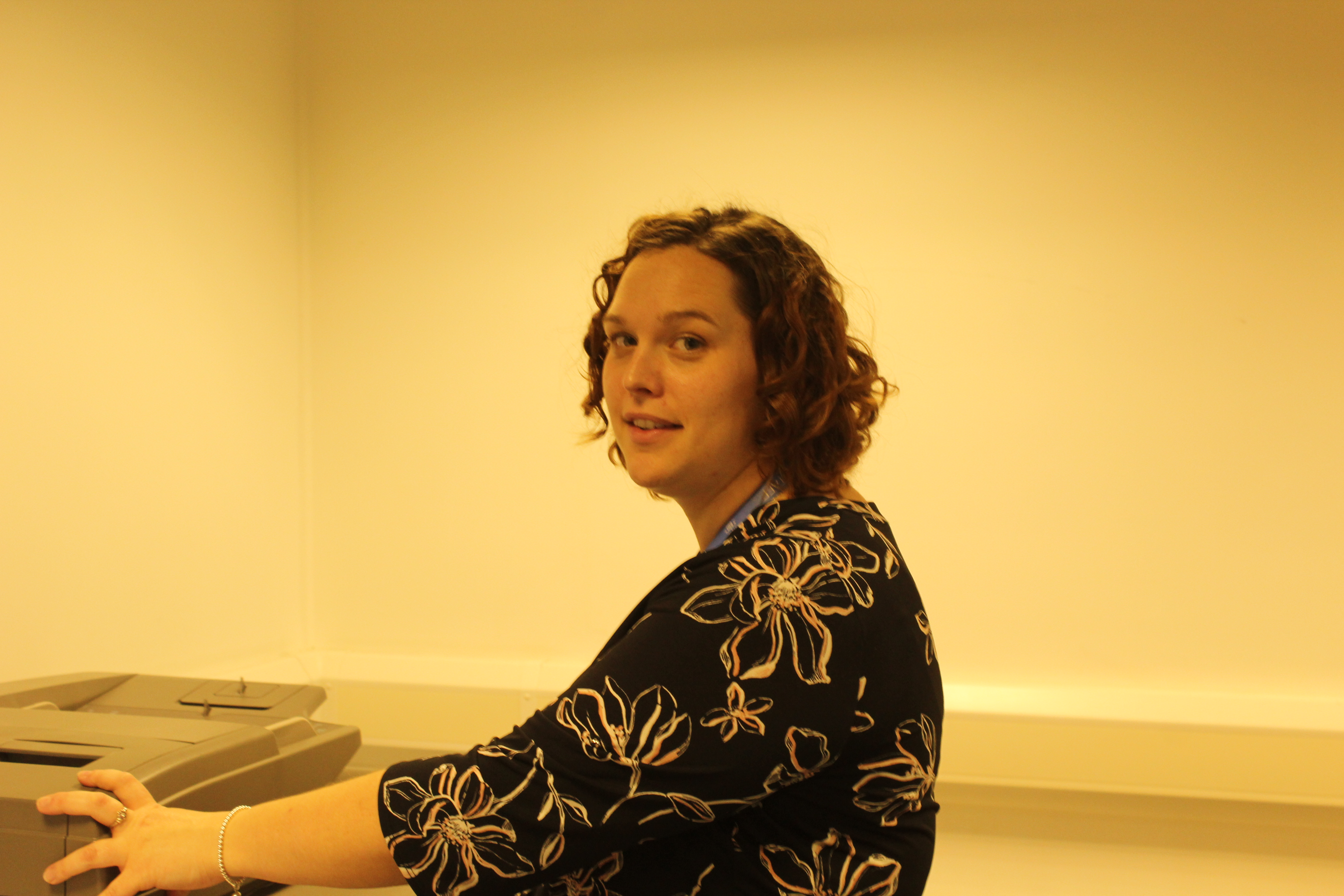
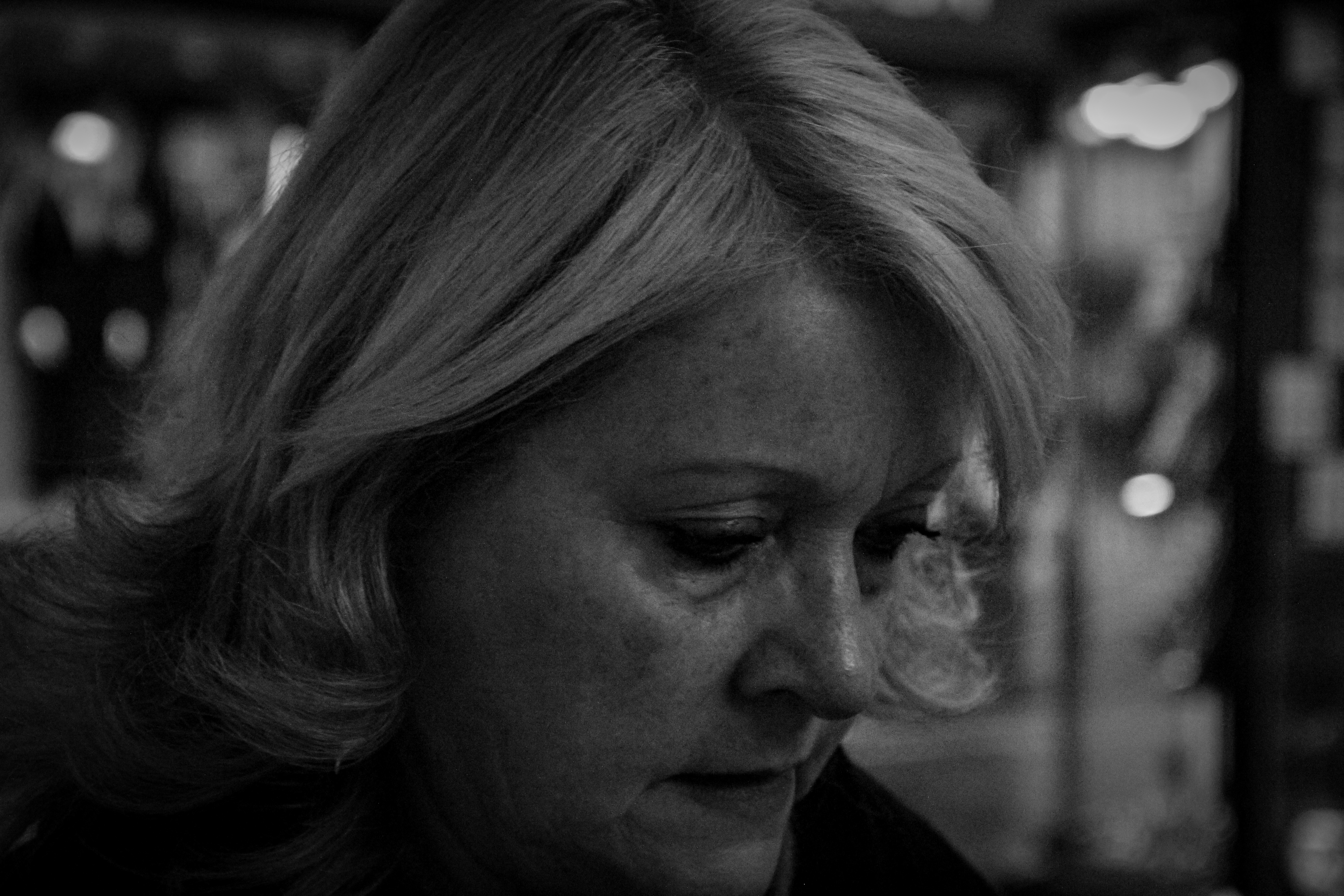
Overall, I think my photoshoot went well however it could’ve gone better. Next time, I want to focus more on having the subject interact with the camera more as I think this way, I would get more successful images. These were the 2 best outcomes of my photoshoot. I like these images as they depict life, working as a waitress.
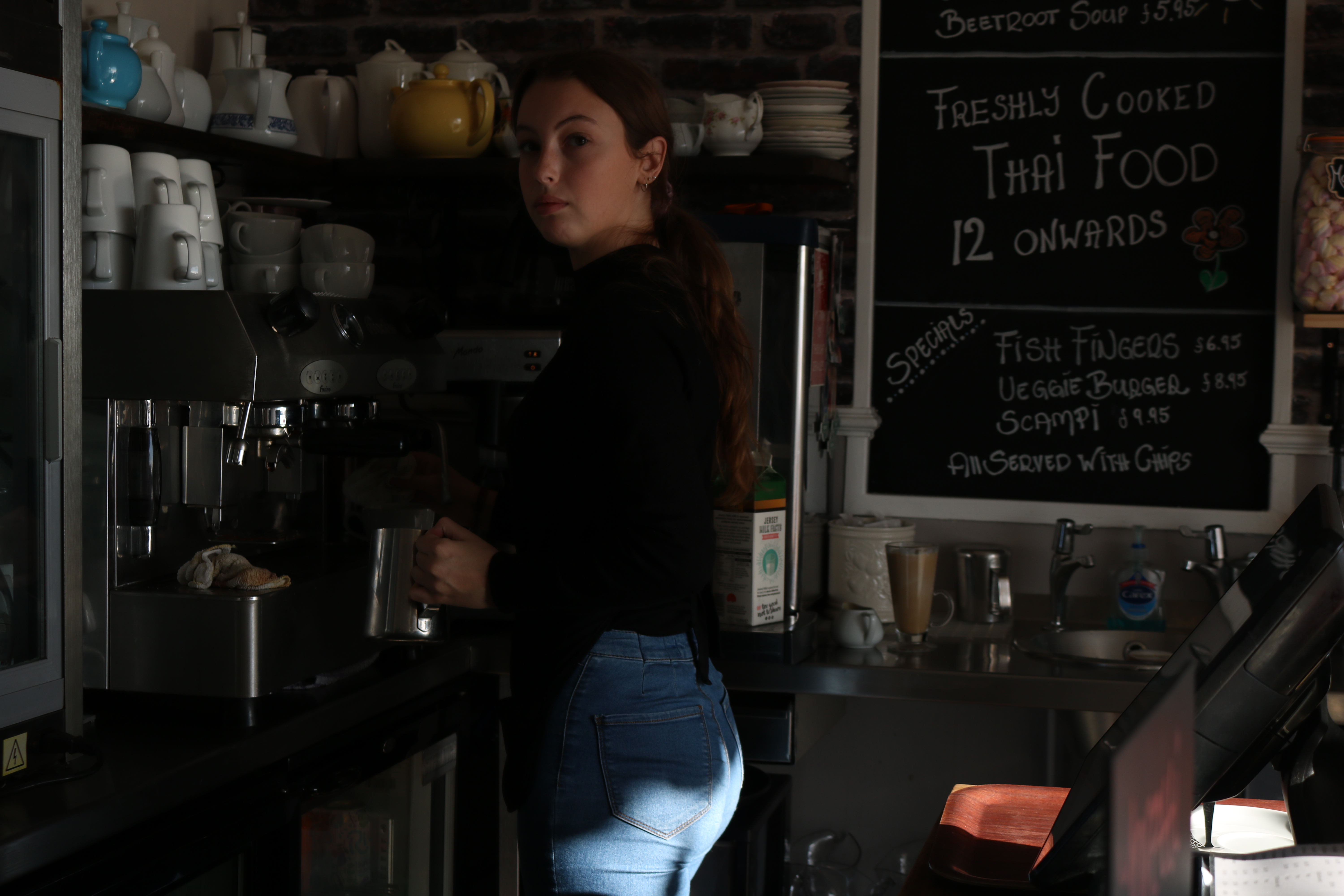

Visually I like the first image as you can clearly see that prior to it being taken, the model was busy making coffee, and this makes the image look a lot less planned, therefore making it more realistic.

Technically, however I think that I could’ve changed my camera settings in order to make the image look better. For example, I think the image looks slightly dark. Next time I think it would be a good idea to put the ISO higher in order to make the lighting better. On the other hand, I think that the shutter speed used was successful as it allowed me to capture the image very quickly with minimal distraction to the model

Another reason that I like this image is due to a potential underlying concept. The image was taken very quickly, just as the model looked at me and you can see that there is a lot captured in the frame, like the till and the board that has been written on to her right. All these ‘distractions’ along with the image being taken quickly, and along with the fact the model is multitasking by attempting to make coffee and looking into the camera, it shows how modern working life can be really hectic and busy.
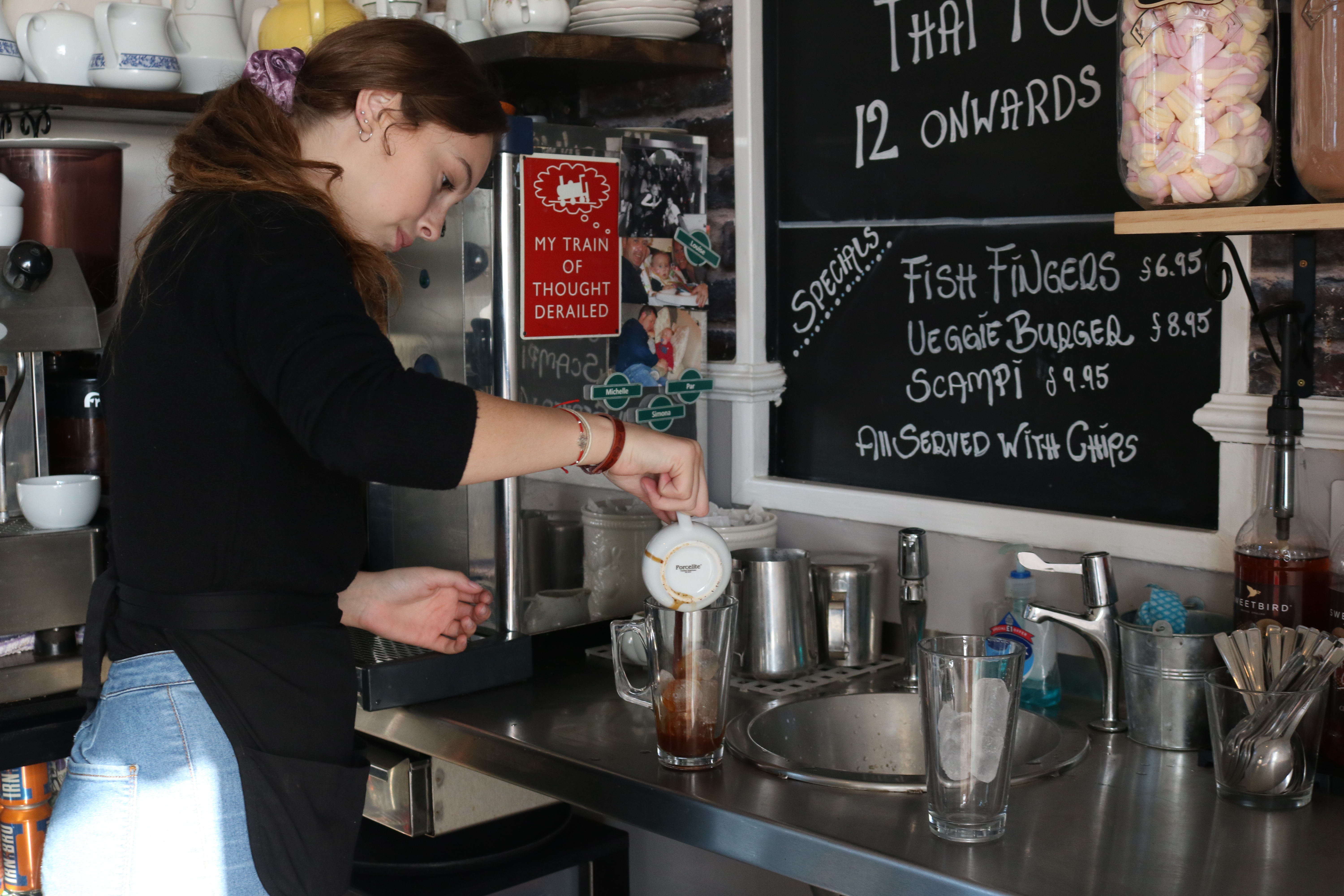
Visually, I think this photo is quite pleasing as it uses the rule of thirds, with the model on the first third of the image. Although the model isn’t directly looking at the camera, you can still see part of her face. It is also clear that she is working, making the photo more realistic and therefore a lot more interesting to look at.

On the technical side of the image, I think it could have been improved. I think that the image turned out too bright. I think it would’ve turned out better if the ISO  was turned down slightly, to darken it a bit more. This photo was taken with a quick shutter speed, meaning that I was able to capture it quite quickly, as the model wasn’t posed like this for long.

Environmental Portraits

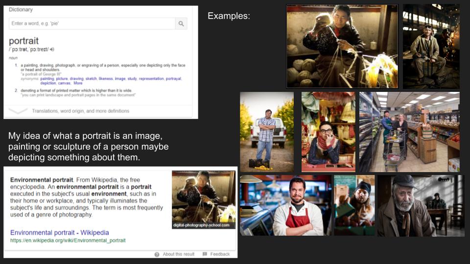
Environmental Portraits capture a subject in their natural environment, and are used to convey the personality and lifestyle of the subject through the context of the image. Environmental portraits often make use of the subject maintaining eye contact with the camera, and posing with a neutral expression on their face. This helps to convey a powerful message to the viewer, as the subject is simply representing what they would look like in their own environment, as they are not posed in an action shot. This helps to maintain the attention of the viewer on the environment, as wells the subject themselves and what they represent.

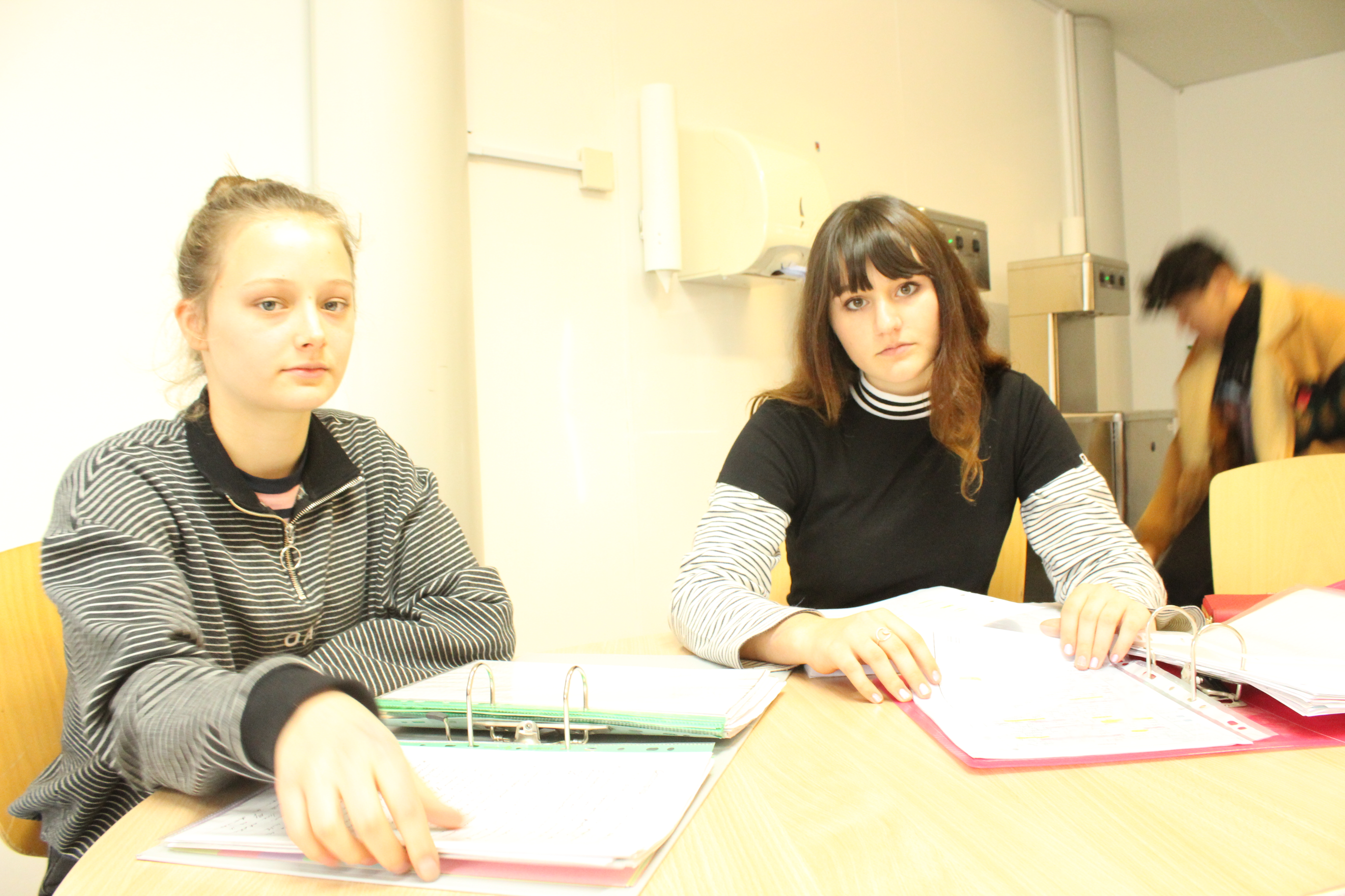
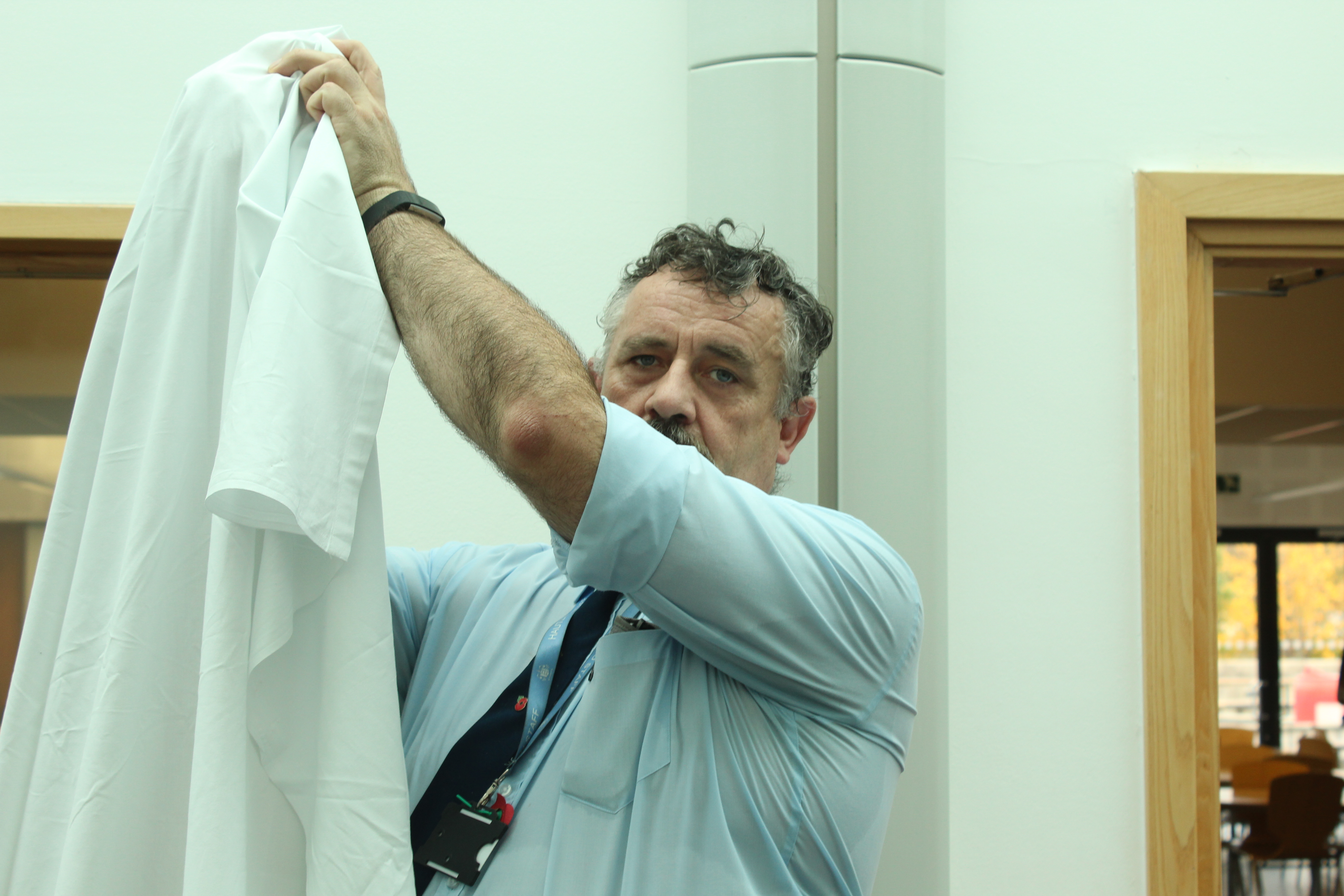
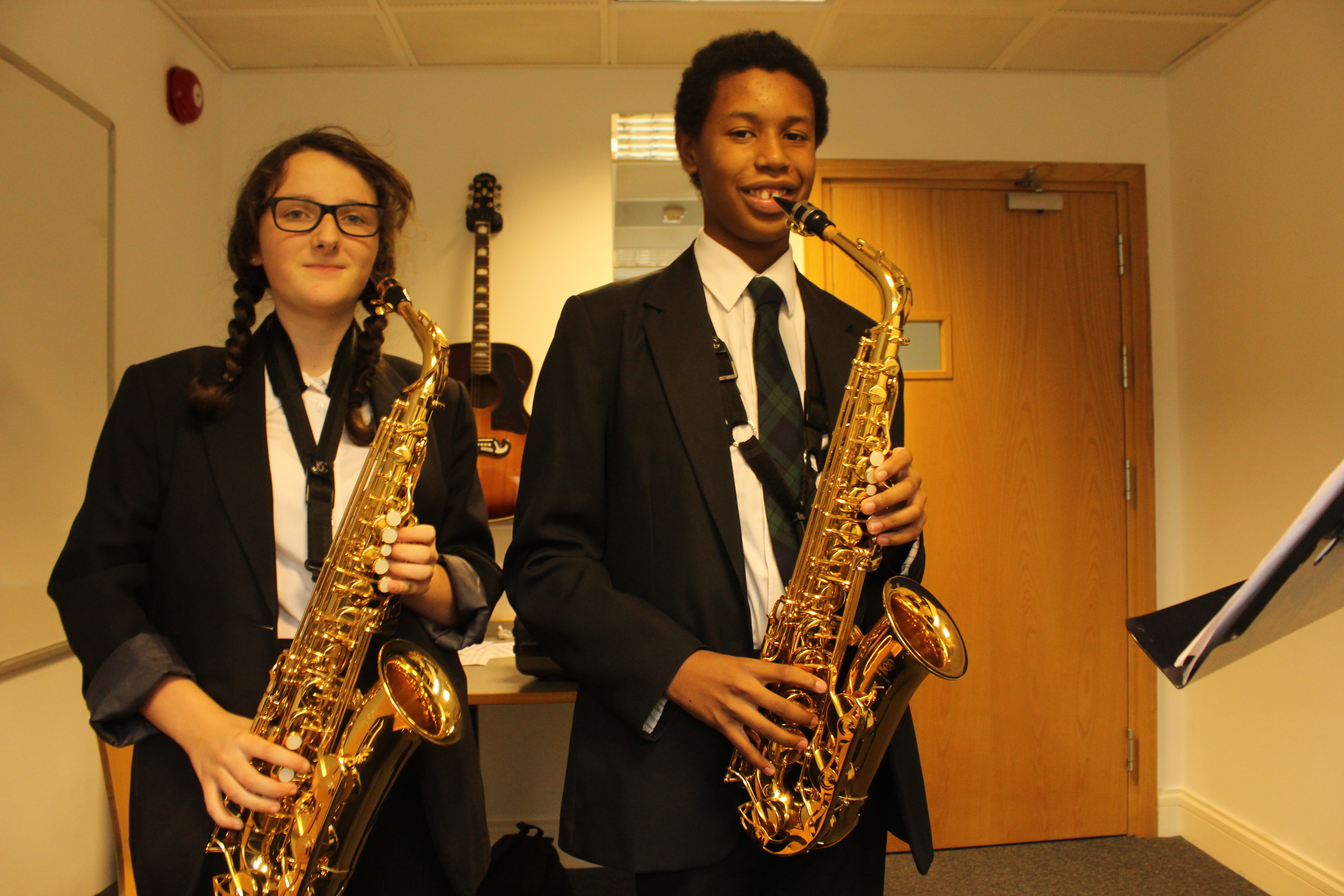
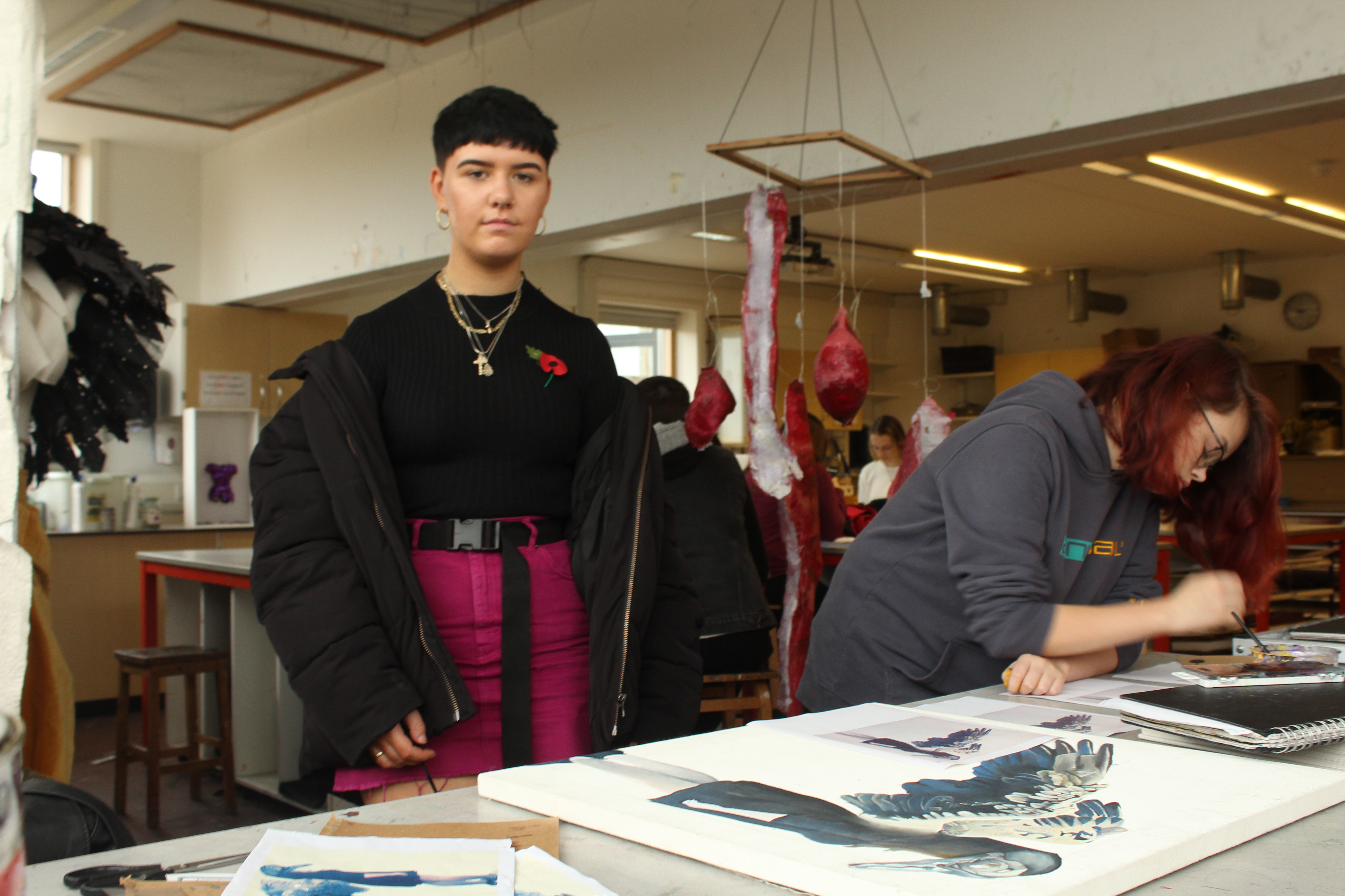
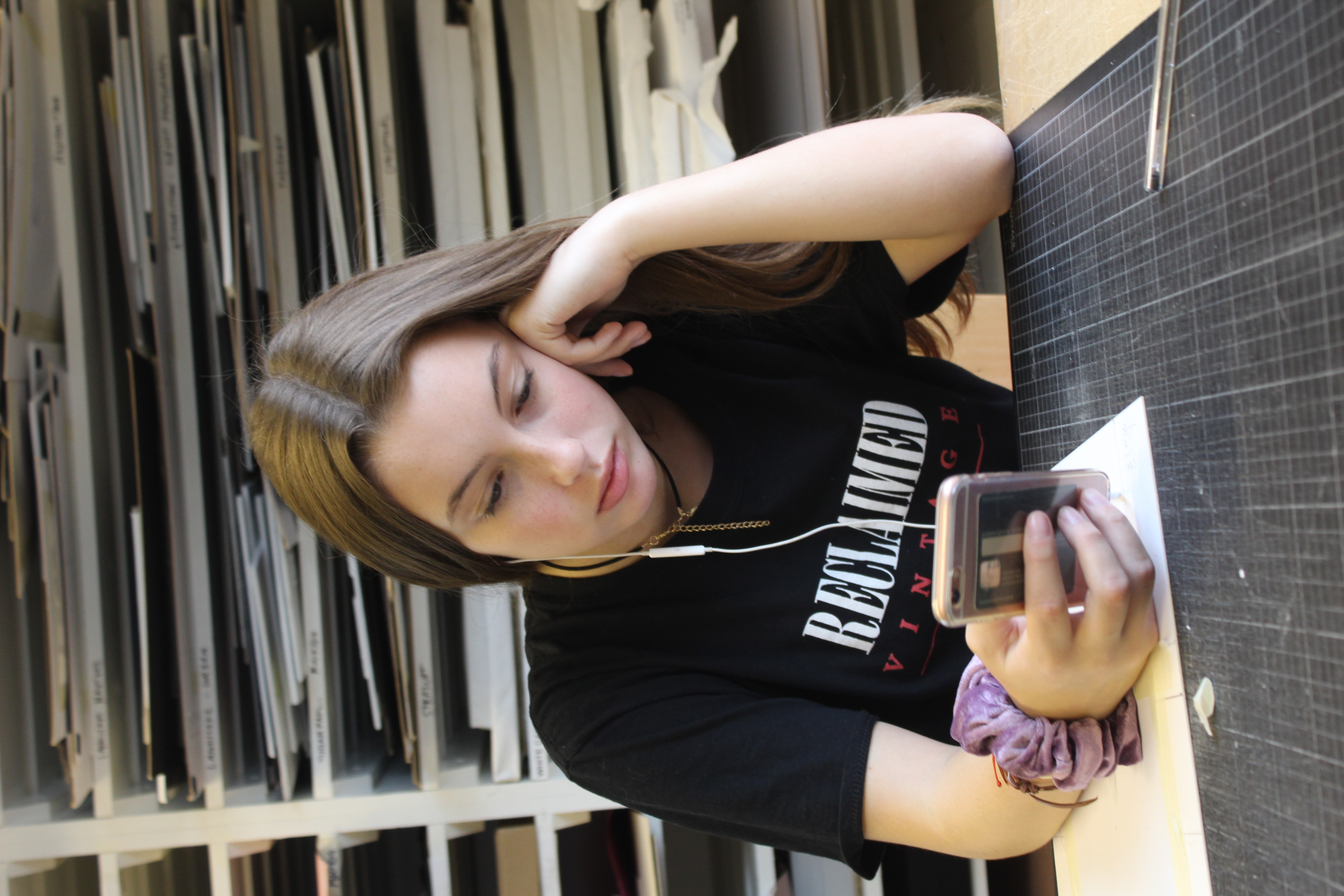
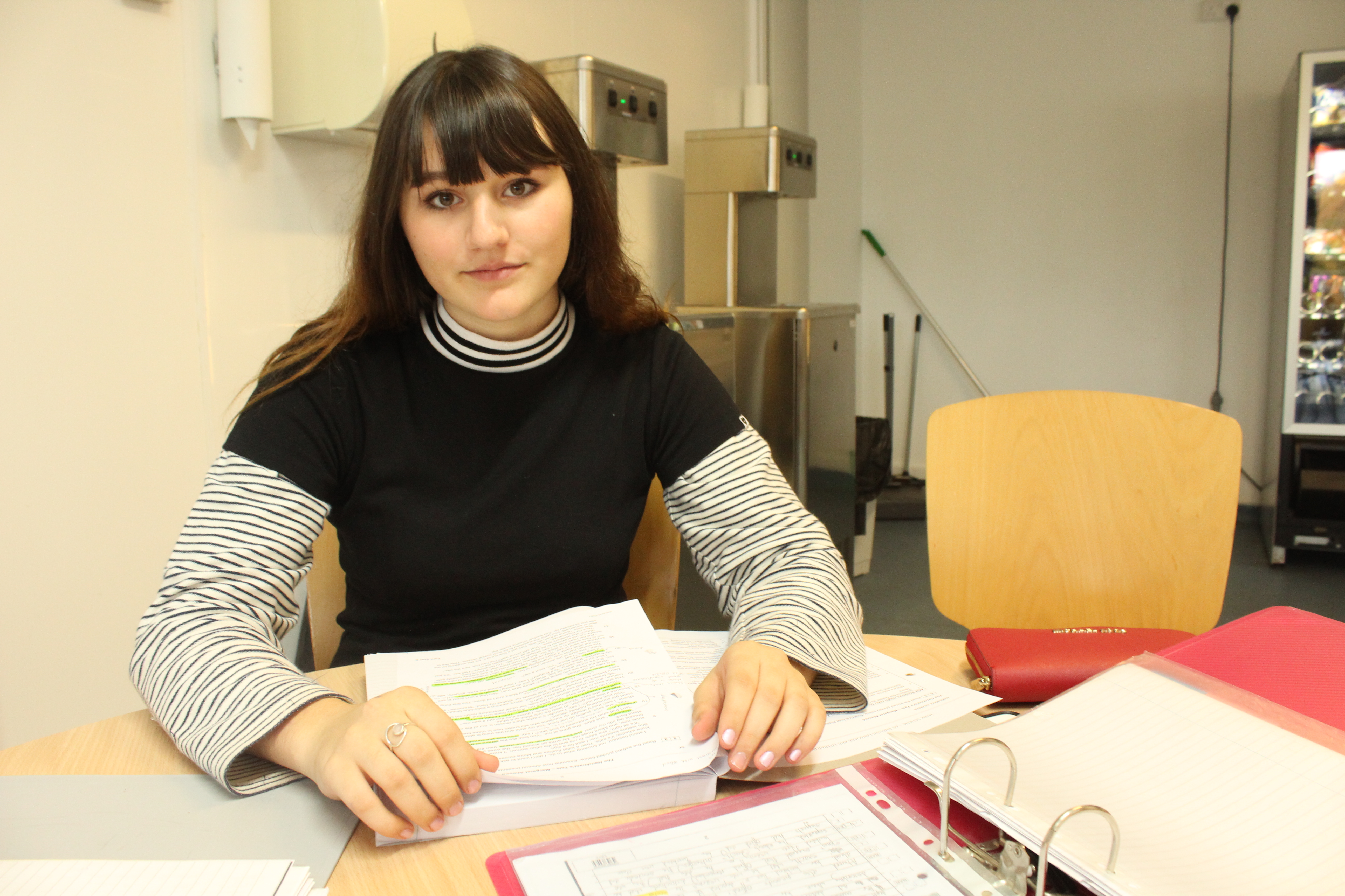
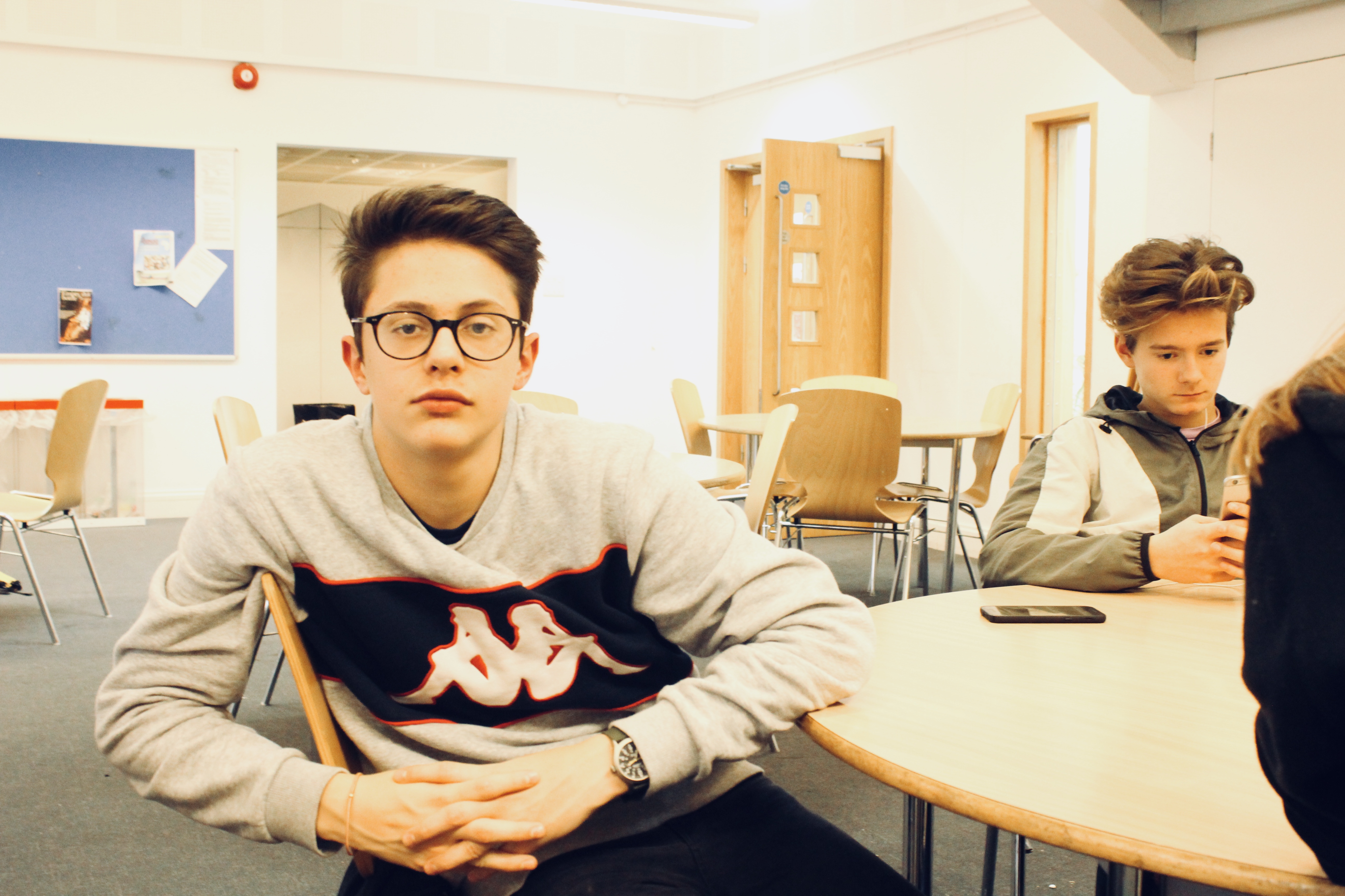
The following images are the images I have taken of the different people found in a school environment:

I feel that these images all convey the different environments that can be found within a single school, and the variety of subjects help to present these different environments effectively. The use of eye contact in environmental portraits helps to maintain the attention of the viewer on that specific subject, and allows the viewer to believe that the subject represents all individuals who are associated with the same environment.

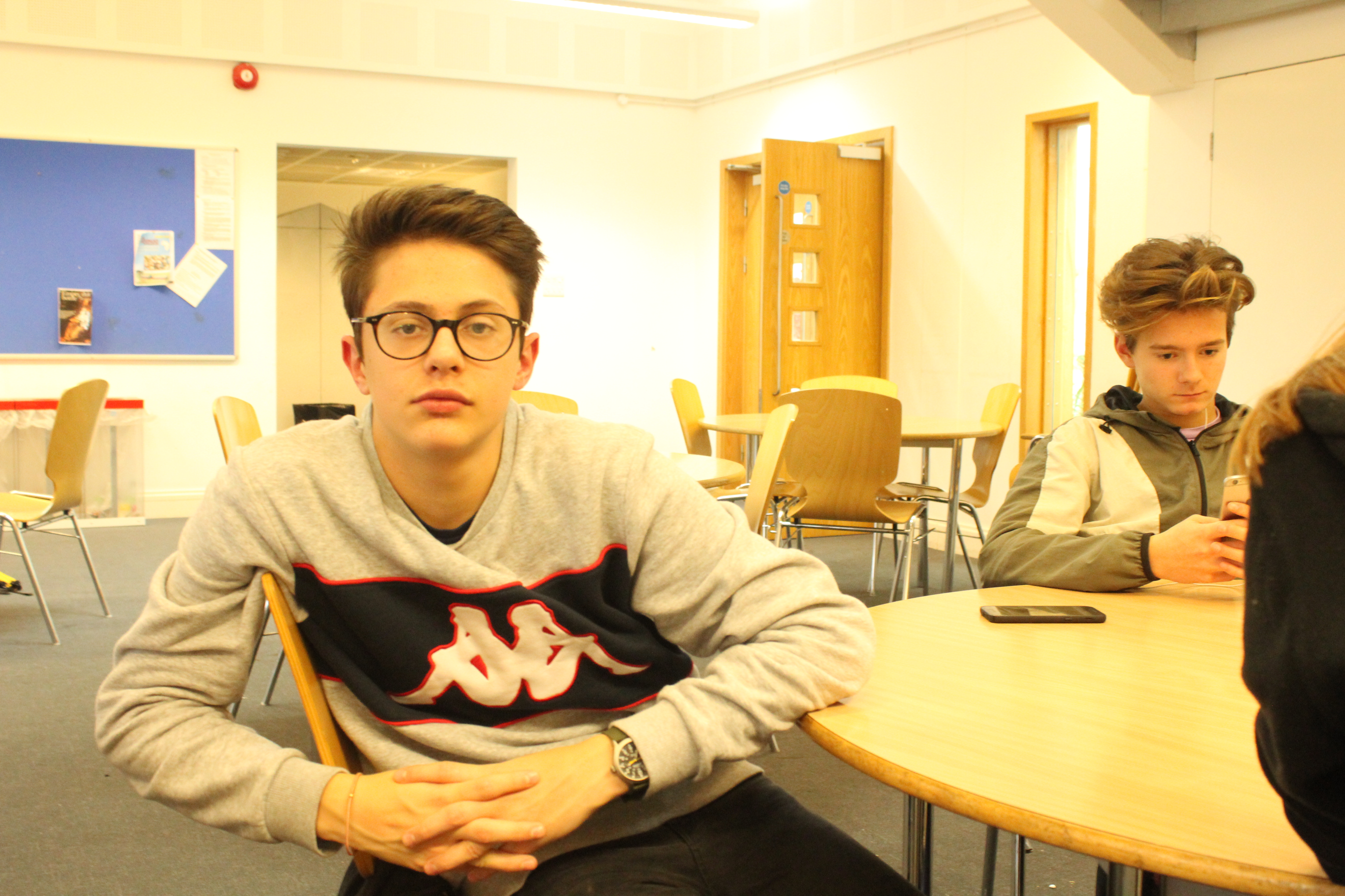
The above image was taken in the canteen, and the subjects facial expression and eye contact is in line with what would be expected of an environmental portrait. The original image was taken in lighting that was difficult to work with, even using camera settings such as white balance, and so the during the editing process the yellow tint was removed to show a more natural representation of the environment.

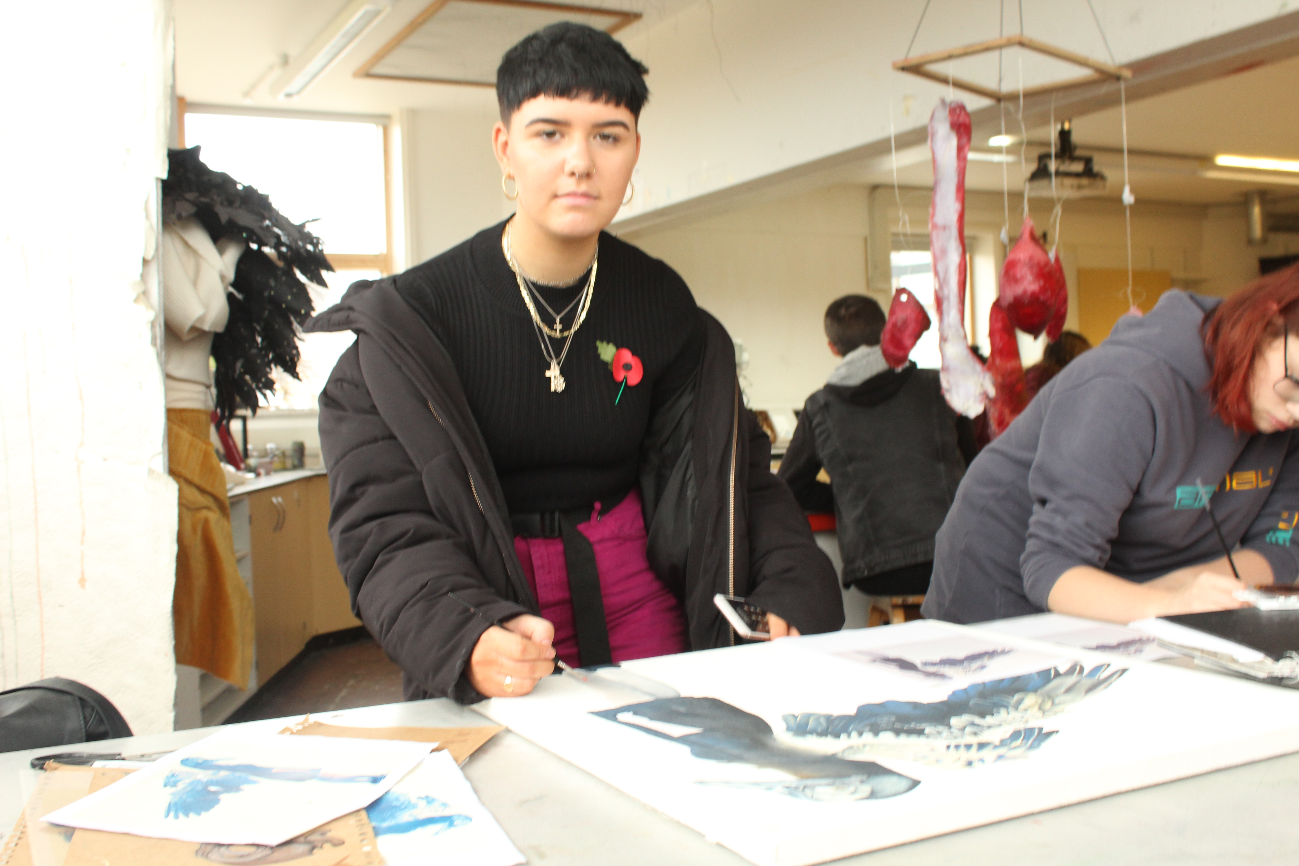
The props used by subjects in environmental portraits can also help to tell the story of the context of the image. In the above image, the subject is using a prop (a white sheet) to show that they are in the process of creating an in school display. The use of the prop helps to give more context to the subject, and in turn helps to convey that the subject is in their natural environment.


WEEK 3- HENRI CARTIER- BRESSON

Henri Cartier- Bresson

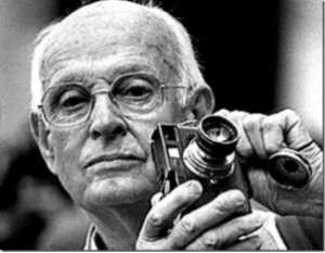
HIS EARLY LIFE: Henri was a French humanist photographer, he created street photography and was known as the master of candid photography (taking pictures of people who are not in a posed position). In his early life he did a lot of painting and had a large photography influence and ended up recieving his first camera in 1929 by a man named Harry Crosby and they spend a lot of time taking images together until Henri fell into a sexual relationship with Crosby’s wife. Henri ended up running away from France to Africa in 1931, 2 years after Crosby committed  suicide and his affair with Crosby’s wide ended which left him broken hearted. While in Africa, he survived by shooting game and selling it to local villagers. During doing this he contracted black water fever in the Cote d’lovire which nearly killed him.

Returning to France in 1931  he started up his love for photography again after being inspired by the photojournalist Martin Munkacsi in 1930. After being inspired, Henri took part in his first photojournalist shoot in 1937 where he covered the ‘ Coronation of King George VI and Queen Elizabeth for the French weekly regards where he focused on the London streets and not taking pictures of the king himself. He married his wife Ratna Mohini in the same year and they lived in a large studio with a small bedroom, kitchen and bathroom in Paris. This studio is where Cariter- Bresson developed his first film. During 193701939, Cartier- Bresson worked as a photographer for the French Communists evening paper ‘ Ce Soir’.

After Cartier- Bresson started film making in  1936, World War II broke out 3 years later in 39 and he joined the French Army in the Film and Photo unit. In the early year of 1940 he was captured in the French mountains by German soldiers and spend 35 months in prison-of-war camps doing forced labour by the Nazis. On his third attempts of trying to escape he finally did and hid on a farm before getting false papers to get him back to France. Coming towards the end of the War, there were rumors that Cartier- Bresson has been killed due to no one knowing he was working under-ground aiding other escapees. While working under ground, his dug up his hidden Leica camera which had been buried in farmland near Vosges.

LATER LIFE: Cartier- Bresson’s photography took him to places all around the work and he became the first Western photographer to photograph ‘ freely’. After working for Vogue in 1962, he withdrew as a principle of Magnum in 1966 to concentrate on portraiture and landscapes. Cariter- Bresson ended up retiring from photography in the early 70s and by 1975 did not take any more images. He returned to mainly drawing while still keeping his camera safe at home. He helf his first exhibition of drawings in 1975- Carlton Gallery, New York.

He died on August 3rd, 2005 at age 95. There was no cause of death announced, he was buried by his wife and daughter in the local cemetery.

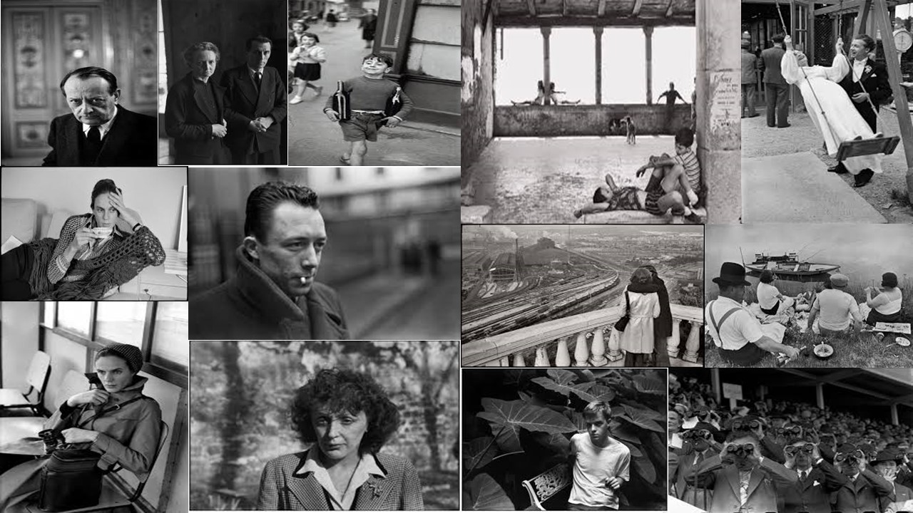
MOOD BOARD..( NOT MY IMAGES) 

Analysation 

Technical analysis 

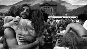
While looking at this image technically, i quickly notices that this image was taken with a wide lens due to us being able to see a large surface of the image, i can also tell that this image is in full focus and therefore doesn’t include a depth of field, this allows us to make more of a contextual and conceptual decision on the picture. Even though this image has been edited, i can also tell that the image has been taken under natural daylight due to the background ( mountains and sky) which means the White balance was set to ‘Daylight’ mode. I think that there was a high ISO used to take this image due to the detail in the subject of the image, as well as being able to see contrast in the image.

Visual analysis 

The visual aspect of this image is very obvious and we can see that the image has been edited to a black and white effect. Using this black and white effect has also allowed for there to be more of a contrast in the image due to the dark colouring of certain object and the lightness of the sky and snow on mountains. The shape of this image is a 2D flat which is allowing us to see the background of the image.

Contextual analysis

While looking at this image, i cannot get a feel for around the year this image was taken. However, due to the subject of the picture not having his shirt on but there being snow on mountains in the background, i am guessing that that this image was taken in France at a reunion camp due to the father and daughter hugging and seeing the people in the background looking a little frantic, like they’re looking for the ones they love.

Conceptual analysis 

I think the reasoning for this photo being taken is because of the very touching situation that is happening. The way i interpret the image is that there is a father and daughter reuniting which is shown through the tight hugging where you can see the mans arms tensing. All though the man is making eye contact with the camera, i think that his eyes are showing relief.
Comparison to Saul Leiter 

Saul Leiter was born December 3rd 1923 and was known as a color and black and white photographer from Pittsburgh Pennsylvania. Leiter was given his first camera at the age of twelve by his mother. However, Leither then went into art and was lucky enough to meet Eugene Smith who then encouraged Leither to become a photographer. He started taking color photographs in 1948 and began associating with other contemporary photographers

Leiter was then a fashion photographer from 1950- 1970 and photographed for Vogue, Elle and Nova.

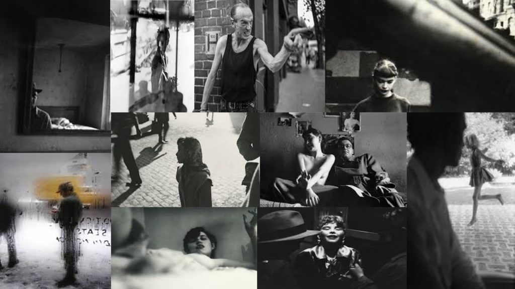
Leiter’s photographers ranged in focus. He tended to experiment a lot with depth of fields which made his images very interesting as every image is different. I think that Leiters use of colour with the different depth of fields helps us to identify the surroundings more as some of the depth of fields used completely blur the picture which can sometimes make it hard to identify what the picture actually it. After analysing his images i have also noticed that he liked to take his images through windows which is shown by the mist on the windows, the rain or the reflection.

MOOD BOARD.. (NOT MY IMAGES)

Similarities to Cariter- Bresson

The technical similarities in their way of taking photos include using natural/daylight when taking their images as most pictures have been shown to be taken outside. Both photographers also have all of the image in focus majority of the time therefore the audience can see what the model is doing which can add a story to the image. While analyzing their images, I think that both photographers used a high shutter speed in order to capture the images the way they did on the mood boards due to them all being very clear with no blurring.

After visually looking at the image i can tell that the photographers both tended to take pictures of the public who are not engaged with the camera, as well as their images being edited into black and white. Using the black and white edit has also added tone and contrast to the image due to the darker parts in the original picture standing out more. Most of their images are in 2D which allows us to see the surroundings that the models are in.

Both photographers also have a large history of being very well known and have both worked for the large fashion company Vogue.

Differences to Cariter- Bresson

After analyzing both of their works, i found it very difficult to detect any differences between the two and i have come to a conclusion that they are very similar and work in the same way.


Street Photography – Practical

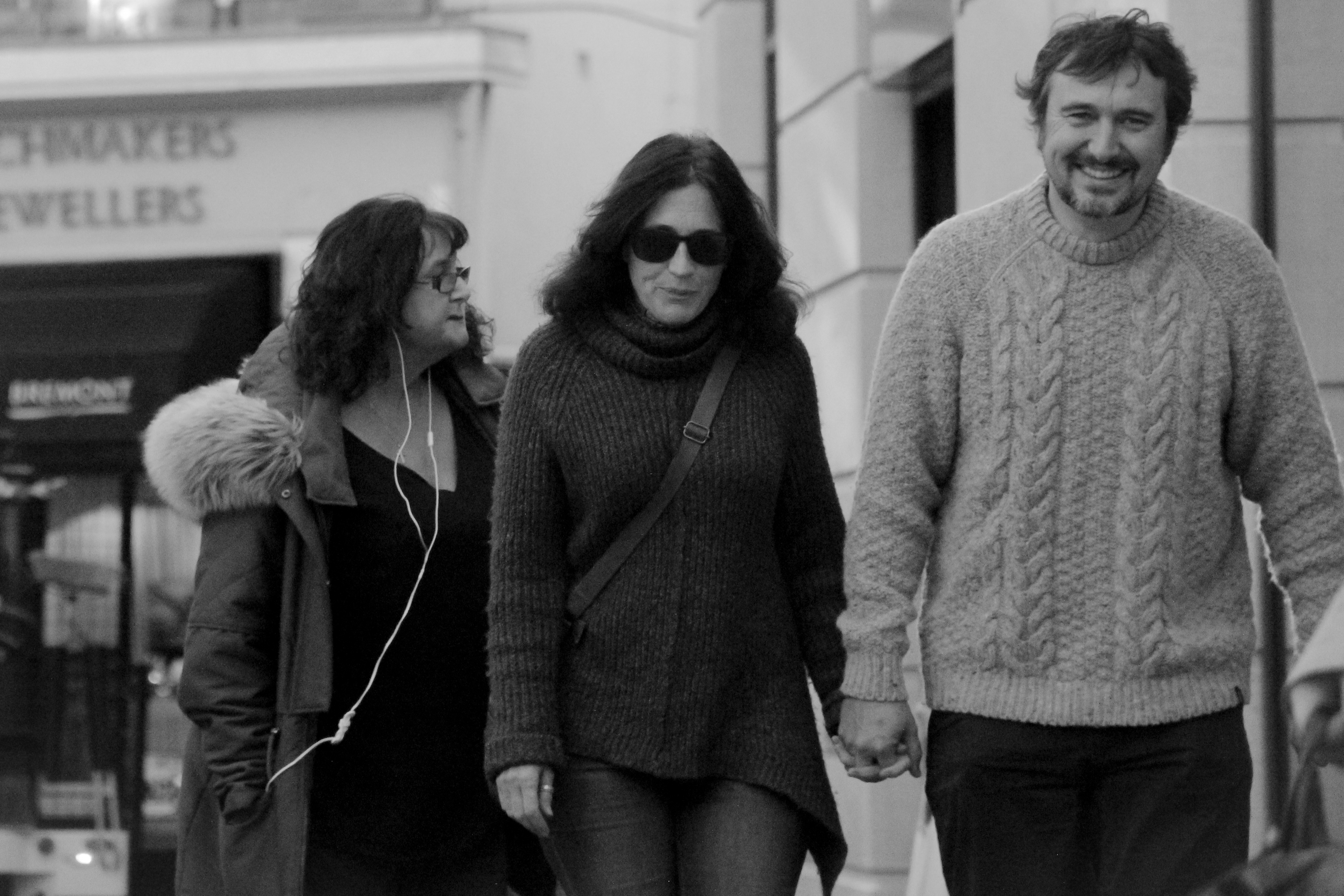
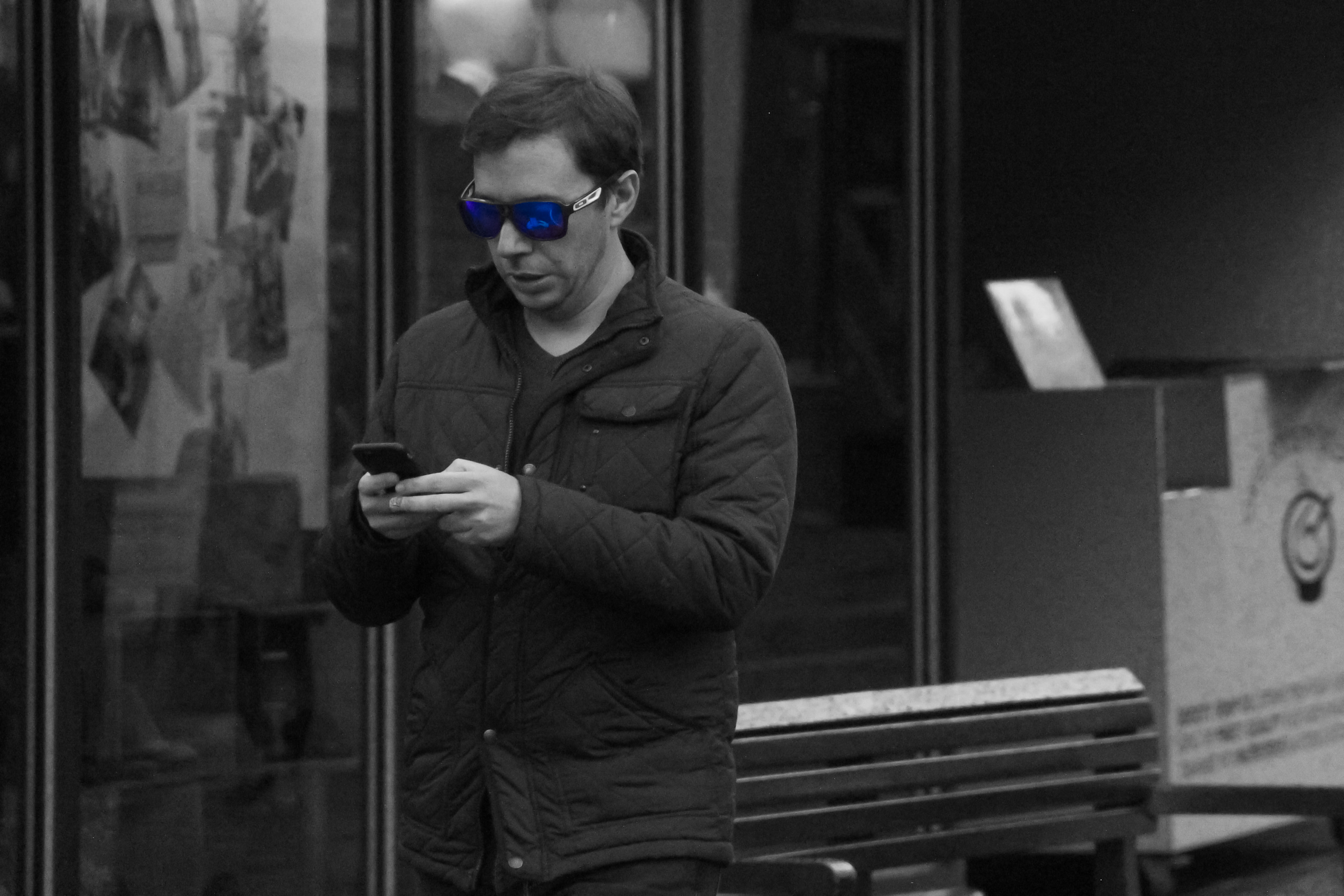
For this practical I wanted to capture people doing ordinary things and having interactions between each other, but add a more dramatic or stylized edge to the pictures. this was my first attempt at street photography and found it to be very interesting seeing people go about their day. After selecting my final images, I decided that I waned to assign each picture an emotion. Some of the images clearly showed some emotion to begin with, but I wanted to edit them to see if i could achieve this while still making each picture look realistic and not over-edited. Below I have put together a contact sheet an some final images that I have edited.


Final Images

Edited in: Lightroom

I started with the emotion of sadness, trying to capture the somber atmosphere by getting very close to the subject so it seems as though nothing is going on in the world around them. I then desaturated the image and lowered the exposure so that it would seem darker.

Edited in: Lightroom

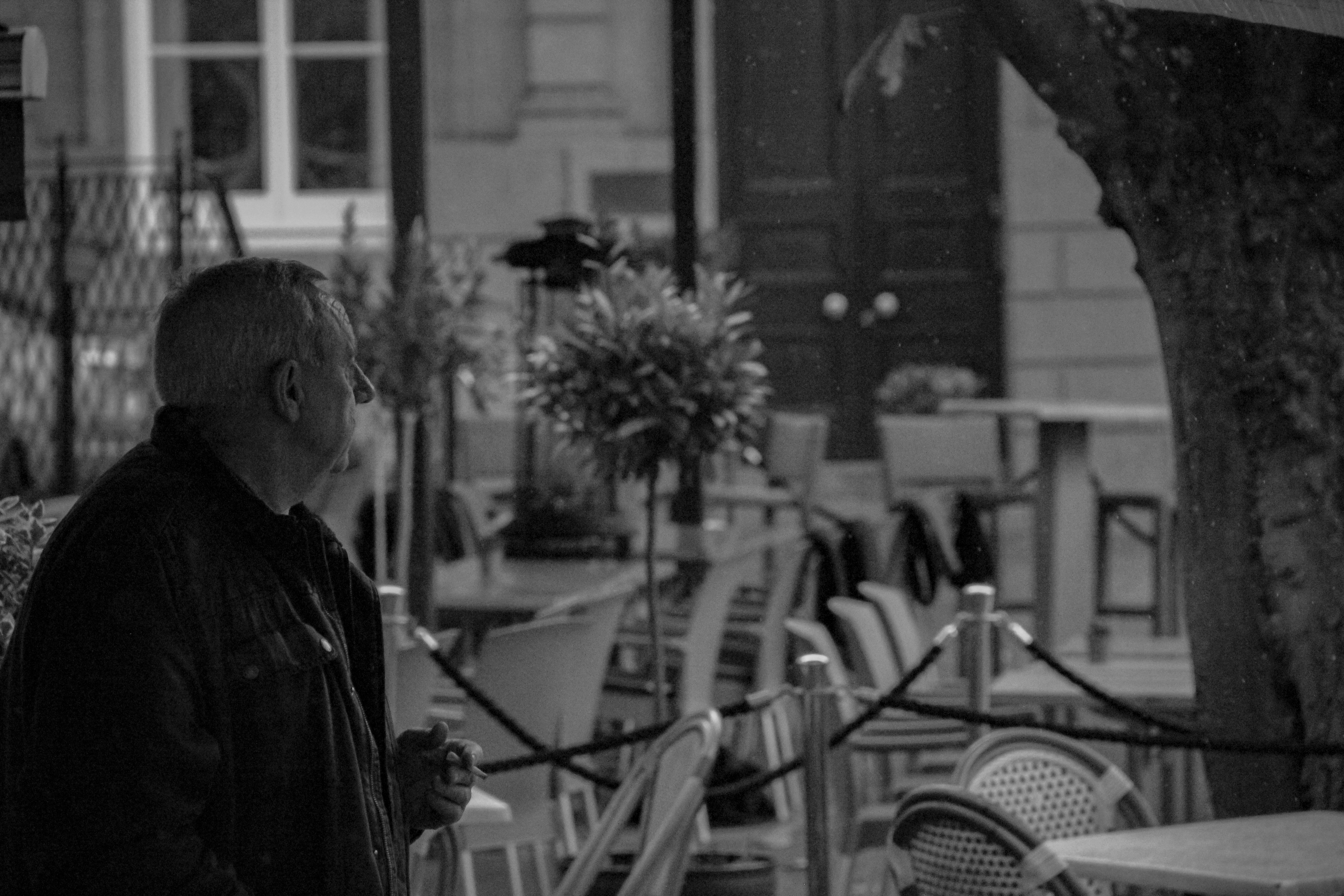
I had a similar approach with this photo as i did with the last. I wanted to capture a somber atmosphere and as you cannot see the subjects face, through the use of some small adjustments and editing, the picture is perceived to be sad as the man is looking into the distance, and because the viewer does not know what he is looking at, it seems as though he is staring at nothing.

Edited in: Lightroom

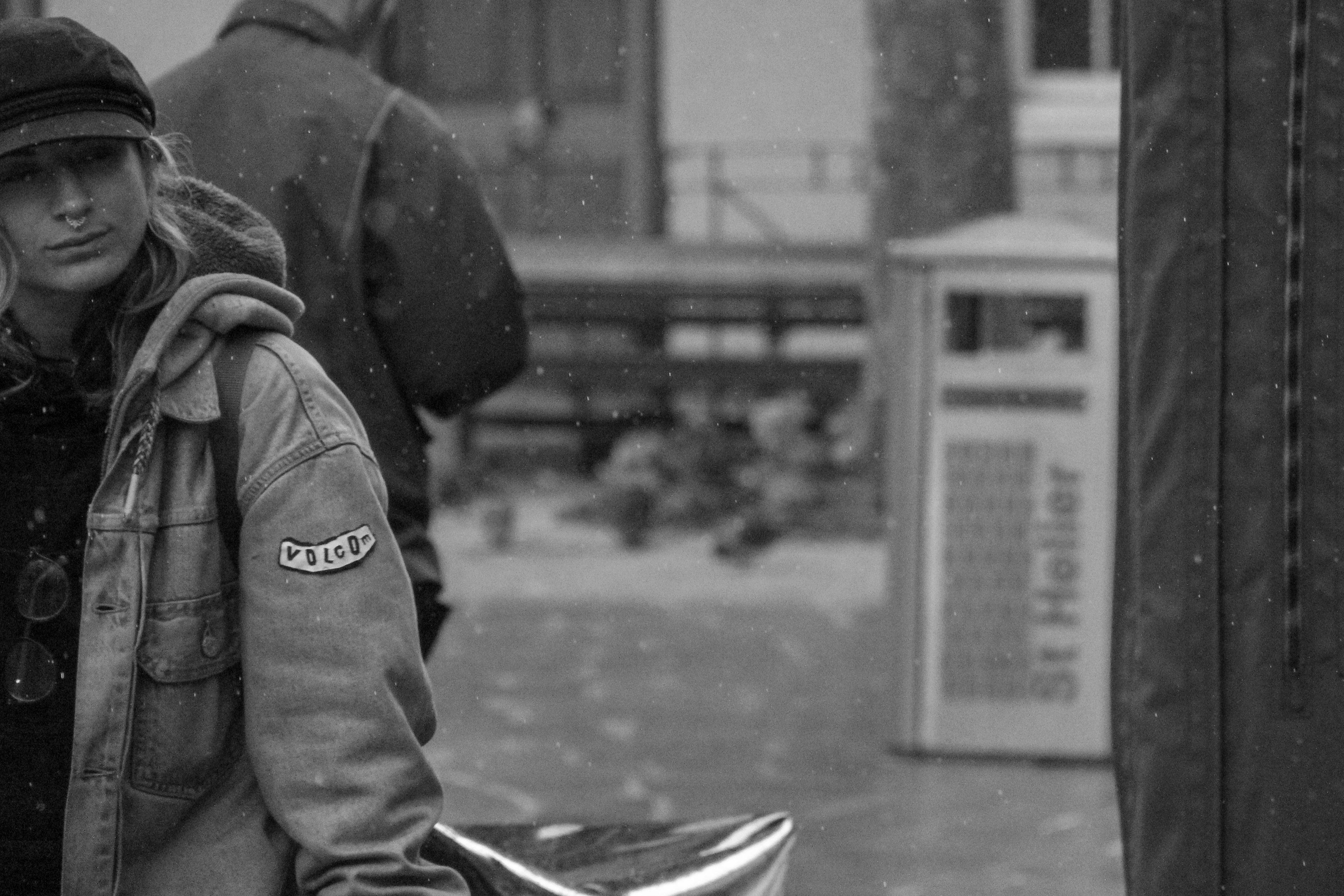
For this image I used a high shutter speed to capture raindrops frozen in midair. I try to utilize the rule of thirds in many of my pictures however i think that it is especially noticeable in this image. The frozen rain, adds a sense of temperature, making the image look cold and dark.

Edited in: Lightroom

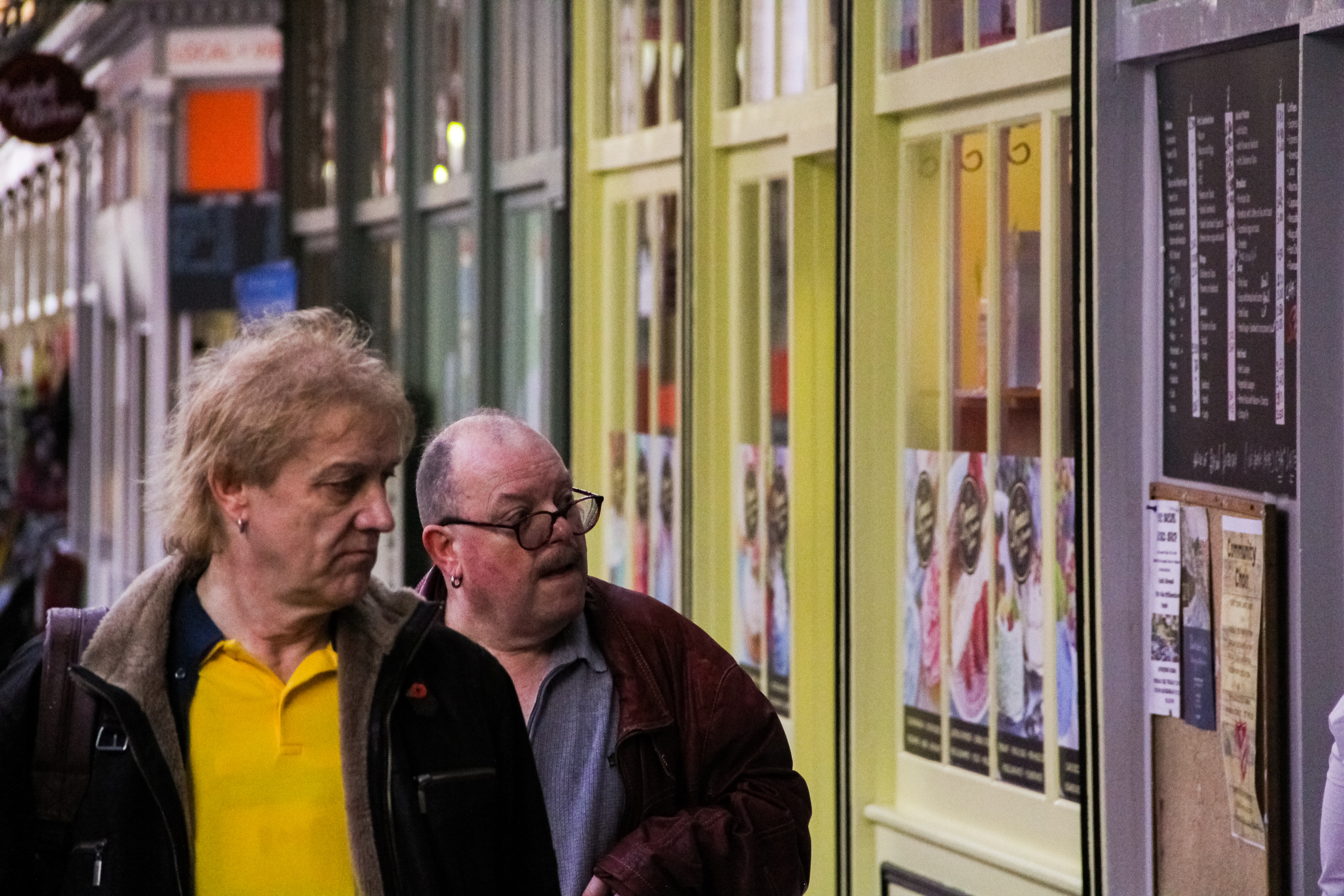
I liked the use of colour in this image and i decided that desaturating it would make it lose some of its most interesting characteristics. For instance, something I noticed while editing the picture is that the man on the left’s shirt is almost a perfect match to the yellow reflection in the glass, and the man on the right’s shirt is matching the grey-painted board on the right side of the image. This helps create a sense of symmetry, as the picture is almost split in to two, at least regarding colour, and gives it a subliminally symmetrical look.

Edited in: Lightroom

Many of my images were focused one person at a time, however this is one of the few which focuses on relationships and interactions between different people in the same frame. Although this is quite a dark image with not many bright highlights, the smiles on the subject’s faces show a clear juxtaposition to the exposure.

Edited in: Lightroom + Photoshop

This picture is slightly more stylized than I originally intended however i like the idea that the subject is so engrossed in their phone that the rest of the world isn’t being taken in, hence why i saturated the polarized lenses  of his sunglasses and made the rest of the picture B&W.

Edited in: Lightroom

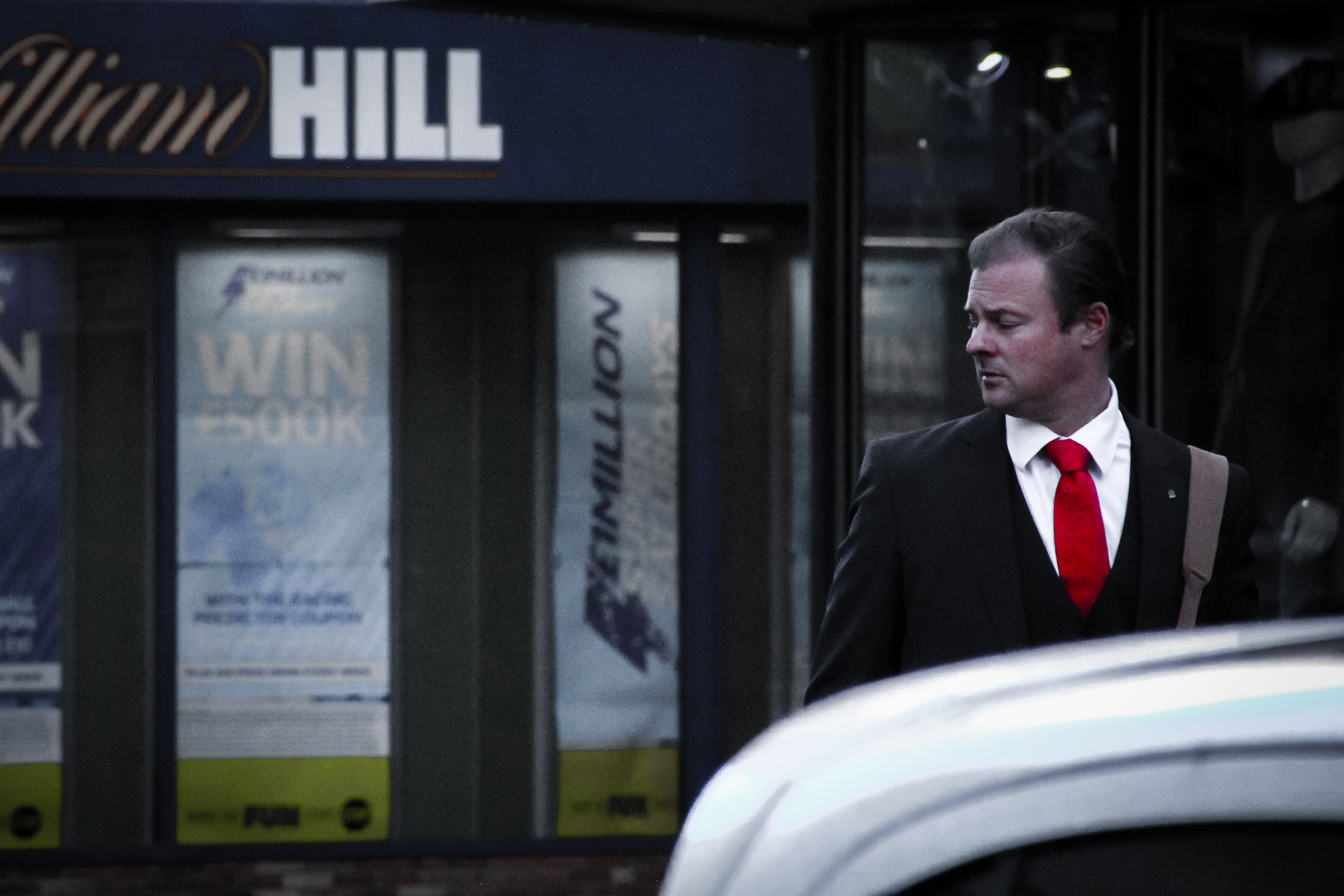
In this image it seemed as though the man was very important, at least compared to his surroundings. for this reason i decided to bring down the colour saturation in his surroundings and emphasize the red of his tie to draw the eye to the right of the picture.

Environmental Portraiture – Post 2 (Arnold Newman Case Study)

Arnold Newman:

Born in Manhattan (3rd March – 1918), Newman grew up in Atlantic City, New Jersey and later moved to Miami Beach, Florida. In 1936, he studied painting and drawing at the University of Miami. Unable to afford continuing after two years, he moved to Philadelphia to work for a studio, making 49-cent portraits in 1938. Newman then returned to Florida in 1942 to manage a portrait studio in West Palm Beach. Three years later, he opened his own business in Miami.

Arnold Newman is often associated with being the first photographer to use “environmental portraiture”, in which Arnold placed the subject in a carefully controlled setting to capture the essence of the individual’s life or work.

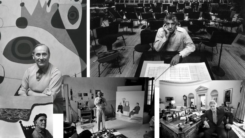
Newman normally captured his subjects in their most familiar surroundings with visual elements representing their professions and personalities (such as tools in a workshop or instruments in a musicians studio). Using a large-format camera and tripod, he worked to record every detail of a scene to create an in depth and accurate image of the subject’s life.

“You don’t take pictures with your camera. You take pictures with your mind and your heart.” -Arnold Newman

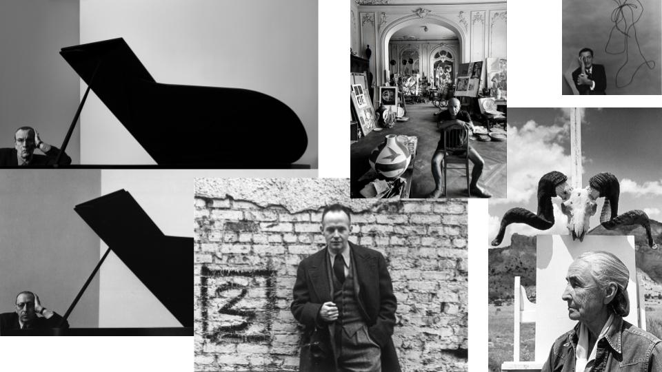
Mood Board:

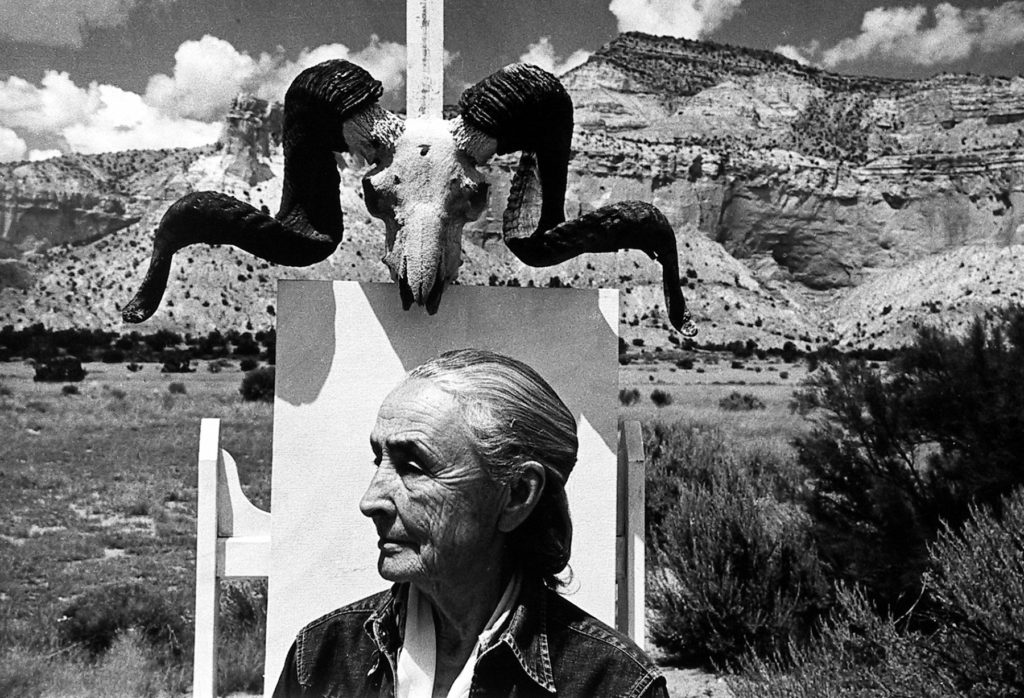
Selected Image:

Georgia O’Keeffe, Ghost Ranch, New Mexico, 1968
Gelatin silver print; printed c.1968
9 1/8 X 13 1/2 inches

Technical:

  • Contrast
  • Use of shade
  • Daylight
  • Contrast for emphasis and highlights
  • Close up (intimate)

Visual:

  • Old woman in the foreground facing off to the left of the image, possibly in thought.
  • Desert setting with few clouds creating ambience and light which casts shadows on the texture of the mountains in the background.
  • Dark shrubs on the right of the image break up symmetry of the background and coincides with the shadow cast by the female figure.
  • Animal skull on painting easel connoting “country” feel and suggesting the female in the image may be an artist at her usual painting spot.

Contextual:

  • The photograph was taken of Georgia O’Keeffe in New Mexico in 1968.
  • O’Keeffe was a modernist painter living in the desert in New Mexico and spent much of her time going on walks and gathering inspiration for her art.

Conceptual:

  • Newman’s inspiration for the image came from the setting on O’Keeffe’s home area.
  • The animal skull and clearly barren background show the setting of where O’Keeffe lived and showed the landscape from which she gathered much of her inspiration.
  • O’Keeffe is the only person in the image with no sign of live past her canvas conveying a solitary, however the artist doesn’t appear sad, showing different people find happiness and inspiration in different places.

Georgia O’Keeffe:

Georgia O’Keeffe (born 15th November 1887) first traveled to New Mexico in 1929 and moved there permanently in 1949, following the death of her husband, Alfred Stieglitz. Although she achieved early success as a painter living in the East, the landscape of the desert  gave O’Keeffe her greatest inspiration.

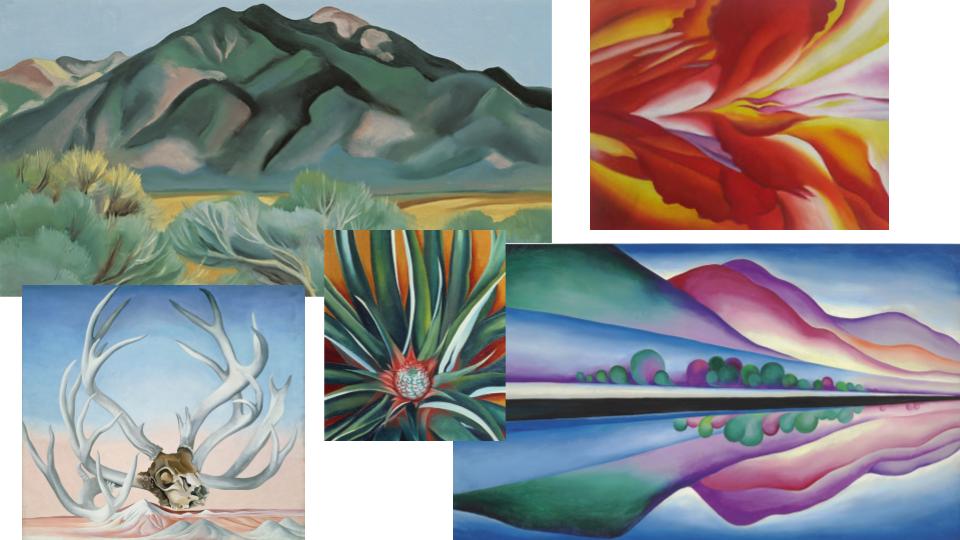
She often painted familiar subjects such as flowers,  buildings, and objects found on walks around her remote home. She did so in a unique way, often transforming common items into colourful pieces of art, focusing heavily on line and form within her work. By the late 1940s O’Keeffe was one of the best-known and original artists in America.

Some of O’Keeffe’s Work:


August Sander

August Sander was a German photographer who attempted to produce an extensive photographic document of German people. He was the son of a mine worker, and Sander did the same work initially as his father. He got his first camera in 1892 and took up photography as a hobby. After the military he pursued it professionally, working in a series of photographic studios in Germany. By 1904 he had his own studio in Linz and after his army service in World War I he settled permanently in Cologne and became friends with photographers and painters dedicated to the New Objectivity. After photographing local farmers near Cologne, Sander was inspired to produce a series of portraits of German people from all levels of society. His portraits were usually sharp, photographed straight on in natural light, while the subjects class and profession was shown through clothing, gesture, and backdrop.

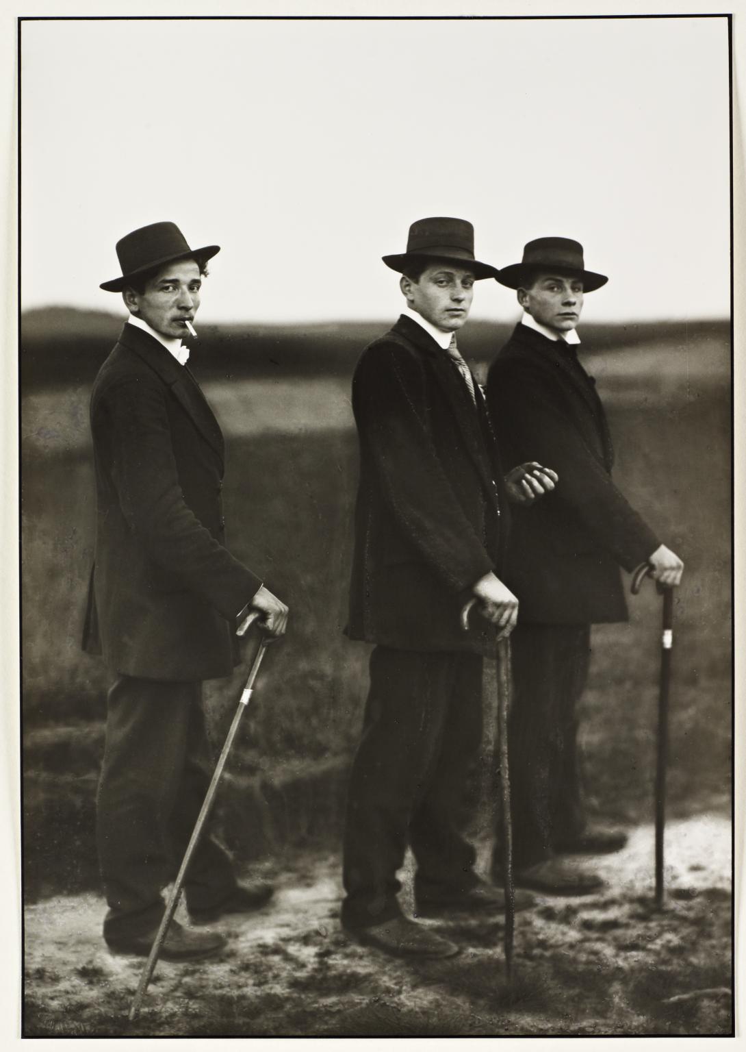
Young Farmers, August Sander, 1914

Contextual: Sander was a German portrait and documentary photographer. During the nazi period he struggled to maintain his job. This image was in Sander’s portrait photo book ‘Face of our Times’ which was published in 1929, and also appears in the first volume of Sander’s incomplete project ‘People of the twentieth century’ which was planned as an extensive series of portraits of the German population, classified into seven groups by social class. These farmers, influenced by popular culture and advertising, may represent a trend that saw workers move away from the land towards the city.

Visual: There are three figures standing in the foreground against an out of focus landscape. The repetition of each figure’s posture, their walking sticks, dark suits, and hats creates a lateral rhythm across the picture plane. Each figure is looking directly at the camera. The shapes of their heads and hats are depicted against the blank sky. Their expressions are serious. Their shared pose is a mixture of formal (stiff posture) and informal (cigarette. They appear to be on their way to an event and have dressed up formal. They are not in their usual work clothes. The rule of thirds is used to locate each figure from left to right and top to bottom. There is also an implied movement from left to right since their feet are pointing towards their destination.

Technical: Apparently this image was taken with a large format glass plate camera on a tripod with a long shutter speed ( common in portrait photographs). The photographer uses available early evening light. Shallow depth of field can also be seen through the image which has been caused by a relatively wide aperture and focal length of the lens.