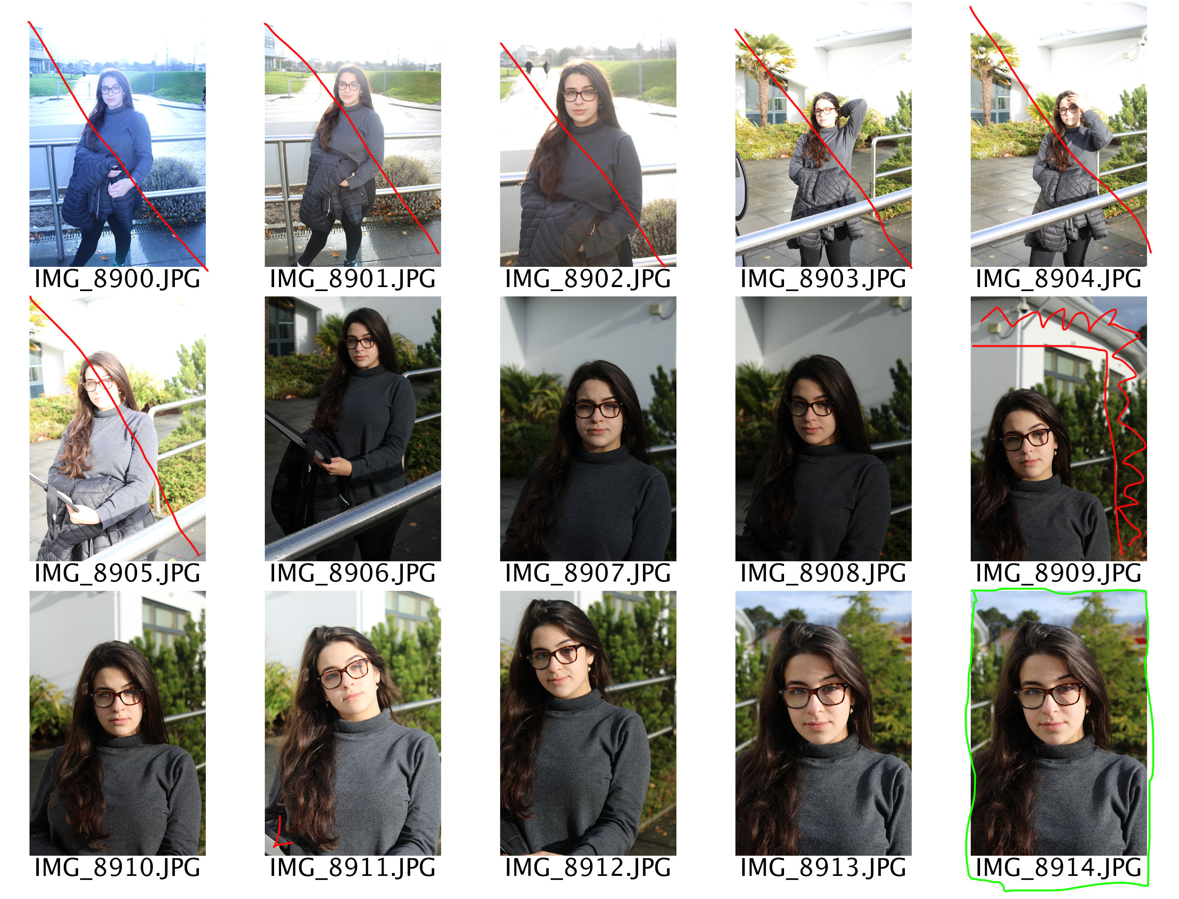
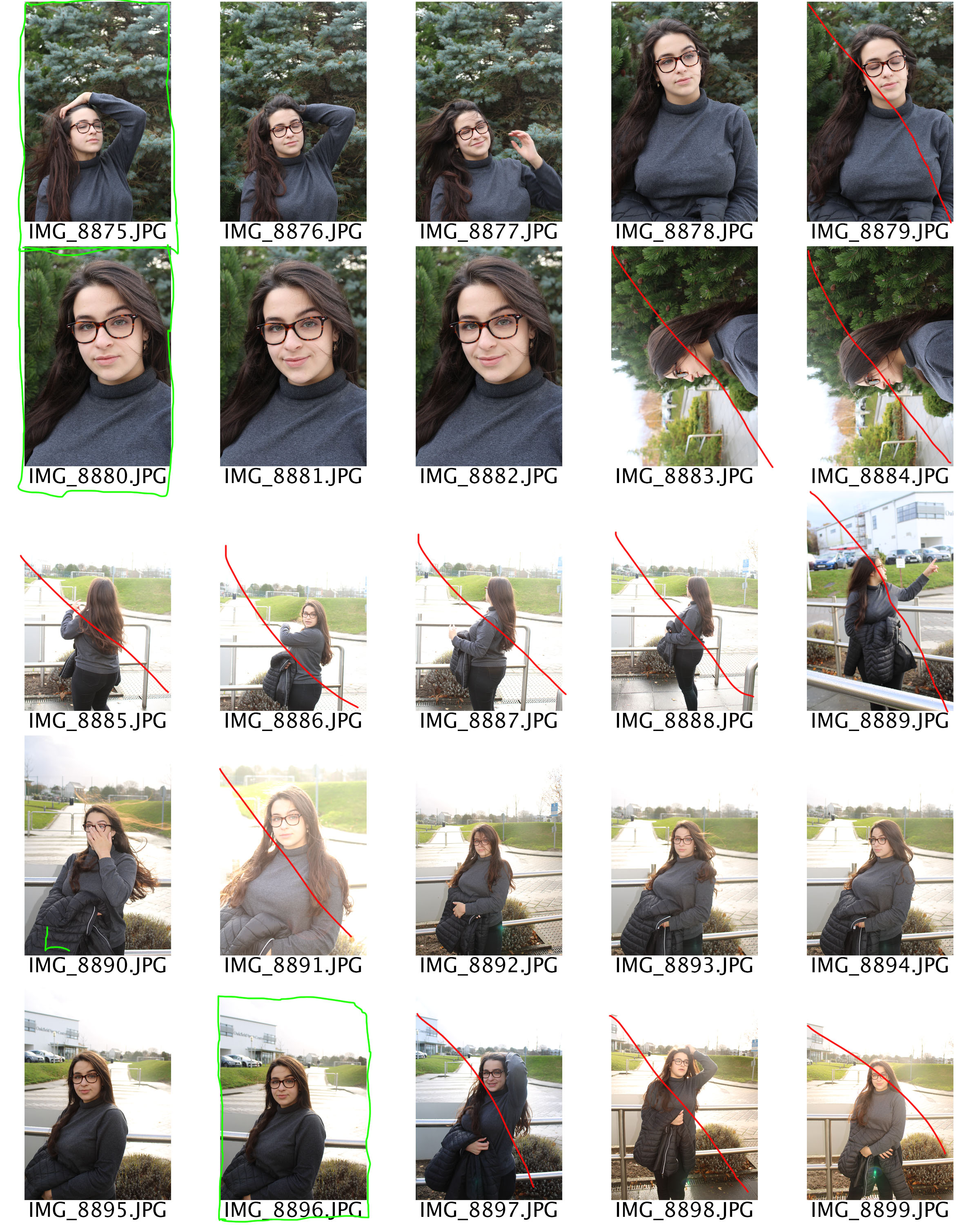
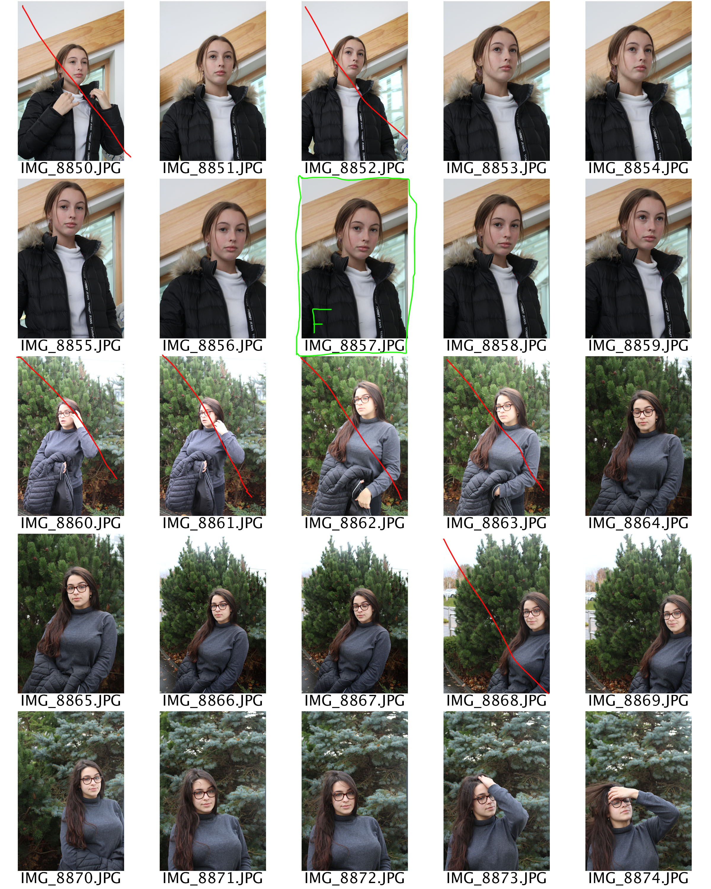
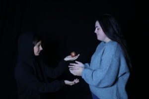
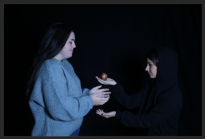
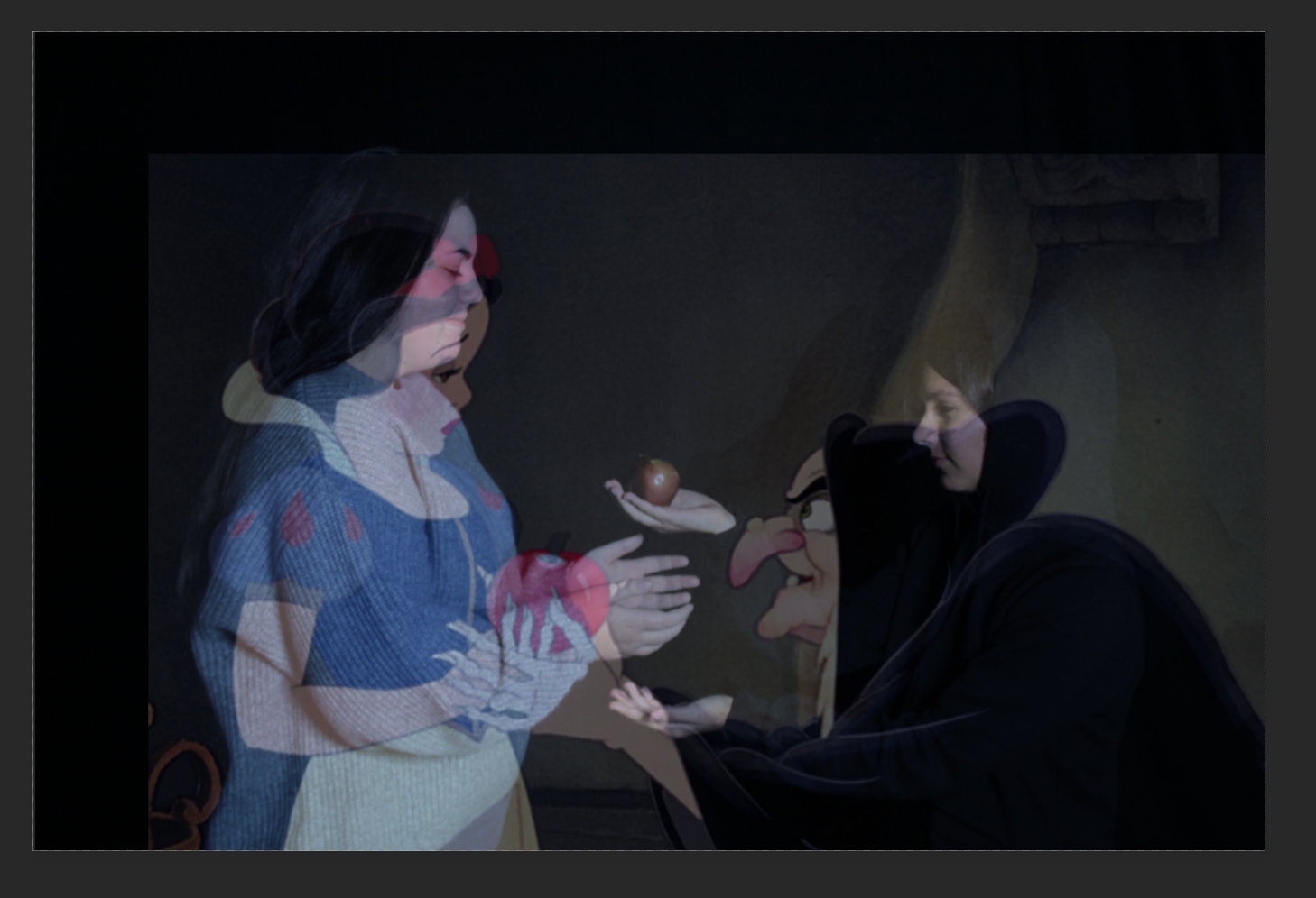
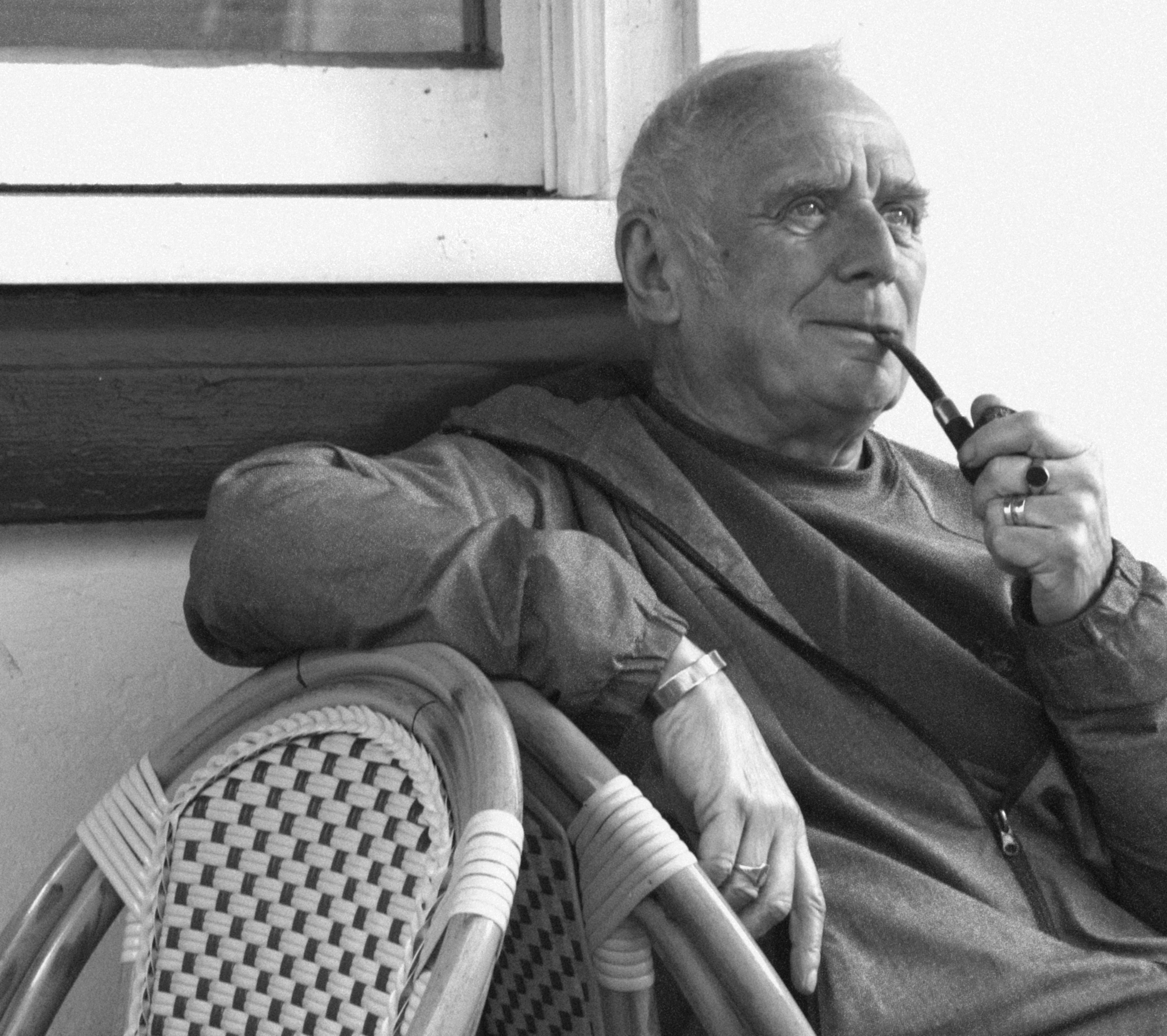
Here is the final image that I made. The solution to the moving tripod, I feel was successful as you cannot see anything that is not aligned without looking very closely at some parts. Other than the editing that it took to make the images of myself appear there was little else done, this was done because I got the exposure correct in camera and knew that if i changed it for one I would have to change it in the exact same way in the exact same amount for each layer, also leaving it with some parts slightly over exposed and some areas with a bit too much shadow means that the image is more realistic and life like and the exposure isn’t so far to one side that an area draws way too much attention and distracts from the whole image.
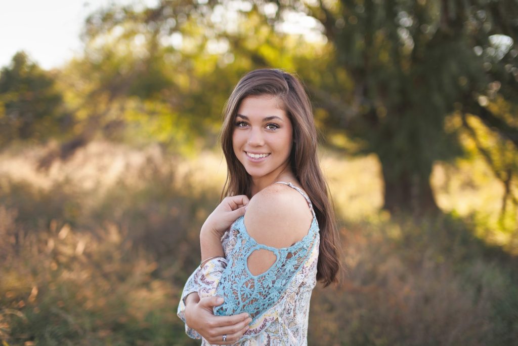
Throughout this photo-shoot I stuck with a large aperture in order to create a strong depth of field in order to give more of a feel of importance to the subjects. This helped to prevent images in which there was a lot going on in the background from looking messy, the softer lines in the background allow the subject to be more pronounced creating a more coherent image.
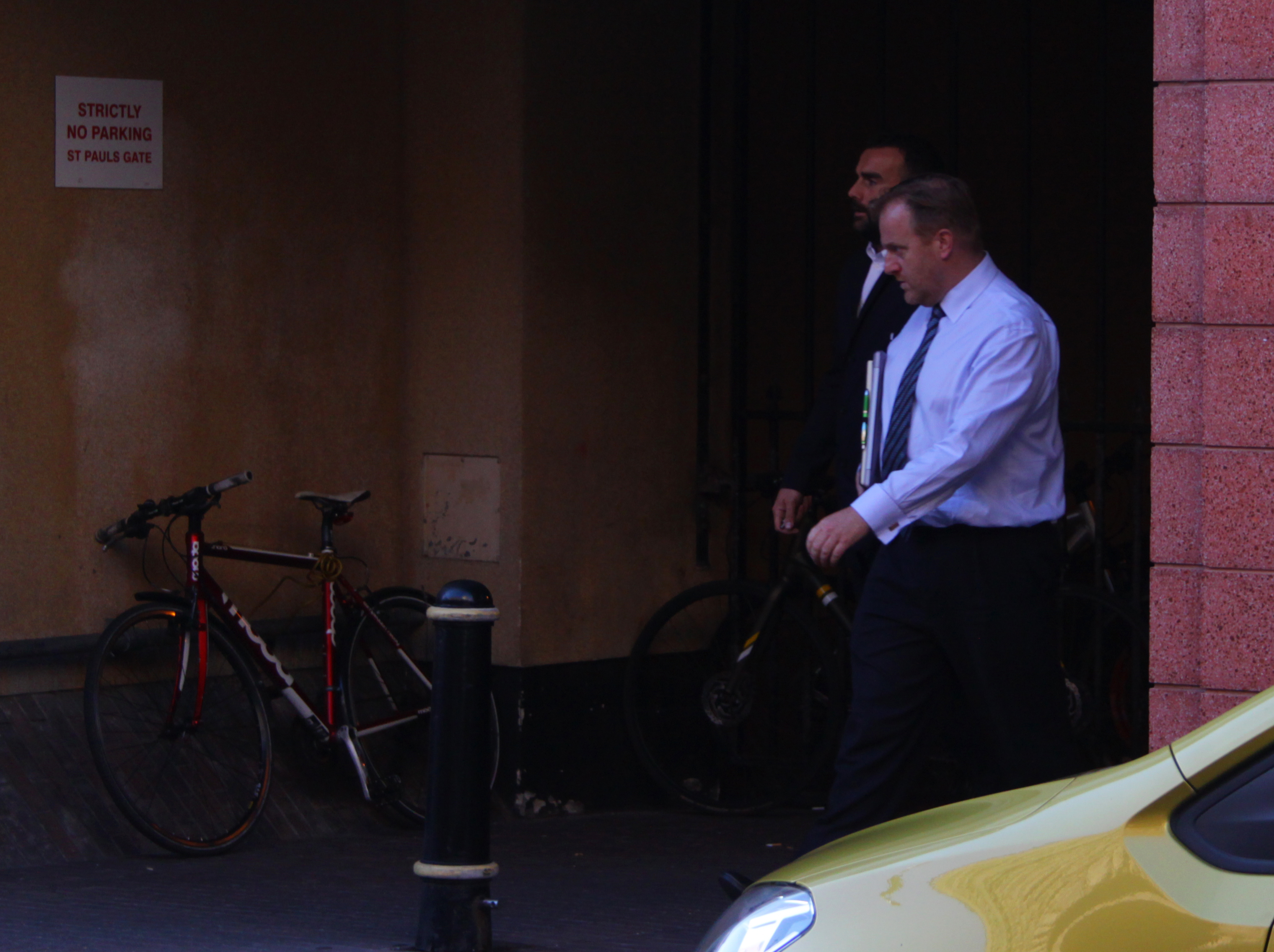
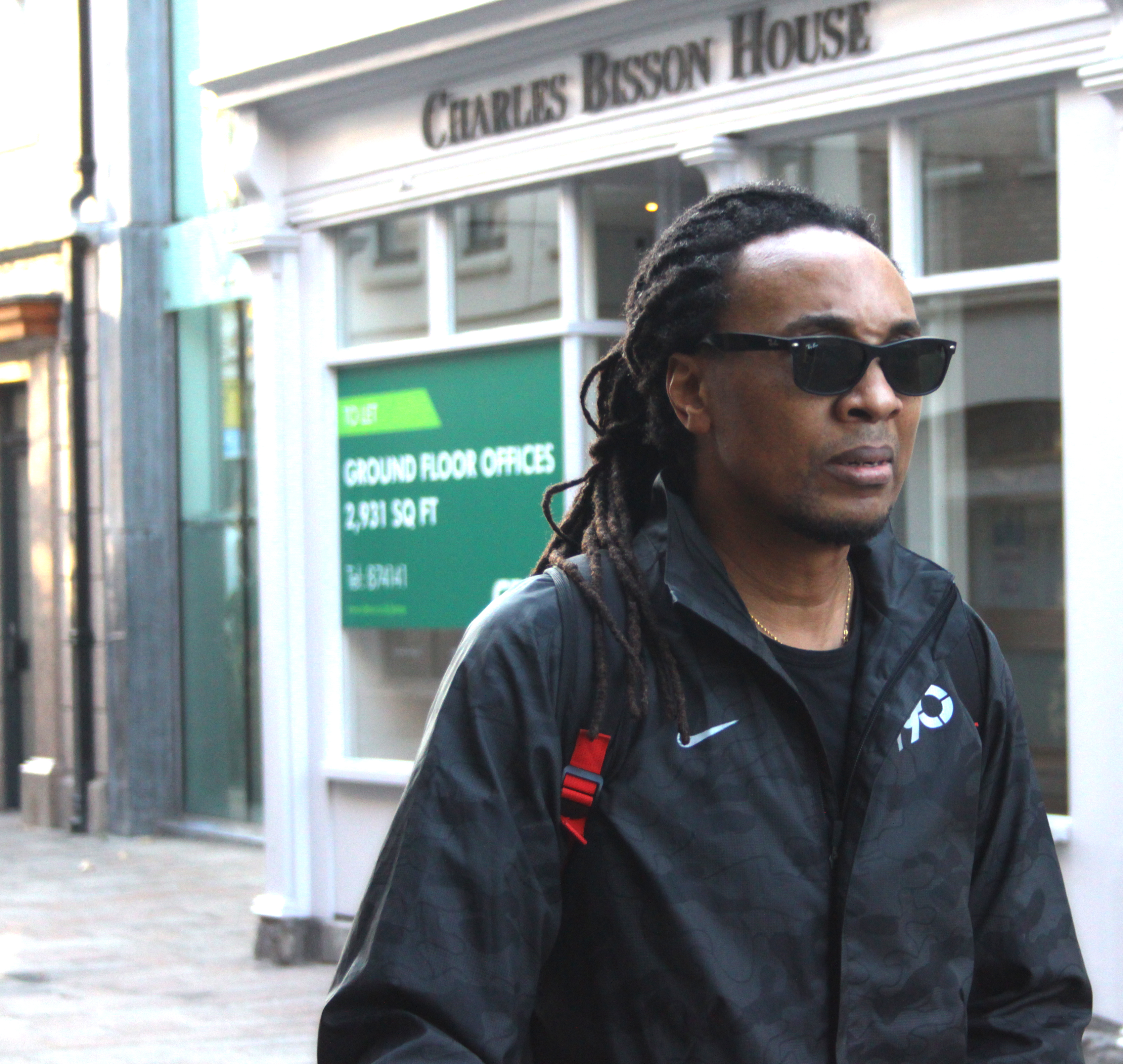
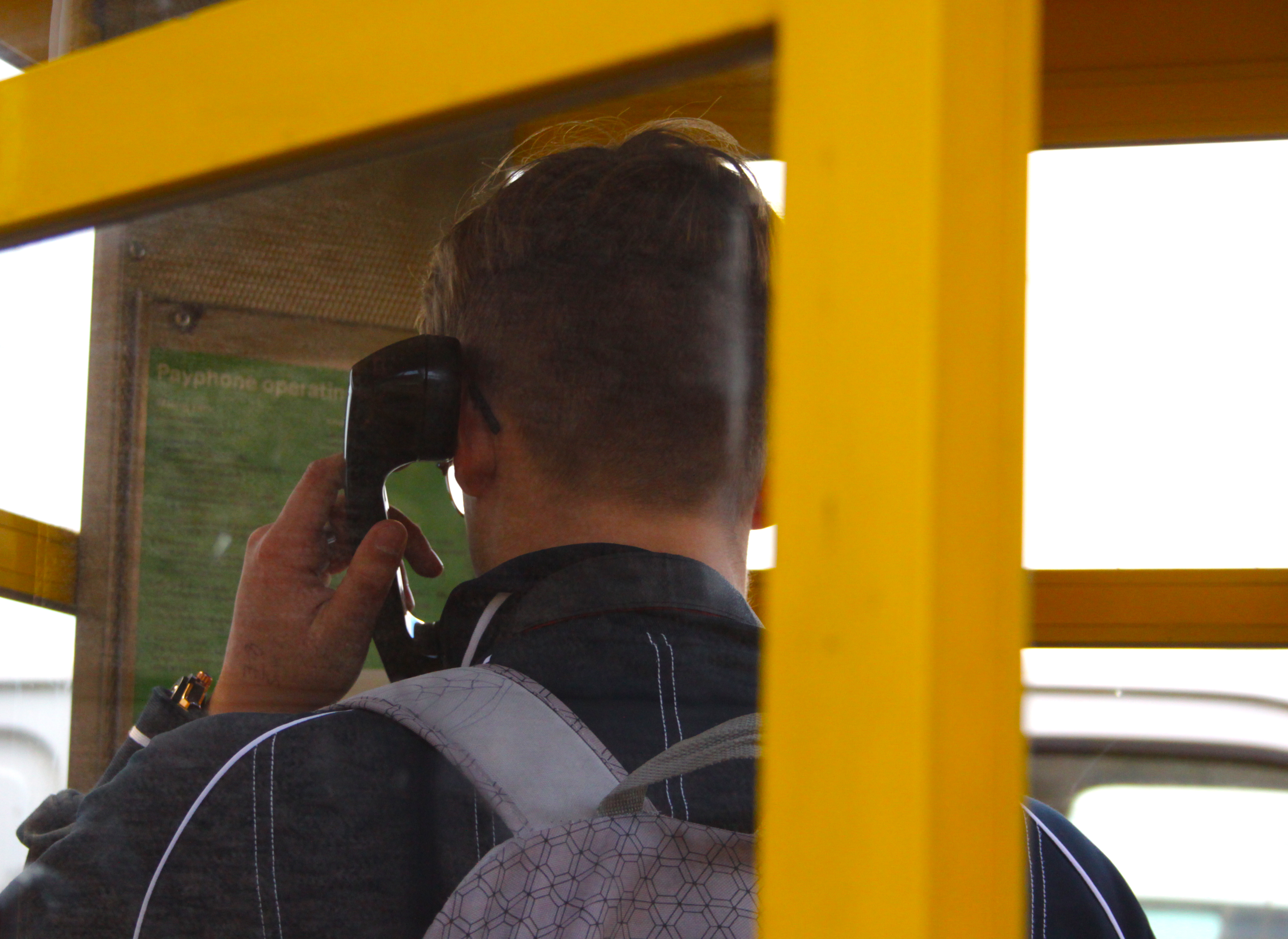
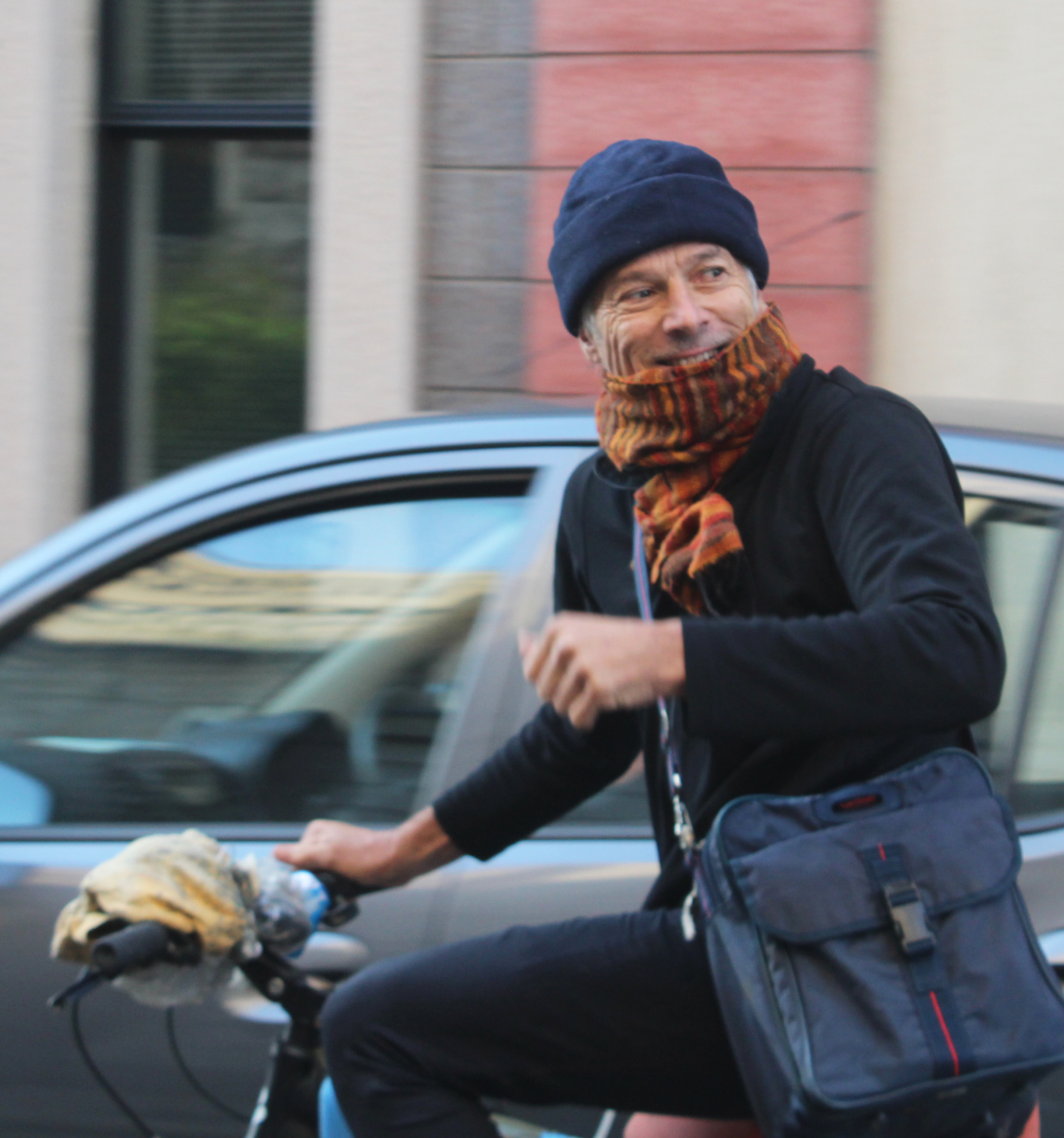
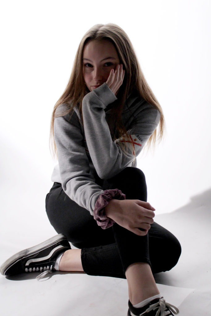
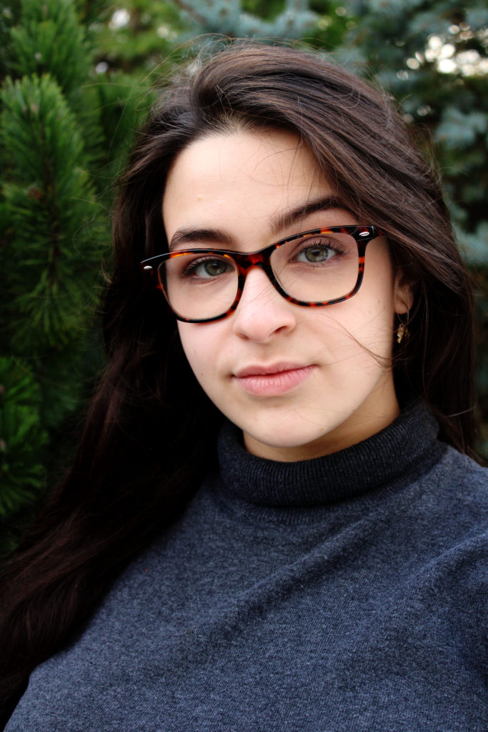
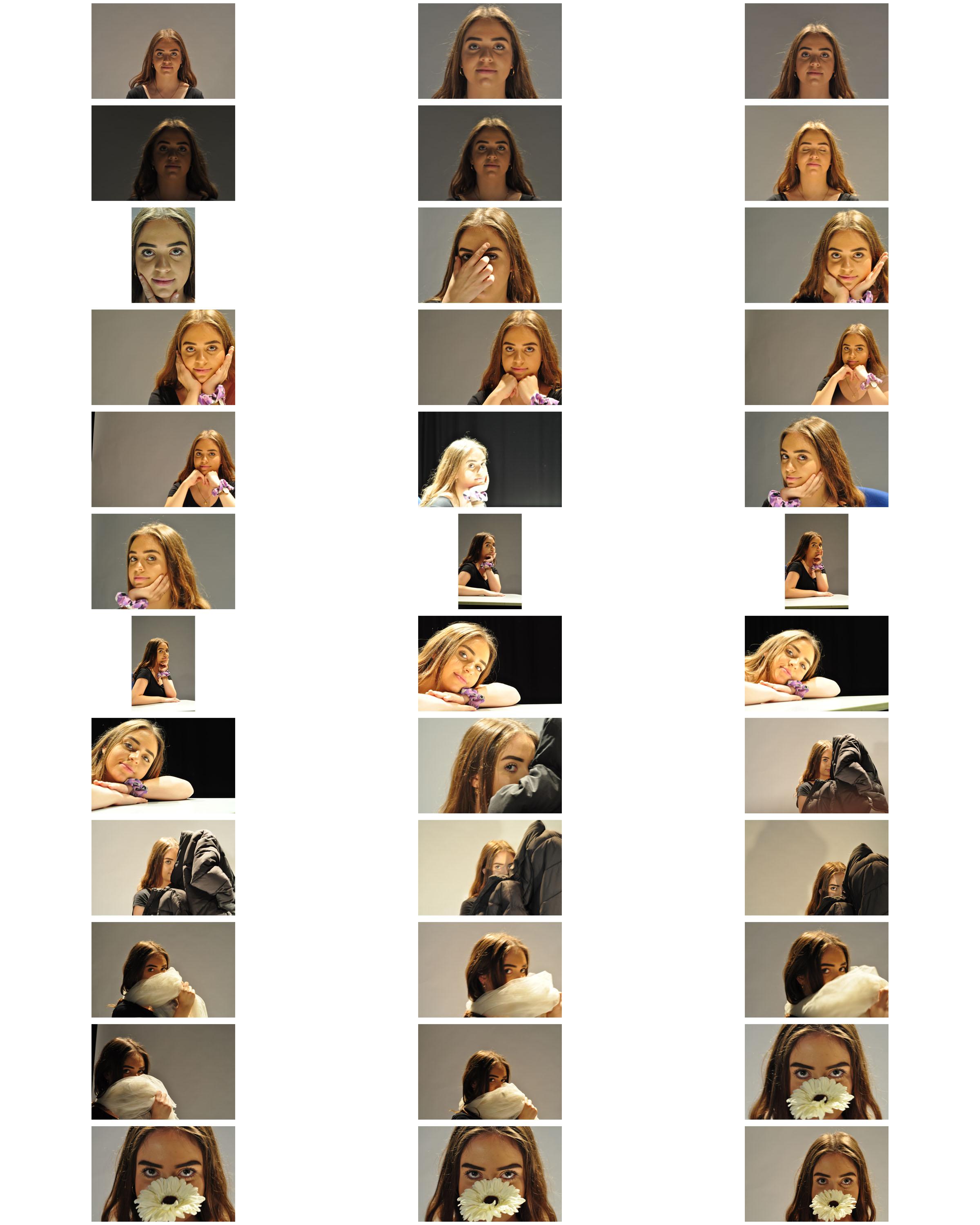
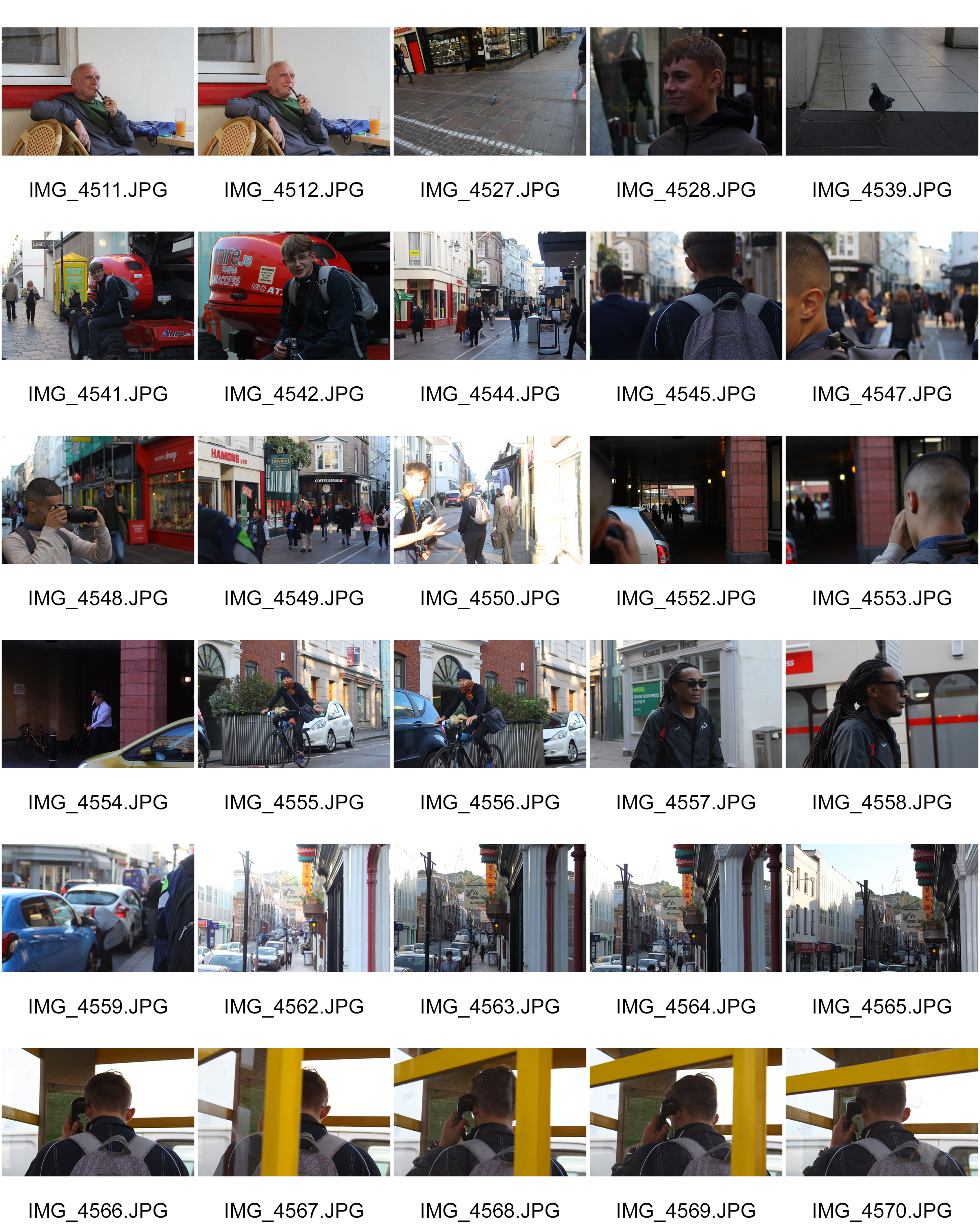
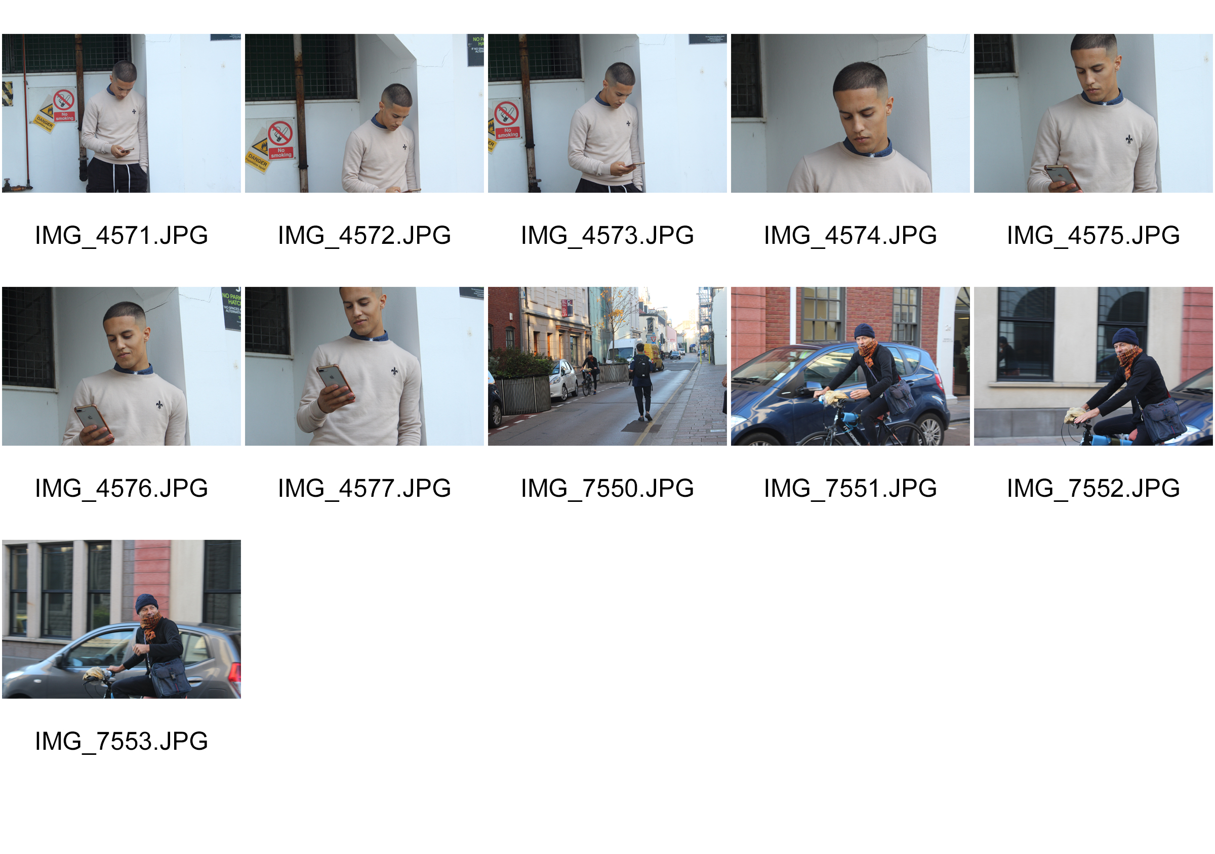
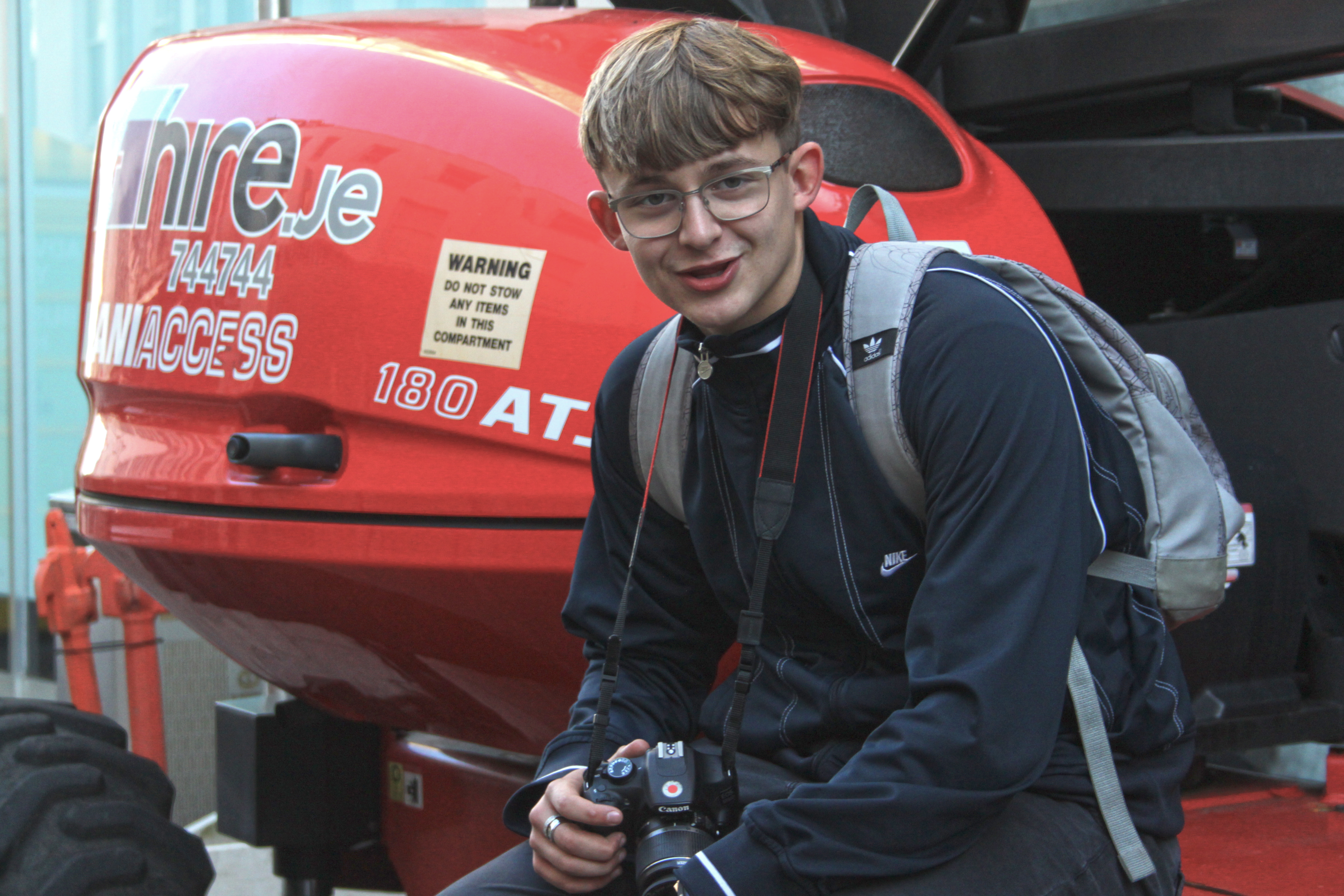
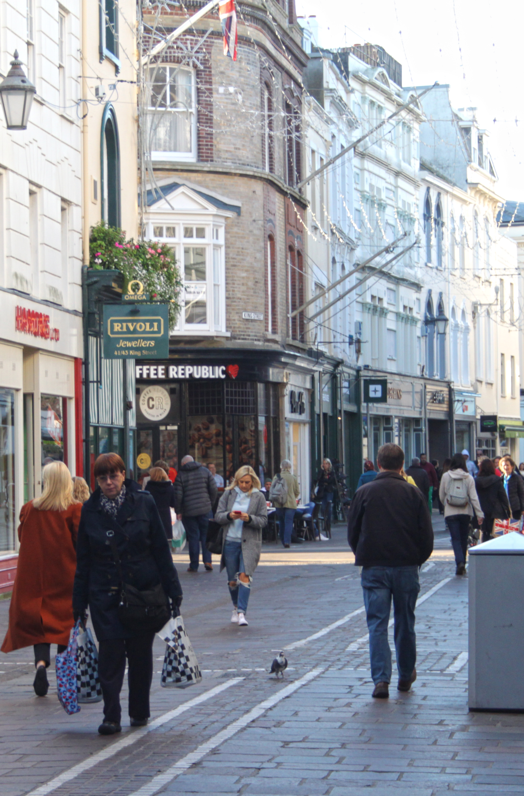
Of the images taken I have chosen to work further into eight in particular. These are IMG_4511, IMG_4542, IMG_4547, IMG_4548, IMG_4554, IMG_4557, IMG_7553 and IMG_4568
For most of the images I decided to keep very subtle with any retouching, this was in order to accurately capture the feeling of the town environment. I mainly focused on lightly adjusting color temperature, cropping and some changes to brightness/ contrast. On the first image of my selection however I decided to make the image black and white and introduce some light uniform grain. I like the soft lighting in all the images i selected and decided to lightly enhance that in some of the images. I tried to keep contrast and saturation rather low (while still being high enough to not result in an image that looks washed out or overexposed) in place of brightness in order to make the images feel more welcoming.
In most cases we can make use of natural or available / ambient light…but we must be aware of different kinds of natural light and learn how to exploit it thoughtfully and creatively.
uses of:
intensity of the light – creates brighter exposures and means that the shadows will be harder.
direction of the light – changing light direction will define the direction of the shadows, as well as create different moods and adds depth to the picture.
temperature of the light and white balance – makes an image warmer (orange) or cooler (blue) to convey different atmosphere.
Using reflectors (silver / gold) – redirects existing light to help the photographer manipulate light.
Using diffusers , tissue paper, colored gels, tracing paper etc – determines the intensity of light in your image as well as the intensity of the shadows.
Front / side / back lighting – frontal lighting will illuminate everything in your image, side lighting means that only one side of your image will be illuminated (this adds atmosphere and depth to the picture), back lighting can be used to make a subject a silhouette as your subject will be obscuring the light.
High Key / low key lighting – high key lighting has a low contrast, very few shadows, high exposure and soft front light. Low key lighting uses high contrast, hard and direct lighting,
Shadows / silhouettes – to show depth or create an atmosphere within the image.
These photographs are the best images that I have taken when experimenting with studio photography and natural lighting photography. I believe that all these images show a variety of techniques from chiaroscuro to depth of field. I am very pleased with my outcomes as I believe that they all convey meaning towards them and are interesting for the viewers to look at.
I have been mainly experimenting with artificial lighting during the portrait unit, and have decided to further develop of using natural lighting from the first photo shoot I conducted.
For this photo shoot I decided to conducted outside when the sun had began to come out after a down pour of rain. It was slightly windy as well. I used a silver and a gold reflector to reflect the sunlight onto darker areas of my model, getting rid of the contrast in tones. Due to different areas being lighter and darker my white balance I used varied. I mainly has it on sunny or cloudy. My ISO was low as it stayed of 400 so that no noise was presented on my final images. Moreover, the shutter speed varied again to how lit up the area was. Within this photo shoot I experimented with using different depths of field to have my model in focus and the background slightly out of focus. I also mainly captured head shots of my model, but occasionally took a full body portrait of the modal.
Case Study
Unknown Photographers Work
When I first look at this image my eyes are immediately drawn to the woman who is smiling and staring straight down at the lens of the camera. They then move around the slightly blurred out background which shows that she is exploring some woodlands. Putting the two together I can understand that she is enjoying what she is doing. This is also supported by her straight body posture. The artificial lighting, the sun, is warm which also creates a happy tone towards the image. This photograph shown above has many technical elements which I believe makes it a good photograph. As mentioned before the girl is in focus and the background is out of focus, which means that a narrow depth of field has been created. The shutter speed must have been quick as the image is perfectly focused. This also means that the aperture is likely to be around f/5.6. Moreover, no noise is found within the image meaning that the ISO used is also likely to be low. The lighting is found behind the modal, as that is where the sun is at that time, which means no shadow of the modal is created. However, shadows of the background can be found on the grass. This helps makes the model stand out from the background. In addition, the photograph is presented in black and white which shows us all the color and allows the viewer to appreciate the scenery. From this case study, I have learnt that a good outdoor portrait should be in color, but I may experiment in black and white, it would be nice to use a narrow depth of field and the facial expressions and posture of the model is important.
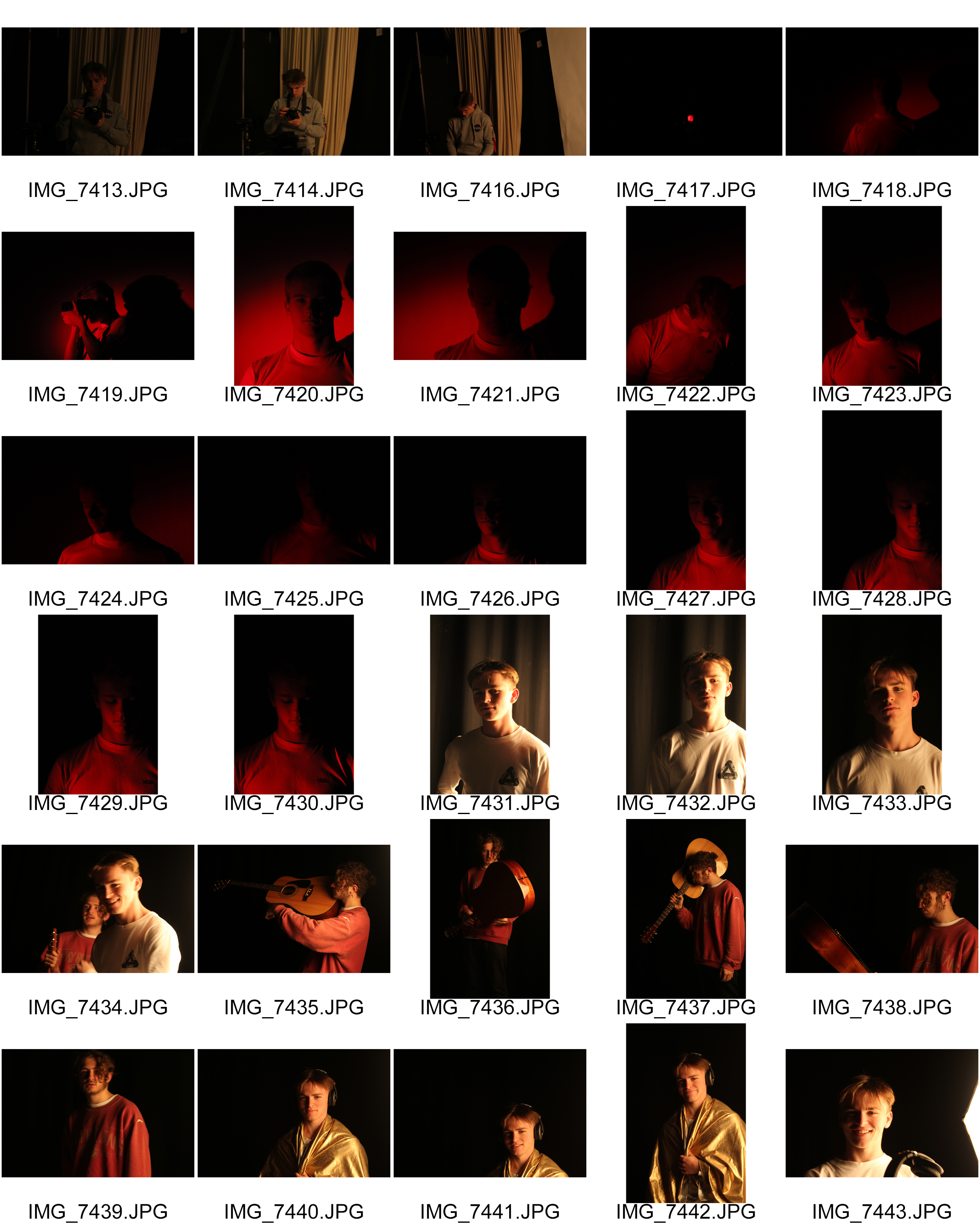
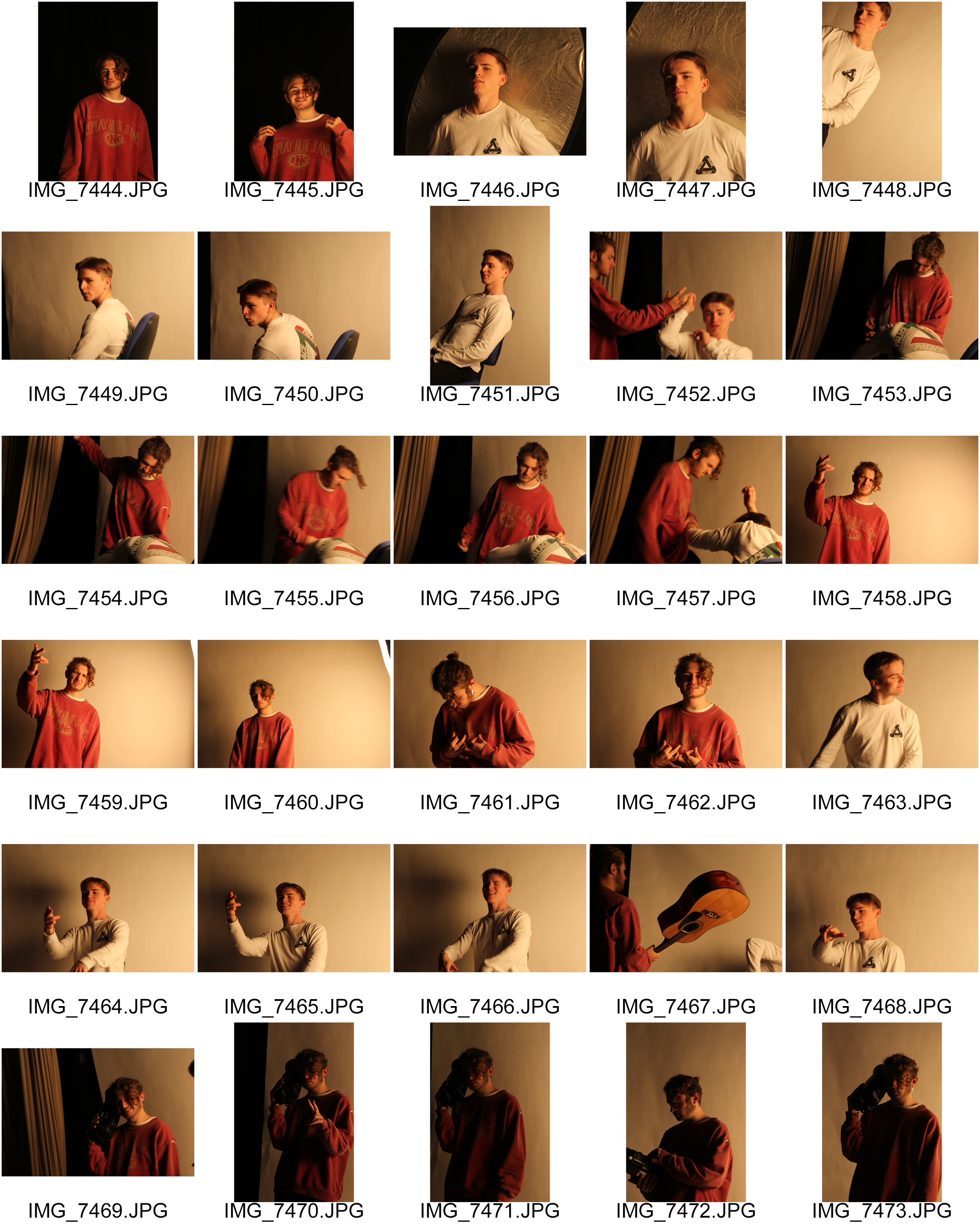
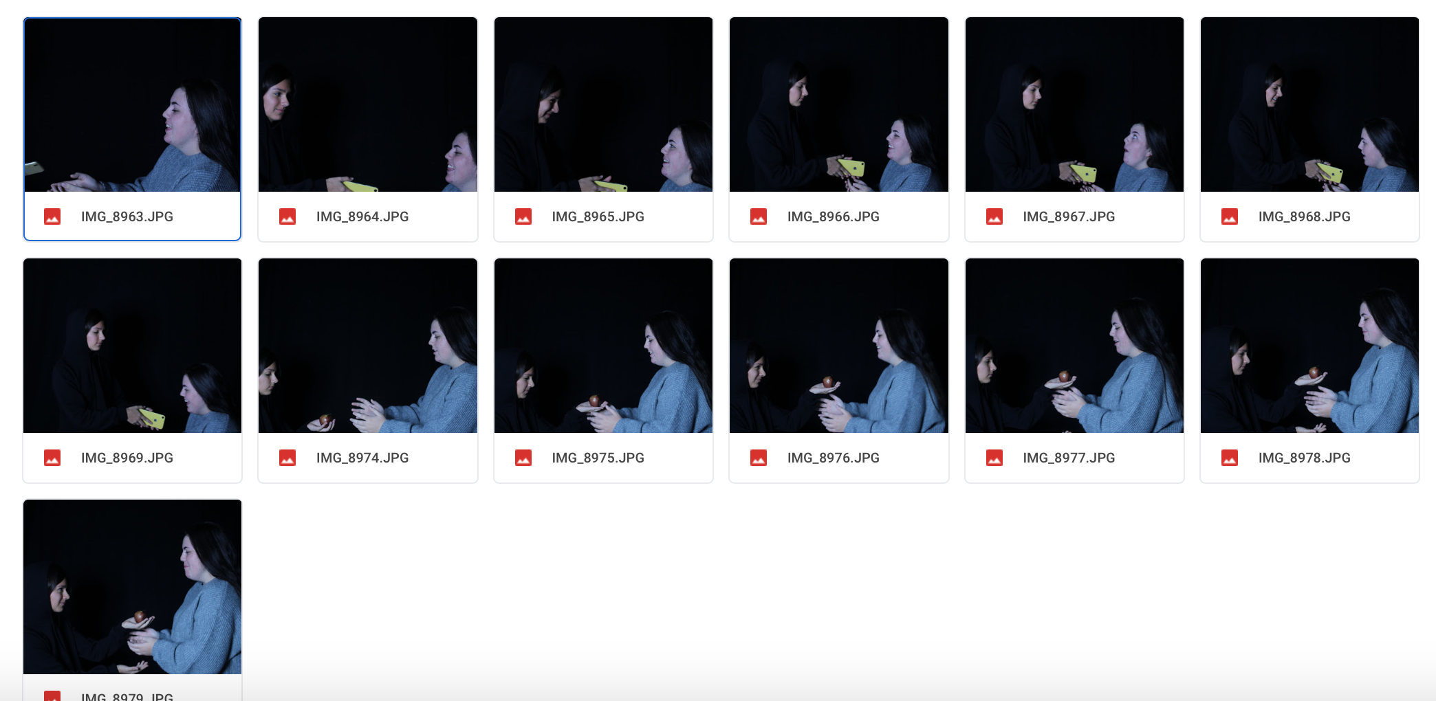
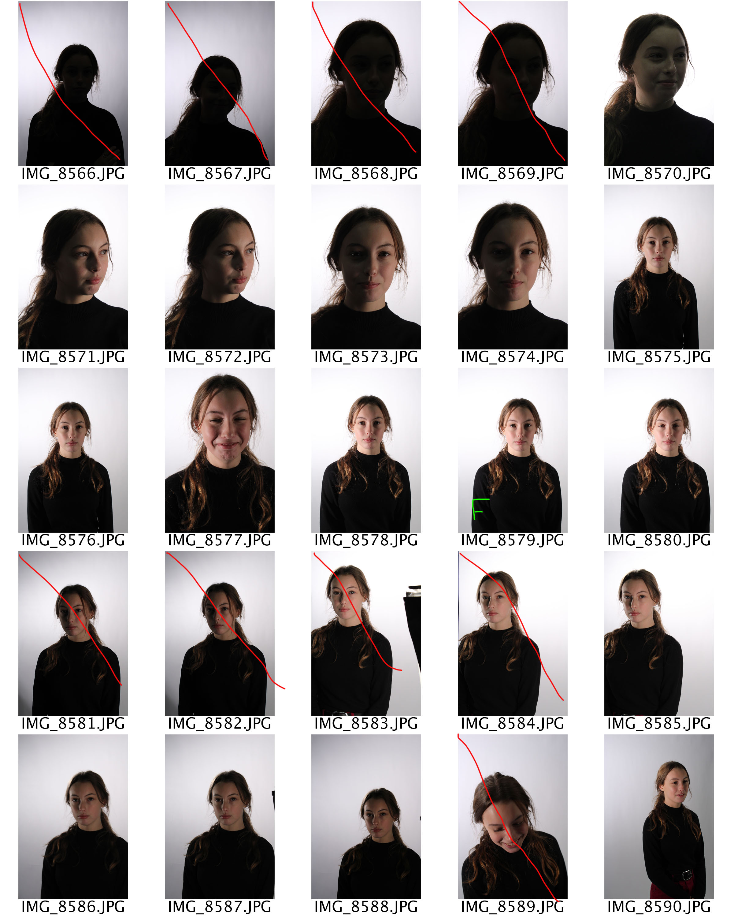
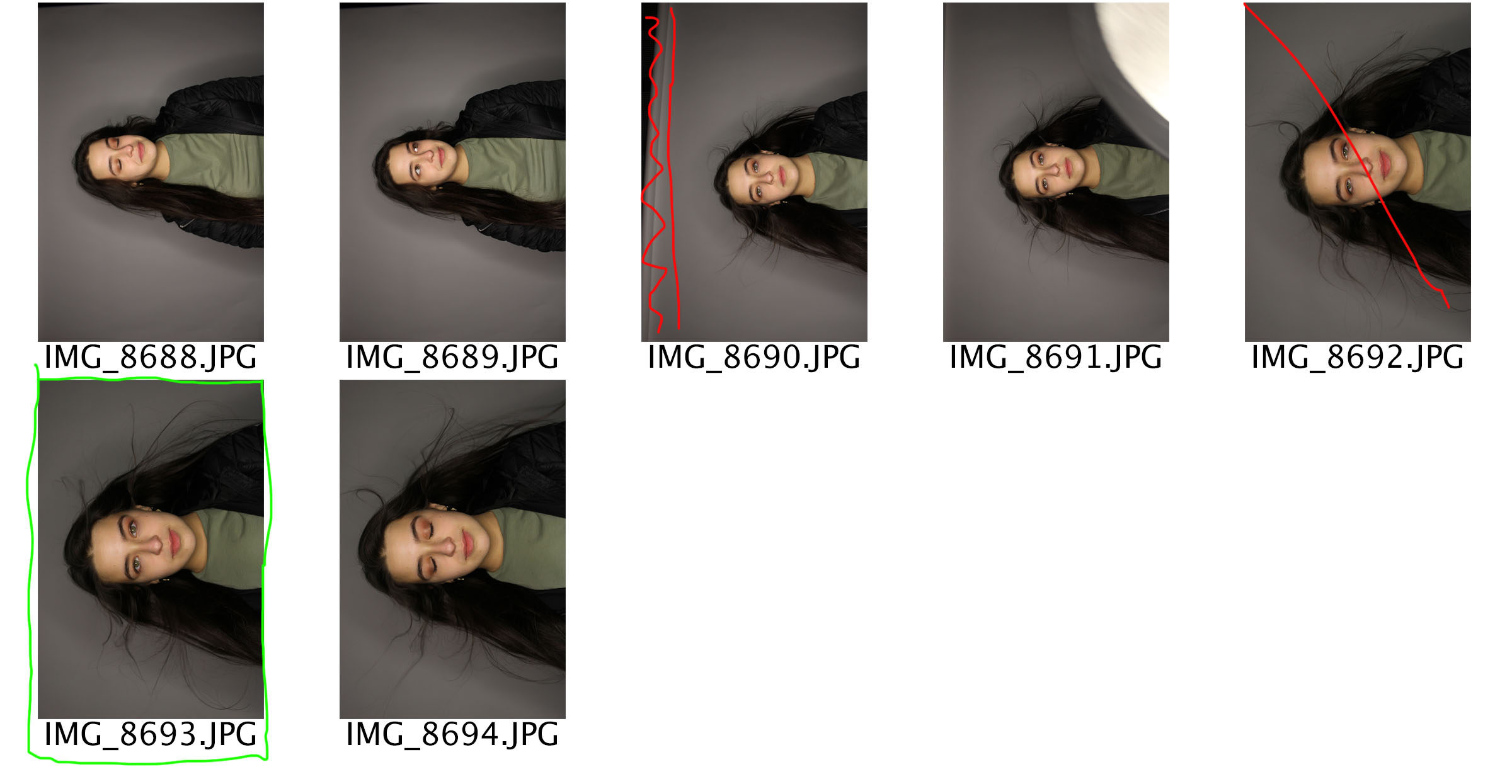
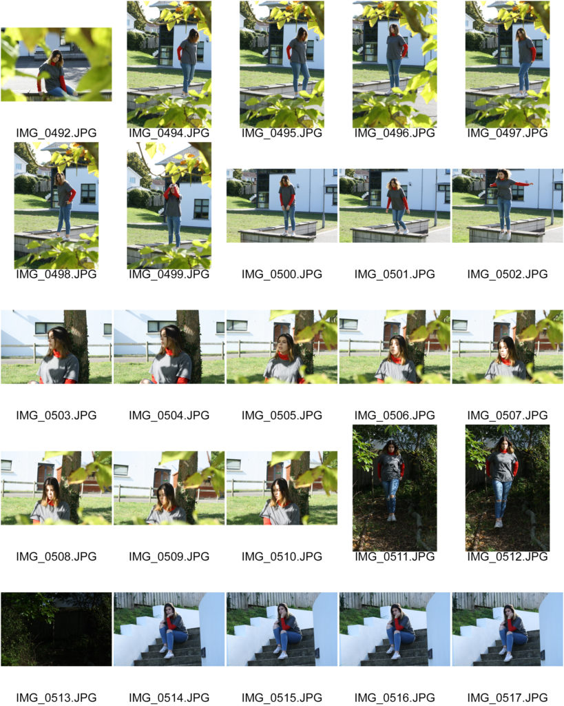
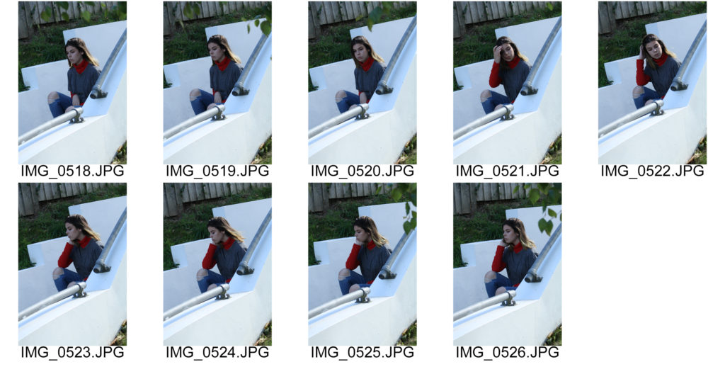
Contact Sheets
Edits
Within these edits I just adjusted the levels and curves to ensure the photographs where sharp. I believe that these images have been one of the most successful photographs that I have taken so far as they clearly show good camera control, due to the different techniques I have used. In the three edits you are able to see a narrow depth of field as the modal is in focus leaving the background slightly blurred. This ensures that the viewers attention will be focused on. Moreover, the photographs clearly show no intended noise and clearly shows the correct white balance, shutter speed and aperture
“I myself have always stood in the awe of the camera. I recognize it for the instrument it is, part Stradivarius, part scalpel.”
Irving Penn
Irving Penn (1917-2009) was an American photographer known for his fashion photography, portraits and still lifes. Penn’s career included work at Vogue Magazine, and independent advertising work for clients including Issey Miyake and Clinique. His work has been exhibited internationally and continues to inform the art of photography.
Irving Penn’s iconic covers for Vogue Magazine showcased the clean lines and tapered waists of Postwar Paris and New York, and transformed the aesthetic of the fashion industry. Penn removed everything from the shot but the clothing and the model. His dramatically lit figures are essentially living, breathing sculptures. Inspired by Surrealism, Modern dance, and film noir, his images register as provocative visual statements, not just commercial photographs. With a firm grasp on the geometry of the body, the psychology of consumerism, and an encyclopedic knowledge of the history of art, Penn lifted fashion photography into the realm of high art.
In the 1970s, the world still viewed commercial photography and art as two separate fields. By making high quality prints from some of his earliest photographs, Penn helped audiences see that the tonal richness and variation of his photographs could be just as subtle as a Goya or a Rembrandt etching.
Penn was the first artist to fully recognize the potential for blending elements of fashion photography with portraiture. More than just live mannequins for the clothes, Penn’s models became psychologically complex, if still otherworldly, individuals.
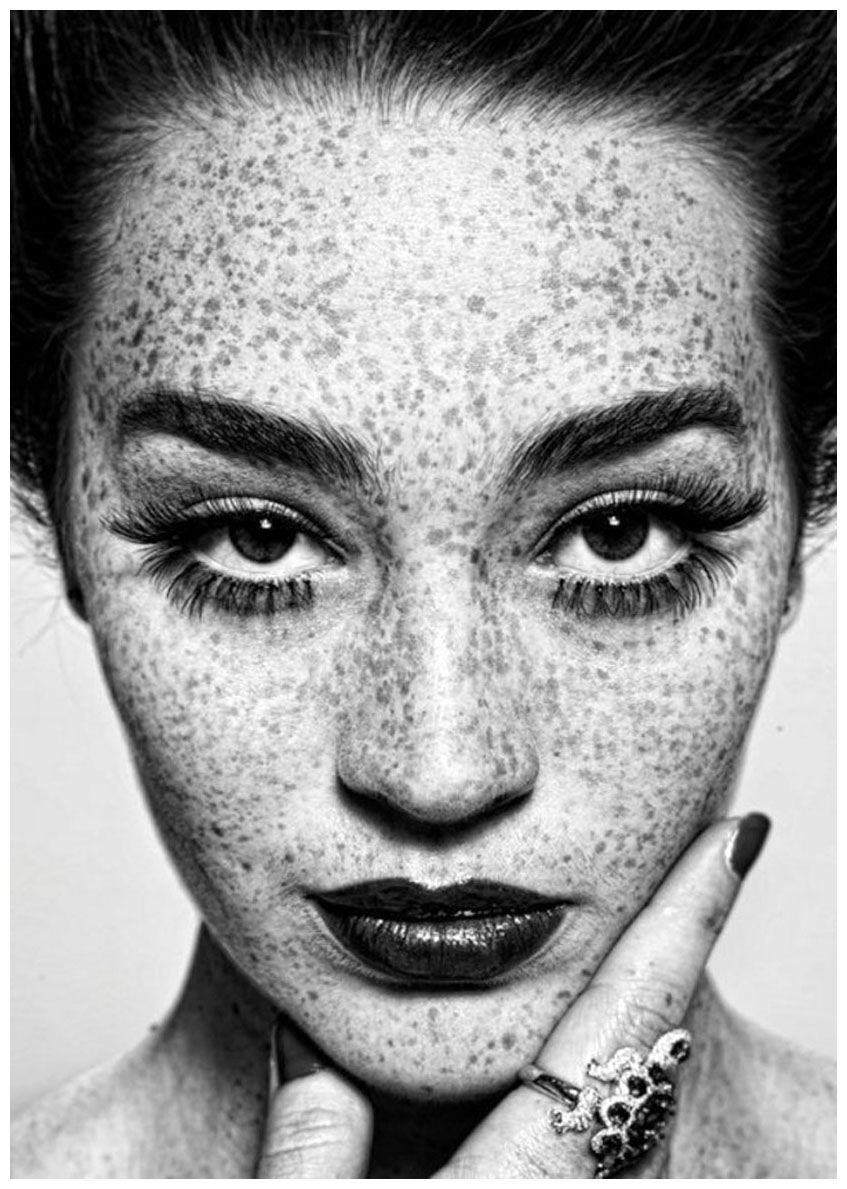
Irving Penn | The Queen of Freckles
Above is a famous photograph taken by Penn titled The Queen of Freckles. It showcases his technique of using a plain white background behind his subject to put all the focus on the model. The model in this picture has long eyelashes and thick lips, as well as an ornate ring on her finger. She fits with the style of most of his fashion photographs which is class and elegance. Penn used the freckles to his advantage, and instead of covering them up, he made them stand out. Penn created a new style of photography and redefined the image of beauty with this photograph, as ‘imperfections’ like freckles were often covered up in this time. The subject of this photograph is in the centre and takes up almost the entire frame. Our eyes are drawn to her eyes which are framed with thick lashes. The model is looking straight at the camera. This photograph represents beauty and that it has more than one definition.
Below shows one example of Penn’s ‘Corner Portraits’ where he would put celebrities or his models into tight corners and awkward poses that revealed unfamiliar elements of their personalities to the camera. This was a favourite setup of Penn’s in the 1940s, he would often put them at a very tight angle, sometimes alone, sometimes with a prop (like Capote’s chair). The lighting is very simple, the walls are a light colour, which act as a bit of a fill, bouncing light into some of the shadow areas and increasing the range of tones in the final image.
Irving Penn | Truman Capote | 1948
Personal Responses To Irving Penn
Set Up
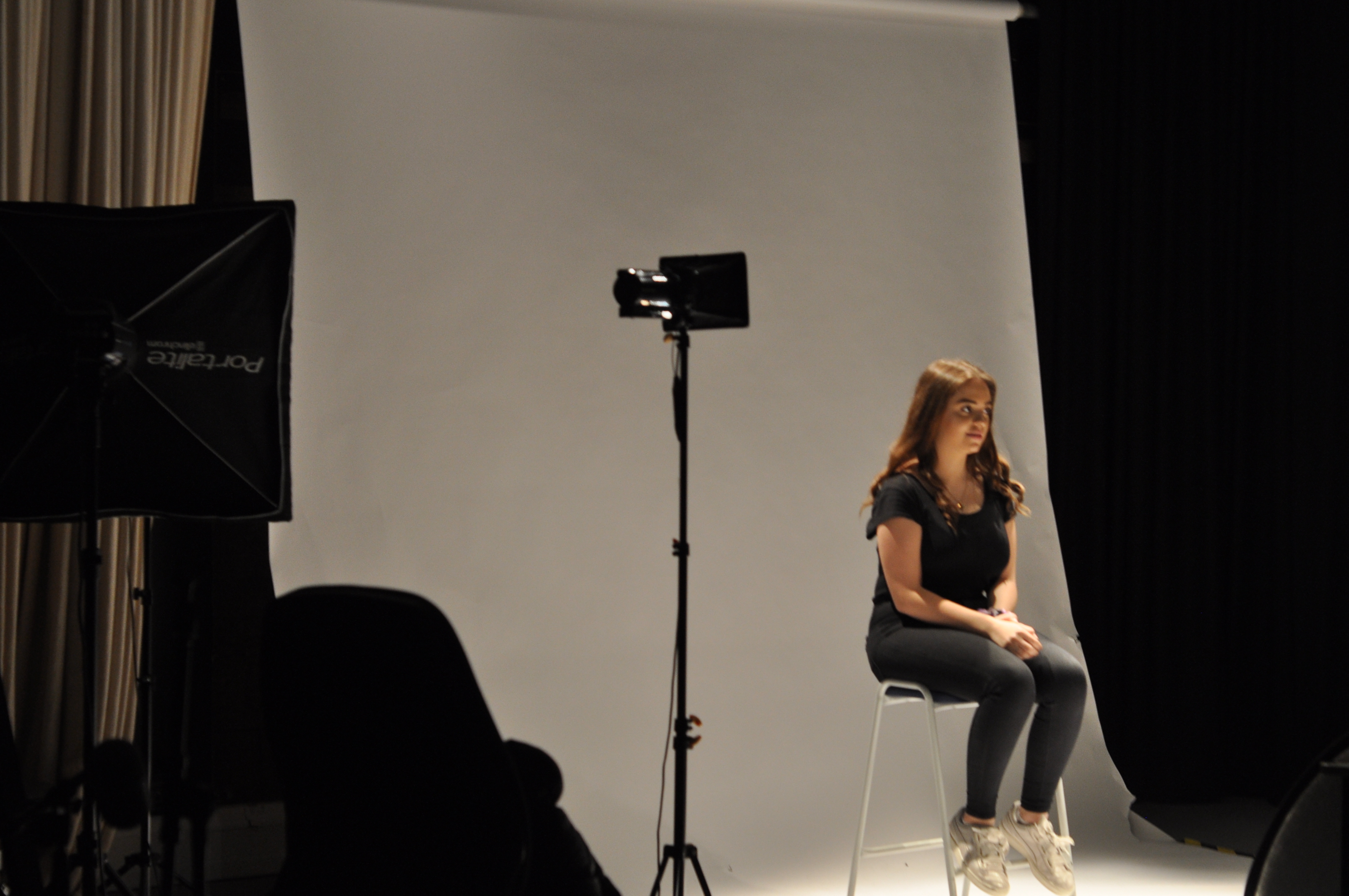
Above shows the set-up that I used and started with for this shoot. I used one of the smaller lights with the soft box over it to diffuse some of the light. I also used some of the lights that came above from the lighting rig and down onto her from above. This set up worked for me as it allowed enough light to fill the area and also allowed me to move the smaller lights to where I needed them to light her.
Contact Sheet of Shoot
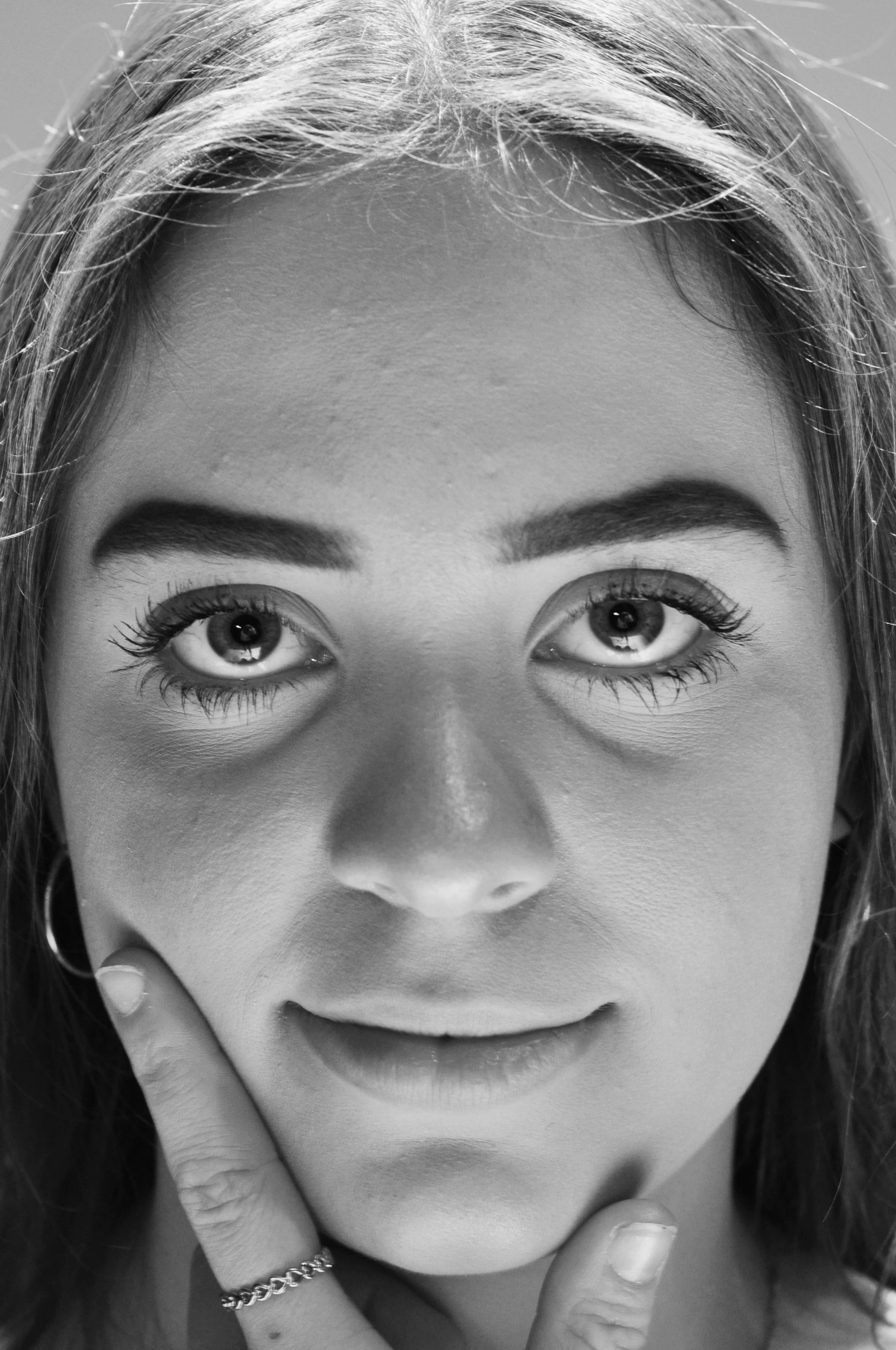
Above shows my contact sheet from the shoot in the studio. It shows the range of positions I placed Ellie in to either conceal her face with fabric or clothes or reveal it and pronounce it with her hands. Unfortunately not all of the photographs produced became as clear and sharp as I wanted however there were a couple of successful ones which I went forward to edit into black and white as a response to Irving Penn.
Best Responses Edited into Black and White
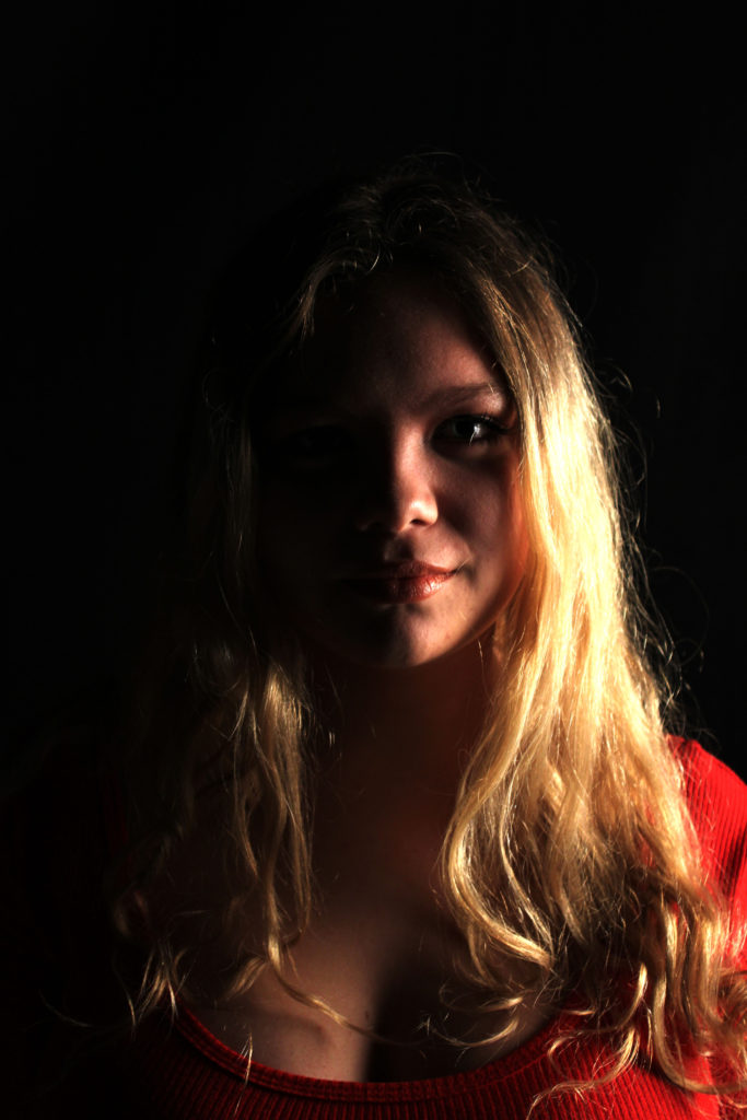
Own Response
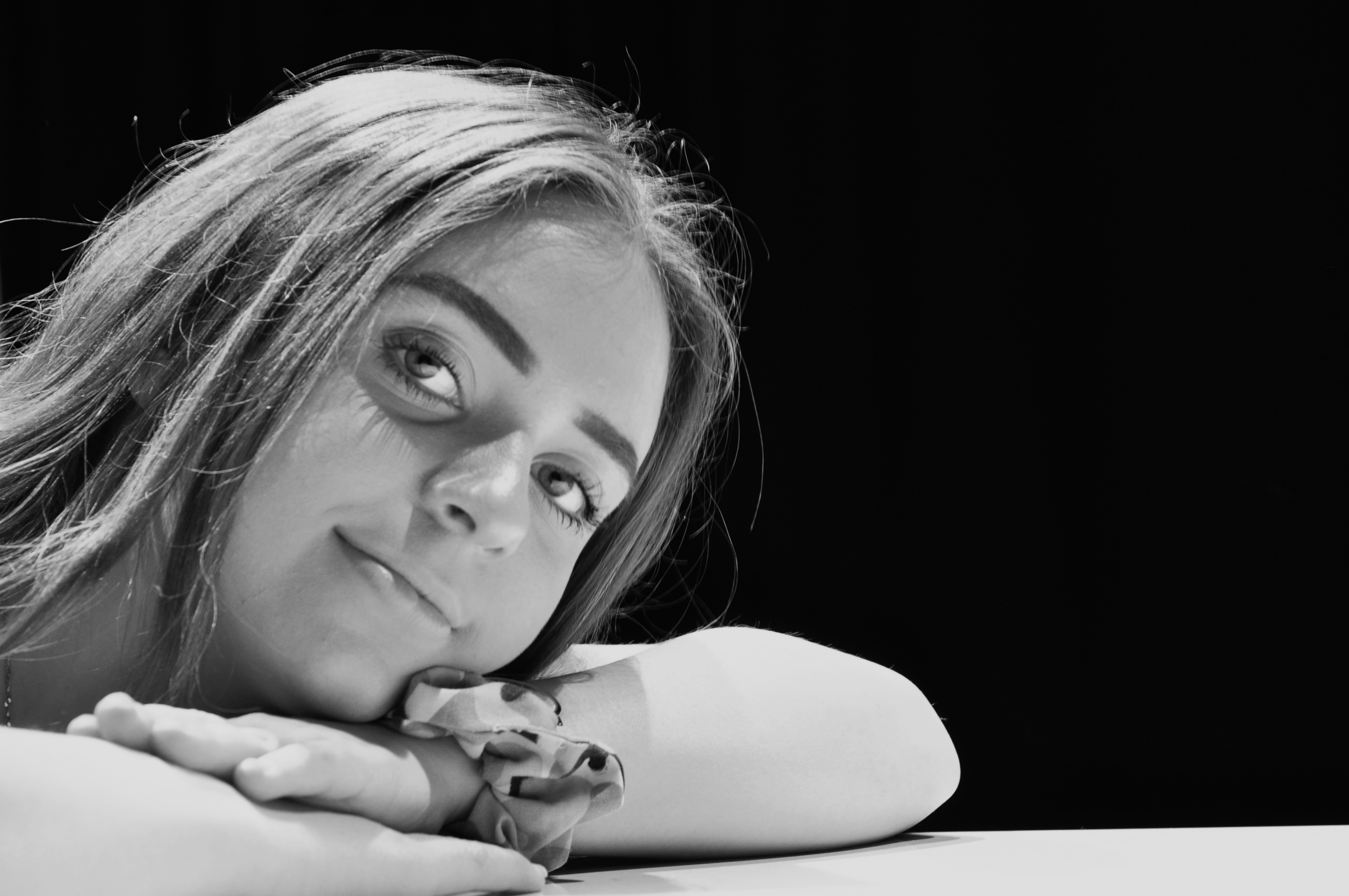
Above is a direct response to Irving Penn’s photograph ‘Queen of Freckles’ however here I feel I am particularly interested in Ellie’s eyes instead of something like freckles, her eyes for me are a feature that stand out as they are large open and wide which is why I always had her lock eyes with the camera.
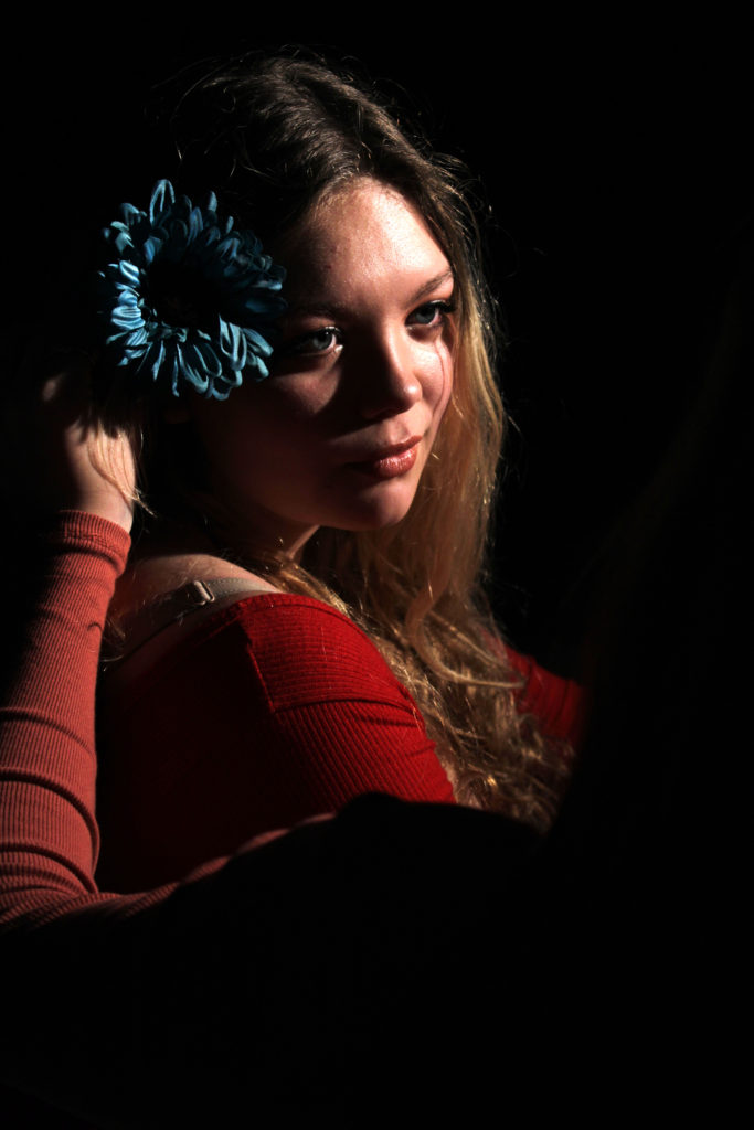
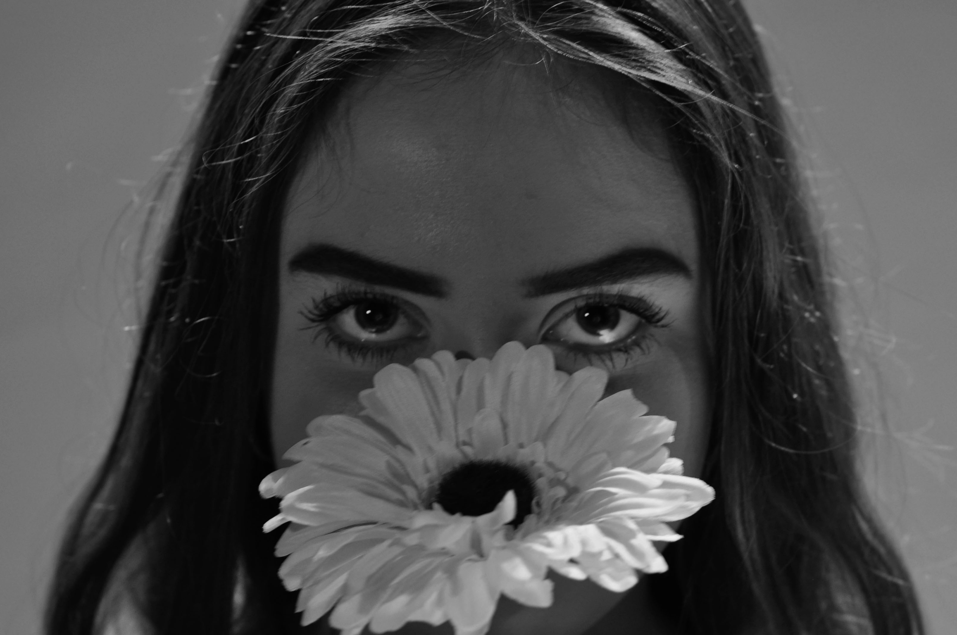
Own Response
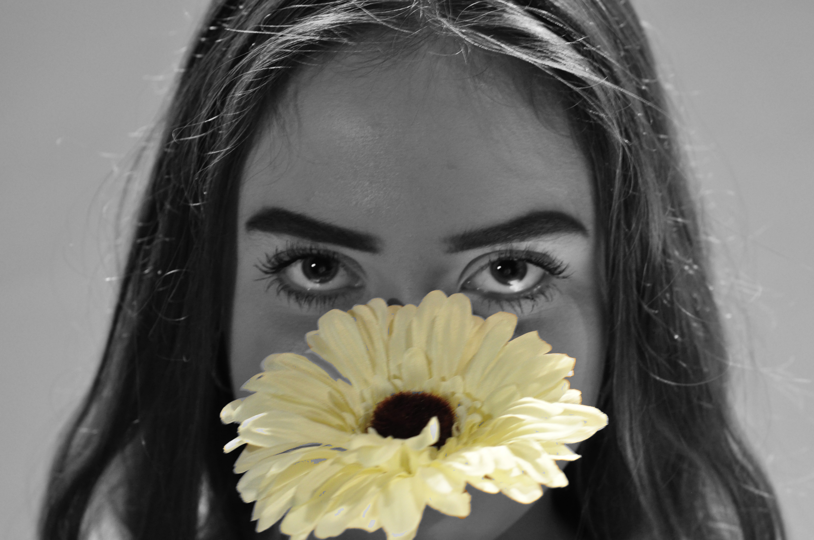
Here above again I am trying to make the focus to Ellie’s eyes by having her hide her face behind the flower and having it sit just below her eyes to try and emphasis them in a different almost ‘conceal and reveal’ kind of way.
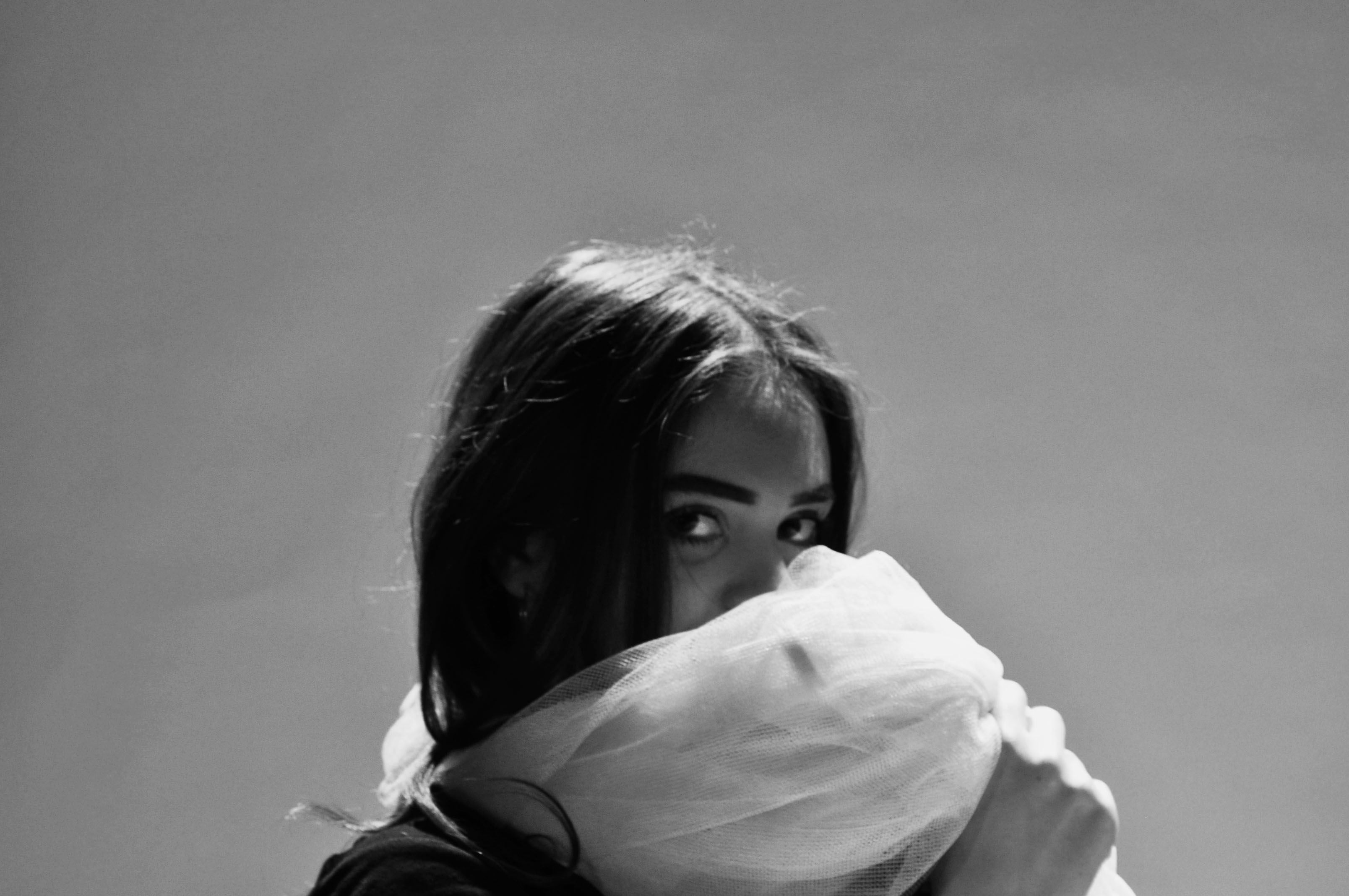
Own Response
This is a more subtle kind of ‘conceal and reveal’. Unlike the other photographs I wasn’t specifically trying to focus in on her eyes or anything specific however I still had her look directly at the camera.
Own Response
Below shows an experiment that I produced with the flower being the only part of the photograph in colour which is something I think was good to experiment with not necessarily in response to Irving Penn but as a quick experiment that I could maybe explore more in portraits.
I conducted a photo shoot to explore all the different types of lighting within studio photography. The types of lighting I looked at was:
One Point Lighting
Two Point Lighting
Three Point Lighting
Ring Lighting
Warm/Cold Lighting
Intensity of the Light
Lighting Rig (On Ceiling)
All these lighting techniques have been explained in previous blog posts.
Set Up
My main light source had a diffuse on it making it a soft light, this was angles slightly to the right of my models face, making a chiaroscuro effect. I then added an additional light which was angles to the left of my model, this evenly lit up my model. Finally I used another light at the back. This was raised on a tripod and was facing directly down onto the model, making the model stand out from the background. Due to this it started to create an element of 3D in my photographs. I then played around with turning some of these lights off, but keeping them in the same place, to see what effect I could create. Moreover, I experimented with ring lighting. This is a singular light which is shaped as a circle, the light is usually quite cold and harsh. You are also able to see the ring of the light in the models eye. When using this light, I made sure it was my only light source. I positioned it to face directly at my model’s face. I then placed my camera through the gap in the middle to capture the model. With this lighting I experimented with the different background colors and the different types of white balance. Additionally, using this lighting I looked at taking macro photographs of my models eye, where you are able to see the ring. Finally, the last lighting set up I used where the ceiling lighting rig. I experimented by using the different lights and their positioning. With some of these photographs I also used the soft box light to make my model more lit up.
Another technique I looked at while trying to capture these photographs was, high key and low key. In my first set of photo shoots in the studio I mainly focused on low key where there is a lot of shadows and contrast found in the image. This time around I looked at high key photographs, where the images are much lighter and too some extent are over exposed. To capture these images I used harsh cold lighting and adjusted my white balance to make the images seem over exposed. Furthermore, I tended to stick with a white background in order to add to the effect of a high key image. When I come to edit these photographs my intention is to use the levels and curves to make these photographs seem brighter than they actually are which will also help to present these images as high key photographs.
Contact Sheets
Edits
These edits are the best outcomes from using ring lighting. Due to previous photo shoots conducted, the other techniques of lighting can be found in there outcomes. When it came to editing I simply adjusted the levels and curves to ensure that my images where sharp.
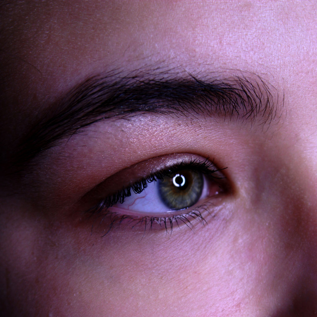
This macro photograph is of the ring light reflecting into my models eye. I decided to capture this as I believed that it was interesting and peculiar to look at. Due to the image being macro it allows the viewer to see all the detail of the facial features, from the eyebrows to the veins in the eye. This helps to present the formal element of line and texture.
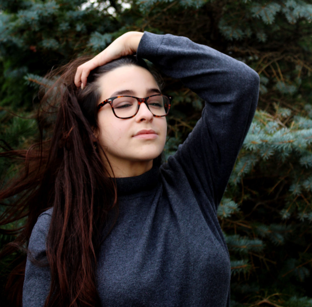
In this final outcome I tried to use the inside of the ring light to frame my model. This has helped to make the model the main focus point of the image. Moreover, I used wind to move around the models hair which has allowed movement and an element of 3D to be found in this image.
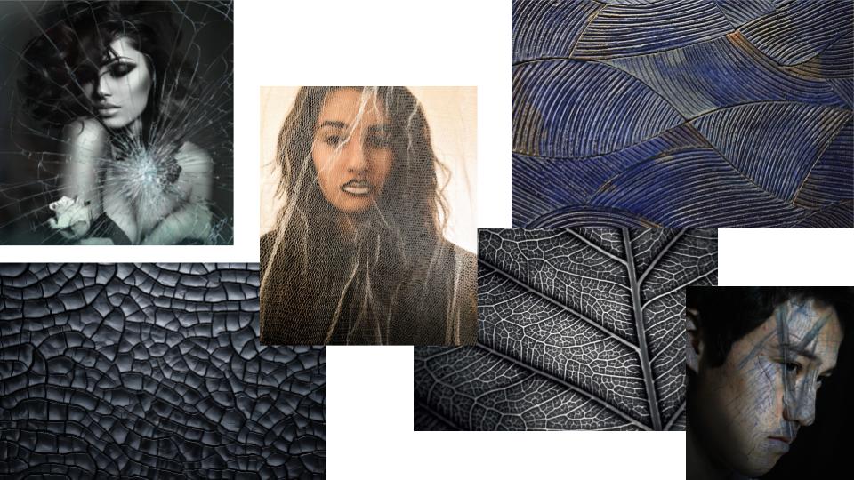
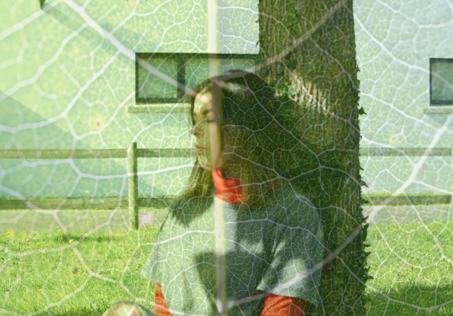
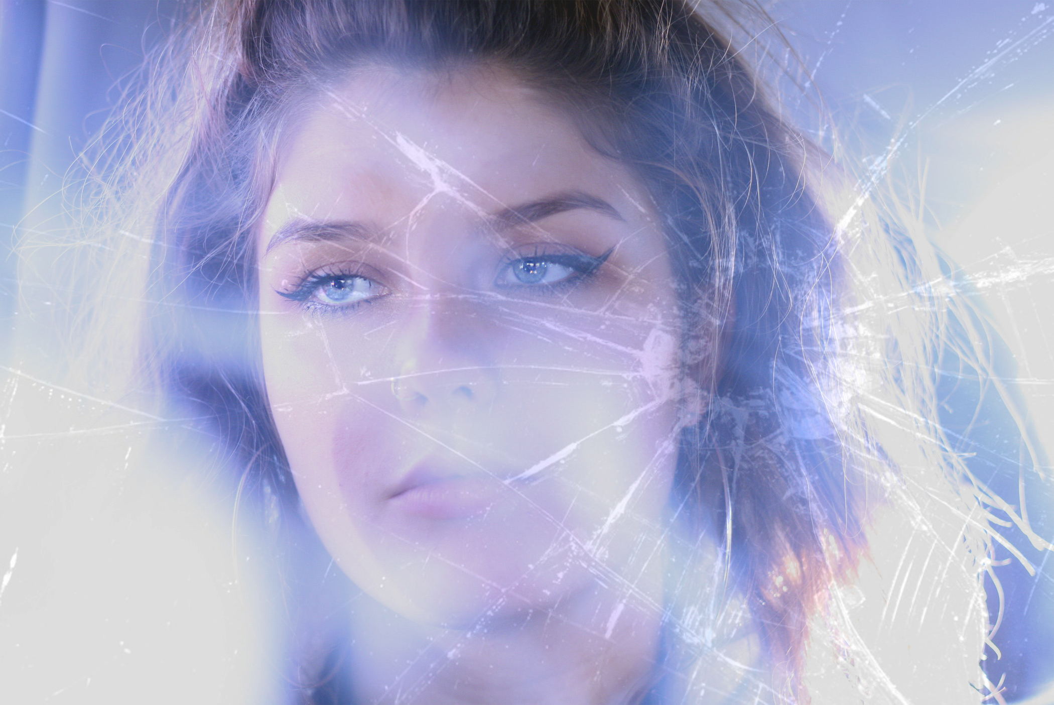
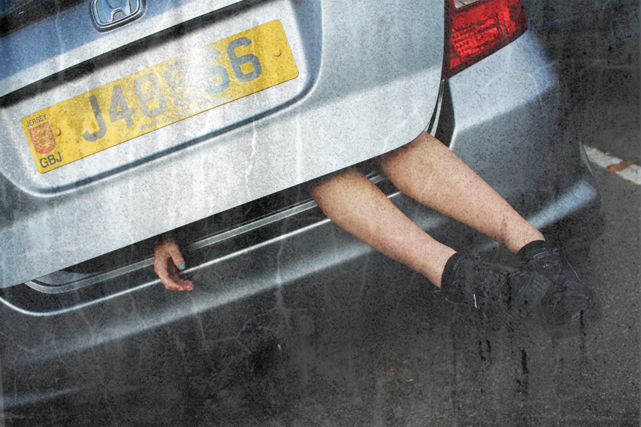
Textures in Photoshop can be used to create different compositions by adding noise or colour or to enhance the purpose of an image.
It can be achieved by adding a texture or other image over the top of your final image, decreasing the opacity to blend the two or more layers together, creating the illusion that the image was made that way.
Mood Board:
The addition of textures to the appropriate compositions can enhance the power or effect of the image. It can also emphasise the message or story behind the photo by adding a second layer of visual “context” to the photo, giving further meaning or background to the ideas or concepts being presented.

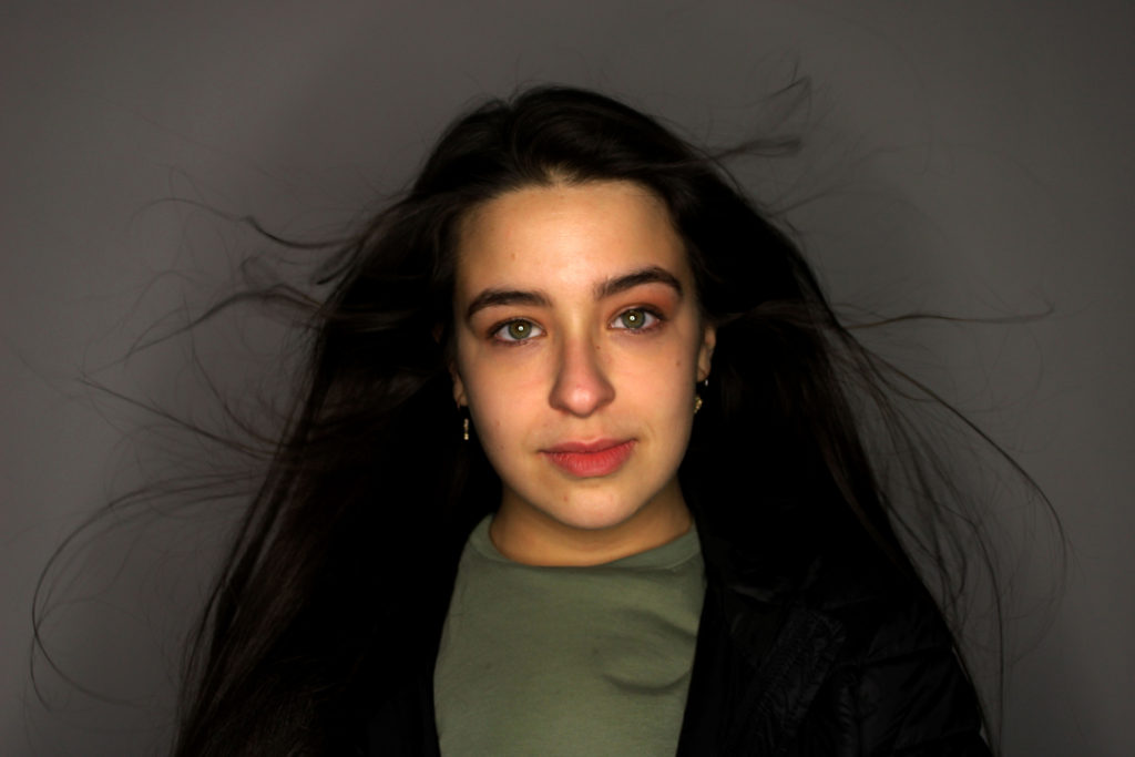
 My Personal Favorite of the selected images ^