As the final 3 choices for my studio portraiture experimentation, I have decided on the following 3 images:

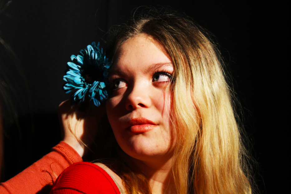
For the above image, I experimented more with contrasting color and camera angles. I feel like the contrast between the bold blue of the flower and the bold red of the subjects clothing helps to draw more attention to the image, and allows for the viewer to have their eye drawn around the image, rather than focusing on just one section. The contrast between the bold colors of the subject and the background also helps to separate the background and the subject in the foreground, which in turn adds more depth to the image. In addition to the colors, I feel that this image makes use of the contrast between the shaded and light areas of the subjects face, which mimics the chiaroscuro effect often found in grey-scale photographs. I feel that this contrast also adds depth to the image, and allows the viewer to see the image as more 3D rather than 2D.

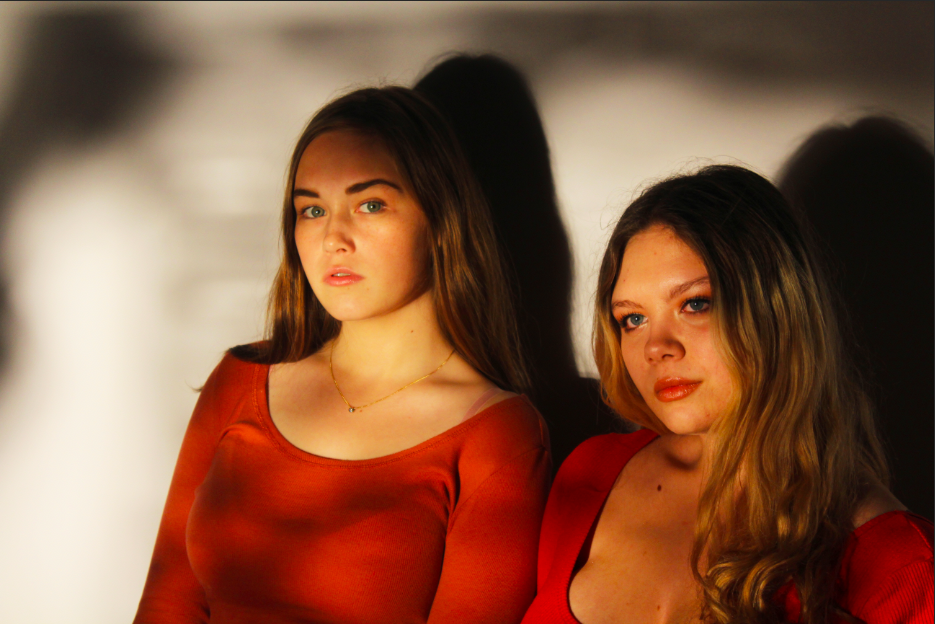
The above image makes use of more abstract shadows, created by holding torn paper in front of the key light in the studio. I feel like the effect that this caused created an interesting pattern of shadows, which in turn will draw the attention of the viewer. With this image, I attempted to experiment more with shadows, and so i neglected to use the filler light to soften the shadows, which allowed for the shadows of the subjects to remain prominent in the image. I feel like this adds to the contrasting tones and colors within the image, and overall I feel like it draws the attention of the viewer to the different contrasting areas of the image.

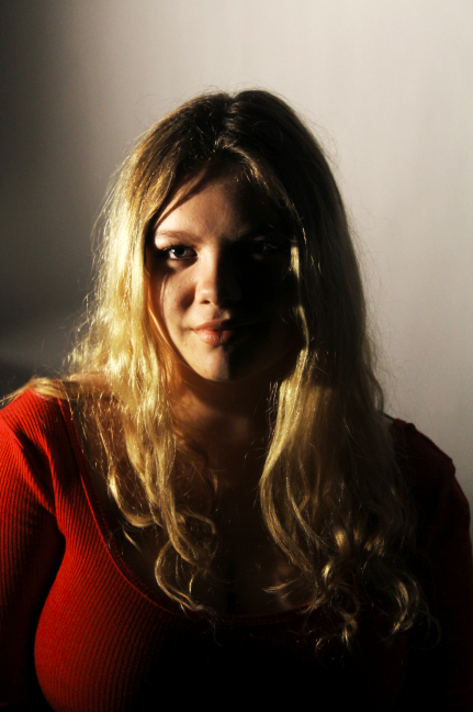
I feel like the above image is the best example I produced of creating a chiaroscuro effect using lighting and camera angles. A key light was used on one side of the subjects face to create this effect, and I feel like the contrast in tones between the left and right side of the face helps to show more depth in the subject. I feel that this image is the best example of me attempting to create a contrast between the light and dark portion of a subjects face. In addition, I feel like the positioning of the camera in this particular image, allows for the viewer eyes to be led directly to the face of the subject, as it is positioned straight ahead of them. I feel that this allows for the viewer to feel more personally involved with the image, and allows them to relate more to the subject and in turn, the photograph itself.
