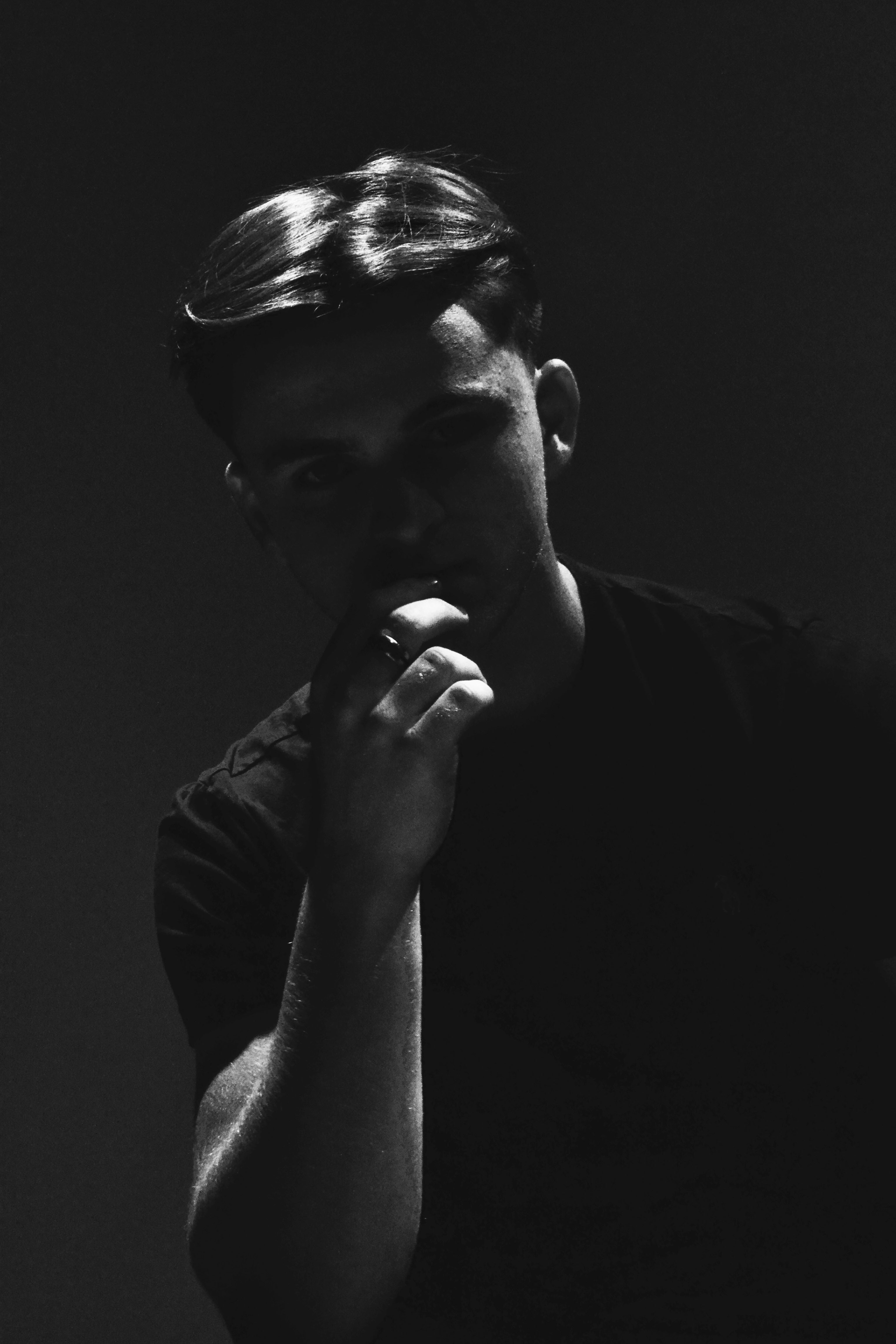
Portraits using Studio Lighting

For my experimentation into using lighting in a studio setting, I decided to also incorporate a number of camera skills into my experimentation as well, to produce the best products possible.

The lighting in the studio consisted of a key light, and a soft box light. the key light was used to illuminate the face of the subject, and to alter the overall lighting of the image, whereas the soft box light was used to manipulate shadows, softening them where necessary to alter the appearance of the image.

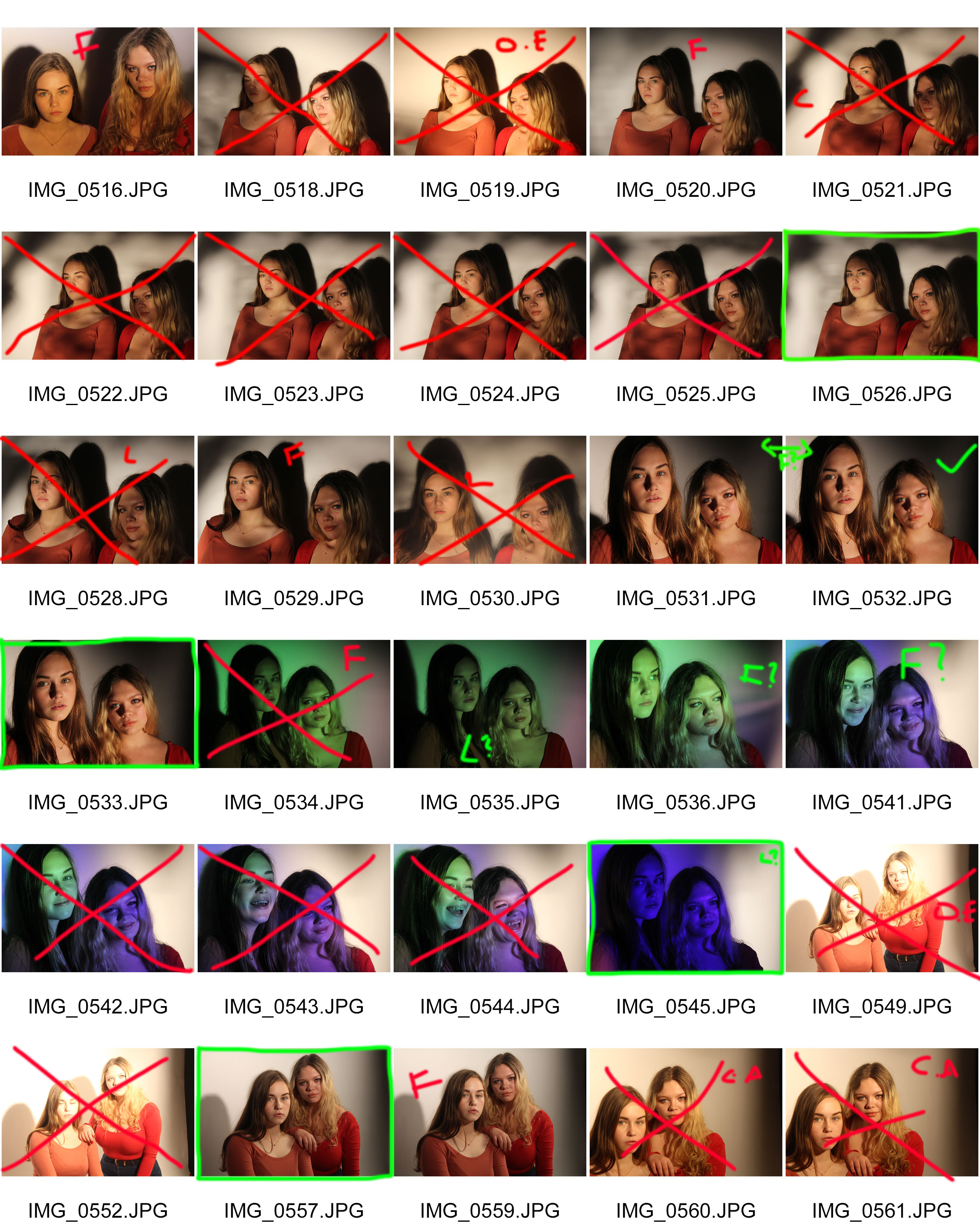
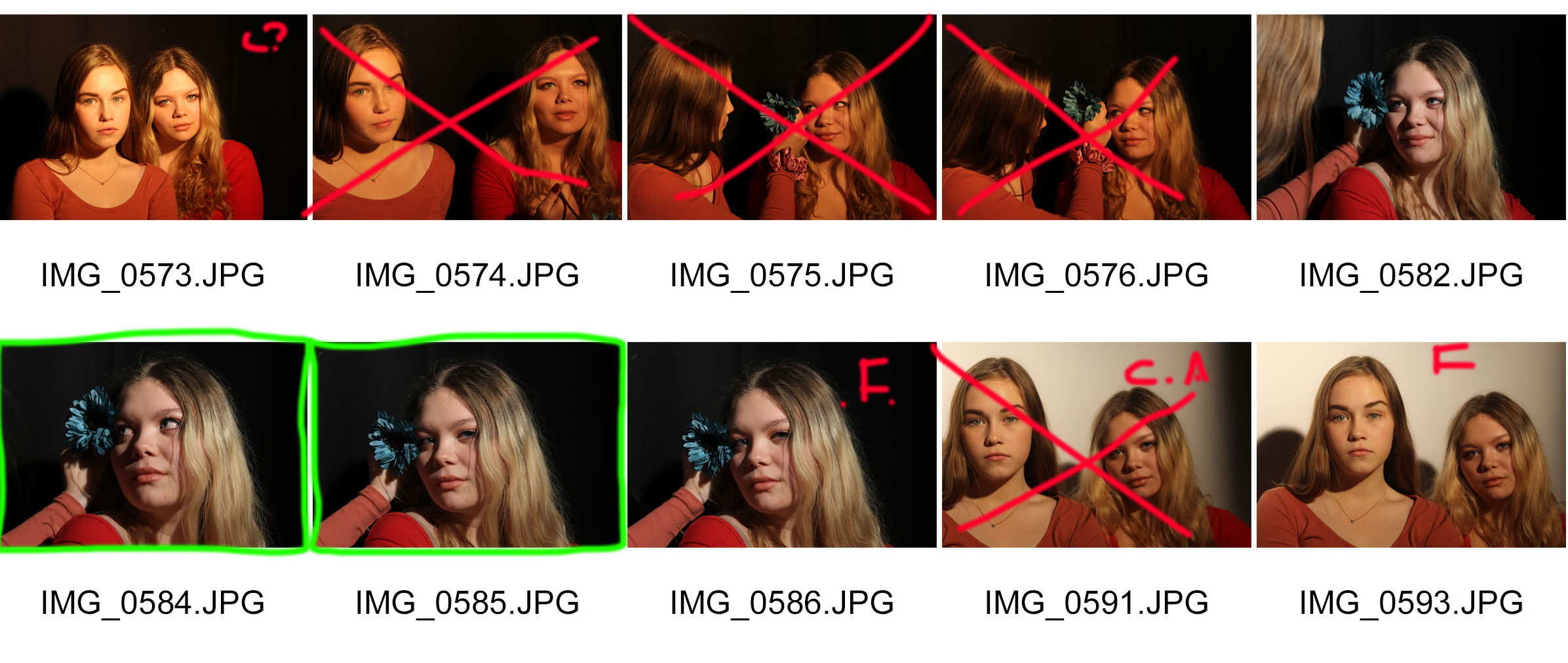
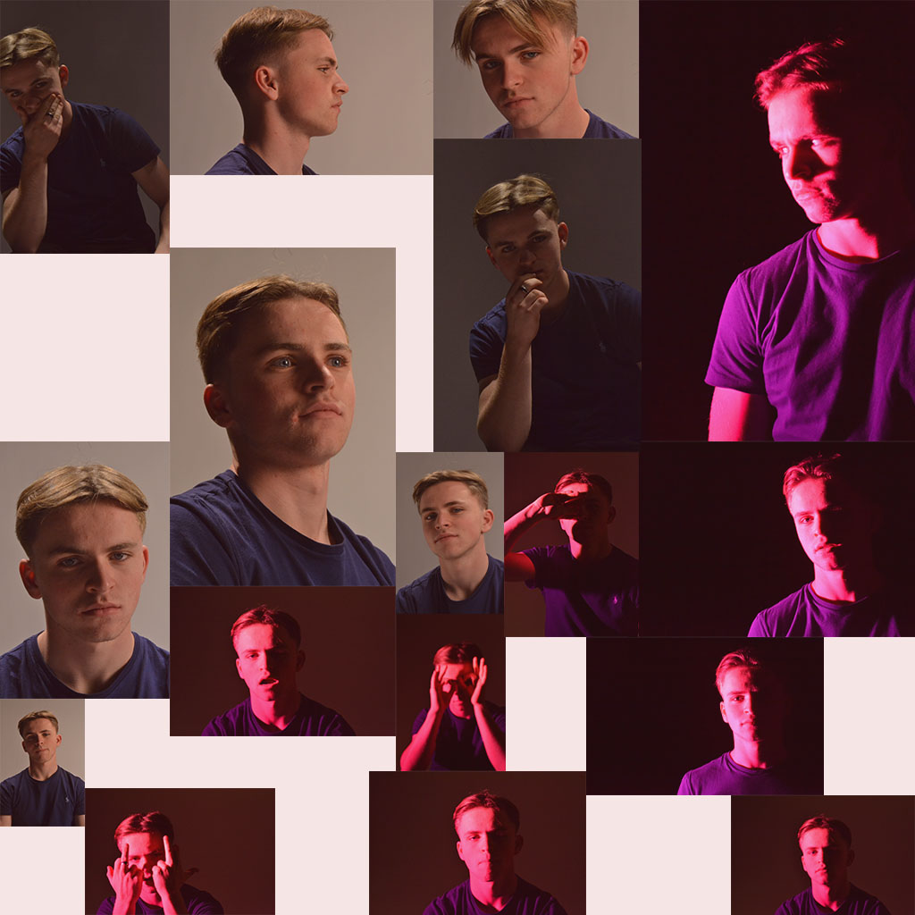
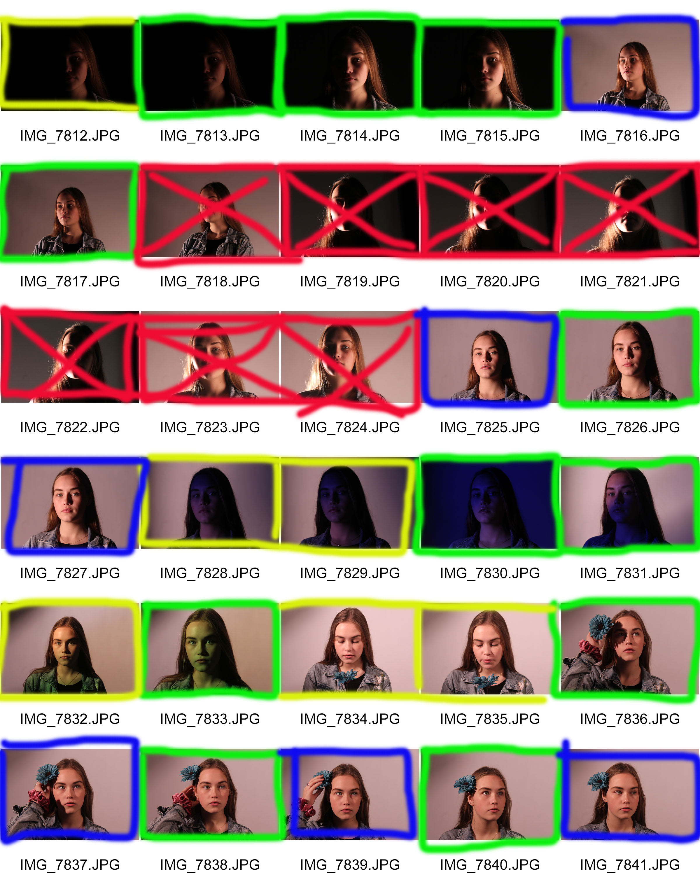
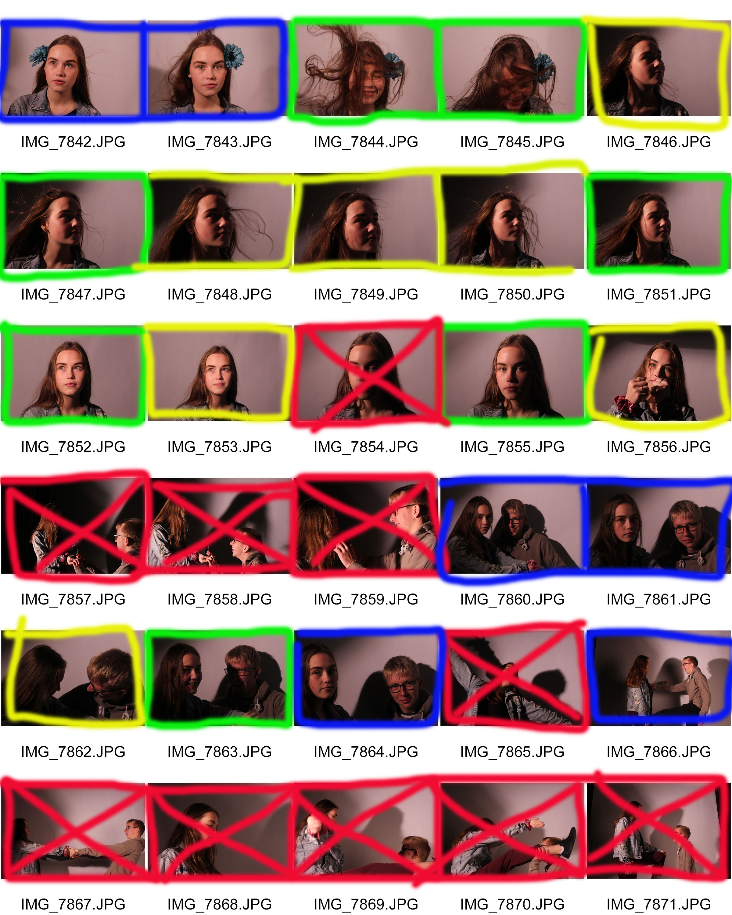
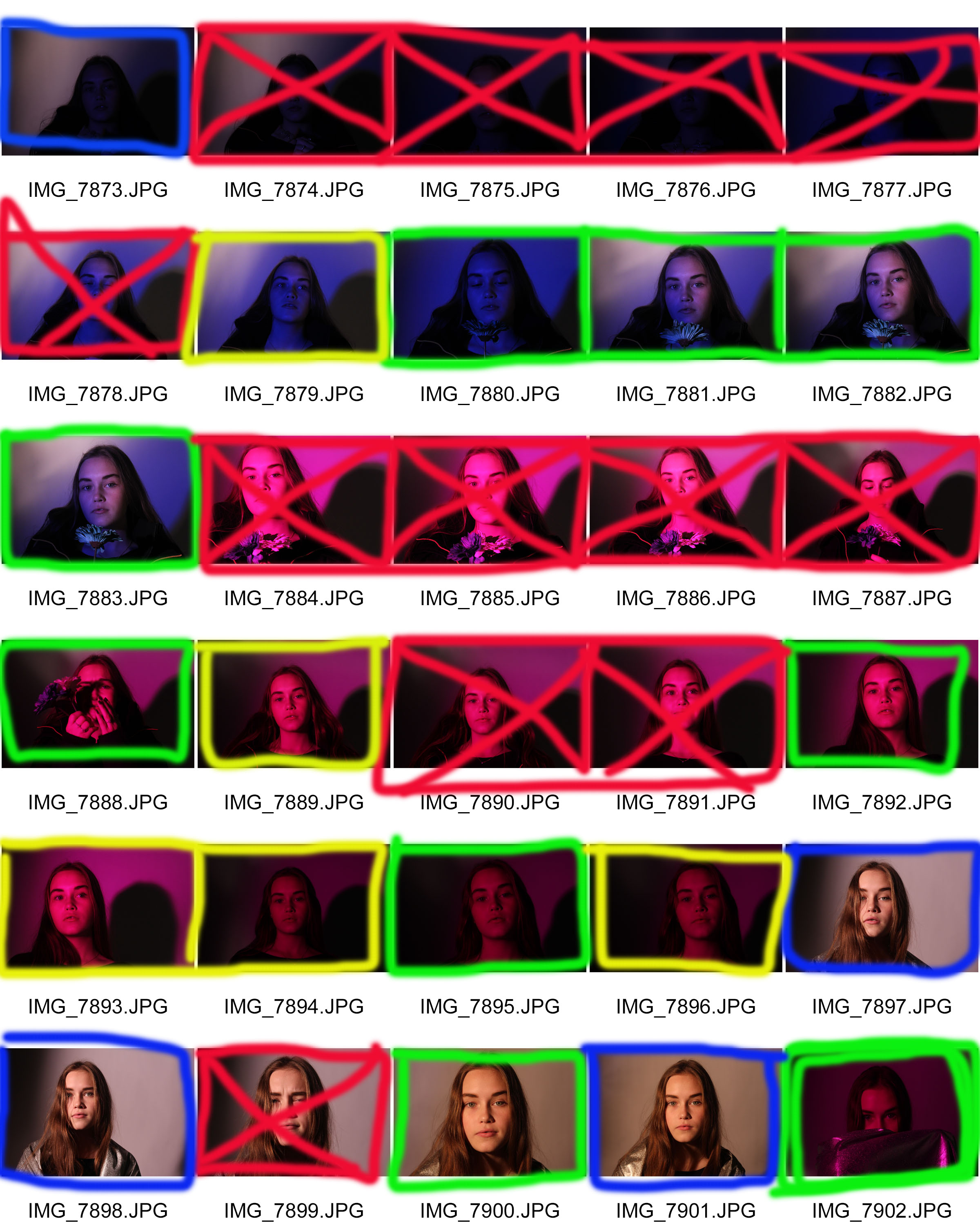
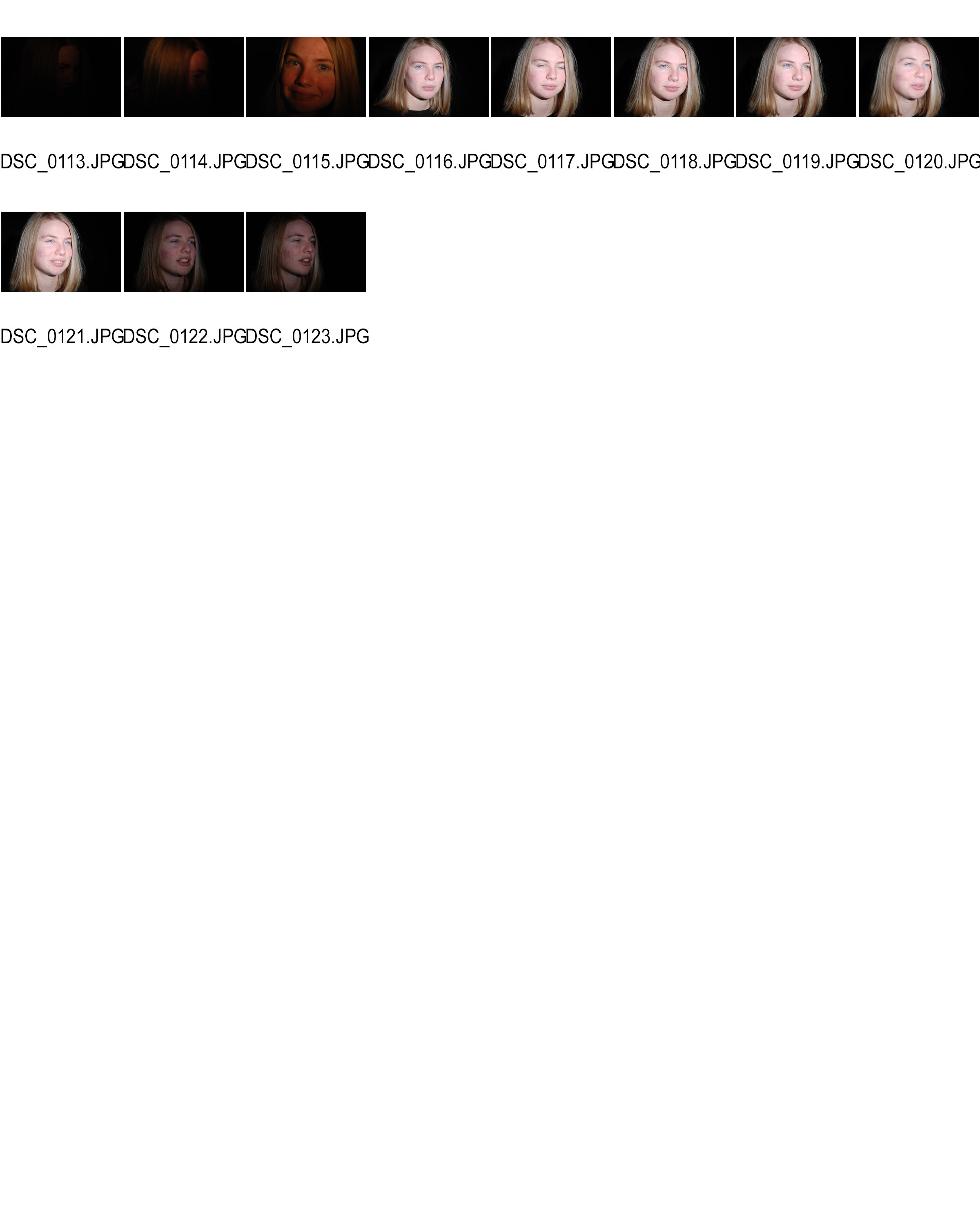
The following images are of contact sheets I have created including all of my studio portraits:
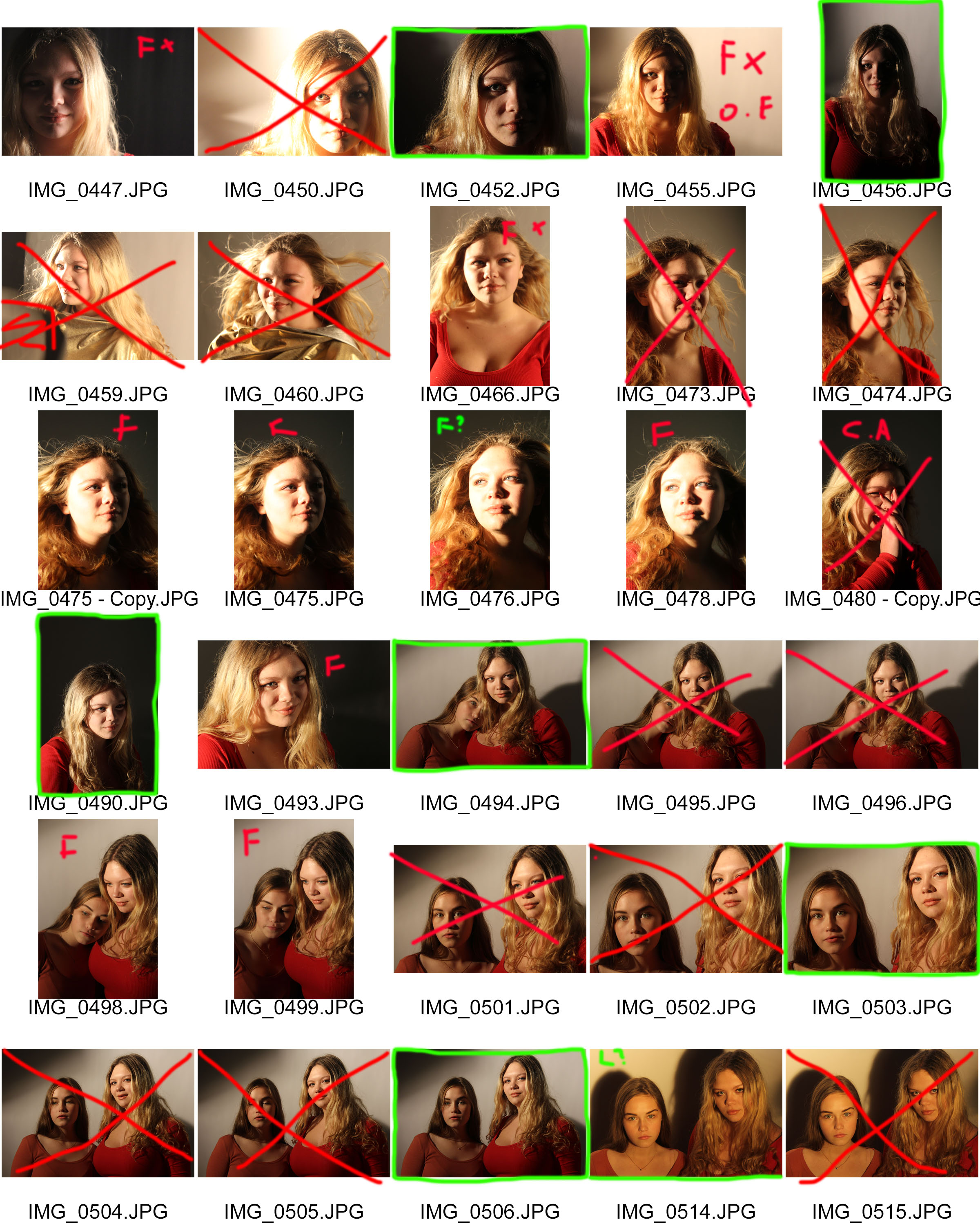
Key: Red F = out of focus, Red C.A = wrong camera angle, Green L = slightly off lighting , Green F = slight focus issue, Red O.E = over exposed, Red Cross = rejected, Green Box = finals for editing

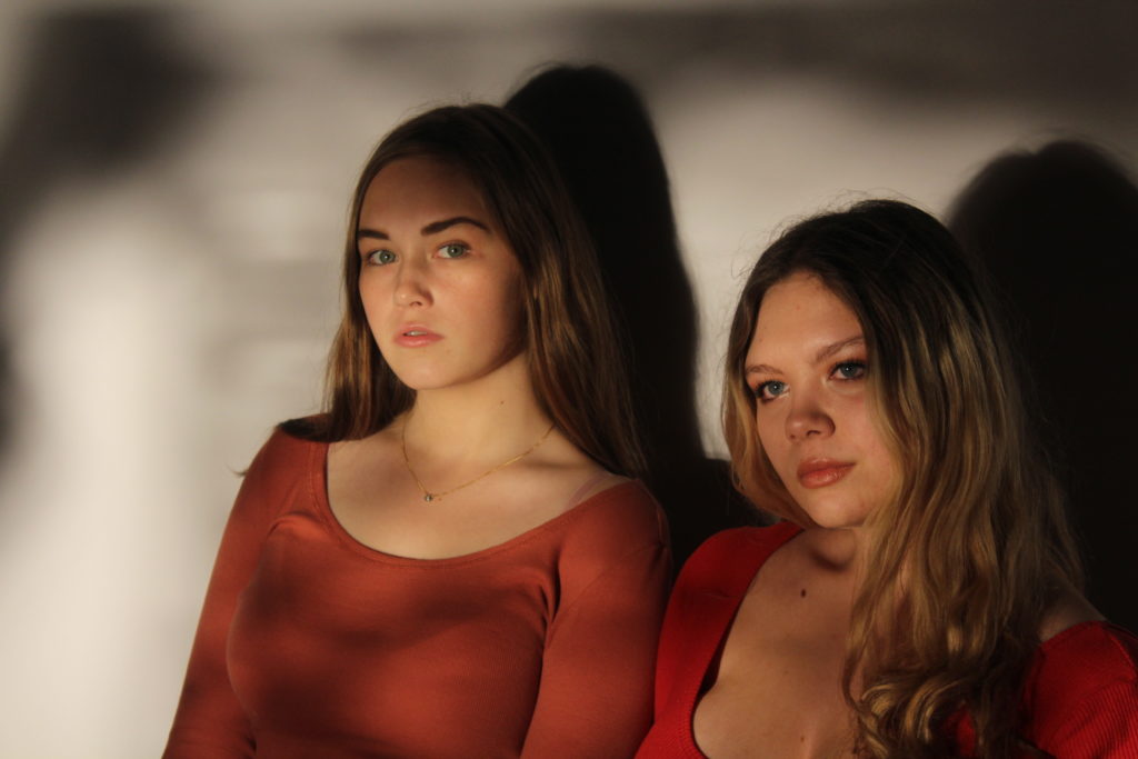
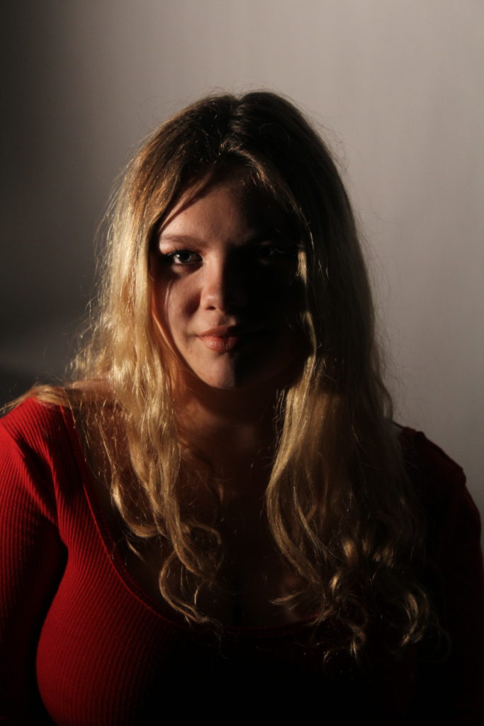
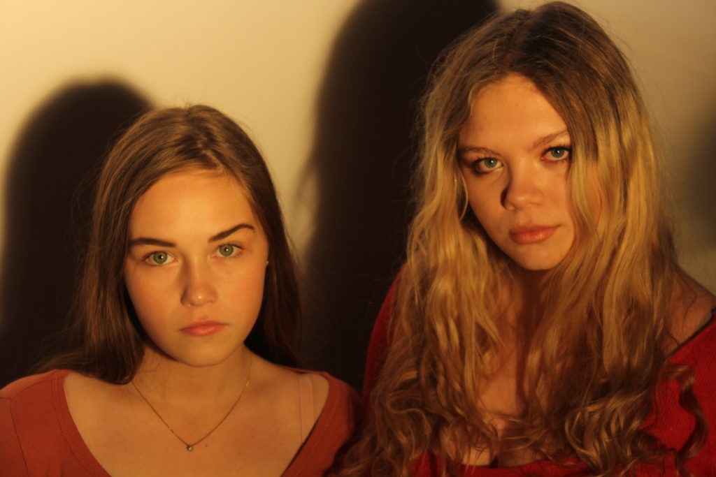
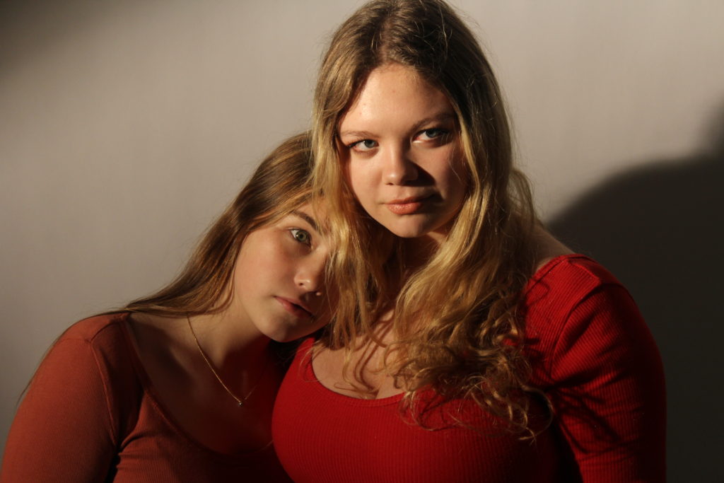
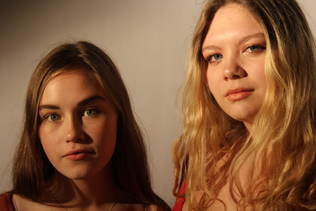
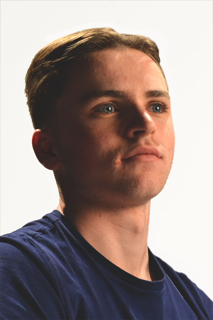
The final images before the editing process can be found below:
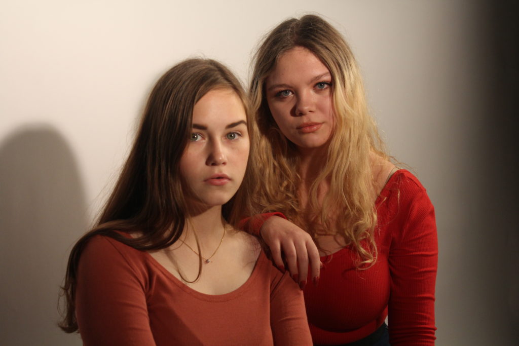
After deciding on which images should be processed to the editing stage, I used Photo-shop to manipulate the colors and tones of the images to make them as eye-catching and effective as possible.

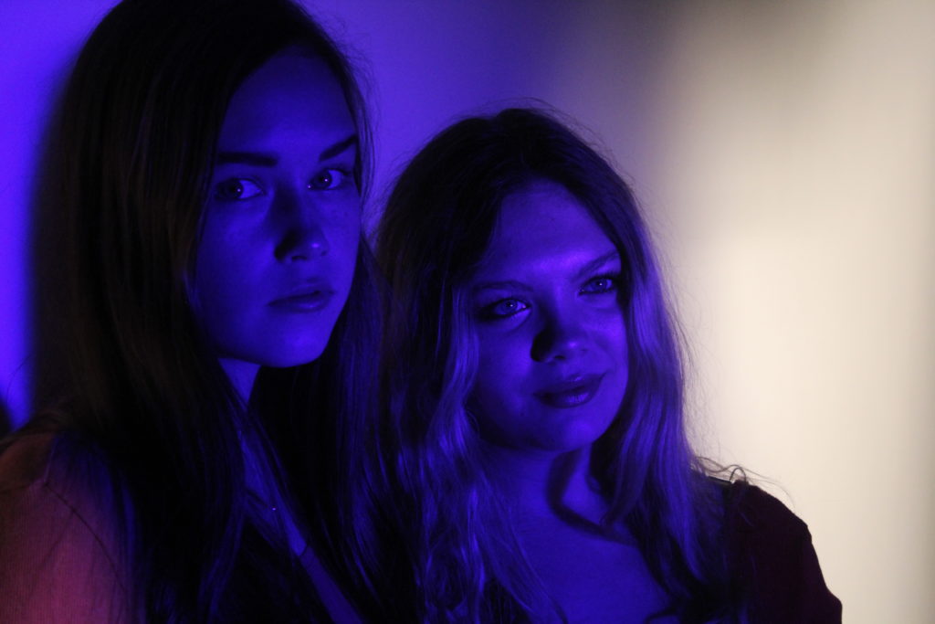
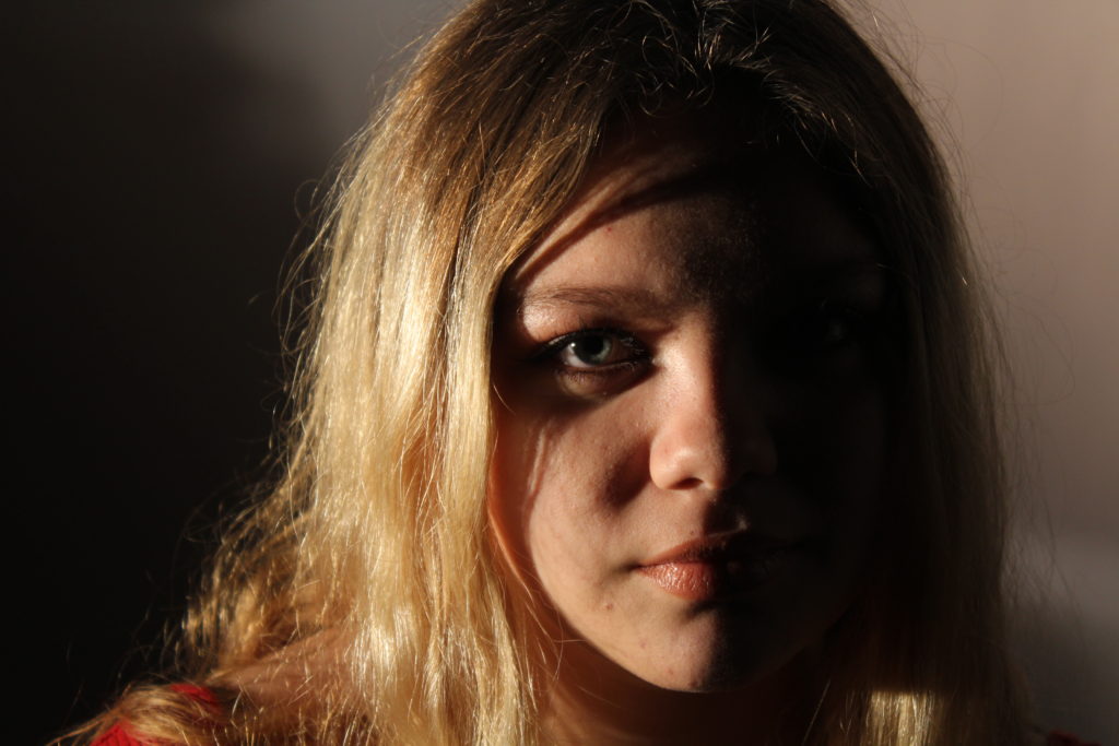
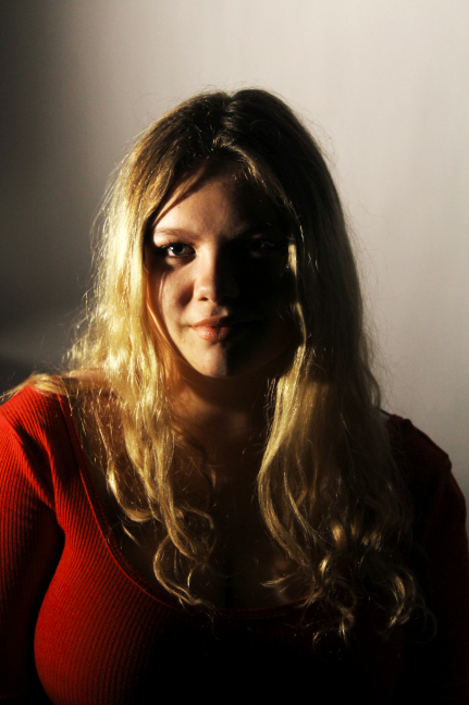
The aftermath of editing can be seen below:
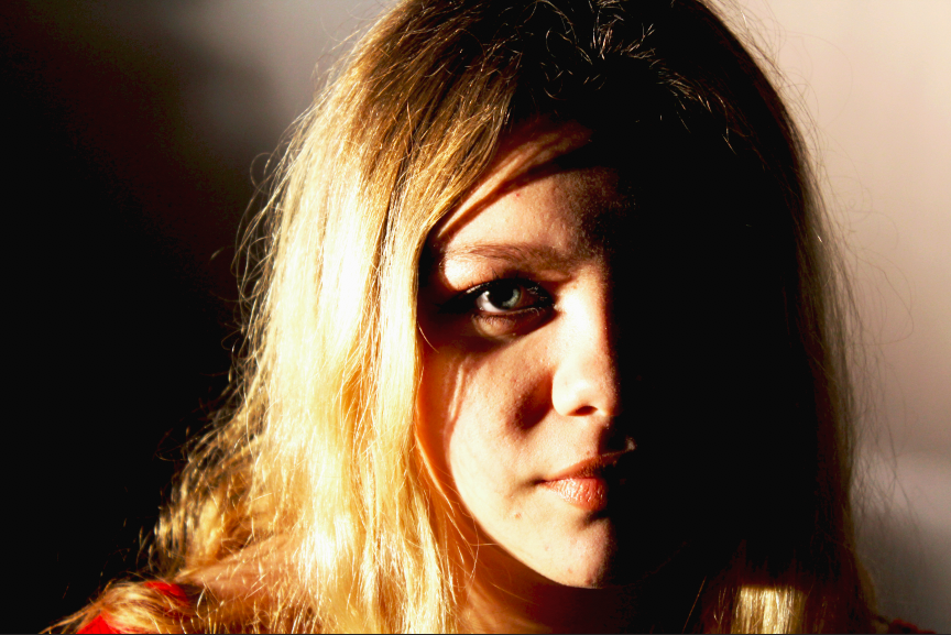
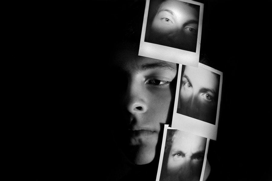
The above 2 images are photographs are examples of me attempting to create a chiaroscuro effect, where 1/2 of the face of the subject is illuminated using studio light, and the other portion is shadowed, to create a contrast between the 2 portions of the same subject. This is very effective when trying to draw attention to the depths of the subject, and it helps to bring the image to life, giving it more of a 3D effect.
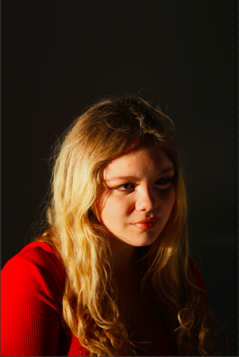
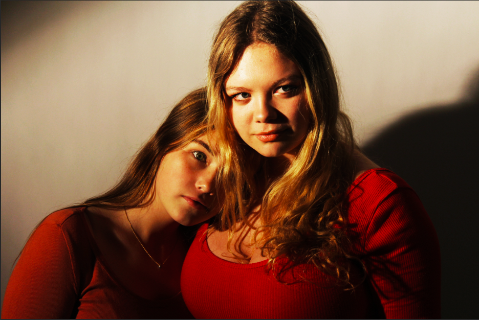
Some of the images were over saturated due to the lighting in the studio and the original position of the camera, and so I attempted to edit some of the images to reduce the saturation, and make the coloring of the images more natural. This kind of editing occurred in the above 2 images.
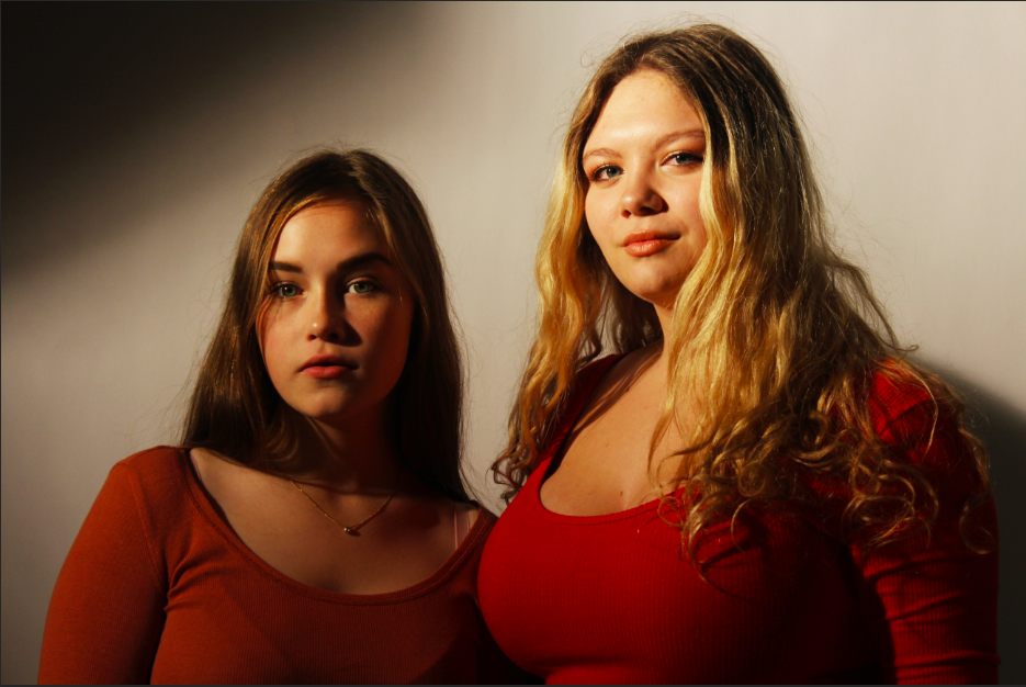
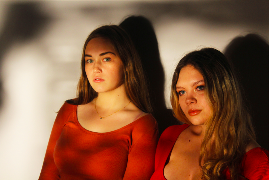
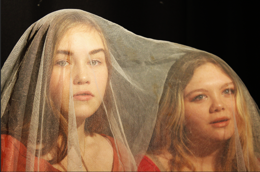
For some of my photographs, I experimented with using different filters in front of the lighting, to create different effects of the image. Colored filter paper was used to manipulate the overall color of the photograph, but for the above photograph, a piece of paper covered in holes was held in front of the key light. I think this created an interesting shadow effect, and helps to draw more attention to the photograph, and gives the viewer more to look at.
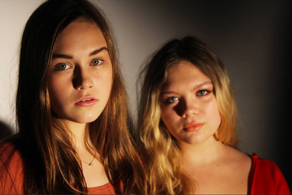
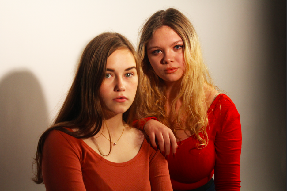
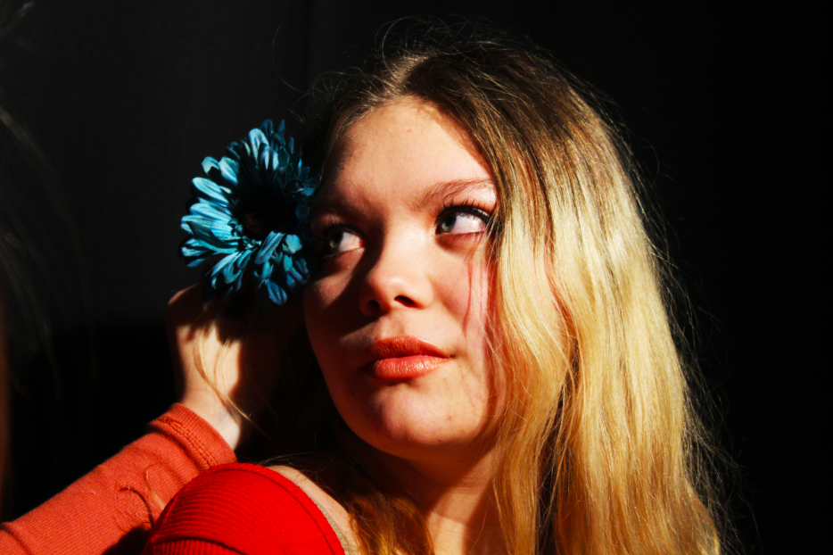
The above 2 examples are example of props being used in studio photography. Props are often easier to use and manipulate in a controlled environment like a studio, rather than in a natural setting.  The props in the above image can be used to create a contrast to the colors of the subject, thus breaking up the color of the image and creating more areas for the subject to have their attention drawn to, and can in certain circumstances be useful in conveying meaning and reason in an image.

Overall, I believe that experiencing the different kind of lighting that can be used in a studio setting has allowed me to understand how much having control over the lighting of an image can effect the final outcome of the photograph. Natural lighting is useful to create a natural effect in an image, however for situations where natural lighting is not possible, or when a particular angle or intensity of lighting is required, using studio lighting can be very useful.

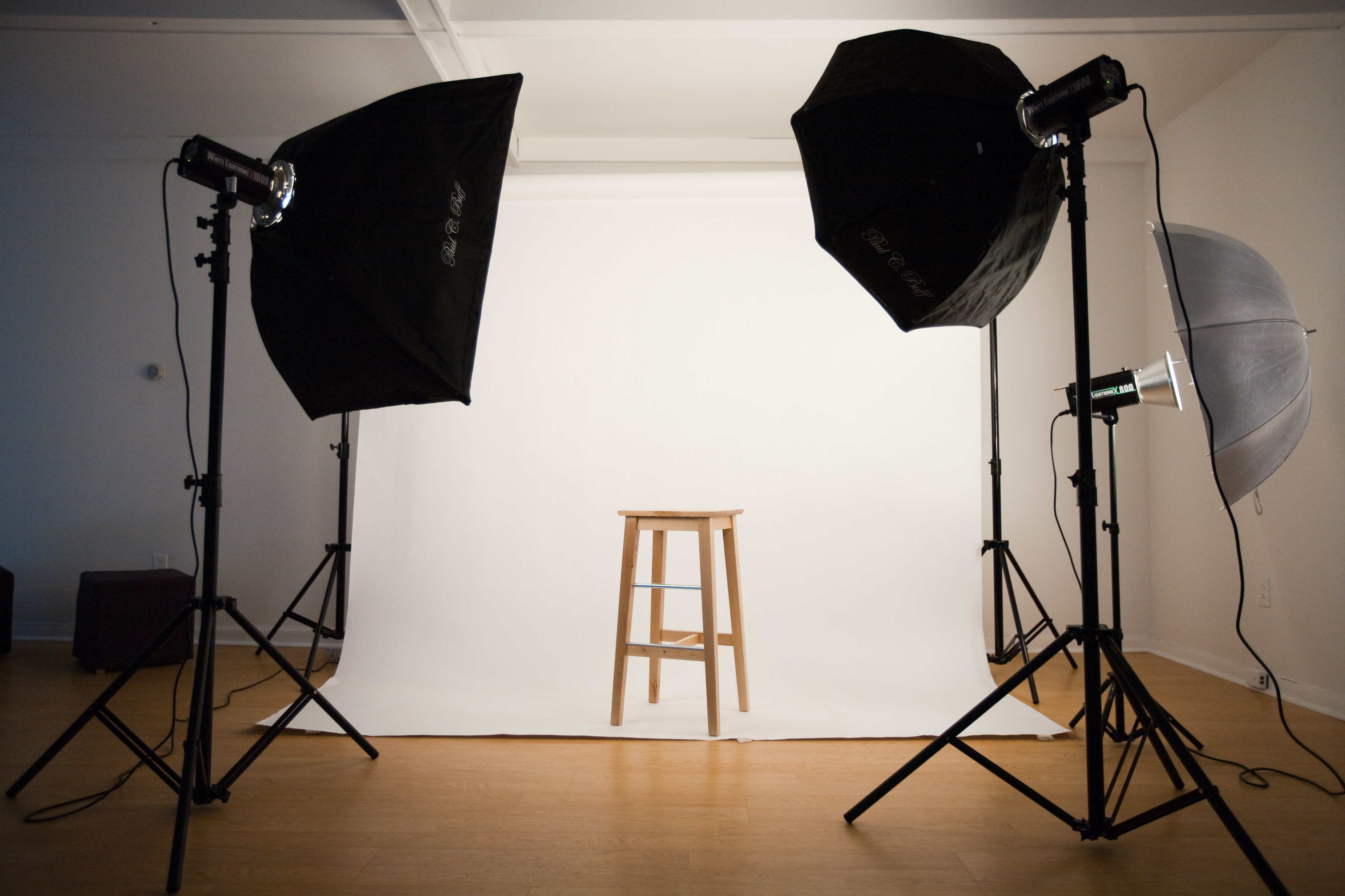
Studio Lighting

Why do we use studio lighting?

Studio lighting offers the photographer control over the final image. Studios are simple rooms with no windows so there’s no sunlight involved. The walls are black or white so there’s no colour introduced. There’s a simple backdrop using a roll of white or black material.  There’s also lots of space for the model and equipment to move around.

What is the difference between 1-2-3 point lighting and what does each technique provide?

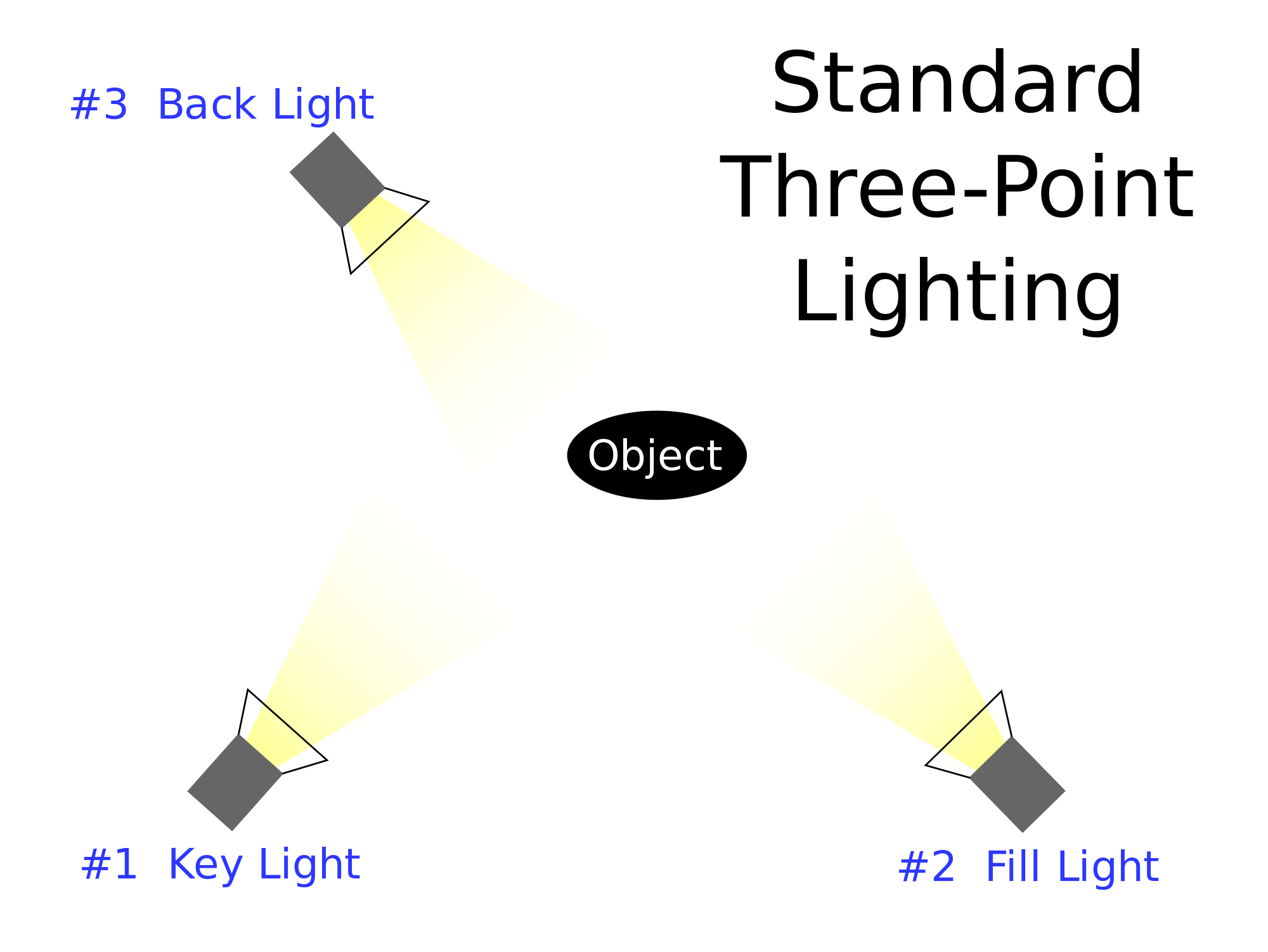
One of the oldest lighting technique is called three point lighting. It is vastly used in studio photography. It is also a good basis for any portrait photograph. In this technique you use three lights:

  • The first light is key light. This is usually the strongest light and this light sets the lighting of the scene.
  • The second light is called a fill light, this light helps fill the shadows that the main light casts.
  • The last light is called a backlight and it provides definition and subtle highlights around the subject’s outlines. This helps separate the subject from the background and provides a three dimensional look.

What is fill lighting?

Fill light is a form of additional light mainly used to lighten up shadows in an image. It is often used in portrait photography to create contrast between the subject and the background giving the scene a sense of depth. In this situation the use of fill lighting reduces the overall dynamic range of the scene allowing for easier selection of exposure settings required to capture an image. When fill light is correctly applied it does not impact the main light source of an image.

What is spill lighting?

Spill light is the light that illuminates the surfaces beyond the area intended to be illuminated. 

What is Chiarascuro ? 

It is a photography technique and can be referred to as extreme low key. It means strong and bold contrast between light and dark areas in photography. It is well suited for portraits and giving the illusion of being three dimensional. It adds depth and a more mysterious atmosphere as it creates contrast between highlights and shadows in a photo.

example of chiaroscuro by Ryan Berry

Studio Photography Lighting (Singular)

STUDIO PHOTOGRAPHY ONE POINT LIGHTING

This post is focussed on our studio lighting photoshoot using a single light to capture images.

Single point lighting or “one point lighting”, is the technique of carrying out a photoshoot within a studio with only a single source of light, for example large lamps, spotlights or torches.

It enables reflective lighting techniques, and it sometimes, can be used to focus a viewers attention to a particular aspect of a photograph or subject in the photograph, or it can be used to create shadows when used correctly that add additional depth of field and conceptual features to an image.

Contact sheet of images:


From this contact sheet I picked out my favourite two images from the shoot and edited them in Adobe Photoshop.

My final edited images from the single point lighting shoot:

I chose to edit both of these images because of the sharpness, diversity in model actions, contrast differences, brightness differences and the similarity in the position of the single light and the shadows on the models’ face.

The camera was using a high ISO of around 800 and an above average aperture on the first photo, and using a lower ISO of around 600 and a smaller aperture on the second.

The shutter speed for the first photo was slightly faster than the second creating the darkened effect with only the single light from the side creating the shiny parts that give the image its ‘definition’.

The depth of field in both images is shown through the shadows created by the side-lighting however, this only shows depth of field on the model themselves.

Alex looking “into the light”

“Seriously Serious”

Studio Photography

Now we have moved into portraiture in photography we have started to use the studio, this is brilliant and fun in the moment on creating better portrait  photos, this is because we can take photos in an controlled environment with no factors of extraneous variables.

In the studio we are able to dim and brighten lights, have lights shining in specific areas to light up part of a face, or we can use a color filter to give the photo a different feeling, like a warm or cold feeling, by using a warm or cold color to affect the light.

In my very first studio photo shoot I asked the person visible to act in whatever manor she liked, this way the movements and facial features would seem more natural and relaxed. I like this way as it doesn’t make the photo seemed forced in anyway, but also this way I can capture the real facial features and emotions of a relaxed person.

In the contact sheet you will notice I have used the same key as I always do.
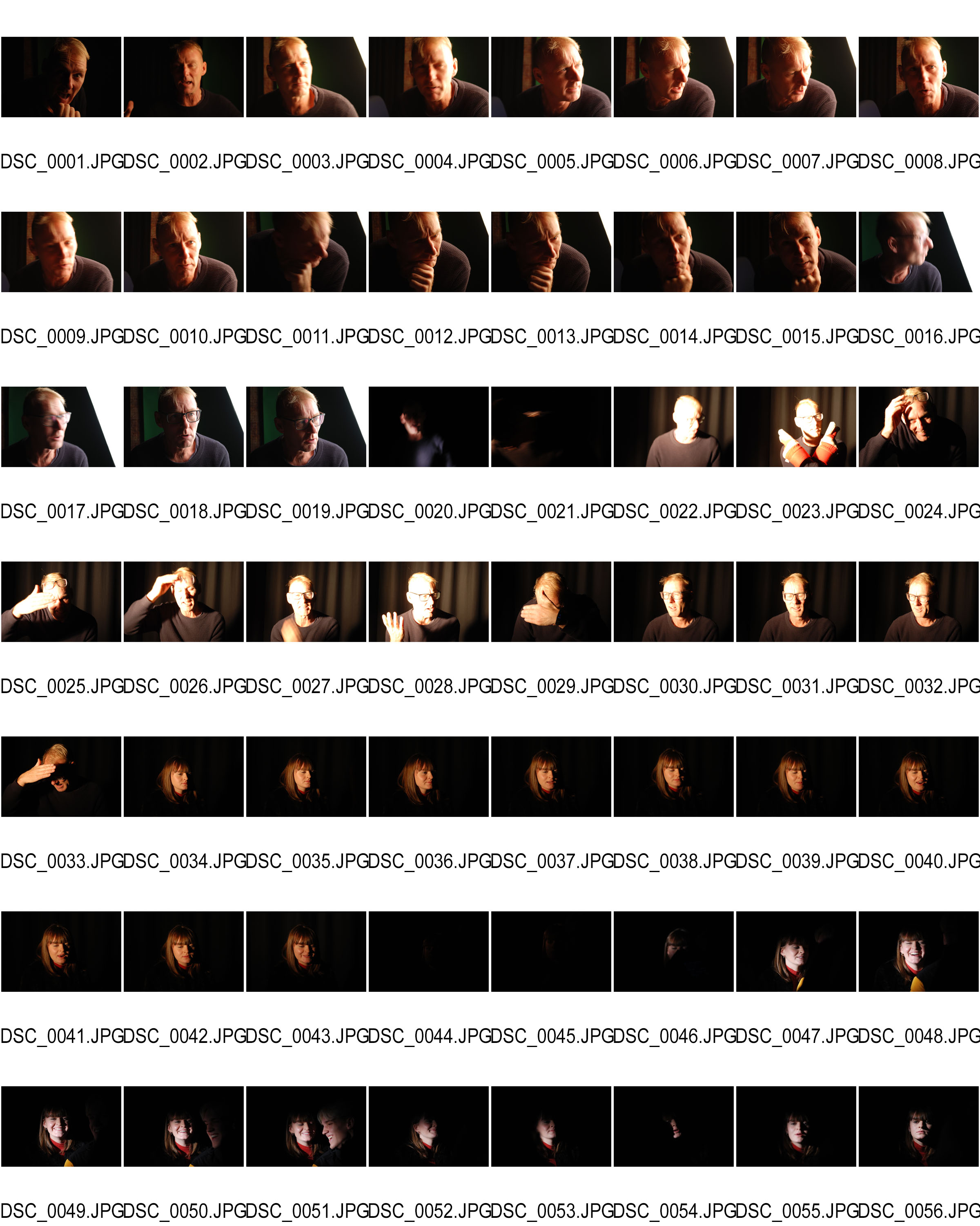
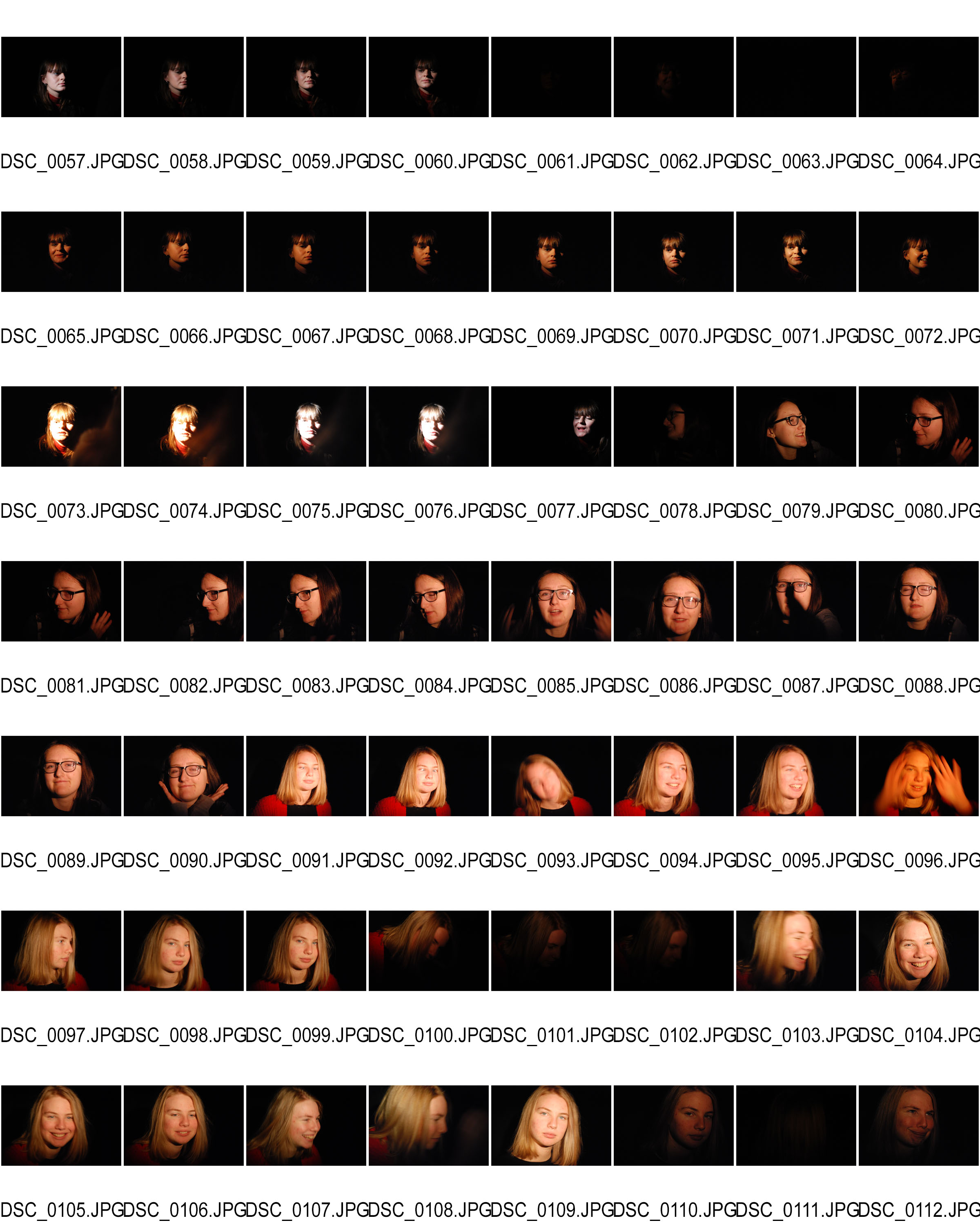
One thing which is visible is that I have loads of photos which I am unhappy with, this is due to the fact that it was my first time using the studio therefore I was getting used to the different settings with ISO and aperture to make it really work with my models face.

Most of the crossed out pictures are because I had made the photos either under or over exposed making it too light or too dark, others which may seemed great did work with the light, but I had realized that my models face looked bored or just uninterested, but there are others where my model is showing emotions such as laughing which really helps me capture the human persona and features.

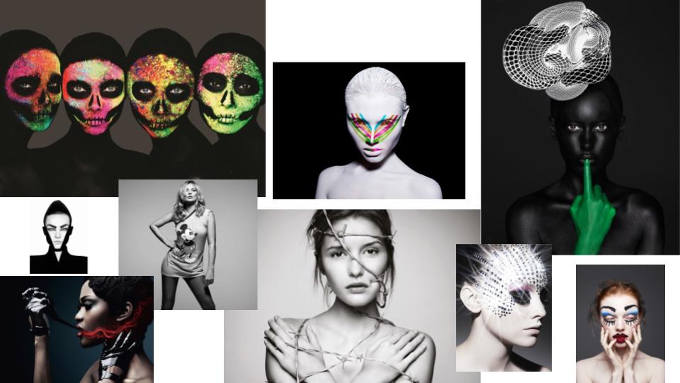
Studio Lighting – Post 1 (Rankin)

Rankin:

John Rankin Waddell (born 1966), also known under his working name Rankin, is a British portrait and fashion photographer and director.

Best known as the founder of Dazed and Confused magazine (along with Jefferson Hack), and for his photography of models including Kate Moss and Heidi Klum, celebrities such as Madonna and David Bowie and his portrait of Elizabeth II. His work has appeared in magazines such as GQ, Vogue and Marie Claire. In 2011 Rankin started the biannual fashion, culture and lifestyle magazine, Hunger and launched Rankin Film to produce and direct his own commercial and editorial film work.

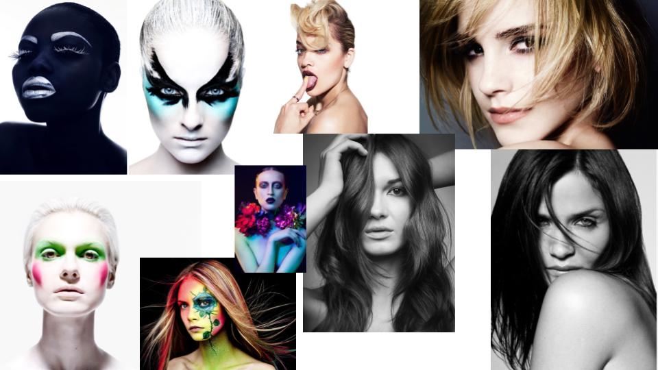
Mood Board:


Studio portraits

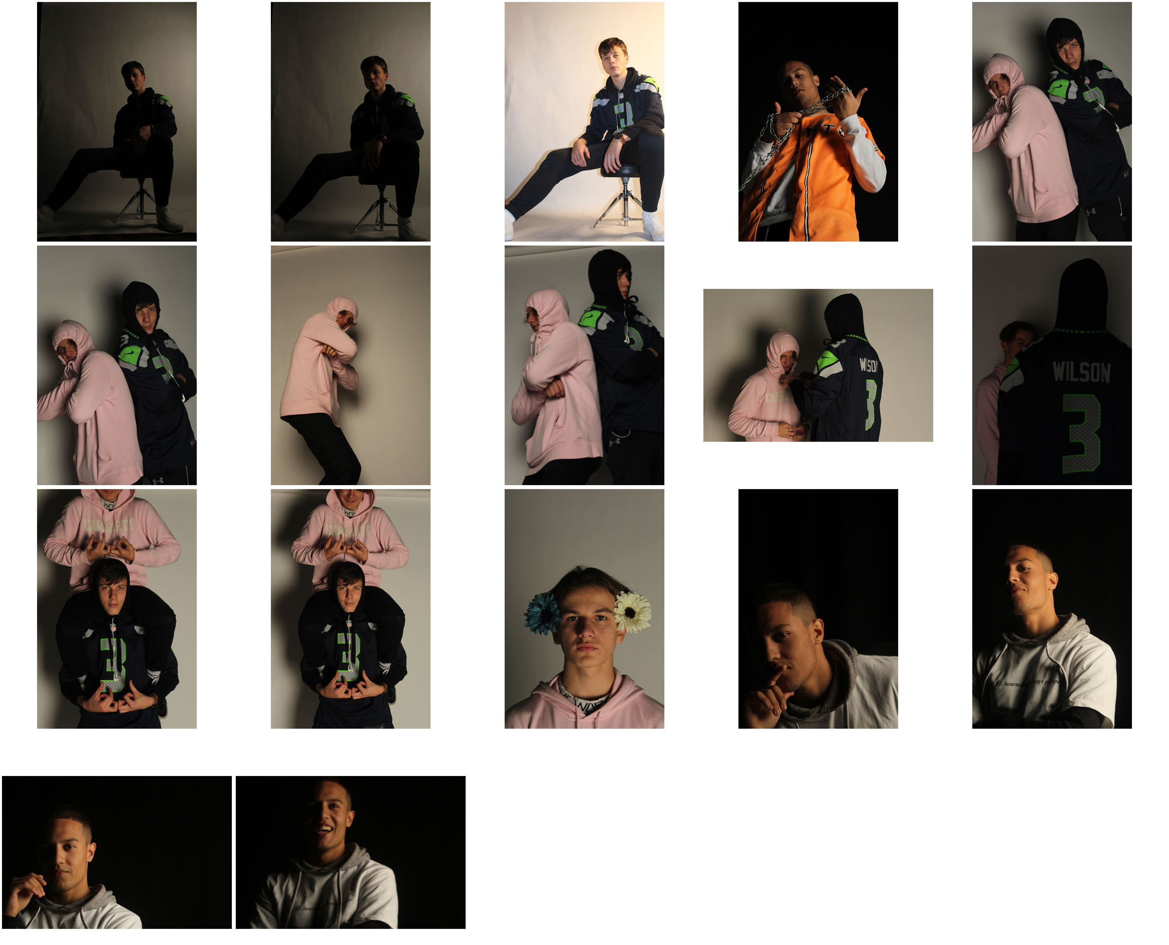
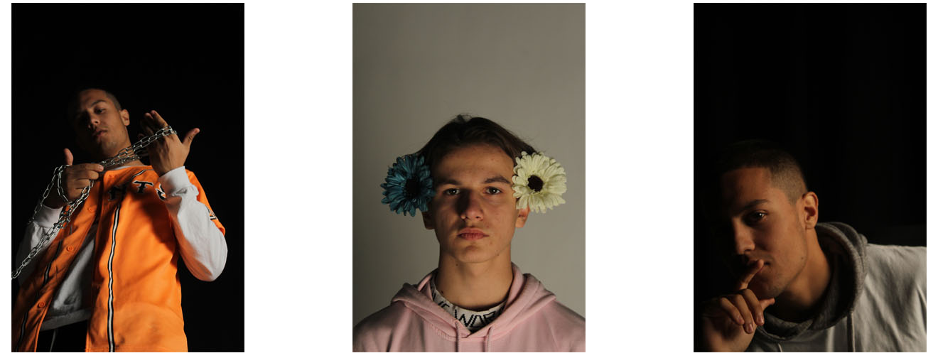
After going into the studio once to test and see what we could do and learn how to do it,  I got about 100 images and then I have taken it down to this group of 17 as possible final images for this shoot

After looking through I selected the images that I thought had the most potential.

Once I had chosen these images I then went into photoshop to edit them.

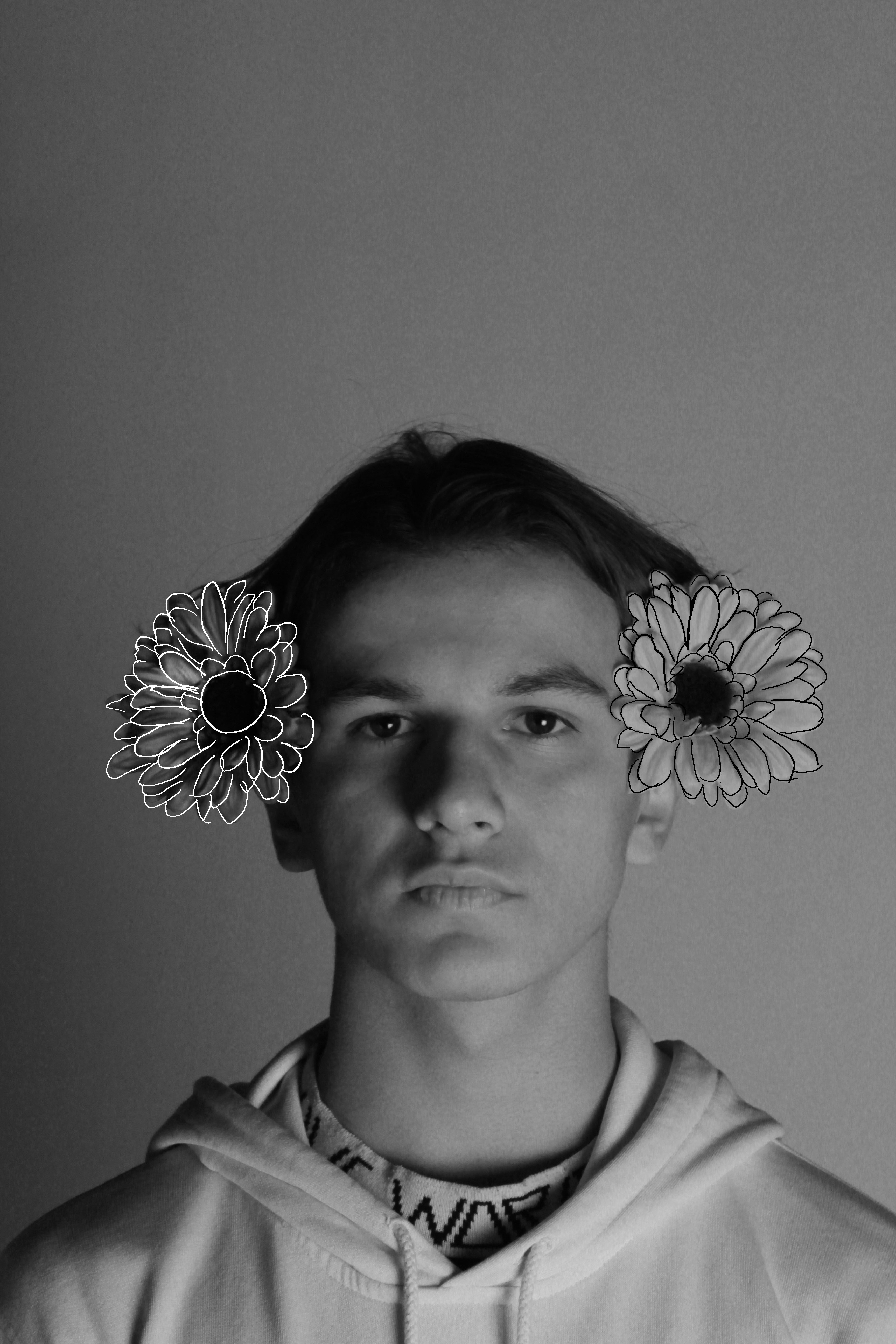
The centre photo I did in the style of Rankin and drew over the top of it after editing it.

The photo on the right I felt that it needed to be cropped and that it would look good in black and white.

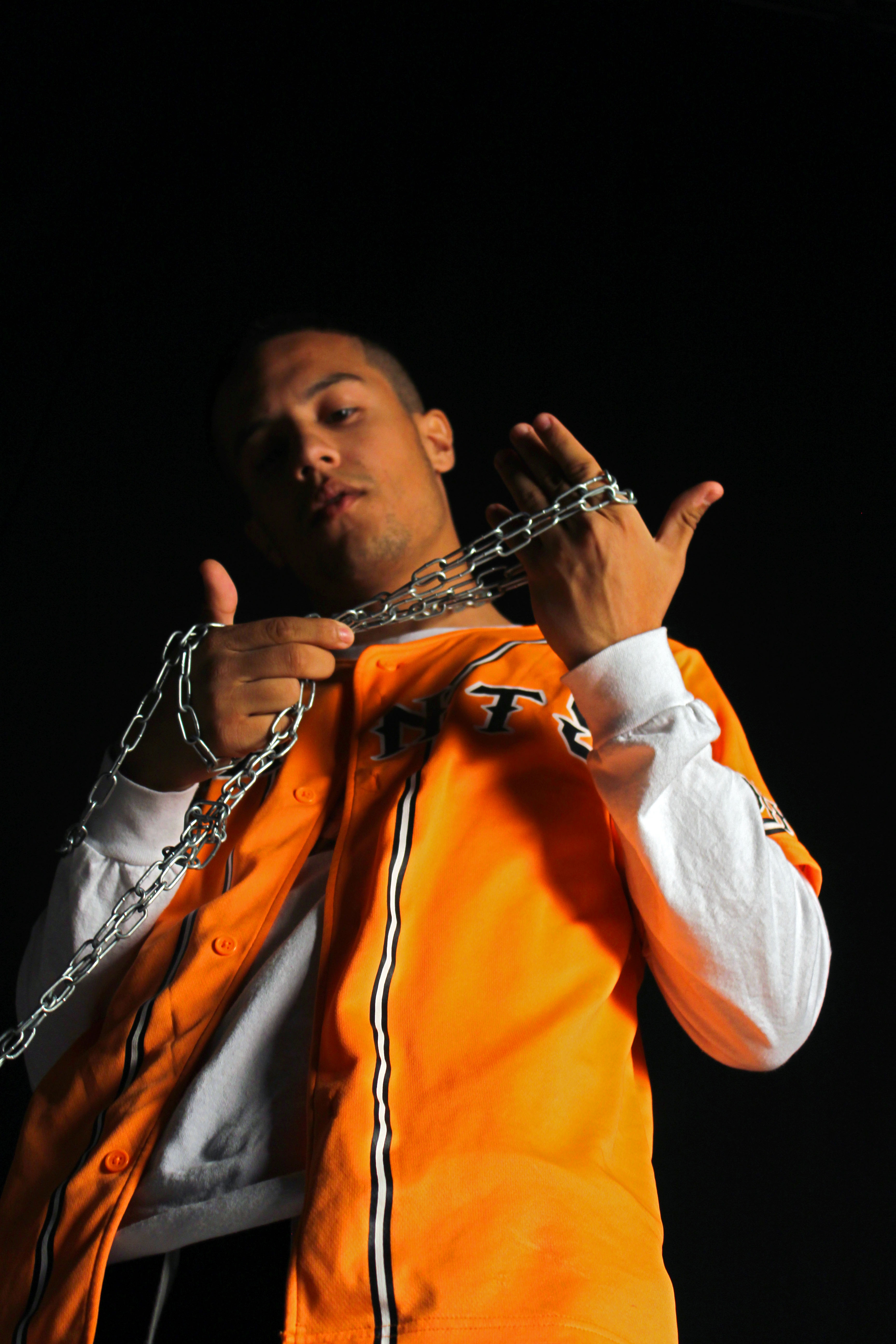
And the left photo I felt that it was composted fine and that i only needed to touch it up and make the colours pop more.

Here are the results: