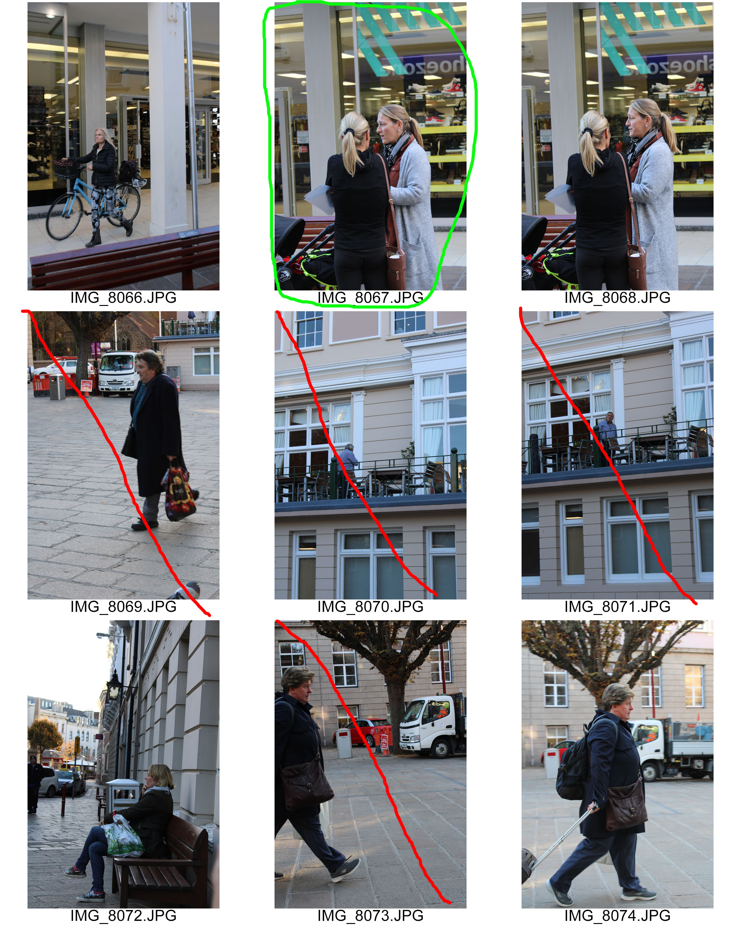
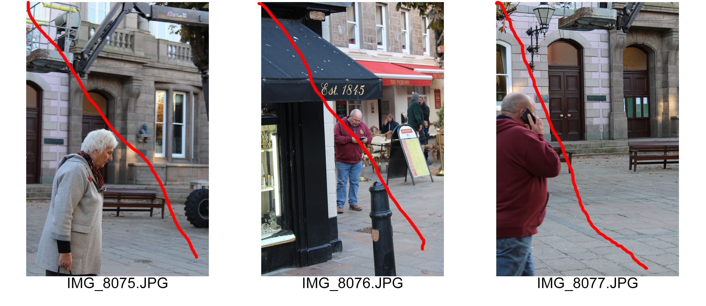
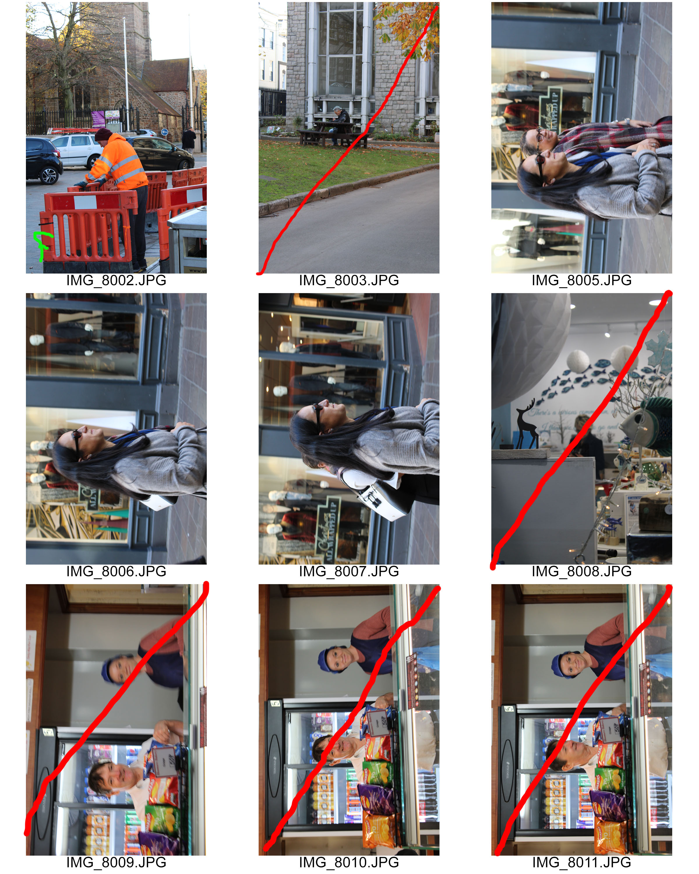
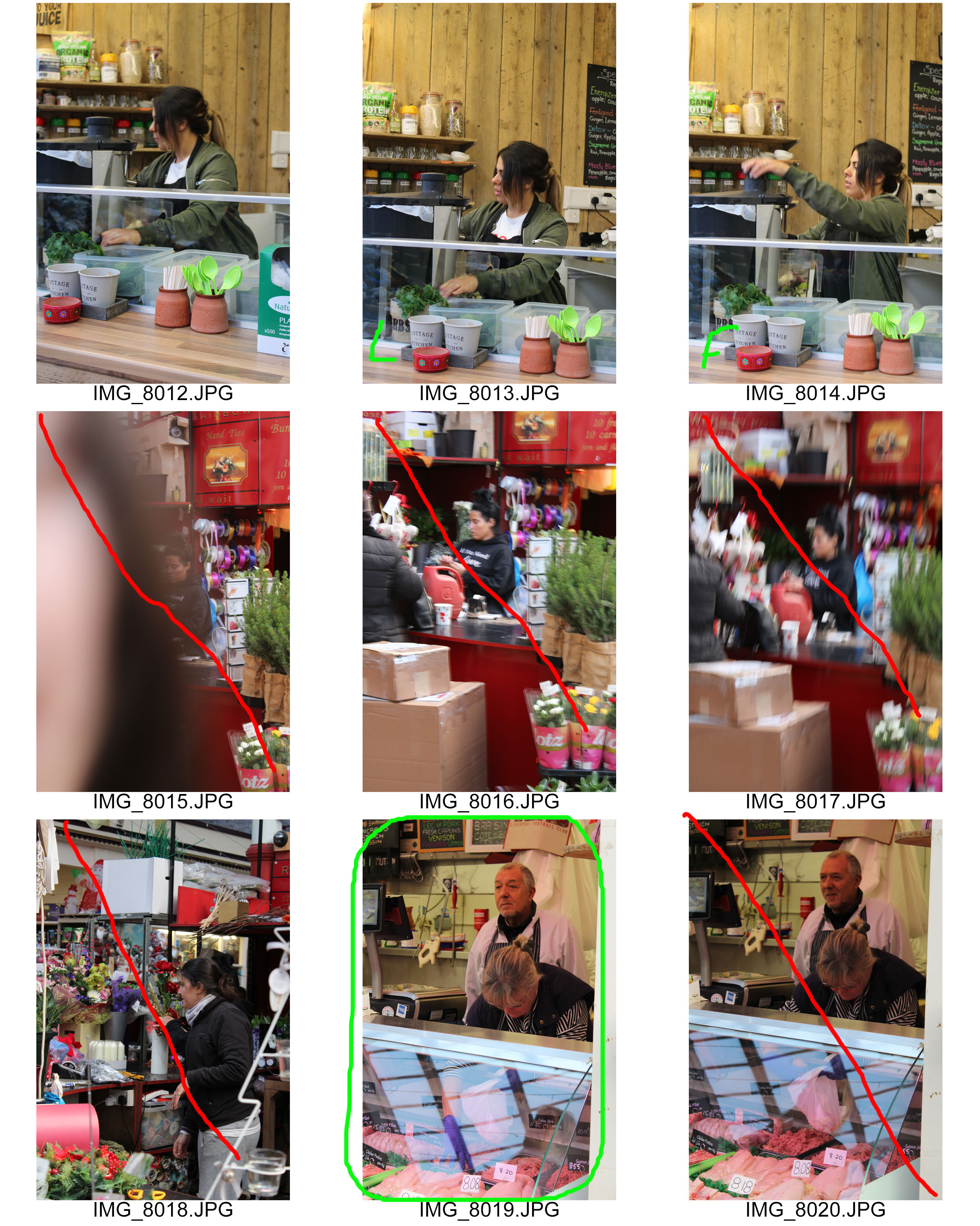
Street Photography Shoot

Street Photography Photo-shoot

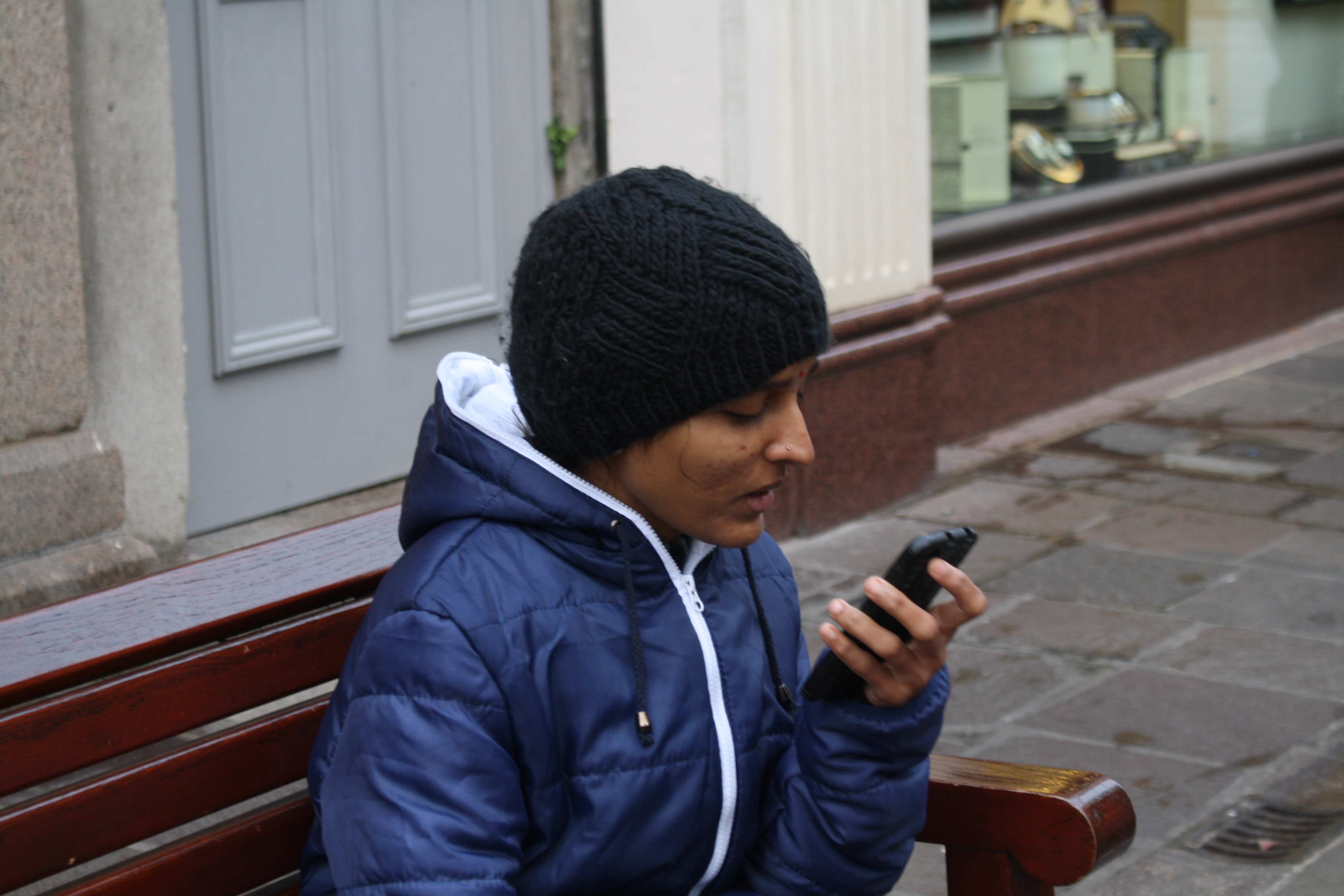
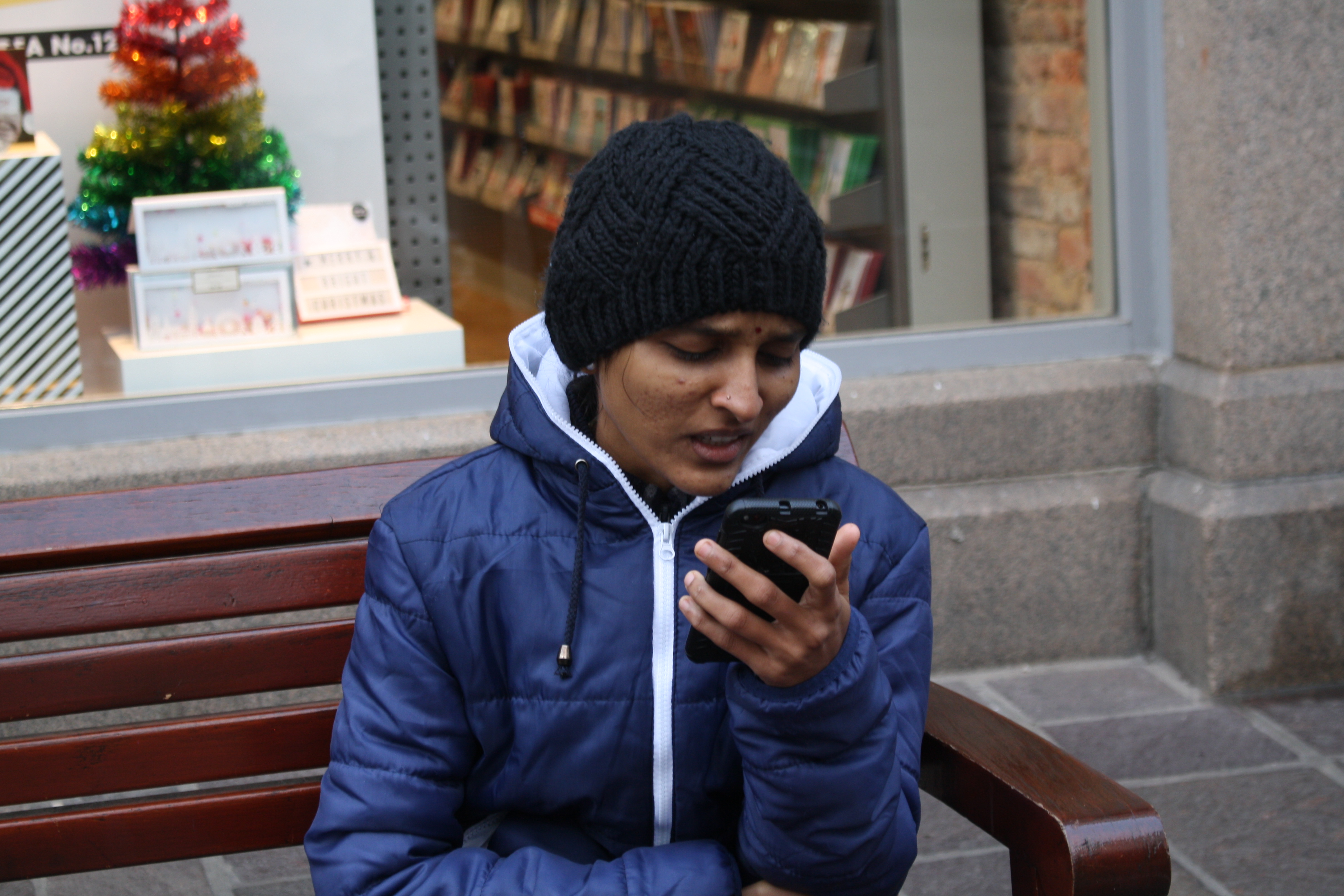
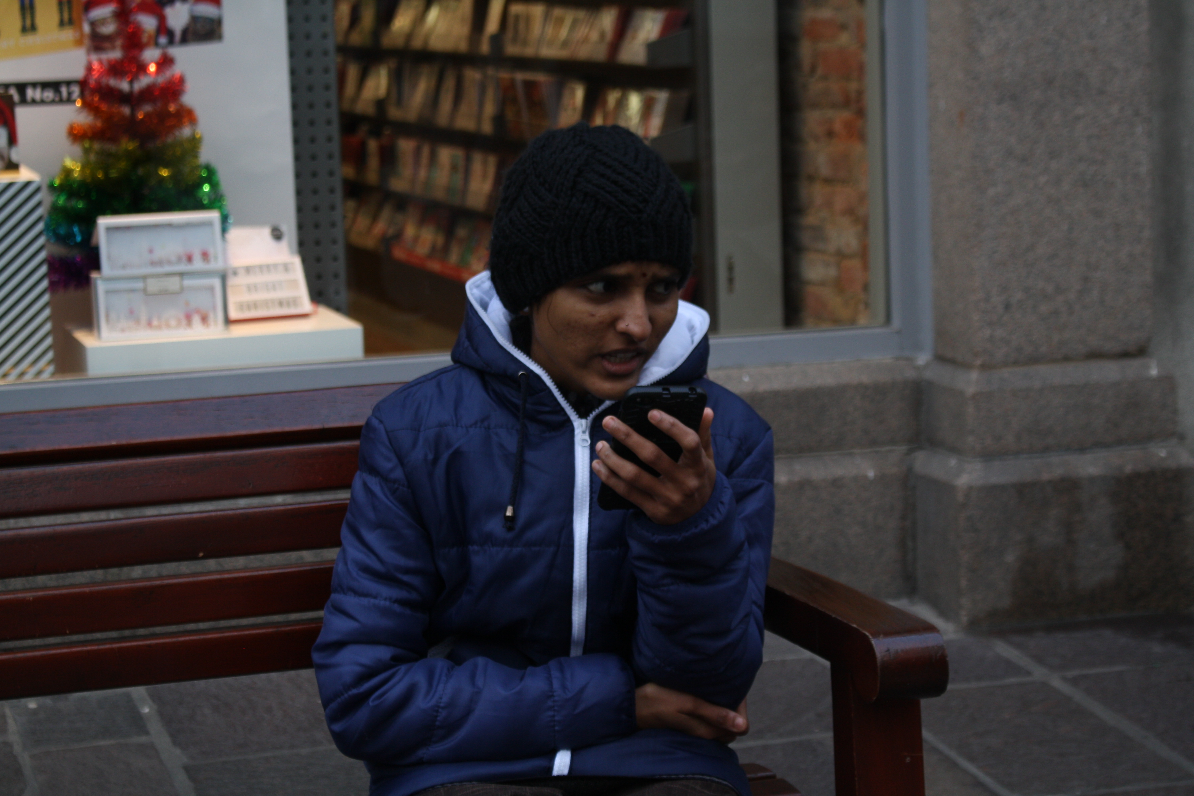
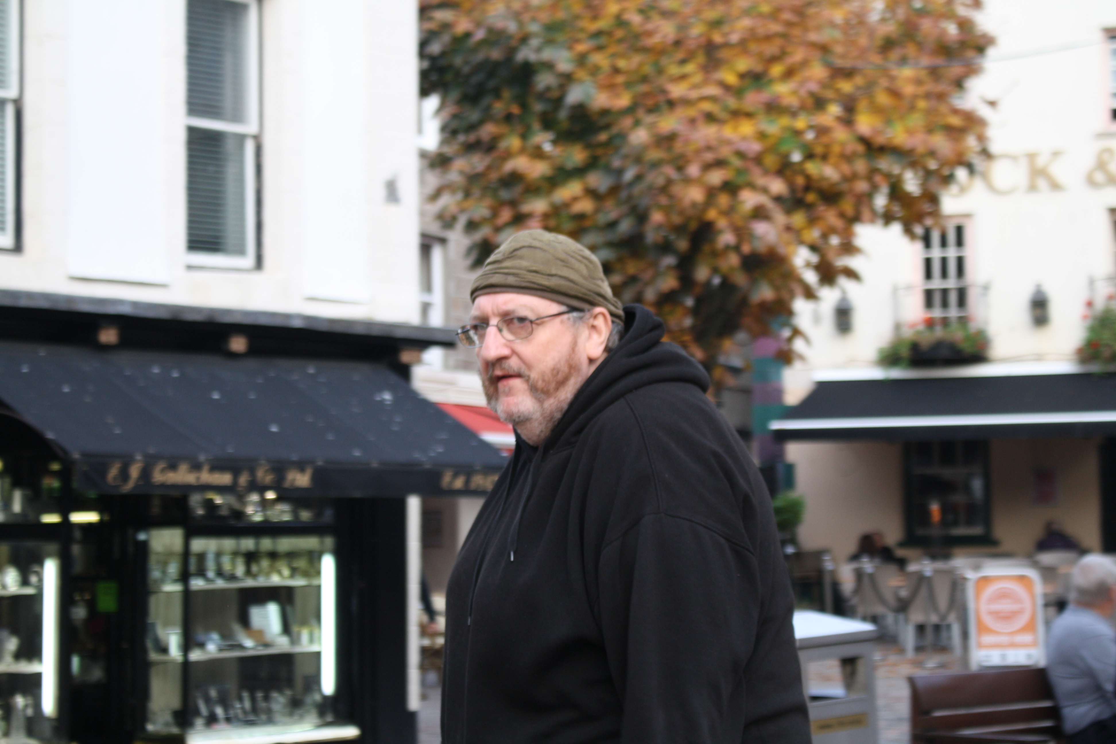
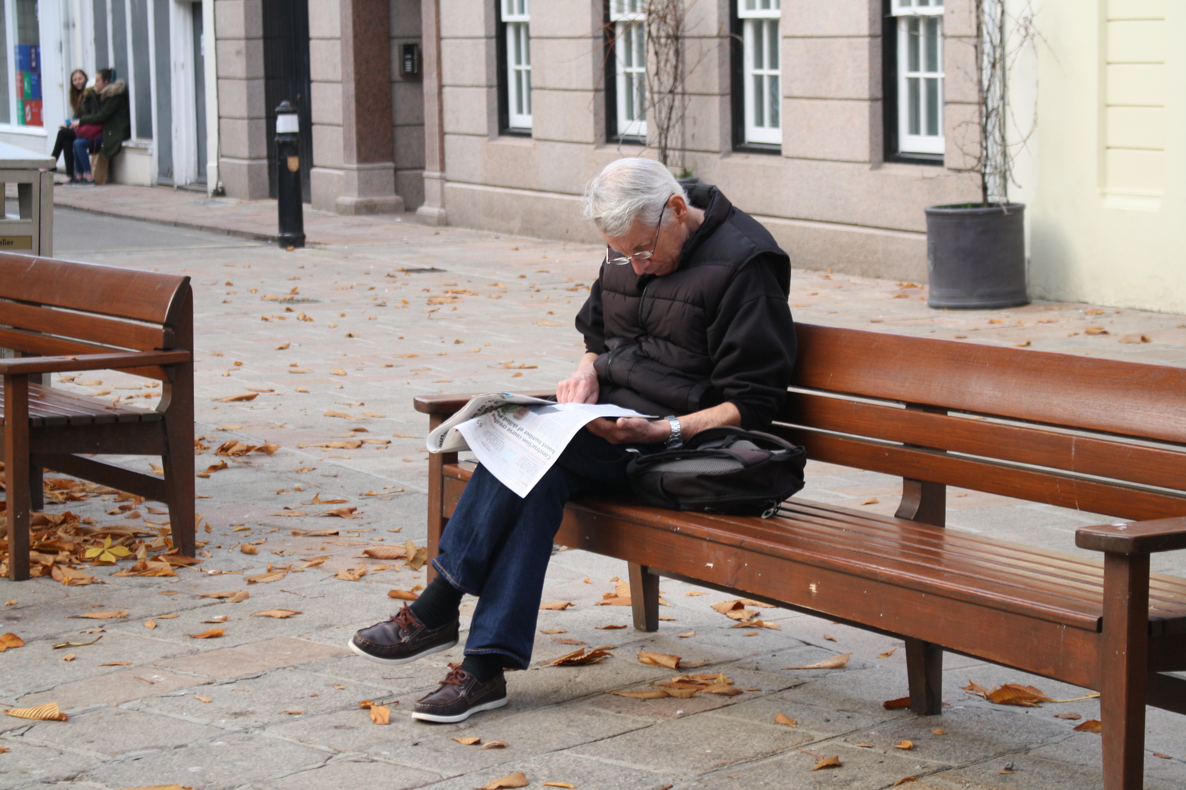
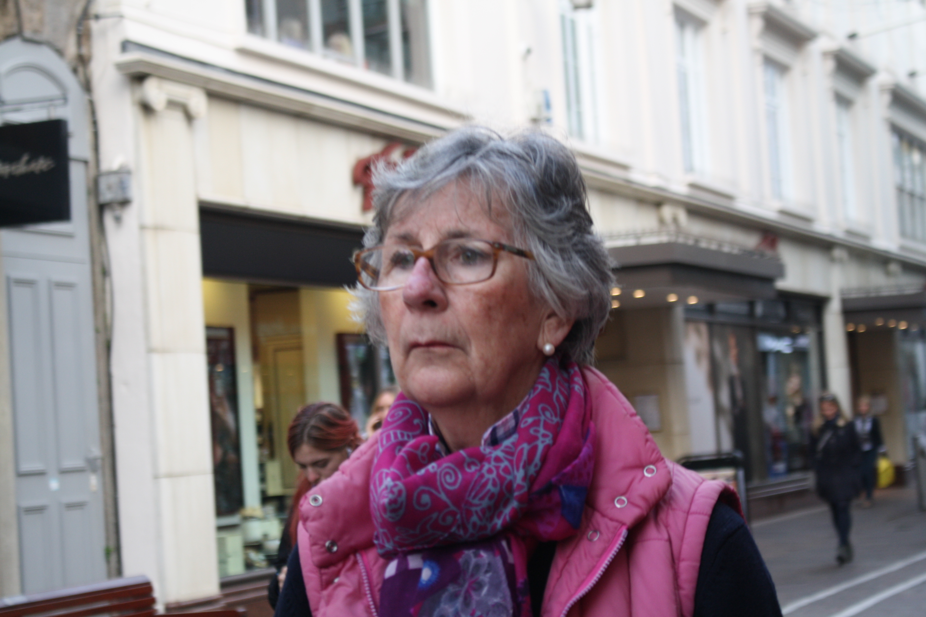
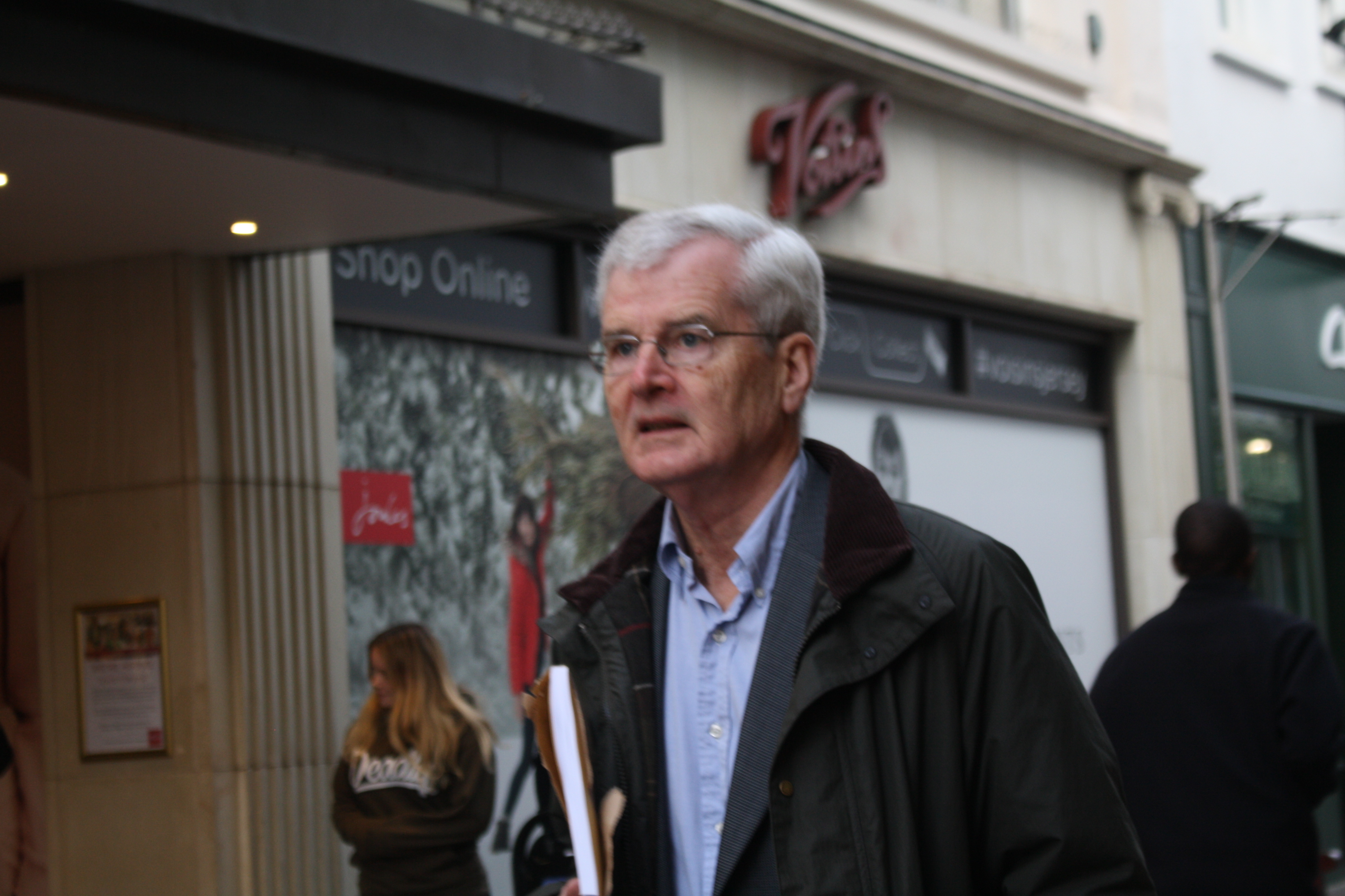
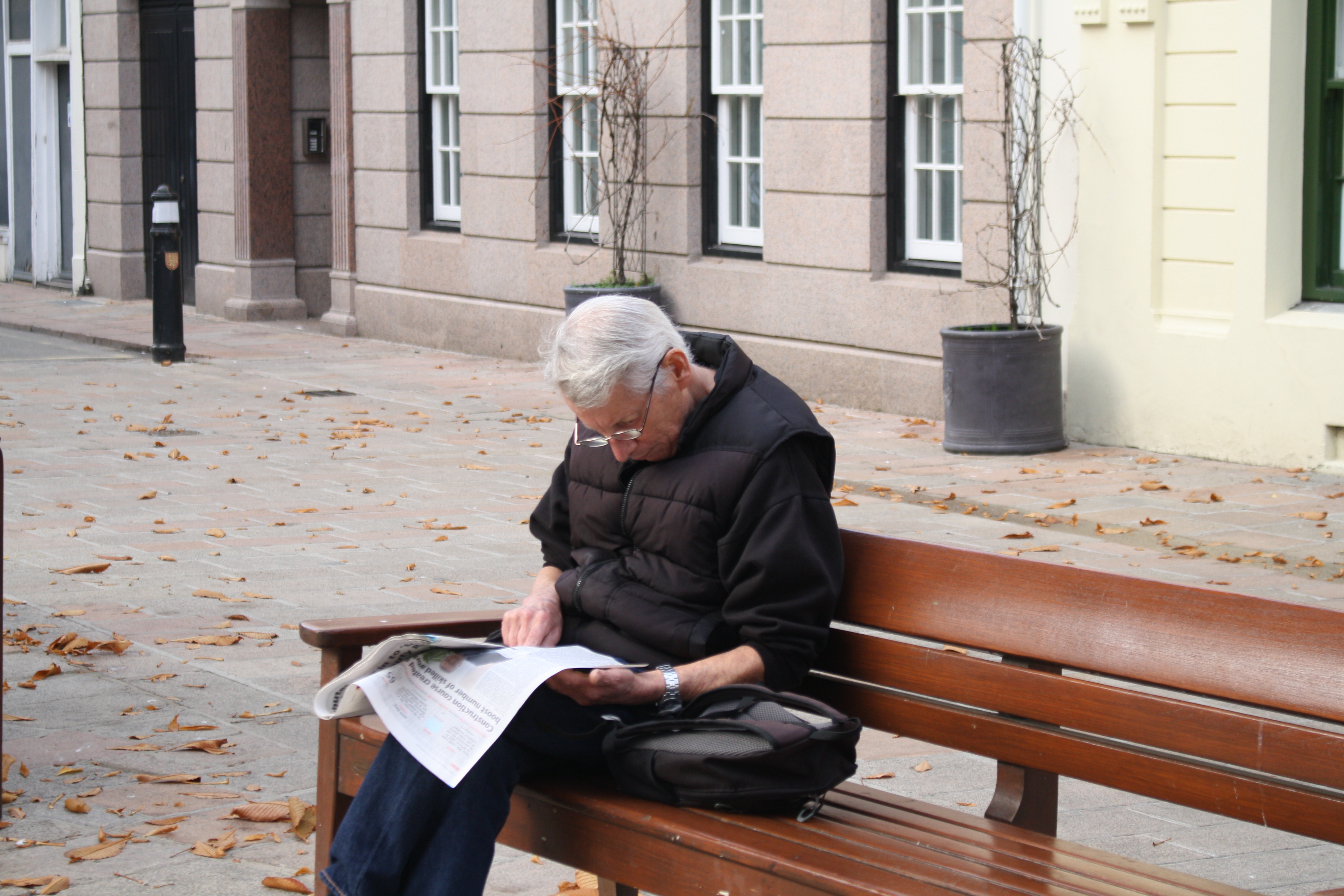
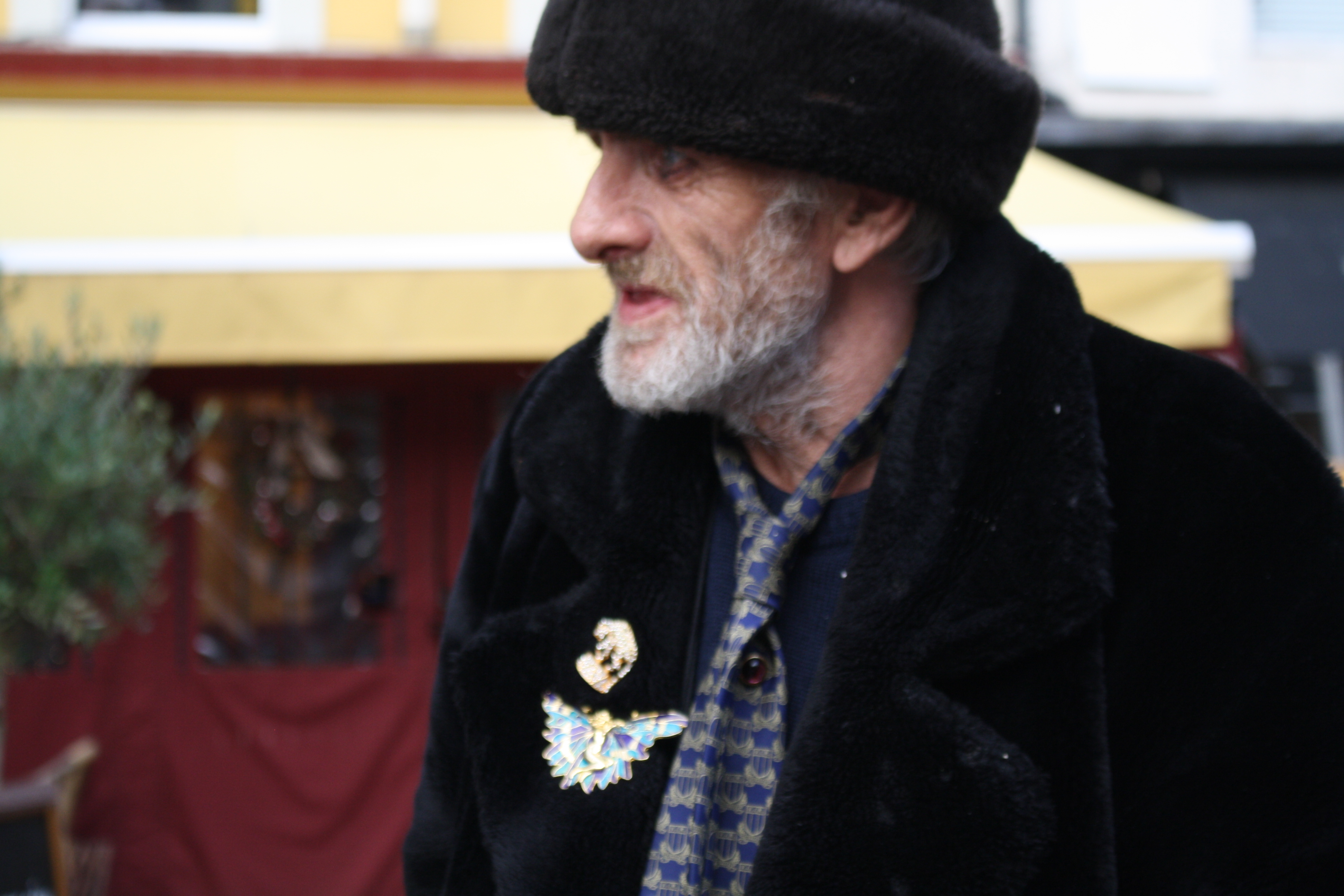
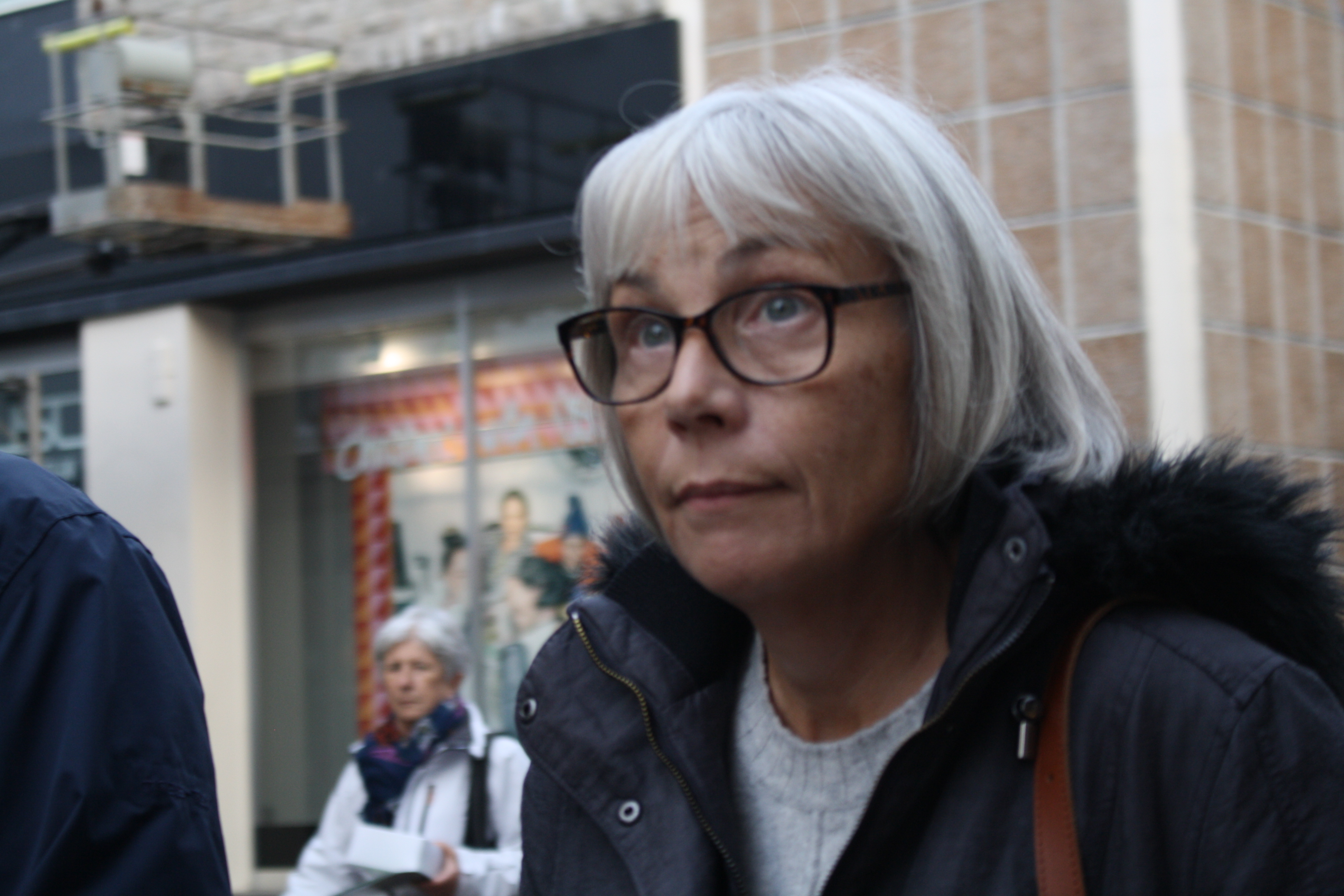
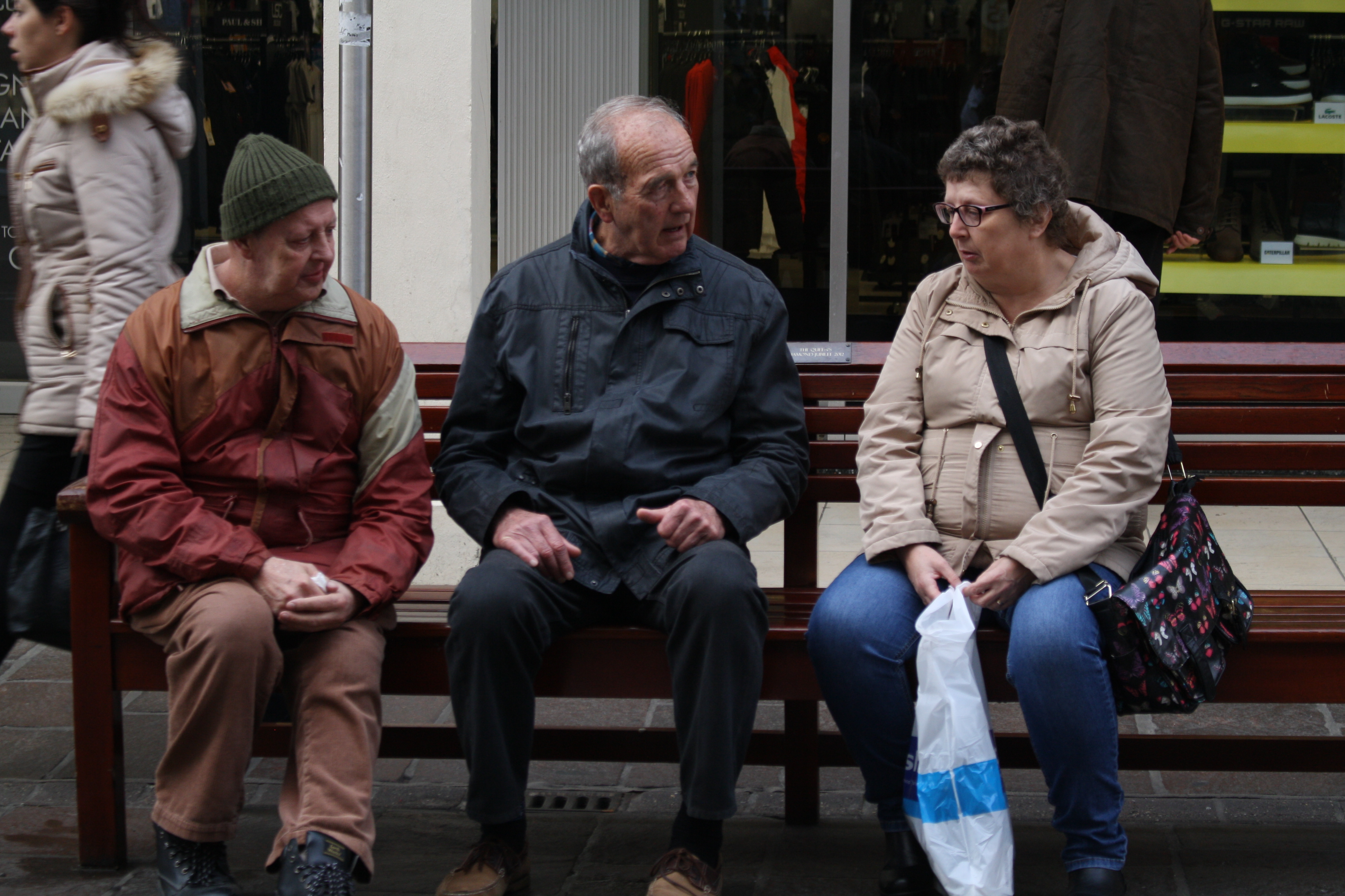
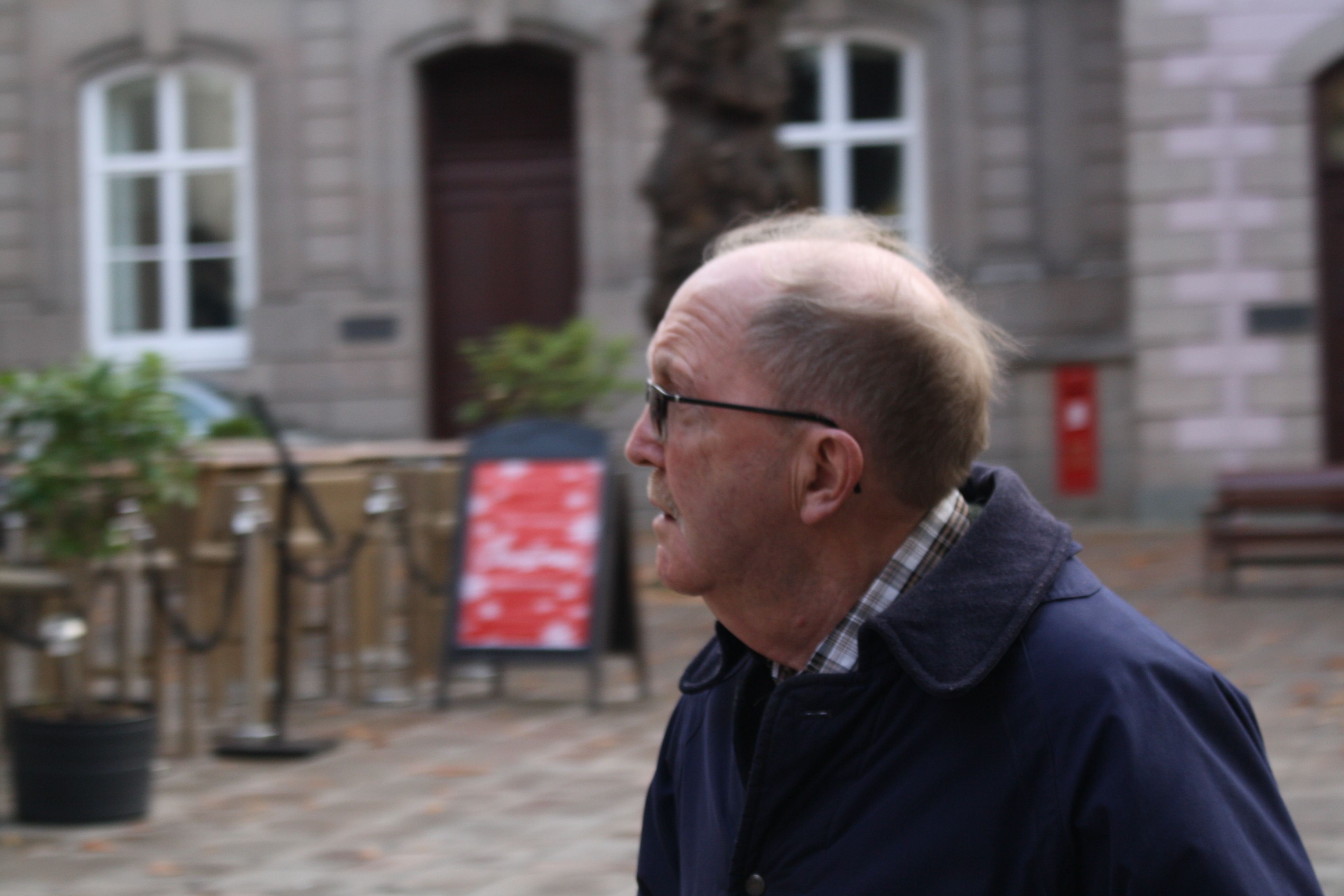
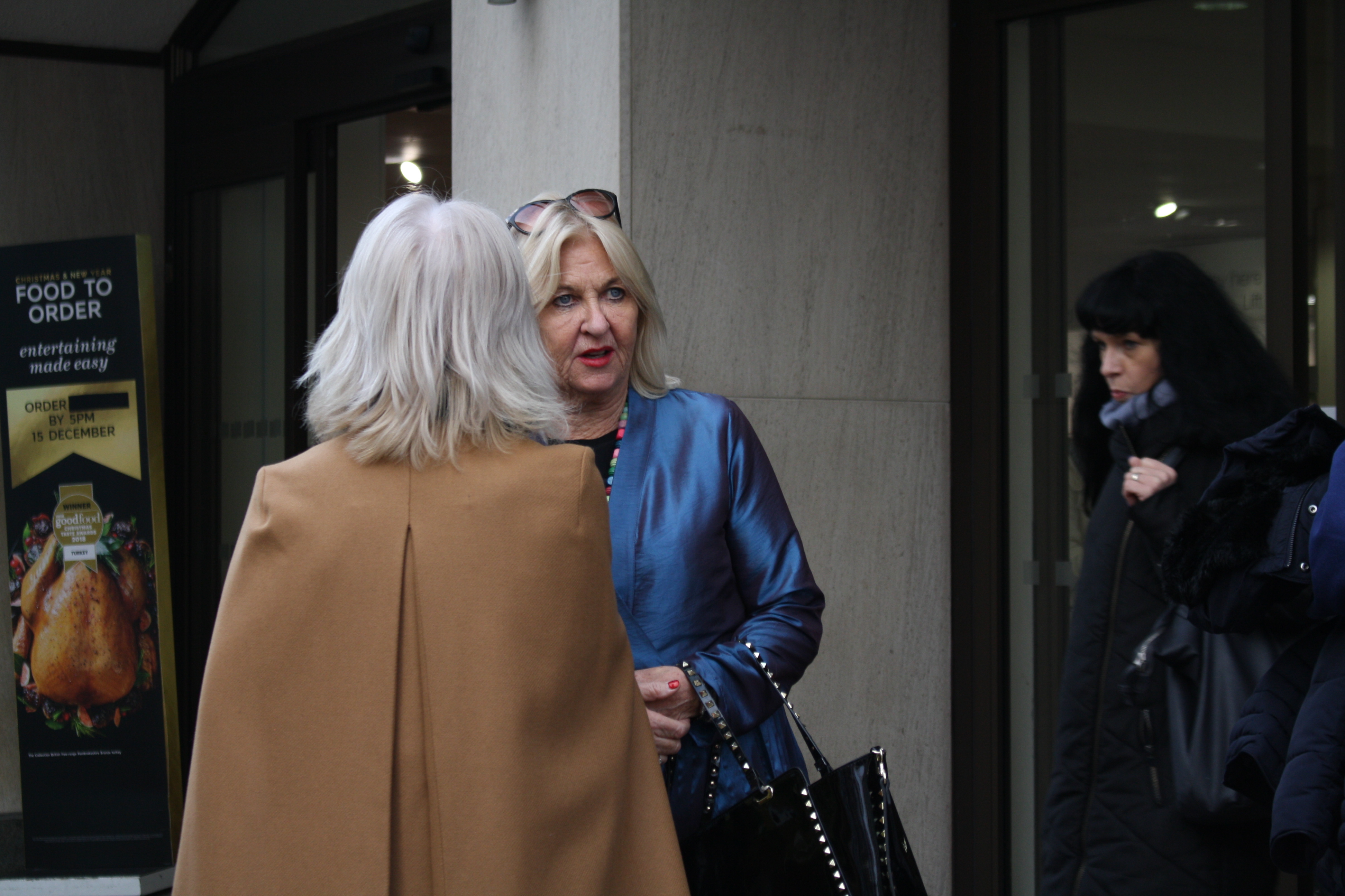
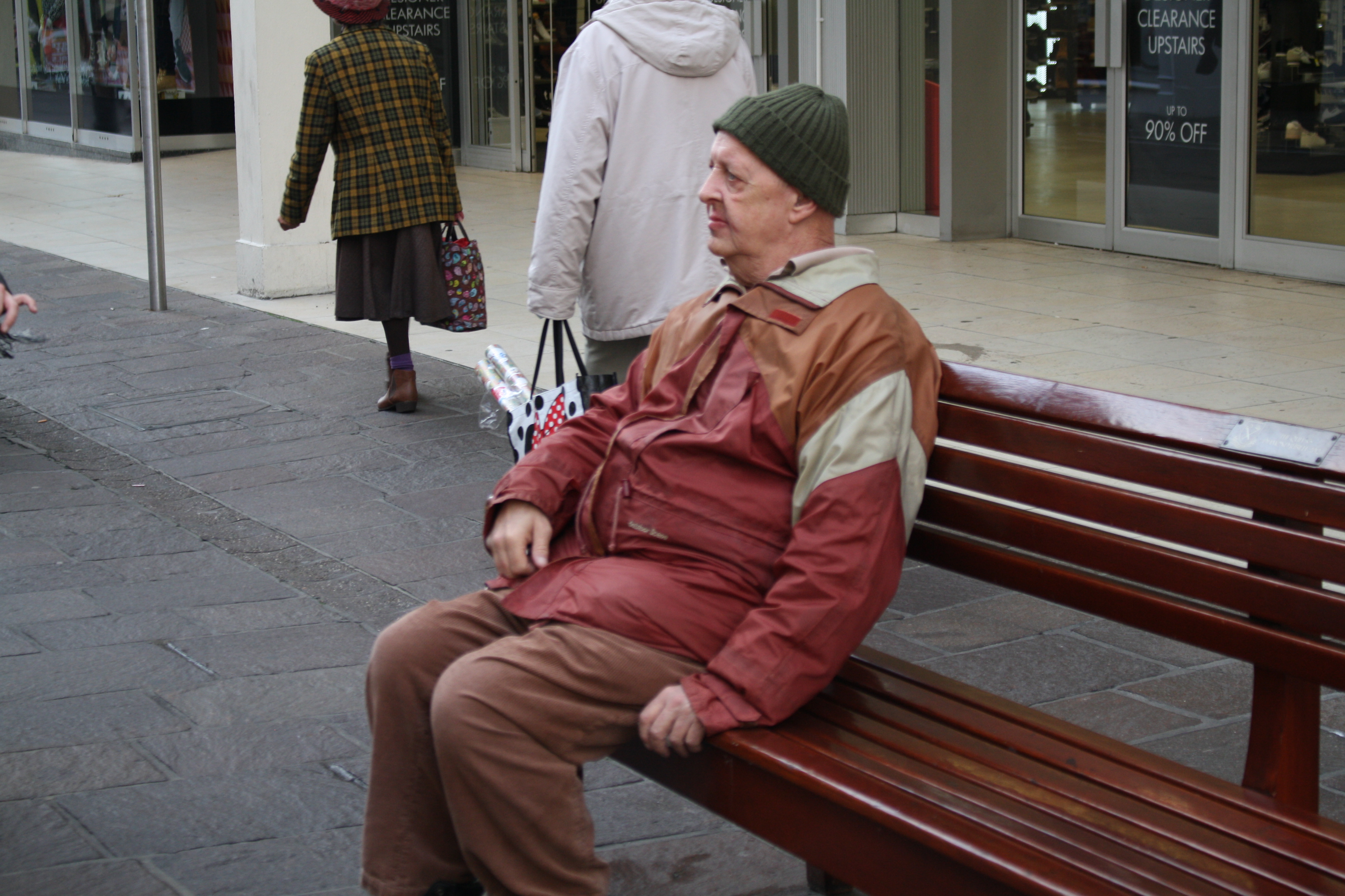
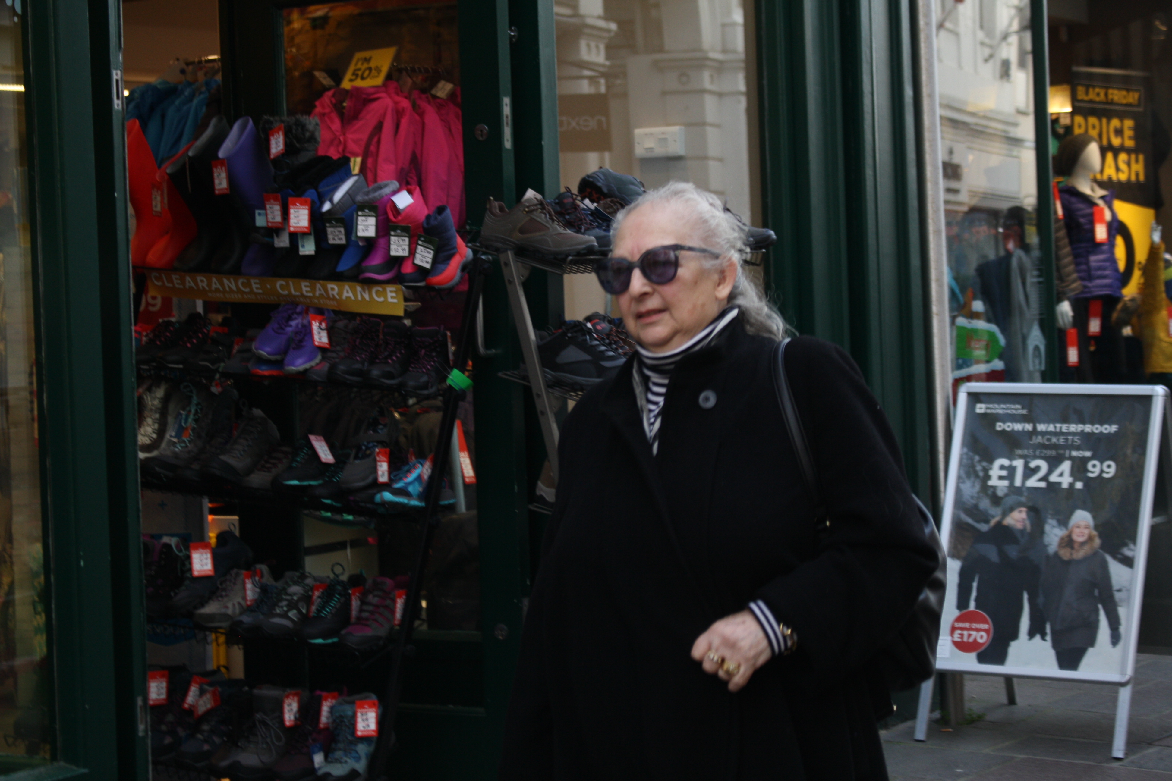
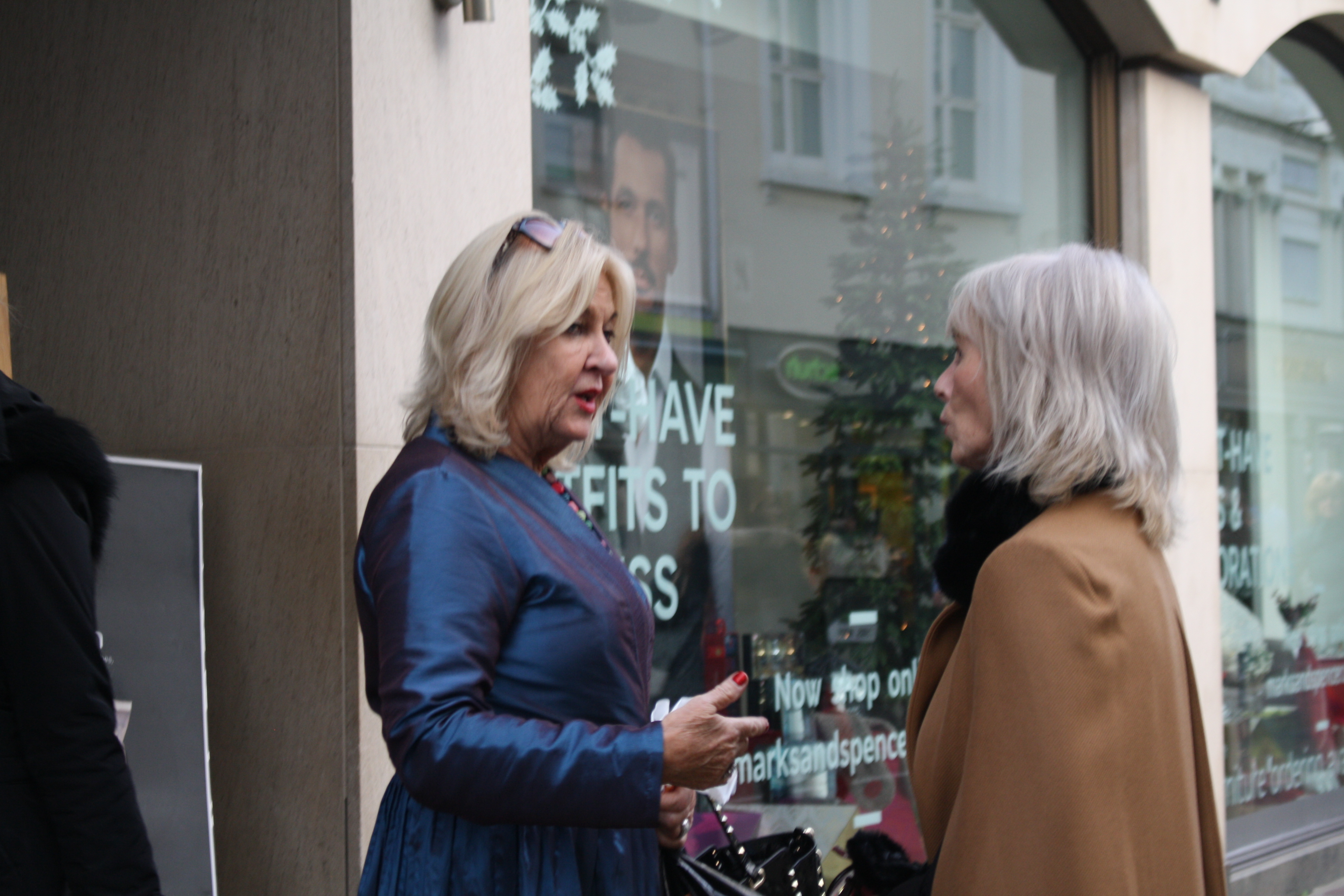
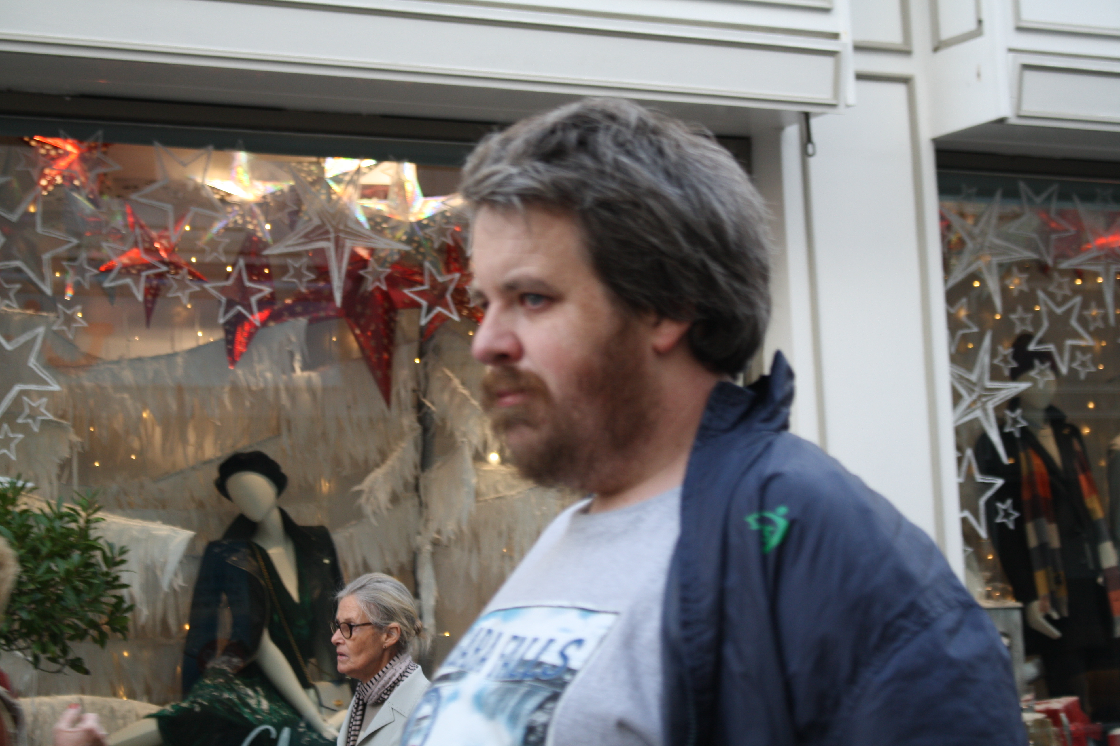
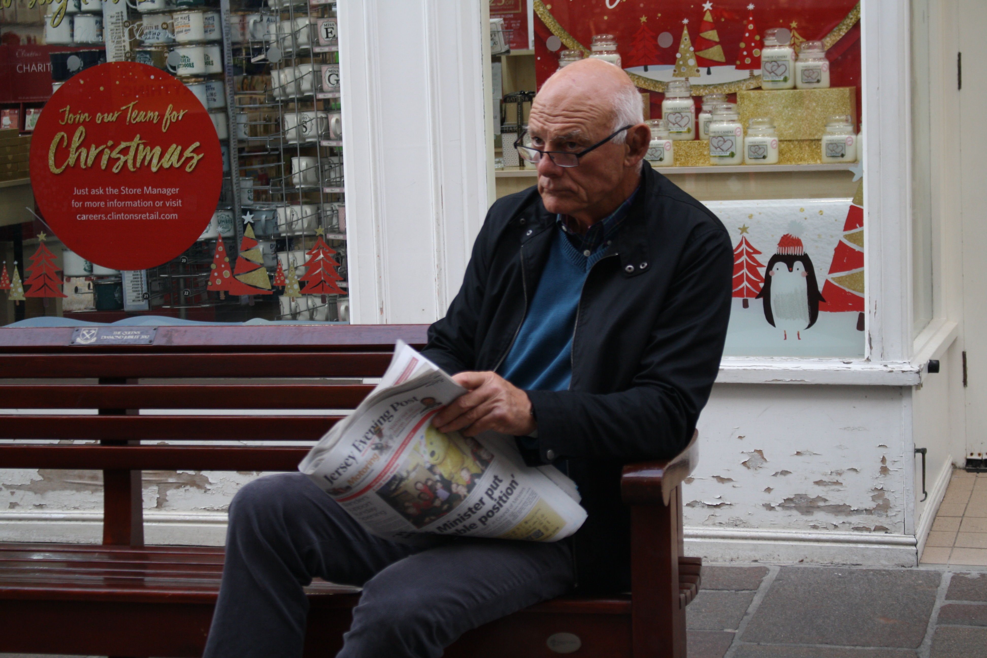
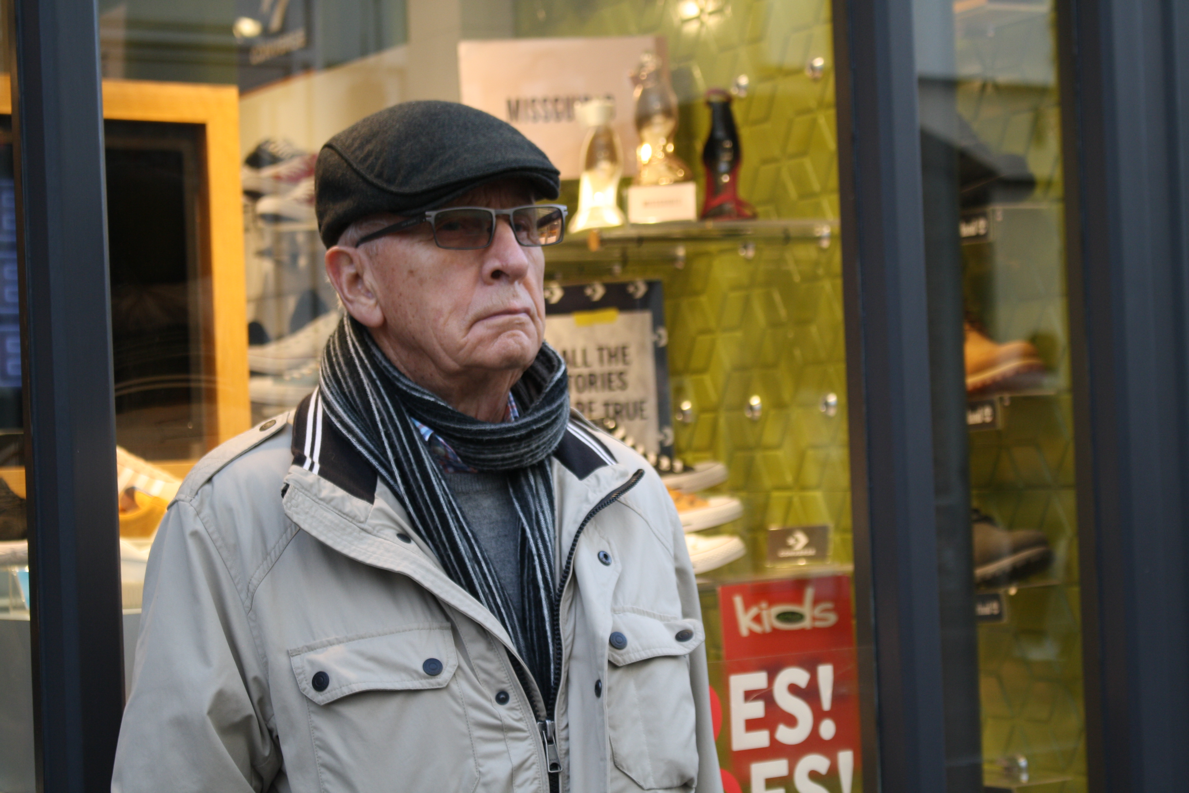
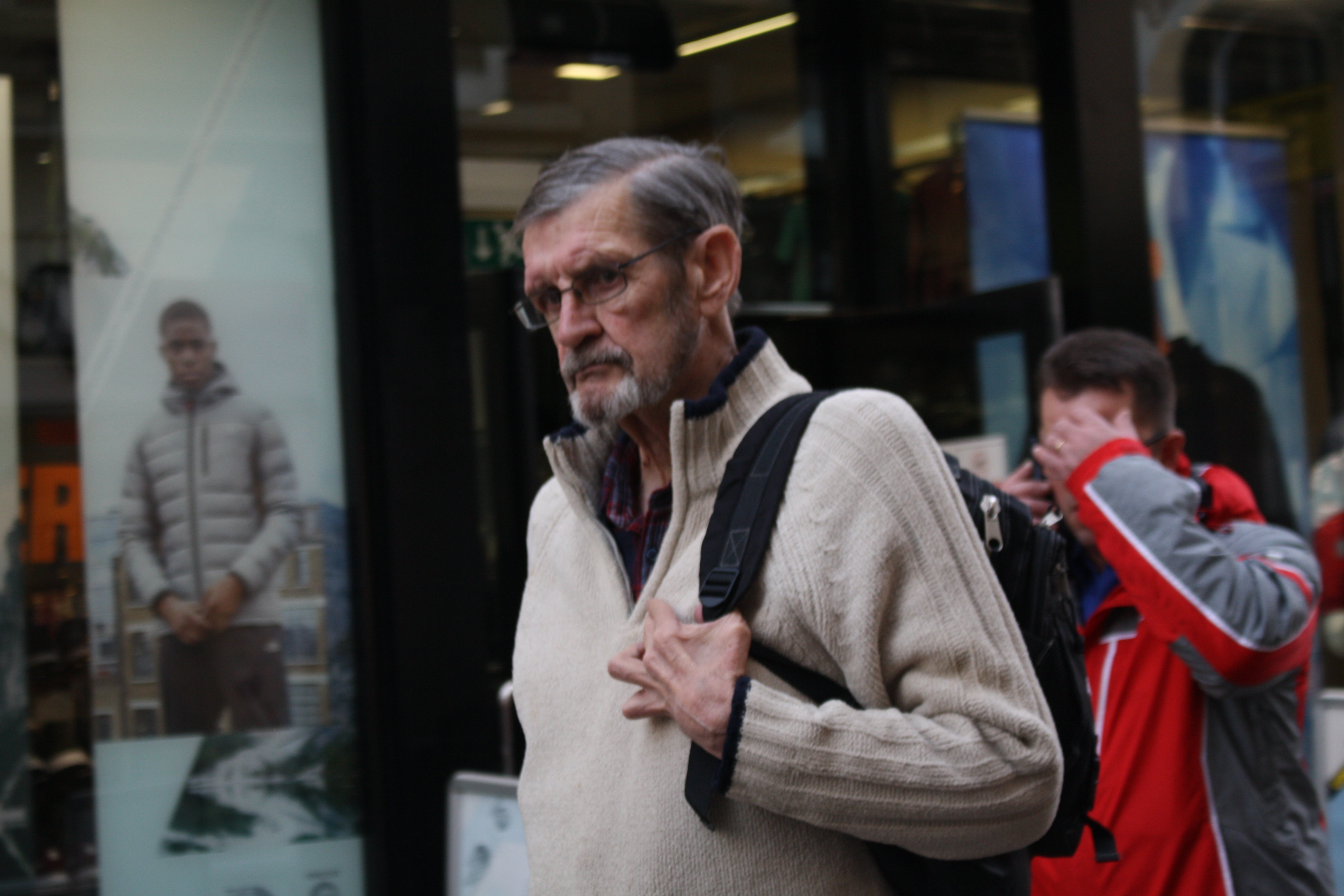
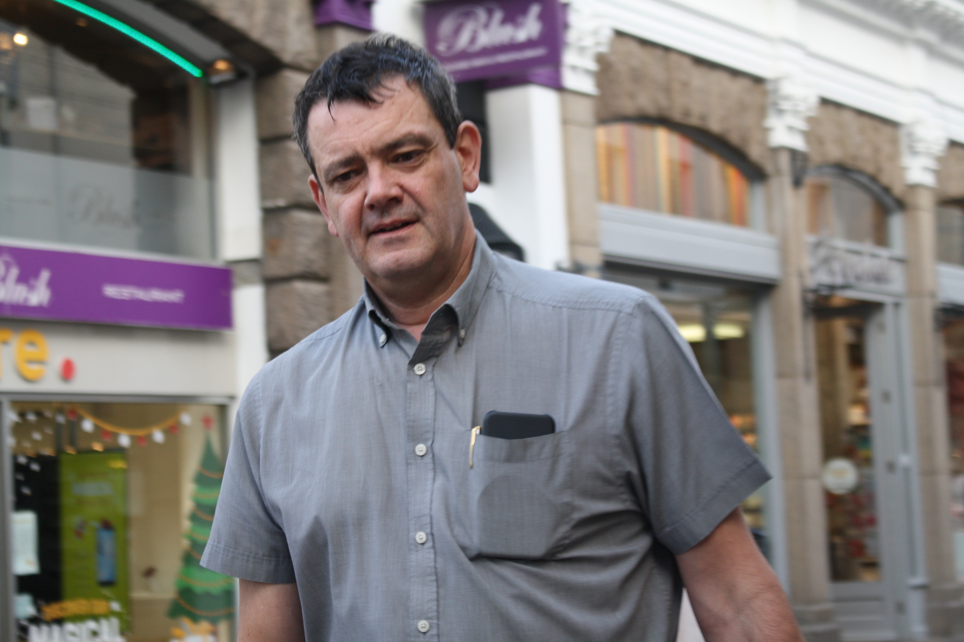
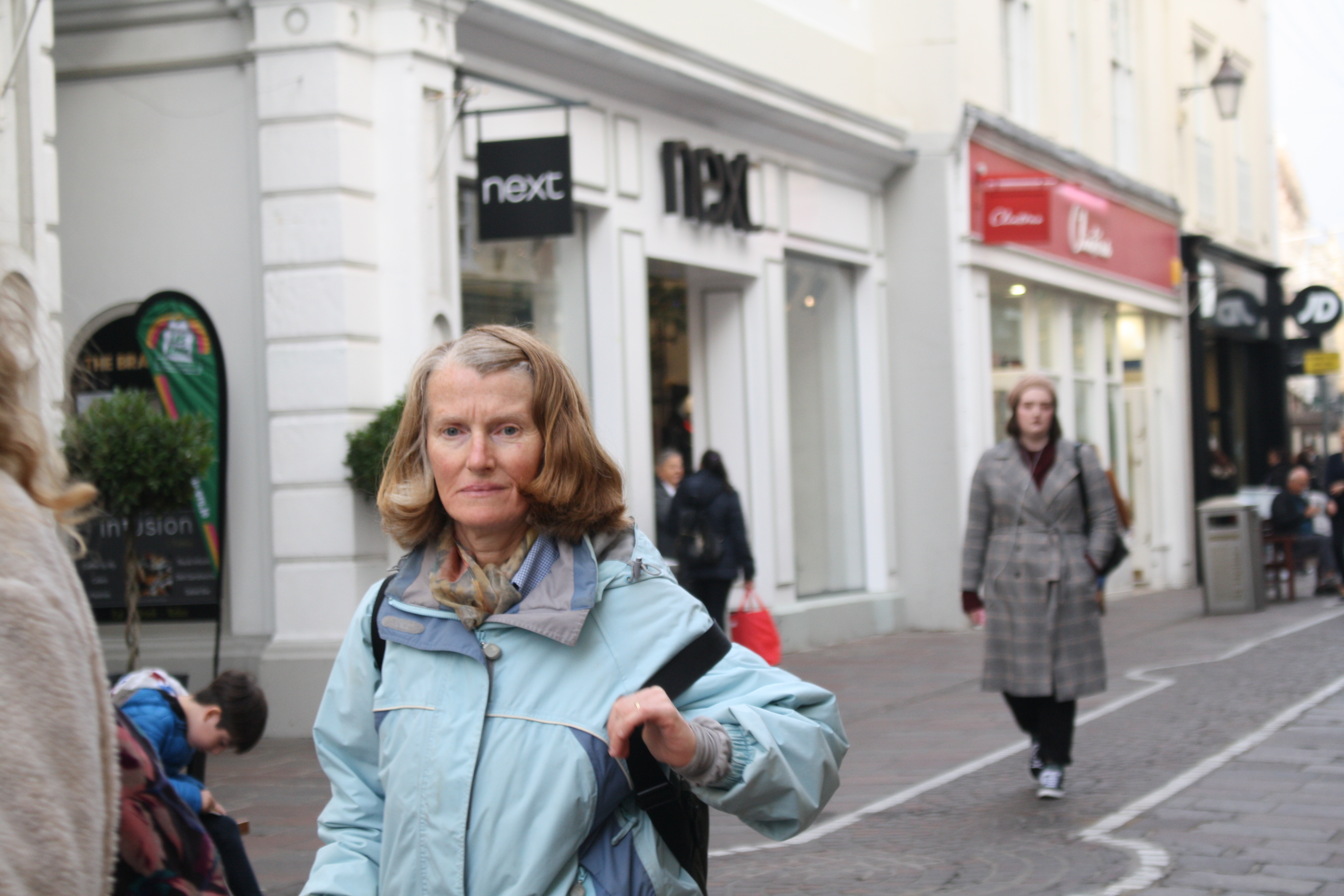
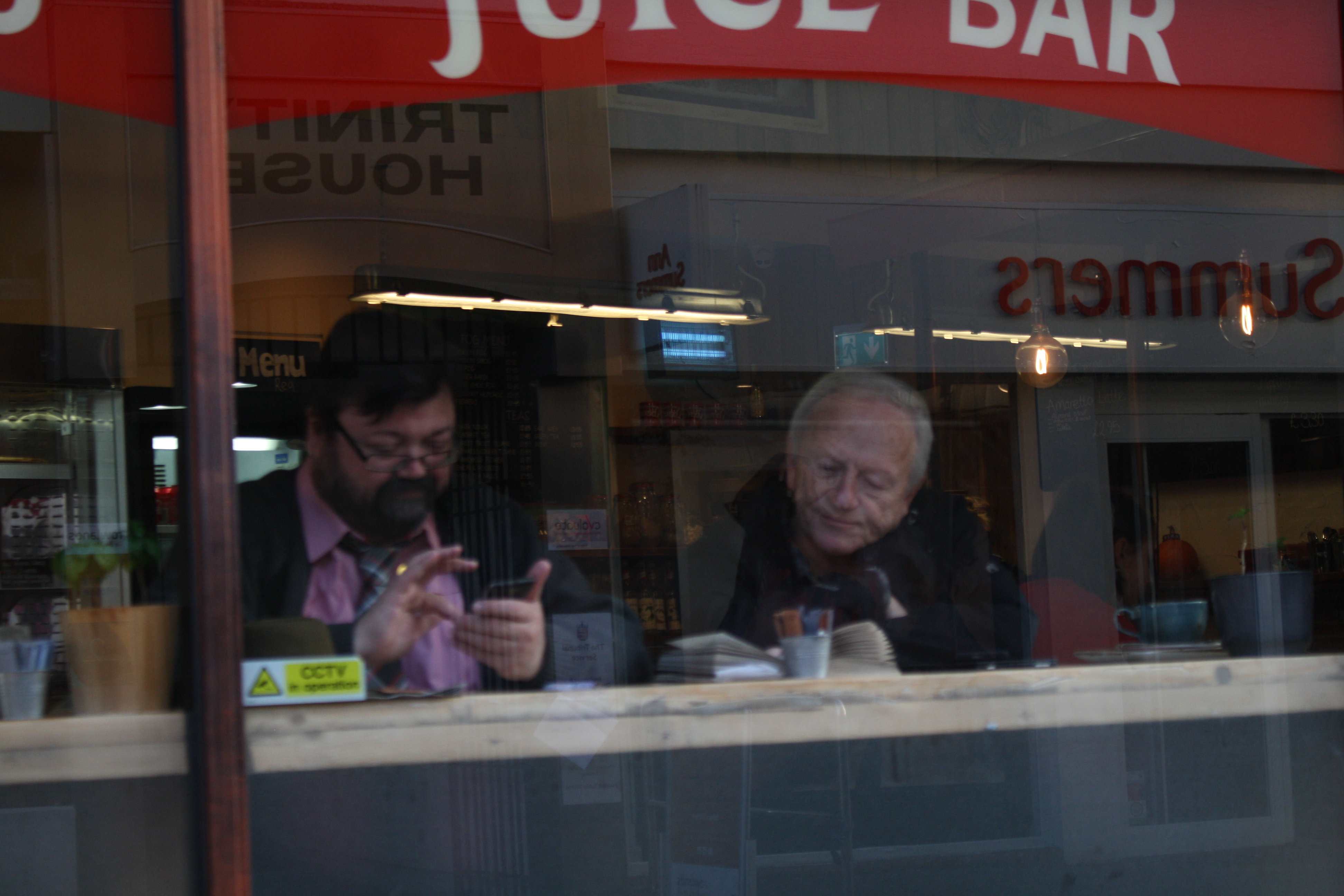
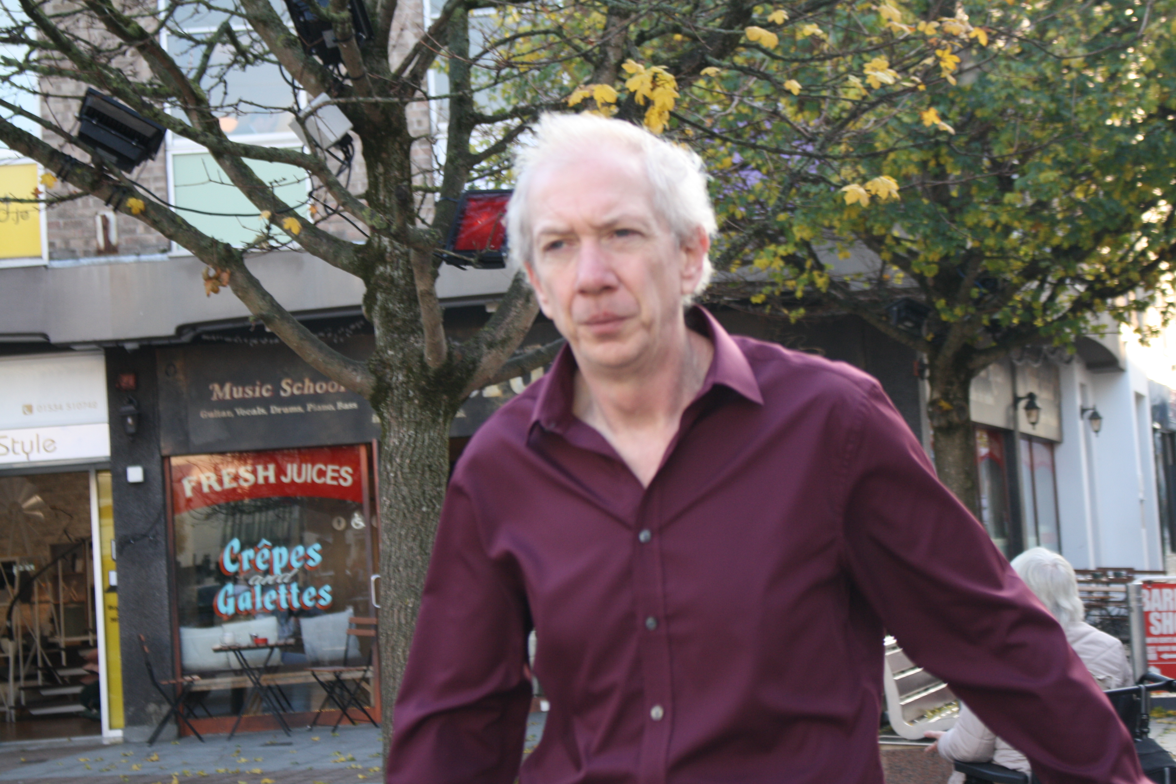
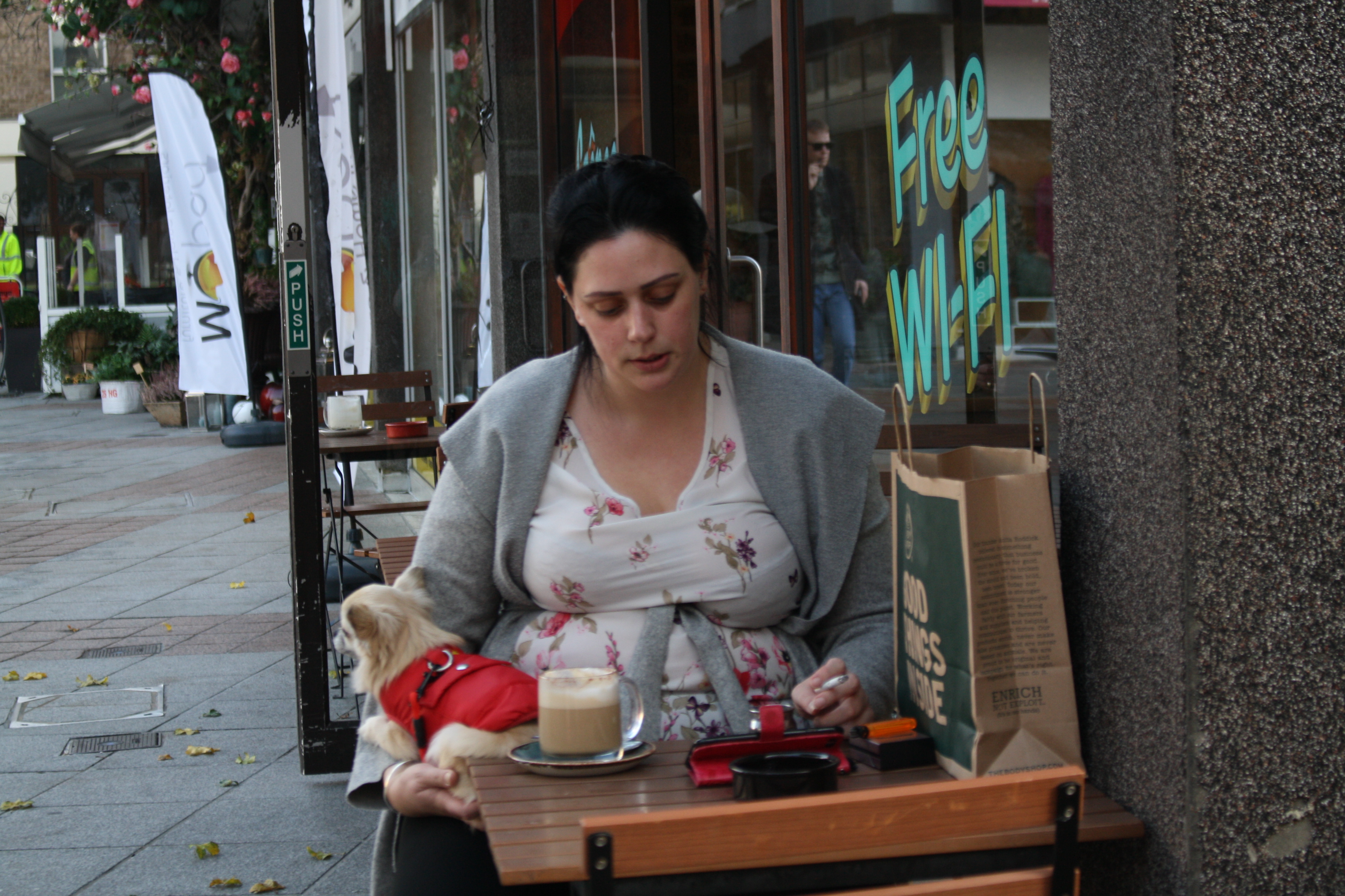
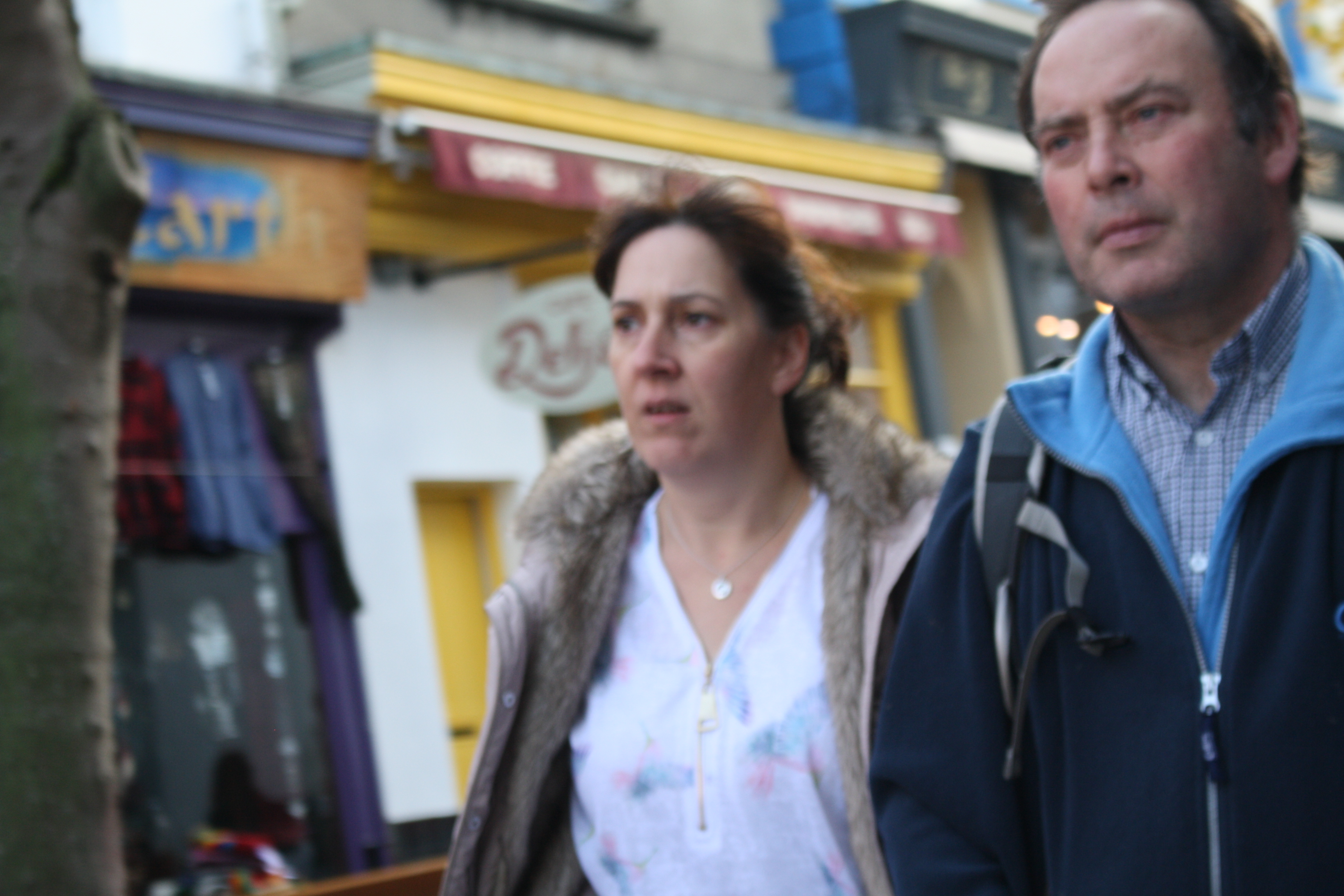
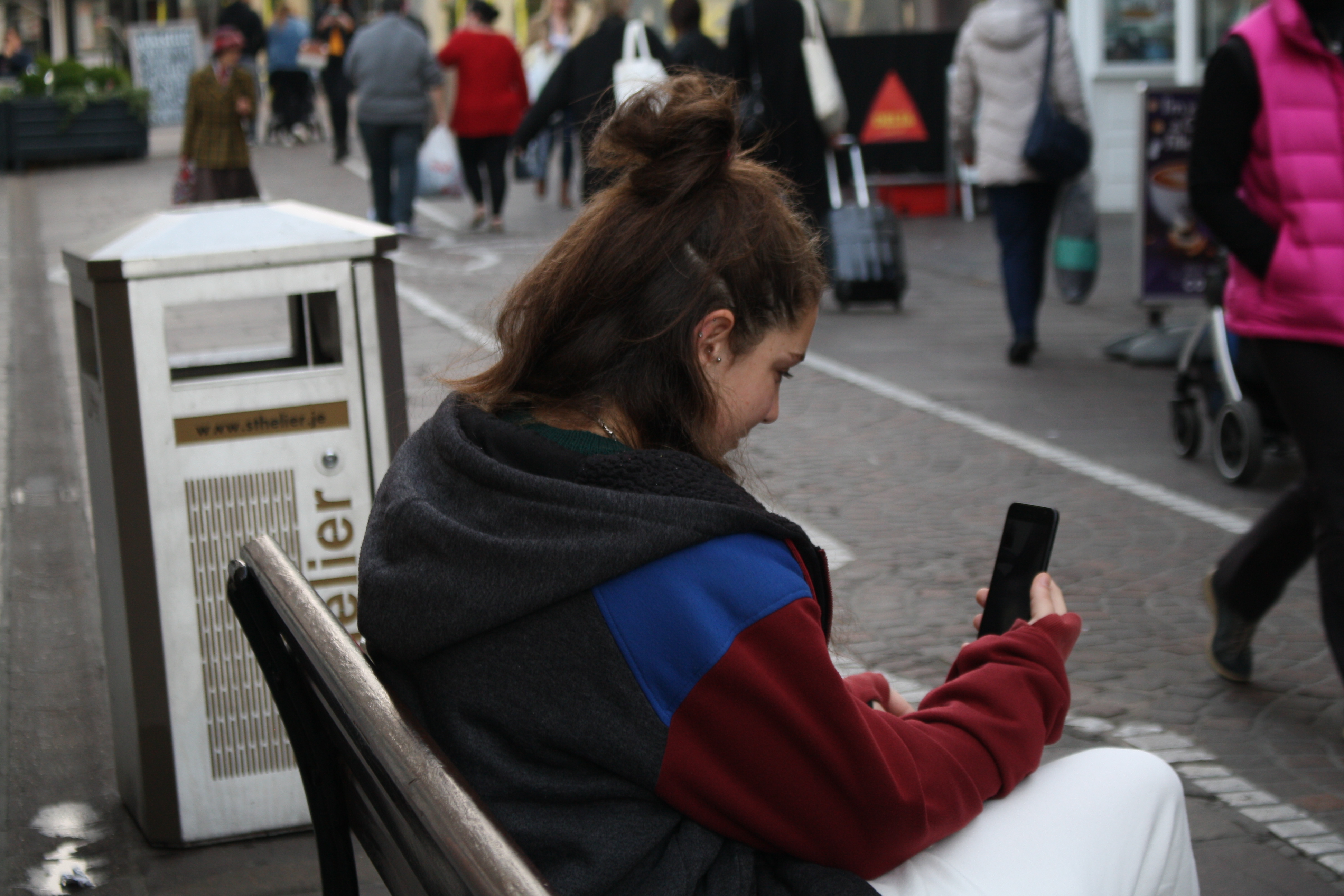
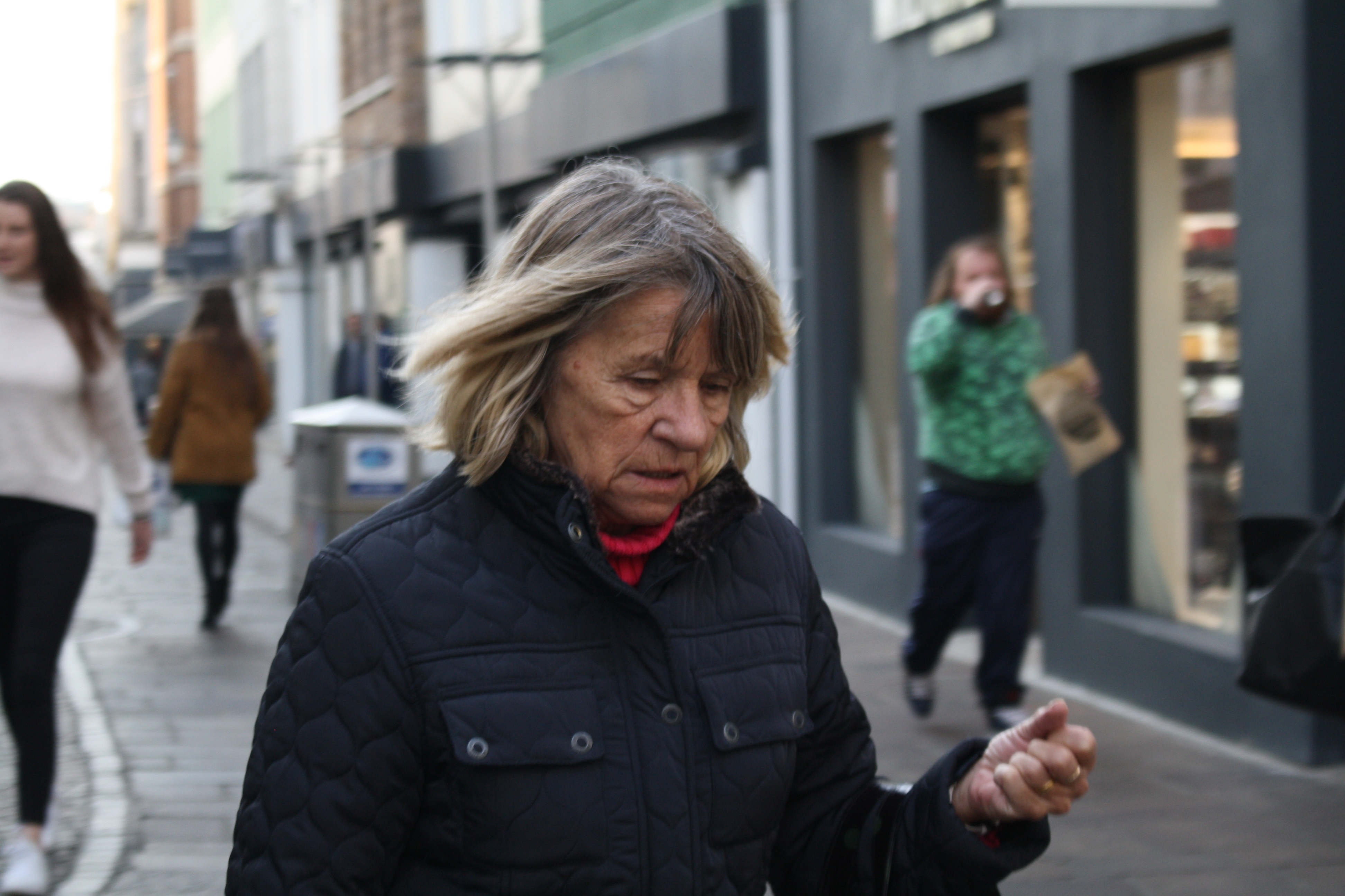
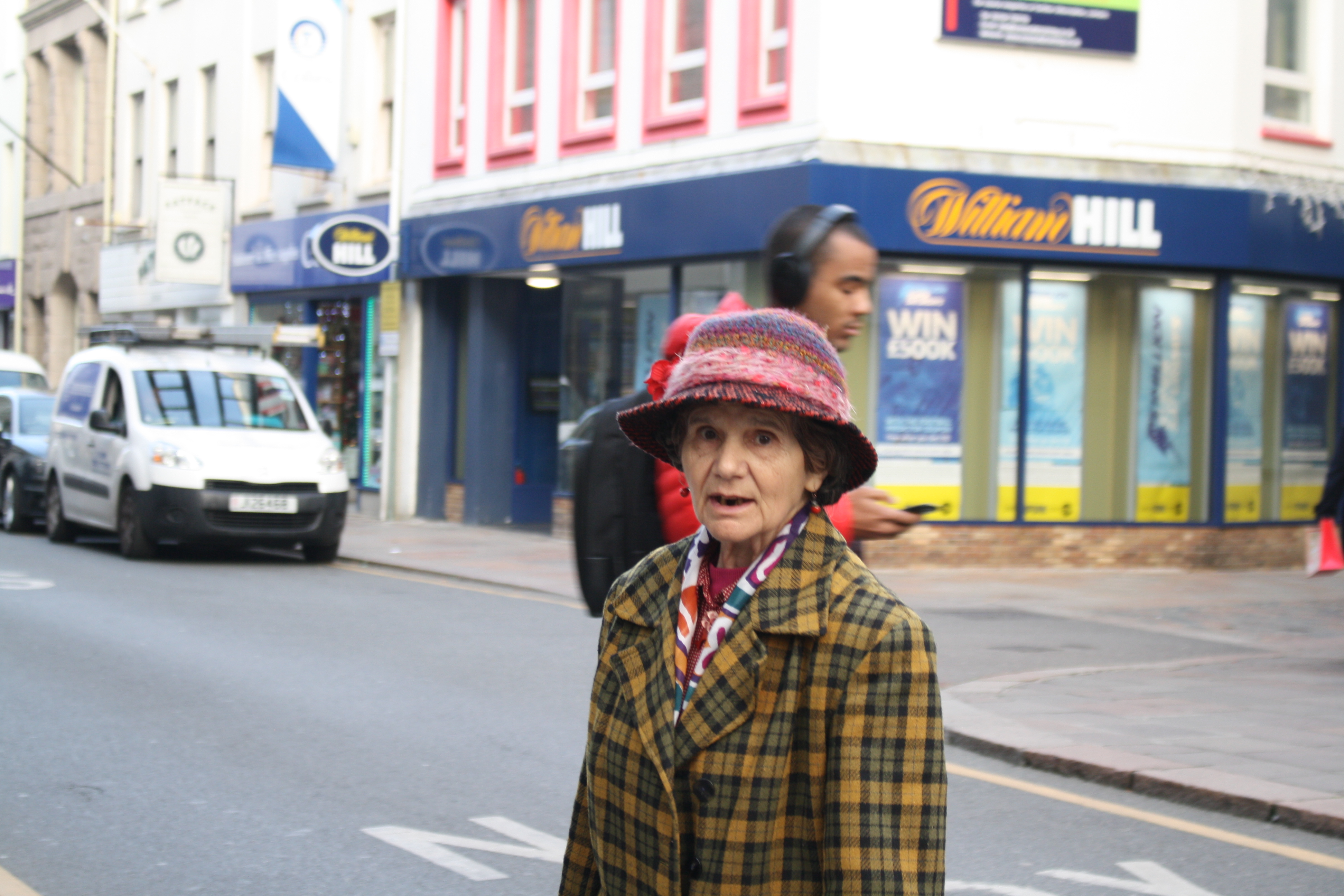
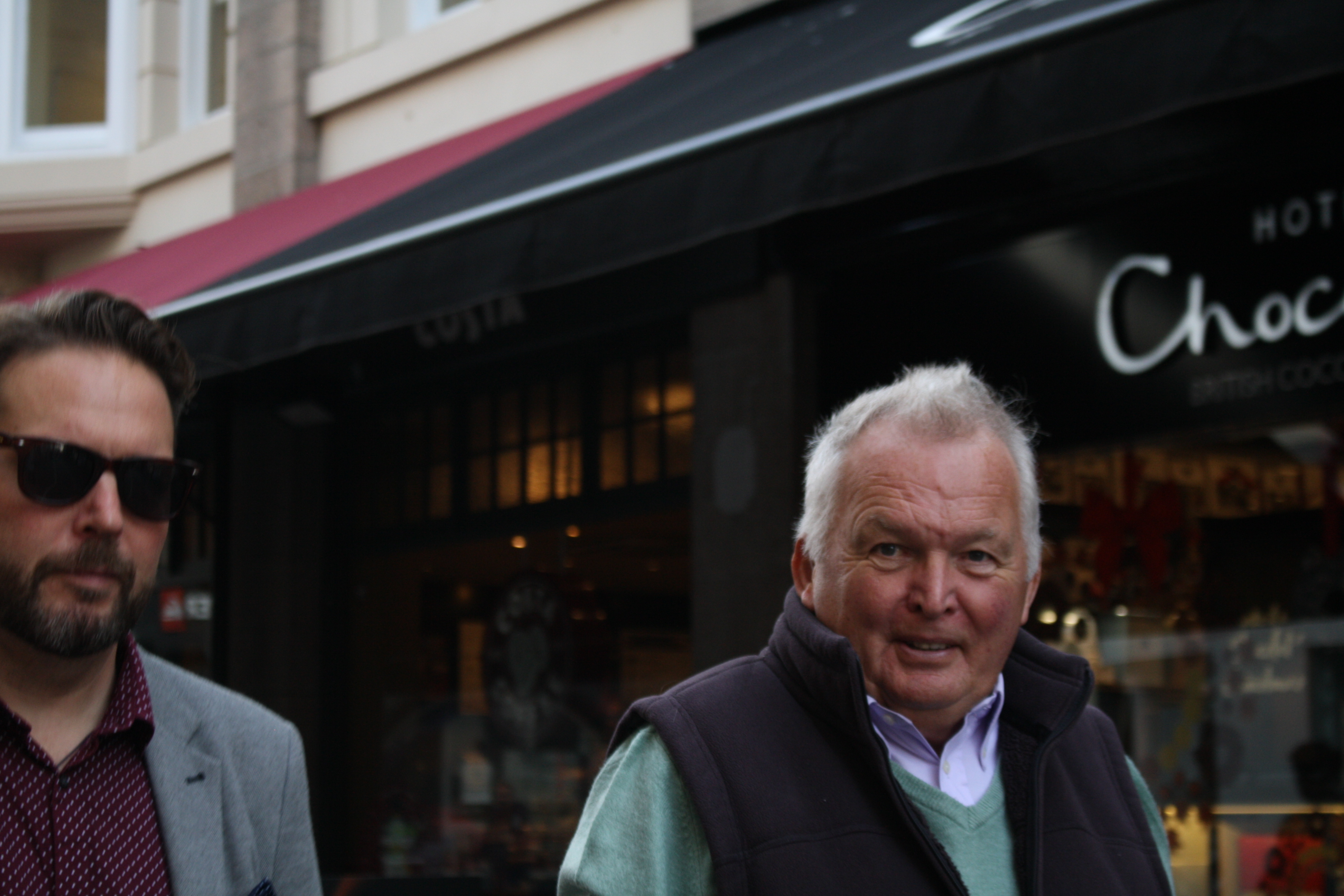
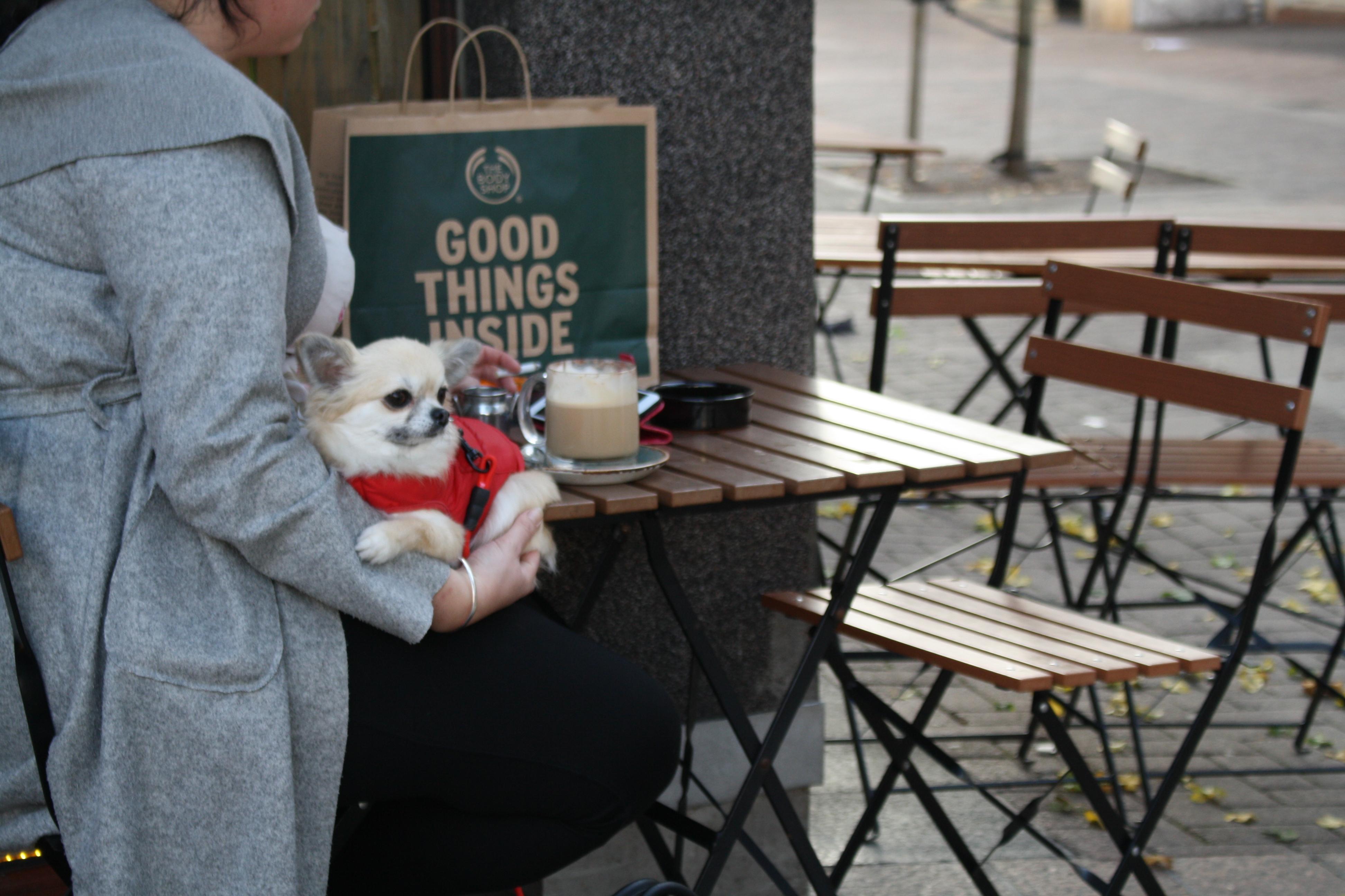
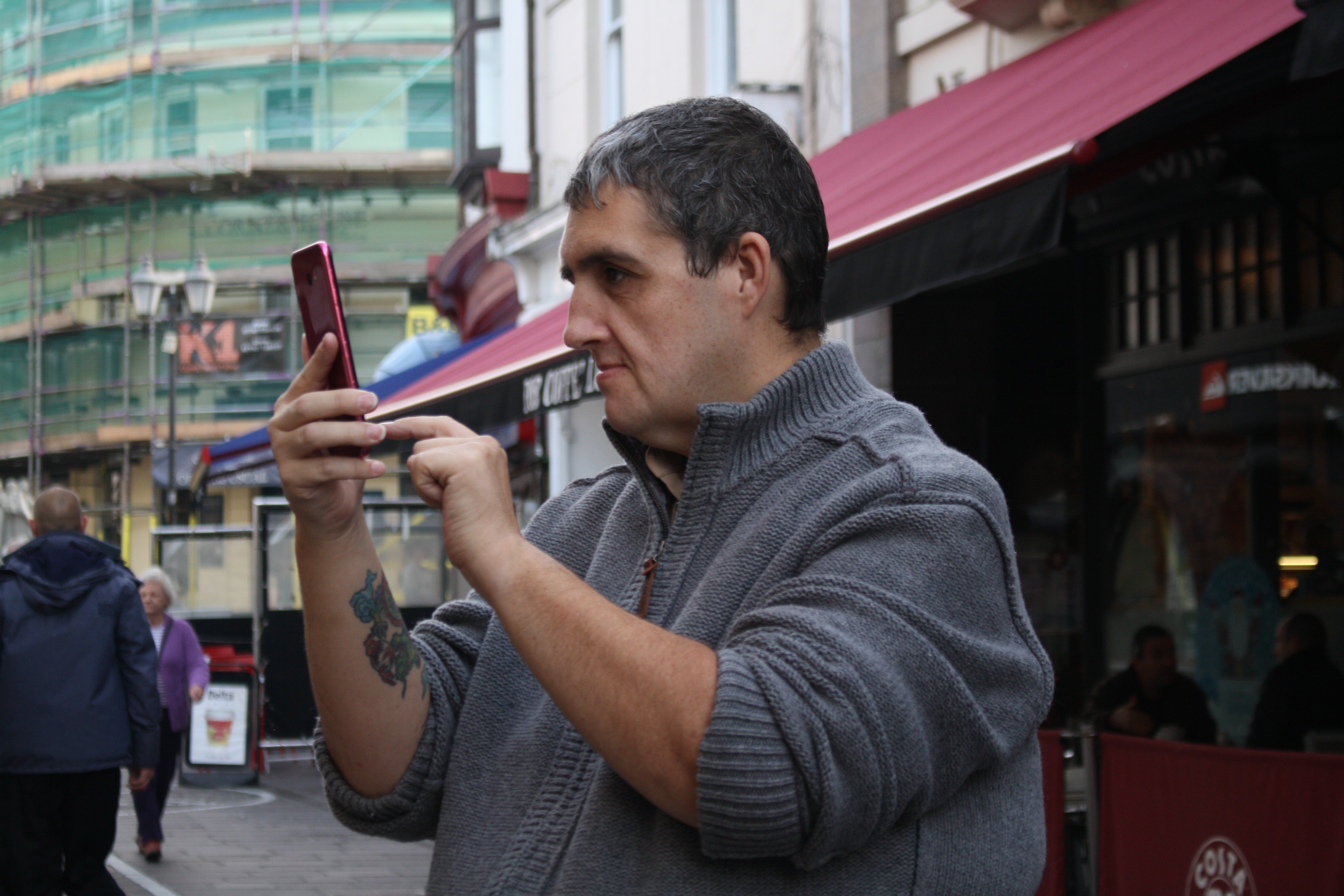
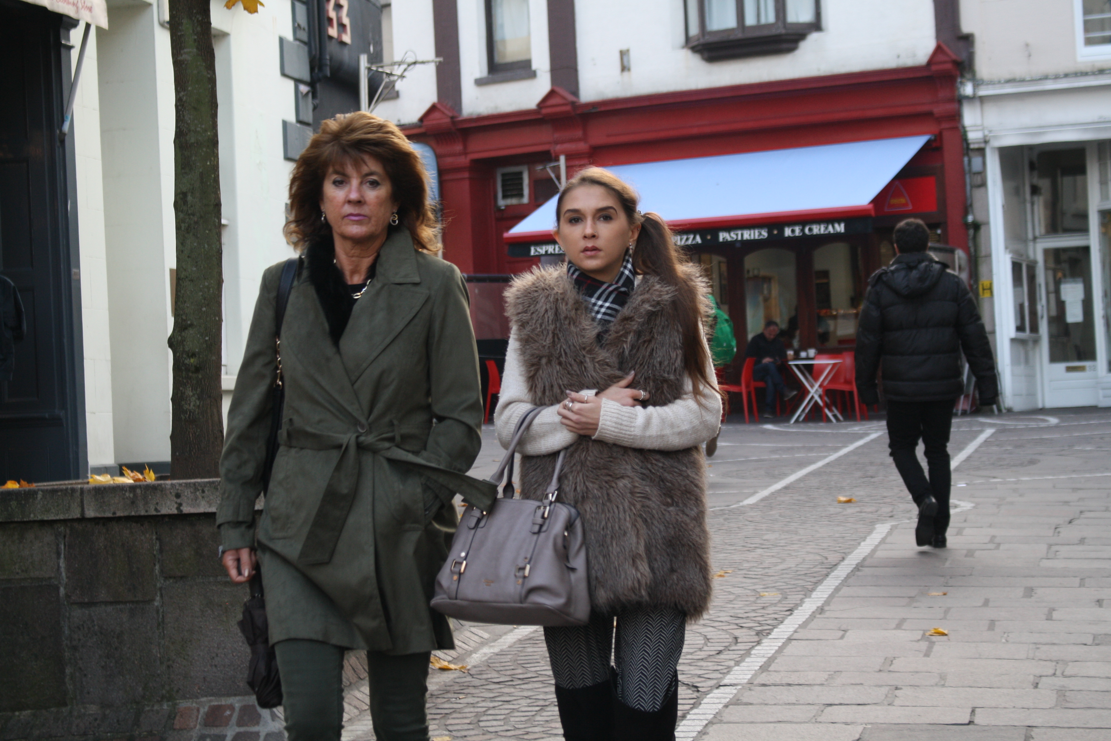
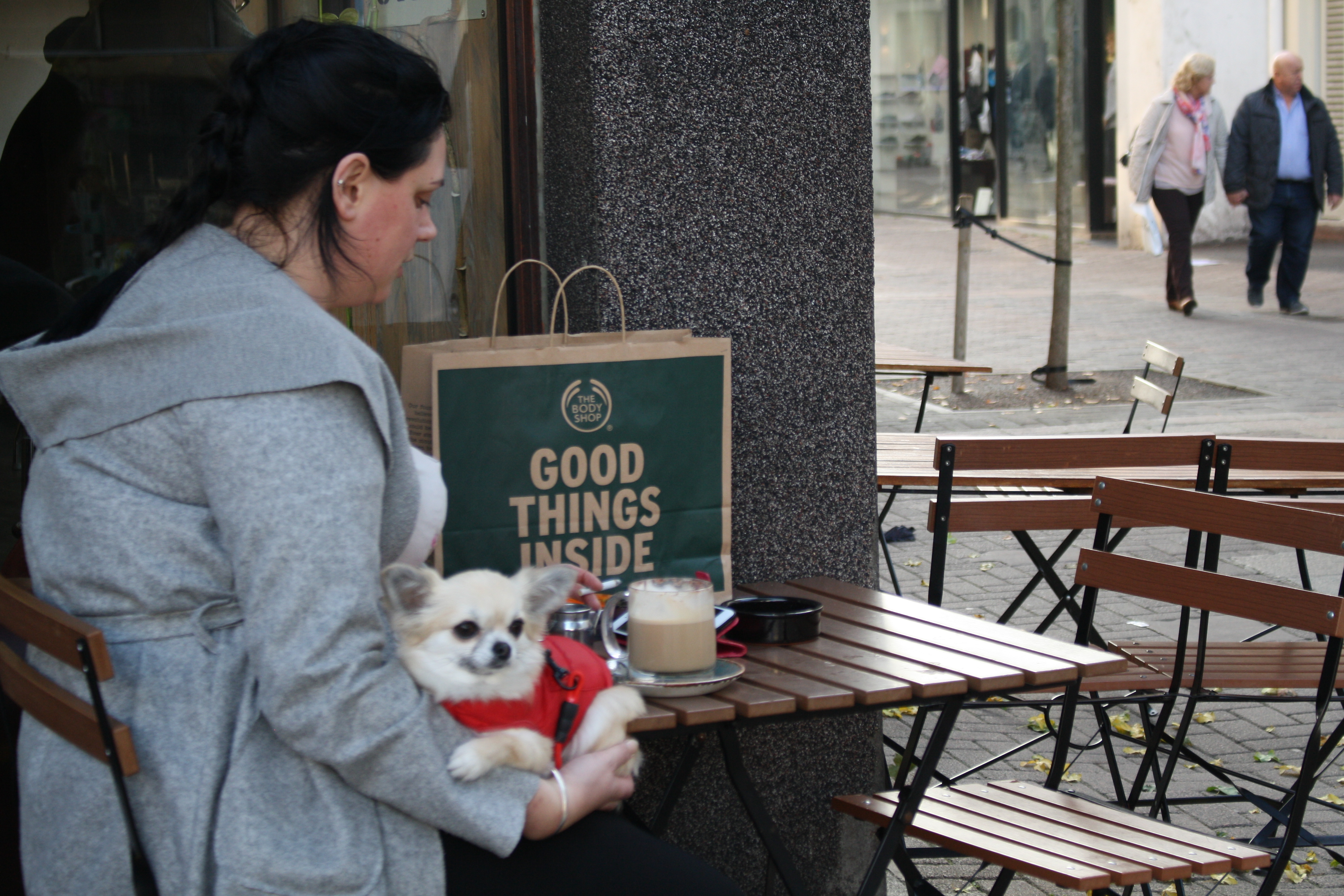
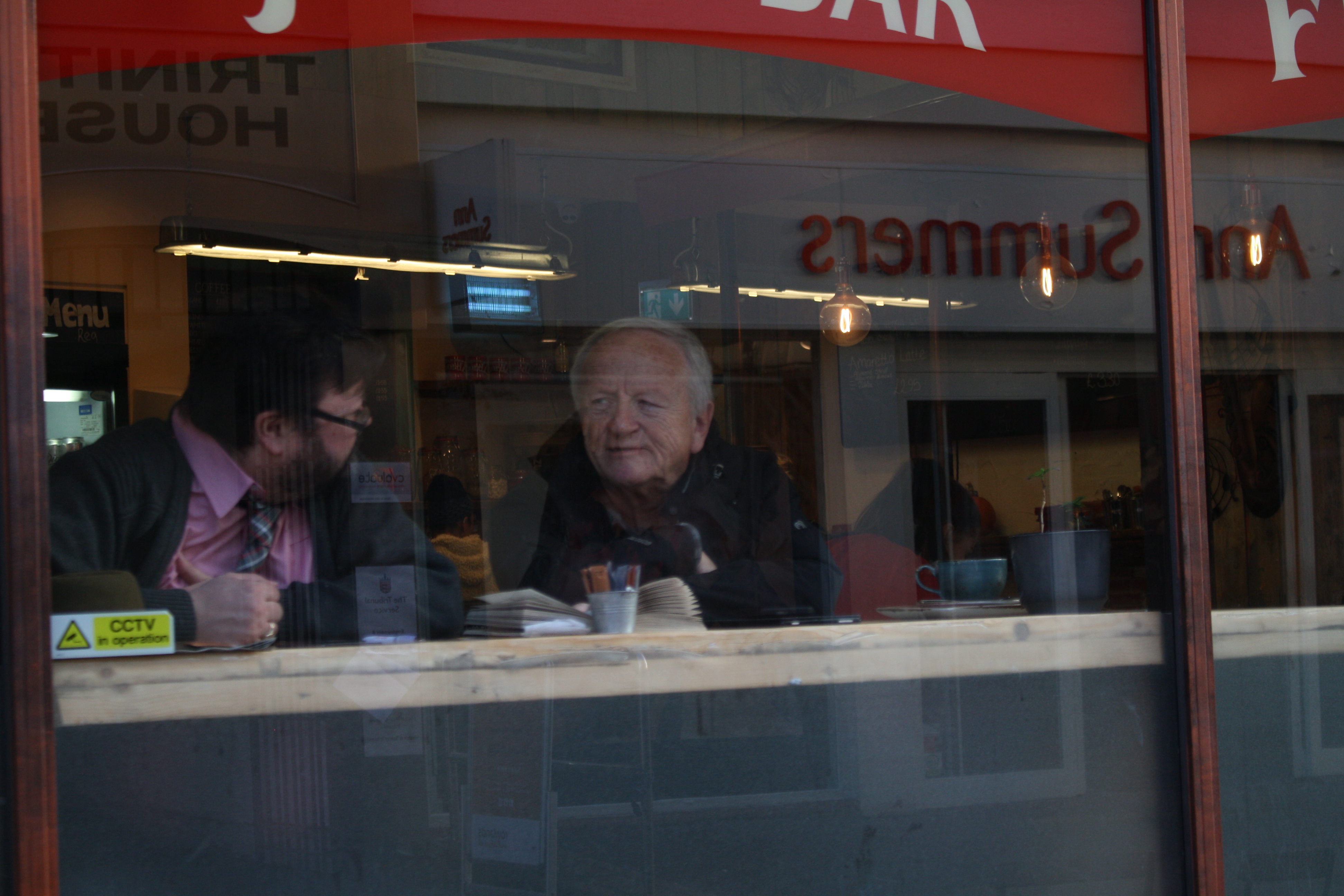
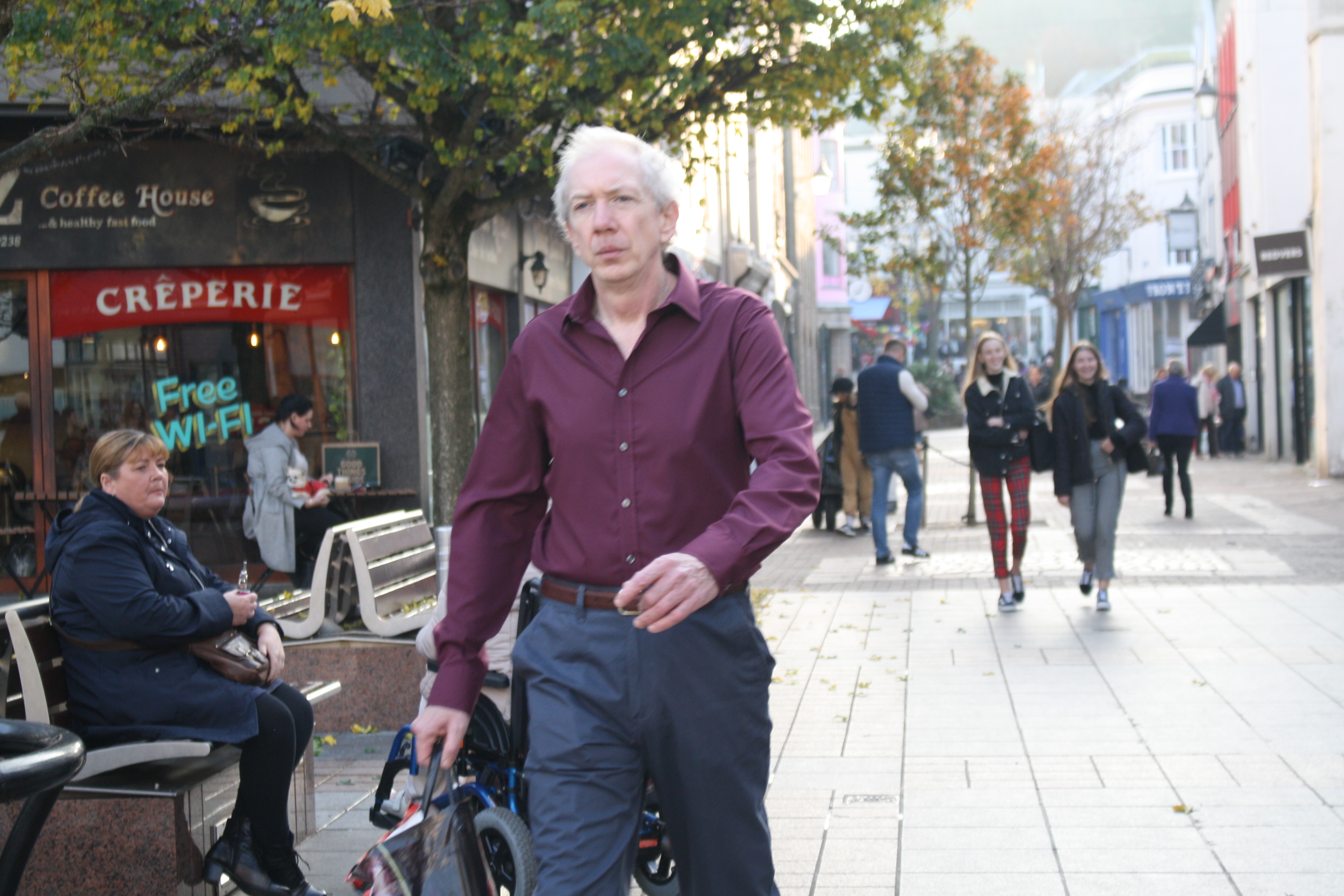
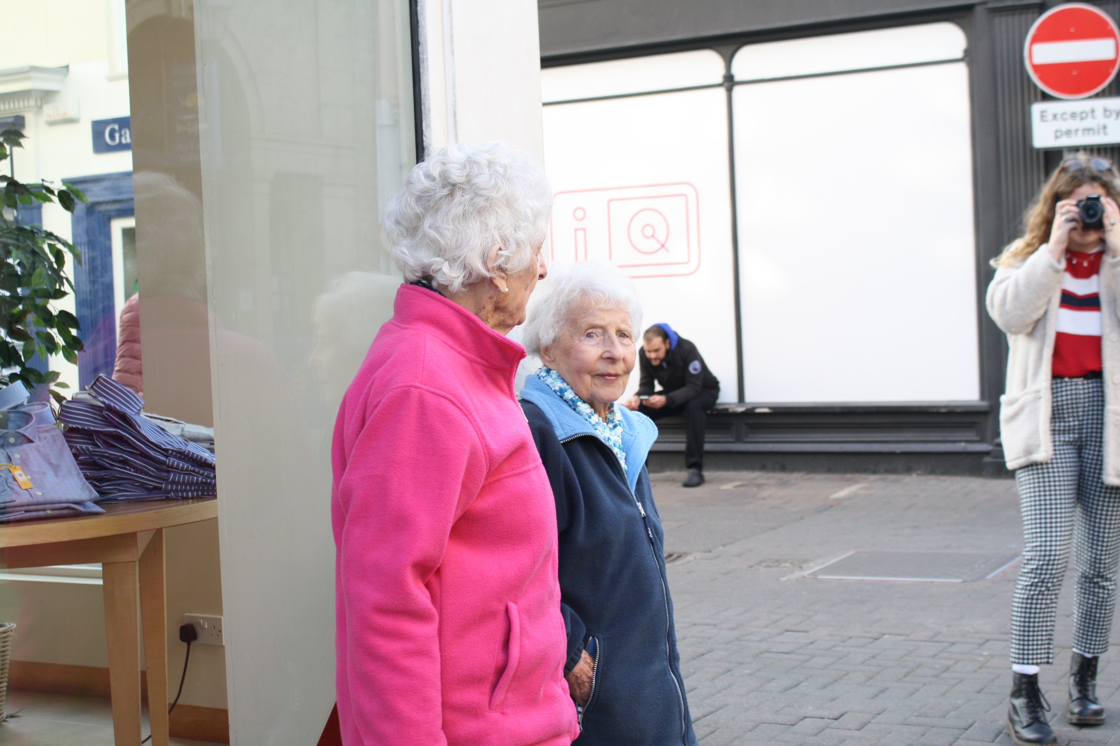
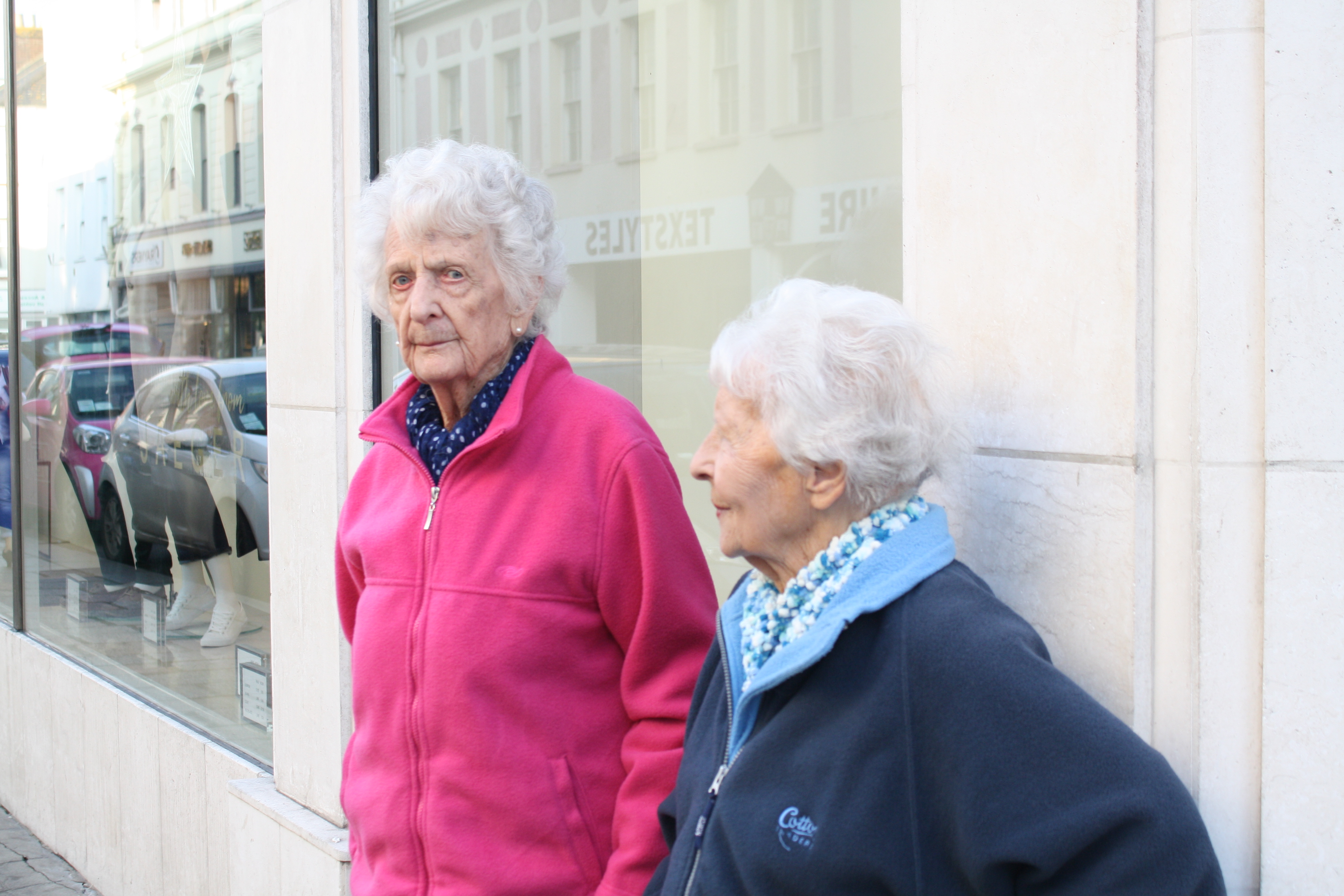
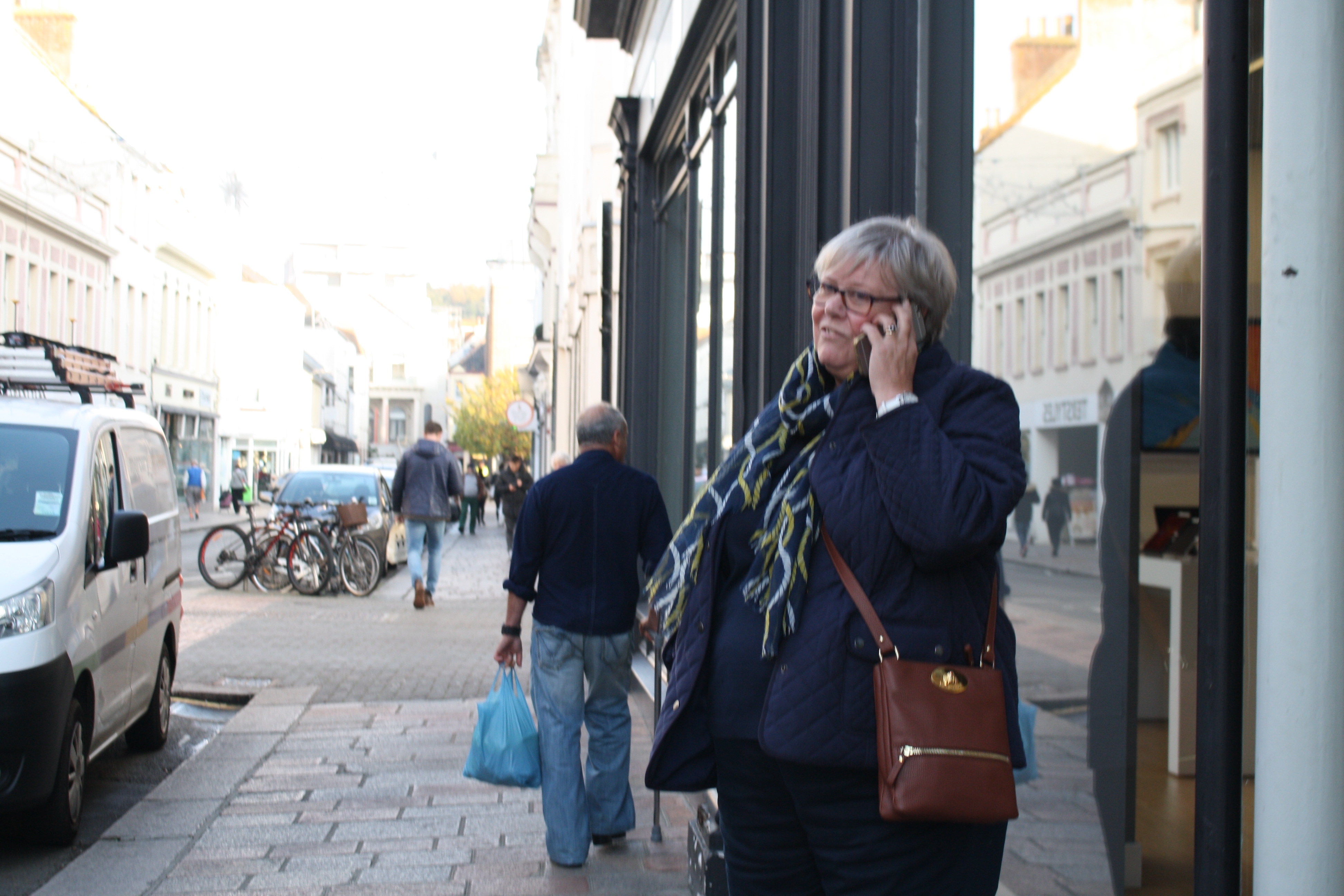
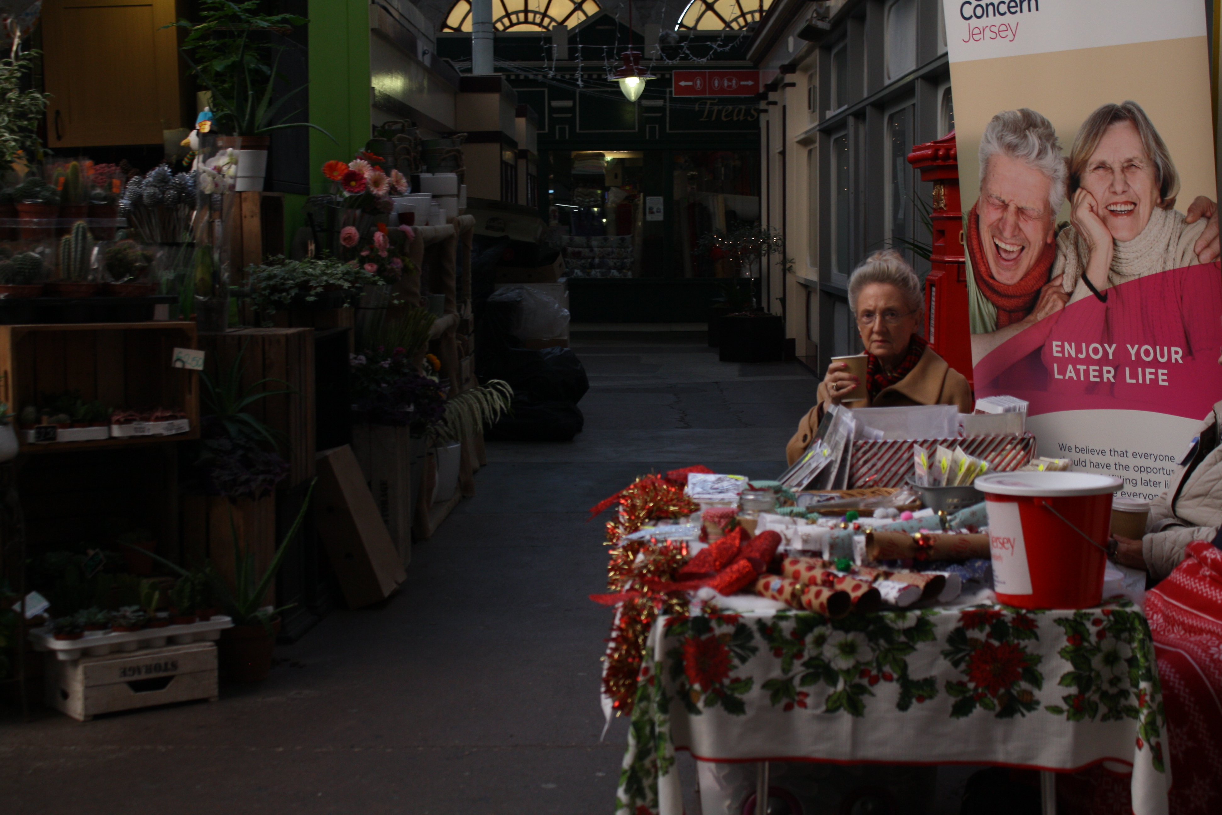
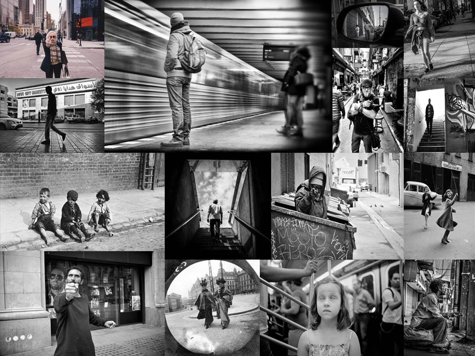
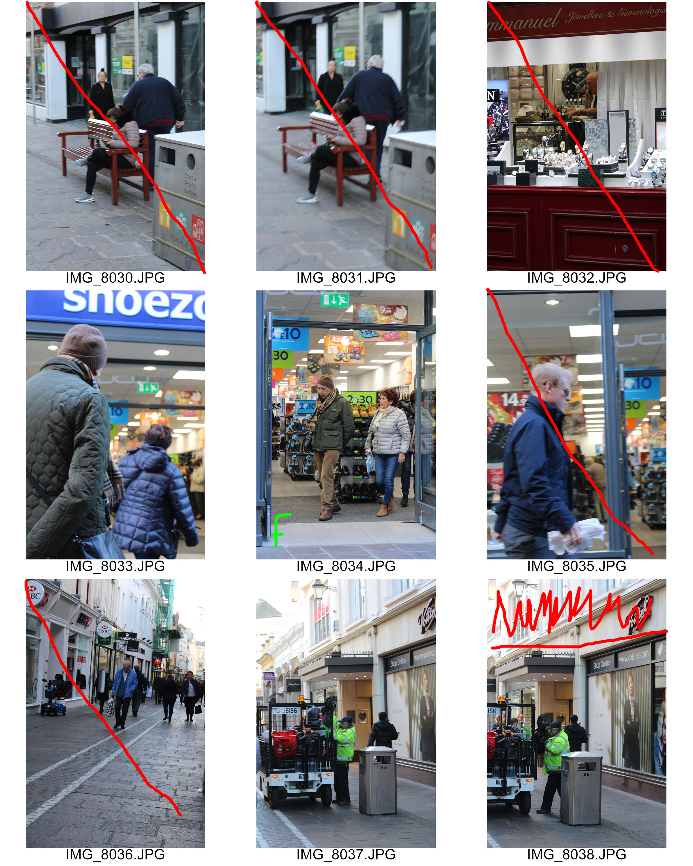
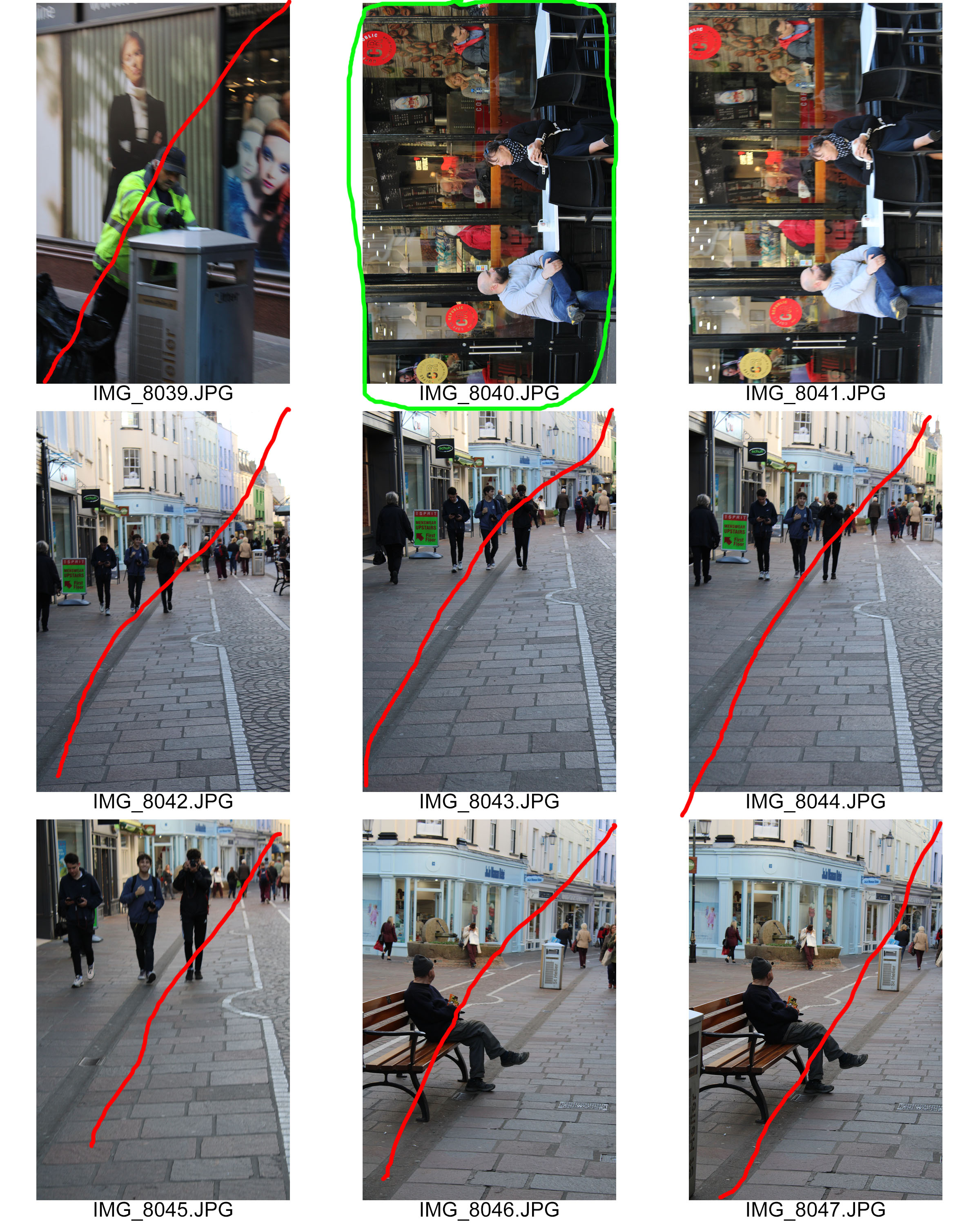
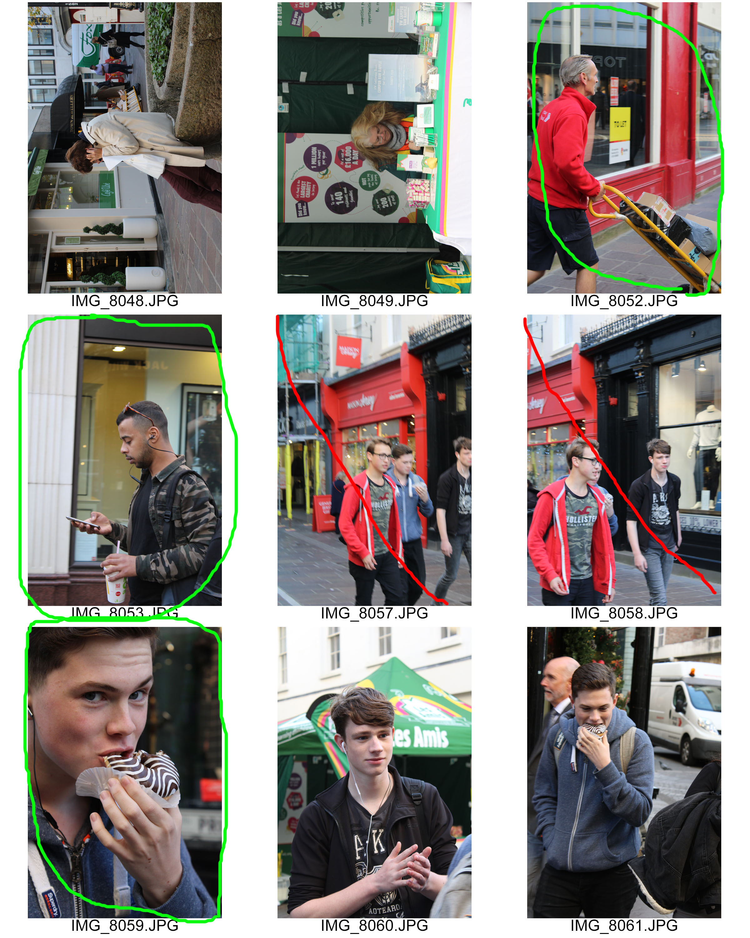
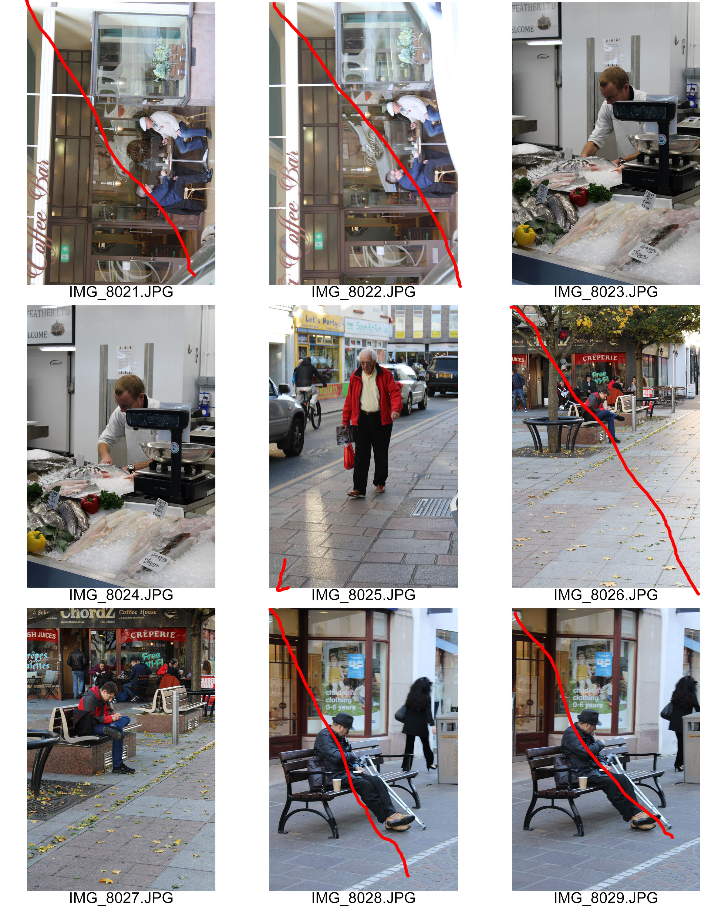
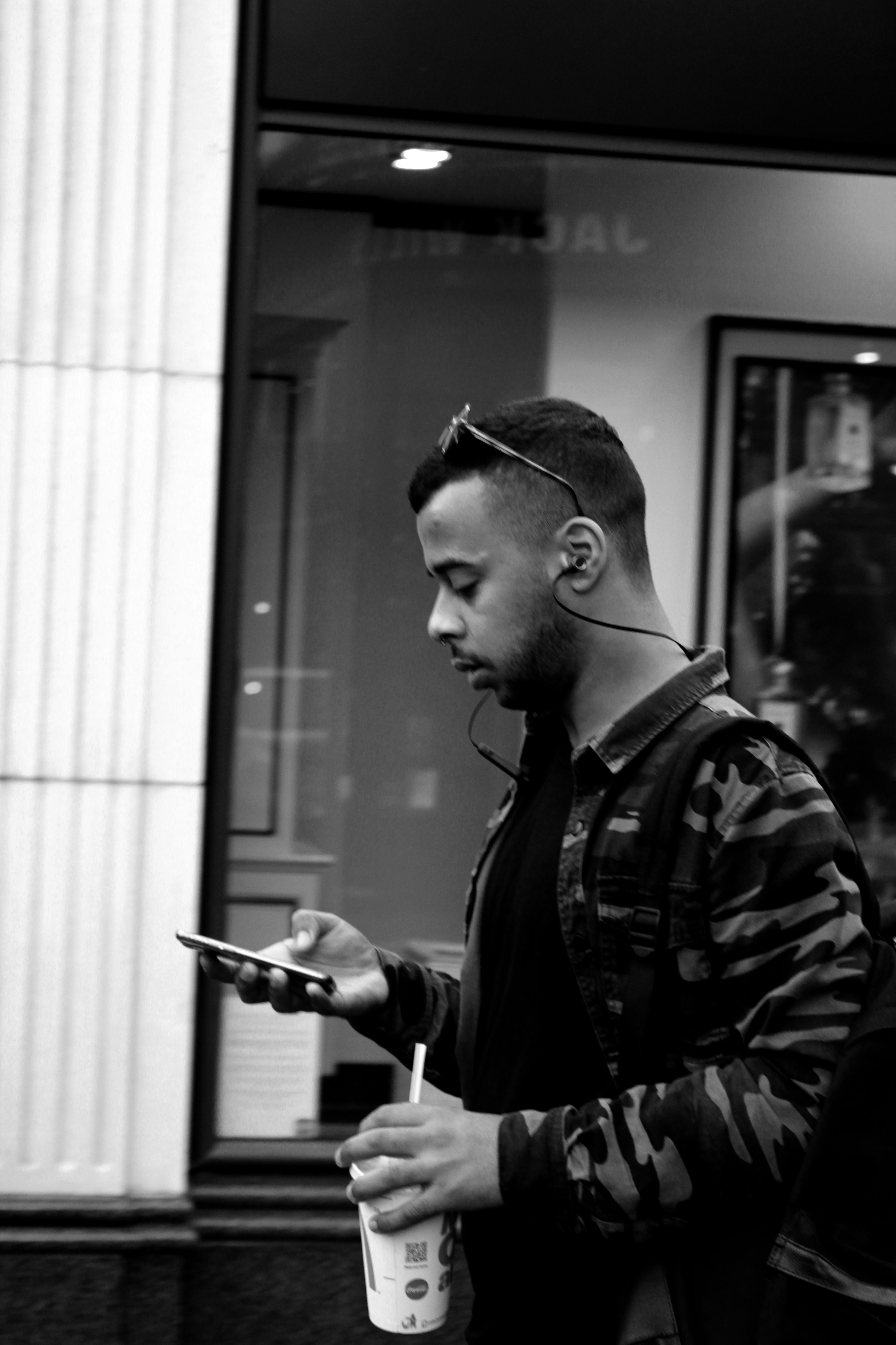
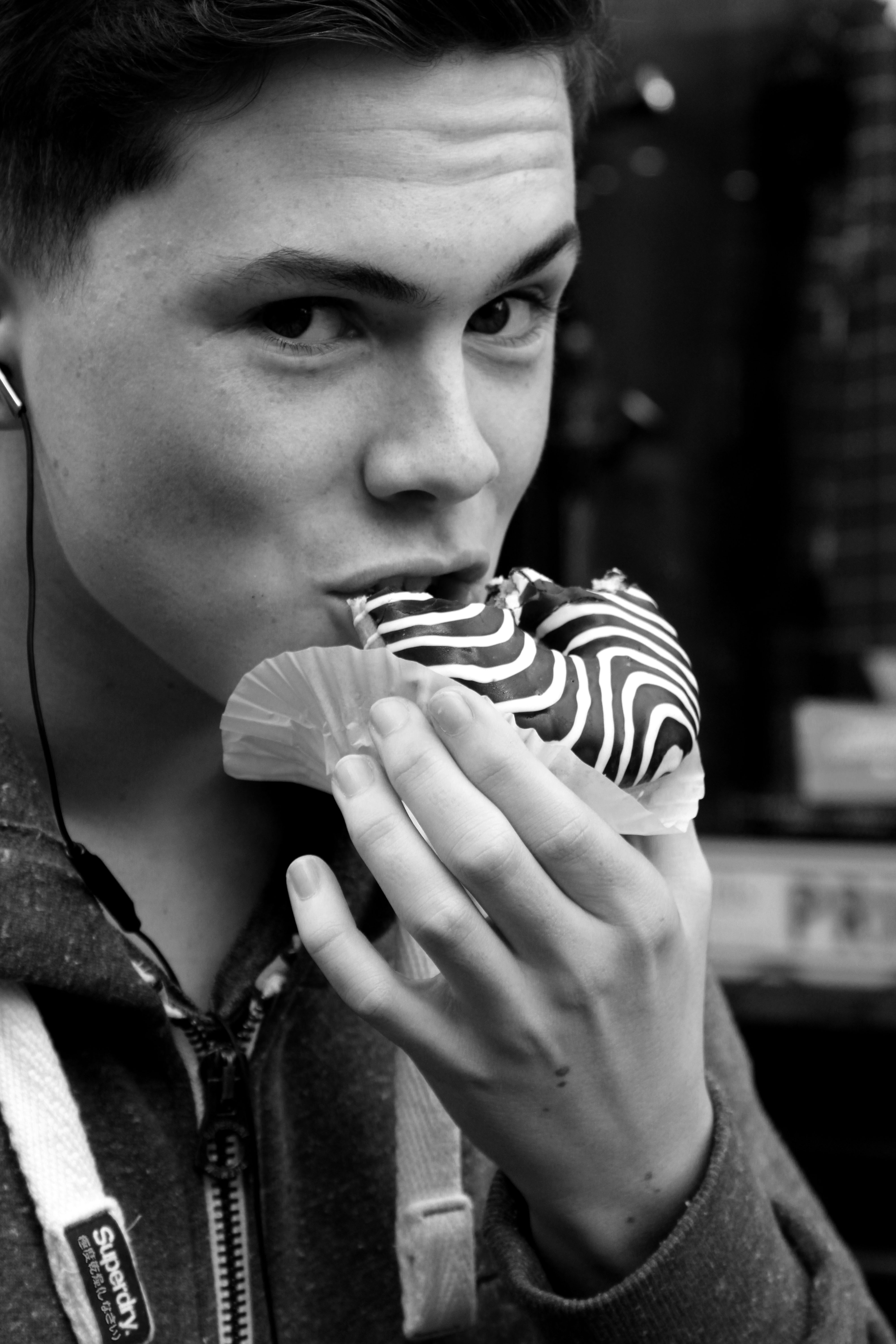
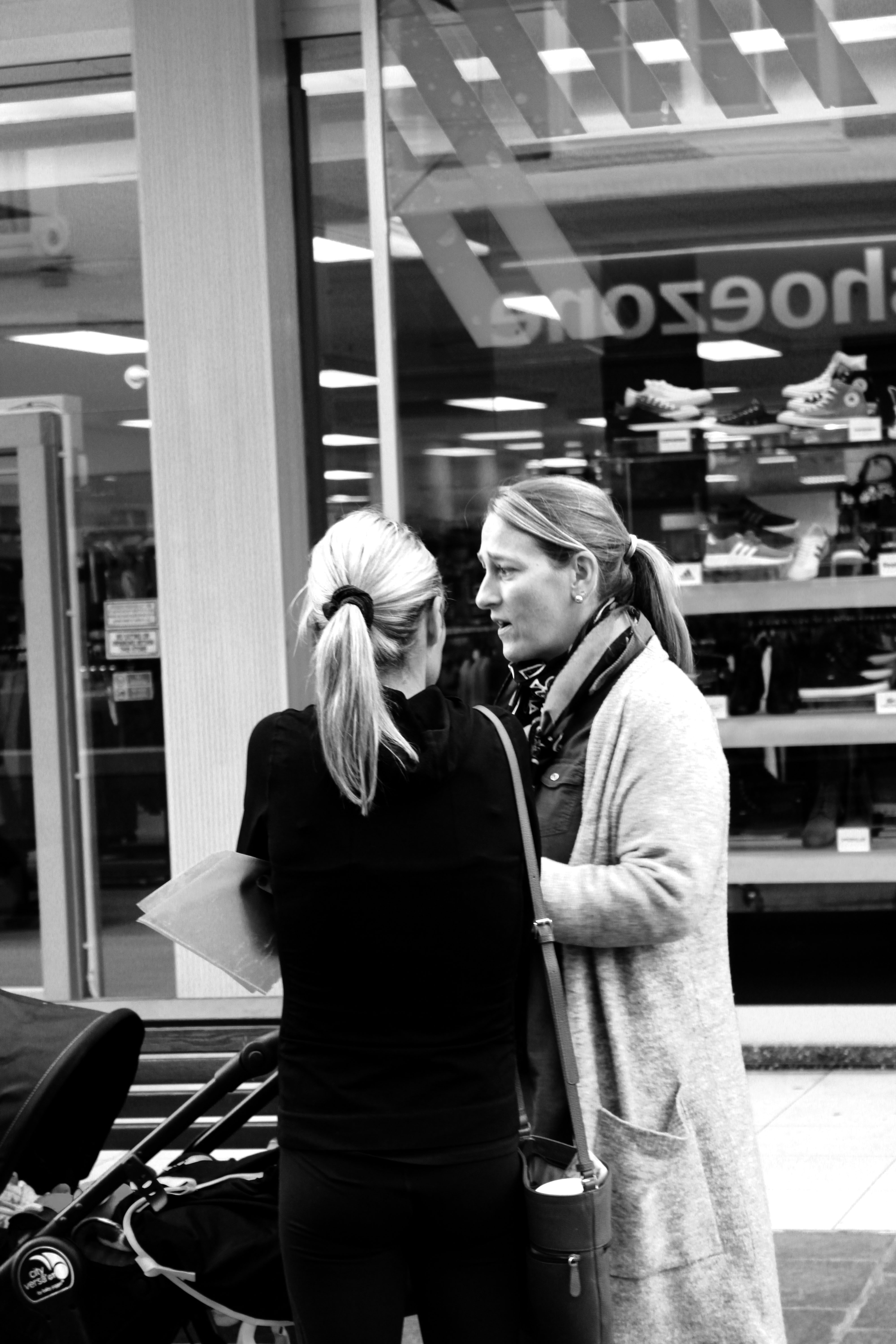
To take these photos I went into the main street in St Helier with our Photography class and just photographed people in the street as they were walking, sitting down or just chatting with someone. At first I was finding it very awkward and quite humiliating as the general population will think it is weird if you’re just walking around taking pictures of people without their permission. I had some good opportunities which I took, some photos turned out pretty well and in focus with the right lighting and some the opposite. However, nearing the end of our time photographing I started finding it easier to just take photos in the street and became more confident around it.

Gallery of All The Photos Taken:

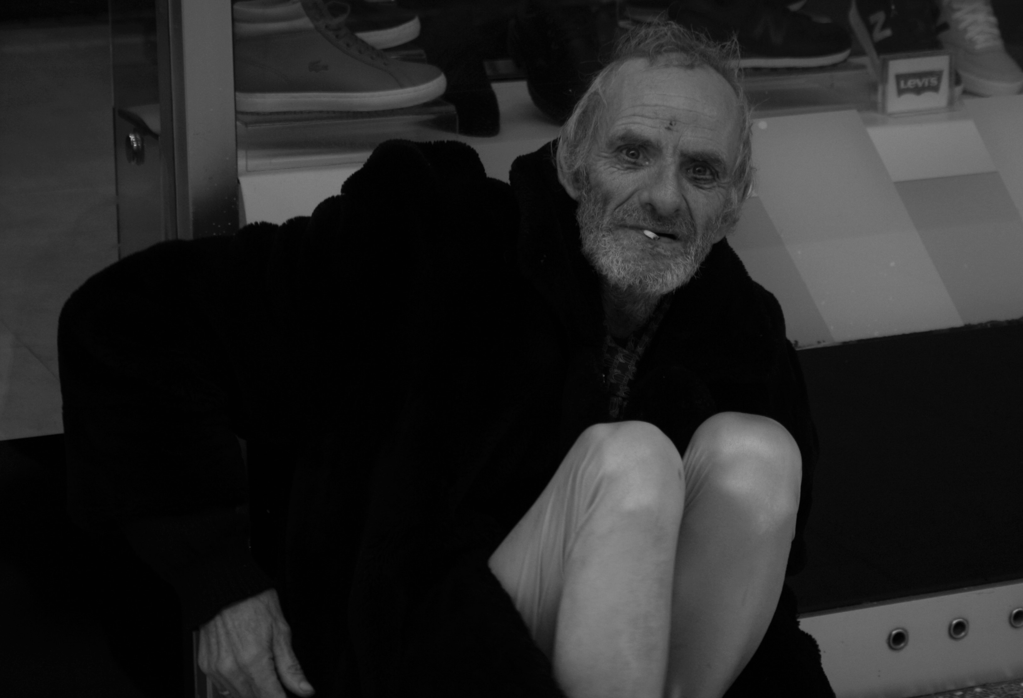
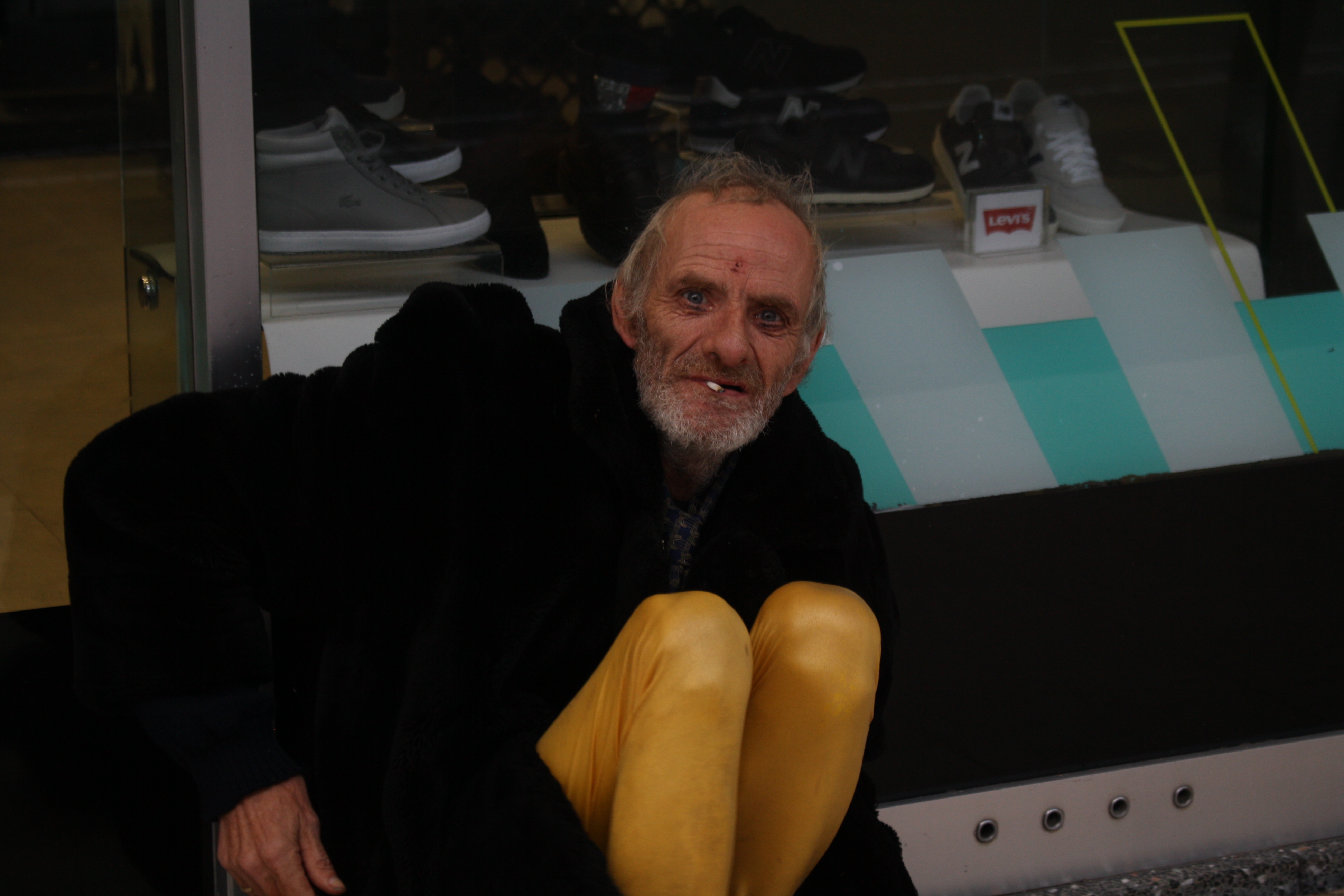
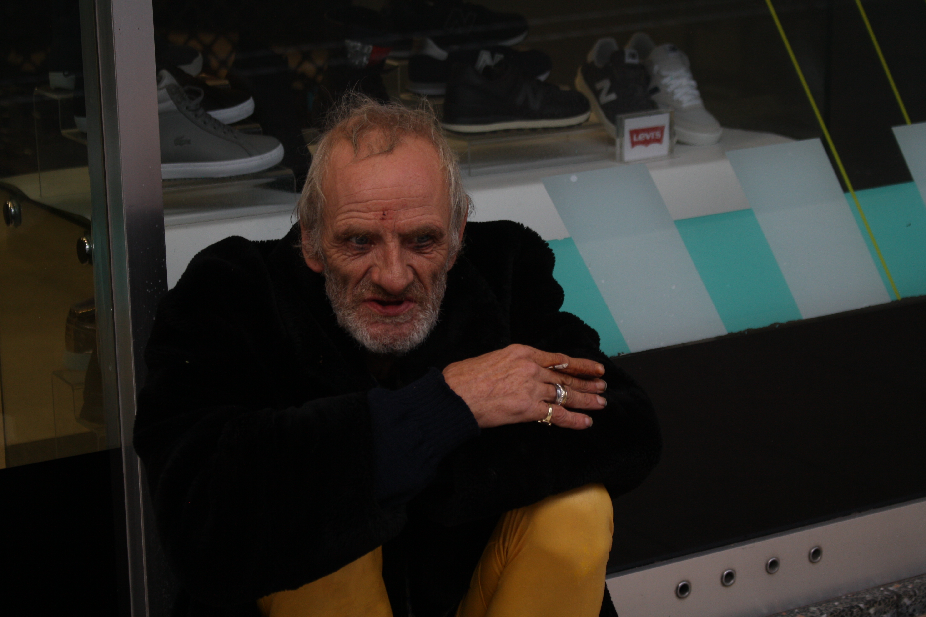
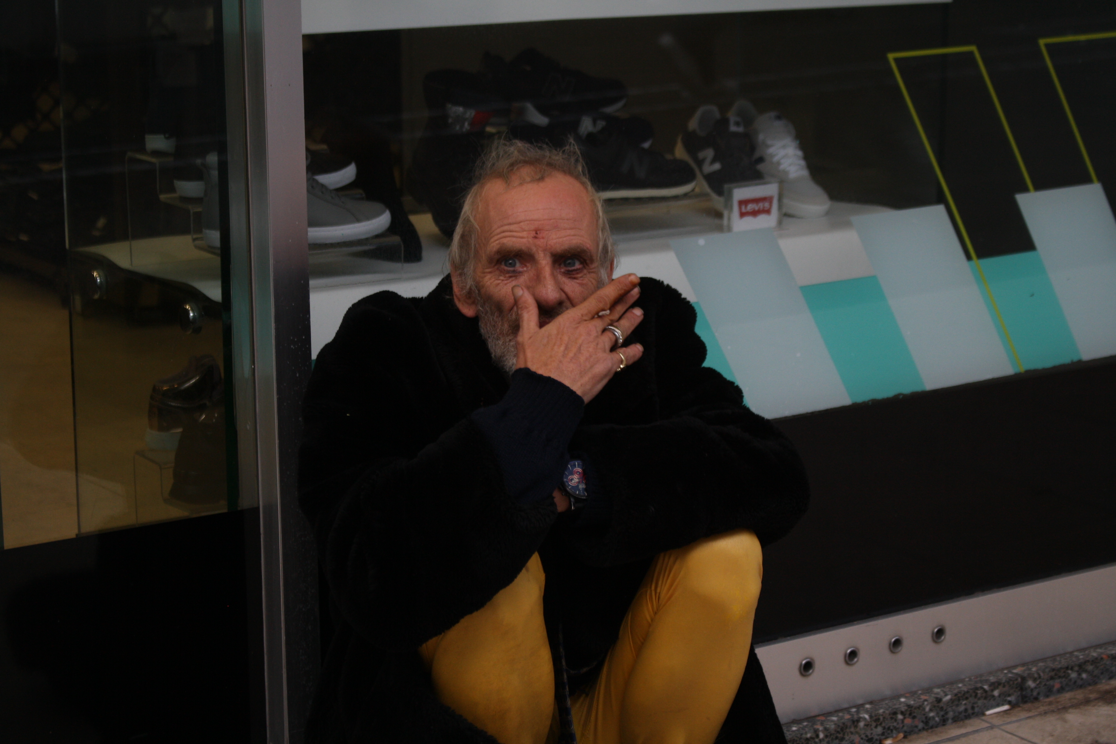
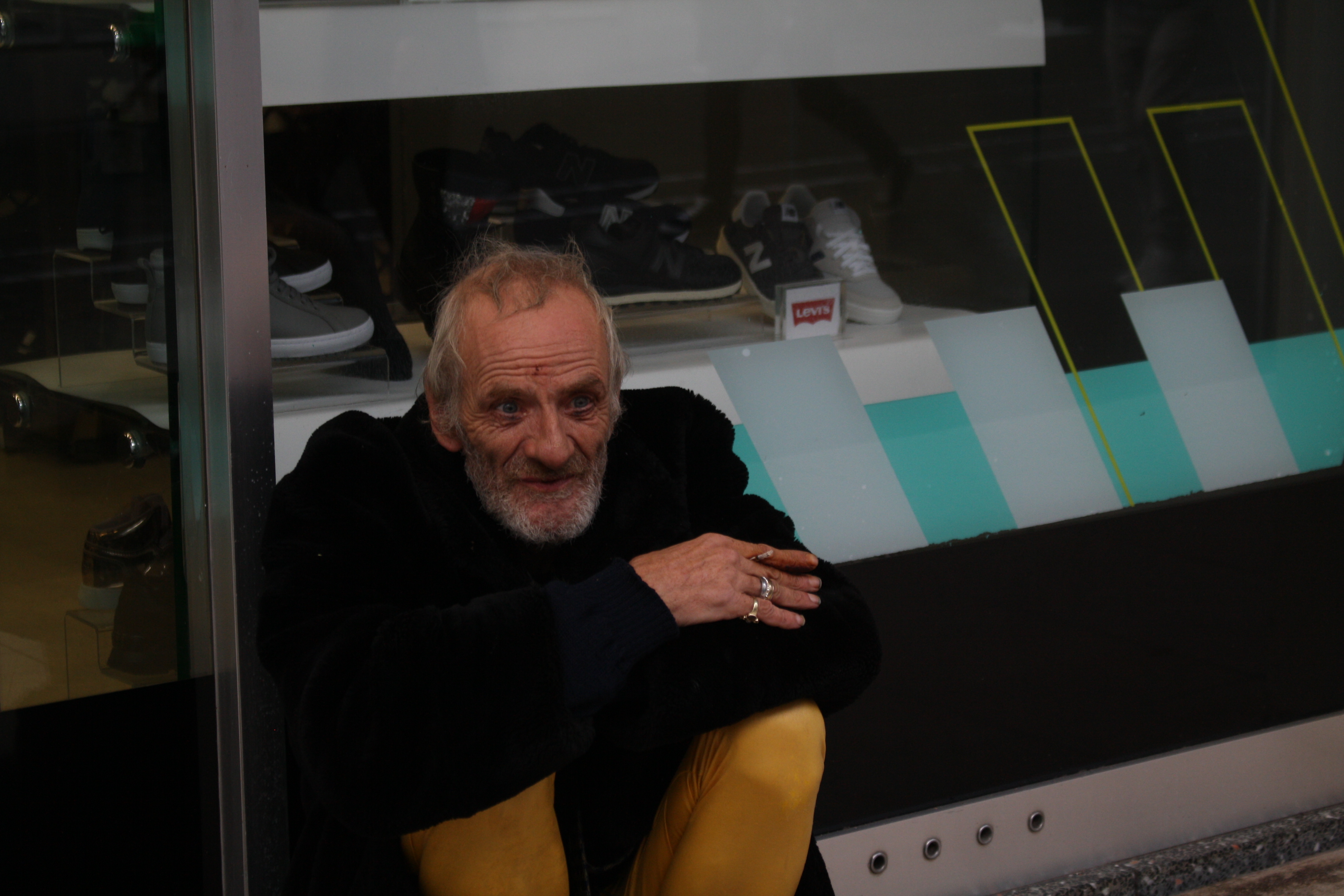
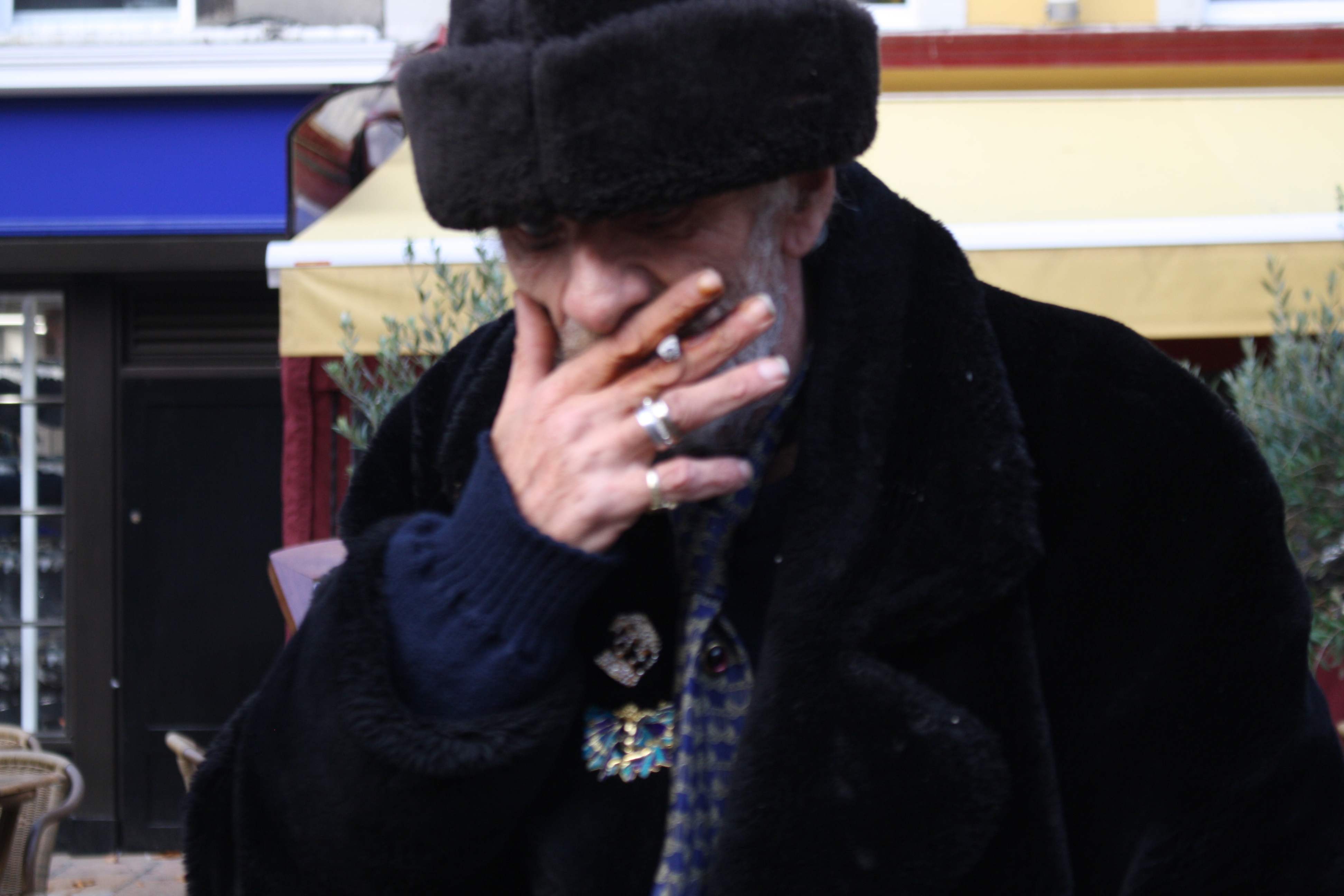
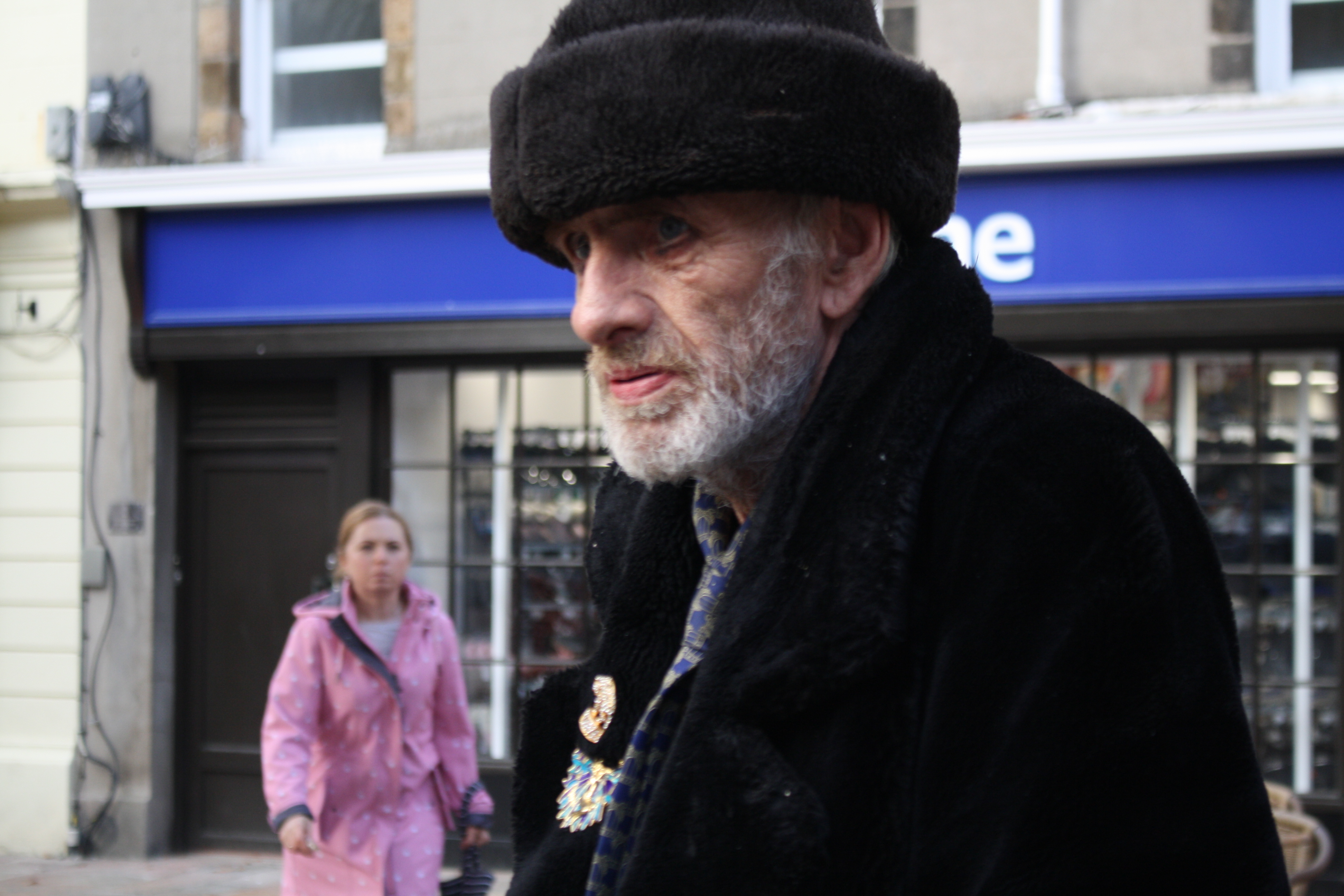
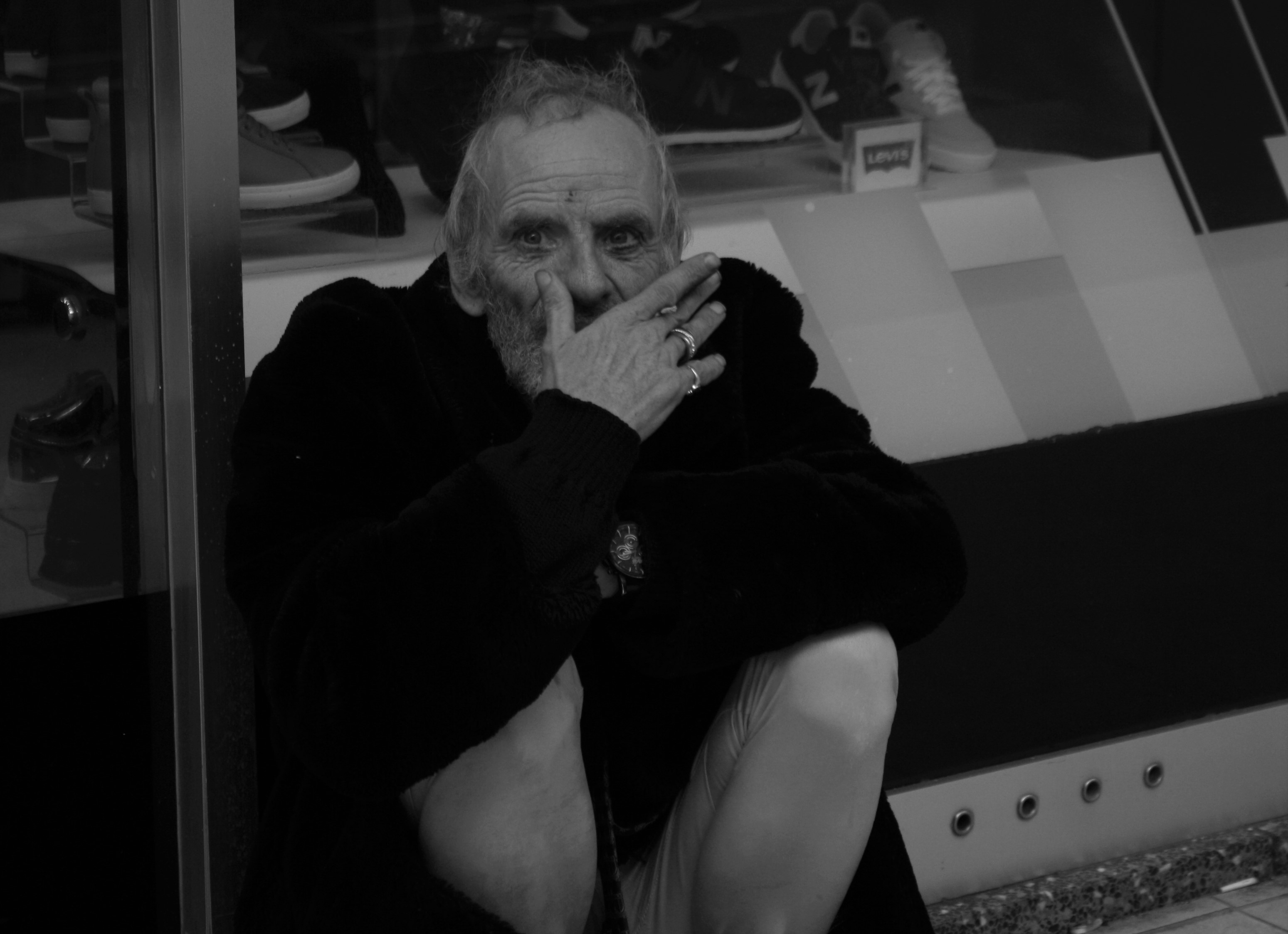
One significant character we encountered whilst taking these photos was this homeless man. He approached our group as we were finishing off by just talking about our experiences, etc. He photographed very well and had very unique clothes on, also the fact he was smoking a cigarette made the photos even more interesting. Unfortunately when we all had a great opportunity to take an interesting photo (with the person looking directly into the camera and not moving), my camera wasn’t in the right setting so my photos of him didn’t turn out as well as they could have.

Thankfully after finishing, my friend and I saw him again on the street, this time I wanted to take more photos. We both asked him for photos and he agreed, I started up a conversation with the man to learn more about him and he told us about his homelessness, that he is a Jersey man but moved to Southampton, then returned to Jersey in the 70s. He also said he wants to leave Jersey but cannot, I asked why and he told me “he has a bad name”, I found this interesting but didn’t want to dig any further as he came across very bizarre and quite intimidating/dodgy at times.

My Favourite Photos

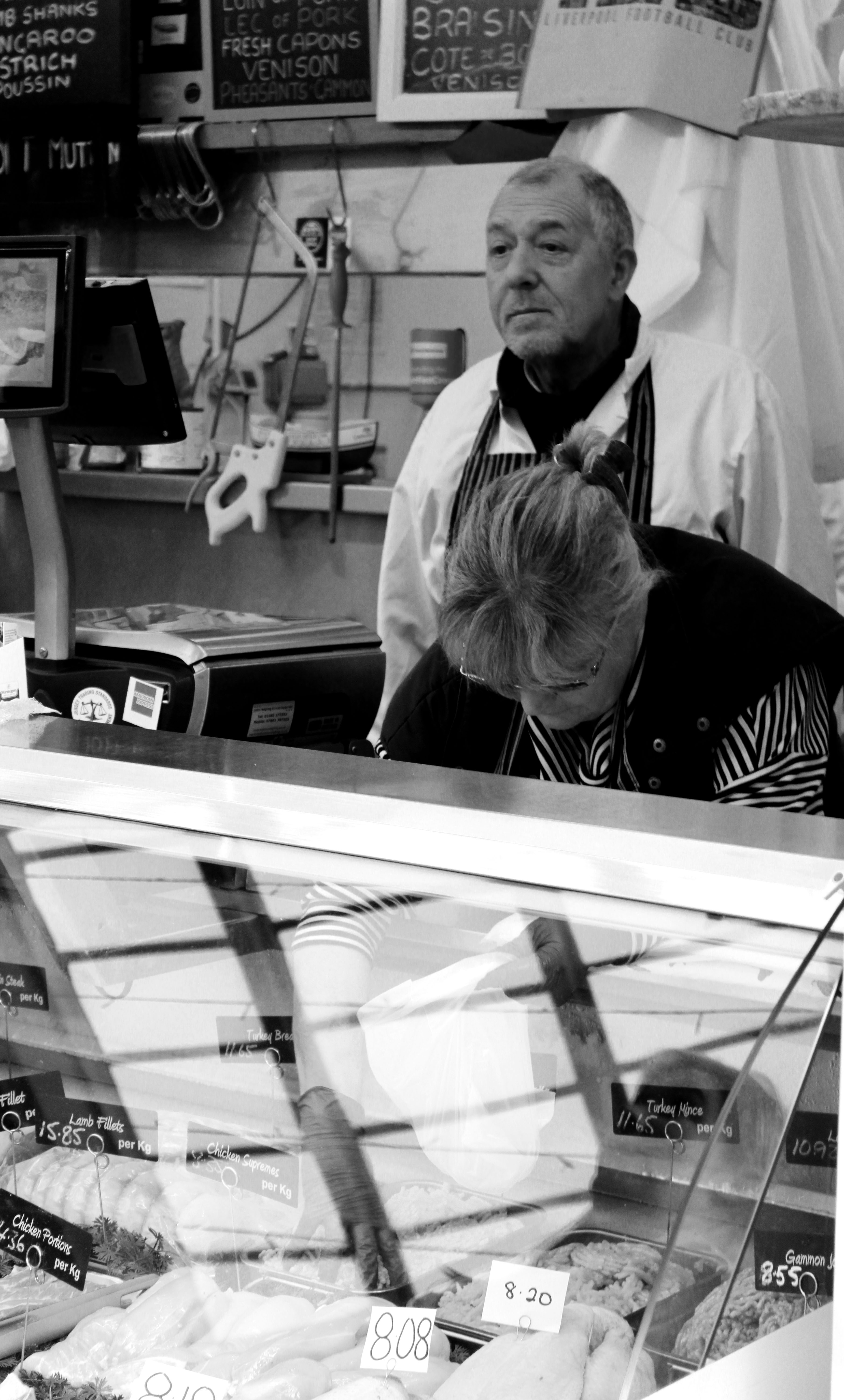
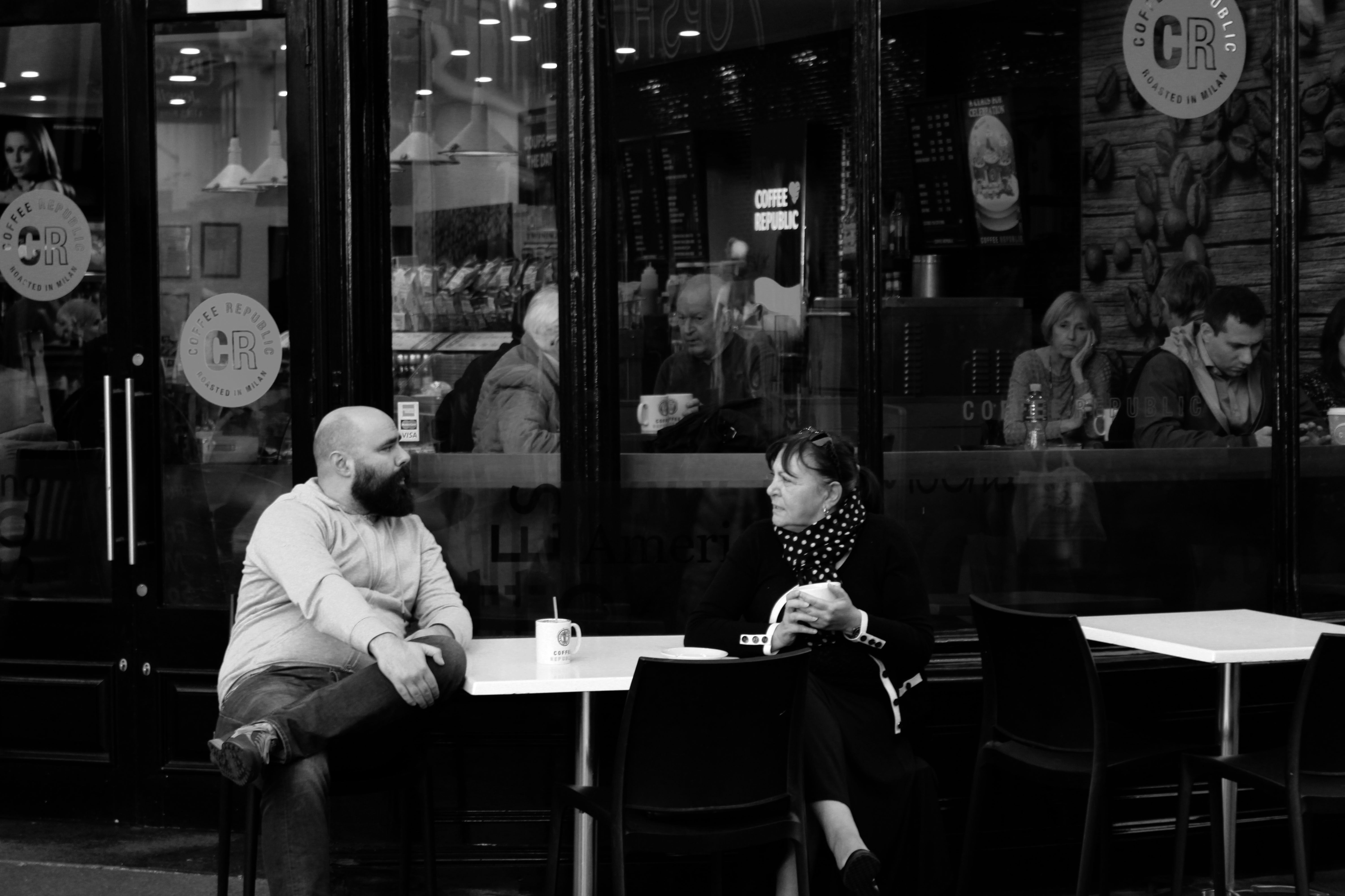
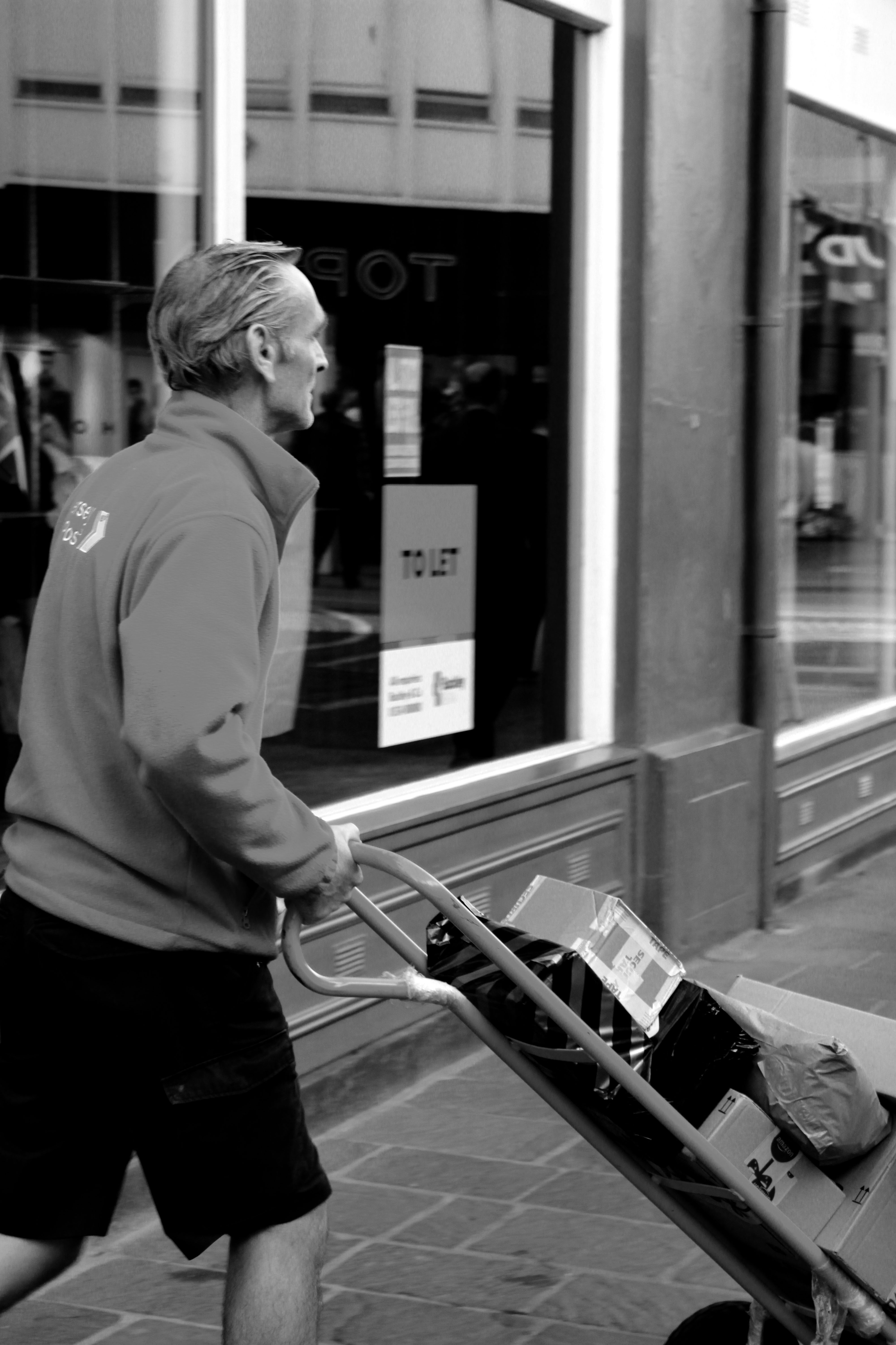
Edited into black and white as I prefer it to colour, as I think it looks better, some have also been cropped.
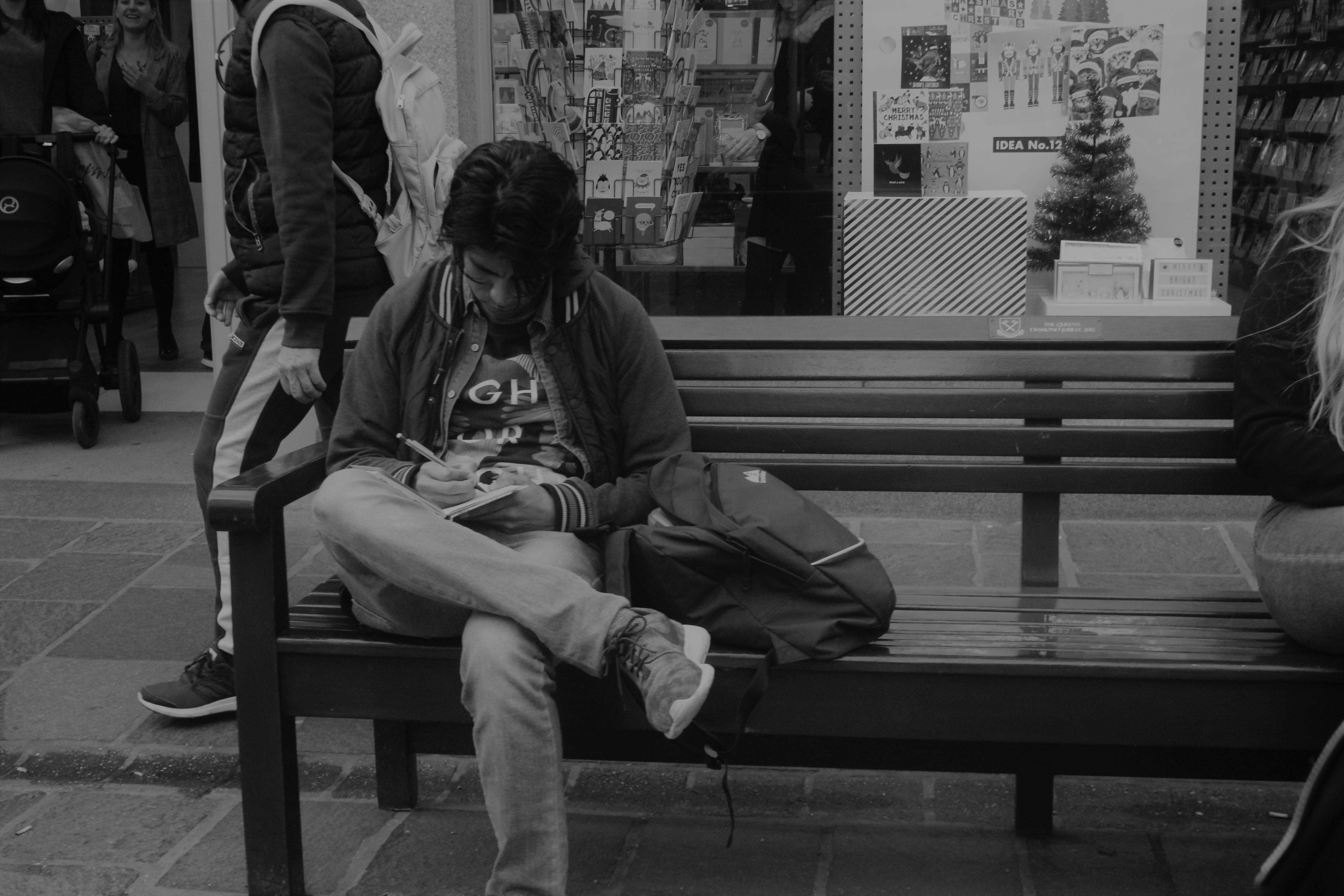
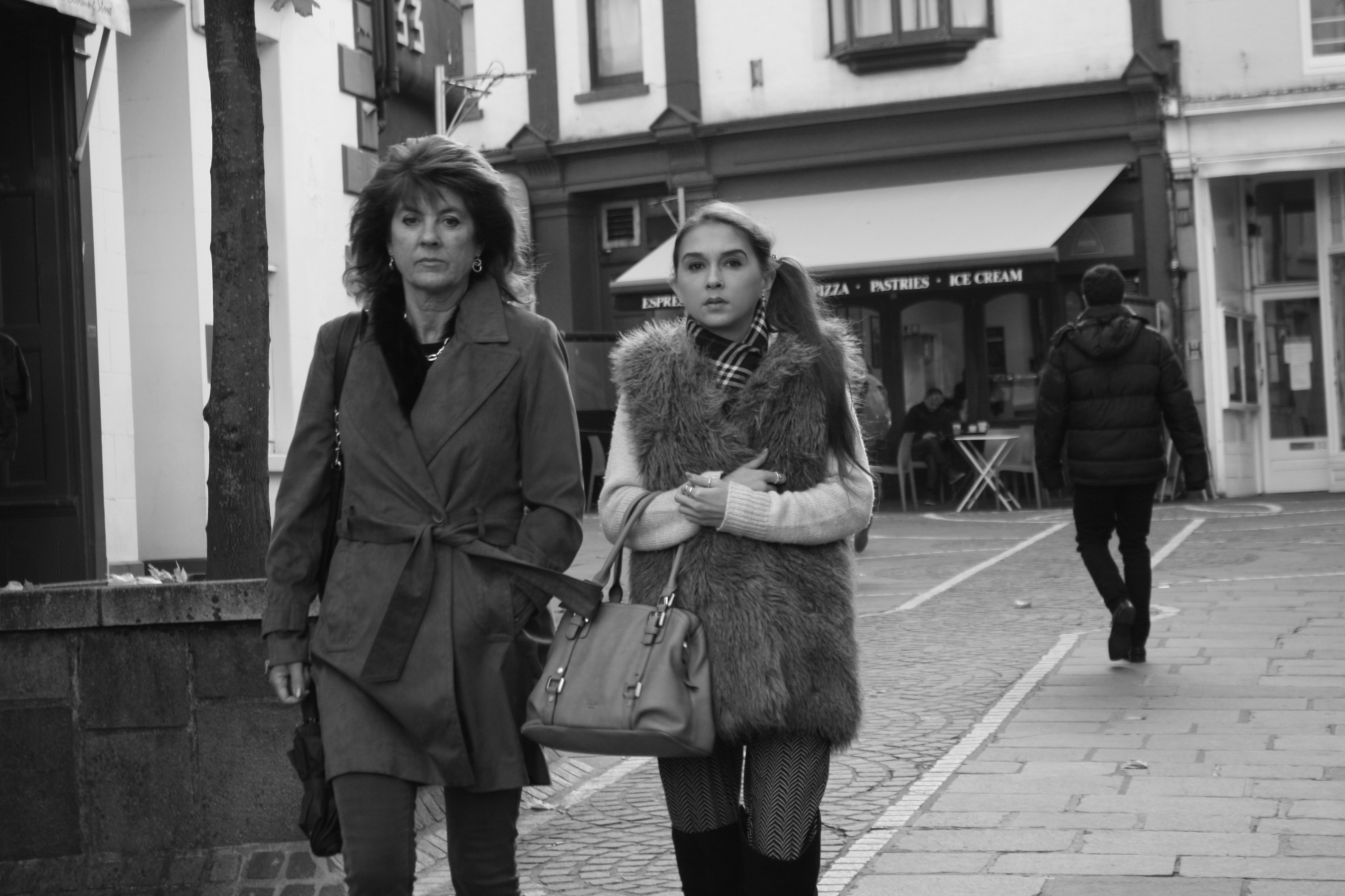
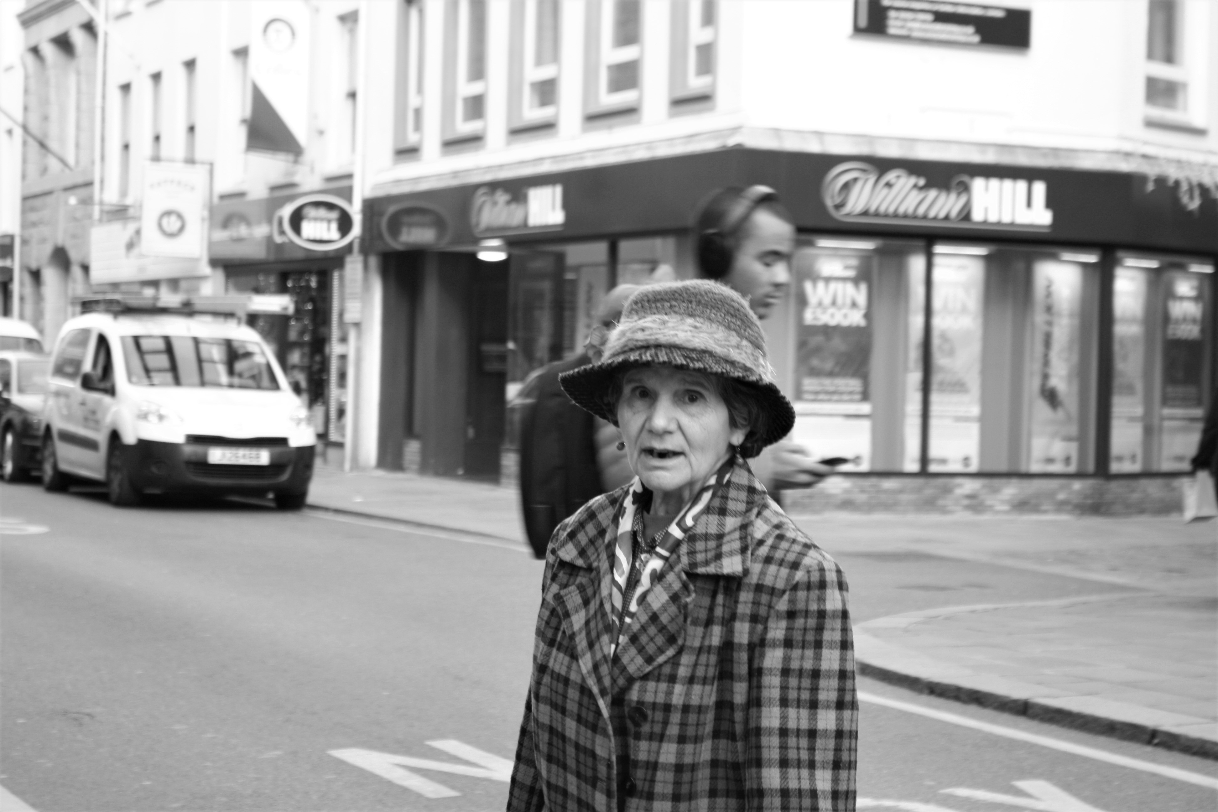
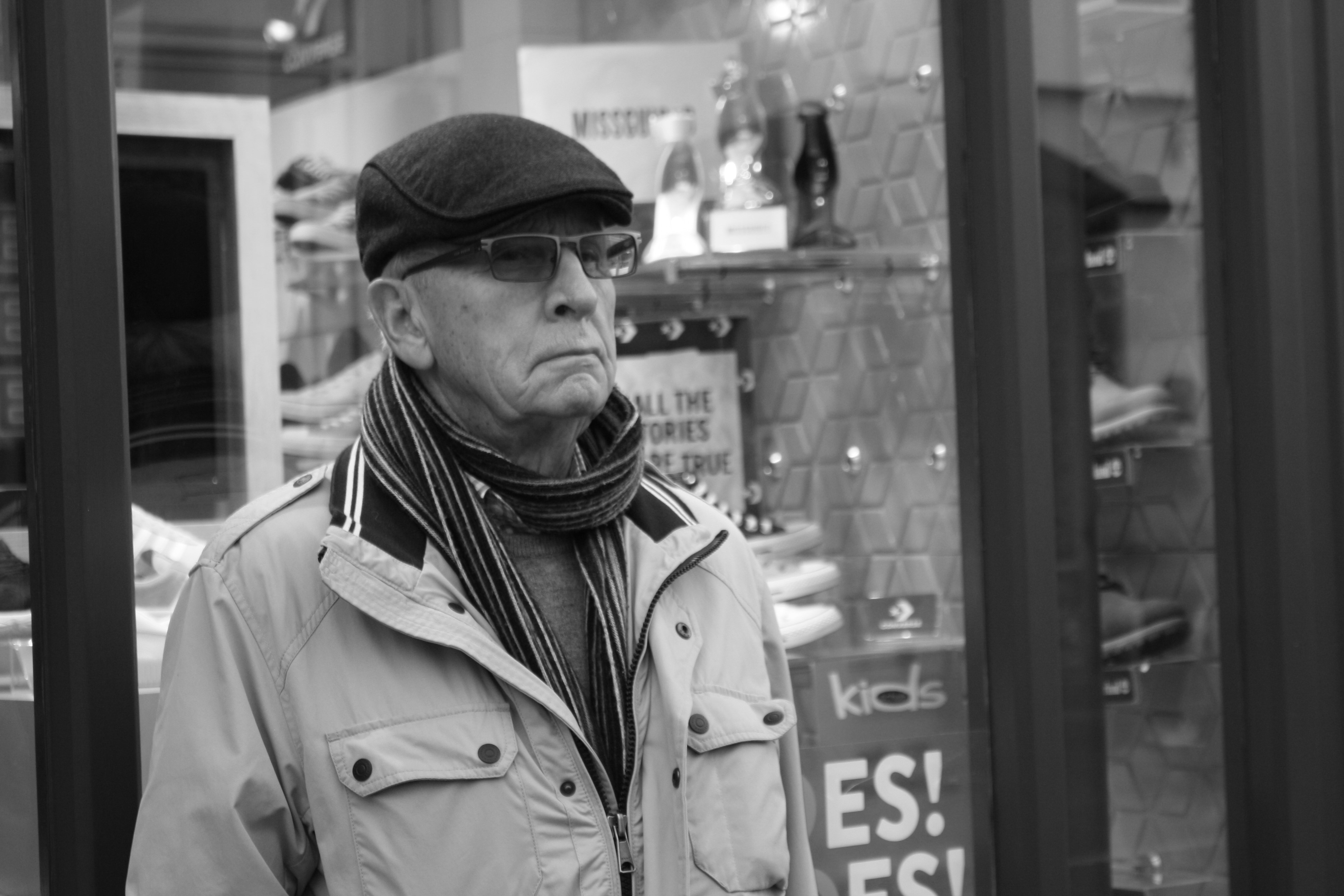
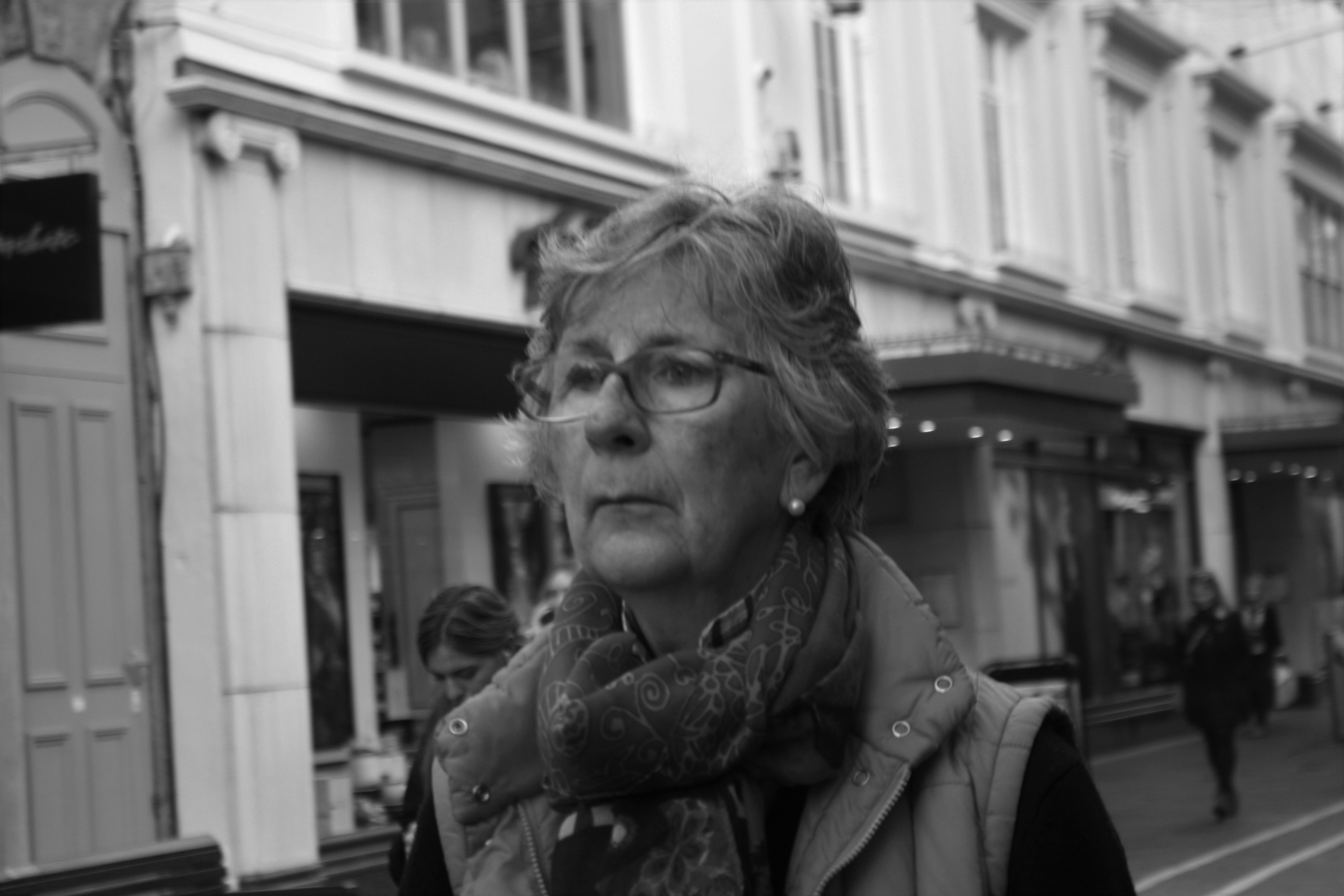
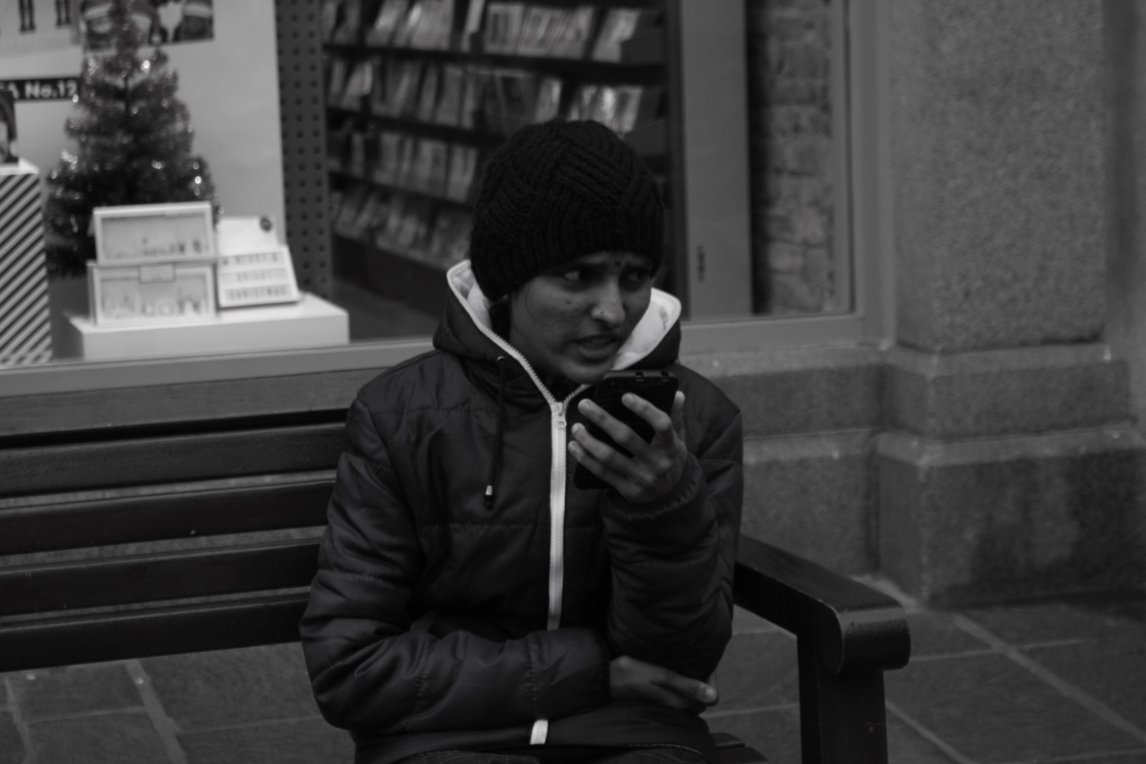
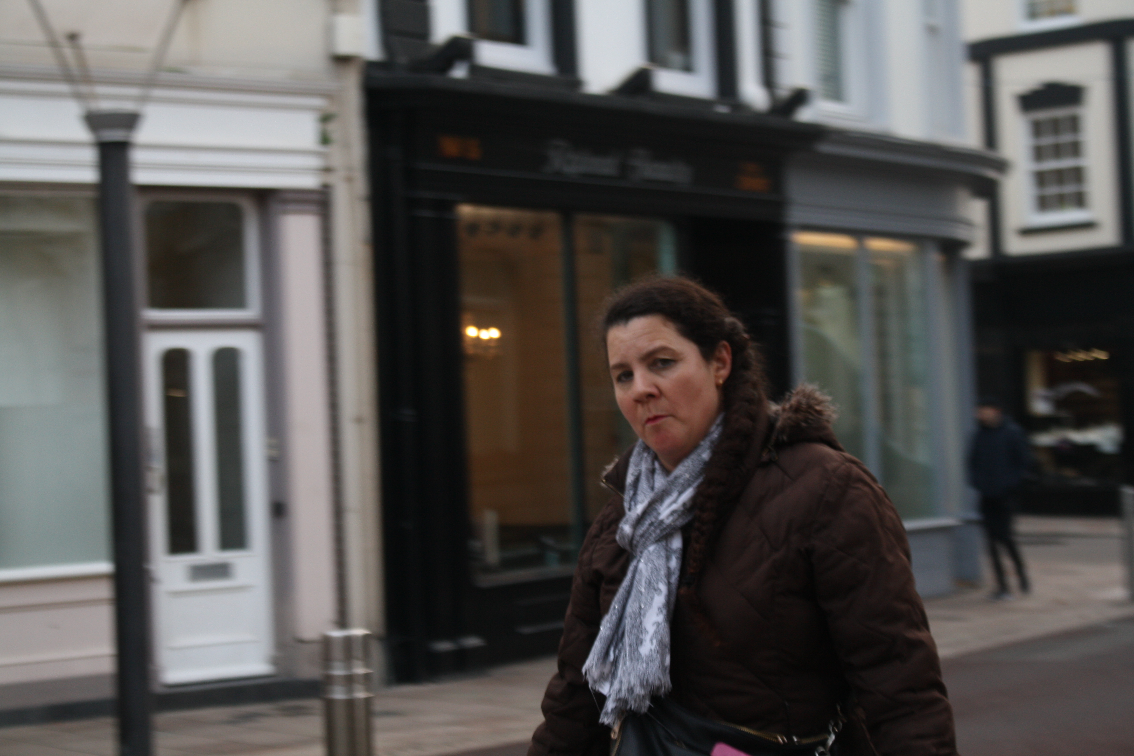
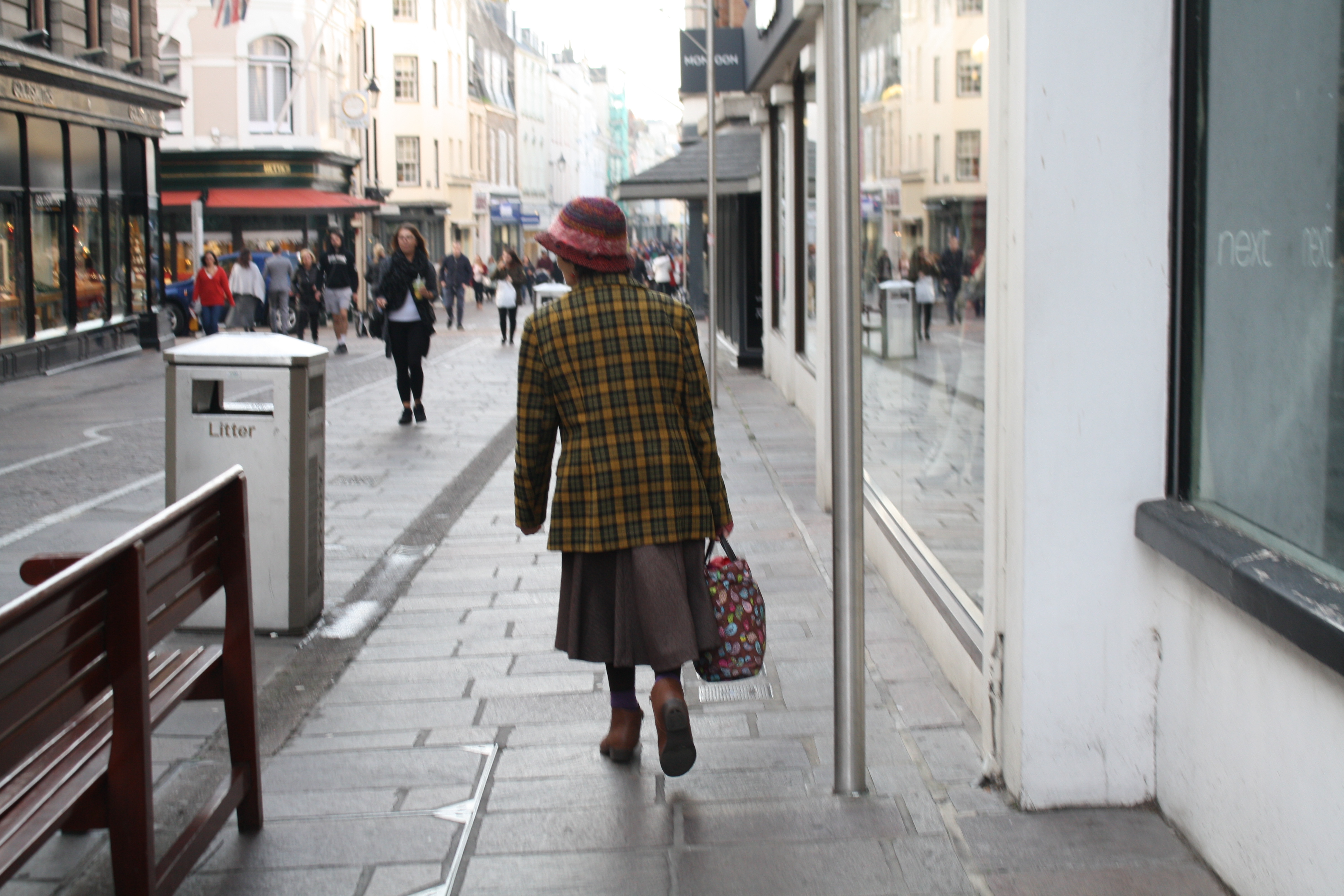
This is one of my favourites as he seems to be very disconnected to the world around him and just drawing/noting things down in his notebook.This one really reminds me of Dougie Wallace’s Work, as the women look wealthy especially due to their handbags and fur coats. Also their facial expressions seem to be disapproving and snobby in a way.I found this woman’s facial expression’s and clothing interesting. She was also singing to herself as she walking down the street. I had to follow her for a couple minutes to get a good shot as she walked quite fast and didn’t look at the camera at all. To me this an accurate representation of a grumpy/disapproving Jersey man, he embodies this well in his body language.This woman’s expression can also be regarded as being disapproving or maybe a bit sad in some ways.To me this woman looking up to the sky seems quite hopeful, she looks as if she could be waiting for something.This trio all seem to be in the same slumped body posture, all looking a bit depressed over something which we will never know about.This is one of the photos where I had the perfect opportunity but I had my camera was out of focus, however I still like this one. This was taking whilst we began talking to him again, I like this stare directly into the camera.
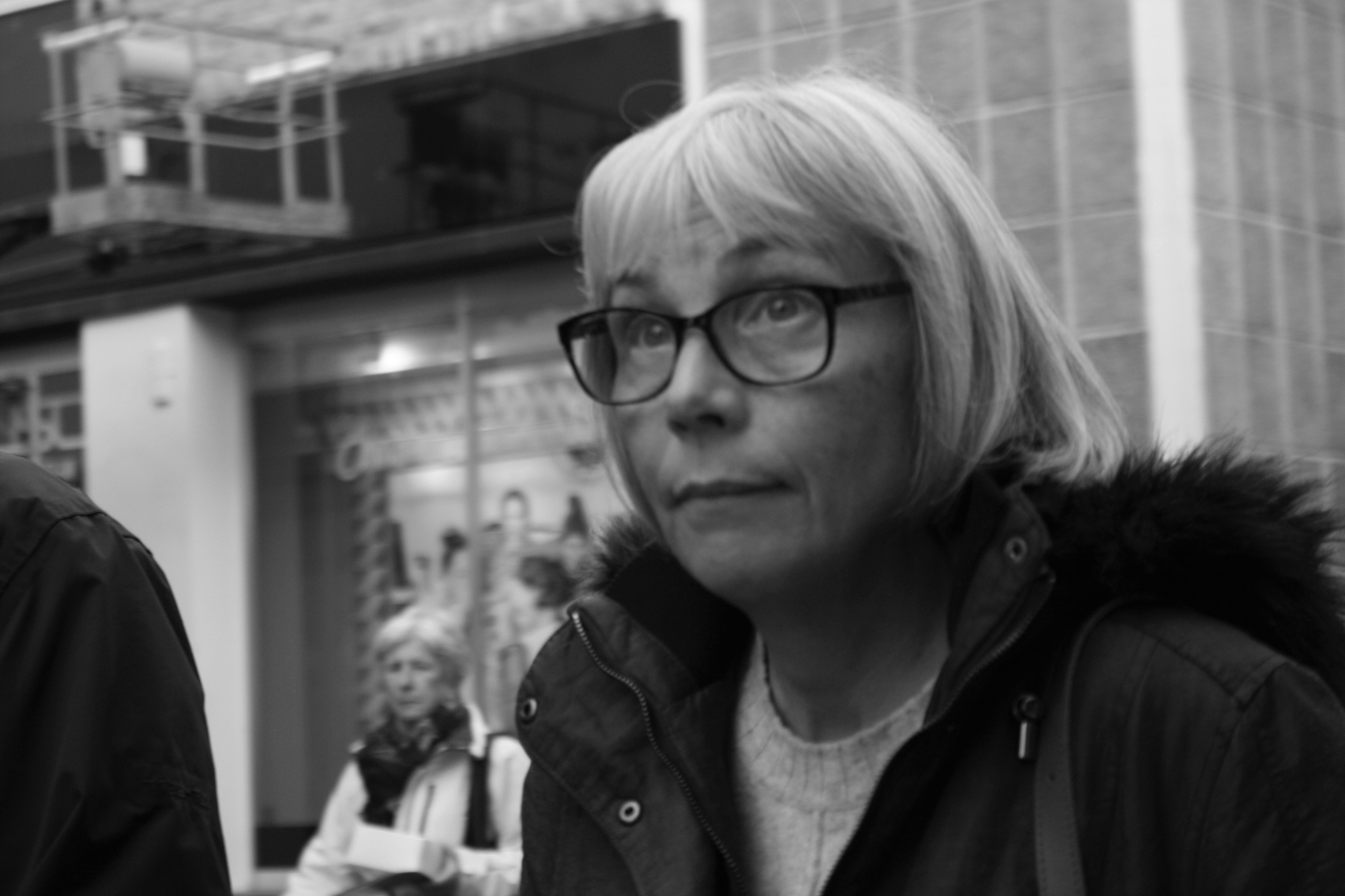
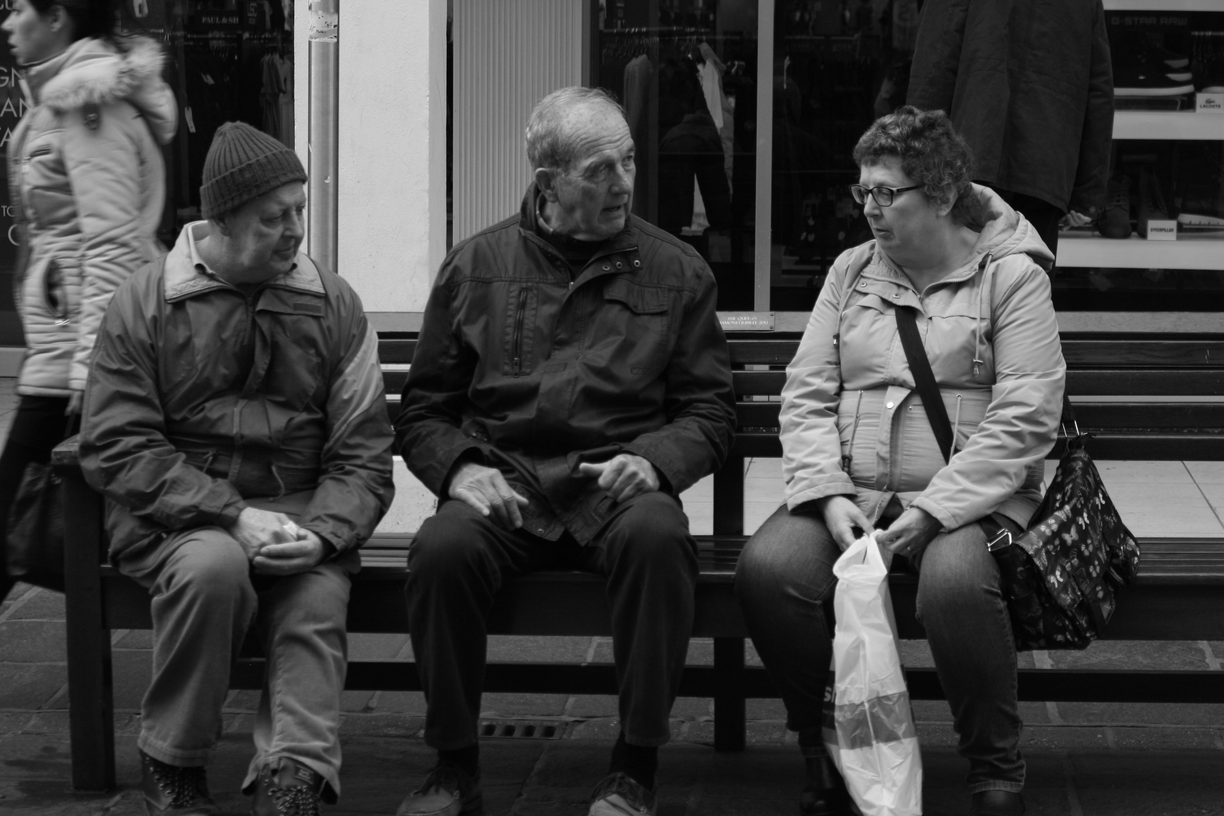
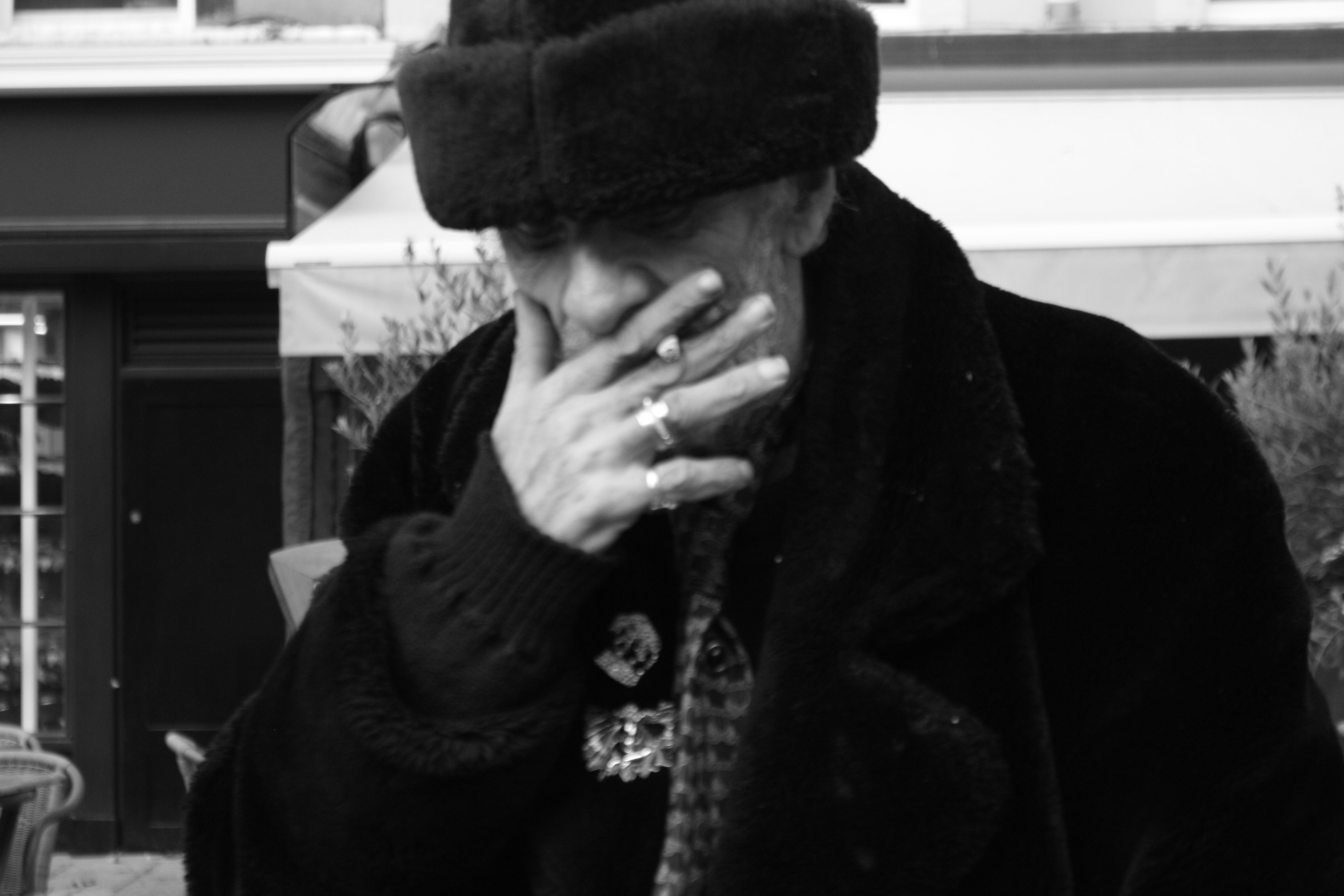
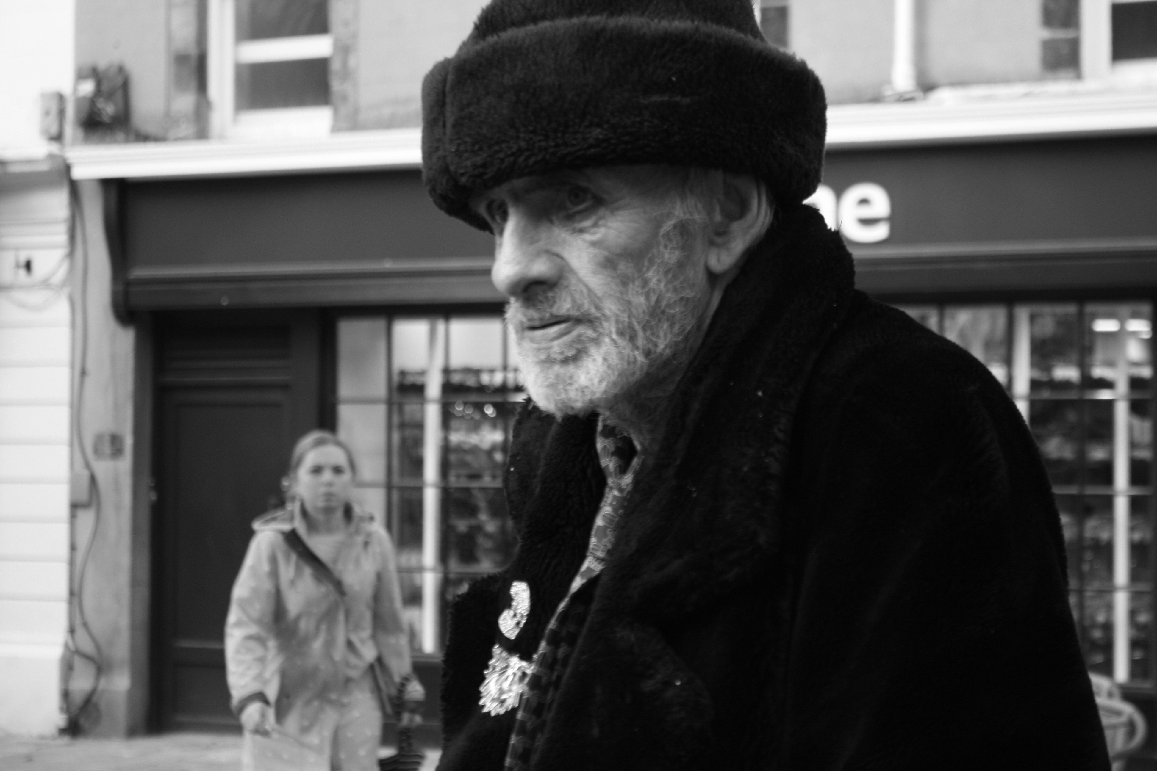
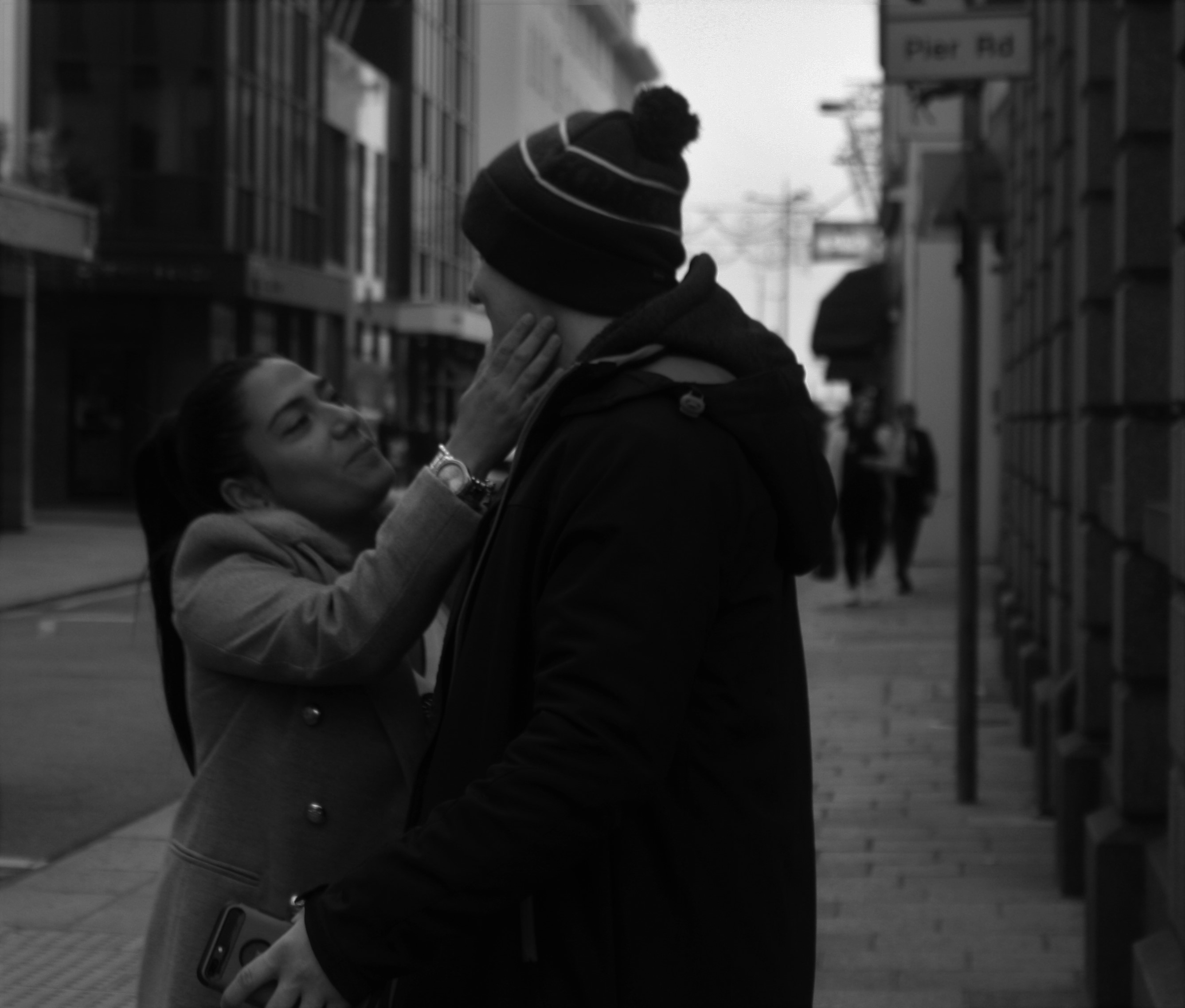
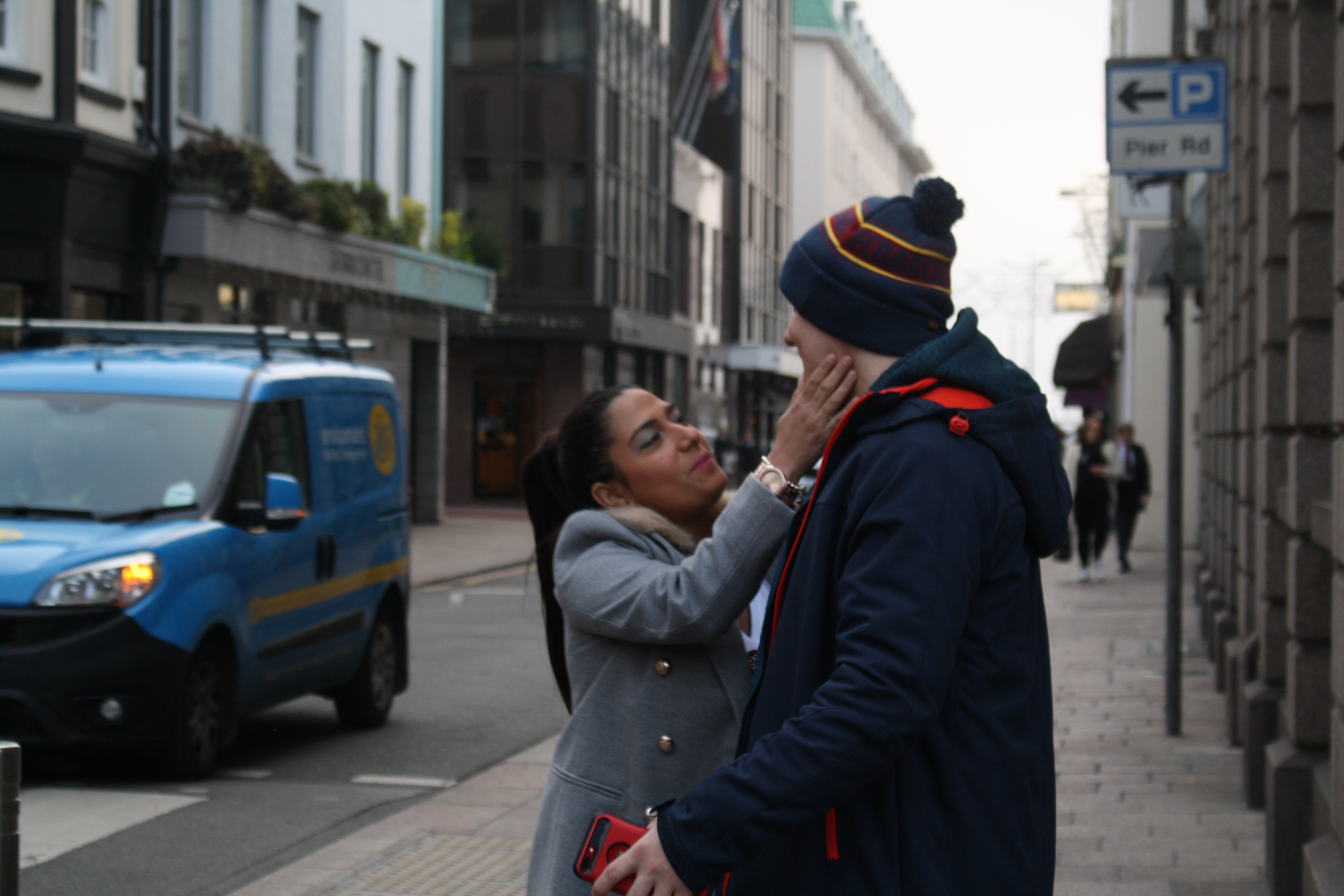
This one was very much a ‘Decisive Moment’ photo for me. I saw what may be a couple or perhaps even a mother and son and just took the photo without thinking much about it, they seemed to be having a proud moment where she just touched his face in admiration. I like this one as it juxtaposes the others which are quite dark and dismal.

5. Studio Portraits and Lighting Techniques (Mon 19th-Friday 30th Nov)

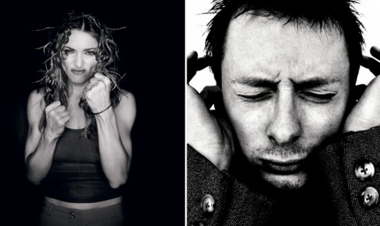
Concept : Rankin on “beautiful portraits”


Image result for selection of rankin portraits


Studio Lighting

Exploring Technique

1. Natural Light

Remember >>>Photography is completely dependent on the availability of  light.

In most cases we can make use of natural or available / ambient light…but we must be aware of different kinds of natural light and learn how to exploit it thoughtfully and creatively

  • intensity of the light
  • direction of the light
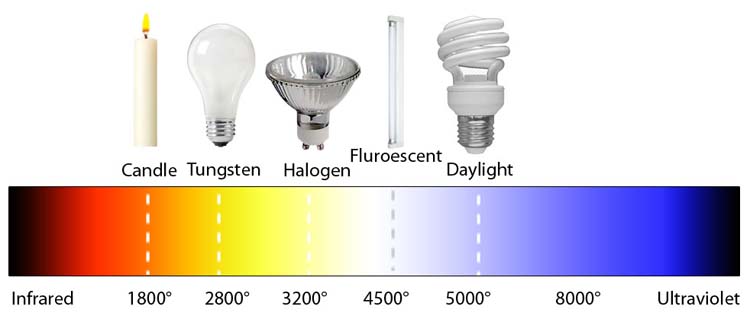
  • temperature of the light and white balance
  • Using reflectors (silver / gold)

Image result for temperature of photography light

Image result for temperature of photography light

  • Using diffusers , tissue paper, coloured gels, tracing paper etc
  • Front / side / back lighting
  • High Key / low key lighting
  • Shadows / silhouettes

2. Studio Lighting

Using artificial lighting can offer many creative possibilities…so we will explore

  • size and shape of light
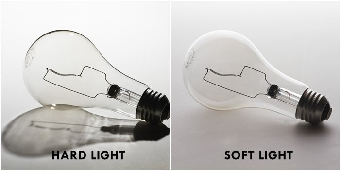
  • distance from subject to create hard / soft light
  • angles and direction…high, low, side lighting
  • filtered light
  • camera settings : WB / ISO / shutter speed etc
  • reflectors and diffusers
  • key lighting, fill lighting, back lighting, 3 point lighting
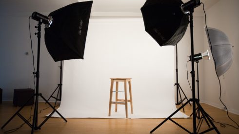
  • soft-boxes, umbrella lights, spot lights and floodlights
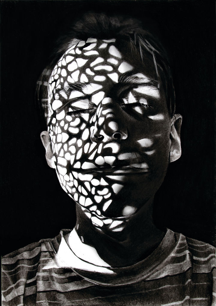
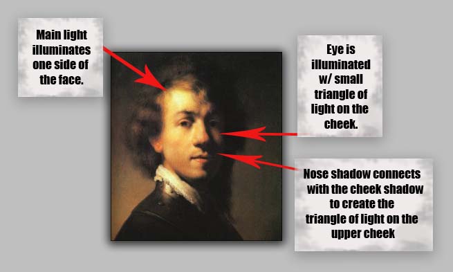
  • chiarascuro and Rembrandt lighting
  • high key and low key lighting techniques
  • backdrops and infinity curves
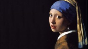
Johannes Vermeer, The Girl with the Pearl Earring, 1665—-chiarusco as employed by the Dutch Masters

Image result for chiaroscuro

Image result for bouncing the flash

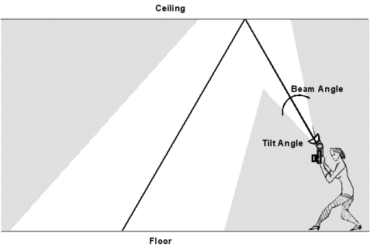
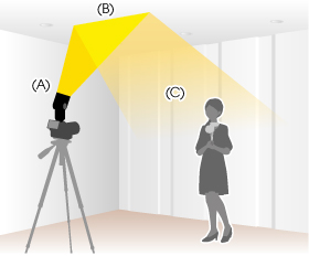
Above : An example of “bouncing” the flash to soften the effects and create a larger “fill” area…try this wherever there are white walls/ ceilings

Using Flash

Flash units offer a range of possibilities in both low and high lighting scenarios…we will explore

  • flash “bouncing”
  • fill-in flash
  • TTL / speedlight flash
  • remote / infra-red flash (studio lighting)
  • fast + slow synch flash
  • light painting c/w slow shutter speeds

Evidence of Your Learning

During this weeks we would expect all students to complete 2-3 blog posts  detailing how you are experimenting with various lighting techniques eg CHIARASCURO / REMBRANDT LIGHTING

Add information / links showing how Chiarascuro has been used since the Renaissance in painting…but also how it used now in photography and film

You must describe and explain your process with each technique…add your images to your blog as you progress, print off your successful images and evaluate your process using technical vocab and analysis skills. Think carefully about the presentation of your ideas and outcomes…compare your work to relevant portrait photographers as you go eg

Annie Leibovitz, Irving Penn, Rankin, Richard Avedon, Yousef Karsh, David Bailey, Mario Testino, Steve McCurry, Jill Greenberg, Nick Knight, Tim Walker, Corrine Day, Jane Bown etc

Expected Final Outcomes this Week

  • Case Study and Practical Responses to Rankin or another studio photographer
  • 1 x Final Portrait using natural light + analysis and evaluation
  • 1 x Final Portrait using artificial light (1, 2 + 3 point lighting) + analysis and evaluation
  • 1 x Final Portrait using flash + analysis and evaluation

Think about how you can show evidence of head shots, cropped head shots, half body, three-quarter length and full length portraits.

Show that you can employ interesting angles and viewpoints…

Make sure you ANSWER THESE QUESTIONS IN YOUR BLOG

  • Why do we use studio lighting?
  • What is the difference between 1-2-3 point lighting and what does each technique provide / solve
  • What is fill lighting?
  • What is spill lighting?
  • What is Chiarascuro ? Show examples + your own experiments
Bouncing the flash to soften its effects


Or use light painting techniques…

  • Slow Shutter speeds (1/30th sec or BULB setting)
  • Illuminate an area / person with a torch , study lamp, glowstick, car headlights etc…

HOMEWORK

(Refer to your tracking sheet)

  1. You must complete a range of studio lighting experiments and present your strongest ideas on a separate blog post
  2. Remember to select only the most successful images
  3. You should be aiming to produce portraits that show clarity, focus and a clear understanding of a range of lighting techniques
  4. Editing should be minimal at this point…we are looking for your camera skills here
  5. But…be creative and experimental with your approach “in camera”…extremes, uniqueness and possibly thought provoking imagery will improve your ideas and outcomes.

Image result for inventive portraits

Image result for contemporary portrait photography
Hendrik Kerstens
Image result for contemporary portrait photography rankin
Rankin
Image result for self portrait contemporary photography
Paola Sanchez

Environmental portrait– Artist comparison

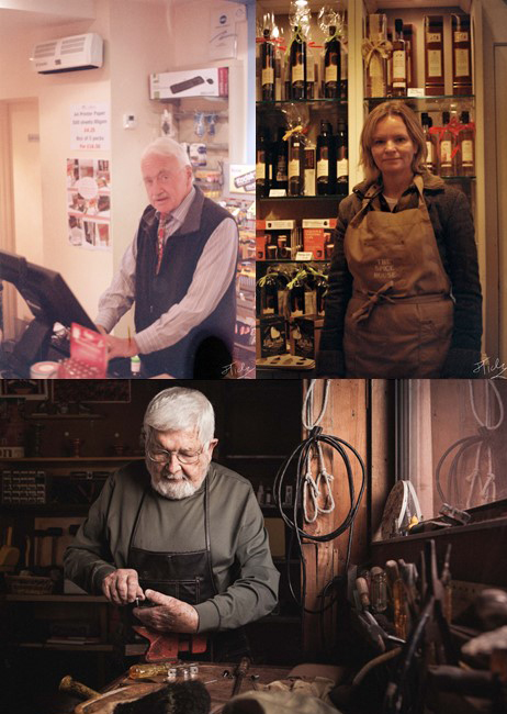
When comparing my images to the work of Anthony there are some clear differences, with the main two being that with mine there are the large imperfections due to the out of date film, and the other being that with mine I wanted the subjects to be in a position where they would be working similar to Anthony’s work but I wanted them to be looking into the camera because that means that they are directly interacting with the camera and it feels more personal.
I think that having the subject working and kind of interrupting them and not giving them time to do anything other than look at the camera means that it gives an honest impression of them and their working environment.

Street Photography


Mood Board

Definition: ‘Street photography, also sometimes called candid photography, is photography conducted for art or inquiry that features unmediated chance encounters and random incidents within a public place. Although there is a difference between street and candid photography, it is usually subtle with most street photography being candid in nature and some candid photography being classifiable as street photography. Street photography does not necessitate the presence of a street or even the urban environment. Though people usually feature directly, street photography might be absent of people and can be of an object or environment where the image projects a decidedly human character in facsimile or aesthetic.’

“Don’t wait. The time will never be just right.”
-Napoleon Hill

“Just go out and shoot! It’s great to get inspired by reading books and watching tutorials and so forth, but you need to actually go out and take pictures. Don’t be afraid to get out there.”                                     -Valerie Jardin

Henri Cartier-Bresson

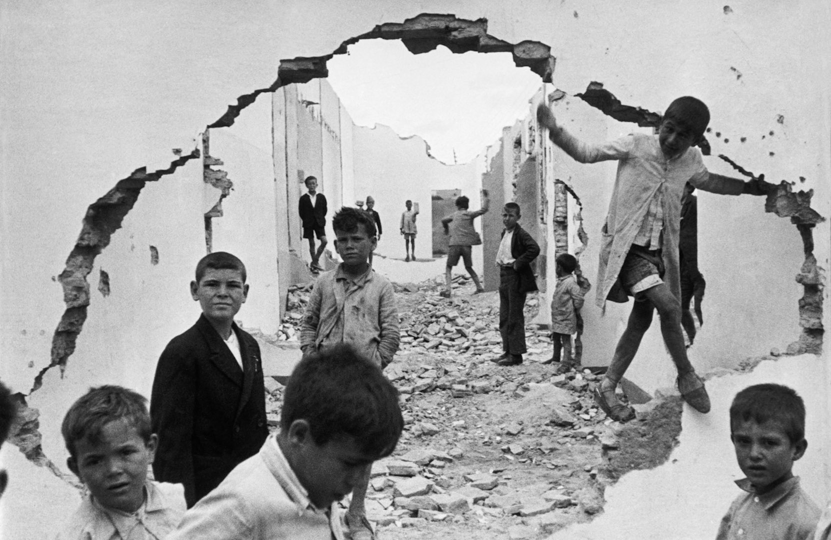
Bresson was a French photographer, who was said to have pioneered the genre of street photography. He thought of photography as a way of capturing a decisive moment. Bresson’s passion of photography came at an early age where he used to capture moments of his family holidays. This small hobbit then turned into his career, where he made a massive contribution towards photography.

Henri Cartier-Bresson

Emotional Response

When first viewing the photograph, we begin to grow an emotional attachment to the child located around the image. This is because it seems like their homes have been destroyed, leaving them with the remains of the homes to play with. The morbid photograph is interesting as the facial expressions on the children are not happy making us realise that something is not right, making us more emotionally attached to the image. Moreover, the children’s faces look soiled meaning that the setting is not hygienic and potentially very unsafe for them.

Technical Response

This photograph is presented in black and white, which allows the solied faces of the children to be clearly visible, it also allows the broken walls and dirty floor, to present the formal element of texture. The fact that the image is black and white also plays on the idea that the children have nothing, like we had nothing back in the day. The wall with a hole in it has been used as a frame, which is framing the background allowing the viewers eyes to clearly be guided around the photograph. The location of the children also helps to guide the eyes, as there are more kids in the foreground and less in the background, (creating a large proximity) making our eyes look at the front of the image and make there way towards the background. The formal elements of shape and space are also presented through this image, through the use of the children and the collapsed walls, trapping them. The whole frame of the photograph is in focus, however, the background is slightly less out of focus, which means there is a large depth of field. Moreover,  the aperture is likely to be around F11 – F8. The shutter speed used to capture this image is likely to be quick, as there is no intended blur. Additionally to the ISO is also likely to be low as there is no noise created by the light. The lighting used in this photograph is likely to be natural, as it has been taken outside, in what could be the children’s natural environment. This image consists of some negative space, which is found at the background of the frame, this creates a sense of that these children live with nothing and are trapped with nothing, which also helps to create an emotional attachment.

Contextual Responce

This image was taken in 1933, which was a couple of years before the Spanish civil war. The children are said to be playing in a ruins, a destruction from a previous war. 1933, was one of the worst years during the Great Depression, which was a time when the economy collapsed, which also helps to provide contact towards the photograph.

Conceptual Response

Now knowing the context, I believe the concept of this image was to show the effect of wars and the Great Depression for those in poverty, the use of children makes the image more hard hitting towards viewers. The hole in the wall is trying to show the children trying to break away from there reality. It also shows how it has effected the children, leaving them with only ruins to play in.

Photoshoot Plan

I will be capturing my street photography images in town, during the early afternoon, a time which can sometimes be busy. I will be walking around the streets, looking for interesting characters. The aim is to remain a discrete as possible, so the citizens are unaware of me capturing the images. The lighting will be natural and my camera settings will also be kept simple, however, I do want a quick shutter speed as it will allow me to capture many images.

Contact Sheets

Final Outcomes

Comparison

In technical terms I feel that my work and Bresson’s work is similar, we both presented our images in black and white, I attempted to have the formal elements of shape, texture and space in my images as those a key elements to Bresson’s photograph. Moreover, I tried to create a depth of field, where the people are mostly in focus, but still having the background in focus, but not as clear at the foreground. Bresson’s photograph is very different in conceptual terms as he is trying to show the effect of war to children in poverty. My photographs concept was to show the different kinds of people found in town during a busy period.