Last week I went into town and did an urban photo shoot, these are my best images which I have slightly edited (added filters,cropped etc.).
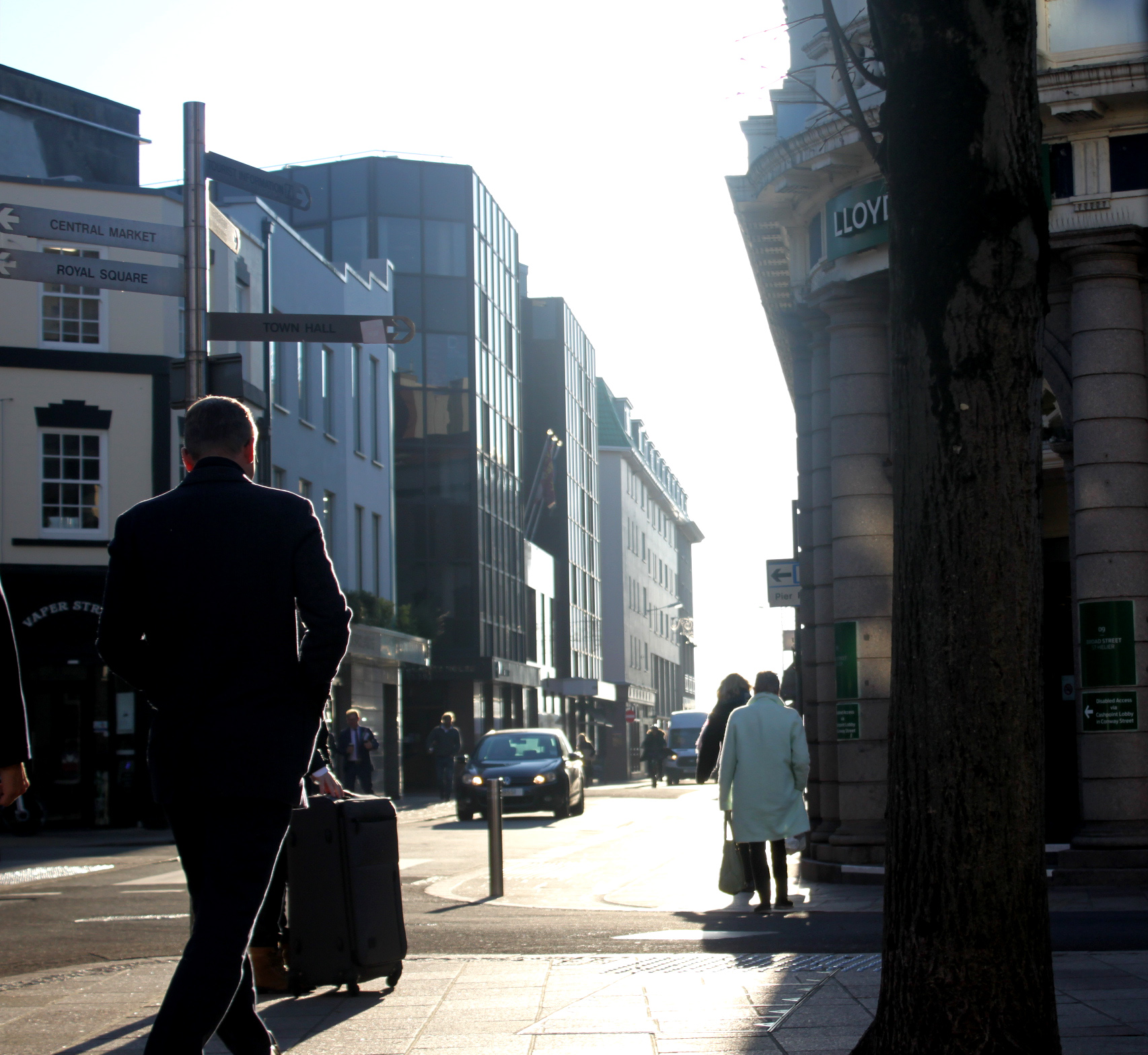
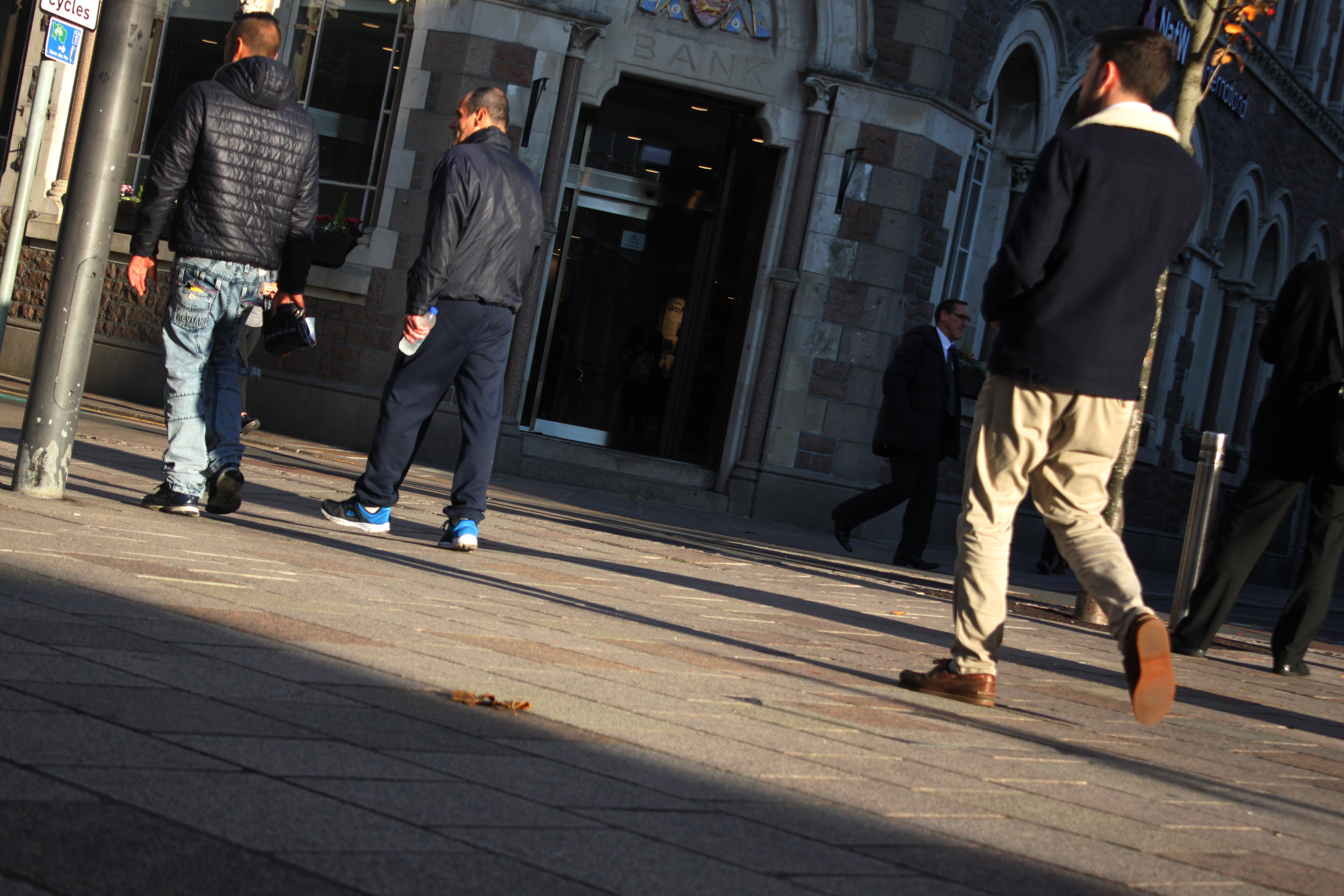
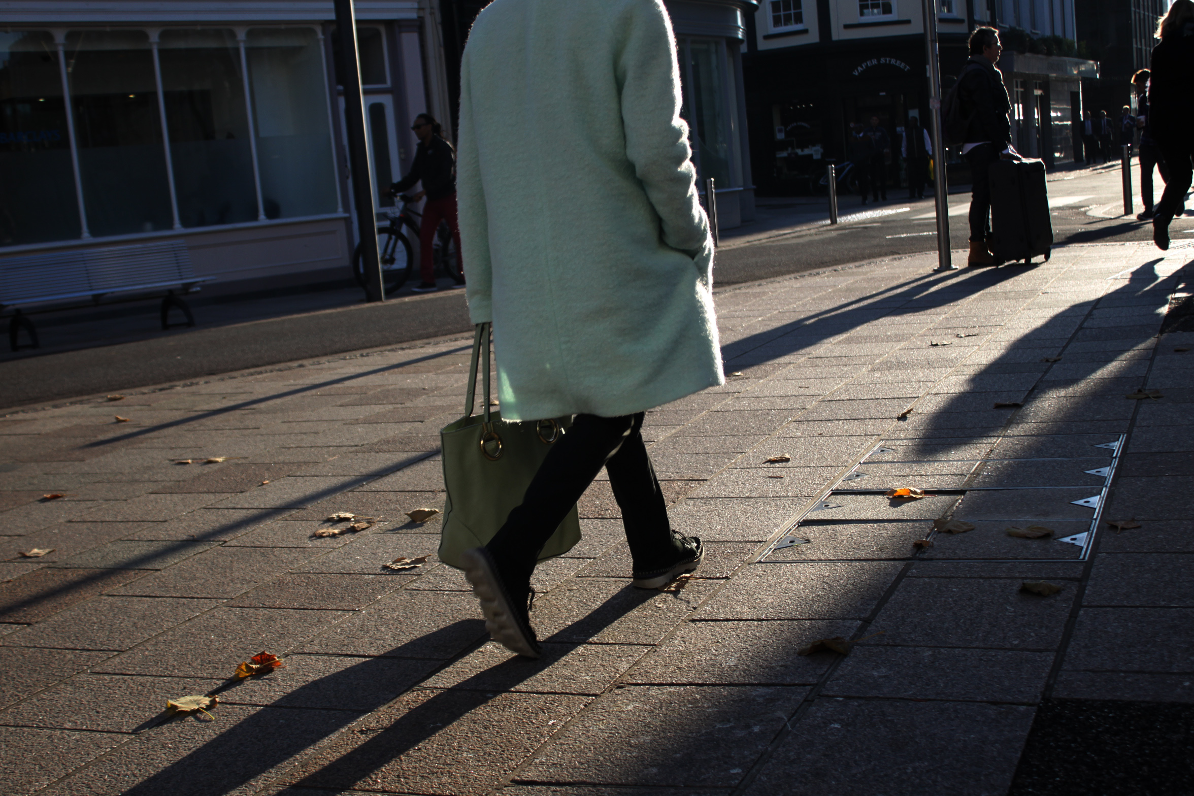 I particularily like the strong shadows and ligh highlights of this photo. Because it was taken near the ‘golden hour’ the sun was low which created these elongated shadows. It also gave a nice outline/shine to people on the street as there wasn’t any cloud cover.
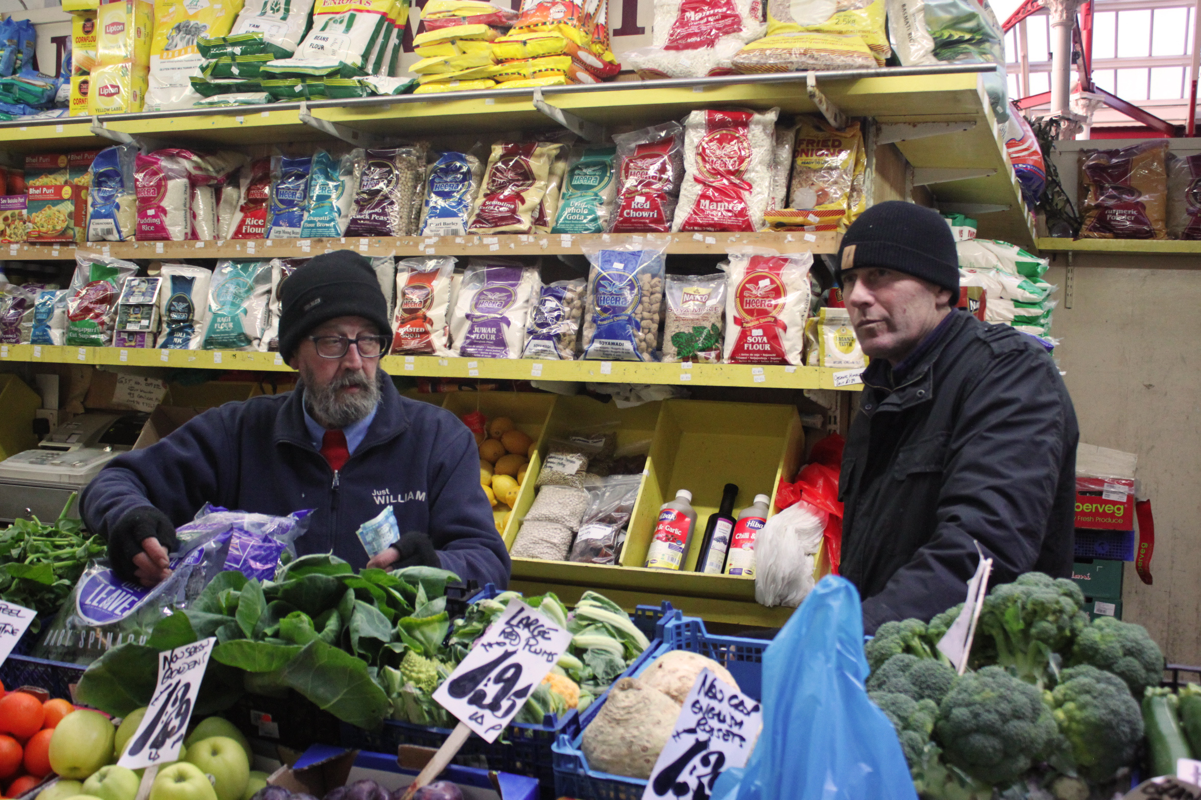
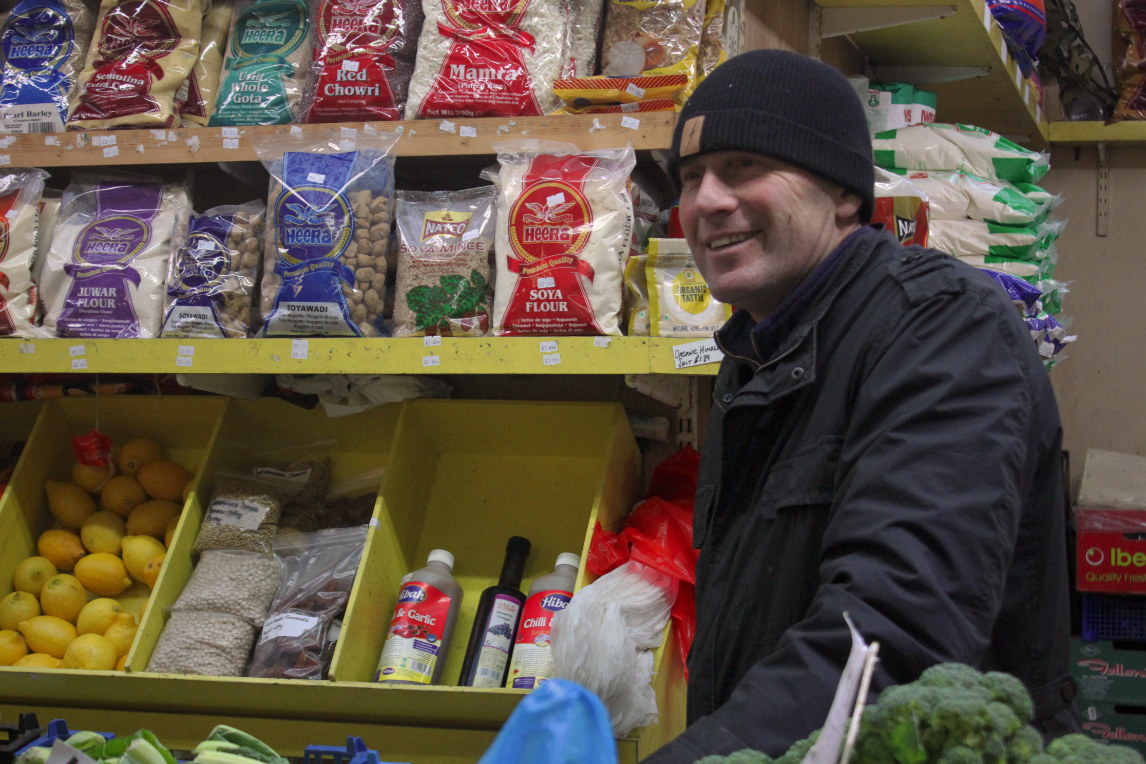 This is a photo of a market trader, I have chosen it because of the contrast between the man and the products for sale behind him. I have cropped it so that the strongest points of the photo (in terms of structure) are visible. It’s just a pleasant photo to look at because: the bright colours which the photo is composed of are naturally attractive to the human eye. The products are stacked symmetrically, this both pleases the eye as well as gives the photo structure. Finally, the trader is smiling and appears very open to conversation, this makes the photo pleasing to look at because seeing other people smiling has been proven to lift your mood and change brain chemistry.
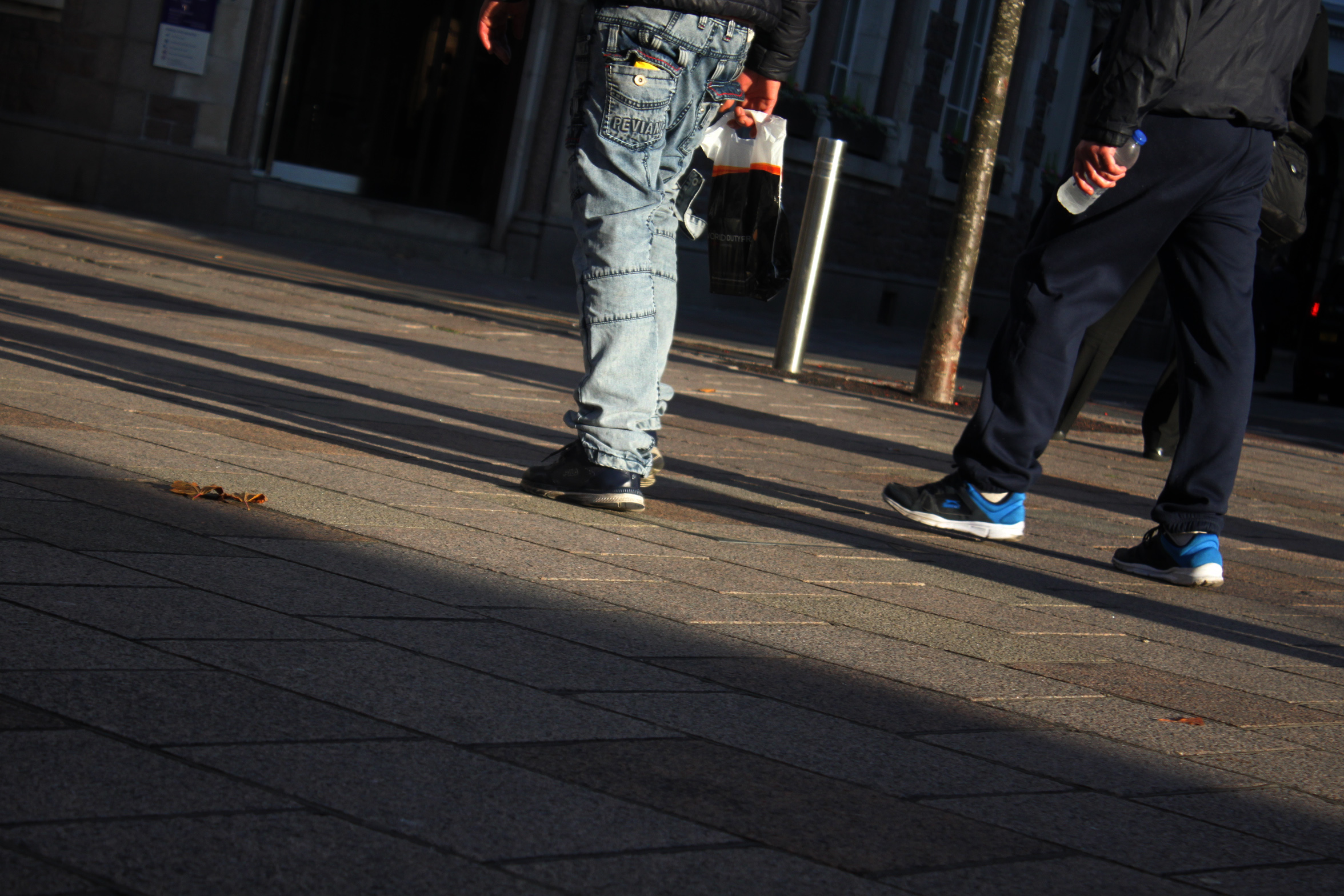 I like this photo because its very simple, it shows the daily commute of people whilst keeping their anonymity. Although it is a simple photo it isn’t boring, this is due to the shadows caused by the sunset, which give the photo structure, the angle at which the photo was taken, and the texture/shapes of the trousers near the centre of the photo. Another aspect of this photo that I like is that both people in the photo are only visible from waist down, it gives a different perspective to the world as it differs from standard photos of whole people taken at head-height.
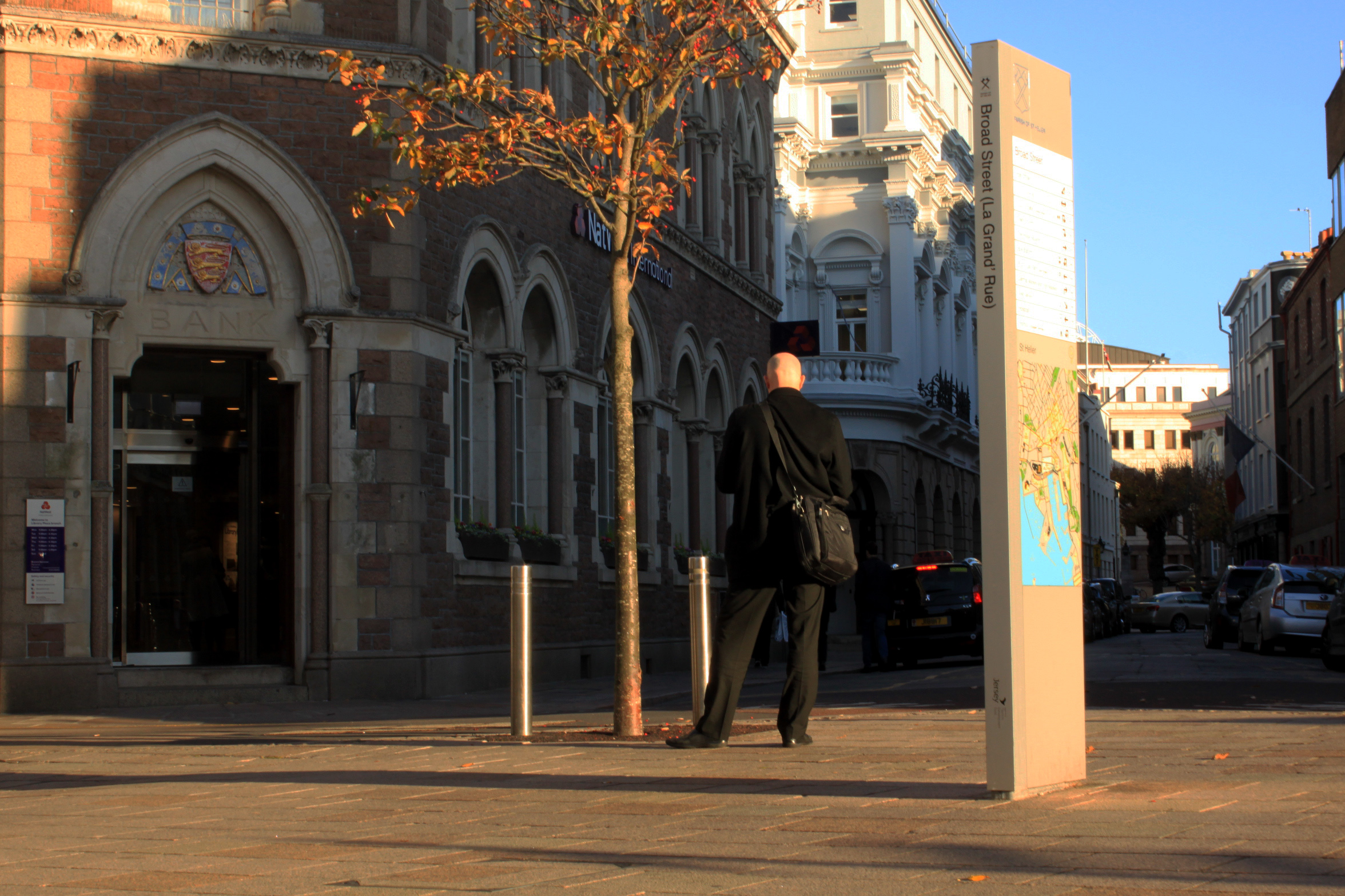
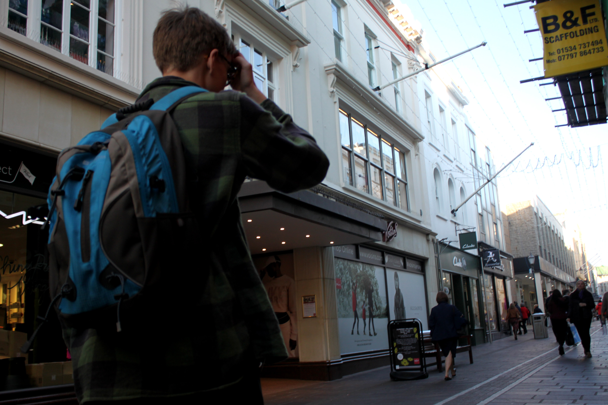
 This is a very similar image to one further back in this post. It doesn’t have the same effect as there are more elements without strong shapes but I have kept it in because it captures the work environment and daily tasks of these market traders.
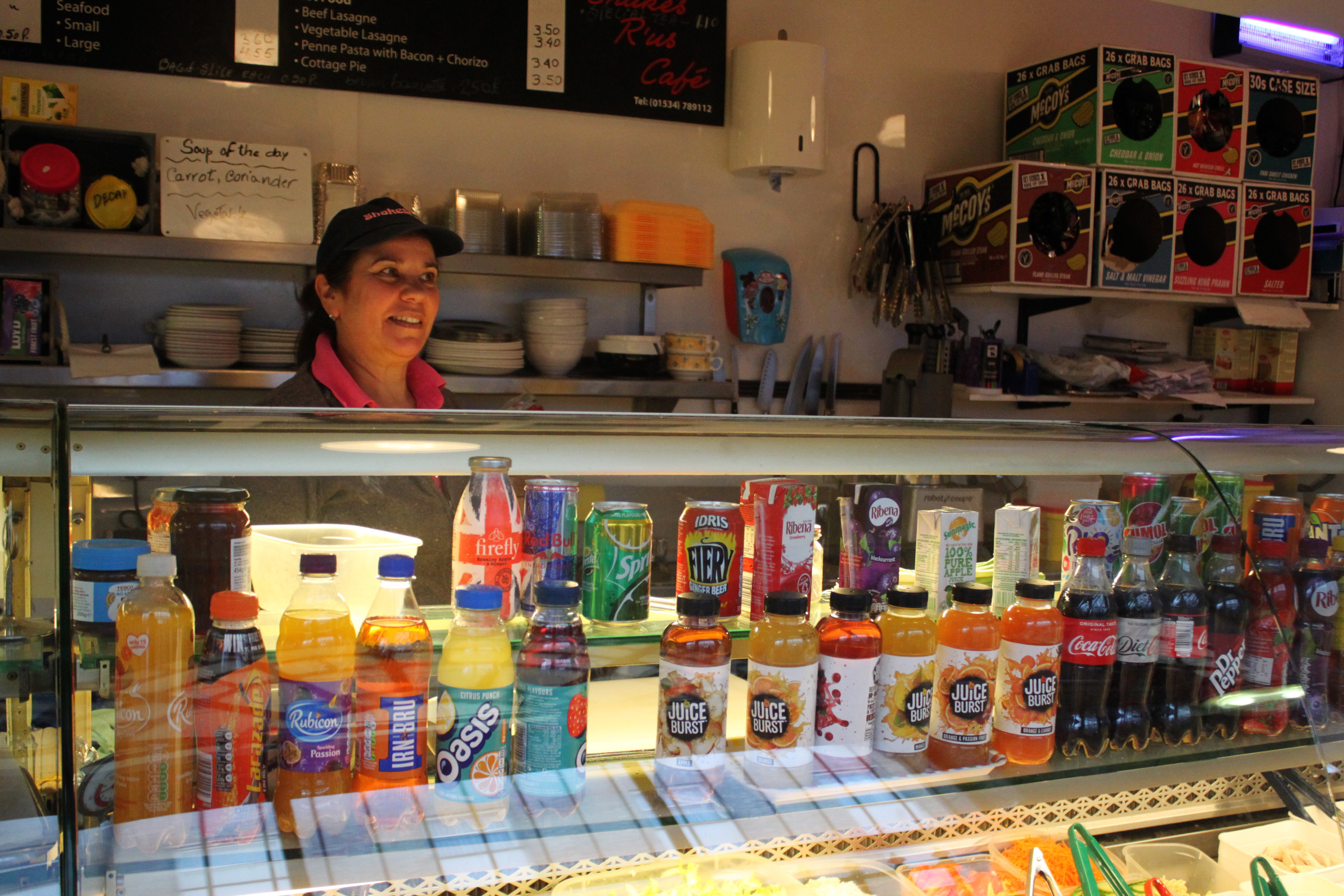 This is my favourite image out of the whole shoot, it has the right exposure, vibrance, structure, and it captures the work environment as a whole. This photo has a warm white balance, this makes it more relaxing to look at as warm lighting as it feels more natural than cold lighting. The photo also has a variety if colours thanks to the products on display out front. There is also a lot of structure and symetry throughout the photo, the bottles on display and crisp packet boxes for example.
