abstract

Abstract photography, sometimes called non-objective, experimental, conceptual or concrete photography, is a means of depicting a visual image that does not have an immediate association with the object world and that has been created through the use of photographic equipment, processes or materials.
Abstract photography is based on the photographers eye. We’re looking to capture something in a way that it would not usually be seen. Looking for the details, the patterns, the lines, the form, shape and colors that complete a subject and utilizing those key features to make an engaging image.
László Moholy-Nagy
Image result for László Moholy-Nagy
László Moholy-Nagy, born in 1895 in Borsód, Austria-Hungary, believed in the potential of art as a vehicle for social transformation, working hand in hand with technology for the betterment of humanity. A multifaceted artist, educator, and prolific writer, Moholy-Nagy experimented across mediums, moving fluidly between the fine and applied arts, pursuing his quest to illuminate the interrelatedness of life, art, and technology. Among his radical innovations were his experiments with cameraless photographs (which he dubbed “photograms”); unconventional use of industrial materials in painting and sculpture; experiments with light, transparency, space, and motion across mediums; and his work at the forefront of abstraction.
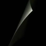
my favorite photograph he took:
Image result for László Moholy-Nagy
this is a photograph he took of a what seems to be a building, but he took it from an angle which made it abstract. the patters of those balconies one on top of the other is very interesting and eye catching. and finally the black and white filter adds even more definition to the photograph.
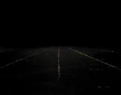
experimenting with abstract photography:
in order to take abstract photographs i had to have a plan first and that was to burrow a camera from the school and go off to the fields and down the beach and just take photographs of anything that catches my eye and this is what i came up with.
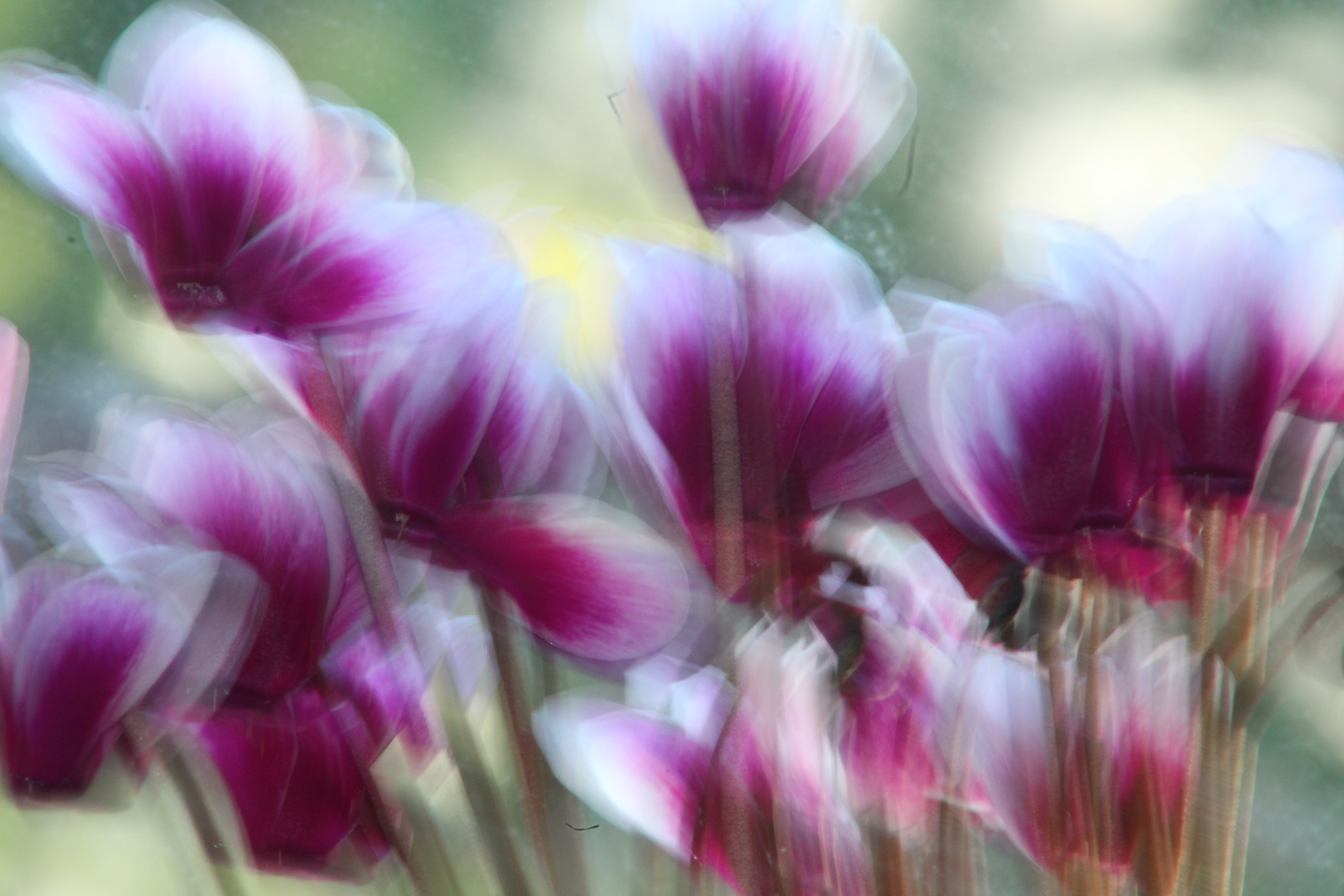
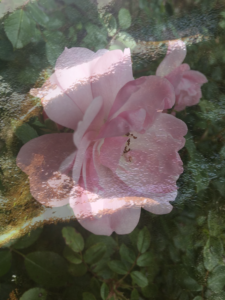
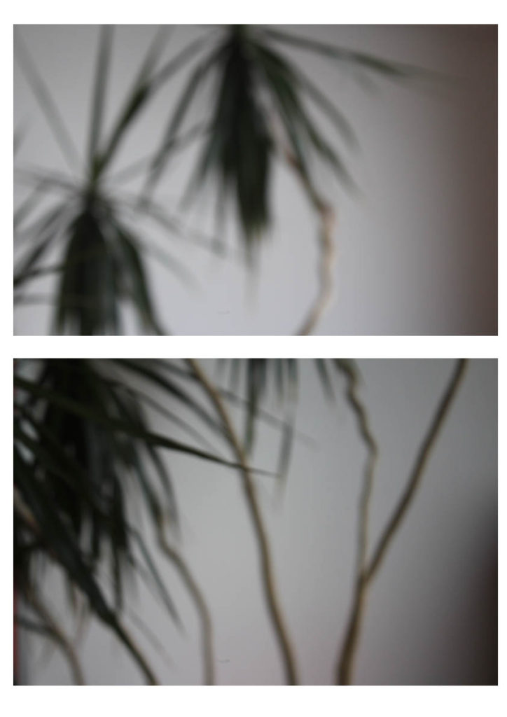
i call this one The Moving Cyclamen and its basically just a photograph of a plant of species cyclamen but the main thing here was to take the photograph with the slowest speed possible while moving the camera to the left and right at a very steady rate. and this created a lot of movement and color in the photograph.


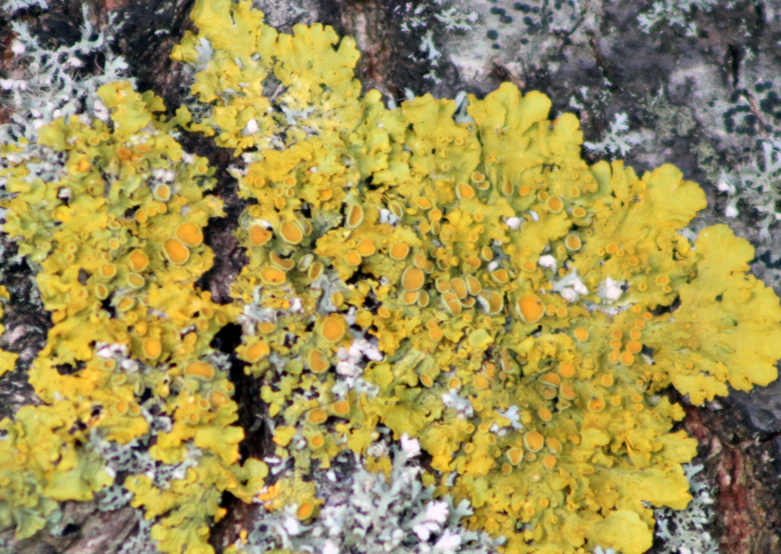
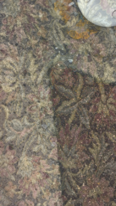
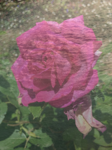
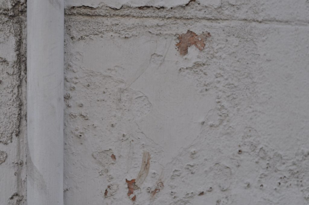
this is a photograph of a lichen growing on a tree’s bark. the intense color of this organism really caught my eye and the texture looks like its a piece of art. this photograph although was taken with very fast shutter speed to create a sharp image.
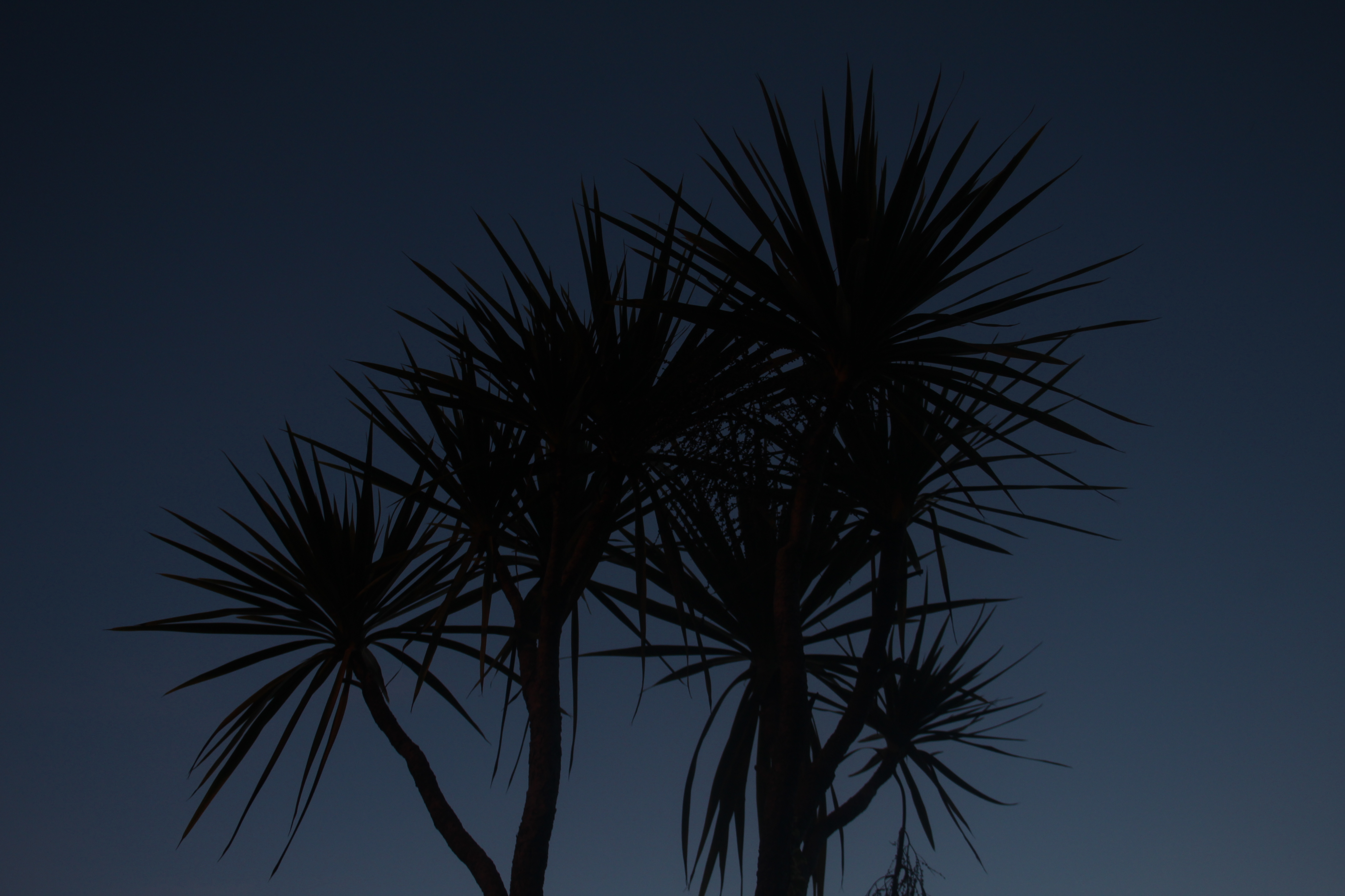
This is a photograph i took of a tree at dusk time. the time of the day in addition to the angle the photograph was taken at created a very simple yet abstract photograph.
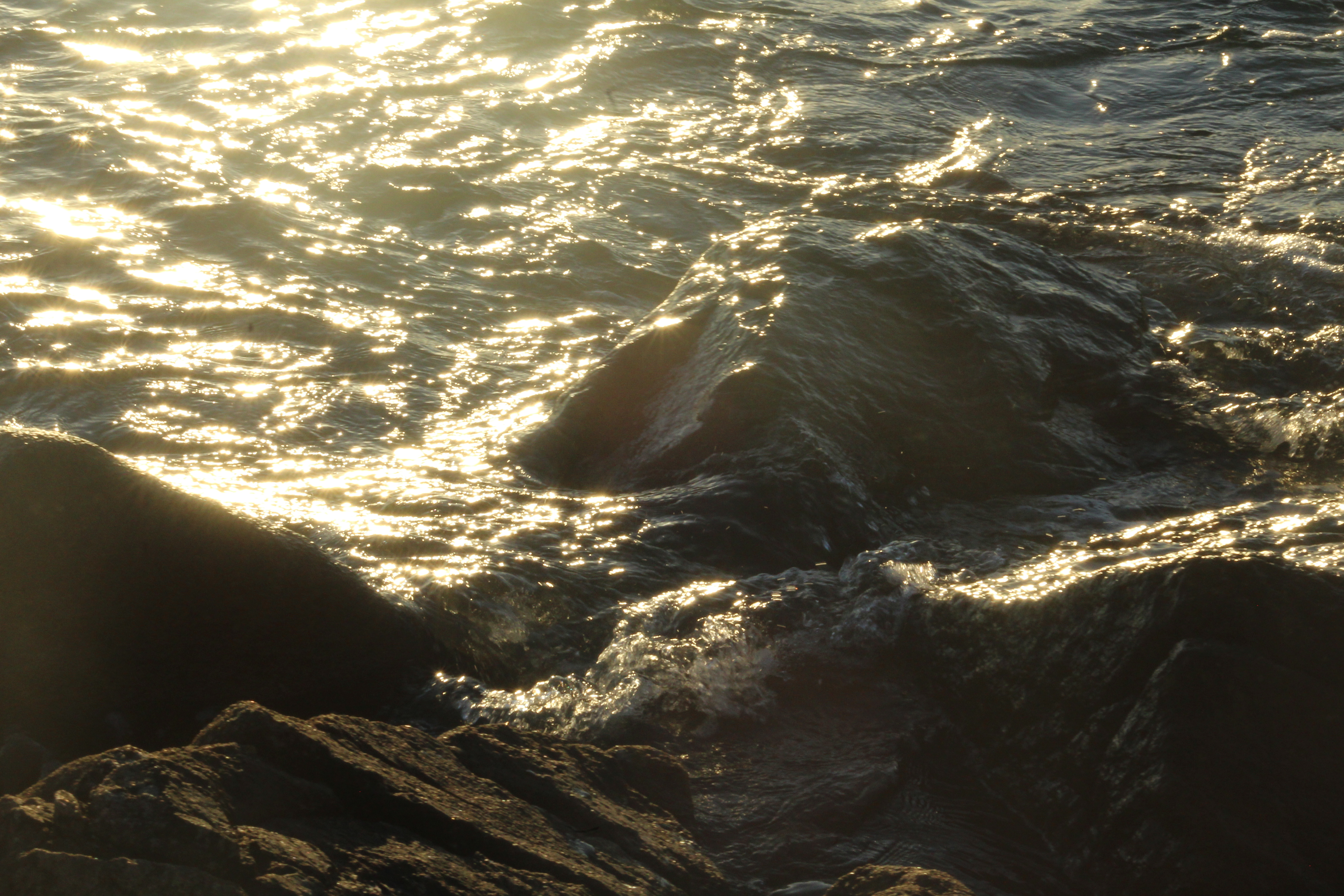
this is a photograph i took at sunrise. i took this photograph at an angle in where the sun is opposite to me reflecting sunshine off the breaking waves into the camera. this created a lot of color and light in the photograph. this photograph was taken at a fast shutter speed to catch the movement of the waves.

Alexander Mourant

Info/Background:

Raised on the Channel Island of Jersey, London-based artist Alexander Mourant (b. 1994, UK) is
drawn to the friction between interior and exterior worlds, as well as photography’s power to
represent existential ideas. For his recent Aomori series, Mourant captured the blue depths of Japan’s
ancestral forests with a lens filter developed specifically for the project.


An Example of his work, Blue Photography:


Alexander Mourant
  • In this photo You can see moss covering rocks and ground on the left hand side and on the other side there is rocks and banks and trees to do this photo he would of used natural lighting, the light is coming from the bottom left hand corner.
  • To get the colour blue he has taken a piece of blue glass  from a church window and had it specially cut to fit the lens of his camera. this meant that all the pictures he took were blue.
  • Mourant has captured the moss on the left hand side and has made it look like water is coming down the banks, when i first saw this picture I first of all thought it was water however when I looked closer I realized it wasn’t.
  • The trees on the right hand side has been made abstract as the lines from the branches are filled and the leaves look like they are block.
  • The lighting is coming from the left hand corner, the light is catching the moss and making it white as if it has been over exposed


This is my example responding to Alexander Mourant work, Instead of using glass over the lens, I changed the white balance setting in the camera, I liked this setting as the photo was green however When I changed the white balance It went to this light blue. The light Is coming from the Left top right corner catching the branch in the middle,

Over-exposure

To start my over-exposure piece, I first chose the two images I wanted to use. I looked for two images which might go well together, and at least one that had texture and was considered abstract. I had to make them the same size, so since one was smaller than the other I had to make the smaller one bigger so it covered the entire picture.

I then went and copied my textured one onto my other photo, and lowered the opacity so the bottom layer was visible through the top layer. I adjusted it until I was satisfied with my outcome.


Final works:

week 1-white paper challenge

In my very first a level photography class i was challenged like the rest of the photography student to take a picture of only a paper with my phone camera, and i was up to the challenge.

So i grabbed my phone with the really bad camera and picked up a paper and started experimenting shapes that i can create from a single sheet of white paper.its really just about being creative at this point you really just need to experiment as much as you can and think ahead on how are you going to take the picture, at what angle, what lighting……..

I saw that most of the students where just trying to copy the photograph of a paper in the form of a ball that the teacher showed us, so i wanted to do something else. so i grabbed a ruler and my paper and started folding the paper around the ruler to create a zigzag paper.

After i did the paper now i should plan on how am i going to take the picture, i decided to use the flash on my phone since there was not enough natural light to create shadows. but i wasn’t sure at what angle should i take the photo so i experimented from two angles and this is what i came up with:

so this one i took it from above the paper and used the light in the room to create that zigzag shadow around the paper.

this one i just took it from the side, and the light from the sun through the window also created some shadow on the paper.

and as you can see both photos where edited and that was using a phone app, since the challenge included only using phone there was no other way to do it.

in the first photo i used a light filter called vintage which makes the photo a bit dim and yellowish, i also used a tick black frame alongside cropping to adjust the paper in the middle of the picture.

in the second one i used a light filter called x process, which makes the photo brighter and blueish , i cropped some obstacles from the photograph and i used a frame with a little bit of texture to create some movement in the photograph.

Compare&Contrast Edgar Martins

Edgar Martins 


He was a Portuguese photographer who is currently living in the United Kingdom. He was born in 1977 in a small town area called Évora, although Martins grew up in China. However Edgar doesn’t just base all his creativity in the photographic area but he has also published a hand full of books in which he has won a variety of awards for. Martins has work exhibited in various places around the world from Portugal to places like Dubai. Not only that but Martins was considered by the UK and the US as one of the most influential artists for this generation. Not only has his work inspired our first project for photography but having looked at my new images and my now edited images there are some obvious changes in terms of contrast and the shadowing I have added to the photo to make it similar to Martin’s developments.

His images is part of a series of work inspired by the writing and sending of letters, the power and intimacy of a letter. Martins has recently won various awards for his minimal, direct and stylish approach.  it is pretty evident that Martins puts a lot of thought into his images as not many artists have had the same approach as he had. 

Edgar photographed paper. There is a stillness to his images that belies the fact they may have been written as suicide notes, used to communicate between prison inmates and loved ones. Martins spent time working with court, prison and parole officials and indeed, prisoners in Portugal.

Here are just some of my favourite examples of his work.

(not an image of paper but still one a famous image)
Paper 1
Paper 2


I like these images due to the contrast of lights and darks and how in the second image of the paper there is a  real sharpness and contrast on how the  black background sits below the white piece of paper.  For me this is really eye-catching as the focus is quite vastly spread amongst the image but immediately only draws attention to the white area.

My paper photographs were not as professional as Edgar’s but there was a thought process. Here are some of my examples before I even edited them slightly. 
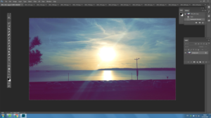
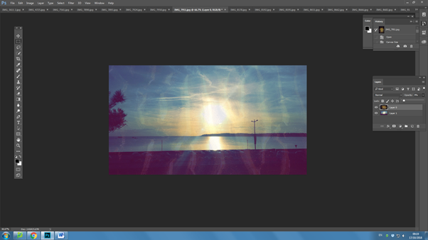
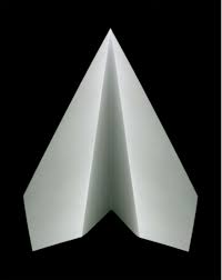
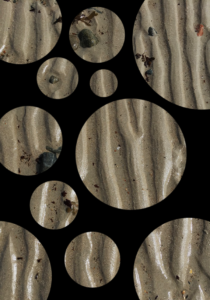
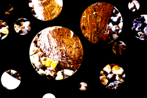
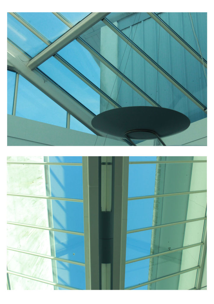
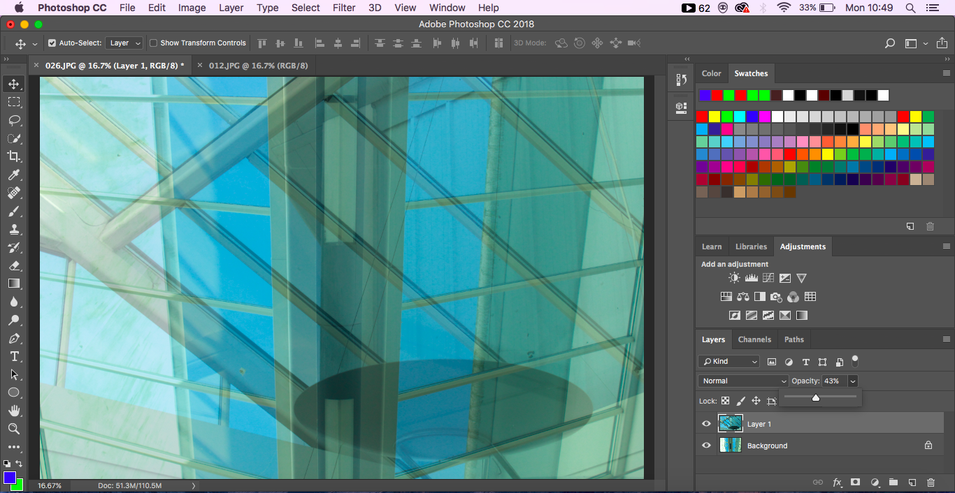
This image was not the first set a paper photographing I did but the second. I chose to edit this image as its one that looks quite similar in terms of Edgars images .

Here I’ve changed the image lighting and added a lot of heavy shading. I’ve edited this image by adjusting the tone, brightness,exposure,contrast and black point.

Final Prints: Display Techniques

Here I am going to be trialing and experimenting with ways to display my final images on the A3, A4 and A5 paper prints.  This will include arrangements of multiple images on one page and also just some single images to see what will work well together and if I can create a series of images that work well along one print.

Display 1:

Display 1

This is my first experiment with a way to display my final images.  This display has two photographs from the same shoot one on top of the other.  I would either place this image as A3 or A4, this would be so that you could clearly see the images and I feel would have a bigger impact on a larger scale.  I feel the two images together have a large impact as they compliment each other and work well together creating a better effect together rather than if I had one of the singular photographs on its own.  I feel this would work well displayed as a final piece as it shows off some of my camera skills and having them both on here emphasizes this.

Display 2:

Display 2

This display I would use for A5 this would enable for the photograph to fill the whole page and I think this would have a larger impact having this particular photograph on its own and isolated.  I would use a small boarder of white around the edge as to frame the photograph as I feel this would have a good effect.

Display 3:

Display 3

This display combines another of my two chosen images side by side as they work well together in the same style with the geometric abstract lines.  I would have it either A4 or A3 as to show off the photographs and to be able to see the detail as I don’t feel this display would work well on a scale of A5.  I feel the two images have a larger impact side by side rather than if I displayed the two photographs by themselves.

Display 4:

Display 4

This is a display option for how I would display this edited image.  I would make it my large A3 photograph as to show the full effect of the image and I feel it would work well on a larger scale to be able to see all the detail and the contrasting double exposure of the two photographs.

Display 5:

Display 5

This is another way I may display my out of focus image however this has one just on it’s own like my textured wall photograph I would have this so that you could see the full effect of the photograph on A4 to be able to see my camera skills clearly with the out of focus shot.

Editing and manipulation of Final Images

Double Exposures

Editing
Editing

For the double exposure I placed one of my chosen images on top of the other and then lessened the opacity of the top image so that the background layer was showing through and this creates the double exposure effect and I feel works really well as an option for my final photographs.

Final Edit

Kaleidoscope

Editing
Editing

For the kaleidoscope editing I opened one image and then doubled the canvas width and then doubled the image and pulled the second layer across to the blank canvas space, I then doubled the height and pulled across the top images to the bottom to create the kaleidoscope.

Final Edit


Final Prints: Initial Ideas

These are my initial choices and ideas for my final developments as I believe them to be my best photograph outcomes.

Own Work

This is one of my initial choices for a final photograph to be produced.  I feel it is one of my best images a because it has a strong sense of geometric abstract photography due to the arrangements and patterns of the horizontal lines across my the photograph and this also becomes contrasted with then vertical lines which travel down the right side of the image.  The photograph has a lot of light giving it some shadows in the top right of the image contrasting the very light panels that travel through the middle.


Own Work

This image again becomes abstract by the use of the symmetrical geometric patterns throughout.  The lines range from going diagonally downwards to less of a slant towards the top of the photographs.  Unfortunately the image is slightly off centered and the line towards the back of the image does not travel directly up the middle which I feel would’ve made it a better image for the abstract project due to the identical symmetry that it would create.  Apart from this I still believe this photograph could be a potential final image as it has strong line and texture running across the bottom of the image which many abstract artists also looked at.


Own Work

This image has an object off center to the right at the bottom of the frame this is what the eye will naturally draw to first and is darker compared to the rest of the light and blue tinted image and this I feel helps to bring it an abstract feel.  This image also has a strong development of lines in different directions which can be seen clearer than some of the previous images due to the clear background behind.  The image is very light and doesn’t hold a lot of contrast however I believe it is it’s geometric lines which develop it in an abstract way.


Own Work

This is another image which works well due to it’s symmetry and it’s use of line.  This photograph is unfortunately over exposed however this could be useful into further editing and could be used to my advantage while editing and developing further along.  This image has a strong symmetrical line directly down the middle with the geometric lines fraying off, this is what I feel develops it as an abstract image.


Own Work

This photograph is one that was taken in inspiration from Ralph Meatyard.  It was developed by working and experimenting with using manual focus to purposely put the image out of focus to develop an abstract image.  I feel it is one of my best photographs as I feel you can clearly still see the form of the plant even though out of focus and unlike some of the other photographs I have produced there is the white negative space in the back which helps to bring the form forward and there isn’t anything in the background that is overpowering and confusing or creating too much noise.


Own Work

This is another image from the same shoot in inspiration by Ralph Meatyard, I feel if chosen these two images would work well as a pair if developed into a final piece.  In this image compared to the previous image there is a slight out of focus colour making it’s way in on the left side which I personally would crop down if I moved forward with this image.  As well as the previous image this has a lot of negative space in it’s background however it helps to bring out the forms of the branches on the tree.  This image and the previous could relate to Meatyard’s work in ‘Zen Twigs’.


Own Work

This is one of my photographs that came from inspiration of Aaron Siskind.  I feel it was one of my most successful photograph in this experiment but also as a whole, I feel it has an abstract feel due to the rotting and rusting walls and the pipe down the left side draws the eye towards that as an object and contrasts the rotting  wall which has soft wavy edges compared the straight vertical edges of the pipe.  I feel this would make a good final image in A5 and as a singular image.  This image focuses on the uses of texture and line.


Own Work

This is another from my shoot with inspiration from Aaron Siskind, I felt this was one of my more successful photographs as it shows a lot of contrast and texture whereas a lot of my previous images focus on line contrast.  It also shows elements of colour and colour contrasts of the dark colours of the blue and the black contrasted with the white and the creams.  I feel these elements work well to create it into an abstract image that works well and could potentially be used for one of my final photographs.


Over-layer

To start with, I went and chose a picture which was abstract, and one I thought was interesting. I then went to layer, went down to new layer, and then chose solid colour and changed it to whatever colour I wanted.

After I got the layer with the colour, I went to opacity and brought it down so I could now see the picture through the top layer. 
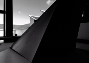
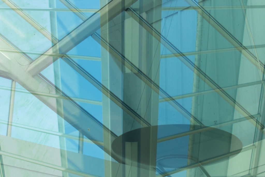
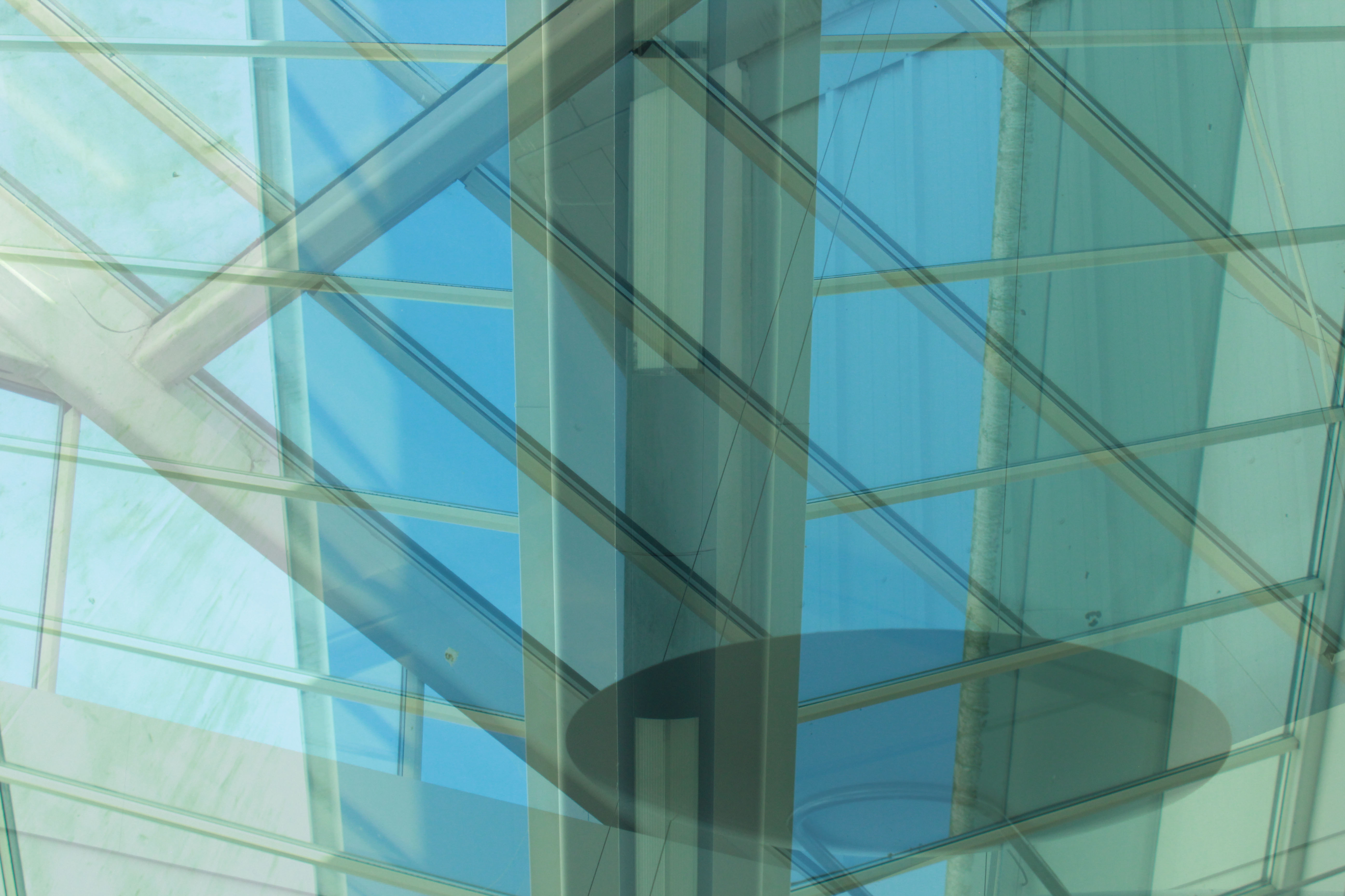
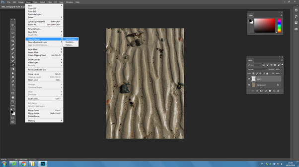
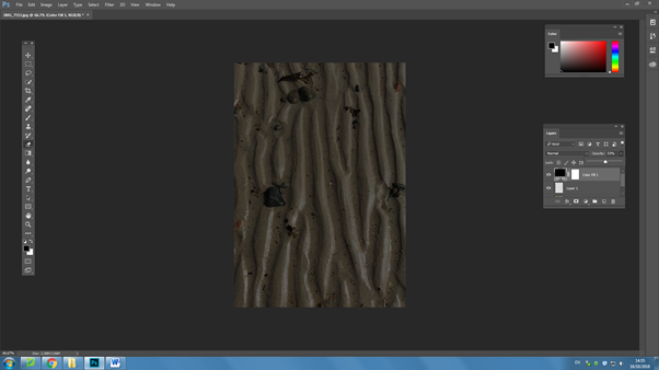
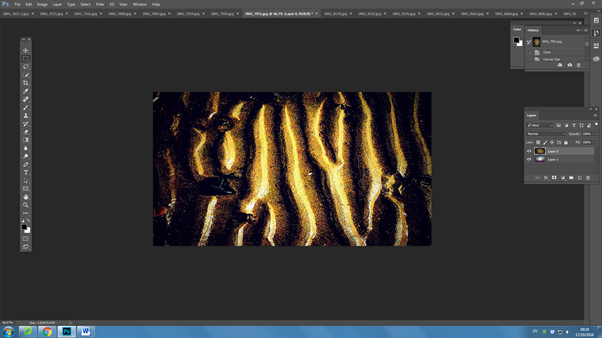
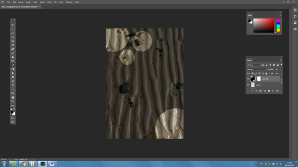
I then went and got the rubber tool, adjusted the edge to what I wanted and used the ‘[‘ and ‘]’ button to change the size of the circle, and then and started to erase parts of the top layer.

Finally, I went and changed the opacity back to 100% and got my finished image.