
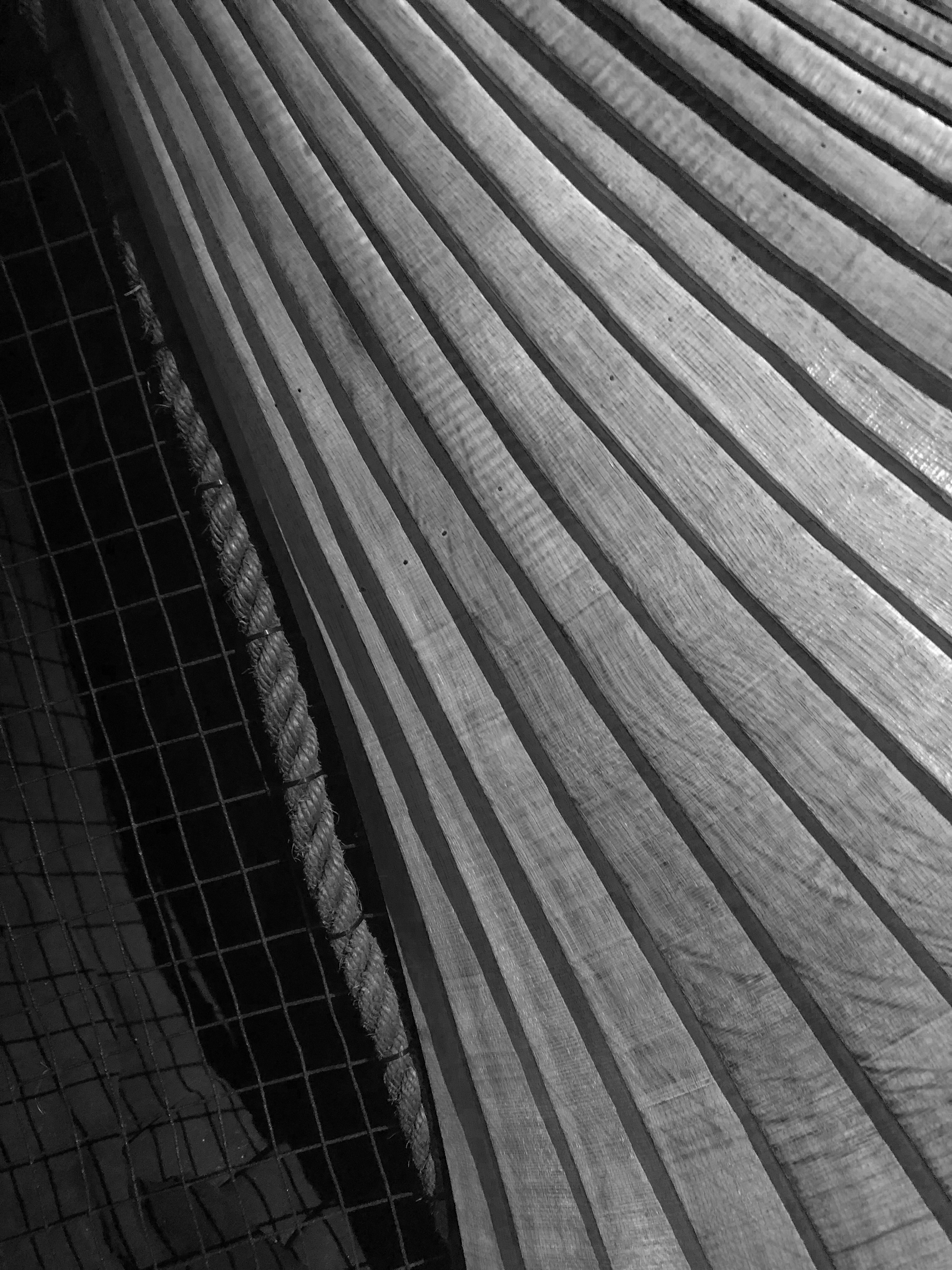
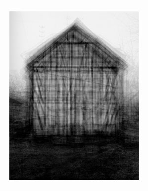
I have decided to use this as one of my final pieces on its own, and not separate the better images away from it. This will allow me to show a lot more generally nice images rather than picking one or two of these images and trying to edit them to make them a lot better.
I have decided to use this image because of the use of the overlapping images creating a darker and more saturated look within the main image, while still keeping the others visible.
What is White Balance?
‘White balance (WB) is the process of removing unrealistic color casts, so that objects which appear white in person are rendered white in your photo. Proper camera white balance has to take into account the “color temperature” of a light source, which refers to the relative warmth or coolness of white light. Our eyes are very good at judging what is white under different light sources, but digital cameras often have great difficulty with auto white balance (AWB) — and can create unsightly blue, orange, or even green color casts. Understanding digital white balance can help you avoid these color casts, thereby improving your photos under a wider range of lighting conditions.’
Definition from: https://www.cambridgeincolour.com/tutorials/white-balance.htm
Video Explaining White Balance:
Experimentation: 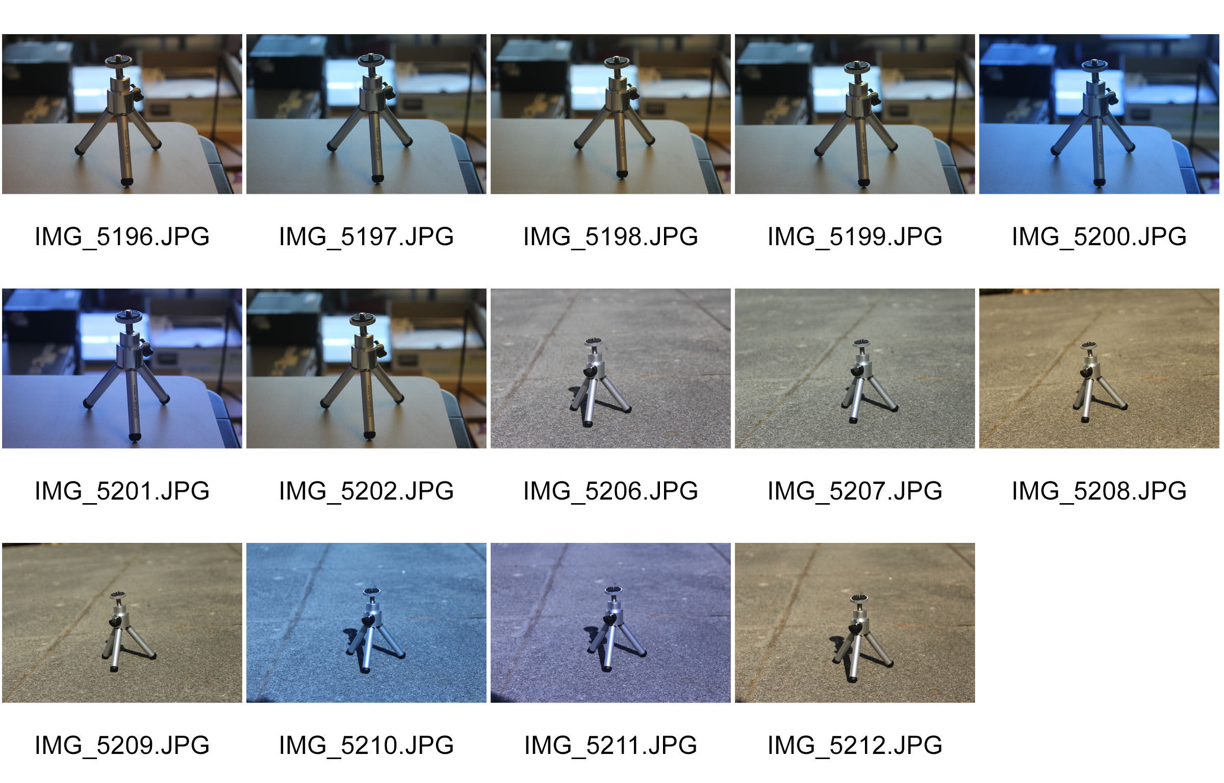
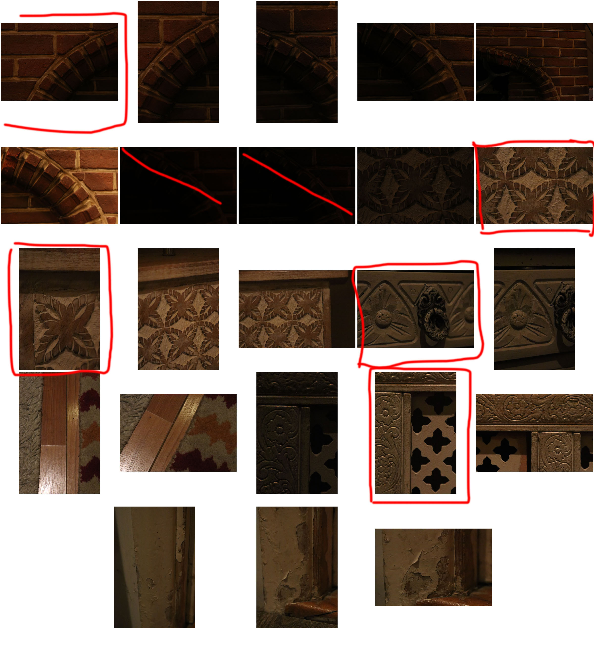
When I took this photos, I changed the white balance on the camera settings. The first 7 photos are indoors and the following 7 are outside. The different types of white balance I used were: Auto, Tungsten, Florescent, Daylight, Cloudy, Flash and Custom. The change in white balance is clearer outside than it was inside, as the natural light outside was a lot stronger than the indoor artificial light.
A3 piece: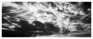
I chose this piece because it shows my editing, cropping and photography skills. Although it seems to have a lot going on, with multiple different shaped clouds, with the right presentation I can turn it into something abstract. I will most likely cut up the images into rectangles and to switch them around, or I will put a black boarder on top of it, only revealing the parts I want revealed. This work was inspired by Alfred Stieglitz and his cloud works, where he filtered them into black and white and made the contrast between light and dark apparent.
A4 piece:
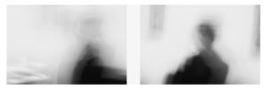
I chose these two pictures because it shows my skills when using slow shutter speed on a camera, and I liked how it came out. It also reminds me of the photographer Ralph Eugene Meatyard and his blurry black and white figures works. I chose to present them together because they were taken of the same person, using the same settings on the camera, and they hold similarities but are also different. I also believe that the simpleness of these images give it a nice tone, and comply with the abstract unit.
A5 piece:
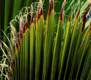
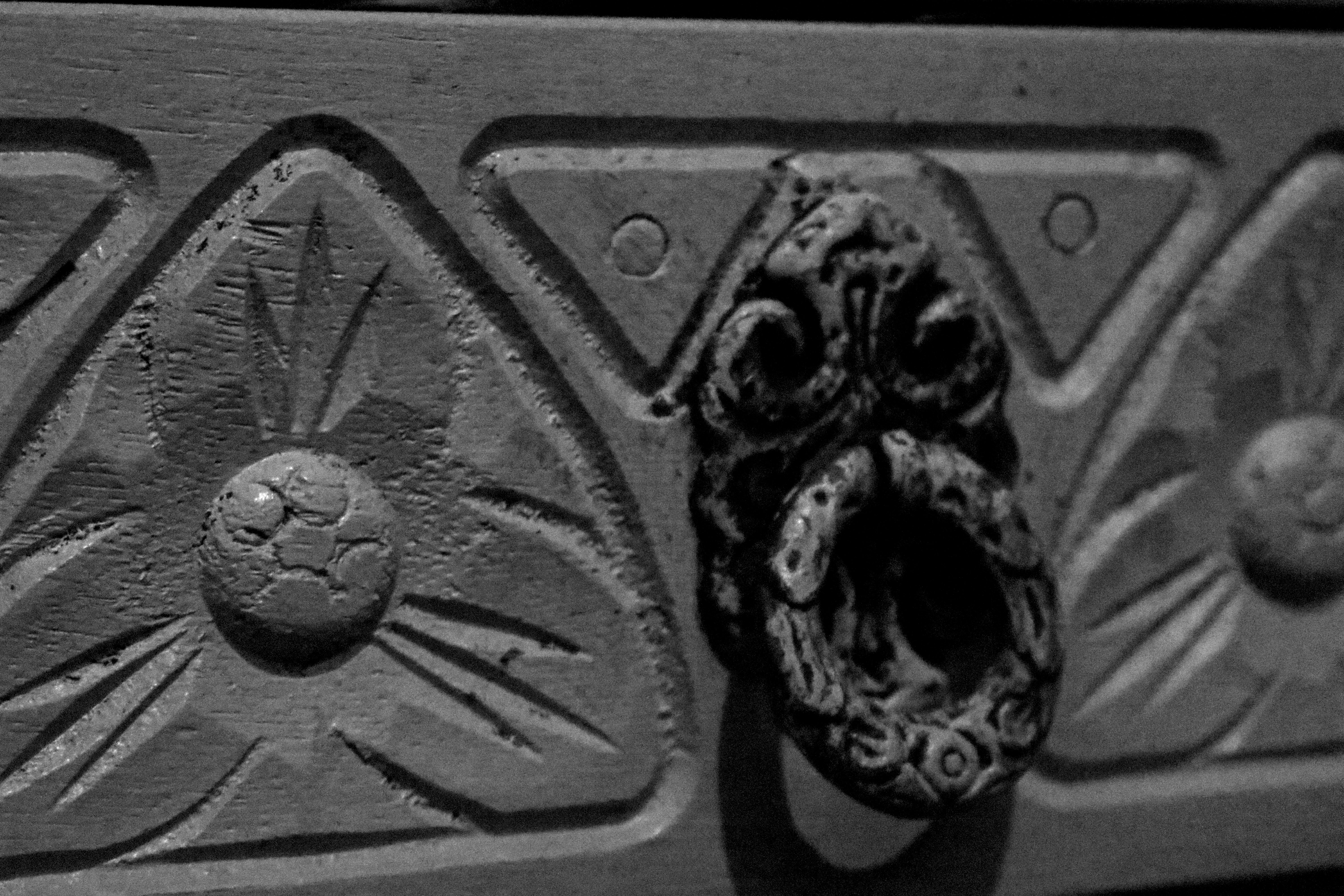
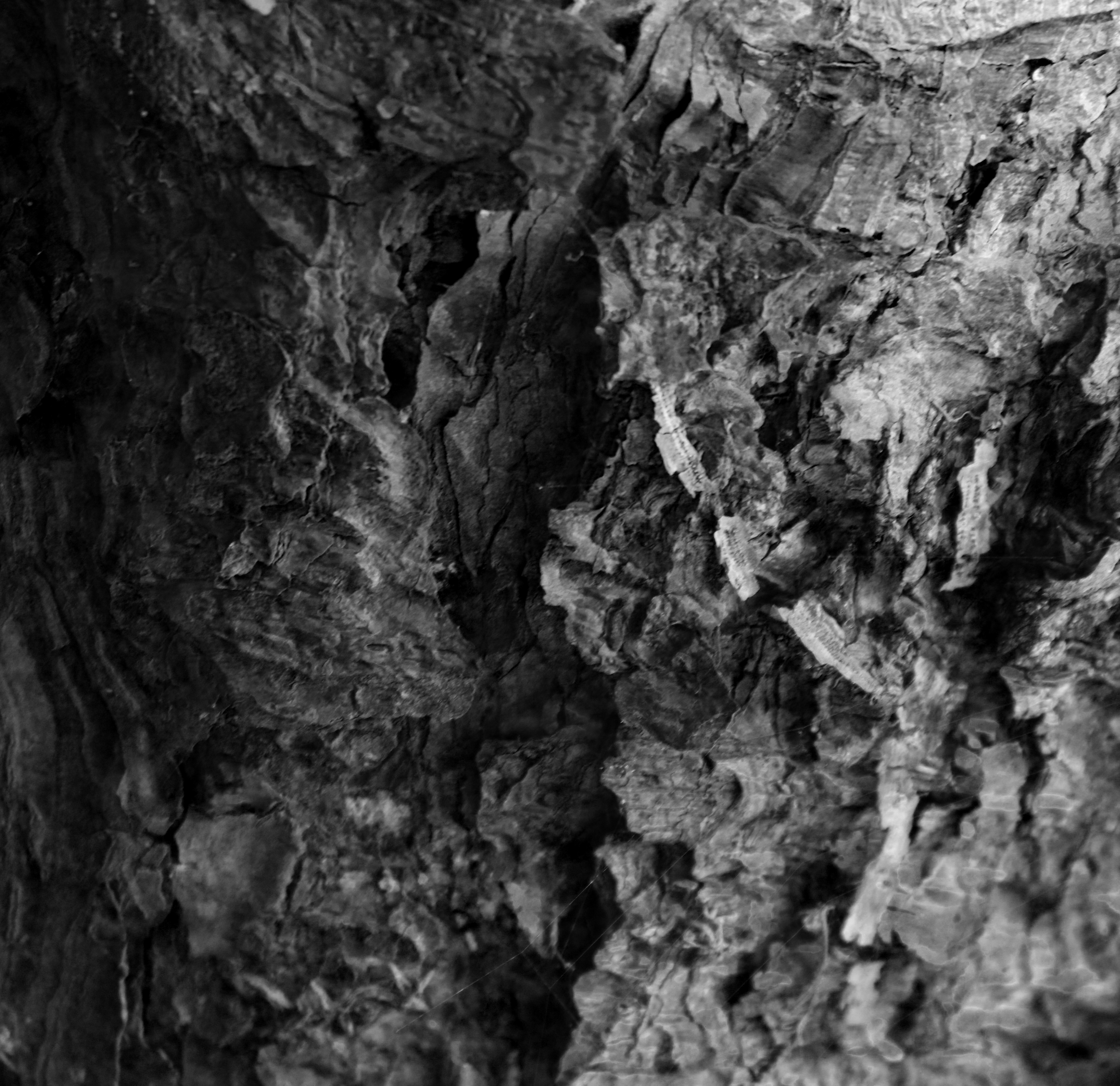
I chose this image because it shows my photography skills when it comes to using a long lens camera. You can see the details on the leaves, and the editing I did on it made it appear more vibrant and colourful. It also appears to be abstract, which goes well with the unit.
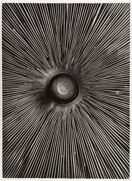
Aaron Siskind was an American photographer who was closely involved with the abstract expressionist movement.
Siskind’s early work contributed to a social documentary of Harlem, New York. This was known as the Harlem Document. Siskind also identified with the ideas and styles of the Abstract Expressionist artists in New York in the 1940s. In these later photographs he continued to emphasize the modernist concern with the flatness of the picture plane, but intensified his approach to picture making – with close-up framing, as well as emphasis on texture, line, and visual rhymes – creating abstract images of the real world.
![]()
An image from the Harlem Document.
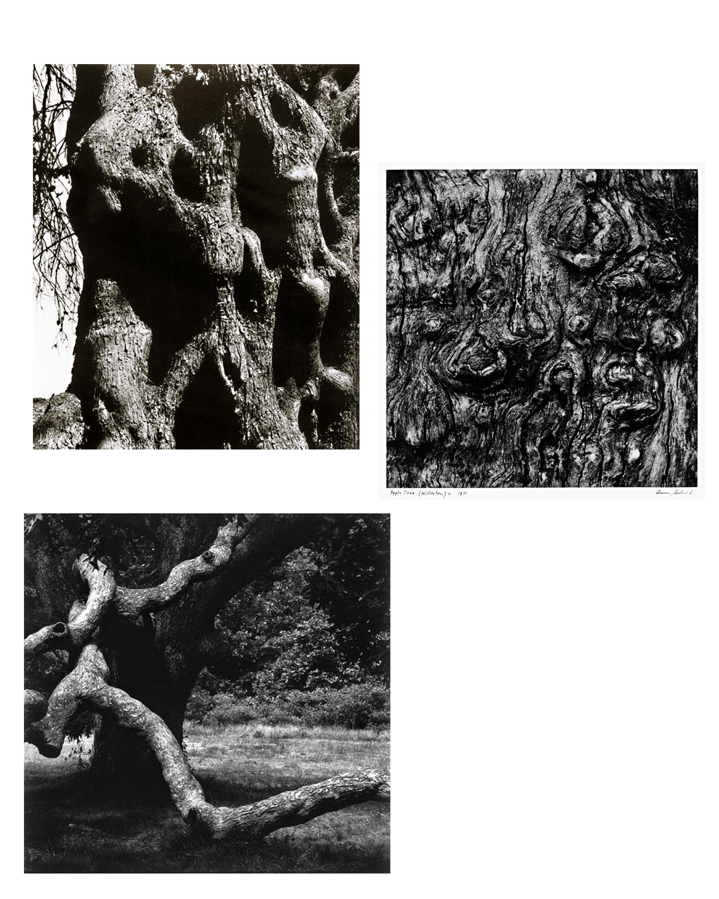


Images By Aaron Siskind.
 Favourite Images
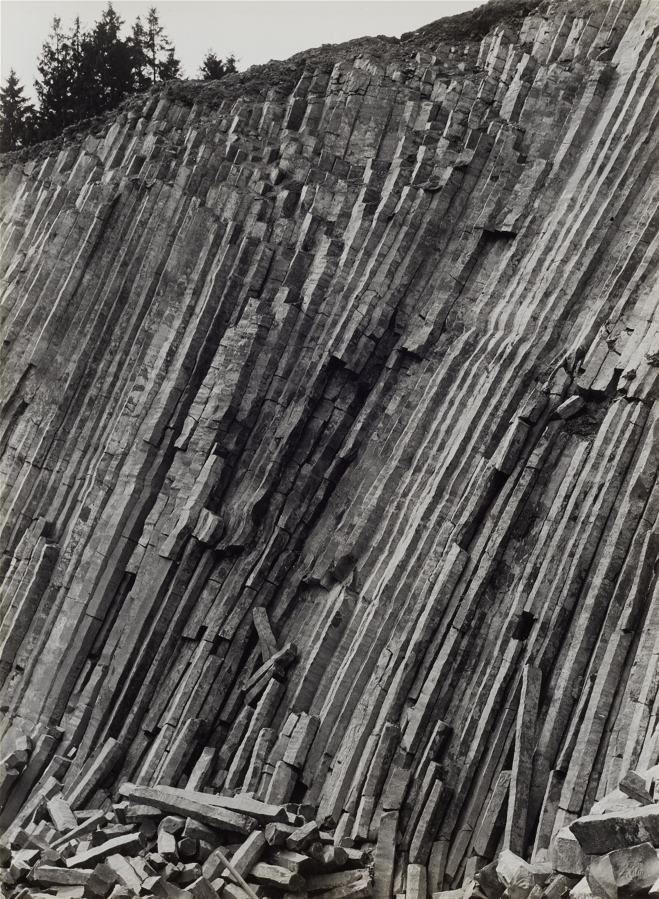
Albert Renger-Patzsch was a German photographer associated with the New Objectivity.
Renger-Patzsch was born in Würzburg and began making photographs by age twelve. After military service in the First World War he studied chemistry at Dresden Technical College. In the early 1920s he worked as a press photographer for the Chicago Tribune before becoming a freelancer and, in 1925, publishing a book, The choir stalls of Cappenberg. He had his first museum exhibition in 1927.
A second book followed in 1928, Die Welt ist schön (The World is Beautiful). This, his best-known book, is a collection of one hundred of his photographs in which natural forms, industrial subjects and mass-produced objects are presented with the clarity of scientific illustrations. The book’s title was chosen by his publisher; Renger-Patzsch’s preferred title for the collection was Die Dinge (“Things”).
In its sharply focused and matter-of-fact style his work exemplifies the esthetic of The New Objectivity that flourished in the arts in Germany during the Weimar Republic. Like Edward Weston in the United States, Renger-Patzsch believed that the value of photography was in its ability to reproduce the texture of reality, and to represent the essence of an object.
In reponse to Renger-Patzsch, I have Taken photographs which experiment and focus on: focus, line, and the theme of object. For this I have used a school camera with a high zoom lens, and my own camera which has a regular lens.
What I most enjoy about Renger-Patzsch’s images is that they focus more on the line and aesthetic of the objects, and feature almost no other concepts. This allows the viewer to subjectively fabricate their own conclusion about the intentions behind the images.
 3 Images By Albert Renger-Patzsch
Looking at double exposures some I feel are not real double exposures because they are not keeping with the traditional sense of double exposure because double exposures are meant to be taken on film and they would be slightly of to the side and they would be a full frame.
Examples of photos that I don’t think are double exposures:
A photographer that I think uses the correct kind of double exposures is Idris Khan. here are some of his photos
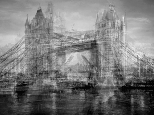
Here are my photos trying to emulate his work.
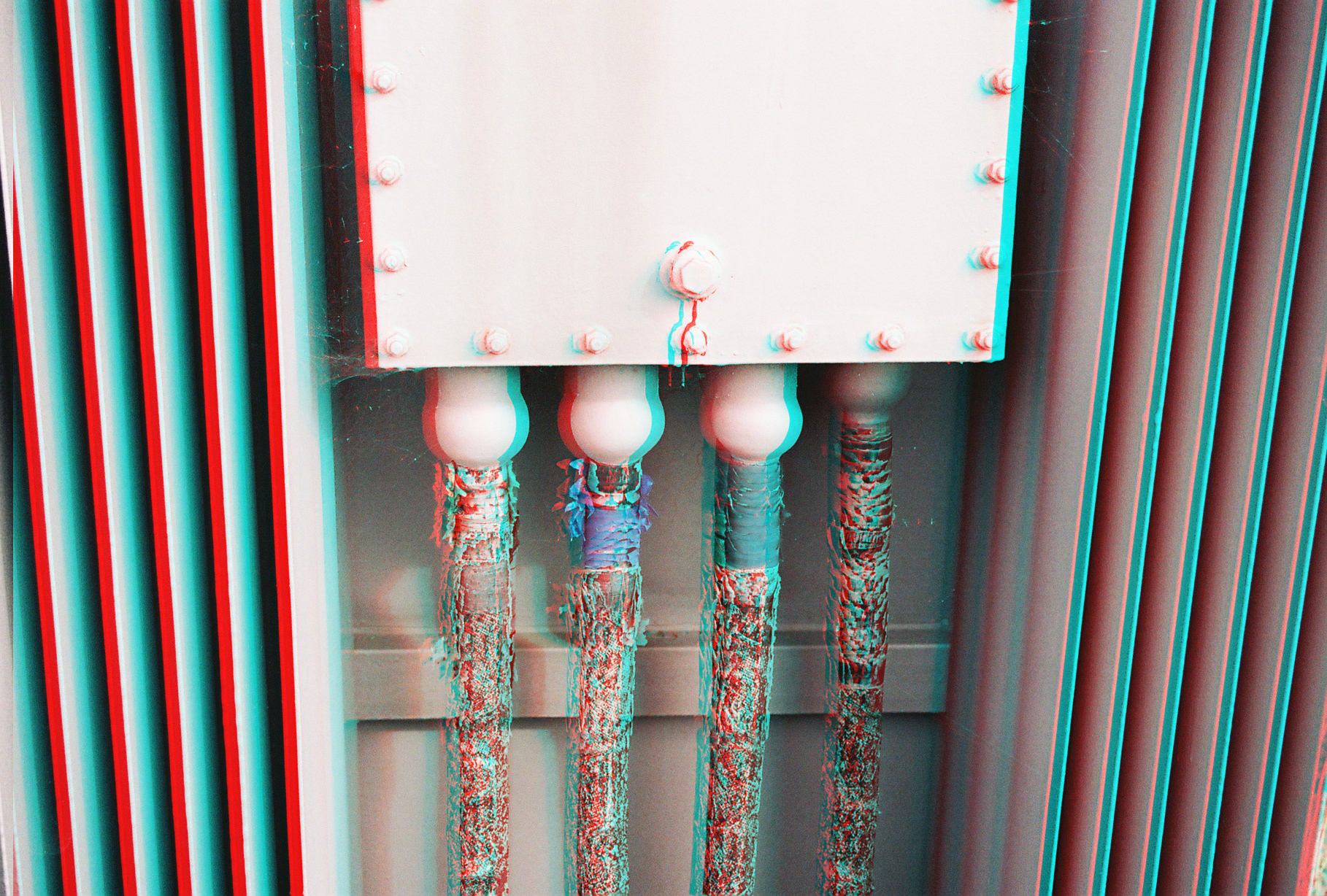
With this image, I duplicated the layer and lowered the layer opacity for the copy and changed the colour to one that would match the transformer box and the tape on it, Giving this image the effect of older 3D glasses.
IDEAS AND INSPIRATION:
These are possible layout ideas for my final images which I selected previously. They range from full image layout, to cropping it parallel and arranging them with additional photos. I have a total of 6 images that I am able to combine and put into a layout. It will be a difficult arrangement as each image comes in a different format, some being more panoramic, some rectangular and some in a regular A4 or A5 format.
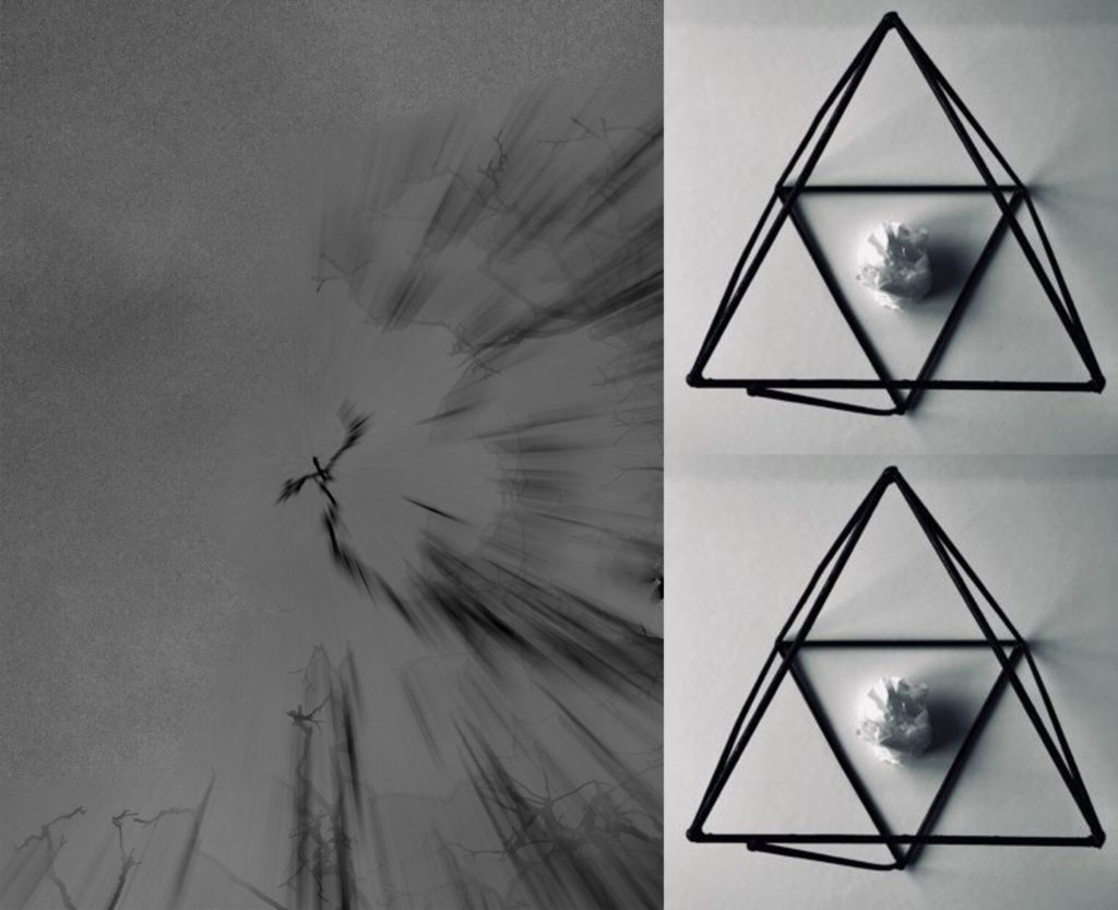
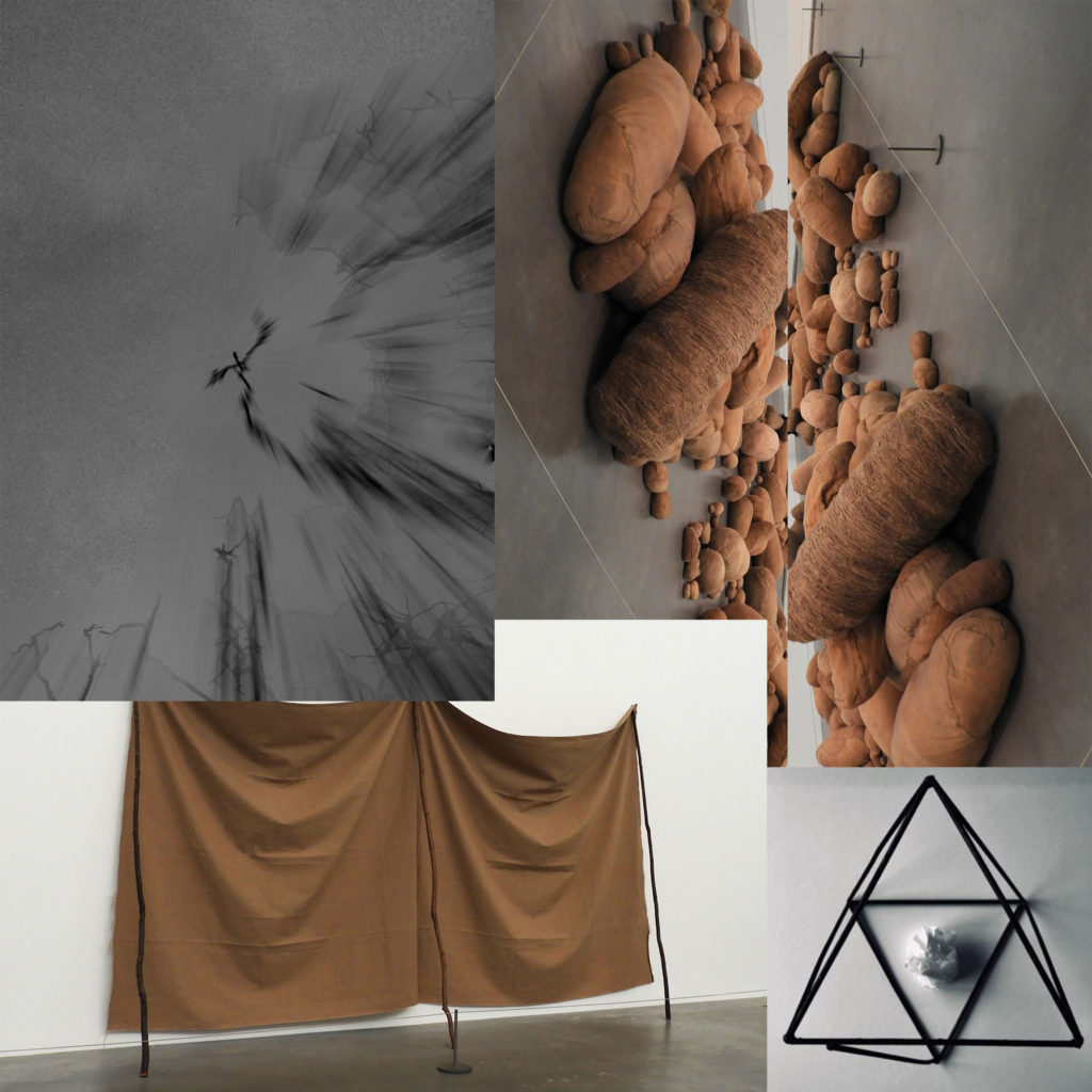
This is another possible layout idea which could work for my final piece, but it is difficult to determine whether this will be the right way to do it as the sizes of the photos are not relative to their actual sizes (A3, A4, A5). I like the overlapping of the images as they harmoniously blend into each other. The simple color pallet of all the images means that they can be easily grouped together without clashing or looking out of place, it also allows me to group the images without having to crop any of them which makes the whole process a lot simpler and easier.
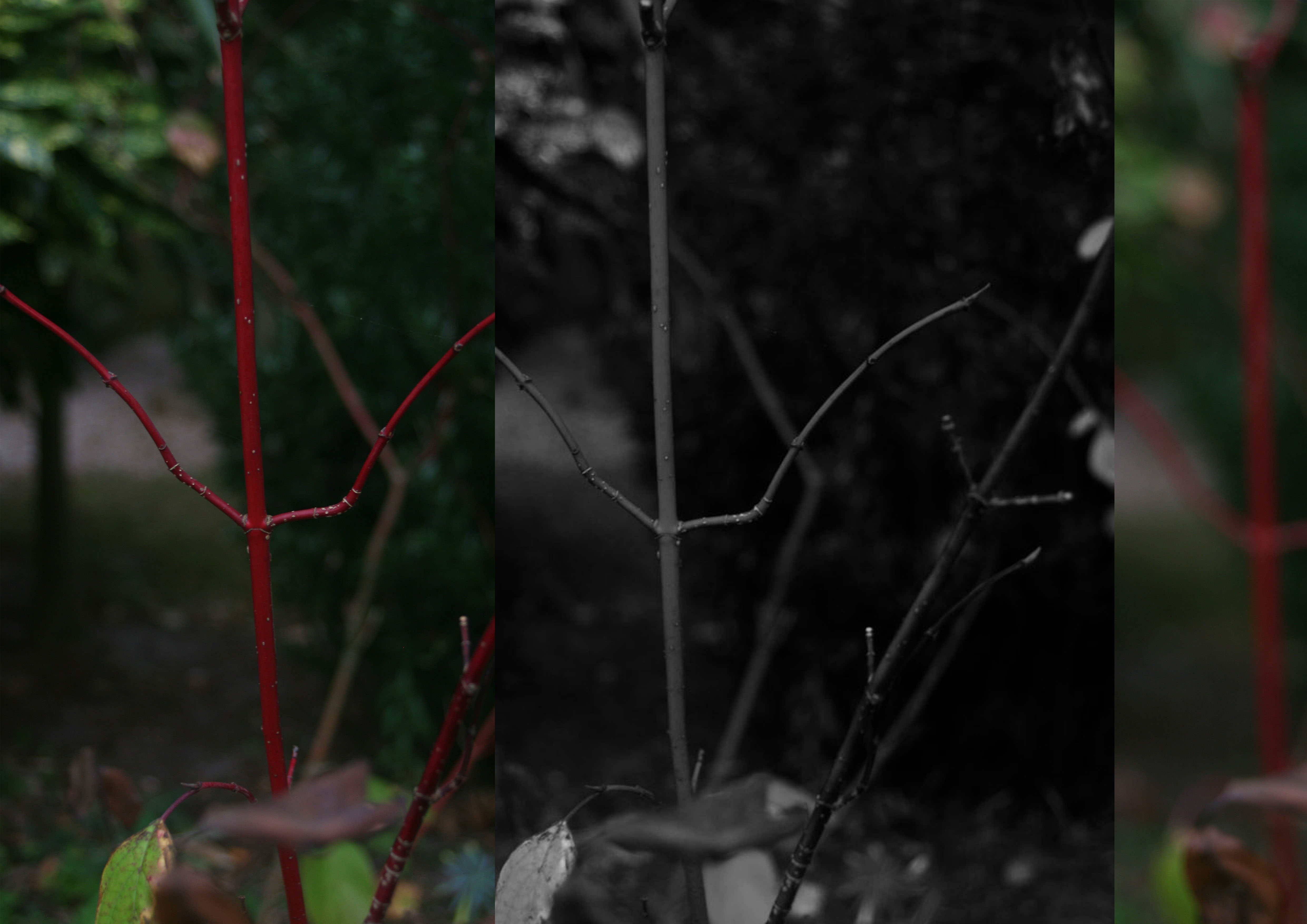
These three images I have chosen to print are my favorite and most successful photos over the abstract project. My A3 print is a combination of three separate photos taken from the same shoot which was about exploring blur motion, focal points and negative space. The first photo situated on the left hand side was taken in the intention of having the plant in focus and the background as blurred negative space as i wanted emphasis on the vibrant red and detailed stalk, as i felt the contrast between the dull murky background and the bright plant would fit well together. The second photo in the middle is similar to the first but I made it black and white, to match with Ralph Eugene Meatyard’s Zen Twigs work. ISO 200-39mm-1/50-ƒ/5.6, these were the setting I had my camera set to to take this photo, I ensured my camera has a middle focus, in order the capture as much detail as possible from the plant as well as being able to display that I can use negative space effectively within my photos. The third image on the left is completely blurred the background and the plant, this is also inspired my Meatyard’s work. I chose to place them in a repetitive structure to extenuate the similarities of the three pictures. I felt that the black and white worked well as a contrast in the middle between the colourful pictures.
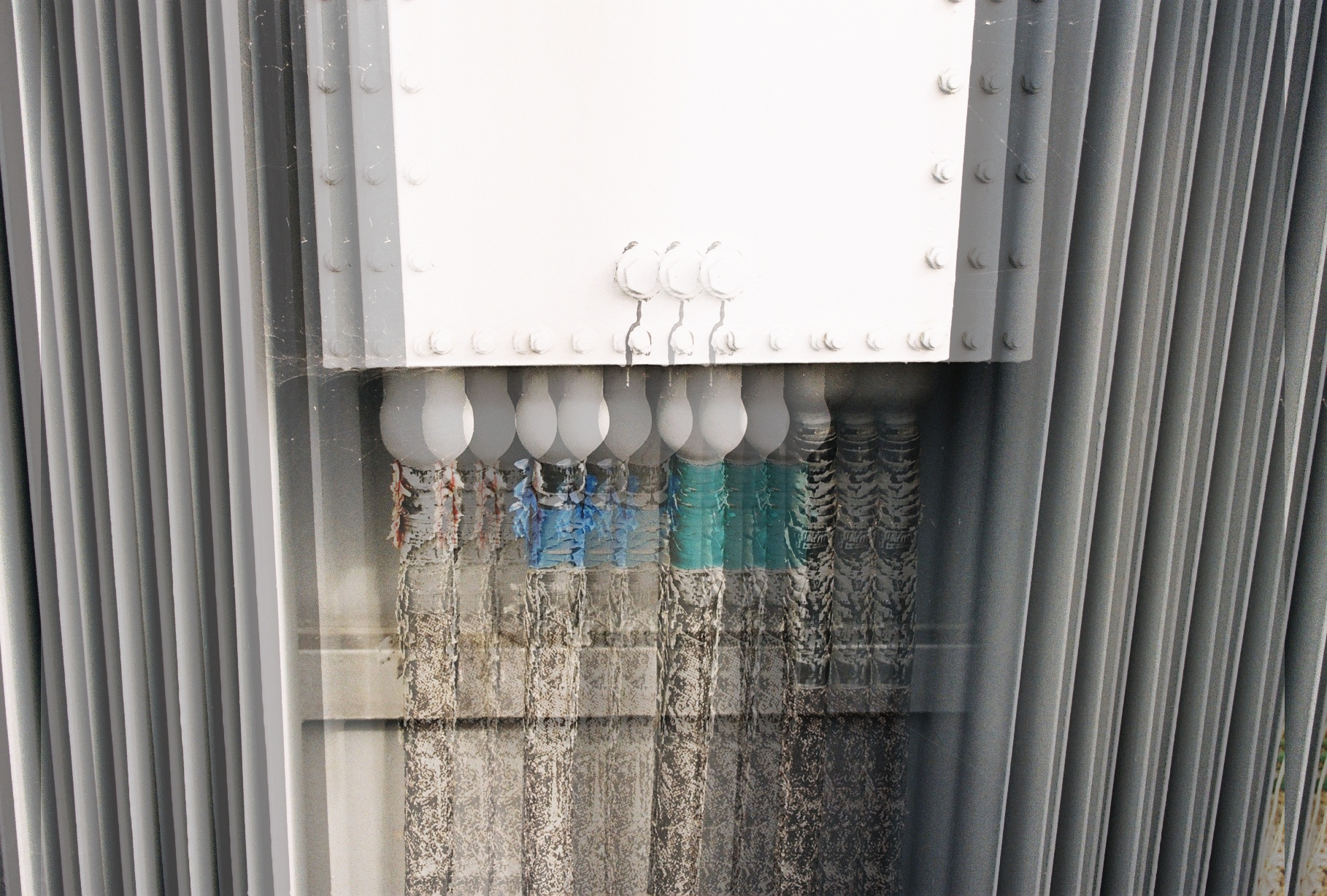
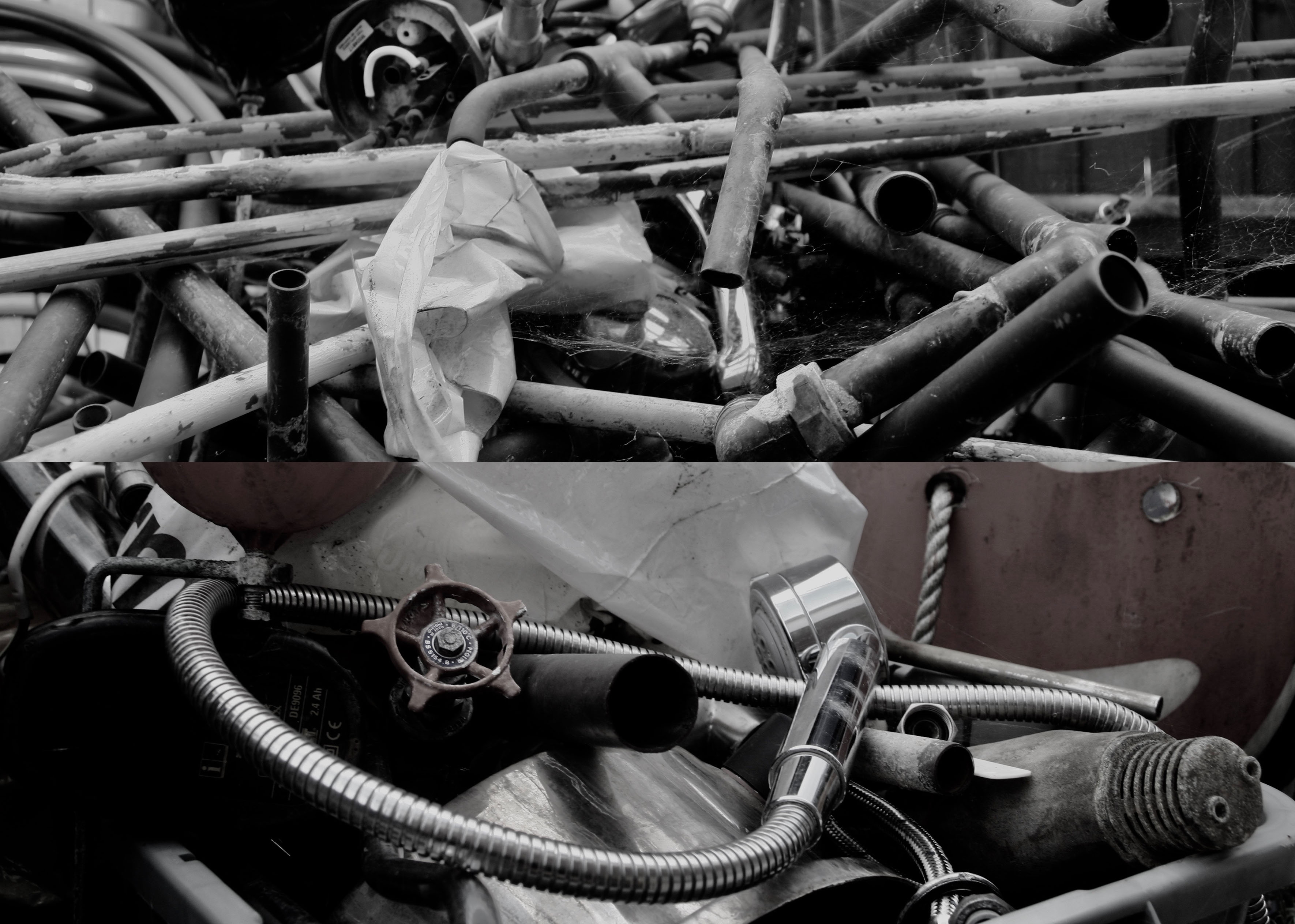
My second print is a combination for two photos from my pre AS summer task. The shoot was inspired by Jan Groover an American photographer who was among the very best still life photographers since the medium’s invention. Her Kitchen Still Life photographs were first exhibited at Sonnabend Gallery. She received a John Simon Guggenheim Foundation Fellowship in 1979. In 1987, Groover had a major retrospective at the Museum of Modern Art which subsequently toured the United States. Her work has been exhibited and included in the collections of most major museums worldwide, and continues to influence a new generation of artists. Groover moved to France in 1991, with her husband, the painter Bruce Boice, who still lives there. I cropped both photos in order to focus on the detail in the pipes, the reflections from the natural light and the cobwebs. The layout of the photos are overall messy, which to me made sense as i was trying to recreate the work of Groover in which she focuses on catching things in the moment. In the two photos there isn’t a clear focal point, I want the viewer to be able to work there way around the photo as their are several different elements to them.
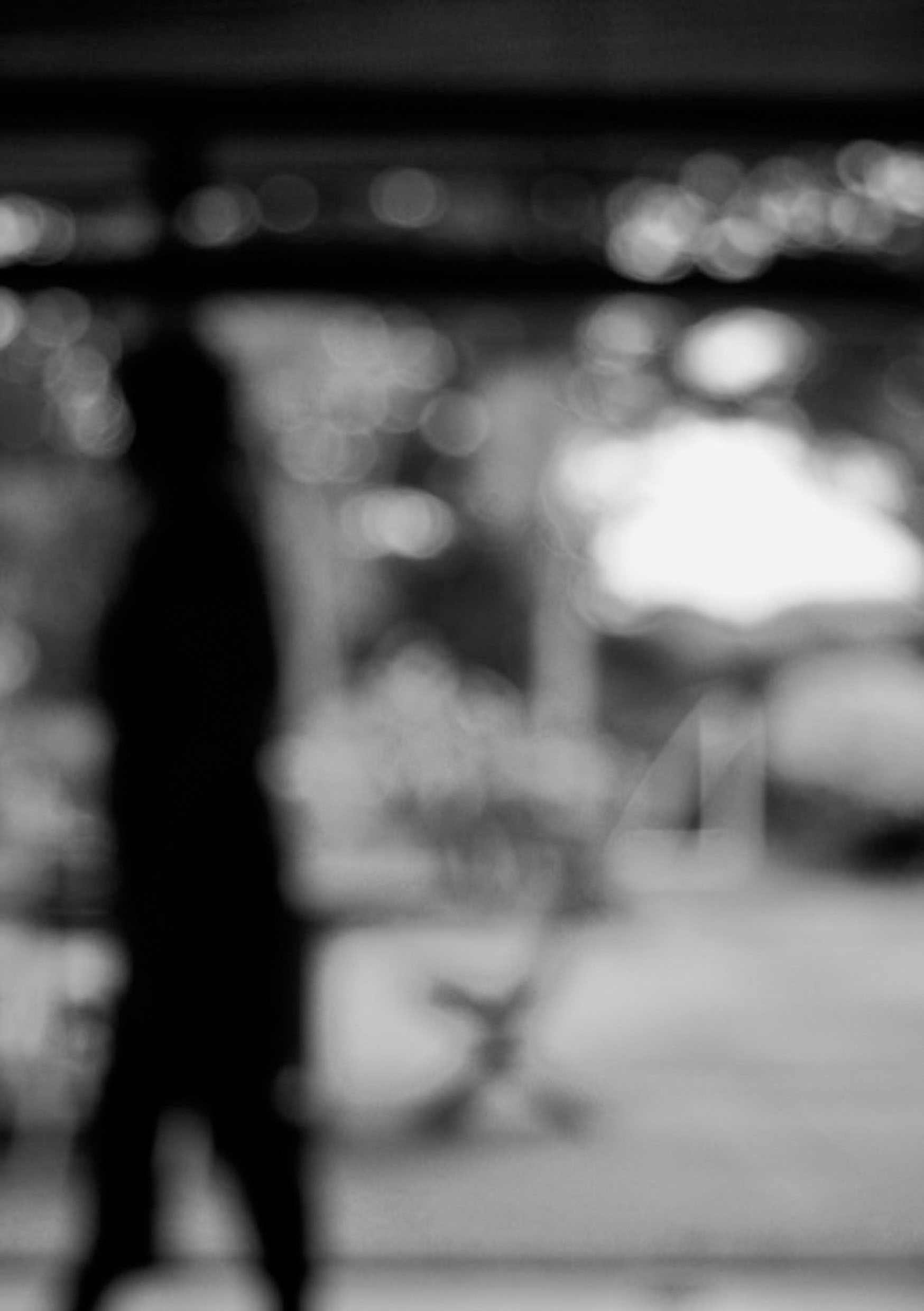
My final print is my favourite photo from my shoot which was inspired also by Ralph Eugene Meatyard but a different collection of his with is called ‘No focus’. Meatyard made his living as an optician. He was a member of the Lexington Camera Club and pursued his passion for photography outside the mainstream. He experimented with various strategies including multiple exposures, motion blur, and other methods of photographic abstraction. Two of his series are particularly concerned with focus and depth of field, both stretching the expressive potential of photography, film and cameras when looking within the ordinary world. My camera was set ISO 200-34mm-1/40-ƒ/5.6. In order for this blur affect to be achieved the aperture must be wide (smallest f-value) so that the blurred area is harsher. A long focal length and a reasonably far distance from the subject would have also been techniques that Meatyard would have used. In all this photos of this particular collection he used a colour balance of black and white, which creates cold tone. The black and white goes well with the motion blur as it creates a mirroring effect for instance the people are walking, everything is fast pace and blurry, you can see no expression from anyone, this is similar to how there is no colour expressing the atmosphere, everything is gloomy and dull. I wanted this photo to be isolated as its own as I feel it was my successful over the abstract unit.
In this blog post I will be showing you my favorite and final abstract photos. I had to chose a few photos of my favorite abstract photography that I had taken and place them in a file to be sent off to print. We had to choose photos to be printed in A5, A4 and A3. I didn’t chose an A3 picture as none of my photos showed enough colour, boldness, enough abstract, or textures/shapes.
But I feel like the 2 photos for A4 and the single photo for A5 are good enough for their size.
These photos were chosen for my A4 printing.
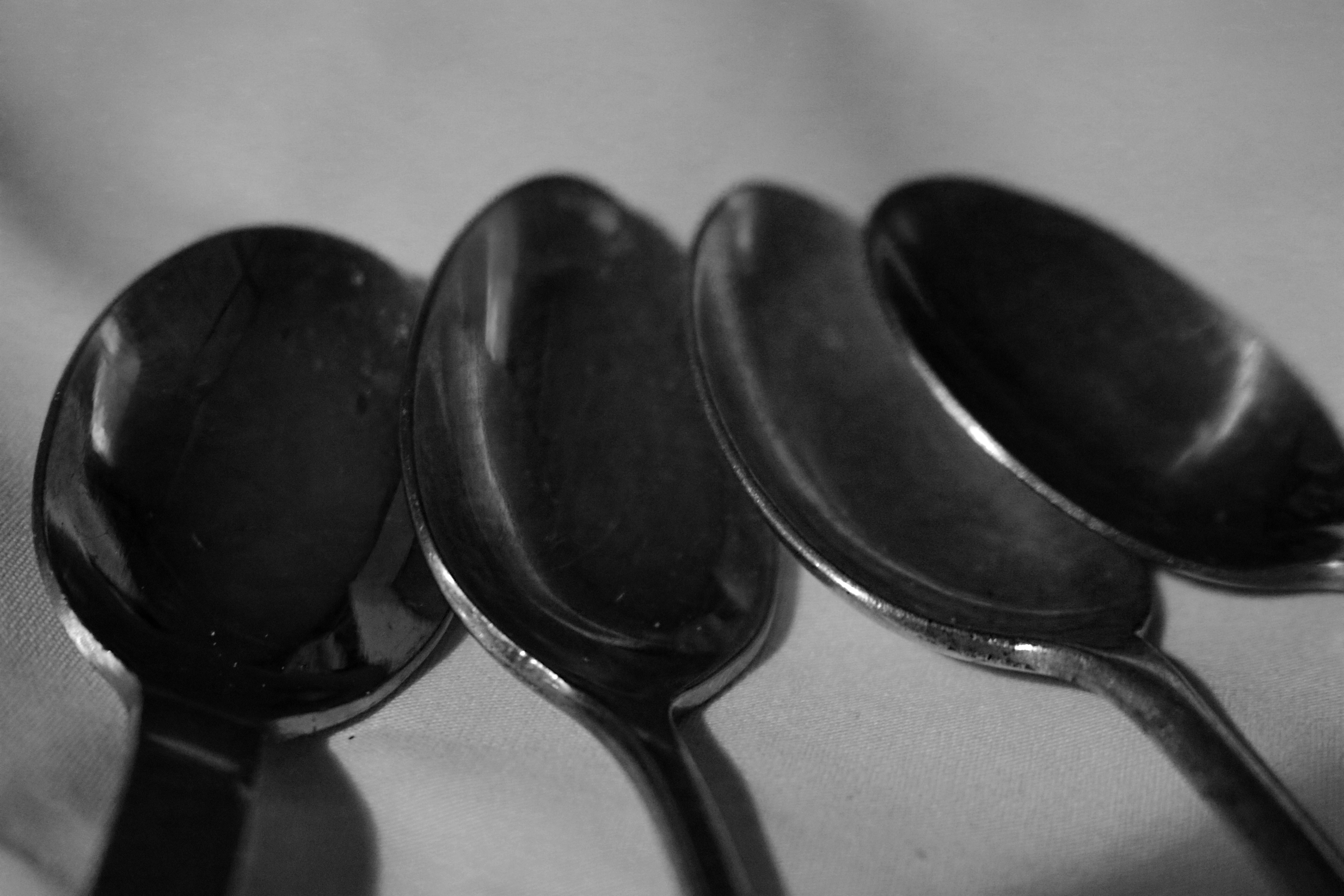
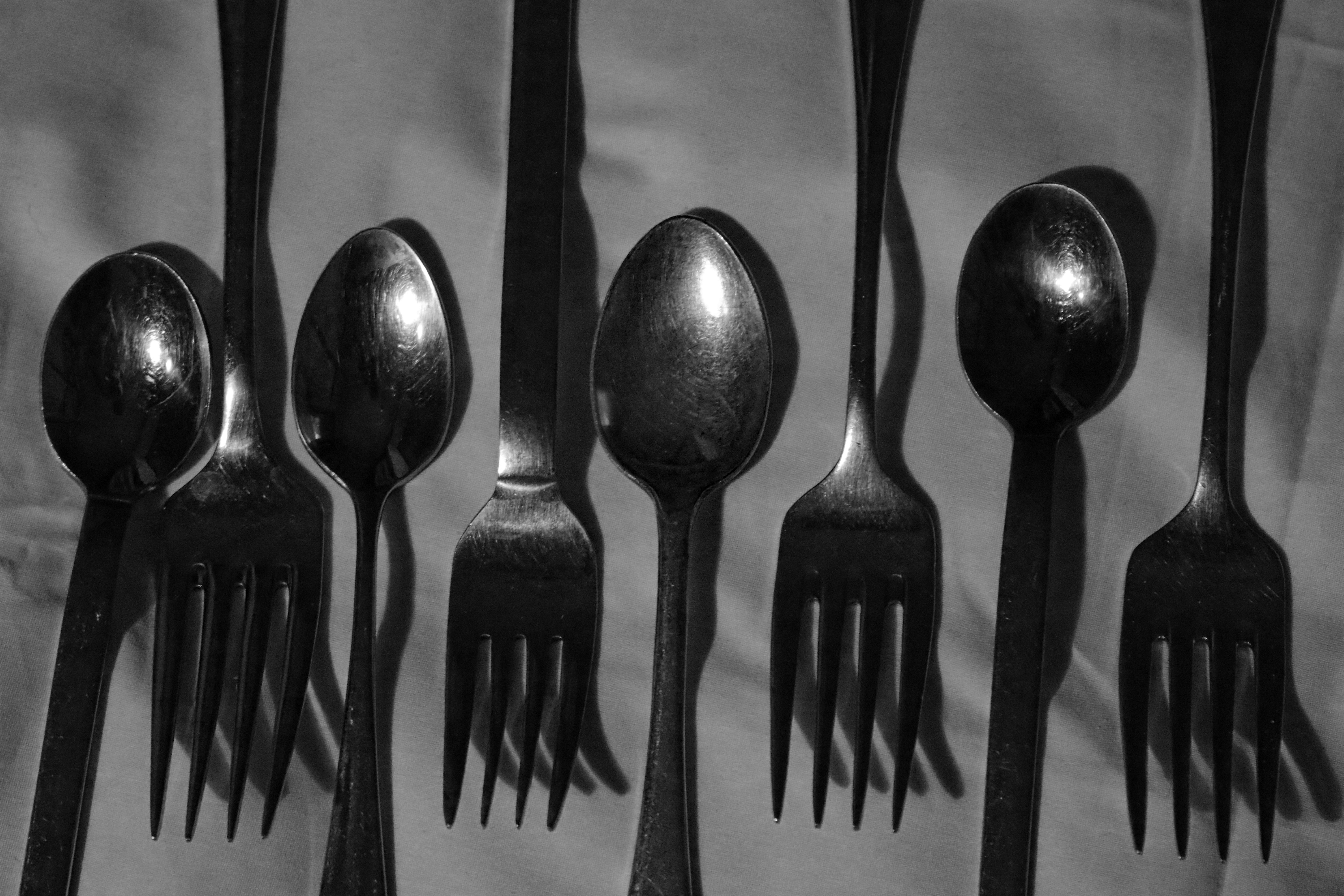
I really like these photos, because it shows good camera skills of portrait but also shows my ability of using Photoshop to create a double exposure effect. On the first photo I used a double layering effect to create the black and white but also to create a more deeper black and to show off the white a bit more.
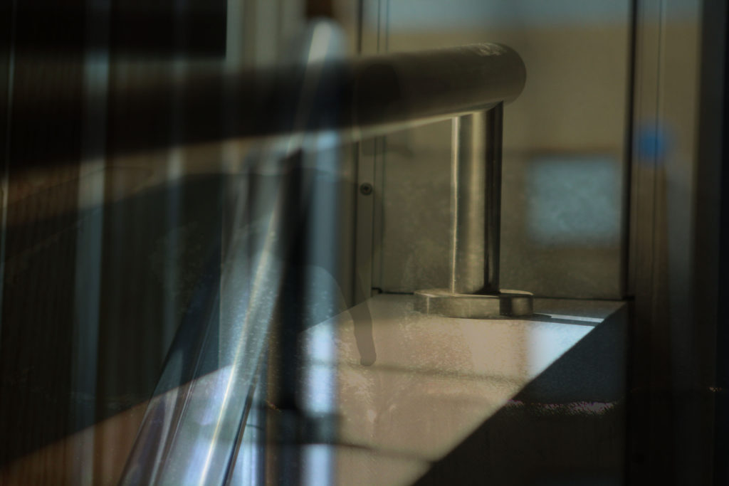
On the second photo I kept the photos original without changing them, but I created the double exposure in a way which made it look like the person taking a photo of a school hallway with a reflection of glass. I created this effect by changing the opacity levels so that the portrait photo was slightly higher than the background photo of the school hall.
This next photo was one which I put forward to be printed in A5
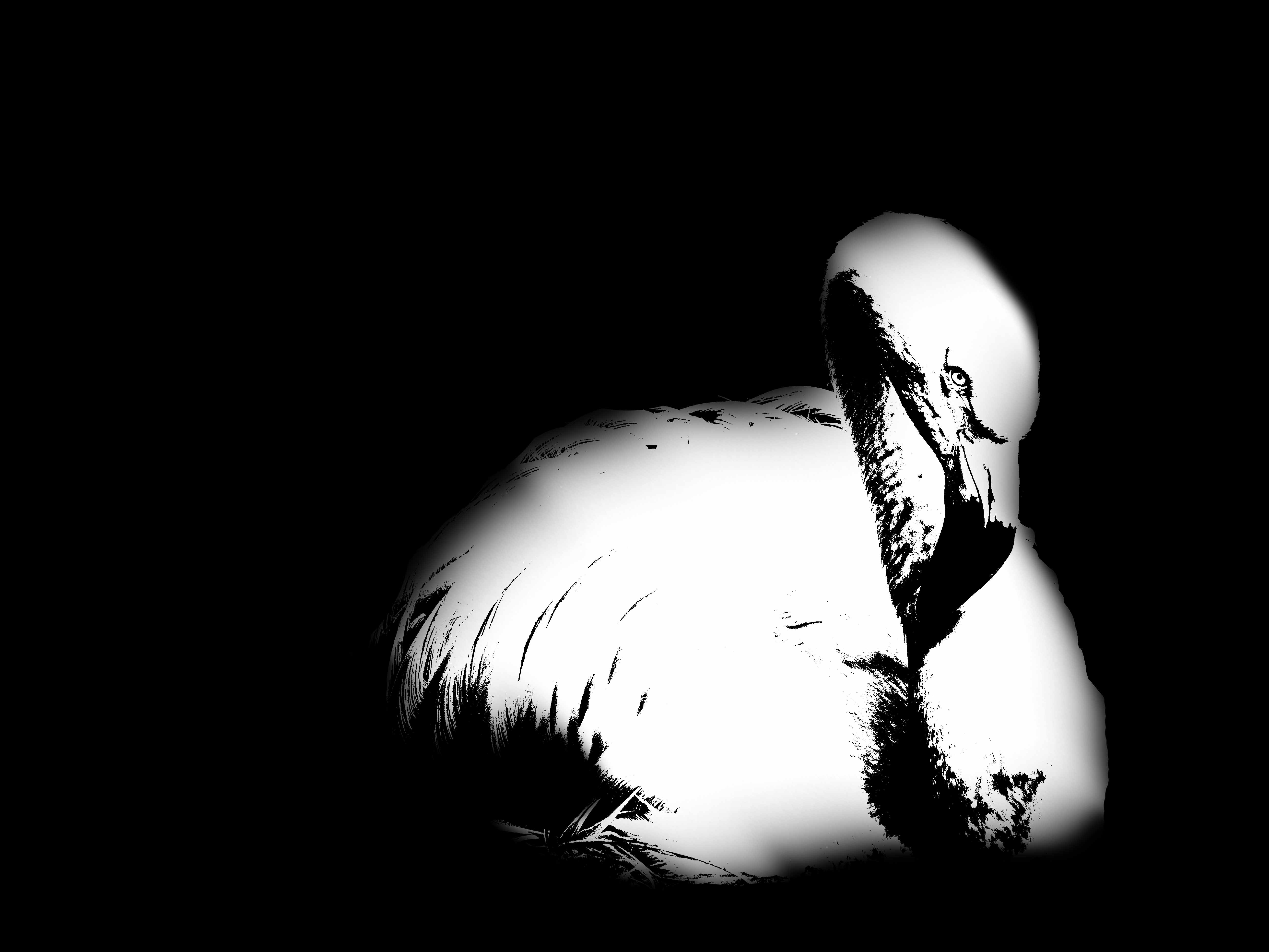
I like this photo as it again shows my ability level on Photoshop. With this photo I have used the different thresholds, and adjusted them to what I thought looked good. I have also used the paint brush tool to create an effect of the photo blurring into the black background.
I thought this photo was suitable for an A5 as it isn’t a big photo worthy as it doesn’t show that much abstractness with colour, texture and shape. But due to the use of the threshold adjustment I thought it would still be suitable as a final printed abstract photo.
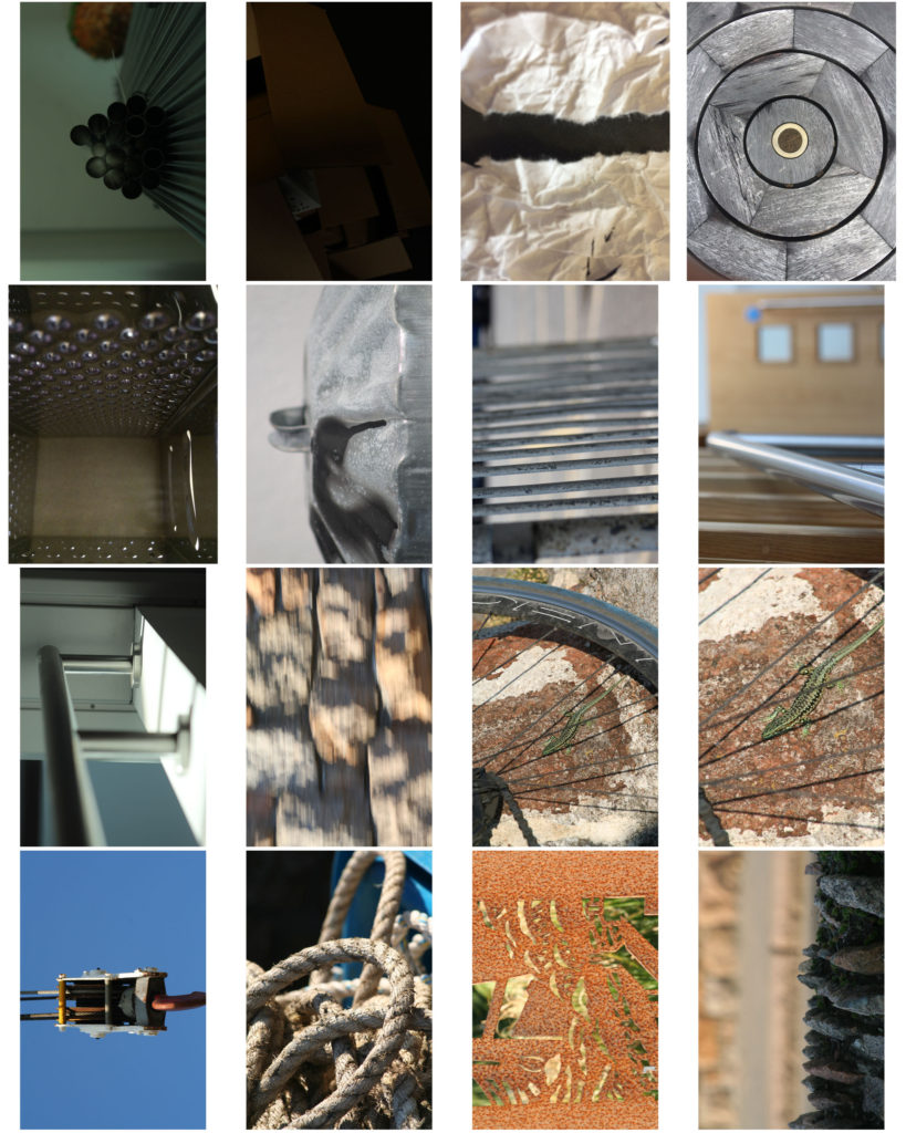
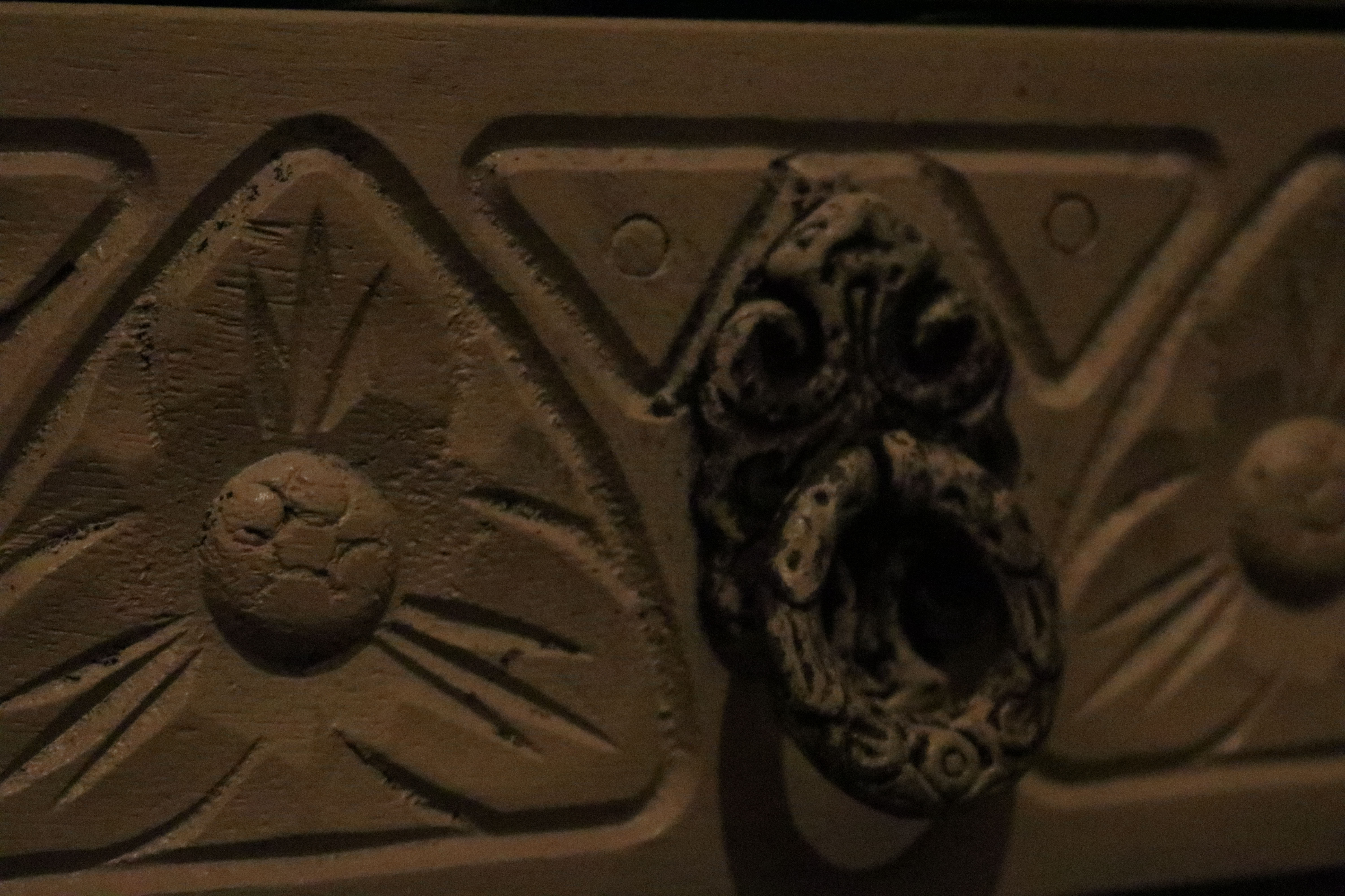
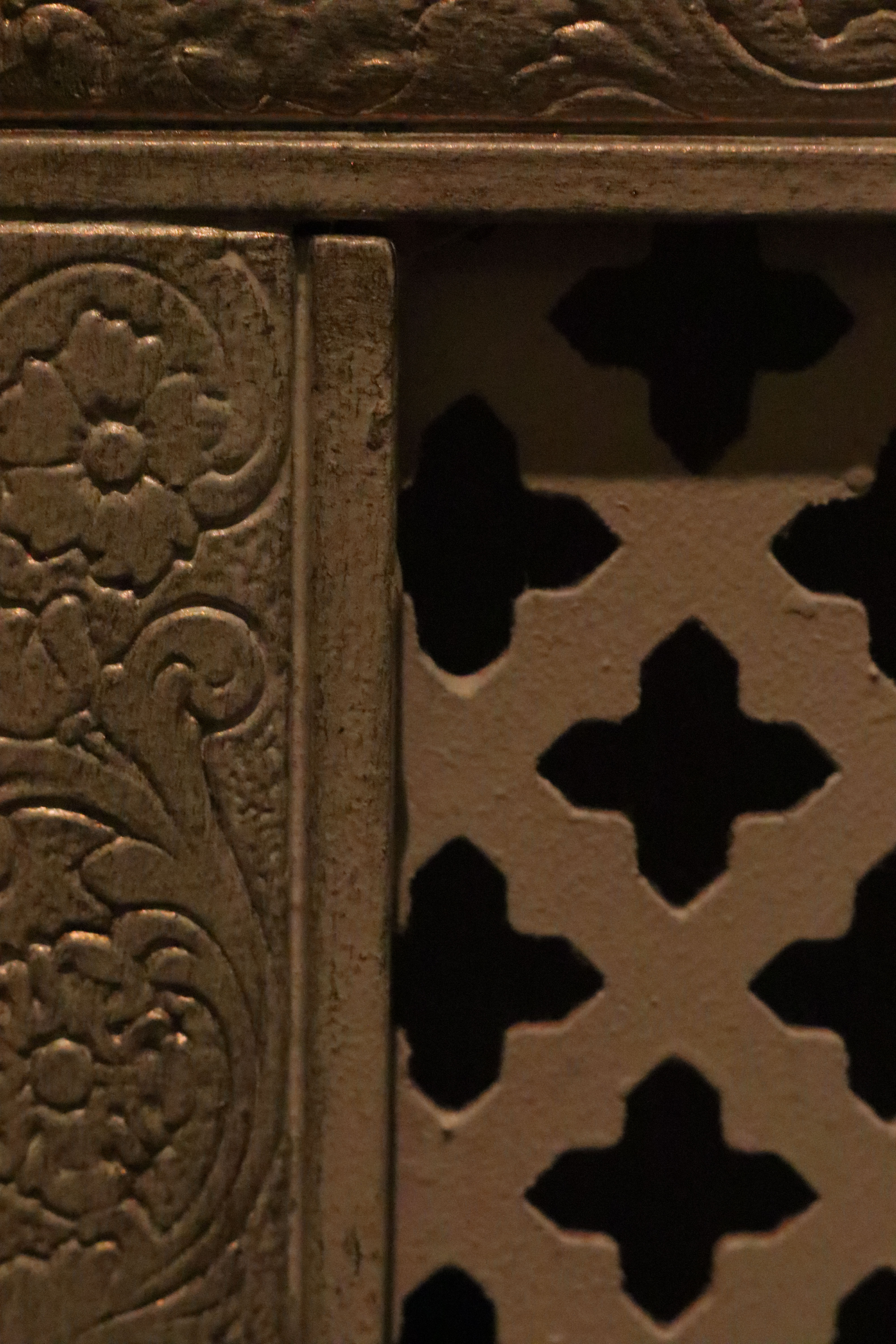
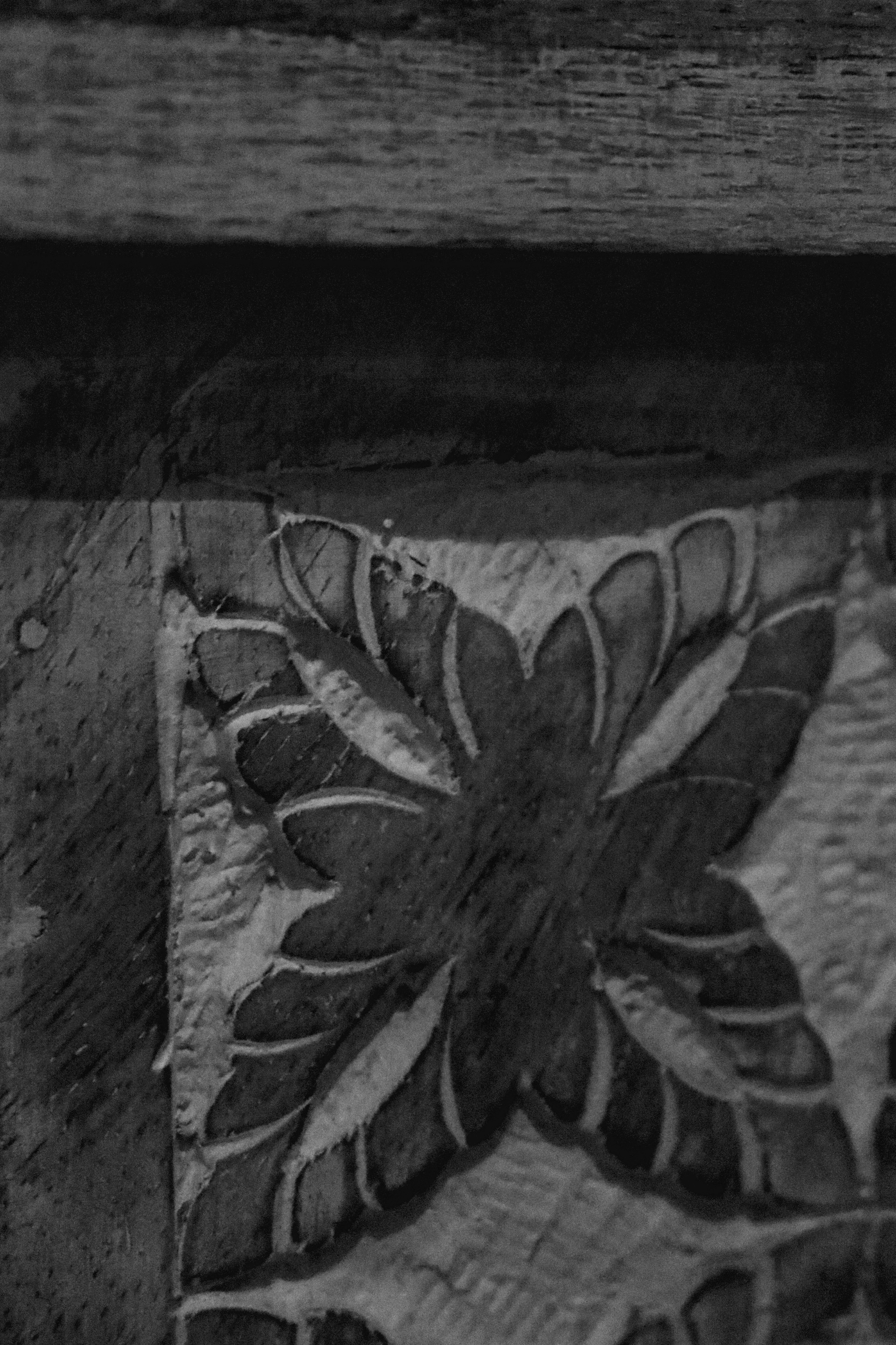
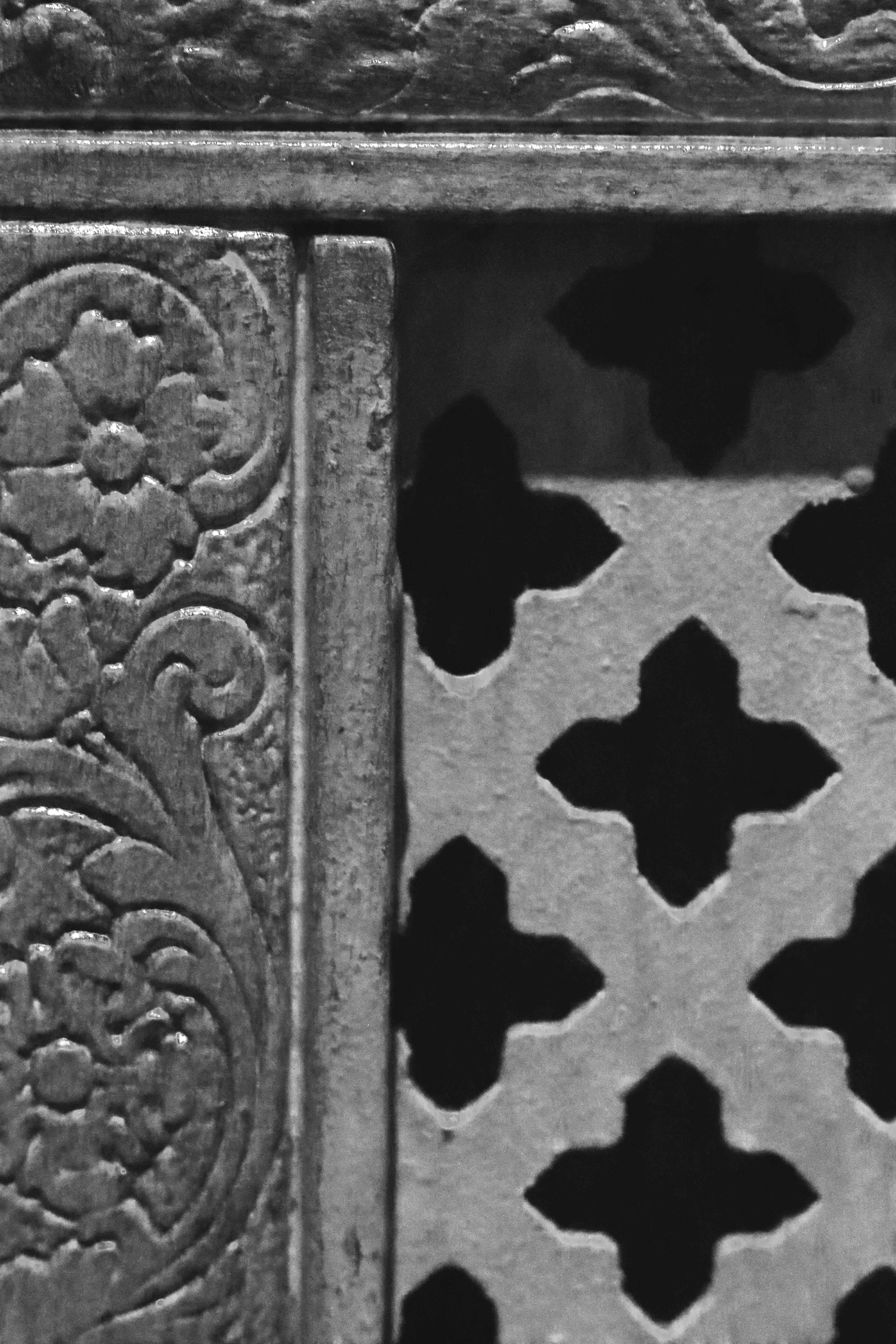
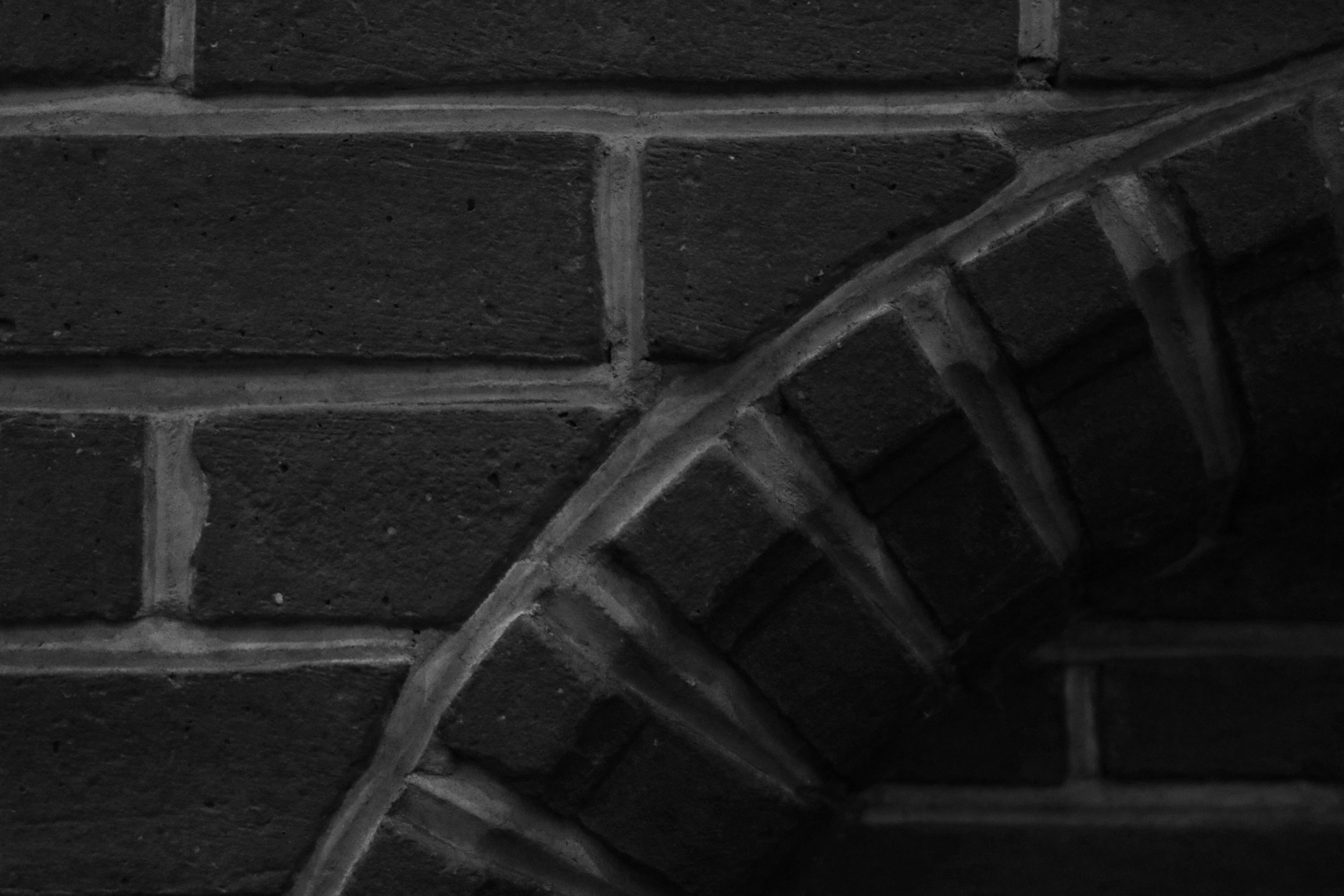
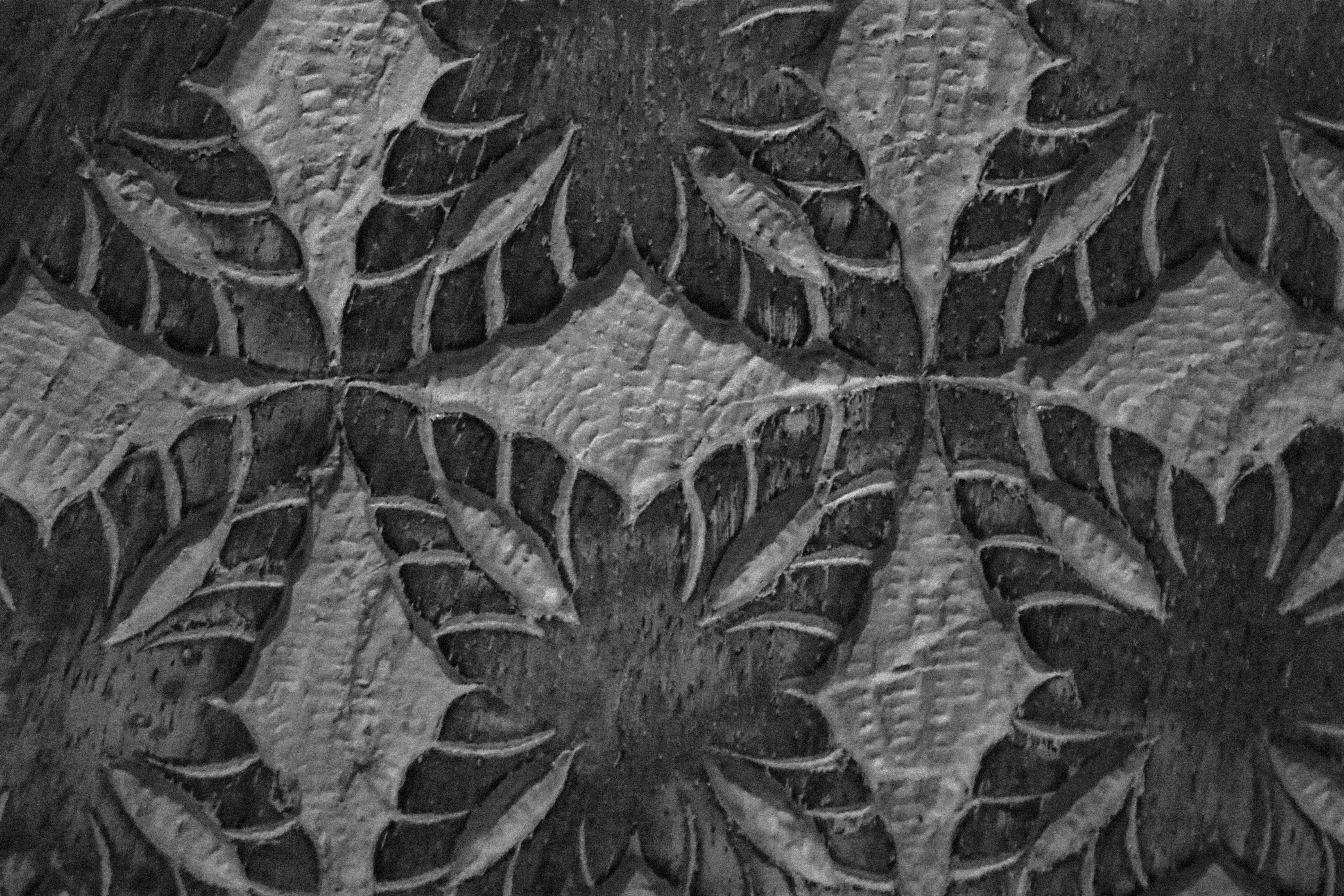
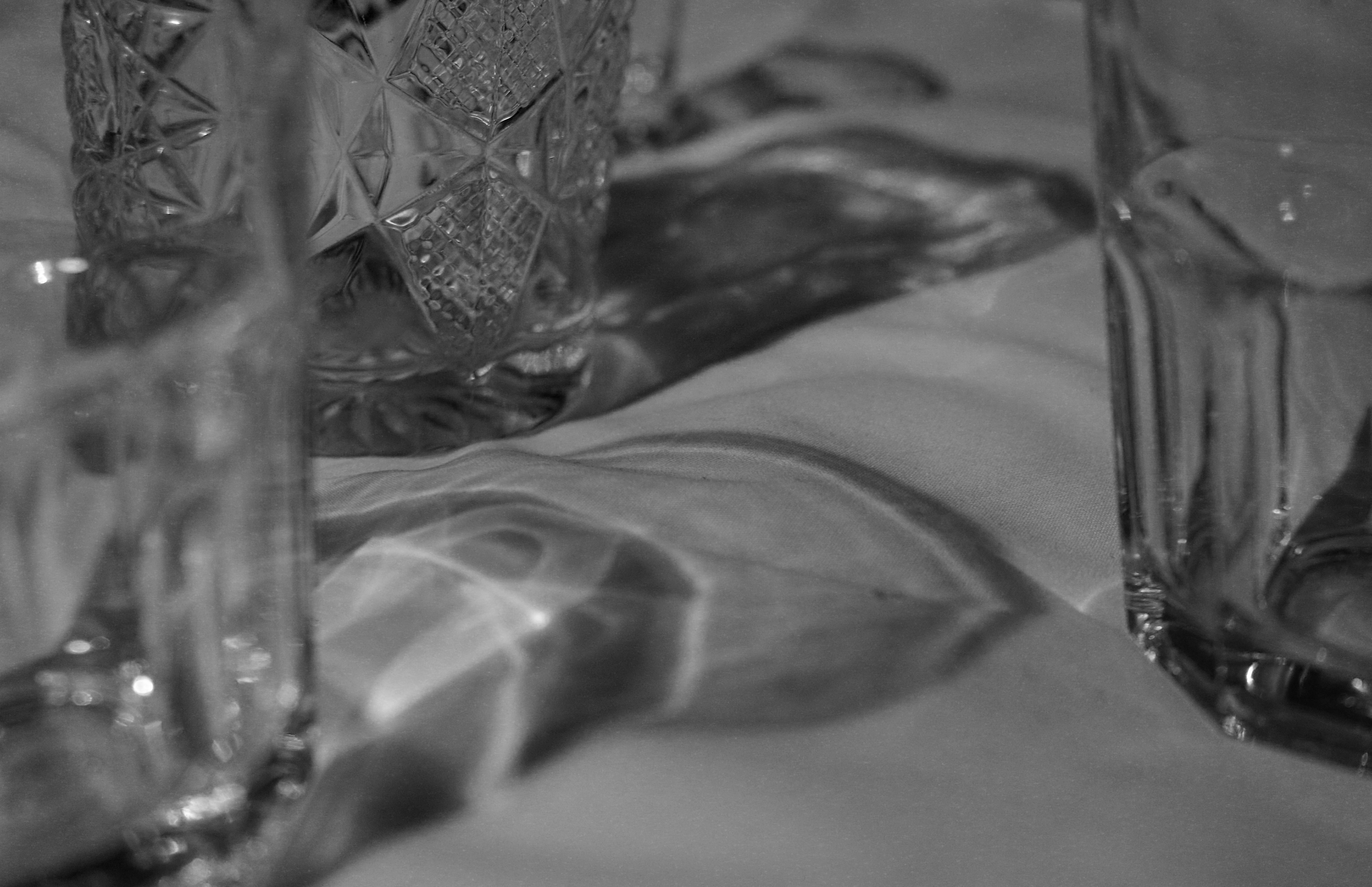
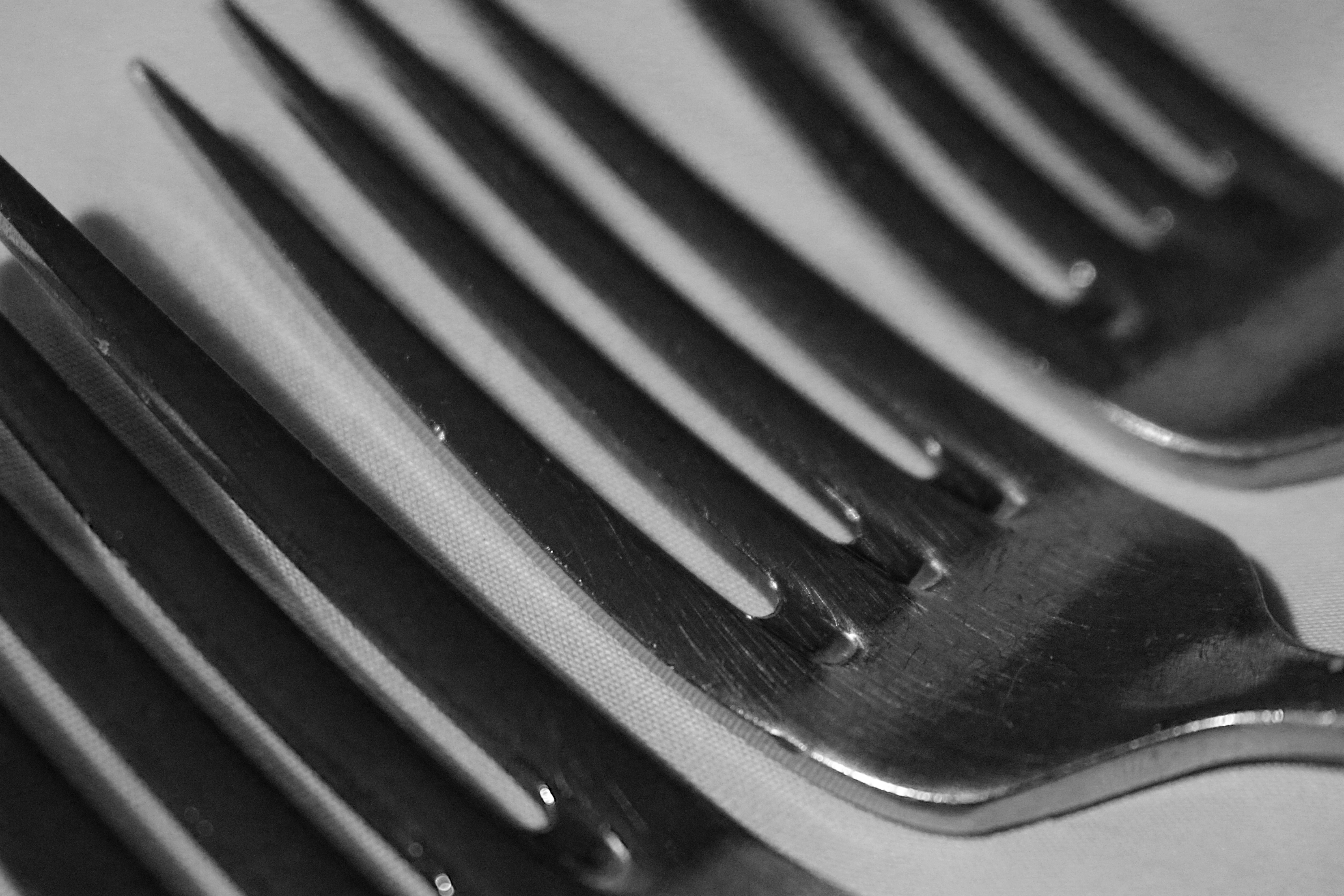
These next photos were photos which I never really took to, but after having a closer look at the photos I realized that without editing they looked like nice final abstract photos.
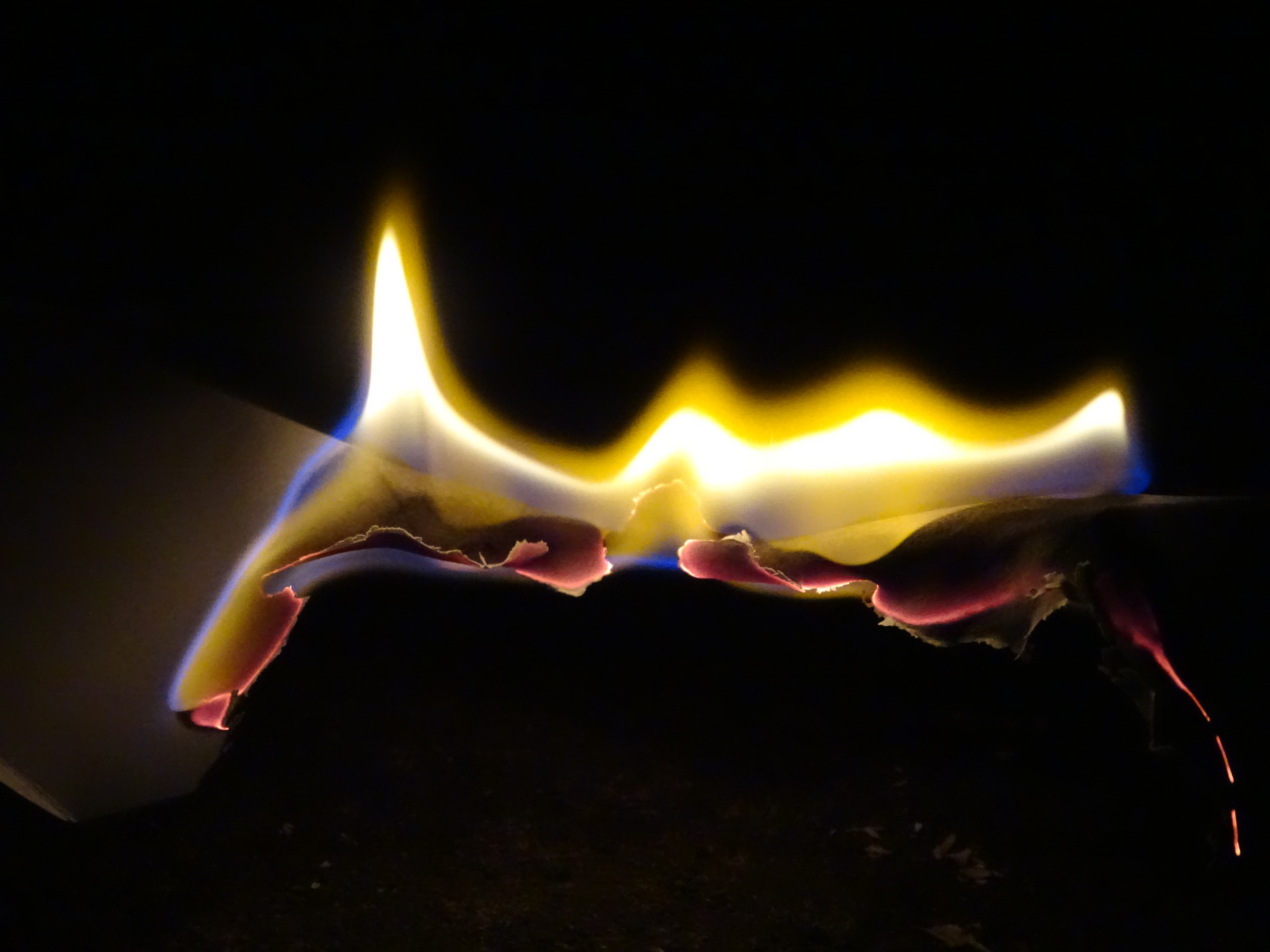
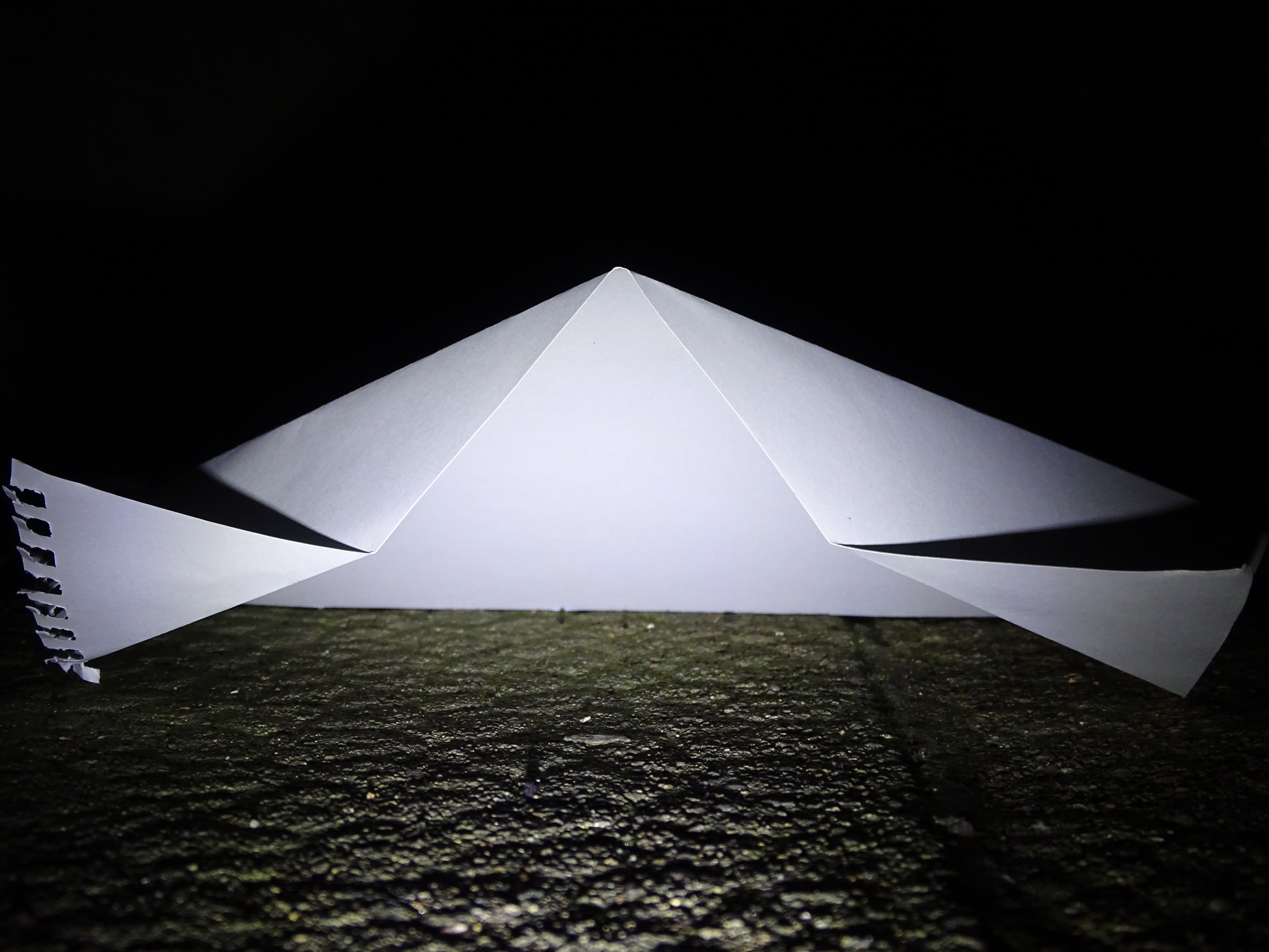
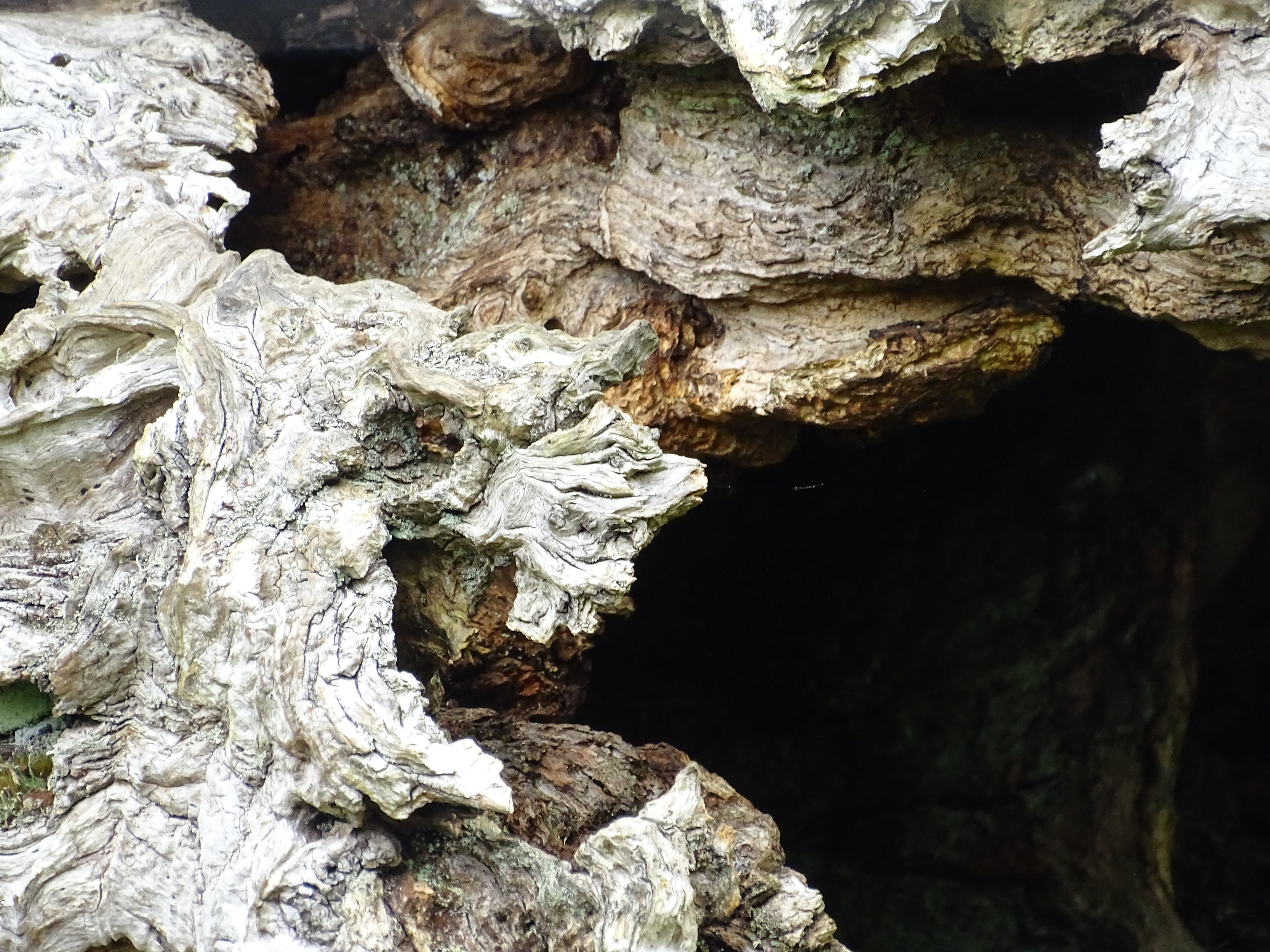
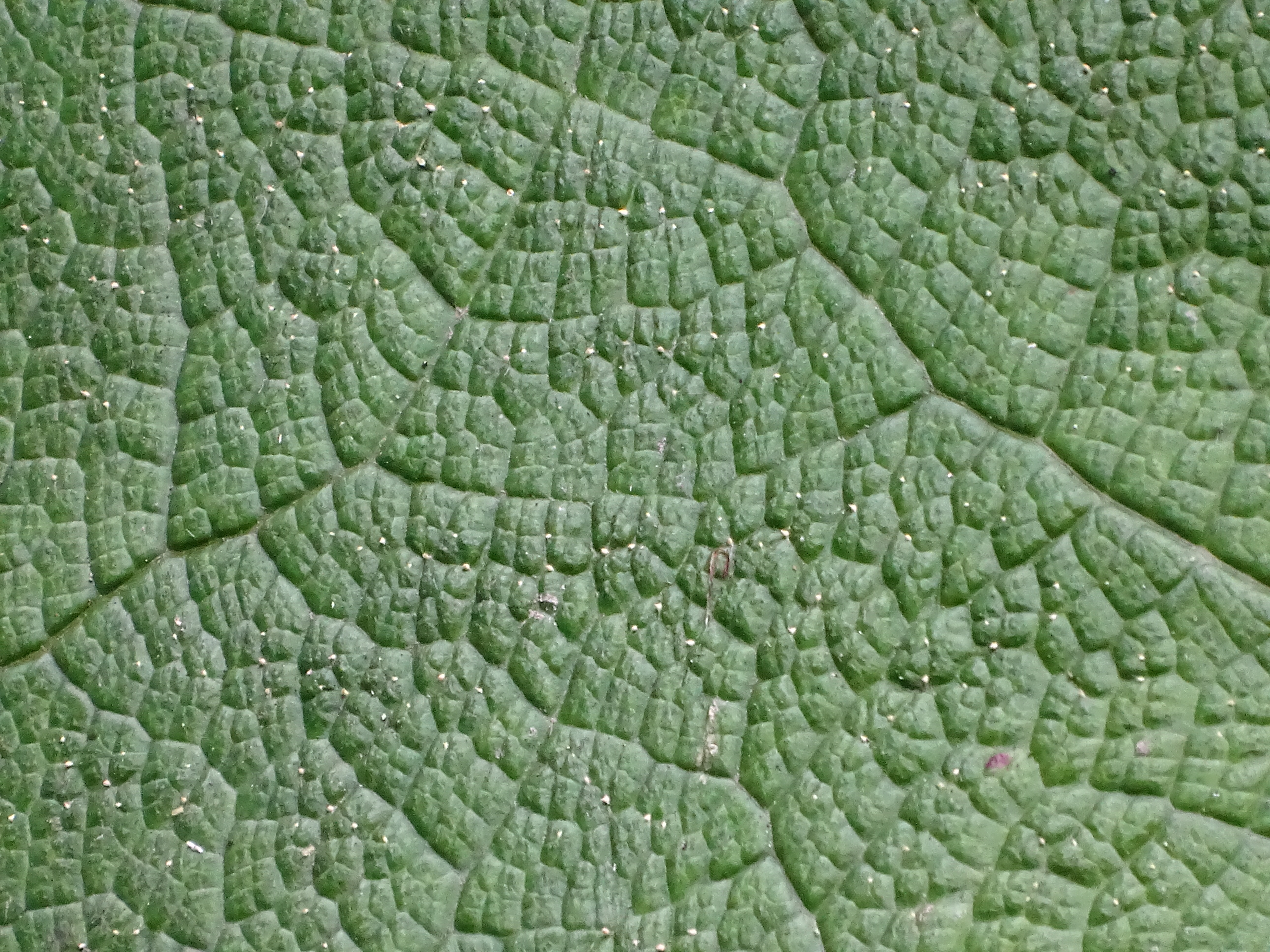
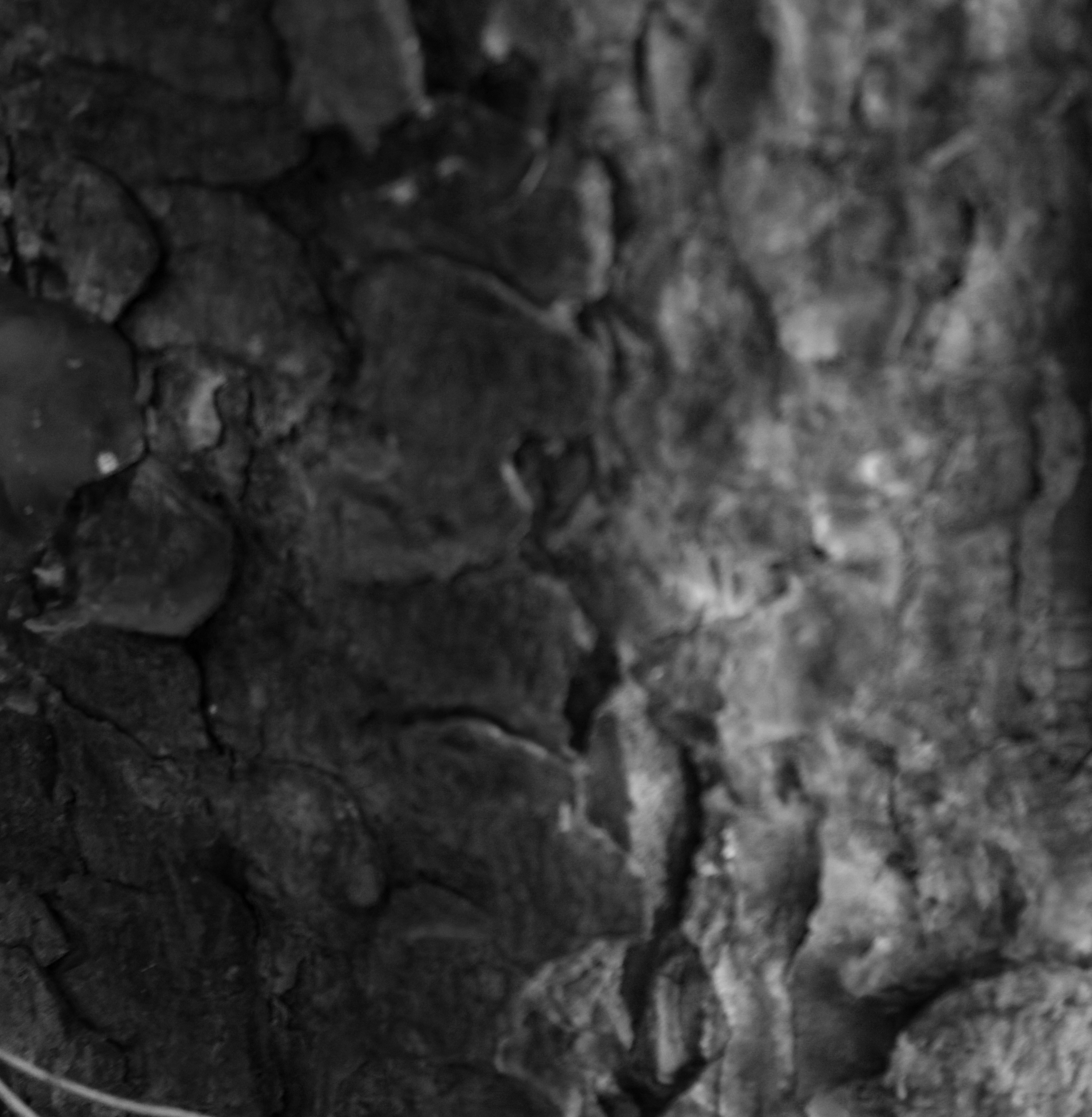
I really like these photos as they show different versions of abstract. With zooming in really close to pick out minute detail, using a variation of depth of field to focus in the fore-ground and blurring out the background, to experimenting with light and dark, by staying up till the early hours of the morning and using a bike light to shine against paper, causing the sharp dark lines of the paper.