
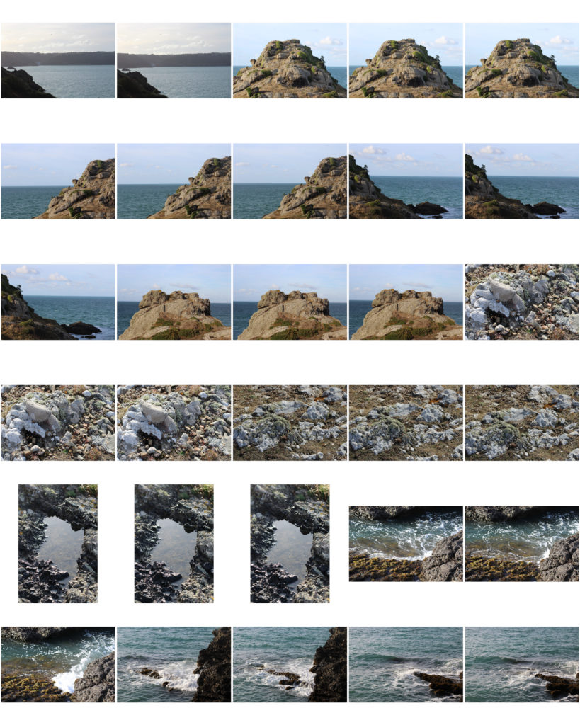
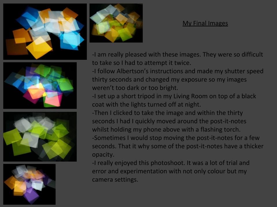
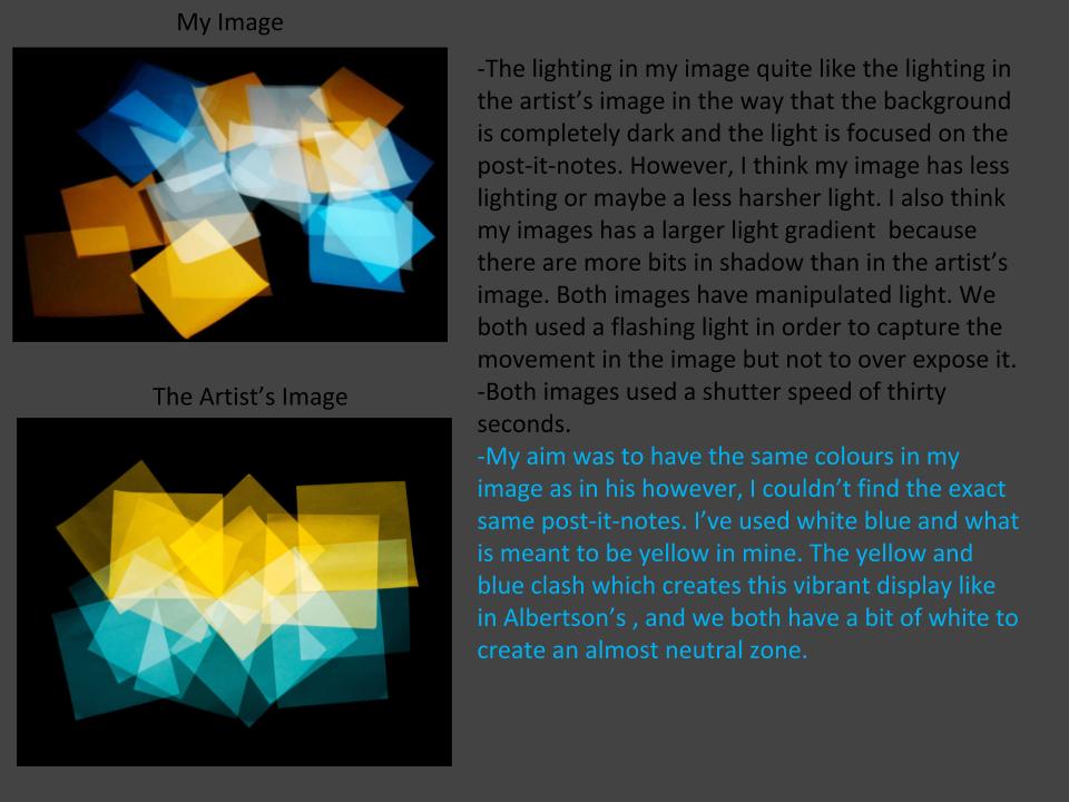
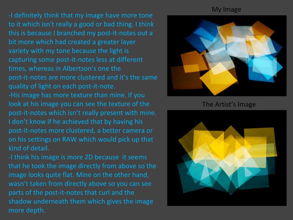
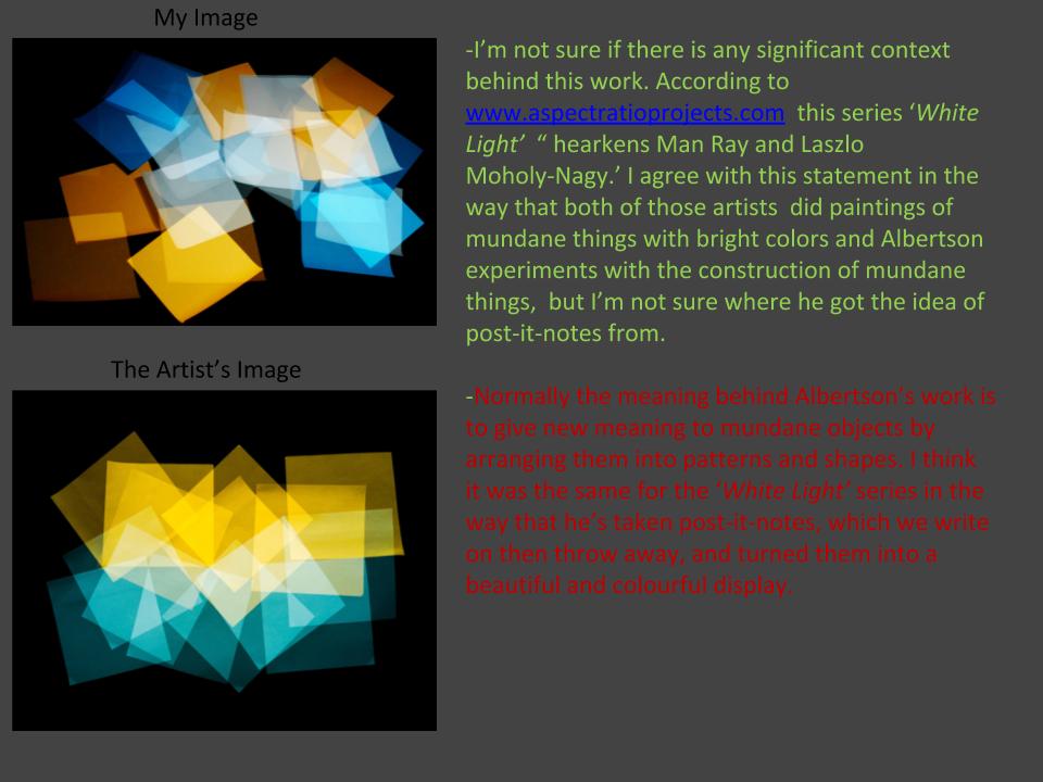
Contact sheets:
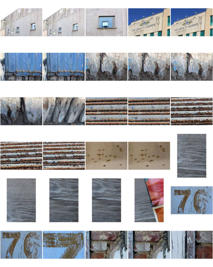
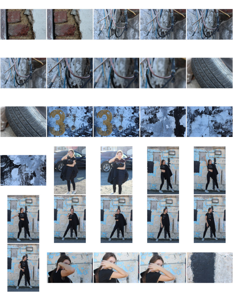
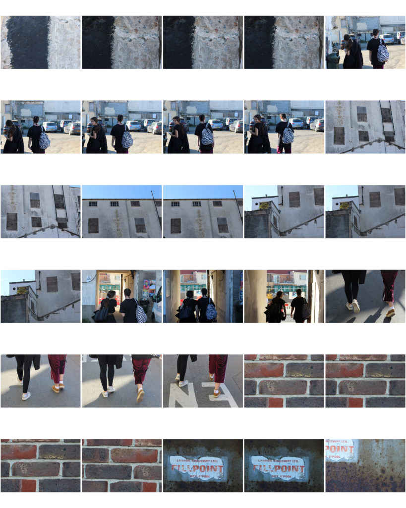
I will select my best photo outcomes to print onto A3, A4, A5. I will search through the entire abstract project and select the ones that look visually interesting and show my photographic skills. Researching many photographers has helped me to capture abstract images in a variety of different ways in order to replicate their style.
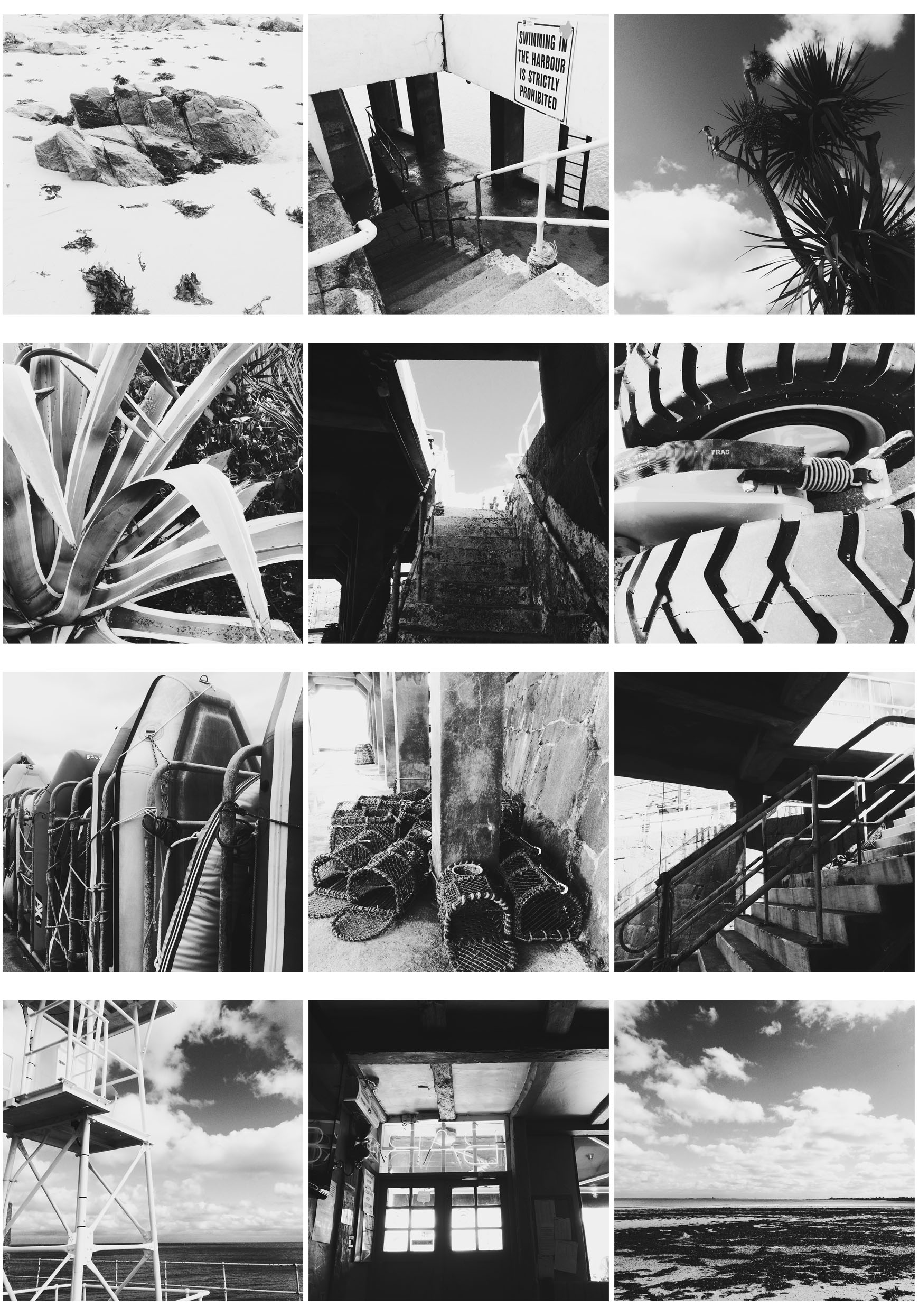
These images are responding to Albert Renger Patzsch photography work. I captured 100 or more images in black and white to replicate his style. I took the pictures using the Hipstamatic app on my iphone with the lens Florence and the film BlackKeys XF. The lens captured images clearly and the film made them black and white instantly. After taking 100 images I made a selection of 12 to make a 4X3 grid. I selected images with either lots of shadow or highlight so when they are placed next to each other, all the images on the grid contrast and stand out.

These 2 images are responding to Jon Setter’s photography work which mostly focuses on urban space. To replicate his style I payed attention to colour and texture to create man made spaces into geometrically satisfying compositions. Photographing a different perspective helped me get the results I wanted to create abstract images. I took around 100 images and selected 2 from the contact sheet. Then on photoshop I edited the two images by increasing the saturation and contrast to correspond to his vibrant style. This created bold and sharp images to emphasise the formal elements. When capturing the images on my camera I made sure to increase the aperture so my depth of field would be greater and my images would have a sharper background. I selected these two images as they both greatly contrast each other through their different colours and textures.
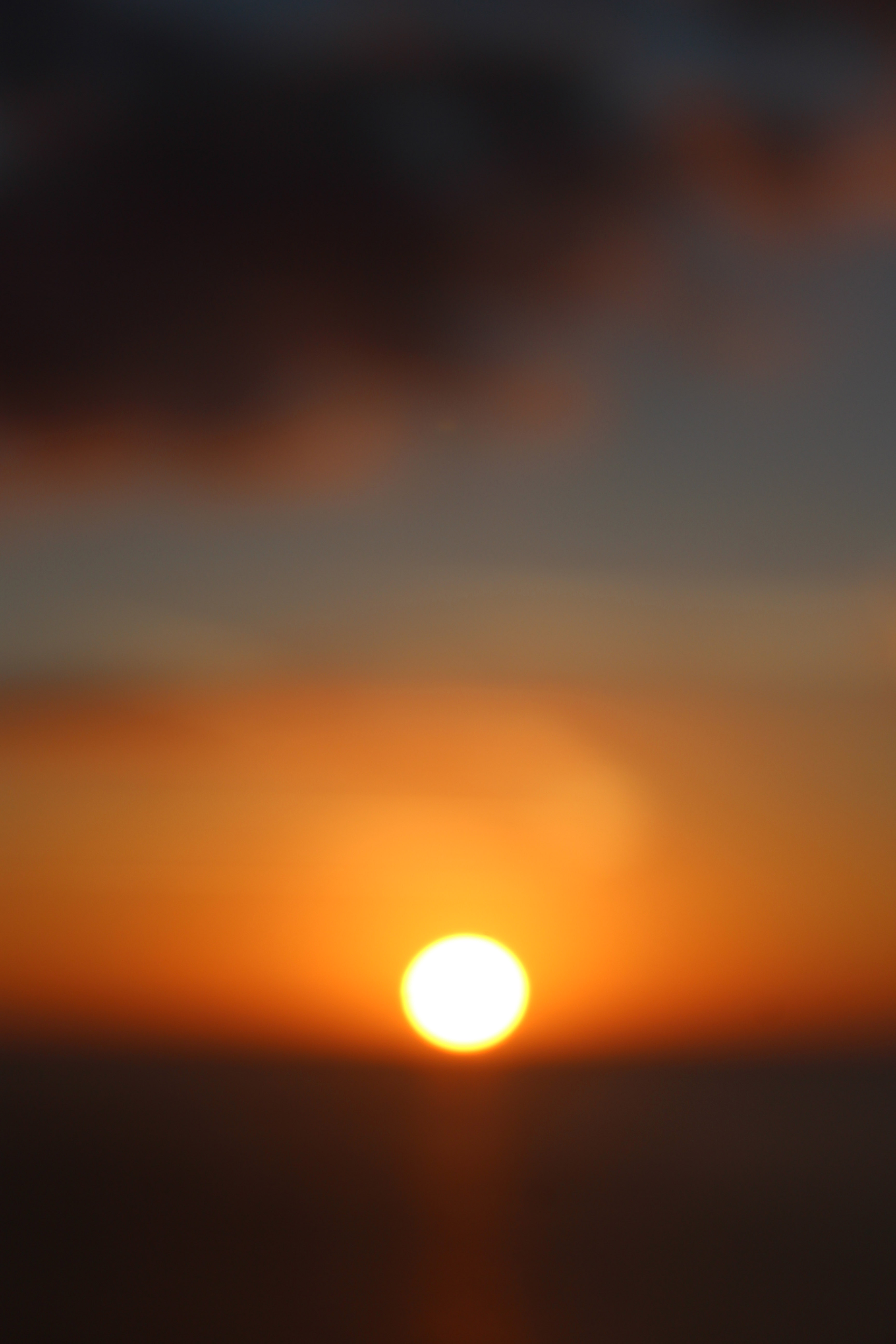
This image was inspired by Uta Barth. She is interested in light, drawing attention to the viewer’s perception and separating the image from the thing depicted. Although her images are blurred, they appear abstract. Uta Barth has made visual perception the subject of her work. She carefully renders blurred backgrounds, cropped frames and the natural qualities of light to capture incidental moments. I decided to use the blurred sunset image inspired by Uta Barth because of the soft blend of unfocused colours surrounded by the sharp, vibrant sun. I chose this image to be printed A3 since most of Uta Barth’s photography work was printed out on a large scale to create a huge impact on the viewer.
Contact sheets:
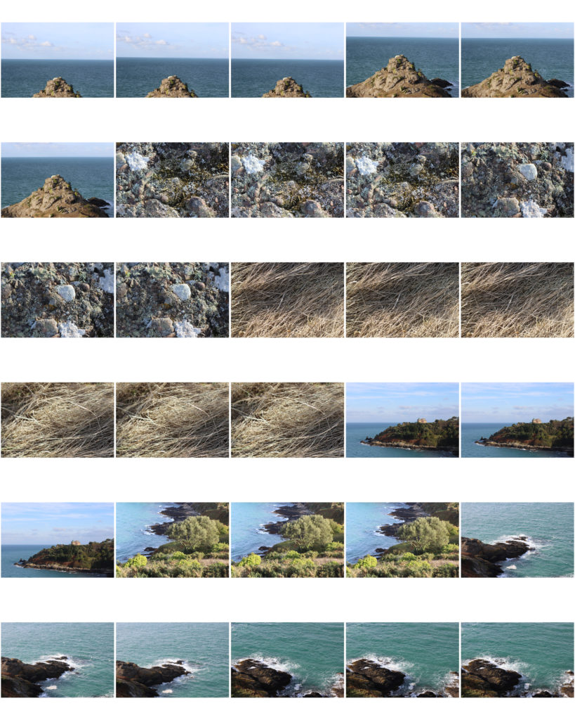
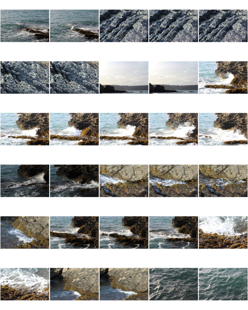


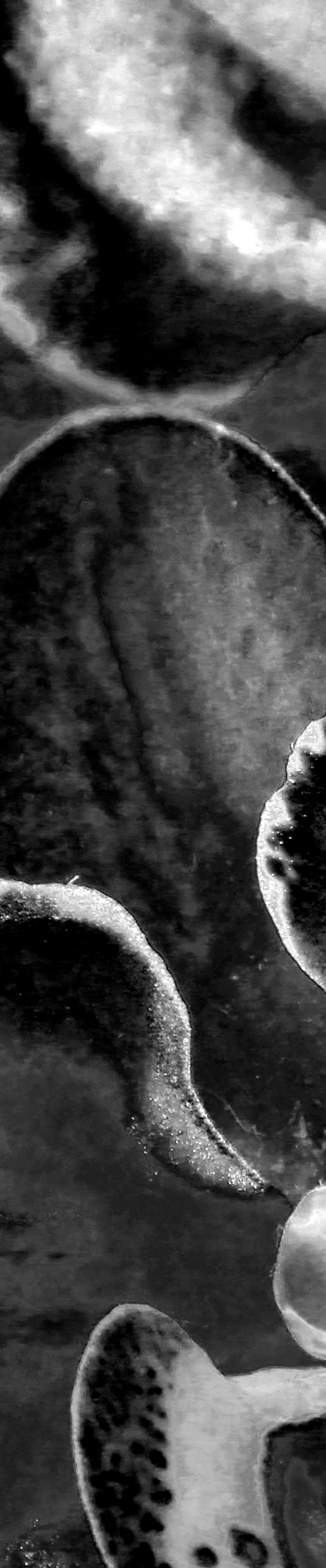
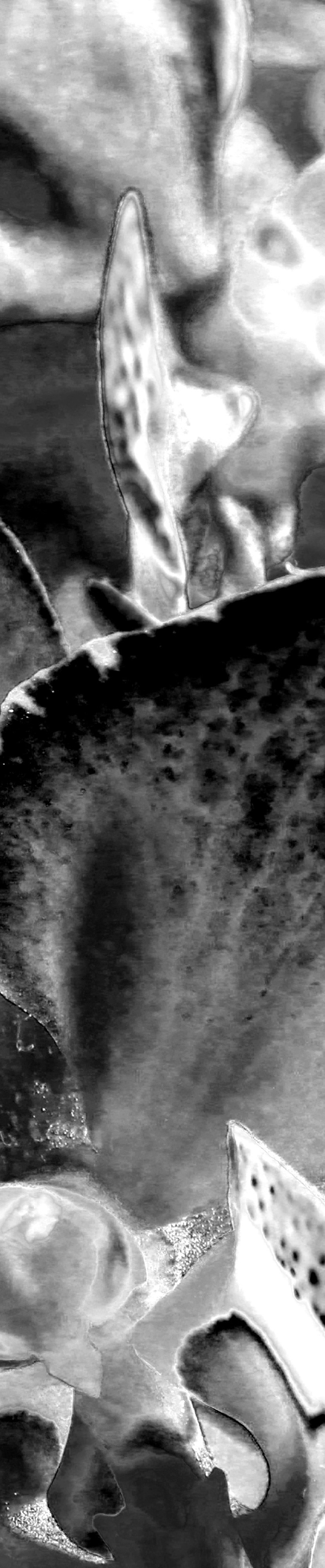
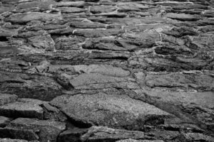
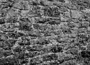
These are my other final 3 images suit the topic of abstract photography. I was inspired to look at rock works and the way they form and overlap one another. This also links to texture and surface which in these images although all the detail is there the image tone and colour is quite neutral and the lighting is quite dim despite being on a medium brightness setting. I’m using these as my A5 images and I’m having them set like a story board as a set of 3.


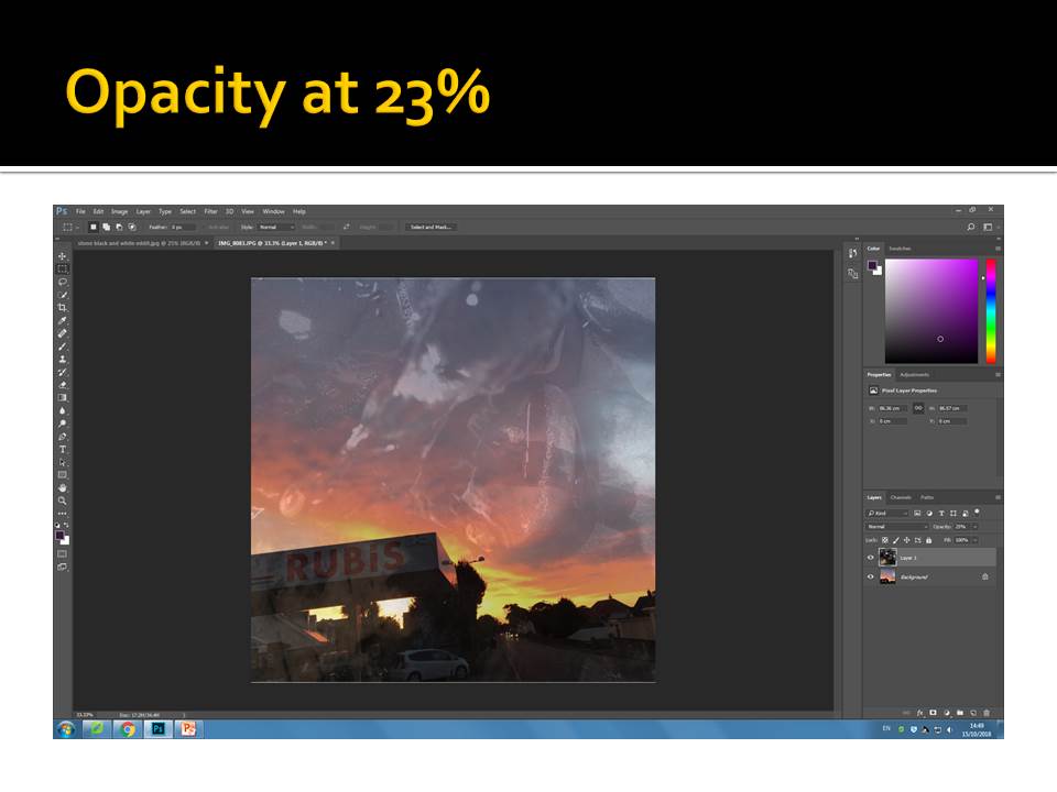
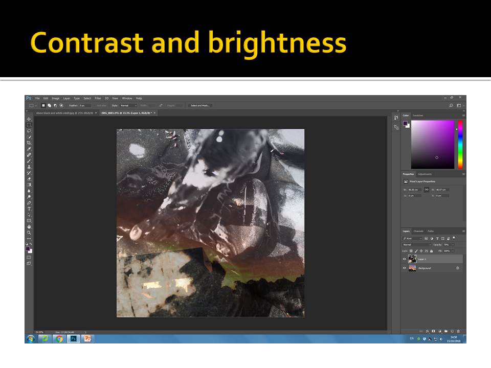
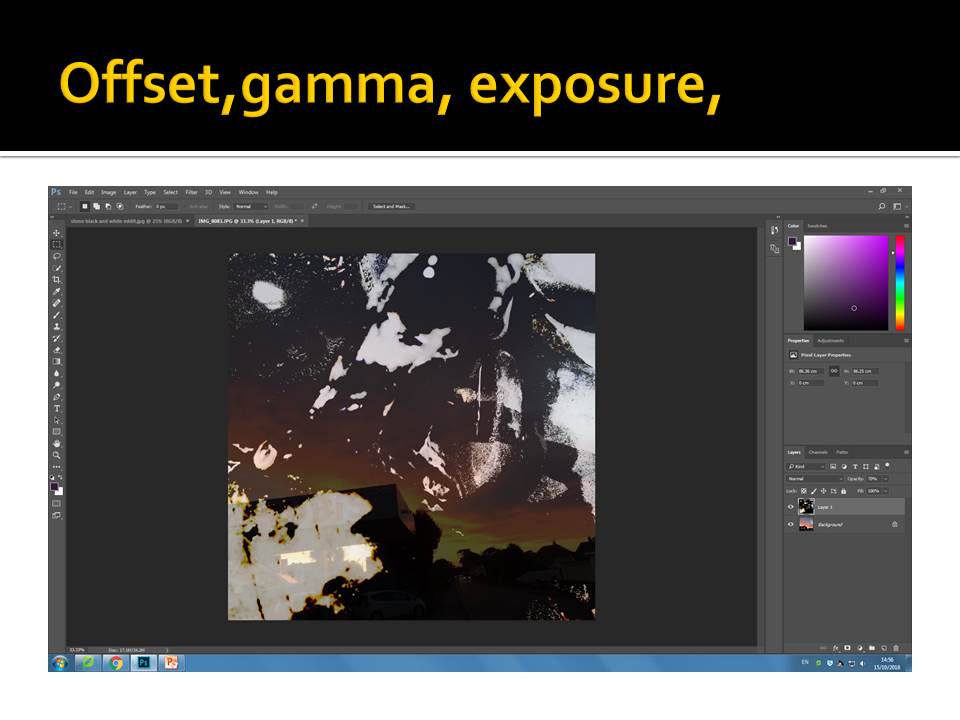
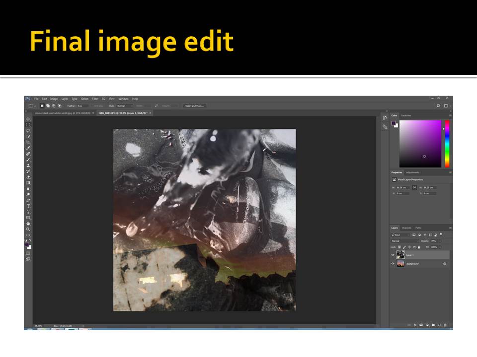
I decided to change the setting on my images to make them black and white. I also edited the image by changing the brightness, exposure, black point, highlights, brilliance and the amount of shadow that is coming through the image.
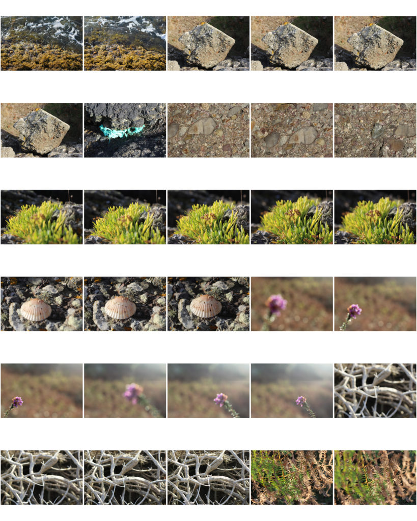
The repeated exposure of a photographic plate or film to light, often producing ghost image.
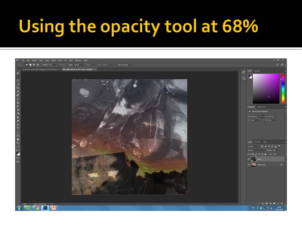
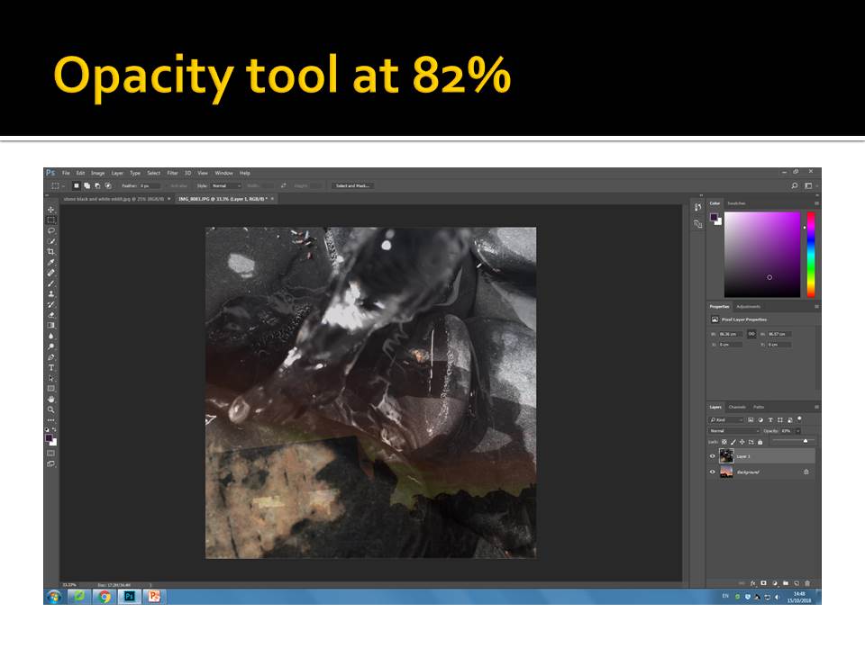
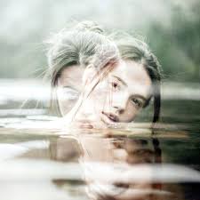
Here are some examples of my first attempts with just some random images I had found on my phone. For this image as I was at home and my laptop makes me pay for Photoshop I downloaded this app called PicShop. on this app all the settings were similar to those of photoshop so having tried it in the lesson and failed miserably I decided to try working on double exposure again as I wish to use this editing technique for my portrait edits when we move to that project.
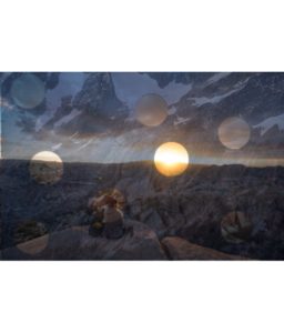
These images I thought worked well over layered because theres quite a high contrast of darkness from the background and then a light just peaking through immediately drawing all attention to it.
There are many artists that use or have used double exposure when developing their images as sometimes they use it to create a story or an idea behind it that some people might not understand. over layering like this can also be called double exposure which some artist take an form an image with a double meaning.
I have decided to chose an artist and try out different examples of their work but with my images.
Here we have some examples of Luke Gram’s Abstract photography work.
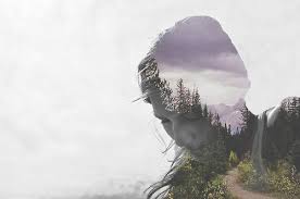
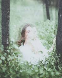 these are just a few out of hundreds of images that Grams has taken. These are the ones that I thought suited abstract photography more as here we can tell he has mixed abstract photography with portrait to create doubling meanings of humans being connected to nature through elements of water, fire,sun and wind. These images stood out to me as I interpret these as images he has focused on creating a story when a person is looking at them closely. He has not only bought in different patterns and texture he has managed to fade objects around the image but still being able to visualise the woman face. I think this is significant because without the portrait side of it the images may have began to look a bit disorientated as there would have been to much going on around those images.
Luke Gram Bio-He is not only a abstract photographer but he photographs people aswell. His images are taken according to him to capture the “serenity and power of life. He does this by placing humans in natural habits like i.e. the forest in the image above. His over lays are also natural places like the ocean, beaches and tree’s .He was about 18 years old when began taking photography seriously. He earned degrees in psychology and history from the University of British Columbia. He previously worked in the Canadian Oil Sands
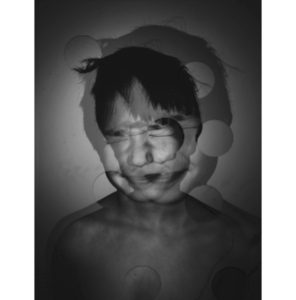
I was inspired by Luke grams work but decided to only have two layers of the same image overlapping one another. However instead of me creating both images to be very visable I made them both quite dark and heavy on shading which then allows the small circles to show elements of the image from underneath.
I tried also at doing another attempt using the images I’ve chosen as my final prints.
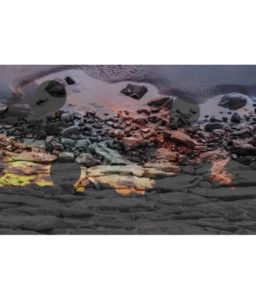
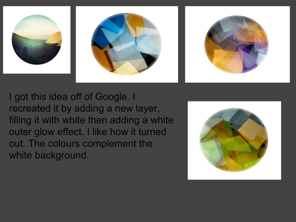
For the image above I used the same app called PicShop which allowed me to use my final image of the rocks and one of my landscape works that I used for art and used one of the effects called Hue on number 59 to be able to get the colors as bright as I wanted.
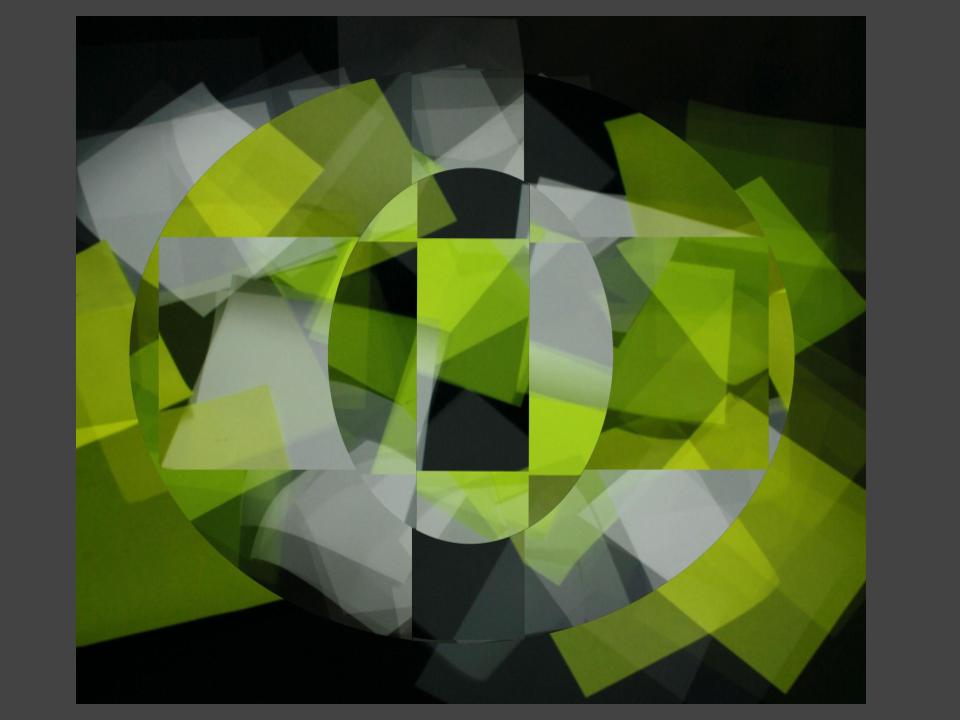
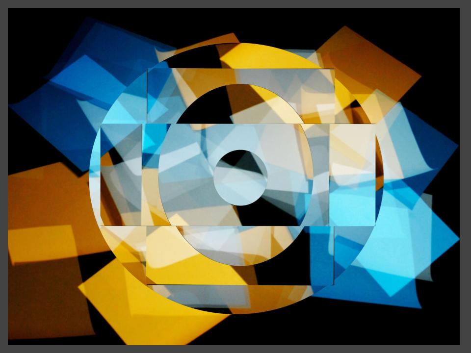
Having worked on these images, I have gained a wider understanding on different ways and ideas on developing my images to make them stand out and not just sit with my basic black and white edits which I chose to do for my abstract final images. Additionally I think that all these ideas and images have been successful at presenting the theme of abstraction. Each image I have created has different shapes which order out in a unique way, in which I have used to reveal certain aspects of the image. By doing this it has allowed the public to look at certain parts of the image which they may not have originally noticed because the image would have been on such a larger scale. It also allows the main focus point of each edit to be more visible and easier to identify.
Due to the edits being the way they are there’s a bit of negative space that I could have cropped out, however I like the negative space because it gives a sense of space and doesn’t make the image look all cramped together. I am very happy with the way these edits have come out as they clearly show development of my understanding of abstraction.

Unit 1 – Abstract Final Images
Approaching the end of the Abstract Unit, we are choosing our final images to sent off and printed professionally so that we can mount and display them ourselves. To choose my images I went through my most successful photos and selected the best. After this I edited them if they needed to be edited and also dividing/putting the images together. I also changed the image sizes and resolution so that my images would look the best they could. High Resolution JPEG files (4000 pixels on height).
1 x A3 print + 1 x A4 print + 1 x A5 print
A3
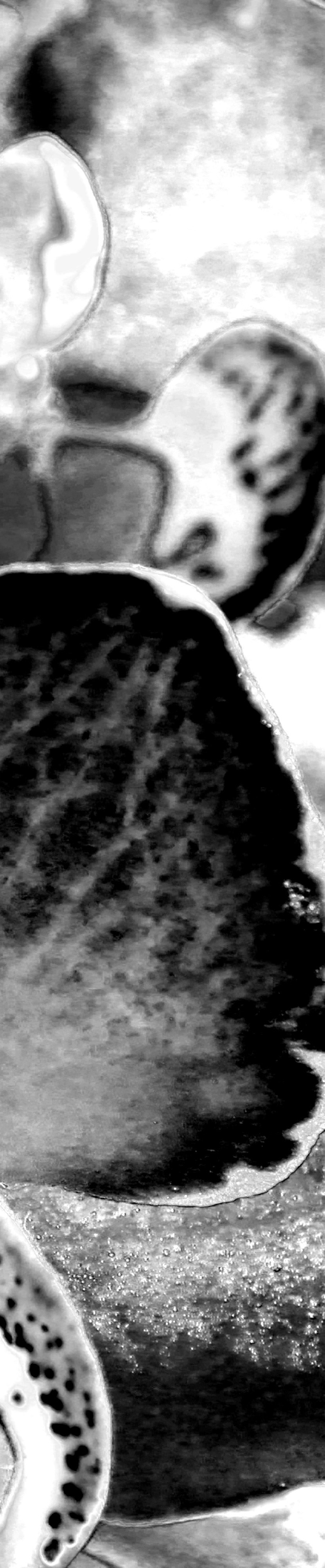
For my A3 print I wanted to do use an abstract photo of an orchid which I took as part of the aperture task. I edited the image in Photoshop to make it black and white and also zoomed in. I decided that just the image on its own was not enough so I divided it into 3 equal vertical sections.
This is my A3 Final Image.
A4
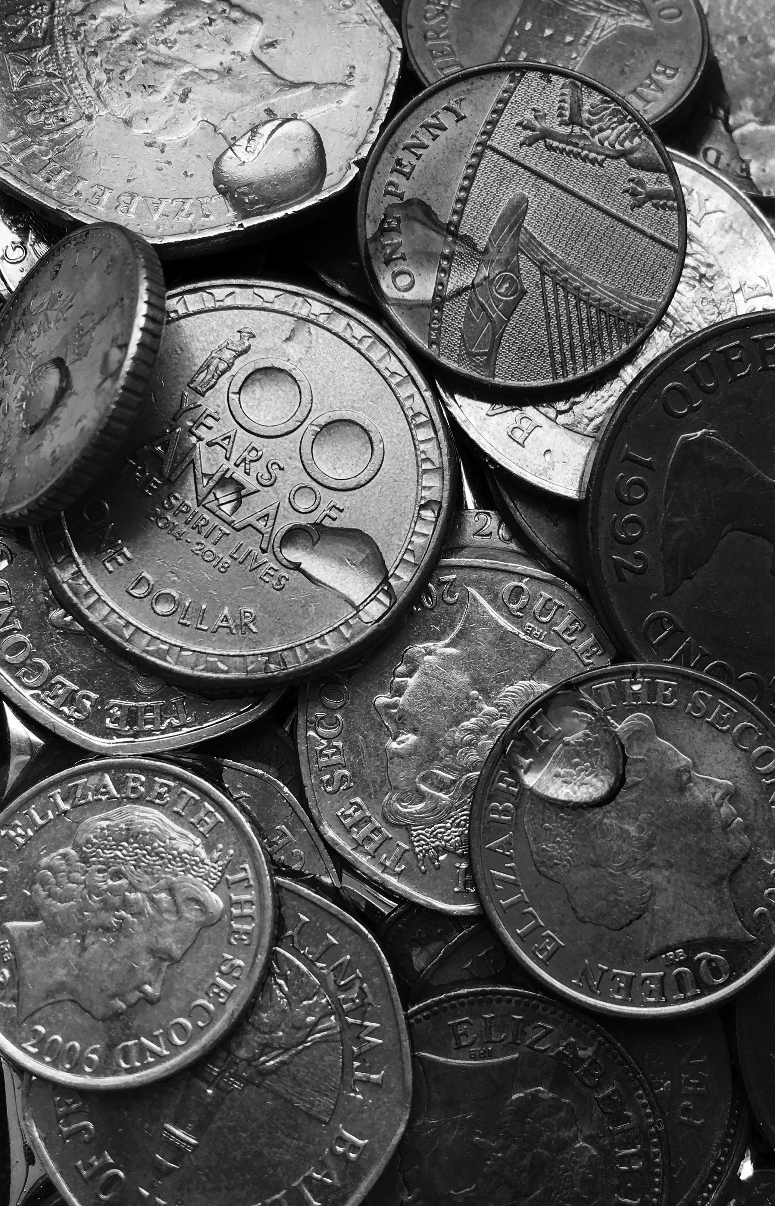
For the A4 image I wanted to use a photo from my summer task because I thought they were good. I used a zoomed in picture of a spill of coins with water droplets over them. I cropped the image and zoomed in a little bit more. I thought the image on its own was enough so I decided not to split it into sections or add more than one image.
This is my final A4 image.
A5
My A5 print is of a picture from the colour and texture homework. I wanted to include some colour in my final images so i used this one because the colours are very vibrant. Also I think the contrast between the ripped cardboard and the smooth paint is interesting as they juxtapose each other.
This is my final A5 Image.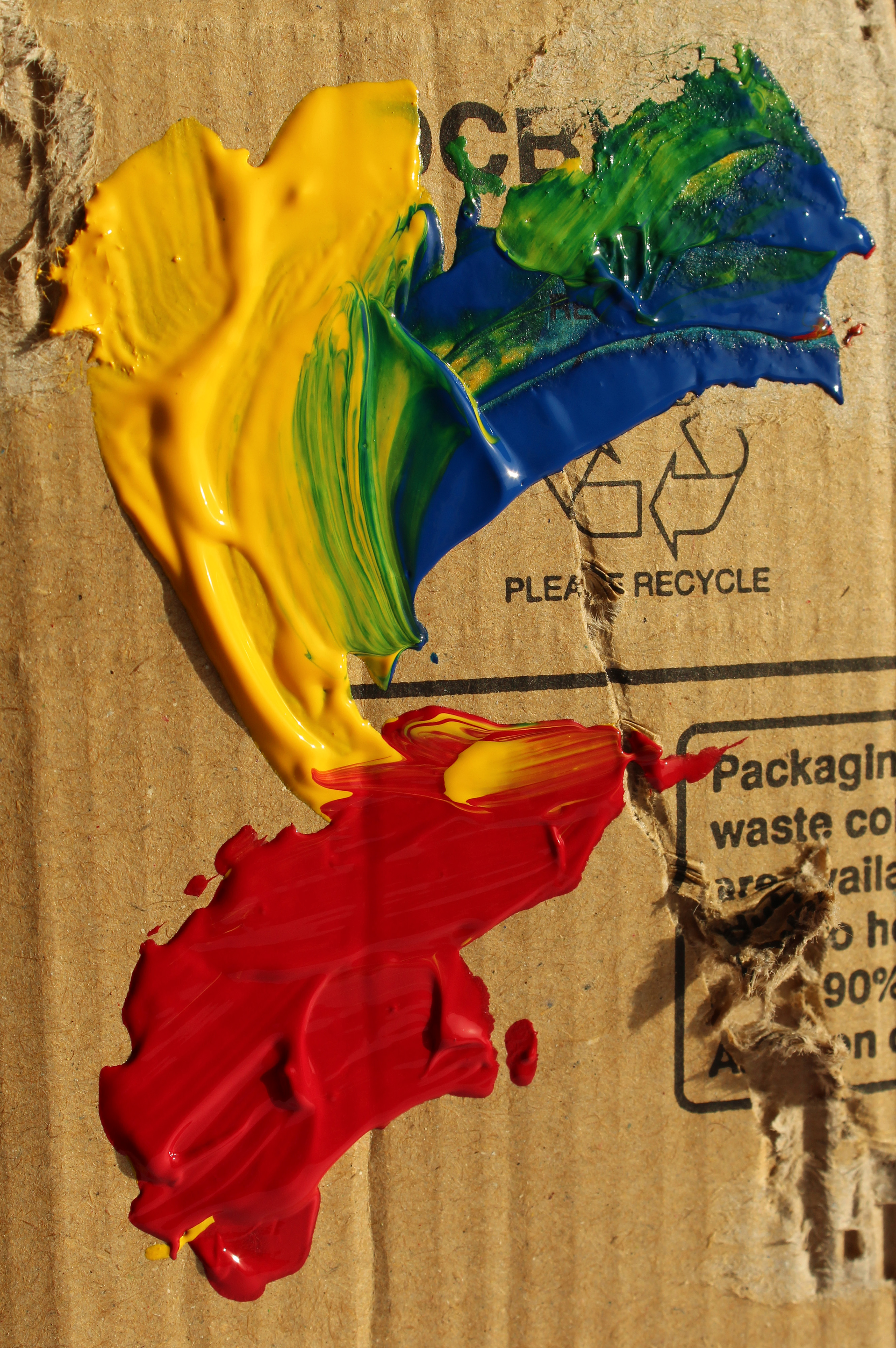
Final Prints – Abstract Photography
Set (1) of 3 Images
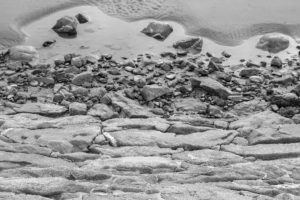
These images were inspired by the works of Aaron siskind’s work although I have kept some elements and ideas from his work I have tried to adapt and create a set of 3 images to all resemble the similar sort of idea to Aarons street photography. For example I liked the fact that Siskind used black and white to enhance features that may not have been captured through colour photography. for editing these images the first one to me contrasts the most as its an image with a bit of empty space which to me was quite necessary as it captures the depth of the image. Whilst I photographed this image I stood on the edge by the rocks to capture an element of fall which by changing my setting to black and white is focused on how the shade on the rocks and the water fall seem quite far away yet was taken quite closely. The second image I also changed the settings as it was originally photographed in colour. I did this through adobe photoshop and simply using an app on my phone called VSCO to change tones and the exposure and shadow settings. Additionally I repeated this process for image 3 although after having looked at it for long enough the image itself looks busy as theres so many lines and patterns and quite rough surfaces lots of different elements of texture but for me the image fits in perfectly with the theme of Abstract photography.
I am using these images as my set of A4 images as I can see they all fit into the element of abstract and all have the same theme throughout each image with extreme elements of sharpness yet some elements of blurriness. For my final presentation I will add these images to a big sheet of black paper and have them present as a line of three almost like a story but with images that are just exploring different ideas within the same theme through different editing and cropping.