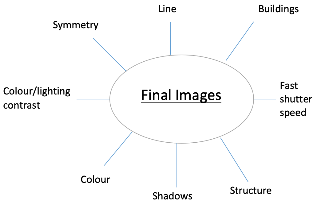
Mind Map:
Mood Board:
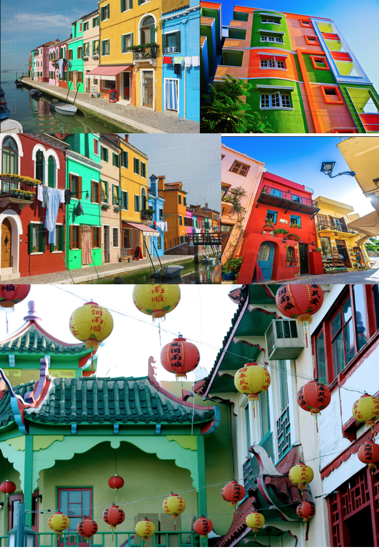
Franco Fontana:
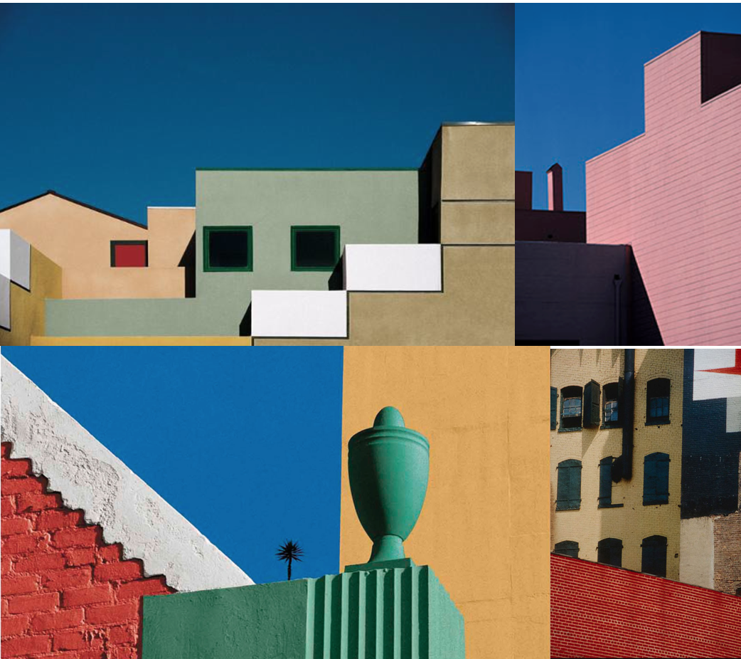
Franco Fontana is an Italian photographer born in Modena, on December, 9th, 1933. Although he is best known for his abstract colour landscapes, he has also takenmultiple images of colourful buildings. He is known as the inventor of the photographic line referred to as concept of line. Fontana plays with the concept of reality and unreality. Fontana views that our built world is more than buildings, surfaces, objects and colors. Fontana engages with the symphony of relationships that is constantly being rewritten between the physical elements of the urban landscape.

Fontana uses natural lighting such as daylight in his images, and uses the vast amount of colours and shadows to contast eachother. Fontana mainy uses a 35mm camera on location as he claimed that the world was his studio. In Fontana's landscape images he uses a high light sensitivity which creates a grainy image, however, in his urban landscape images of buildings he appears to use a lower light sensitivity because the images are a lot less grainy. Fontana plays with both warm and cool temperatures in his images, constantly creating a contrast.

Colour and line are the main features of Fontana's work that makes it so striking and unique. The reoccuring theme of line runs through his work, creating unique and distorted impressions, creating the illusion that some of his images are photoshopped. The tone of his work varys, with both light and dark and light and shadows constantly featuring. There is usually some element of space in Fontanas images aswell, however he cleverly uses it as it is usually the sky, with the blue contrasting the colours of the image.
Action Plan:
1 x A3, 1 x A4, 1 x A5.
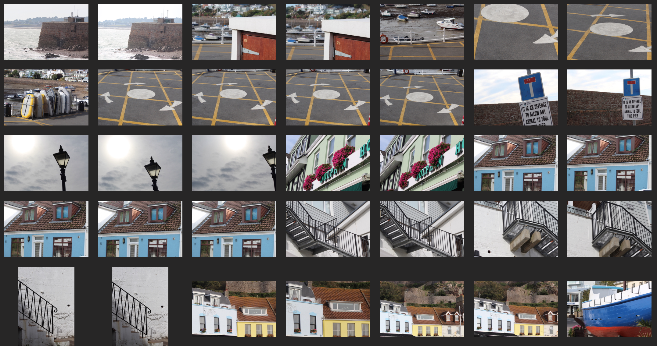
I was inspired by Fontana's images of the urban landscape and also wanted to photograph images of colourful buildings. Location wise, I thought Gorey is the perfect location to shoot my photographs because along the pier there are many colourful buildings. I decided to use a 55-250mm lens to capture my images because I decided not to take close upimages, but images that are a bit further away, so therefore I thought that a 55-250mm lens would be more suitable. I also wanted to have atleast one of my images featuring the sky to create some negative space, however I would have to be careful and ensure I am not creating too much negative space. I also chose to shoot in the middle of the day so I wouldn't have to use artificial light.
The Photoshoot:
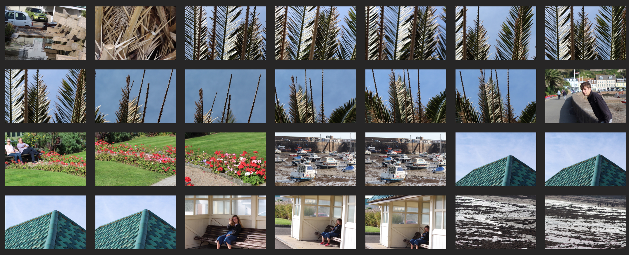
I did take images of the buildings at Gorey, however I was also interested in features such as the paint of the road, and the abstract shapes formed by palm trees. However, overall I prefer the images of the buildings. The I find the colours very striking and eyecatching.
Final Image Selection and Manipulation:
Out of all of the images I took, my favourites are of the buildings. Here are my three favourites:
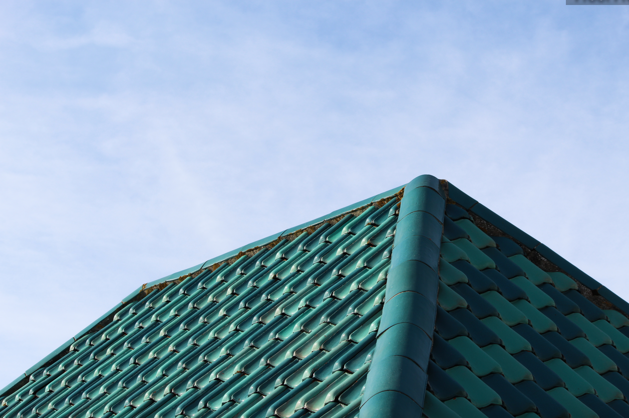
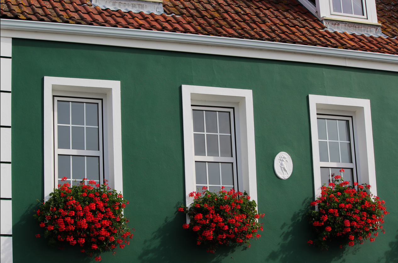
A3:
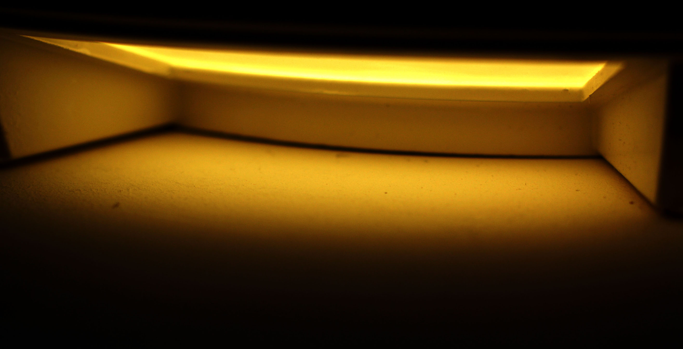
For this image I used adobe lightroom to manipulate it. I increased the contrast, decreased the exposure, cropped the image and slightly increased the vibrancy of the image. This is my favourite image because I really like how detailed the pattern is of the buildings roof in the foreground, and the pale blue of the sky in the background. I also like the shaped introduced in this image, for instance the round curves created by the tiles, however the line introduced of the outline of the roof. I feel that the blue and green compliment eachother, and the natural daylight creates the shadow of the right side of the roof constasts the bright and vibrant colours of the left side of the roof. Line and pattern is a reoccuring theme of this image, which makes the image eyecatching and interesting.
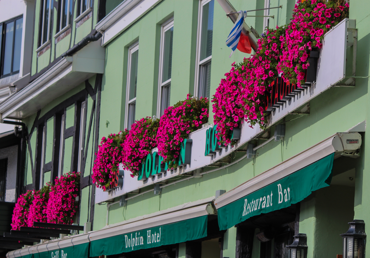
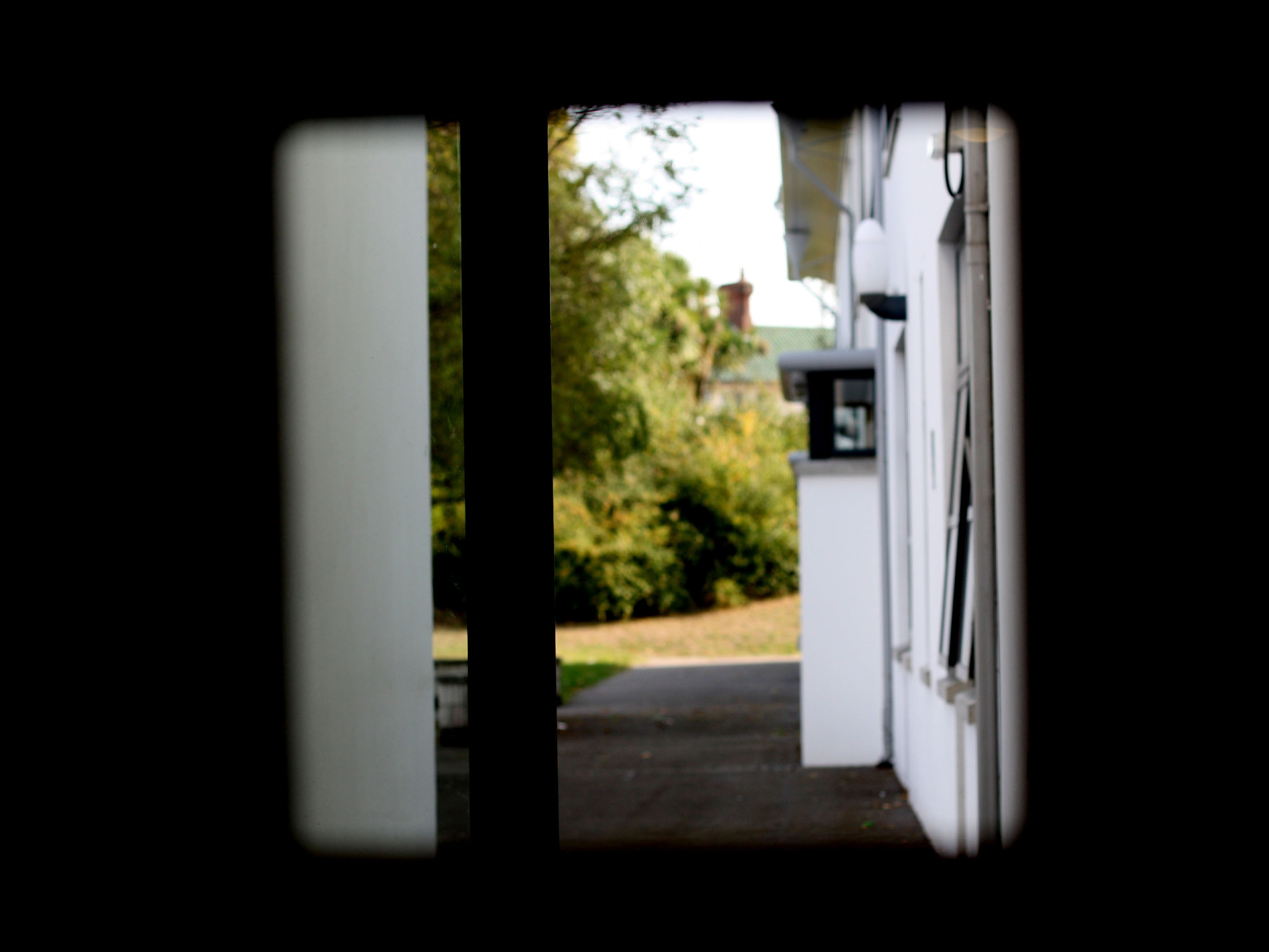
A4: Once again I used adobe lightroom to manipulate my image. I increased the vibrance, contrast and slightly increased the clarity. I then decreased the exposure and hightlights. To take this image I used a fast shutter speed to ensure there was no shakiness. I also ensured that I used a low light intensity to make sure that the image won't be grainy. Colour is the main focus of this image, I especially like the magenta contrasting the green in this image. I also like the textural difference of the flowers to the smoothness of the building. There are also some elements of line in this image, seeming as the windows, borders and buildings feature line.
A5: Adobe lightroom was used to manipulate this image. I decreased the exposure, increased the contract,decreased the shadows, increased the vibrancy and increased the highlights. I used the daylight as my natural lighting. I like the contrast between the dark olive green and the vibrant reds in this photograph. I also like how the busy and unique texture of the flowers contrast the smooth and regular texture of the house. the repetition of the three windows and three bushes of flowers add symmetry to the photograph, making it more aesthetically pleasing. The temperature of this photo is mainly warm because the red of both the roof and the flowers add a warm temperature and feel to the photograph. I used a fast shutter speed to make sure the image wasnt blurry or grainy.
Presentation of Final Images:
To present my images, I am going to place them onto foam board. My reasoning for this is because the foam board will give a slight 3D feel to the photos, and emphasis on the fact that the images are of buildings.

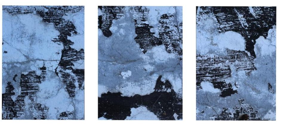
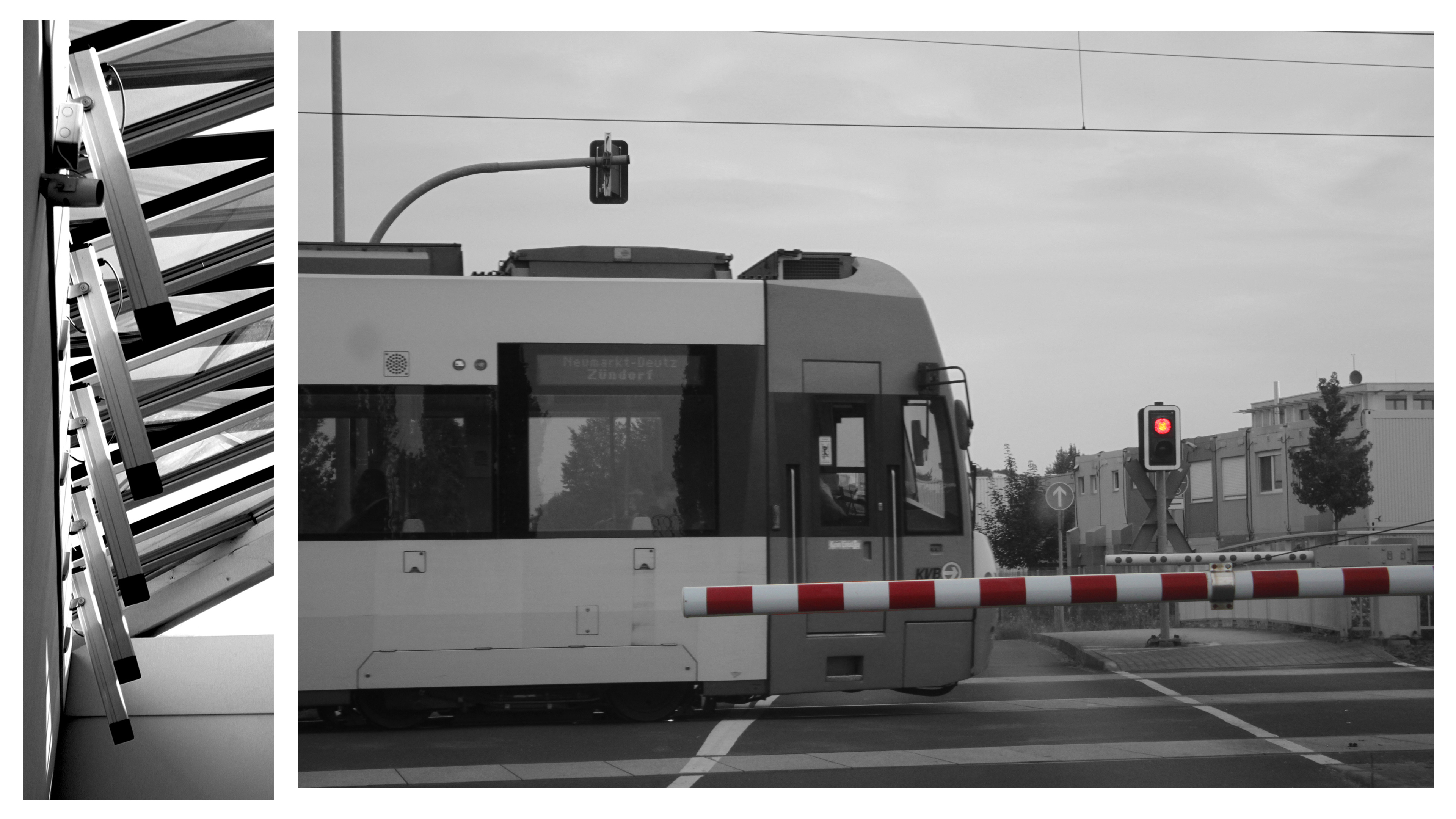 This will be my largest print out (sized at A3). I will seperate the print into the two images it consists of; then stick them onto one layer of white styrofoam board, then display them on a black A2 piece of card. This will make them literally pop out of the page more as they will be lifted approximately 1cm above the card. The whole display will also keep the black & white theme as the display elements are also black & white.
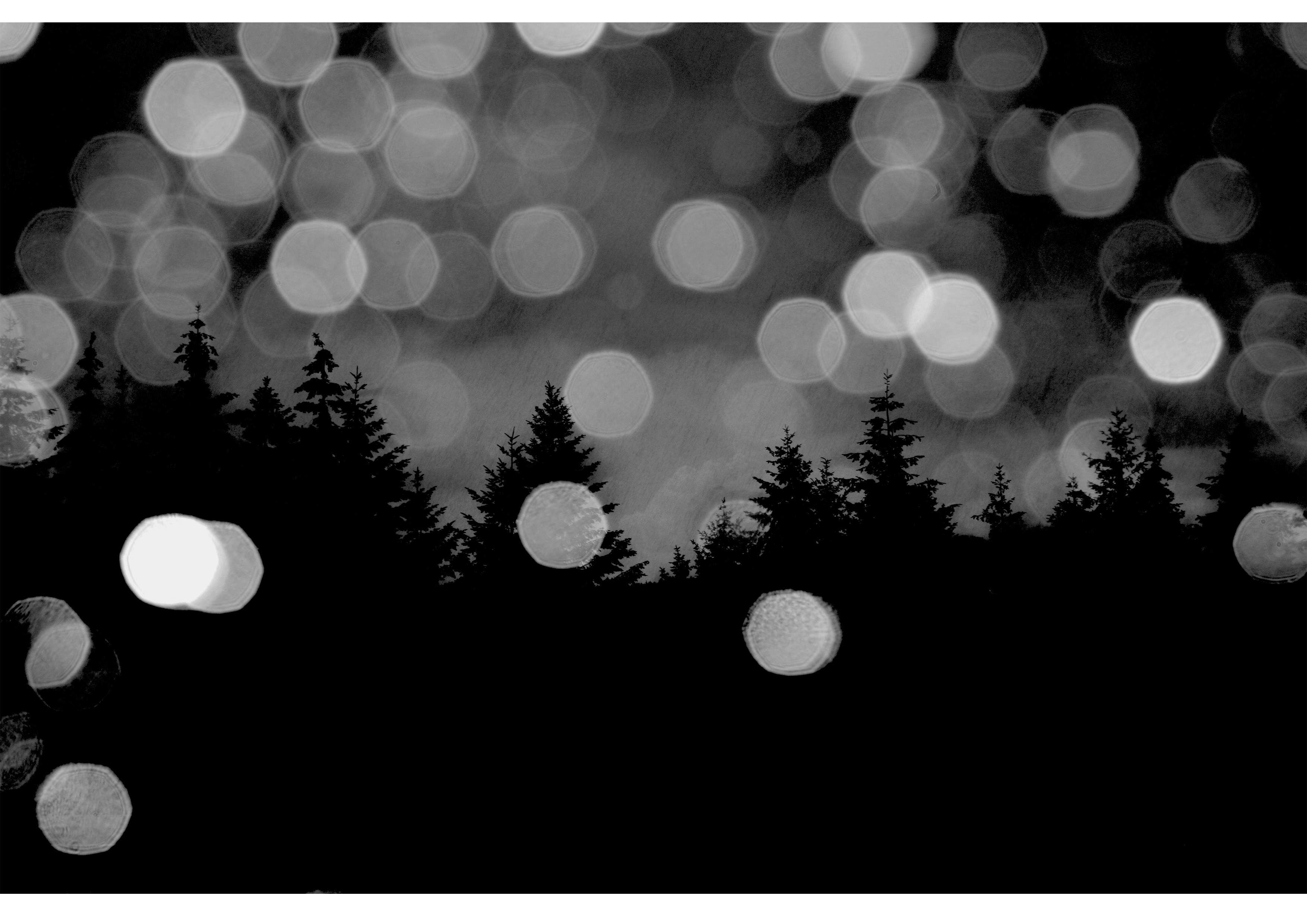 This image will be printed out in A4 size. I will frame it in black A3 card to keep the dark theme of the photo. Howevr, I will bevel the edges around the photo so that the white underside of the card shows through, this will help distinguish the image from the frame without adding too much bright elements.
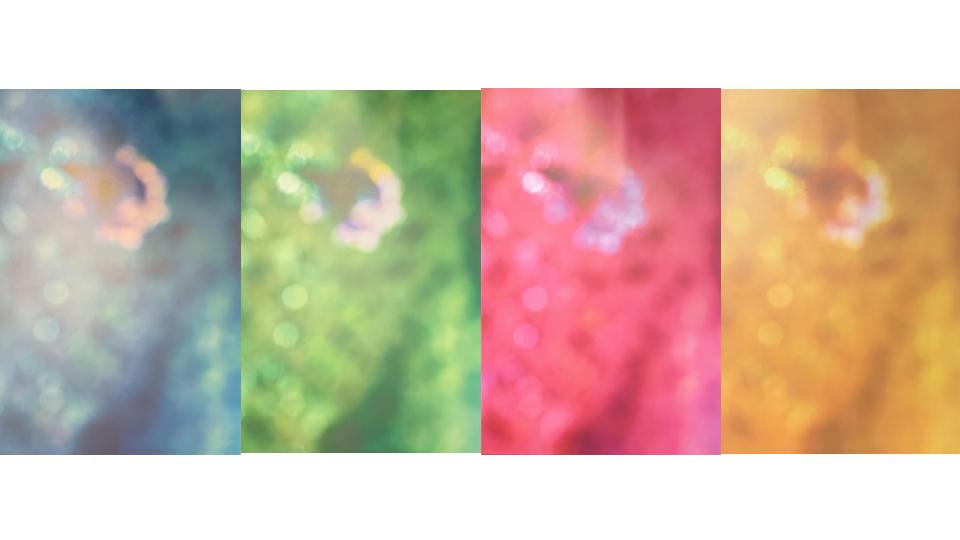
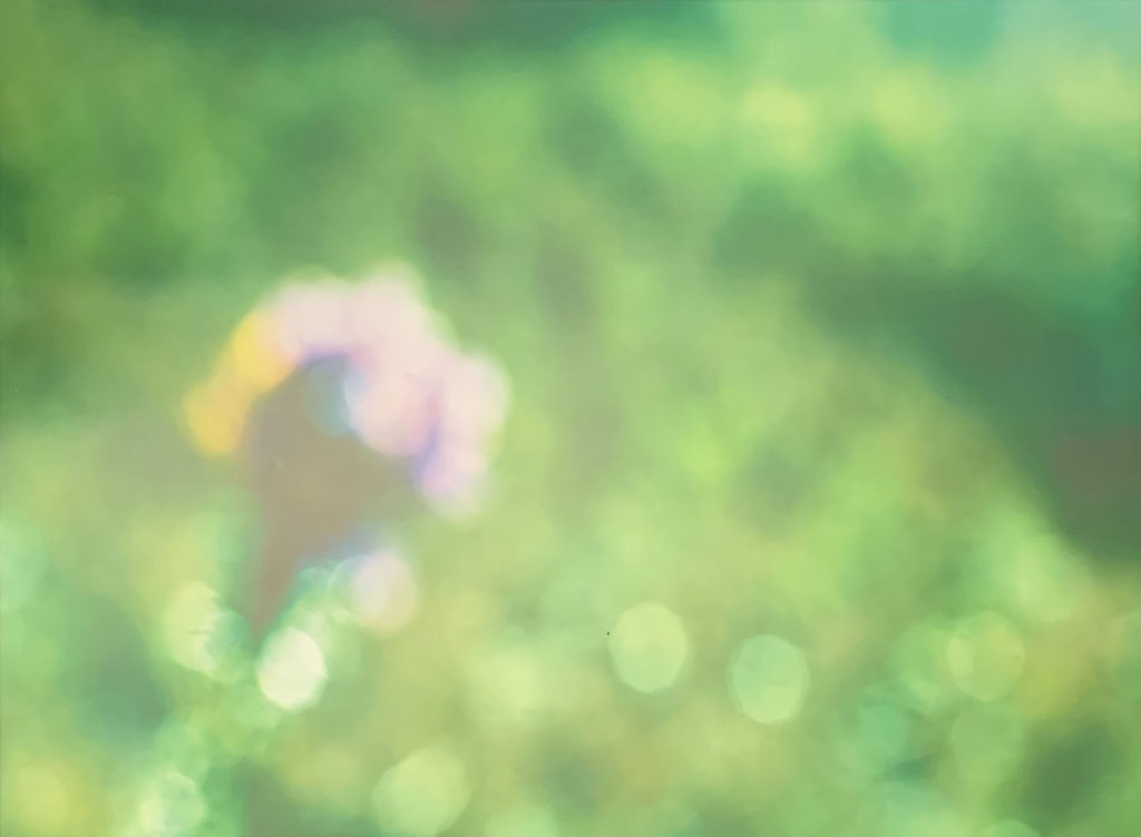
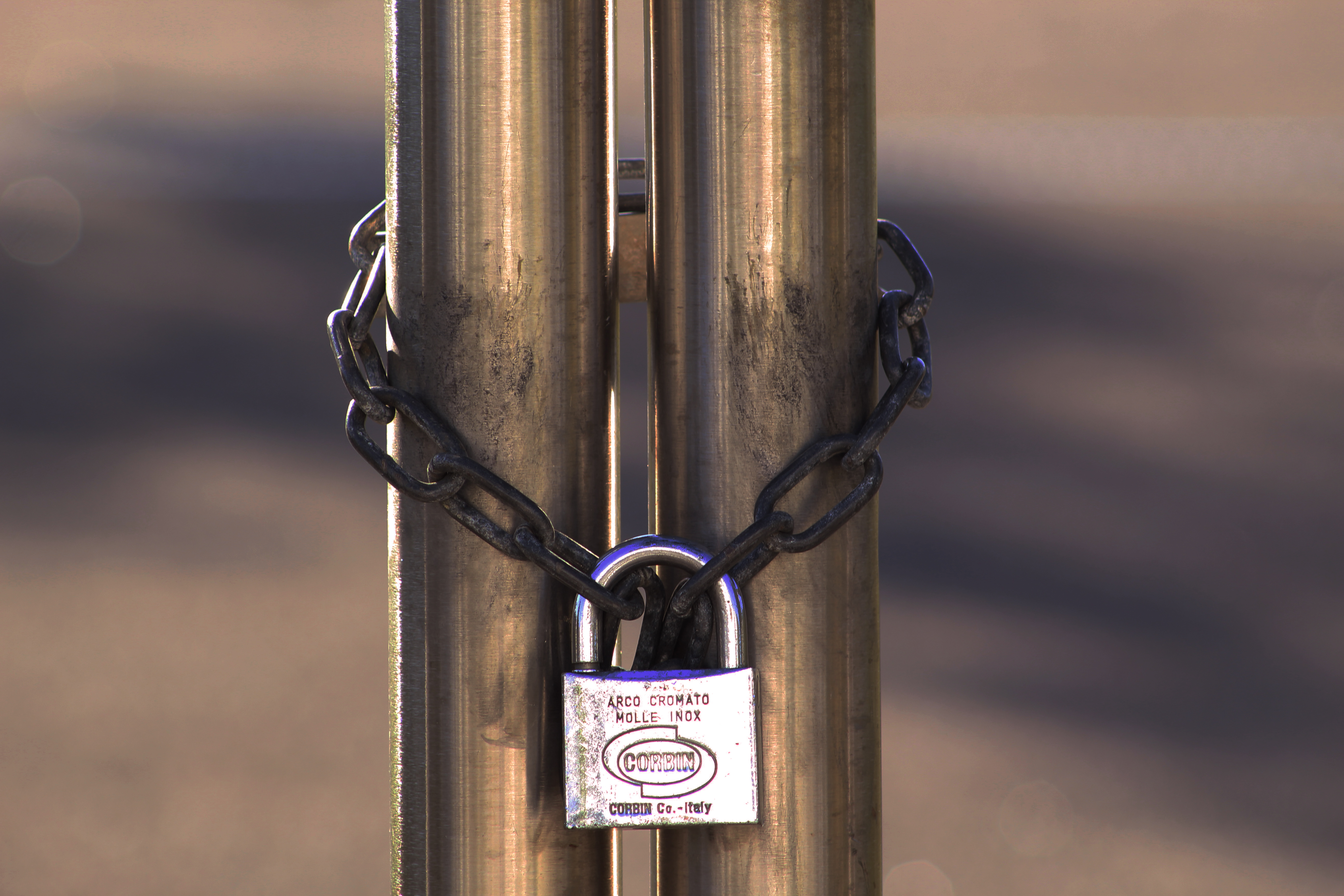 This photo will be printed out in A5 size. I will cut it into three elements (left, middle, right) to help show how the image consists of three clear parts. I will then layer them on different thicknesses of styrofoam board; left part will be 2 layers thick, middle right part will be 3 layers thick, and middle part will be 5 layers thick. These will then be stuck onto an A4 piece of black card with small gaps between each third of the photo.
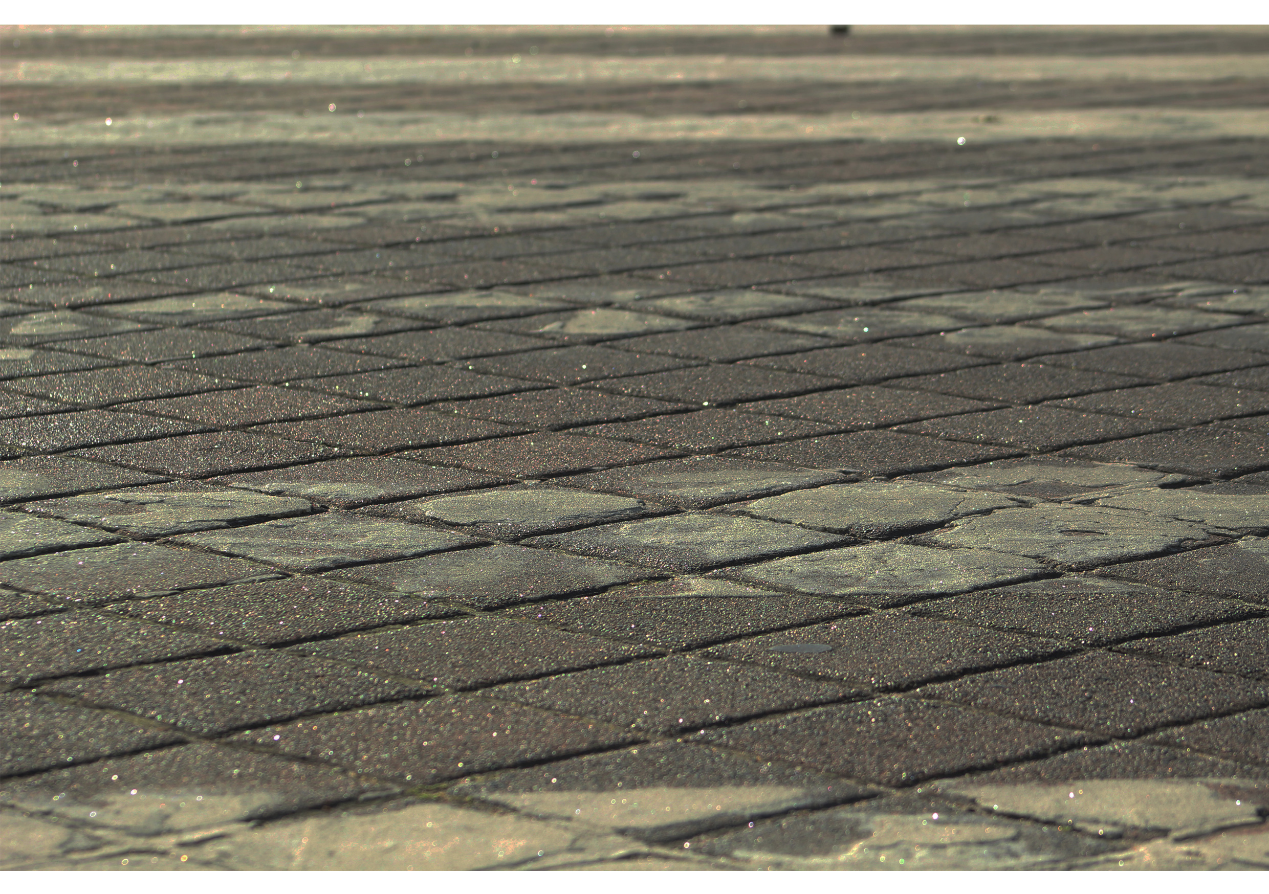
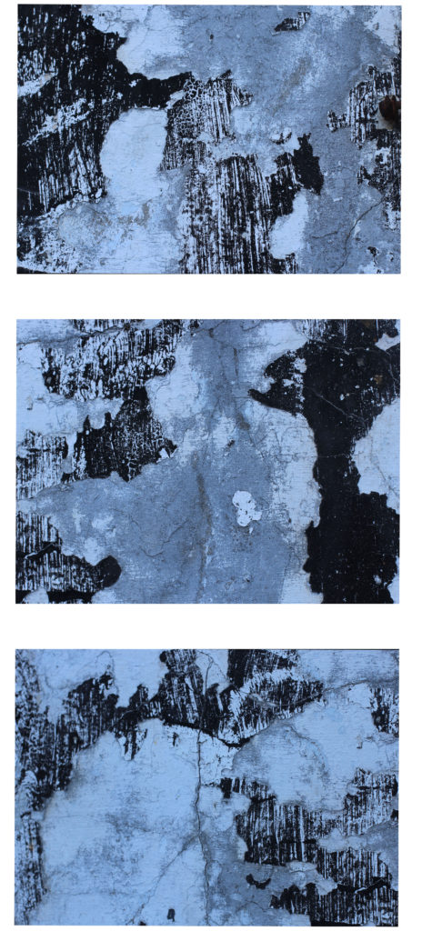
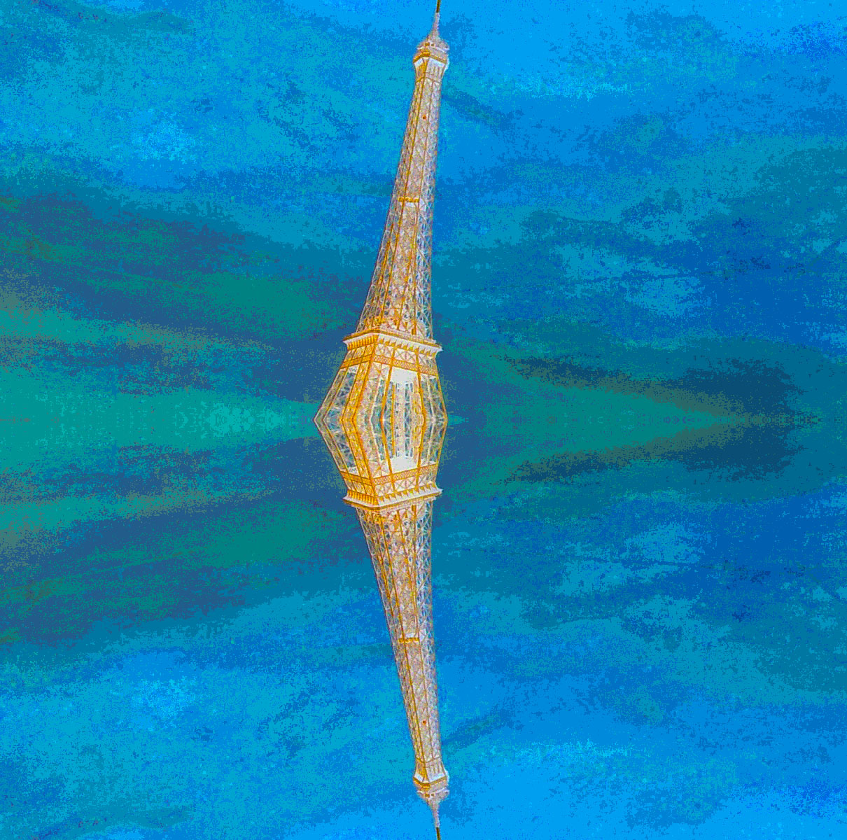
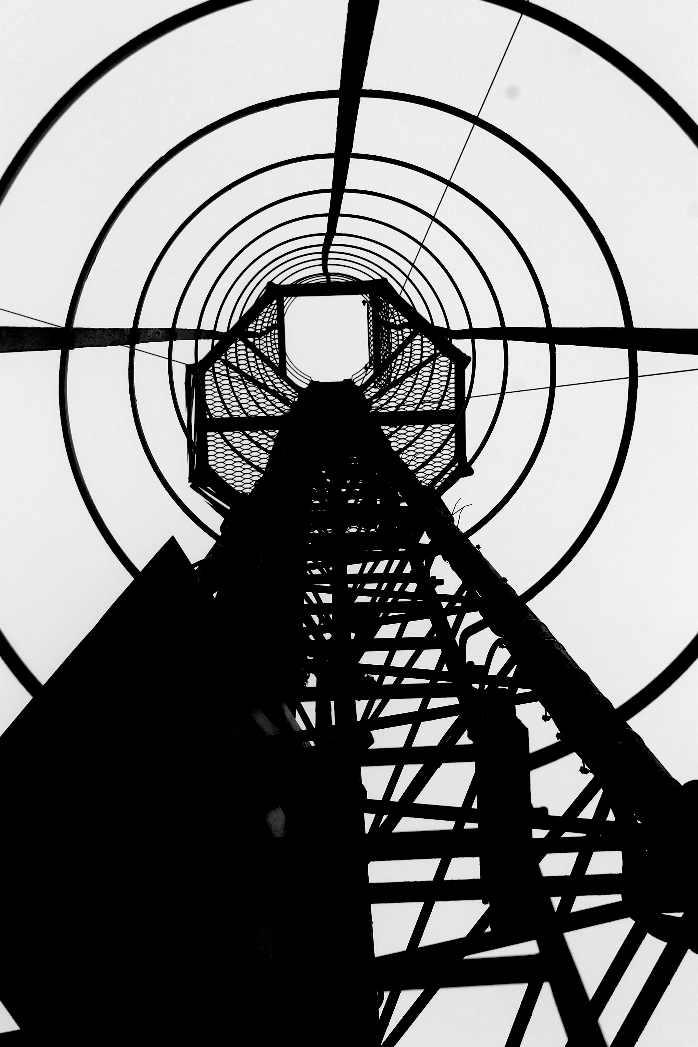
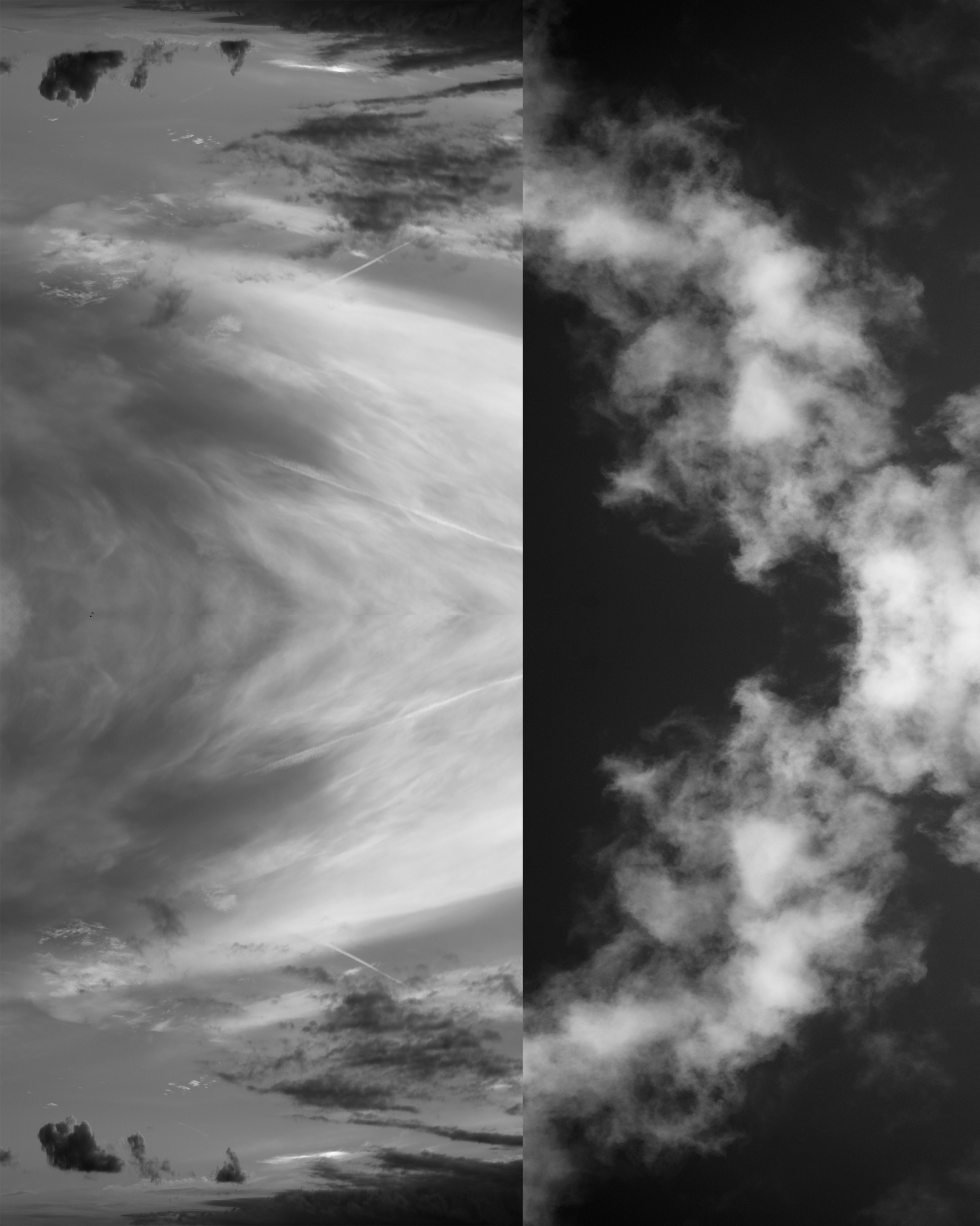 A3 image – I piked this image as my final images, as it is showing my Photoshop skills and also the contrasts between the light and dark colors along with the different shapes made by the clouds make it different and interesting to look at. By putting together two similar yet highly different images created an abstract image for me
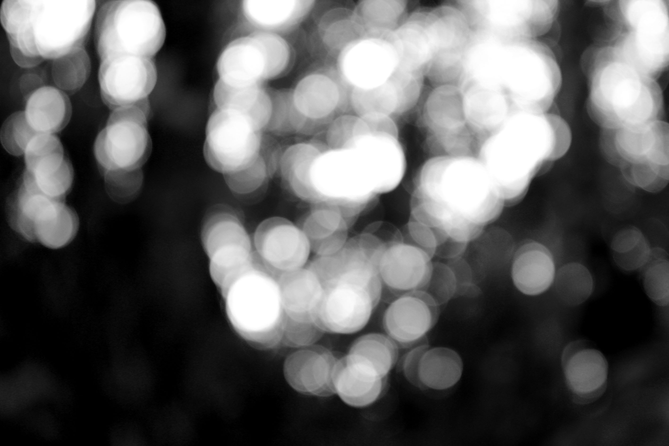
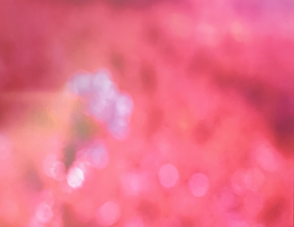
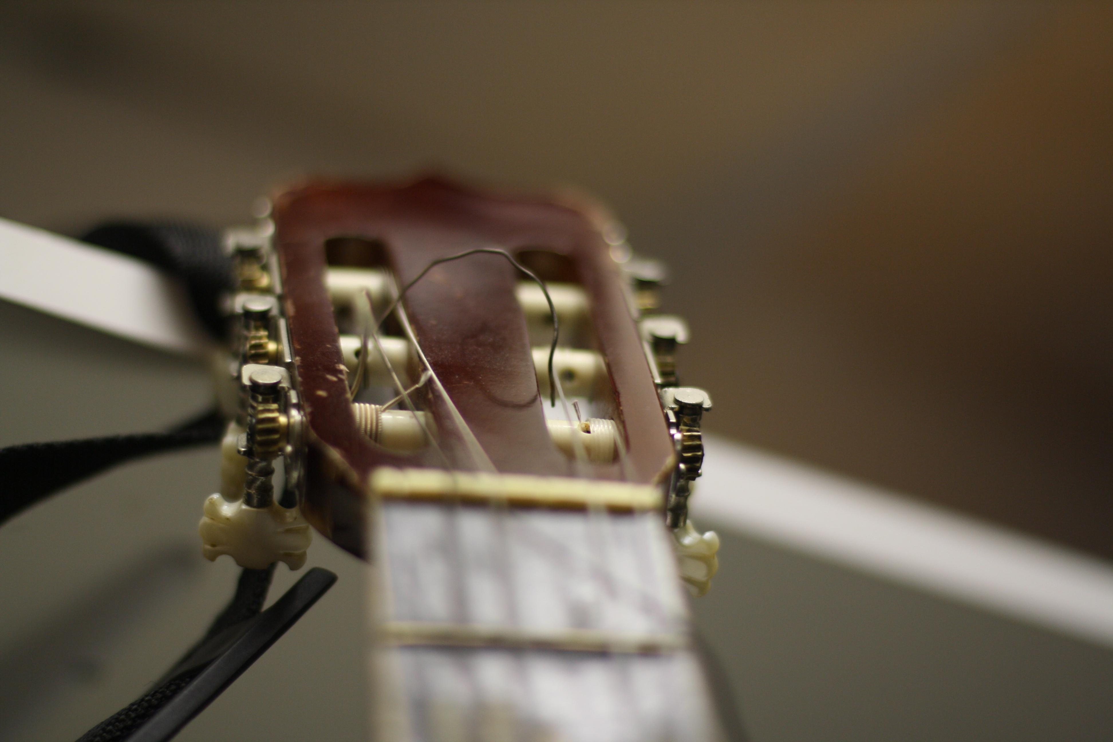 A4 image – this image shows my camera skills in the sense of being able to use manual focus, to only focus on one small tiny part of the photo. Also I like the way this photo came out.
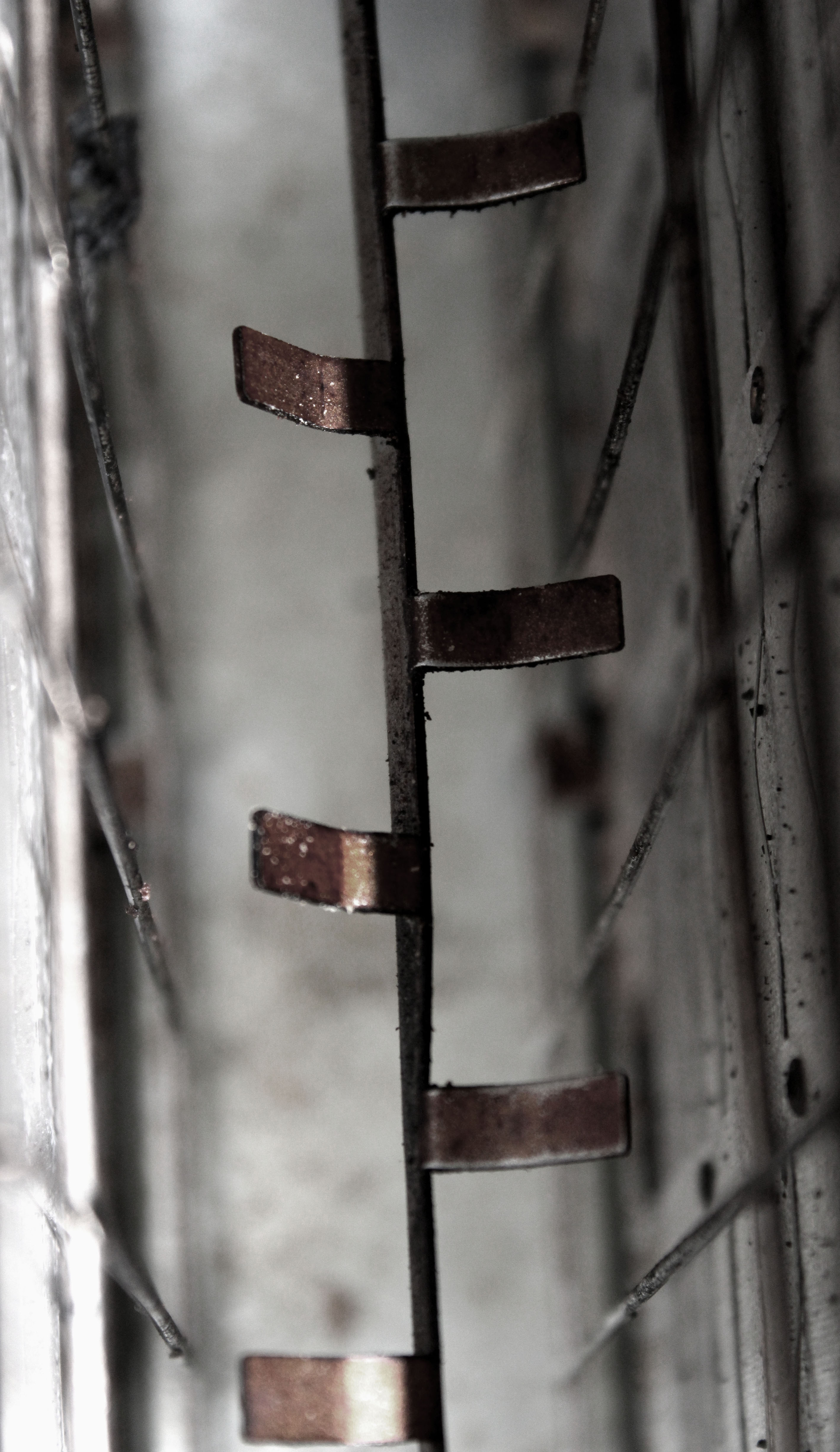
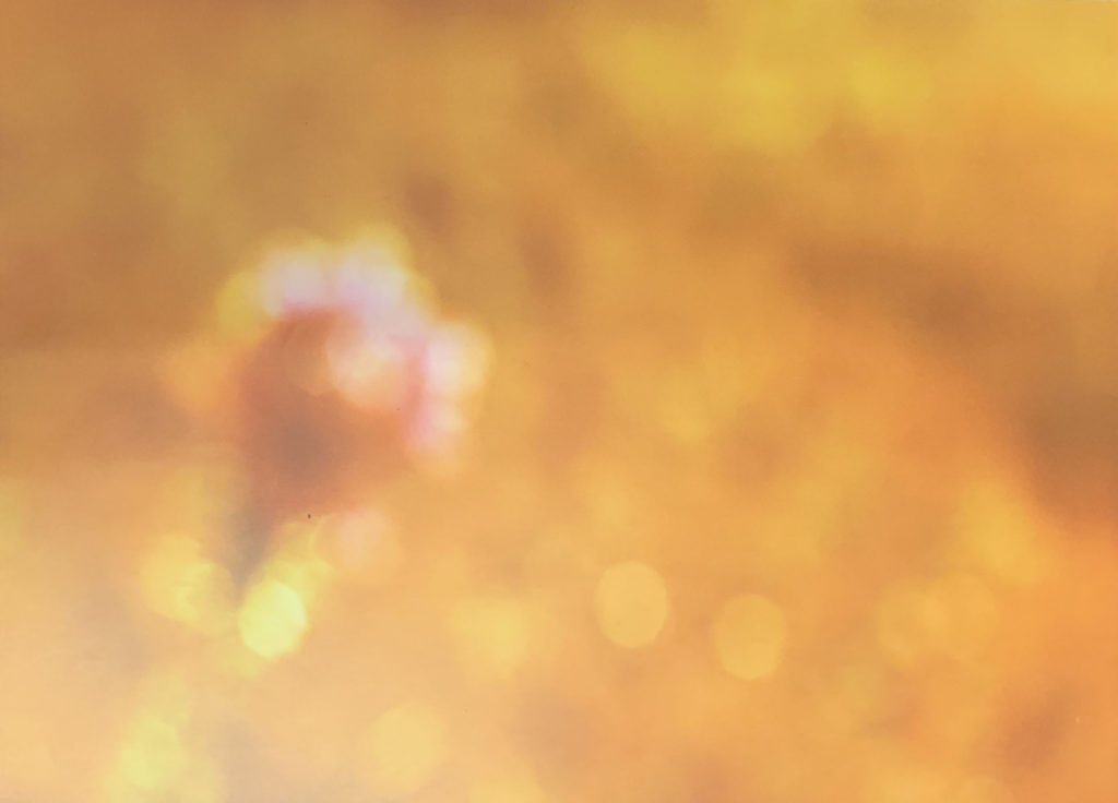
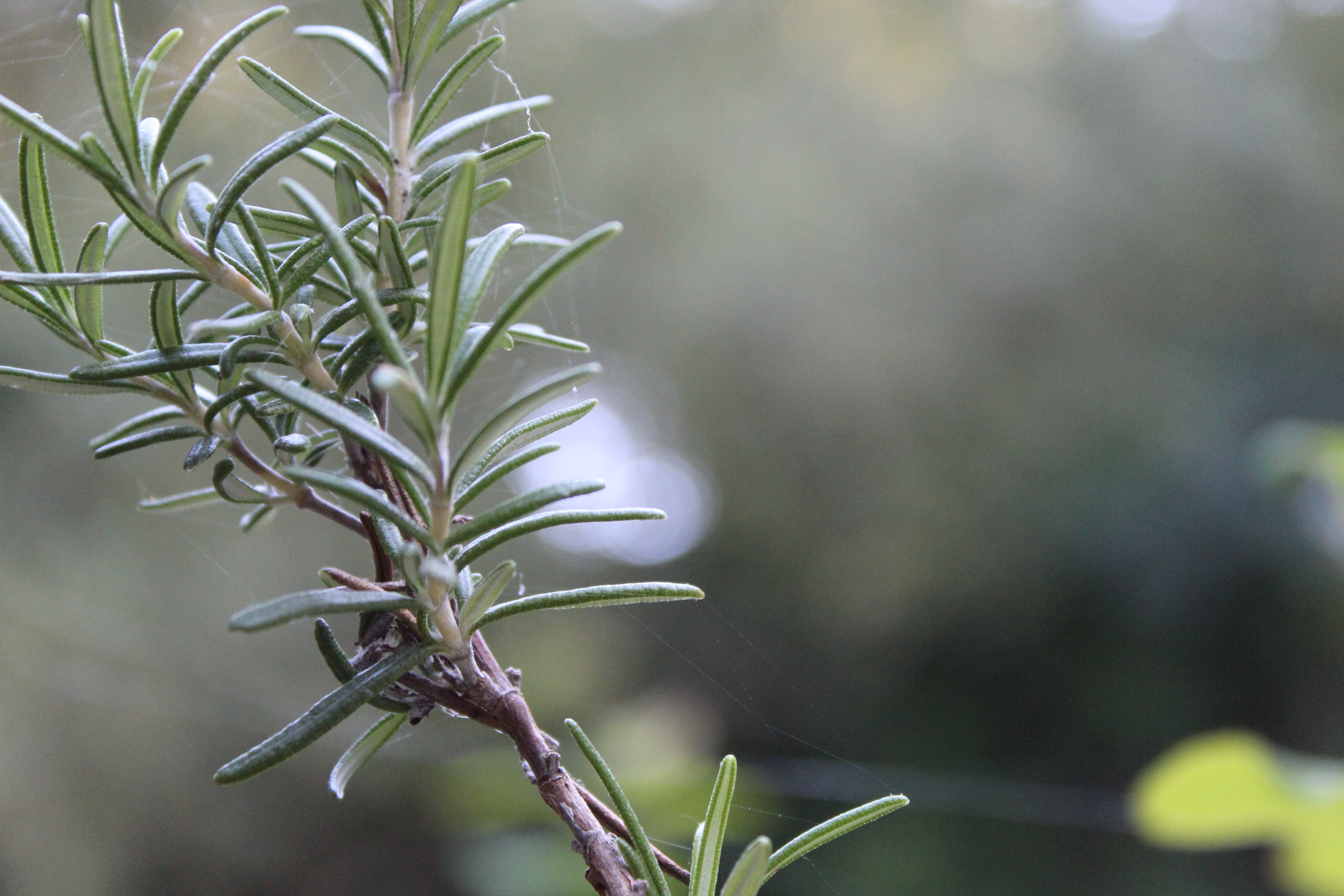 A5 image – again this images is showing my ability to focus on one primary subject in the photo. I like this photo because of the sharpness of the branch, and the highly blurred background created by using manual focus.