Ralph Meatyard & Uta Barth

Ralph Eugene Meatyard

Meatyard made his living as an optician but was a member of the Lexington Camera Club and pursued his passion for photography outside the mainstream. Meatyard’s work spanned many genres and  he experimented with various strategies including multiple exposures, motion blur and other methods of photographic abstraction. Two of his series are concerned with focus and depth of field. They both show the expressive potential of photography, film and cameras when looking at the ordinary world.

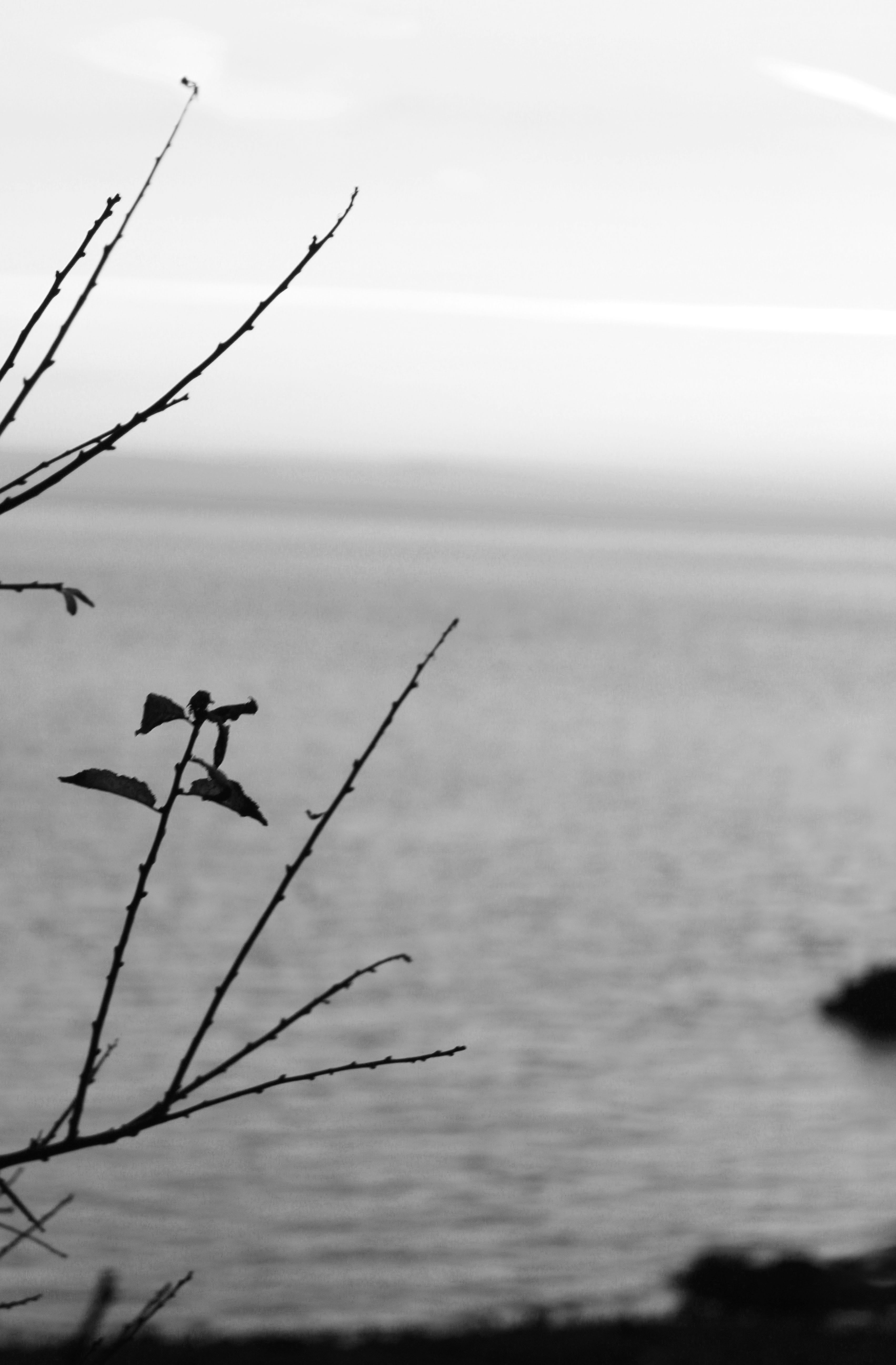
Zen strongly influenced Ralph Meatyard's photography works since his photos reflect a connection between nature and humans. His Zen twig series include close up detailed images of thin tree branches set against out of focus backgrounds. To respond to his photographic style, I will take photos zoomed in on twigs and make sure that the background is blurred so the subject is sharply focused.
Uta Barth

Uta Barth describes herself as an artist who works mostly with photographs. She is interested in light, drawing attention to the viewer’s perception and separating the image from the thing depicted. Although her images are blurred, they appear abstract. The works that brought her international attention is the photographic series Ground and Field. These photographs are blurred caused by focusing the camera on an unoccupied foreground. Uta Barth has made visual perception the subject of her work. She  carefully renders blurred backgrounds, cropped frames and the natural qualities of light to capture incidental moments.

Field #20 is a photograph of a street corner taken deliberately out of focus with a shallow depth of field. At a glance the image appears to look like an abstract design of muted browns and greys with red traffic lights that have been expanded by the out of focus effect. Close up they look like an abstract composition of coloured dots and from a distance the street scenes appear disorted as if seen through a partially opaque glass. To respond to her photography style, I will deliberately take images out of focus to create abstract photos with a merge of colour
Keld Helmer-Peterson Response

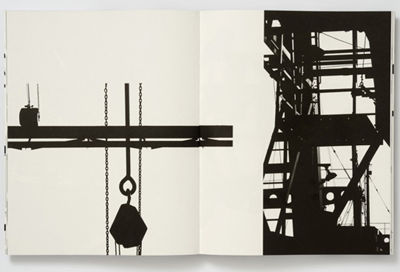
Keld Helmer-Peterson is a Danish photographer, who took inspiration from Albert Ranger-Patzsch (who I previously researched). Peterson began his passion of photograph in 1938, where he received his first camera as a gift for graduating. In 1940 Helmer decided to try out and become familiar with war photography // new objectivity as it was a recent concept at the time

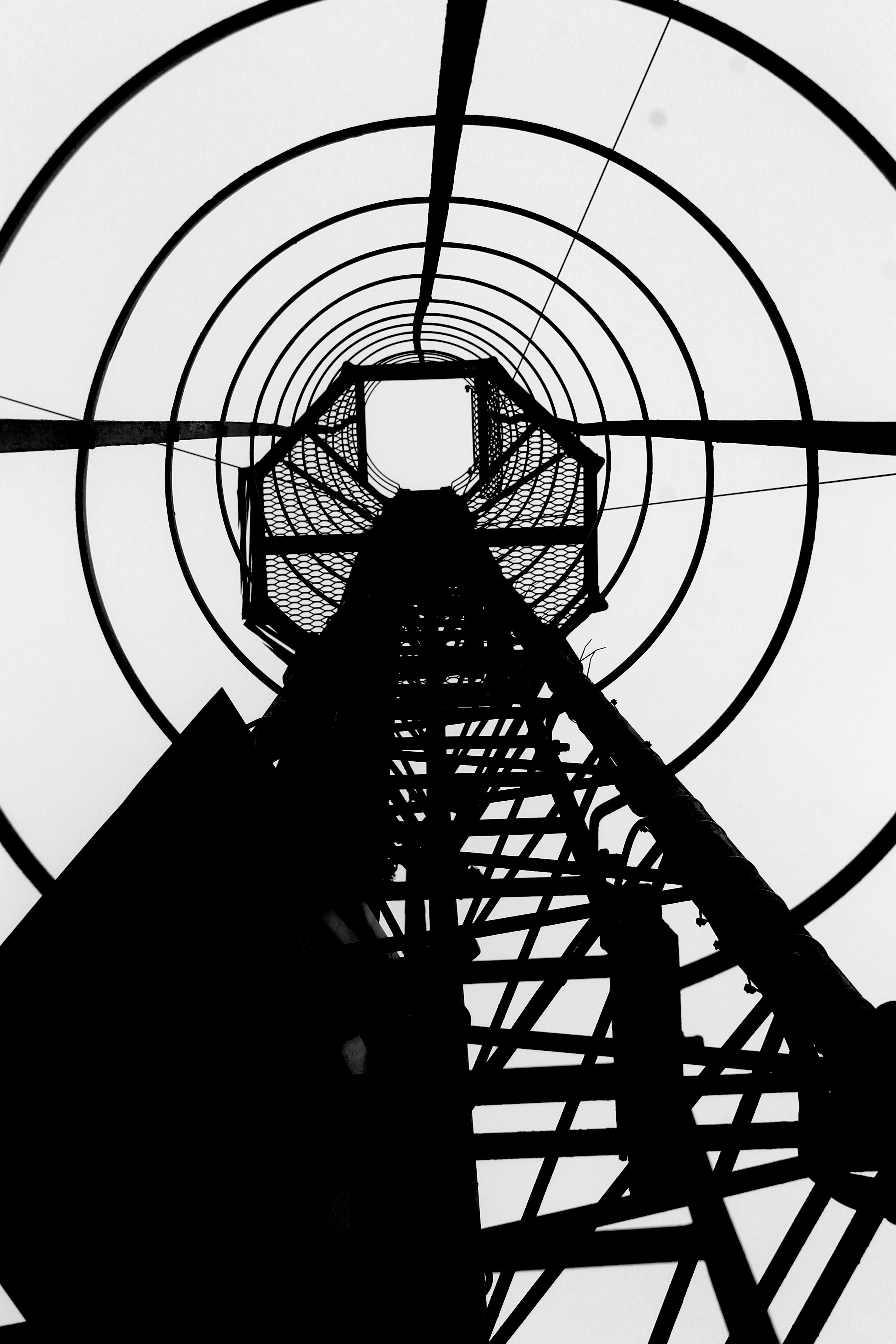
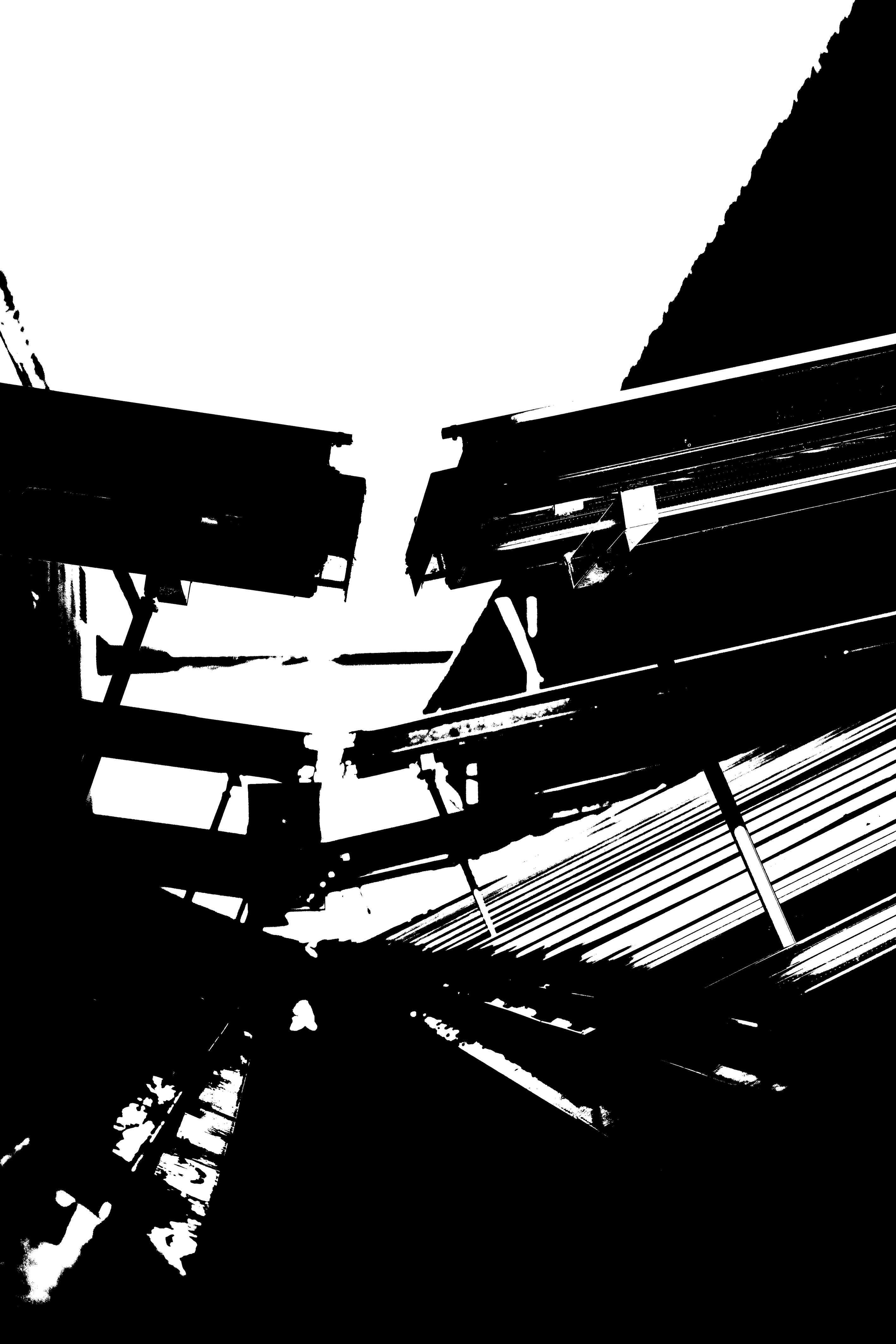
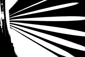
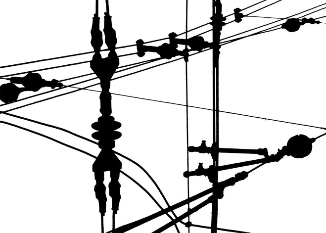
The aim of the images in this series was to get rid of mid tones, He took a normal image, which usually images of industrial machines and places, and turned it completely black and white, making the images more in contrast. In his images there is also a lot of negative space, which has allowed he structure of the metal work to really stand out to us and helps to create a sense of emptiness. The clear formal elements which are presented in this image are tone, shape and line, which are all clearly shown through the structure. The lines are also used to guide the viewers eyes around the frame of the image, starting from the bottom and then making our way to the top.  The lighting is most likely to be natural as industrial images are usually taken outside, as you can not place the tall machines inside. The ISO is not sensitive to the light, as there is no visible noise in the frame of the image, which suggests that the ISO is low. Moreover, the shutter speed is likely to be quick as the whole frame seems to be in focus, with no blur. Due to the whole frame being in focus it also means that this photograph has a large depth of field. The aperture of the camera is likely to be high, which helps makes the whole frame more in focus. Due to the nature of the image being completely black and white, it creates a cold temperature adding to the mood of the image. Peterson has cleverly used inspiration from Patzsch but has still managed to add his own ‘twist’ to make his images more unique. I really like the idea of getting rid of the mid tones as it makes the structures seem more isolated, which allows it to stand out more, captivating the viewers.

My Response

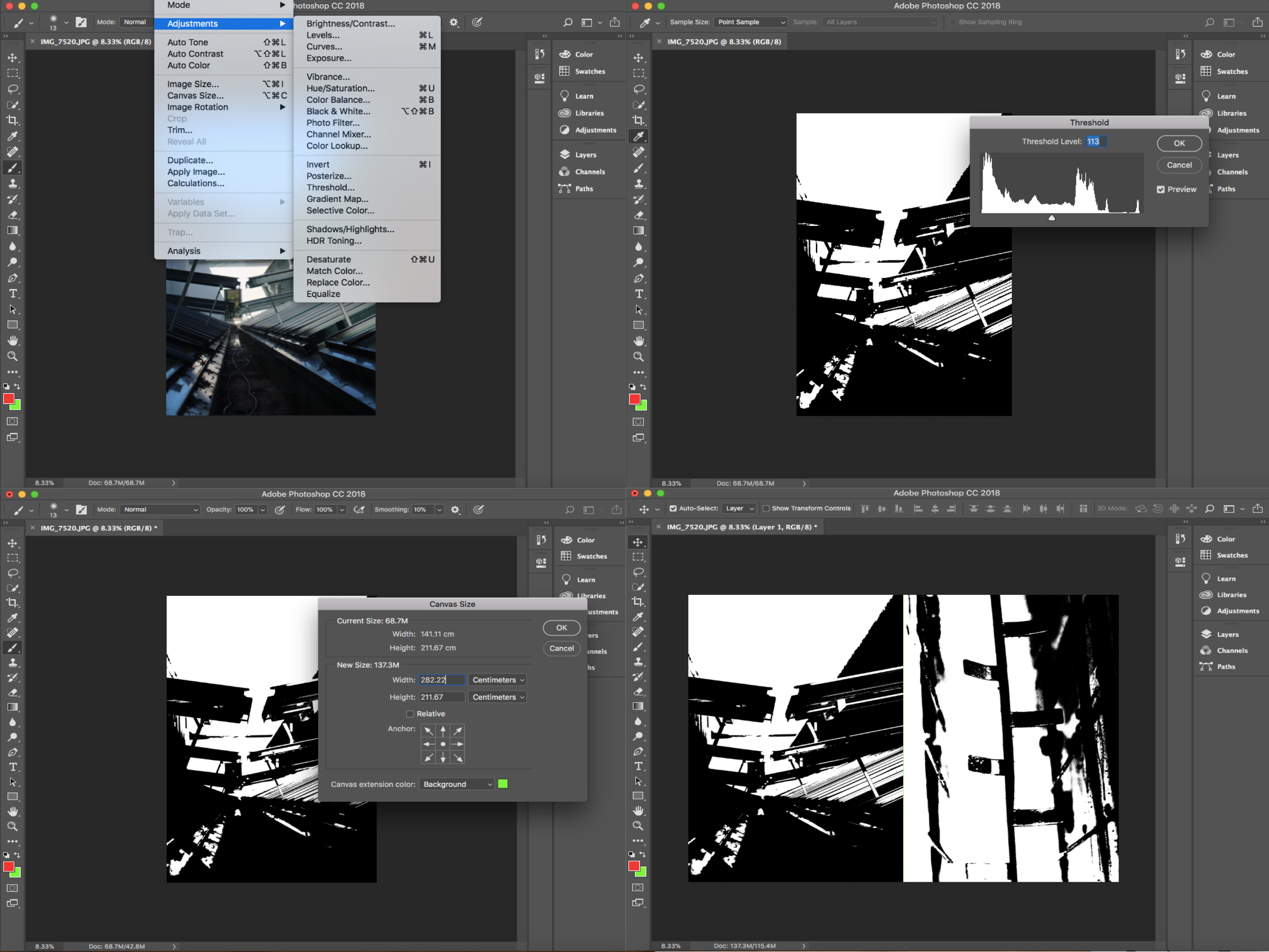
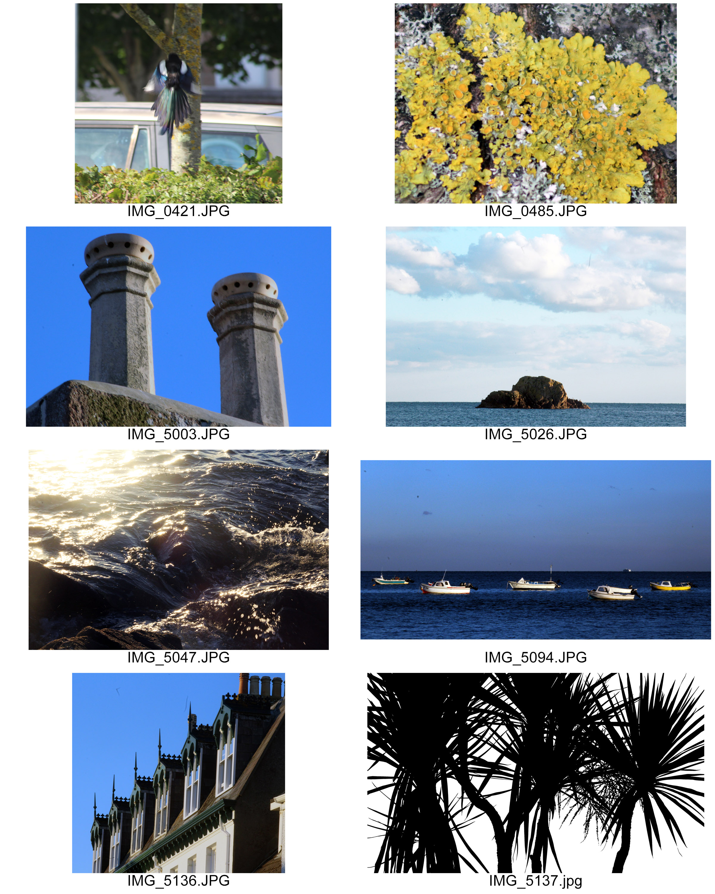
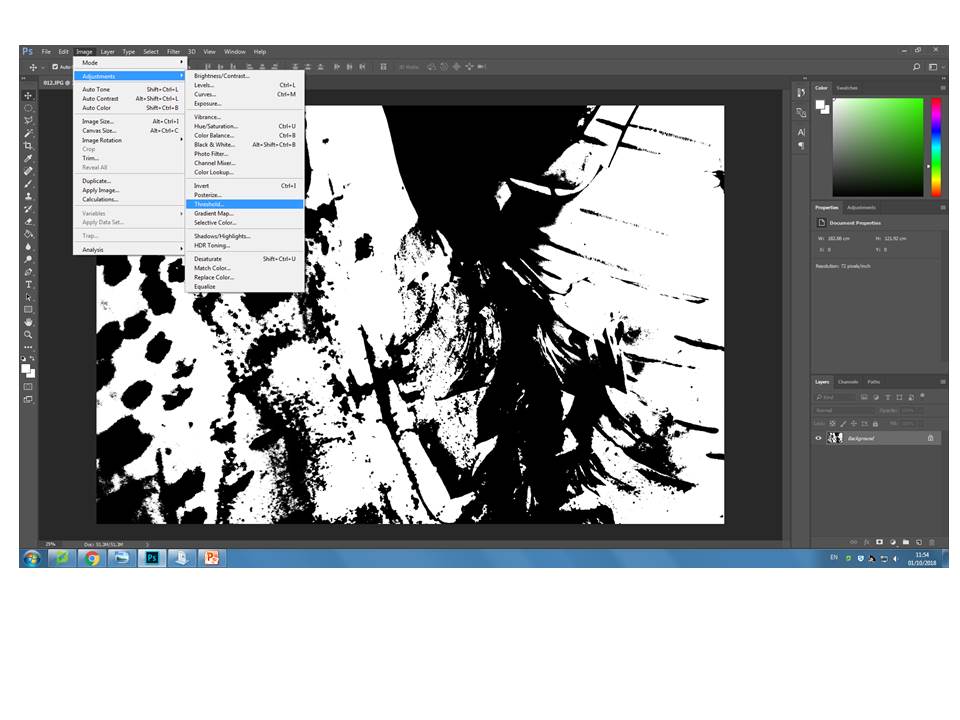
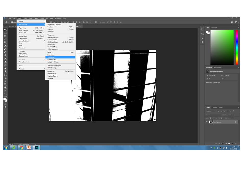
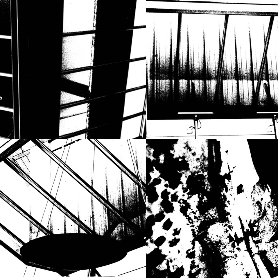
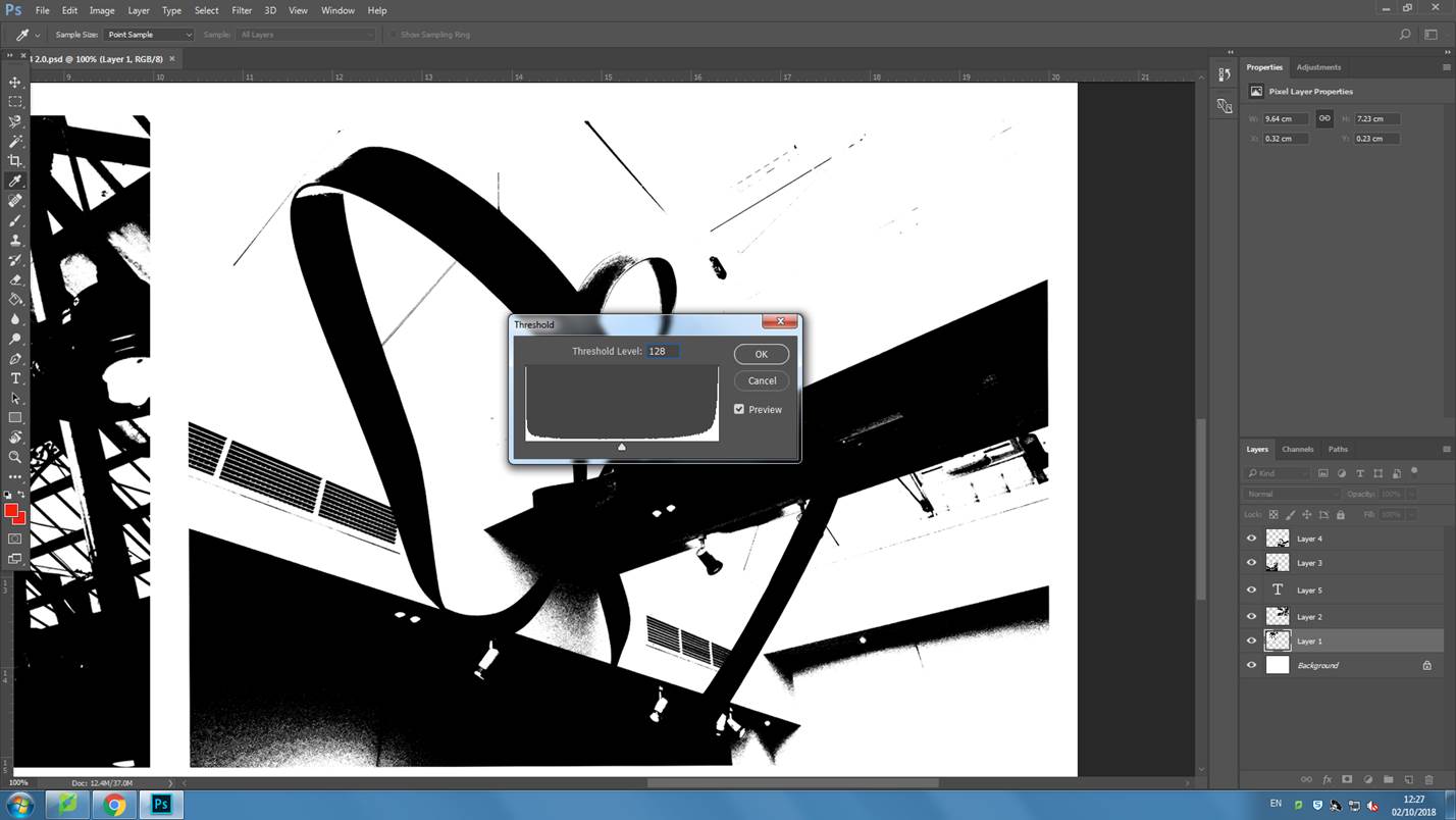
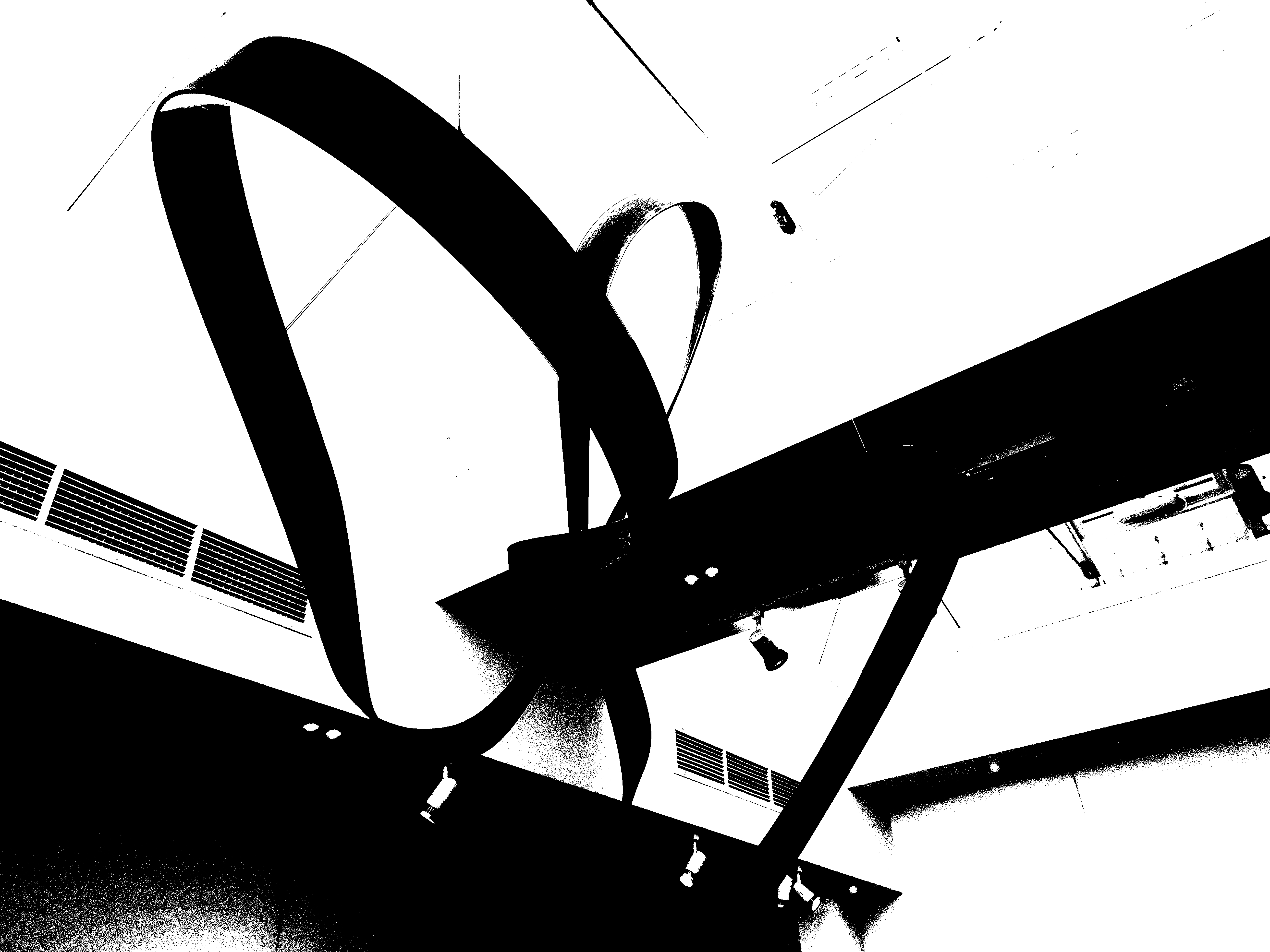
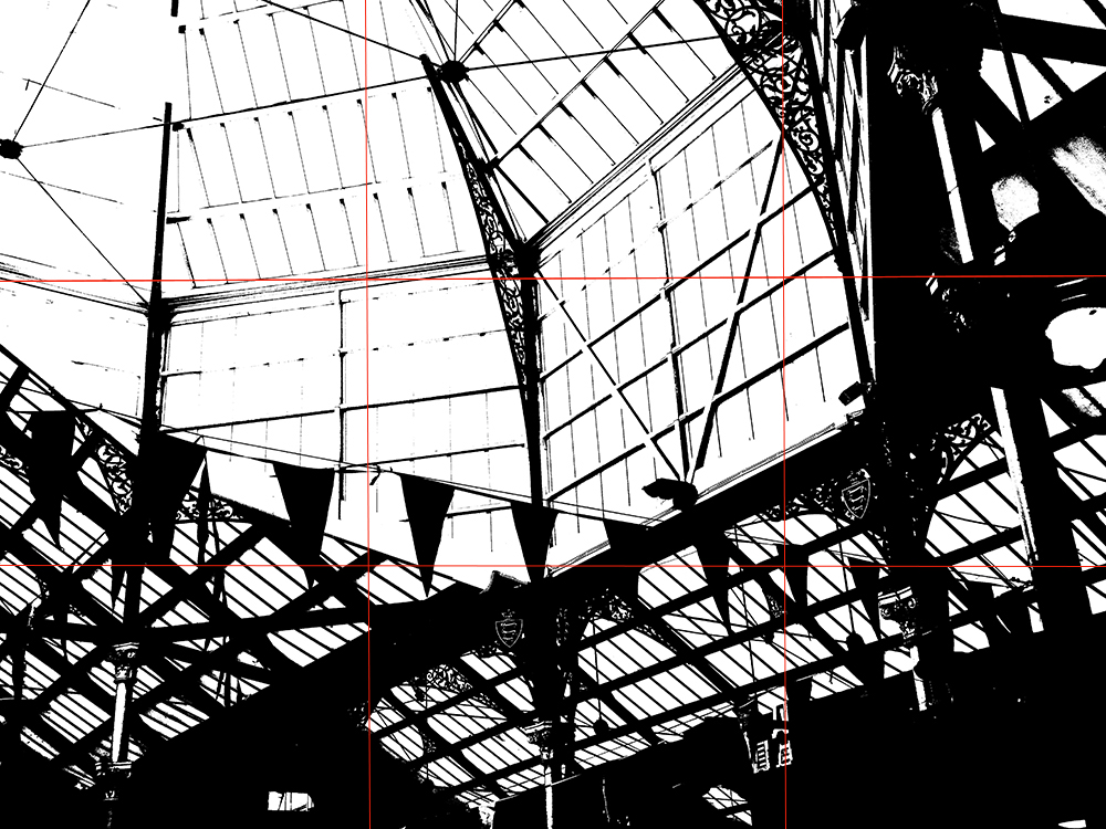
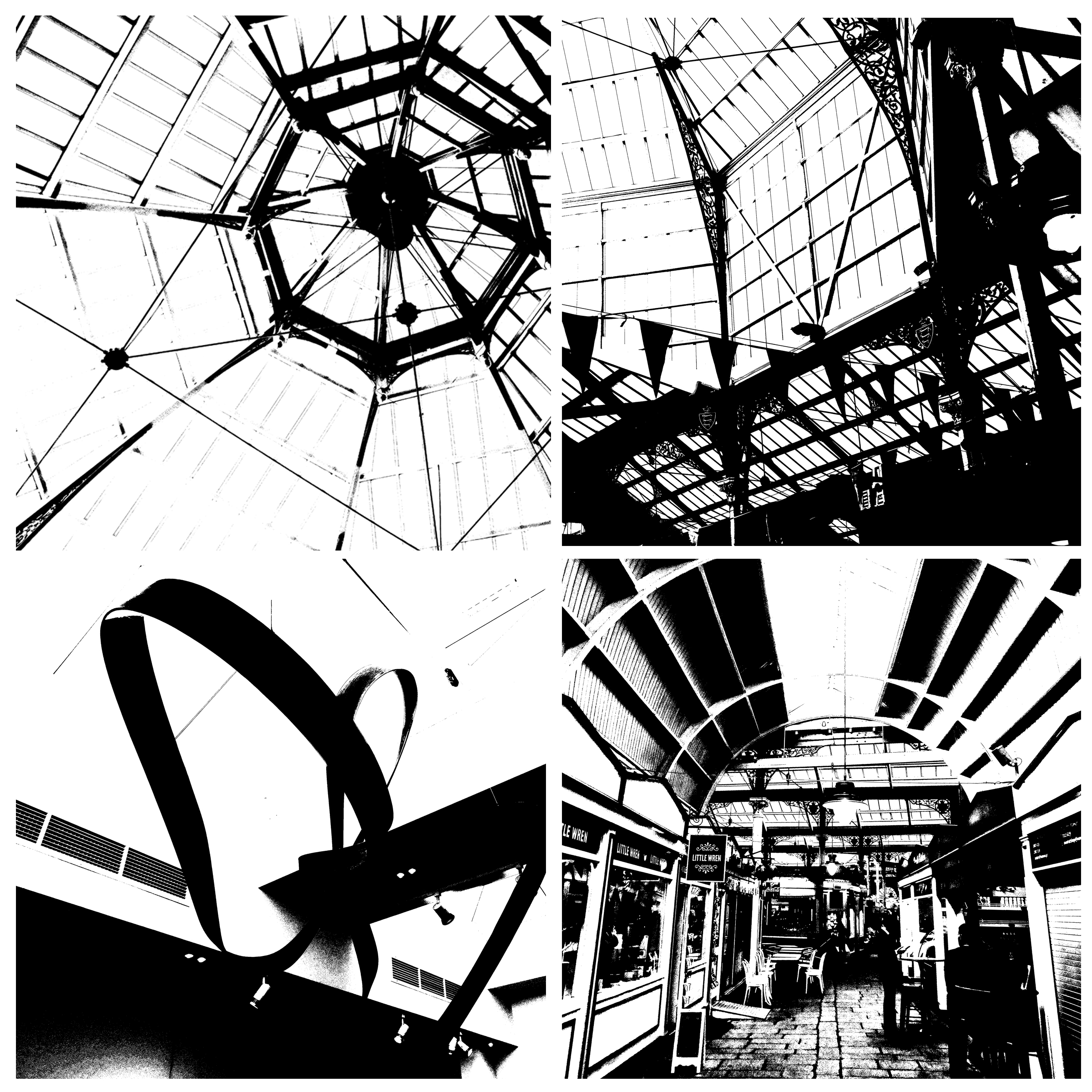
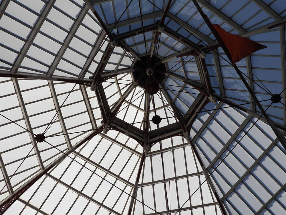
In order to recreate Peterson’s work, I went through previous photoshoots and selected four images which I thought would go well with this mid tone idea. I then opened them all up on photoshop and went up to image>adjusment>threshold. I then adjusted the slider until I was happy with the final outcome (These steps are shown below through the screen shots taken). I then changed the image sizes, in order to make them all the same size. Then on one of the images I doubled the width of the canvas sized and dragged another one of my images next to it. I then doubled the hight allowing me to place the other two edits onto the screen, creating a grid  of four. I then saved this edit to the size of an A4 paper, allowing me to print it out.


Screenshots


Final Outcome


Keld Helmer-Peterson – Threshold adjustment experiments

Keld Helmer-Petersen is a photographer, using various formats, shows in his photographs “a strong leaning towards extreme simplicity and graphic clarity in carefully composed compositions, often silhouetted, but more often than not containing subtle greys in contrast to pure black and white.” He leans more towards simplicity, wanting there to be obvious contrast between the black and whites of the photo.

Image result for keld helmer petersen


I went and created my own photos by taking pictures and editing them using the threshold adjustment option, which will change the photos to black and white and will make it look like they’ve been inspired by Peterson’s works.

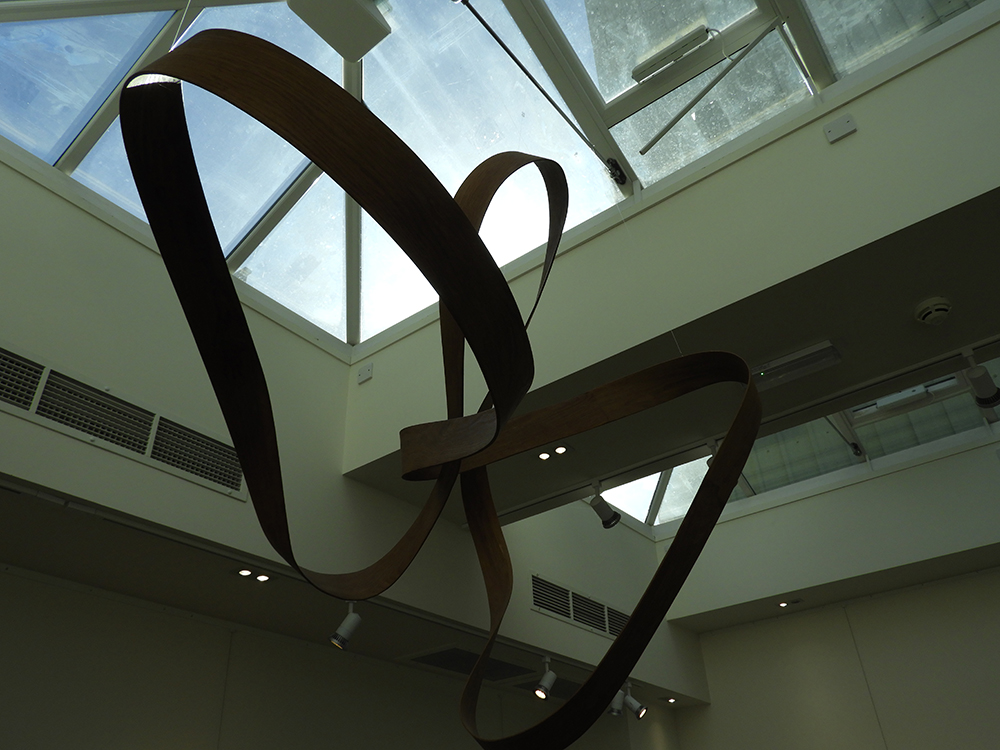
Original images:

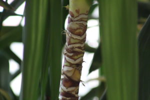
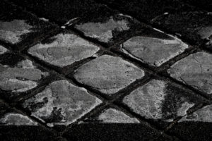
These are the original photos which I chose to use for this assignment. I chose these because they are something I can turn into an abstract photo, and I also think that they would suit with Peterson and his work.


Edited final outcomes:

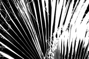
With these pictures all I used was the threshold adjustment option, and played around with it until I liked them. I like how they came out, however I don’t think they would be something that Kelm would produce. Most of them seem a bit too dark and don’t have near to equal black to white balance.

Aperture photo shoot

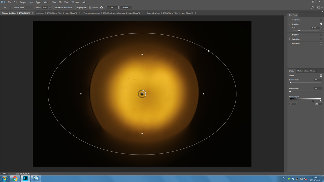
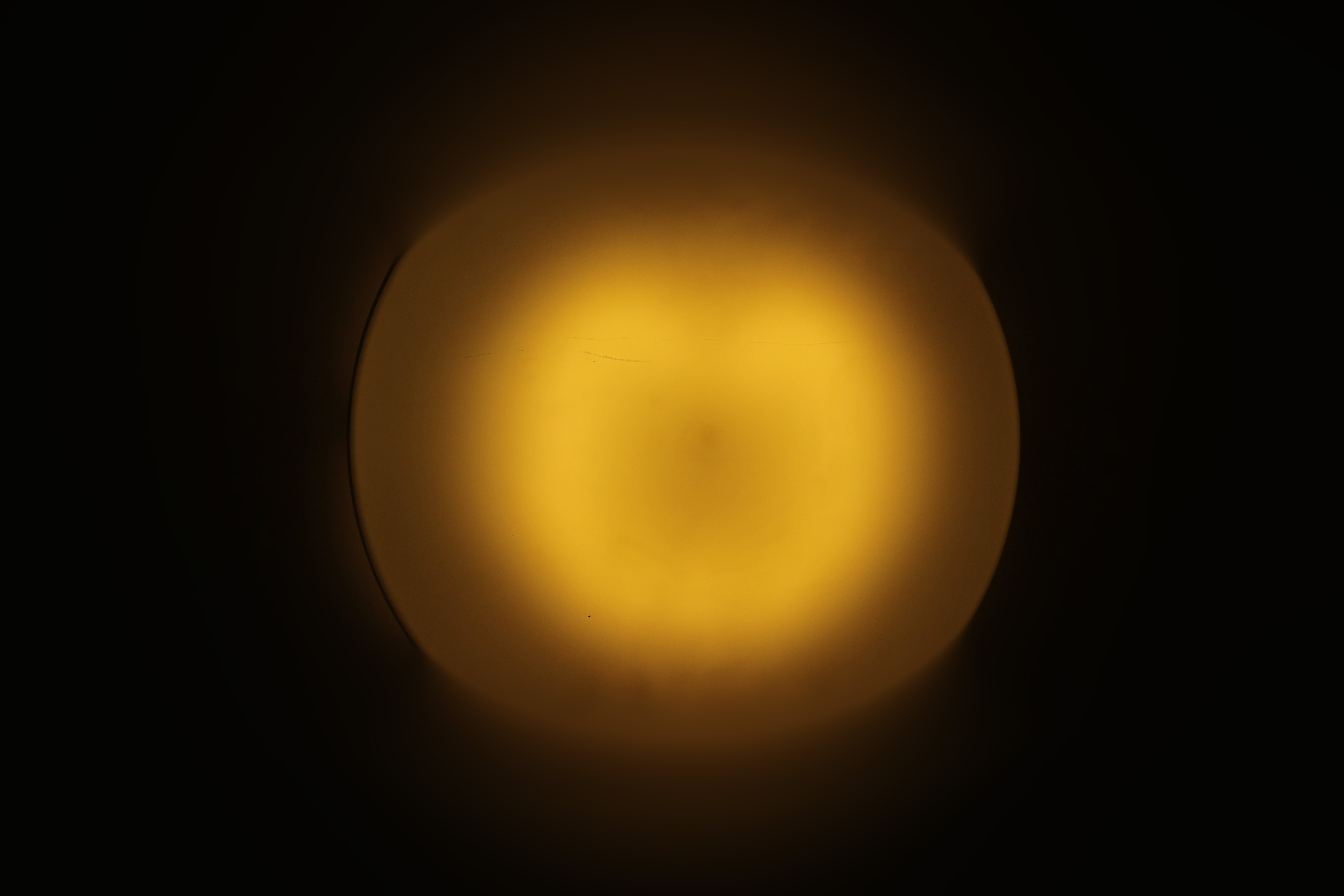
I took a photo of a lamp in the street which was all in-focus, then I artificially blurred it using the ‘iris blur’ tool. This helps achieve the proportions you want to have in and out of focus without moving your camera around for 10 minutes.
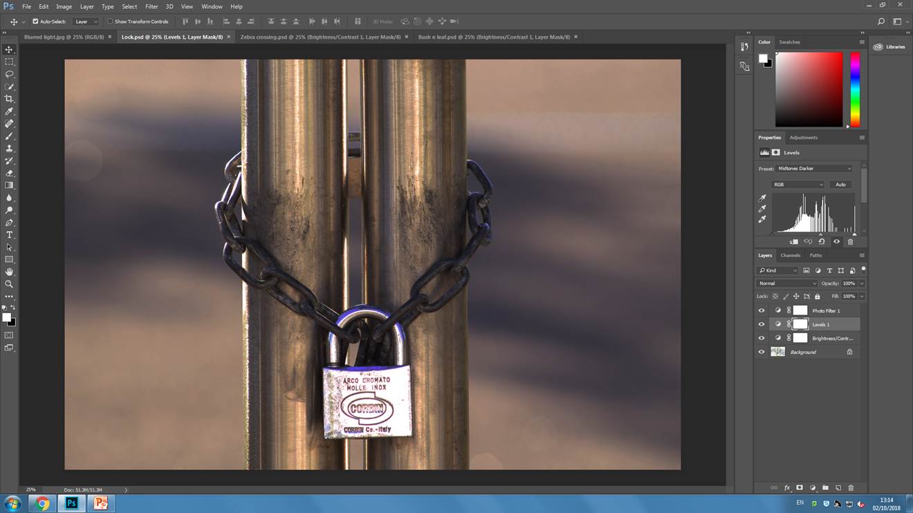
I made this photo a lot darker as the original was over-exposed, this helps bring out shadows, and the roundness of the poles. I also applied a warm photo filter and adjusted the light levels. All of this helps bring out the detail of the chain and the dirt on the poles.

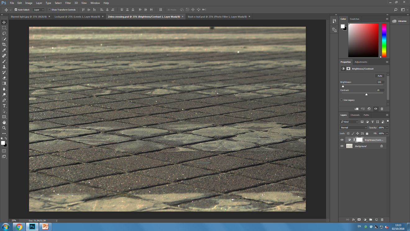
In this photo I have only decreased the brightness to make the photo easier to see, and increased the contrast to make the details in the asphalt more visible.
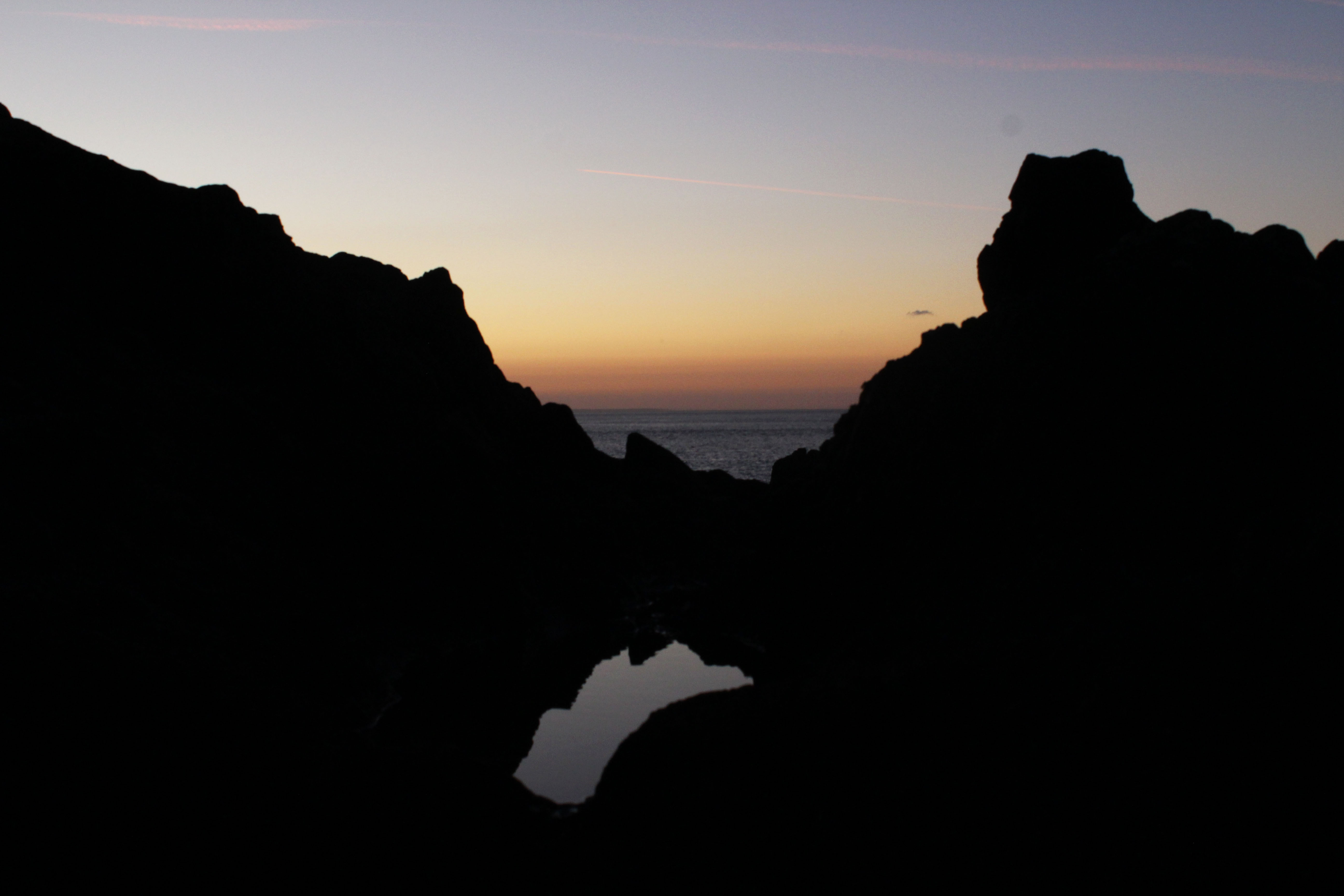
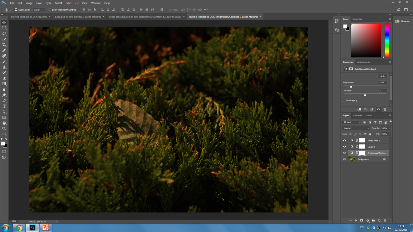
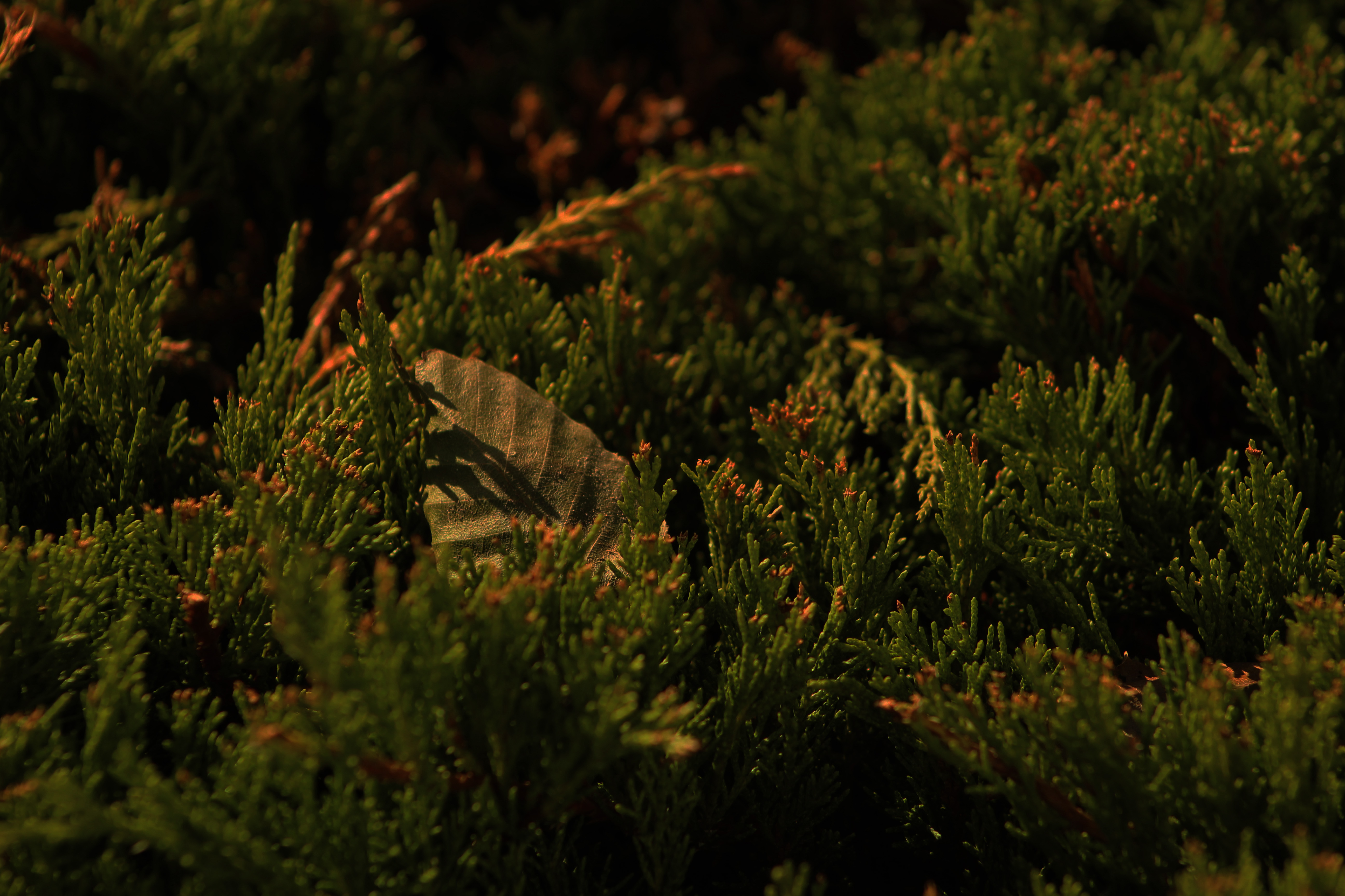
This photo was taken at midday but I have applied an orange photo filter, decreased the brightness by a lot. I have also made the midtones darker by adjusting the light levels of the photo. These effects make the photo look as if it was taken at sunset or ‘the golden hour’. The background and foreground of the photo are out of focus which puts more emphasis on the branch tips and the leaf.

Keld Helmer-Petersen: Thresholds Experiments

Keld Helmer-Petersen was a Danish photographer who achieved widespread recognition for his abstract photographs.  He gained recognition through his coloured photographs but also published black and white photographs exploring the contrasts of the tones.  He was inspired by Albert Renger-Patzsch, the experiments at The Bauhuas in Germany and by Henry Callahan and Aron Siskind at the Art Institute of Chicago.

Keld Helmer-Petersen


My Own Experiments


Example of editing process
example of editing process

For all four of my experiments I took my photograph into Photoshop and I edited and experimented with the threshold of the image which adjusted the contrast of the black and white tones within my photographs.  From taking inspiration from Keld Helmer-Petersen my aim was to extenuate the dark’s and the lights of the photograph and editing and experimenting with the threshold of the photograph.

Final Four Photographs


Final Four

These are the final four photographs I produced from experimenting with the thresholds of the images being inspired by Keld Helmer-Petersen.  I feel my outcomes were quite successful as some are showing the geometric lines which Helmer-Petersen also produced and using the thresholds I have extenuated the contrasts of the black and whites.

Threshold adjustment. Nature Vs Man made

In this blog post I am trying to mimic the style of Keld Helmer-Petersen. Helmer-Petersen is most famous for his dramatic use of black and white features, where he explored dramatic contrast of tones.

Keld Helmer-Petersen was a Danish photographer who achieved widespread international recognition in the 1940s and 1950s for his abstract colour photographs. He was born in Denmark on 20th August  1920, and died 6th March 2013

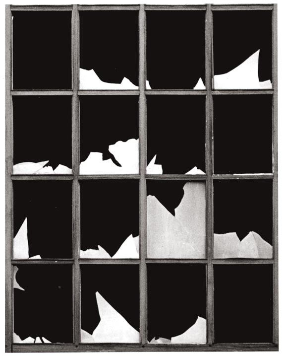
Here is some of his work.

As you can see there is a massive contrast between the extreme white, and dark black within the colours.

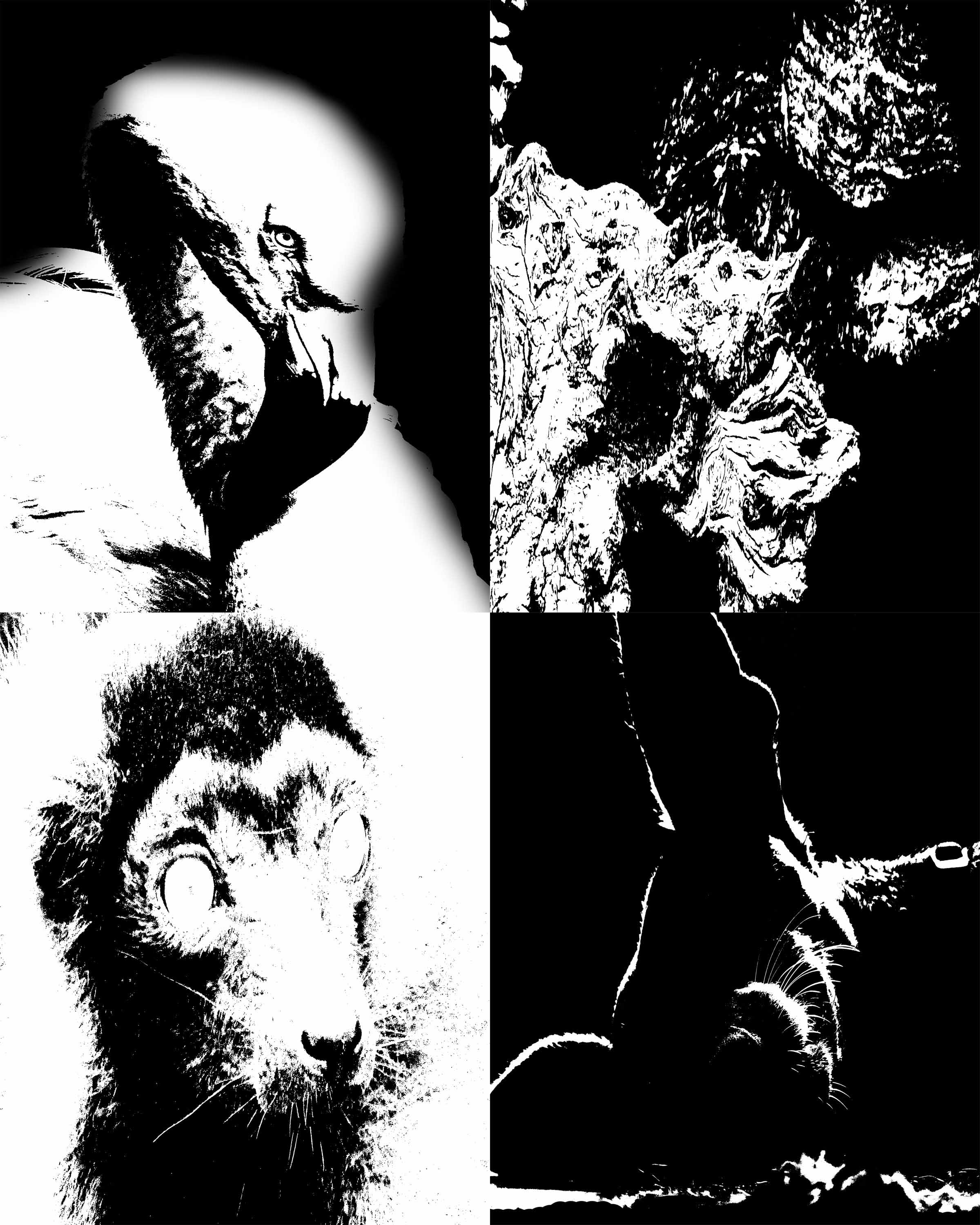
I have tried to recreate his take on photography by using the  change on threshold within Photoshop, I feel I did really well with this task, I did two different sheets for this, each with 4 photos. My first attempt was an all natural version, with a Flamingo, some wood, a Lemur and a Whippet. I feel this went really well


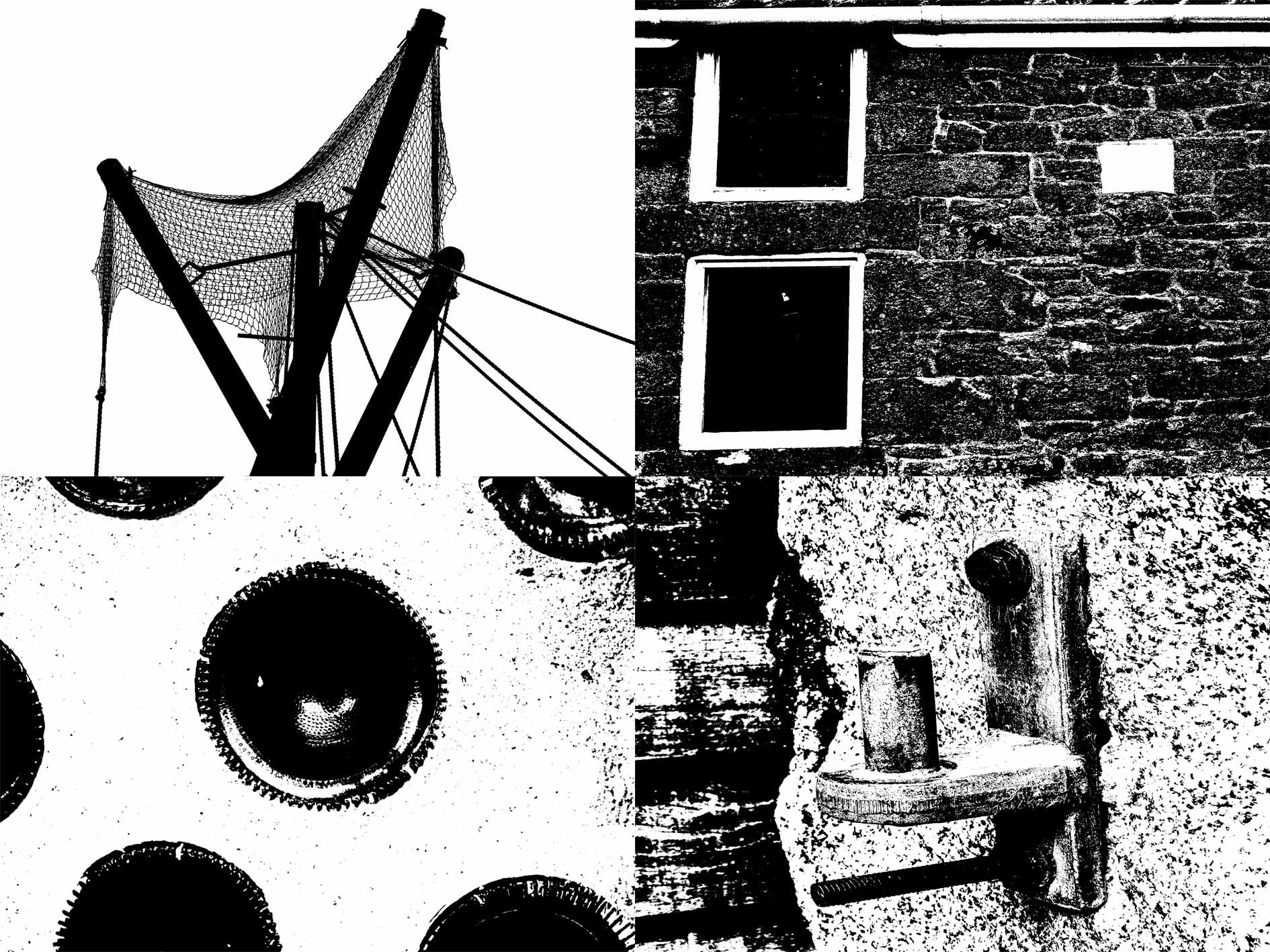
My second attempt was more of a man made version, with a Climbing frame for Orangutans, the side of a building, a glass bottle within a wall, and an old hook for a large gate.

Personally I felt this was even better than my natural one as I found the perfect threshold for the contrasting tone, much like Helmer-Petersen.


exploring Keld Helmer-Petersen’s photography

KELD HELMER-PETERSEN:

The pioneer of Danish Modernist photography, Keld Helmer-Petersen (1920-2013), is internationally acclaimed for his images of structures, patterns and details found in industrial areas, cityscapes and nature. He started photographing in the late 1930s and first made his name with 122 Colour Photographs in 1948. This book is especially well known due to its innovative use of colour in thoroughly composed photographs of patterns in landscapes and buildings. During the 1950s and 1960s he established himself as a photographer of architecture and design. Simultaneously, his artistic work shifted towards the more abstract, as he found inspiration in German and American photography as well as international abstract art.
CRITICAL ANALYSIS:

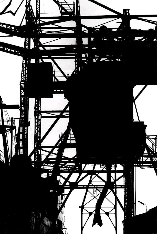
The contrast in this image is very high creating a very dramatic and overexposed photo.  It is composed of geometric shapes and lines which crisscross each other in regular, sometimes patterned shapes and forms. It is very difficult to create this type of photo purely through camera work therefore I believe that Petersen used heavy editing in his photography in order to create this highly overexposed image whilst in the dark room. It is hard to distinguish between the foreground and the background in this photo as the lack of tonal range merges them together. As the only colours in this image are black and white, they flow and create the appearance of one large structure.

PROCESS:

This is the most successful set of images based of the work of Keld Helmer-Petersen who focuses on over exposure of images creating simplistic line work in his work. I applied this same technique to my work through the use o threshold on Photoshop, as the example shows down below. By decreasing the threshold, the image becomes more exposed and white, by increasing the threshold, the image becomes less exposed and black. I tried to keep all my images to the middle of the scale which prevented them from becoming too overly over exposed or underexposed. The images which I chose to include in this work were ones which contained a lot of strong, geometric, line work. I found that the more busy, and packed a photograph is, the more messy the threshold filter looks on it, therefore i chose to stick with fairly simple photographs.

This is the threshold tool which appears on Photoshop, adjusting the scale from one extreme to another makes it over or under exposed.

This is the before and after the threshold has been applied to the image, clearly showing the extreme contrast it has between the different geometric shapes in the picture.

CRITICAL ANALYSIS: 

In terms of the technical aspects of this image, the light is coming in from the top left hand corner of the image, creating a lot of exposure making it more white whereas the right bottom corner of the photo has less light hitting it, creating more shadows. In this photo I used a fairly long lense as the subject  the image was high up and could not be phothraphed without the aid of zoom, giving a fairly small field of view. In the original photo, the ISO was set to 600 as it was a bright room and I felt that in order to combat the possible overexposure I should decrease the ISO.  The grain on the original photo is quite fine therefore the image is detailed and sharp.

After applying the threshold filter, the image has been totally flattened out due to the lack of tonal range, only being composed of black and white. It is difficult to distinguish between the background and the foreground in this image. The photograph is mostly composed of very strong and bold line work. There is also a sense of pattern in this image due to the repeating lines and triangles. There is no real sense of space in this image as the abundance of line work fills every part of the photo.

I created these images with the intent of capturing as many  geaometric shapes as I can because I knew that this would work best when applying the threshold filter. More organic shapes tend to look too busy and messy in a sense as they have too many tonal ranges and shadows.


My final pick of four successful photos, which have the threshold filter applied to them.

ORIGINAL IMAGES: 

Successful Photos From Photo shoot

ANALYSIS AND APPROACH: 

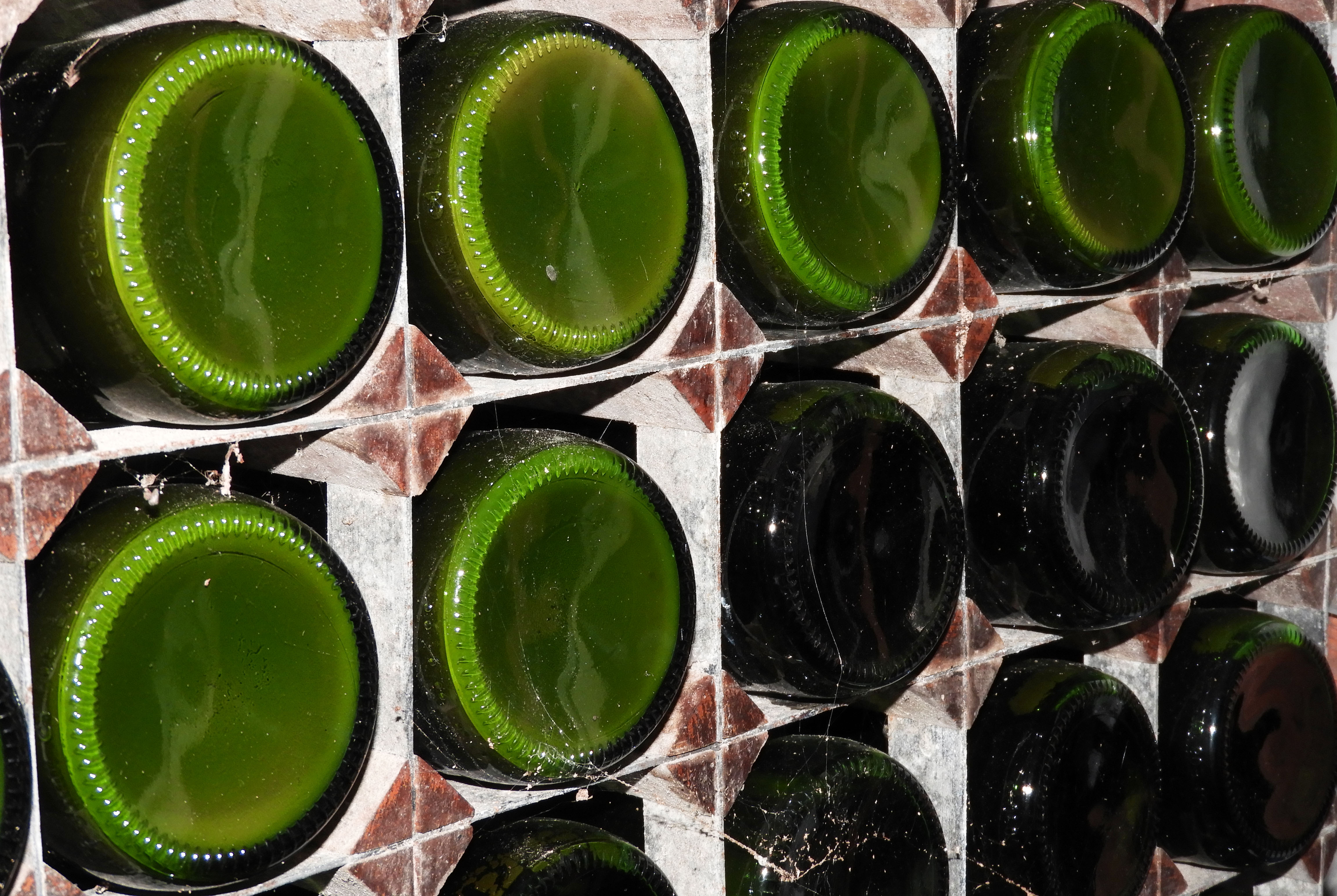
These four photos were the ones which i felt were the most successful out of the Photo shoot I personally did. I really focused on the formal elements which I had to cover such as exposure, shutter speed and focal length. In the first and fourth photo I mainly focused on exploring exposure, changing the ISO speed to 200, resulting in a very dramatic and dark photo. I captured these photos with the aid of a tripod as I found that lowering the ISO speed resulted in shaky photos that distracted away from the main formal elements which I attempted to capture. In the fourth photo, the glass bottles were in  a very dimly lit room therefore i changed the ISO setting all the way to 16000, which allowed the colors to pop and stand out.

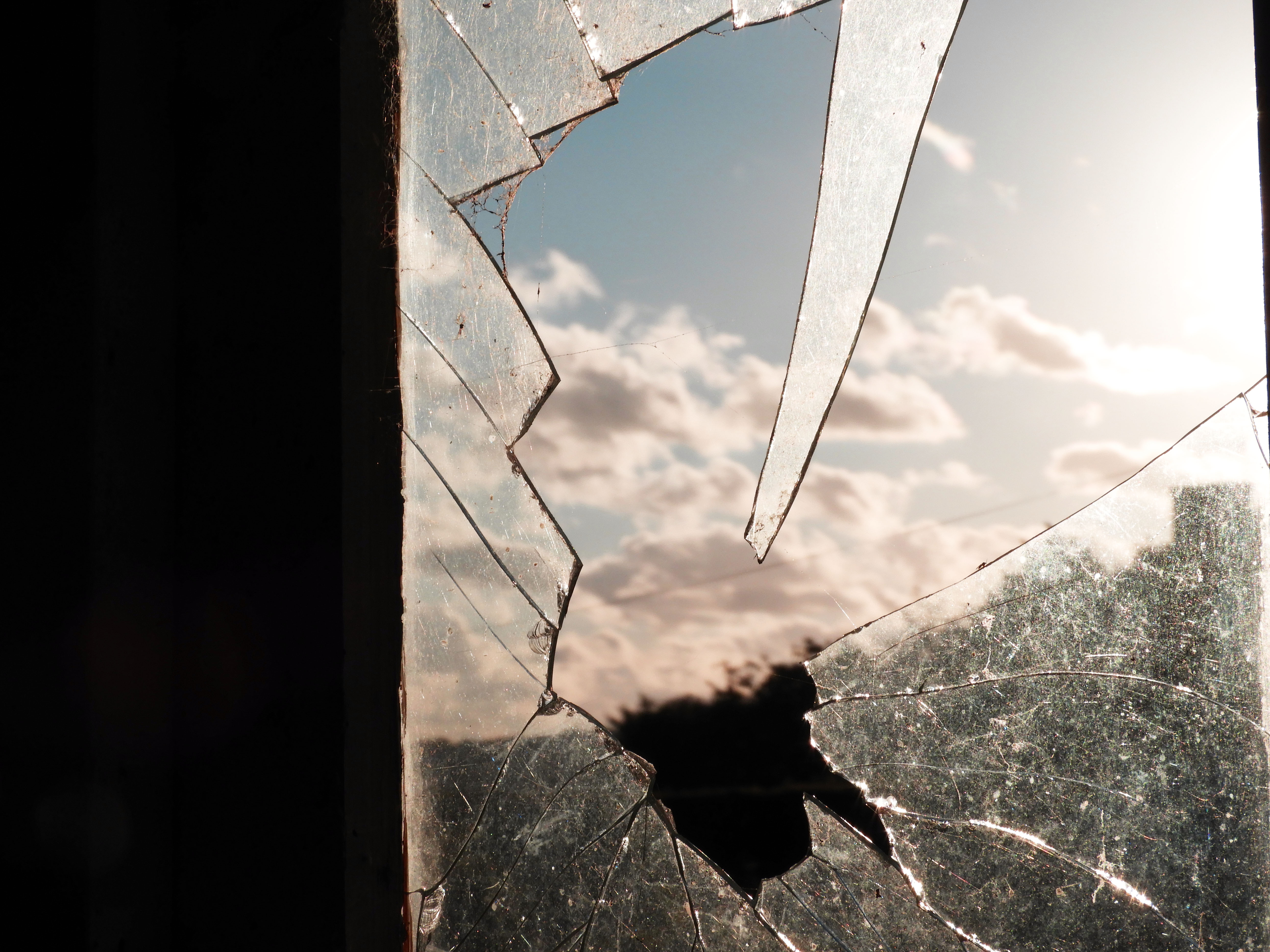
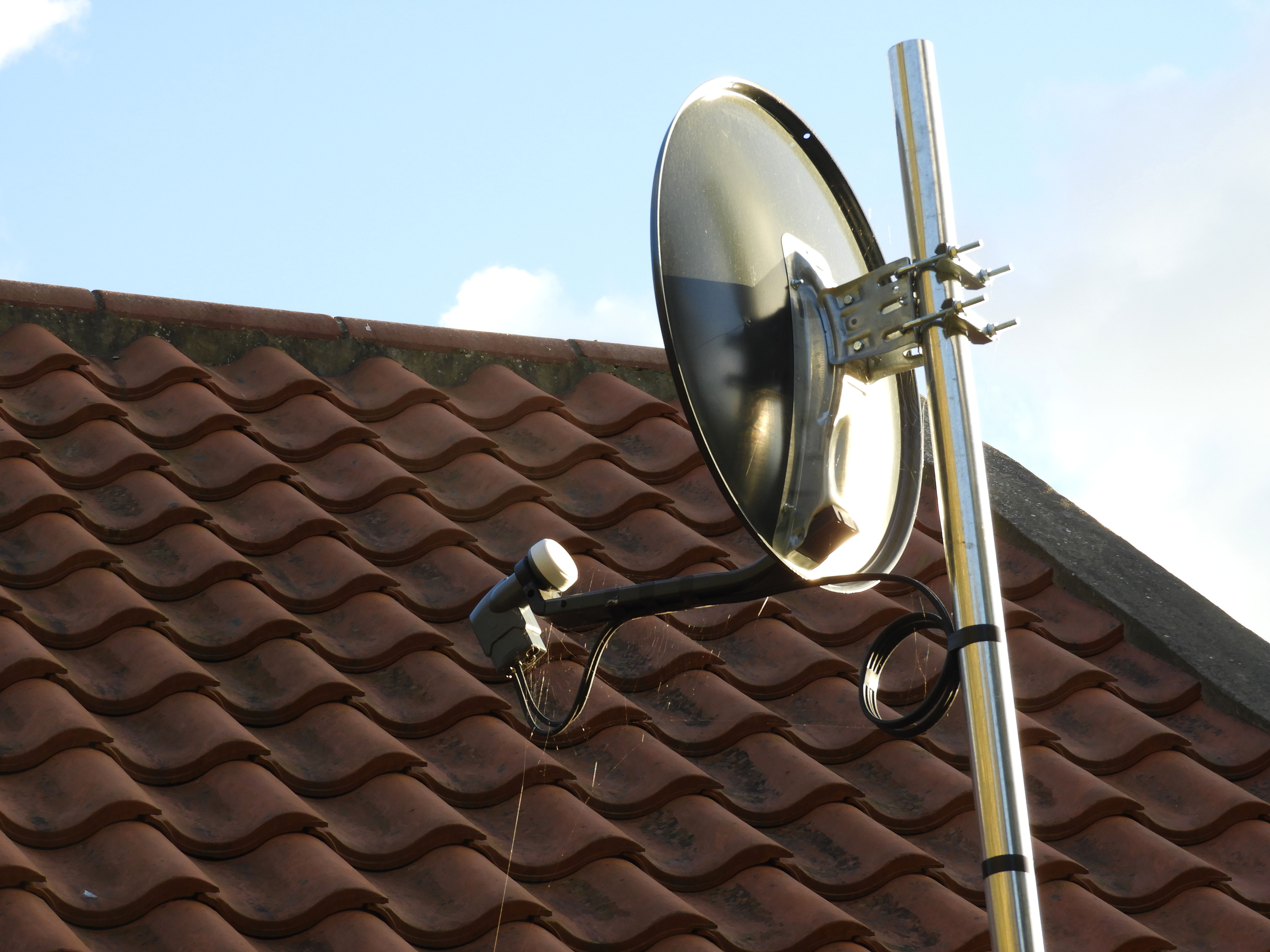
In the second photo, I experimented with changing the focal length. I zoomed into the piece of broken glass and used manual focus in order to focus on it, this resulted in  a very blurry backdrop which was the main aim of this shoot. I had the same approach with the fourth photo, the radio post was quite far away from me which forced me to zoom in. The backdrop is not as blurry as compared to the first photo as I used the infinity focus setting on my camera to see the type of effect it would have on the focus.

Colour and Texture- Research

Colour photography is photography that uses media capable of reproducing colours. By contrast, black and white (monochrome) photography records only a single channel of luminance (brightness) and uses media capable only of showing shades of grey.

Texture is the perceived surface quality if a work of art. It is an element of two dimensional and three dimensional designs and is distinguished by its perceived visual and physical properties. Use of texture, along with other elemental design, can convey a variety of messages and emotions.


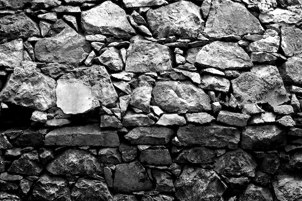
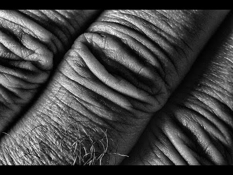
Texture in photography can be used to create strong images in an architectural and structural way like this

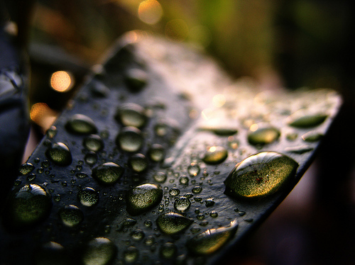
It can be used to show off the beauty and different surface feelings of nature, like this


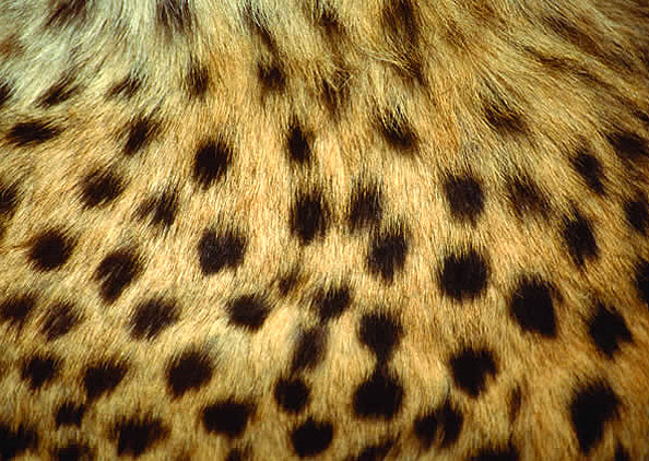
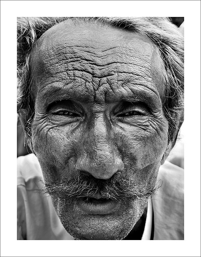
It can even be used to show the certain characteristics and age of a person like this

I like this type of photography as it allows you to have more freedom over the camera as you can use both auto and manual focus, letting you get as close or as far away from the subject as you want or need to be. It also means that anything can be your subject as anything and everything has a different surface and texture.


I also like the use of Colour photography as it can be original or edited to have a great outcome. There are many different types of ways you can have an outcome of photography. You can have multiple or the same colours in your original photoshoot, you can add a layer of colour on top of the frame during editing or even make the whole frame black and white and only select specific parts of the photo to have colour.