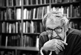
Ralph Eugene Meatyard Response

Ralph Eugene Meatyard was a qualified optician, the company he worked for sold photography equipment. For his son’s birthday he bought him a camera, which sparked his career into photography. He later became a member of the Lexington Camera Club where he pursued his passion for photography outside the main stream, he experimented with multiple exposures, motion blur and depth of field to create non focal pictures.

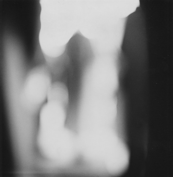
This photo by Meatyard is from his ‘no focus’ collection in which he has many photos with a blur effect, creating an all round negative space. From my interpretations this photo is of busy people walking, its good that I don’t know what the photo is of as this is what Meatyard wanted us to feel, a sense of the unknown. In order for this blur affect to be achieved the aperture must be wide (smallest f-value) so that the blurred area is harsher. A long focal length and a reasonably far distance from the subject would have also been techniques that Meatyard would have used. In all this photos of this particular collection he used a colour balance of black and white, which creates cold tone. The black and white goes well with the motion blur as it creates a mirroring effect for instance the people are walking, everything is fast pace and blurry, you can see no expression from anyone, this is similar to how there is no colour expressing the atmosphere, everything is gloomy and dull. As well as that there appears to be a pattern within this photo, the people are evenly spread apart, there is a clear rule of thirds. This also creates a sense of repetition and how everyday is the same nothing changes, there is nothing new to look forward to, everything is black and white.

My Photos:

ISO 200-50mm-1/13-ƒ/5.6
ISO 200-34mm-1/40-ƒ/5.6
ISO 200-50mm-1/100-ƒ/5.6
ISO 200-44mm-1/100-ƒ/5.6
ISO 200-44mm-1/60-ƒ/5.6
ISO 200-44mm-1/25-ƒ/5.6
ISO 200-39mm-1/50-ƒ/5.6

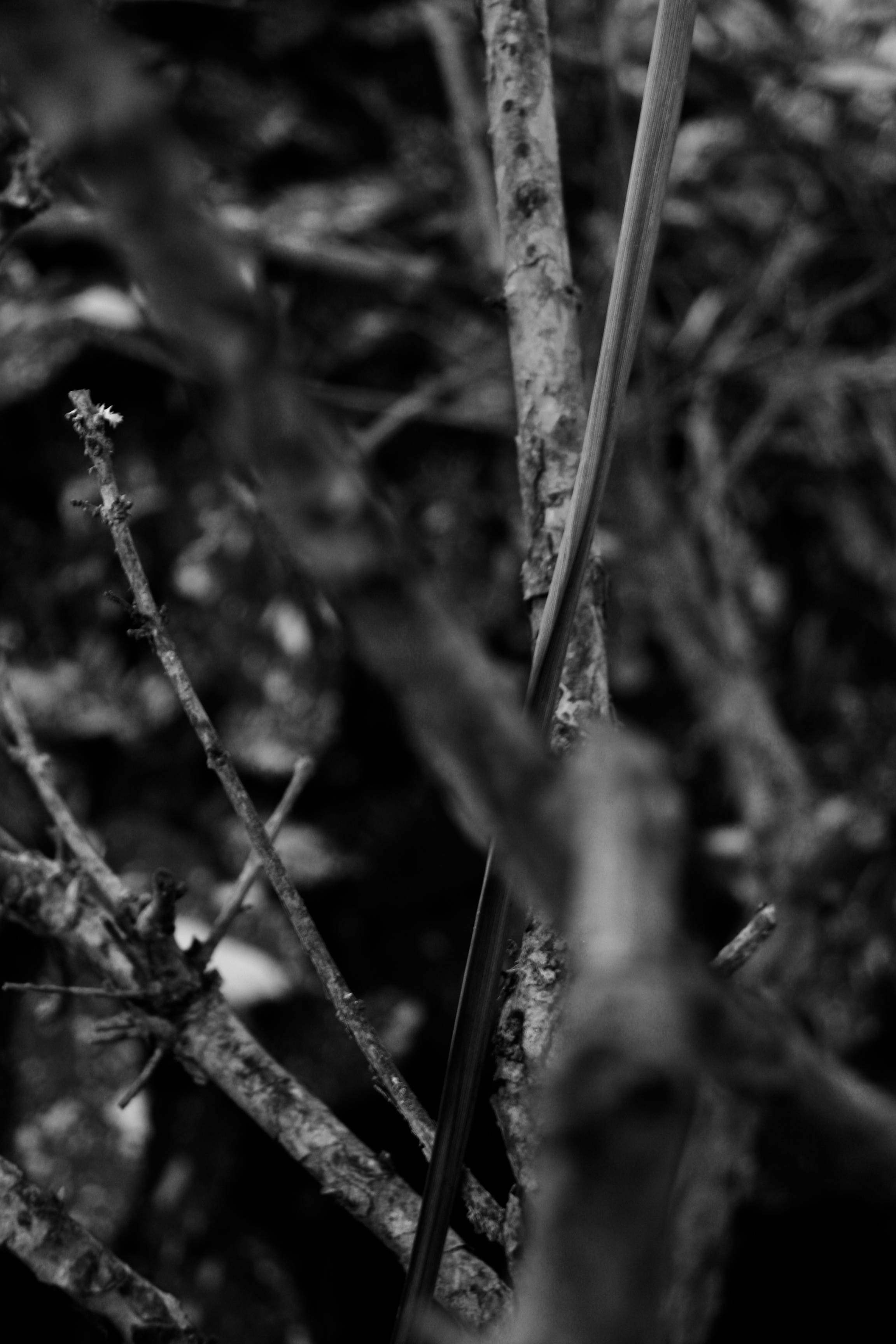
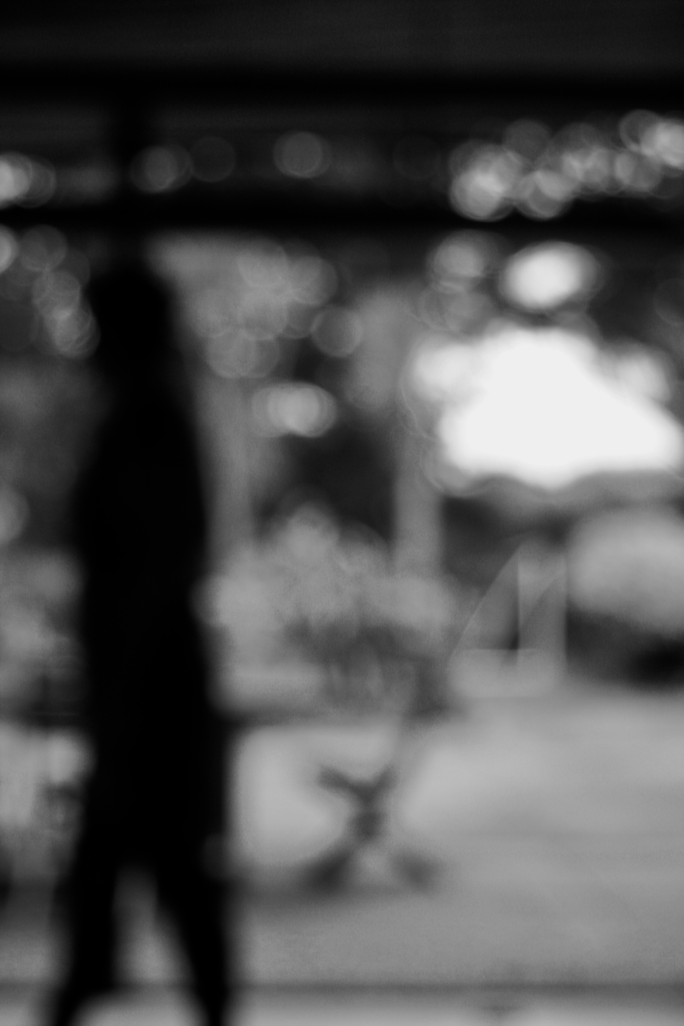
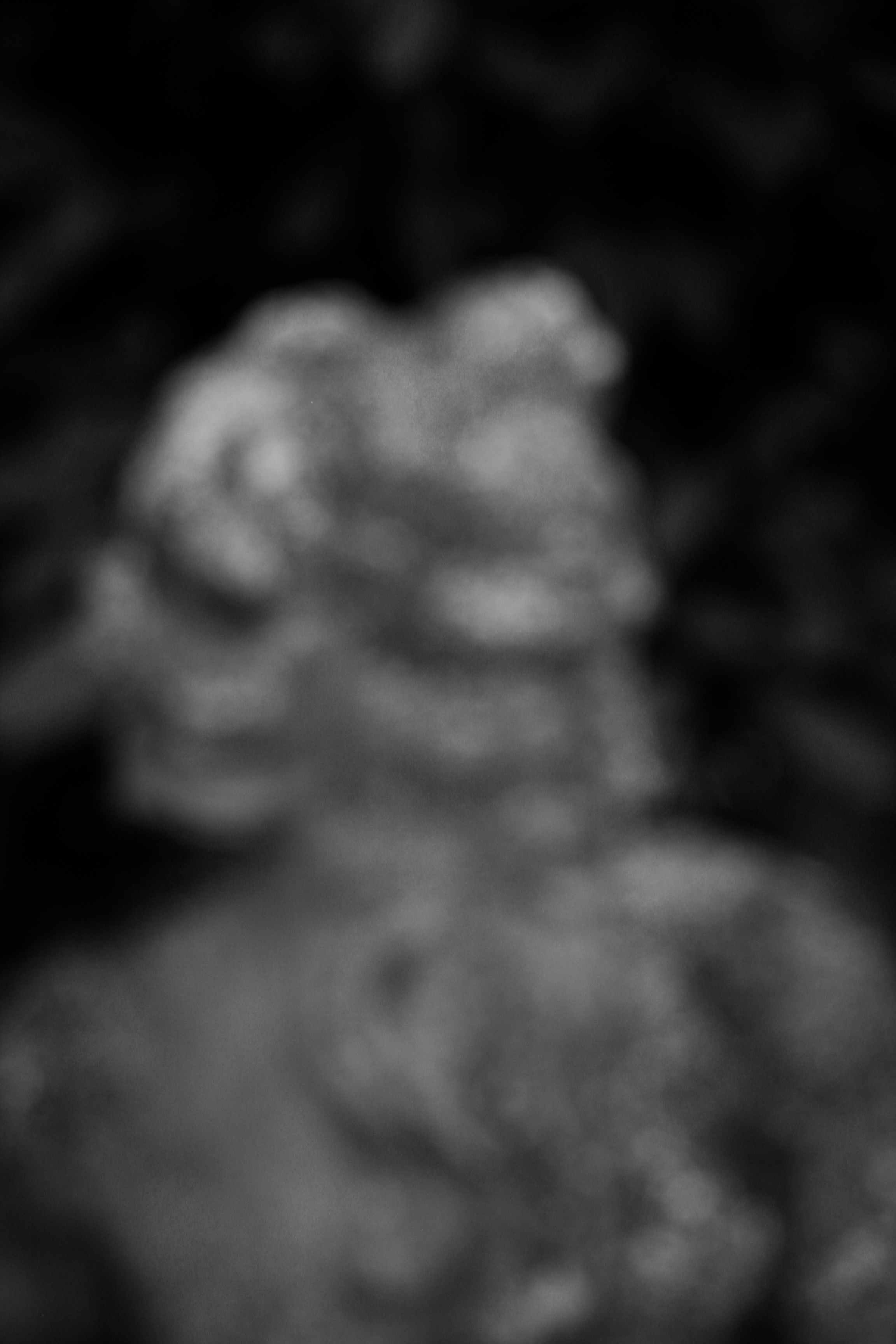
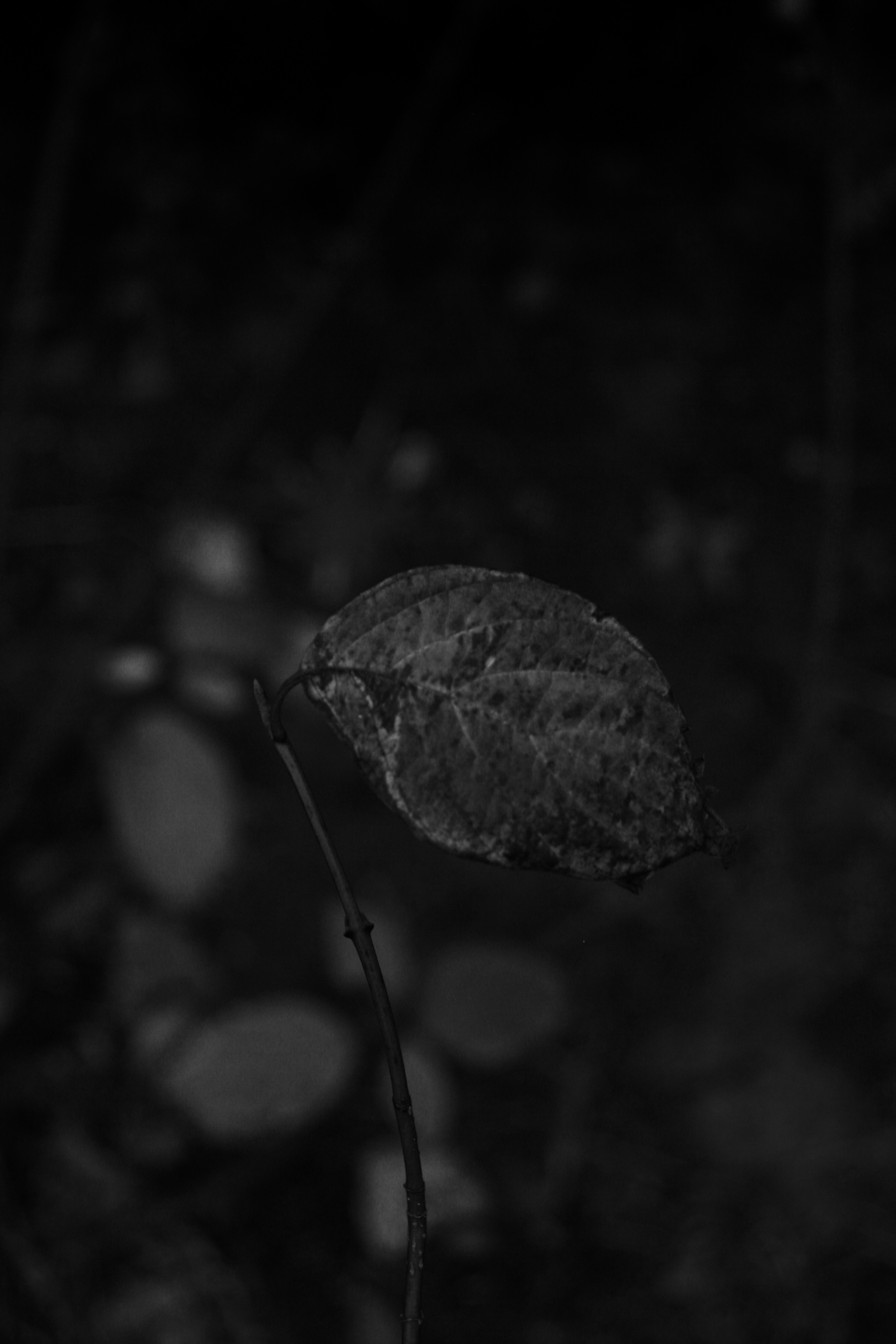
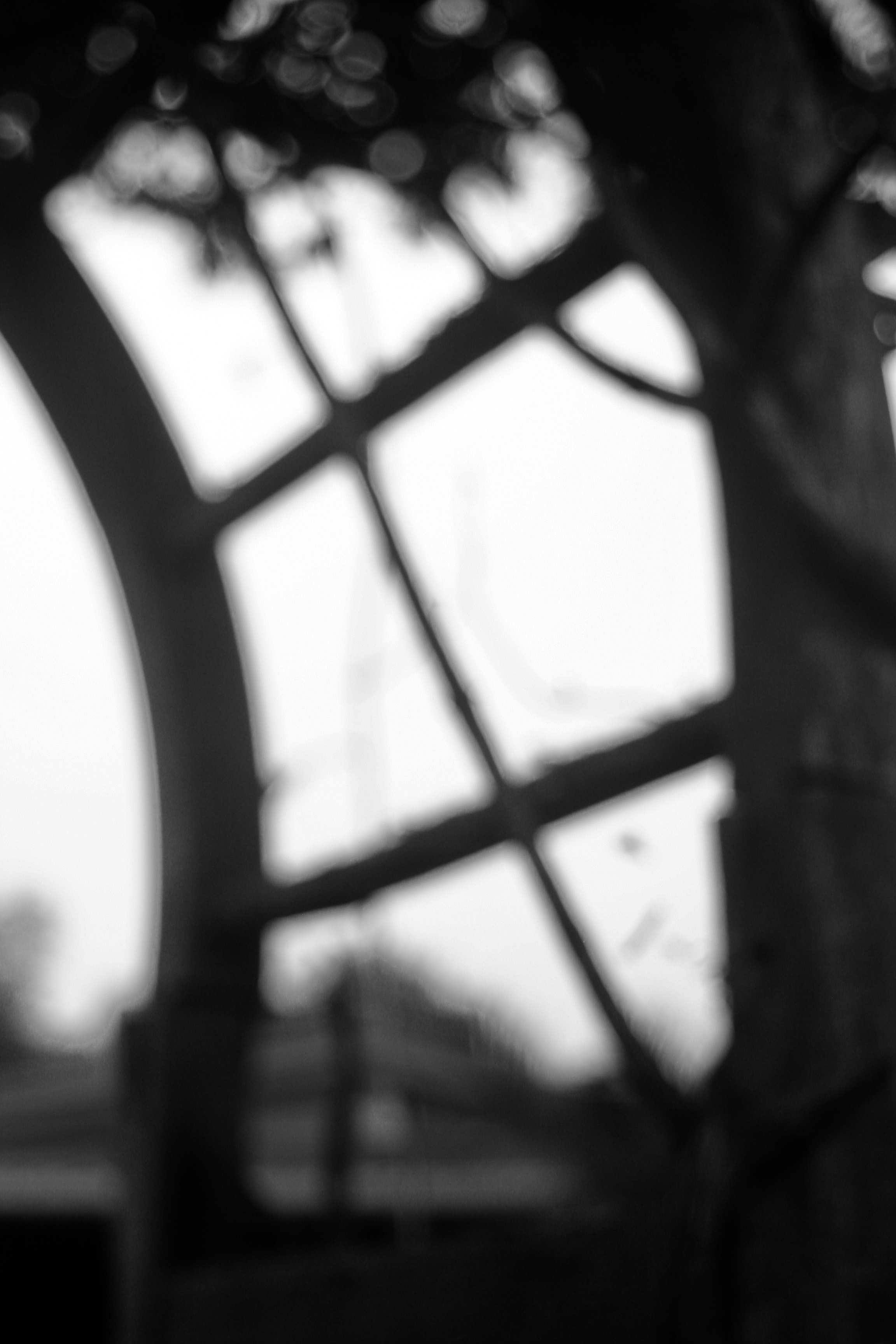
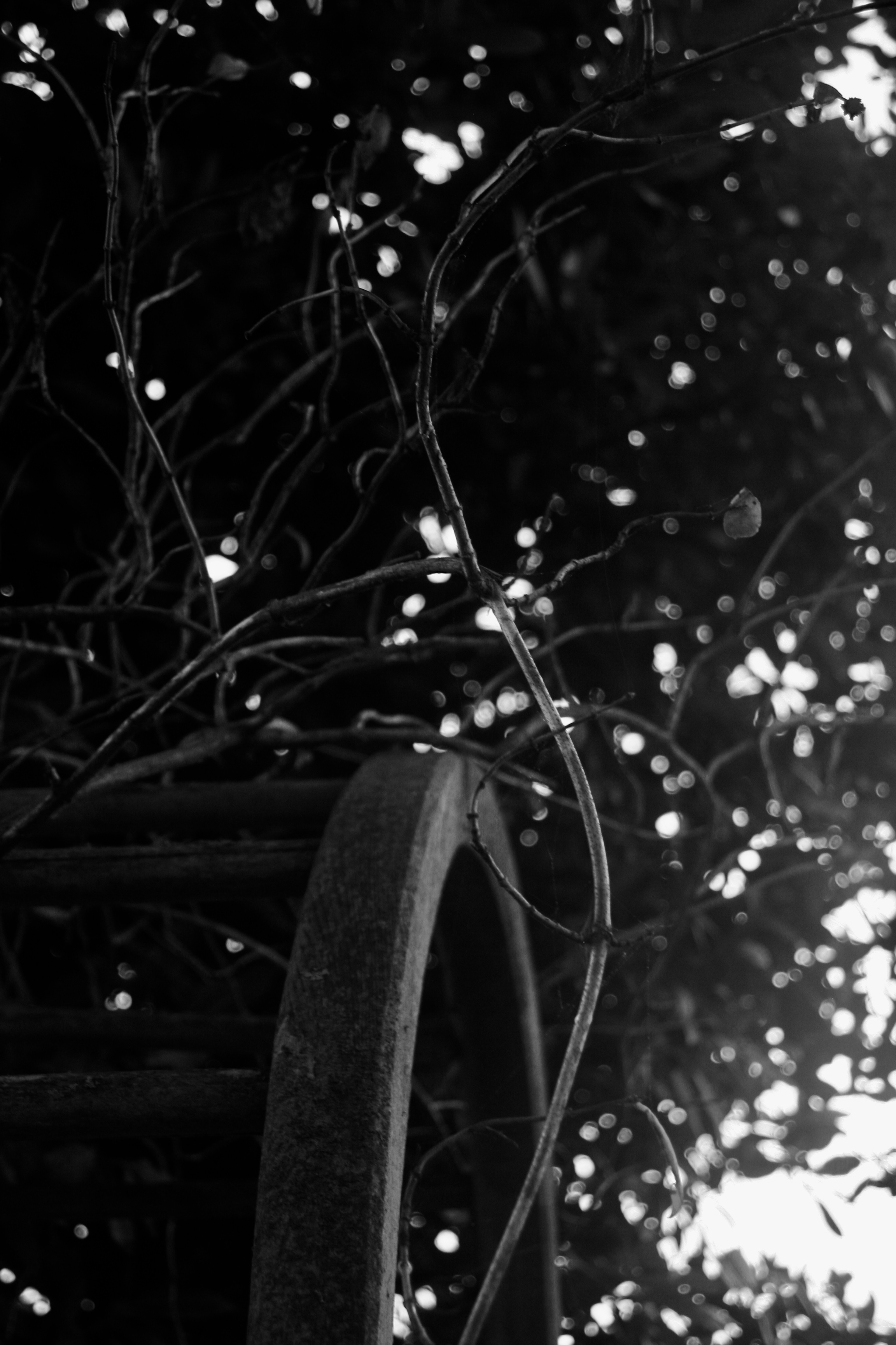
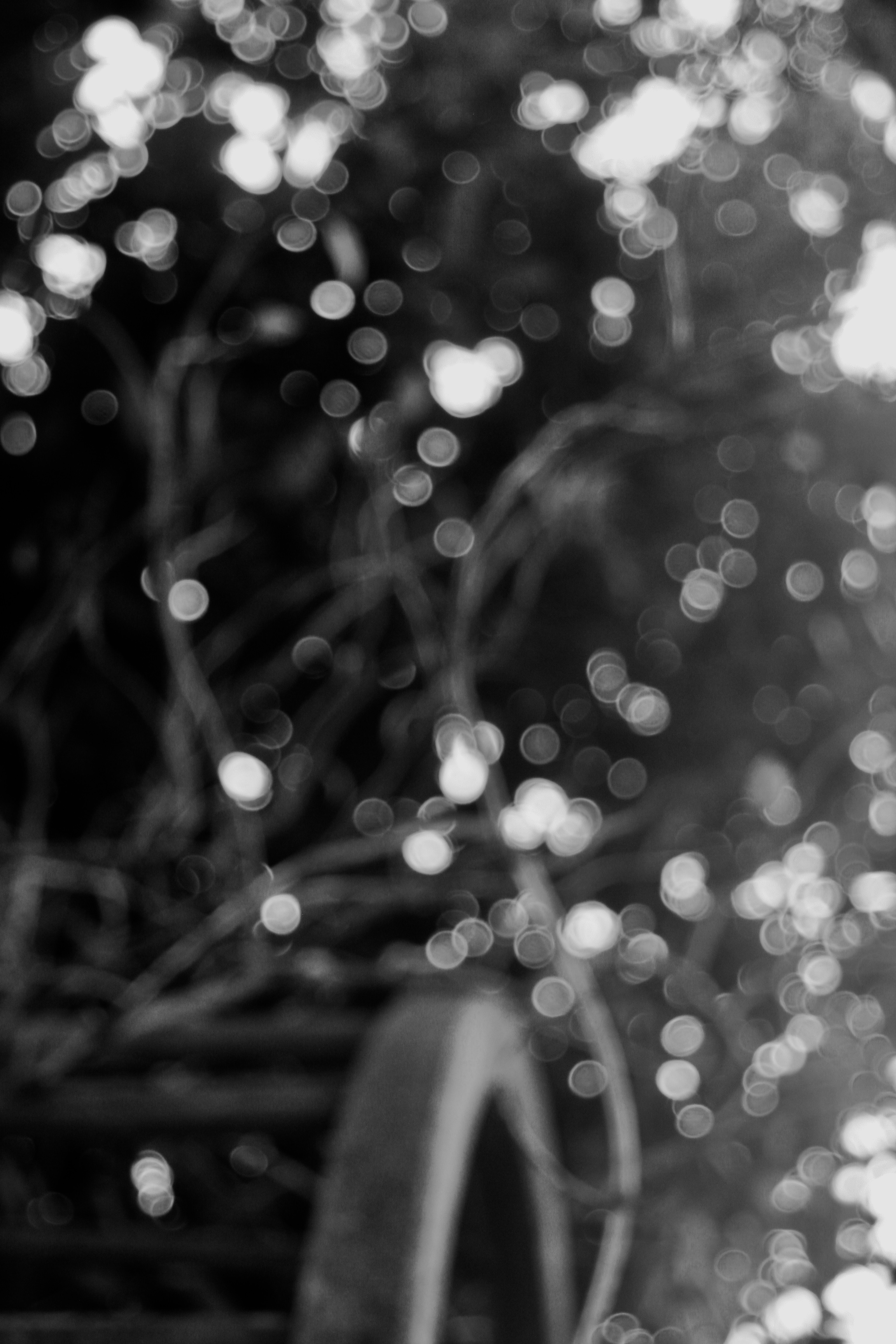
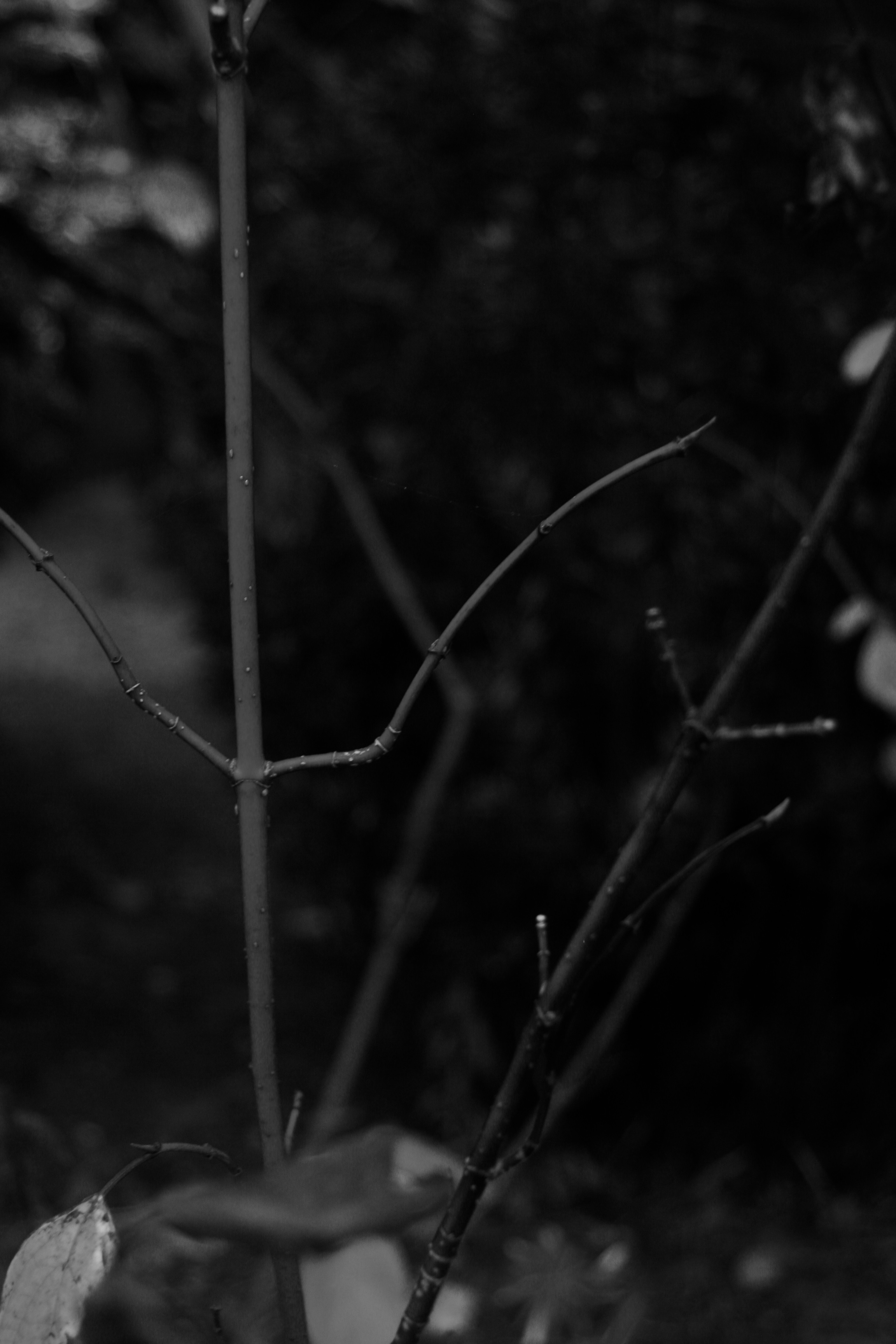
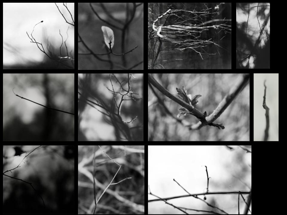
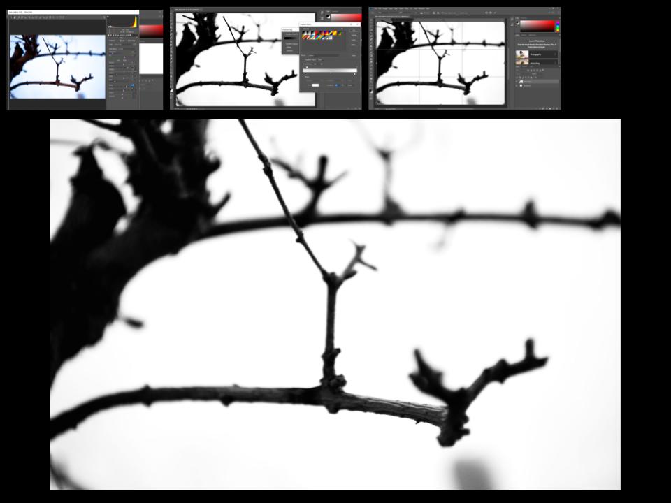
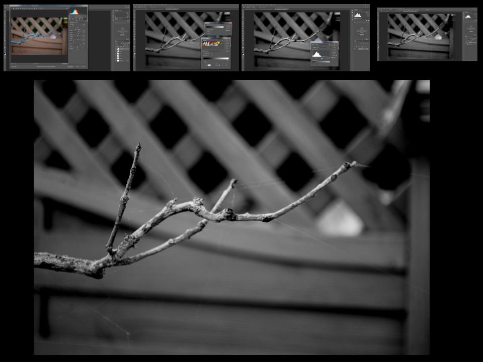
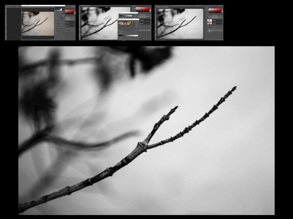
In response to Meatyard’s work I experimented with focal length, depth of field and aperture. I took most of my inspiration from his ‘zen twigs’ collection, focusing in on plants and branches and blurring out the background to create large negative space. In order to achieve this set my camera to a large aperture and I had a shallow depth of field. Overall I am pleased with my final images, I decreased the brightness of all images and made them black and white, to resemble the work of Meatyard. I have tried to mirror his work as my photos are either completely blurred or there is one focal point and the rest is out of focus negative space.


Experiment: Curve/Tonality (Contrast)

Tonality:  Contrast

A curve, in image editing, is a remapping of image tonality, as a way to emphasise colours or tone in a picture.

Applying a curve to all channels of an image typically change the brightness. Light parts of an image can become lighter while dark parts of an image become darker, increasing the contrast in a composition.

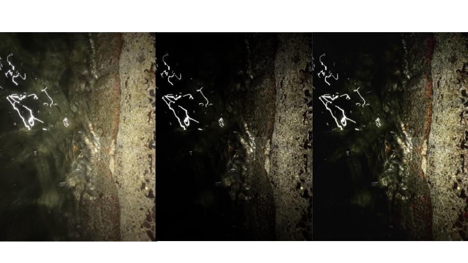
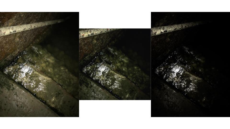
Below I have shown examples of images in their original form as well as with two examples of the same image with different levels of contrast.

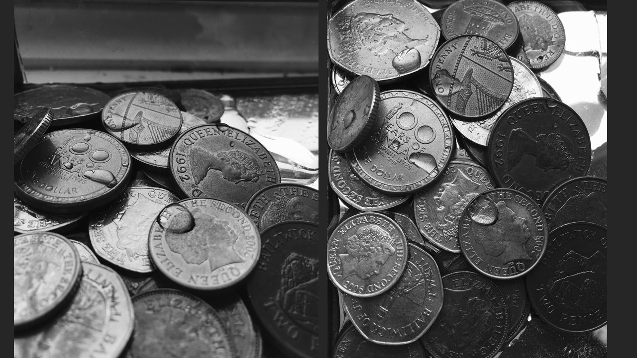
As displayed in these images, the higher the contrast the more dramatic the image. I took these frames of light reflecting on water at night to create natural contrast before the editing process to show how slight changes to the tonality of an image can drastically change how an image appears.

I could have further increased the curve of these images or perhaps even decreased it to give the images less contrast, however I felt it was most effective for these specific images to increase the curve sensibly to create realistic images rather than obviously edited ones.

Conceal / Reveal

THE PROCESS:

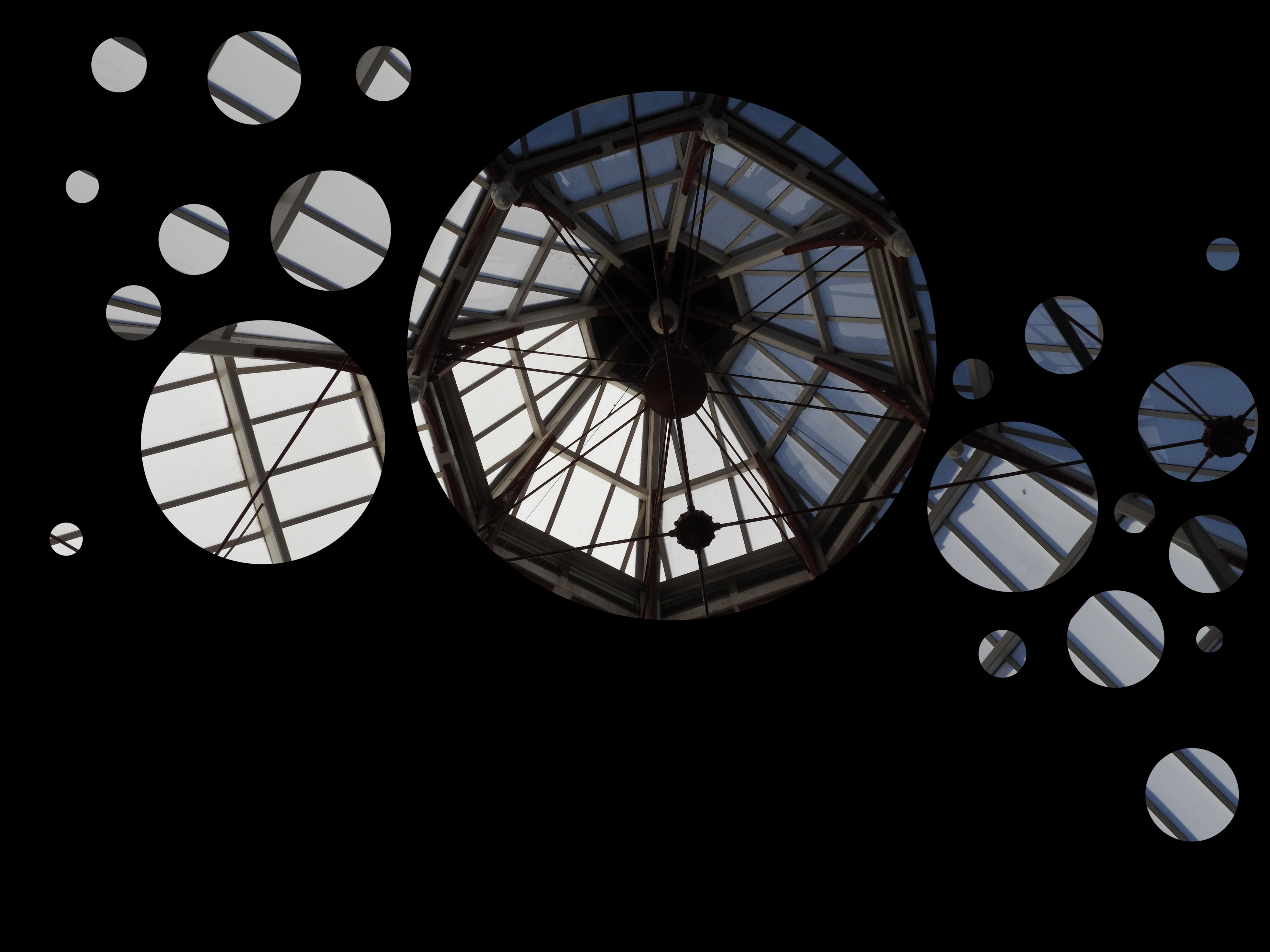
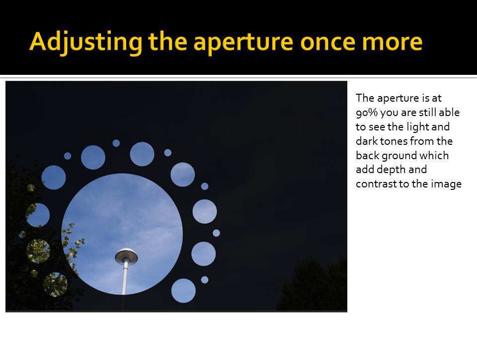
In order to create this final piece I followed the instructions provided to me in order to achieve this conceal/reveal image which is composed of a photo which has a panel layer added to it. Then using the brush tool, i was able to achieve varying sizes of revealing circles that show the original photo. The final outcome is very unique and brings up multiple questions for the viewer of the image.

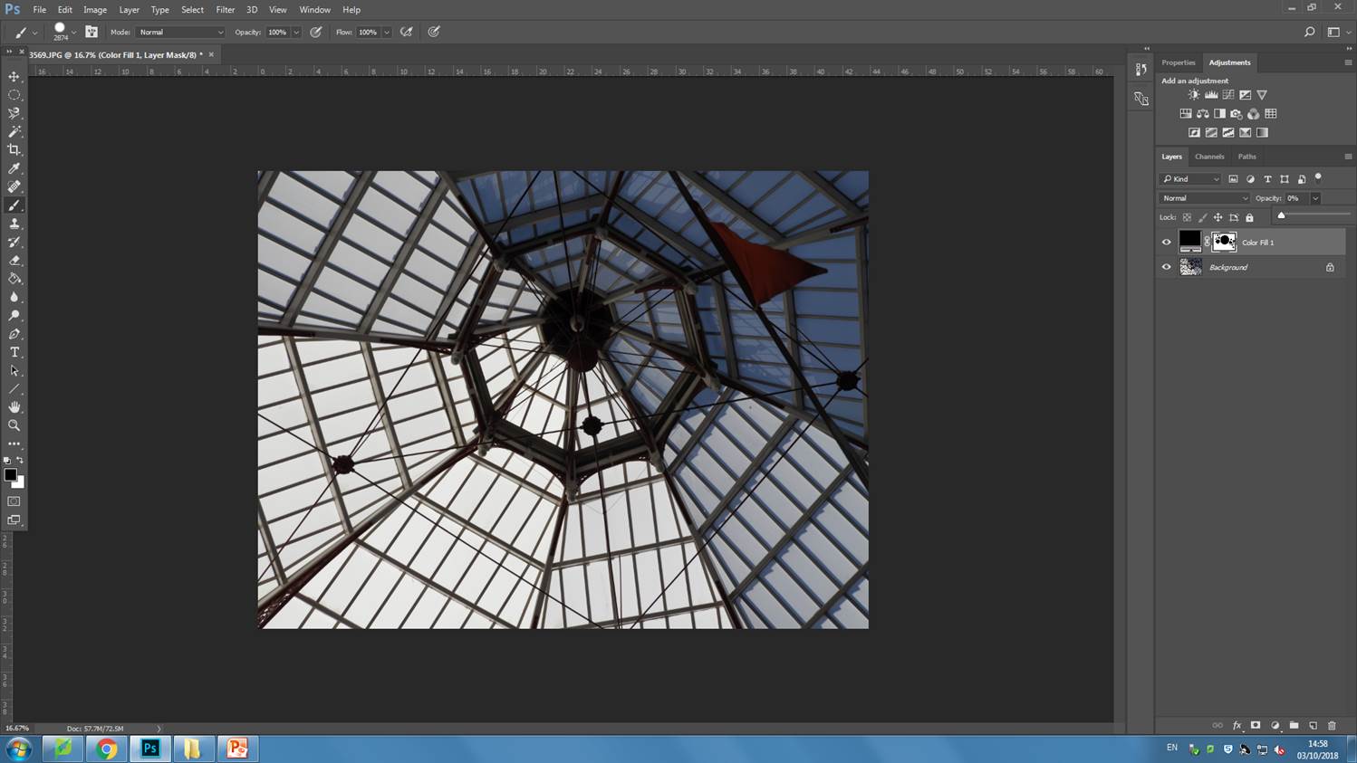
using the layer panel tool, i added a black, solid color in front of the original image.
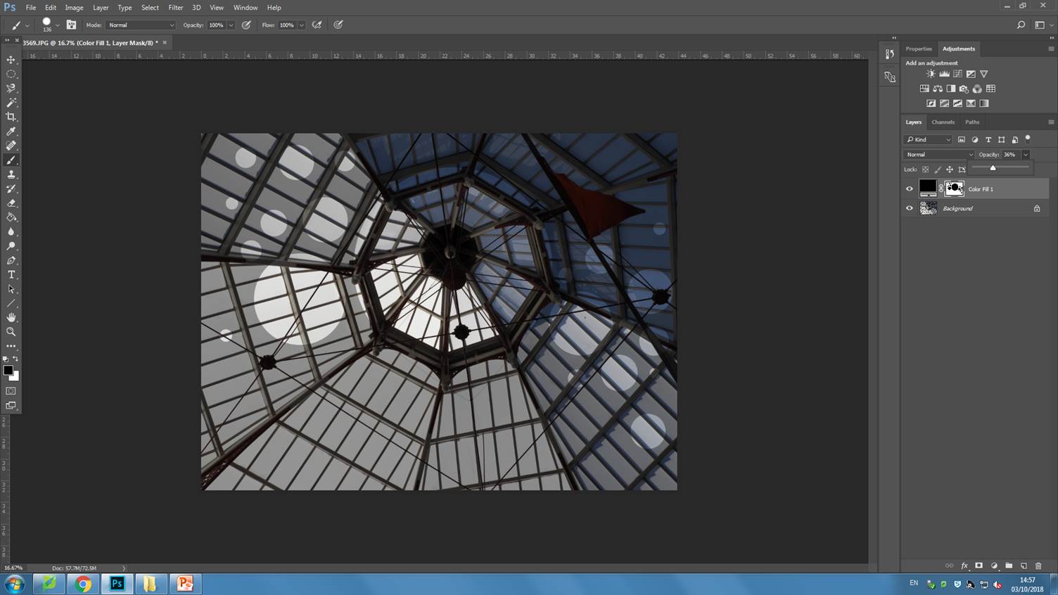
i decreased the opacity so that i would be able to see the original image and place the holes in the desired places.
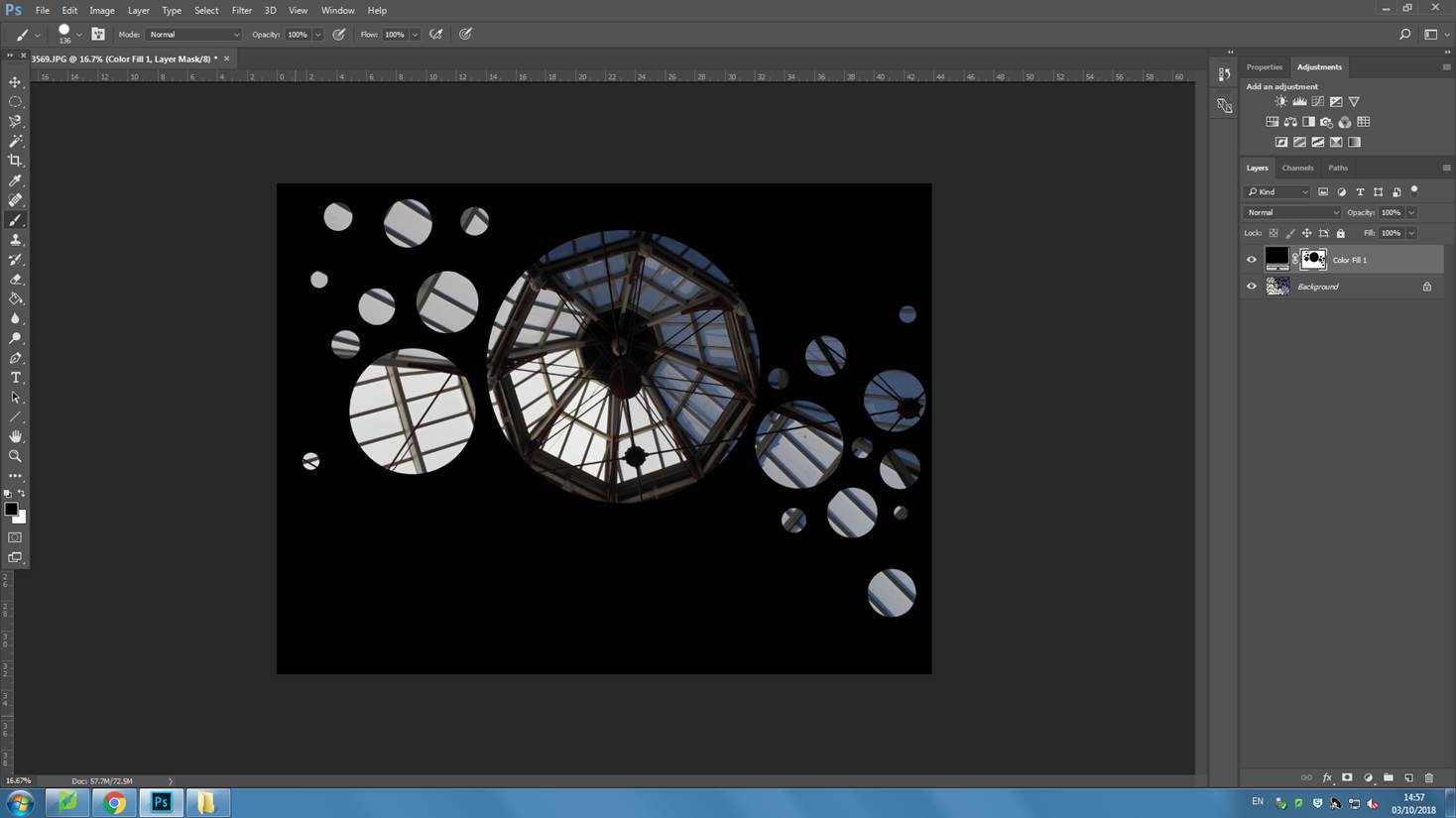
by increasing the opacity back up to 100%, the final image is produced.

ANALYSIS:

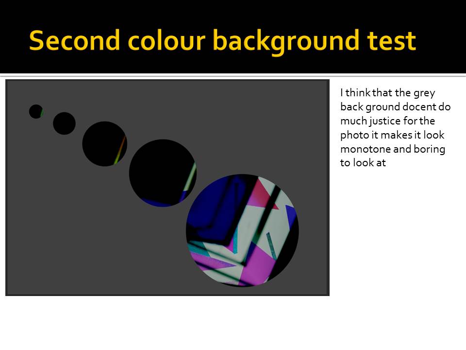
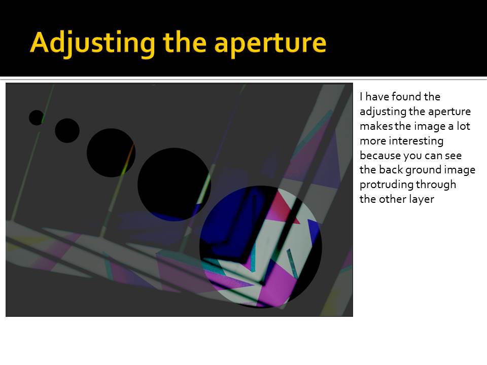
This is the final image which I produced from the conceal/reveal task. As the title suggests, much of the image is concealed with a black panel layer. It puts many ideas into the head of the viewer. What is hidden behind the black? Why did they choose to only show certain parts of the image? The revealed parts of the image all allude to different things. I chose to reveal the circular structure, central in the image because i felt that this would create a sense of pattern and unity within the image. It is the area of the image which draws the most attention.  I kept the circles in a linear pattern as this creates flow and movement within the image. I did not want to decrease the opacity of the black panel as I wanted to retain that question in the viewers mind of, what is behind the concealed parts?

Coming through the glass is a very soft and diffused light which varies in intensity in different parts of the image, the bottom left hand corner being more strong and the top right more soft. The composition in this image is very simple and is purely made up of strong, symmetrical, repeating  lines that come towards a singular point central in the image. There is a lot of geometrical patters that play together to create a very harmonious photo. The co lour range of this image is fairly simple, being mostly composed of soft grays, blacks and subtle blues. The photo has a warm hue to it as can be seen in the lighter areas of the image. The photo lacks any sort of foreground, mid ground or background therefore it is quite flat and 2D.

In order to take this image, I zoomed in, decreasing the field of view and increasing the focal length as it was quite far up and could not be seen clearly from a stationary position. I kept the ISO fairly low, at 400, as it was a bright day and i wanted to avoid overexposing the image. I used auto focus whilst taking this image as it is very flat and did not require much attention to get it in focus. I used a fairly low shutter speed due to the strong light coming through the glass, which prevented the image from becoming overexposed.

FINAL IMAGE

Albert Renger Patzch – The New Objectivity

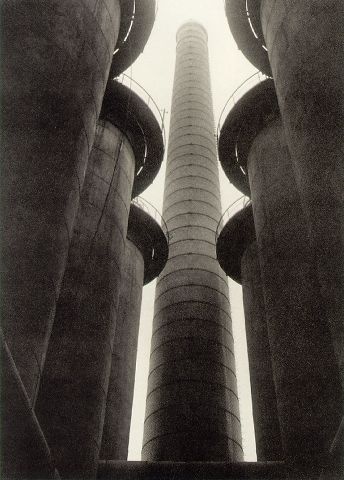
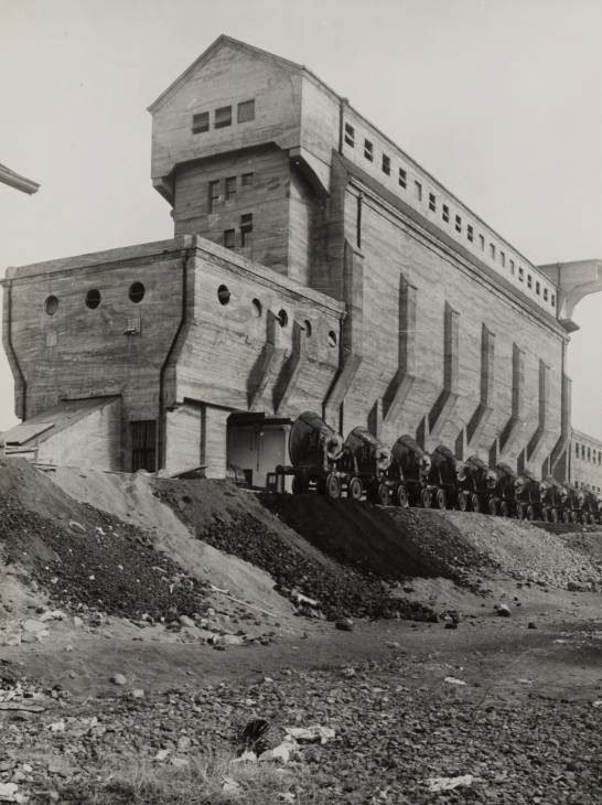
Albert’s work primarily focused on the idea of making ordinary items into extraordinary pieces of photography. The majority of his notable work is in black and white giving a sense of drama to his pieces. Albert also published the well known book “The World is Beautiful” which documented his work focusing on subjects such as industrial subjects, mass produced items and natural forms. His work often features a small aperture allowing for the majority of the image to be in focus, creating a objective look to his photo’s.

Image result for the world is beautiful albert renger patzsch bookImage result for the world is beautiful albert renger patzsch book

This particular photo utilizes an organic subject as the photo includes rows of trees. The photo features a small aperture however due to the fog in the photo it gives the appearance of depth of field. It features strong contrasting tones between the thick white fog and the almost black trees.

Image result for the world is beautiful albert renger patzsch book

Response:

Personal Favorite Images:

Final Choice: 

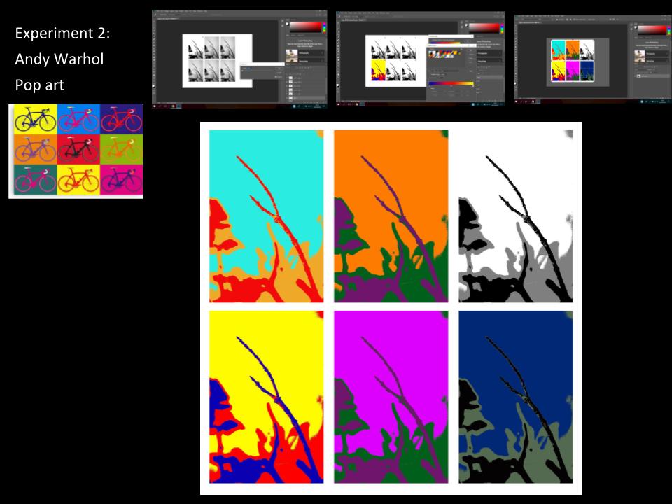
threshold adjustments

this image above contains three of my photographs that i edited with photoshop by adjusting the threshold of each of them.

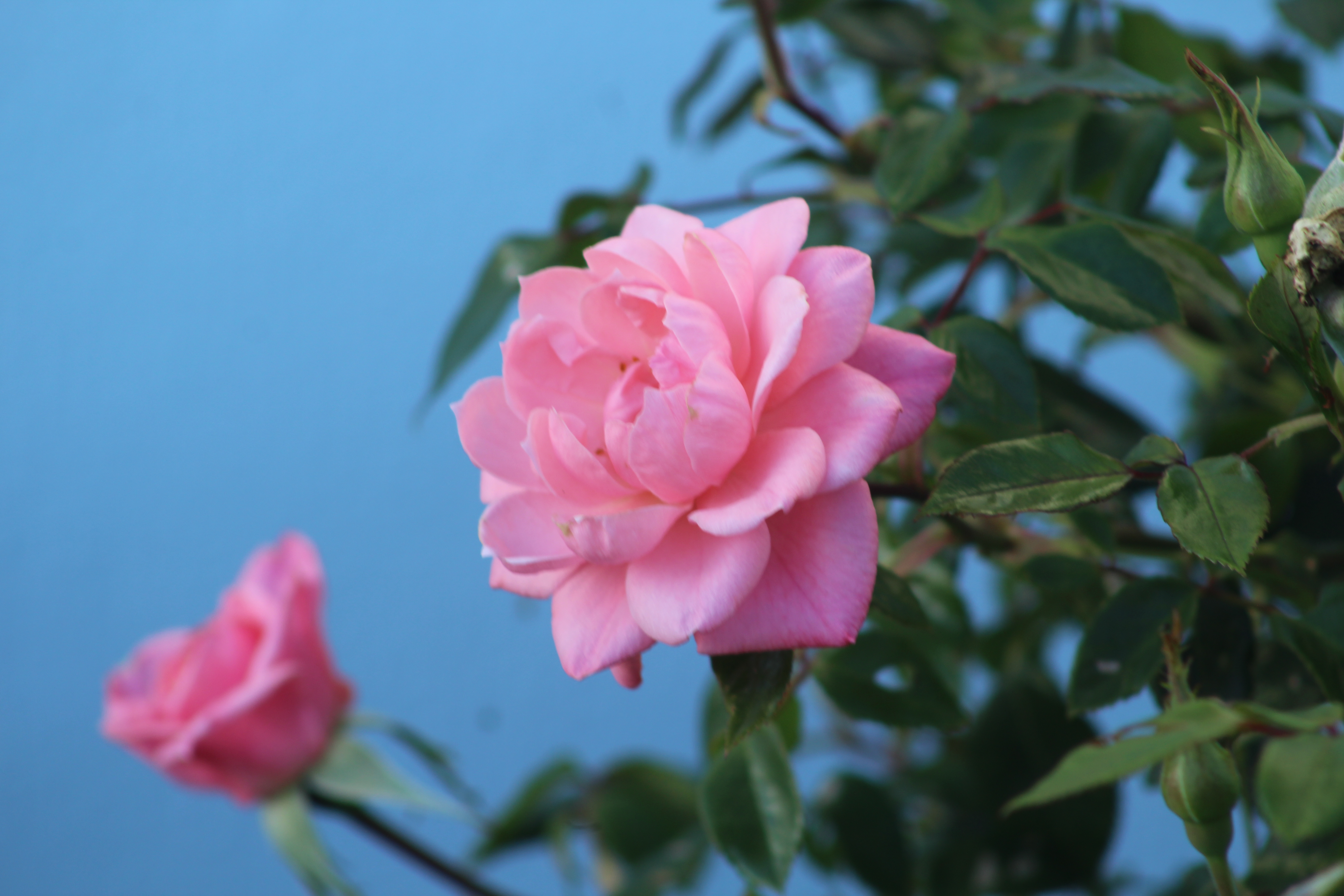
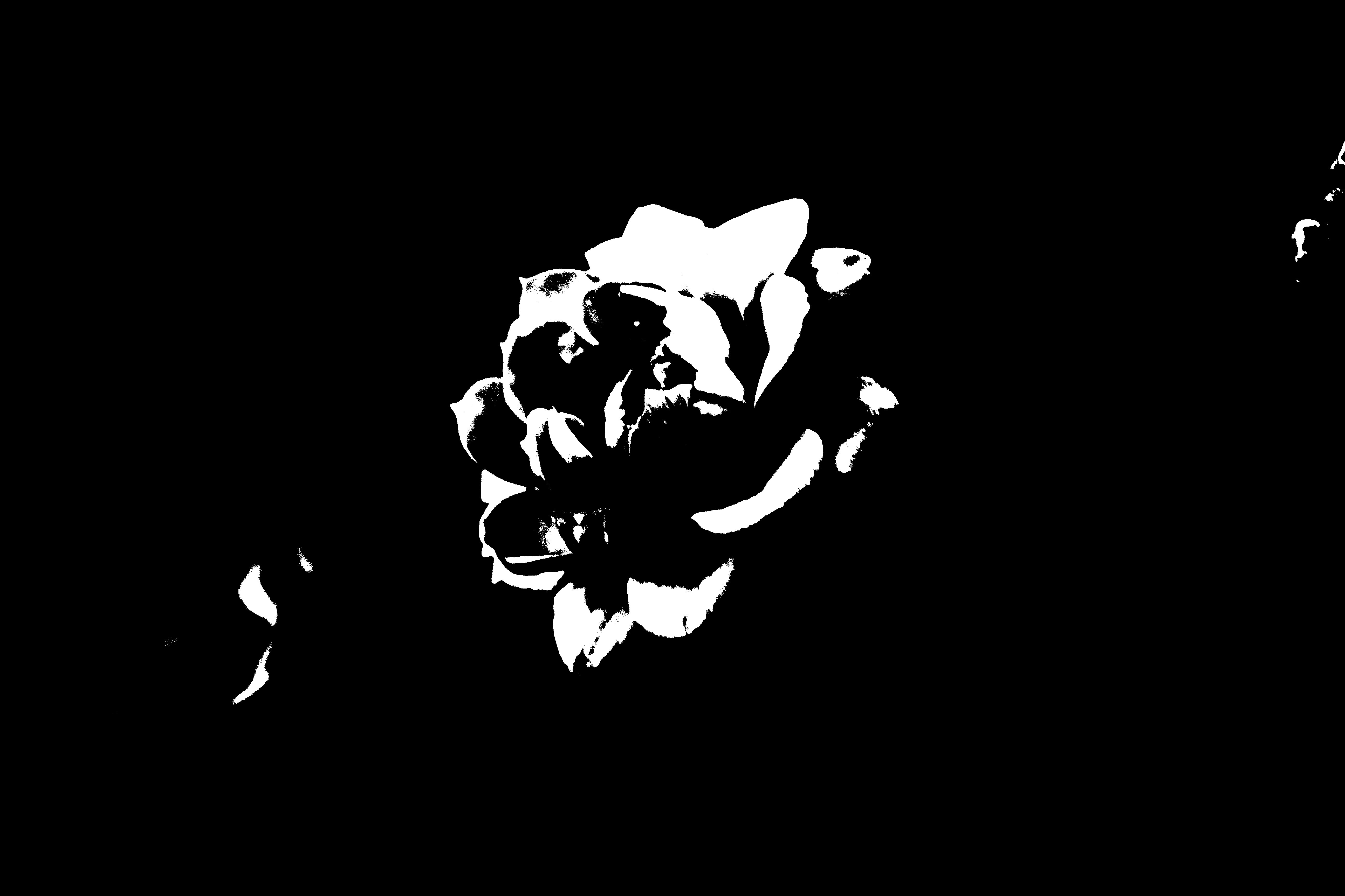
This photograph is about a pink rose bush with a rose in the middle which is sharply focused and the background is mostly the green part of the bush alongside with the clear blue sky background, it was taken using the AV settings on the camera so that it focuses on the rose and the background is unfocused.


After using the threshold adjustment i put the threshold on almost midway to the left so that only the focused part which is the flower is white and the background is black.


this photograph above was taken indoors using a phones camera and the natural light from the window was used to create the shadows around the paper, the paper was made into a zigzag shape by hand to create that shadow effect.


the photo was already edited by phone quick photo editing, then it was downloaded on the computer and was edited with photoshop in which the threshold was adjusted to create an effect in which the shadows where black and the paper is white.


Keld Helmer-Petersen

Keld Helmer-Petersen was a danish photographer who achieved a wide spread recognition in the 1940-1950’s, he was known for his color abstract photography. But in this project I focused on his black and white contrasting images. In his black and white photos there is a lot of empty space in the photos and he focuses on lines, texture and pattern. Petersen ended up opening up his own studios.

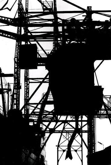
In this image Peterson has sued the natural light as the image has been take outside, but he has edited this image by changing the threshold and making the images more distinct with more empty spaces, shown by the block of either black or white in the image. The range of tone is limited in this image this is because of the way Peterson has edited his image and made it bold and simple.  He also has a range of focus and depth in this image, the things at the front of the image are more focused and bold, but as you look further back into the image things become less clearer and less bold. Visually this image looks like a cold image because of the bold black areas taking over the photo, and the lines in all directions give it a chilling feeling.

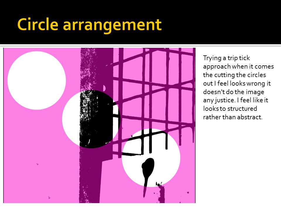
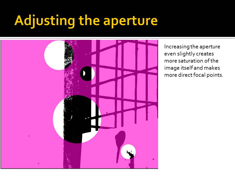
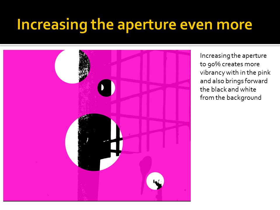
I then decided to responded to Keld Helmer-Petersen’s work, I did this by using images I had previously taken and then editing them in Photoshop. When editing the images i mainly focuses on changing the threshold of the images, to either increase the amount of white or black in the image, and making the represent the work Petersen did.

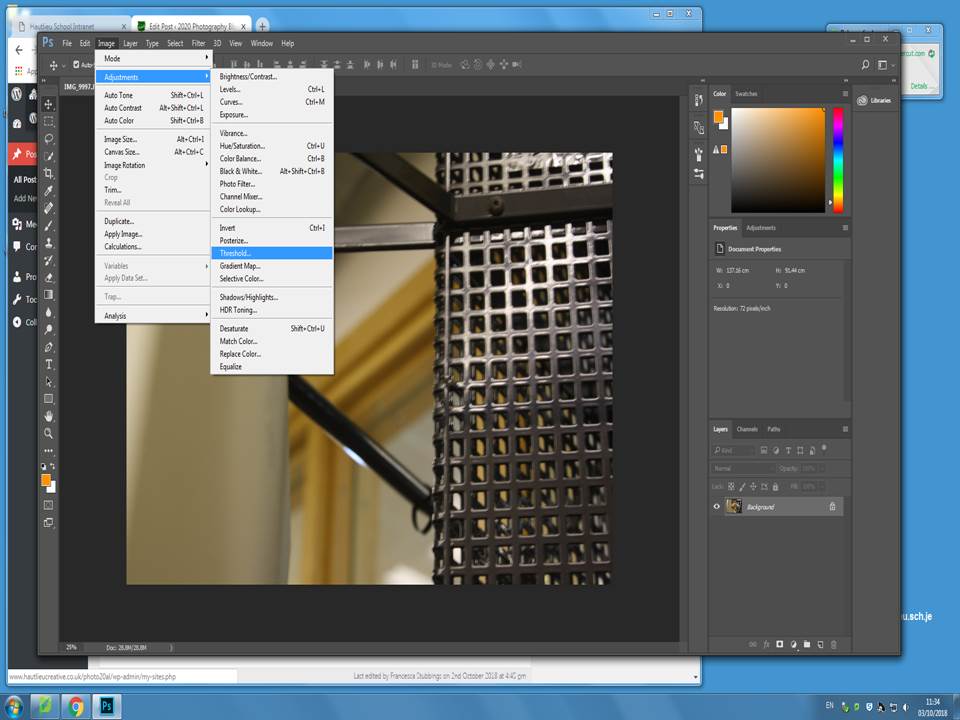
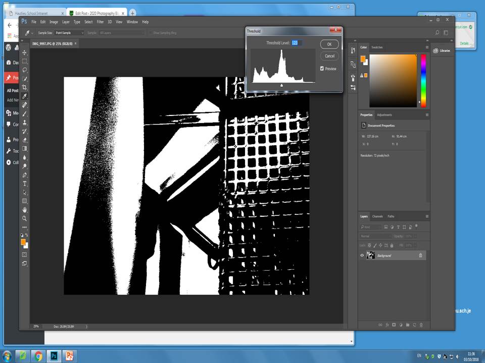
I firstly started with the original image in Photoshop and took these steps in order to change the threshold.

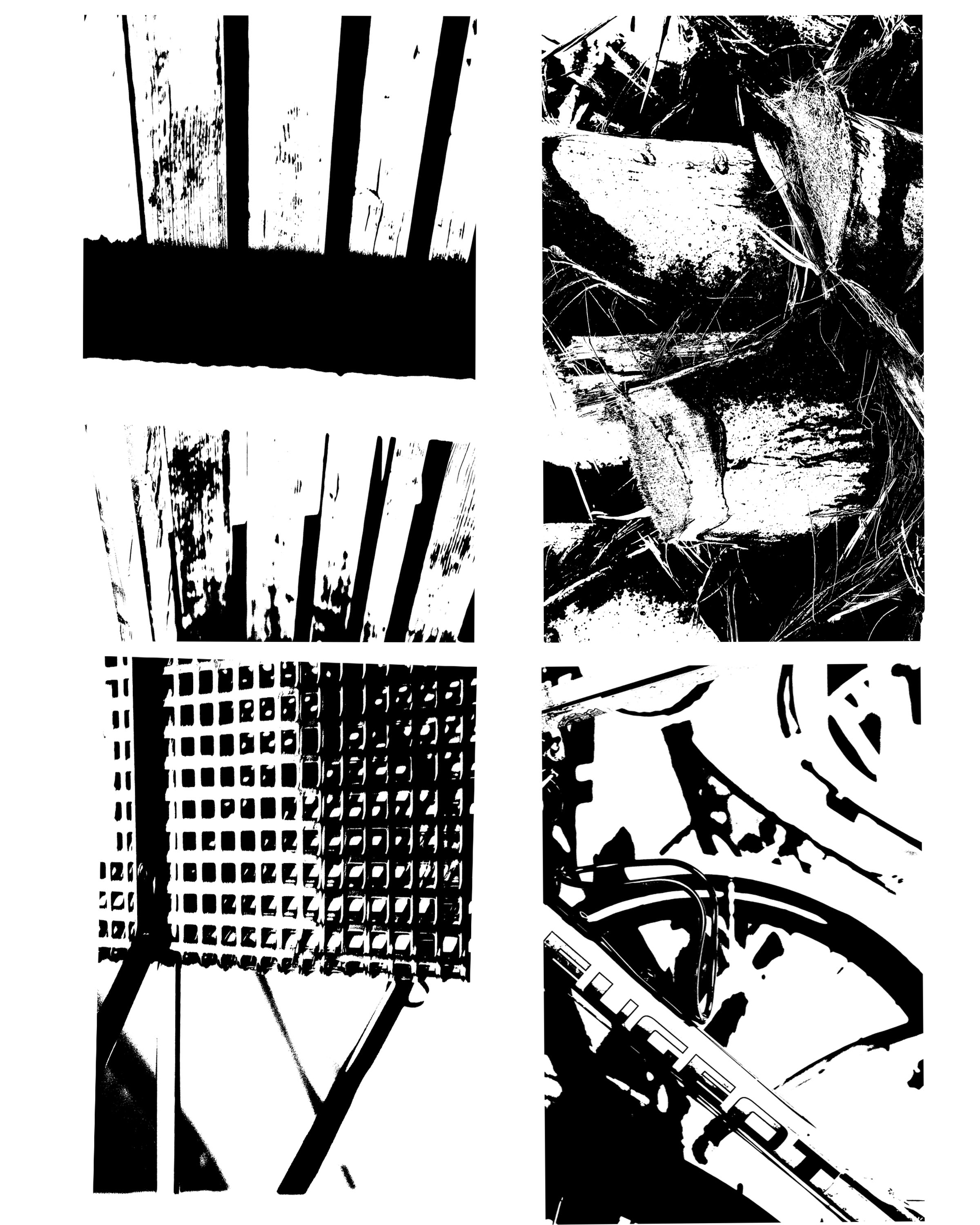
I did these step for each of my 4 images, I then copied them all over onto one page and created a gallery of these 4 final images. These are my 4 final images.

Each of these images were originally taken in natural light. All images have a range of depth and focus. The image in the top left hand corner is mainly focused on the black blocked line across the upper part of the photo and them the majority of the image is in white, where as the bottom right hand image has many more white blocks in the images and there is no real focus in the image, but there is depth, the text is at the front of the photo and then the vague lines behind the text really show off the depth of the image.


SAUL LEITER- BOKHA PROJECT

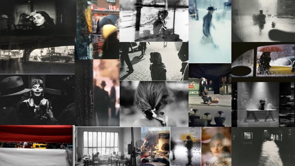
Saul Leiter 

Saul Leiter was born December 3rd 1923 and was known as a color and black and white photographer from Pittsburgh Pennsylvania. Leiter was given his first camera at the age of twelve by his mother. However, Leither then went into art and was lucky enough to meet Eugene Smith who then encouraged Leither to become a photographer. He started taking color photographs in 1948 and began associating with other contemporary photographers

Leiter was then a fashion photographer from 1950- 1970 and photographed for Vogue, Elle and Nova.

His images explore color harmonies and exploit unusual framing devices which helps to create an abstract feel of everyday streets.

Leiter’s photographers ranged in focus. He tended to experiment a lot with depth of fields which made his images very interesting as every image is different. I think that Leiters use of colour with the different depth of fields helps us to identify the surroundings more as some of the depth of fields used completely blur the picture which can sometimes make it hard to identify what the picture actually it. After analysing his images i have also noticed that he liked to take his images through windows which is shown by the mist on the windows, the rain or the reflection.
Analysis 

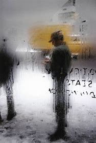
This is my personal favourite image from a selection of Lieter’s pictures as the use of taking the image through a window implies the weather of the picture without the picture explicitly showing you what the weather was like at that time, ie the dripping condensation and the writing showing that were Lieter is it is warm and where the primary subject ( the man) is it is cold, as well as the writing shows it is a window. The yellow colouring helps us to capture everyday life as the colouring is shown in the distance which could imply that it is a vehicle. The depth of field is focused on the mans top half in this picture and everything around that top half is blurred which makes the image very abstract as everything else in the picture is implied
Planning my photo shoot 

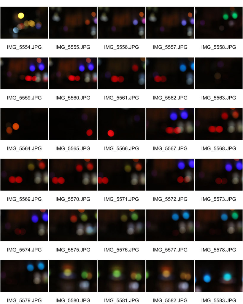
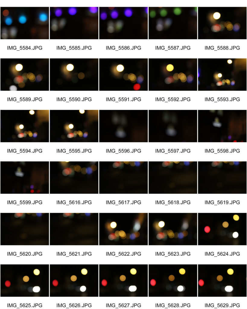
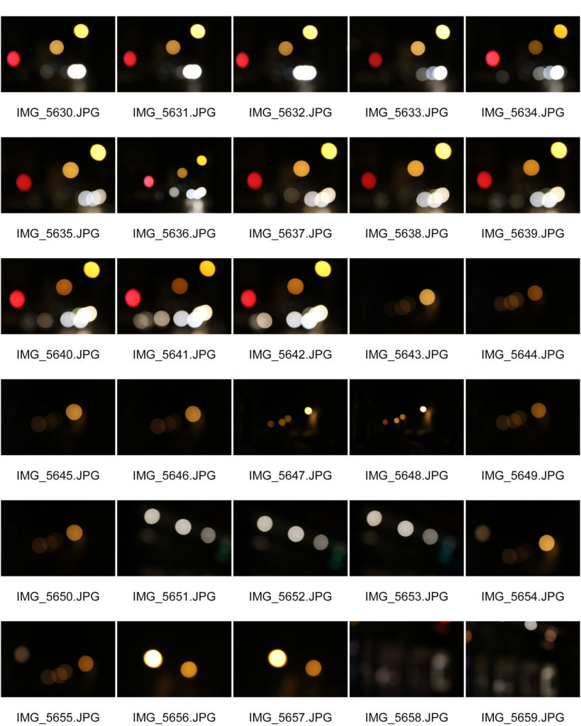
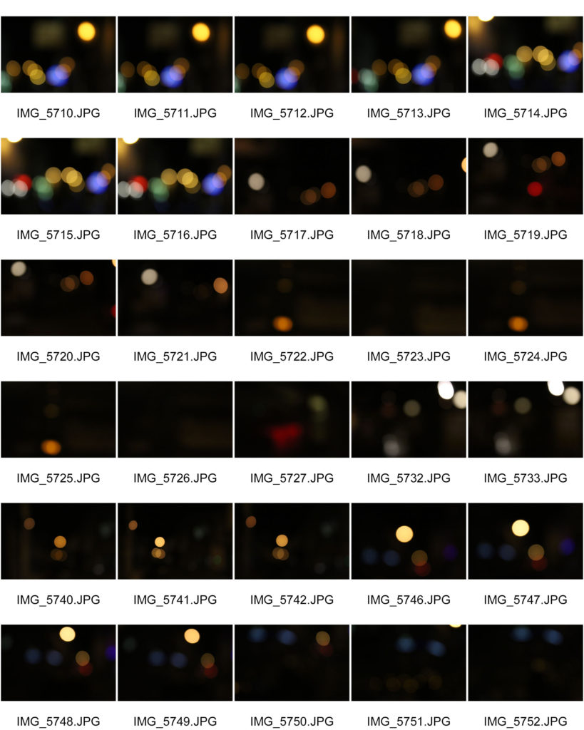
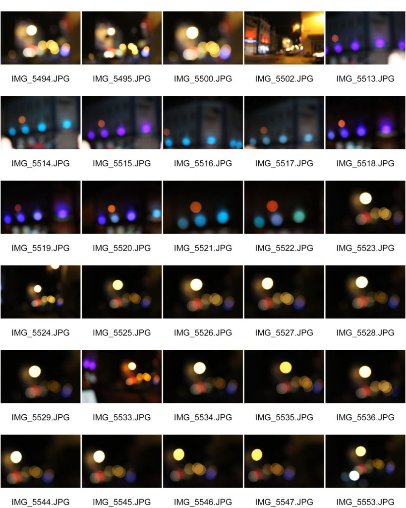
For this photo shoot i have decided to take images of different colored lights in the town central. I think this will be a cool idea as using the Bokha effect will make the different coloured lights look really effective. This shoot will also take place at night to enhance the contrast between the bright lights and dark night.

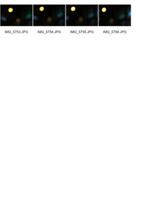
Contact sheets


Best outcomes 

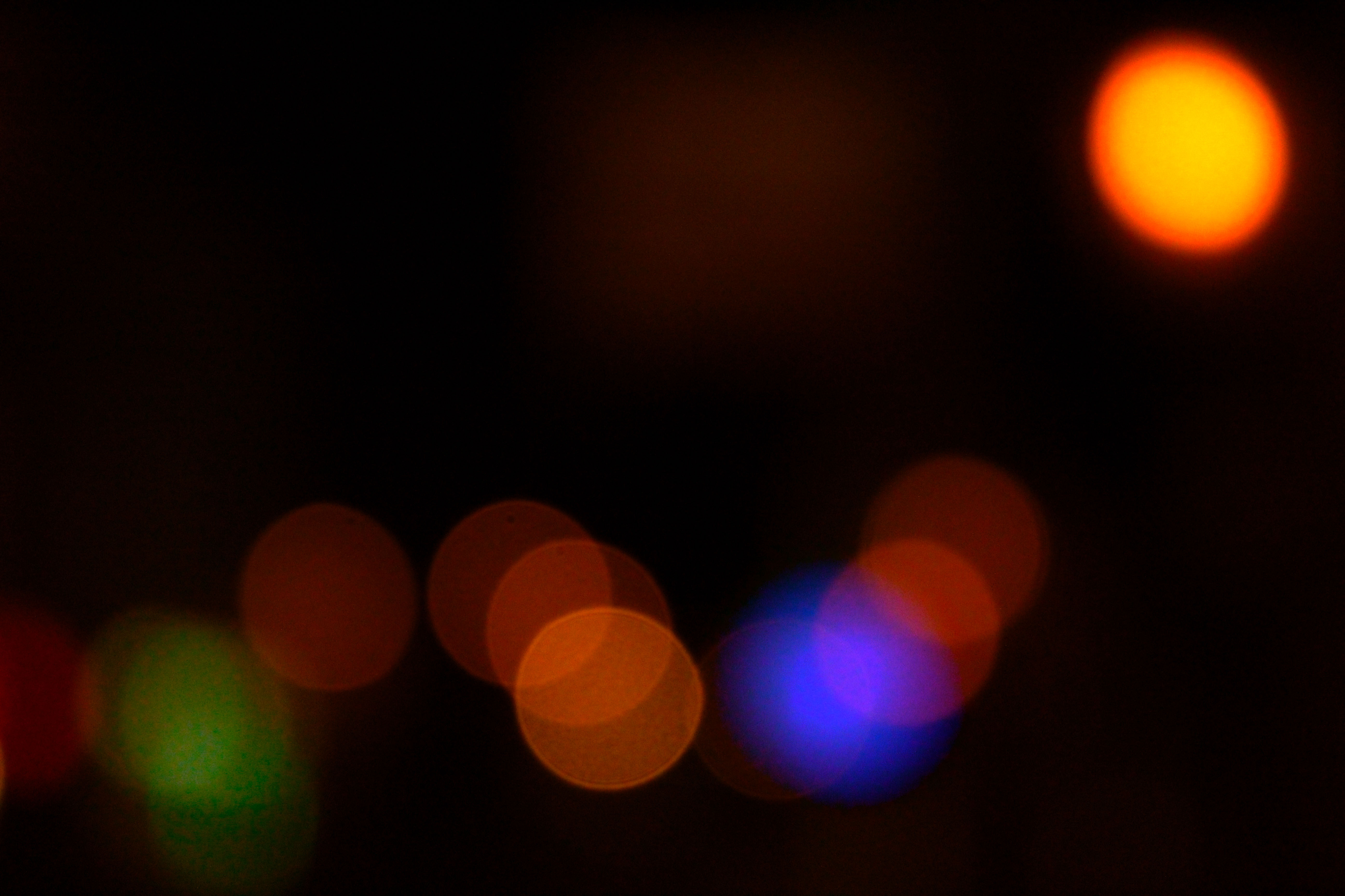
The image i thought was my best out of this first shoot was this picture as i thought the range of colours in the picture is really interesting and it would turn out very well when edited.
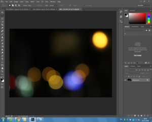
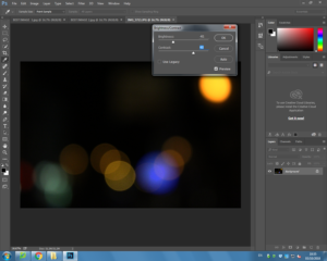
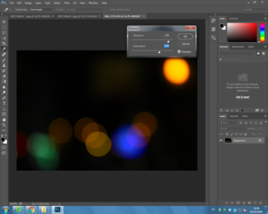
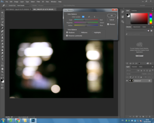
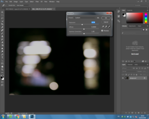
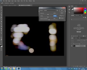
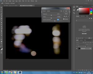
Editing my pictures from this shoot.. 
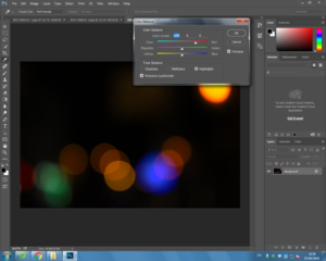
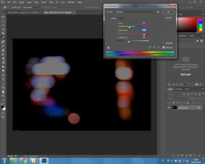
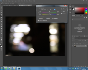
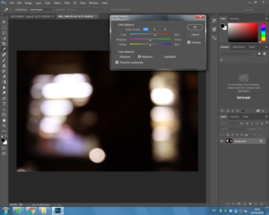
When originally taking this image it was taken at night with no flash  as i wanted to capture the range of colours.  This helps the image successful as it made the colours even brighter in contrast to the dark sky. While planning my editing stage i planned to use Photoshop to change the brightness, colour balance, contrast,  viberance and the saturation which would help me achieve my end goal.

When taking my images i used Canon EOS 1300 D and took all my images in Manual focus which helped me to create the Bokha effect.  When taking the image i also used a high shutter speed ( 1/250), using the fast shutter speed under exposed the image due to the black in the image. However, this helped me to achieve my goal of having the color and the darkness of the picture contrast as there was not much light let into the image. I also used an ISO of 6400 which again helped the contrast between light and dark.

The visual aspects of the image are shown through the colors in the image which is emphasised  by the tone of the overall light. There is not much texture in this image due to it being a 2D photograph. However there is a small pattern through the image with the way in which the blurred colors are shown. This pattern arrangement makes the image pleasing to the eye due to the selection of different colors which are very compact and help to contrast each other. There is no obvious rule of three in this image, however the right hand side is a little more  focused than the rest of the image which could be identified as the rule of three.

End image..
 

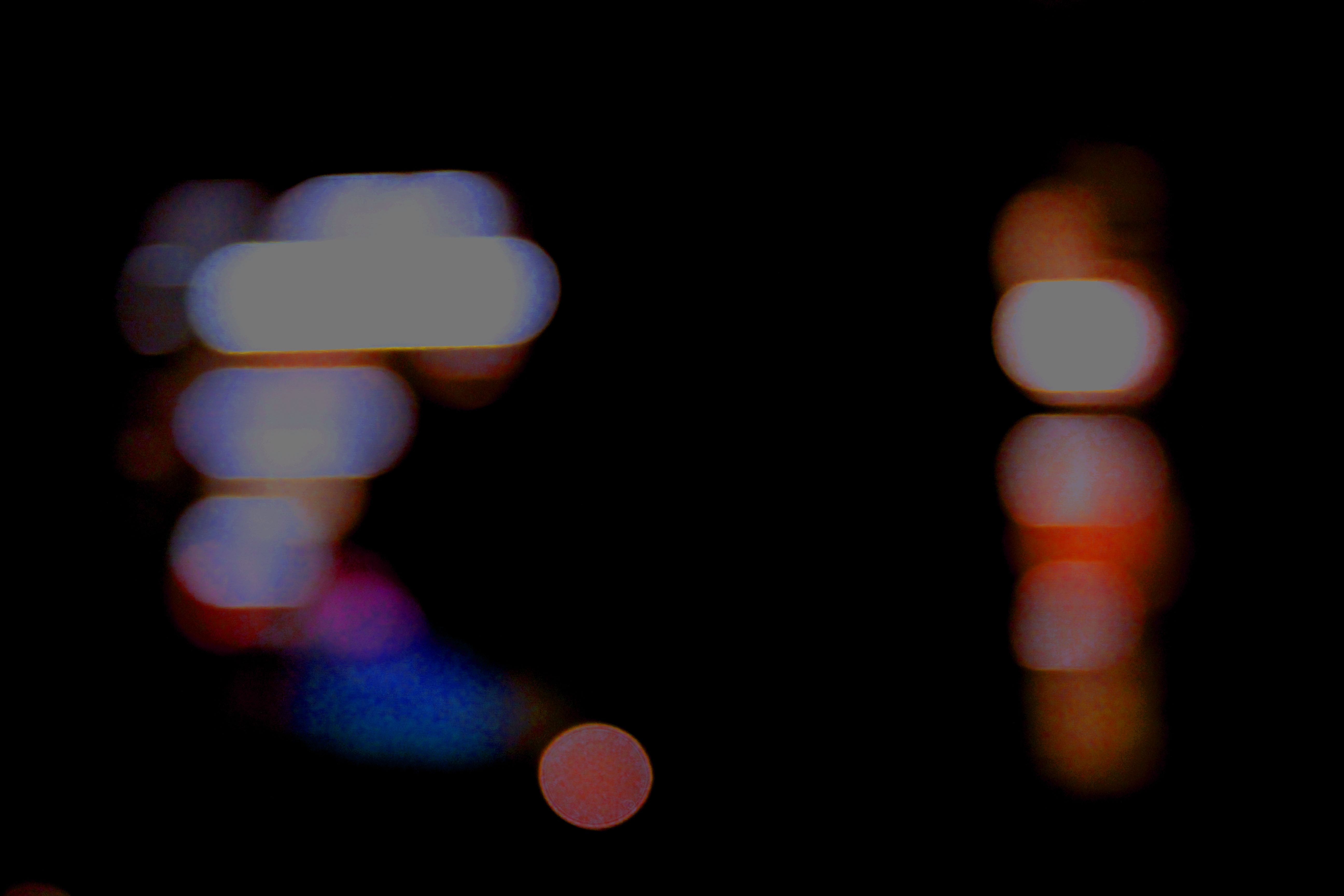
I think this is my most successful picture out of my second shoot due to the image being blurred but the image still being viable, as well as me liking the range of colours.
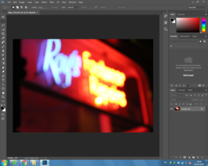
Editing my picture from this shoot.. 
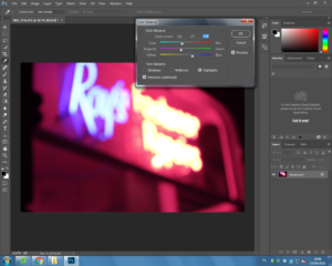
When originally taking this image it was taken at night with no flash  as i wanted to capture the range of colours. This helps the image successful as it made the colours brighter in contrast to the dark sky.

When taking my images i used Canon EOS 1300 D and took all my images in Manual focus which helped me to create the Bokeh affect.  When taking the image i also used a high shutter speed ( 1/250), using the fast shutter speed under exposed the image  and emphasized the darker elements in the photo. However, this helped me to achieve my goal of having the colour and the darkness of the picture contrast which was going to be hard due to the amount of colour and lighting the subject of the image has but the shutter speed ensures that there was not much light let into the image and allowed the darkness of the night to still be shown. I also used an ISO of 6400 because the higher the ISO the more light is noticeable in the image.

The visual aspects of the image are shown through the colours in the image which is emphasized  by the tone of the overall light. There is not much texture in this image due to it being a 2D photograph, as well as there not being much tone to the image due to the range of colours and the blur effect. I decided not to crop the image as i liked how the image overall looked and only wanted to focus on making the colours of the image more saturated as this was my main focus.

End image..
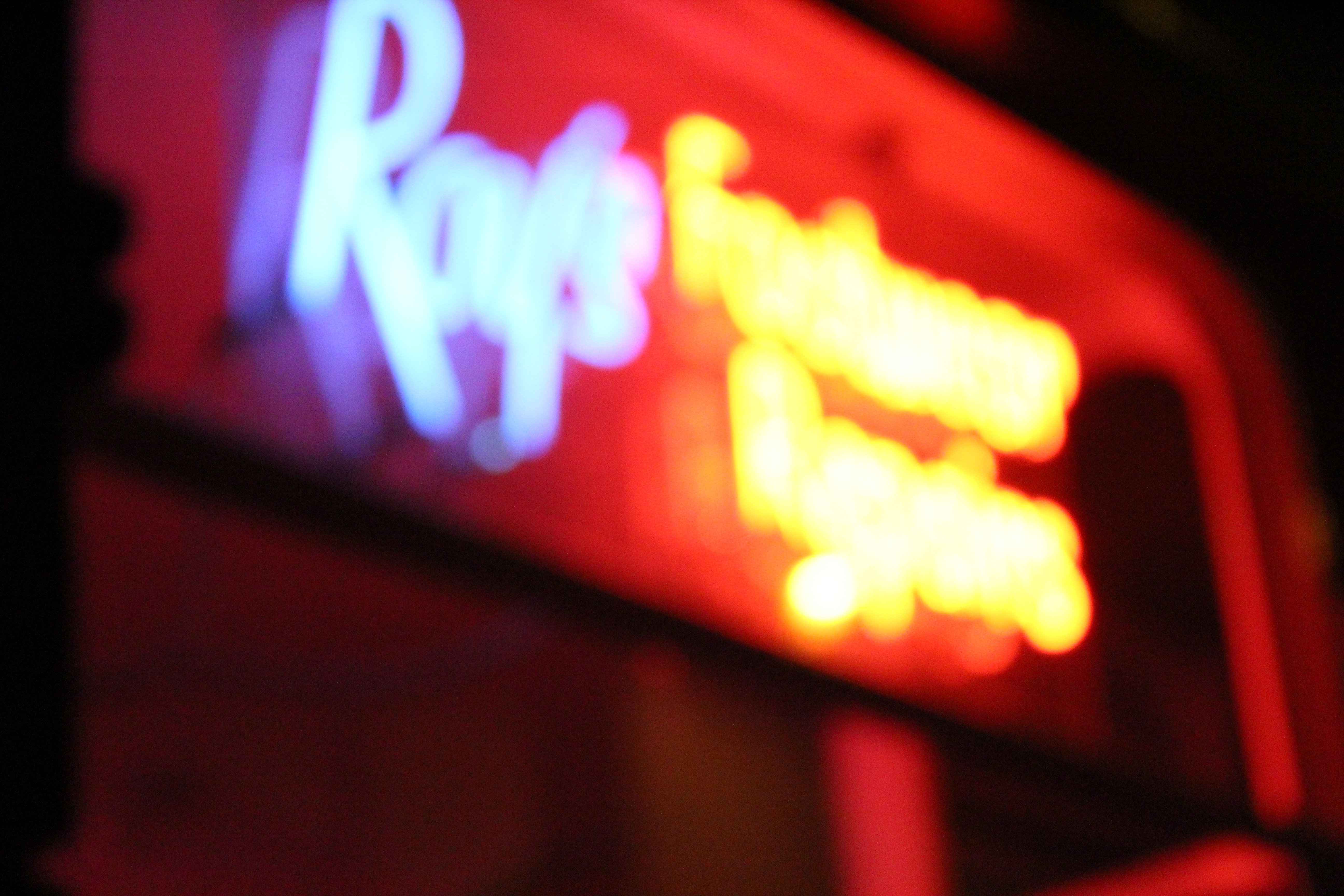
 

I think my most successful picture from this shoot is this image as it includes a lot of technical aspects and is very eye catching.
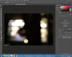
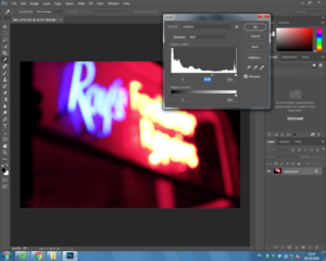
Editing the picture.. 

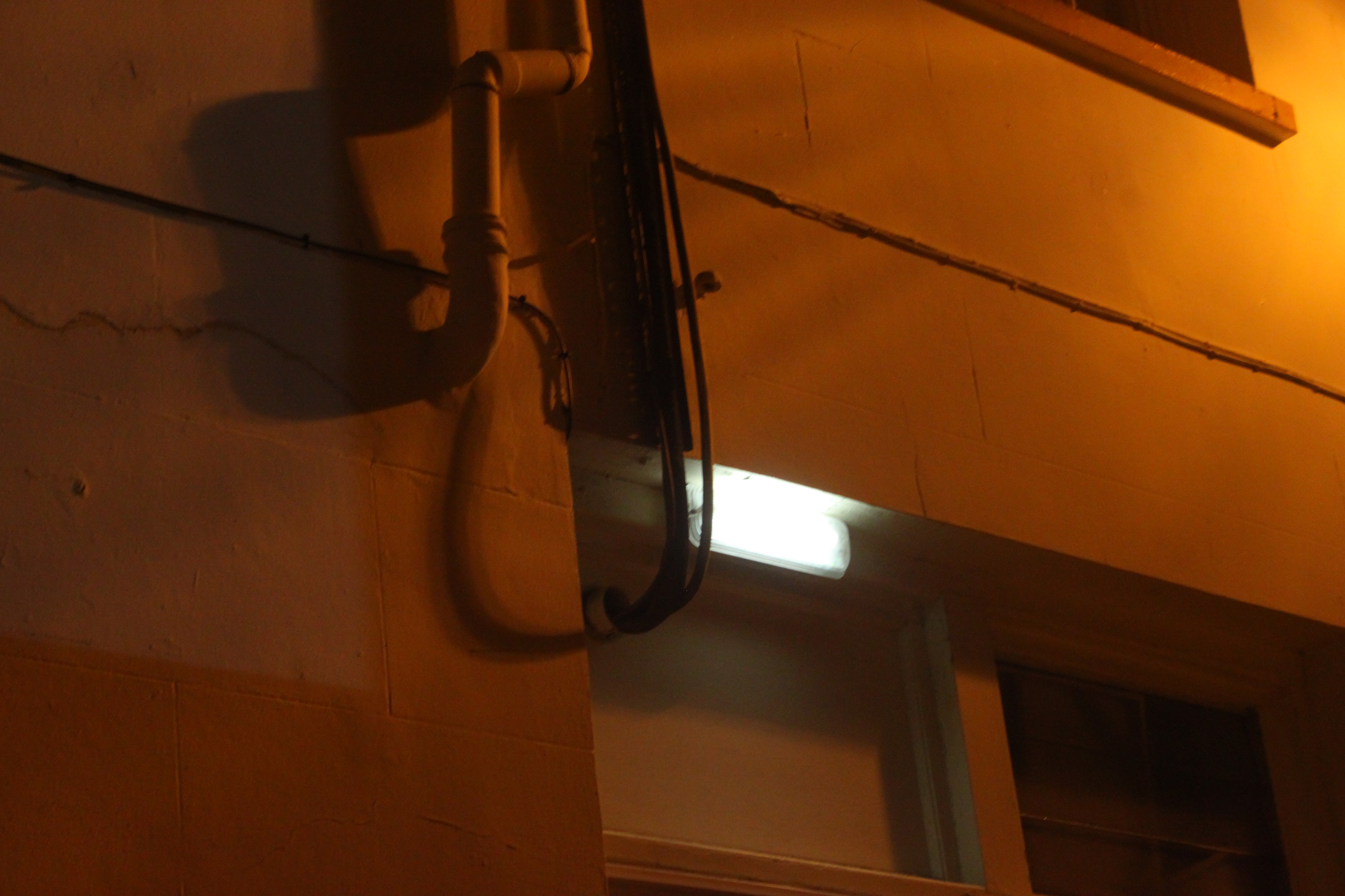
When originally taking this image it was taken at night with no flash  as i wanted to capture the golden colour from the street. This helps the image successful as it made the colour brighter in contrast to the dark sky.

When taking my images i used Canon EOS 1300 D and took all my images in Manual focus which helped me to create the Bokeh affect.  When taking the image i also used a high shutter speed ( 1/250), using the fast shutter speed under exposed the image  and emphasized the darker elements in the photo. However, this helped me to achieve my goal of having the colour and the darkness of the picture contrast . I also used an ISO of 6400 because the higher the ISO the more light is noticeable in the image.

This image is very visually simplistic compared to my others and unlike the others doesn’t include high saturated colours. I think the simplistic of the edited white light adds small amounts of detailing to colours around the light as they help to contrast each other and makes the image stand out due to all the darkness around it. I think the rule of three in this image also helps to make the image more attractive and it engages the audience.

Best outcome