Monthly Archives: October 2018
Filters
Keld Helmer-Peterson- My Final Pieces
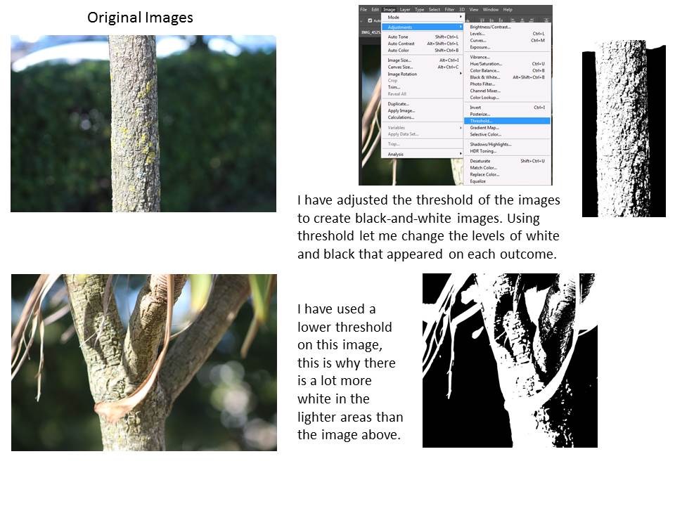
Steps on how to use Threshold on Adobe Photoshop
- Open your chosen photo of Adobe Photoshop
- Go IMAGE-> ADJUSTMENT -> THRESHOLD
- Slide the curser up and down to get different depths of black and white contrast intensities
- Create a new separate A4 page
- Ctrl + A and drag image into page
- Ctrl+ T to change the shape of the image

 My Own Idea with Threshold
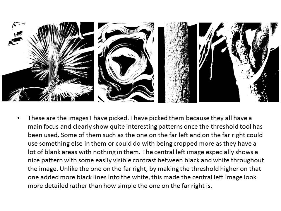
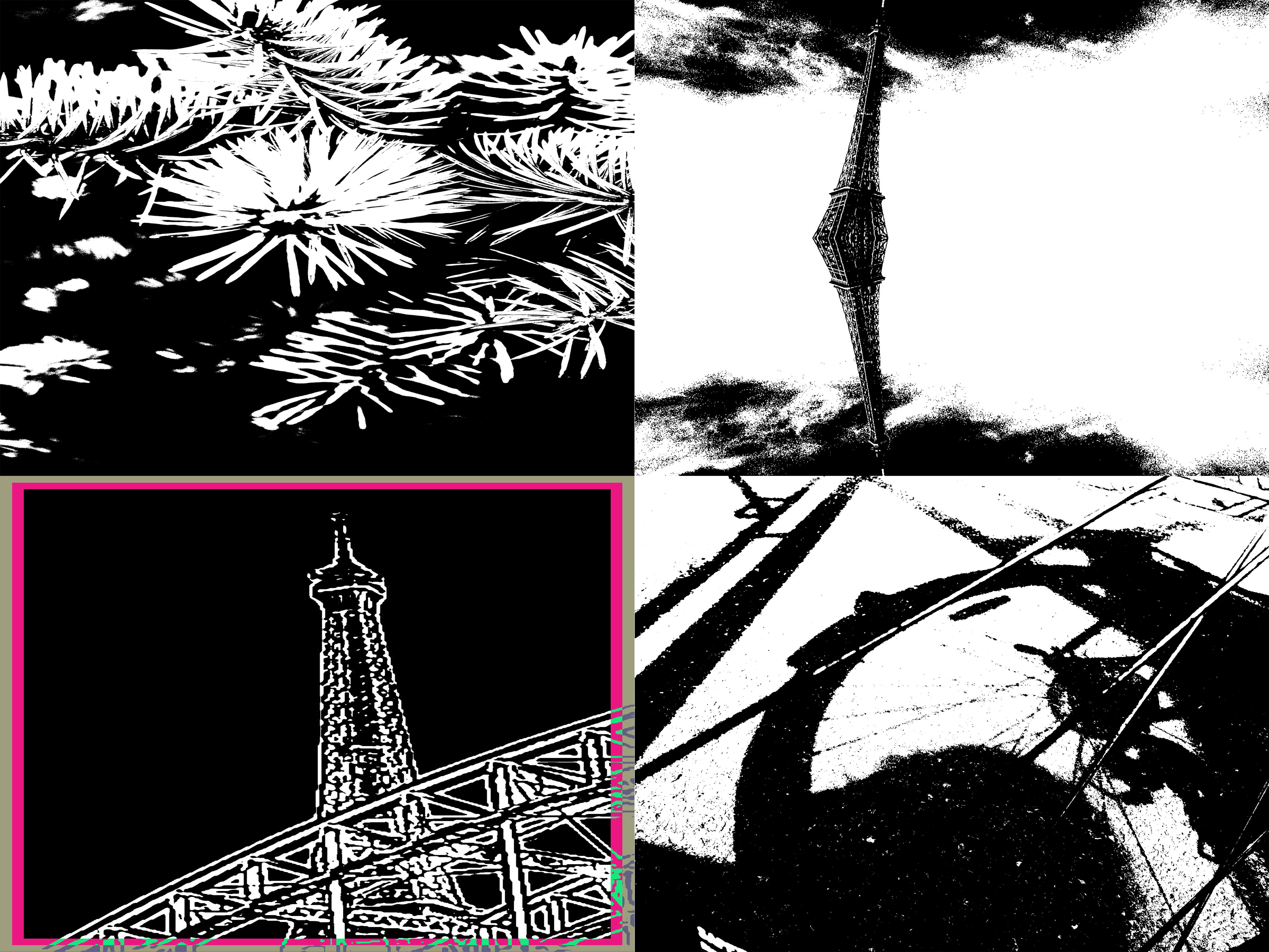
After experimenting with several different images, and trying different levels of threshold to help represent the contracts of black and white I chose these four photos as my final pieces. In these four photos I have used fairly high levels of threshold meaning the images are more strongly black compared to white.


For my final four photographs, I wanted to try closely link the textures and theme together to ensure the final piece looked well put together. To complete this idea I used a theme of nature, due the fact all my images were well linked as they included, a flowers and leaves in each photograph. This gave the final image a well grouped together appearance. For the texture of the image I wanted to go with ‘block’ like colour to give the feel that the image has been filled in with white and black pens. To do this the threshold on each image was slightly higher than the middle level on the scale, I did this because as previously mentioned I wanted the piece to be darker using black to reflect that rather than white, so each image contained more black shades than white shades. This made it a lot simpler when I put the four pieces together as they all merged into each other well together. For the presentation of my four images which had now been transformed i wanted to keep it simple, therefore i just placed evenly all four images on an A4 piece of paper and this was my final outcome.

On the other hand I wanted to complexly contrast with my original idea of solid colours and little texture. Therefore I began to experiment using different images and different levels of threshold which soon presented me with many different textures. I yet again put another four different images together but this time tried to portray texture and threshold in a different light and this is what I came up with:

Abstract Depth of Field Photoshoot
Ralph Eugene Meatyard was born in 1925 in Illinois. He studied pre-dentistry but later changed his studies into become an optician. He bought his first camera in 1950 to photograph his first new born child. In 1954 he joined the Lexington camera club.
Though Meatyard experimented with lots of different ways to take images such as using multiple exposures and blur. He often worked with very heavy depth of field effects in his images and normally worked in black and white. He may have worked with heavy depth of field effects to reflect his job as an optician. These can be seen especially well in his “Zen Twigs” project.
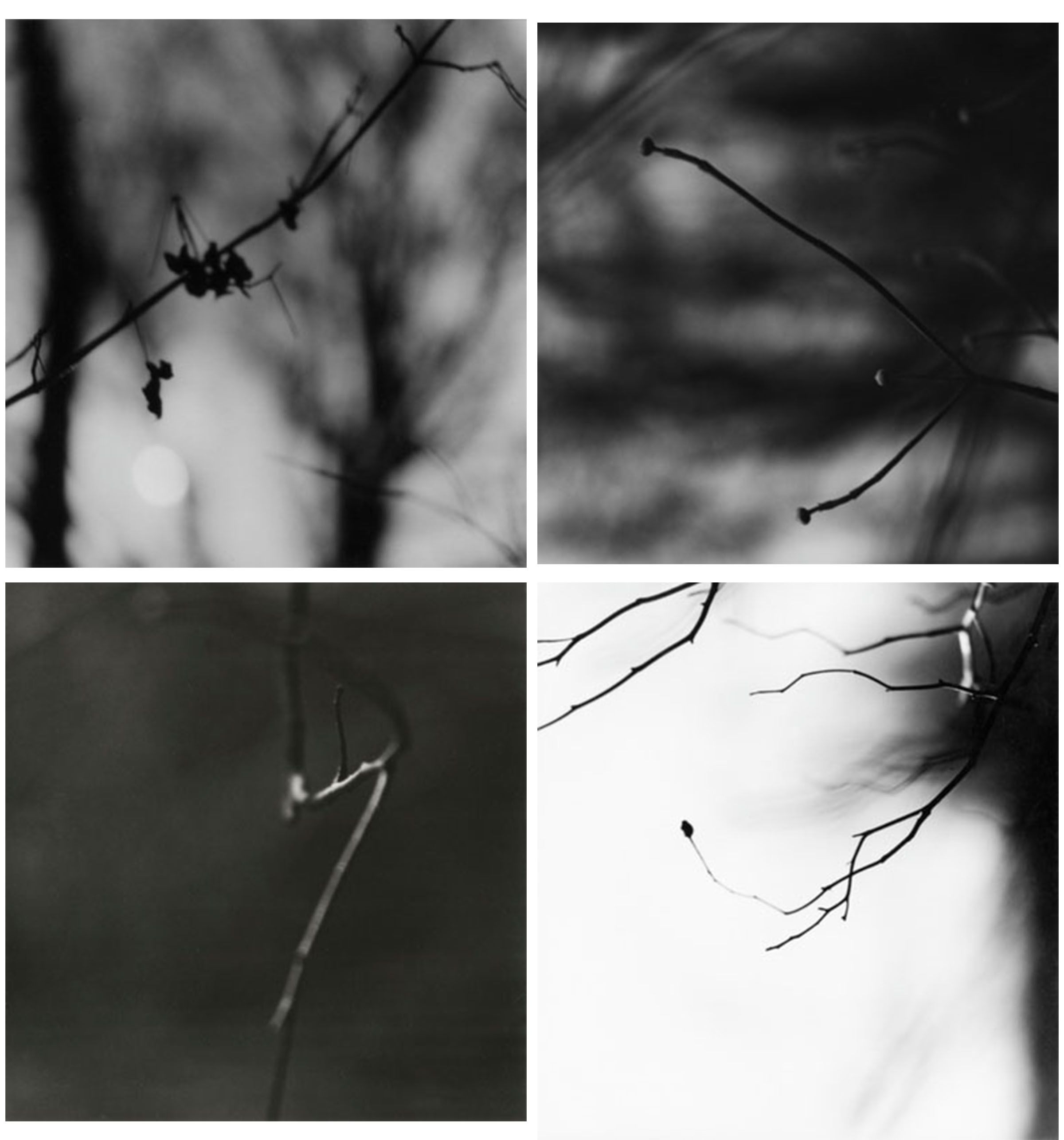
This is a selection of my favourite work by Meatyard. These are all images from his “Zen Twigs” project. In this project he focused mostly on depth of field to make the images look simple.
After researching about Meatyard, I went out and took some images like the ones from his “Zen Twig” project. After I went out and took some photographs I went into photoshop and edited the best ones. I have done this to crop them down to the parts I wanted, to make them black and white so they’re more similar to Meatyards project and to change the exposure levels to make some of the images a lot darker than the others. I have changed the exposure to make them darker so that the blacks in the images stand out a lot more over the whites. These are the best images I took on this photoshoot:

The image shown above is my favourite image that I took. In this image specifically I have added a lot of exposure to make the dark areas stand out a lot over the white. I think this image mimics Meatyard’s work the best out of the images I took as it shows a very heavy amount of depth of field around the focus point. While the image below don’t show nearly as much.
The images above and below show branches in focus in the foreground with a lot of depth of field in the background. These images follows closely with Meatyard’s work due to the main focus point and the huge amount of depth of field in the background. If I were to take the above image again I’d focus further in on one part of the branch rather than the whole thing. While the below image I am happy with how it turned out. 
Conceal / Reveal
My first attempt of the task:
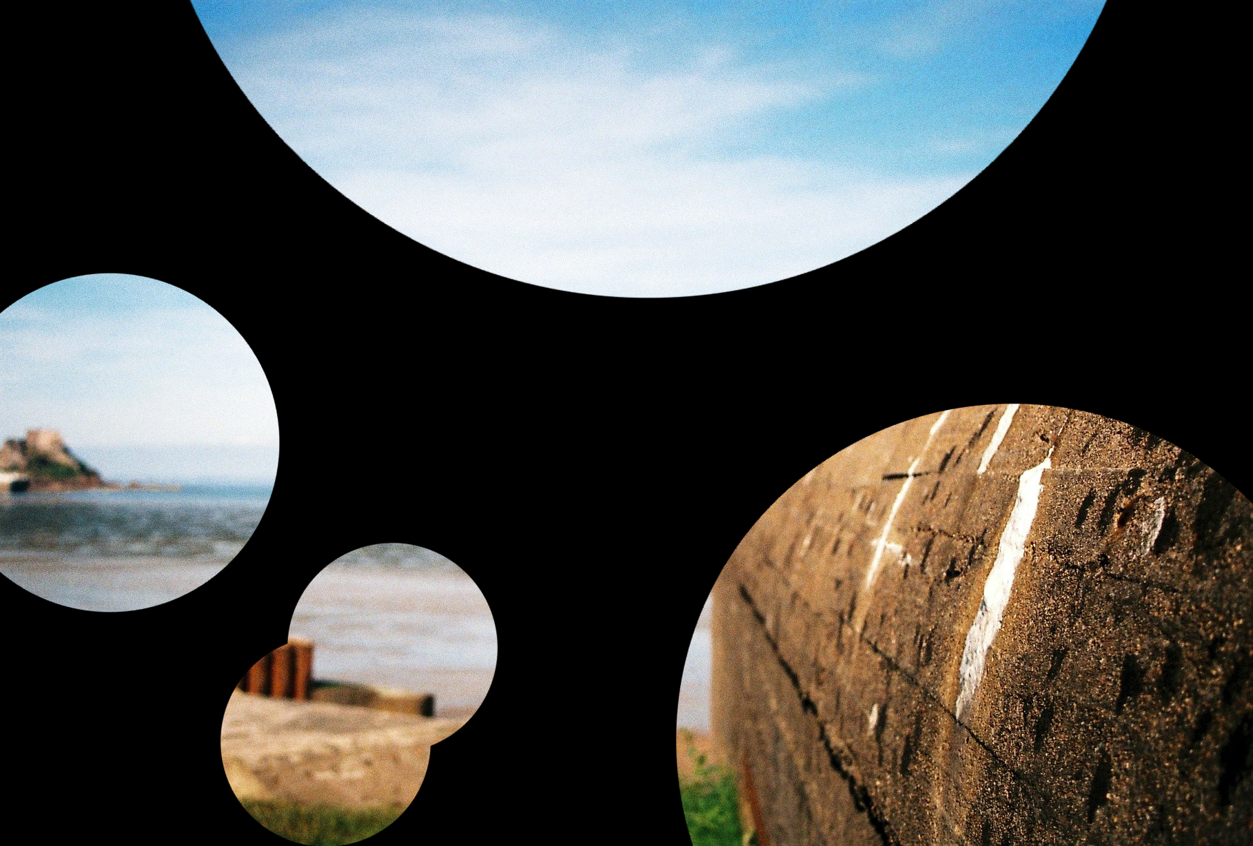
I am not sure what I think of this because of the photo and the fact that the bunker in the foreground is too big to put in one circle.
Then I developed my ideas and made these:

The above slide shows me using the content aware fill to remove some of the larger imperfections.

i chose this photo because the main subjects (the ends of the piers) are small enough to fit in a circle and i can get the sun and the reflection in it to.
Conceal/ Reveal Other Experiemnts
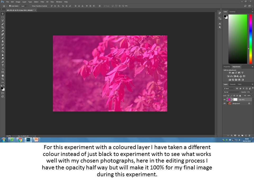
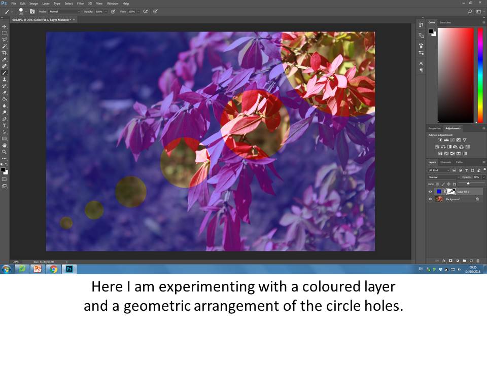
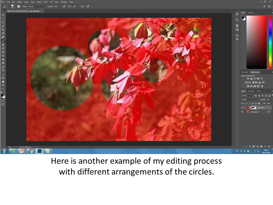
After experimenting with just using a solid black layer and the circles I will continue to experiment using different coloured layers, different circle arrangements, different opacity of the layers and using previously edited photographs for different effects.
Solid Colour Layers and Circle Arrangement
Final Outcomes
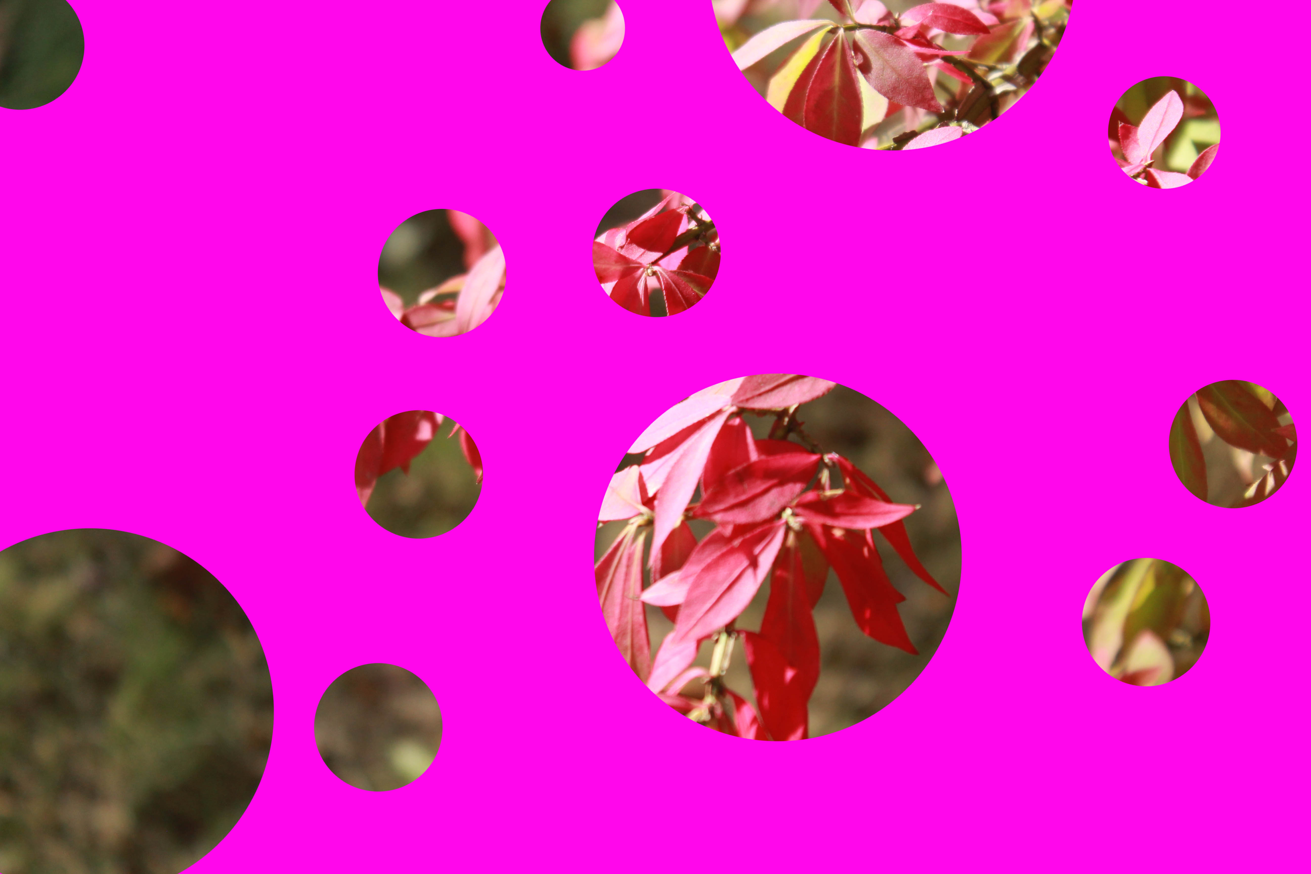
Solid Colour
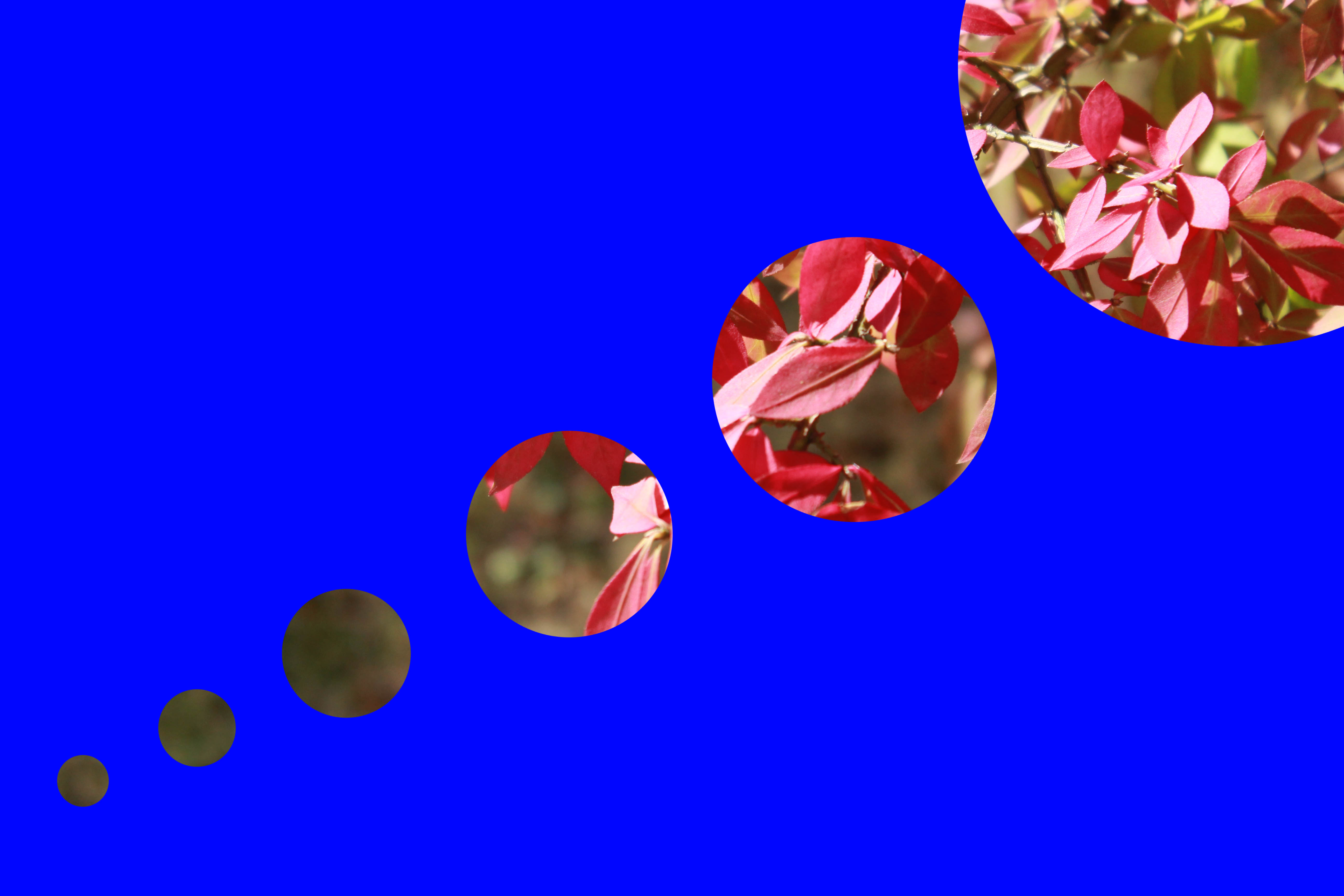
Solid Colour and New Arrangement
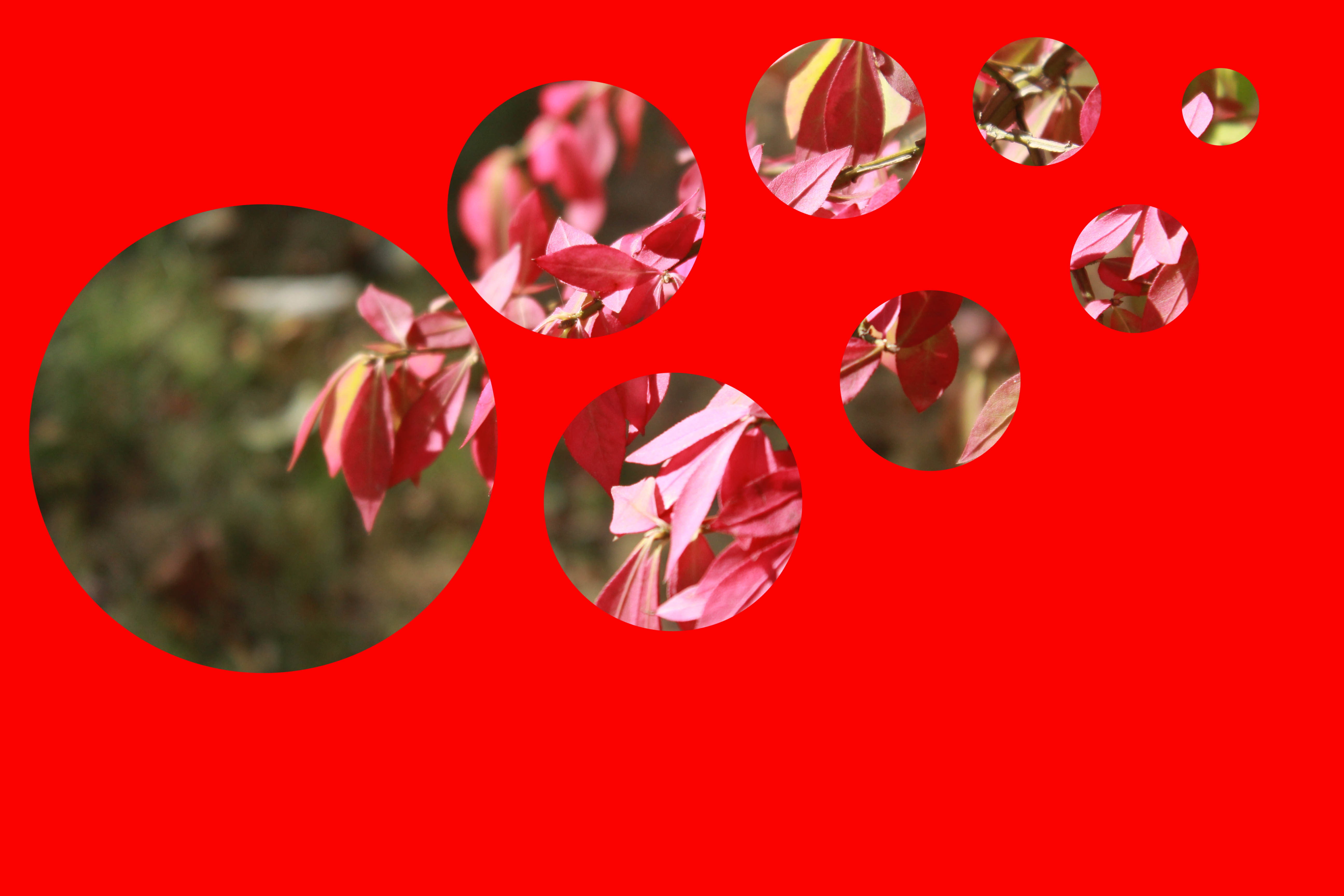
Solid Colour and New Arrangement
Above are all my final outcomes for the experiments I have produced. I feel they have worked well and I have been able to find different ways to arrange my circle holes and also the effects of using different colours as the solid colour.
Different Opacity and Previously Edited Photographs
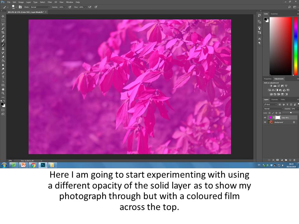
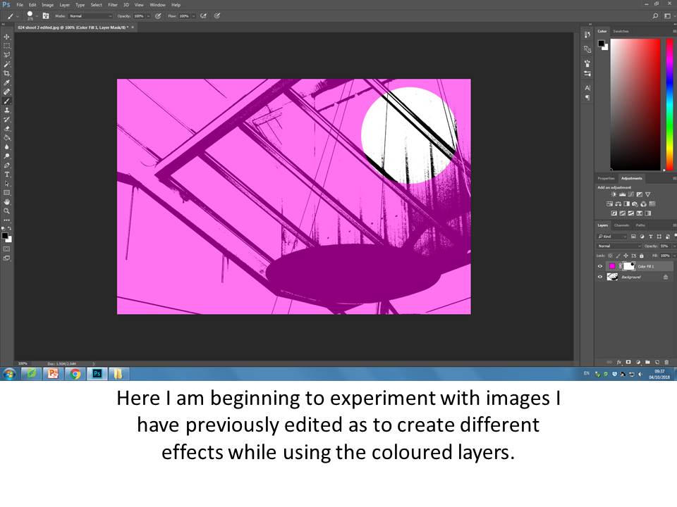
Final Outcomes
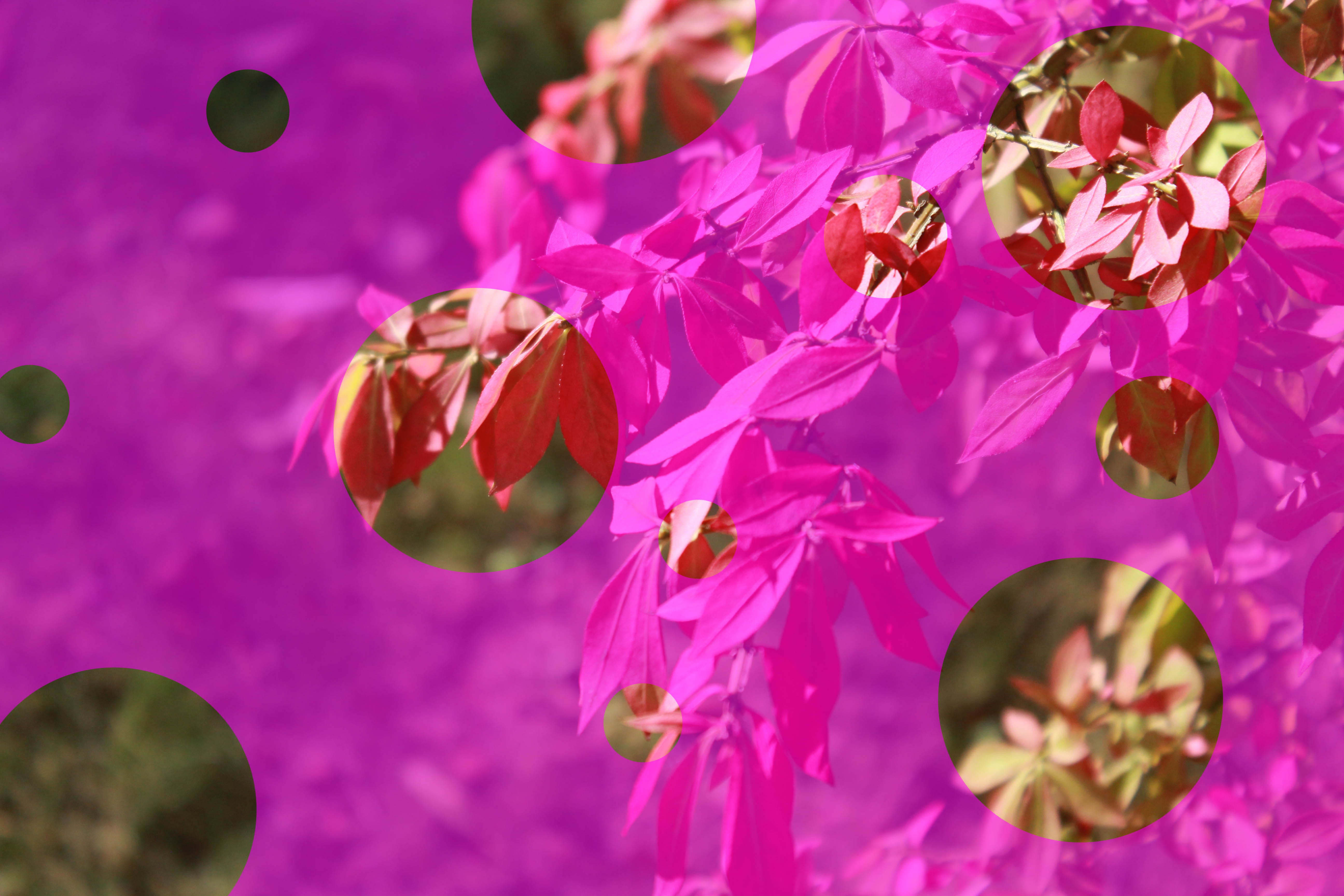
Using a Different Opacity
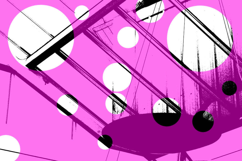
Using a Previously Edited Image, Different Opacity
These are more of my final outcomes for other experiments that I produced, I feel these I my most successful as I think they show a range of experiments by using my previously edited photographs and also the different opacity of the solid layers.
Conceal/ Reveal
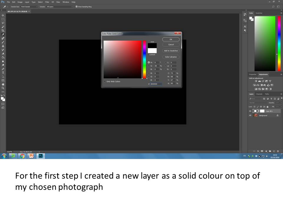
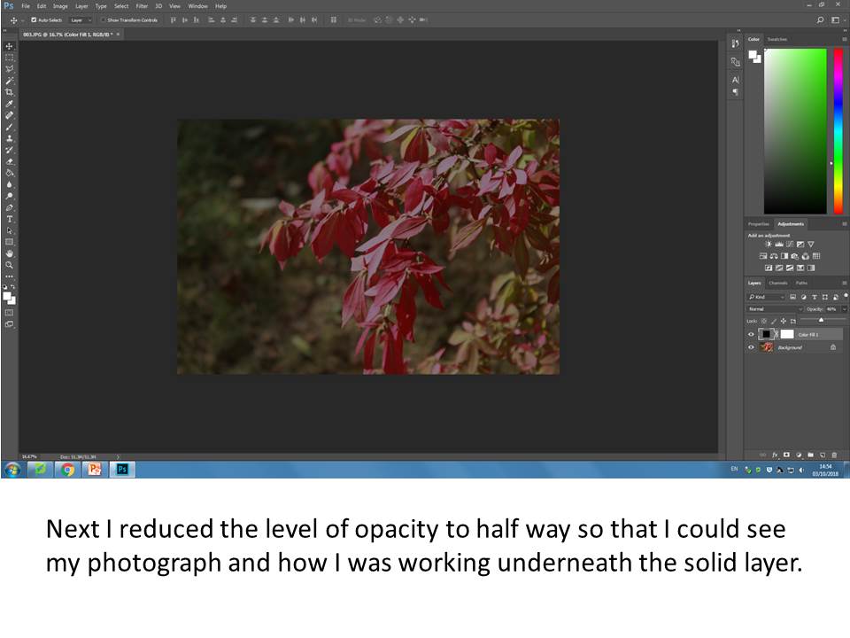
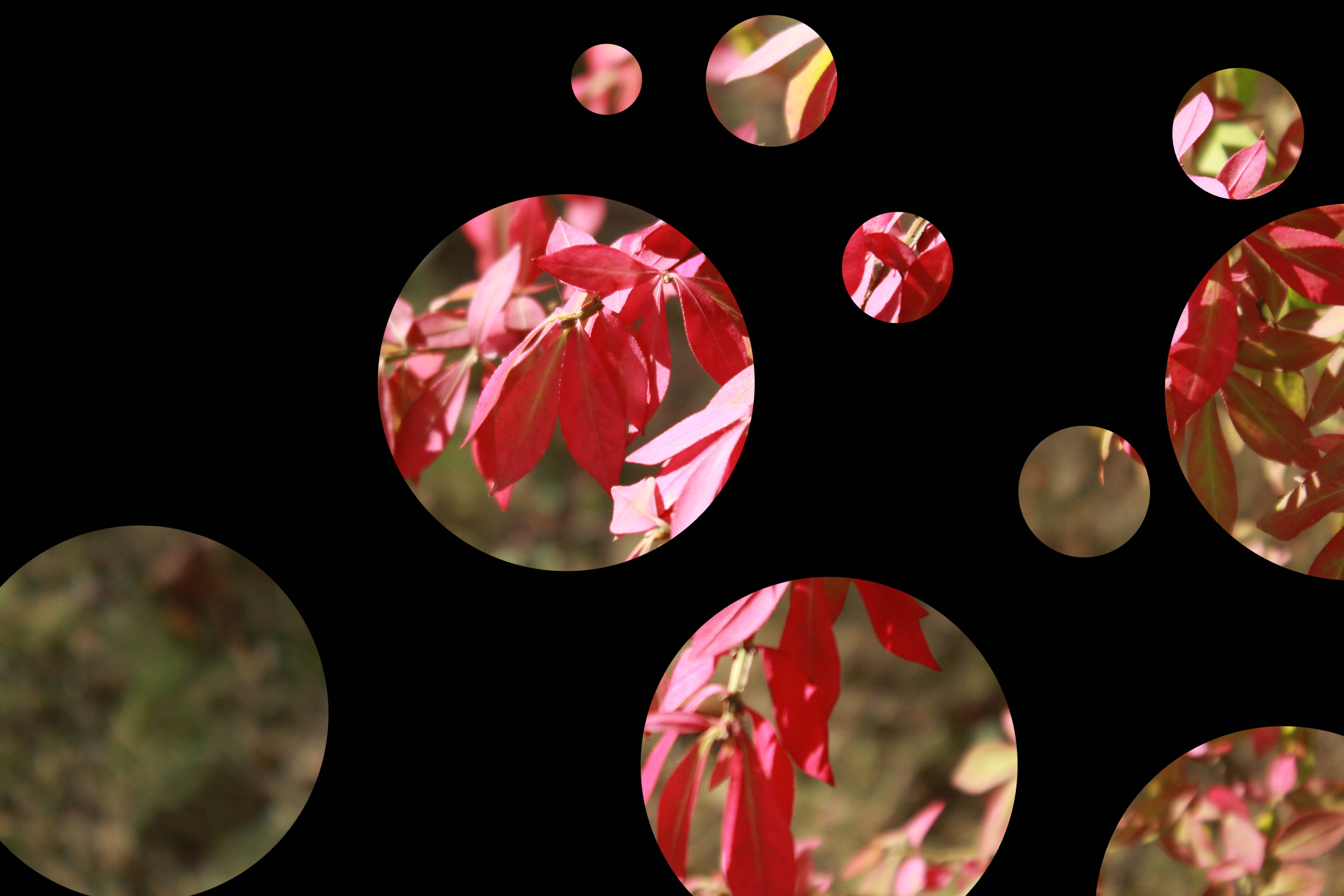
For this experiment I will be exploring using layers as layer masks to reveal and conceal areas of my photographs and exploring different ways to do this.
Chosen Photograph to Experiment with
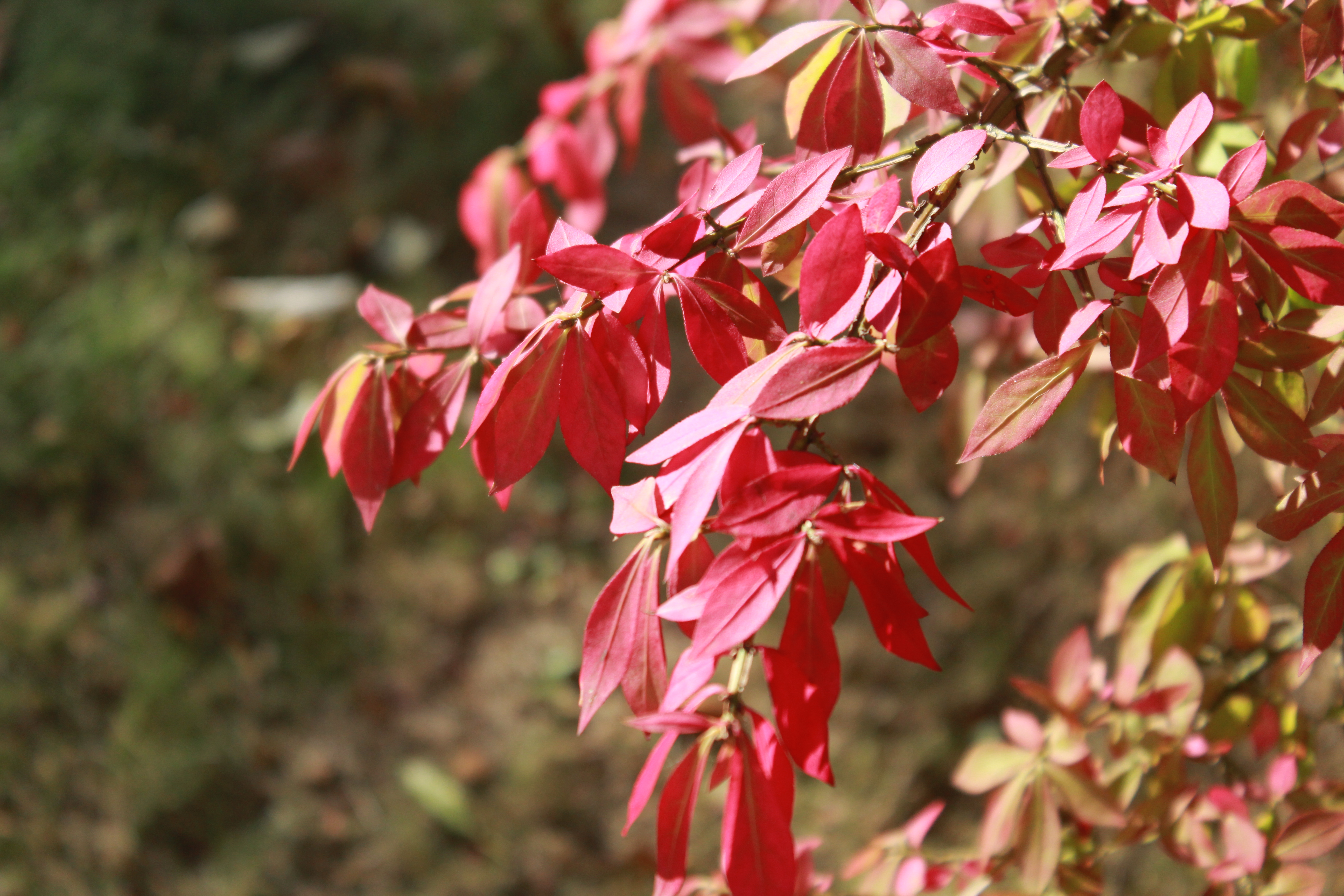
Editing Process
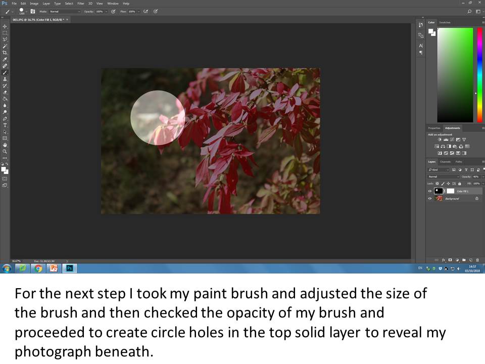
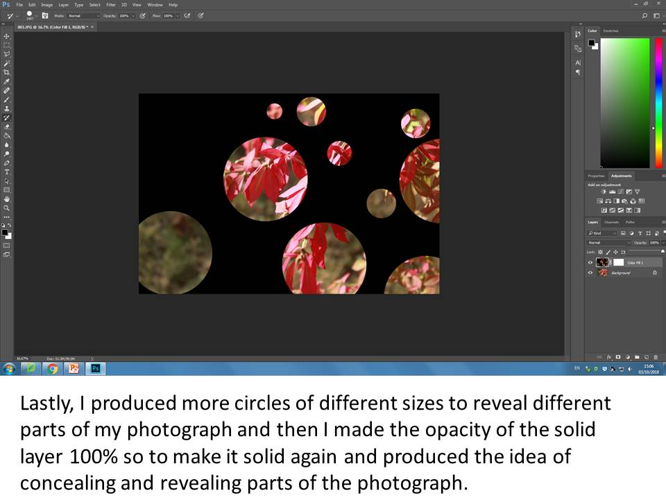
Final Produced Image
Keld Helmer-Peterson Threshold Experiments
Helmer-Petersen was a Danish photographer who was inspired by Albert Renger-Patzsch, the experiments at The Bauhaus in Germany and by Harry Callahan and Aaron Siskind at the Art Institute of Chicago. He achieved fame for his colour photographs but he also published several books of black and white images that explore dramatic contrasts of tone. In some, we are only presented with images that are black and white. All mid tones have been removed. He created and found these images, using both cameras and flat bed scanners to achieve the effects he was looking for. These books are beautifully designed and encourage us to consider the space around the image and the accompanying text as integral to the meaning of the work.
https://tallisalevelphoto.weebly.com/black-light.html
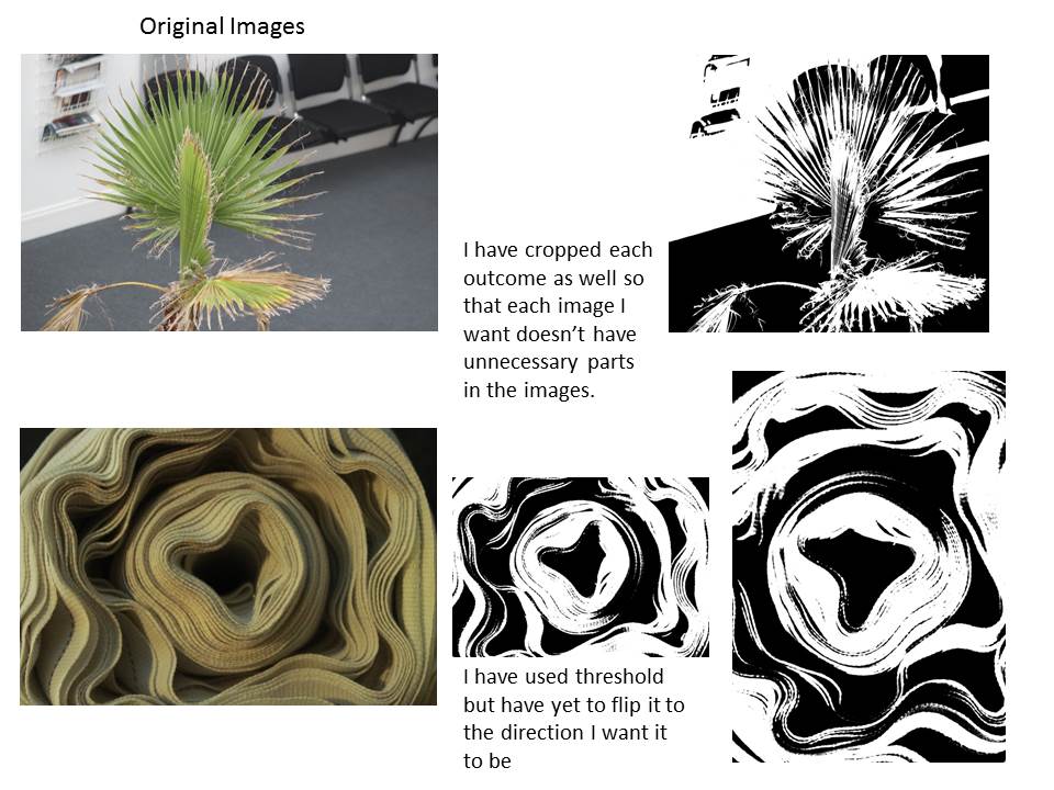
These are my experimented ideas, I have chosen to use different pictures and seeing the result of the threshold adjustment.
Here i have chosen my favorite 4 photos out of my edited photos using threshold. I have chosen the photos as they still contain a lot of detail which is what I wanted especially the close up of the plant, this is my favorite image out of my for images as it has more character than the others. the second best image is the one of the close up of the Eiffel tower as threshold effect has made the solid lines more solid and the image I found is the most abstract out of this project as there is only focusing on the detail of the lines it also looks better in black and white instead of using colour.
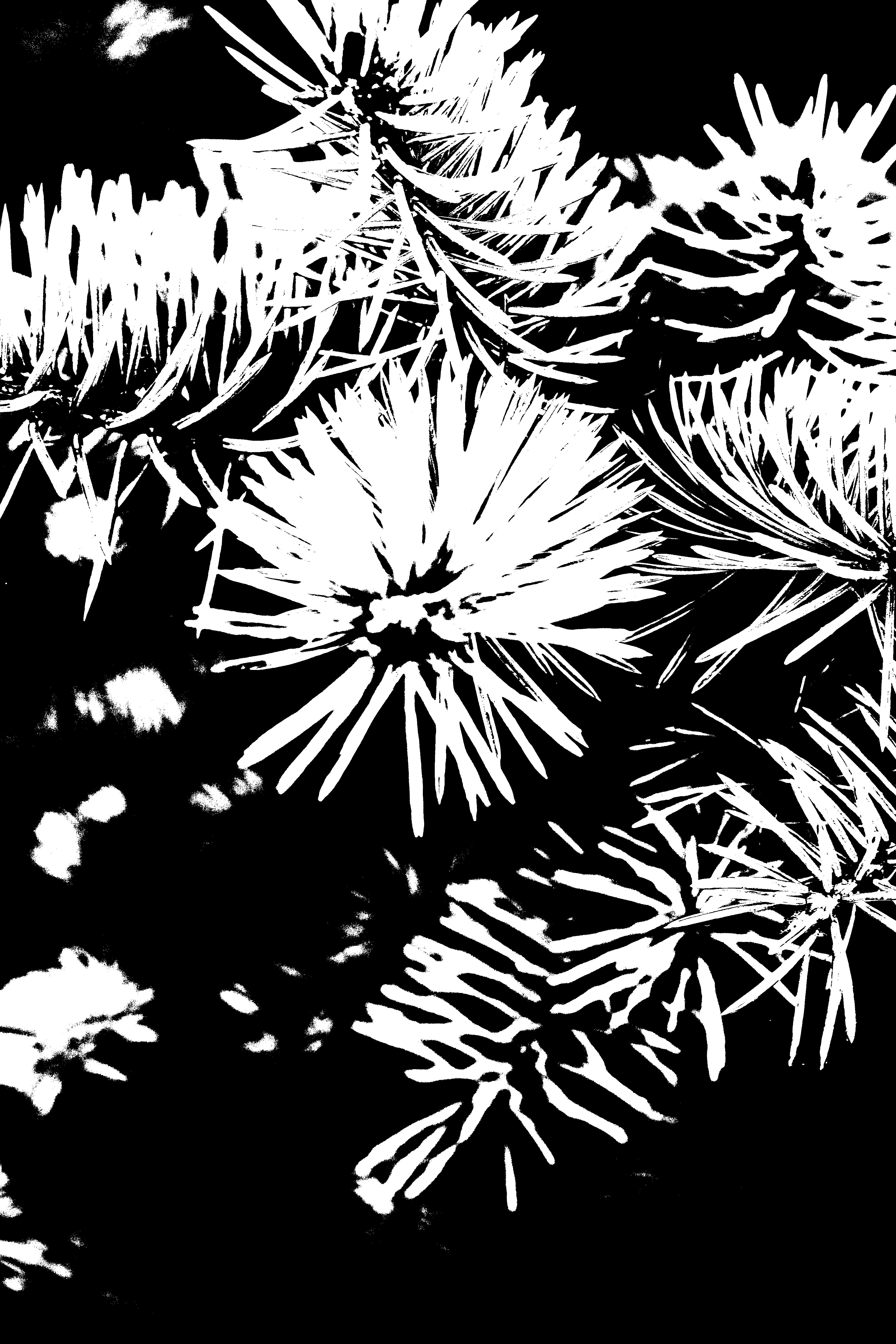
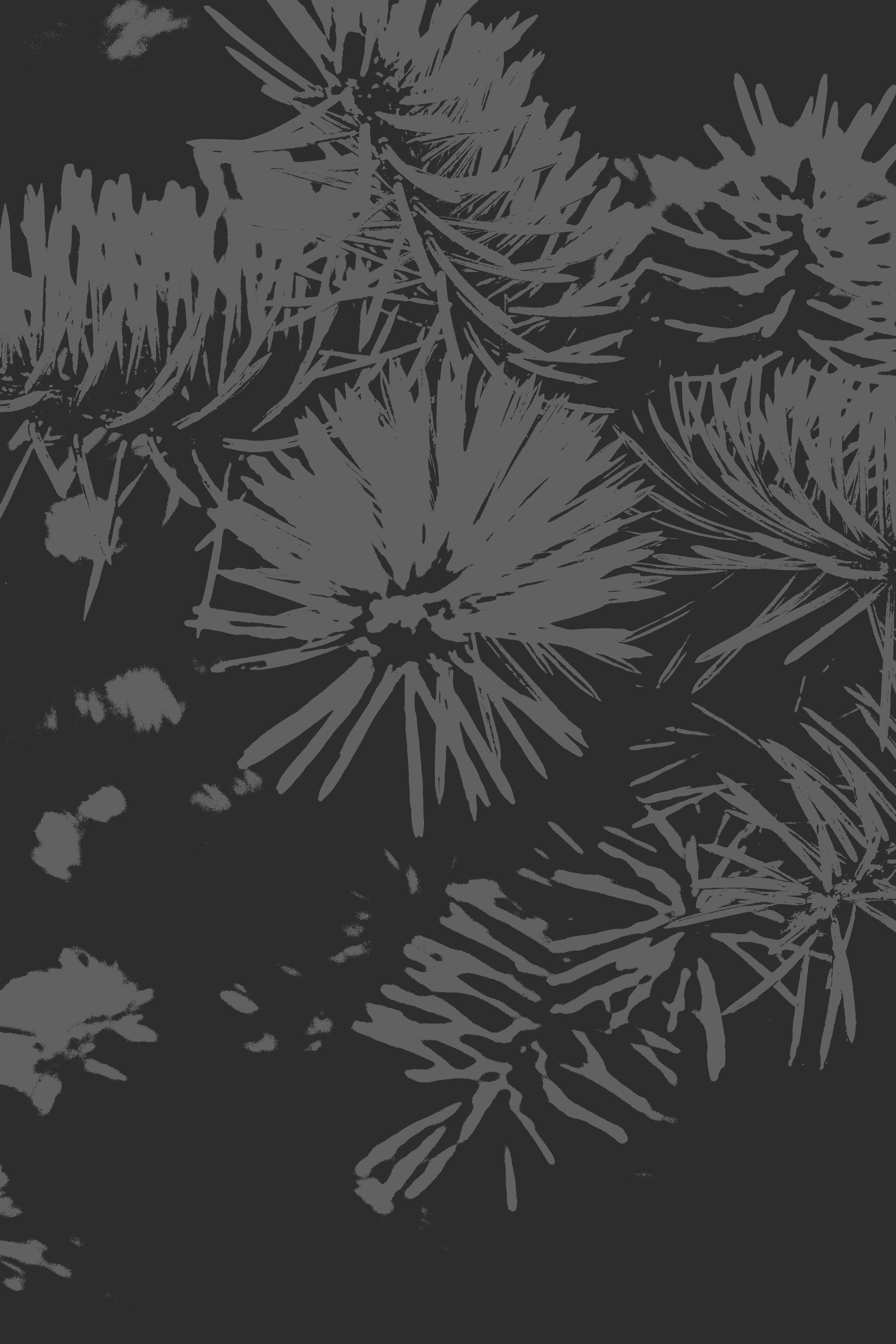
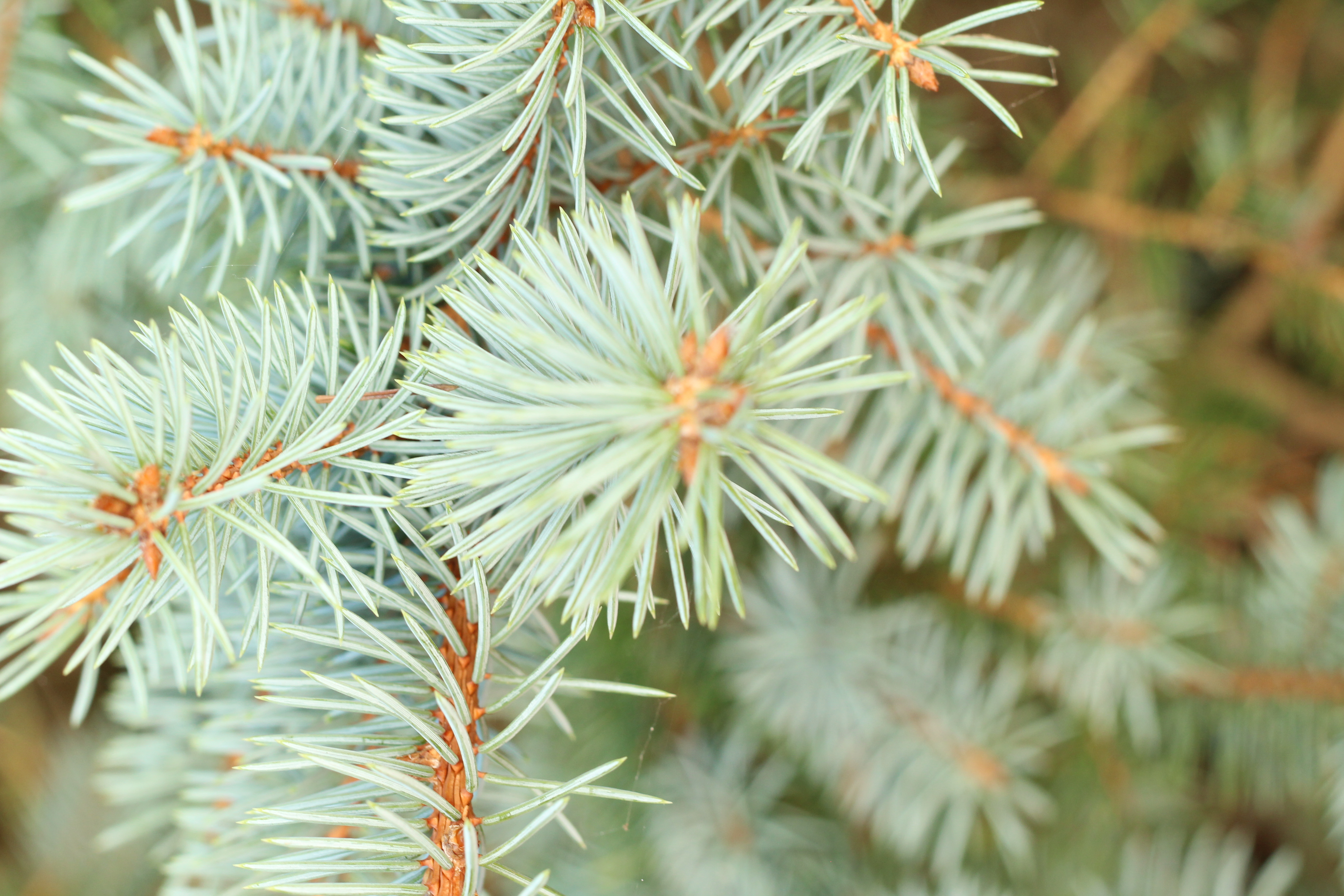
This picture below is of a close up of the plant I like this picture as in black and white there seems to be more detail within the image which is presented. I used the threshold adjustment which made it go into black and white and it adds more detail and a sense of it coming out of the page. I have included the original photo before I started editing the photo so I can compare the differences of before and after. In my opinion I prefer the edited version as it makes me feel that the picture is actually coming out of the page which is different to the other picture. In the second edited photo I used the edited photo but afterwards I changed the contrast and brightness so that it was darker. I have included it but i didn’t like it but included it as a comparison.
For this photo I decided to again use the threshold adjustment, but I didn’t like this outcome due to the fact the detail within the photo was taken this was because it wasn’t very abstract and the lines were very close together so the shadows collided making it darker.
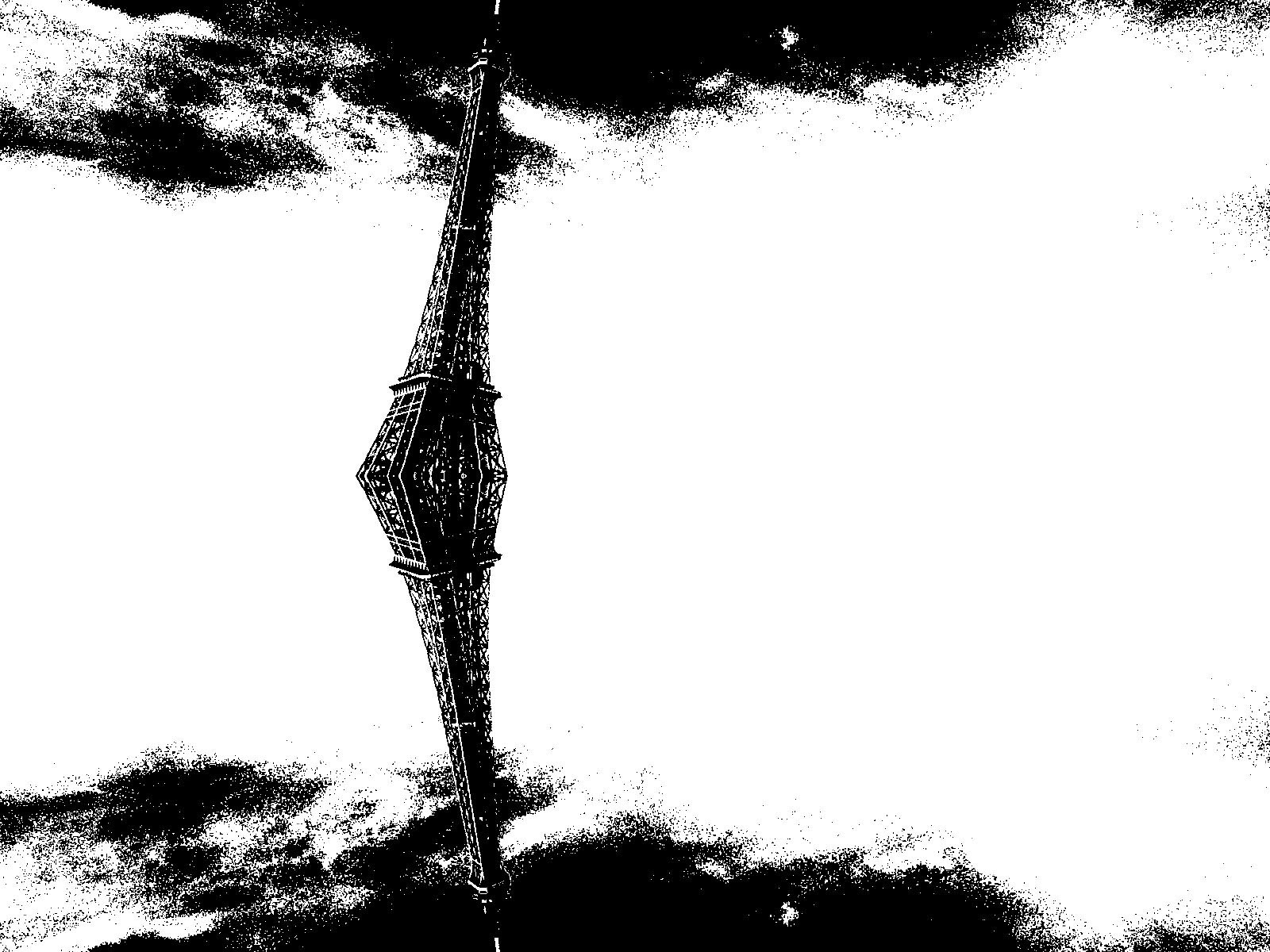
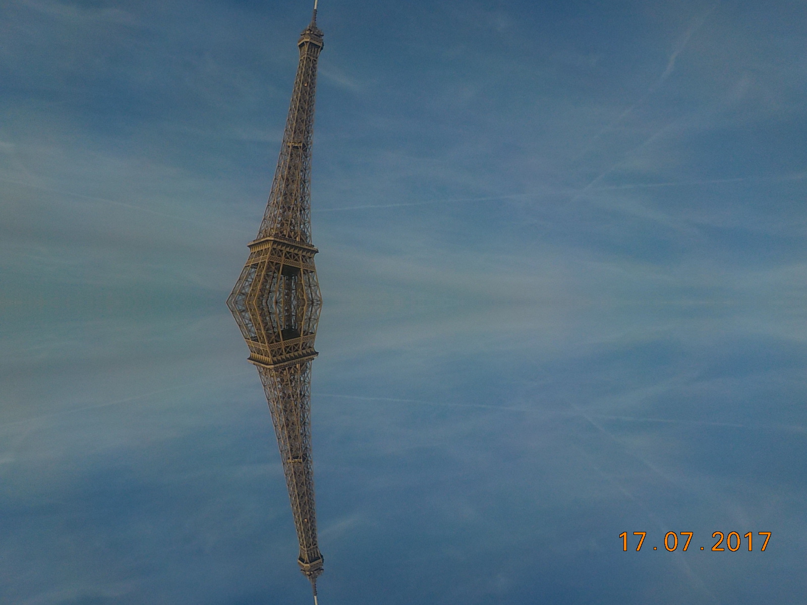
For this photo I used the threshold adjustment making it into black and white. I like it as the detail within the picture is still present however I don’t think it would be classed as abstract as there is a definite lines and it isn’t close up. I also after using the threshold adjustment i decided to add a and invert which converted the picture into white and then the lines were black I found this very basic and I didn’t like it however i decided to include it as a comparison between the original and both of the edited photos. On the threshold edited photo I included a Stroke to identify my favorite out the of the edited photos.
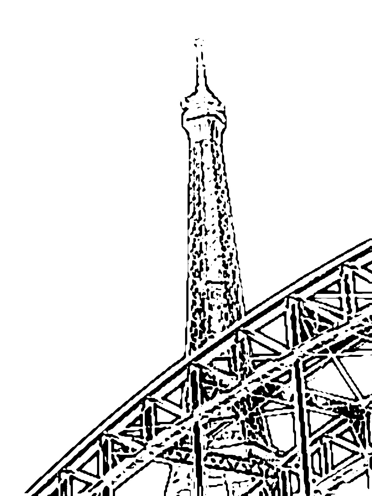
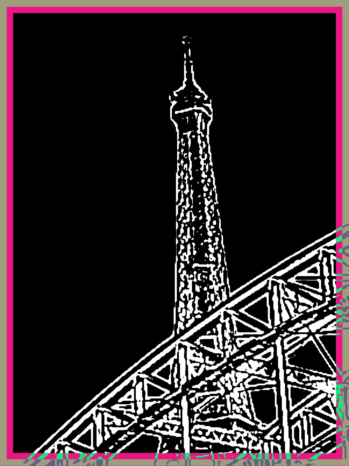
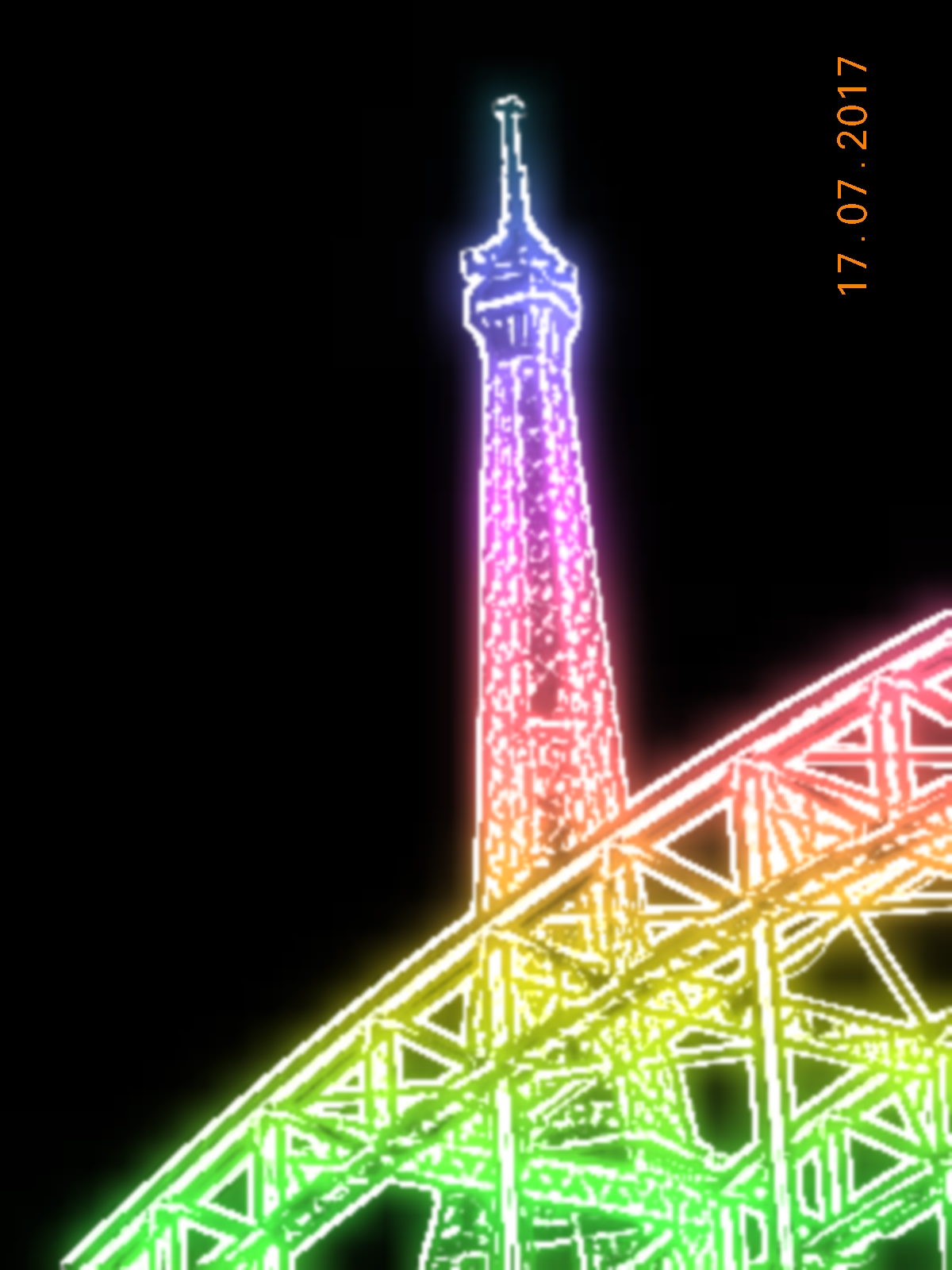
I decided to use this photo below to see what happened when I choose the very basic picture and used the threshold adjustment to convert into black and white however I found that the edited consisted of little detail and I preferred the original photo as it contains more things to focus which maybe not abstract however the edited would be classed as abstract.
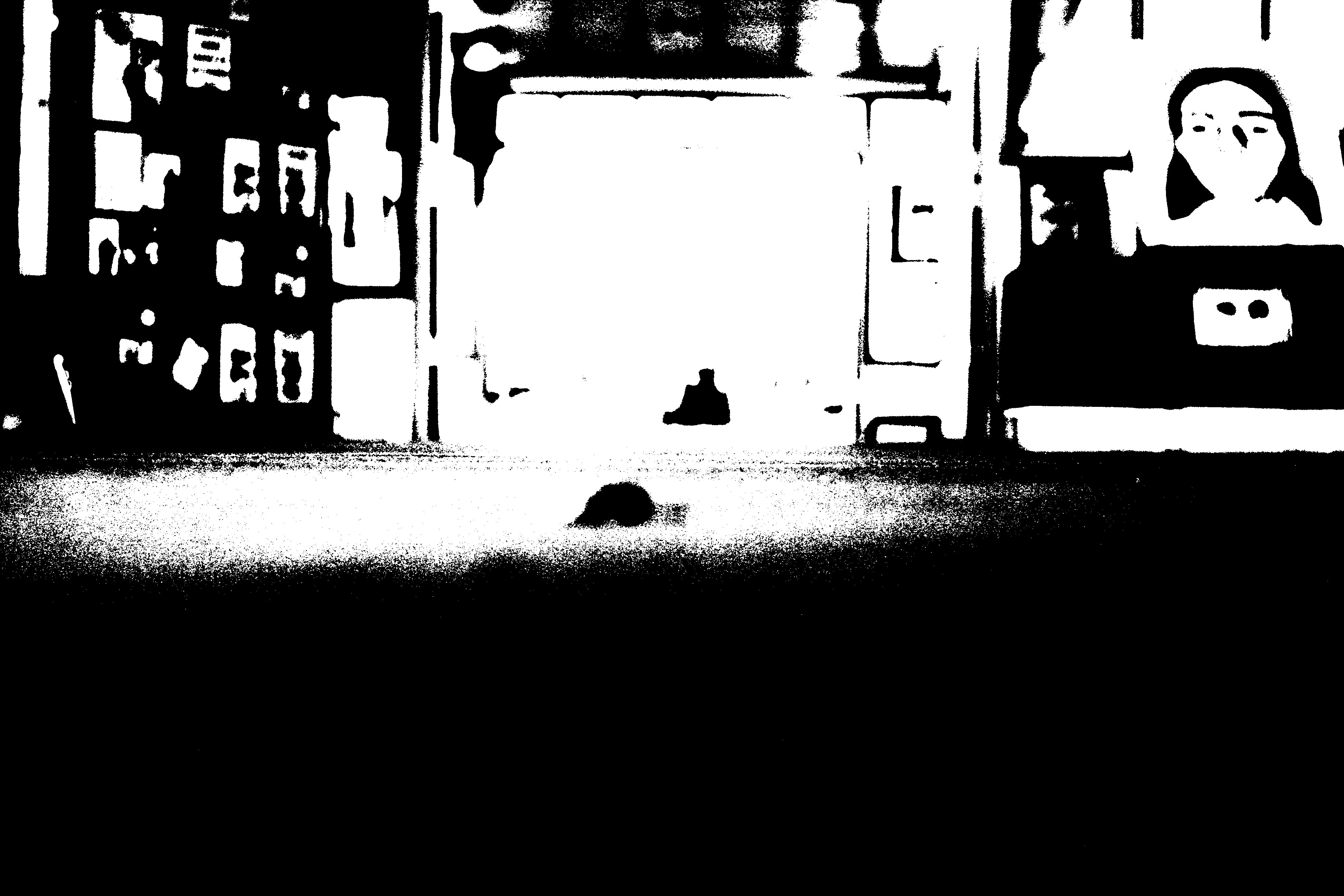
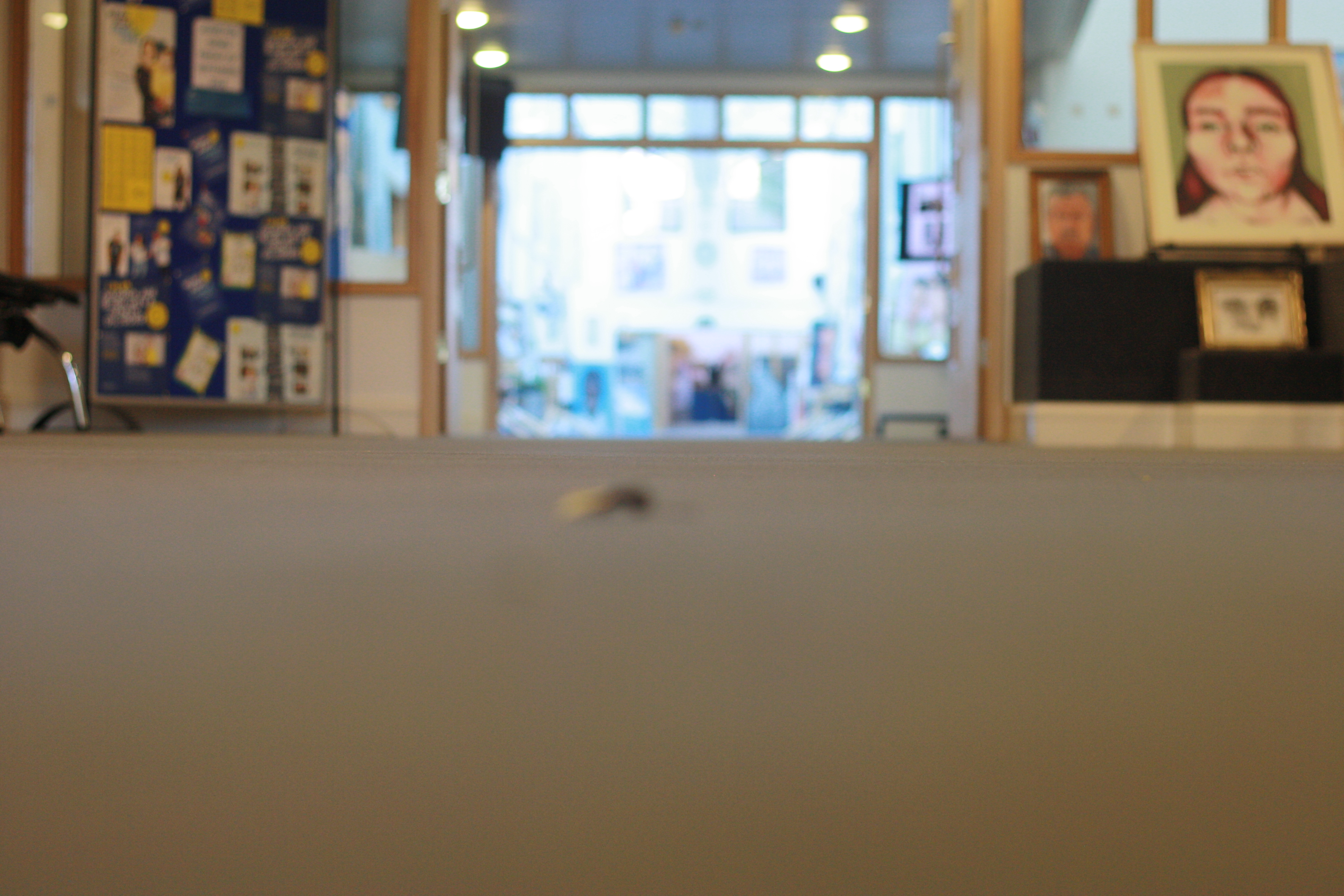
I chose this picture as it was very simple and I thought about the idea What would it look like if i used the threshold tool. I thought that it was a good outcome as all the shadows reflect the tree. Comparing it to the original photo I prefer the edited photo as you can see the shadows more clearly than the original.
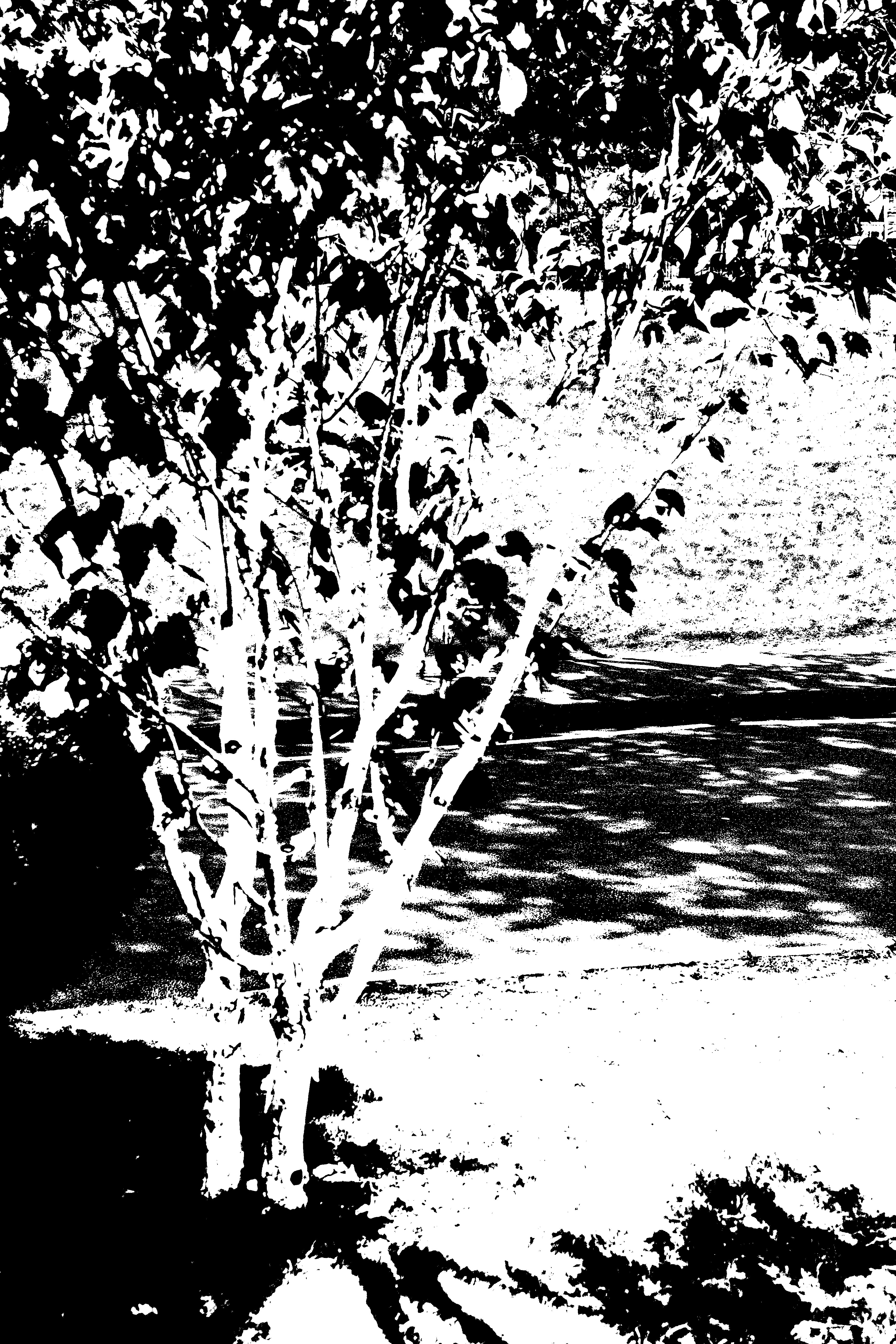
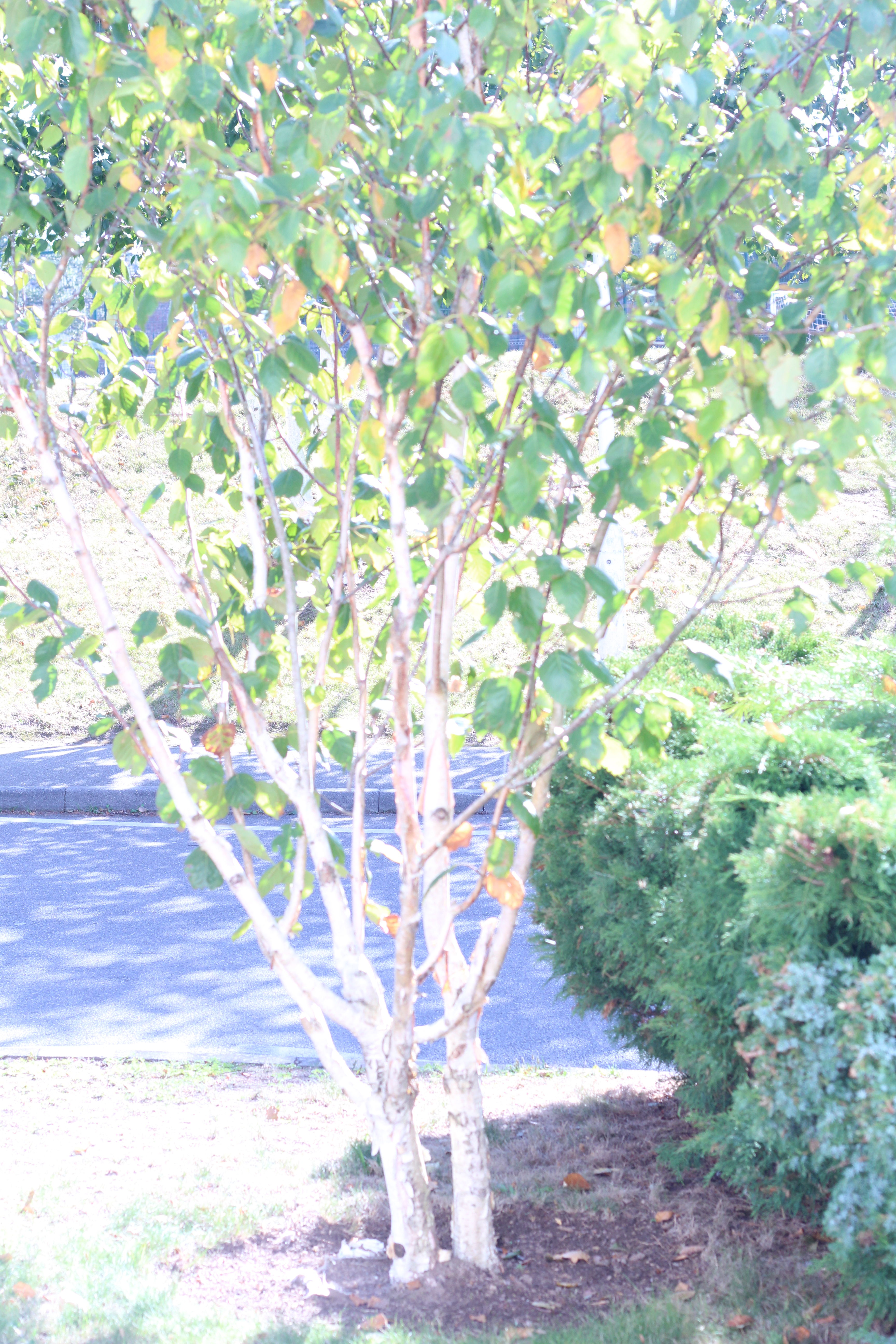
This picture is of a bicycle wheel I chose to edit it as i found that it was abstract as it only focused on the wheel and its shadow, I thought that if I edited it with the threshold adjustment that it would bring out the detail and it would make the lines bold. For comparing I Prefer the edited version of the photo as it is more unique to the original which I think is very dull and has no personality.
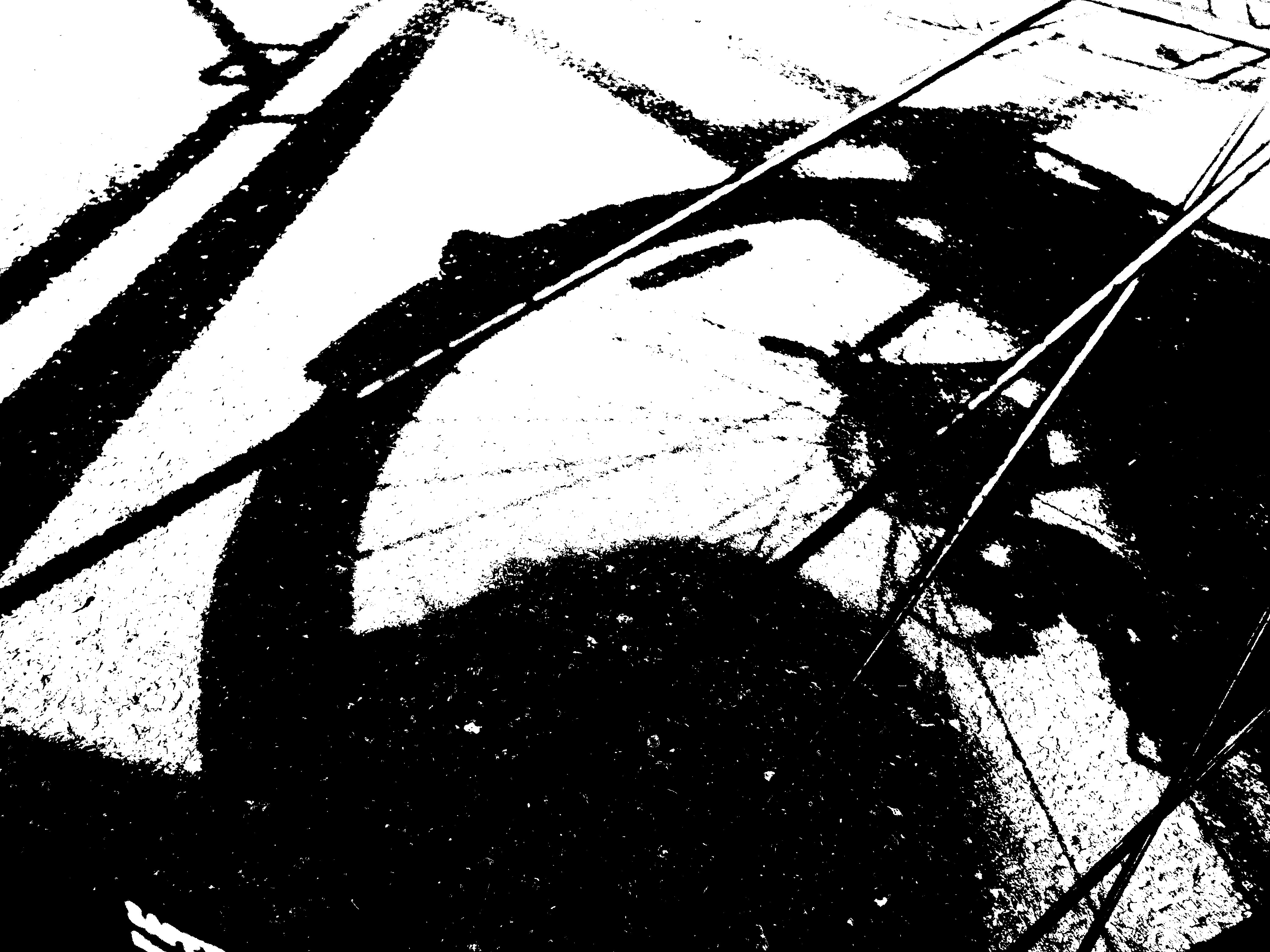
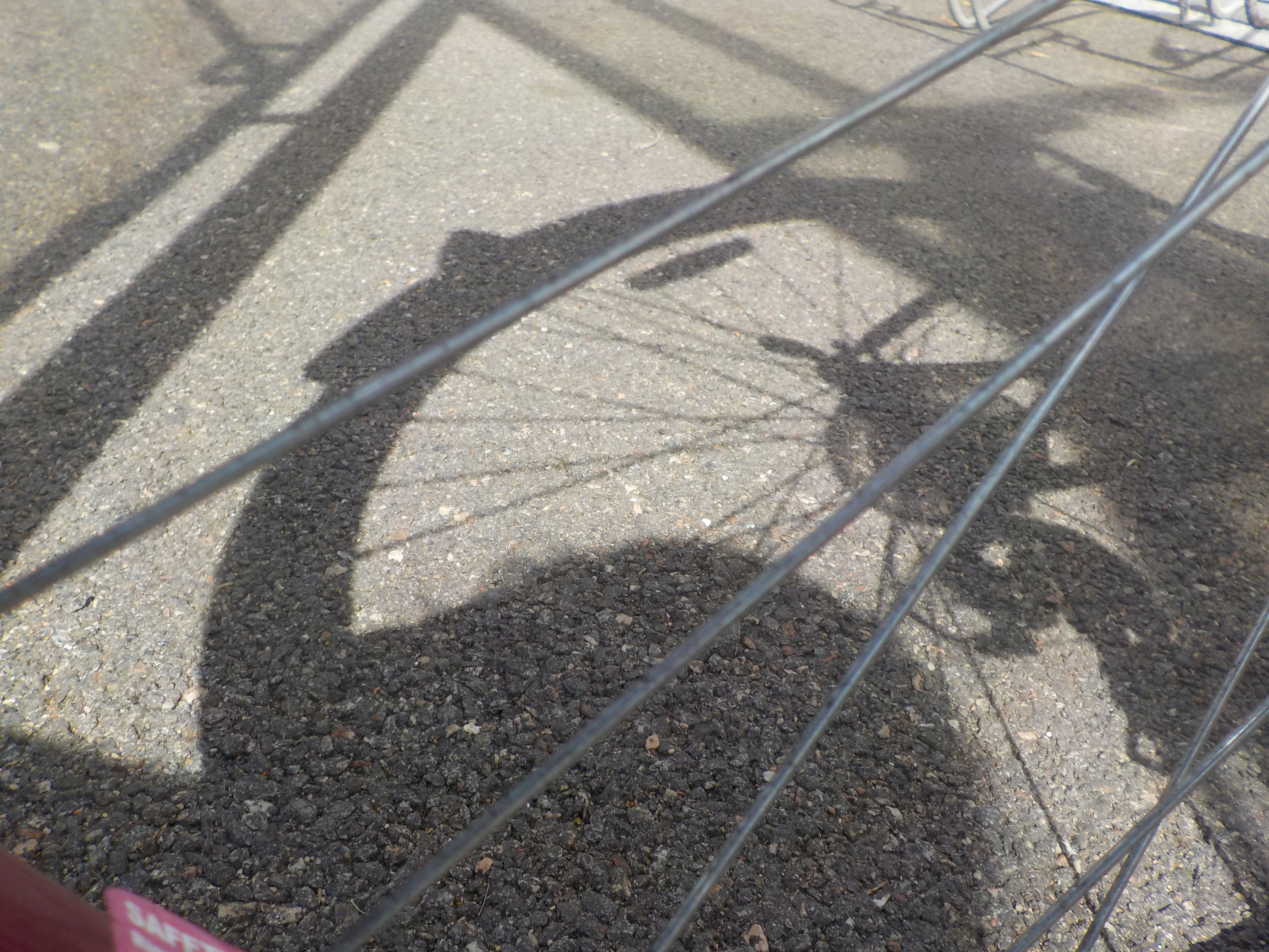
I think for this photo it would be classed as abstract as it only focuses on a little section unlike the other photos. I used the threshold adjustments which converted the photo into black and white and the lines are solid and bold which is what Keld Helmer-Peterson. I included the original so I can compare how different the adjustment did to the photo. Personally I prefer the edited photo as it seems so much more alive and it brings out the uniqueness of the photo.
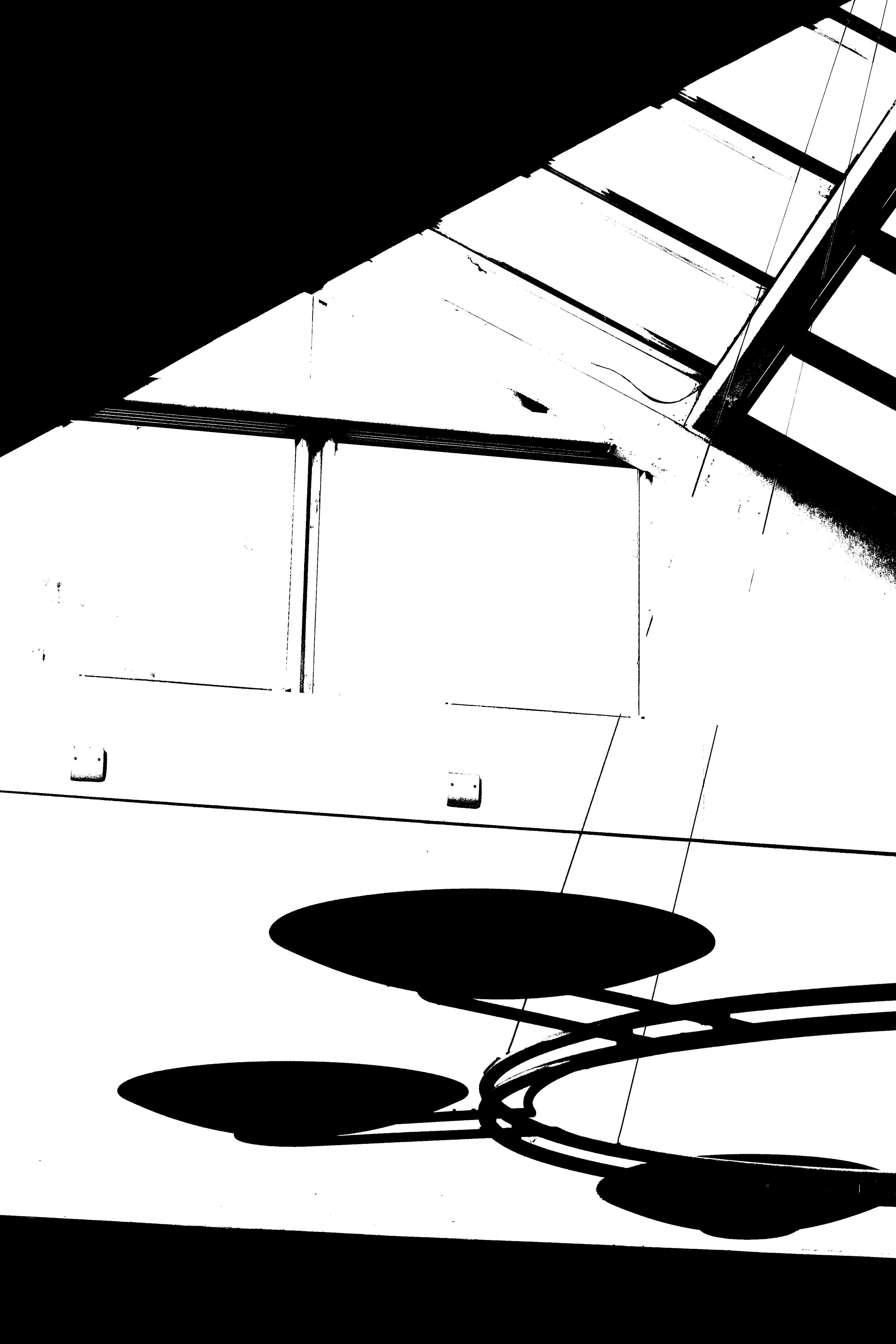
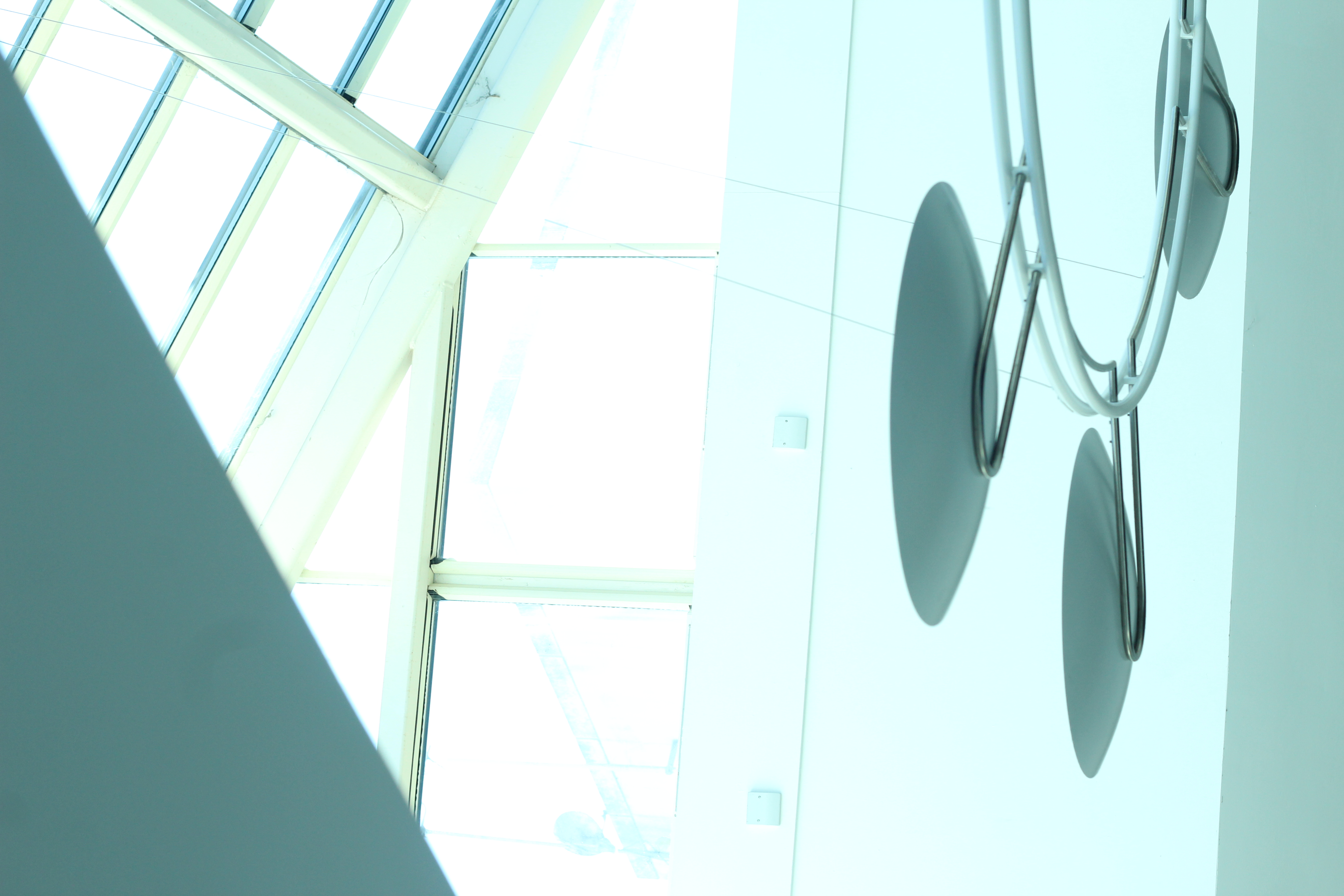
Conceal/Reveal
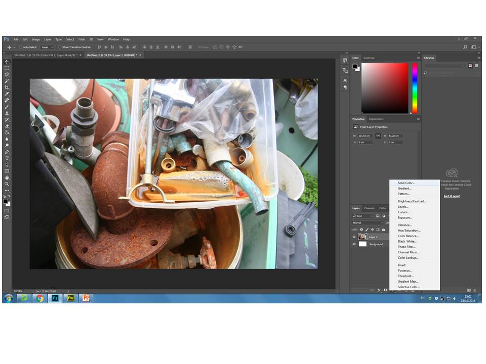
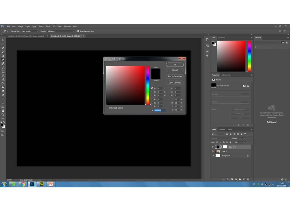
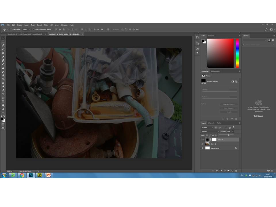
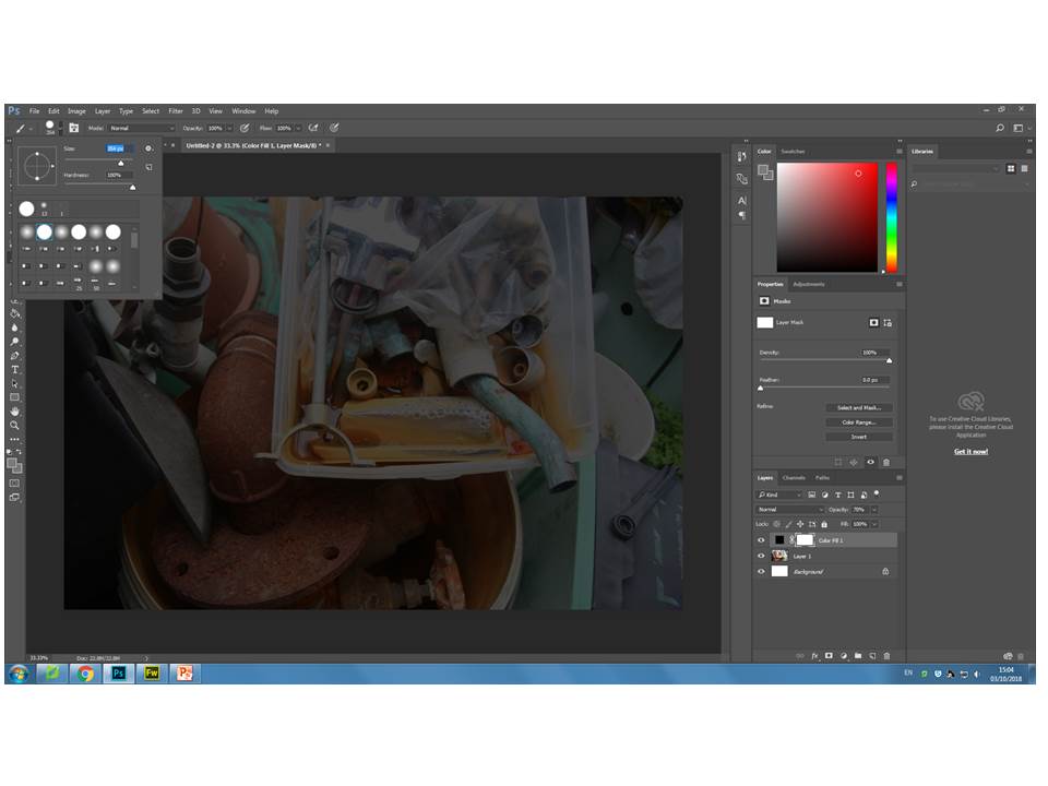
The Process
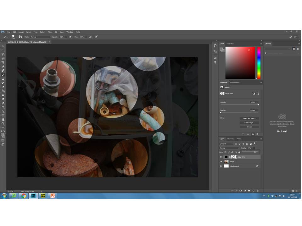
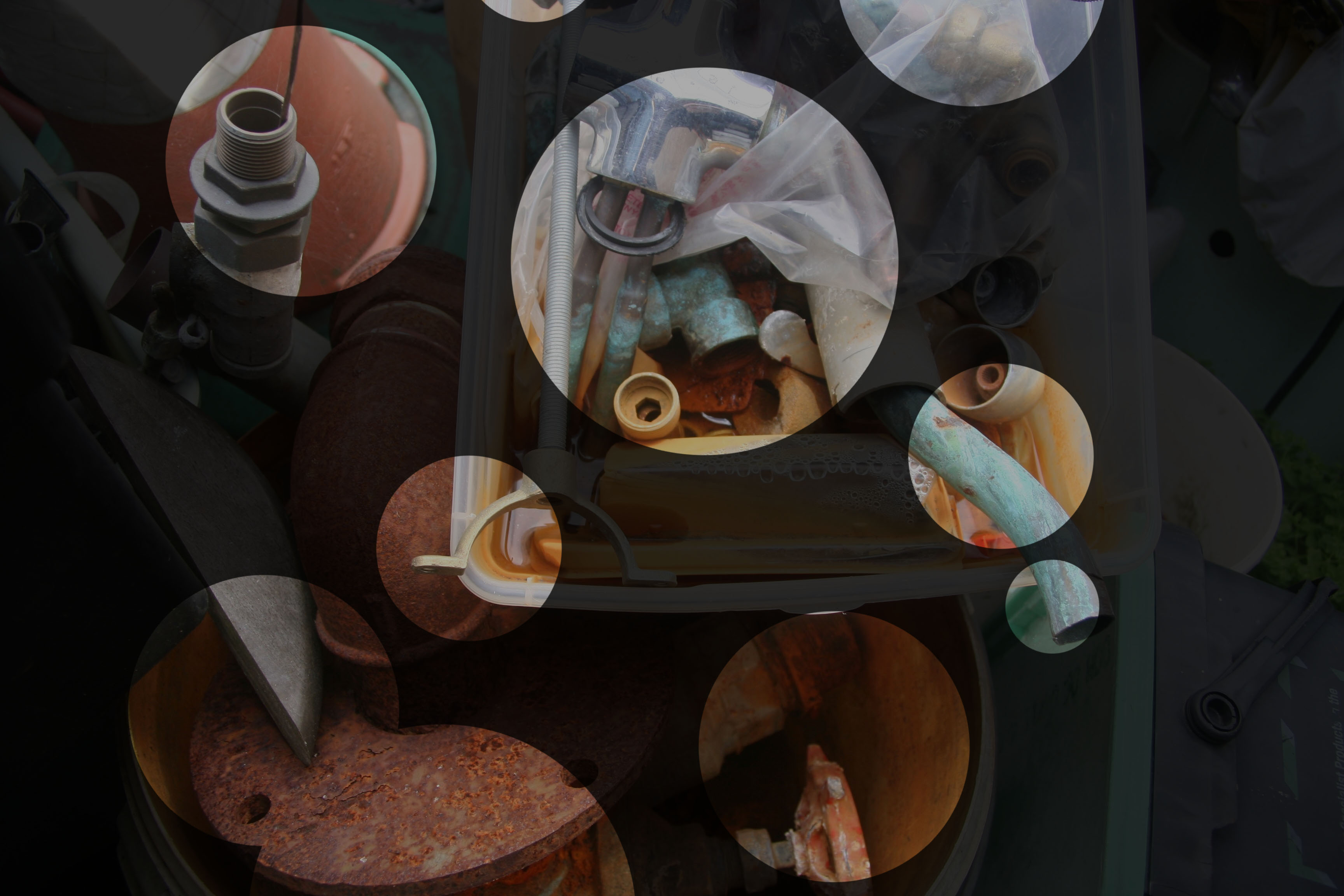
Analysis
The process to create my final image was relatively simple to complete and is now something I can use more often in my work. I reduced the opacity in a way which the ‘concealed’ area of the photo became visible, but ensuring the ‘revealed’ was more prominent and vibrant to extenuate the colour of the pipes. If I was to do this exercise again I would have used a photo with more colour in order to create more contrast between the dark ‘concealed’ areas and the bright ‘revealed’ areas. I ‘revealed’ the area with the sharpest focus and most depth, for instance the bottom left hand corner had detailed rusting and was displayed well in the natural lighting. The texture of the picture varied between rust and cooper residue, which adds a sense disorganization which fits well with my ‘revealed’ circles because they displayed the areas where most is going on, not the tidier areas of negative space in the background. The pipes are all in 3D form, this adds more depth to the photo with shadowing as displayed in the bottom ‘revealed’ circles.
Experiment – Curve/Tonality (Colour)
Tonality: Colour
A curve, in image editing, is a remapping of image tonality, as a way to emphasise colours or tone in an picture. Changing the black point, grey point or white point of an image can dramatically affect the colours shown in an image. Below I have included some examples of where I have changed these points in different areas of the image to create different colour schemes in each image. I used an image of fire as it had many tones running through it that I thought may give good results.
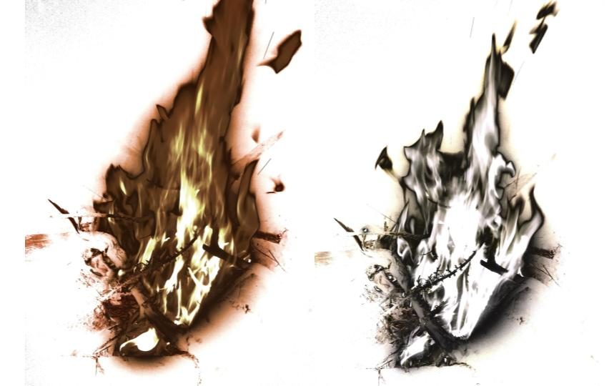
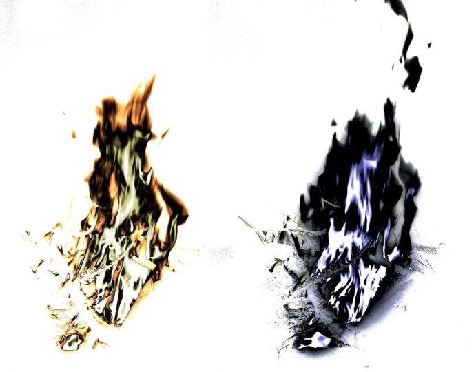
As shown in these images, changing the black point, grey point or white point of an image can massively change the appearance of an image. The original colours of the fire (white, yellow and orange) were changed as I changed the tone points of each image.
I was less subtle with the editing process of these images, resulting in them looking highly unrealistic and obviously manipulated, however in doing so I produced some dramatic very images.
Ralph Eugene Meatyard
About Ralph Eugene Meatyard:
Ralph Eugene Meatyard lived in Lexington, Kentucky, where he made his living as an optician while creating an impressive and enigmatic body of photographs. Meatyard’s work spanned many genres and experimented with new means of expression, from dreamlike portraits—often set in abandoned places—to multiple exposures, motion-blur, and other methods of photographic abstraction. He also collaborated with his friend Wendell Berry on the book The Unforeseen Wilderness , for which Meatyard contributed photographs of Kentucky’s Red River Gorge.
My photos :

My edited work:
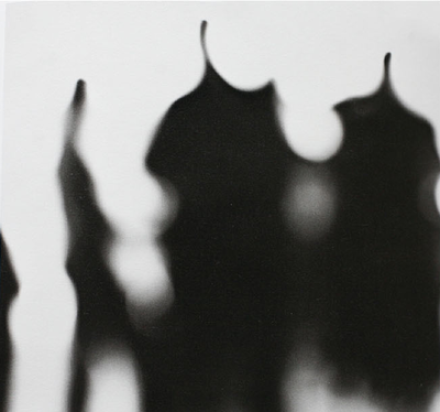
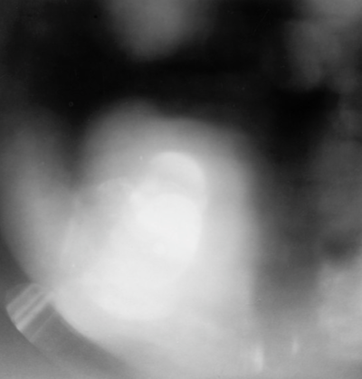
I took some of the photos which I thought could be used in inspiration of Eugene, and put a black and white filter on them. I then used the blur option until I got my desired look.


