I will select my best photo outcomes to print onto A3, A4, A5. I will search through the entire abstract project and select the ones that look visually interesting and show my photographic skills. Researching many photographers has helped me to capture abstract images in a variety of different ways in order to replicate their style.

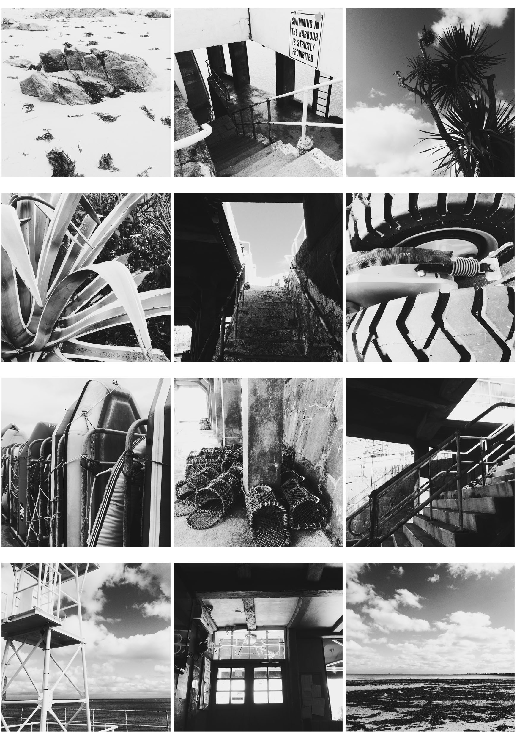
These images are responding to Albert Renger Patzsch photography work. I captured 100 or more images in black and white to replicate his style. I took the pictures using the Hipstamatic app on my iphone with the lens Florence and the film BlackKeys XF. The lens captured images clearly and the film made them black and white instantly. After taking 100 images I made a selection of 12 to make a 4X3 grid. I selected images with either lots of shadow or highlight so when they are placed next to each other, all the images on the grid contrast and stand out.

These 2 images are responding to Jon Setter’s photography work which mostly focuses on urban space. To replicate his style I payed attention to colour and texture to create man made spaces into geometrically satisfying compositions. Photographing a different perspective helped me get the results I wanted to create abstract images. I took around 100 images and selected 2 from the contact sheet. Then on photoshop I edited the two images by increasing the saturation and contrast to correspond to his vibrant style. This created bold and sharp images to emphasise the formal elements. When capturing the images on my camera I made sure to increase the aperture so my depth of field would be greater and my images would have a sharper background. I selected these two images as they both greatly contrast each other through their different colours and textures.

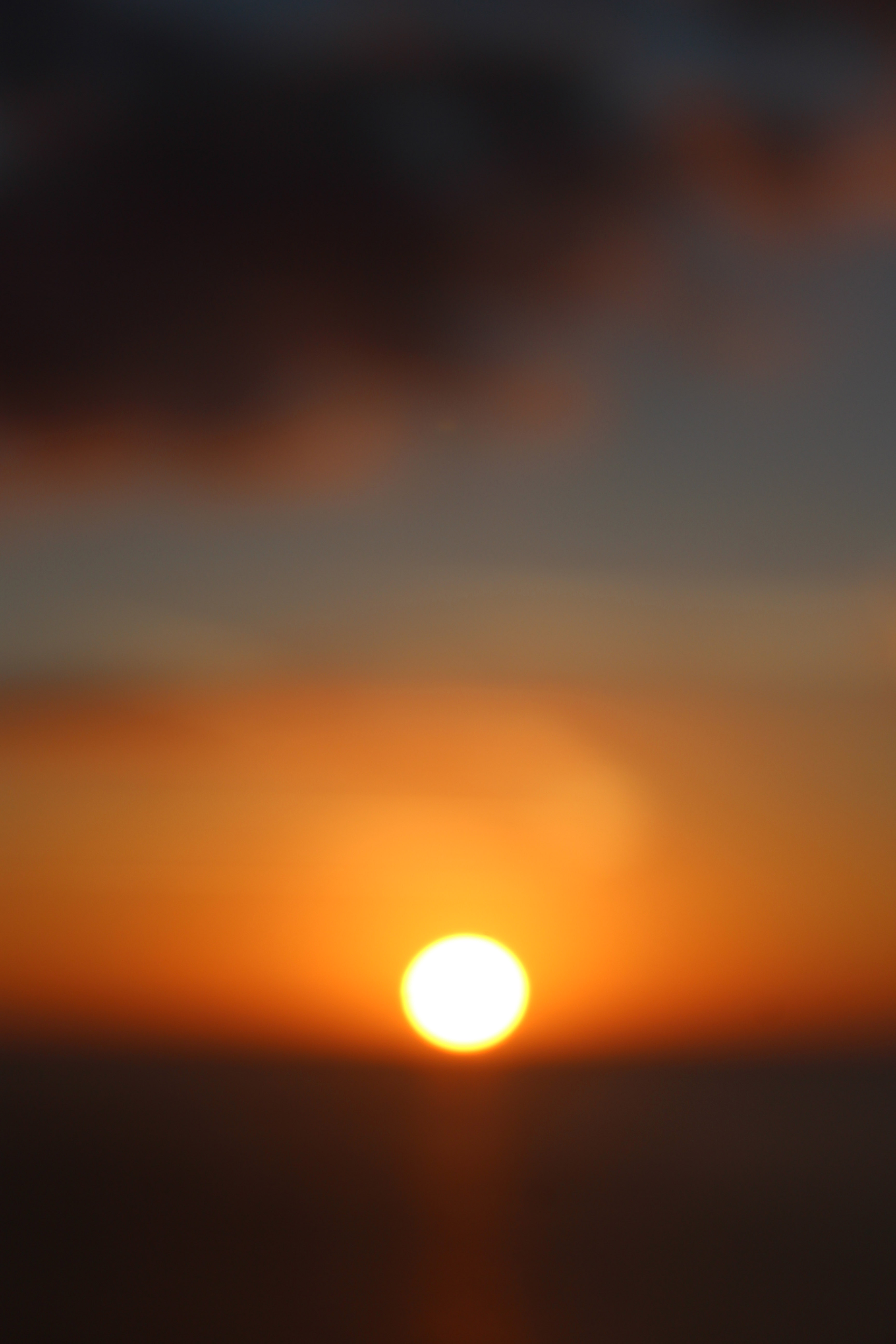
This image was inspired by Uta Barth. She is interested in light, drawing attention to the viewer’s perception and separating the image from the thing depicted. Although her images are blurred, they appear abstract. Uta Barth has made visual perception the subject of her work. She carefully renders blurred backgrounds, cropped frames and the natural qualities of light to capture incidental moments. I decided to use the blurred sunset image inspired by Uta Barth because of the soft blend of unfocused colours surrounded by the sharp, vibrant sun. I chose this image to be printed A3 since most of Uta Barth’s photography work was printed out on a large scale to create a huge impact on the viewer.
