A3 piece:
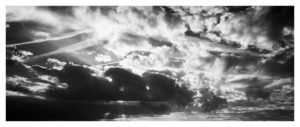
I chose this piece because it shows my editing, cropping and photography skills. Although it seems to have a lot going on, with multiple different shaped clouds, with the right presentation I can turn it into something abstract. I will most likely cut up the images into rectangles and to switch them around, or I will put a black boarder on top of it, only revealing the parts I want revealed. This work was inspired by Alfred Stieglitz and his cloud works, where he filtered them into black and white and made the contrast between light and dark apparent.
A4 piece:

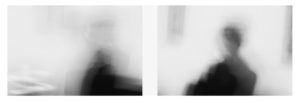
I chose these two pictures because it shows my skills when using slow shutter speed on a camera, and I liked how it came out. It also reminds me of the photographer Ralph Eugene Meatyard and his blurry black and white figures works. I chose to present them together because they were taken of the same person, using the same settings on the camera, and they hold similarities but are also different. I also believe that the simpleness of these images give it a nice tone, and comply with the abstract unit.
A5 piece:

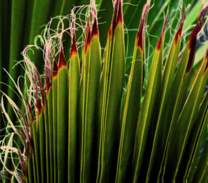
I chose this image because it shows my photography skills when it comes to using a long lens camera. You can see the details on the leaves, and the editing I did on it made it appear more vibrant and colourful. It also appears to be abstract, which goes well with the unit.
