
Double exposure
The repeated exposure of a photographic plate or film to light, often producing ghost image.
Here are some examples of my first attempts with just some random images I had found on my phone. For this image as I was at home and my laptop makes me pay for Photoshop I downloaded this app called PicShop. on this app all the settings were similar to those of photoshop so having tried it in the lesson and failed miserably I decided to try working on double exposure again as I wish to use this editing technique for my portrait edits when we move to that project.
These images I thought worked well over layered because theres quite a high contrast of darkness from the background and then a light just peaking through immediately drawing all attention to it.
There are many artists that use or have used double exposure when developing their images as sometimes they use it to create a story or an idea behind it that some people might not understand. over layering like this can also be called double exposure which some artist take an form an image with a double meaning.
I have decided to chose an artist and try out different examples of their work but with my images.
Here we have some examples of Luke Gram’s Abstract photography work.
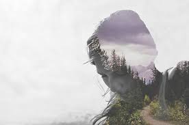
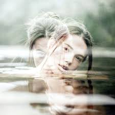
 these are just a few out of hundreds of images that Grams has taken. These are the ones that I thought suited abstract photography more as here we can tell he has mixed abstract photography with portrait to create doubling meanings of humans being connected to nature through elements of water, fire,sun and wind. These images stood out to me as I interpret these as images he has focused on creating a story when a person is looking at them closely. He has not only bought in different patterns and texture he has managed to fade objects around the image but still being able to visualise the woman face. I think this is significant because without the portrait side of it the images may have began to look a bit disorientated as there would have been to much going on around those images.
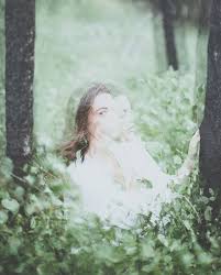
Luke Gram Bio-He is not only a abstract photographer but he photographs people aswell. His images are taken according to him to capture the “serenity and power of life. He does this by placing humans in natural habits like i.e. the forest in the image above. His over lays are also natural places like the ocean, beaches and tree’s .He was about 18 years old when began taking photography seriously. He earned degrees in psychology and history from the University of British Columbia. He previously worked in the Canadian Oil Sands
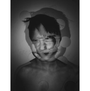
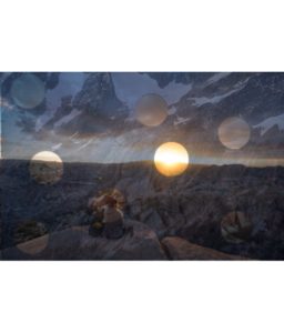
I was inspired by Luke grams work but decided to only have two layers of the same image overlapping one another. However instead of me creating both images to be very visable I made them both quite dark and heavy on shading which then allows the small circles to show elements of the image from underneath.
I tried also at doing another attempt using the images I’ve chosen as my final prints.
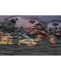
For the image above I used the same app called PicShop which allowed me to use my final image of the rocks and one of my landscape works that I used for art and used one of the effects called Hue on number 59 to be able to get the colors as bright as I wanted.
Having worked on these images, I have gained a wider understanding on different ways and ideas on developing my images to make them stand out and not just sit with my basic black and white edits which I chose to do for my abstract final images. Additionally I think that all these ideas and images have been successful at presenting the theme of abstraction. Each image I have created has different shapes which order out in a unique way, in which I have used to reveal certain aspects of the image. By doing this it has allowed the public to look at certain parts of the image which they may not have originally noticed because the image would have been on such a larger scale. It also allows the main focus point of each edit to be more visible and easier to identify.
Due to the edits being the way they are there’s a bit of negative space that I could have cropped out, however I like the negative space because it gives a sense of space and doesn’t make the image look all cramped together. I am very happy with the way these edits have come out as they clearly show development of my understanding of abstraction.