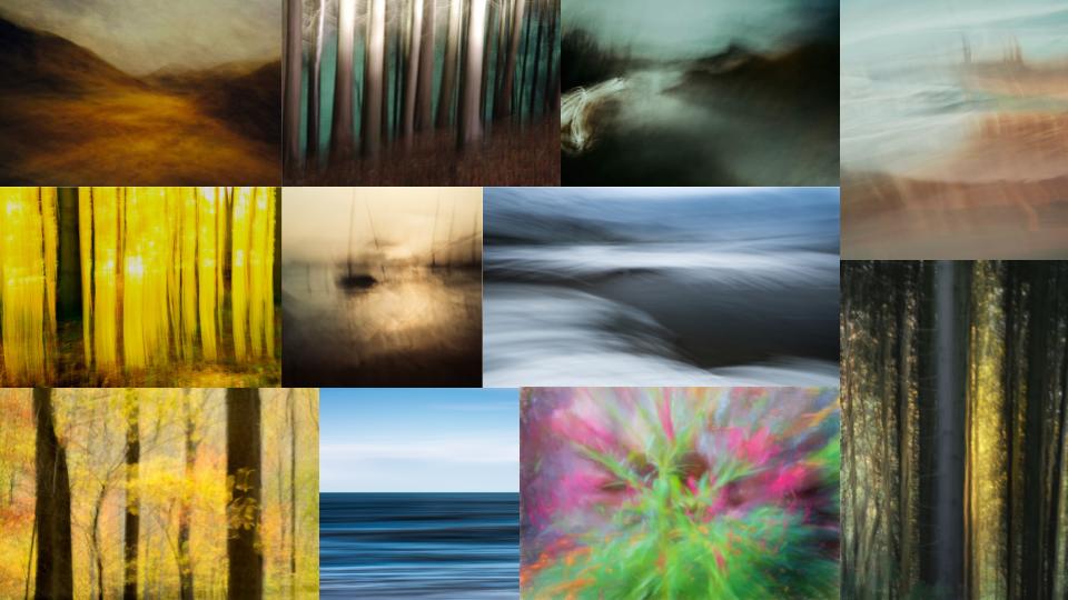
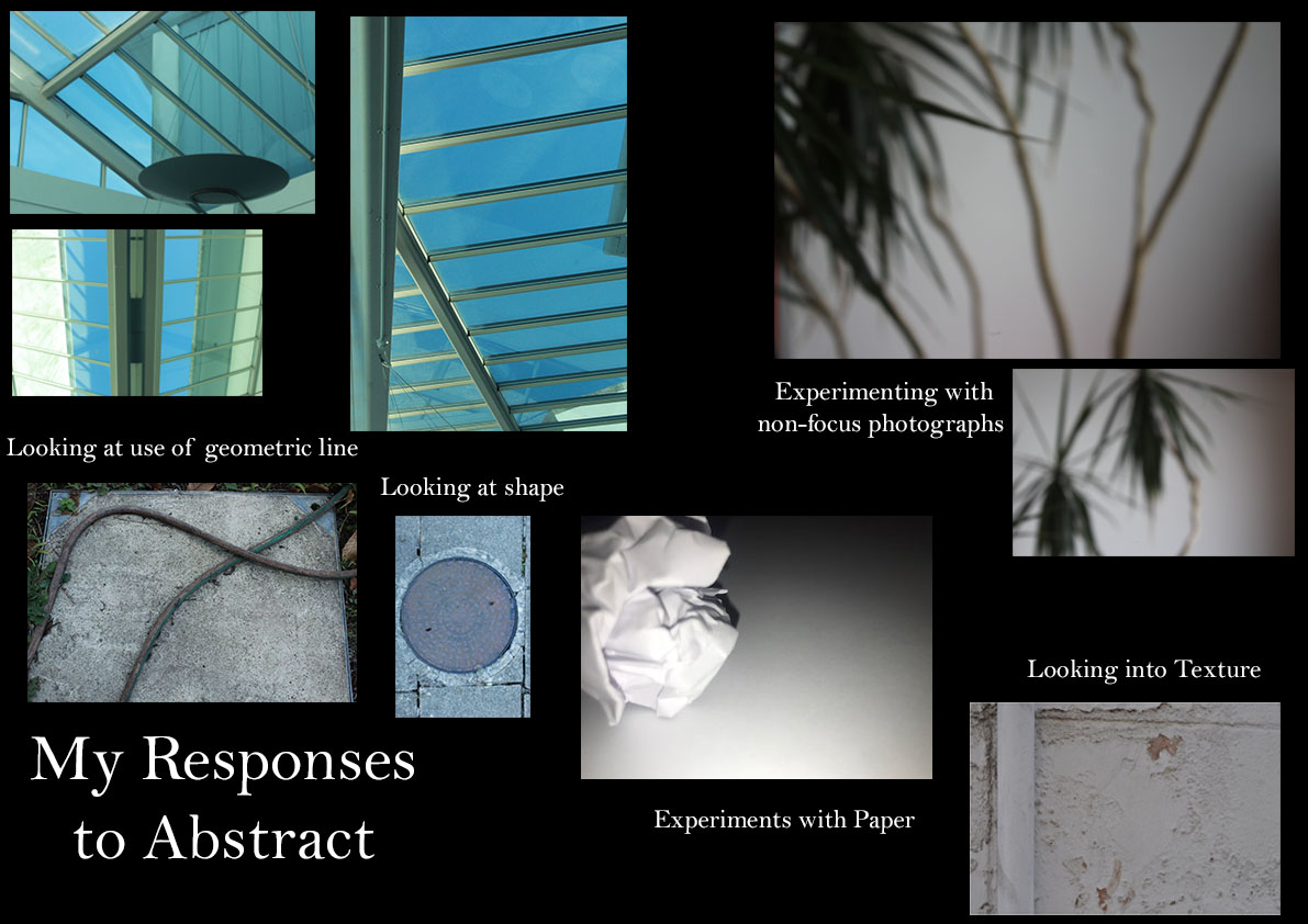
Mood Board

Edgar Martins is a Portuguese photographer. The photograph below comes from a series of work he produced that was inspired by the writing and the sending of letters and the power and intimacy of letters. For this mini series he photographed paper, carefully lit and isolated from anything else. There is a stillness to them that belies the fact they may have been written as suicide notes, contact between prison inmates and loved ones and more. Martins spent time working with court, prison and parole officials and indeed, prisoners in Portugal exploring this theme, that often ended in death for many of his subjects.
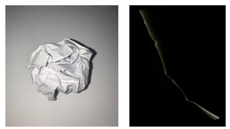
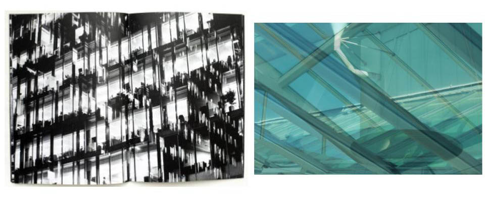
Above is one of my own photographs from a paper shoot beside one of Edgar Martins work. They are both very different takes on photographing paper. Edgar Martins photograph and way of working is a lot darker the photograph is very dim compared to my way of photographing paper which uses very harsh artificial light on the paper, this may be due to the context that Martins work with, when he photographs the paper he is looking at the power of paper in some very dark areas such as suicide notes and prison letters, the photograph portrays this in a visual manner of the black dark space with the very slim paper which itself is dimly lit, this would be done on purpose by Martins maybe for effect of portraying the subjects he is looking into in his own visual manner. Both takes on the paper are focusing on isolating the paper so it’s on its’ own, Martins does this with the dark space and the thin isolated paper, the paper in my photograph is isolated on the white background and left to itself on the white blank paper which is a different take on the ideas of isolating the paper.
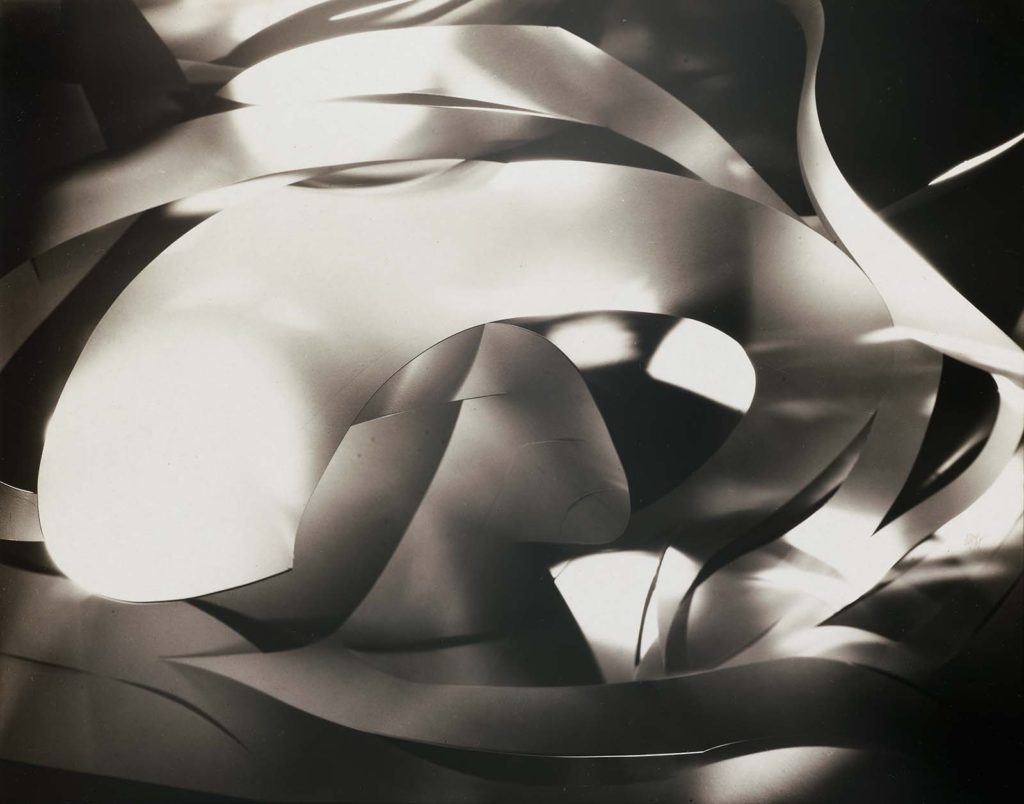
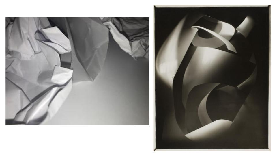
Above is one of my own photographs from the shoot of ‘Photographing paper’ alongside one of Francis Bruguière own work. In comparison to each other they have two different takes however they have some similarities with each other and they way they were photographed. Both my own and Bruguière photographs seem to be using artificial light in order to create effect of light, tone and shadows and this is a similarity they both have with each other. Bruguière looks and the texture of the paper by cutting it and folding them into each other this creates smooth textures of the paper whereas with my own image I experimented with folding and creasing the paper to create texture and to explore this, both takes are exploring texture but in two different ways with the paper. Bruguière’s work shows a toned down exposure to some of his other work and is a lot darker when compared to my own work which is a lot brighter due to the white artificial light used creating a brighter photograph.
For my final images I decided to stick with the technique of ICM as I really liked how it looked and I think this style is where I produced the best images. I will also have one photo that is in the out of focus style as it is one of my favourite images out of the ones I have taken.
With these photos I plan to create a A3 piece with a white background and these photos on top. The A3 piece will be landscape and in colour. It will look similar to this:
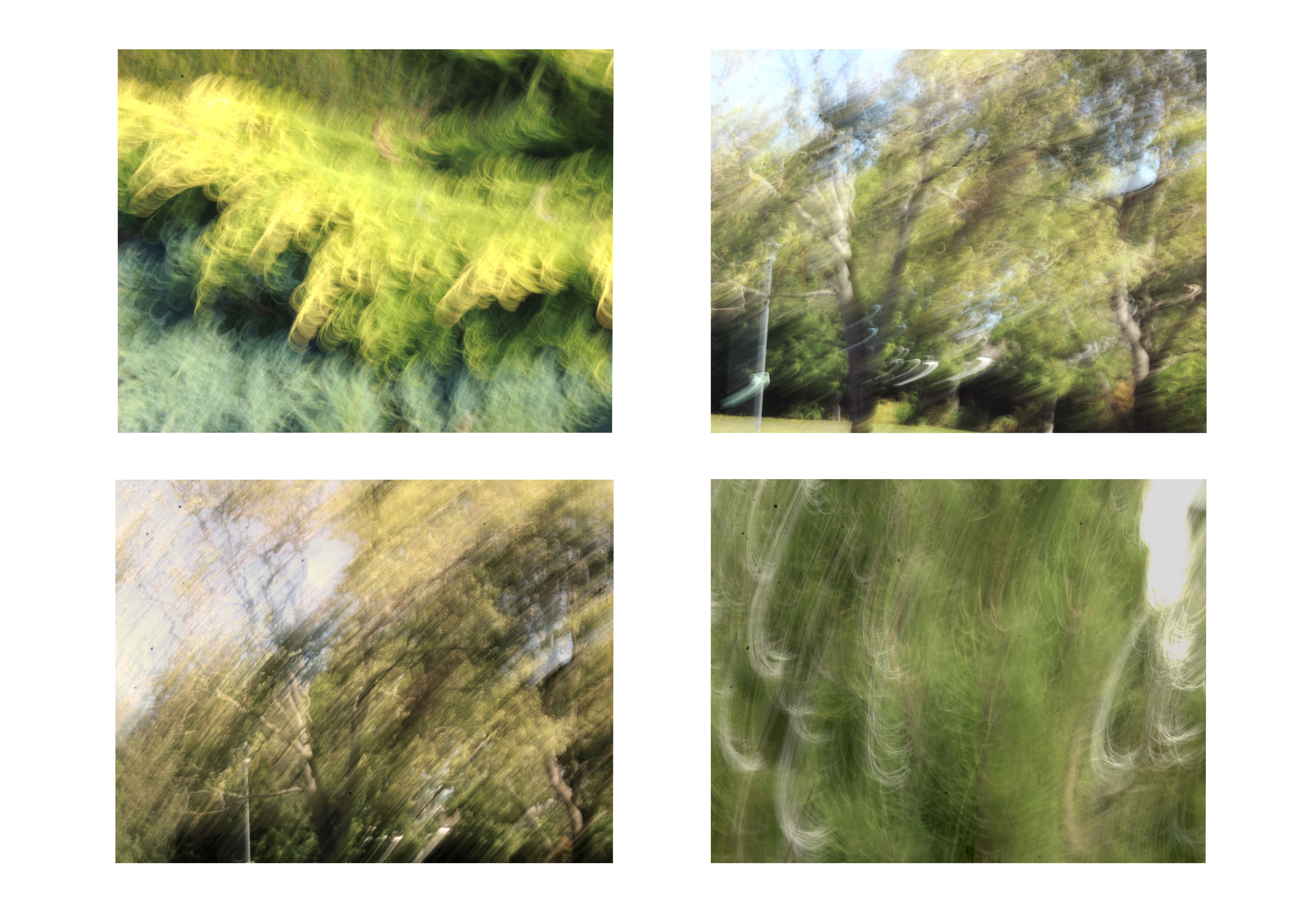
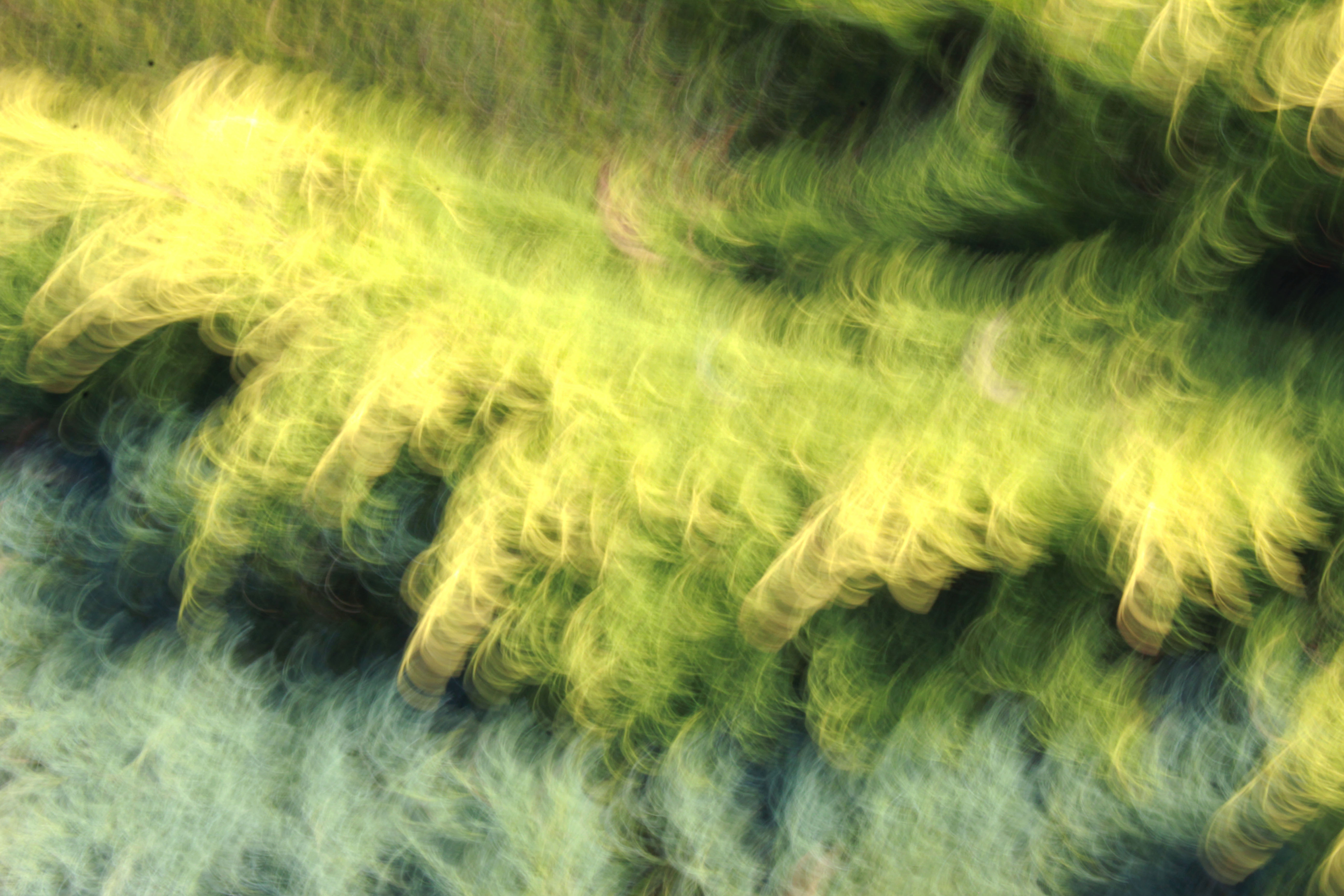
This is what my final image for the A3 print will look like. I think by putting the 4 images on the white background, it will make the photos stand out from each other, as they are all similar in colour.
With this photo I will be using the image below and it will be for my A4 mounted piece. There will be no borders it will just be the image.
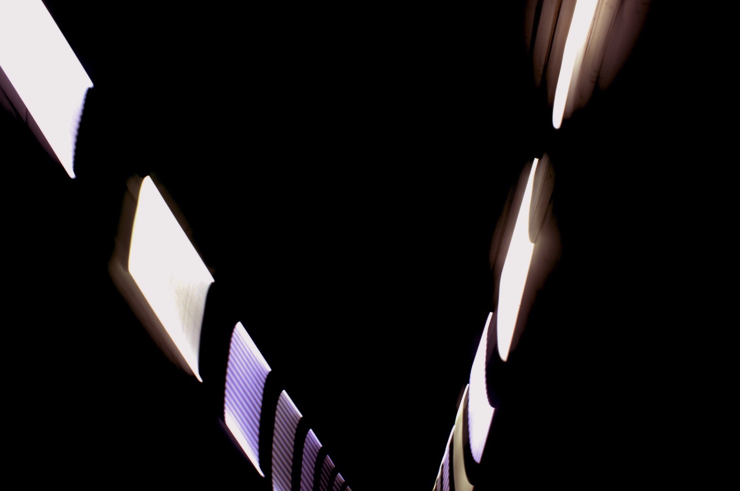
I have chosen this photo because I think it is one of my best photos I’ve taken. I really like how the lights stand out from the dark background, it gives it a really nice look.
This is what I chose for my A5 piece. I chose it because I really liked the way the heads of the figures looked. Also I think I did this way of taking photos really well and executed the technique.
I think overall I did a good job at choosing my final images as I believe these photos are the best ones I have taken. I also think I have edited these very well, still keeping the original image present, just enhancing the photo to make it look a bit better. I think to take this to a higher level I could’ve chosen a photo that was different from ICM, but, I still think I took the best photos in this style of taking photos. Overall I am very pleased with how this project turned out.
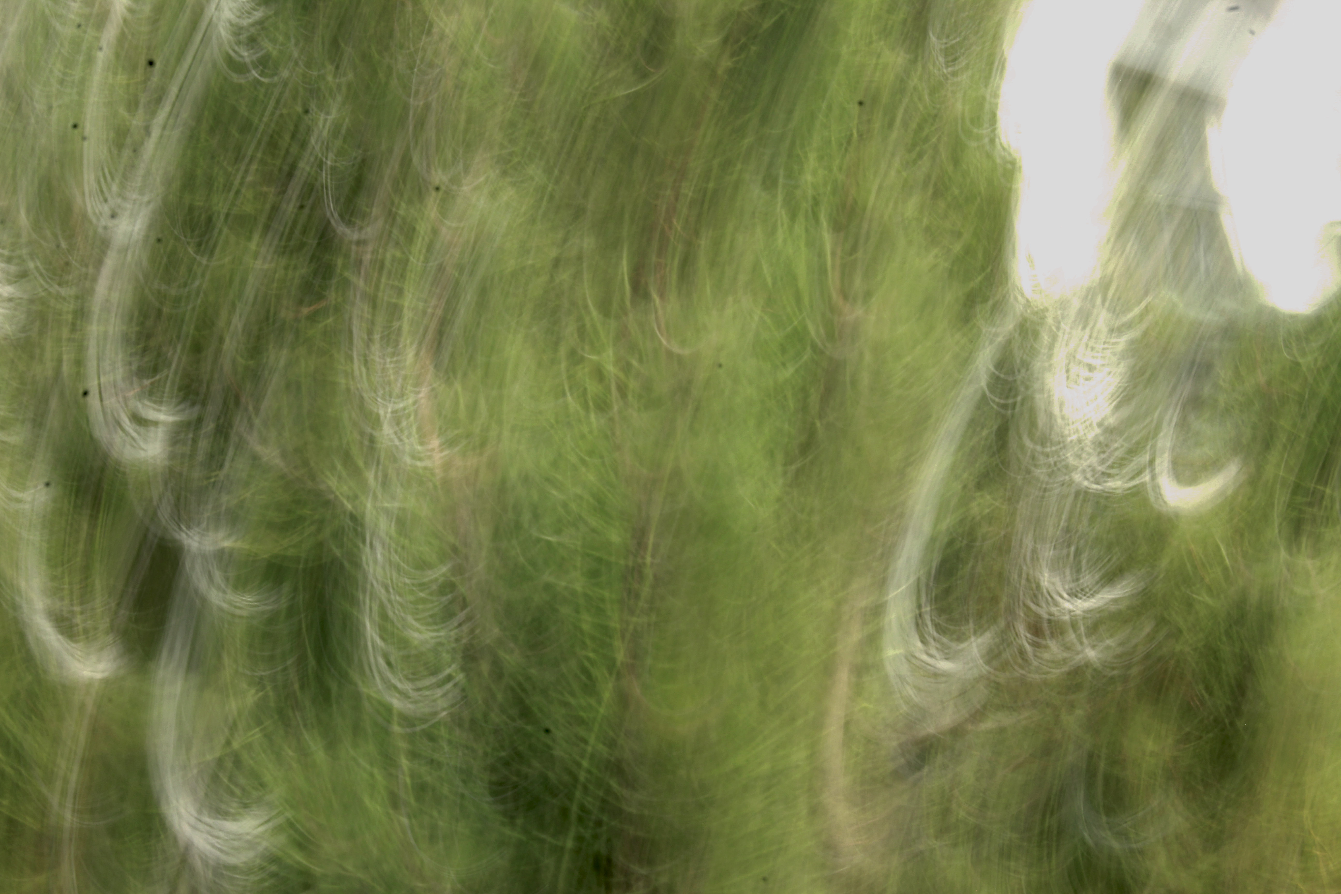
Lewis K. Bush is a British photographer, writer, curator and educator. He aims “to draw attention to forms of invisible power that operate in the world”, believing that “power is always problematic” because it is inherently “arbitrary and untransparent”. London was once known as the Metropole, the mother city at the heart of a vast empire stretching across a quarter of the planet. Produced during numerous winter night walks through the city, Metropole records the effect of this capital influx on London by documenting these new corporate high rises and luxury residential blocks as they are constructed and occupied. Using double exposures to layer building over building, these structures becomes increasingly disorientating and threatening as the series progresses, obliterating scale, perspective and orientation, and emulating the sense of loss that many Londoners now feel.
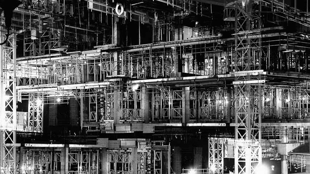
Above is a comparison of my own photograph taken and edited and Lewis Bush’s own from the series ‘Metropole’. Both of the photographs include a double exposure creating a blurred and busy effect on the photograph, this may be done intentionally by Bush to emphasis the thoughts he is trying to put across of the city and the ‘Metropole’ being a busy place with this rushing past, by creating a double exposure, maybe using the same image to angle it Bush is creating the effect that the building itself is rushing and moving which is implied by the way he presents the photograph that sits with the context of the project and the photograph was taken in. Bush’s work has a lot of contrast in it’s photograph using the black and white whereas I am trying to use the blue tones to work together as the lights and the dark’s to create a contrast. Both the photographs have a strong sense of line throughput the image, Bush’s photograph has very geometric and symmetrical lines whereas mine tend to be a bit more abstract themselves due to the angles and directions they go in.
THE PROCESS IMAGE 1:
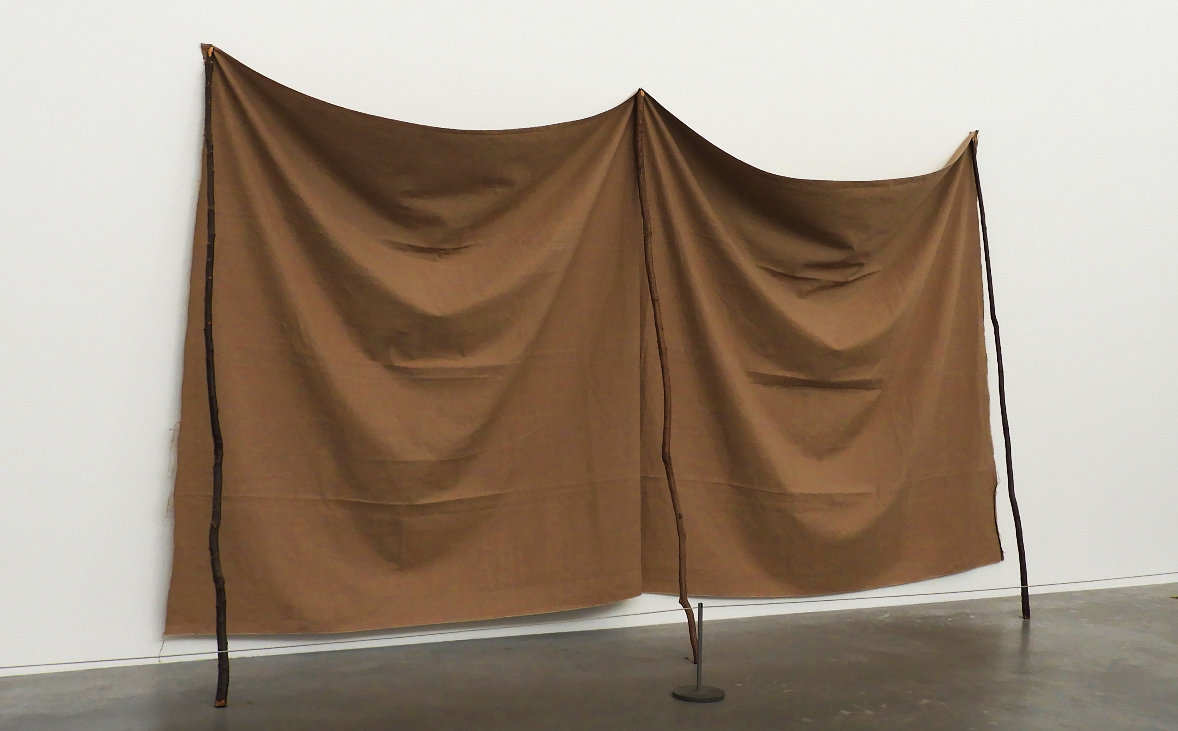
This image was taken at TATE modern in London, a space filled with abstract and modern day art. I particularly loved this exhibition as the space where the art was exhibited in was flooded with natural light. Combining this with the crisp and clean white backdrop allowed me to capture some truly beautiful images that showed of the subtleties in each image. The space was also very large and open which allowed me to maneuver my camera without the disturbance of other people or pieces of art.
This was in my opinion one of the most successful images from this photo shoot, therefore making it into my final selection. I reflected up on many different photo shoots from the last couple of months in order to make my selection, even going through images which i have previously discarded as i have learned throughout the past couple of months that almost any image can be transformed through simple editing and cropping, Image 1 i thought initially was too simplistic and quite frankly boring, yet i have discovered that minimalism is a very real and valid form of photography therefore i reconsidered the image. After reviewing the image, i found that it actually holds many different aspects and qualities, like the interesting creasing of the fabric and the contrasting textures of the wall and the floor.
CRITICAL ANALYSIS OF IMAGE 1:
TECHNICAL: For this photo shoot I approached each image in the same way, setting my focus to auto as each piece of art work was fairly big and i did not focus in on small details therefore setting it to manual would be totally useless. I kept my exposure throughout the photo shoot at 400 as each large, white hall was filled with natural light, the bright white walls added to extra light bouncing into the camera. I kept it at a stable level as i wanted to prevent the images becoming overexposed. I switched on my white auto balance setting as again the white walls created problems with the colors of the art work becoming washed out and dull. I set the shutter speed 1/60 as i wanted to create very clean and crisp images that show all aspects of the art work.
VISUAL: One of the most notable aspects of this image i find are the shadows created by the large creases in the draping fabric, the intensity of the shadow increasing the further down the fabric that the eye travels. All aspects of this image are crisp and clean, the high shutter speed to which i set my camera meant that the image is sharp. There is contrast in texture all around in the image, from the rough surface of the fabric, the smooth and matte white wall, to the glossy grey-black floor. The rule of 1/4 applies to this image as most of the subject is contains in the first 1/2 and 1/3 of the image. There is also a sense of repetition in the image through the even creases that go down the fabric sheets and the 3 sticks that mirror each other. Although the image is already bright, a lot of the light is hitting it from the top right hand corner, creating a slightly deeper shadow on the left side of the sheet. The colors in this image are very simple, consisting of a slightly blue toned white, a grey-black and caramel beige. There are many sharp lines which cut through the image such as the separation between the wall and floor, but also the 3 sticks which prop up the fabric which gives the image some geometry and symmetry.
CRITICAL ANALYSIS OF IMAGE 2:
TECHNICAL: For this photo shoot I approached each image in the same way, setting my focus to auto as each piece of art work was fairly big and i did not focus in on small details therefore setting it to manual would be totally useless. I kept my exposure throughout the photo shoot at 400 as each large, white hall was filled with natural light, the bright white walls added to extra light bouncing into the camera. I kept it at a stable level as i wanted to prevent the images becoming overexposed. I switched on my white auto balance setting as again the white walls created problems with the colors of the art work becoming washed out and dull. I set the shutter speed 1/60 as i wanted to create very clean and crisp images that show all aspects of the art work.
VISUAL: This image overall is very busy and overwhelming with the density and contrast in shape, texture and color. Firstly there is a sharp contrast with the texture in the image, with the white, glossy floor and the ragged and varying fabric of the sculptures. Although being very different, create harmony as an image. The light hitting directly above from the image creates depth and shadow which is cast onto the floor, creating a sort of subtle reflection. The larger the shape, the more dramatic and deep the shadows become. There is a lot of repetition in this image, not only through the editing and mirroring the image, but also the varying round shapes of the sculptures that fill up the image. The small white line creating a border around the sculpture in a way breaks the harmony and separates the image from the chaos of the sculpture and the smoothness of the floor.
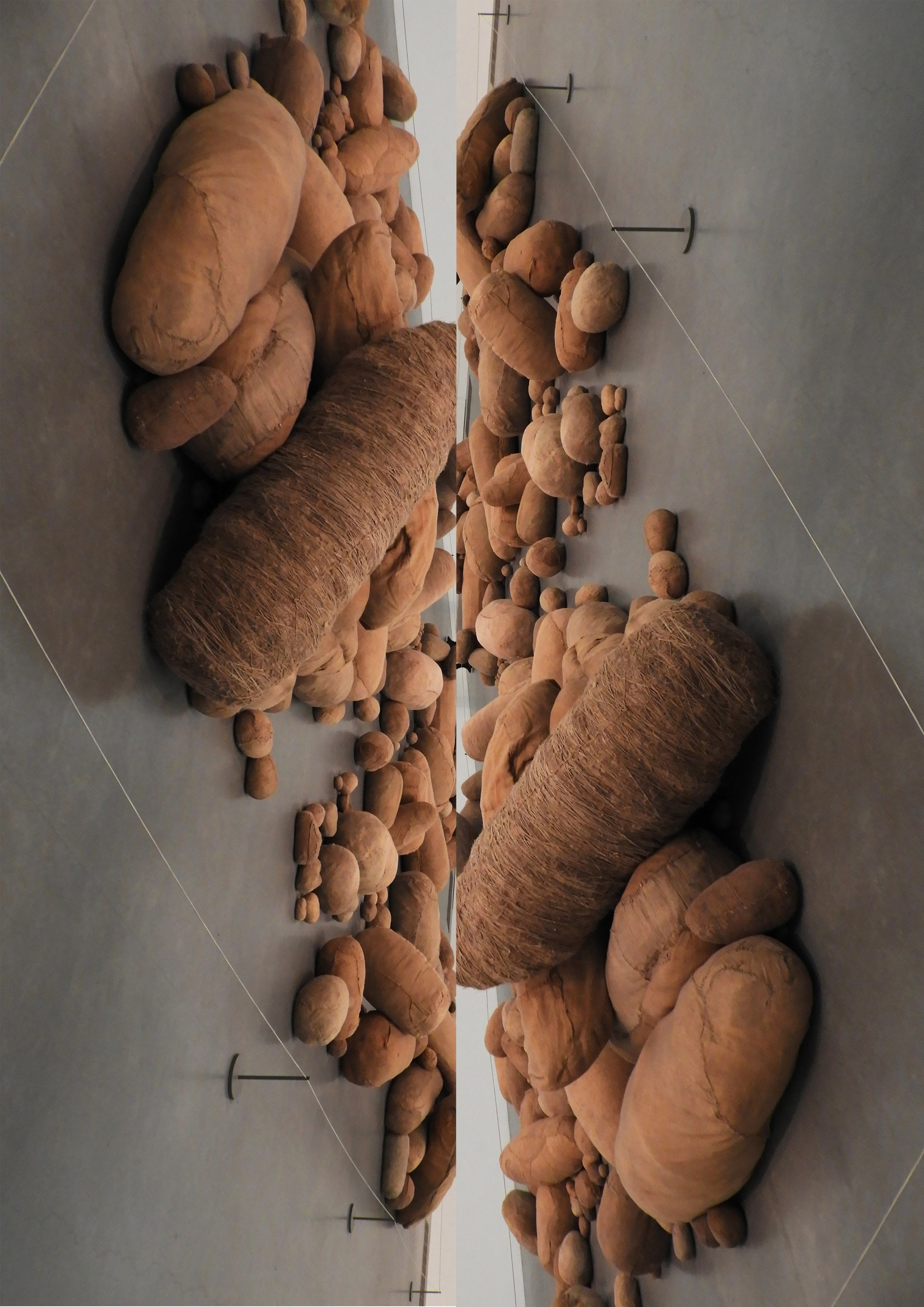
CONCEPTUAL: Magdalena Abakanowicz began sewing three-dimensional objects with sacking, stockings, rags and rope in the 1970s.
These cocoon-like objects reflect Abakanowicz’s interest in biological systems, organic matter and regeneration, topics she discussed with scientists in her native Poland. In response to a commission to represent Poland at the Venice Biennale in 1979, she made hundreds of soft sculptures of varying shapes and sizes, ‘rounded like bellies, or elongated like mummies,’ as she described them. Abakanowicz collected old mattresses, clothing and sacks to create this ‘invented anatomy’ of forms and installed eight hundred in Venice under the title Embryology.
CONTEXTUAL: Made at a time of political tension between the Soviet Union and Poland, Abakanowicz has said the work ‘could be understood as a cry from behind the Iron Curtain’. She had come to prominence in the 1960s with a series of large woven sculptures called Abakans. At the time, the Polish state would not allow her to buy or rent a studio, so she made them on a loom in a friend’s basement, using sisal from discarded ropes. Without a large space in which to work she would often see her pieces in their entirety for the first time only when they were installed in exhibitions.
CRITICAL ANALYSIS IMAGE 3:
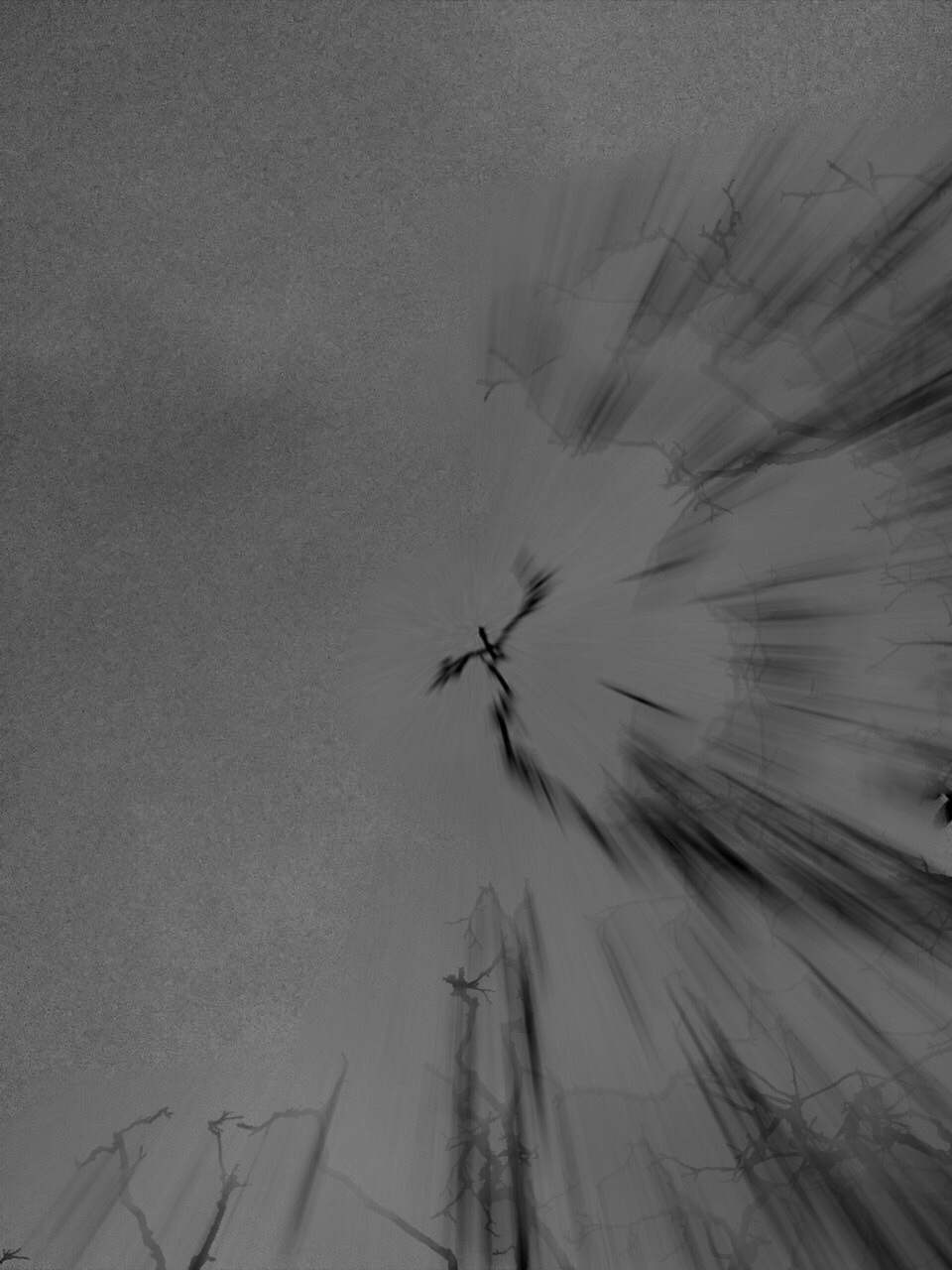
TECHNICAL: For this photo shoot I attempted as much as possible to recreate Meatyard’s “zen sticks” series. I particularly focused on exposure settings, focus control, and depth of field. The photograph below was taken of a dead tree, of the branches facing upwards towards the sky. Meatyard’s images are all very dark and dramatic therefore I chose to do my photo shoot during the evening, on a stormy, grey day. I increased the exposure to 800 in order to capture the branches in a dark setting yet still have some highlights and shadows. The dark night, and mid-range ISO setting meant that the image contracted a lot of motion blur, the effect which i was aiming to get.
VISUAL: It resembles the work of Meatyard in many ways. The dark evening also meant that the resolution of the images decreased and became more grainy. The branches of the tree were also quite far up meaning i had to decrease the depth of field and zoom in, again compromising the quality of the image. The grainy texture of the image I feel adds to the overall aesthetic of Meatyard’s work: old and worn. The differences in motion blur also create a focal point in the image, with the central branch being less blurred than the outermost parts of the image. The image is also quite underexposed which further adds to the dramatic and intense tone, giving it almost a Gothic aura. There is a very apparent sense of space in the photo as the lack of branches in the top left hand corner of the image freeing up space. There is also a lack of light in this image due to both the time of day the image was taken and the lack of exposure adjustments made on the image during editing as i wanted to retain the dark theme.
CONTEXTUAL: Ralph Eugene Meatyard (1925–1972) lived in Lexington, Kentucky, where he made his living as an optician while creating an impressive and enigmatic body of photographs. Meatyard’s creative circle included mystics and poets, such as Thomas Merton and Guy Davenport, as well as the photographers Cranston Ritchie and Van Deren Coke, who were mentors and fellow members of the Lexington Camera Club. Meatyard’s work spanned many genres and experimented with new means of expression, from dreamlike portraits—often set in abandoned places—to multiple exposures, motion-blur, and other methods of photographic abstraction. He also collaborated with his friend Wendell Berry on the 1971 book The Unforeseen Wilderness, for which Meatyard contributed photographs of Kentucky’s Red River Gorge. Meatyard’s final series, The Family Album of Lucybelle Crater, are cryptic double portraits of friends and family members wearing masks and enacting symbolic dramas.
CONCEPTUAL: Meatyard stated in a lecture to the Louisville Photographic Society, he was involved in working on no fewer than 12 “methods, series, subjects.” Among them were what he called “photographs made under the influence of Zen,” shown here with the title “Zen Twigs.” While the images are very minimalist, they deal with growth and decay, is impressive, they are familiar enough to be looked over lightly. A particularly beautiful one (untitled, like much of Meatyard’s work) shows a young trunk sprouting — or seeming to sprout — a branch that curls around it in a wiry loop, the whole almost a visual haiku. The simplistic tonal range of the image is effective in portraying the theme of deterioration and degeneration. Meatyard has clearly used a very narrow field o view, with a singular branch being in focus and the rest of the backdrop is extremely blurry. The images are in a mid-range of exposure, not too overexposed or underexposed. The light grey tones from the backdrop of the photo, highlight they unsophisticated, dead branch. The upwards growth of the branches, have strong and dark lines which cut through the sea of blurriness. The image also contains various shades of white, black, and grey, all working together to create a harmonious image. The contrast between the blurry backdrop and the foreground give the image a real sense of depth and space.
Now that I have narrowed down my favorite images for printing, I will do the lasts bits of editing and present how I want them to be displayed.
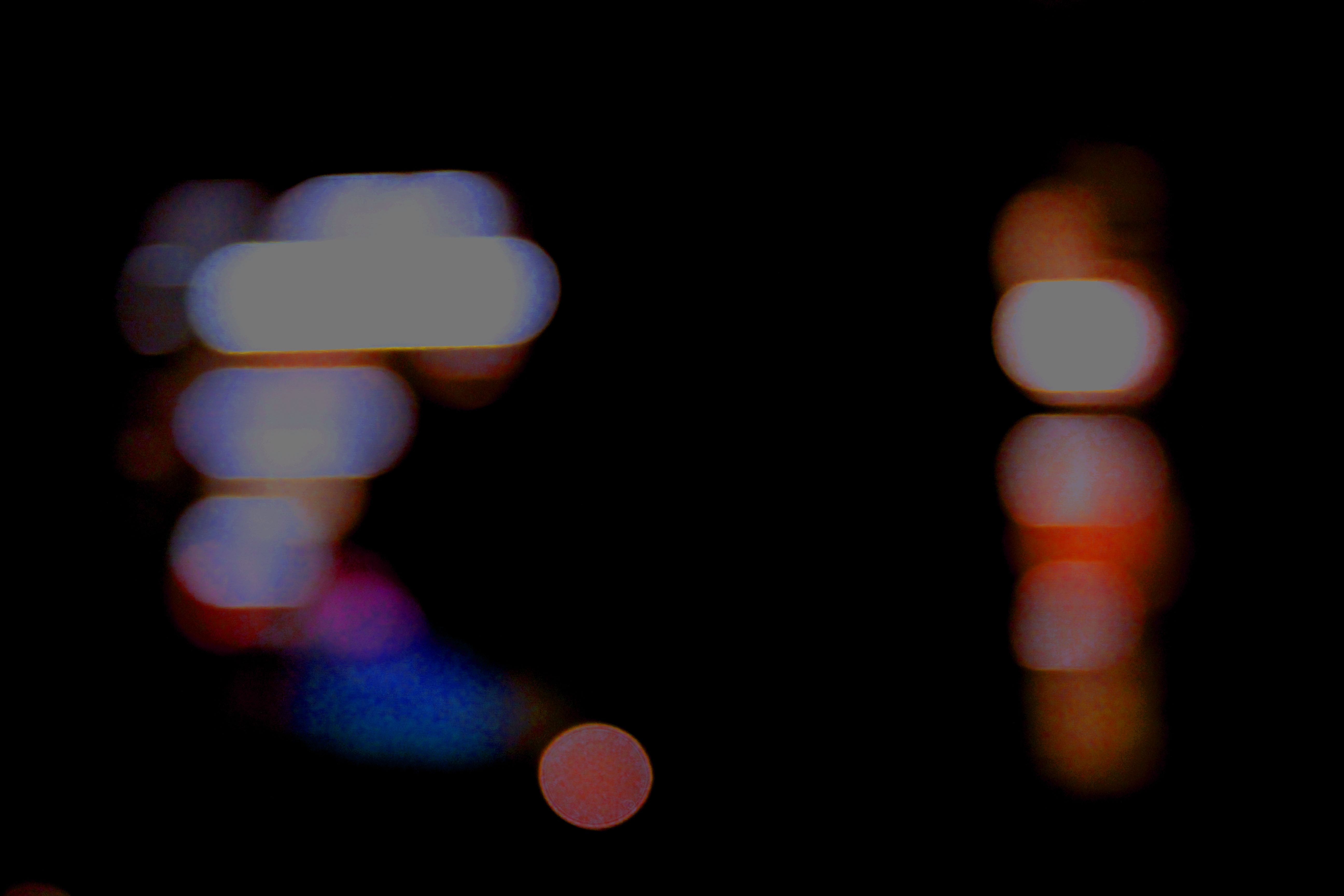
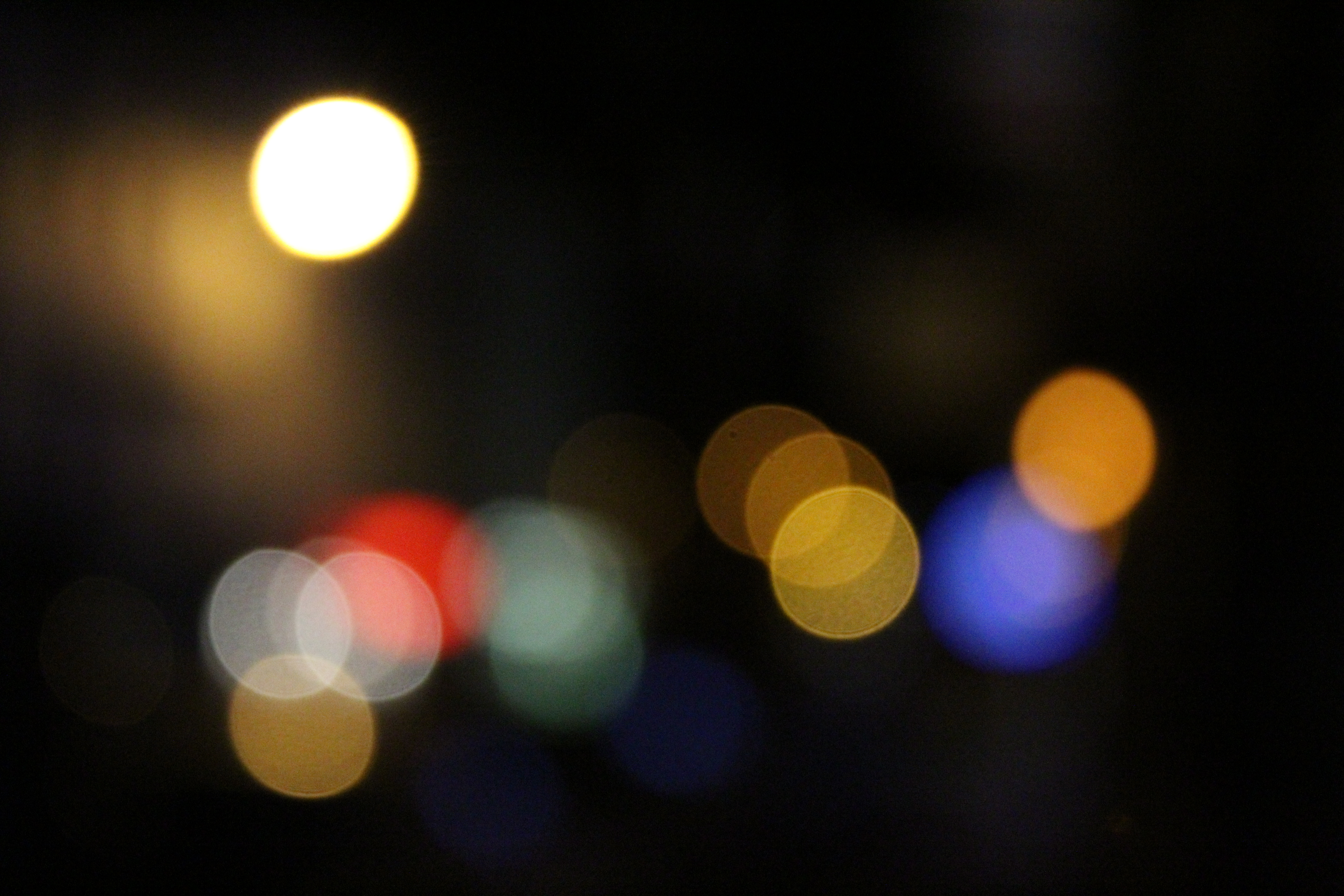
The image i had chosen from my Bokha project had been previously edited and i ended up chosing the edited verison of the image.
The image was taken on a Canon EOS 1300 D and was taken in Manual Focus which helped to purposly make the scenery blurred and achieve the ‘ Bokha’ effect. A quick shutter speed was also taken to help under expose the image and emphasis the darker elements in the photo. The image was also taken with no flash which helped to make the colours in the picture stand out in contrast to the darkness of the sky.
When editing the image i firstly changed the brightness down to emphasise the darkness in the background, as well as changing the contrast so that the original golden white with coloured undertones contrasted with the night sky. The exposure of the image was then turned down in order to make the image more underexposed. The colour balance of the image was then changed. This was the step which had the most effect on the image and made it into its final image. This was because when changing the colour balance to a green colour meant that the undertones of the street lights were then enhanced.
When deciding how this picture was going to be displayed i had experimented with mirroring the image, as well as layering it. Even though this would show more technique, i decided to come back to the original and slightly edited picture as i think that it looks good as a singular A4 image as it is and doesn’t need to be overly edited.
This was originally an experimental image which i was very fond of and decided to bring into my final prints as it had lots of potential.
The image was taken on a Canon EOS 1300 D and was taken in Manual Focus which made sure my ‘ F stop’ was low which created the narrow depth of field effect that i was aiming for in the image. No flash was used to take this picture as the image was taken under natural lighting which emphasized every detail on the hand, as well as my shutter speed of 1/200 which allowed light into the lens.
I did not do any editing to this image.

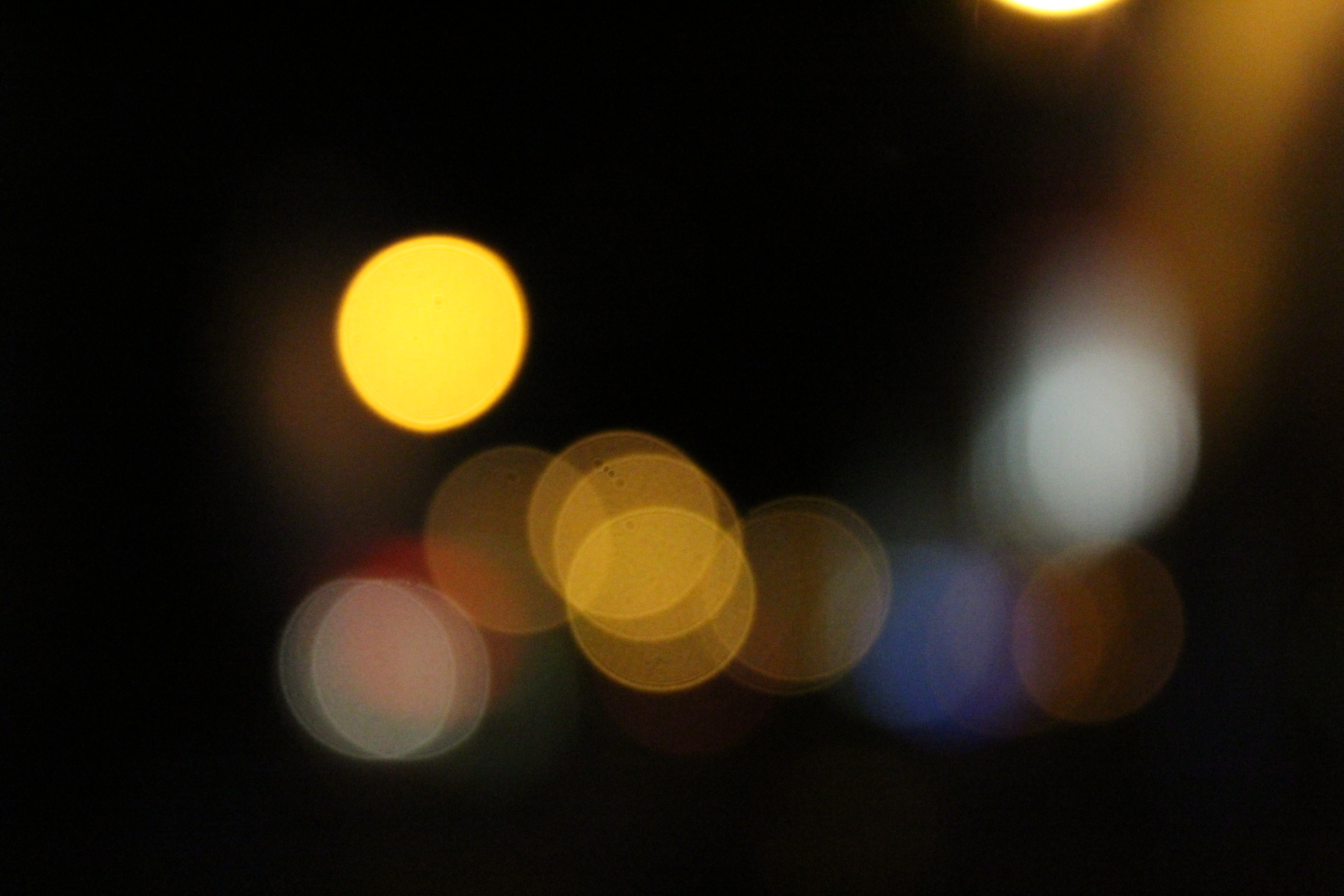
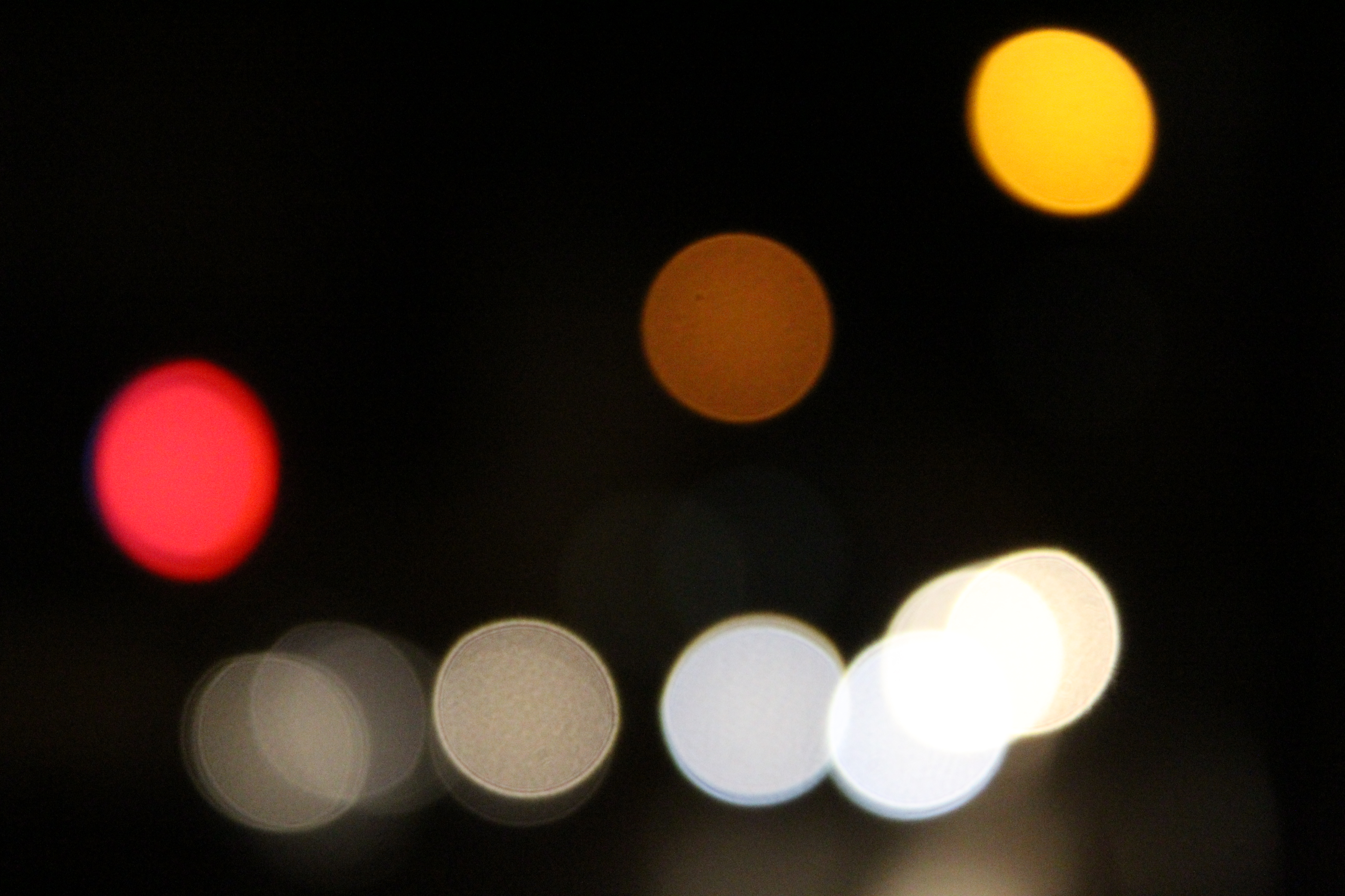
The image i had chosen from my Bokha project.
The image was taken on a Canon EOS 1300 D and was taken in Manual Focus which helped to purposly make the scenery blurred and achieve the ‘ Bokha’ effect. A quick shutter speed was also taken to help under expose the image and emphasis the darker elements in the photo. The image was also taken with no flash which helped to make the colours in the picture stand out in contrast to the darkness of the sky.
There was no editing done to these images.
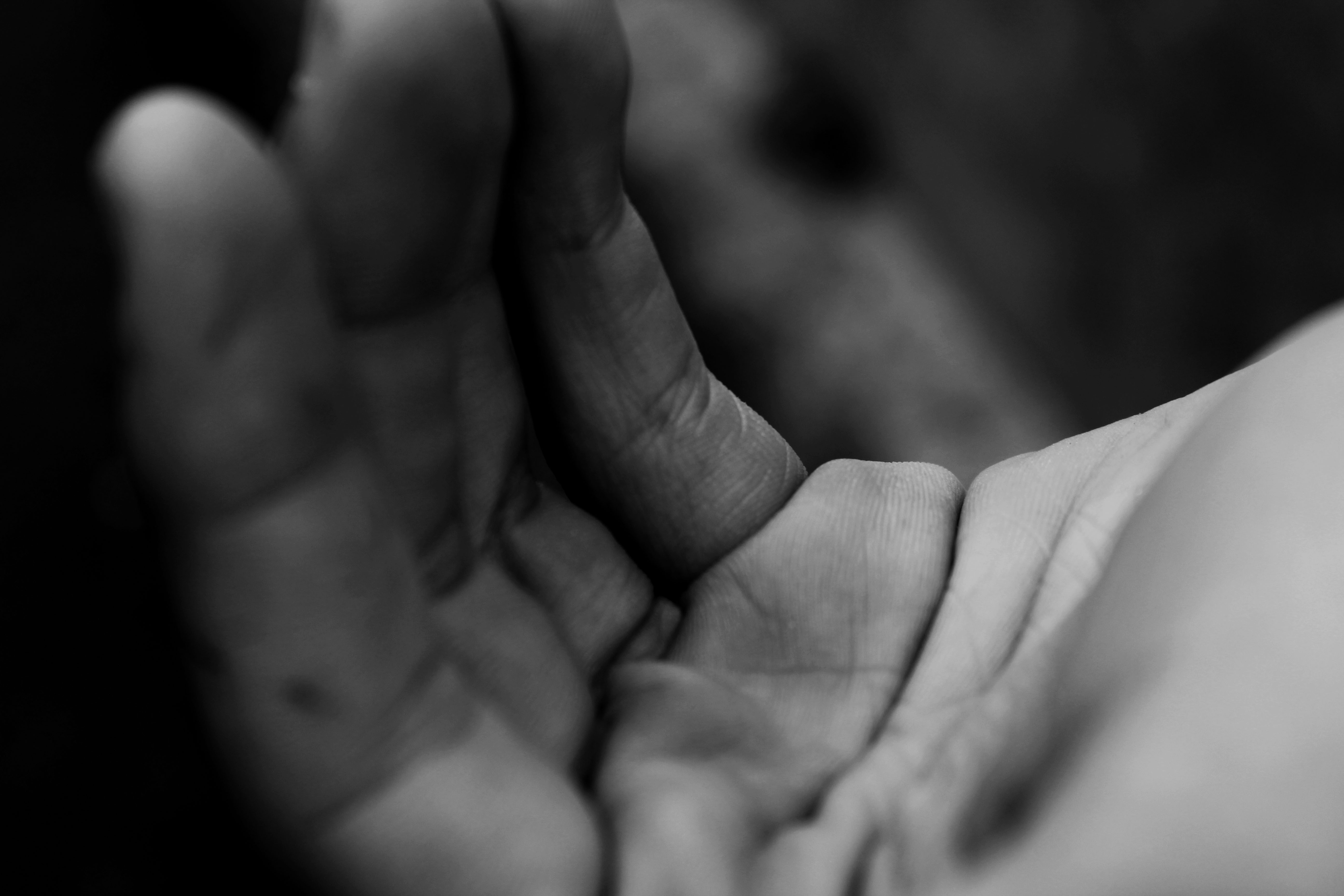
This was originally an experimental image which i was very fond of and decided to bring into my final prints as it had lots of potential after being slightly edited.
The image was taken on a Canon EOS 1300 D and was taken in Manual Focus which made sure my ‘ F stop’ was low which created the narrow depth of field effect that i was aiming for in the image. No flash was used to take this picture as the image was taken under natural lighting which emphasized every detail on the hand, as well as my quick shutter speed that i used to under expose the image for a darker background.
When editing this image i firstly edited the image to black and white as i thought using a black and white filter would help to emphasise the details of the hand. I then created ‘levels’ and lowered the level scale until i found that the background was dark enough to my liking in contrast to the main subject ( hand) being lighter. For my final editing stage i edited the brightness of the overall picture up in order to brighten up the hand.
I never had any intentions of changing the the display of the overall image and think the image is too simplistic to be mirrored etc.. I have decided to leave the image as it is and have the whole image on the A5 print.
This was an image which deliberately taken for one of my final images as i was disappointed that i didn’t get a chance in the overall Abstract project to take an image like this.
The image was taken on a Canon EOS 1300 D and was taken in Manual Focus which made sure my ‘ F stop’ was low which created the narrow depth of field effect that i was aiming for in the image. My aim with the image was to have a lot of shadowing being shown and i therefore took the image on a cloudy day which helped emphasise the shadowing. The image was also taken on a quick shutter speed which like i have mentioned in my other images, helps to under expose the image and add emphasise on the textural parts ie the bark on the image and make the shadows darker than they actually are.
I only took two steps in editing this picture as i really liked it before hand. The first step was decreasing the ‘ Levels’ on my image which added more depth to the shadowing. I then took it a step further and decreased the brightness of the output levels which then added more darkness. I was then left with my ideal final image.
Having this image displayed on A3 was ideal for me as i really wanted the texture of the image to be very noticeable and by putting this image on the larger card is the better idea. I think that because the image is so simple it didn’t need lots of editing done to it and i therefore plan to leave the image how it is.