These are my initial choices and ideas for my final developments as I believe them to be my best photograph outcomes.

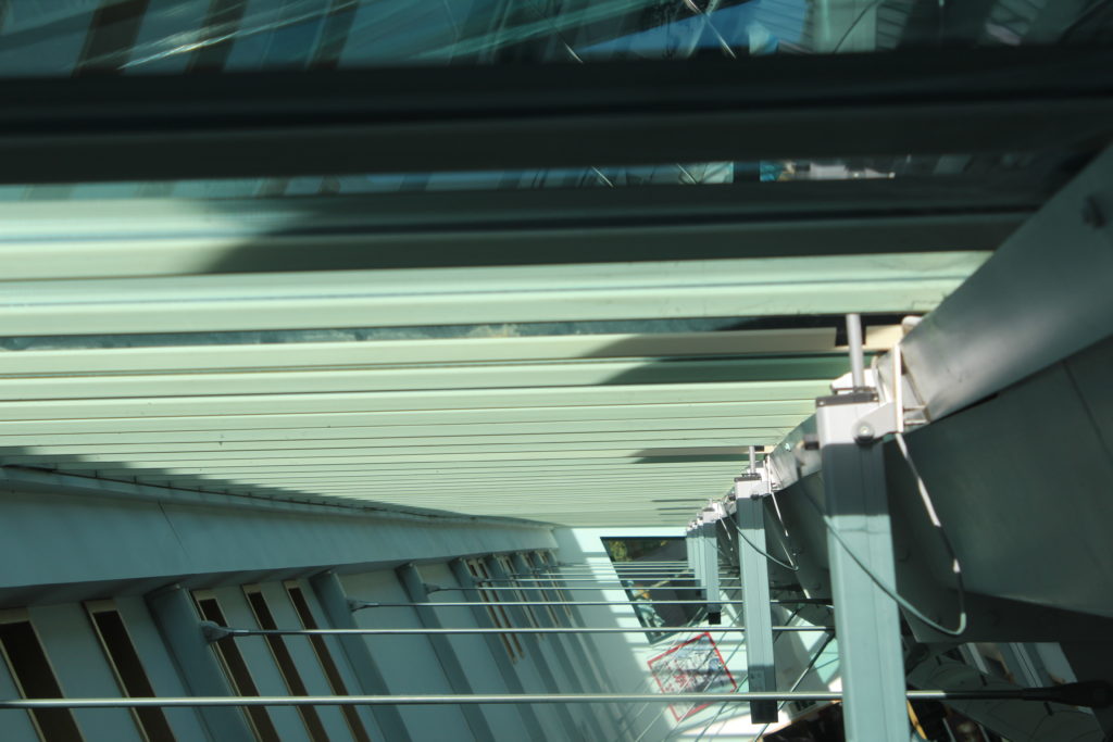
This is one of my initial choices for a final photograph to be produced. I feel it is one of my best images a because it has a strong sense of geometric abstract photography due to the arrangements and patterns of the horizontal lines across my the photograph and this also becomes contrasted with then vertical lines which travel down the right side of the image. The photograph has a lot of light giving it some shadows in the top right of the image contrasting the very light panels that travel through the middle.

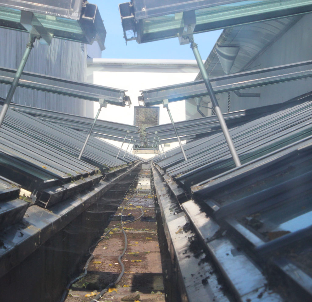
This image again becomes abstract by the use of the symmetrical geometric patterns throughout. The lines range from going diagonally downwards to less of a slant towards the top of the photographs. Unfortunately the image is slightly off centered and the line towards the back of the image does not travel directly up the middle which I feel would’ve made it a better image for the abstract project due to the identical symmetry that it would create. Apart from this I still believe this photograph could be a potential final image as it has strong line and texture running across the bottom of the image which many abstract artists also looked at.

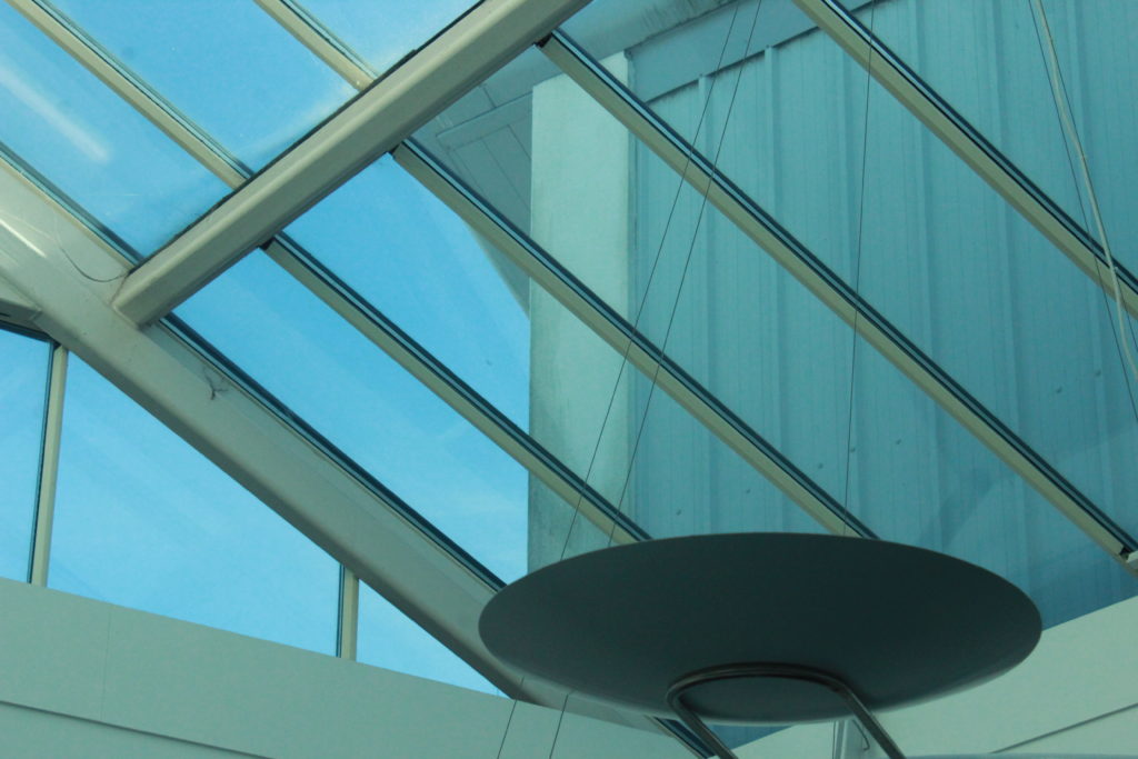
This image has an object off center to the right at the bottom of the frame this is what the eye will naturally draw to first and is darker compared to the rest of the light and blue tinted image and this I feel helps to bring it an abstract feel. This image also has a strong development of lines in different directions which can be seen clearer than some of the previous images due to the clear background behind. The image is very light and doesn’t hold a lot of contrast however I believe it is it’s geometric lines which develop it in an abstract way.

This is another image which works well due to it’s symmetry and it’s use of line. This photograph is unfortunately over exposed however this could be useful into further editing and could be used to my advantage while editing and developing further along. This image has a strong symmetrical line directly down the middle with the geometric lines fraying off, this is what I feel develops it as an abstract image.

This photograph is one that was taken in inspiration from Ralph Meatyard. It was developed by working and experimenting with using manual focus to purposely put the image out of focus to develop an abstract image. I feel it is one of my best photographs as I feel you can clearly still see the form of the plant even though out of focus and unlike some of the other photographs I have produced there is the white negative space in the back which helps to bring the form forward and there isn’t anything in the background that is overpowering and confusing or creating too much noise.

This is another image from the same shoot in inspiration by Ralph Meatyard, I feel if chosen these two images would work well as a pair if developed into a final piece. In this image compared to the previous image there is a slight out of focus colour making it’s way in on the left side which I personally would crop down if I moved forward with this image. As well as the previous image this has a lot of negative space in it’s background however it helps to bring out the forms of the branches on the tree. This image and the previous could relate to Meatyard’s work in ‘Zen Twigs’.

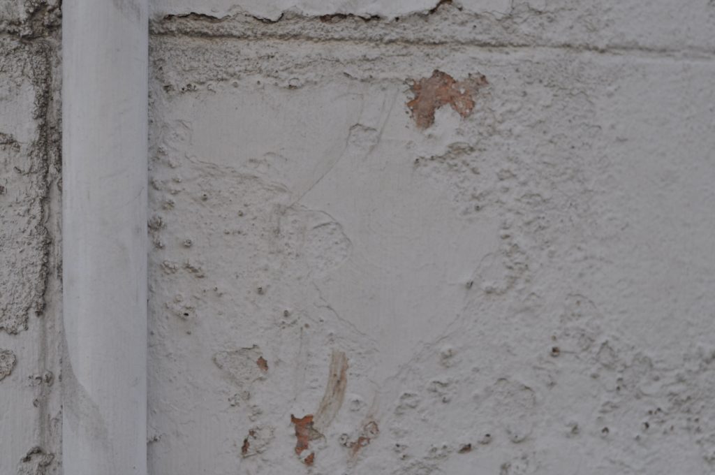
This is one of my photographs that came from inspiration of Aaron Siskind. I feel it was one of my most successful photograph in this experiment but also as a whole, I feel it has an abstract feel due to the rotting and rusting walls and the pipe down the left side draws the eye towards that as an object and contrasts the rotting wall which has soft wavy edges compared the straight vertical edges of the pipe. I feel this would make a good final image in A5 and as a singular image. This image focuses on the uses of texture and line.

This is another from my shoot with inspiration from Aaron Siskind, I felt this was one of my more successful photographs as it shows a lot of contrast and texture whereas a lot of my previous images focus on line contrast. It also shows elements of colour and colour contrasts of the dark colours of the blue and the black contrasted with the white and the creams. I feel these elements work well to create it into an abstract image that works well and could potentially be used for one of my final photographs.
