Here I am going to be trialing and experimenting with ways to display my final images on the A3, A4 and A5 paper prints. This will include arrangements of multiple images on one page and also just some single images to see what will work well together and if I can create a series of images that work well along one print.
Display 1:

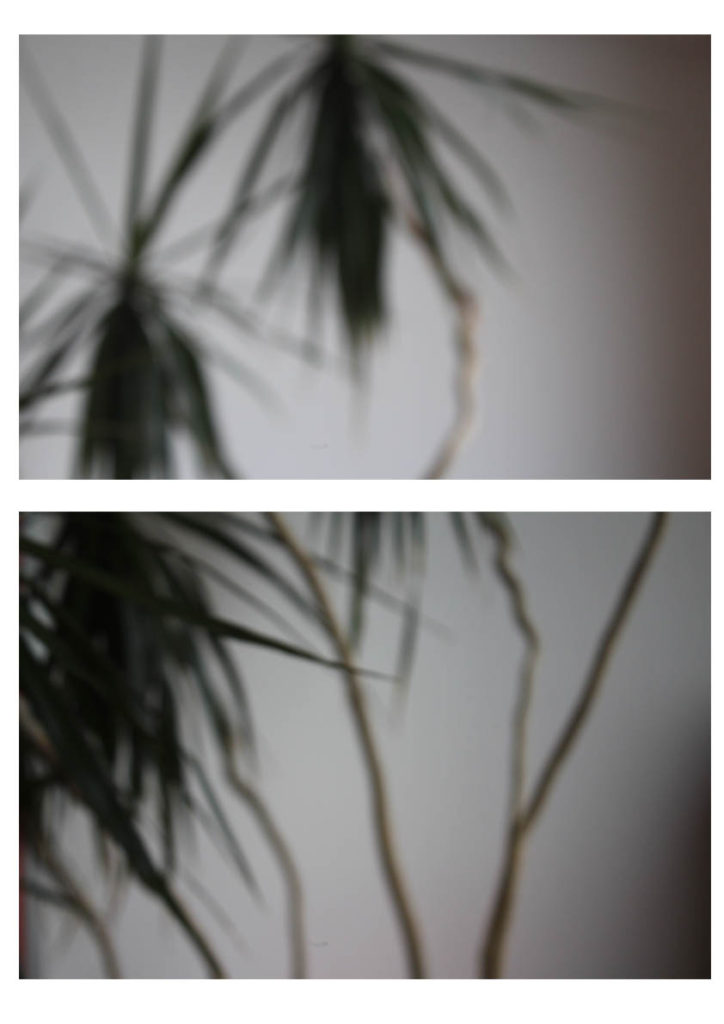
This is my first experiment with a way to display my final images. This display has two photographs from the same shoot one on top of the other. I would either place this image as A3 or A4, this would be so that you could clearly see the images and I feel would have a bigger impact on a larger scale. I feel the two images together have a large impact as they compliment each other and work well together creating a better effect together rather than if I had one of the singular photographs on its own. I feel this would work well displayed as a final piece as it shows off some of my camera skills and having them both on here emphasizes this.
Display 2:

This display I would use for A5 this would enable for the photograph to fill the whole page and I think this would have a larger impact having this particular photograph on its own and isolated. I would use a small boarder of white around the edge as to frame the photograph as I feel this would have a good effect.
Display 3:

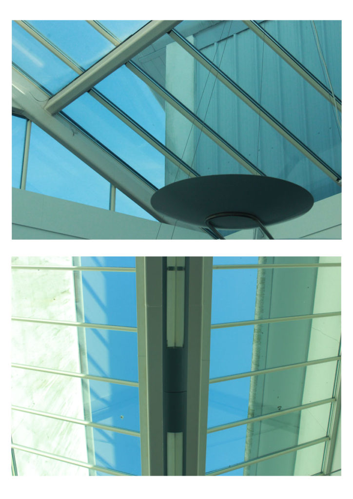
This display combines another of my two chosen images side by side as they work well together in the same style with the geometric abstract lines. I would have it either A4 or A3 as to show off the photographs and to be able to see the detail as I don’t feel this display would work well on a scale of A5. I feel the two images have a larger impact side by side rather than if I displayed the two photographs by themselves.
Display 4:

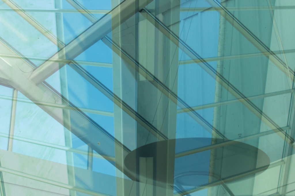
This is a display option for how I would display this edited image. I would make it my large A3 photograph as to show the full effect of the image and I feel it would work well on a larger scale to be able to see all the detail and the contrasting double exposure of the two photographs.
Display 5:

This is another way I may display my out of focus image however this has one just on it’s own like my textured wall photograph I would have this so that you could see the full effect of the photograph on A4 to be able to see my camera skills clearly with the out of focus shot.
