Compare&Contrast Edgar Martins

Edgar Martins 


He was a Portuguese photographer who is currently living in the United Kingdom. He was born in 1977 in a small town area called Évora, although Martins grew up in China. However Edgar doesn’t just base all his creativity in the photographic area but he has also published a hand full of books in which he has won a variety of awards for. Martins has work exhibited in various places around the world from Portugal to places like Dubai. Not only that but Martins was considered by the UK and the US as one of the most influential artists for this generation. Not only has his work inspired our first project for photography but having looked at my new images and my now edited images there are some obvious changes in terms of contrast and the shadowing I have added to the photo to make it similar to Martin’s developments.

His images is part of a series of work inspired by the writing and sending of letters, the power and intimacy of a letter. Martins has recently won various awards for his minimal, direct and stylish approach.  it is pretty evident that Martins puts a lot of thought into his images as not many artists have had the same approach as he had. 

Edgar photographed paper. There is a stillness to his images that belies the fact they may have been written as suicide notes, used to communicate between prison inmates and loved ones. Martins spent time working with court, prison and parole officials and indeed, prisoners in Portugal.

Here are just some of my favourite examples of his work.

(not an image of paper but still one a famous image)
Paper 1
Paper 2


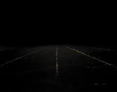
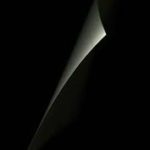
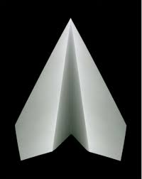
I like these images due to the contrast of lights and darks and how in the second image of the paper there is a  real sharpness and contrast on how the  black background sits below the white piece of paper.  For me this is really eye-catching as the focus is quite vastly spread amongst the image but immediately only draws attention to the white area.

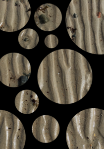
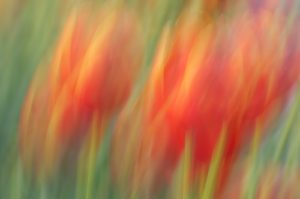
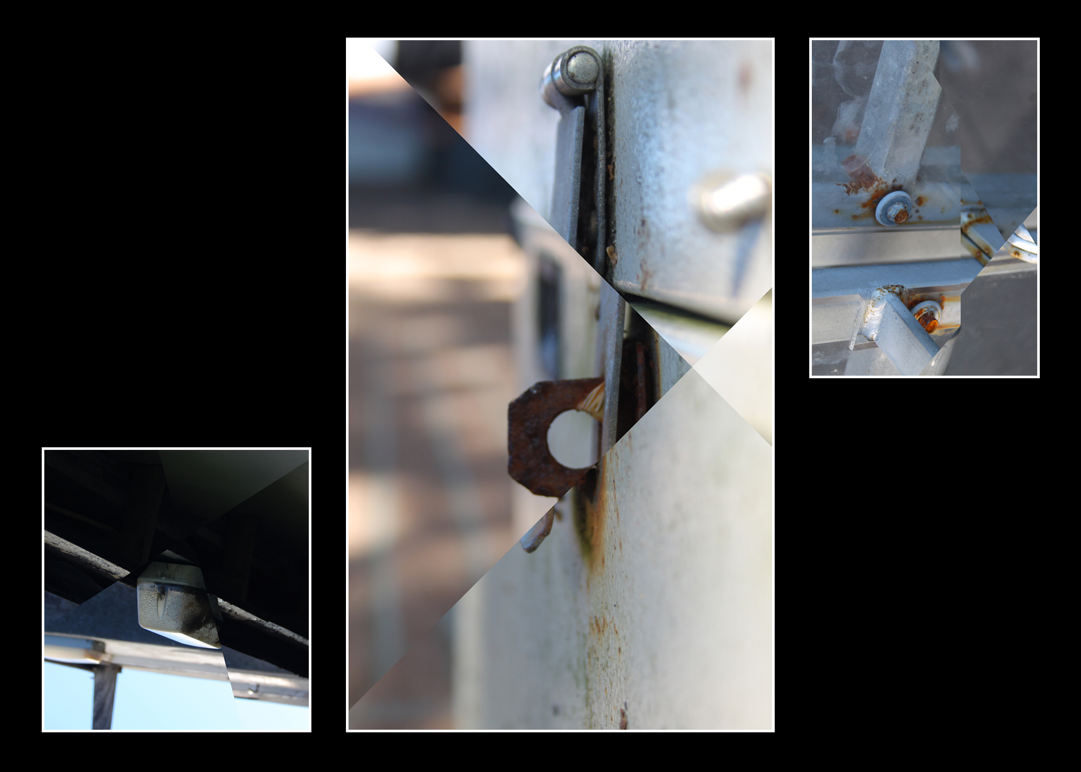
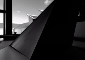
My paper photographs were not as professional as Edgar’s but there was a thought process. Here are some of my examples before I even edited them slightly. This image was not the first set a paper photographing I did but the second. I chose to edit this image as its one that looks quite similar in terms of Edgars images .

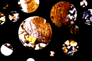
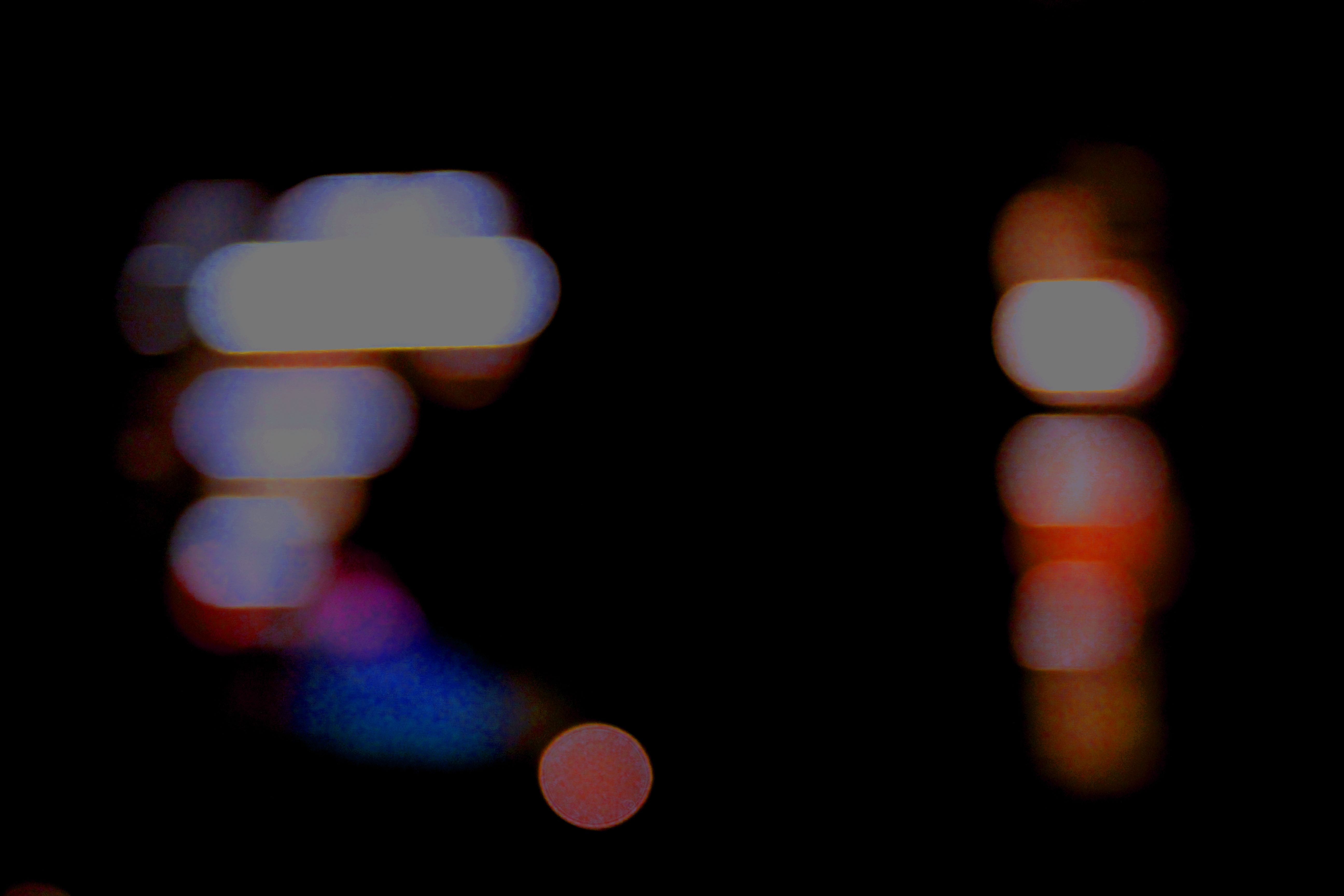
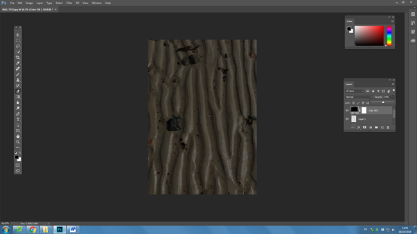
Here I’ve changed the image lighting and added a lot of heavy shading. I’ve edited this image by adjusting the tone, brightness,exposure,contrast and black point.

Final Prints: Display Techniques

Here I am going to be trialing and experimenting with ways to display my final images on the A3, A4 and A5 paper prints.  This will include arrangements of multiple images on one page and also just some single images to see what will work well together and if I can create a series of images that work well along one print.

Display 1:

Display 1

This is my first experiment with a way to display my final images.  This display has two photographs from the same shoot one on top of the other.  I would either place this image as A3 or A4, this would be so that you could clearly see the images and I feel would have a bigger impact on a larger scale.  I feel the two images together have a large impact as they compliment each other and work well together creating a better effect together rather than if I had one of the singular photographs on its own.  I feel this would work well displayed as a final piece as it shows off some of my camera skills and having them both on here emphasizes this.

Display 2:

Display 2

This display I would use for A5 this would enable for the photograph to fill the whole page and I think this would have a larger impact having this particular photograph on its own and isolated.  I would use a small boarder of white around the edge as to frame the photograph as I feel this would have a good effect.

Display 3:

Display 3

This display combines another of my two chosen images side by side as they work well together in the same style with the geometric abstract lines.  I would have it either A4 or A3 as to show off the photographs and to be able to see the detail as I don’t feel this display would work well on a scale of A5.  I feel the two images have a larger impact side by side rather than if I displayed the two photographs by themselves.

Display 4:

Display 4

This is a display option for how I would display this edited image.  I would make it my large A3 photograph as to show the full effect of the image and I feel it would work well on a larger scale to be able to see all the detail and the contrasting double exposure of the two photographs.

Display 5:

Display 5

This is another way I may display my out of focus image however this has one just on it’s own like my textured wall photograph I would have this so that you could see the full effect of the photograph on A4 to be able to see my camera skills clearly with the out of focus shot.

Editing and manipulation of Final Images

Double Exposures

Editing
Editing

For the double exposure I placed one of my chosen images on top of the other and then lessened the opacity of the top image so that the background layer was showing through and this creates the double exposure effect and I feel works really well as an option for my final photographs.

Final Edit

Kaleidoscope

Editing
Editing

For the kaleidoscope editing I opened one image and then doubled the canvas width and then doubled the image and pulled the second layer across to the blank canvas space, I then doubled the height and pulled across the top images to the bottom to create the kaleidoscope.

Final Edit


Final Prints: Initial Ideas

These are my initial choices and ideas for my final developments as I believe them to be my best photograph outcomes.

Own Work

This is one of my initial choices for a final photograph to be produced.  I feel it is one of my best images a because it has a strong sense of geometric abstract photography due to the arrangements and patterns of the horizontal lines across my the photograph and this also becomes contrasted with then vertical lines which travel down the right side of the image.  The photograph has a lot of light giving it some shadows in the top right of the image contrasting the very light panels that travel through the middle.


Own Work

This image again becomes abstract by the use of the symmetrical geometric patterns throughout.  The lines range from going diagonally downwards to less of a slant towards the top of the photographs.  Unfortunately the image is slightly off centered and the line towards the back of the image does not travel directly up the middle which I feel would’ve made it a better image for the abstract project due to the identical symmetry that it would create.  Apart from this I still believe this photograph could be a potential final image as it has strong line and texture running across the bottom of the image which many abstract artists also looked at.


Own Work

This image has an object off center to the right at the bottom of the frame this is what the eye will naturally draw to first and is darker compared to the rest of the light and blue tinted image and this I feel helps to bring it an abstract feel.  This image also has a strong development of lines in different directions which can be seen clearer than some of the previous images due to the clear background behind.  The image is very light and doesn’t hold a lot of contrast however I believe it is it’s geometric lines which develop it in an abstract way.


Own Work

This is another image which works well due to it’s symmetry and it’s use of line.  This photograph is unfortunately over exposed however this could be useful into further editing and could be used to my advantage while editing and developing further along.  This image has a strong symmetrical line directly down the middle with the geometric lines fraying off, this is what I feel develops it as an abstract image.


Own Work

This photograph is one that was taken in inspiration from Ralph Meatyard.  It was developed by working and experimenting with using manual focus to purposely put the image out of focus to develop an abstract image.  I feel it is one of my best photographs as I feel you can clearly still see the form of the plant even though out of focus and unlike some of the other photographs I have produced there is the white negative space in the back which helps to bring the form forward and there isn’t anything in the background that is overpowering and confusing or creating too much noise.


Own Work

This is another image from the same shoot in inspiration by Ralph Meatyard, I feel if chosen these two images would work well as a pair if developed into a final piece.  In this image compared to the previous image there is a slight out of focus colour making it’s way in on the left side which I personally would crop down if I moved forward with this image.  As well as the previous image this has a lot of negative space in it’s background however it helps to bring out the forms of the branches on the tree.  This image and the previous could relate to Meatyard’s work in ‘Zen Twigs’.


Own Work

This is one of my photographs that came from inspiration of Aaron Siskind.  I feel it was one of my most successful photograph in this experiment but also as a whole, I feel it has an abstract feel due to the rotting and rusting walls and the pipe down the left side draws the eye towards that as an object and contrasts the rotting  wall which has soft wavy edges compared the straight vertical edges of the pipe.  I feel this would make a good final image in A5 and as a singular image.  This image focuses on the uses of texture and line.


Own Work

This is another from my shoot with inspiration from Aaron Siskind, I felt this was one of my more successful photographs as it shows a lot of contrast and texture whereas a lot of my previous images focus on line contrast.  It also shows elements of colour and colour contrasts of the dark colours of the blue and the black contrasted with the white and the creams.  I feel these elements work well to create it into an abstract image that works well and could potentially be used for one of my final photographs.


Over-layer

To start with, I went and chose a picture which was abstract, and one I thought was interesting. I then went to layer, went down to new layer, and then chose solid colour and changed it to whatever colour I wanted.

After I got the layer with the colour, I went to opacity and brought it down so I could now see the picture through the top layer. 
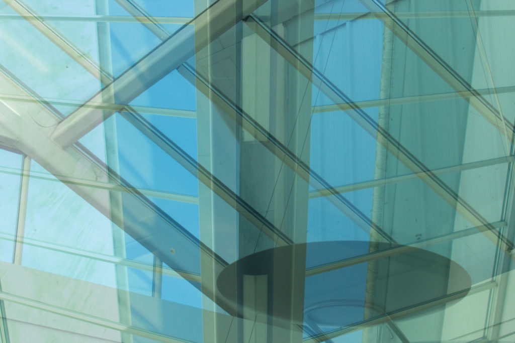
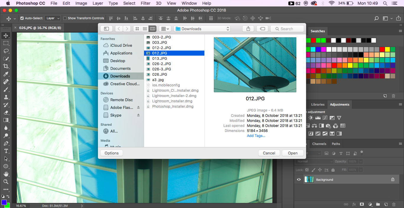
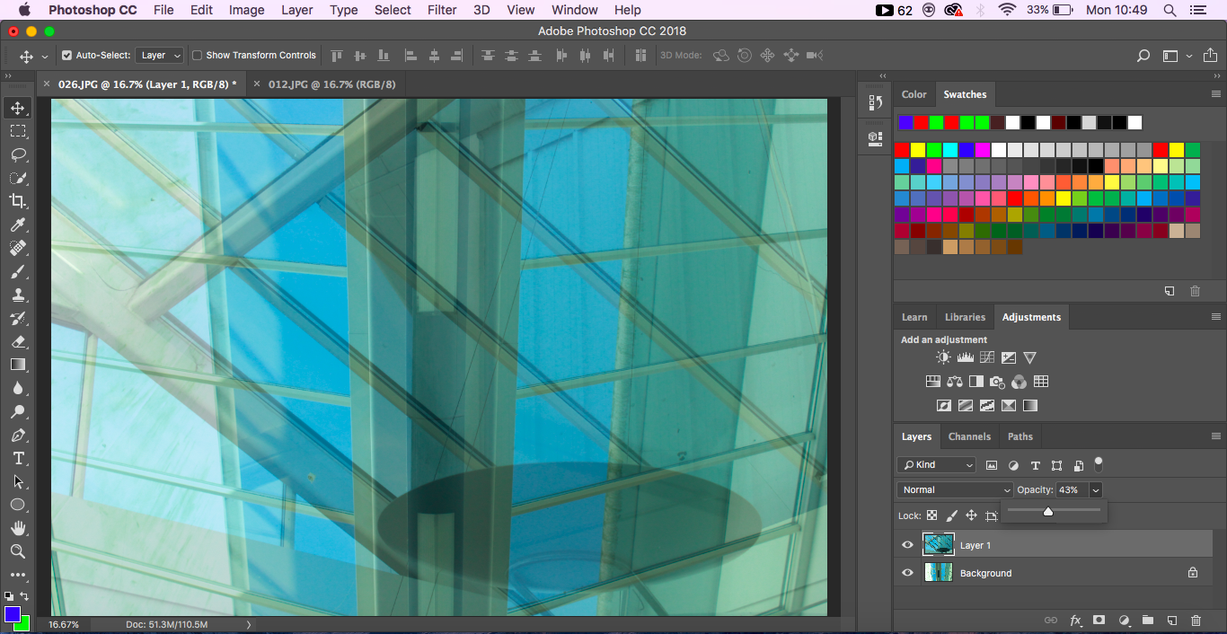
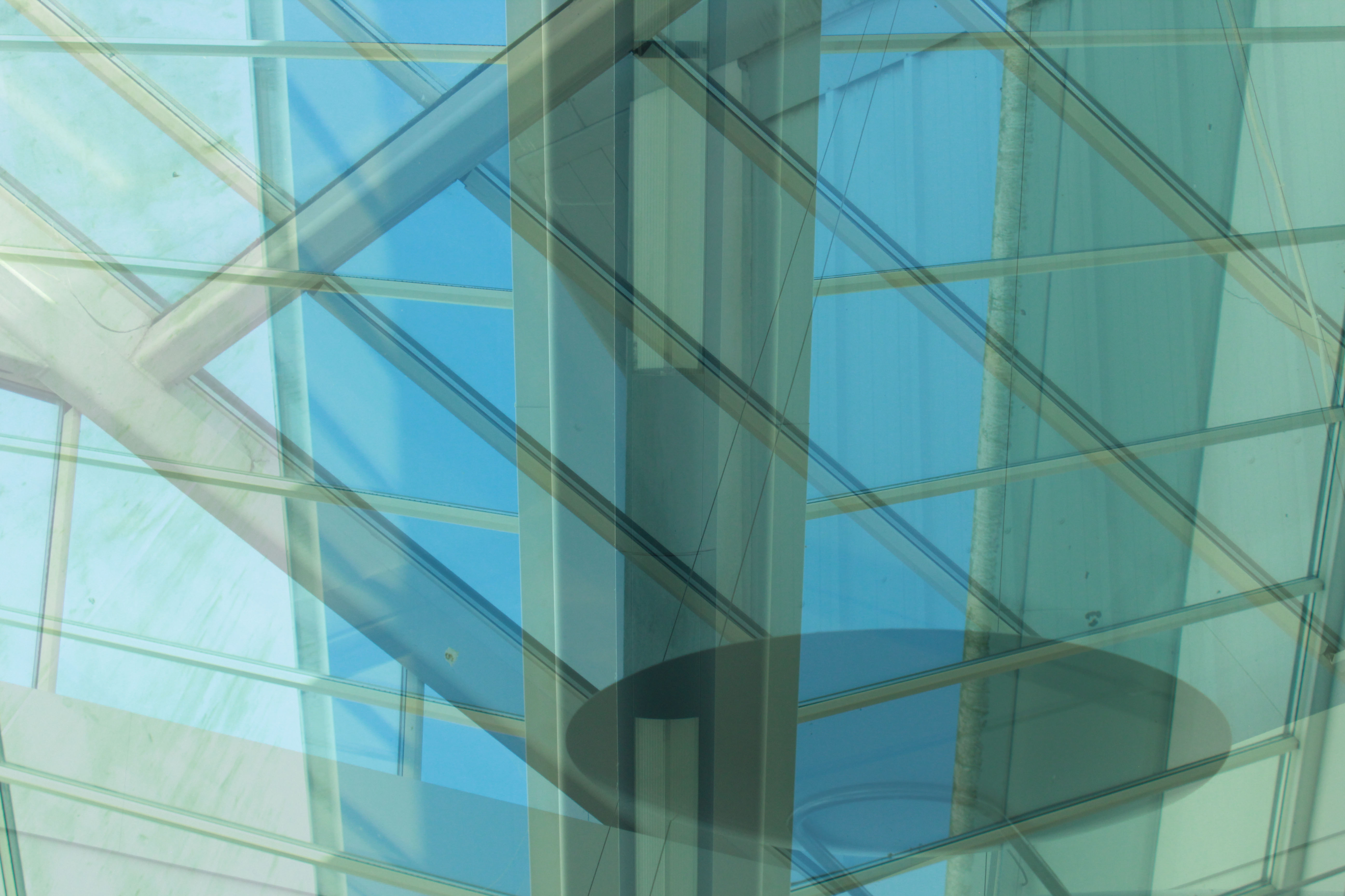
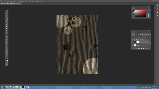
I then went and got the rubber tool, adjusted the edge to what I wanted and used the ‘[‘ and ‘]’ button to change the size of the circle, and then and started to erase parts of the top layer.

Finally, I went and changed the opacity back to 100% and got my finished image.

Byron Jorjorian

Byron Jorjorian’s award-winning photography has been appreciated and admired all over the world. His work has appeared in major publications including Time, National Geographic, Outdoor Photographer, Smithsonian Books and the Audubon Field Guides. He, like most, began humbly. His interest in photography started at age 11, when he got his first camera as a gift from his grandfather. This small event was life-changing for the young Byron and awakened in him an insatiable passion for photographing nature.

Image result for byron jorjorian

Byron Jorjorian has been capturing the natural world on film for over 30 years. With over 210,000 images in his files, his photographs have appeared on nationally published greeting cards, calendars, magazines, posters, murals, fine art prints, brochures, and advertising. Byron has had over 10,000 images published.

this is  some of his work

Image result for byron jorjorian

Image result for byron jorjorian

Image result for byron jorjorian

Image result for byron jorjorian


in some photos he just focuses on the obstacles in the front ground and the back ground is unfocused which gives a lot of texture and color to the photograph.

experimenting to copy his work:

i tried to study some of his work and try to copy similar

Abstract stand of red and yellow variegated spring tulip blossoms and flowers

in this abstract photo we find a lot of color and movement because of the technique he used to take it, it was set on low shutter speed and taken while the camera was moving.


this is my work, i tried to copy his work by putting the camera on low shutter speed  and focusing on those pink and yellow cyclamen flowers in the front and keeping the back unfocused then i took the photo wile i’m slightly shaking the camera which is why its not really similar to Jordanian’s work.

in this photo he sharply focused on the flower in the fore ground on normal shutter speed this time without shaking or moving the camera and he kept the green background unfocused to create color in the flower.

i took this photo on normal shutter speed and manual settings. i focused on the seed pod and kept the background unfocused. its not good as Jorganian’s work though because there is less sunlight and the background is not fully green, also because i was using a long lens so i couldn’t take the photo but from at least 4 meters away so that it can focus which doesn’t produce a photo as sharp and focused as a short lens camera from up close.


DISPLAYING FINAL IMAGES

Displaying final images

Final piece 1:

This image will be displayed in a black peep hole where there is a black frame outlining the image.


Final piece 2:

This image will be displayed in a black peep hole where there is a black frame outlining the image.


Final piece 3:

This image will be displayed in a black peep hole where there is a black frame outlining the image.


Final image 4:

This image will be displayed in a black peep hole where there is a black frame outlining the image.


Final image 5:

The groups of images will be placed on a plain white background however also be on a foam board so that the images stick out.


Abstract Project – Evaluate/ Critique

In conclusion I am happy with the final product, while my link to Letha Wilson is rather vague I feel it is still evident in the manipulation of the images. I like the lighting in the images as it creates very soft tones while still having plenty of contrast. I’m also happy with the color balance of the images as none of the tones are too overpowering except for perhaps the brown tones in some areas. The center-piece of the final product is my favorite mostly due to the strong depth of field which nicely compliments the sharp edges created by the style of editing. My favorite display of editing however is the image on the right as that had the most intersections of any image. If I were to redo this project I would likely make sure that the images were more similar in composition and perhaps color. I would also likely tone down the brown slightly as it is a bit too strong for my liking in the central image particularly in the background. I would also make sure that the 2 images on the sides were cropped to the same aspect ratio however these images simply didn’t allow for that as parts of the image were frankly boring and detracted from the image.