
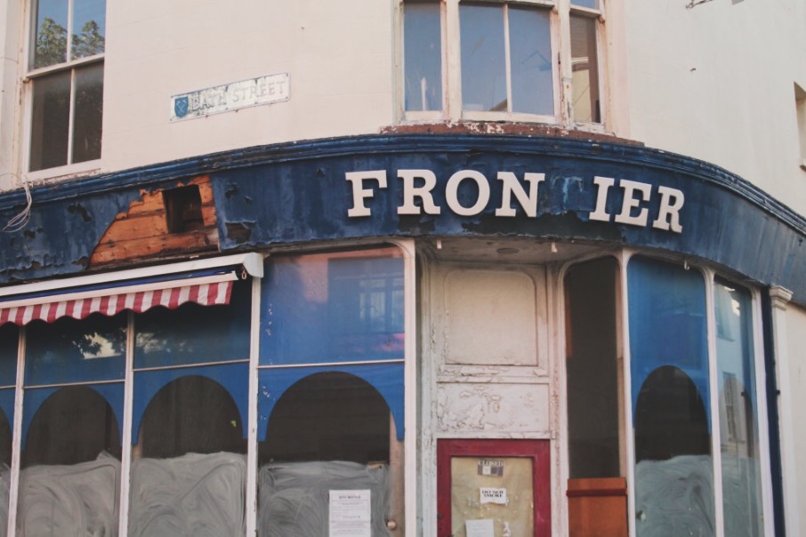
I chose this image as my final A3 print because i think it portrayed: good camera skills, aspects of abstract (the mixture of textures and shapes) and good use of utilizing enhancing tools such as sharpening and contrast.
It’s my favourite exposure because within the concept of ‘Abstract’, i ventured into the idea of abandonment and decay. This idea of utilizing surfaces of decay was to show the different textures side by side to new surfaces.
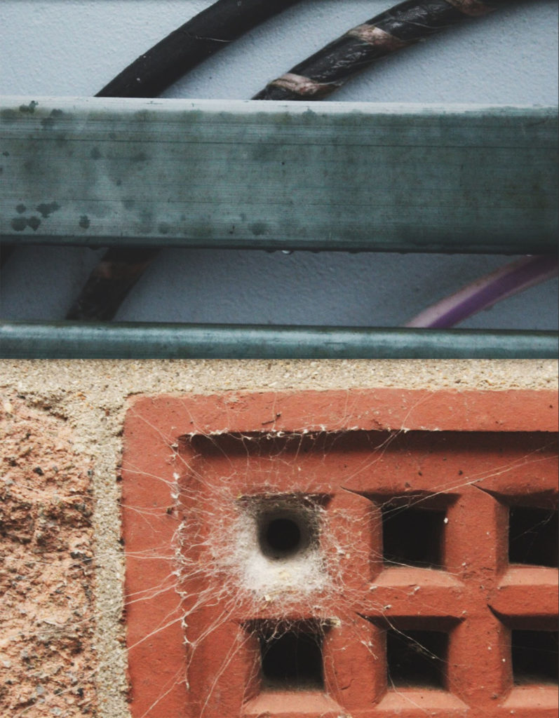
I chose this composition as my A4 print. This is due to again returning to contrasting surfaces: for example- the contrast of the man made bricks compared to the natural spider’s web. I also like these frames because they contrast yet compliment each other due to their colour palettes. The top image shows the cool colour palette with a few pops of the warm palette, compared to the bottom image’s warm colour palette with a centralized cool colour.
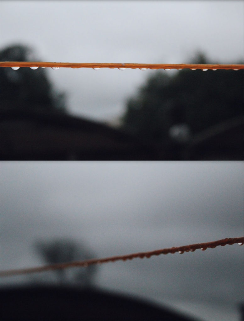
I chose these images as my final A5 frame. This is due to showing my camera skills showing examples of depth of field and area of focus. The top image is a prime example of utilizing focus because by using the camera settings, i was able to focus solely on the washing line in front, blurring the background. Similarly, the bottom image uses focus but in a different way. I was able to focus on one section the the line then create a blurred effect along the rest of it. This creates the sense of depth of field, just by focusing on one specific part.