Initial Choices for final images
After looking through my whole ‘ Abstract’ project, i have used Adobe Photoshop to play around with 5 possible images which i can choose from to be a final image of mine.
Reasoning for my choices

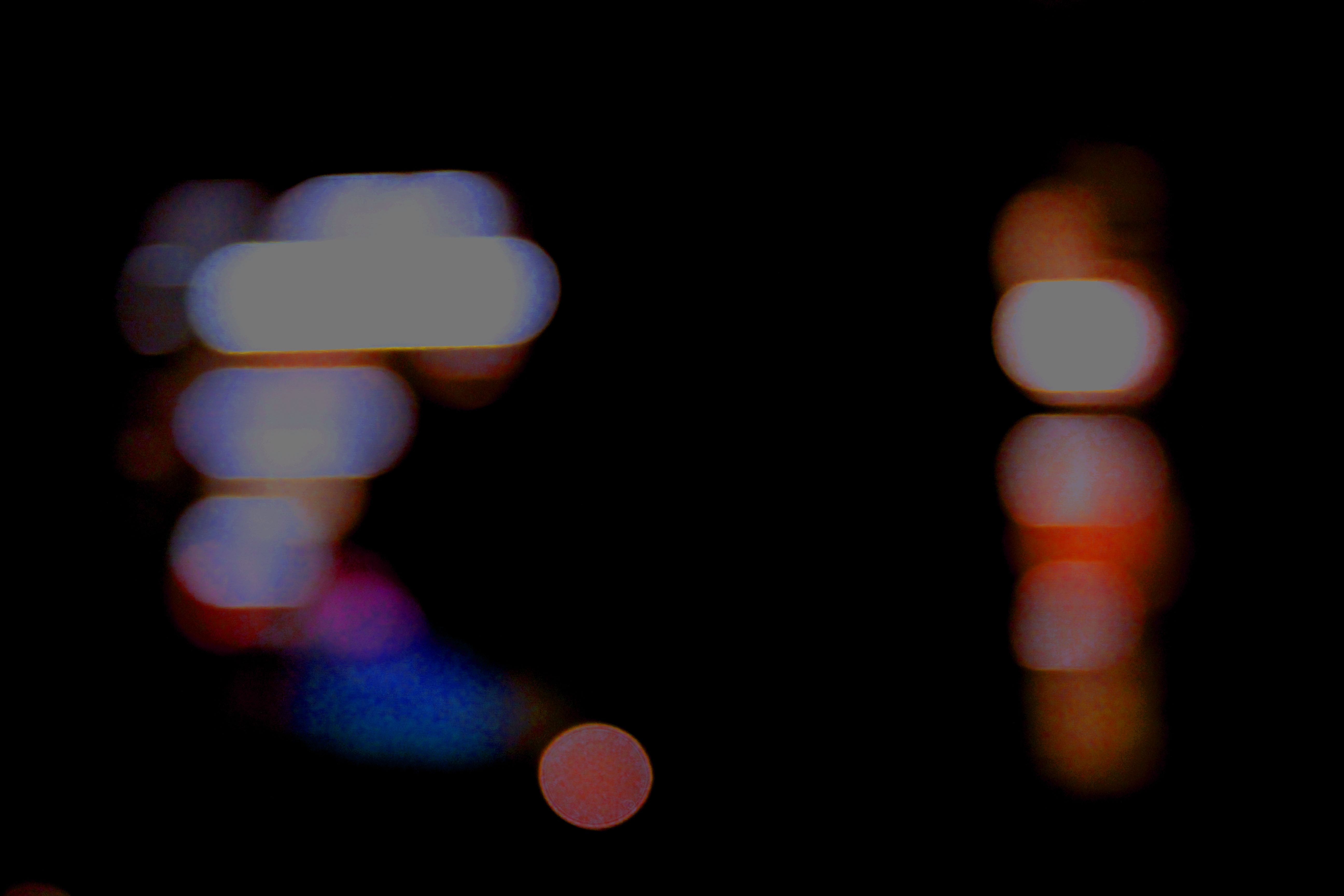
I think using my ‘ Bokha’ inspired image for A4 print out is a good choice. This is because this was my most successful image from a previous Bokha project when studying the photographer Saul Leiter. I think this was one of my most successful pictures from that project as it includes a lot of contrast in the picture due to the high saturated colours, the bright white and the overall darkness.
This image also shows a range of techniques that was used to get this end picture. I took this picture in Manual Focus as which helped to purposely make the scenery blurred while as using a quick shutter speed to take pictures of the lights not in focus as well as it helping to under expose the image and contrast the colours with the overall darkness a lot more which was one of my main goals.

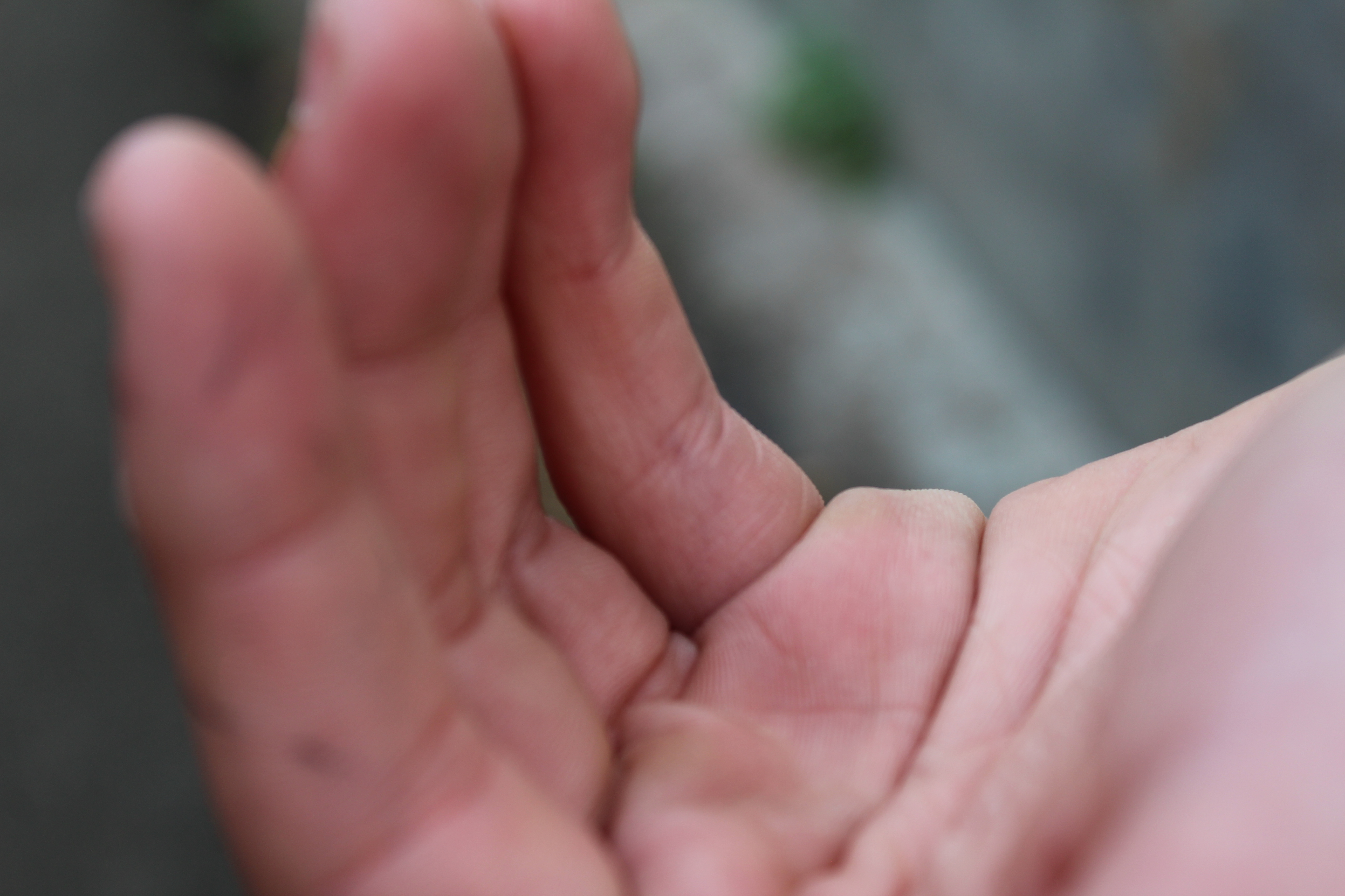
I think using this very toned picture of a hand for my A5 print out is a good decision as this image includes a range of technical elements and taking this picture on this photo shoot taught me a range of things.
This image was taken in Manual Focus so that my ‘ F stop’ was low which made a narrow depth of field which was an affect that i was aiming for. This image was also taken under natural lighting and therefore when using the quick shutter speed on my camera, this allowed for every detail of the hand to be emphasized which added a lot of tone for when edit the into black and white. Using the quick shutter speed taught me that i can use it to help under expose the image to create a darker effect for the non- subject parts of the image which helps to contrast between the light and dark in the picture.

Using this very natural abstract image as my A3 print out is a good choice as the image contains a lot of interesting textures which are very pleasing to the eye. As well as my editing being used to contrast more between the light and dark in the picture and i overall really like the picture and this it will be a great choice for an A3 print out.
This image was taken in Manual Focus which helped me learn what an ‘ F Stop’ is as i had used a low F stop in order to create a shallow depth of field. This image was also taken on a very cloudy day which created a lot of shadowing on the tree bark adding a lot of texture to the image.


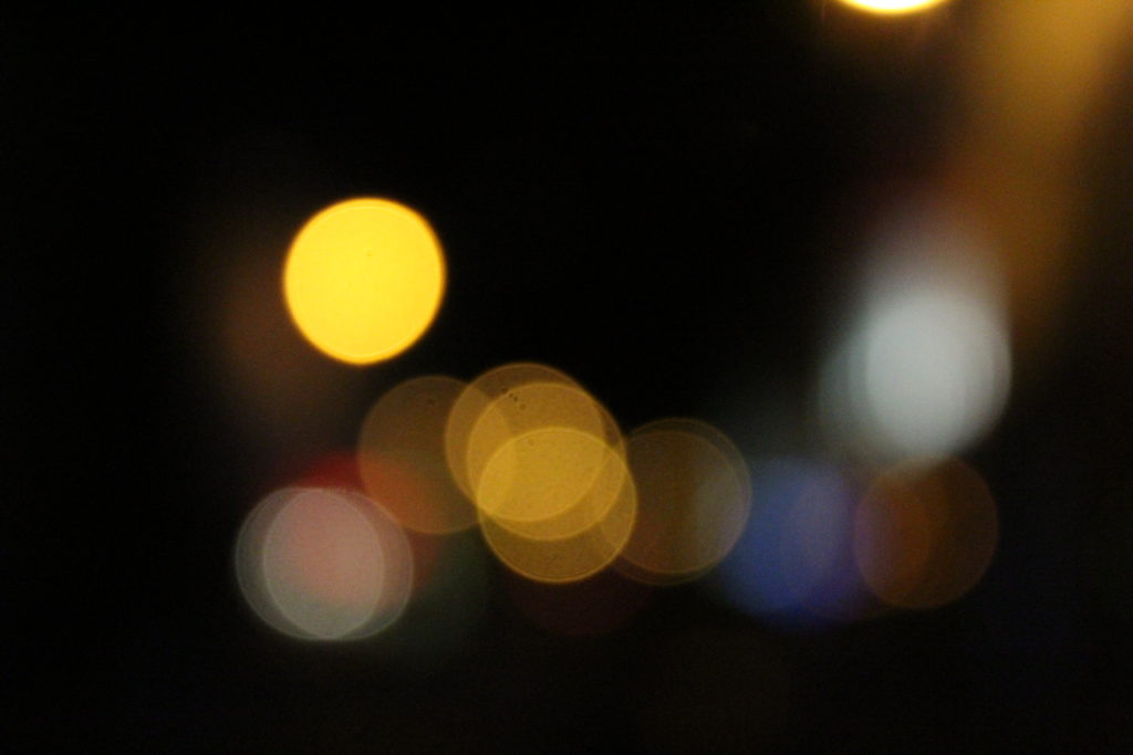
Using these three images for a final piece is a good idea as the images will look nice displayed as a three piece of art. I like the range of different colors in the images and think that i can creatively display these images.
These images also shows a range of techniques that was used to get this end picture. I took these images in Manual Focus as which helped to purposely make the scenery blurred while as using a quick shutter speed to take pictures of the lights not in focus as well as it helping to under expose the images and contrast the colors with the overall darkness a lot more which was one of my main goals.

This is a great image as it is showing a clear use of depth of field. This image has not been edited at all and therefore shows the quality of the camera skills used.
The image was taken in Manual Focus with a shutter speed of 1/250 which helped to let in light to the lens of the camera. I also had a ‘daylight’ white balance.
