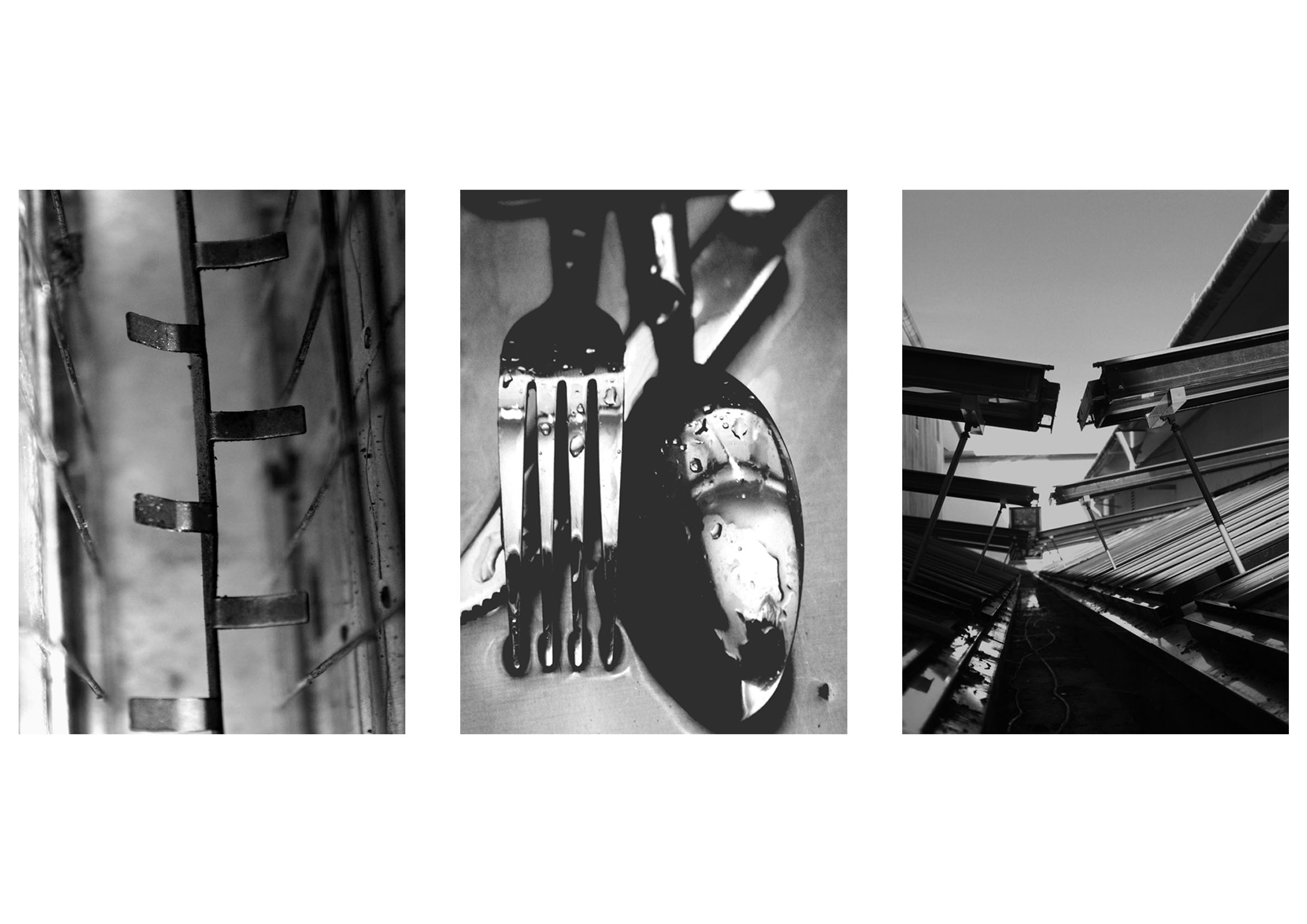
A3 Print Ideas
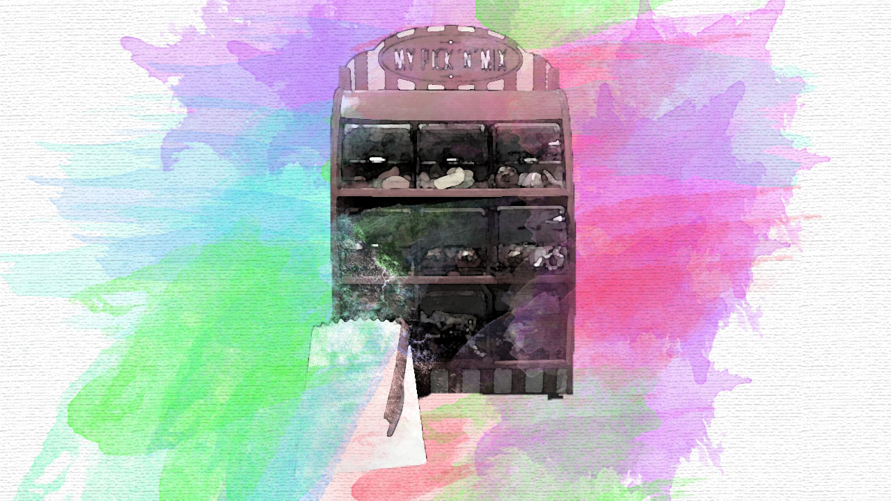
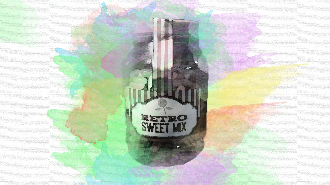
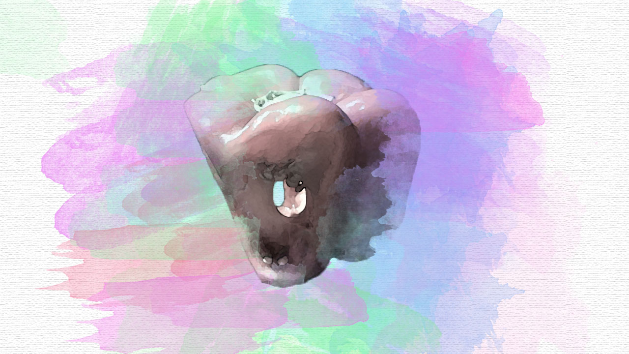
This was my initial idea for an A3 print. I would display these three horizontal images one underneath another, allowing the three basic subjects to be shown with pastel colors bursting out of them. Although I like the way this print would look I feel that it will not clearly show the theme of abstract photography, moreover it does not really show my camera skills and what I am capable of. Therefore, I am not going to follow through with this final outcome.

For my next final outcome idea, for A3 print, I wanted to still display three photographs that can clearly show my camera skills and show the theme of abstract photography. I choose photographs which have been similarly edited, but still juxtaposed one another. I really like the space between each image, making the images ‘breath’. I think with this piece I may put it in a frame, allowing the three images to stand out. I feel like this is the A3 final print that I will be putting forward.
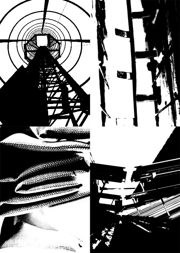
A4 Print Ideas

This A4 print is showcasing four images which are all in the style of Keld Helmer-Peterson, who I previously conducted research about. I want to raise two of these images using foam board, adding an element of 3D. I feel that I will raise the top two images, which will allow them to stand out more, showcasing my best bit of work.
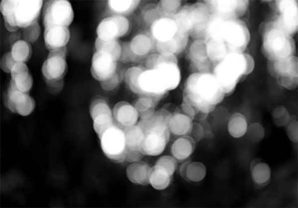
A5 Print Ideas

My first idea for an A5 print is to showcase this out of focused image. This image was taken from a previous photo shoot and research I had conducted. It looked at a photographer who purposefully made his images out of focus. I believe that this is the top image from the photo shoot as I like the contrast in tones and how the light is trying to seep in. I think that this photograph will be strong enough to be a print by itself and is most suitable for an A5 print.
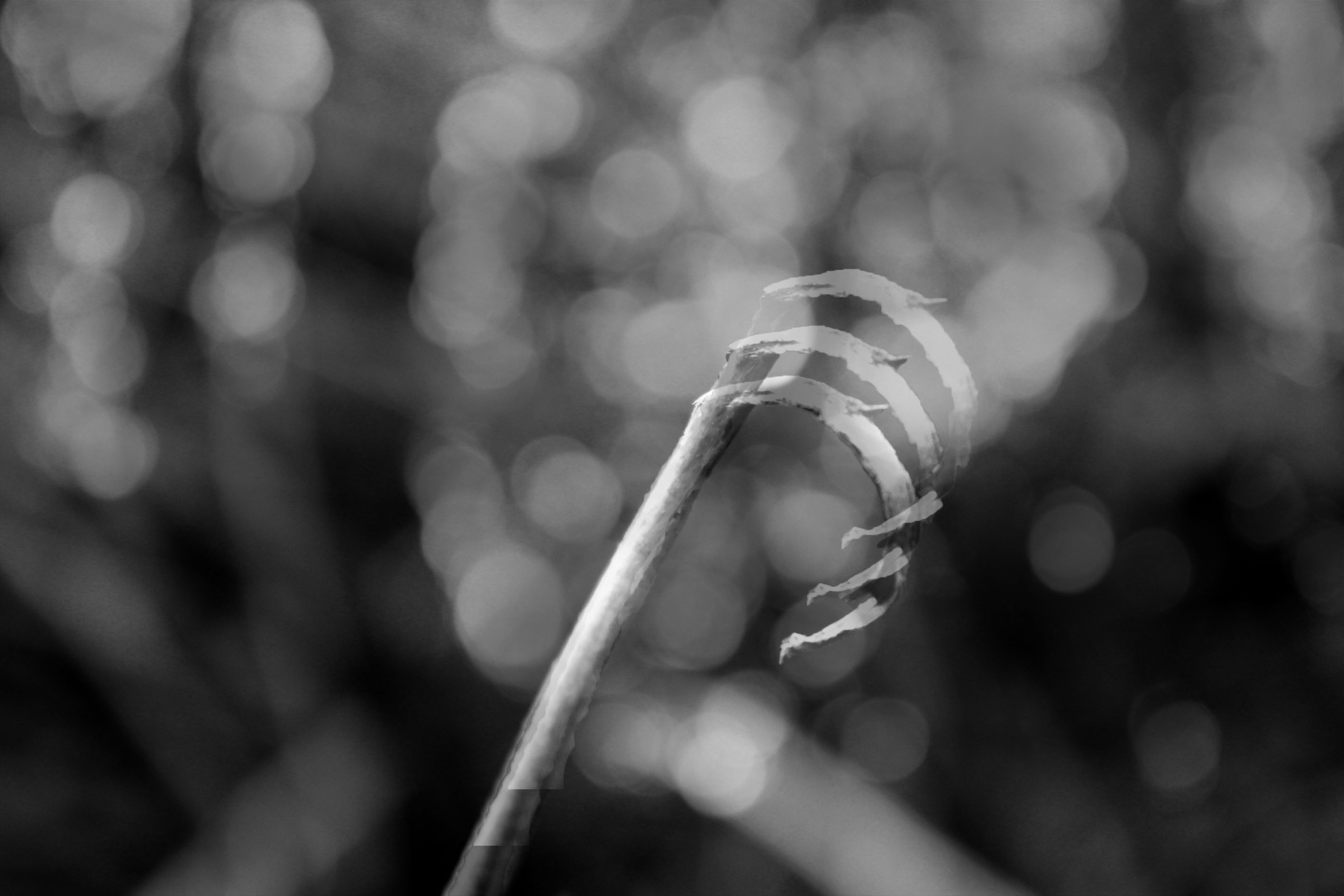
My next idea for the A5 print is to showcase the same image but in a double exposure. I took another image from my Zen Twigs photo shoot and placed it on top creating this double exposure. As much as I like the outcome I do not believe the photograph is as strong as the original image on its own.
Final Outcomes
I have taken into consideration all the pros and cons of each print and what I think would suit the topic best. These three prints clearly show the camera skills which I have developed, my Photoshop ability and the overall theme of abstract photography.
