For this shoot, I took a lot of inspiration from minimalist photographers such as Jon Setter, Kyle Jeffers and Julian Schulze, but also tried to take into account the style of Photographers like The Boyle Family and Aaron Siskind, and tried to get at least on subject photographed in the style of these photographers. i found it very interesting focusing of colour and shape, as well as texture and different techniques. I wanted this Photoshoot to show a verity of these skills and I feel as though i have achieved this.
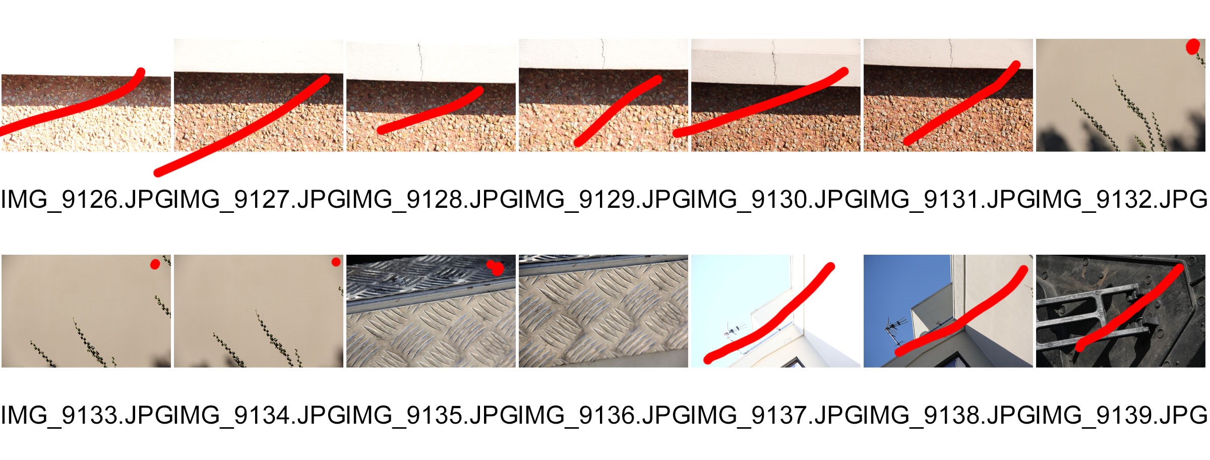
Contact Sheets:
Red Dot: Consider for final edit
Red Line: do not use
Box + Arrow: Crop
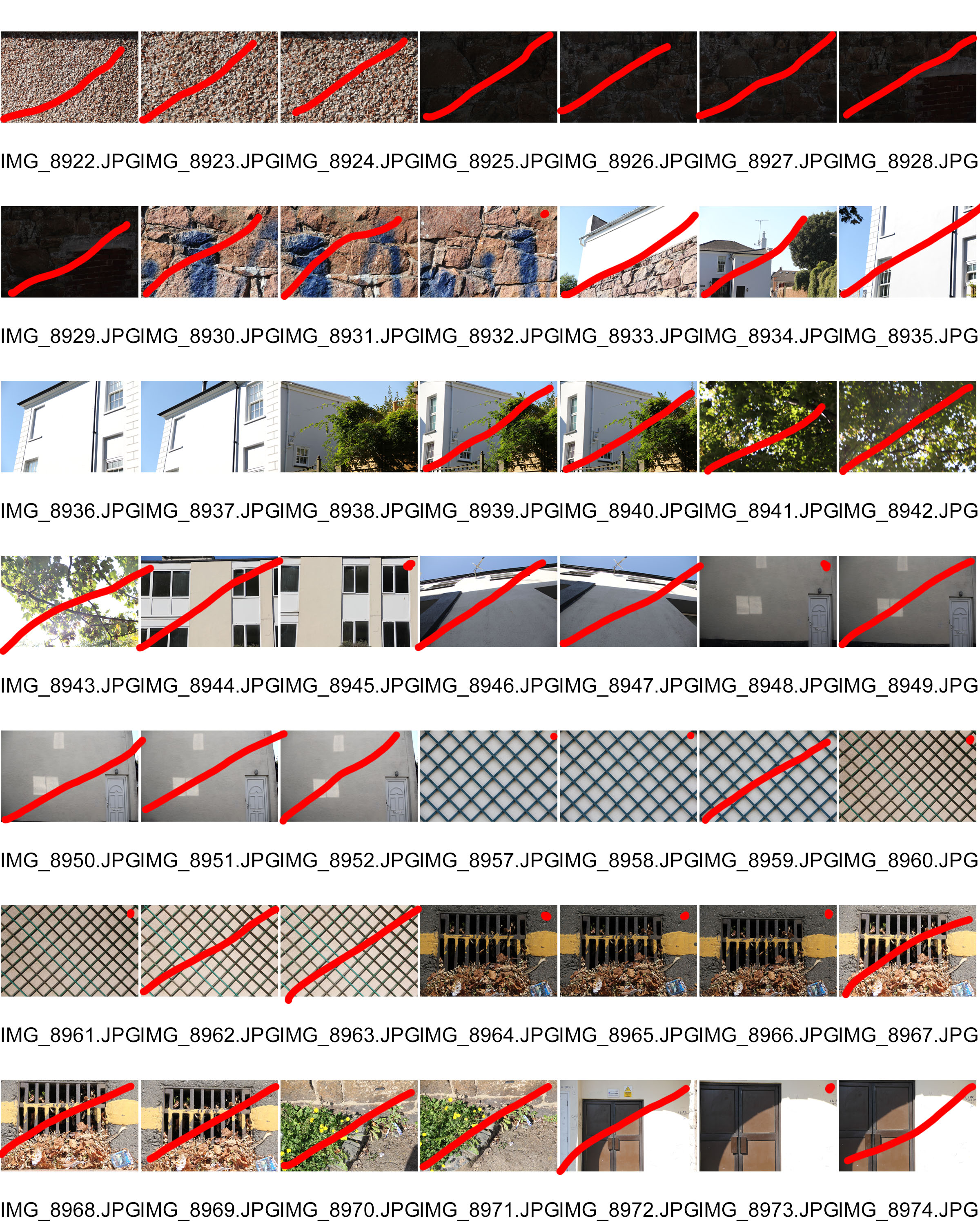
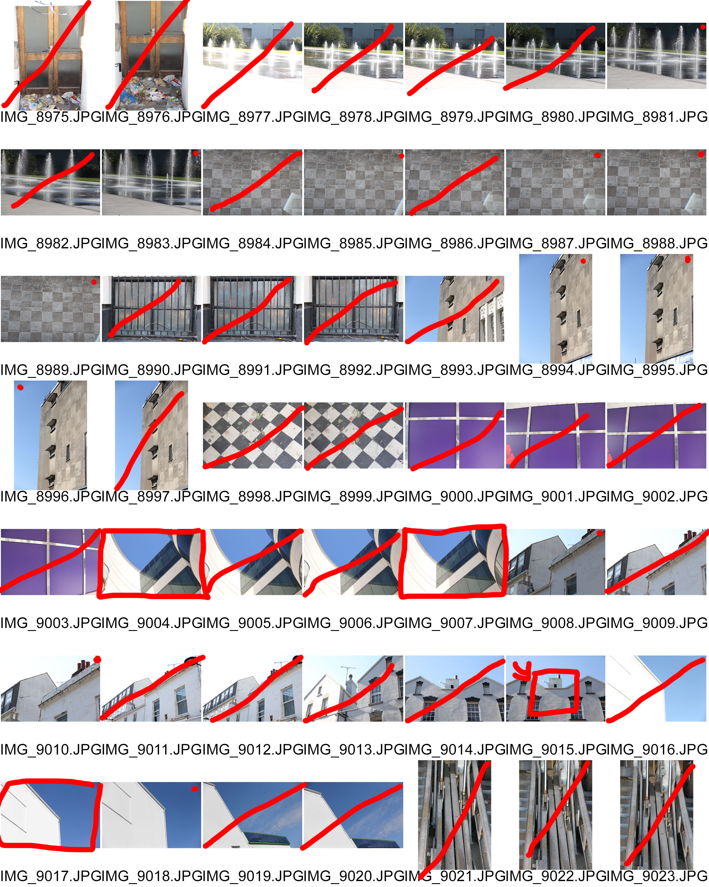
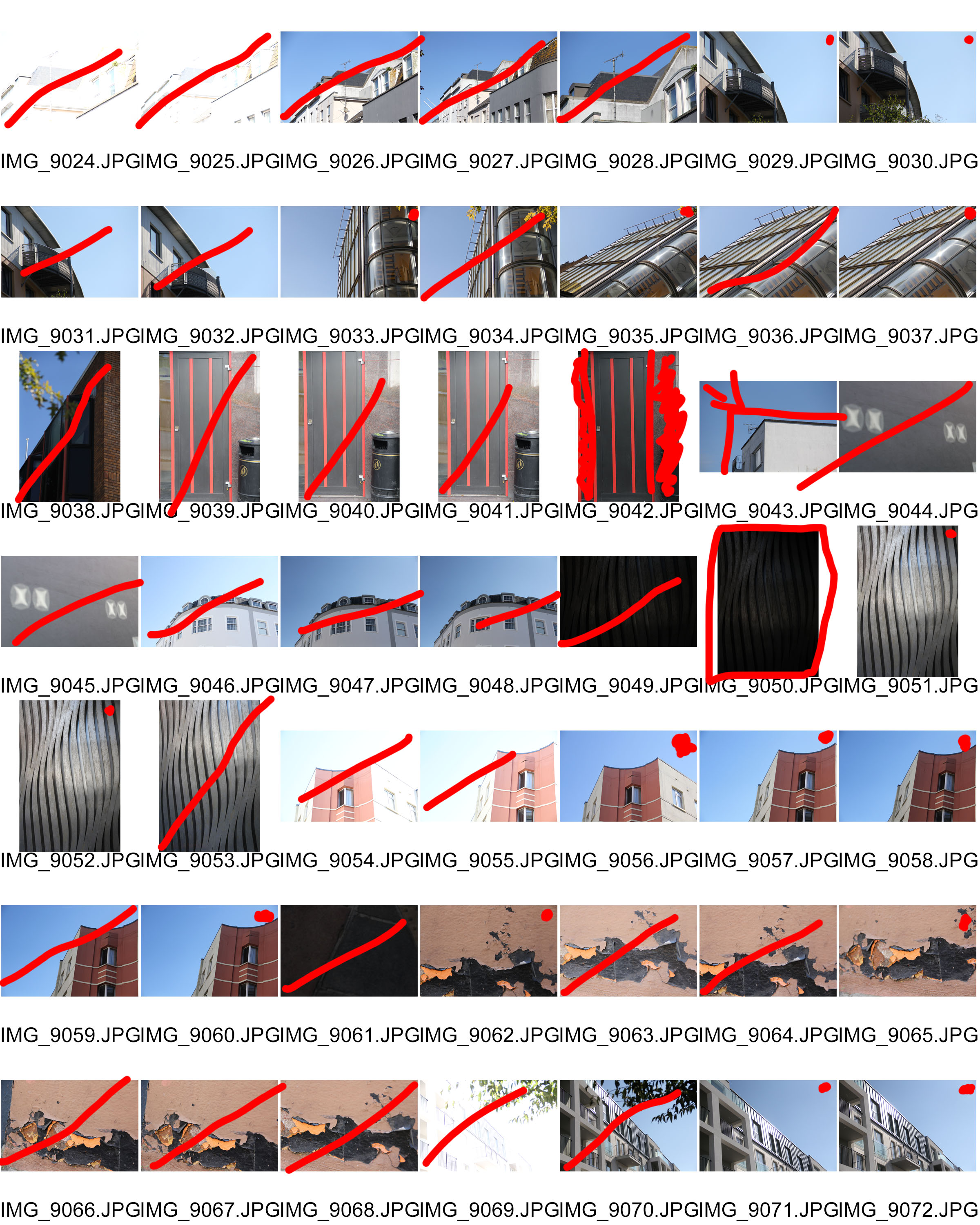
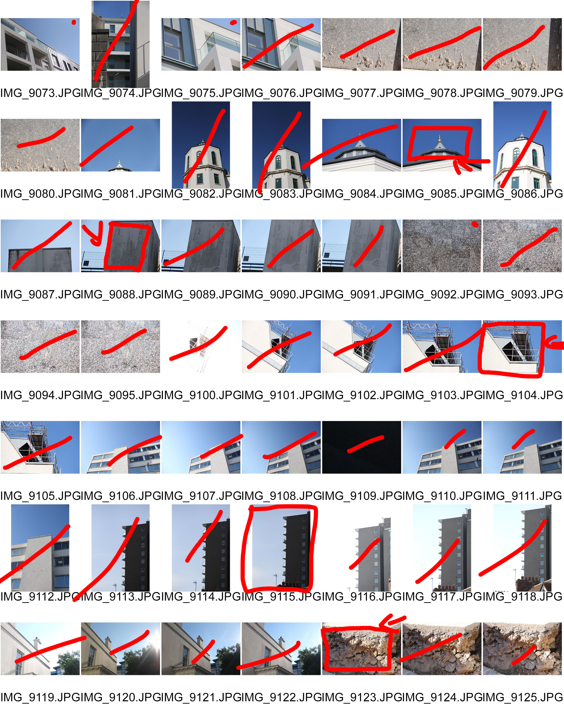
Inspiration for my images:
Many of the images in my contact sheet are based on the works of Kyle Jeffers and Jon Setter especially. I wanted to recreate the sharp images of setter combined with a slightly less saturated palate of Jeffers (concerning his pictures of buildings that is) and therefor i can see many elements of their work starting to emerge through my own.
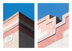
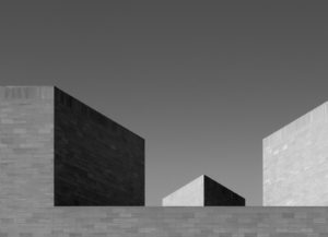
However, I also wanted to try to take some pictures in the style of other photographers as well, most notably the Boyle Family, but also a few in the vain of Aaron Siskind (although i tried to do different shots compared to the summer task that i completed about him) to try and challenge myself and produce the best variety of high quality photographs.
Final Images:
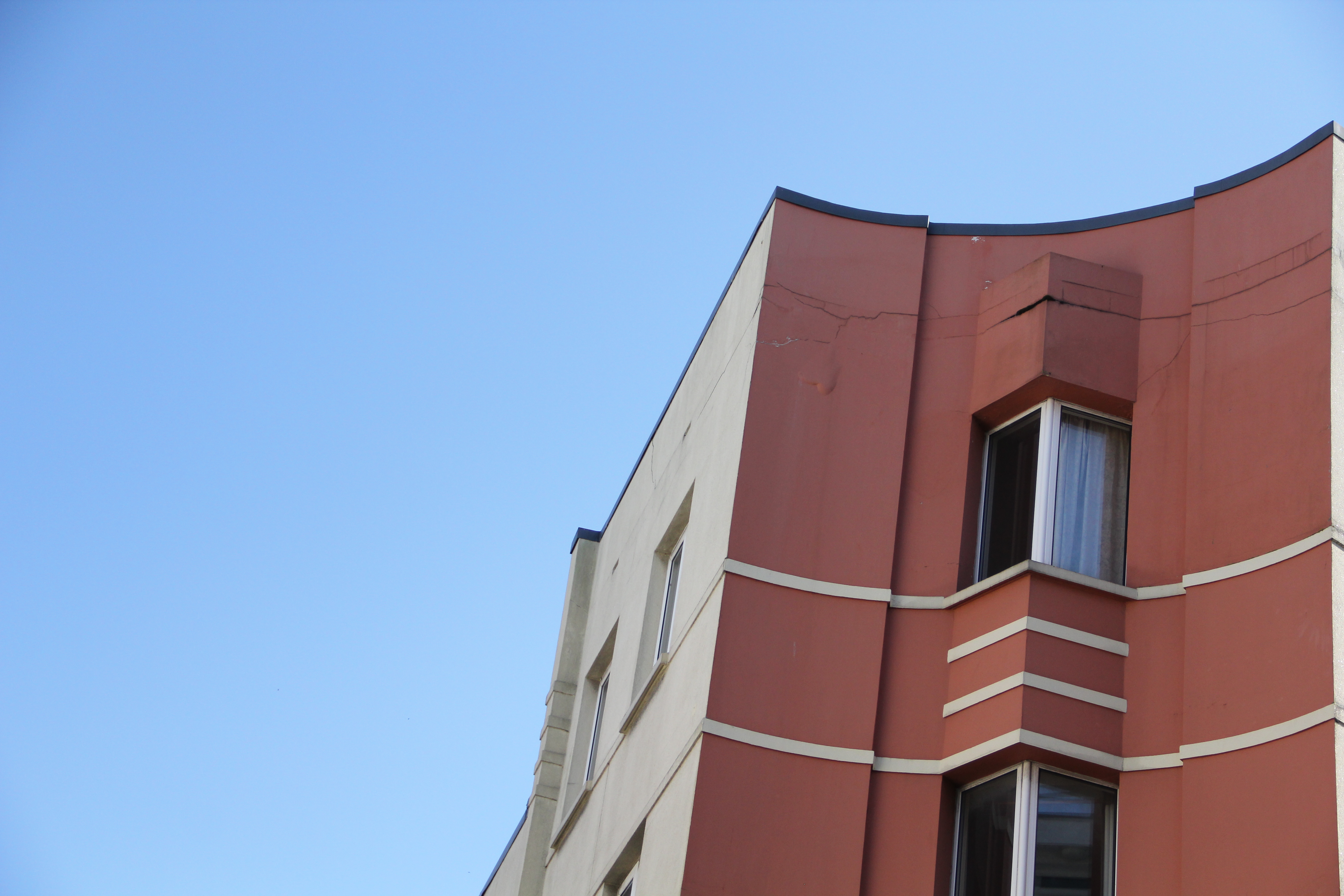
I found that this image is the closest that i got to that of Jeffers’ and Setter’s work, as it has the same characteristics in terms of shape, sharp edges, and an interesting colour palate. My goal for this picture was to try and emulate Setter’s ‘RedMilk’. I also feel as though I have put a unique spin on my picture, using a picture taken from further away.
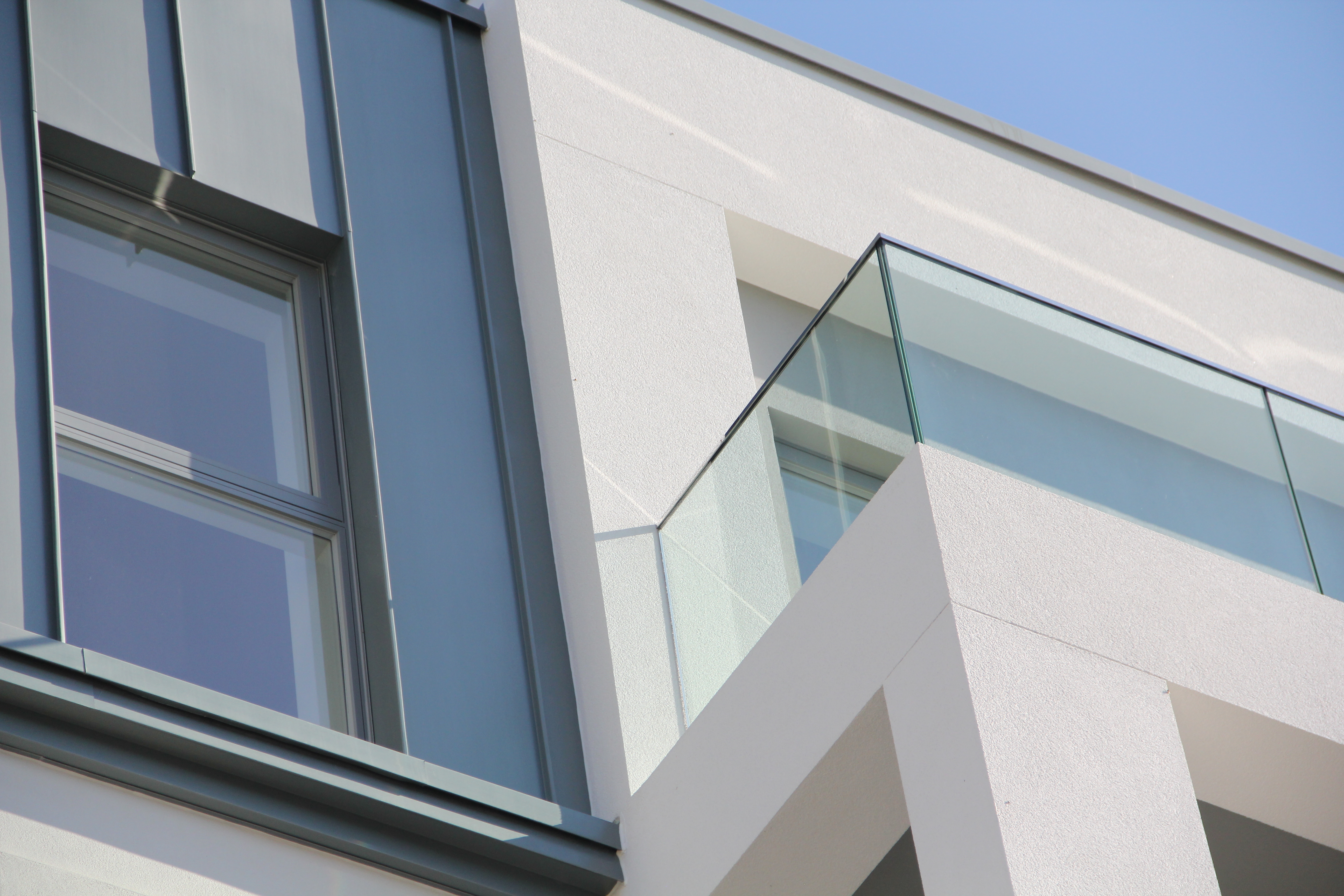
For this Picture, I liked how the lines were perpendicular to one another, similar to a lot of Setter’s work, yet it also has more of a monochromatic tone compared to a lot of Setter’s pictures. I also Like the use of angles in this photo, as the camera is slightly canted and this adds to the sharp edges of the perpendicular, 90 degree angles within the picture.
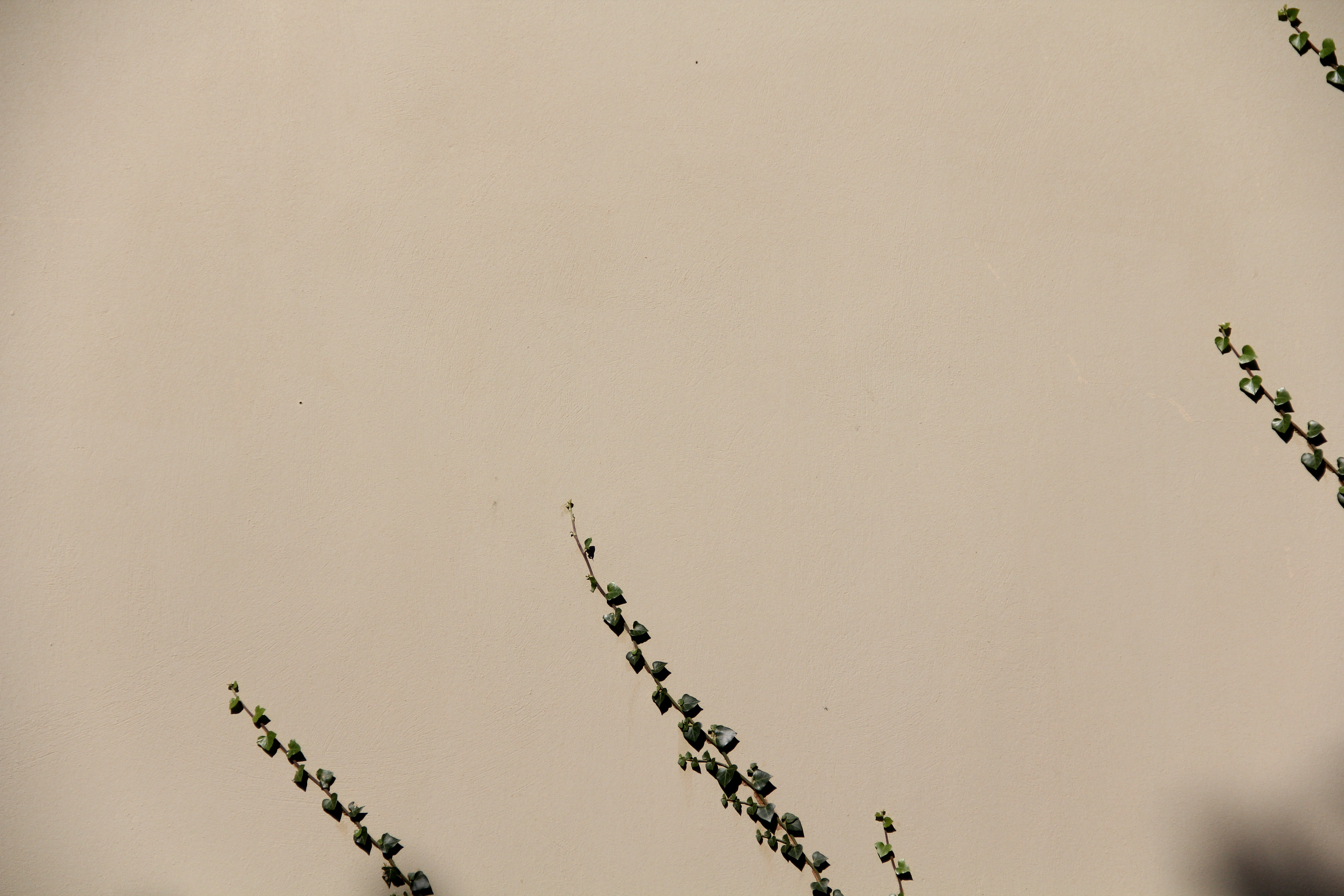
For this picture i wanted to focus on minimalism and It has definitely turned out better than i was expecting. This specific photo was not taken as an attempt to copy others work, but as this was near the end of my shoot, I had started to get an eye for the colour and texture photos that Photographers were producing, yet it does still feature some of the key elements of minimalistic photographer’s work.
