Alfred Stieglitz was an American photographer and modern art promoter who was instrumental over his fifty-year career in making photography an accepted art form. In addition to his photography, Stieglitz was known for the New York art galleries that he ran in the early part of the 20th century, where he introduced many avant-garde European artists to the U.S.
Examples of his cloud works :
In his work, he takes pictures of instructing and unique forms of clouds, with the light and darks clashing.
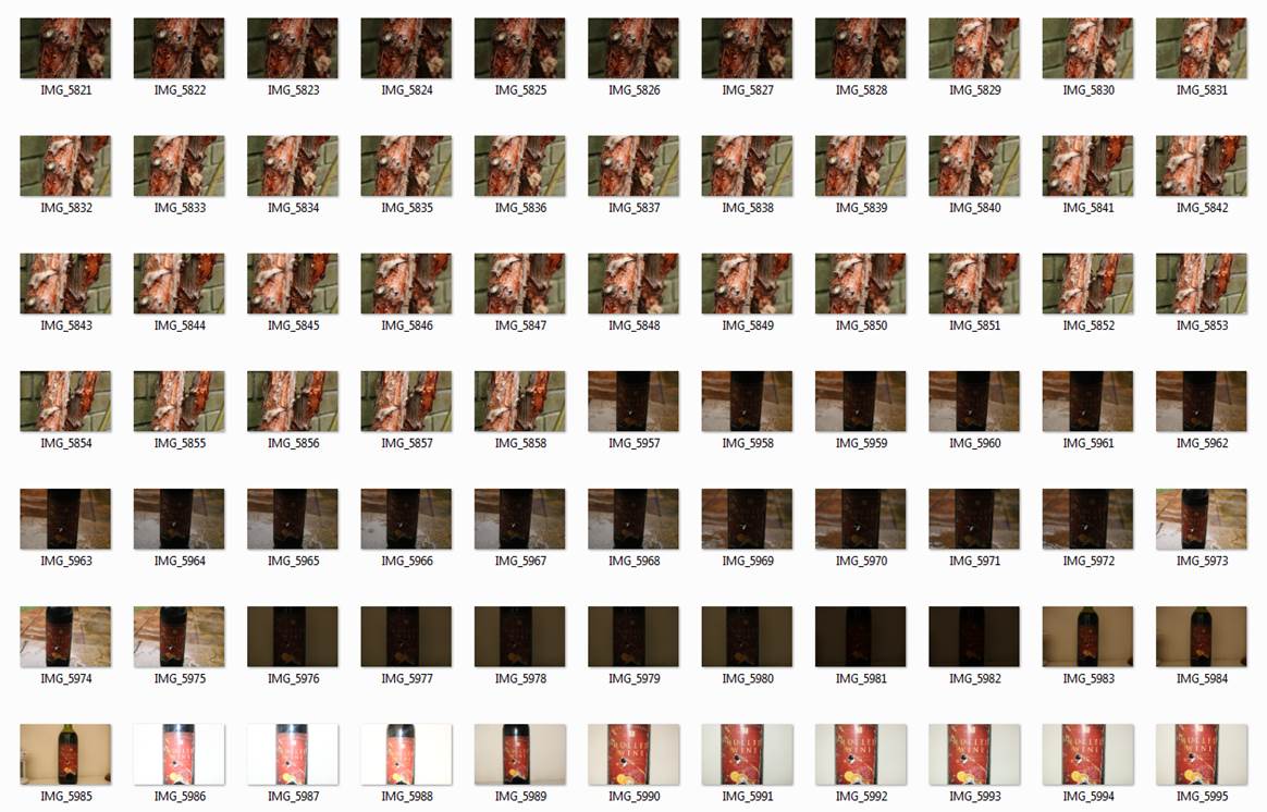
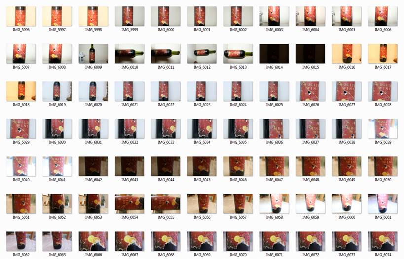
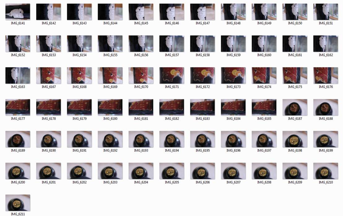
Contact sheets:
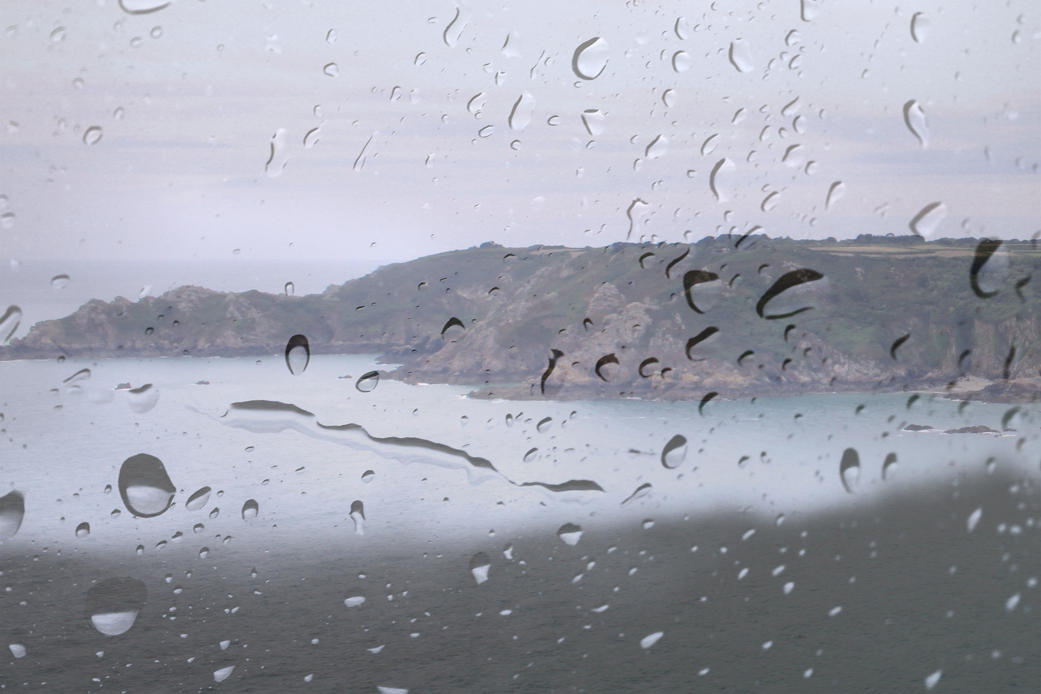
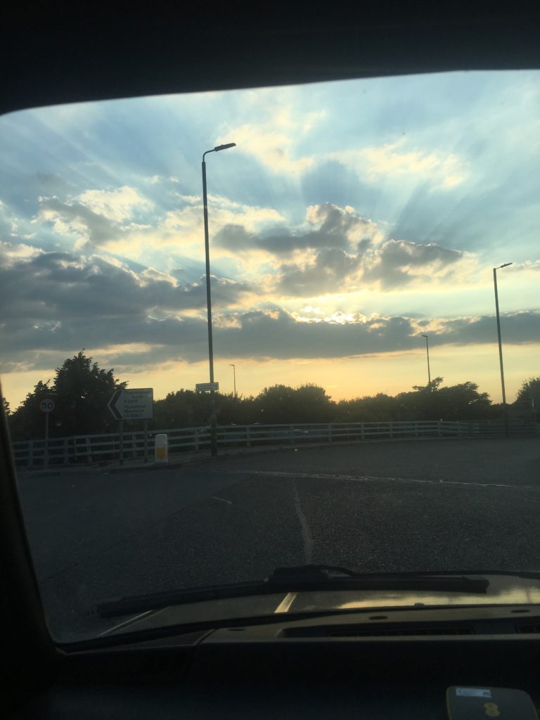
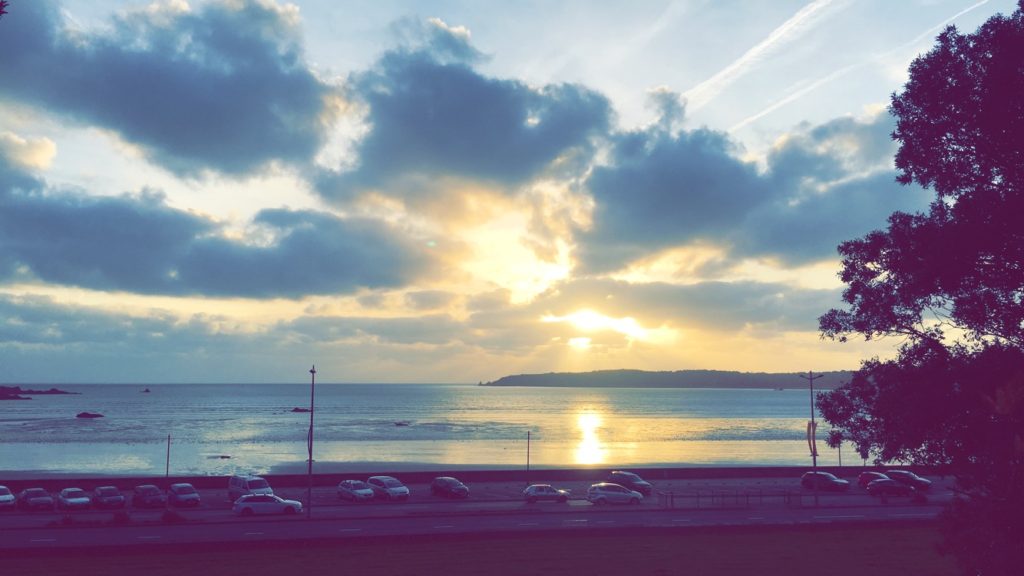
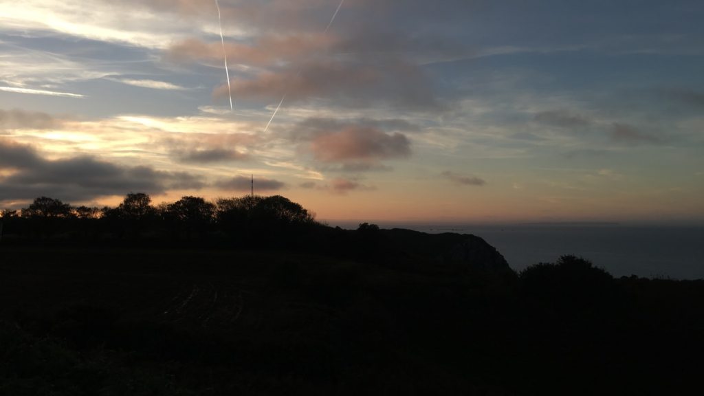
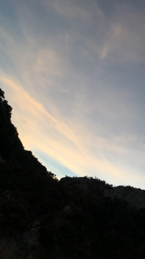
To take photos with inspiration from Stieglitz’s work, I will be aiming to take pictures of clouds, ones with unique textures and where the sun is trying to break through from behind. I’m also looking for pictures where the lights and darks contrast considerably, and ones which I can turn into an abstract photo.
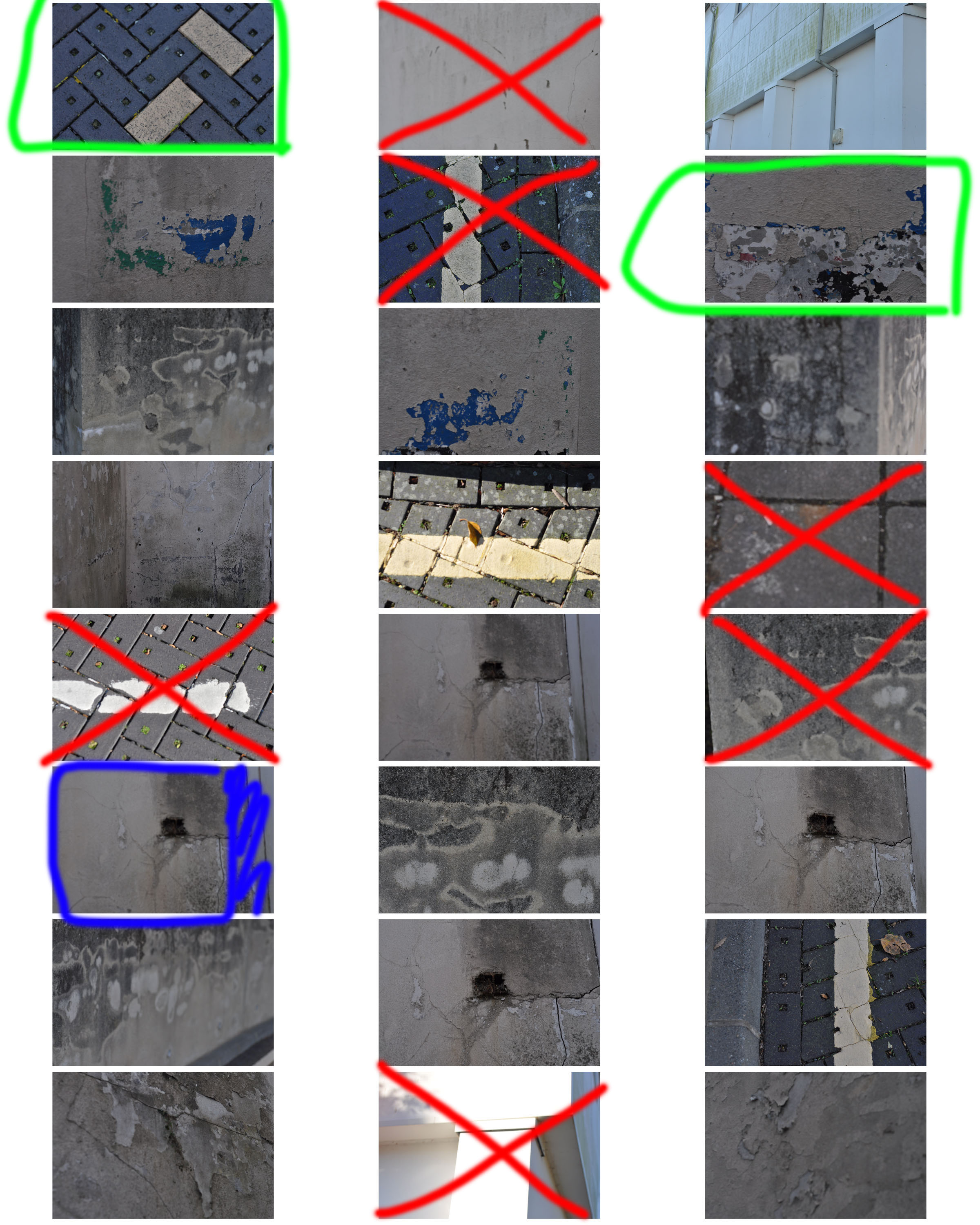
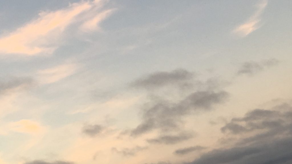
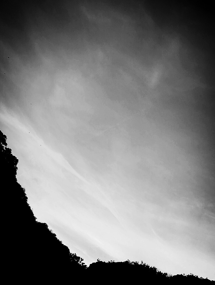
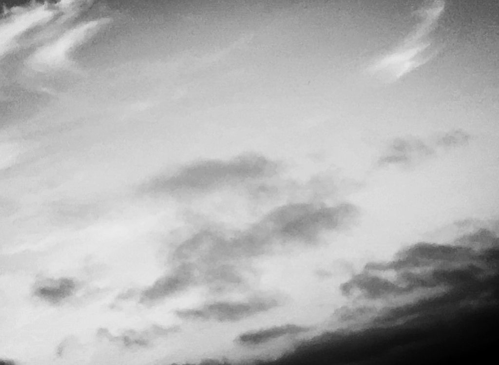
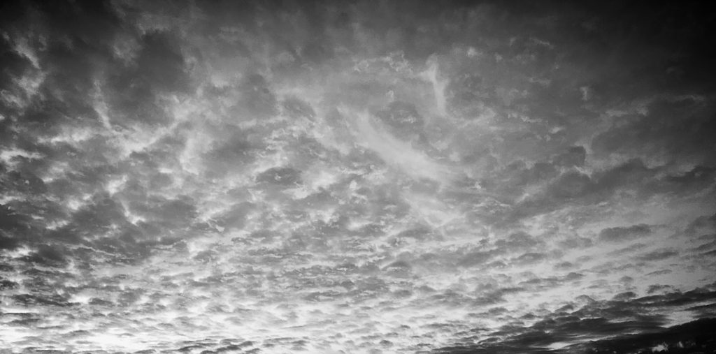
My chosen photos:
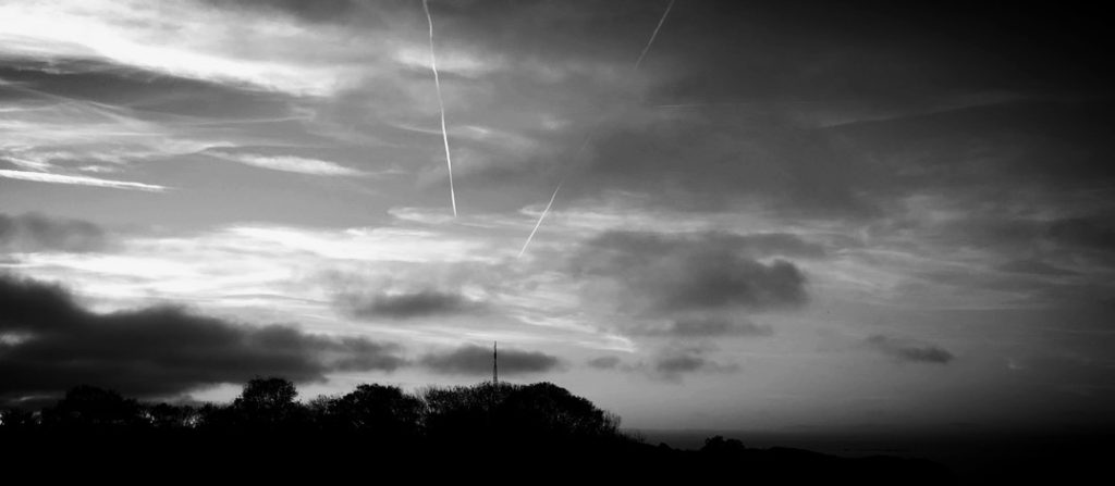
Edited photos:
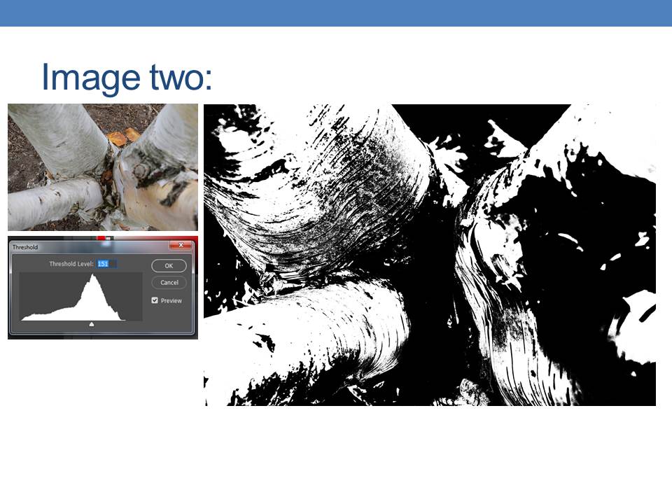
To edit these photos, I went and put a black and white filter on, and then went and played around with the contrast, exposure and light. I brought the light and exposure down, and increased the contrast to try and replicate Alfred’s works.
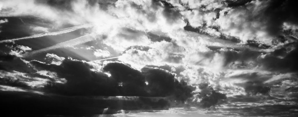
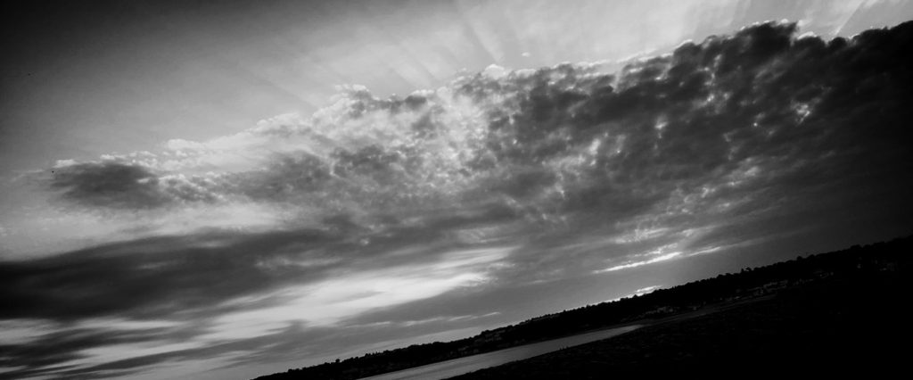
My final choices :
I chose these three as my final photographs for this task because I believe they relate the most to Stieglitz’s work. It shows contrast between the lights and darks of the clouds and continues on with his black and white style.
Ralph Eugene Meatyard was born in Normal, Illinois and raised in the nearby town of Bloomington, Illinois. Meatyard purchased his first camera in 1950 to photograph his newborn first child, and worked primarily with a Rolleiflex medium-format camera ever afterwards. He eventually found his way to the Lexington Camera club in 1954, and at the same time joined the Photographic Society of America. It was at the Lexington Camera Club that Meatyard met Van Deren Coke, an early influence behind much of his work. During the mid-1950s, Meatyard attended a series of summer workshops run by Henry Holmes Smith at Indiana University and also with Minor White. White, in particular, fostered Meatyard’s interest in Zen Philosophy.
This is one of Meatyard’s photos from his Zen Twigs series. He has made the focus of the image the twigs by blurring the background so that it is almost unrecognisable. To achieve this focus on the twig Meatyard may have use manual focus to make the background as blurry as possible. The effect of leading lines can be seen in this photo as the viewers eye may focus on the twig then follow the twigs shape round the image. The photo has been taken in black and white which shows what time period the photo was taken in as there weren’t coloured photos yet. The effect of the black and white gives the photo an abstract effect.
Contact Sheets:
Experimentation:
These are my ‘Zen Twigs’ experiments. I tried to make the images look as similar as possible to Meatyards photos. I started each edit by making the image black and white. I then changed the amount of black and white in levels to make the twigs stand out from the background, and give the twigs as much detail as possible. I cropped some of the photos to makes the twigs the main focus of the photo and get rid of any possible distractions in the background. I’m happy with the final product of the edits as they look very similar to Meatyards and because they are very focused and crisp.
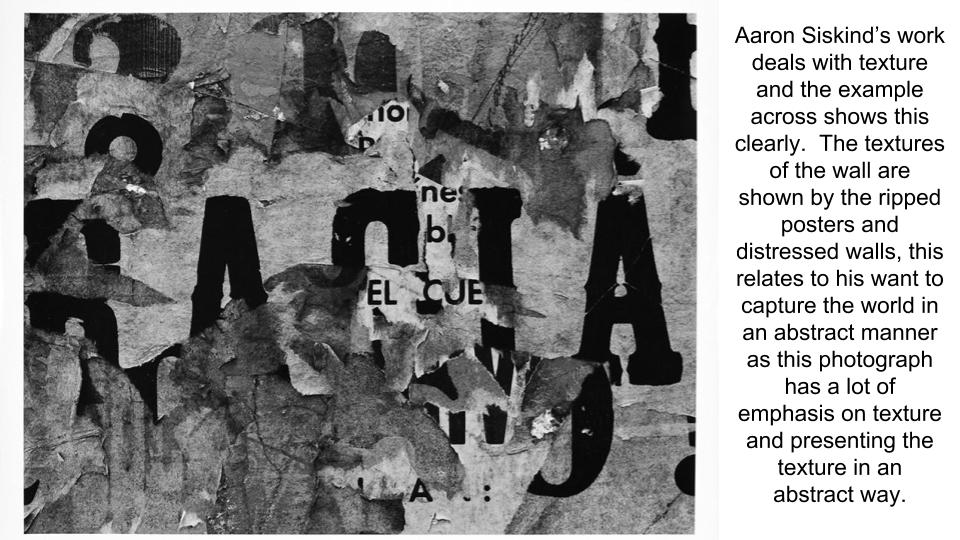
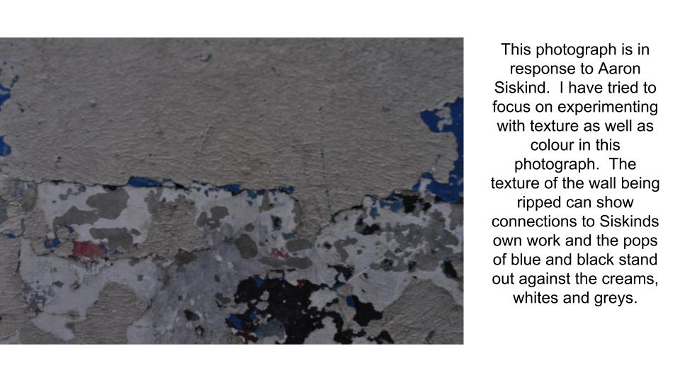
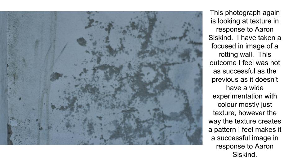
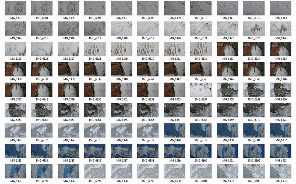
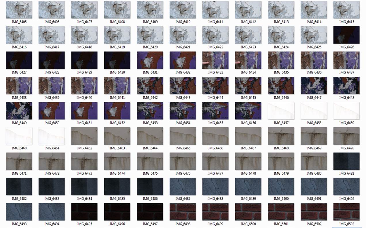
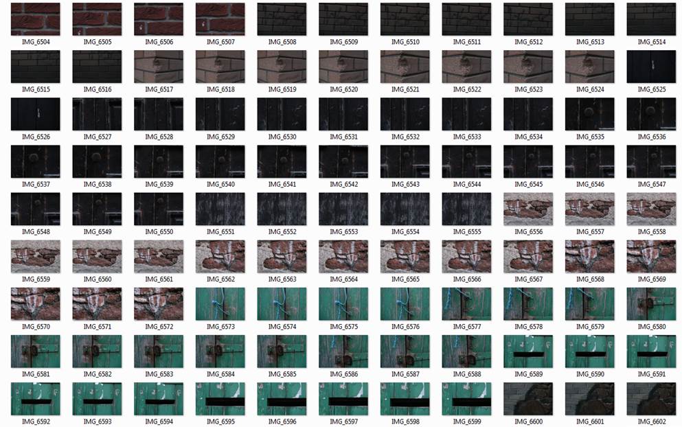
Aaron Siskind was an American photographer who was interested in taking images of “true to life” objects in an abstract way. He took many images of things both in natural and urban environments. Many images he has taken contained many types of unique textures. In the mood board below this is especially visible in the images he has taken of tree barks.
Mood Board
Here are some images that Siskind has taken, that will inspire my future photo shoots.
Analysing his work
In this image Siskind uses interesting technical features. Although the image is in black and white, it is clear that the image was taken in daylight, as all the details in the frame are lit up clearly. It is also clear that the shutter speed was not too high or low, as the image isn’t over or underexposed. The aperture must have also been controlled due to the balance in exposure.
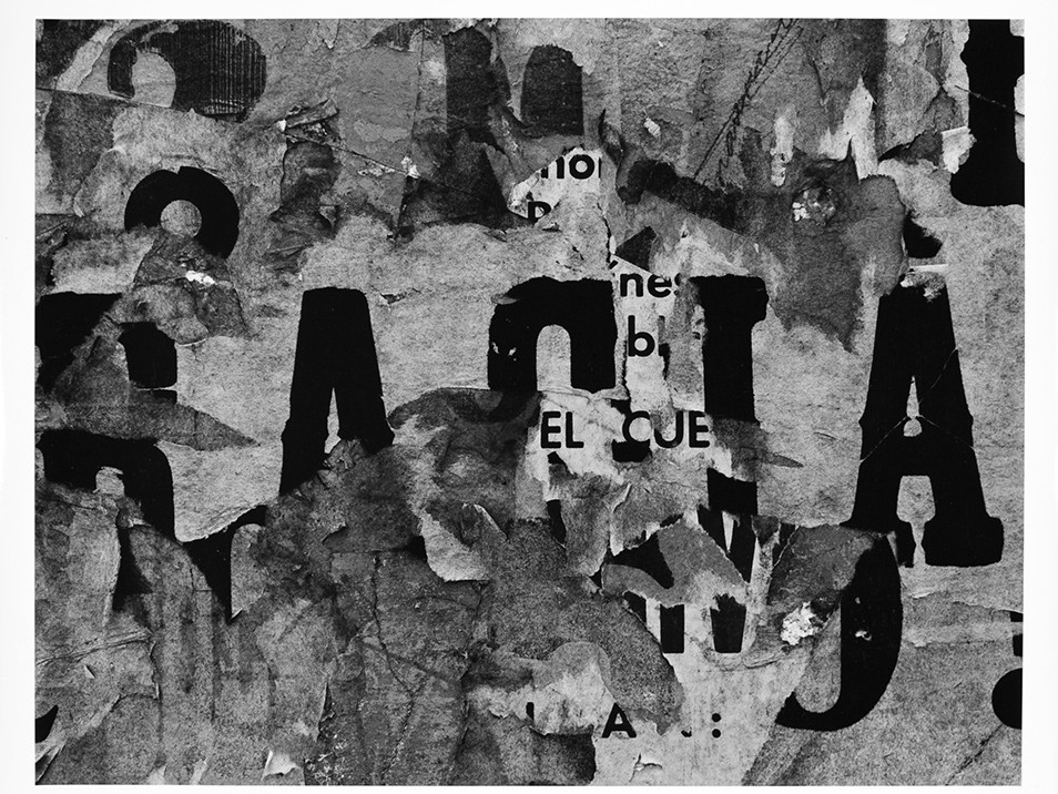
Part of what makes the image successful are the visual techniques. The image shows what appears to be many different layers of a poster peeling of a wall. By capturing this, Siskind has created many intriguing visual techniques. Firstly, the image has a very interesting texture. The photographer has successfully captured the rough and bumpy surface of the wall. This is very appealing to the audience as it gives the image a whole other level for the audience to appreciate. The image’s form is also helps to capture attention, as the different layers almost give the photo a 3D effect, making it more appealing.
The image’s context makes it further interesting. This particular image was taken in 1961, in Mexico. During this time Mexico was going through The Dirty War where there was conflict between the government and left-wing groups.
After researching to context, it became clear that Siskind may have been trying to capture a deeper, conceptwith this image, about what was going on around him at the time. Because the wall he photographed was ruined, and peeling away he could have been trying to interpret the effect the conflict was having on the country.
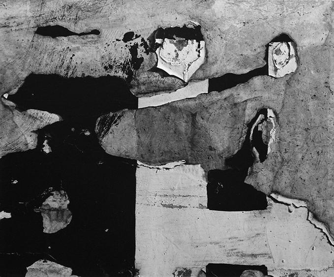
This images is one of my favorites by Siskind. Similar to the last image, it also uses many technical features. Firstly, the image is in black and white and it its over or under exposed. It also appears that this image was taken in the daylight, as the details in the image are perfectly lit and visible.
The visual effects of this image help to make it very appealing. Because the paint on the wall is peeling, and Siskind has captured it from the front, this image contains various different types of interesting tones and shadows. The peeling paint also gives the photograph a very attractive form, as it gives the photo a 3D vibe to it. This makes the image really interesting, as the wall has different layers to it. The image also has a very visually pleasing texture to it. You can very clearly see the bumpy and cracked surface. This is interesting to an audience as it gives the image a very vintage feel to it.
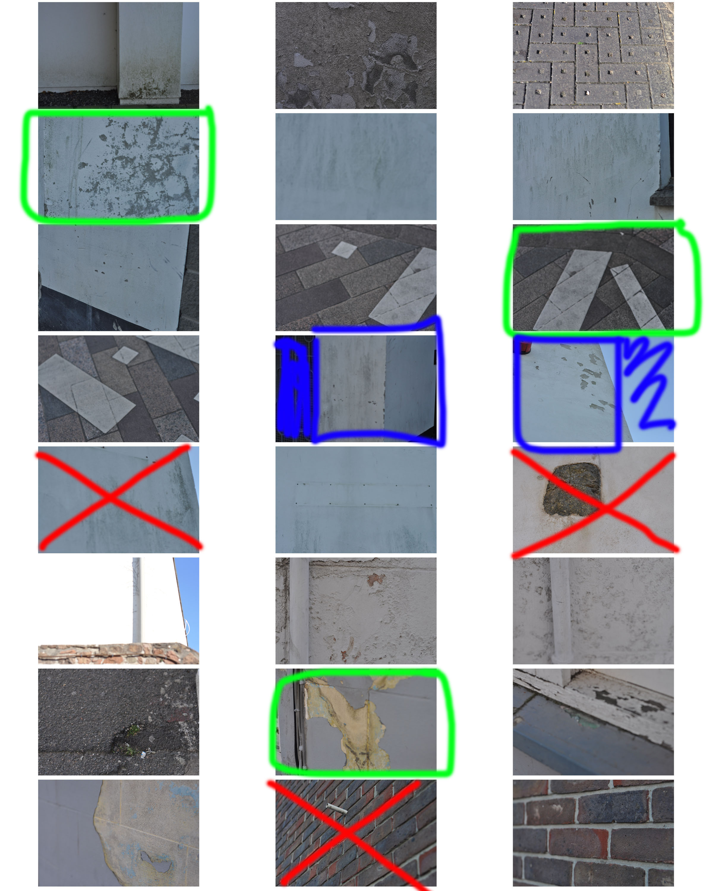
My response
For my response I attempted to capture interesting and unique types of textures, as this is what Siskind also photographed.
My best outcomes
Editing
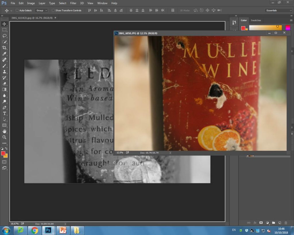
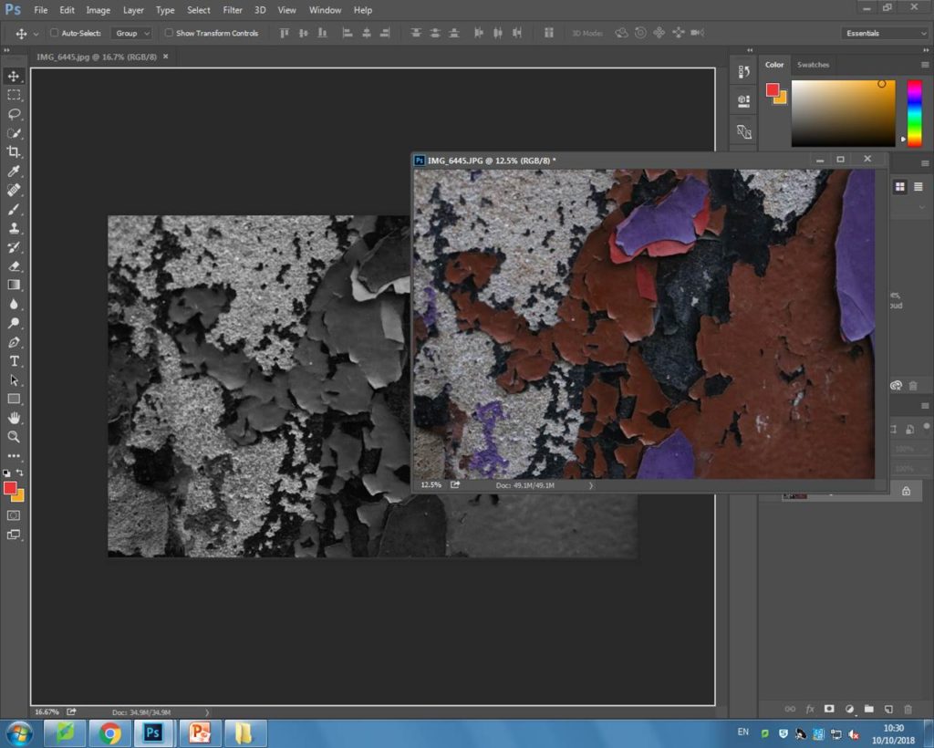
These were the two images I begun with on Photoshop.
Next, I dragged one image on top of the other, so that the second image became a separate layer
Next I changed the image into black and white.
After, I slightly lowered the brightness so it was a little darker, and I increased the contrast a lot so that the white label would stand out more.
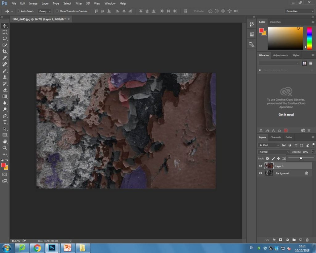
Next, I had to also edit my second layer which was the other image that I dragged over the top of my background. I also changed this image into black and white so the colors on the label could create an interesting contrast.
Here, I increased the contrast and also the brightness, so this image could look brighter when it was layered over the background as the background image was edited darker.
I then edited the opacity to 54% so both of the images could blend together.
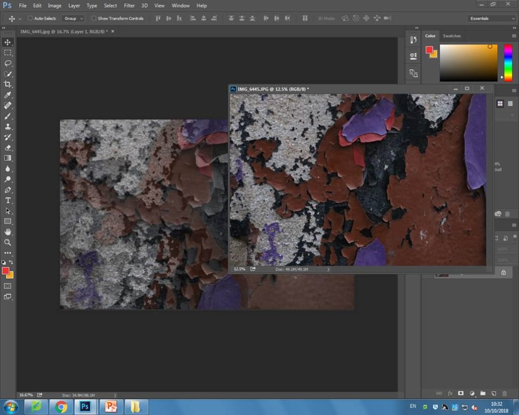
This was my final outcome, after editing the two images and layering them on top of each other.
I then wanted to experiment further by seeing how the image would look with a bit of colour. So I then layered the original photo of the label, on top of the one that I had already Photoshoped.
Here, I lowed the opacity so I could see how the images would look over the top of each other. I decided to place the original photo slightly higher, and to the left to create this interesting effect.
After I was satisfied with the positioning of the image, I changed the opacity to 100% so I was able to edit my image. I decided to put the brightness very low and the contrast very high, so that the darkness of the photo could blend well with the black and white background.
Lastly, I then lowered the opacity again so both of the layers were visible on top of each other.
This is another potential outcome for my original two images.
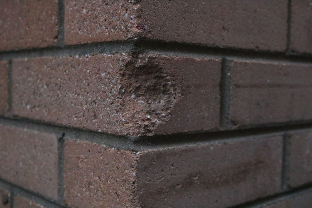
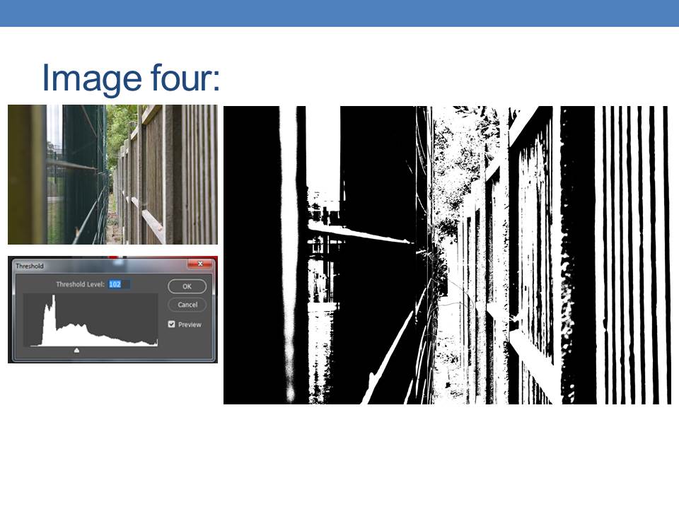
To being editing this photo, I cropped it so that the dent in the wall was right in the middle of the image as I wanted it to be the main focus when an audience views my photo.
Next, I increased the contrast dramatically and the brightness only slightly. I did this because both parts of the wall were in different positions to the sun, meaning one side was very lit whereas the other side was in the shade. I wanted to exaggerate the contrast of lighting.
Lastly, I changed the image into black and white so the lighting contrasts would be even more noticeable.
This is the final outcome.
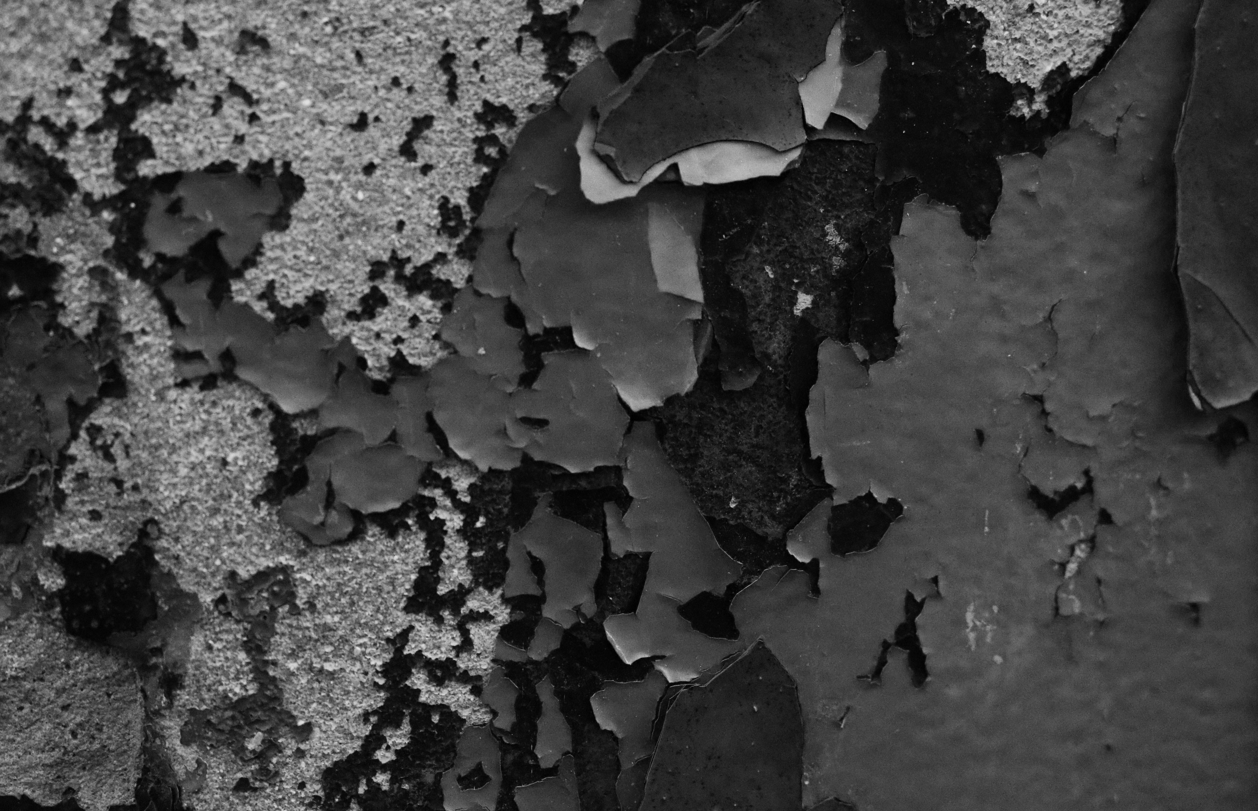
Firstly, I cropped the image to get rid of the lower left side of it as the background was visible and it was distracting.
Next, I lowered the brightness so all the colours would look darker and I increased the contrast.
I then changed the image into black and white so the contrast of all the layers of colour would be a lot more prominent.
After, I dragged the original image on top of the image i had already edited.
I then decreased the opacity to 50%, and positioned the image in a slightly different position to the version used on the background. I think it makes my image look a lot more interesting as both of the images have different opacitys and this makes the contrast between the tones really interesting.
I then layered another original version of the photo, and positioned it slightly higher and changed the opacity to 30% so it was lower than the previous one. I like how the image looks as there is an interesting fade effect.
This is my final image.
My best edited outcomes
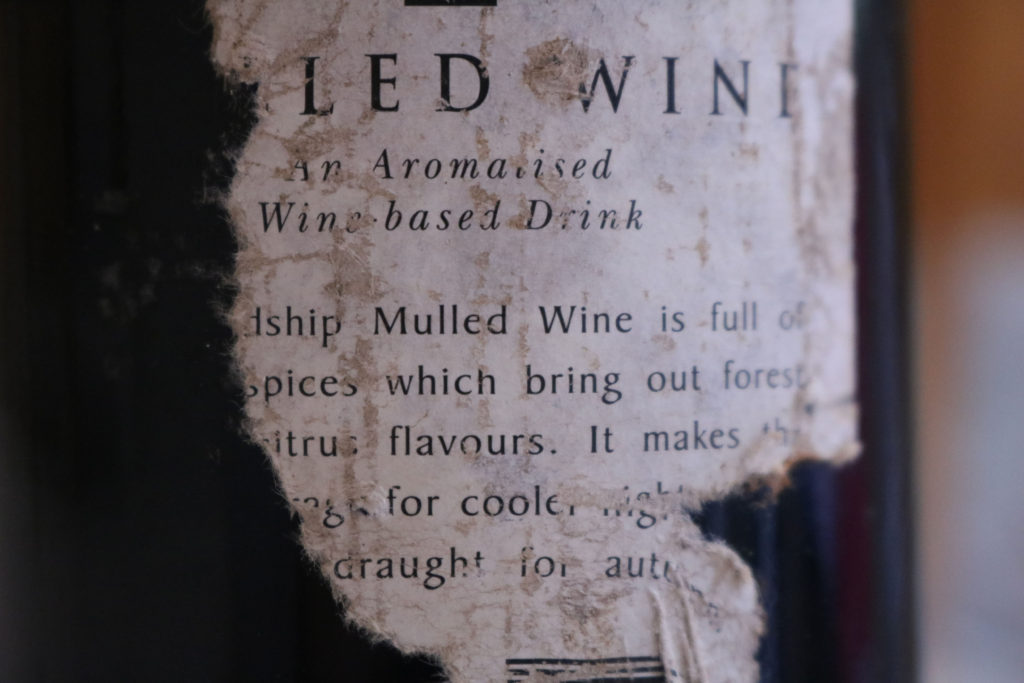
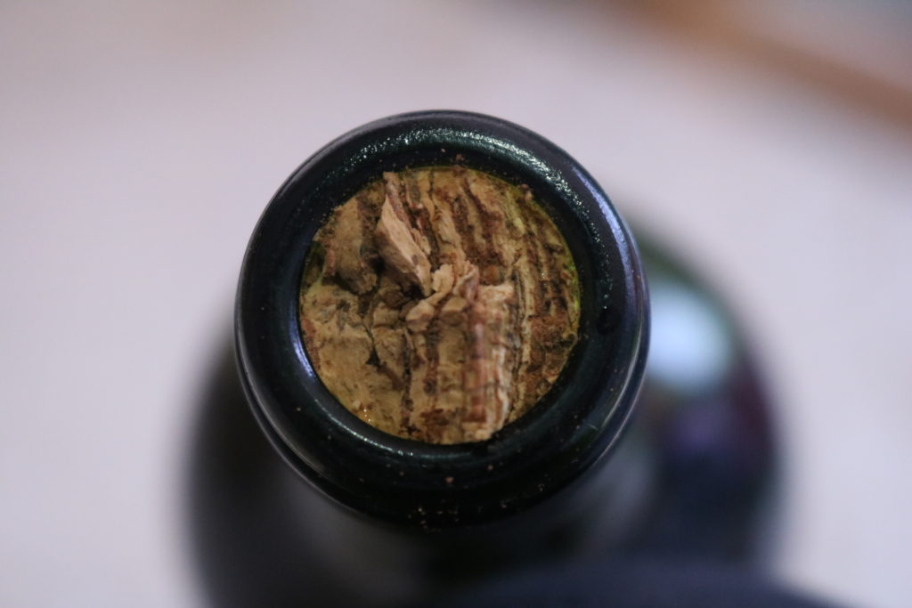
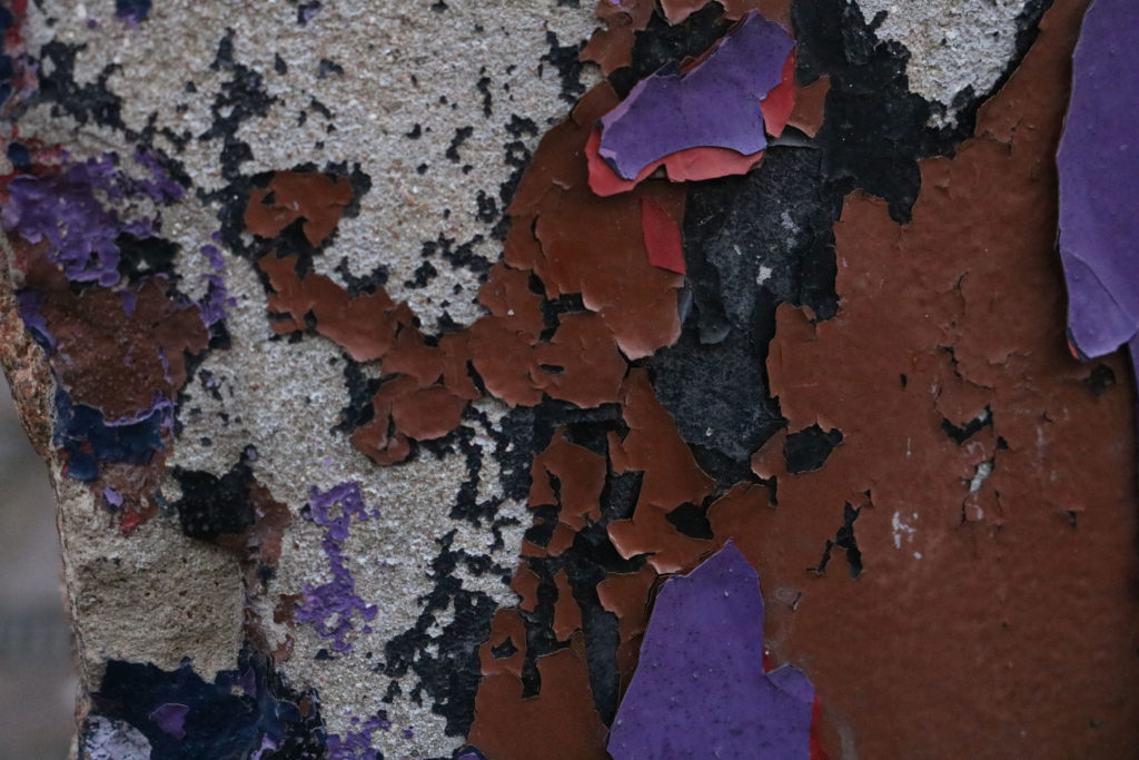
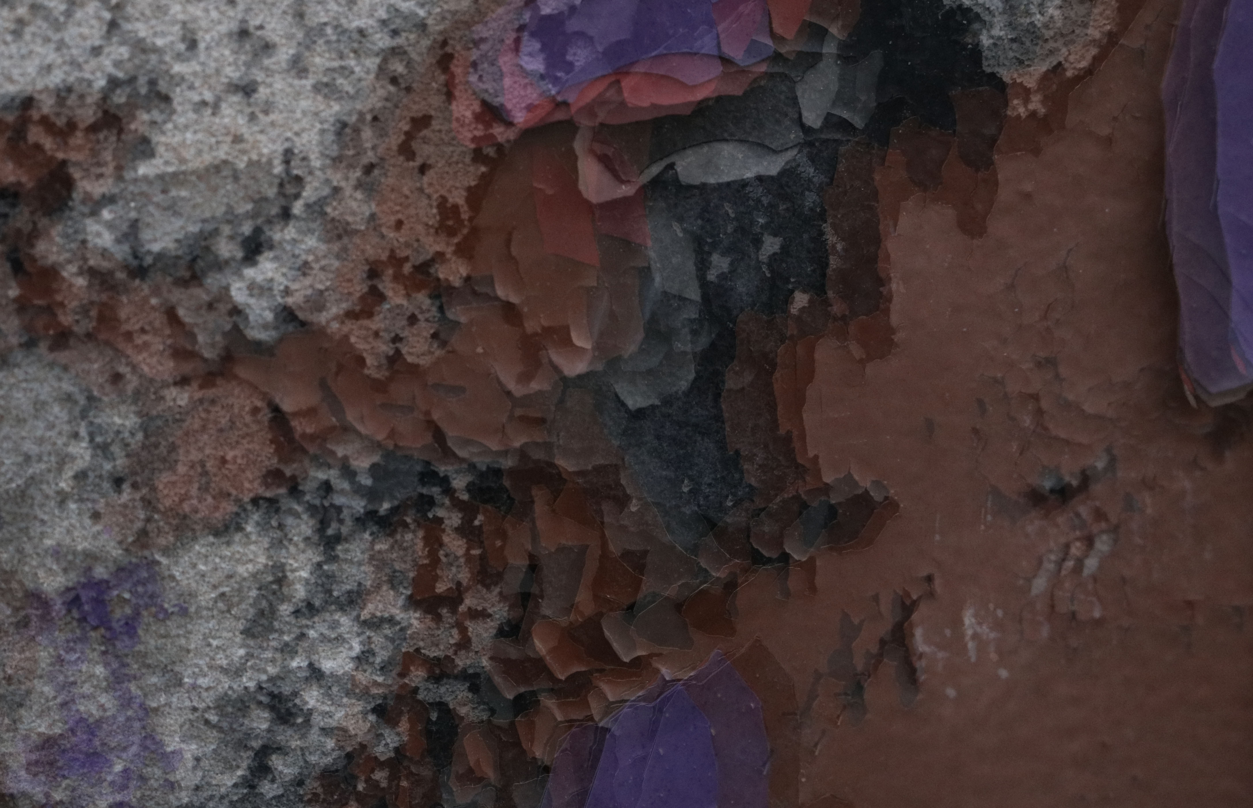
This image is one of my best due to many elements. On the technicalside, this image was taken in the day light, using manual focus. I used manual focus so that I was able to choose which layer of paint to focus on.
The visual elements of the image are also very interesting. The image is of lots of different coloured layers of paint peeling of a wall. This is very interesting as it makes the image contain many different textures and layers, which gives the photo a sort of 3D effect. This is very visually pleasing because it gives the audience more details to notice. As the image is black and white, There are a lot of interesting tonal contrasts, as originally all the layers were very varied different colours and stood out a lot.
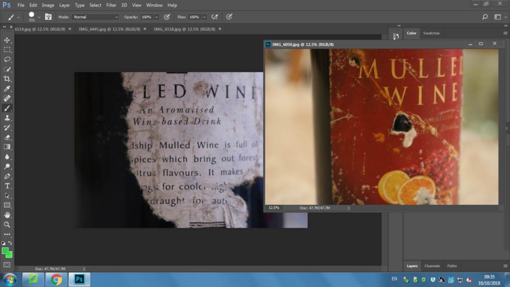
This image is very visually interesting. This is due to many things but, primarily the layering of images. I think that layering of the images helps make this photo far more appealing to the audience. This is because the black and white images and the coloured image create a distinct contrast that is very eye catching. Another contrast that is also very appealing is the writing on the label. I like how there is a coloured version and a black and white version position differently. I think they complement each other very well as they are completely different. The dramatic contrast that the white and yellow creates, helps to draw people’s attention in. There is also a big variety of different textures present in this photo, as all the individual images were focused on the different surfaces seen on a wine bottle. The textures within the photograph are interesting because they are very intricate details that will help keep the viewers attention on this photograph for longer.
The technical features of this image help to bring out the visual features I mentioned above. All the images that were layered were taken using manual focus. This helped me capture the textures of the label in a lot more detail compared to using autofocus. It was very helpful as it allowed to focus on the exact detail that I wanted to. The images were also taken in day light. This was also very helpful as it meant the images turned out very clearly, and perfectly exposed.
Abstract photography, sometimes called non-objective, experimental, conceptual or concrete photography, is a means of depicting a visual image that does not have an immediate association with the object world and that has been created through the use of photographic equipment, processes or materials.
“photography fascinated me, first as a toy, then as a passion, then as an obsession”
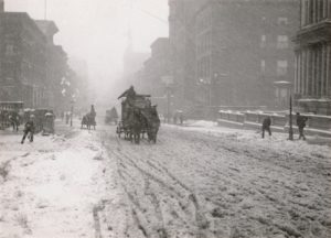
He was an American photographer and modern art promoter who was born on January 1, 1864. He was friends with German artist at the beginning of his career and he brought his first camera and traveled through the European country side photographing landscapes and peasants. He began to self teach himself about photography and he won first place for his Last Joke, Bellagio photography in 1887 from Amateur Photographer. In the main part of his career he considered himself an artist but refused to sell his photographs. His father decided to purchase a small photography business so he could earn a living in his chosen profession, Stieglitz paid his employees a high wage as he wanted high quality images. He then started getting awards for his photography exhibitions. He brought his first hand-held camera in late 1892 and he used this to take his two best known photos which are Winter, Fifth Avenue (right) and The Terminal (left).
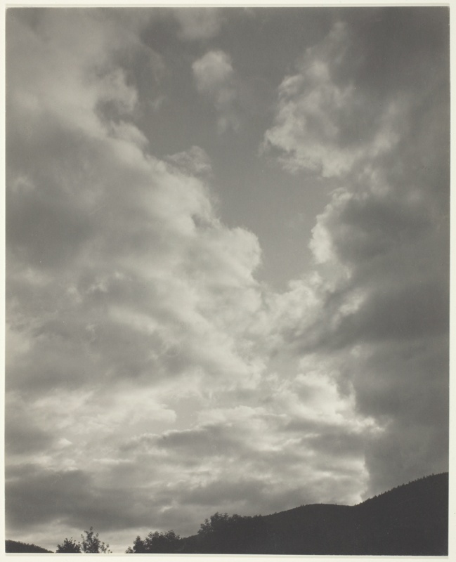
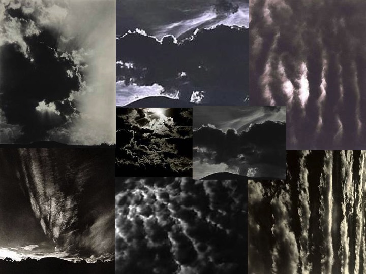
SONGS OF THE SKY
His photographs called ‘Songs of the Sky’ are focused on landscapes of the sky, which have abstract qualities. The title of these images are related to music, which shoes Stieglitz intended to do.
Moodboard;
These 8 images here are my inspiration for this shoot. I like how the dark and light in the images contrast each other and they all have different moods such as danger or a sense of heaven. He has really shown nature giving off many emotions in this project and it makes people looks at the images very differently because you can feel an emotion when looking at these images of clouds, something so simple yet with so much meaning.
This image by Stieglitz is one of my favourites because the natural light is seeping through the waves of clouds. The leading eye point in this images would be the whiter parts of the image because it captures the eye as it is contrasting up against the dark duller coloured clouds in the image and this shows how nature works together to create something so simple but beautiful and I believe that was Stieglitz’s motive behind this image, to show the earth for what it is. This image also has little editing to it, so it is showing the natural creations.
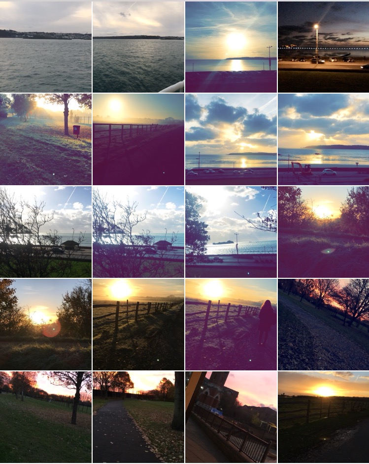
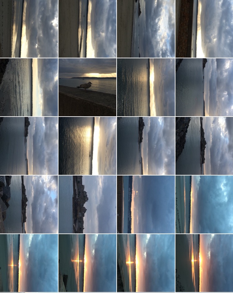
SHOOT 1
When performing my shoot, I regularly came back to the 8 images above, so regain inspiration and to remind myself of the images he took.
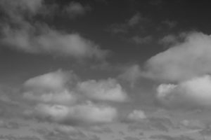
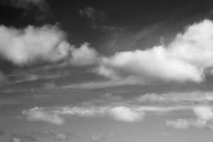
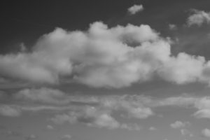
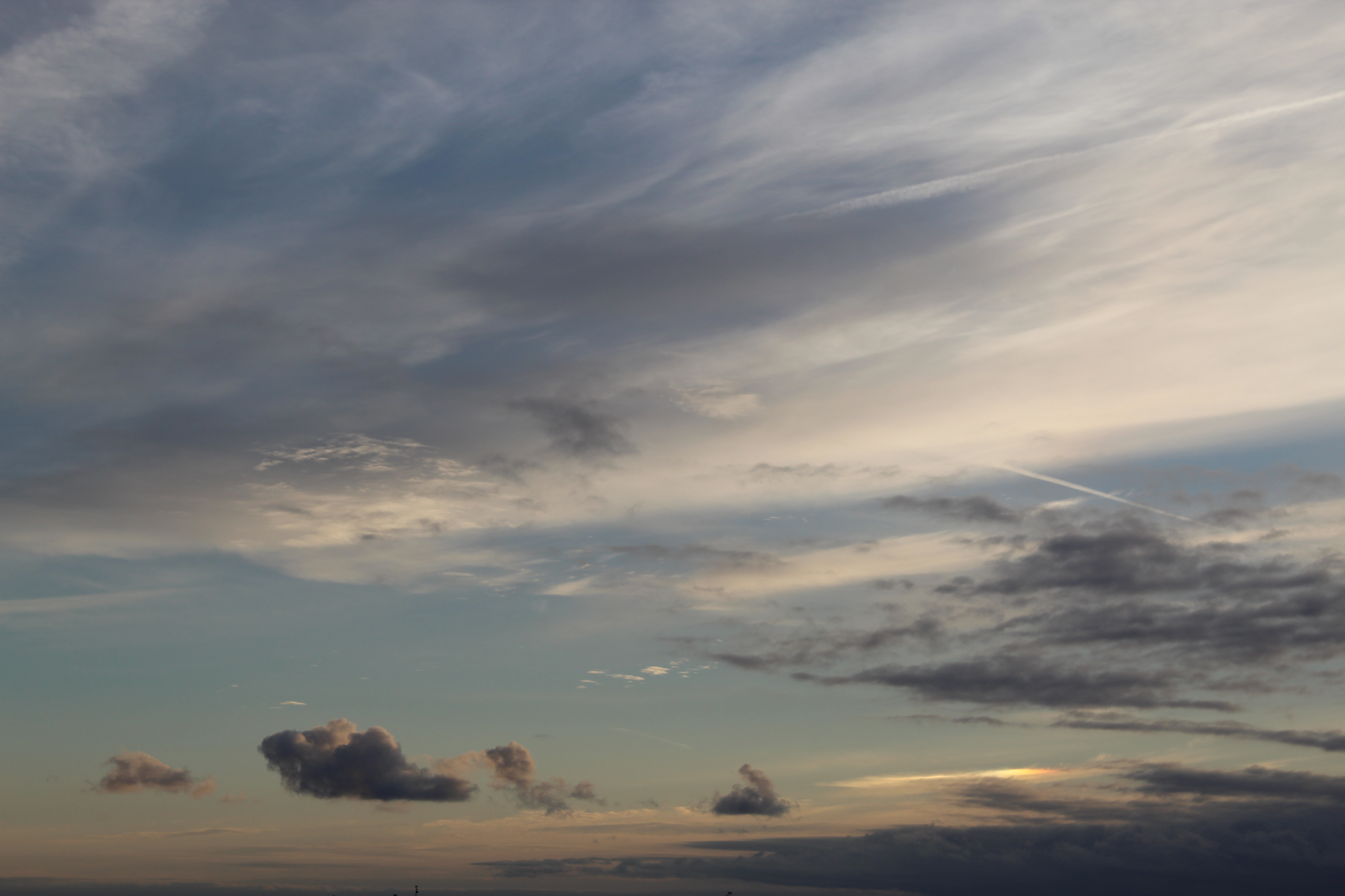
These three images here are a few I selected from my shoot, just to show the variety of images I took. All three images have been edited into black and white and also have adjusted the contract slightly, to make the white clouds pop more. To help me get these images I regularly came back to my moodboard I created earlier before starting to shoot, to remind myself of the way he took his photos and to regain inspiration, to form new ideas.
EDITING/PHOTOSHOP
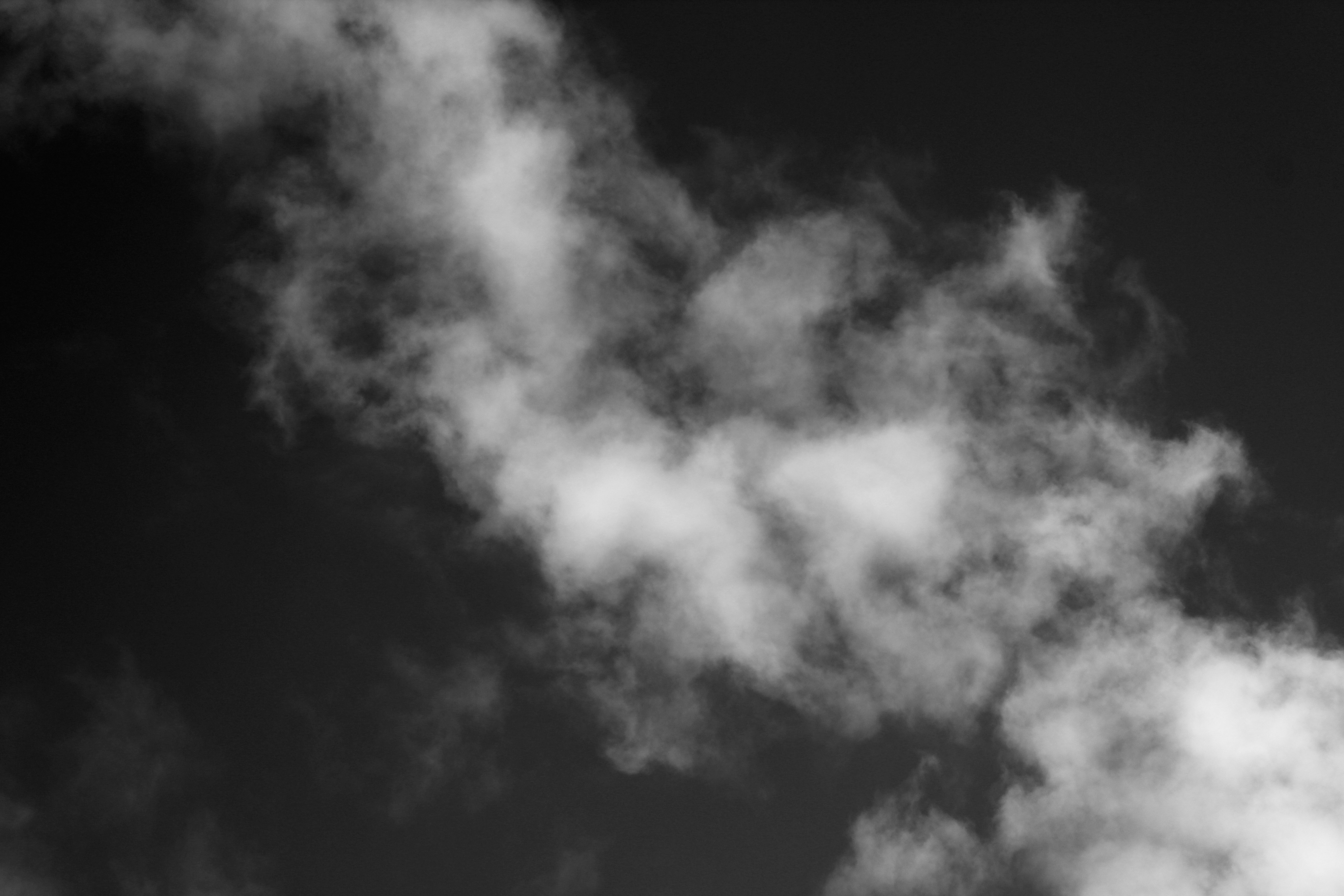
When editing this photo I focused in editing the darkness of the images, to create a higher contrast between the tones in this images. I would use this image as one of my final images because of the way the clouds look, the texture looks soft, so it gives the image a calm mood, but with the dark background the clouds look more vibrant and bold.
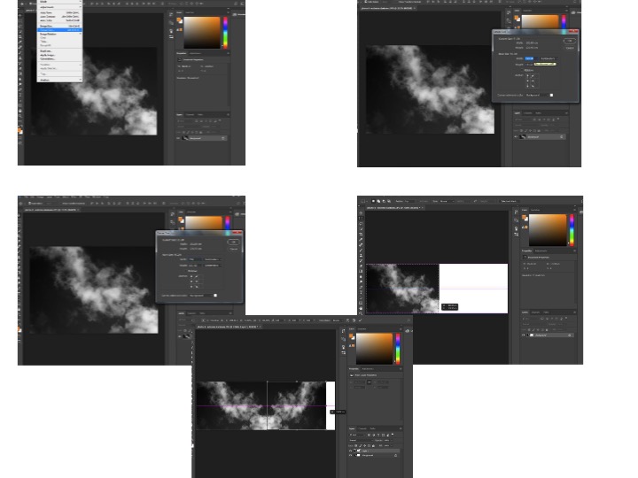
I was also experimental with my images, mirroring them using Photoshop, to make my own abstract photo. I mirrored each image then joined them together to make one photo, this makes the image more interesting and creates a contrast.
These are the steps on Photoshop I took to get the finished result of joining 2 mirrored photos together;
FINAL IMAGE
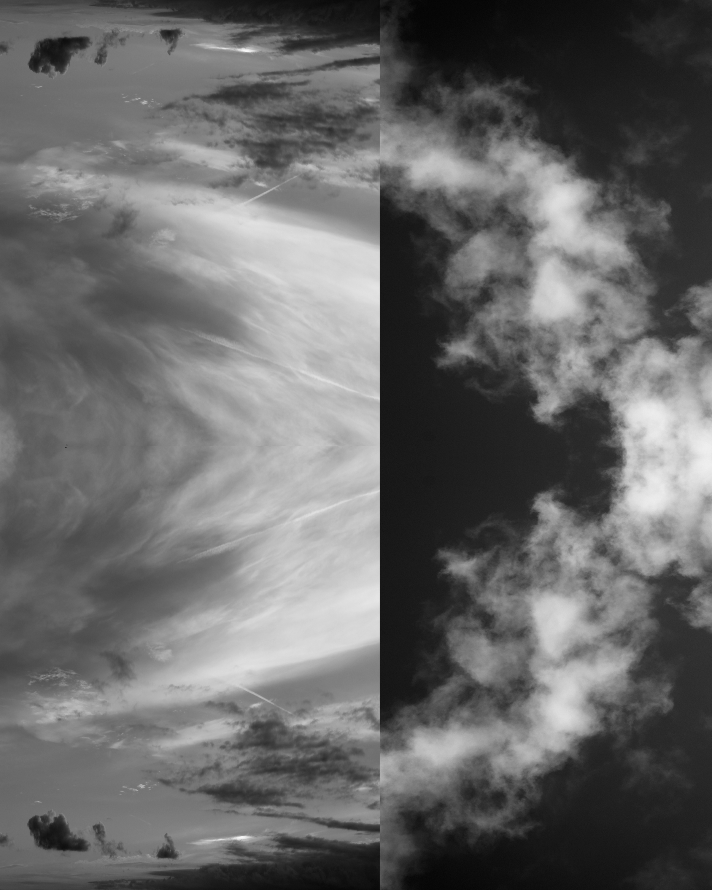
Before After
These images demonstrate a before and after editing. The final, completed image has been edited into black and white but I have also edited the darkness on the image and the contrast. I made the contrast high to show the different tones and shade. There is a depth of field in this photo, the top of the photo feels more close up to the white sheets of cloud and then the clouds become smaller which makes them look further away, even tho everything was in line. The clouds have made many different unique shapes, which creates a more interesting photo as there are more shapes to look at and admire. The images just looks satisfying because of the different tones and shapes around.
Aaron Siskind is an American photographer who is a part of the abstract movement. Siskind captures the abstract qualities of layers and texture. Aaron Siskinds work focuses on ideas of distraction in nature and architecture. Siskind intensified this approach to photography with the abstract movement with close-up framing and an emphasis on texture, line and visual rhythms, creating abstract images of the real world. Siskind was one of the first photographers to combine what was known as “straight” photography (recording the real world as the lens “sees” it) with abstraction. Siskind turned away from the social/political world post-World War II, and instead looked inward to seek meaning in the mostly inanimate forms he observed around him.
Aaron SiskindAaron Siskind
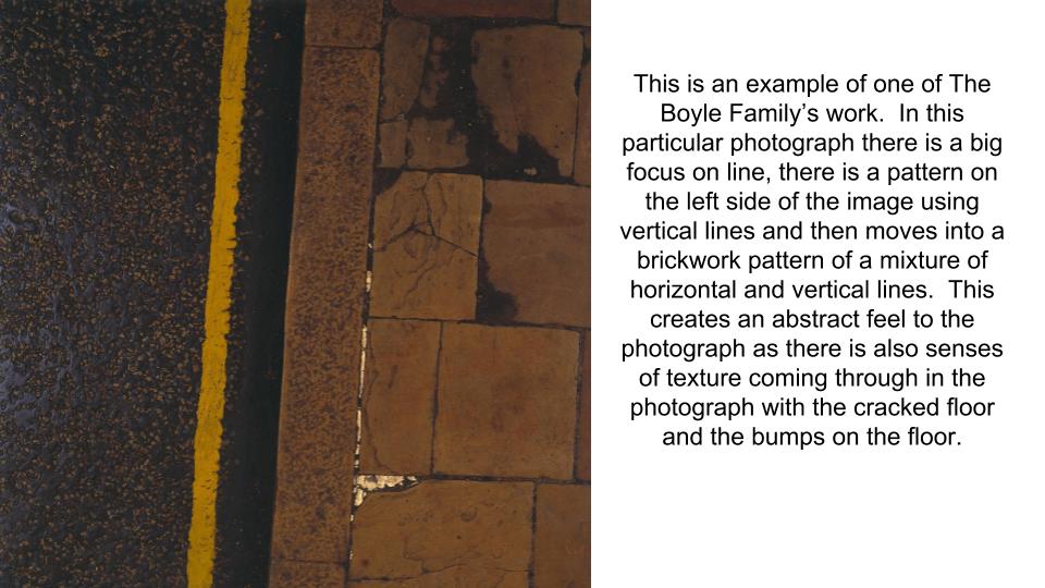
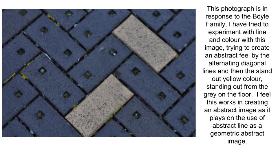
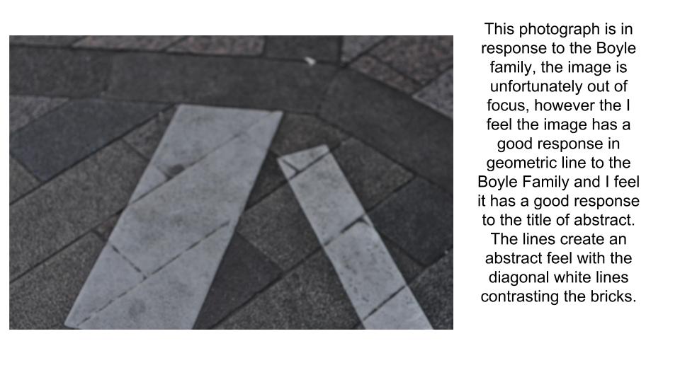
The Boyle Family
The Boyle Family is a group of collaborative artists based in London. Boyle Family aims to make art that does not exclude anything as a potential subject. Over the years, subjects have included: earth, air, fire and water; animals, vegetables, minerals; insects, reptiles, water creatures; human beings and societies; physical elements and fluids from the human body. Boyle Family is best known for the earth studies: three dimensional casts of the surface of the earth which record and document random sites with great accuracy. These works combine real material from the site (stones, dust, twigs etc) with paint and resins, preserving the form of the ground.
expand your ideas and show your understanding and creativity
We always get asked how many blog posts are required (as a minimum) to complete the unit…so here goes :
Moodboard (AO1) x 1 blog post
Mindmap of ideas (AO1) x blog post
Artist Reference / Case Study with IMAGE ANALYSIS (AO1) x 1 blog post
Action Plan (AO3) x 1 blog post
Photo-shoots + contact sheets (AO3) x 1 blog post
Image Selection (AO2) x 1 blog post
Image Editing/ manipulation (AO2) x 1 blog post
Presentation of final outcomes (AO4) x 1 blog post
Compare and contrast to your artist reference (AO1) x 1 blog post
Evaluate and Critique your final outcomes (AO1+AO4) x 1 blog post
Have a close look at the marking criteria below…and compare to your work / blog posts.
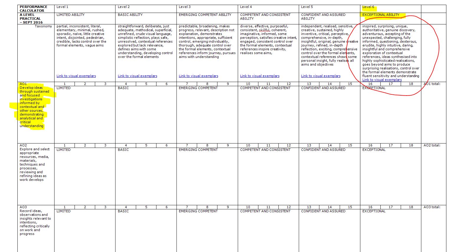
PERFORMANCE CALCULATOR
Cross – Referencing your ideas with contemporary / influential photographers
Compare and Contrast : Edgar Martins
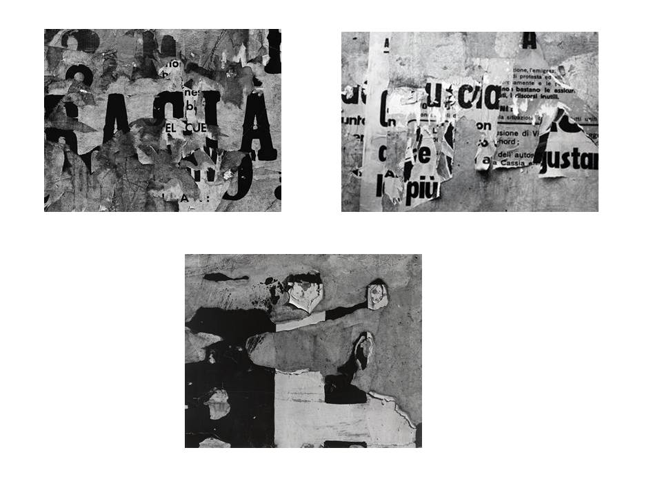
The images above are by a Portuguese photographer, Edgar Martins.
They are part of a series of work inspired by the writing and sending of letters, the power and intimacy of a letter. Martins has recently won various awards for his minimal, direct and stylish approach.
For this mini-series he photographed paper, carefully lit and isolated from any other context. There is a stillness to them that belies the fact they may have been written as suicide notes, contact between prison inmates and loved ones and more. Martins spent time working with court, prison and parole officials and indeed, prisoners in Portugal exploring this theme, that often ended in death for many of his subjects.Now refer back to your experiments with paper, and add your own research and analysis of Edgar Martins’ work.
TASK 1
Compare and contrast Edgar Martins work to your own images
Ensure you have discussed TECHNICAL and VISUAL aspects of the images
Think about the CONCEPT of the work and annotate your own accordingly
employs a range of editing techniques to his images of London City, it’s constantly changing built environment and the industries held within it.
Have a closer look at his work and compare the way he blurs, overlaps and distorts our vision of the city to techniques that you may have employed to your images.
Why do you think he does this?
Describe and explain how your ideas have evolved.
Remember to use this model when discussing and analysing photographs :
TECHNICAL -VISUAL-CONCEPTUAL-CONTEXTUAL
ALWAYS choose 1 x key image of your own to discuss in detail
ALWAYS choose 1 x key image of an influential photographer to discuss in detail
HOMEWORK METHOD
Follow the 10 Step Process for each unit to ensure you tackle all Assessment Objectives thoroughly :
Moodboard (AO1)
Mindmap of ideas (AO1)
Artist Reference / Case Study (AO1)
Action Plan (AO3)
Photoshoots + contact sheets (AO3)
Image Selection (AO2)
Image Editing/ manipulation (AO2)
Presentation of final outcomes (AO4)
Compare and contrast (AO1)
Evaluate and Critique (AO1+AO4
Copy and use this plan to help you organise / evaluate your photo-assignments…
I firstly layered two images over one another, as shown above.
After I layered them I tried out changing the opacity of the layer on top to see if I liked how the image looked by just using opacity. I decided against using it for these two images.
I then went through the different blend options to see how the image would look using different blends. The option I liked the most was the “multiply” option.
I then added a new layer with a new image and used both the opacity and the blend options together to make the new image appear almost invisible but still noticeable in the image.
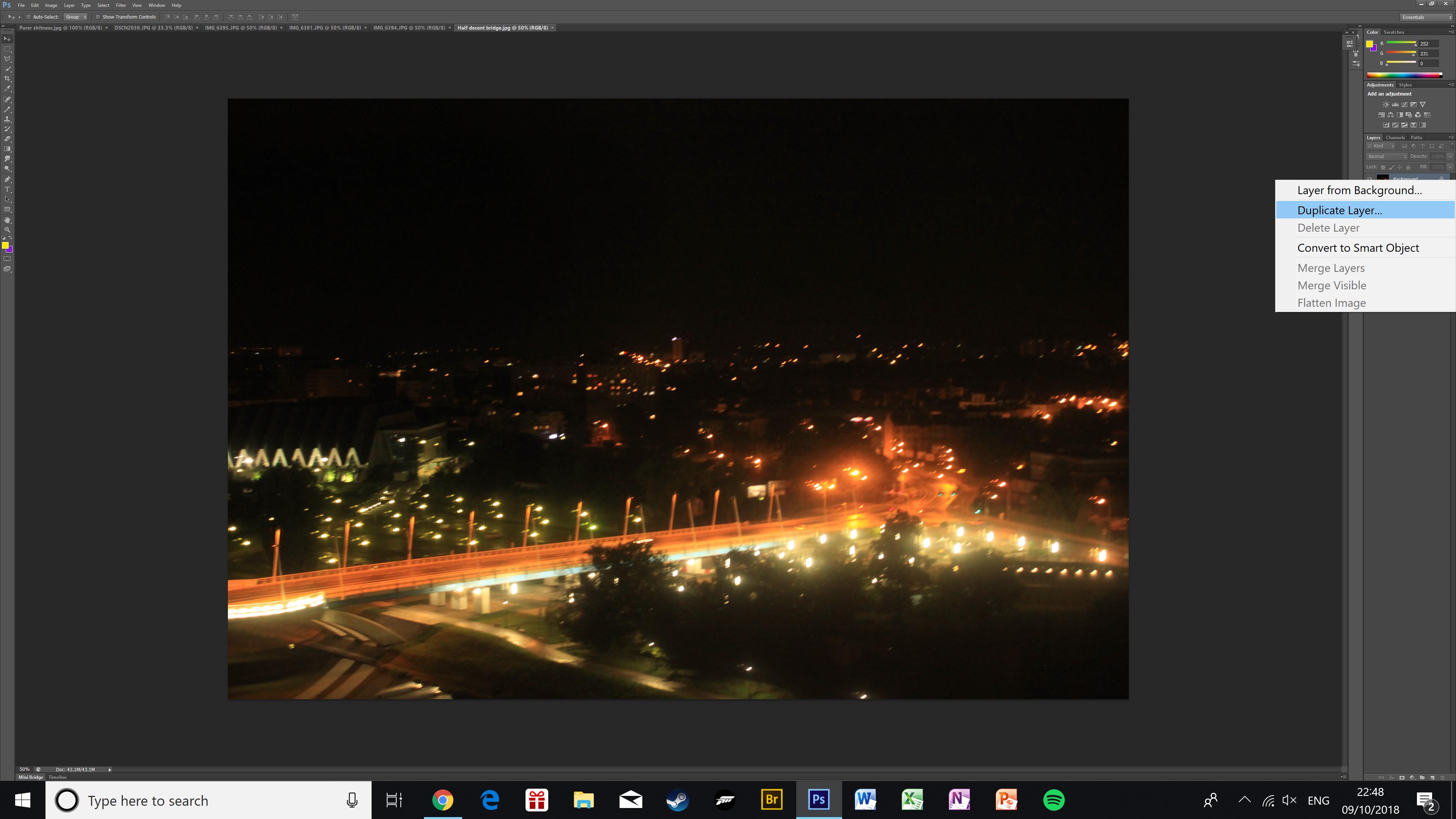
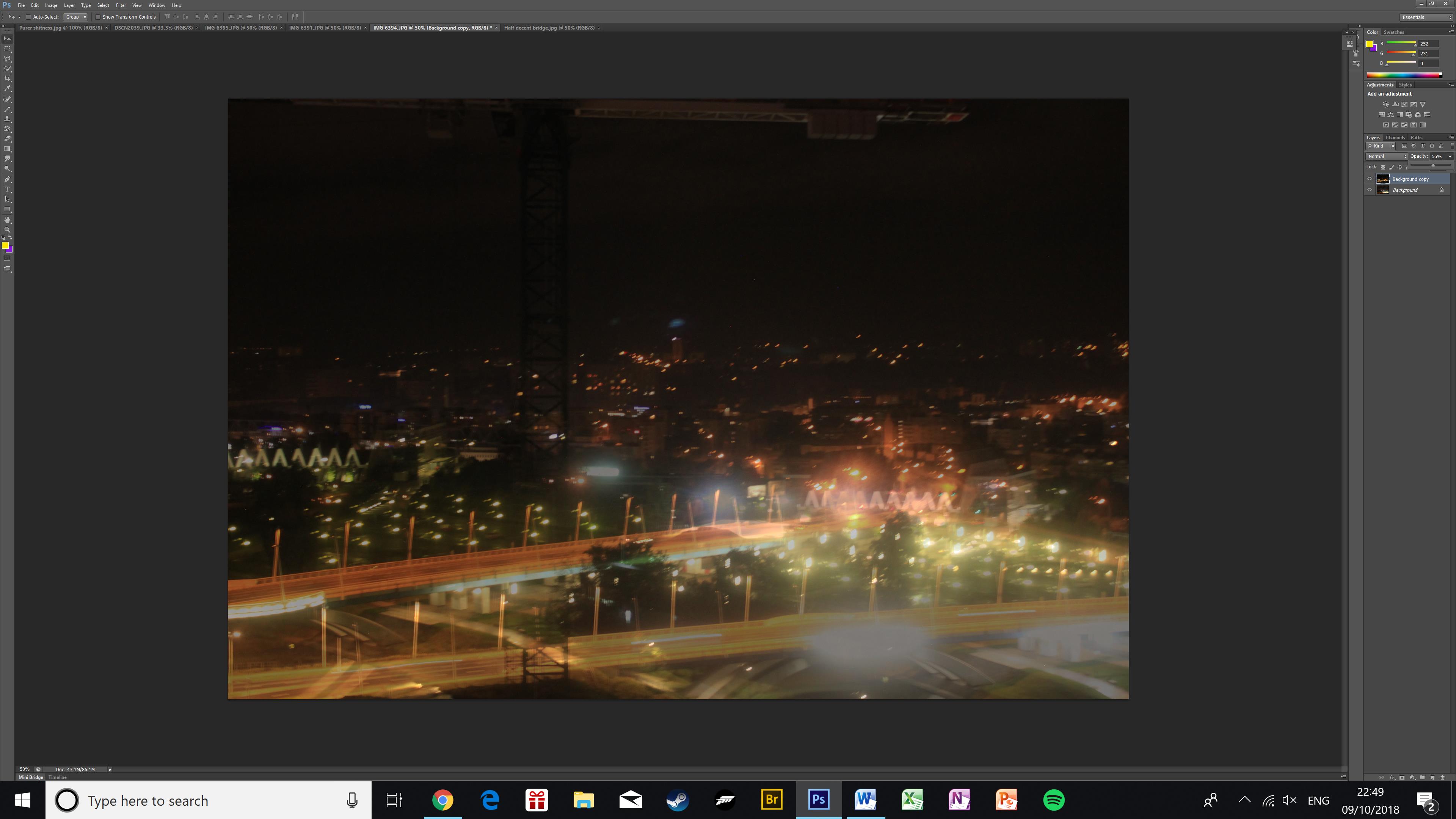
To create a double exposure I used two similar photos of the same bridge. First, I duplicated the layer I wanted to go on top and placed it on top of my base image.Then I made the top image more transparent using the opacity slider. In this image, it creates an effect of there being two layers of bridges across the bridge, as well as raising the skyline in the background.
The next two pictures are finished double exposures.


 Next, I dragged one image on top of the other, so that the second image became a separate layer
 Next I changed the image into black and white.
 After, I slightly lowered the brightness so it was a little darker, and I increased the contrast a lot so that the white label would stand out more.
 Next, I had to also edit my second layer which was the other image that I dragged over the top of my background. I also changed this image into black and white so the colors on the label could create an interesting contrast.
 Here, I increased the contrast and also the brightness, so this image could look brighter when it was layered over the background as the background image was edited darker.
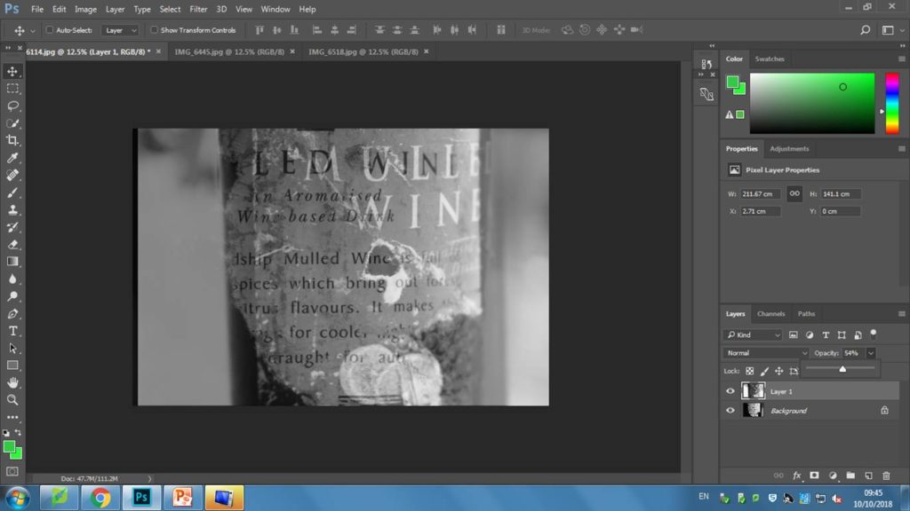 I then edited the opacity to 54% so both of the images could blend together.
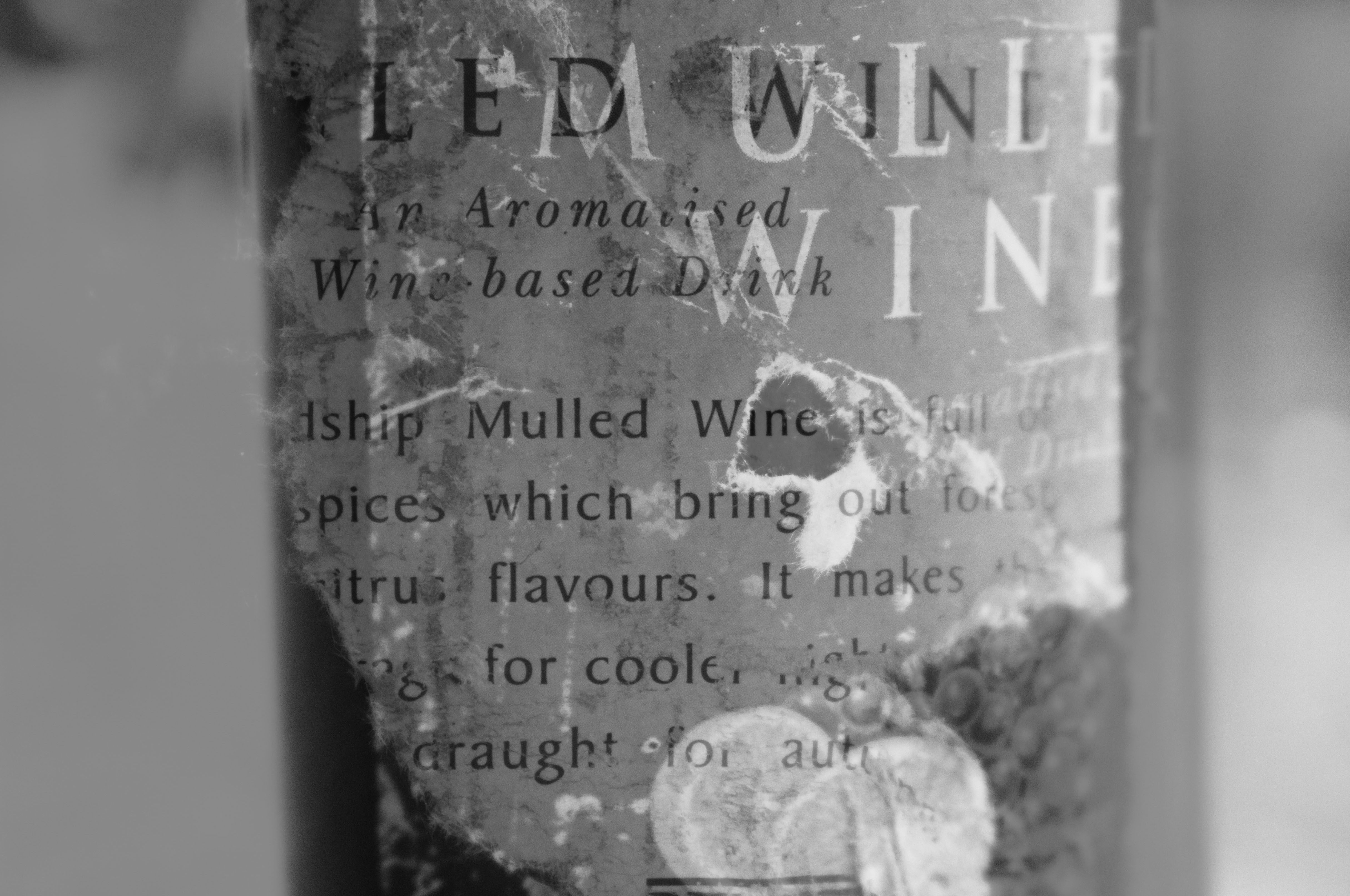
 Here, I lowed the opacity so I could see how the images would look over the top of each other. I decided to place the original photo slightly higher, and to the left to create this interesting effect.
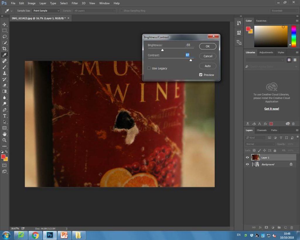 After I was satisfied with the positioning of the image, I changed the opacity to 100% so I was able to edit my image. I decided to put the brightness very low and the contrast very high, so that the darkness of the photo could blend well with the black and white background.
 Lastly, I then lowered the opacity again so both of the layers were visible on top of each other.
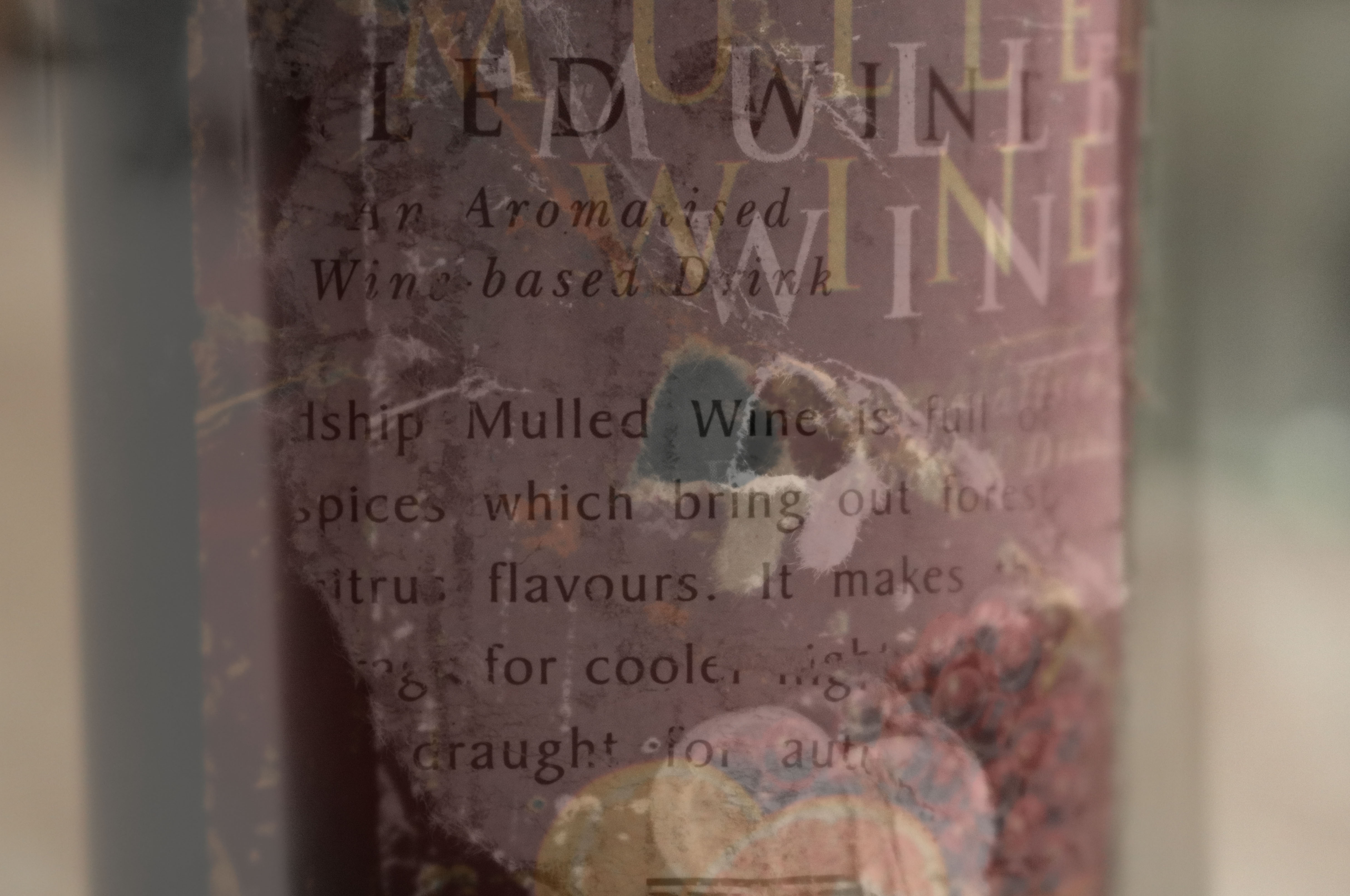
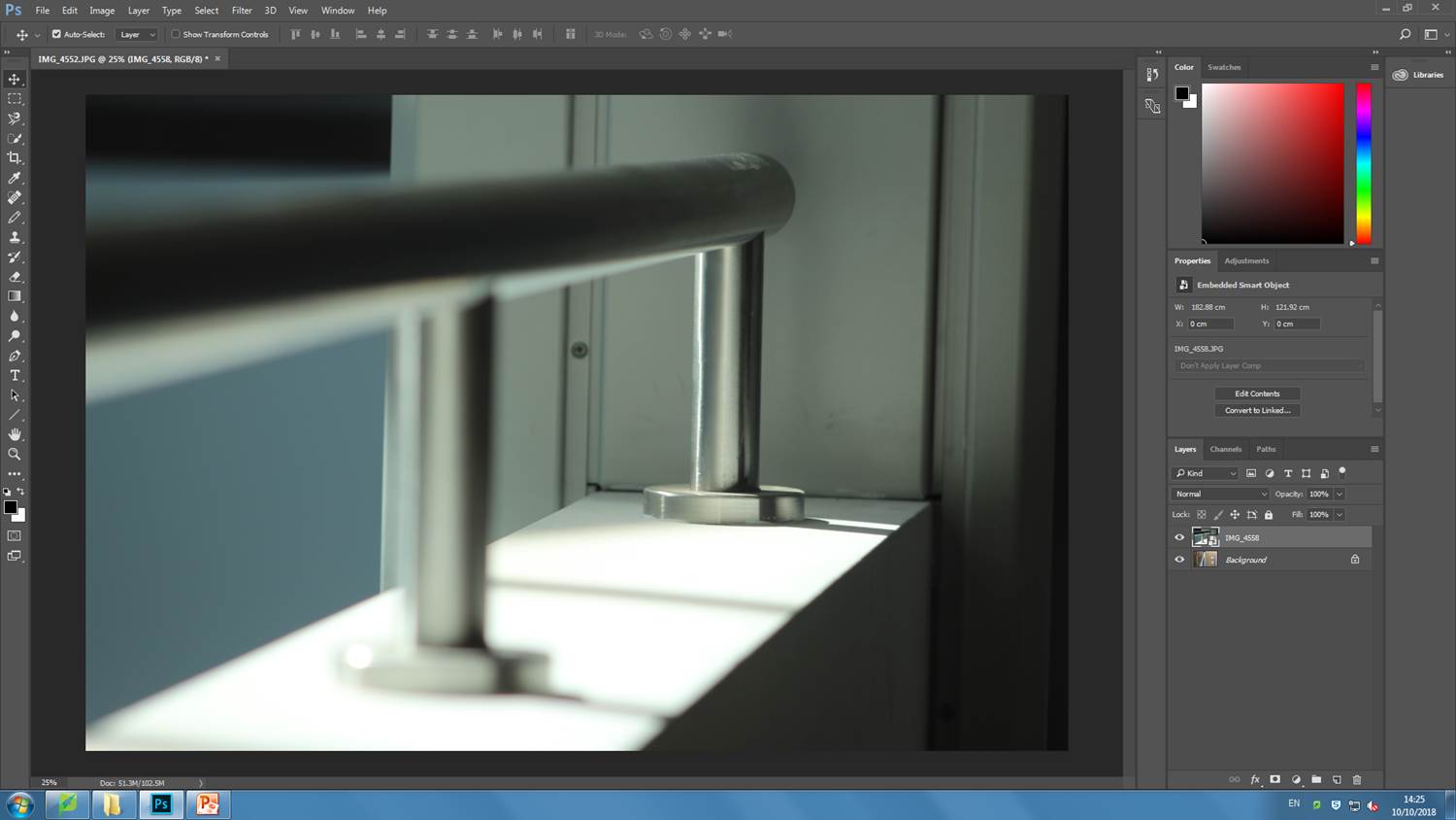
 To being editing this photo, I cropped it so that the dent in the wall was right in the middle of the image as I wanted it to be the main focus when an audience views my photo.
 Next, I increased the contrast dramatically and the brightness only slightly. I did this because both parts of the wall were in different positions to the sun, meaning one side was very lit whereas the other side was in the shade. I wanted to exaggerate the contrast of lighting.
 Lastly, I changed the image into black and white so the lighting contrasts would be even more noticeable.
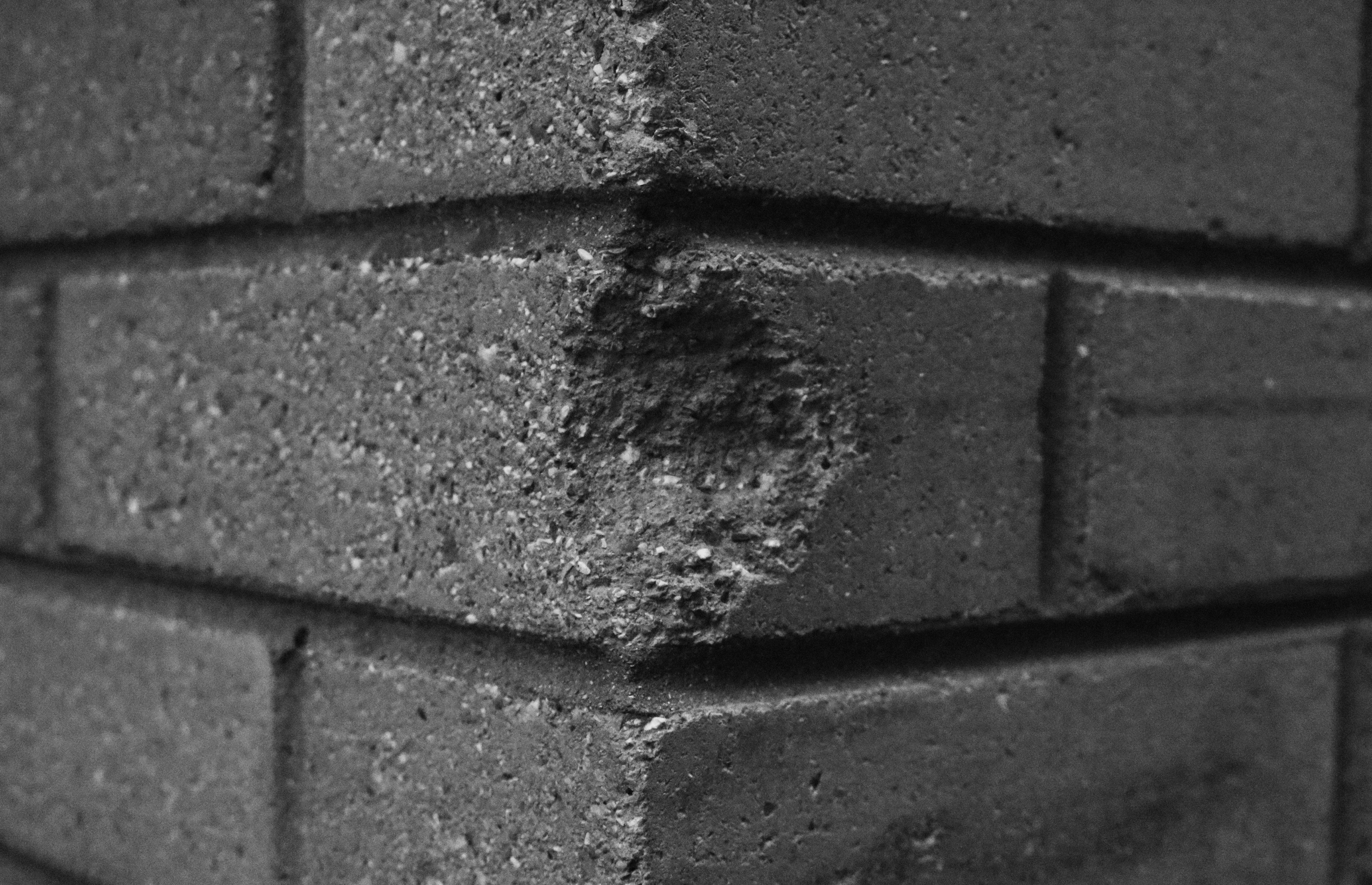
 Firstly, I cropped the image to get rid of the lower left side of it as the background was visible and it was distracting.
 Next, I lowered the brightness so all the colours would look darker and I increased the contrast.
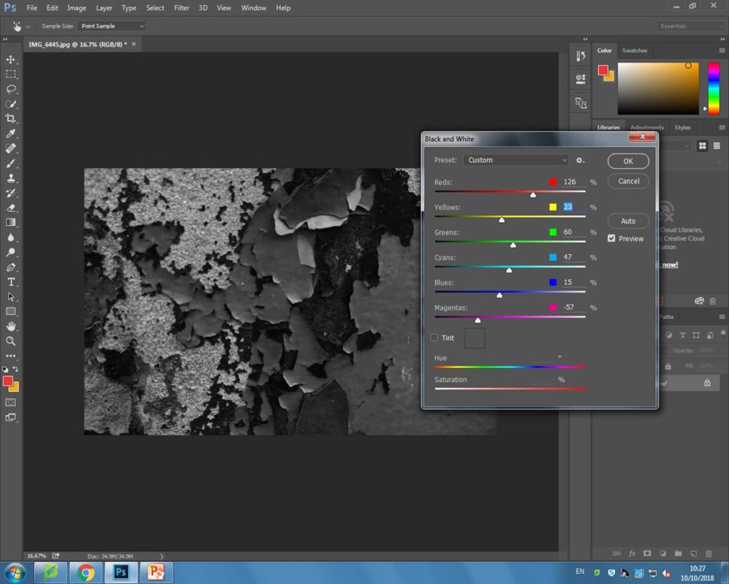


 Before
 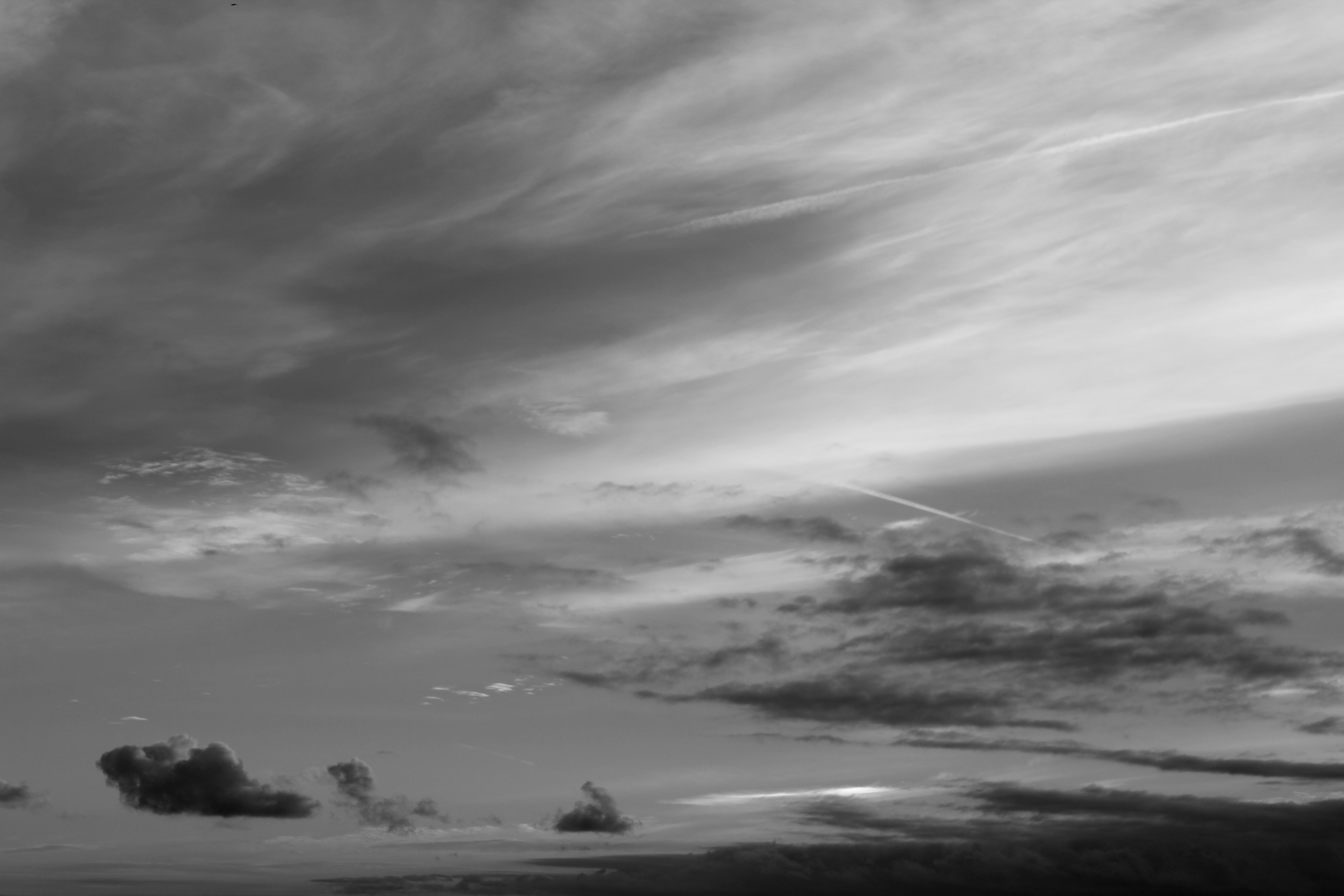 After
After