Saul Leiter
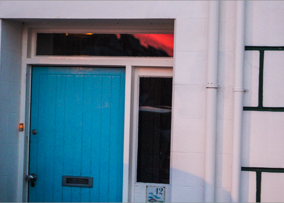
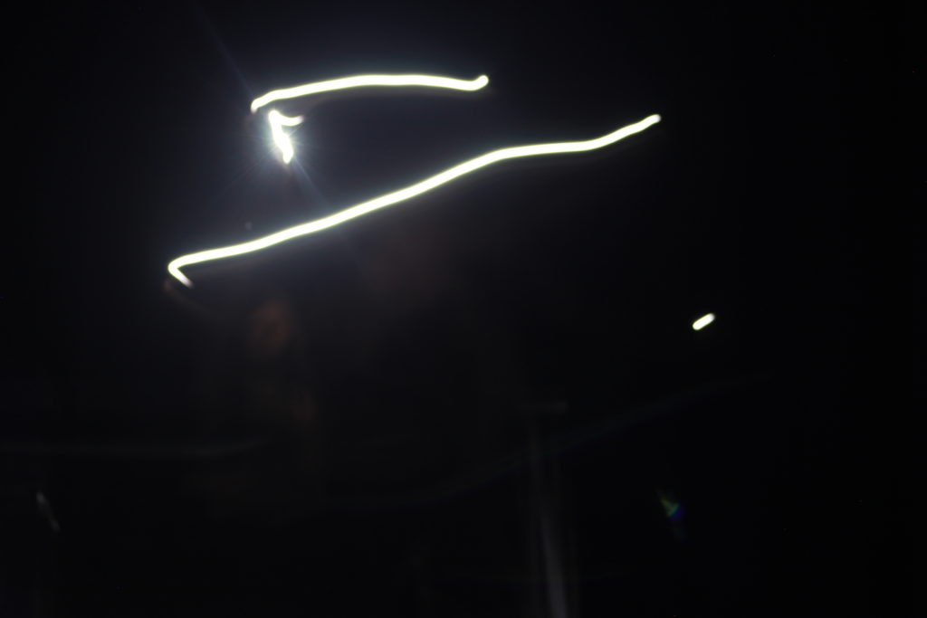
Saul Leiter was born in 1923 in Pittsburgh, Pennsylvania, where his father was a well-known Talmud Scholar. Leiter first started falling I love with art in his late teens, presides being pushed to become a Rabbi like his father. At the age of 23 he decided to pack his bags and leave is life style at theology school and move to New York where he could pursue his love for art. When in New York, Leiter became close friends with the Abstract Expressionist painter Richard Pousette-Dart, who also had some experience with photography. This is where Leister began to develop his love for art and started to look toward photography. Leister’s earliest work was black and white photography and proved to be a bit success in the photography world. By the 1950s, leister had begun looking at colour photography as well and had continued to put together an extensive body of work. Leister had a unique style and the way he went about producing black, white and colour photo were like non other at the time, this proved to be a huge advantage as it made him stand out from the crowd. Leiter was overall was and enormous contribution to street art and bought a very unique feel to it.
His abstracted forms and very innovative pieces, that stands out among the work of his New York School contemporaries. Perhaps this is because Leiter has continued through the years to work as both a photographer and painter.
Leiter’s work is features prominently in Jane Livingston’s The New York School and in Martin Harrison’s Appearances; Fashion Photography Since 1945. His work is in the collections of the Museum of Fine Arts, Houston; the Art Institute of Chicago and many more.
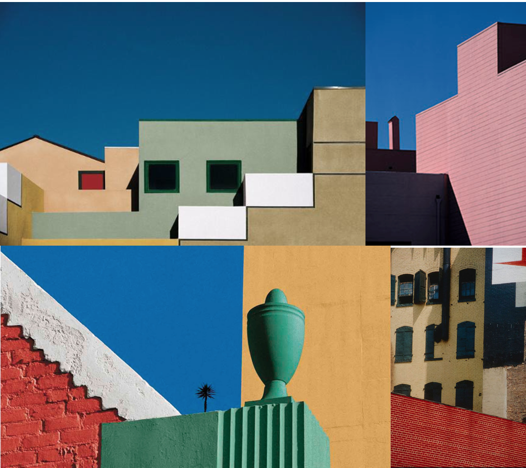
Some of his work:


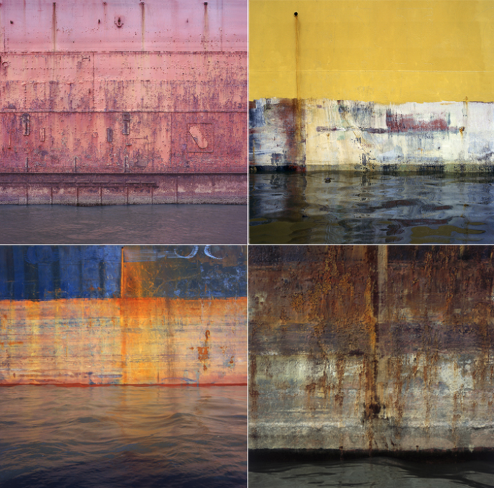
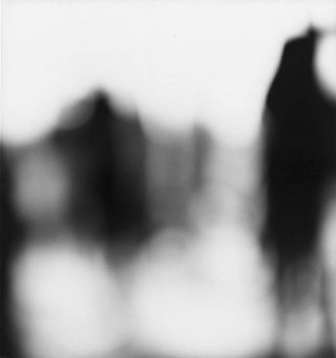
Uta Barth
Uta Barth was born in 1958 in Berlin, Germany and has grown up to be a fine contemporary photographer who now currently lives in Los Angles, California. Barth received a bachelor arts degree from the University of California Davis and a Master of Fine Arts from the University of California. Uta Barth was a professor in the Art Department of the University of California, Riverside, between 1990 to 2008. This is where she is still currently a professor of art emeritus. Uta Barth is famous for the way she goes about looking at her images and her visual perspective- the idea of how the human eyes sees everything differently to the way the lens on your camera perceives everything . That is to say, she is perhaps less interested in where the camera is pointing than the act of looking through the lens in the first place.
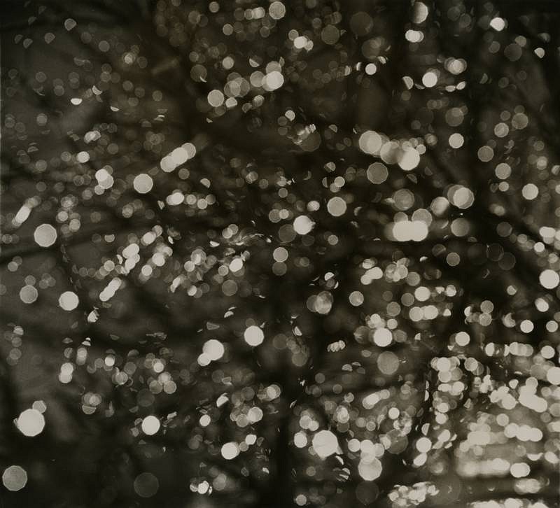
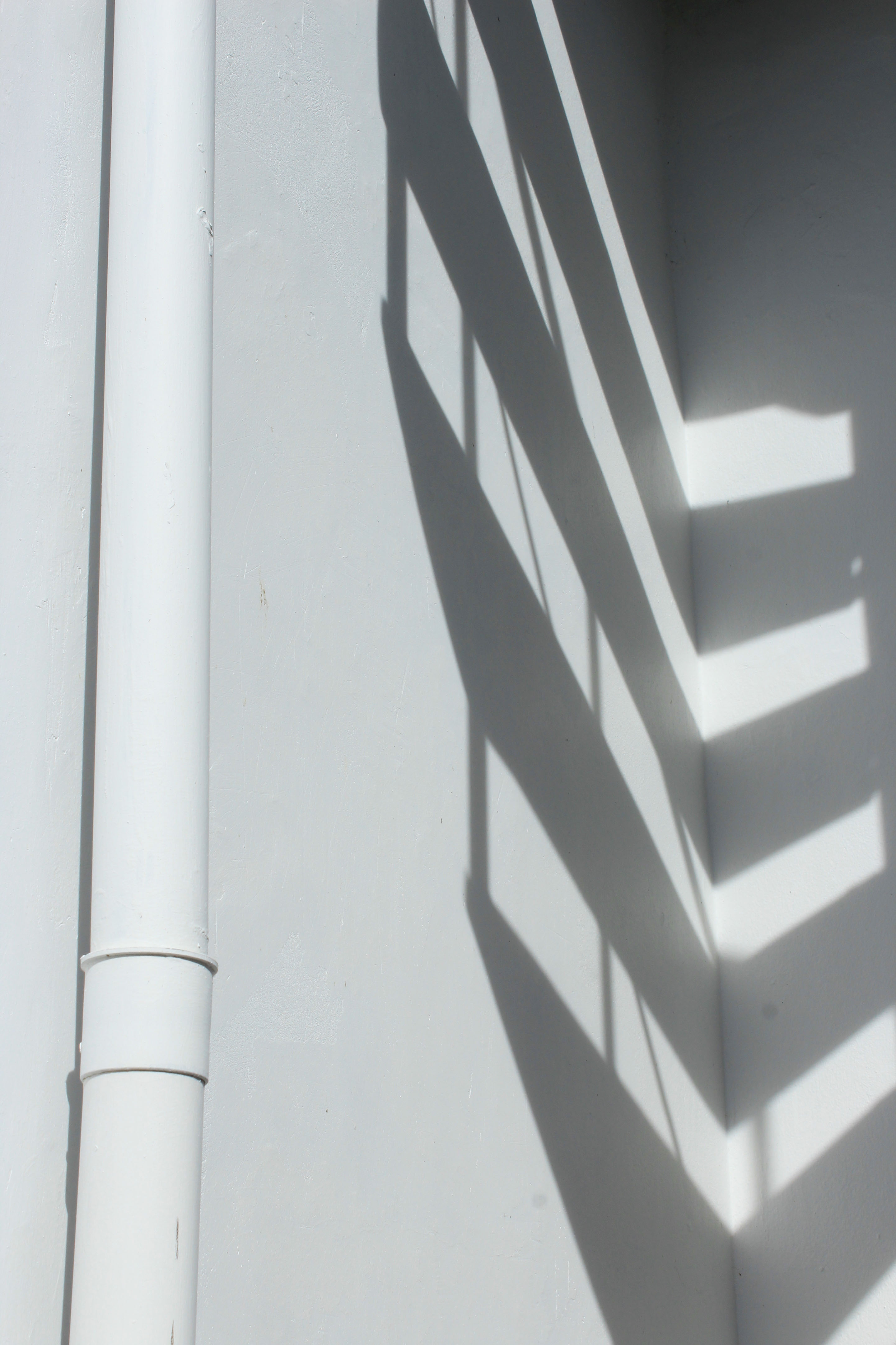
Some of Uta Barth’s work:


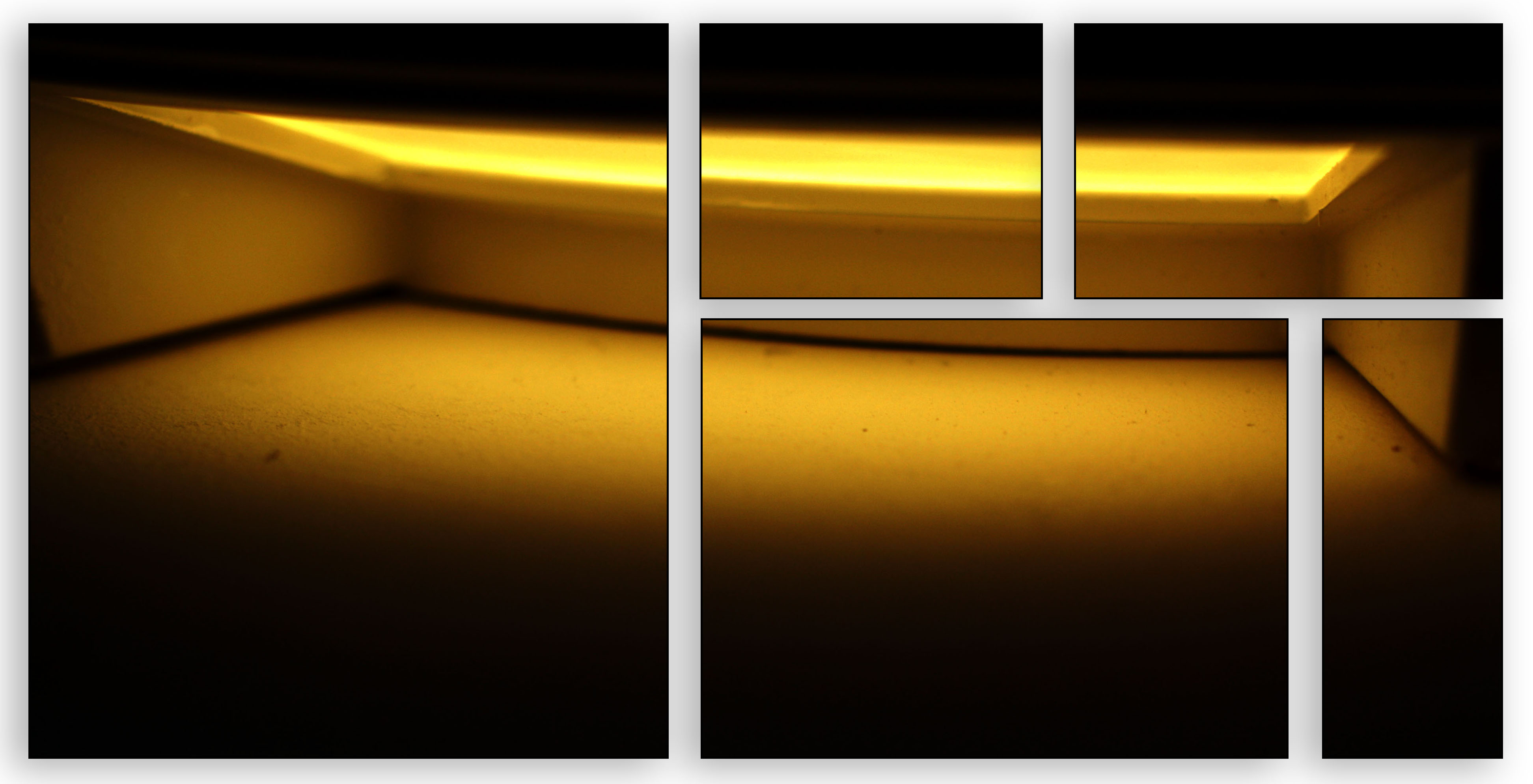
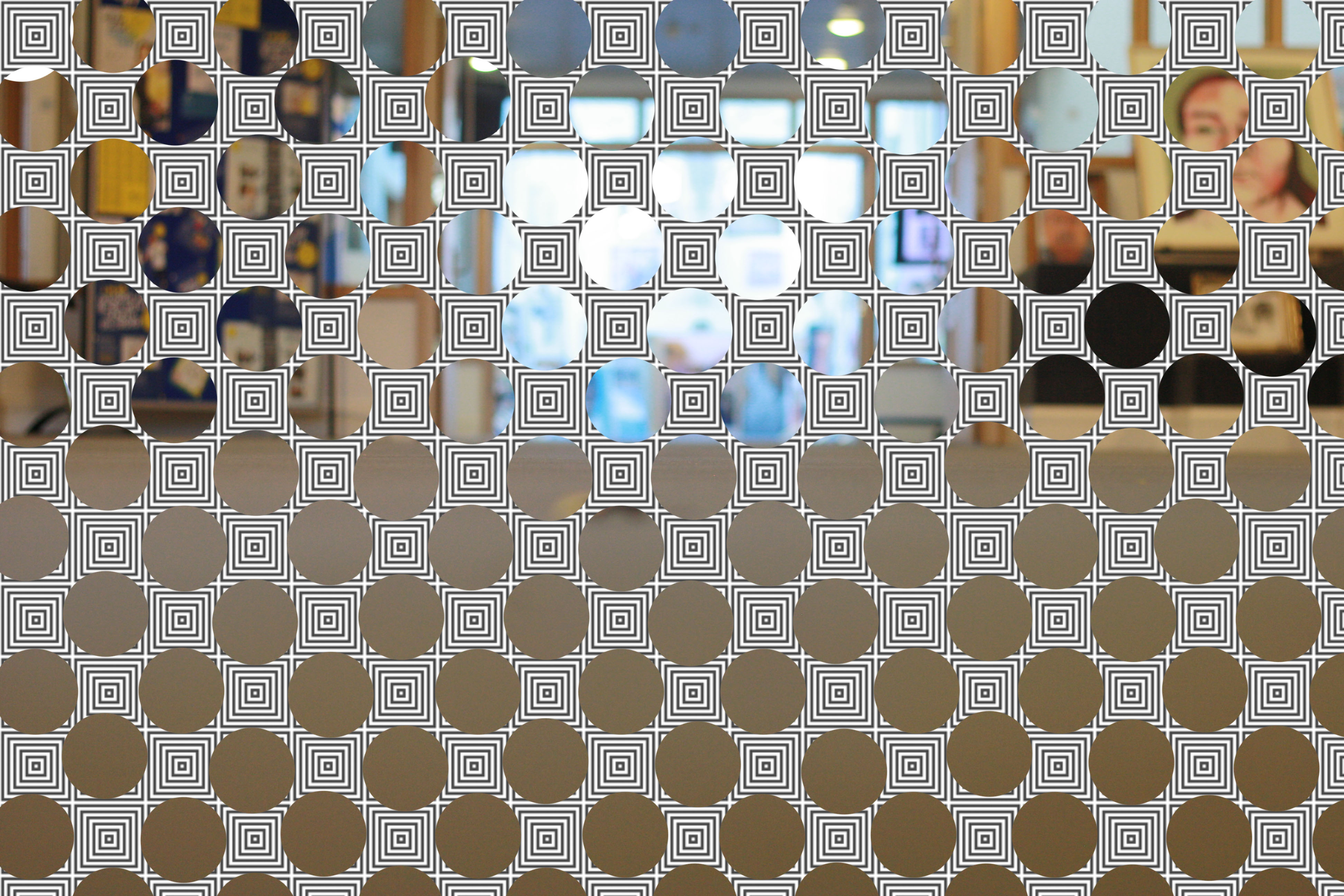
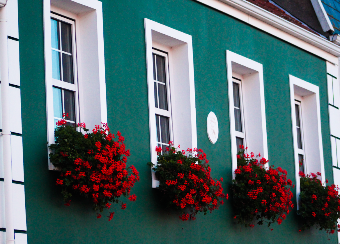
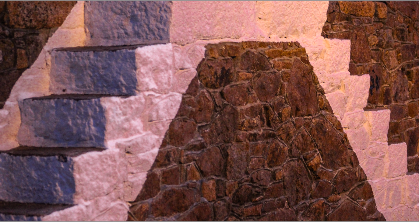
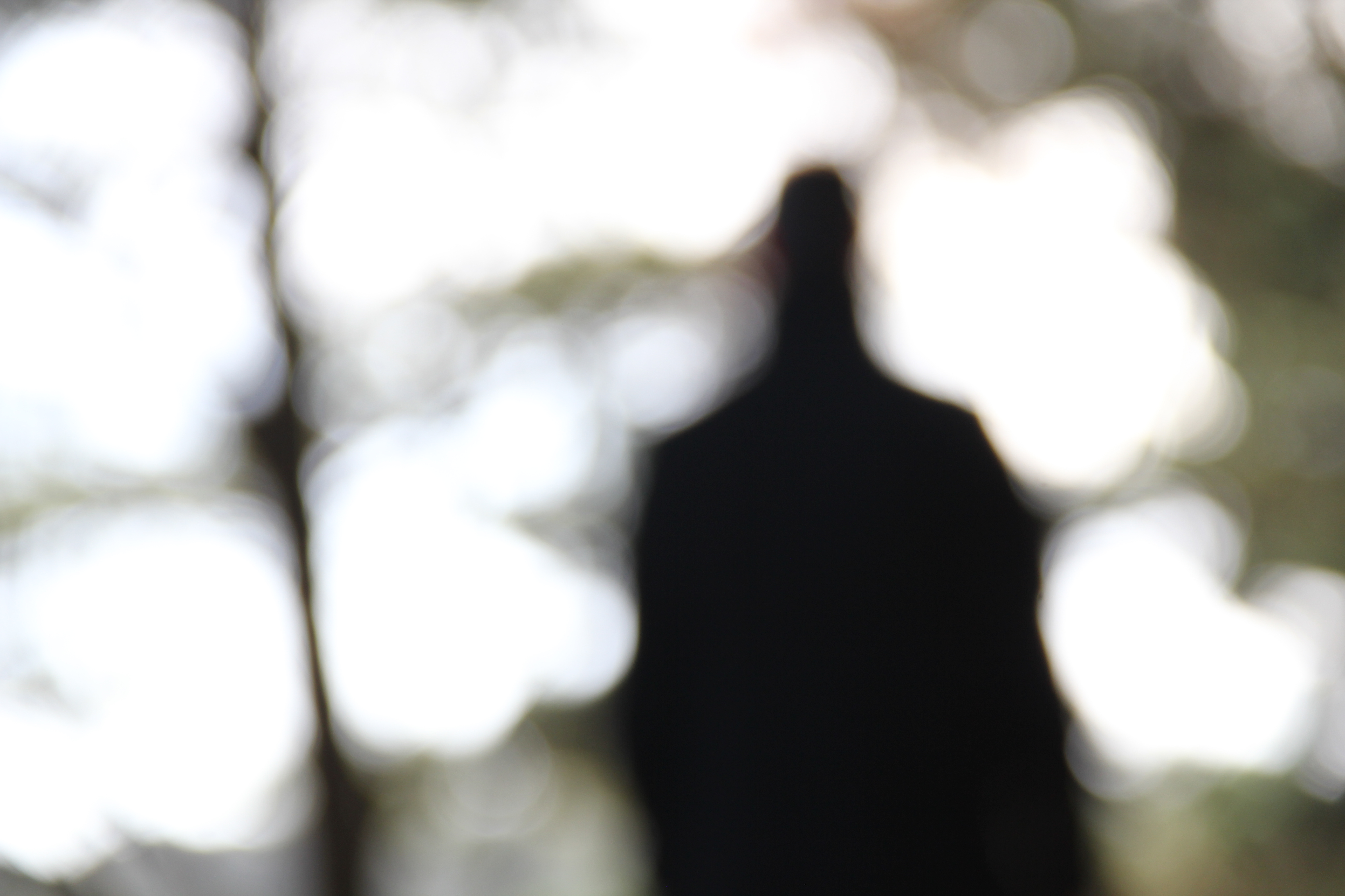
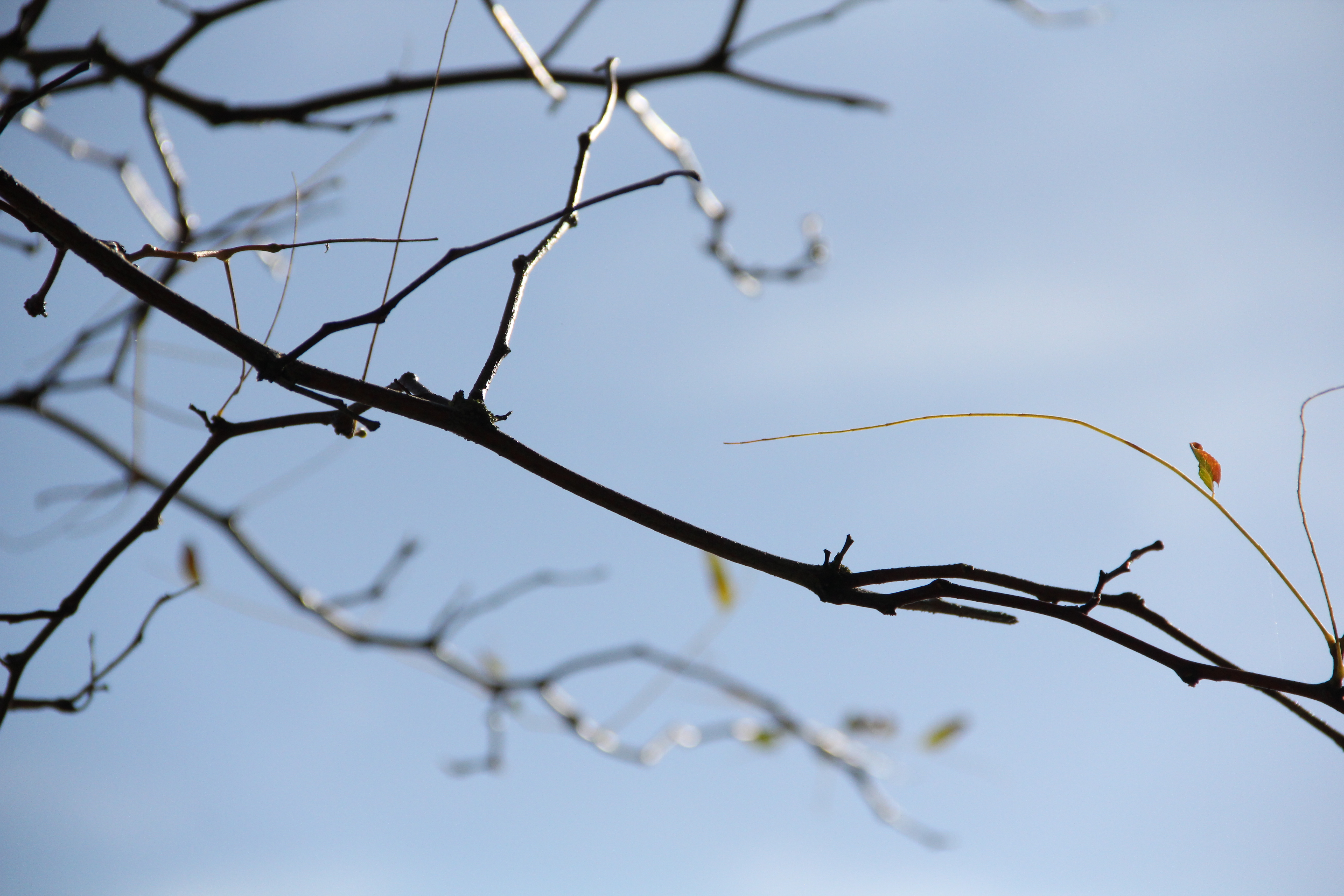
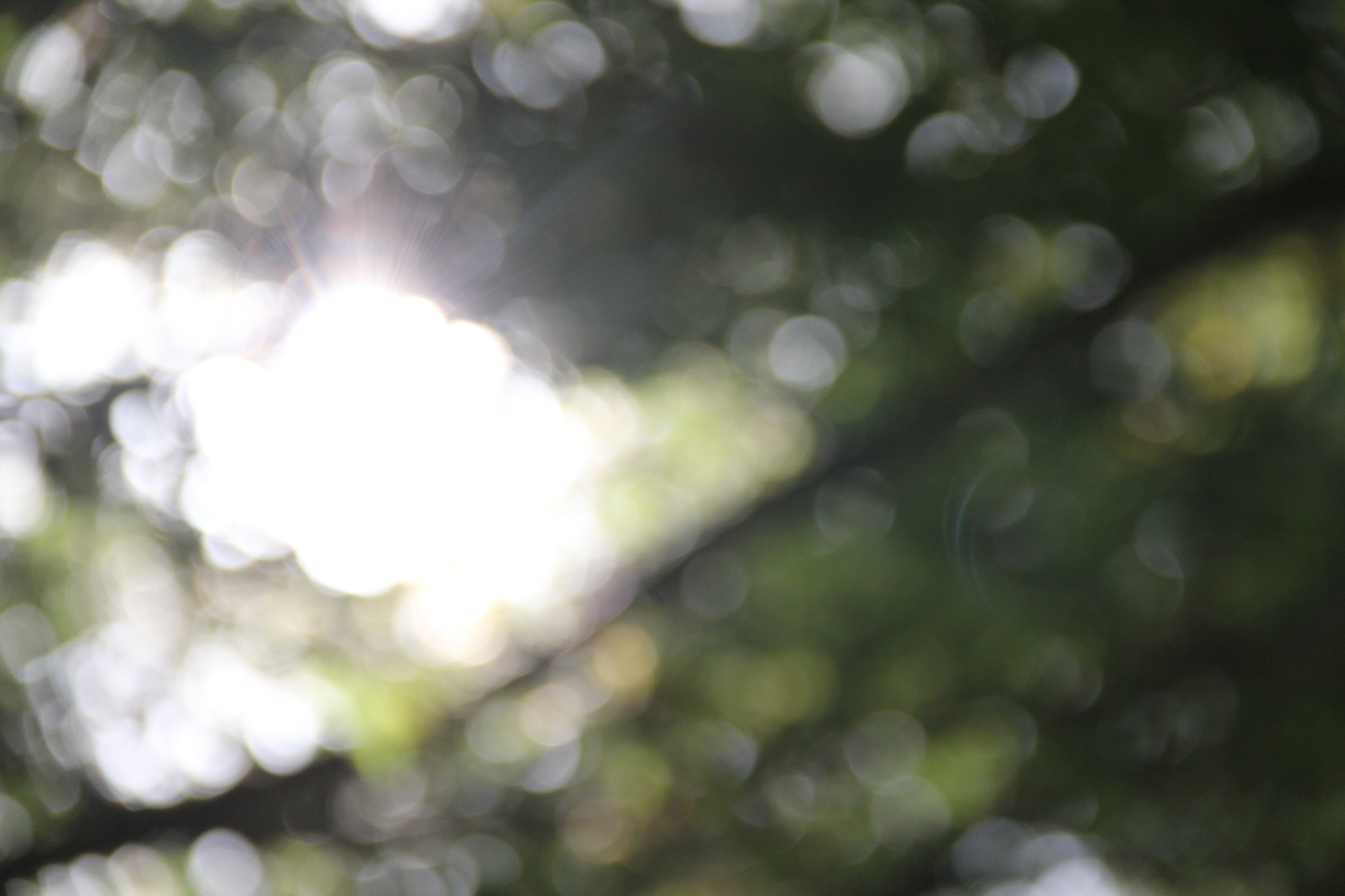
After looking closely at both Saul Leiter and Uta Barth’s it was event the blurring images and allowing different shadows and shapes to been seen in the ‘background’ were key. when next looking at takingmy own photos inspired by both Barth and Leister I had to keep these key idea in mind. These were my favorite three out of my overall photo shoot. I selected these as my favorite because in all of these images there is not a specific focus point due to the fact the whole imaged is blurred and its like the petals in the flowers have merged together causing the shadows to interchange through each other. As well as the shadows being undistinctive the lines are also unclear which allows the view to concentrate more on the colours and shades of the picture. i think this is important as it help the image stand out from others. linking into the tone of image which varies due to the levels of the light,, with the ends of the petals being and light and slowly decreasing in colour as you get closer to the centre this helps portray a smooth feeling texture of the petals.
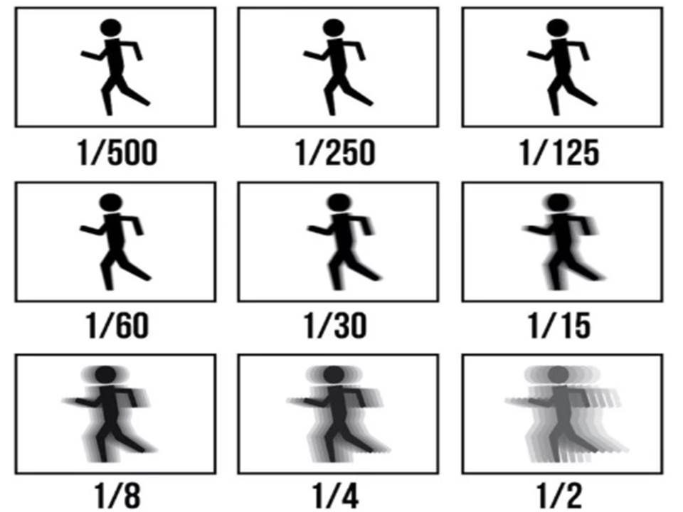
For these image I used my micro lens to enable me to get close up to the flower, when using a micro lens it is essential to make sure you are completly still to allow full quality and sharpness of the image.
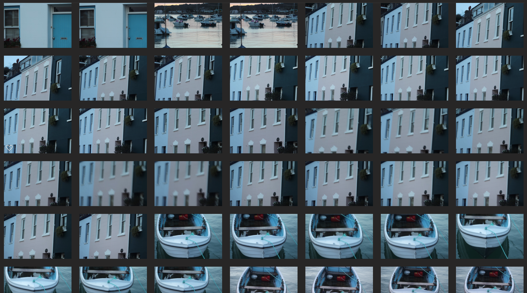
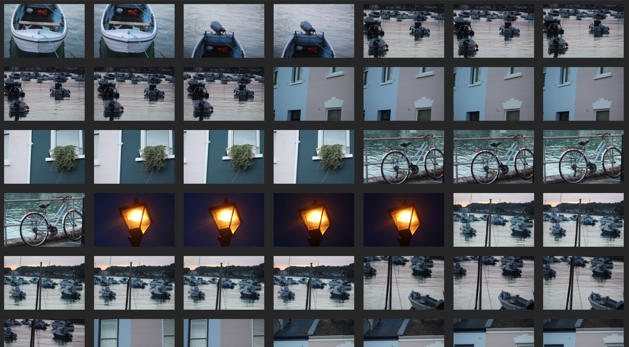
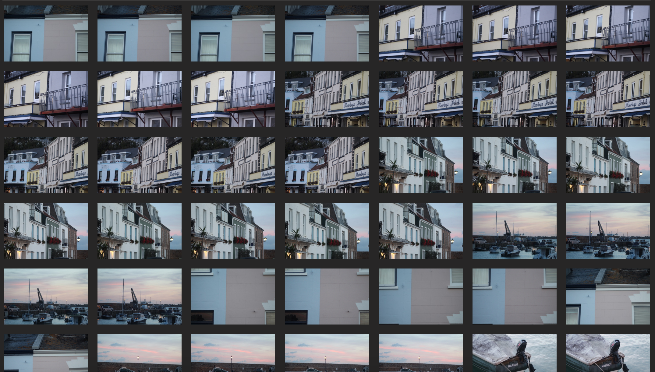
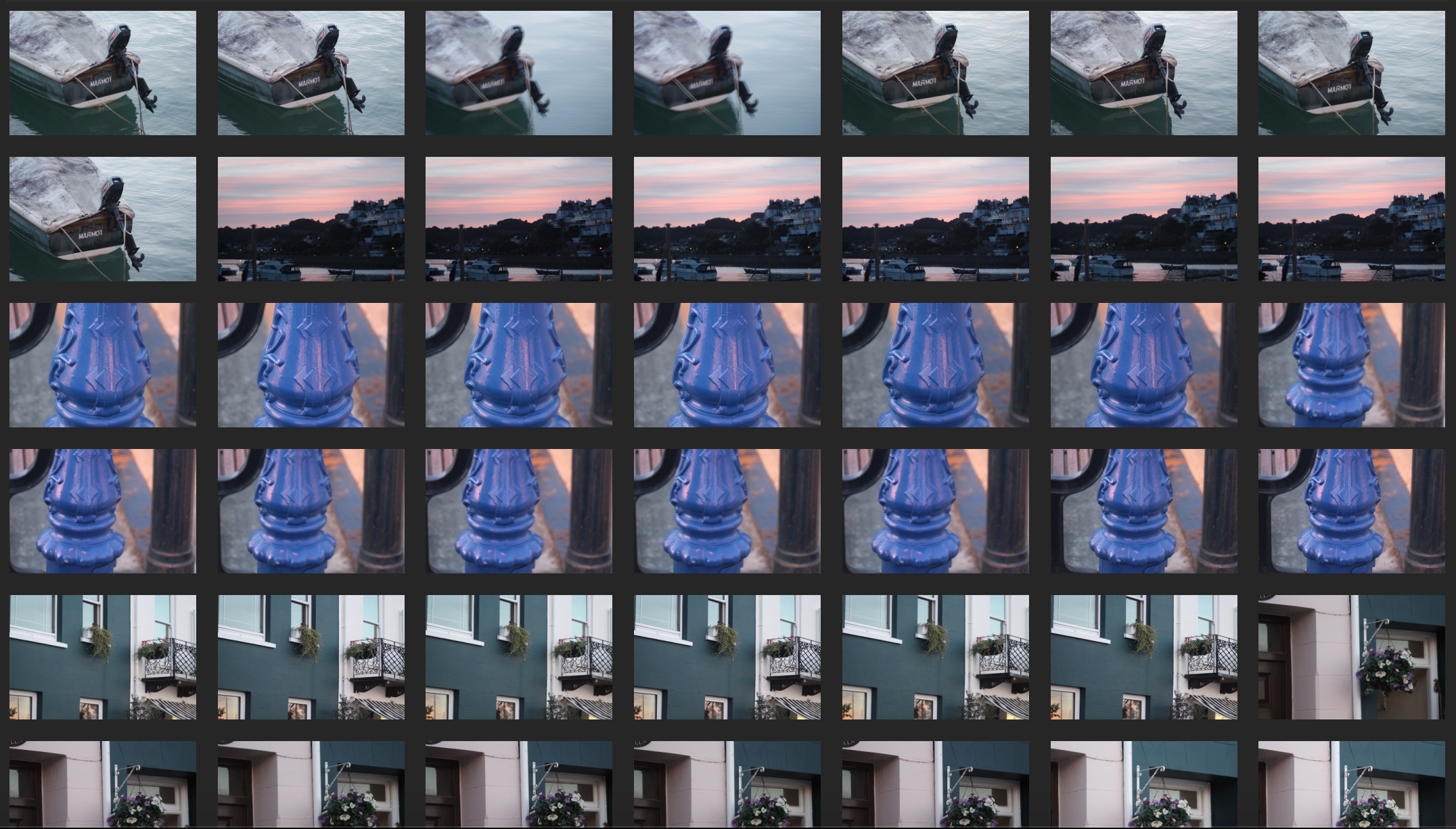
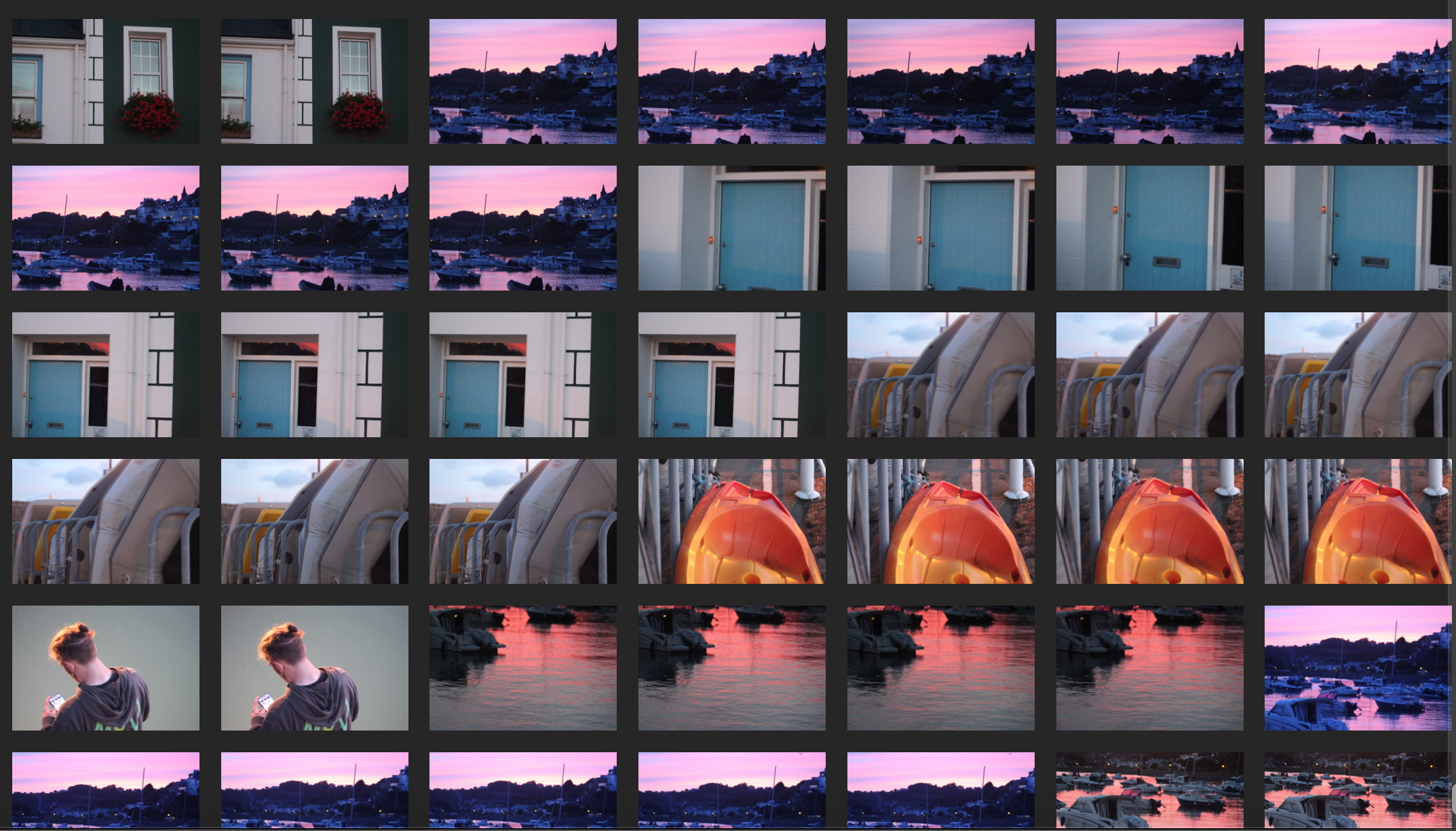
These are my photographs that took inspired by Barth and Leister:


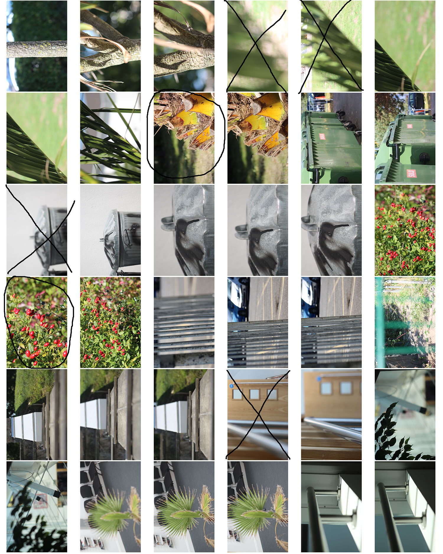


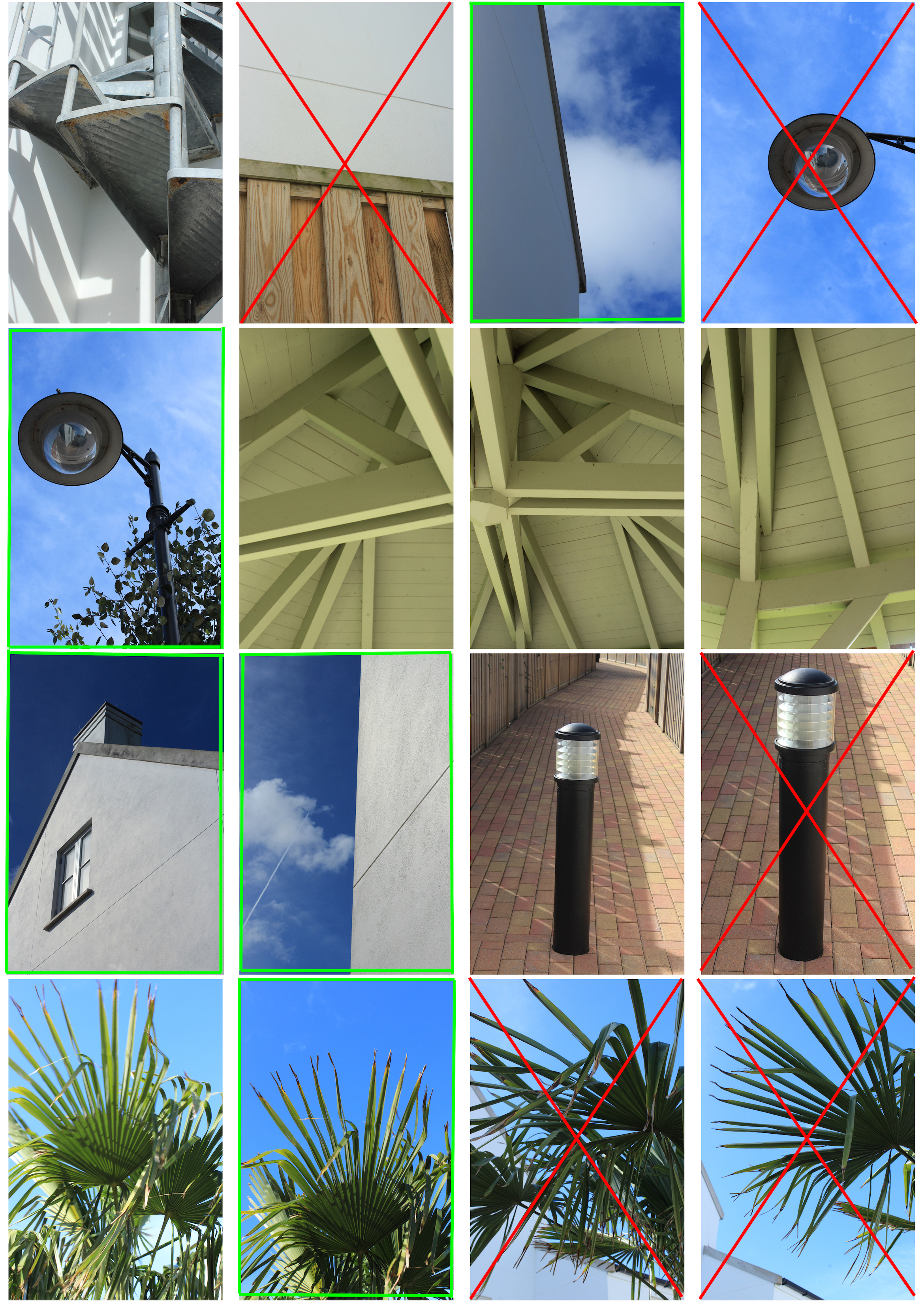
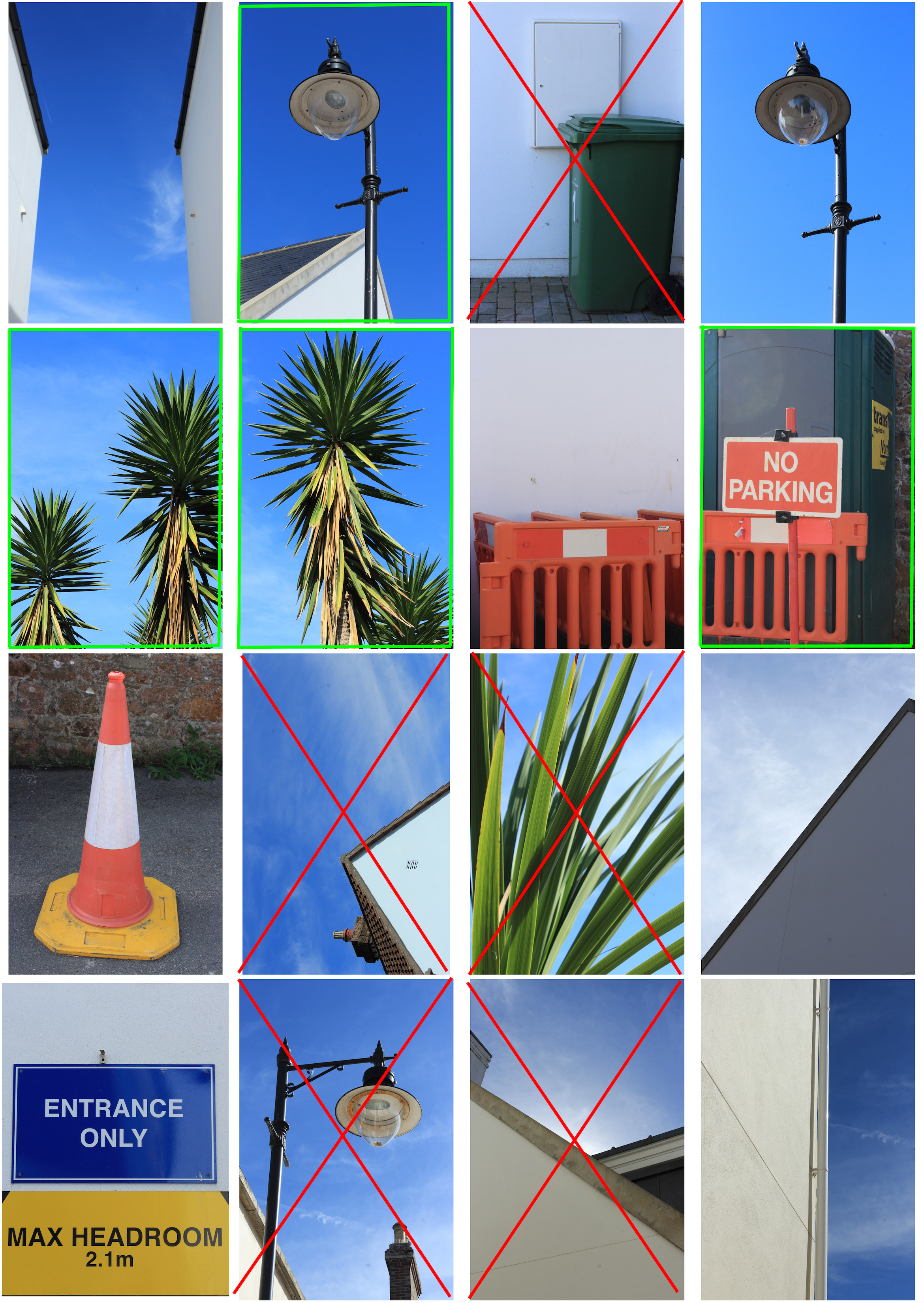


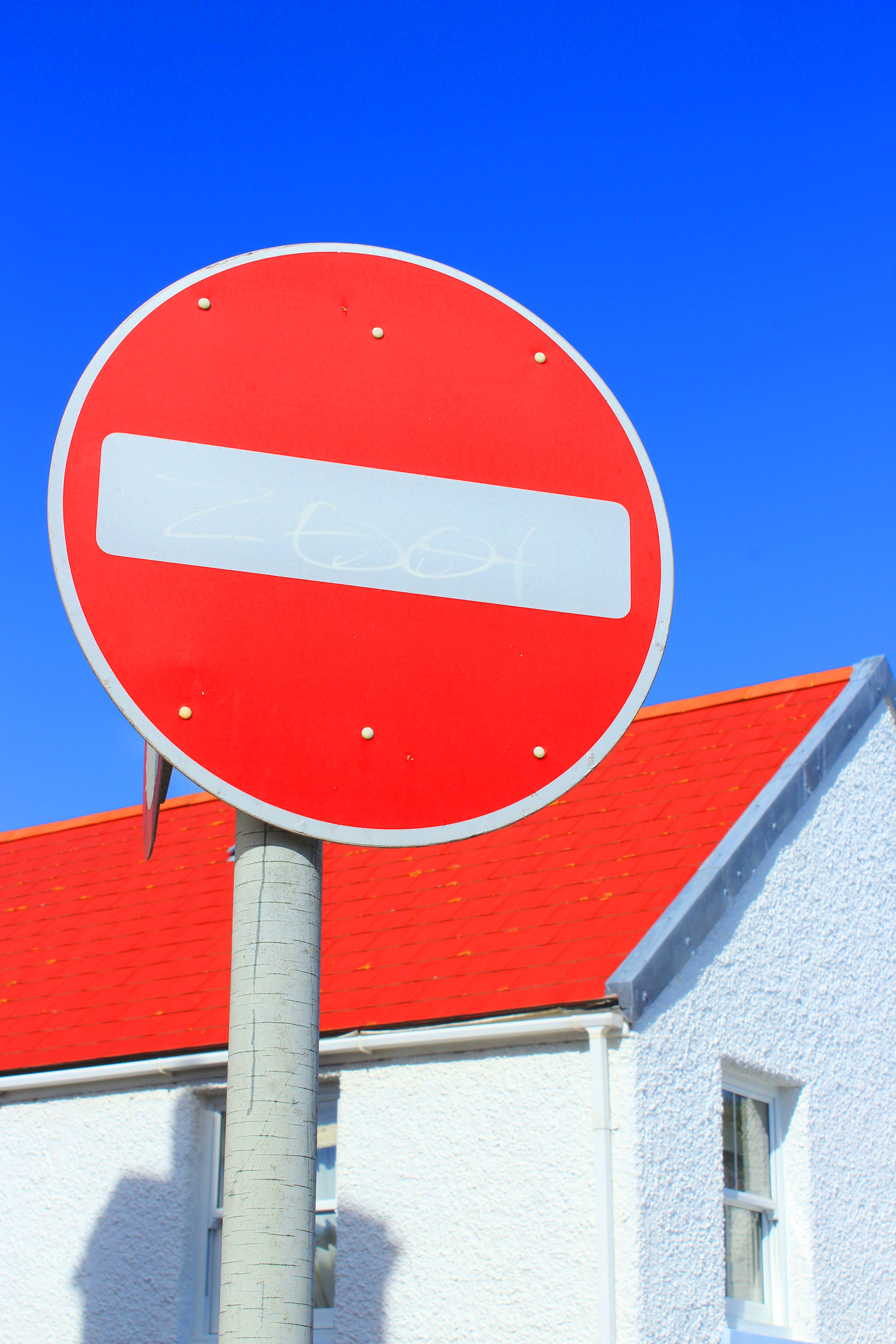


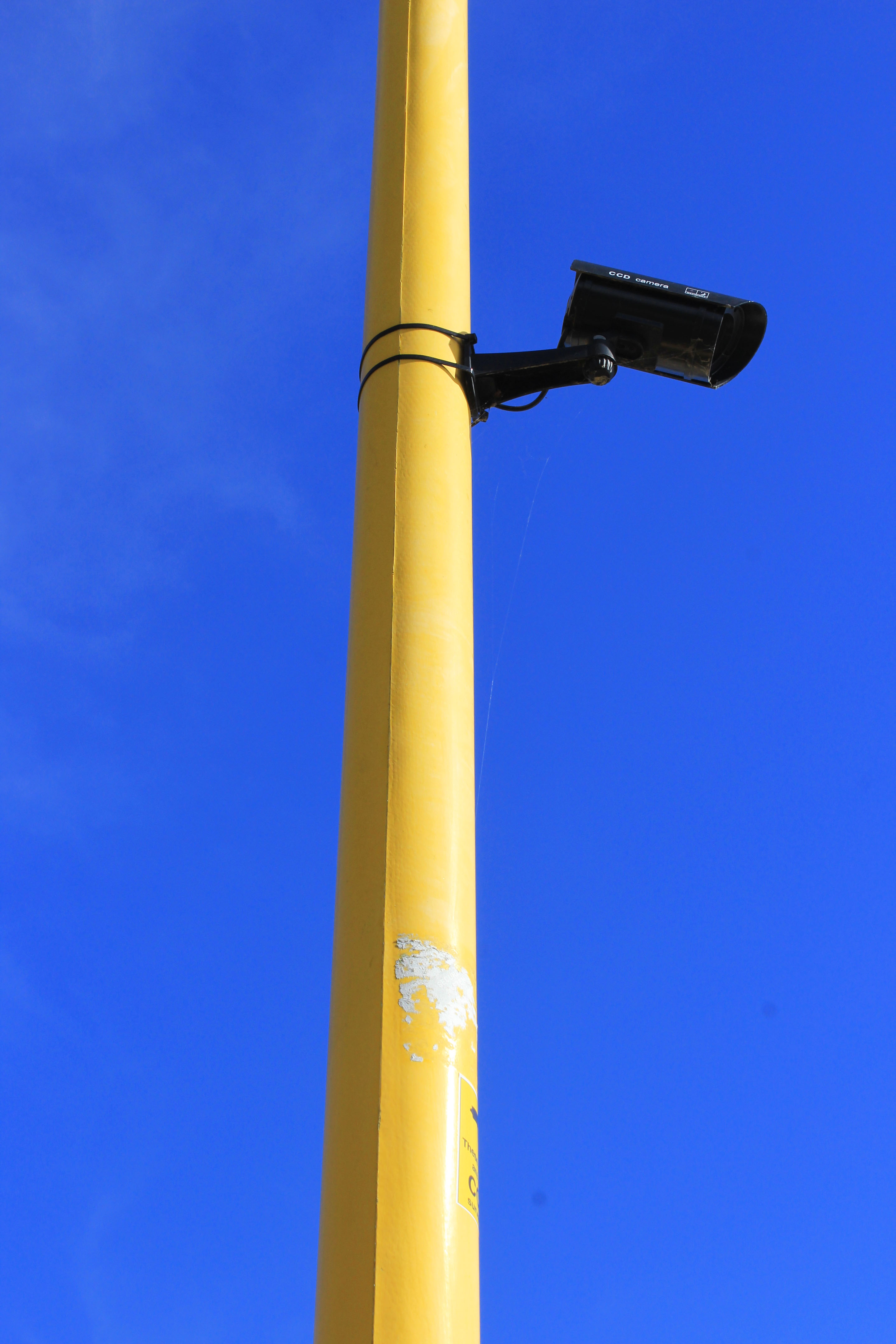

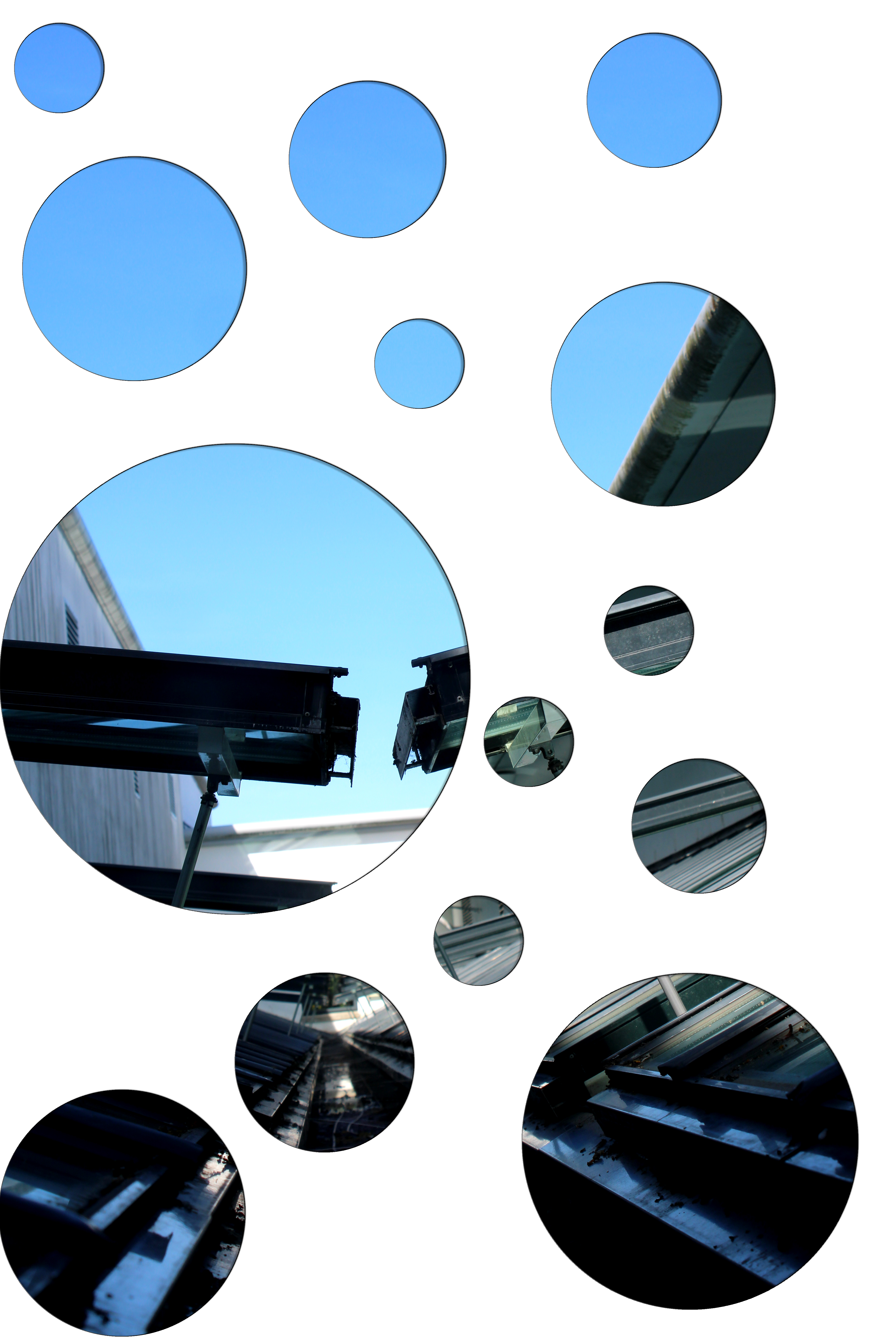
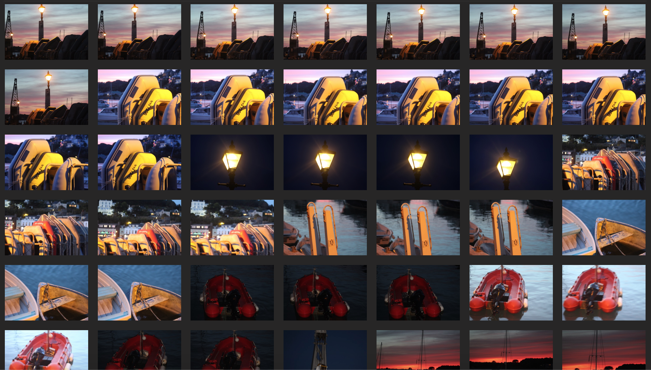
 After selecting eight images from the contact sheet, I opened up photoshop and edited them to reflect Jon Setter’s photographic style. I increased the saturation and contrast on each photo to created vibrant, bold and sharp images to emphasise the formal elements such as colour, shape, line etc. When capturing images on my camera I made sure to increase the aperture so my depth of field would be greater and my images would have a sharper background. Overall, I think that I replicated Jon Setter’s abstract images as my photos are simplistic yet visually interesting because of the dominant formal elements that capture the viewers attention.