Complete this week (by the end of Friday 12th October 2018)
Blog Post 1 create a visual blog post(s) that includes your initial choices of final outcomes. Analyse and justify your choices and then evaluate your decisions. Be critical and purposeful. Show examples of what you are intending with your choice of image and how they relate to what you have LEARNED ie : camera skills, artist references
Blog Post 2 create a visual blog post that demonstrates an understanding of various sequences of image, display techniques and your FINAL IMAGE SELECTION once you have completed a range of editing / manipulation. Show your process thoroughly and edit recent images so that ypour camera skills are clearly demonstrated. Do not mask your camera skills with “over-editing”
Blog Post 3 create a range of responses to the creative prompts below and demonstrate clearly your ability to convert original images into something creative. These could then be considered for final outcomes and printing too.
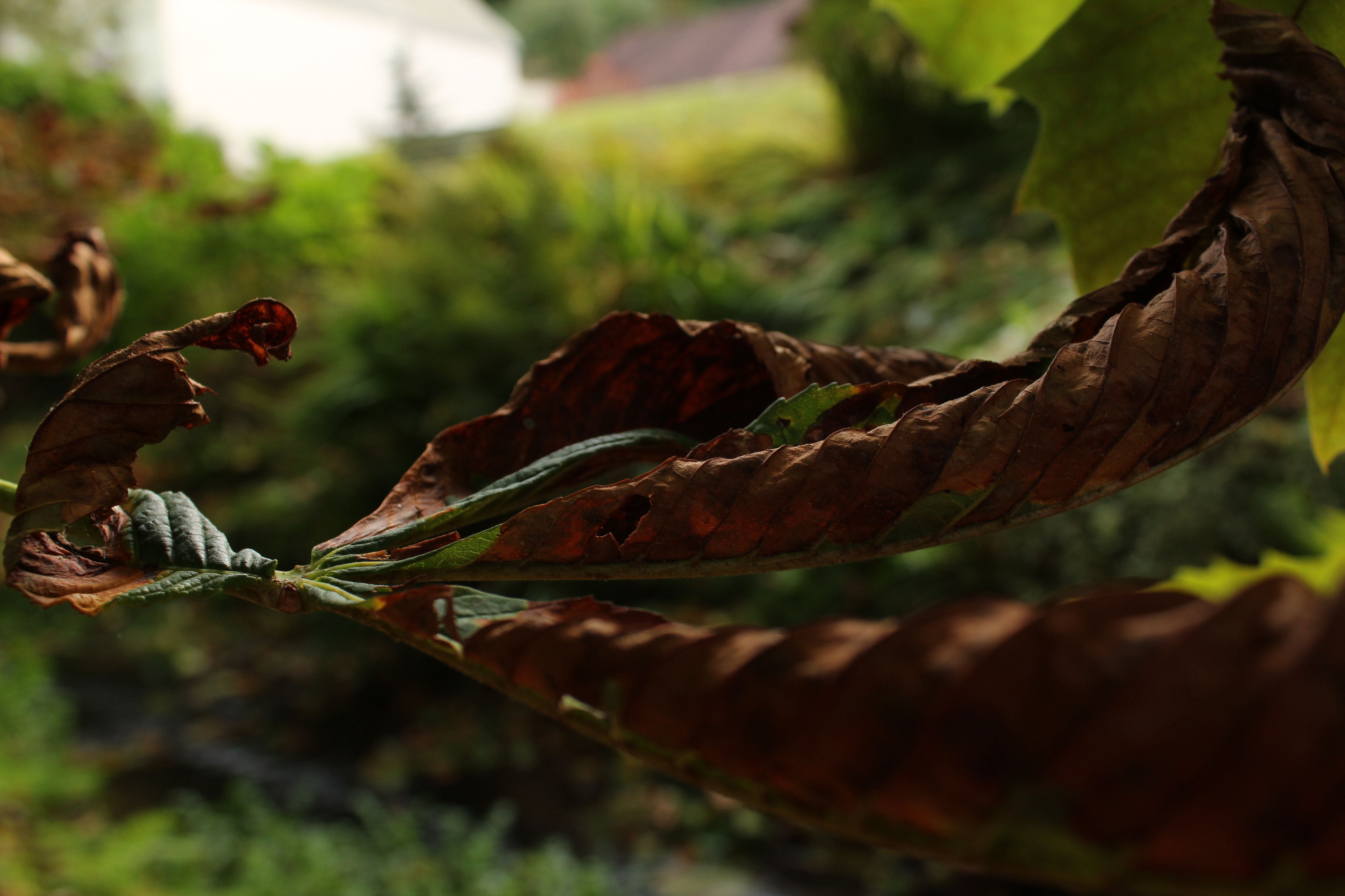
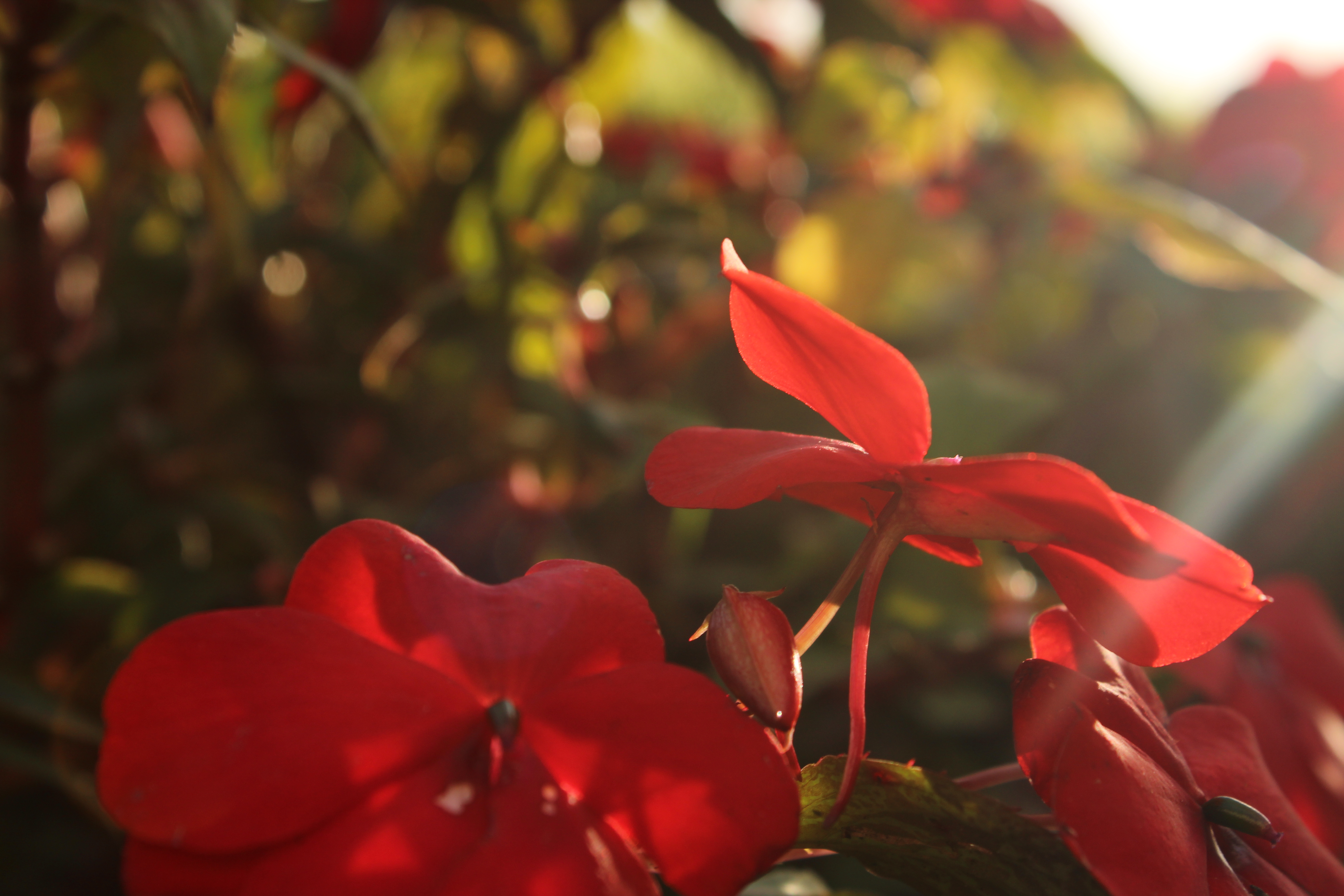
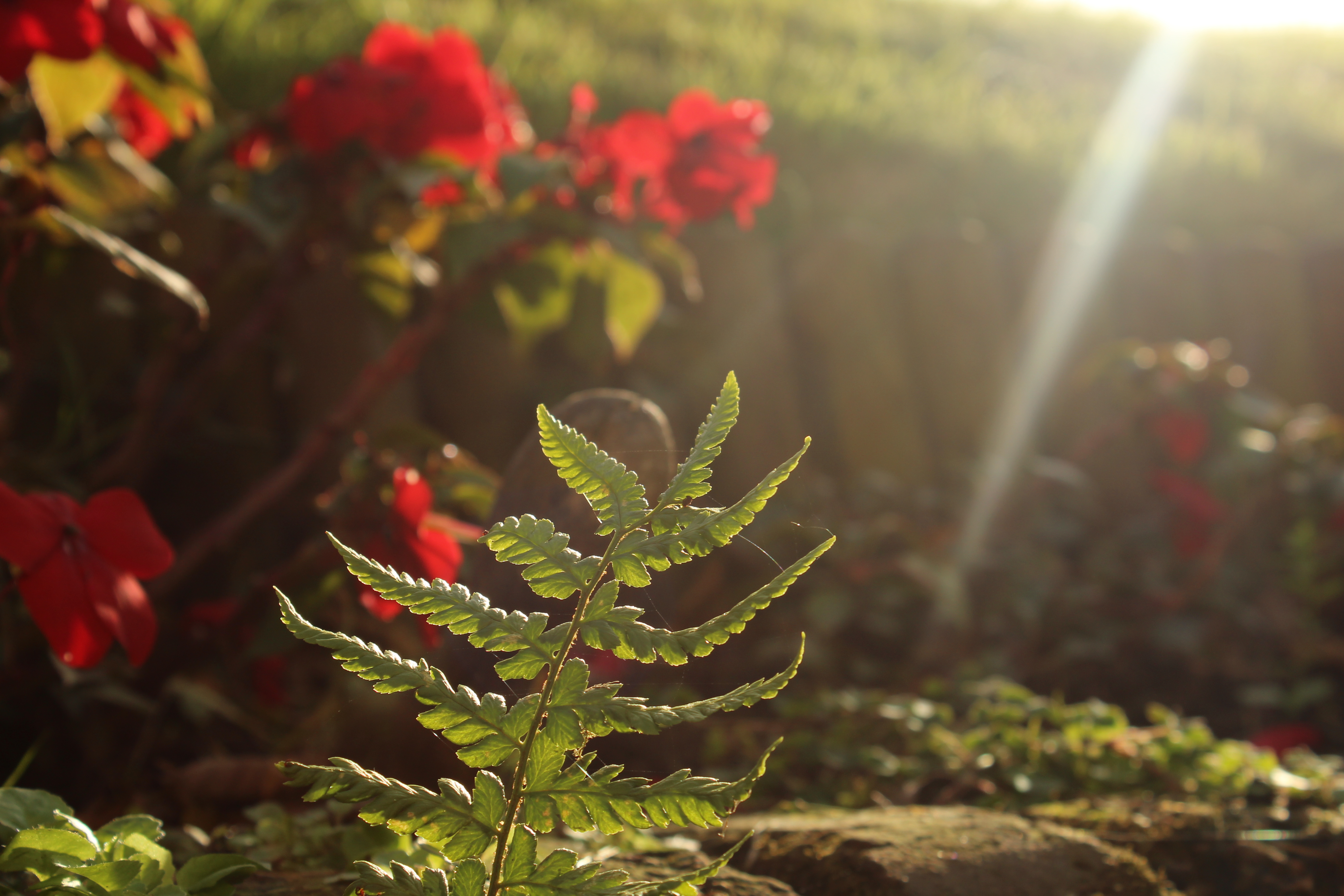
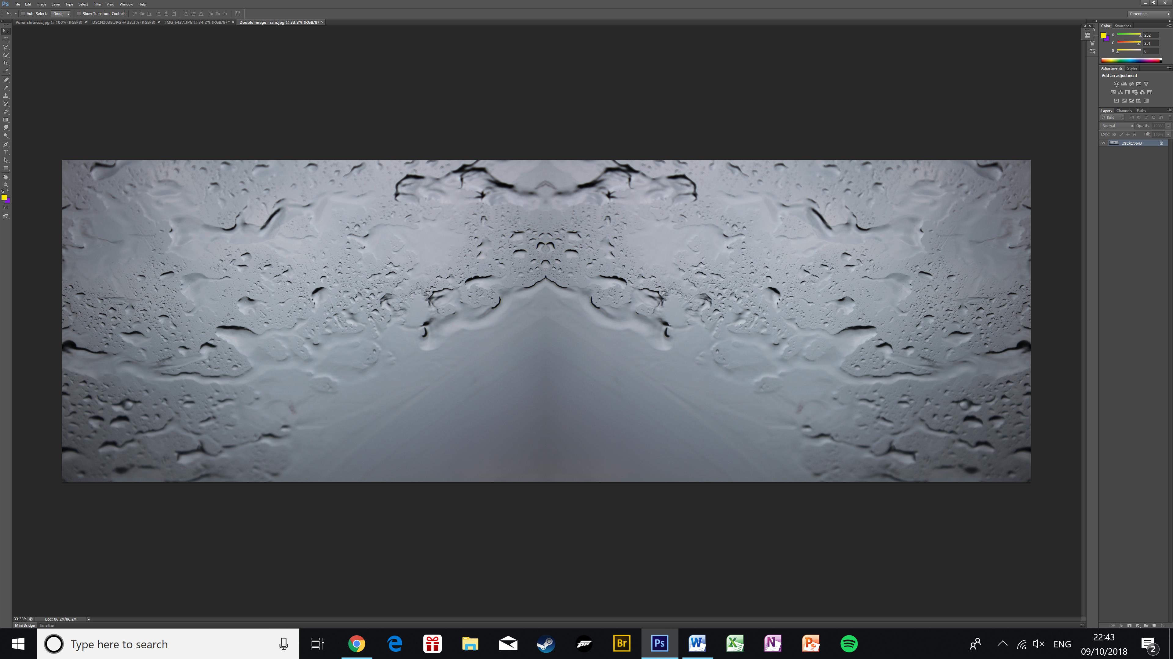
Mirror image / kaleidoscope techniques : symmetry and repetition
Shutter speeds are measured in seconds, or fractions of a second. For example, a shutter speed of 1/100 means 1/100th of a second, or 0.01 seconds. This is also known as the “exposure time”, because it’s the amount of time the sensor is exposed to light.
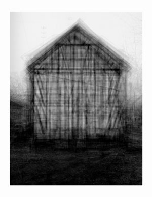
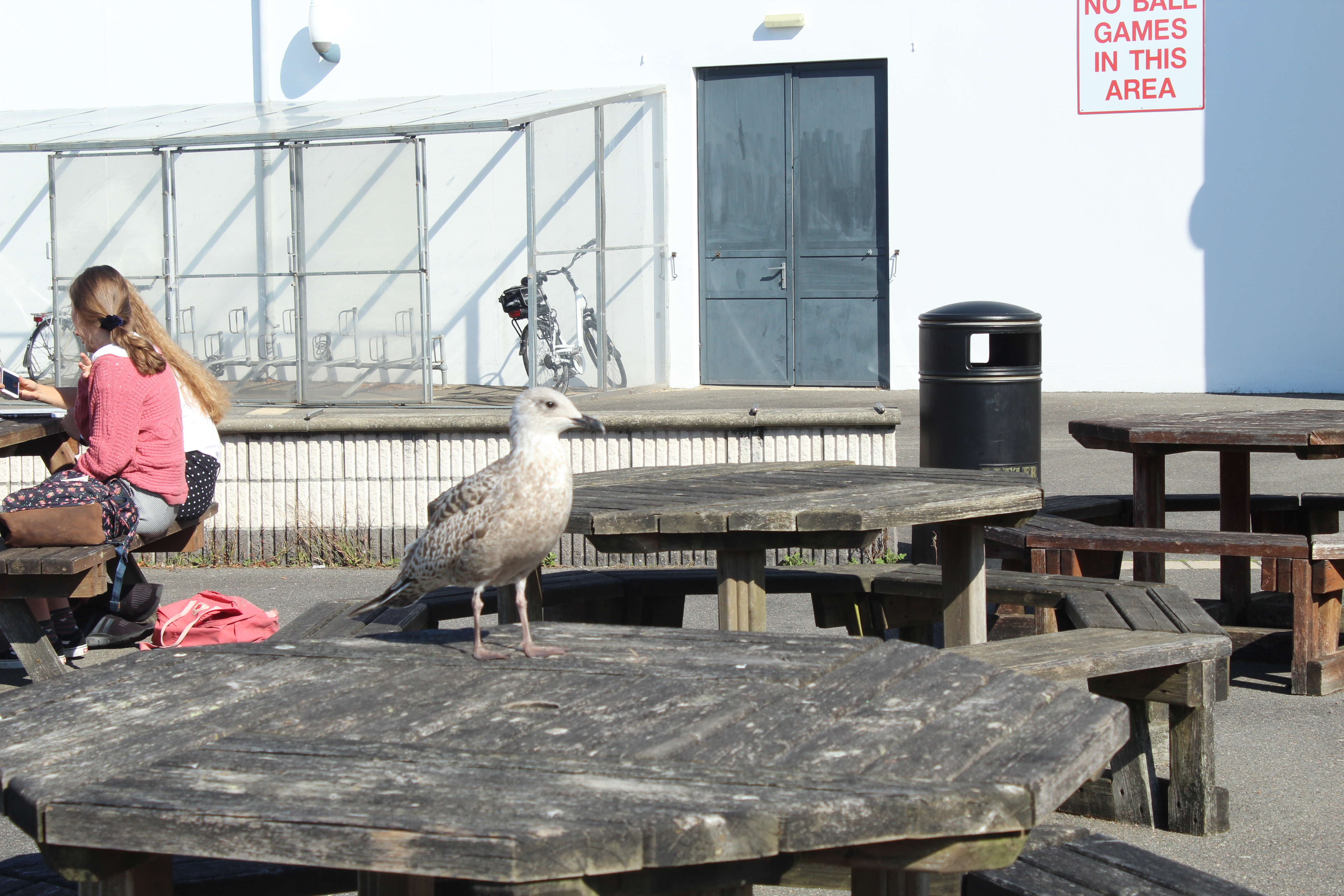
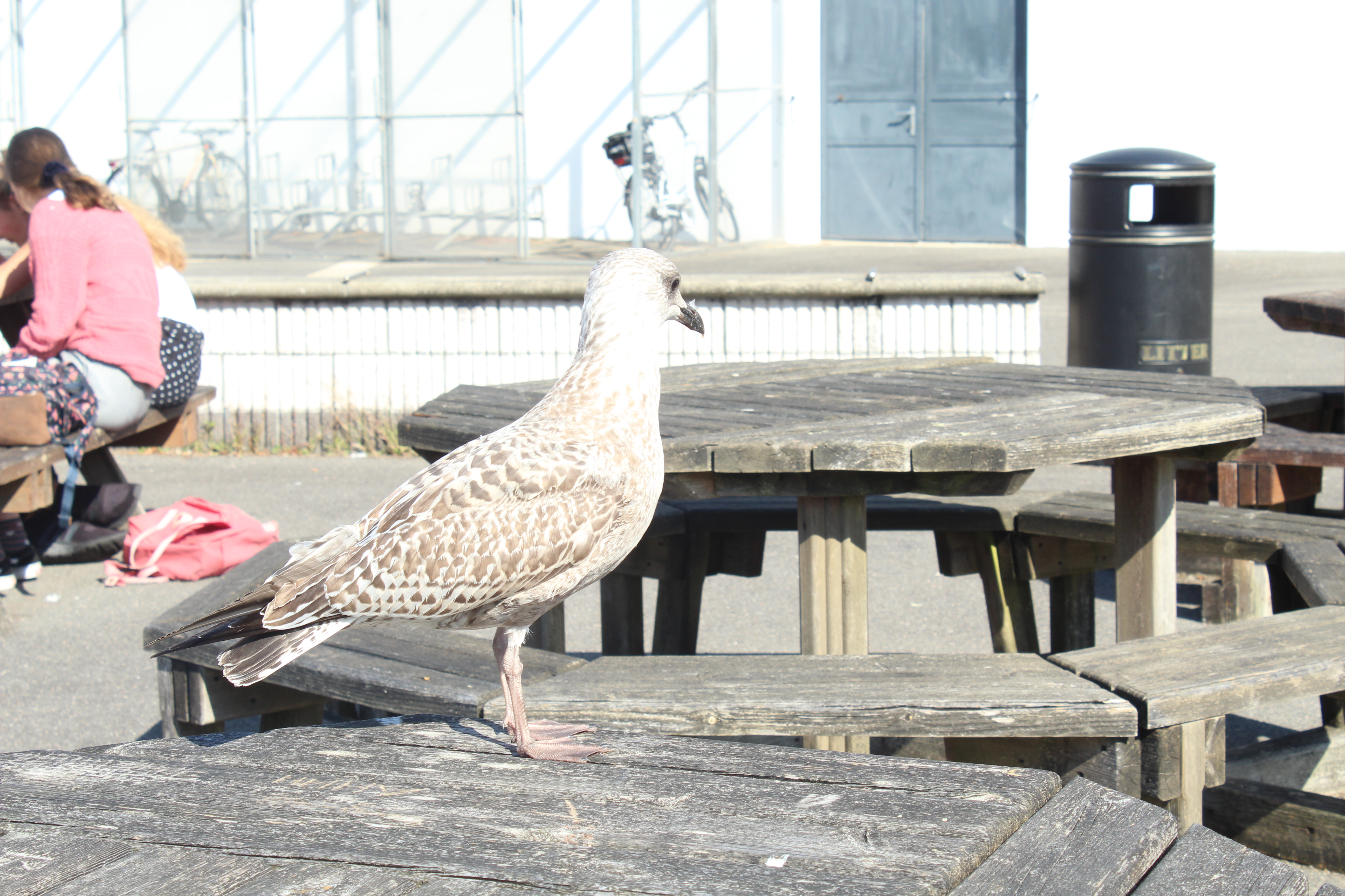
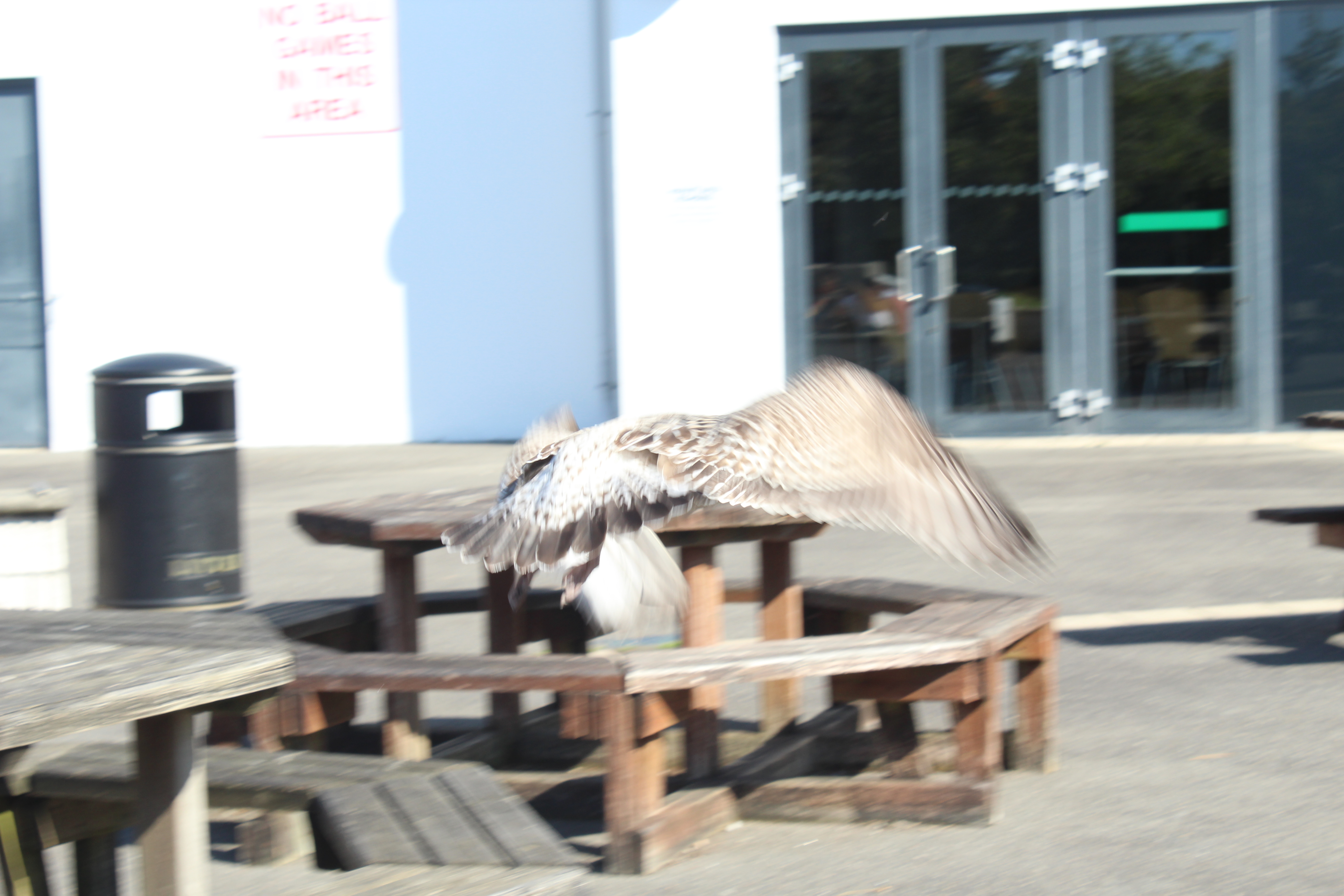
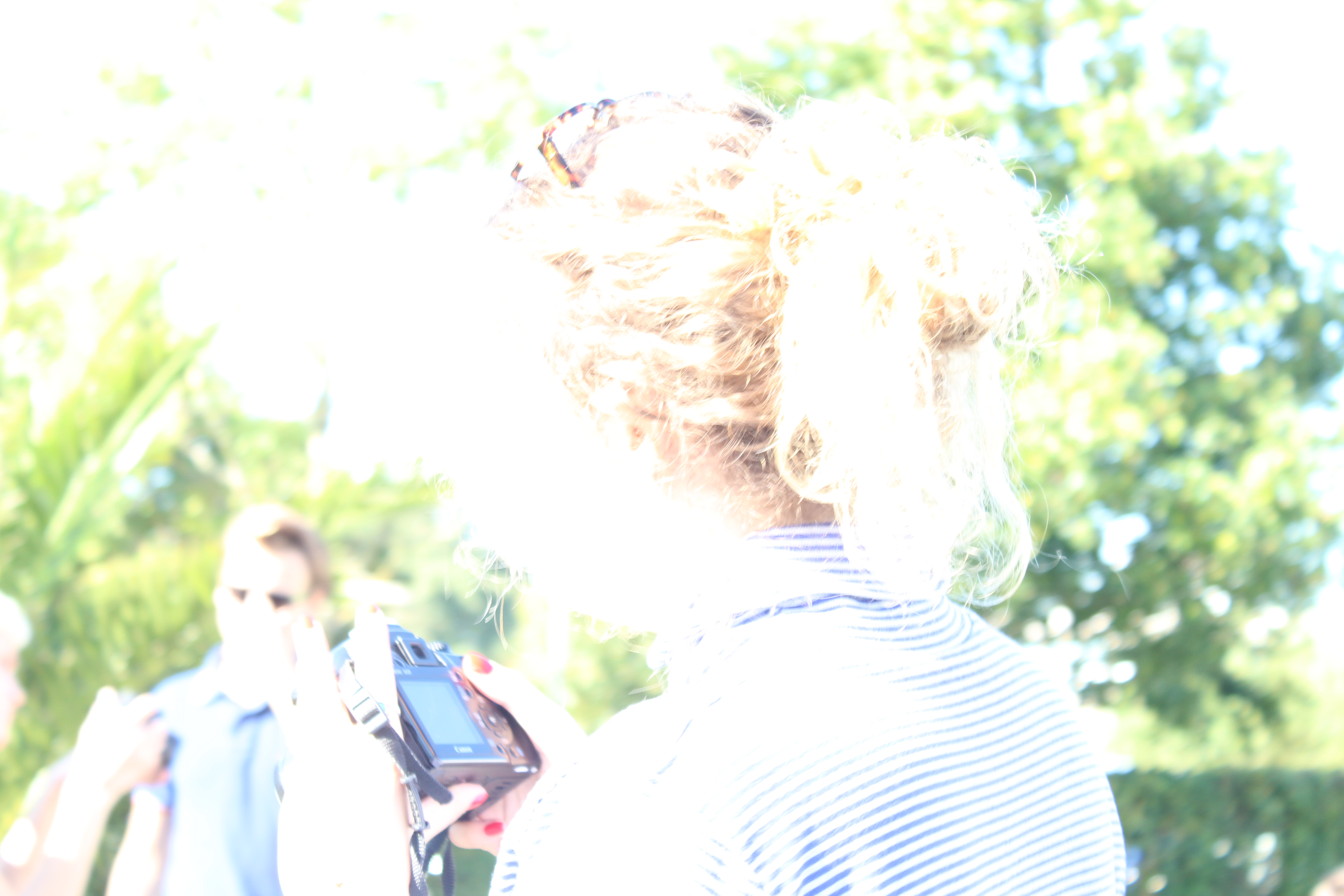
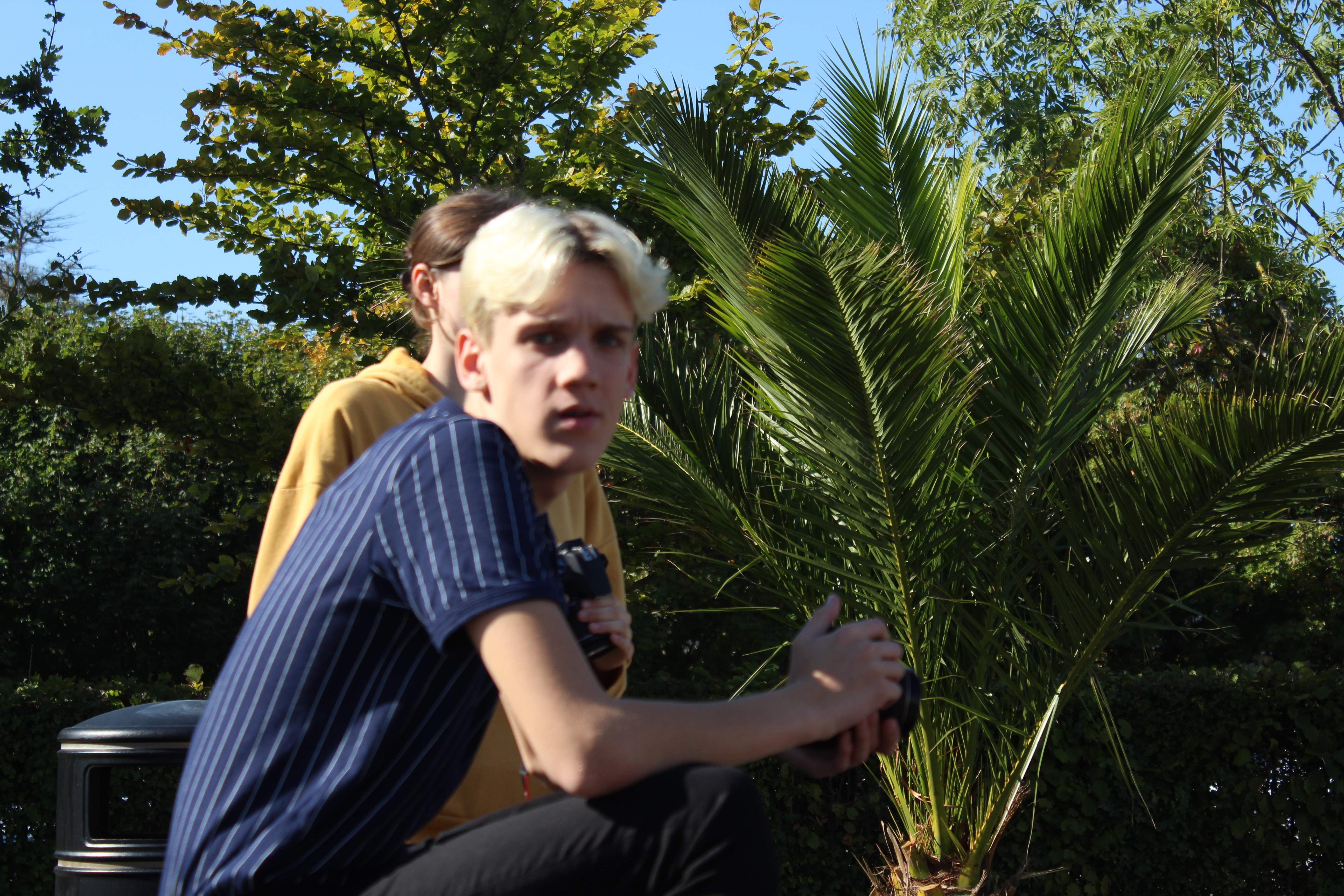
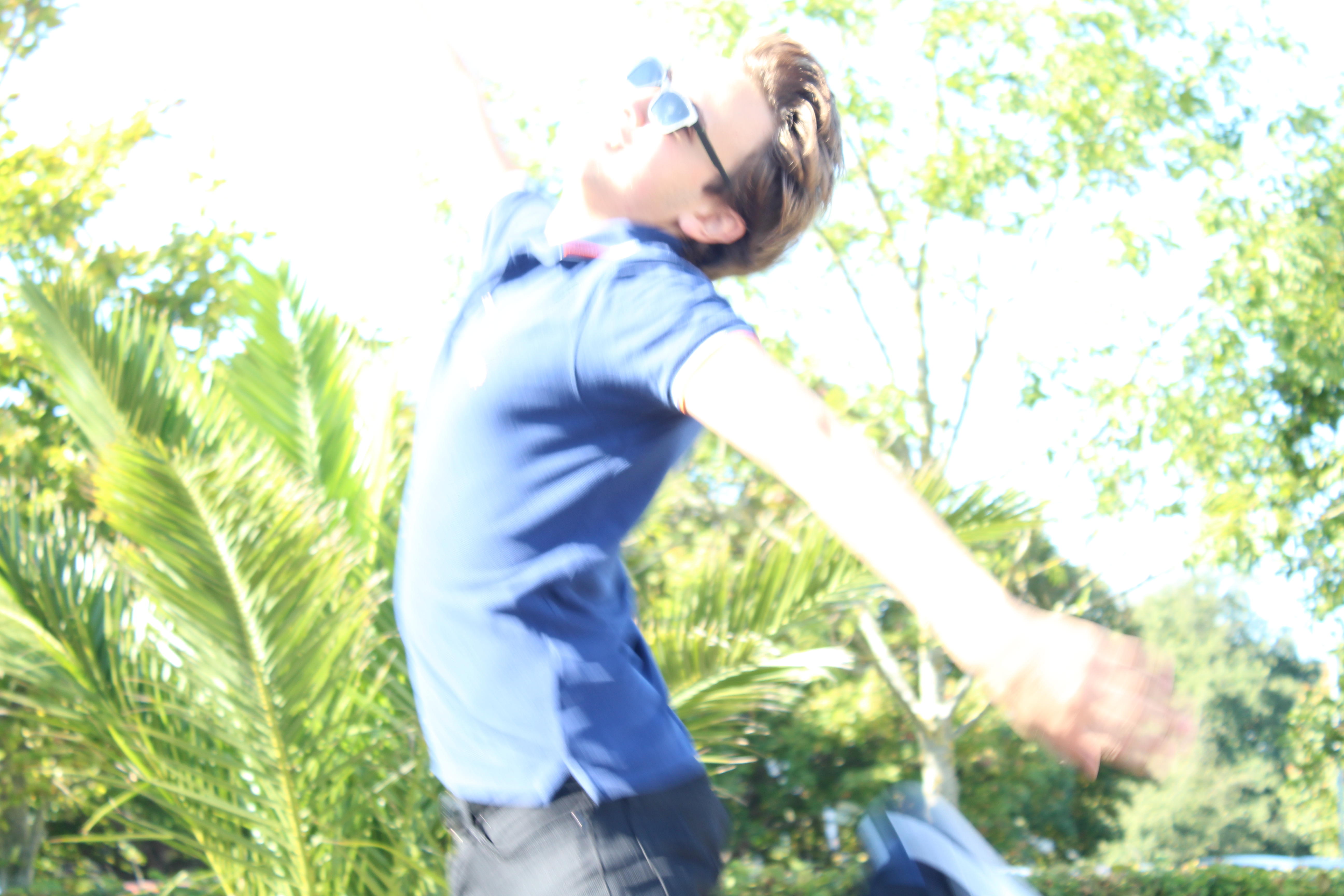
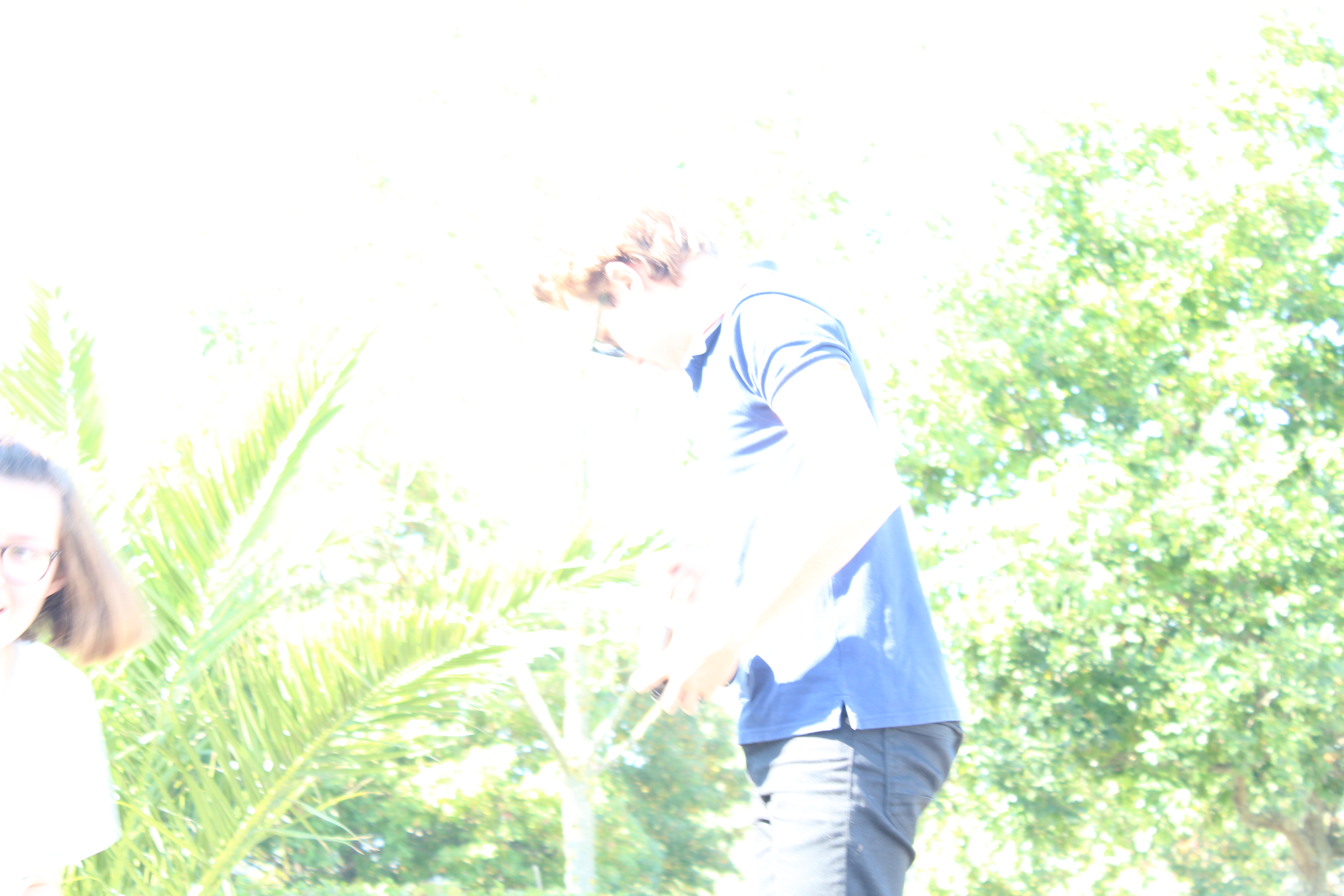
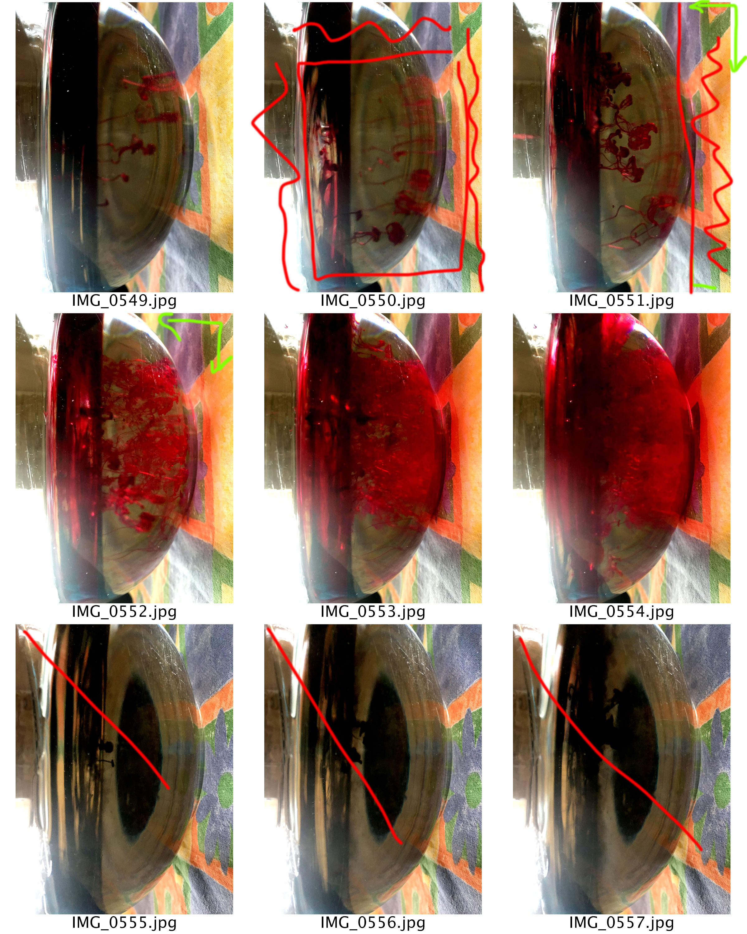
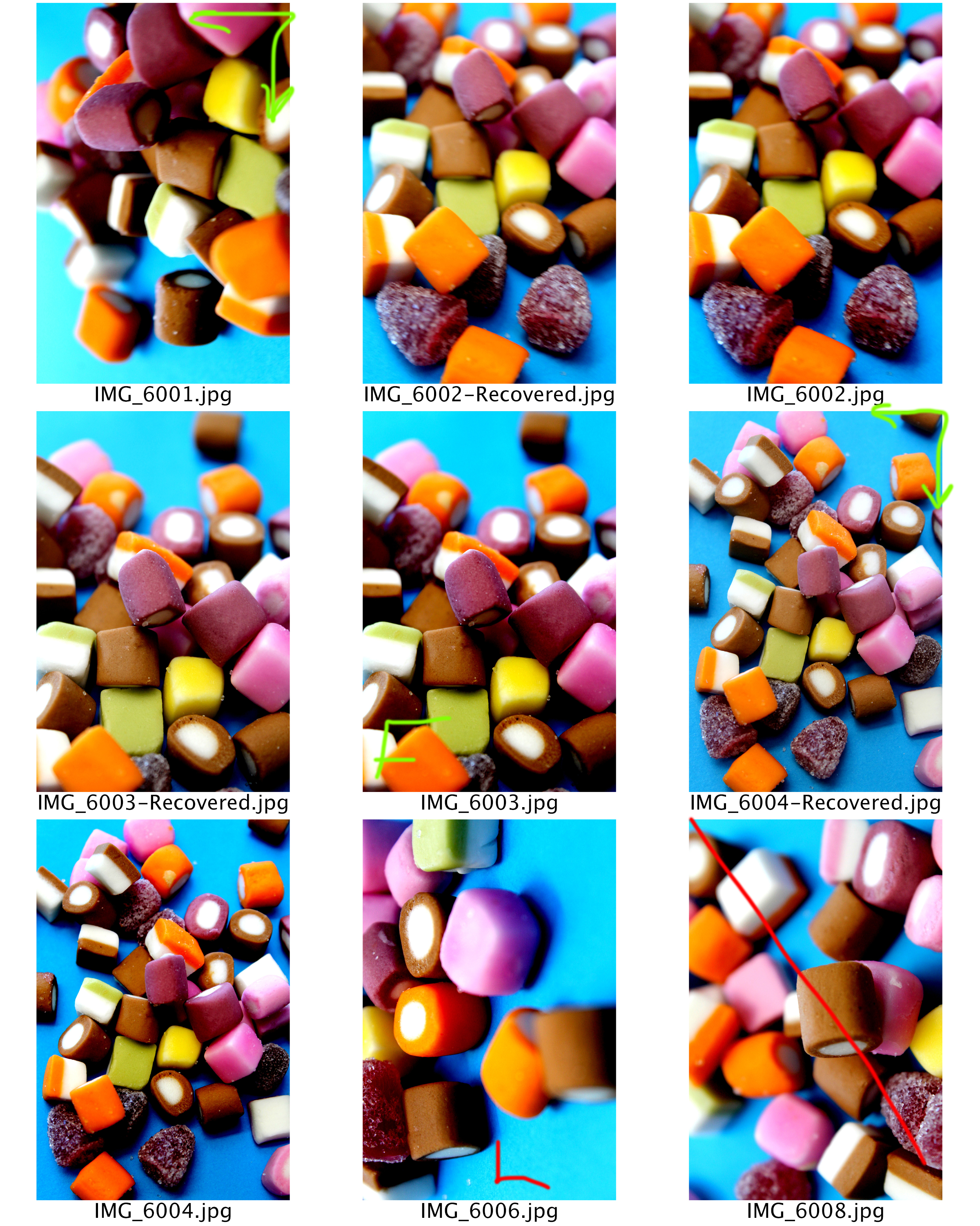
This is a gallery of the photos I took whilst experimenting with different shutter speeds. Most photos didn’t work very well as I was still getting used to manually changing the shutter speed and other camera techniques. Some of my photos are very over exposed and also blurry, due to the fact I was using the wrong shutter speed. However some of the blurry photographs actually look quite interesting at times.
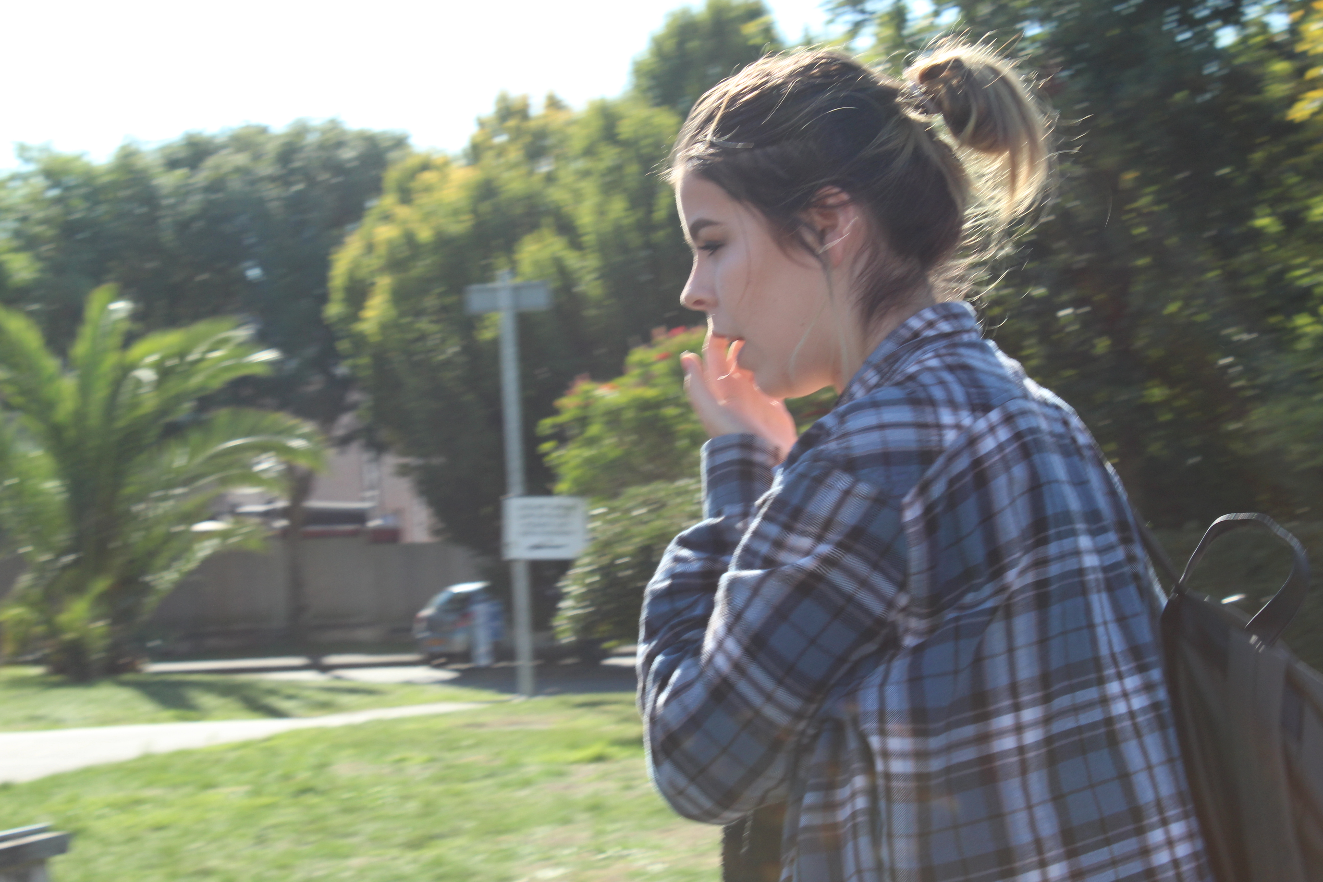
These are some of the photos which I think worked out decently well but not perfect. I like the way some parts of the objects in frame are blurry whilst others aren’t, I think it makes the photos more interesting. I also edited the last photo because I think the black and white filter suits portraits the best.
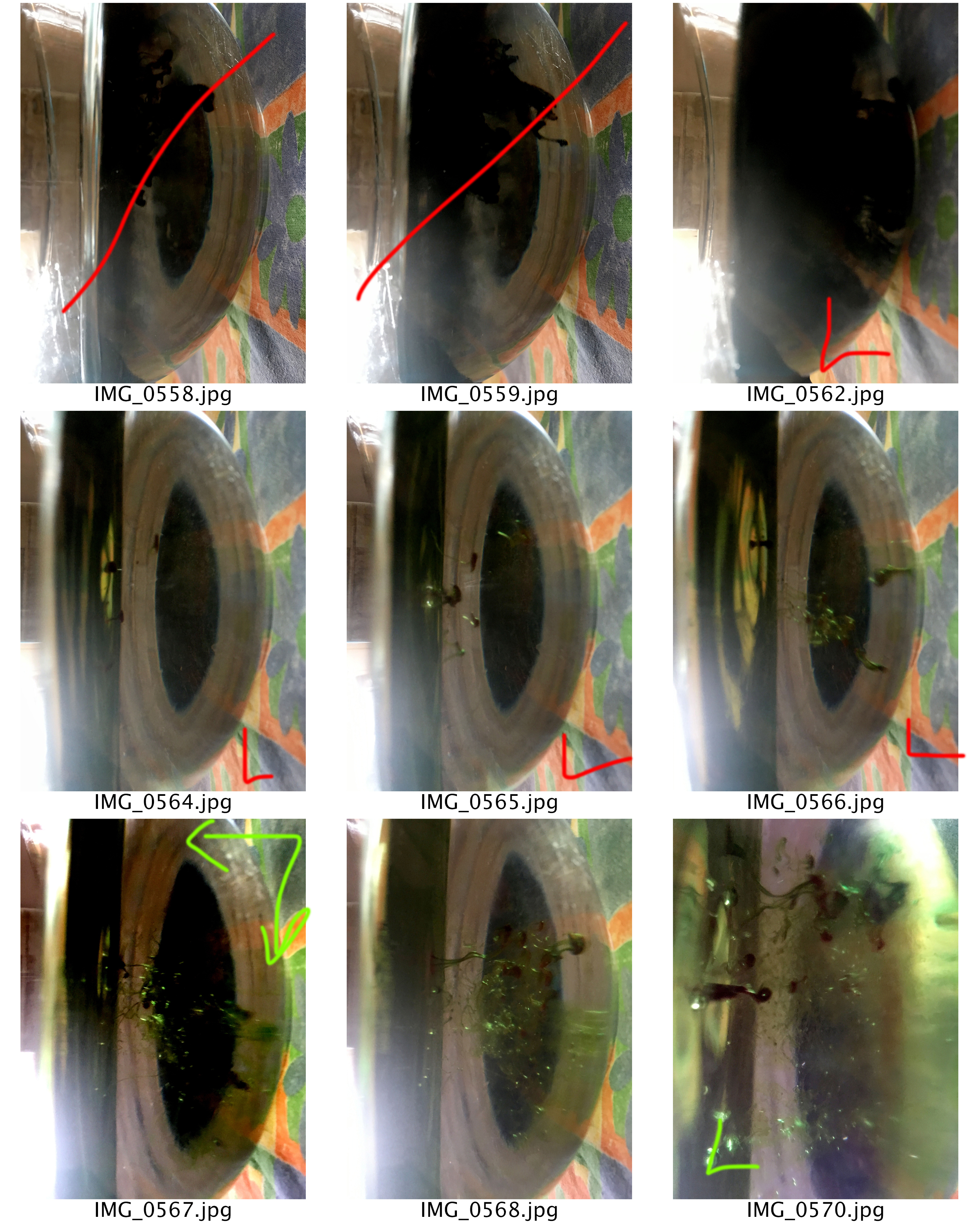
In photography. The aperture stop of a photographic lens can be adjusted to control the amount of light reaching the film or image sensor. In combination with variation of shutter speed, the aperture size will regulate the film’s or image sensor’s degree of exposure to light. The higher the aperture the more you will be able to view everything in frame. A lower aperture will allow for more focus on a certain part of what is in focus.
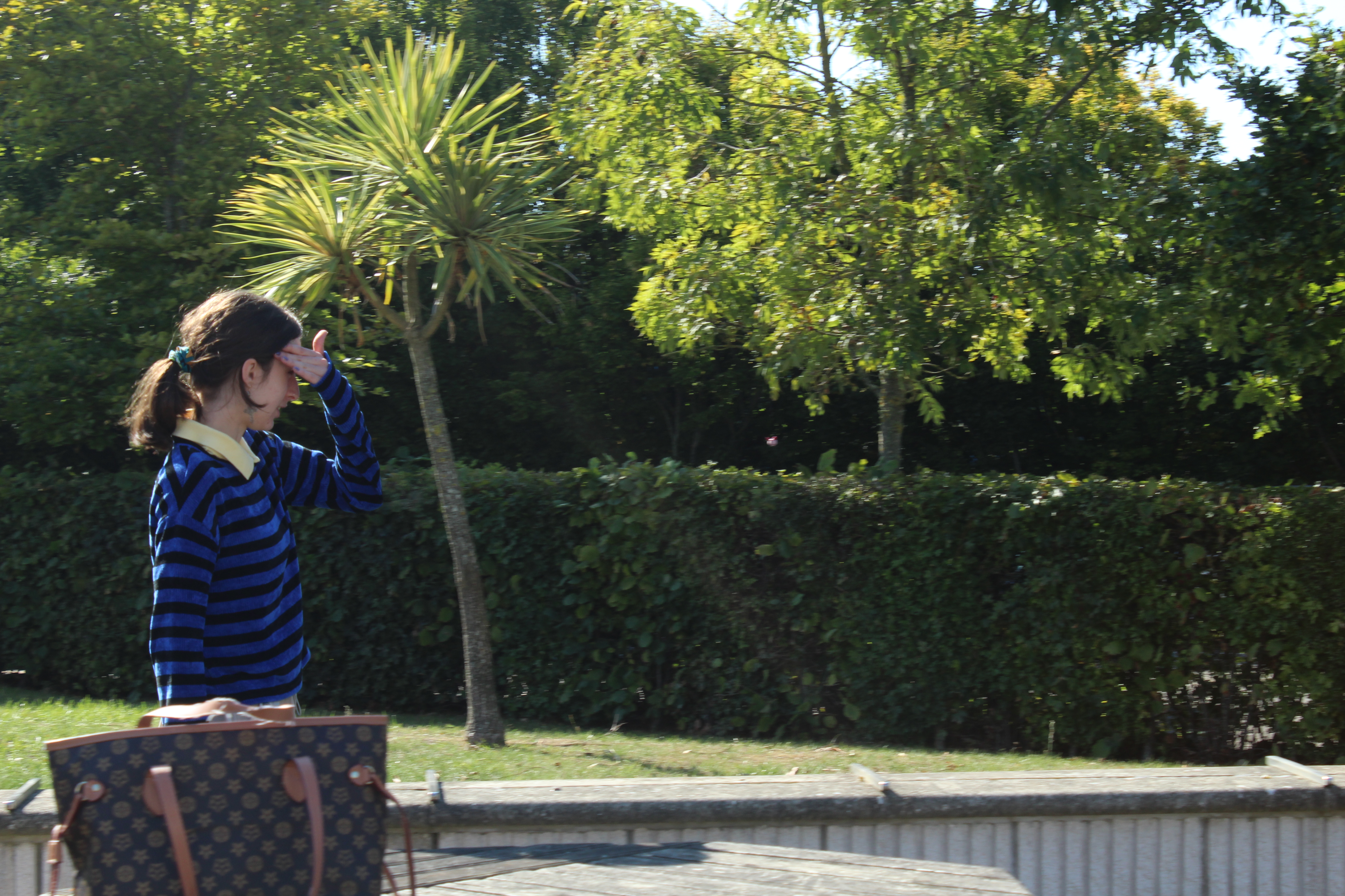
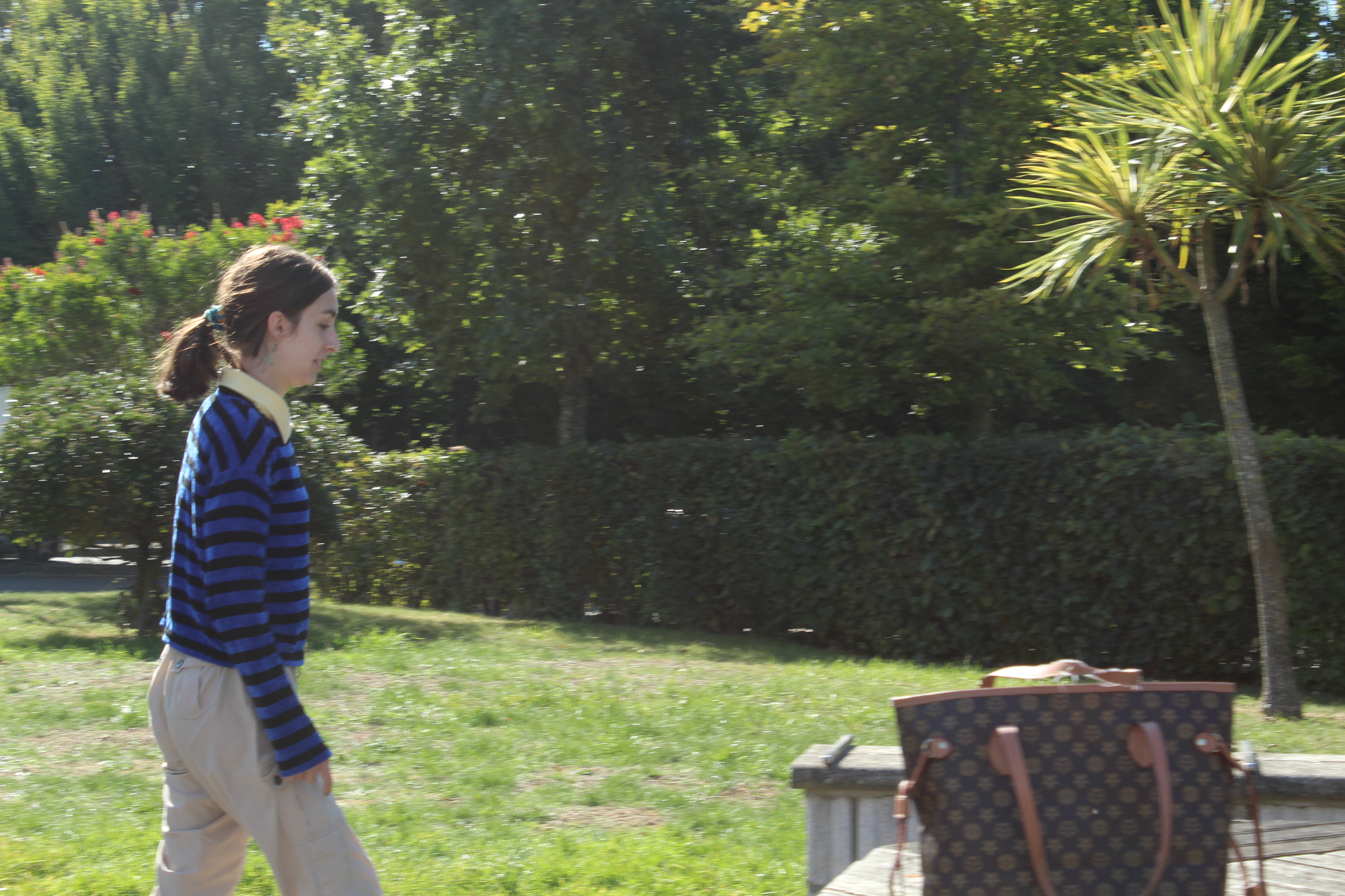
I experimented using a 18-55 mm lens, a 75-300 mm lens and different aperture levels. Here are some examples of my experimentation,
These were taken using the 75-300 mm lens, with a high aperture.
The following were taken with a low aperture of 5.6 and the smaller lens.
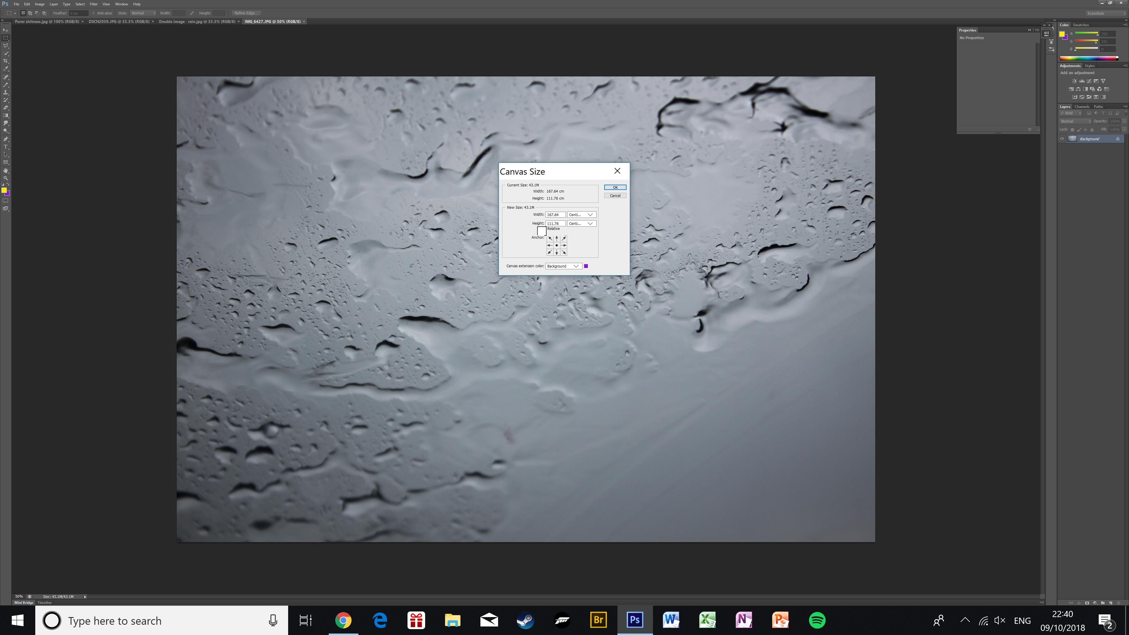
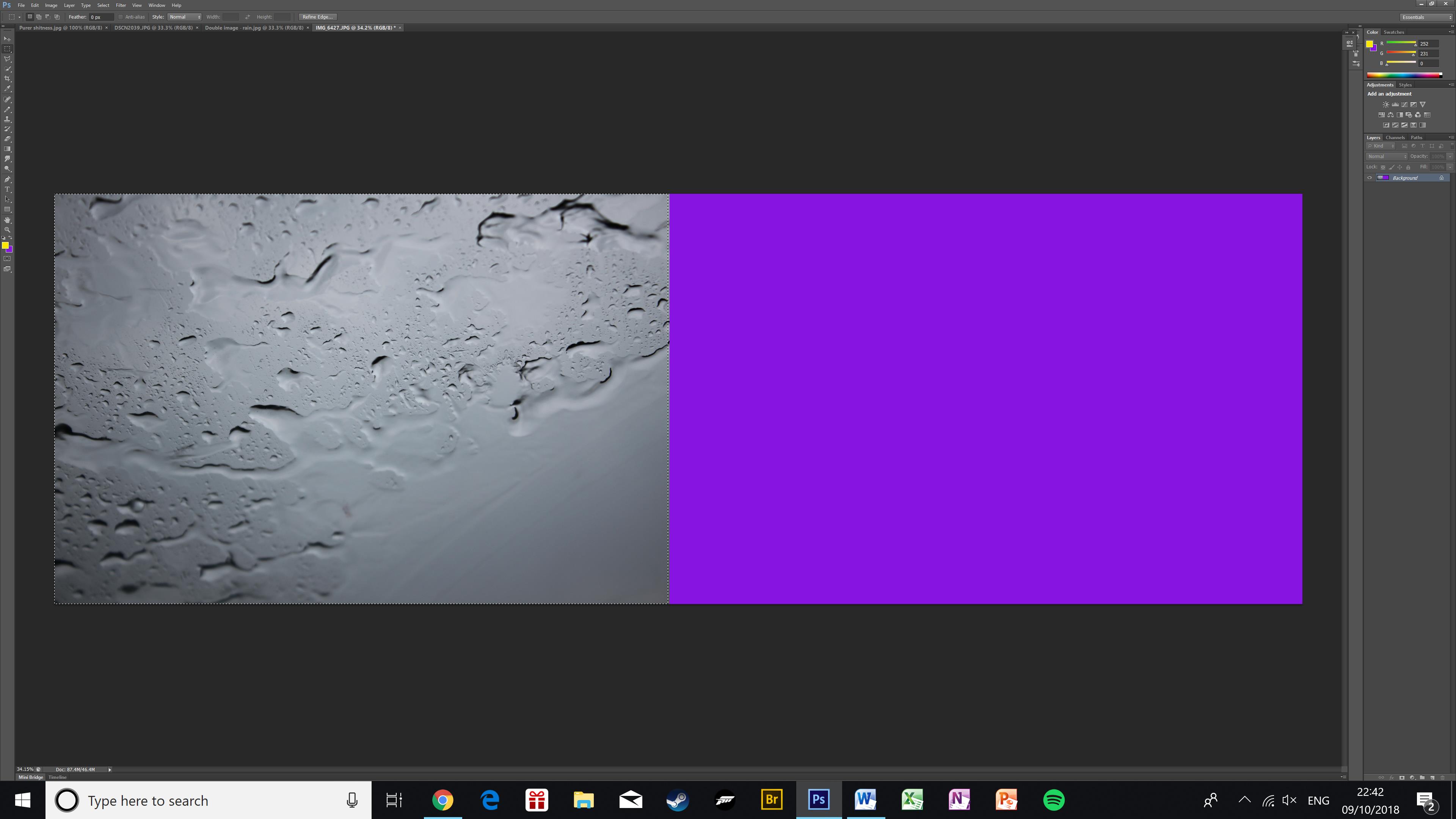
First I anchored the image to the middle-left of the canvas, then I doubled the width of it. This makes space for a duplicate image.Here is the image after the canvas size has been doubled. The purple area is the empty canvasHere is the image once it has been duplicated. Using Ctrl+J and Ctrl+T I have duplicated the photo and flipped it onto the empty canvas creating a kaleidoscope effect.
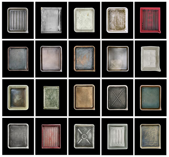
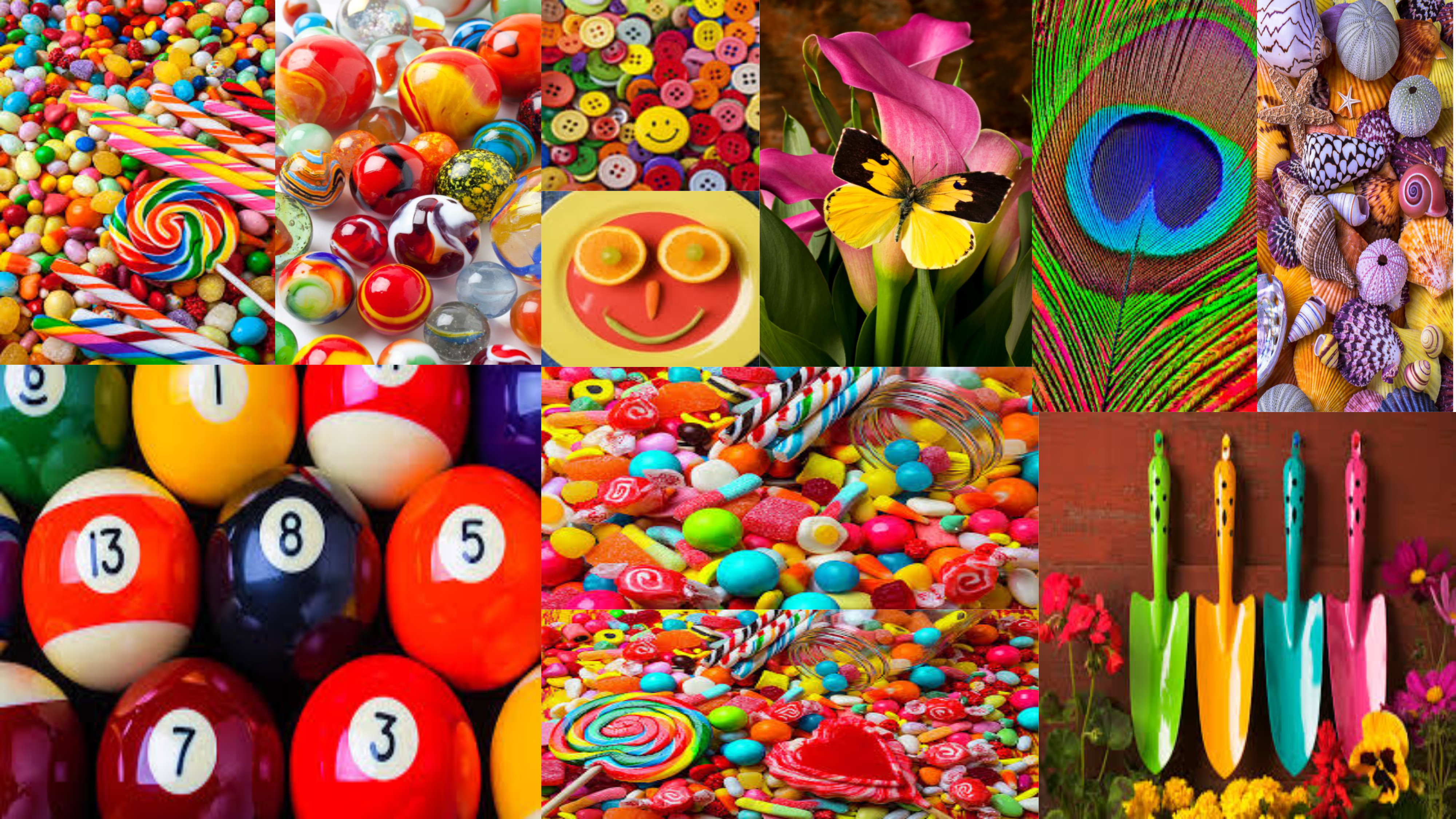
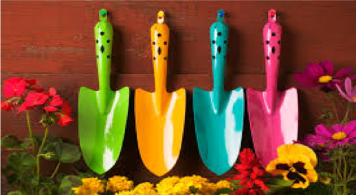
Gary Gay was born in Glendale, California in the year of 1951. He has been taking digital photographs since the year of 1993. Garry Gay has had a successful carrier as he has been elected president in many photography clubs. In these images he captures a range of colourful household objects and spreads them out to capture the different objects that stand out.
The main focus point of Garry Gay’s work is the different colourful objects that are satisfying to look at. The formal elements found in Garry Gay’s photography are shape and texture. Shape is shown with the different sized and shaped objects in the frame of the image and texture is shown through the materialistic objects. The lighting used in Garry Gay’s photography seems to be bright and artificial, which allows the main focus point to stand out. To capture these amazing images I think Garry Gay has used a quick shutter speed, this is because there is no intended blur in his images. The photograph is taken at a straight on angel, allowing Garry to showcase the different objects. Contextually, these images are usually transferred onto puzzles, mugs etc which informs us why so much colour is presented in his photographic series. This makes the product eye catching and will want the customer to buy the product because of the bright colours he has captured. The background of Garry Gay’s photography seems to be something plain which allows the main focus point stand out more, or Garry does not use a background as he is showing a collection of items which cover up the background. This informs us that he has used a wide depth of field as usually the whole frame is in focus. Moreover, this tells us that the aperture used to capture the images is high, which also allows the whole frame to be in focus. Within this image, we can see that there is no noise, which tells us the ISO is low, as it is not that sensitive to the artificial lighting. Overall, I like Garry’s work as it presented both colour and texture in a unique way. It shows simplistic objects, but the images are captured in a way to make them seem much more interesting.
Planning
For this photoshoot I am going to look at capturing a collection of items, food and look at using a quick shutter speed to capture food colouring falling into water. I intend to copy Garry’s idea of collection of items, however the food colouring idea I thought of myself and thought that it would work well.
When Capturing the images, I will be using my DSLR camera on the manual setting, allowing me to control the aperture, shutter speed, focus and ISO. I will probably set these on a ‘standard’ setting but change them as and when I need to. I will capture these photographs indoors, using artificial lighting, allowing me to create different shadows. I will attempt to use a plain background as well, to make the images more like Gary’s.
For editing these images I want to look a different ways I could display the images, and manipulating them to make the photographs seem more captivating. The edits are not likely to be simplistic, however, I feel that it will help to presented the formal element of colour and texture.
Contact Sheets
Edits
Screenshots
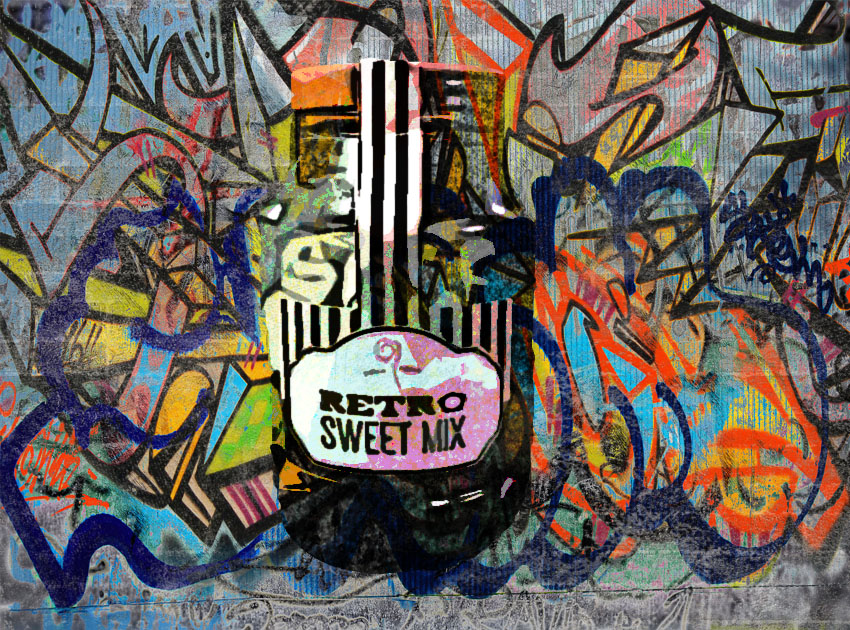
First of all I created a new document which was landscape. I then copied a graffiti wall image onto the page. Using a gunge paint brush I taped on it to create texture in the photograph. I then opened the photograph I wanted to use and used the quick selection tool to cut around it. I then pressed layer via cut and place it onto the graffiti wall page. I then used the cutout filter on the sweets. The I added a new posterize, hue/saturation, brightness adjustment layers. I ensured these layers were clipping masks to the sweets. I then on the brightness layer used the same brush tool as before to reveal some colour. Next I then created a new layer and pasted the sweet cut out on again. I then went to filter and added a photocopy sketch and then another artistic cut out. Then to make the image blend into the wall I set the blend mode to multiply
I am really happy with the way this edit has turned out. My image has been blended in with the graffiti wall, making it seem more realistic. The colours are complimenting each other making it pleasing for viewers to look at. Texture and colour has clearly been presented by the graffiti wall. Although this edit is not like Garry’s I feel that I still have met the same artistic intention that Garry had when capturing and editing his images.
Screenshots
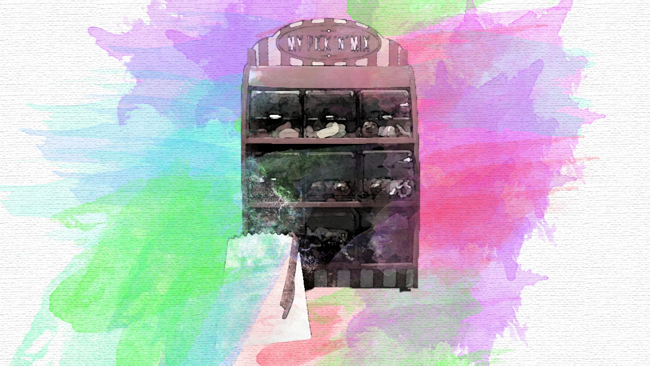
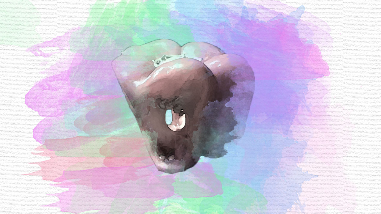
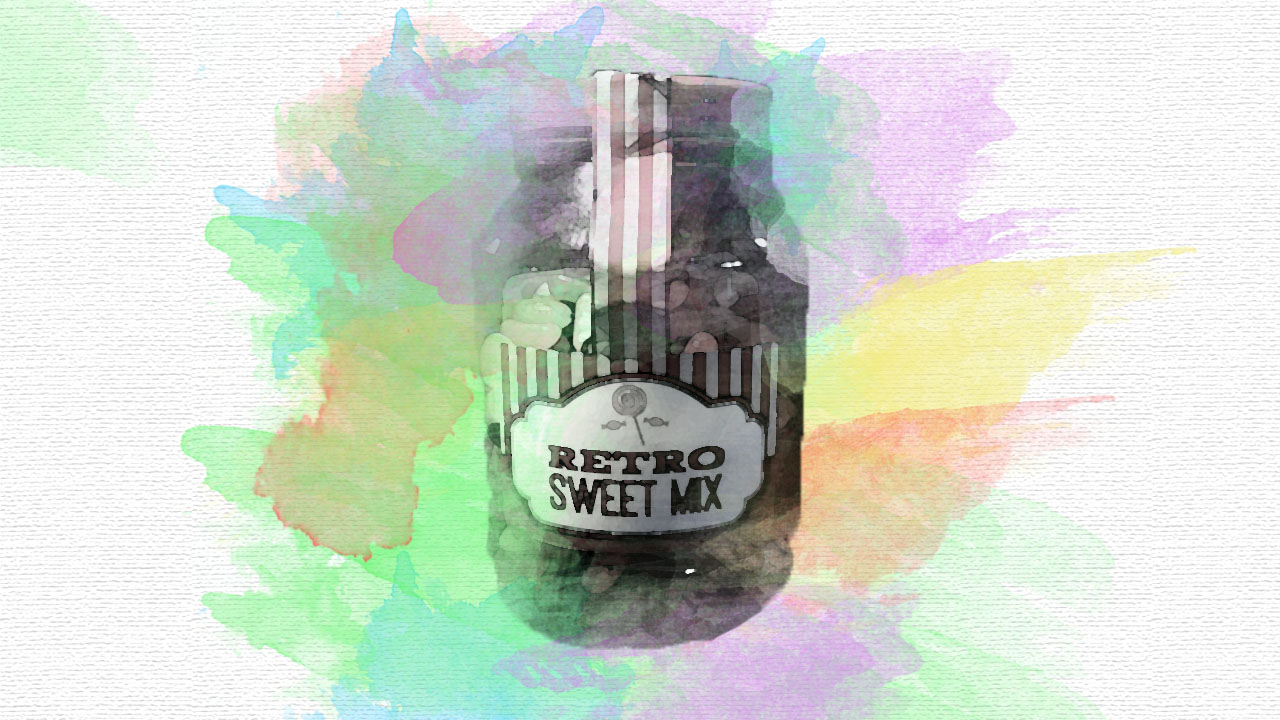
First of all I opened a new landscape document. I then went into the filter gallery and then into texture and then selected the texturize filter. I ensured that the scaling was 150% and the relief was 3. I then pasted the photograph I wanted to use onto the textured document and desaturated it by pressing ctrl + U. I then went into the filter gallery and set the filter to water colour. I then added a vector mask to this layer. I then used a paint brush tool and black paint on the vector mask to dissolve some of the photograph, in order to add the bursts of colour later. I then created a new layer. Using pastel colours a used another water colour paint brush and started tapping around the sweets. I made sure that the colours blended well.
The three edits present the theme of colour, through the watercolours which are bursting out of the main focus point of the edit. The subjects have been pixelated, to present the formal element of texture and the background has been kept plain. This allows this edit to be more like Garry’s and allows the subject to stand out more, has more emphasis on the subject.
Screenshots
First of all I selected all the photographs I wanted to use. I used the ellipsis and tool and cut out a circle in the centre of the photograph. I then created a new document in order to put the circles on. I then turned the background colour to cream. I then moved the circle onto the new document and resized it by pressing ctrl + T. I then repeated this step till all the circles where on the document. I then added drop shadows to all of the photographs to add depth to the photographs.
The circles are used to help display certain aspects of these four images. Each section clearly shows colour and texture, making them all like each other in a way. The circles have a drop shadow and stroke, which pushes the sections forward making them stand out more. In this edit the background has also been kept plain, to allow the circles to be the main focus point and to make this edit more like Garry’s work.
Screenshots
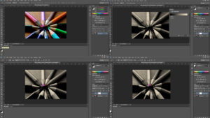
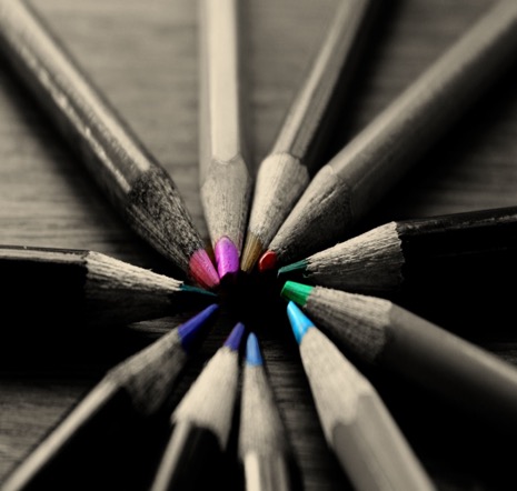
First of all I selected the image I wanted to use and re levelled it. I then ensured that black and white where my colours on the colours panel. I then added a gradient map by pressing the adjustment layer > gradient map. I then ensured that the vector mask was white . Then using the paint brush tool I used the black paint and paint over the areas I wanted to be in colour. As I painted over the colour started to reveal. If I painted over an area which I did not want coloured, I used the white paint and it went away.
I really like the use of the colour splash, as it allows the tips of the pencils to have a burst of colour. This edit only really presents colour, however I still believe that this edit is still as successful as the rest. I like how only a certain section of the image is in colour as it allows the viewers eyes to be drawn to there first, making it the main focus point. I also believe that this edit still has met the same artistic intention that Garry had when capturing and editing his images.