Daily Archives: October 5, 2018
Filters
High contrast images with Keld Helmer-Petersen
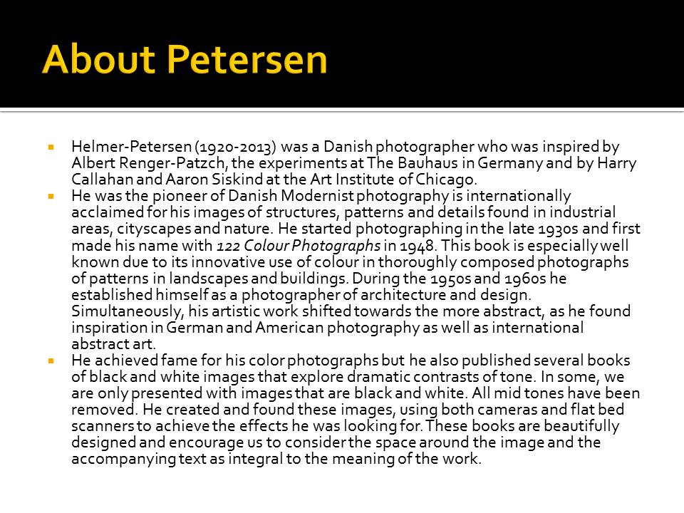
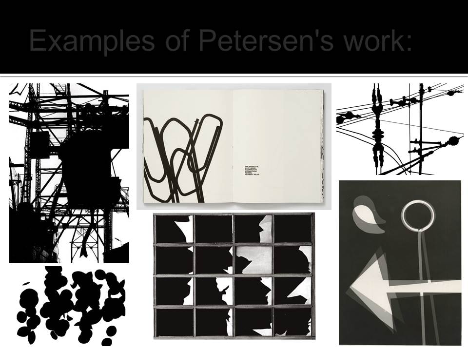
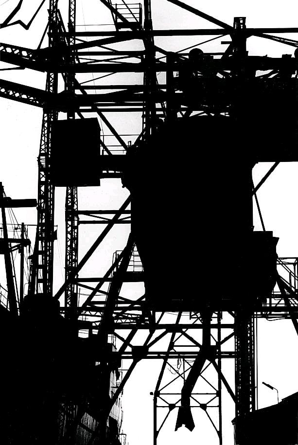
Keld Helmer-Peterson was a Danish photographer who took abstract photographs. He was heavily inspired by Albert Renger-Patzsch and Aaron Siskind. This photographer took images of things like buildings, and edited his photos until the contrasts were very high. He published many books that contained heavily contrasted images, like the one below. He took the images in the books using cameras, and also bed scanners. All the images in the book are surrounded by a lot of space and sometimes even text.
My images
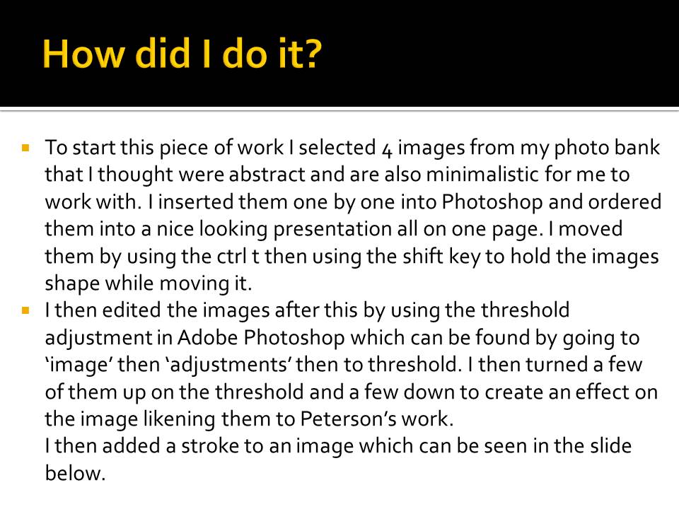
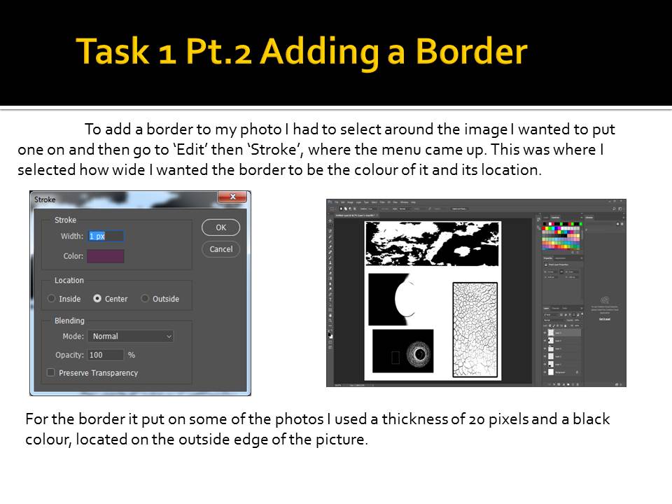
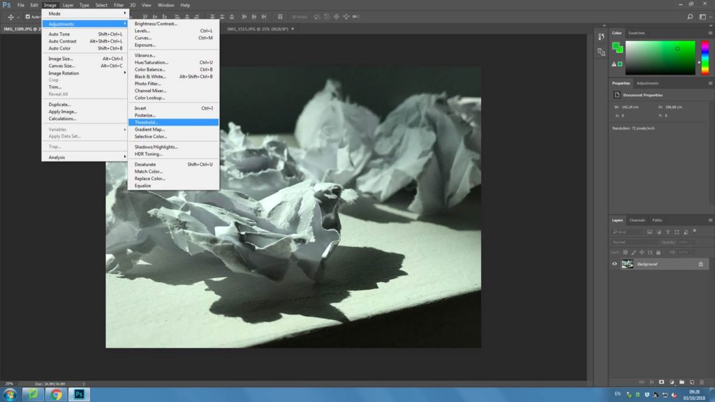
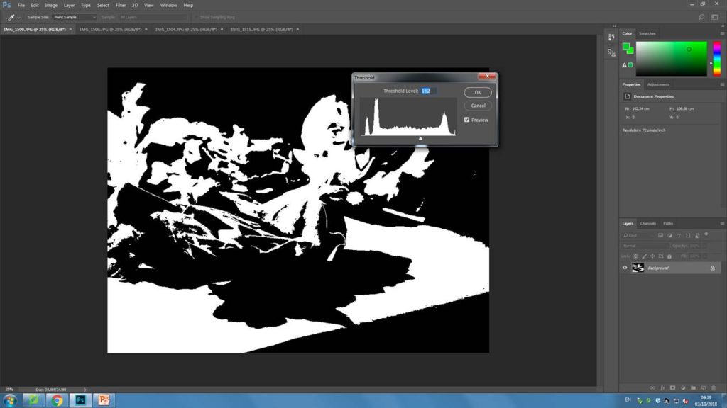
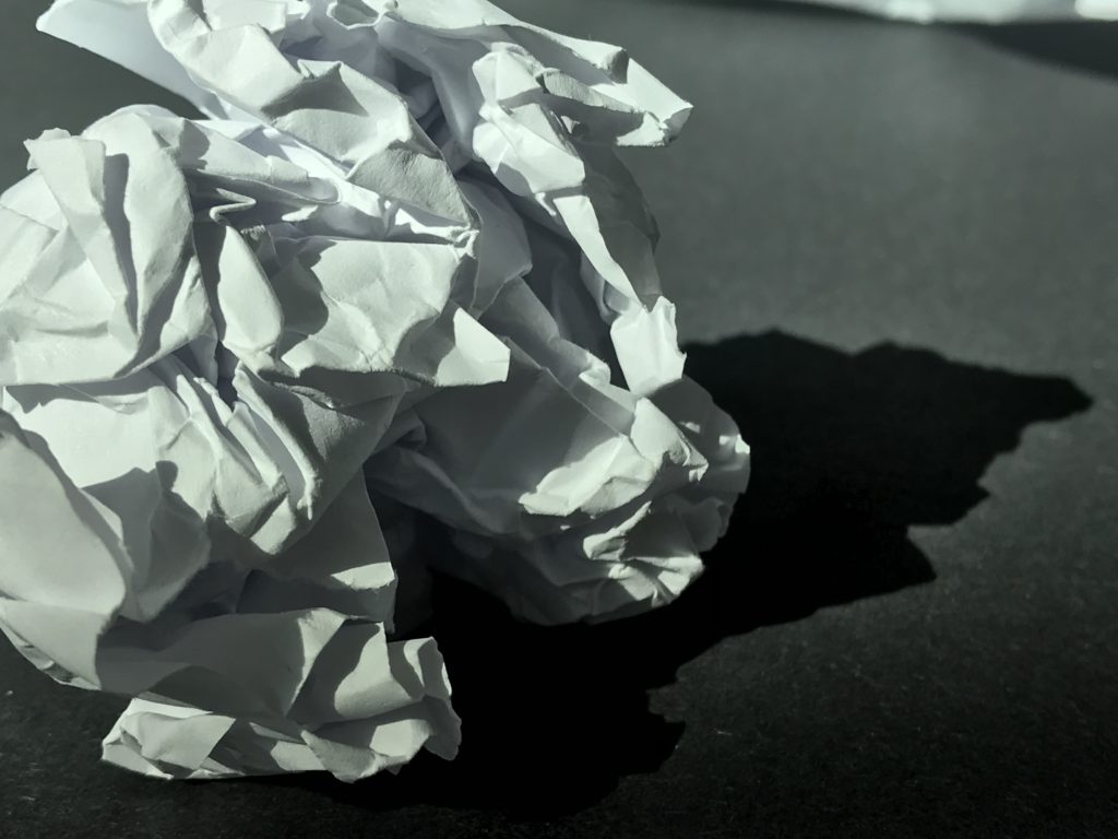
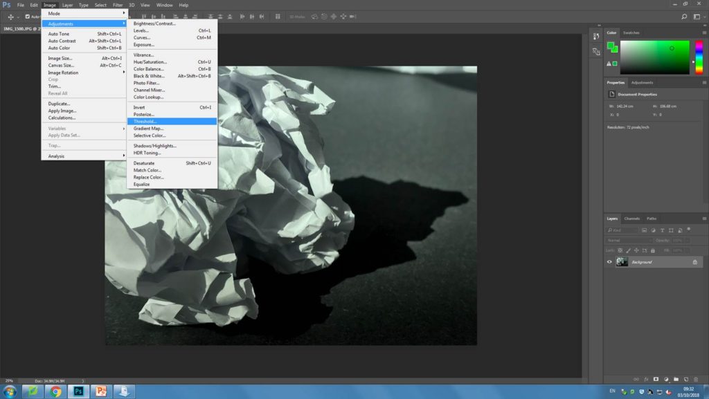
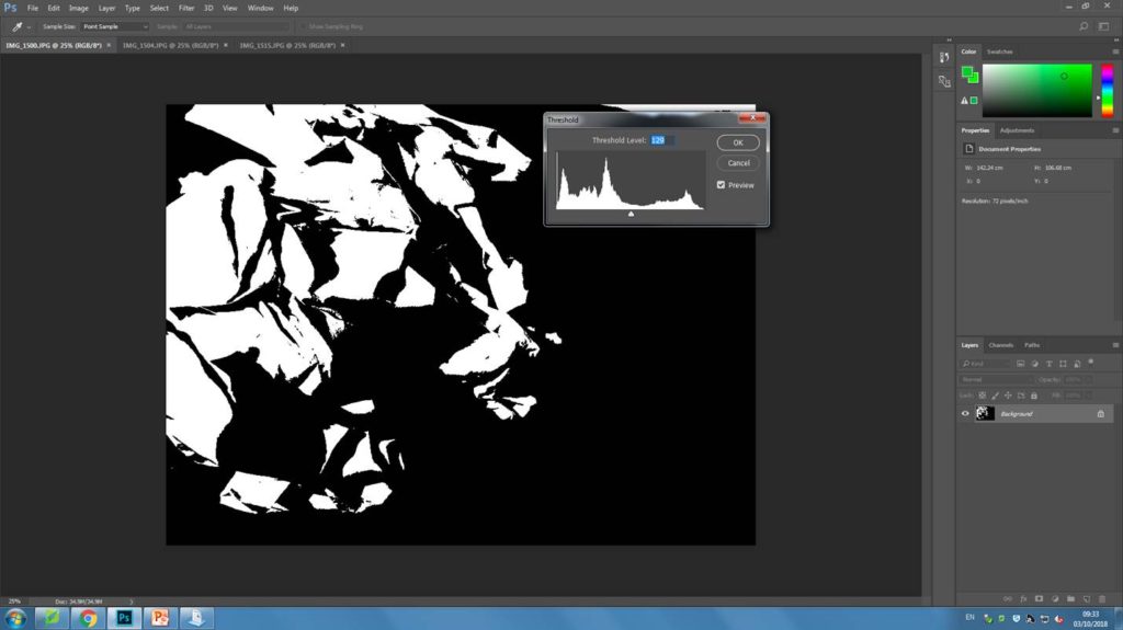
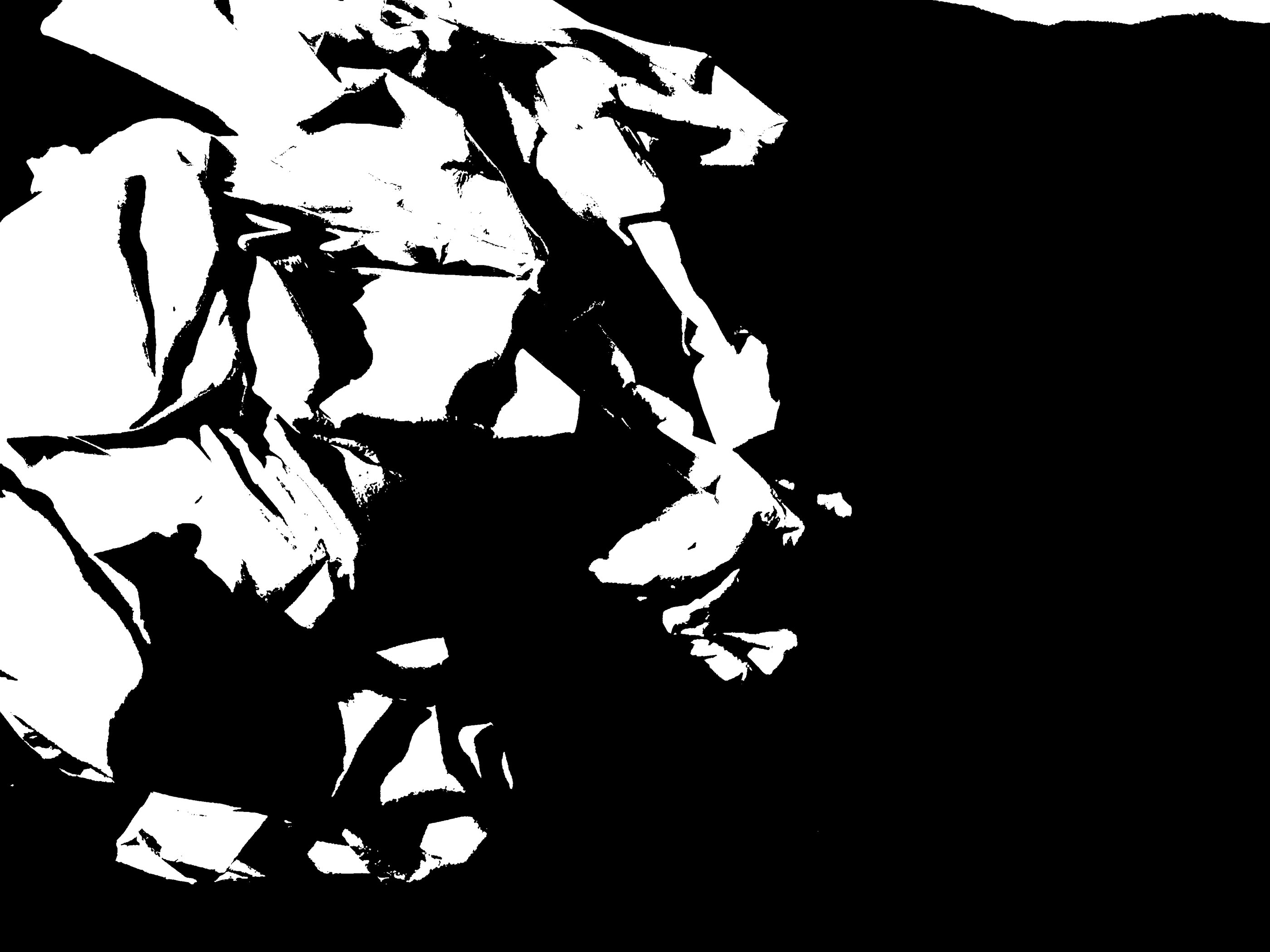
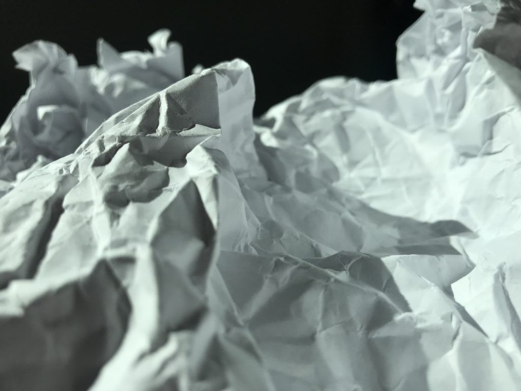
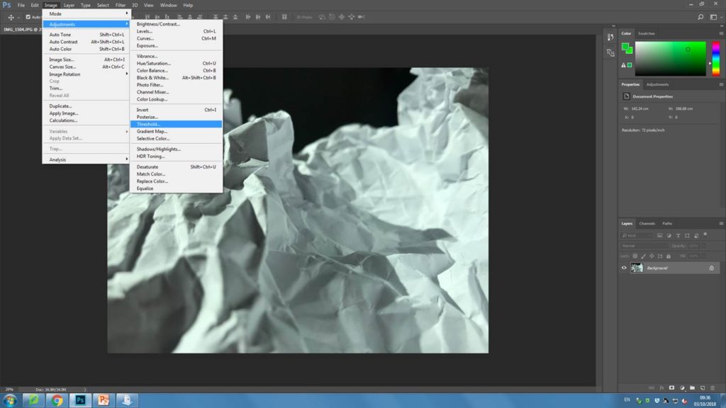
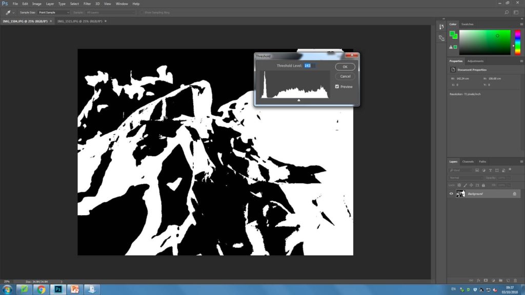
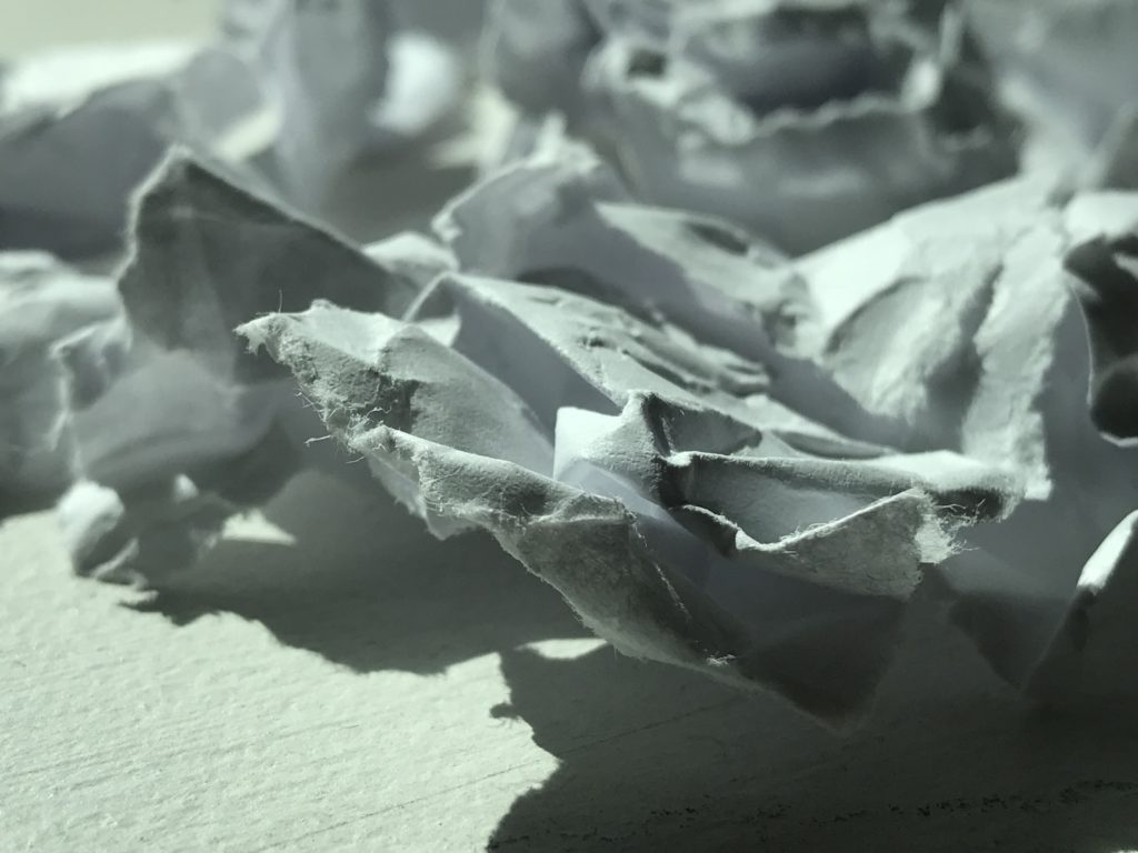
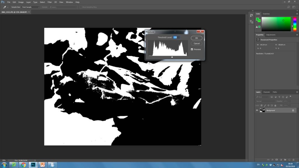
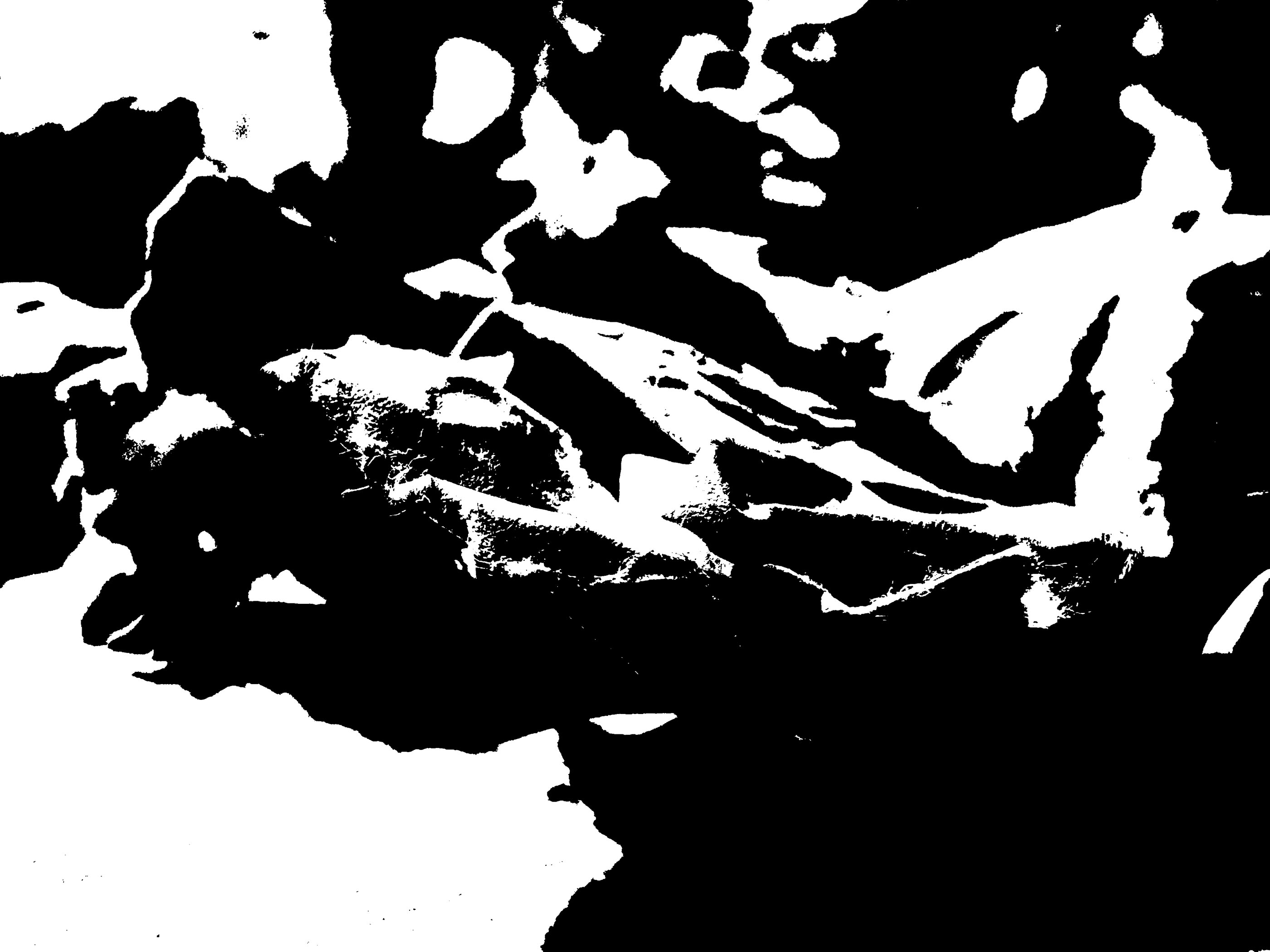
For my following experimentation, I have chosen 4 abstract images I have previously taken to edit on Photoshop. To edit all the images I have adjusted the threshold, by going to image then selecting ‘adjustments’. For each image I have then adjusted the threshold until i has satisfied that I had a heavily contrasted image that i was happy with. Below i have included screenshots of my process for each image.
My final piece
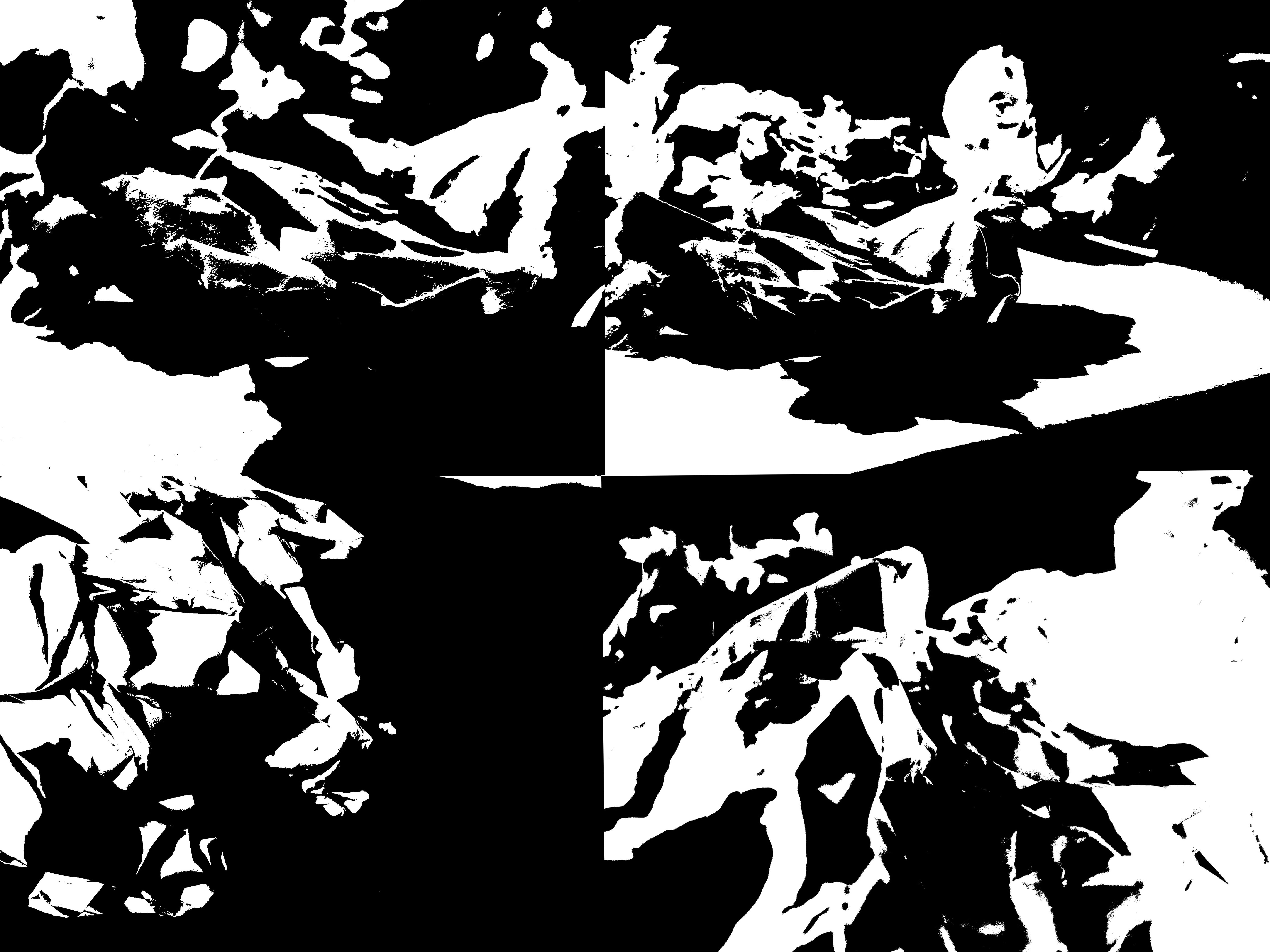
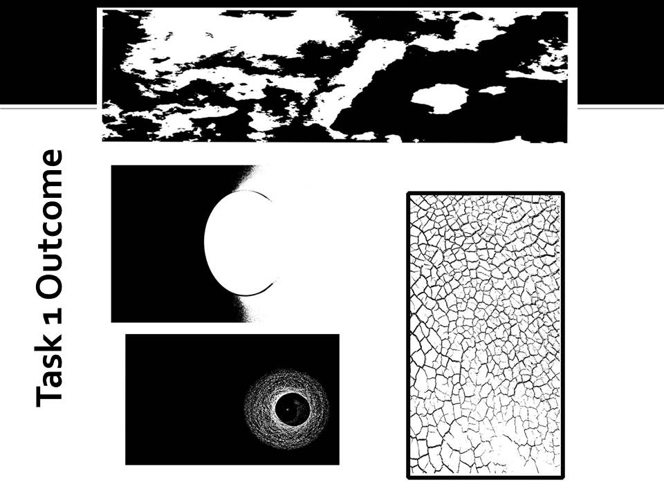
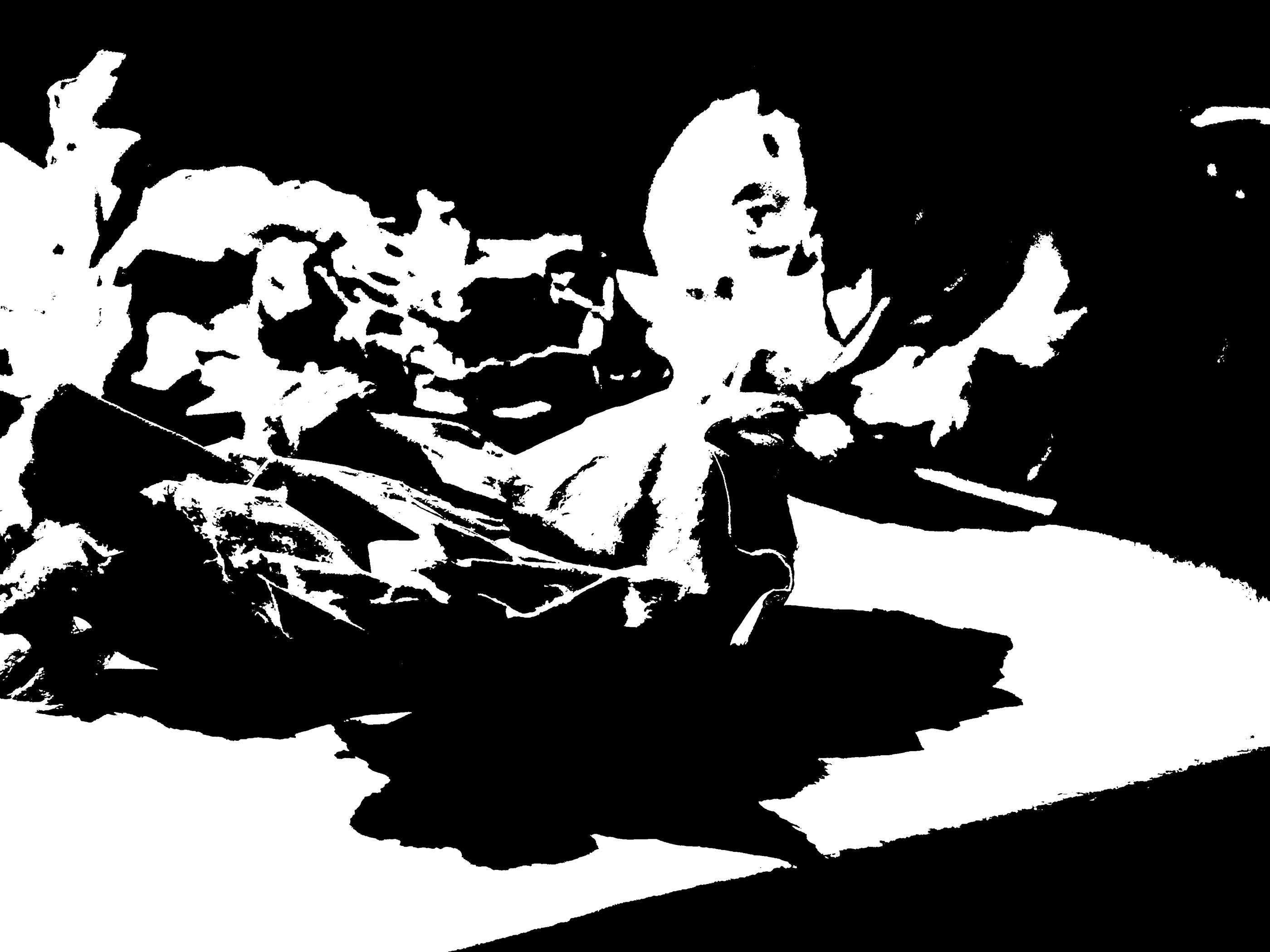
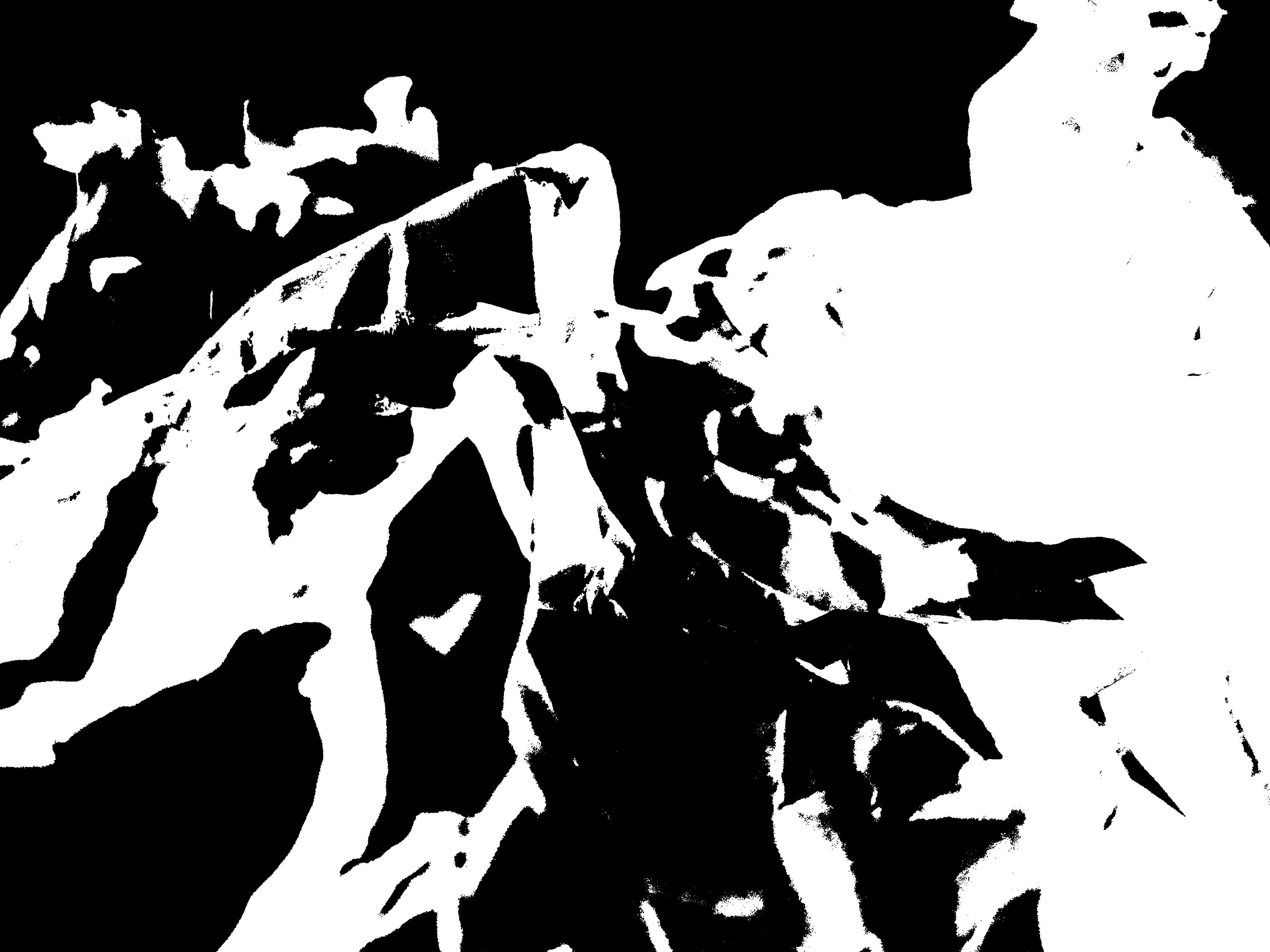
For my final pieces, I have attempted to create images like the ones Helmer- Petersen presented in his books. I think my images turned out very successful as they are very heavily contrasted and all the mid tones have also been removed. Because the paper I took pictures of was very scrumped, there were many different points on the paper that were illuminated by light, and other parts that were more shadowed. I think that has helped my images look very interesting after I had photo shopped them as there is a nice blend of both black and white on my final images.
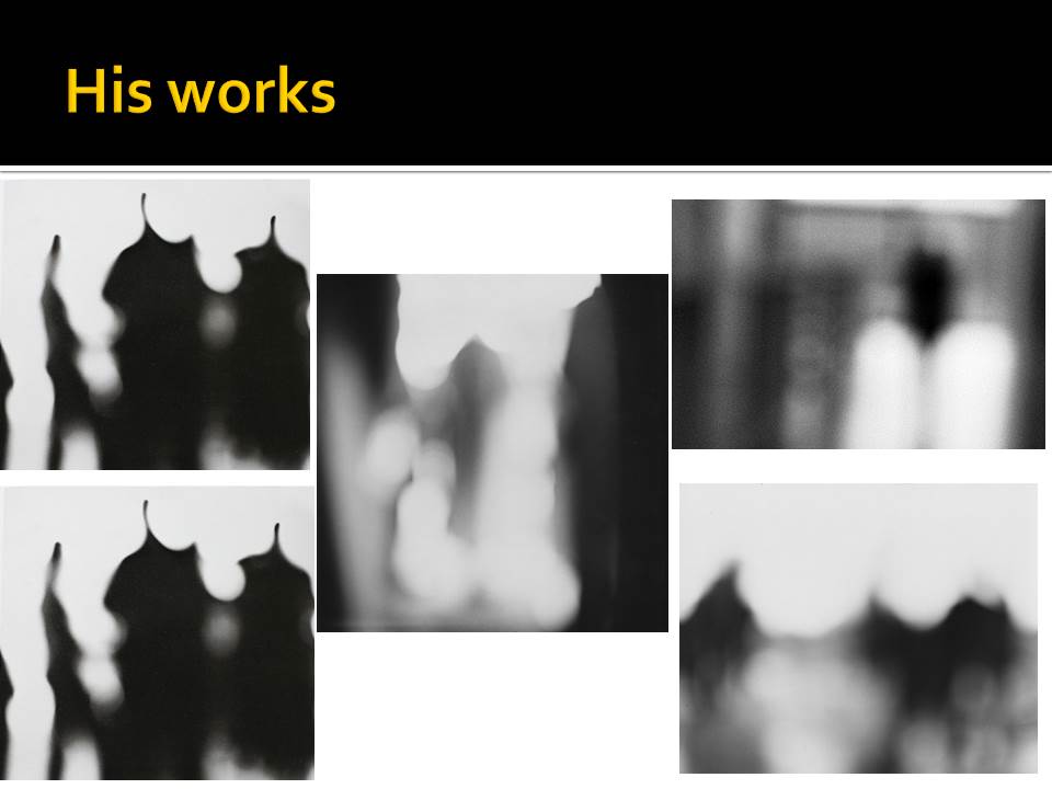
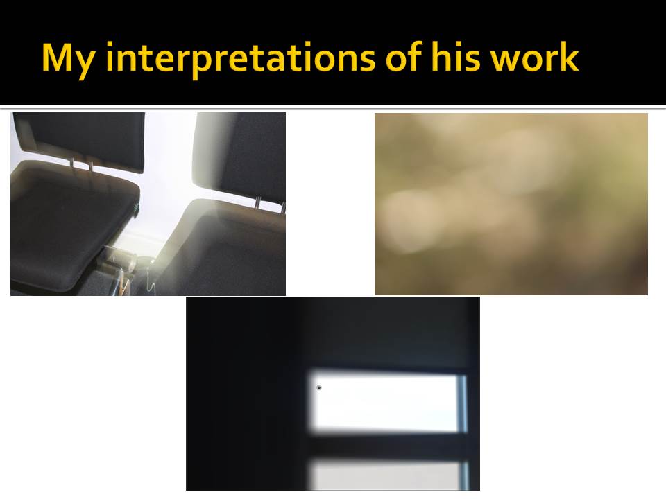
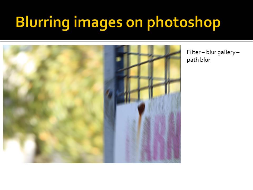
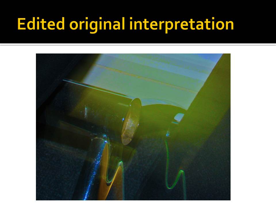
Ralph Eugene Meatyard

Layer Mask Experiment
Intro
Layer Masking is a process that involves creating a layer of color over an existing image and removing parts of the new layer to have certain parts of the photo visible.
Method
I loaded up Photoshop and selected my Image I wished to edit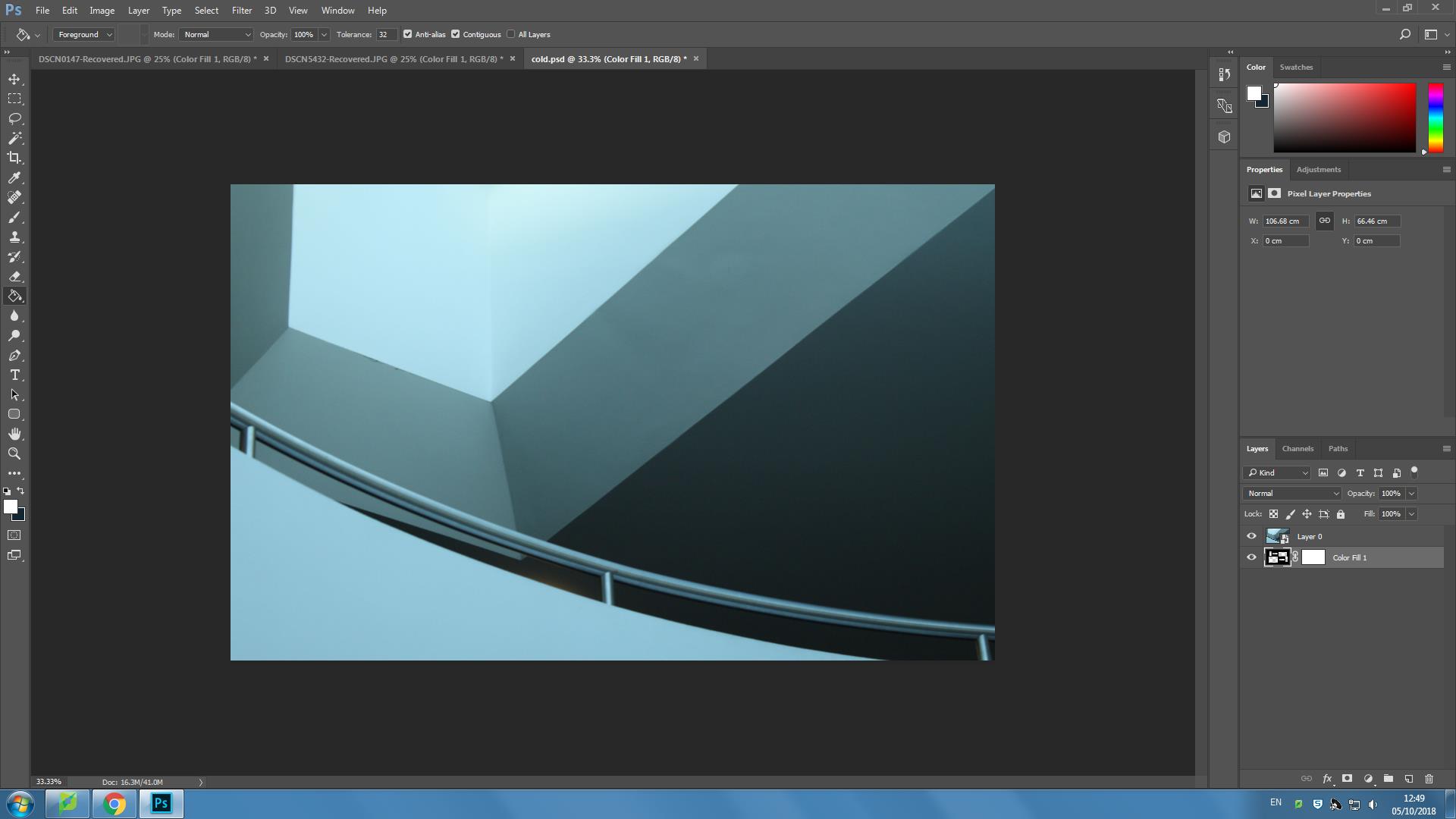
I then went to Layer-New Fill layer-Solid color and selected a colour from the image that would accent the image and layer and applied it and removed sections of the layer
Here are a few final edits
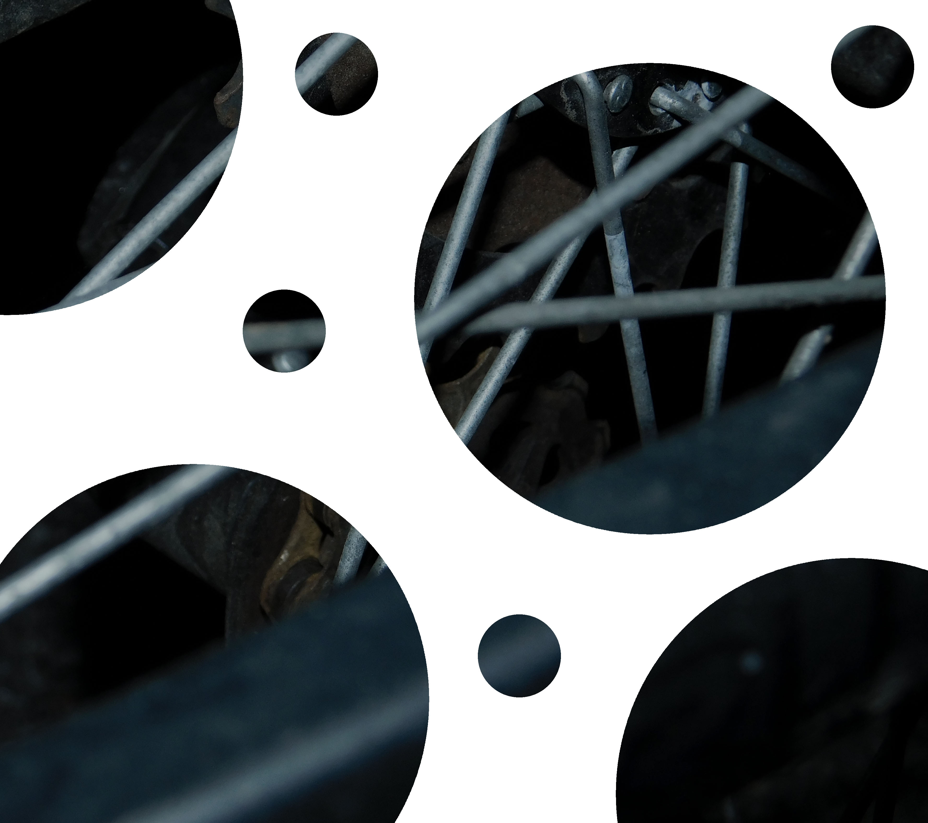
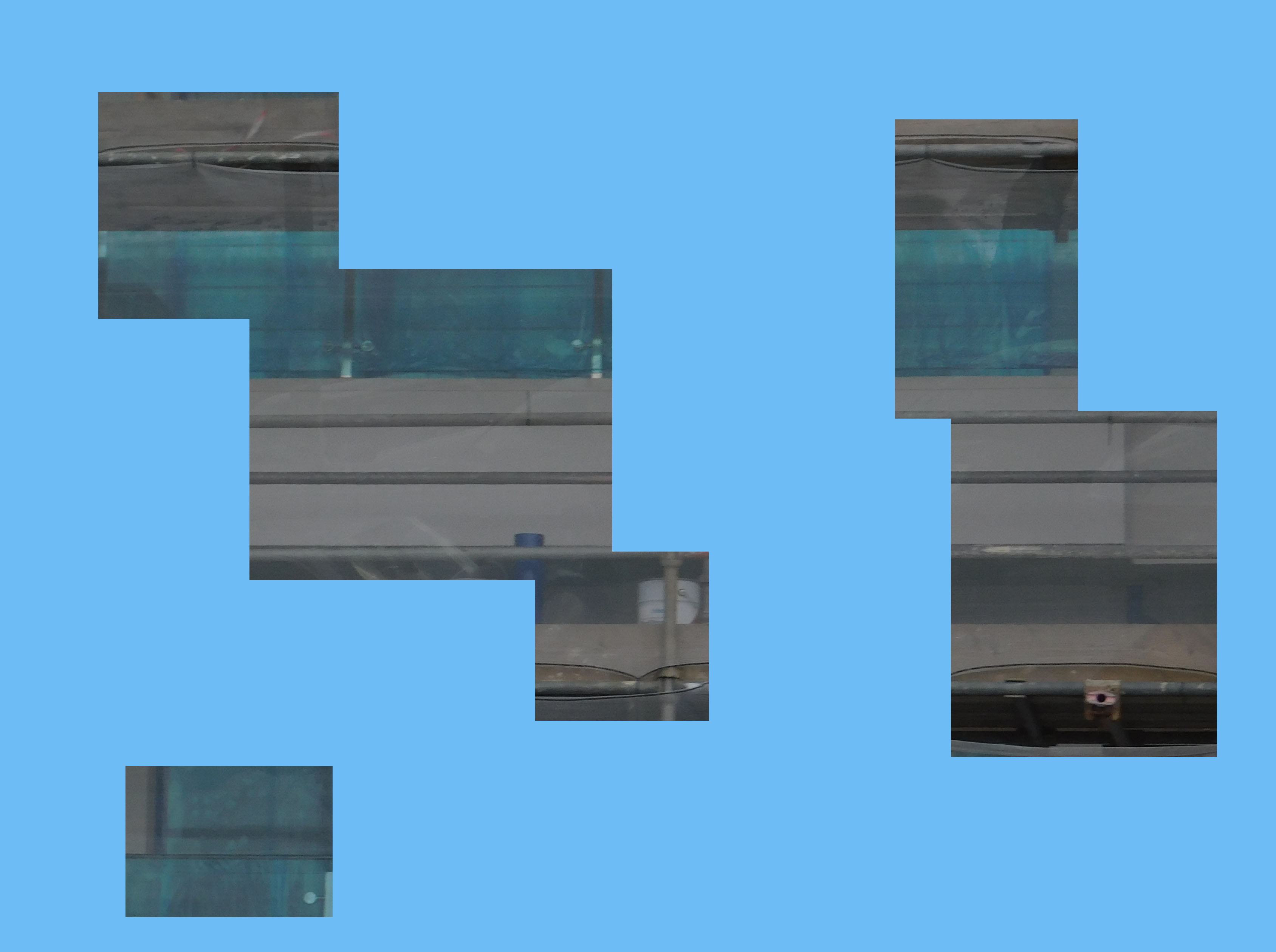
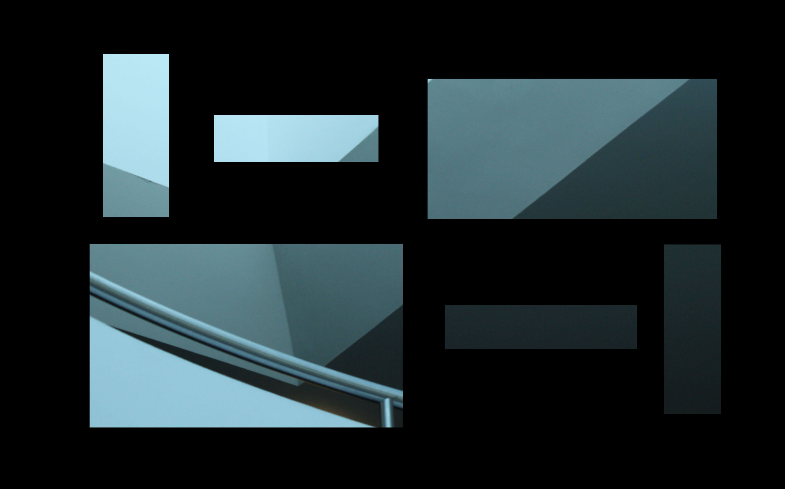
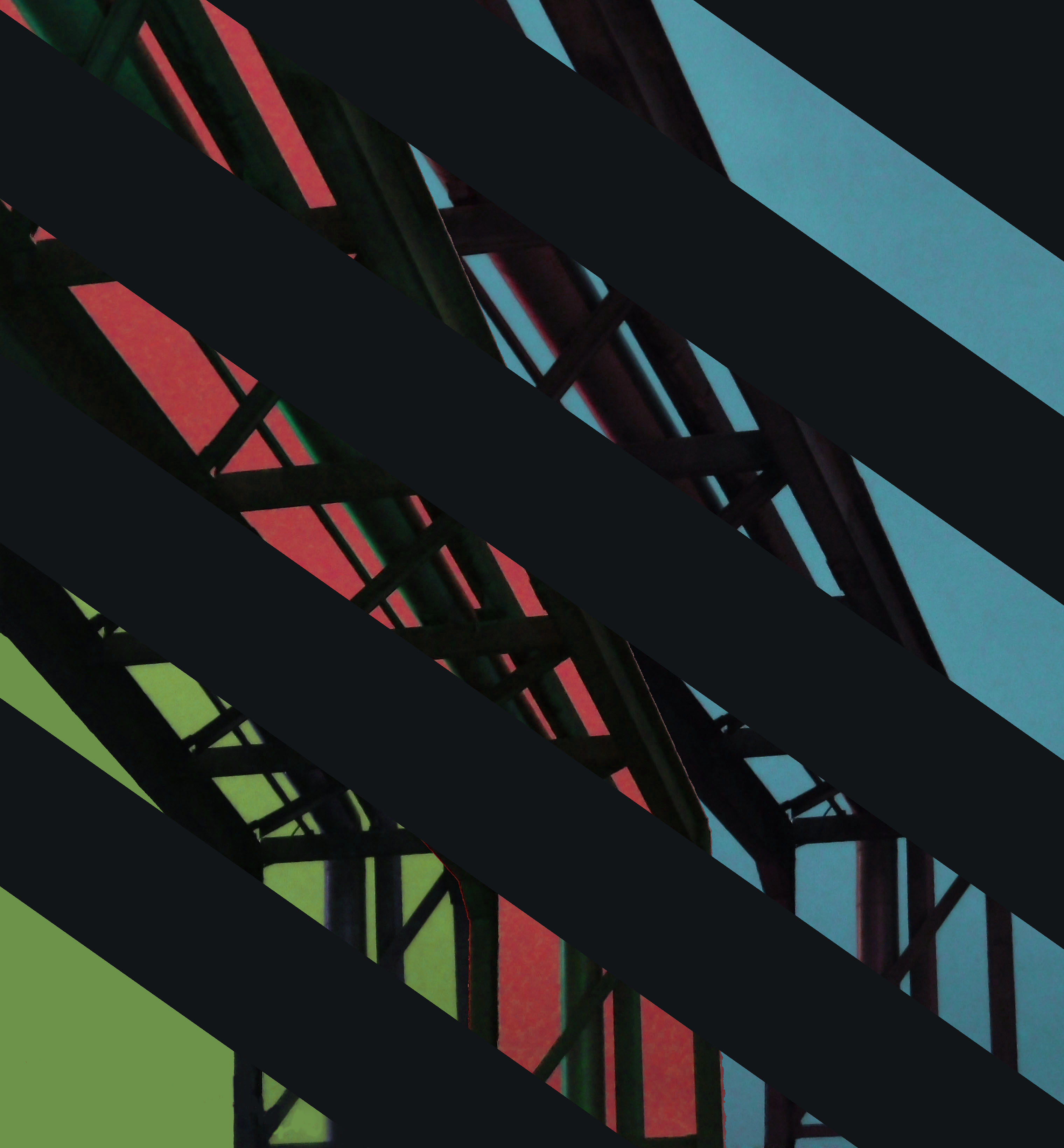
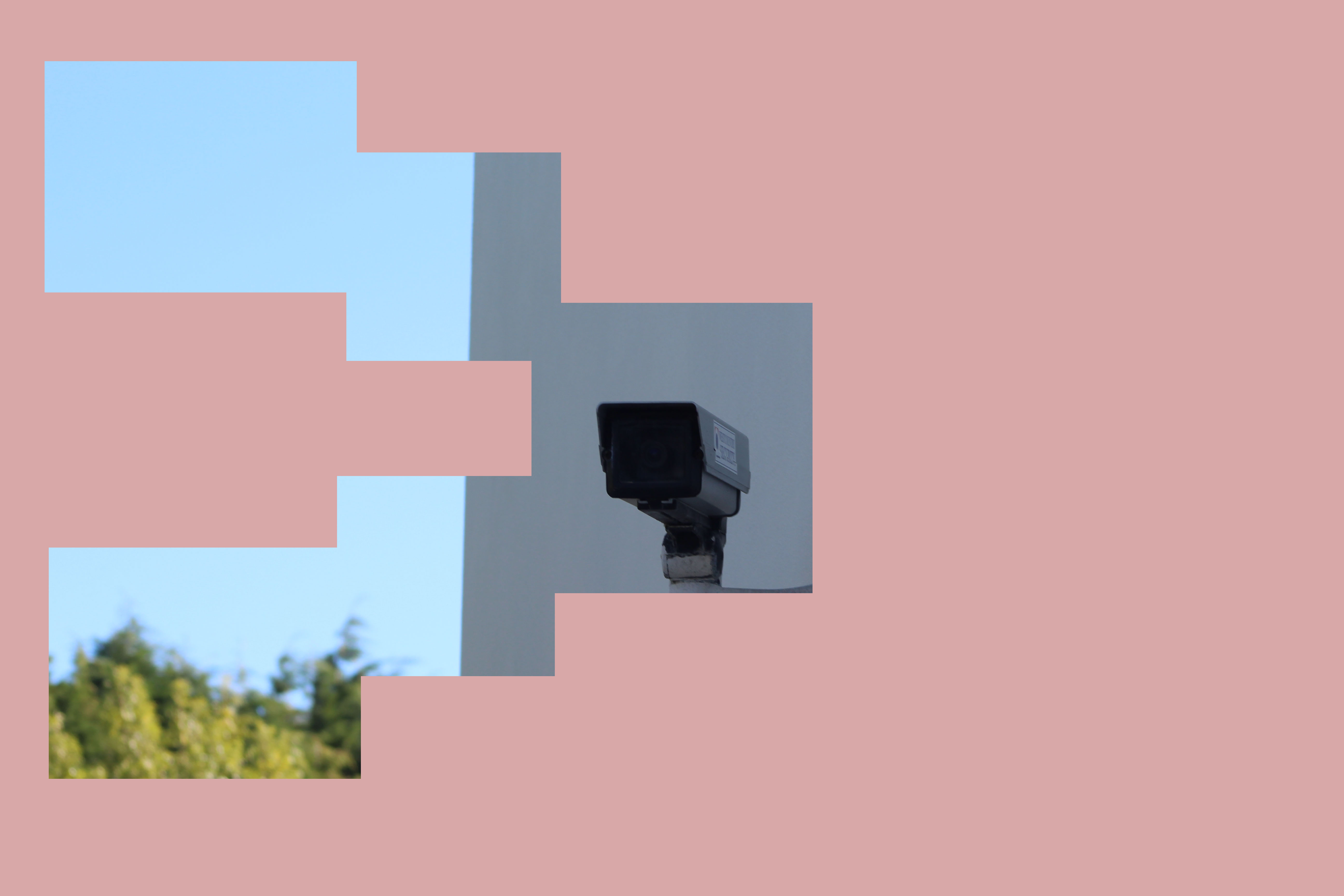
Instead of using circles, I chose to focus mainly on squares and rectangles in order to isolate different parts of an image to highlight them or to create a nice visual effect.
Uta Barth
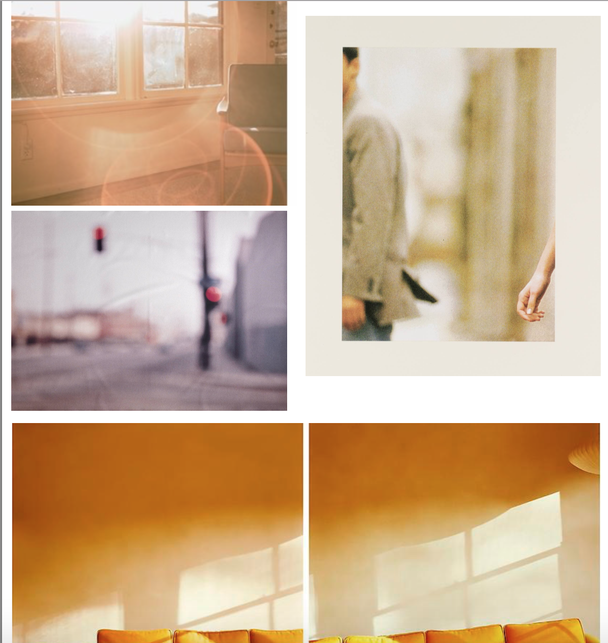
Throughout the past two decades, Uta Barth has made visual perception the subject of her work. Regarded for her “empty” images that border on painterly abstraction, the artist carefully renders blurred backgrounds, cropped frames and the natural qualities of light to capture incidental and fleeting moments, those which exist almost exclusively within our periphery. With a deliberate disregard for both the conventional photographic subject and point-and-shoot role of the camera, Barth’s work delicately deconstructs conventions of visual representation by calling our attention to the limits of the human eye.
A 2012 McArthur Fellow, Barth was born in Berlin in 1958 and currently resides in Los Angeles. She received a B.A. from the University of California, Davis in 1982 and an M.F.A from the University of California, Los Angeles in 1985.
Since then, Barth’s work has been the subject of major exhibitions worldwide. Notable solo presentations include to draw with light at SCAD Museum of Art in Savannah, GA (2013), … and to draw a bright, white line with light at The Art Institute of Chicago (2011), Henry Art
Shutter Speed Experimentation
Experimentation
In photography, shutter speed or exposure time is the length of time when the film or digital sensor inside the camera is exposed to light, also when a camera's shutter is open when taking a photograph. The amount of light that reaches the film or image sensor is proportional to the exposure time.

https://en.wikipedia.org/wiki/Shutter_speed
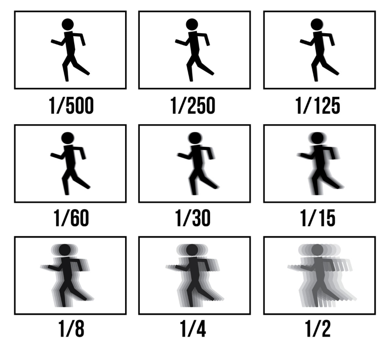
Here is a mood board:
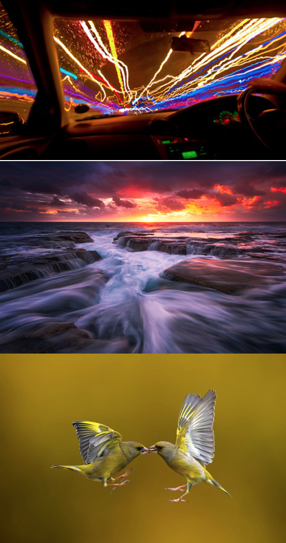
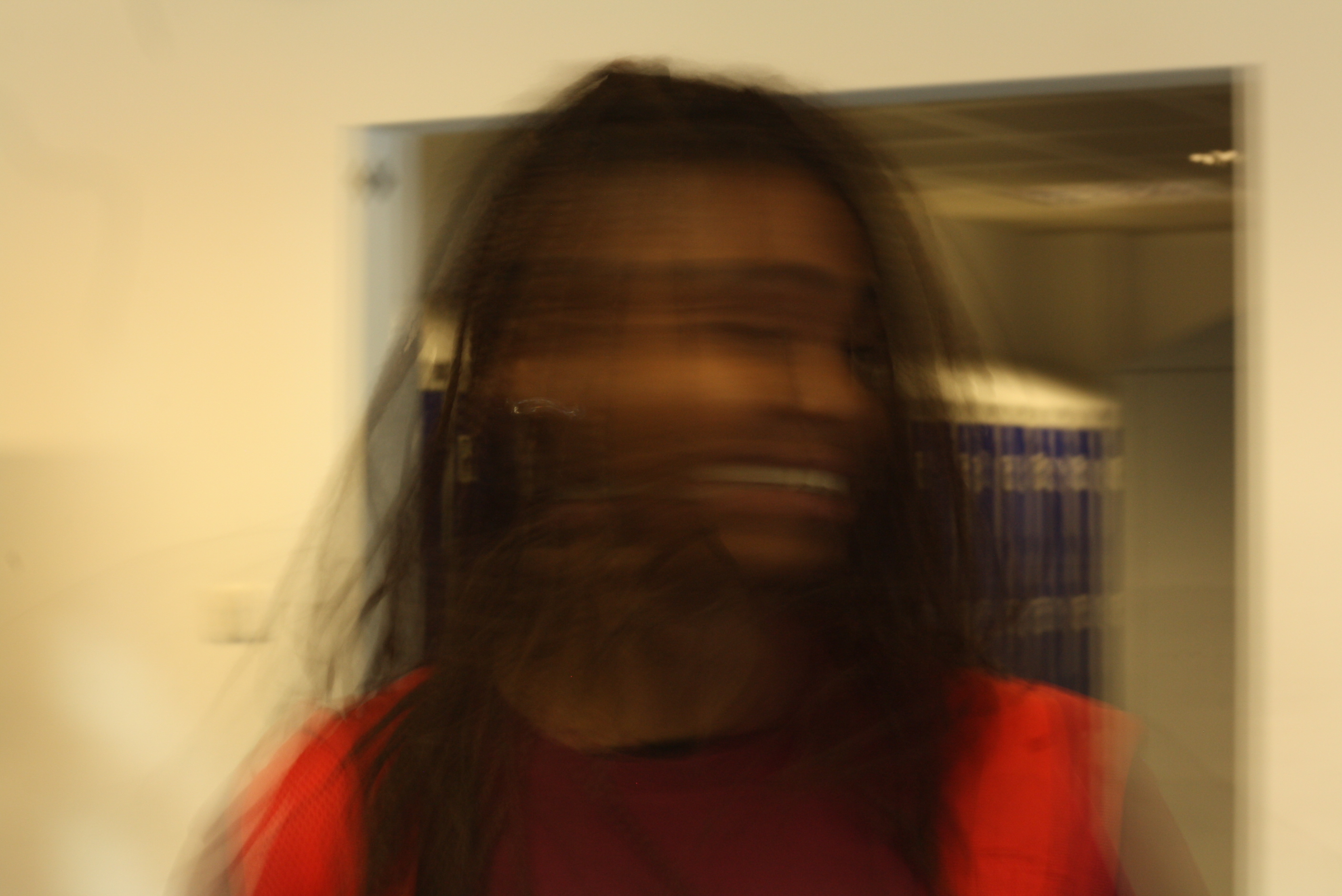
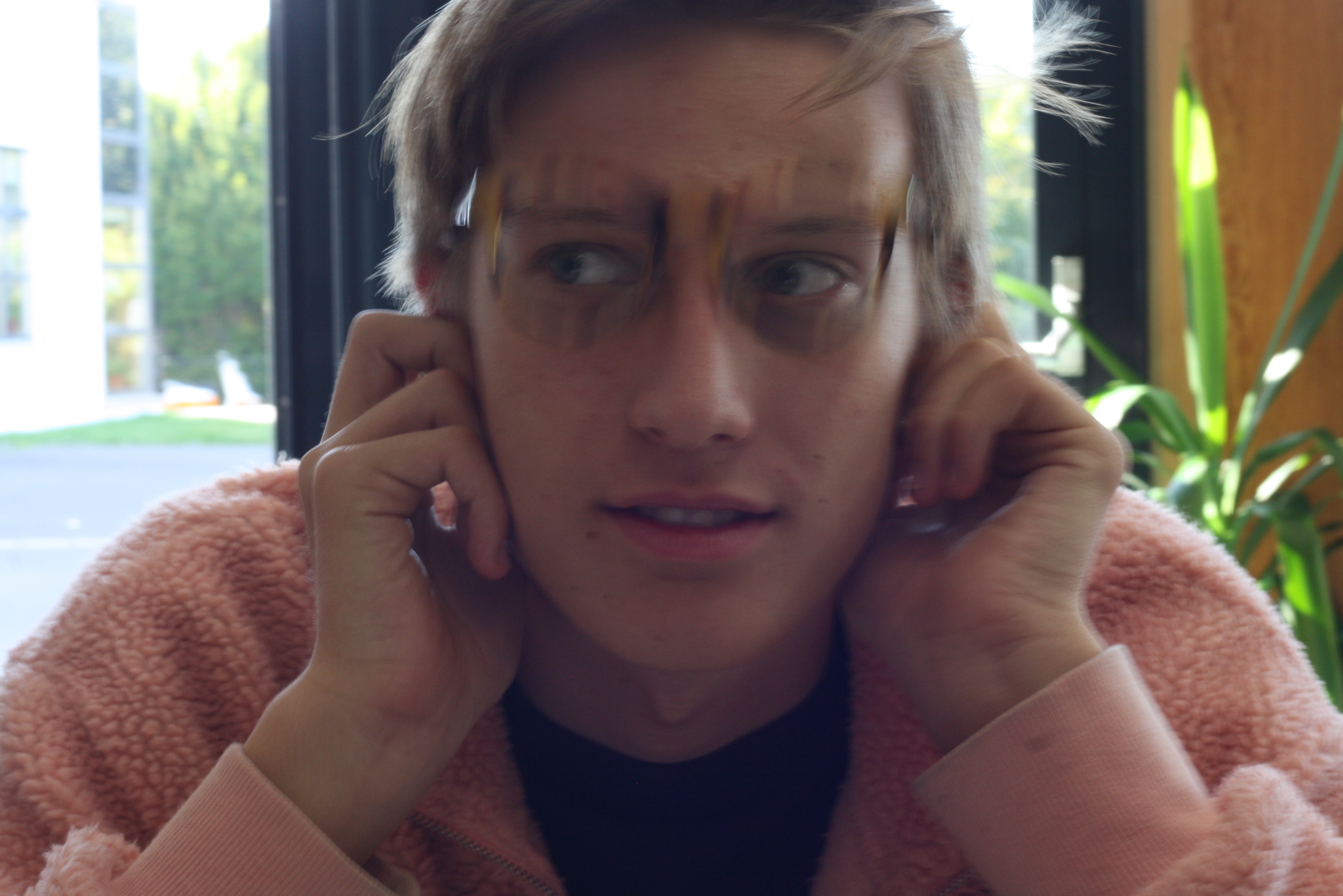
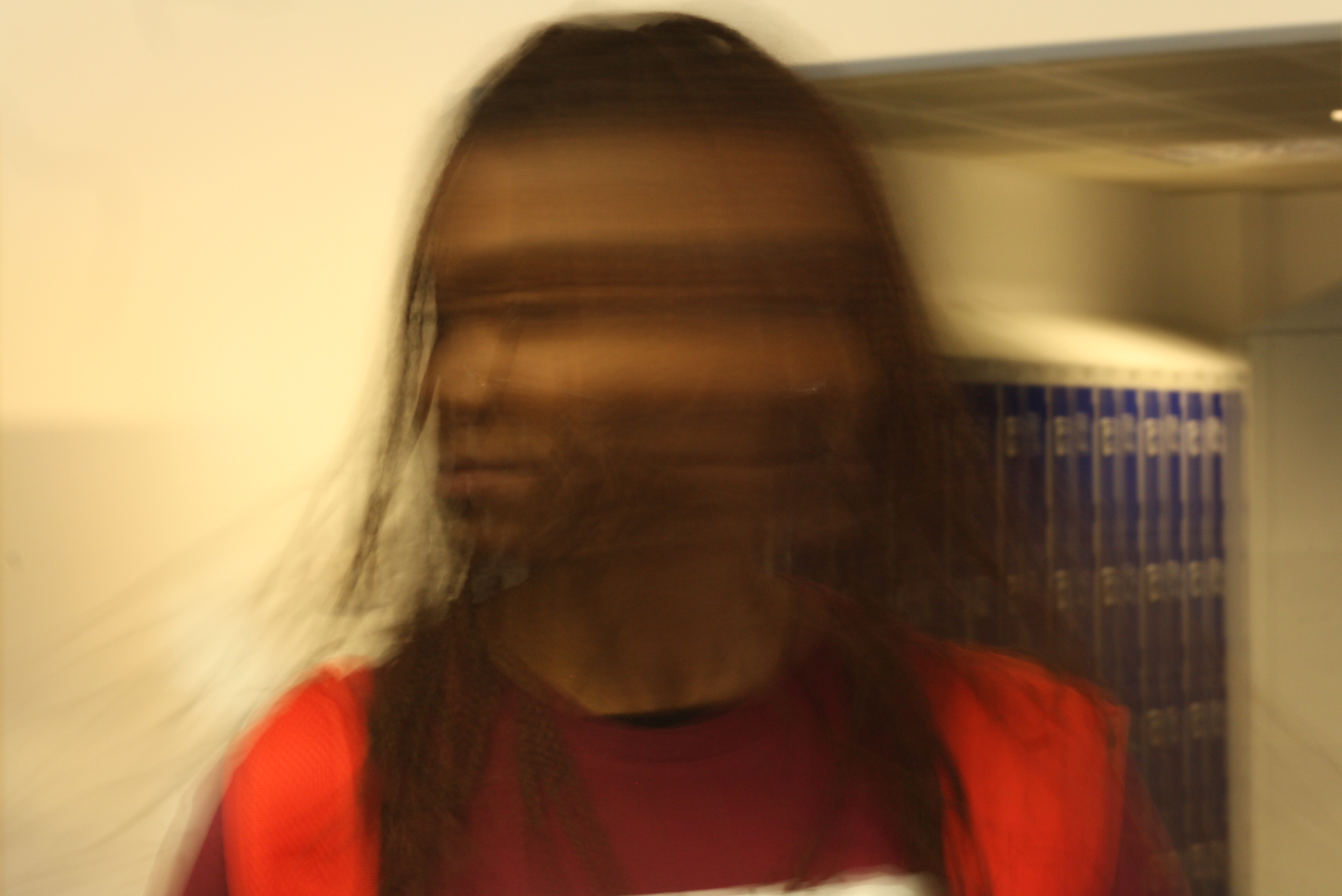
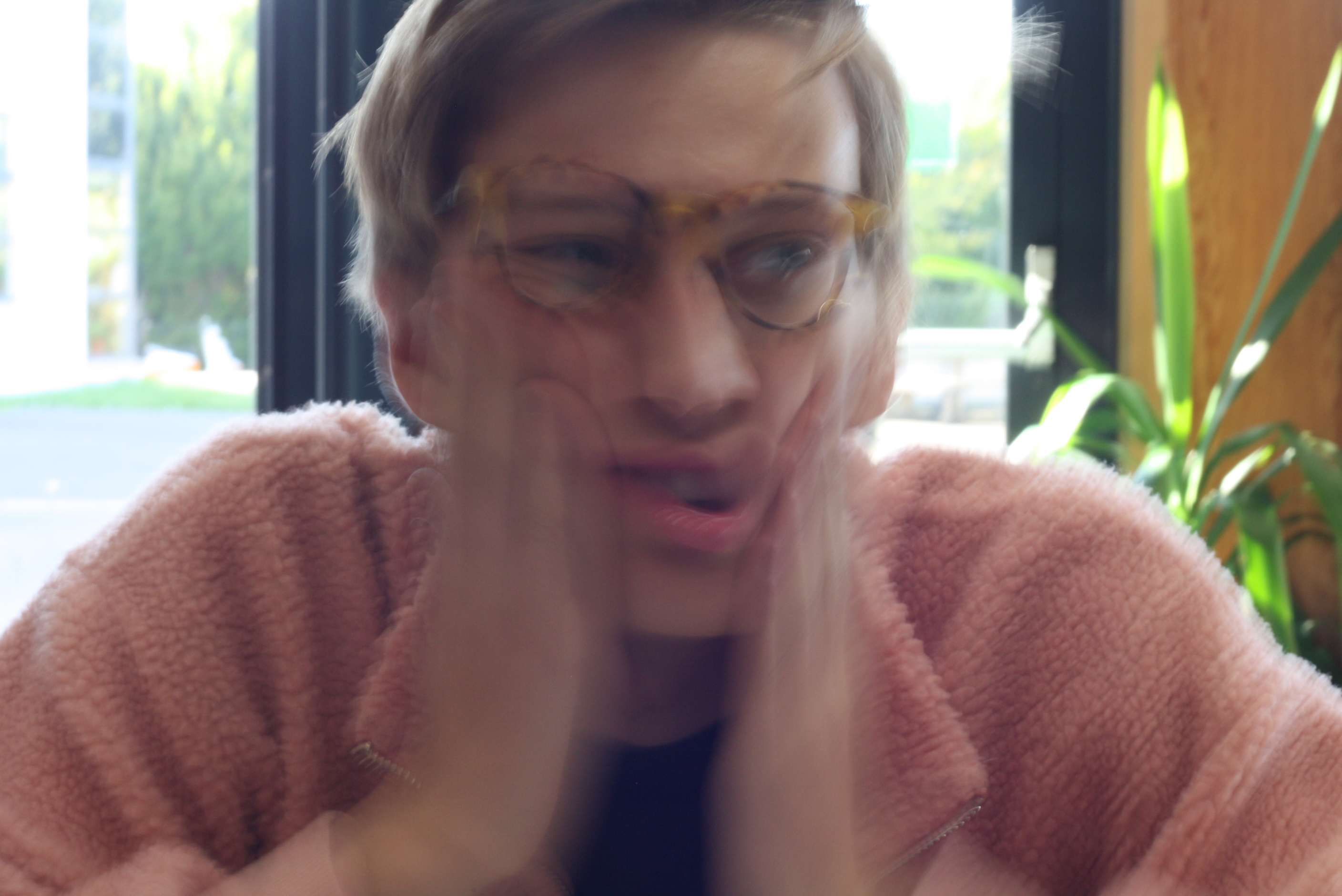
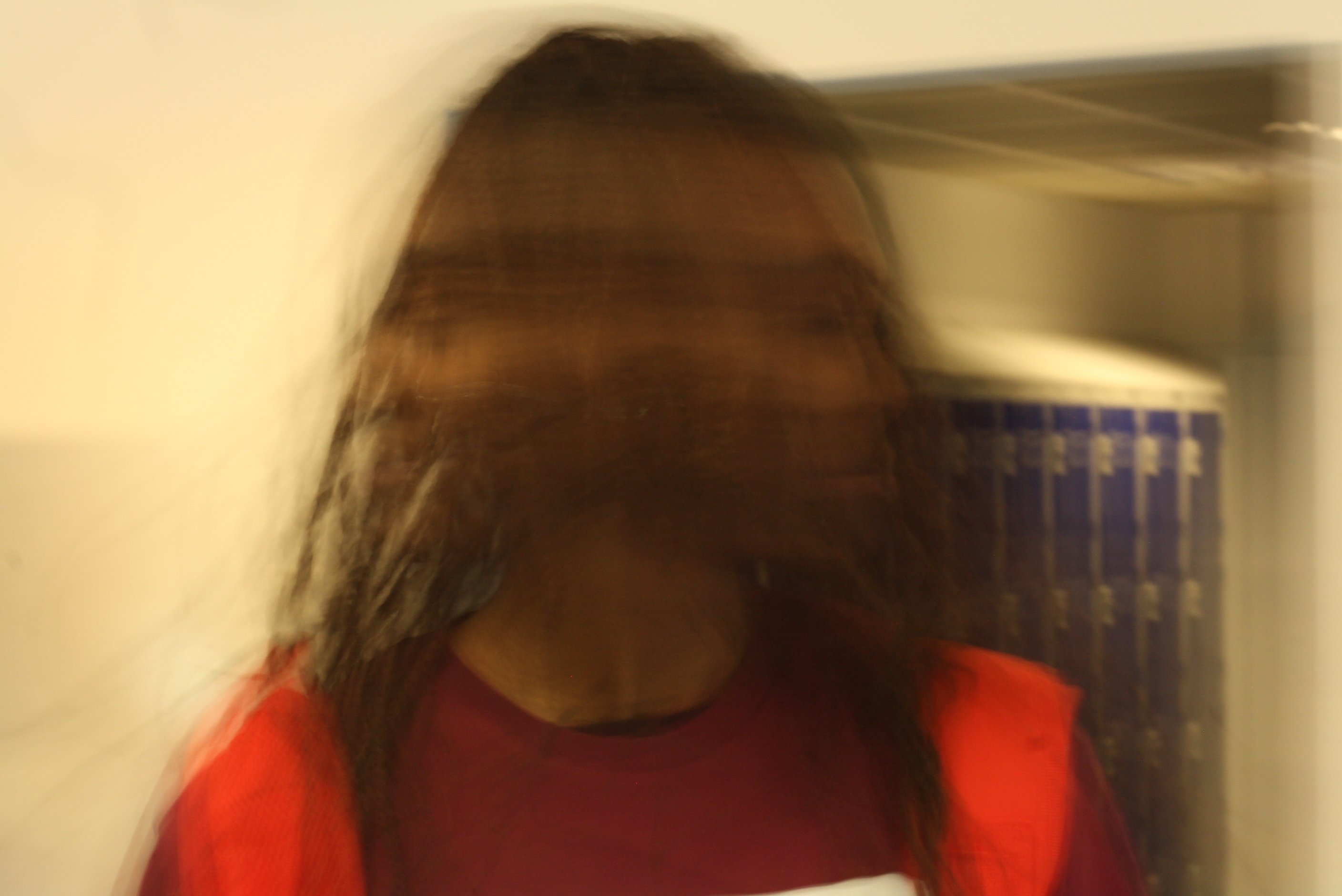
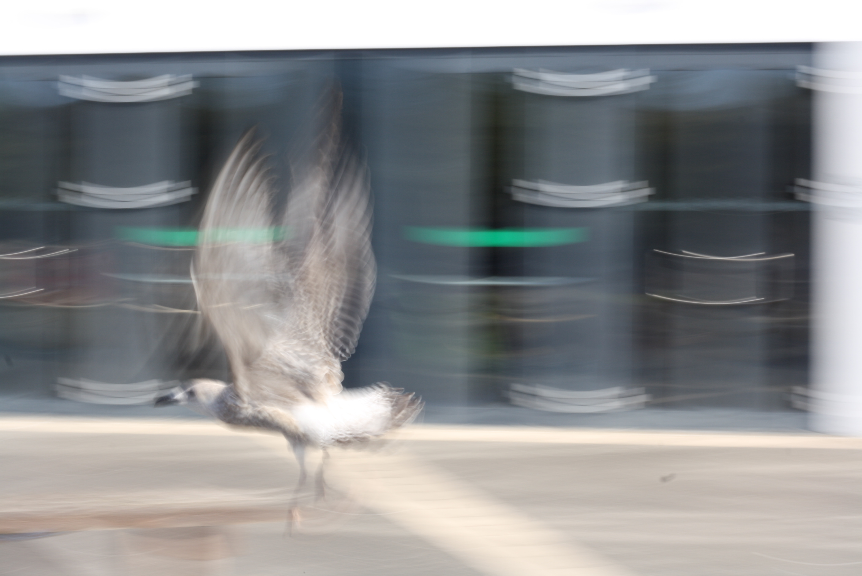
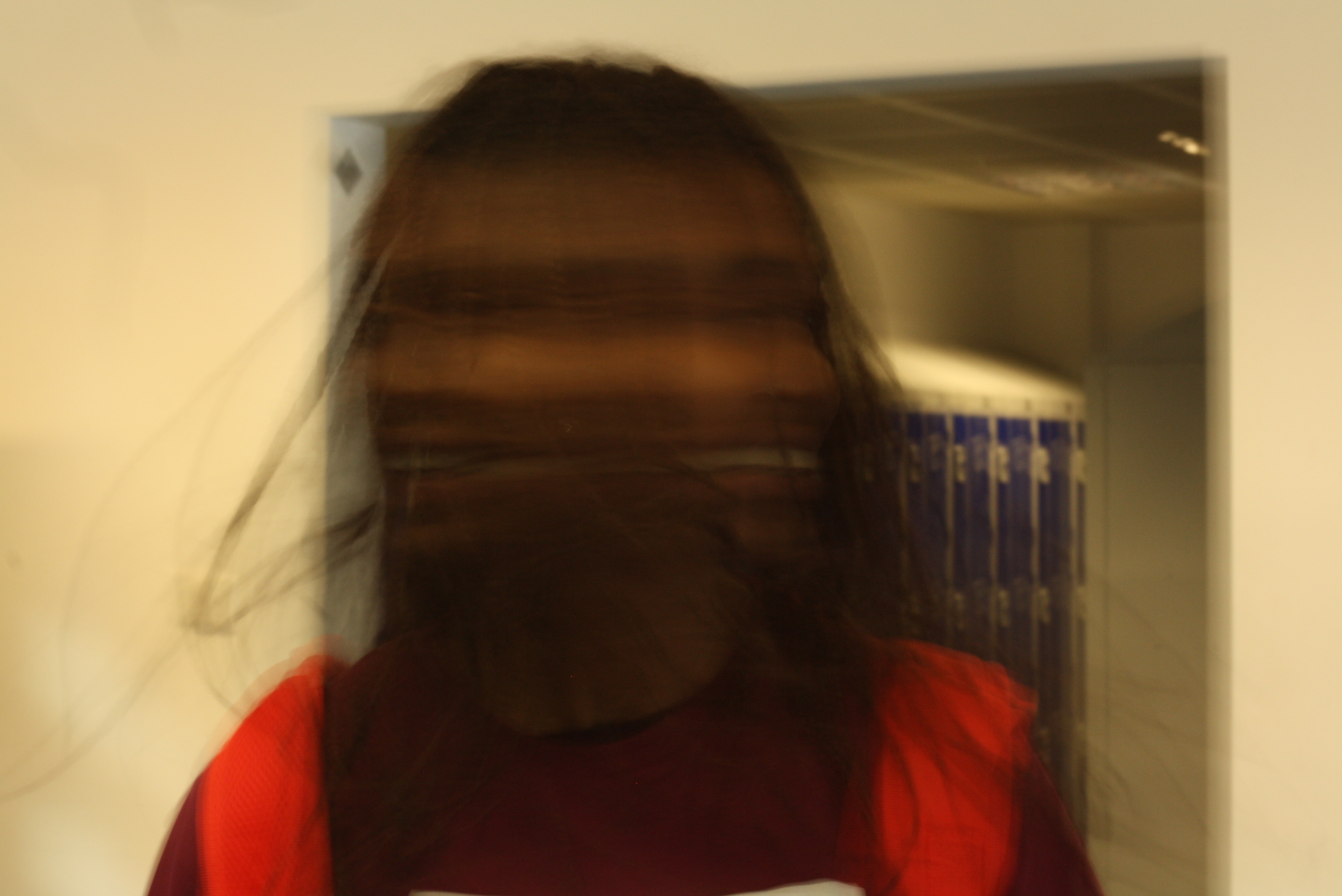
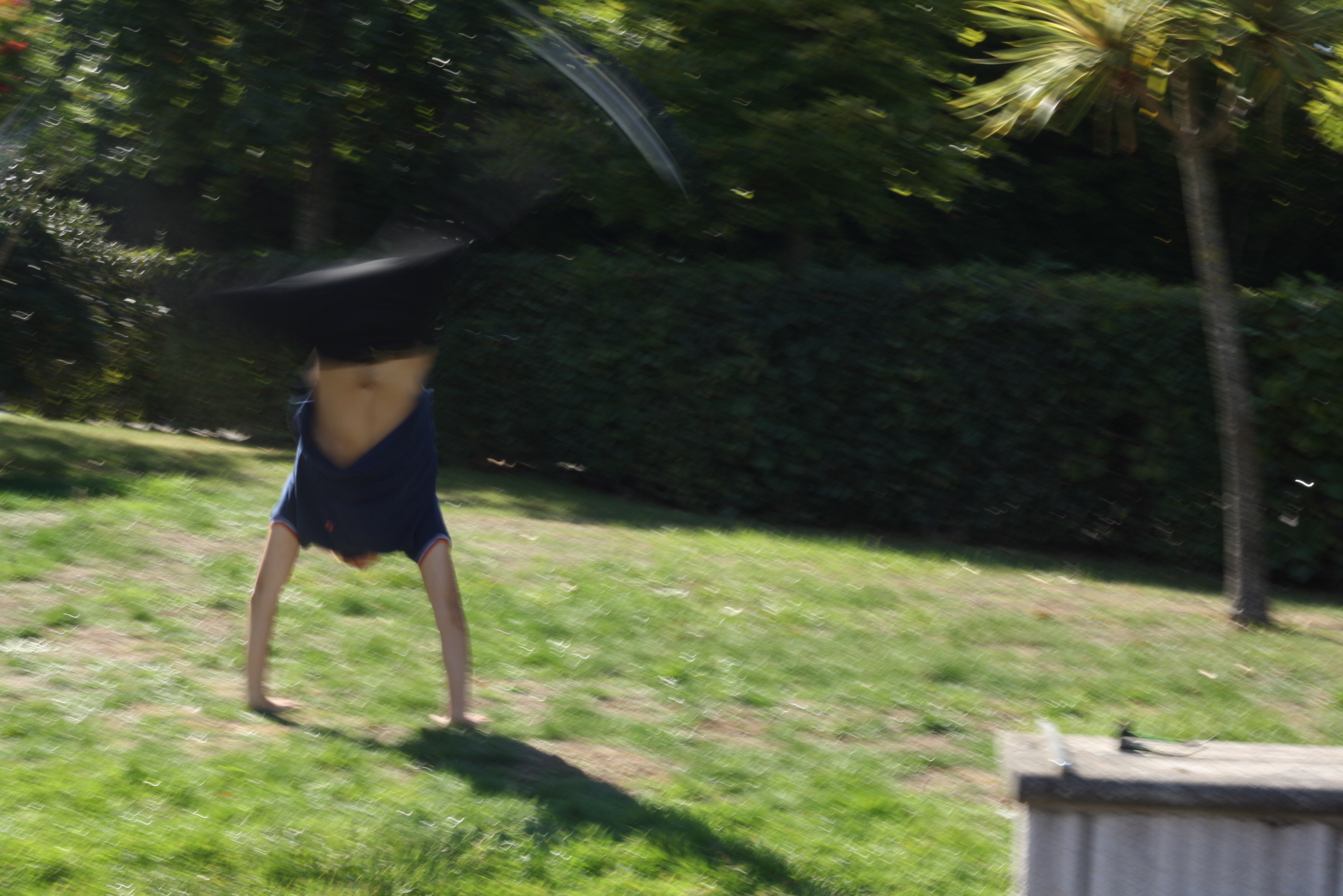
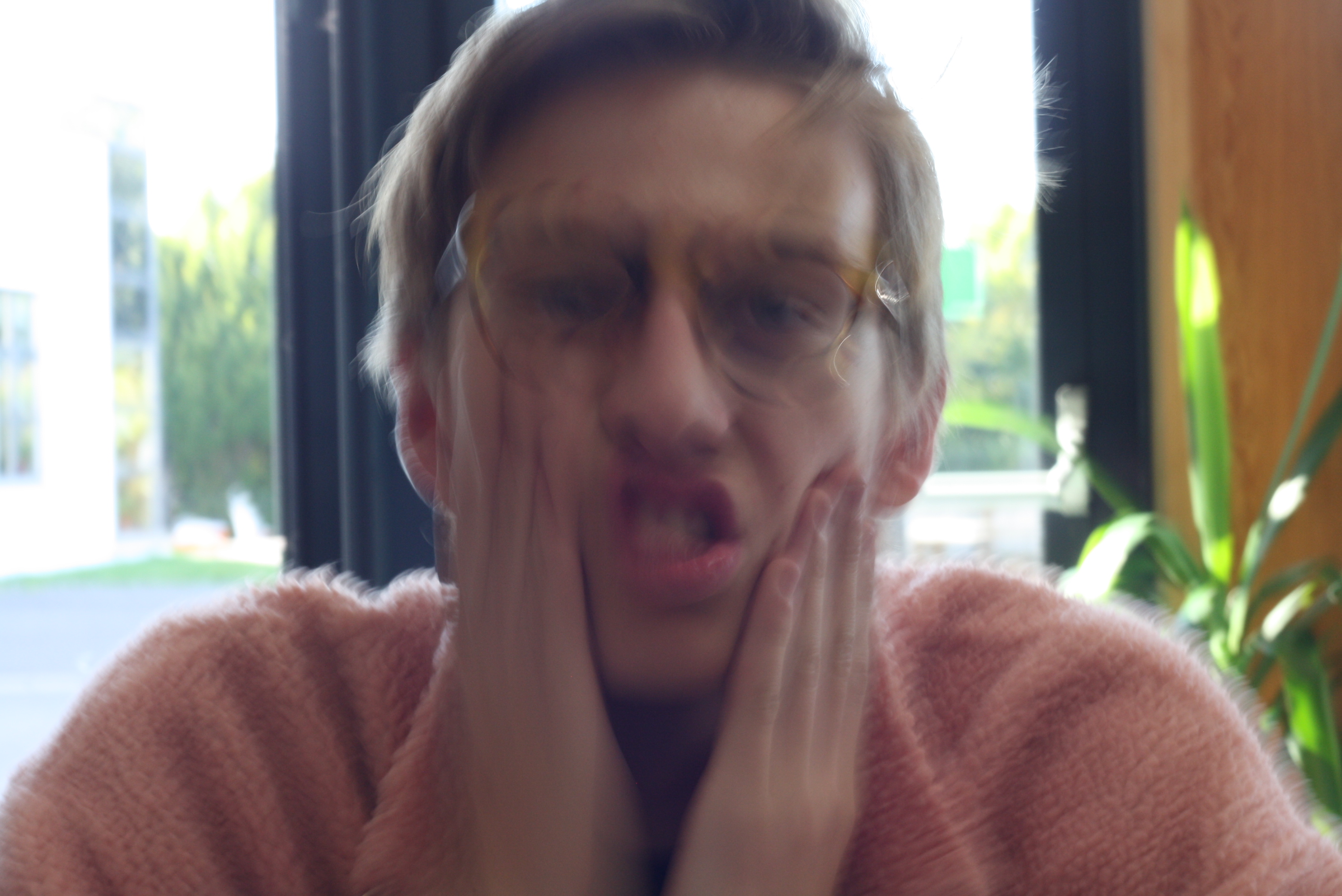
Here are my experimentations. I learnt the slower the shutter speed, the higher the exposure, so I had to do a lot of adjusting to the ISO and apeture. This is my first time experimenting with shutter speed, so therefore my images aren't amazing because I was constantly learning how much I should adjust my ISO and apeture to.
I like the photos of Imani shaking her head because it appears she has multiple faces. To create this image I slowed the shutter speed and because the image was taken inside in a dark area, I adjusted my ISO and apeture a little higher then the photos I took outside where they were very low.  I believe next time that I can adjust the white balance because the images have an orange tone to them. My mistake of taking photos of tom rubbing his faca and moving his glasses is that I didn't focus of the backgrounf. If I made him sit the other side of the table then the background wouldn't be so light and distract the image.

Here are some examples of the images I manipulated:
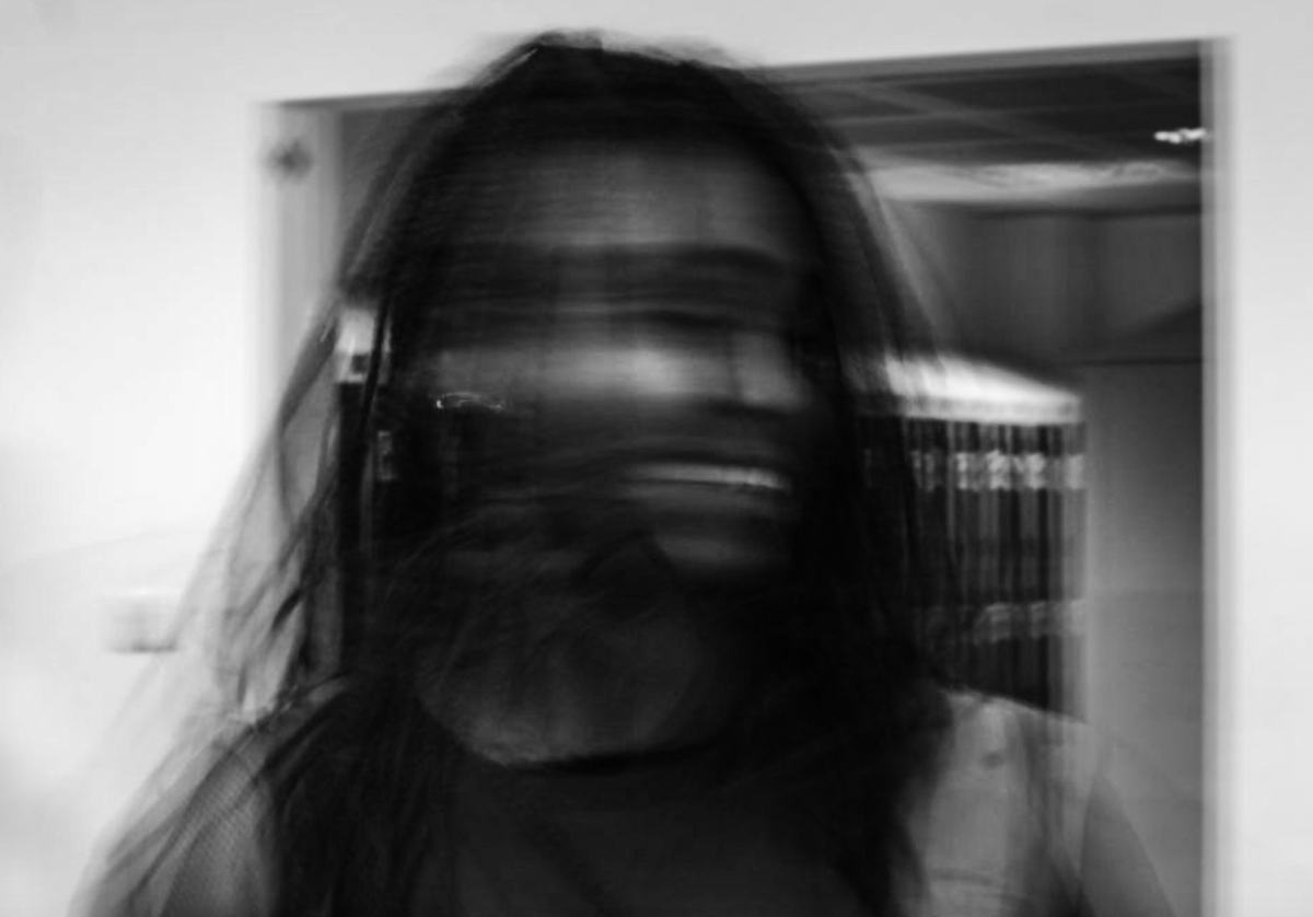
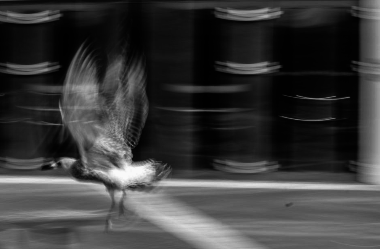
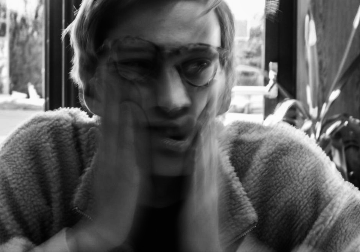
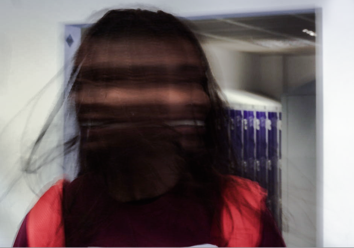
I feel that the images look a lot better in black and white. I used adobe lightroom and applied a black and white preset to my images. I then adjusted the clarity, exposure, contrast, highlights and shadows of the image until I was satisfied with how the image looked. The last image is an experimentation because I wanted to see what the image would look like if the white balance was corrected. I used the white balance correcter tool to balance out the background. I then adjusted the contrast, exposure, highlights, shadows, clarity and saturation of the image until I was happy with the results. Personally I prefer the black and white images because I find that it is easier to focus on what's going on in the images, the colours distort and distract the image too much. However, I am glad that I had adjusted the final image and fixed the white balance issue.
White Balance
White Balance is when you adjust the colours on your camera to help make an image look more natural. You can change the white balance to make the camera take warmer or cooler images. The impact of this is the image looking more like how our eyes perceive colours and light.
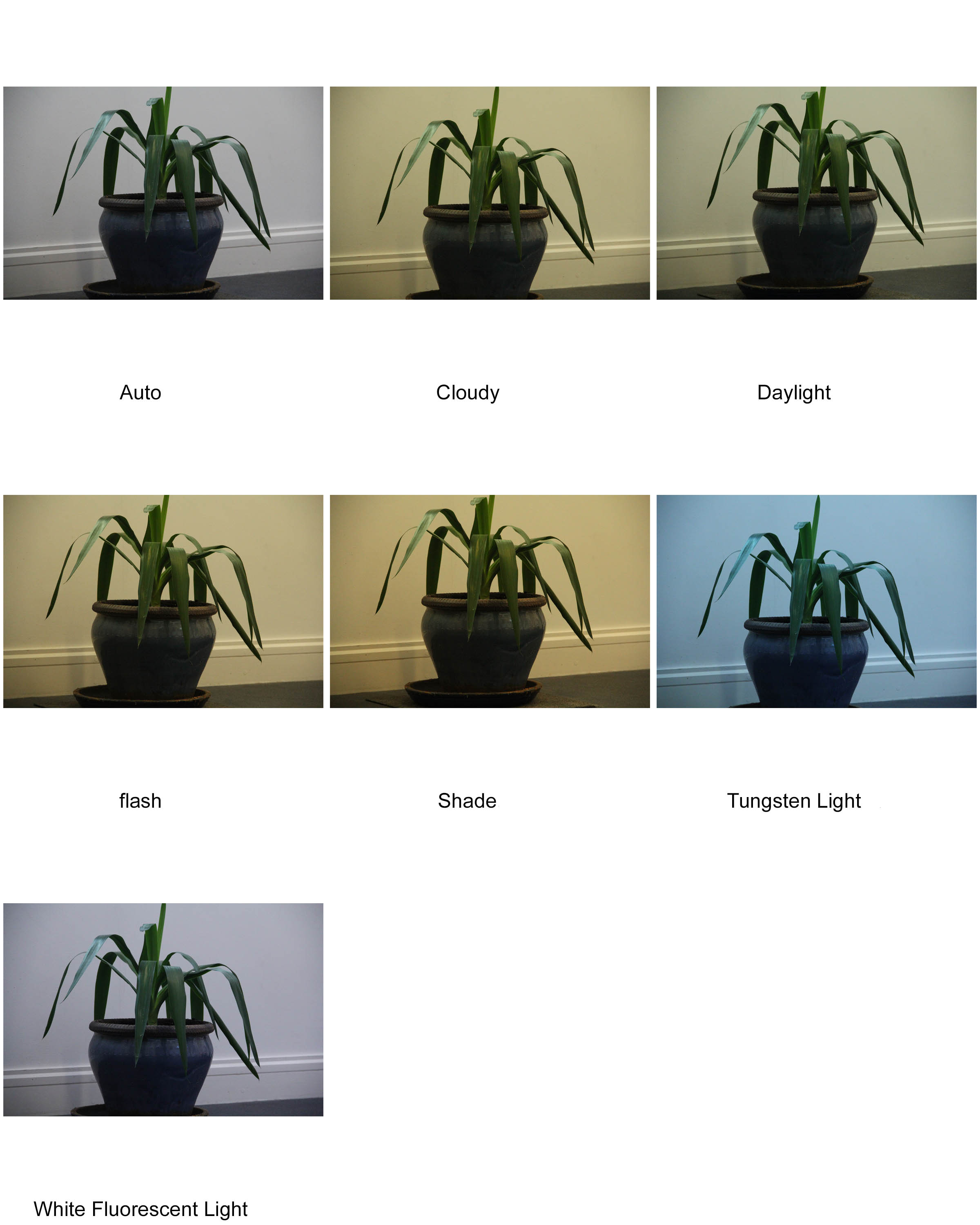
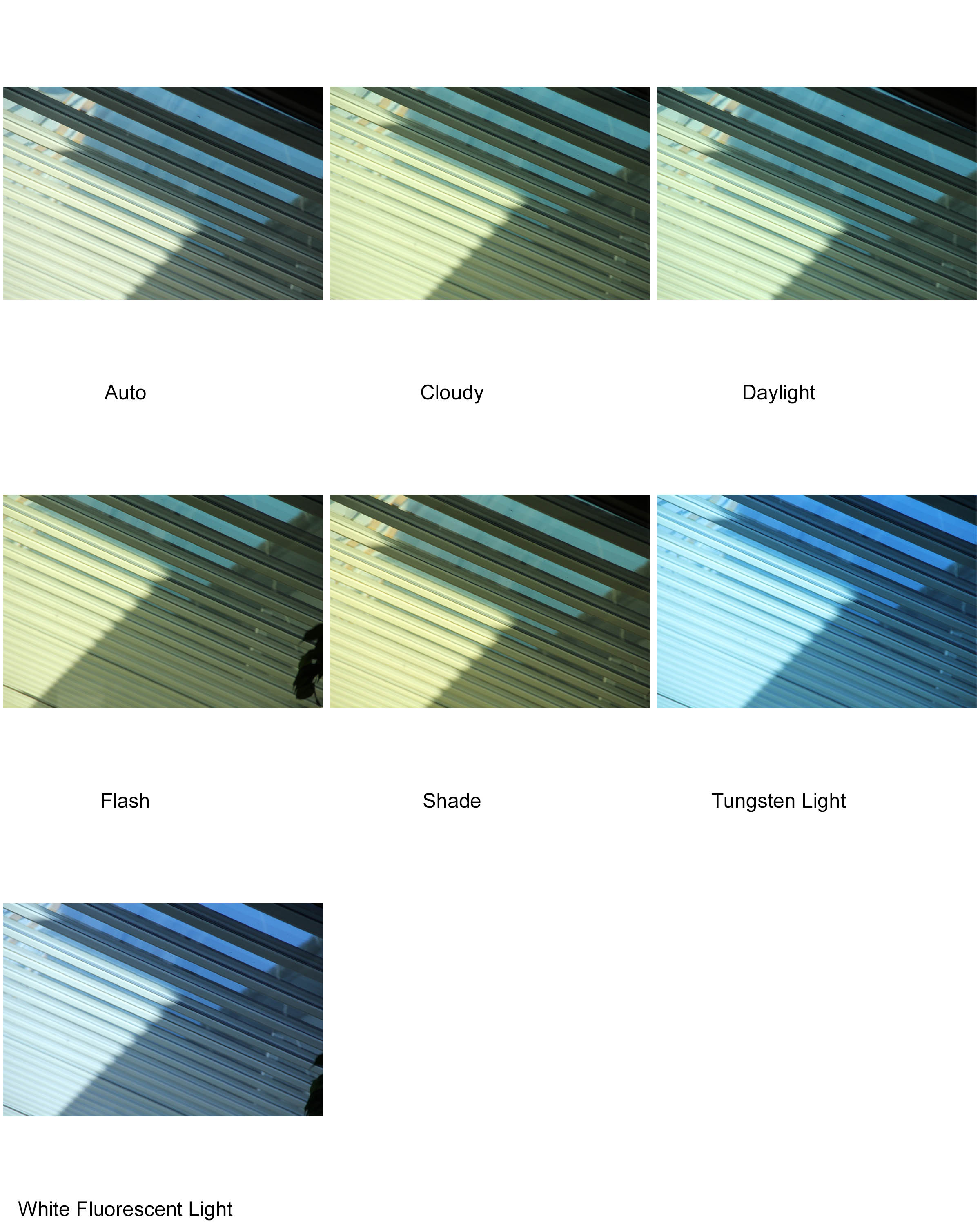
As you can see, first set of images (inside using mostly artificial light) have much more of a distinction between each picture, where as the second set of pictures (using mostly natural light) are much more similar to one another.
Conceal / Reveal
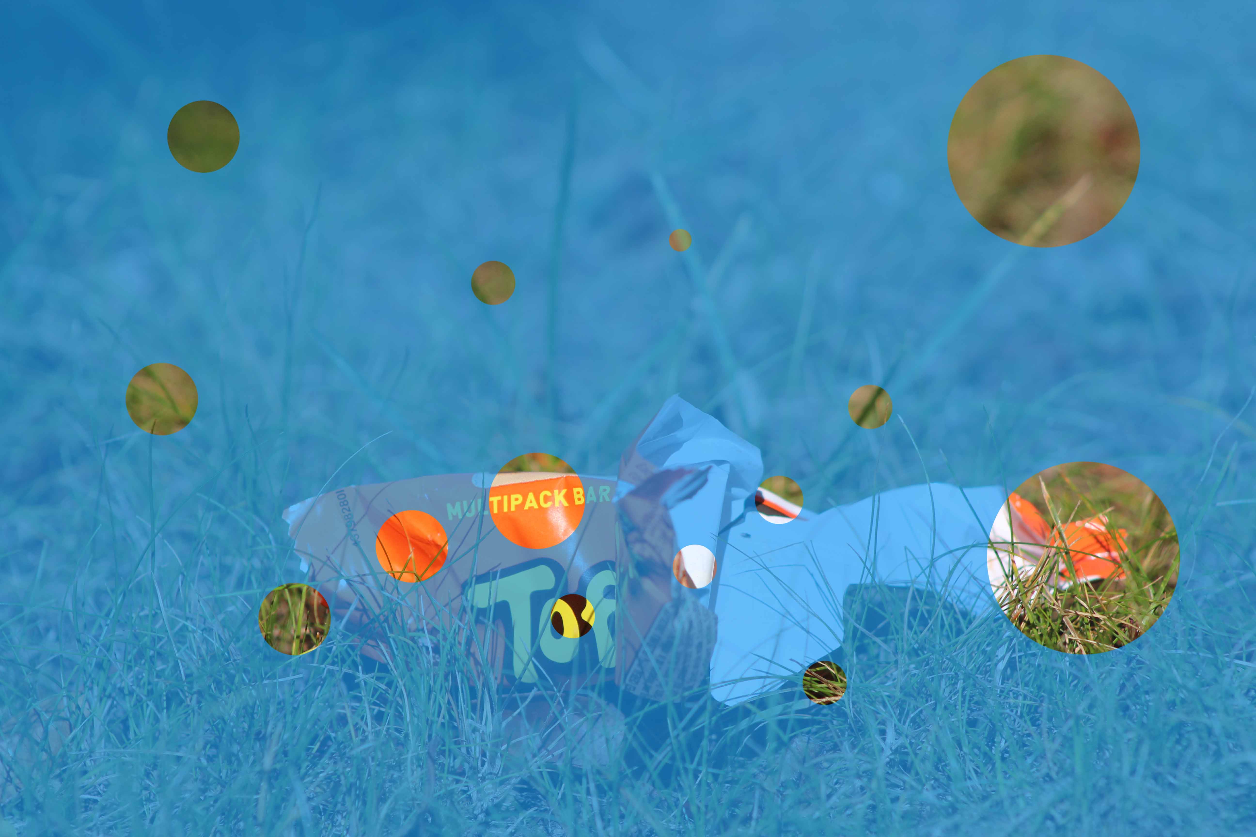
In this blog post I’m going to be showing the use of the solid colour effect to help do Conceal and Reveal on Photoshop.
First we need to choose a photo. I’ll use this one as an example.
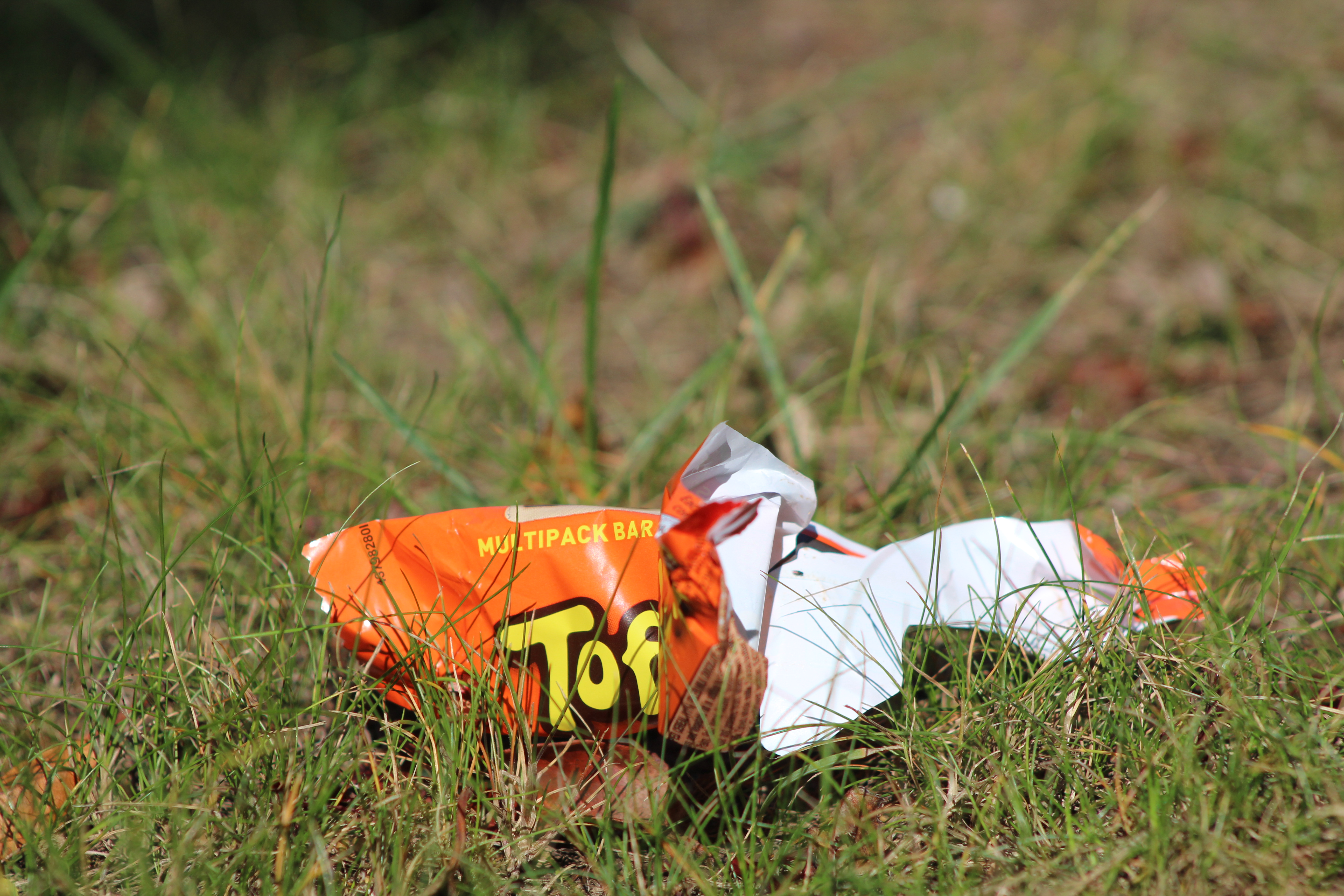
First on Photoshop we need to duplicate the layer.
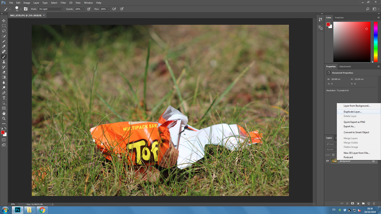
After doing that we need to change the new duplicated layer to a solid colour. Lets use blue.
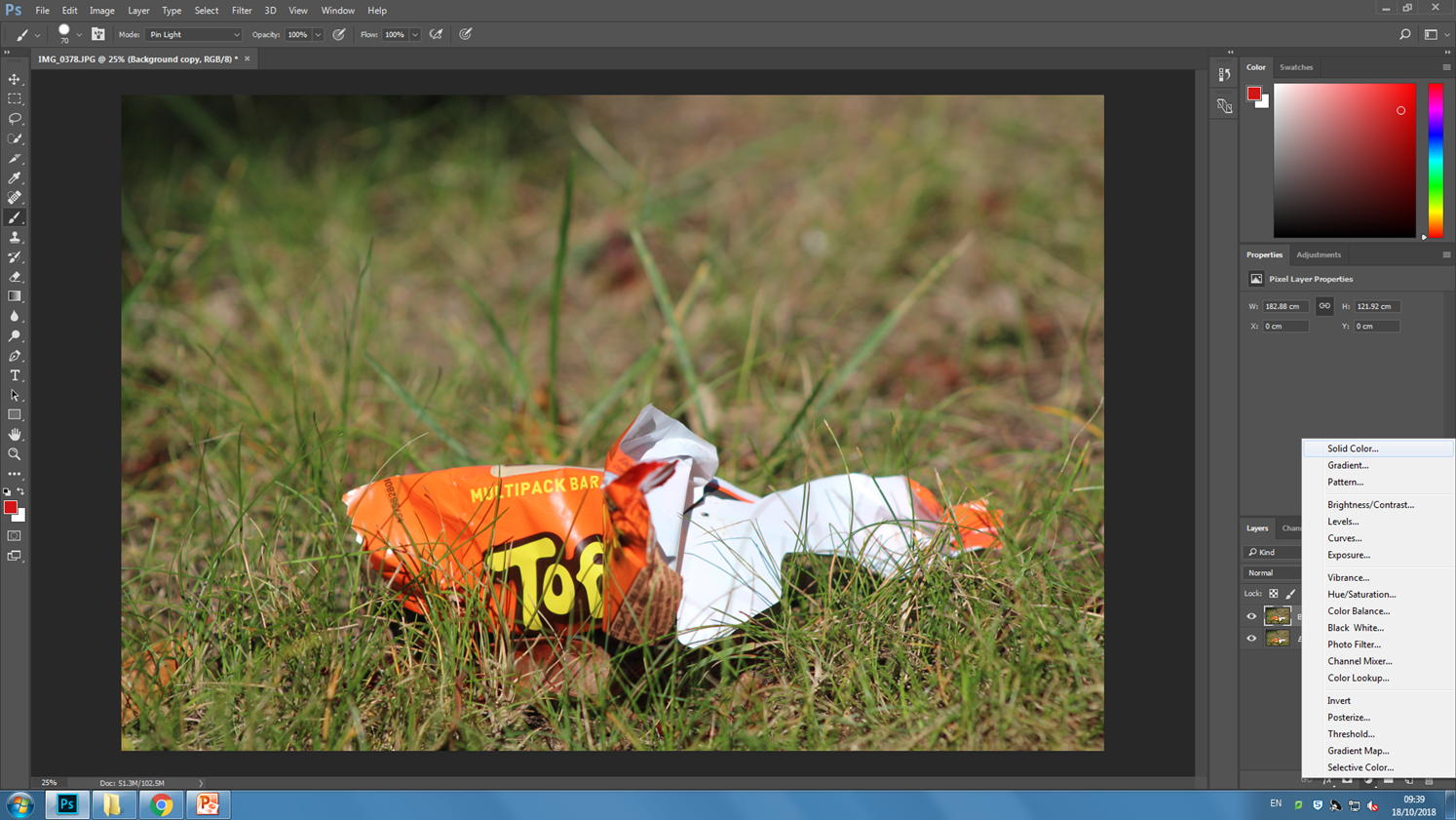
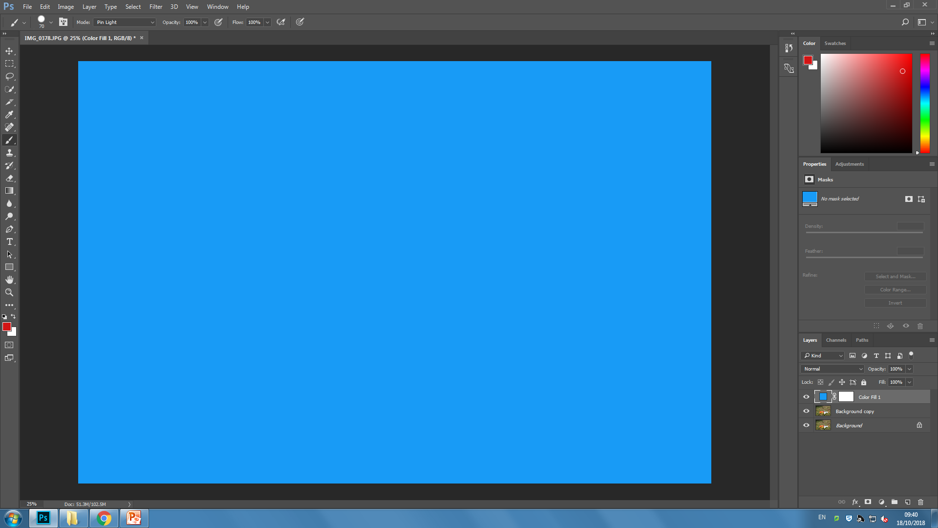
Then using the paintbrush tool and the circle shape, In random places start to remove the top layer. If you want, lower the opacity so that you can see the photo below. Remember to have the colour of the paintbrush on BLACK!!

After you’re done, remember to flatten the image and Save it.
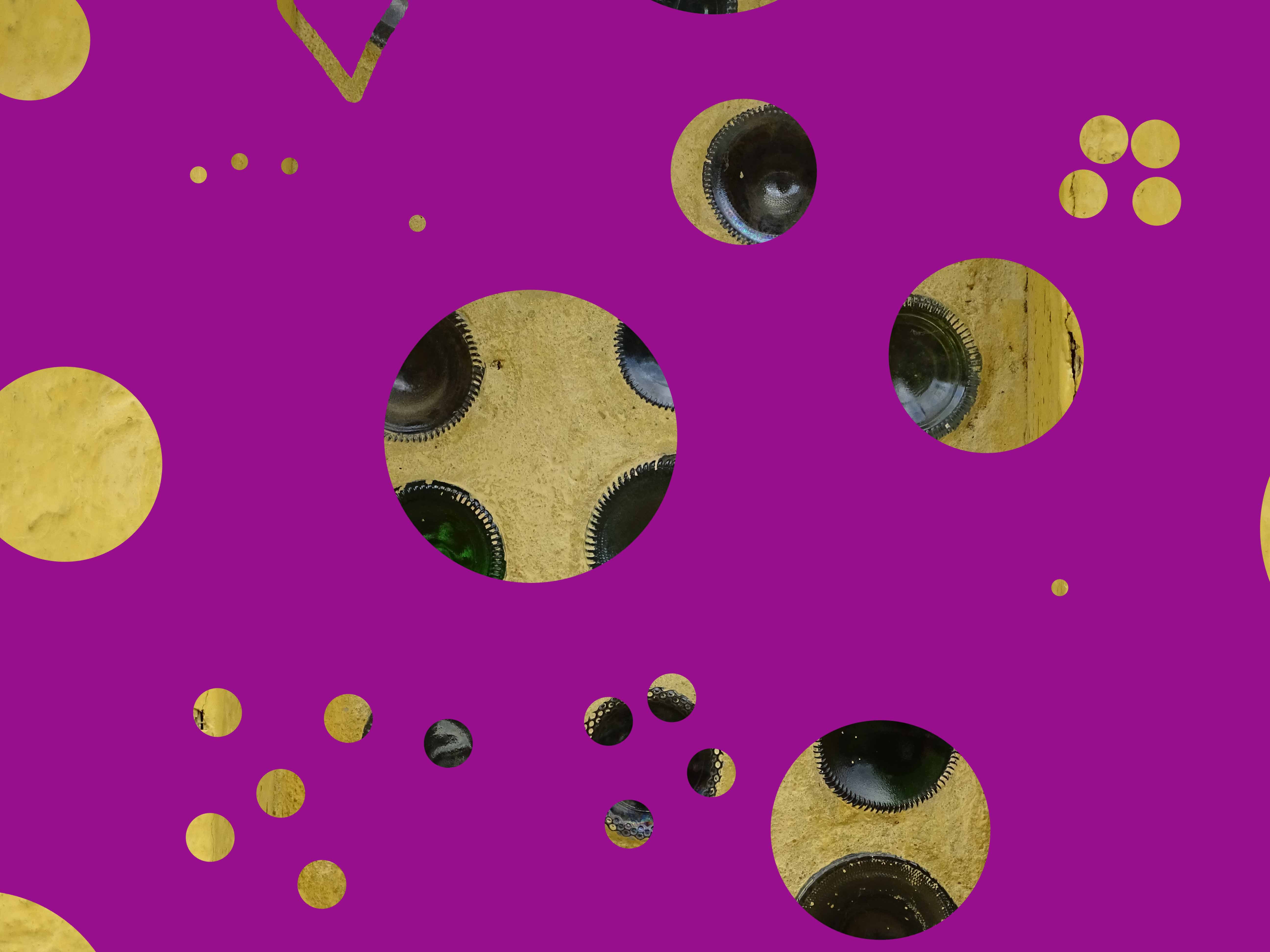
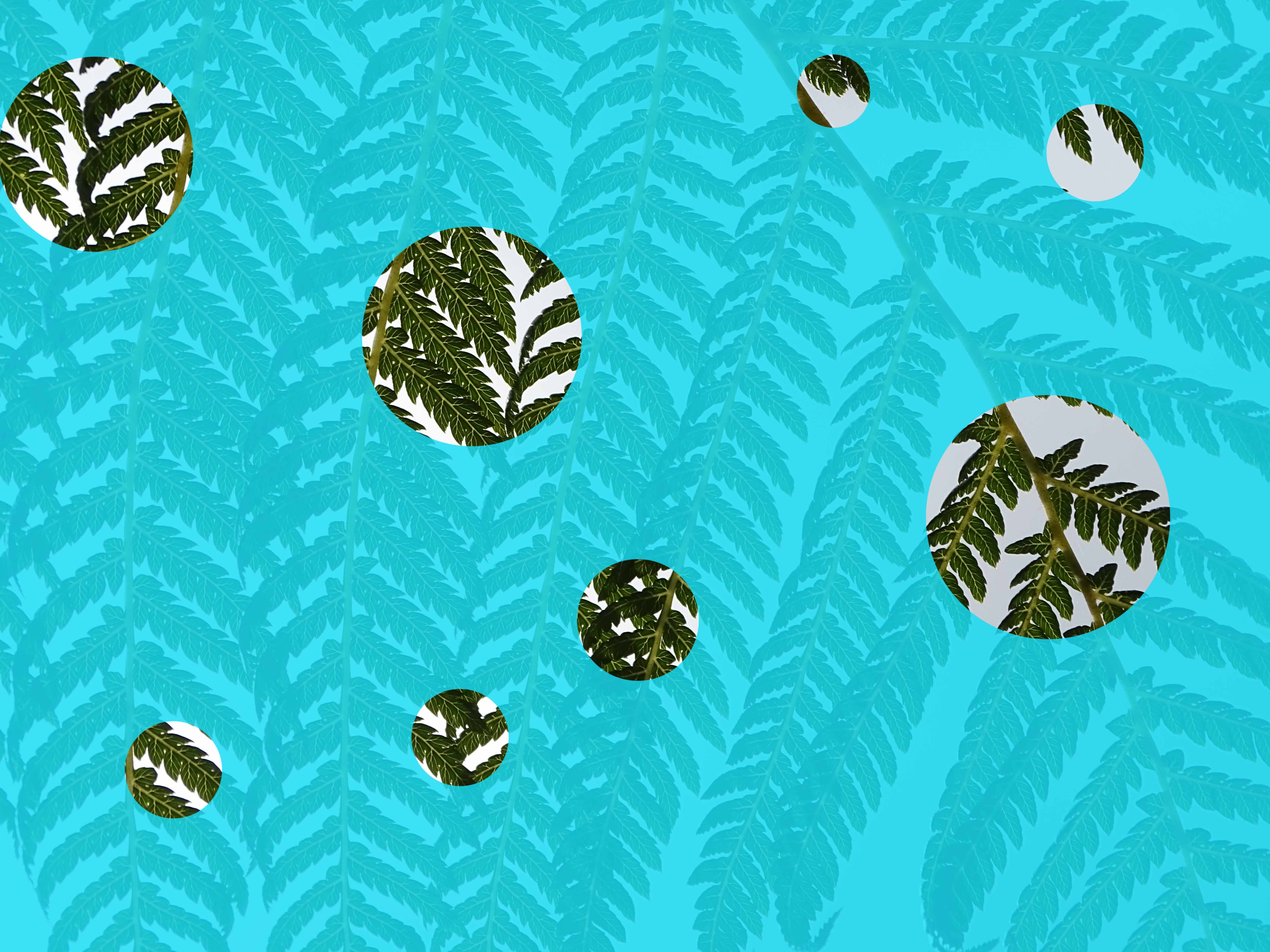
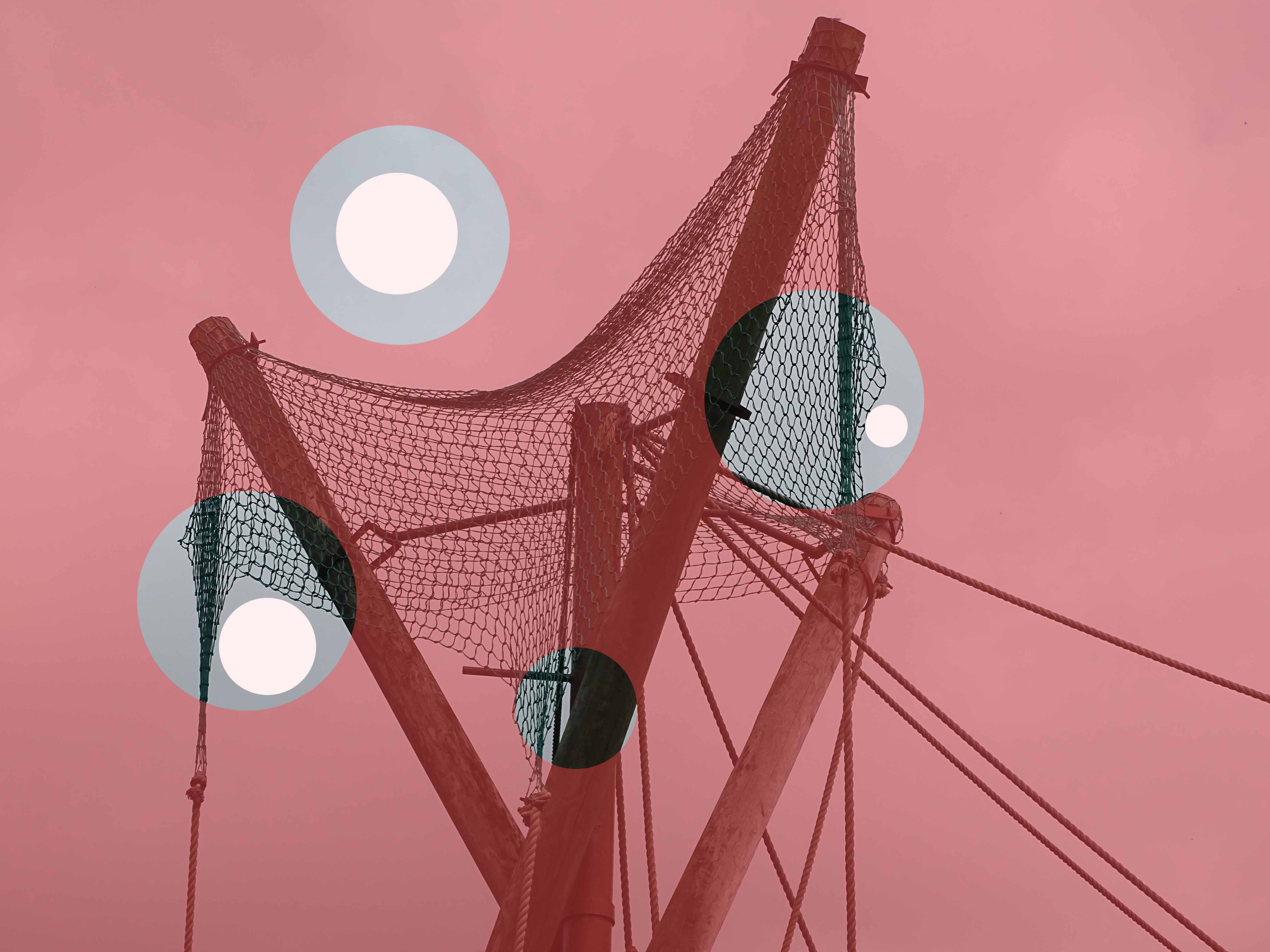
These next few are ones which I have already completed previously.
KELD HELMER PETERSEN
Keld Helmer Petersen was a Danish photographer who gained widespread recognition for his color abstract work in the 1940s and 1950s. He was the pioneer of Danish modernist photography and published his first book 122 color photographs in 1948. He Established a himself as a photographer of architecture and design and while also being known for his color images, he later transitioned into more abstract photography, taking influences from German and American photography as well as international abstract art.
Keld Helmer Petersen’s Abstract photography:
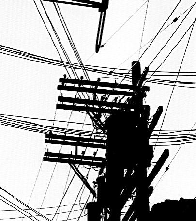
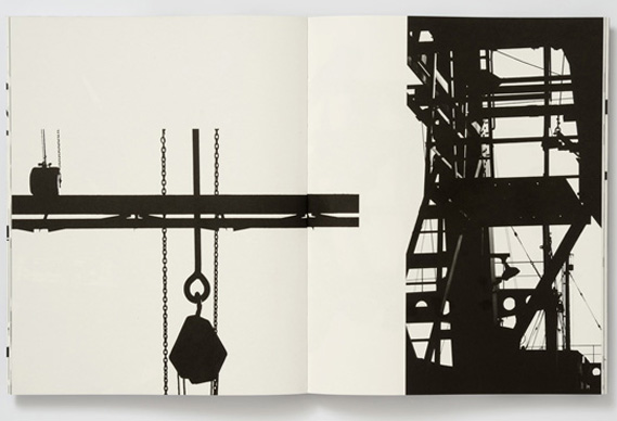
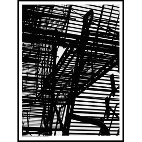
I wanted to recreate Petersen’s work involving cranes and scaffolding using the threshold tool on Photoshop with my most recent photo-shoot. I wanted to emulate the same sense of atmosphere created by Petersen’s photographs. many of the images that I have Chosen had Petersen’s Photos in mind while editing.
My Final Images:
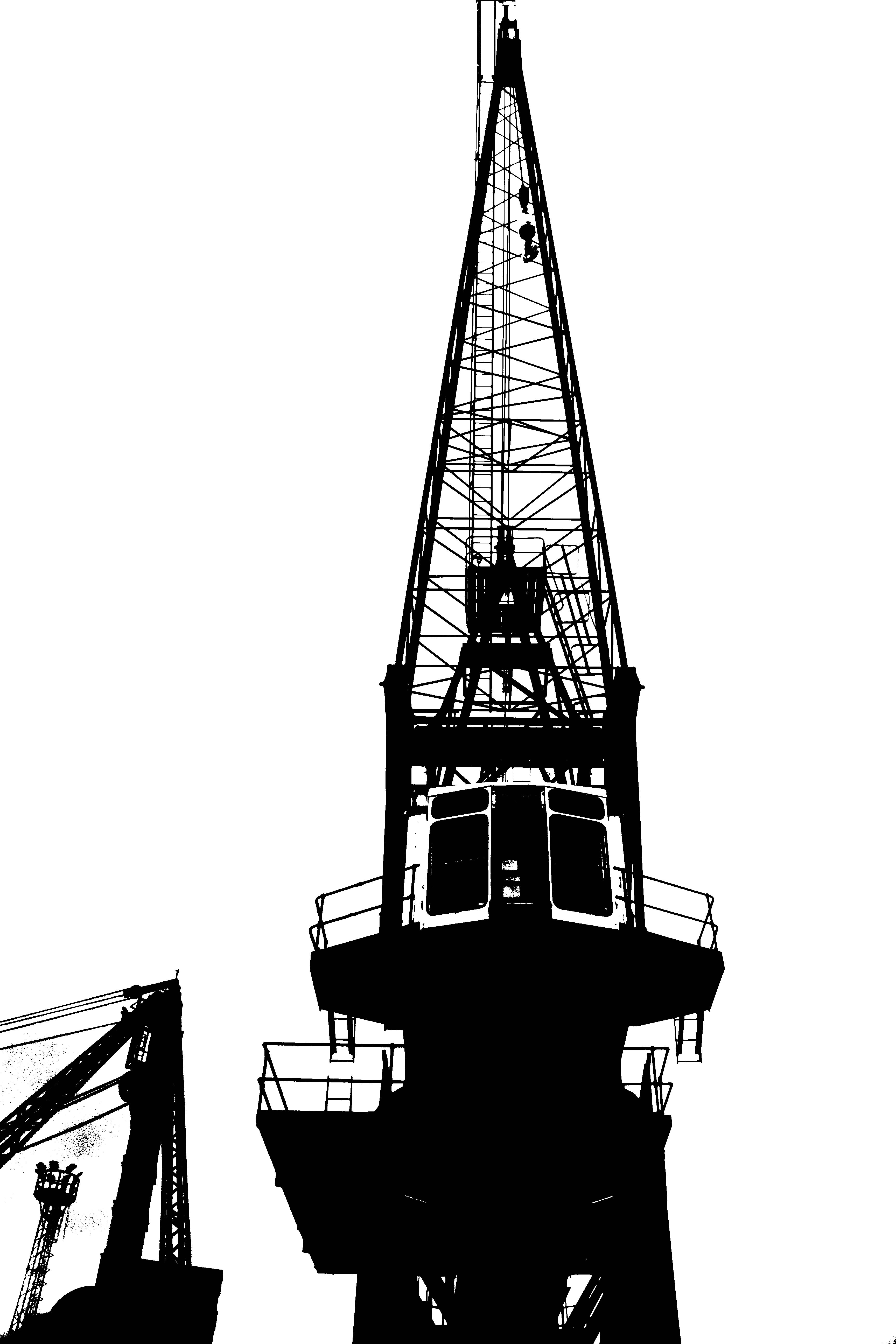
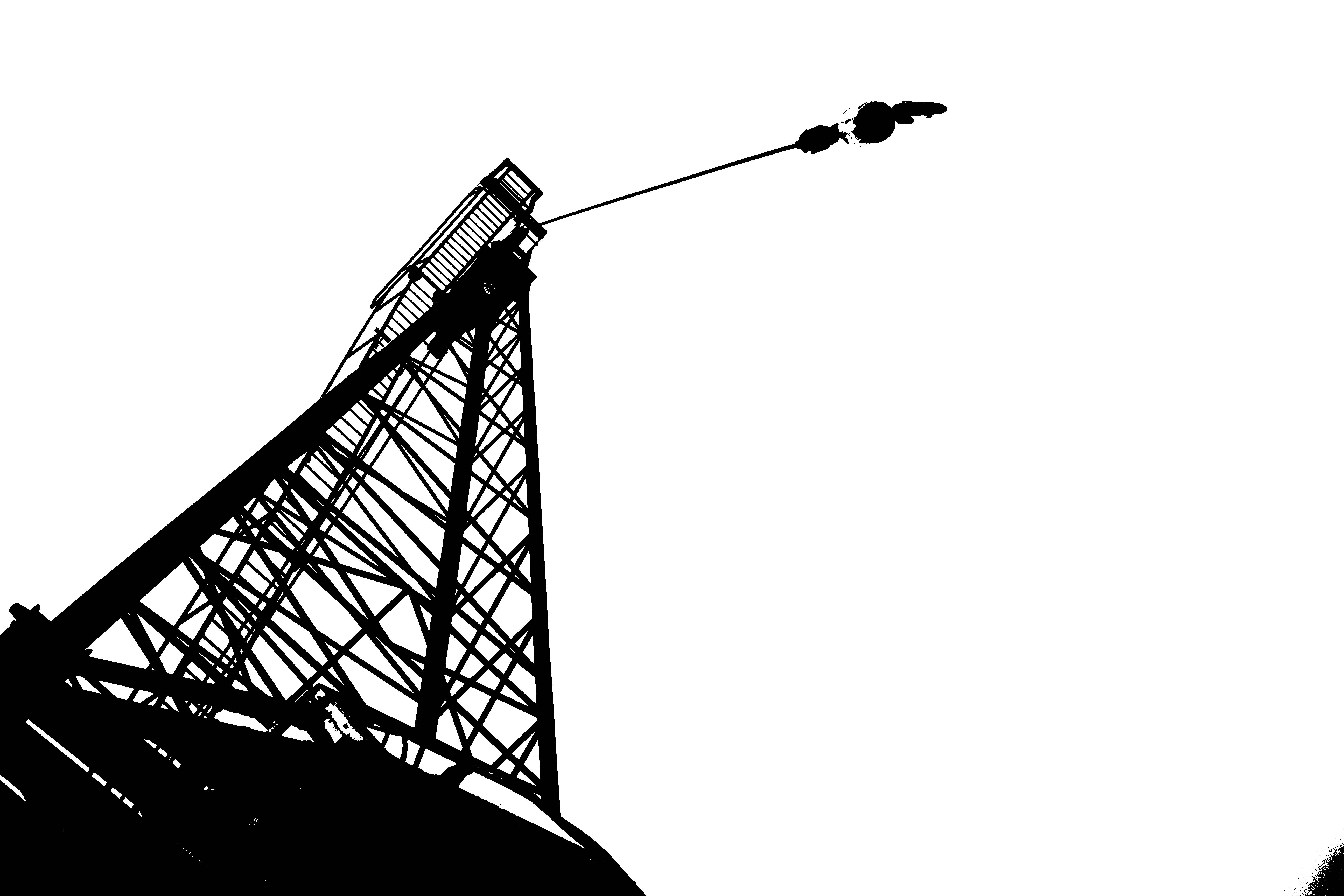
I wanted these Images to replicate that of Petersen’s Black Noise photograph and evoke the same feelings that his work does. I wanted to create the a similar image, while also using my own style combined with that of Petersen’s. This image, while it mainly takes inspiration from Black Noise, it also takes inspiration from many other pieces of his work.
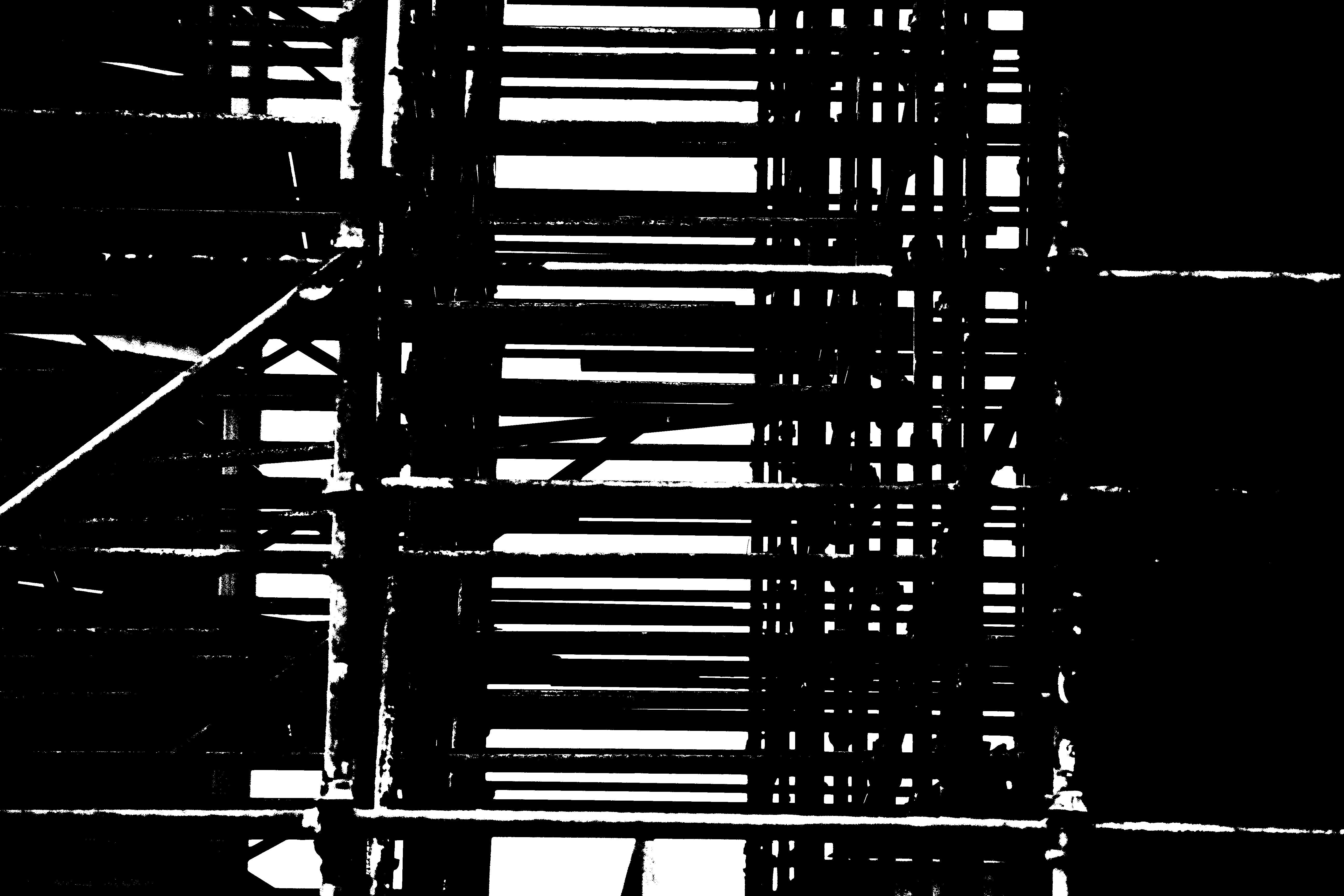
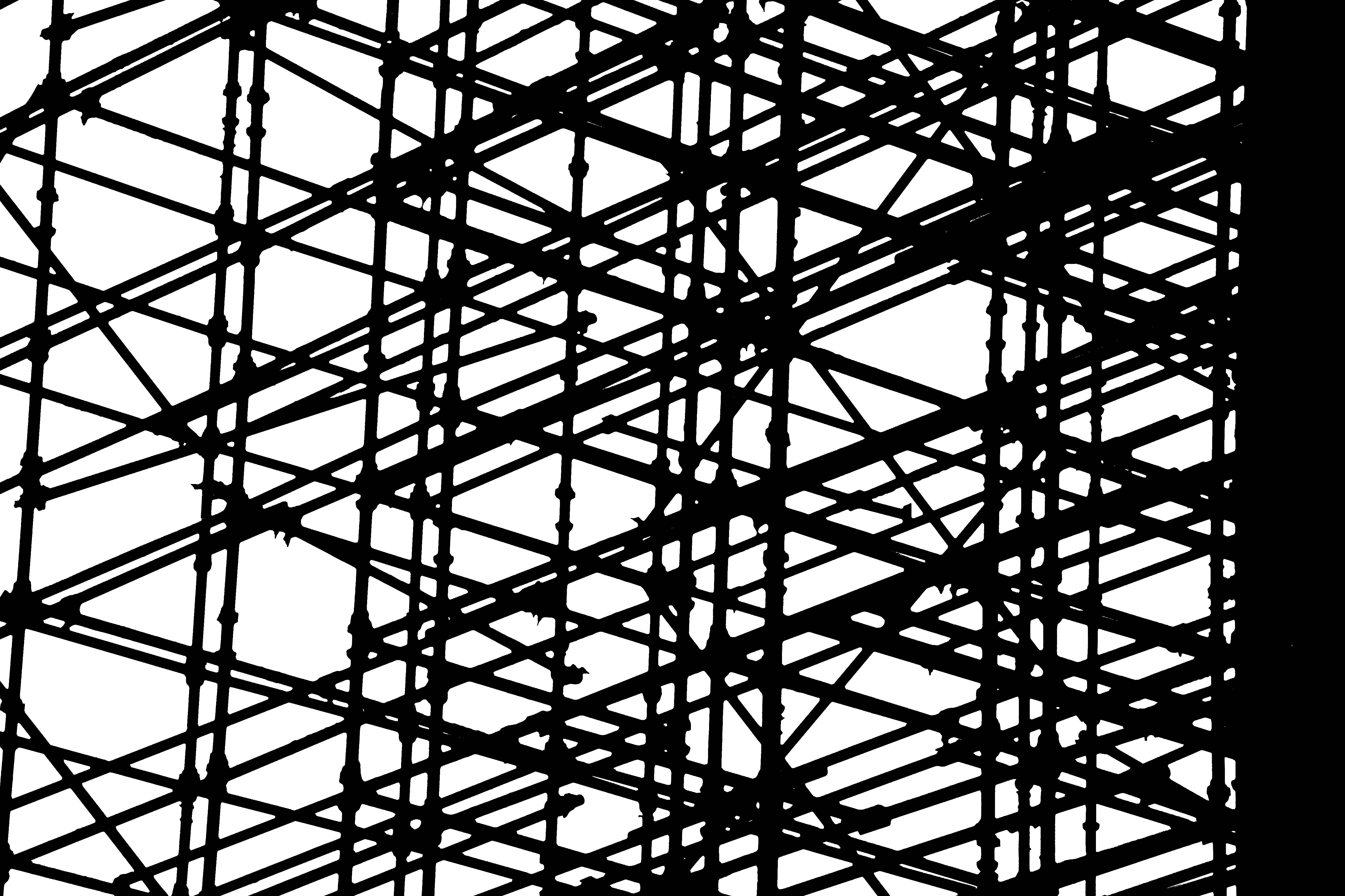
I decided that the Harbor was not the only place to get pictures of industrial buildings and materials. These photographs were taken in town on a building site that was under construction. I wanted to create a high contrast, B&W picture using the threshold tool, and decided that scaffolding with the backdrop of a white sky would work to my advantage.

