Barth is a contemporary Photographer who was born in Germany and lives and works in Los Angeles. She focuses a lot on the nature of vision. She enjoys exploring the way humans see things, compared to the way a camera sees things. A lot of her work is purposely captured out of focus, and some of her work also creates a bokeh effect. This is when light appears in images in a type of spot formation, as it is not sharp and in focus. This means that most of her work is abstract.
Barth Mood Board




Analysing Barth’s images

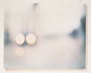
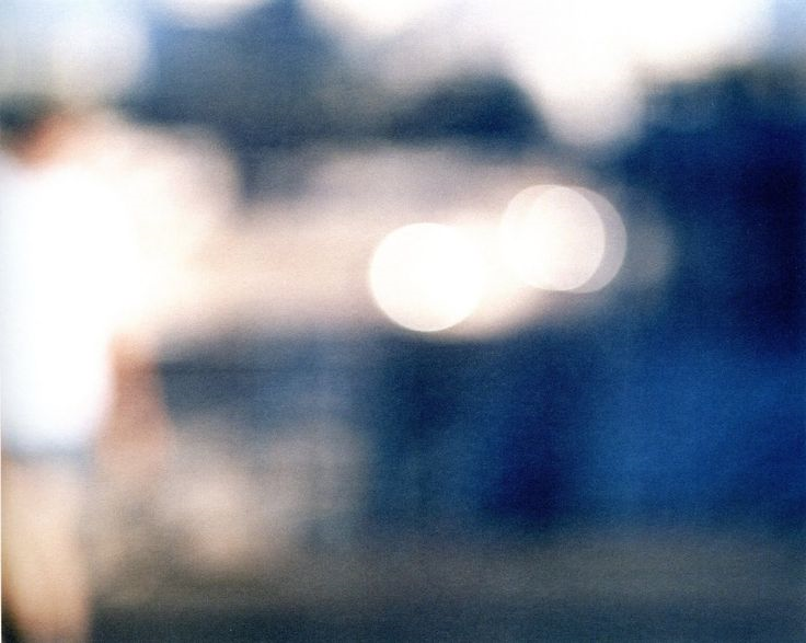
This image uses a variety of successful technical elements. For example, her image looks to be taken outside in natural daylight. This image is also very bright and almost unnaturally white. This could be due to many elements. For example, she could have used a high ISO making the camera allow more light into the image. She could have also used a slower shutter speed which would make the image look overexposed. Lastly, she could have also used a White Balance setting that made her image have a lighter tint.
The visual elements are also very interesting. Although the image is highly unfocused and not sharp its clear that the scenery the photographer was standing in front was very aesthetically pleasing. I like how this image has captured a bokeh effect, as it helps add a more interesting visual point to this image. I like the composition of the image because there are many successful elements to it. It is interesting how you can vaguely make out some distant buildings in the background, a long road with symmetric tyre tracks through the snow in the ground, and also some snowflakes falling in front of the lens.

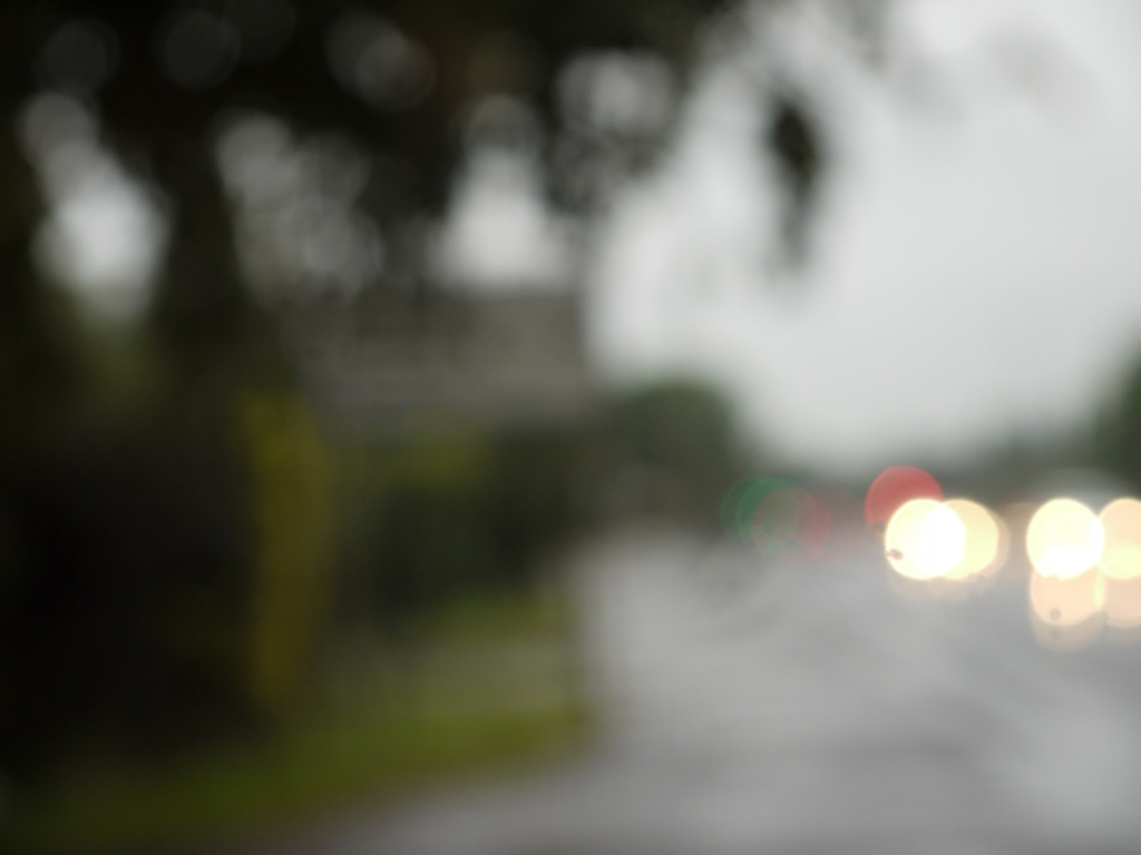
Firstly, there are many technical elements that make this image a success. The lighting in the image is interesting, it seems to be taken in daylight outside. This image is also very blurred, and not sharp or in focus. The ISO of this image seems to be quite high as the image is very bright, as due to the high ISO the lens is allowing a lot of light into it. As the image is very white it is possible that the photographer used a type of White Balance setting like daylight, for example.
The visual elements are also helpful when making this image successful. The color of this image is attractive to the eye because it is very white and plain, and the tonal contrast in this image is also very high due to the present black and white tones. I really like the layout of this image as the trees fill the entire frame in the background, and I like how the photographer has captured this image with random people in the frame.
There also may be an underlying concept in this image. The photographer has chosen to capture street photography in this unclear manor. She may be trying to voice her opinion on everyday life. Because she chose to capture the photo unclearly, she may be trying to portray life as being unclear.
Mood Board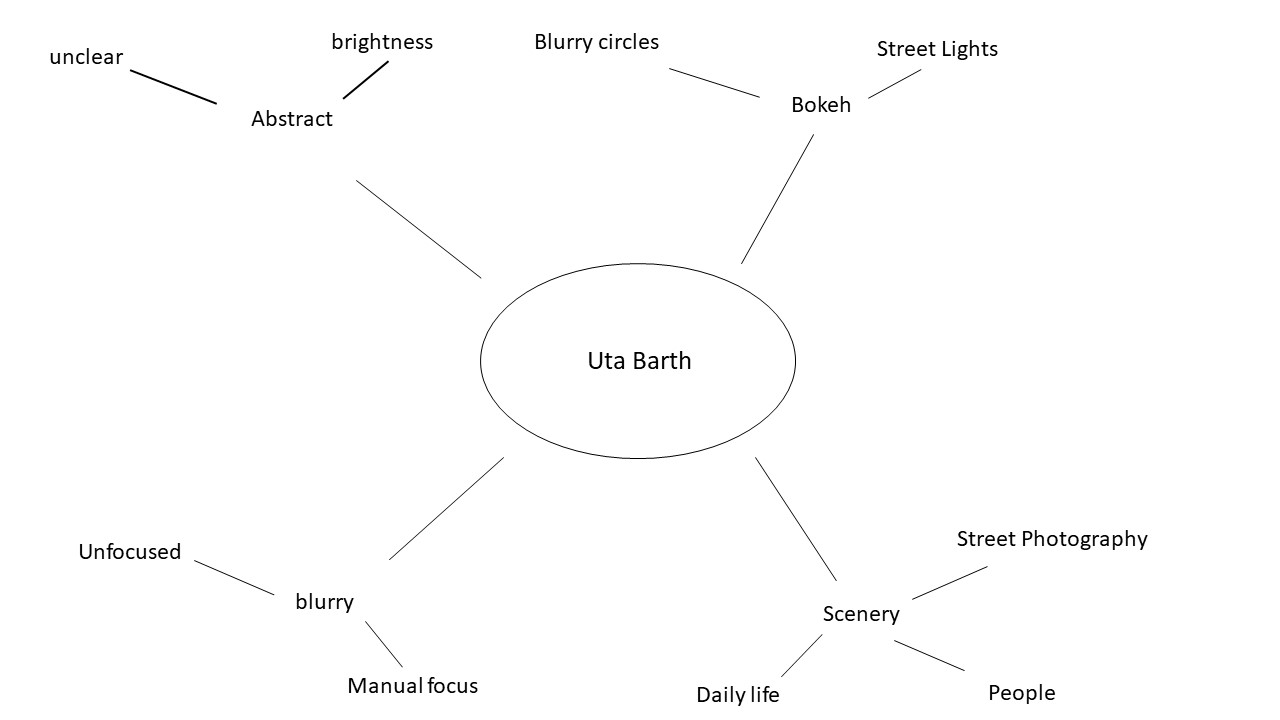 My response to her work
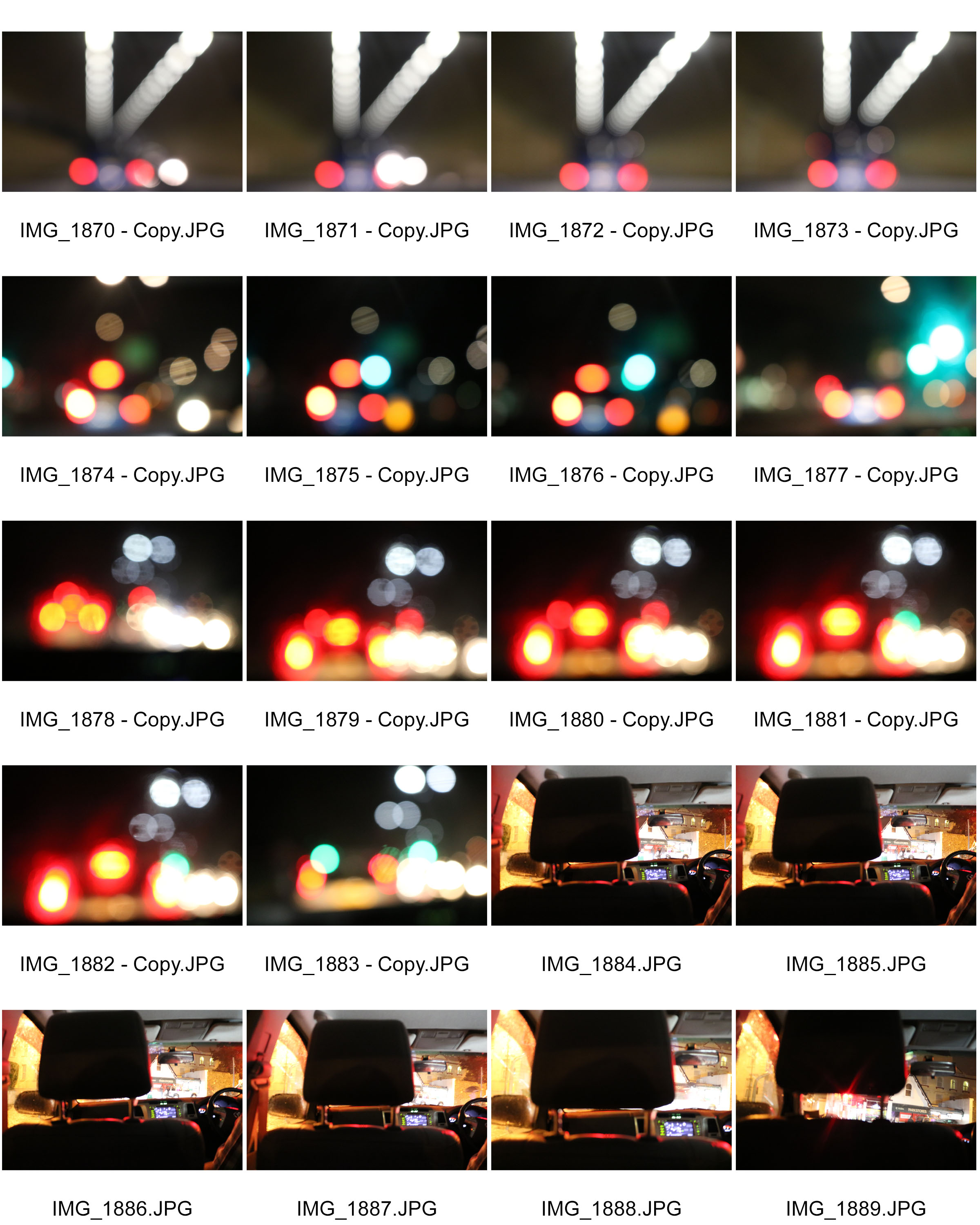
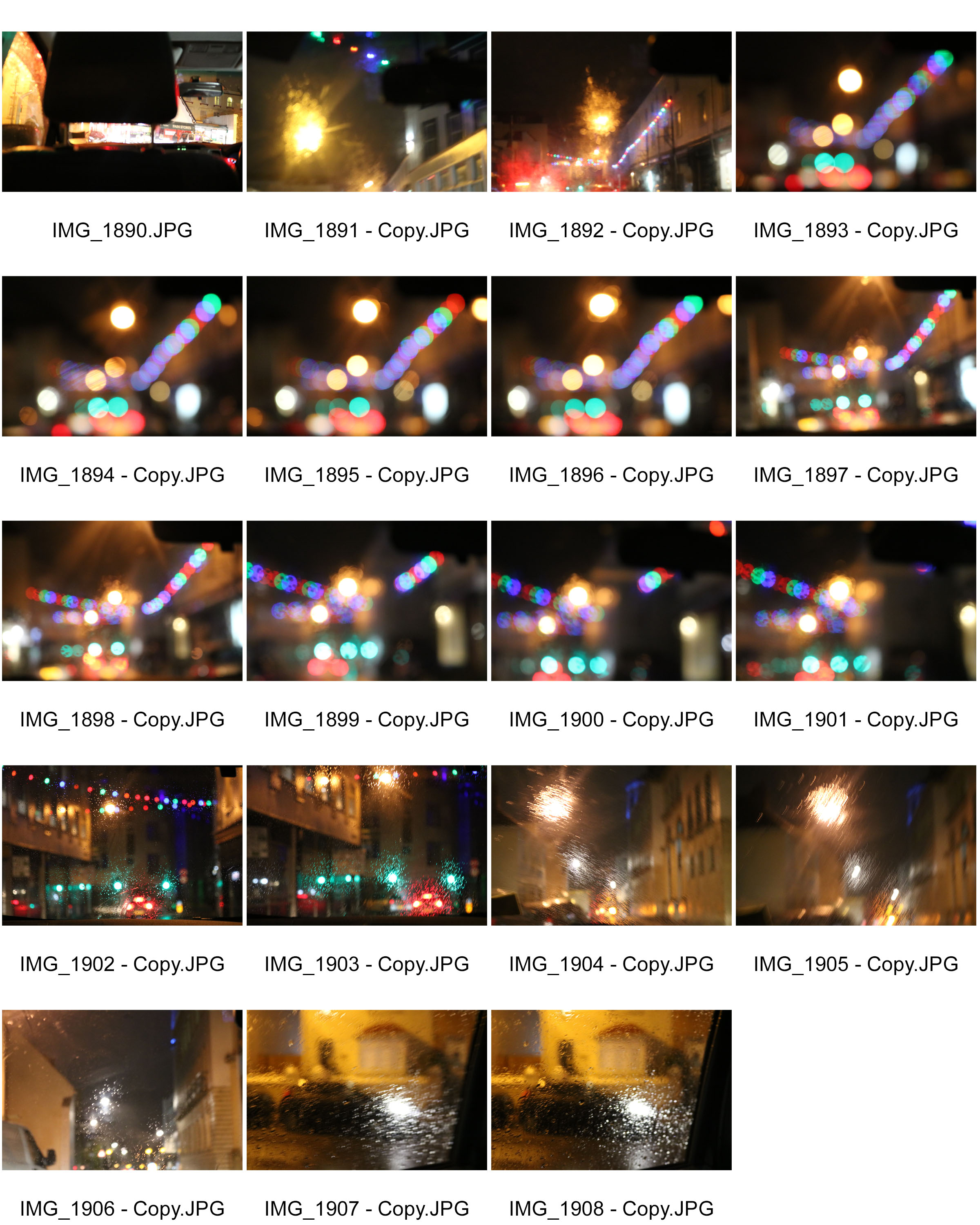
2nd photo shoot
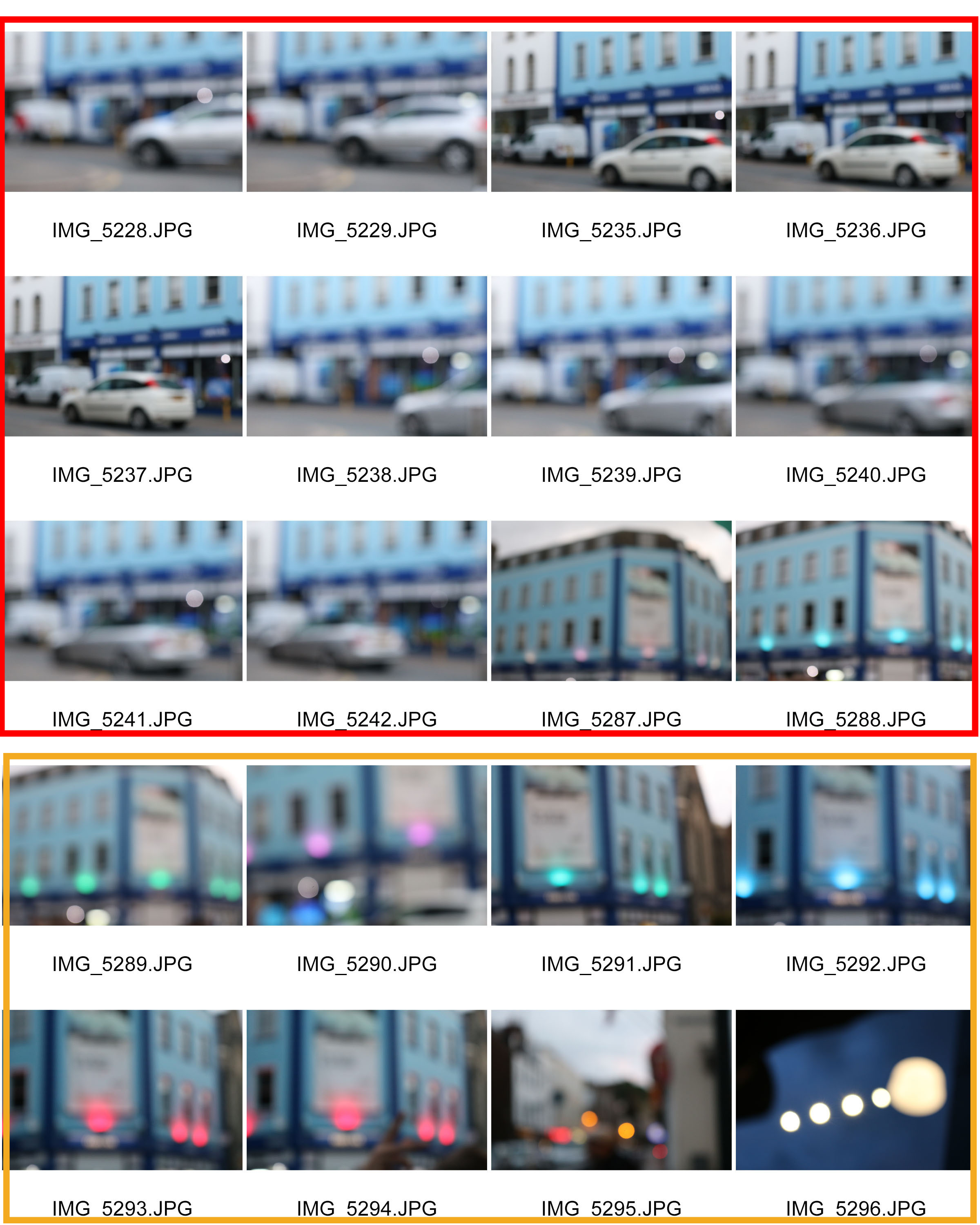
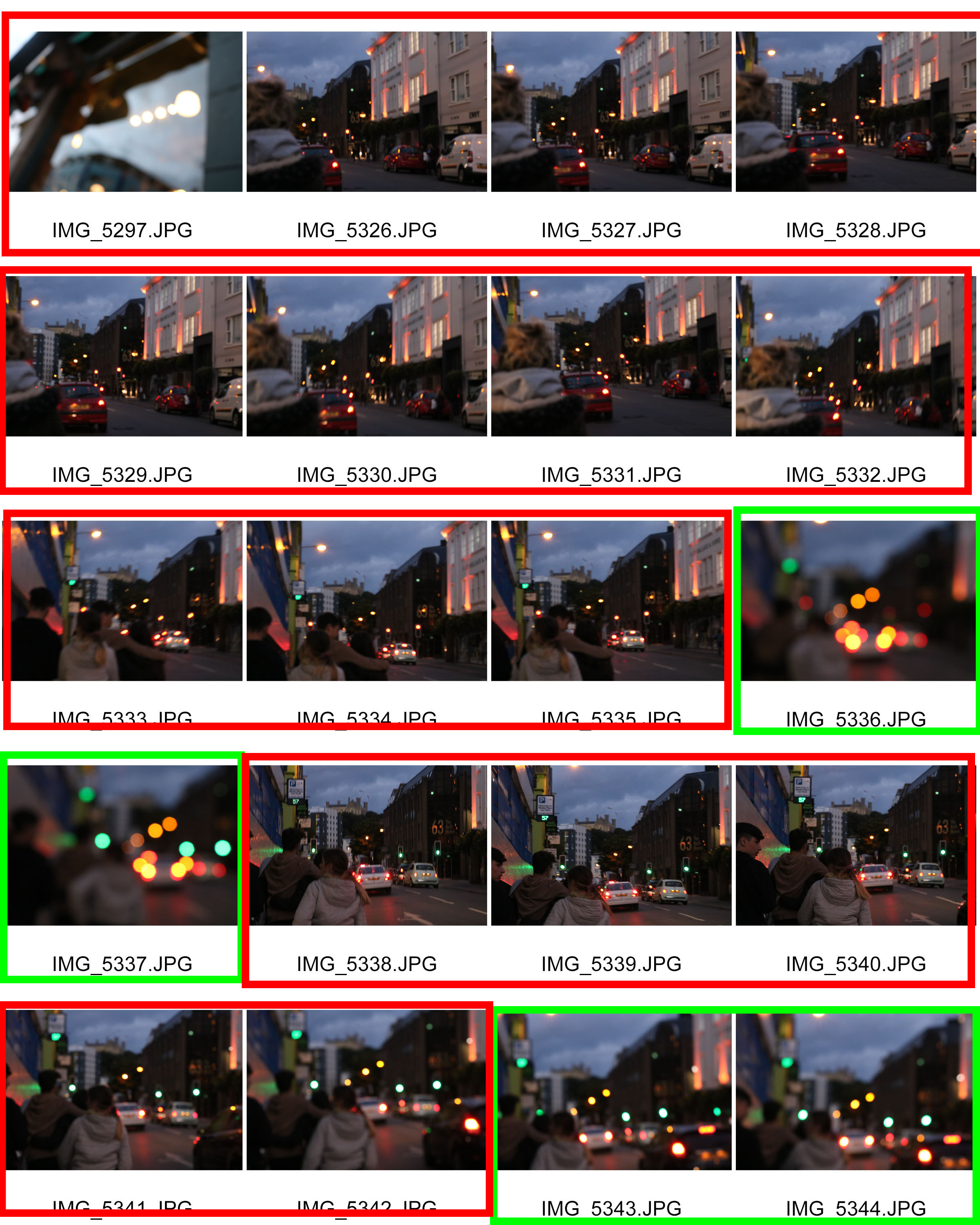
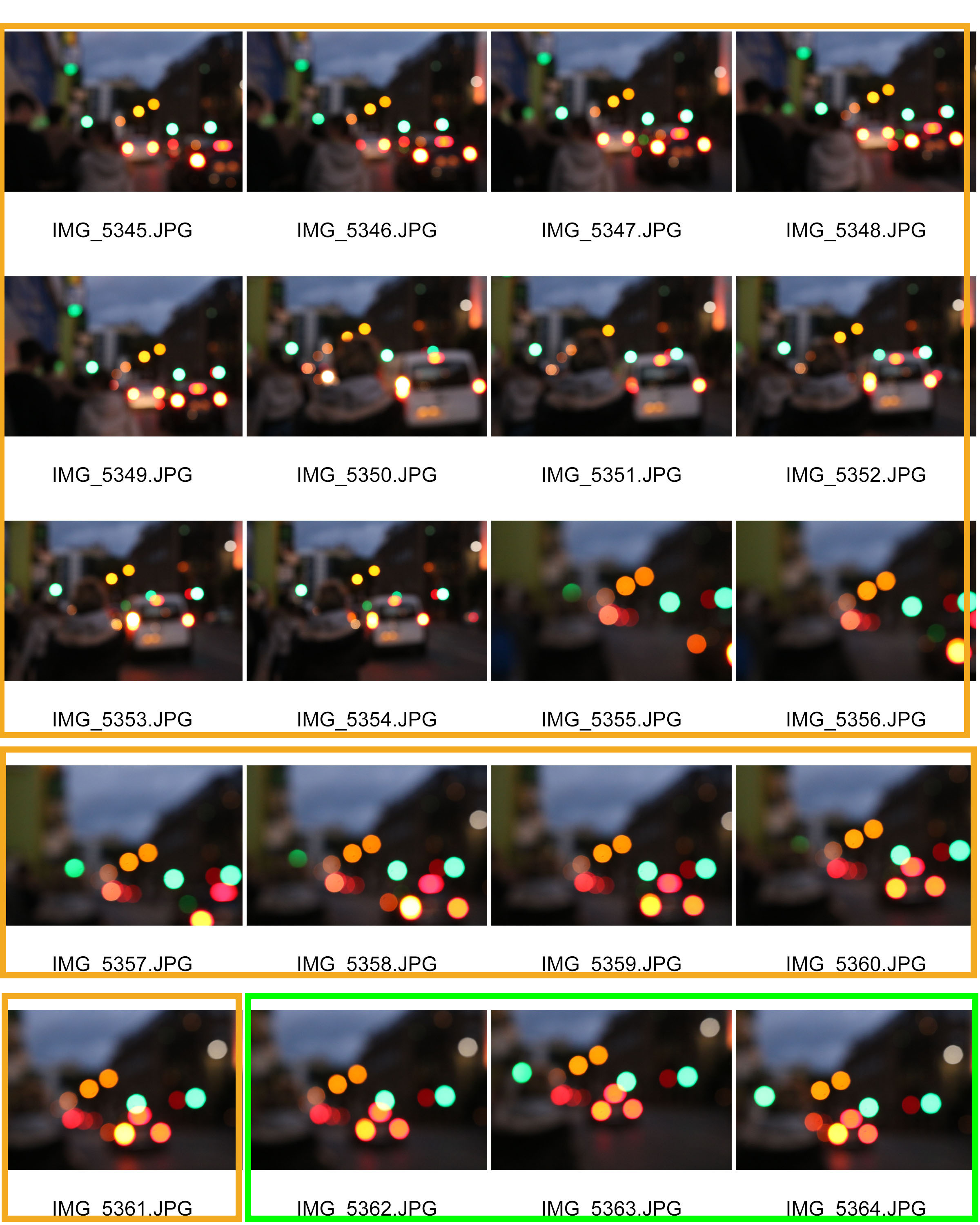
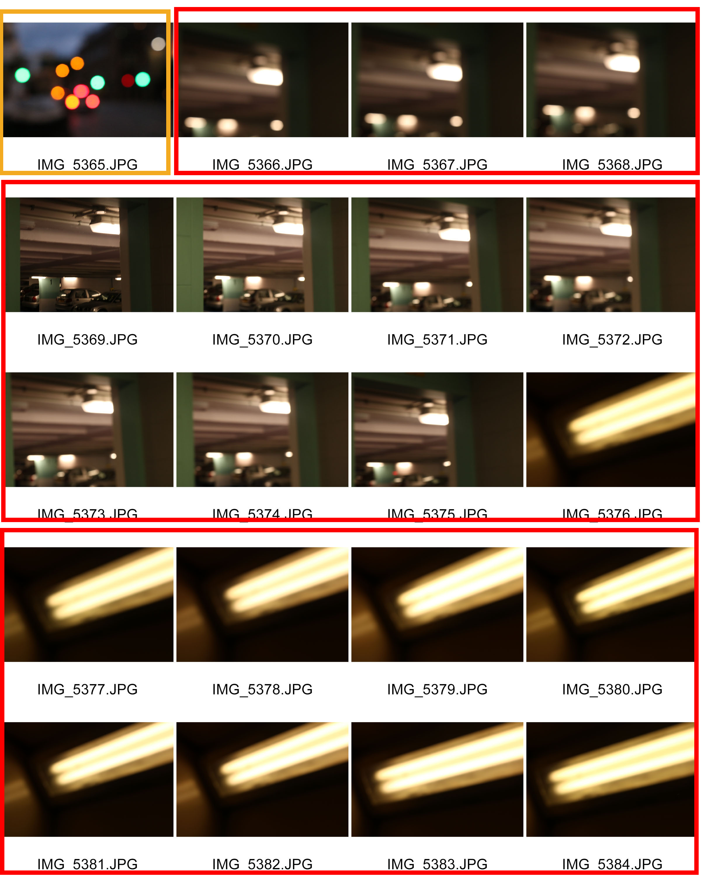
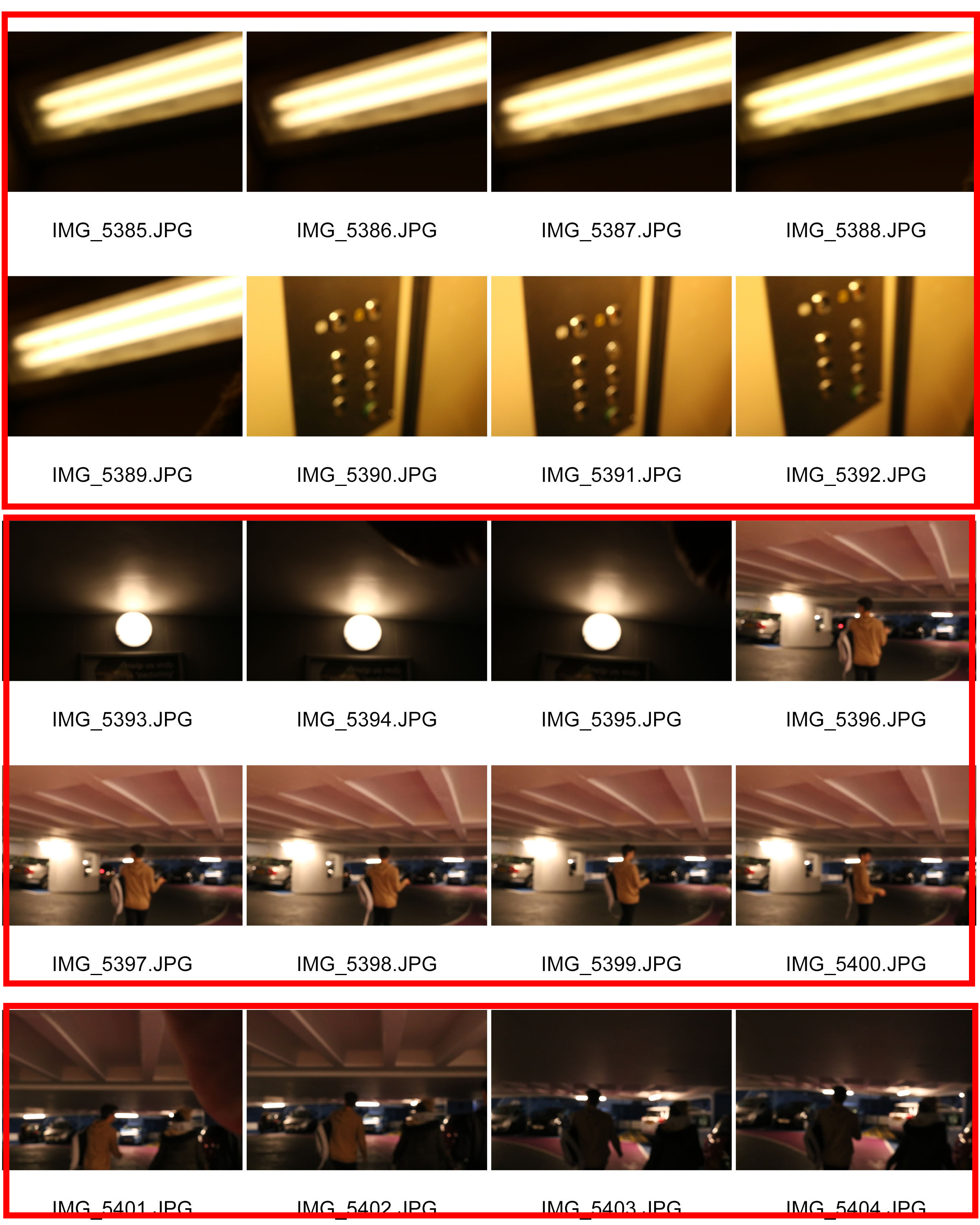
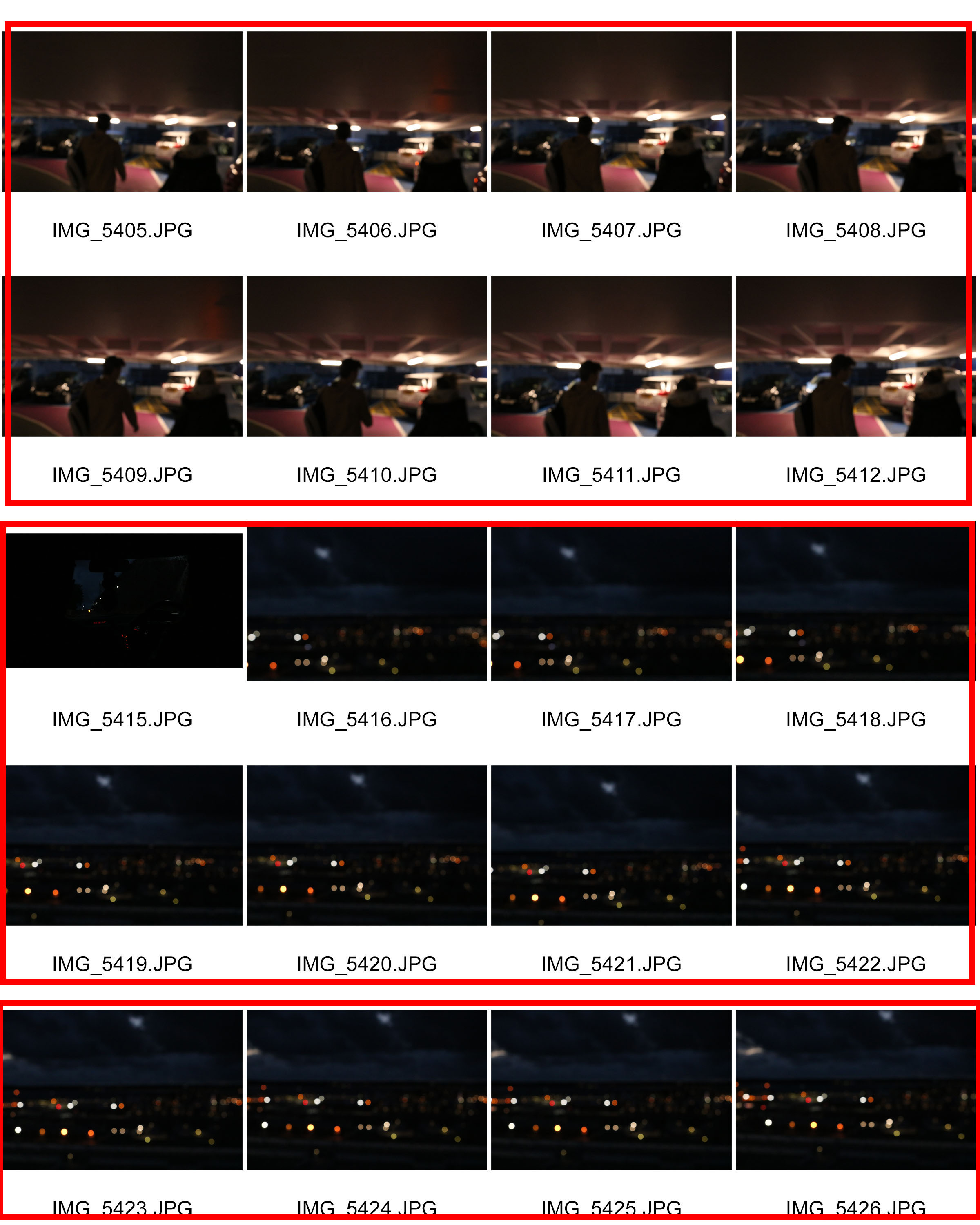
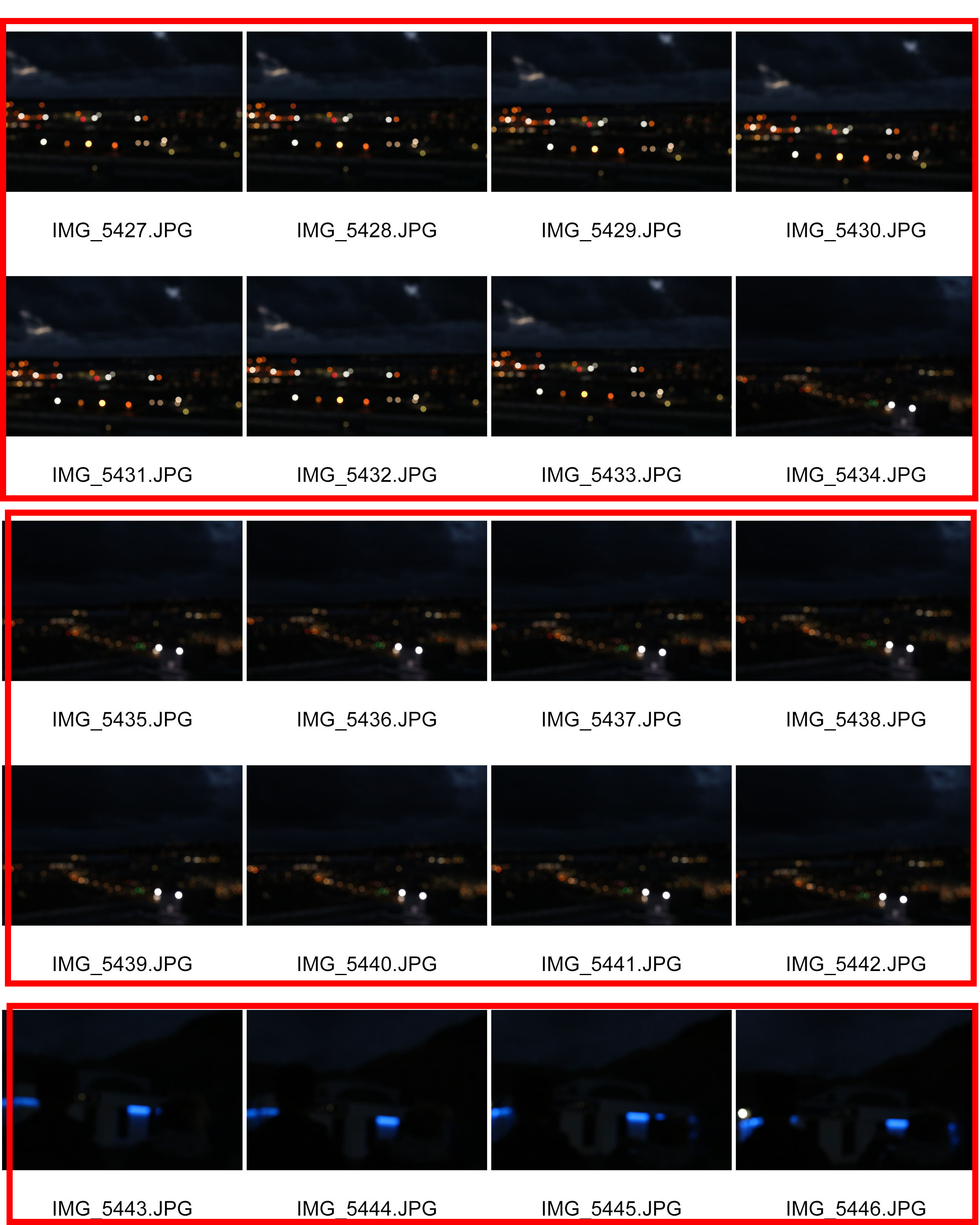
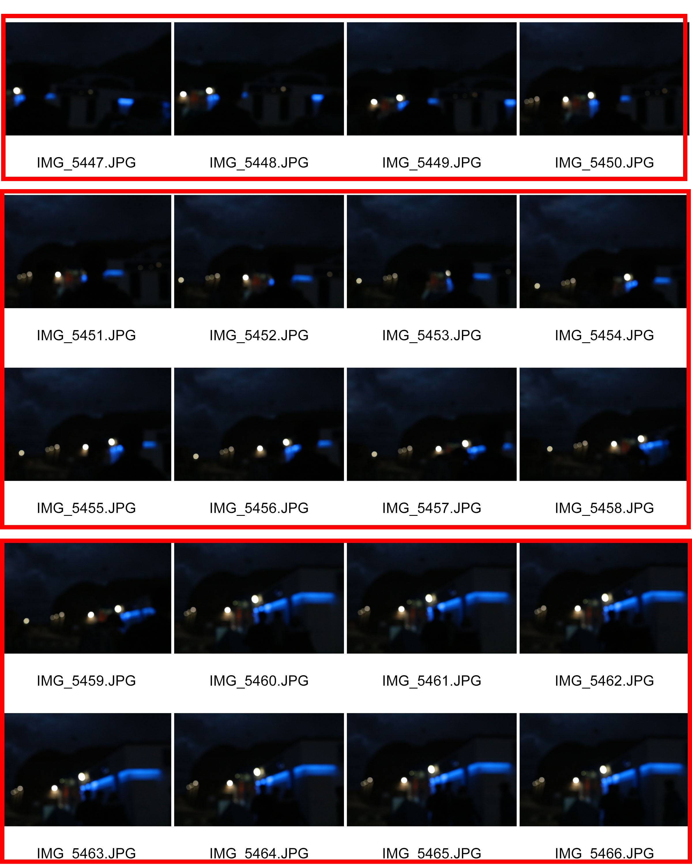
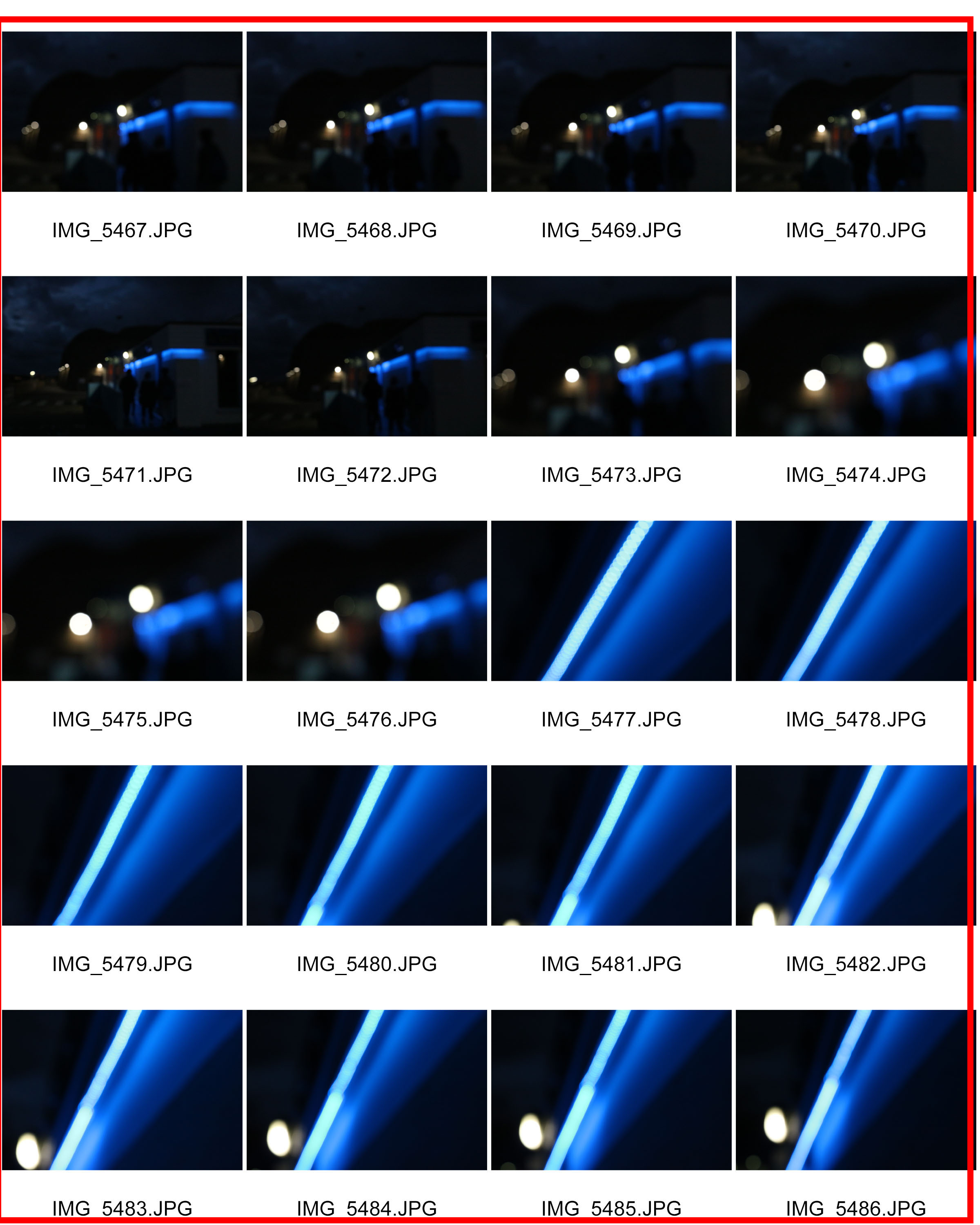
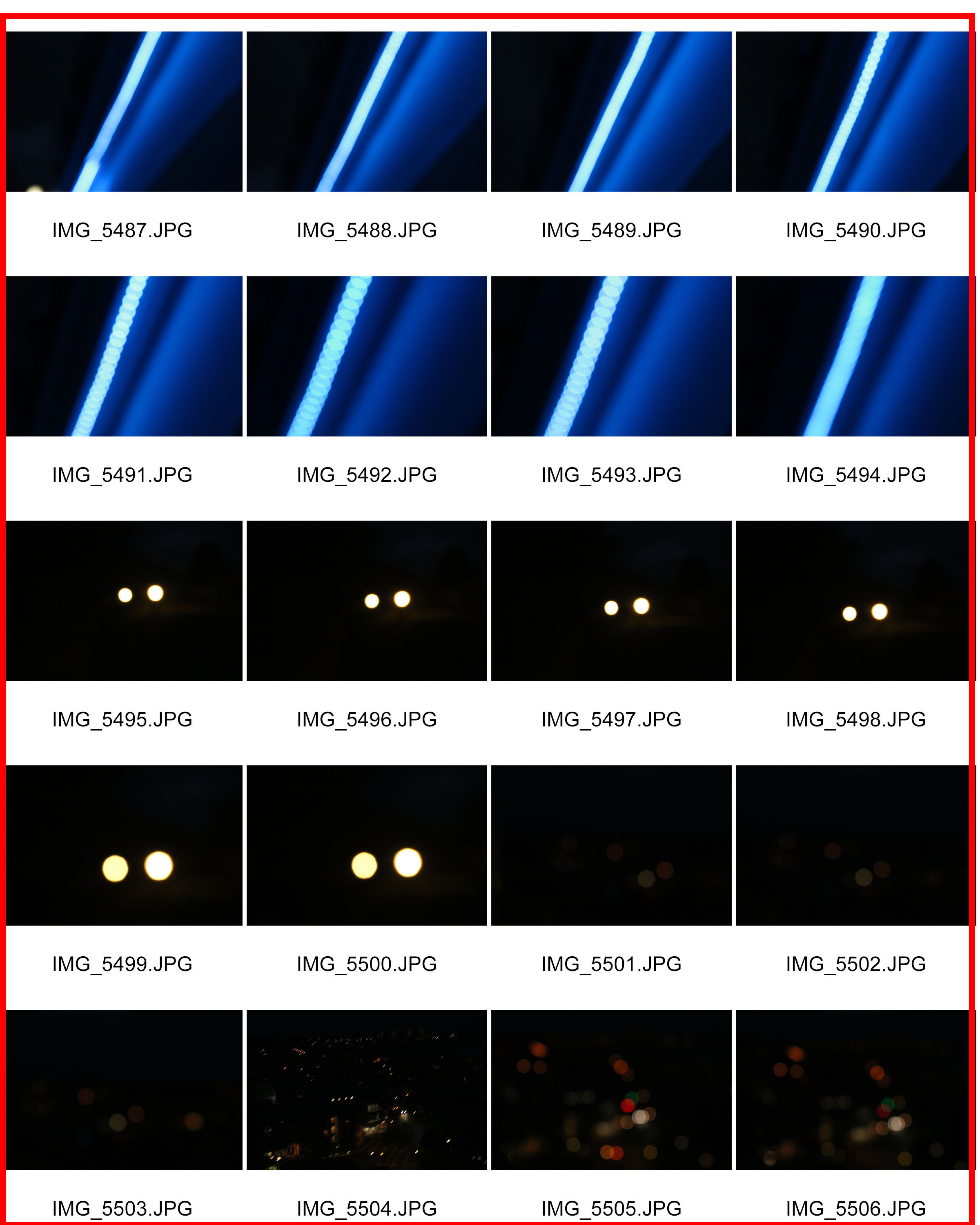
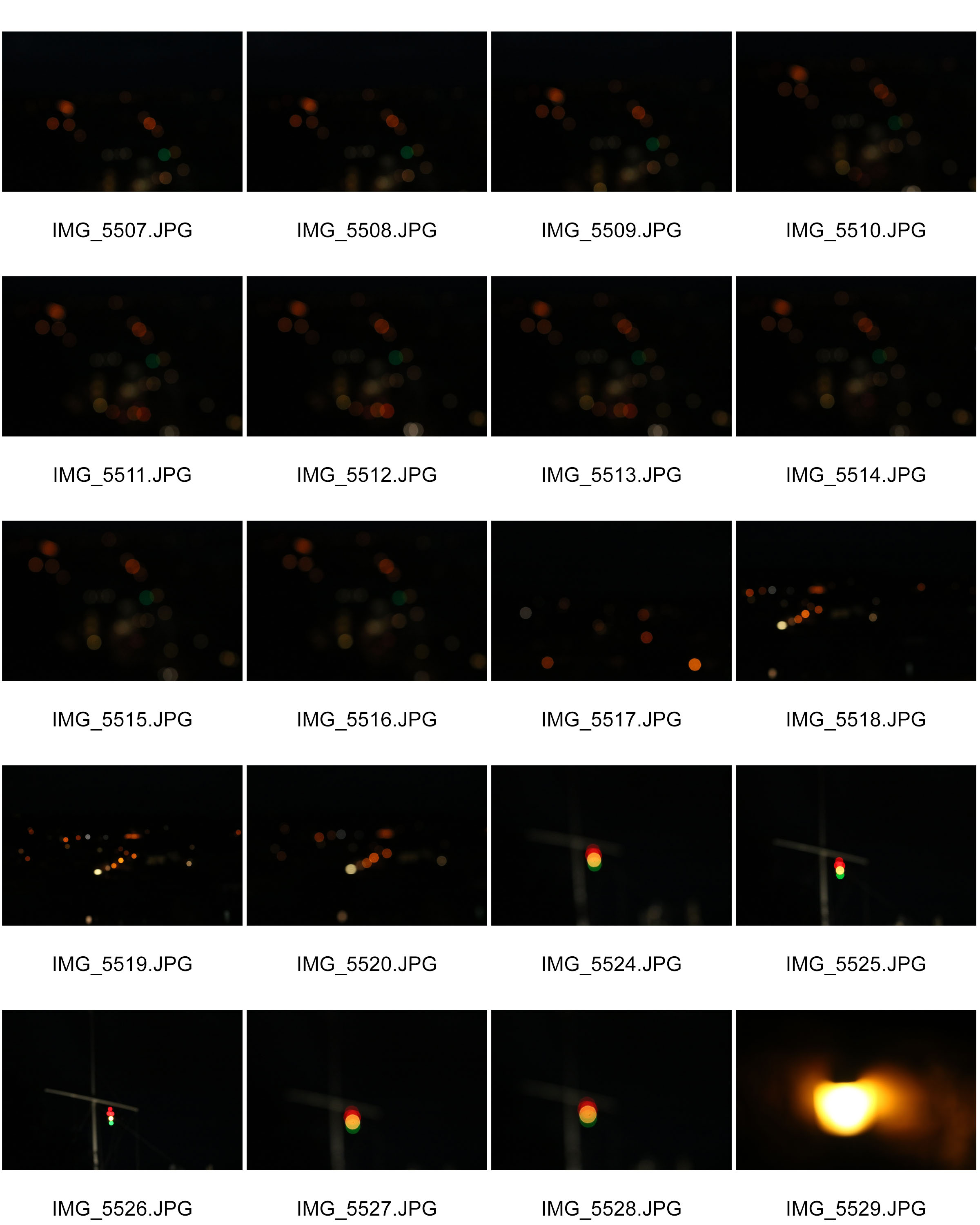
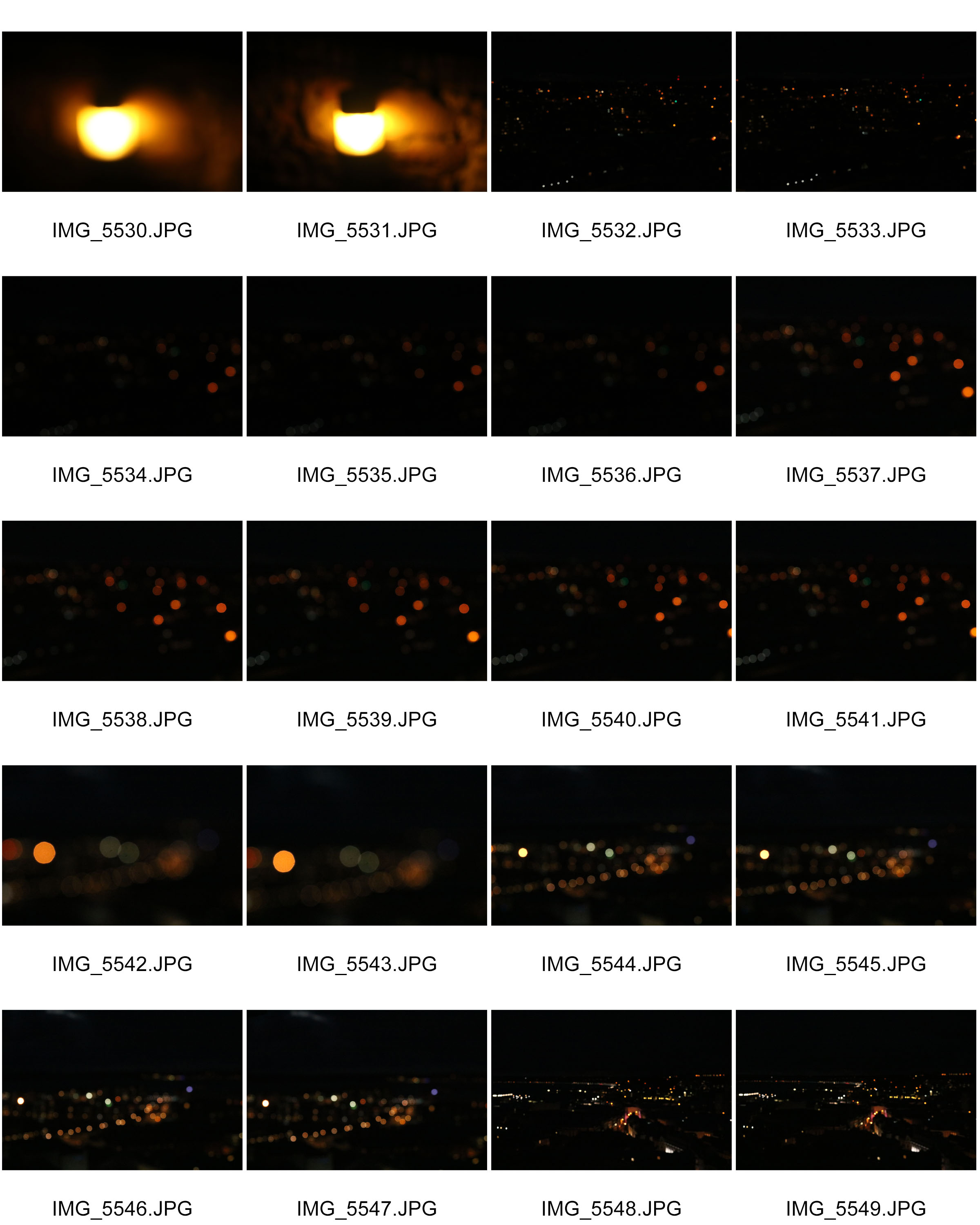
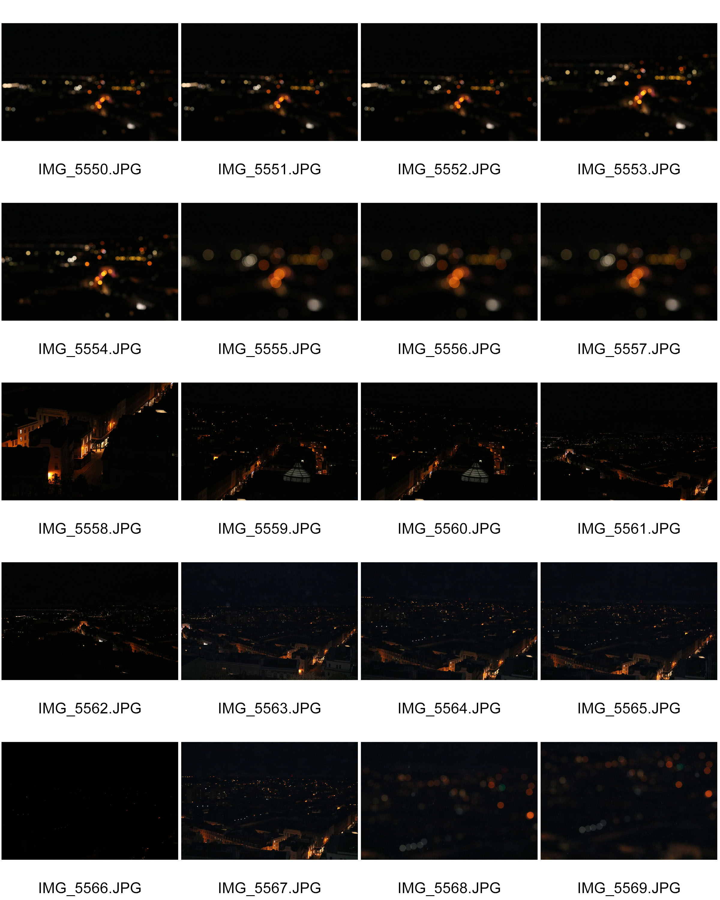
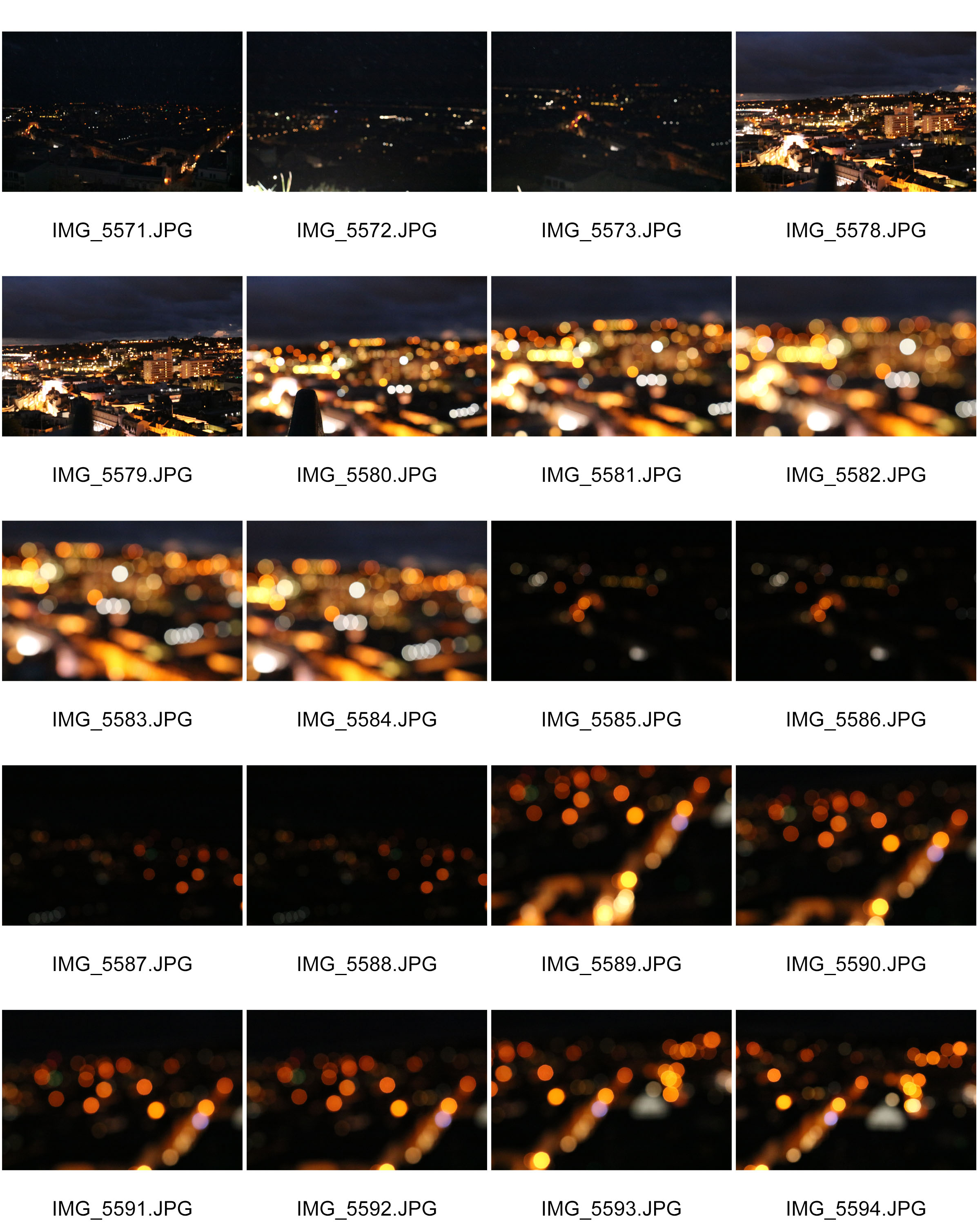
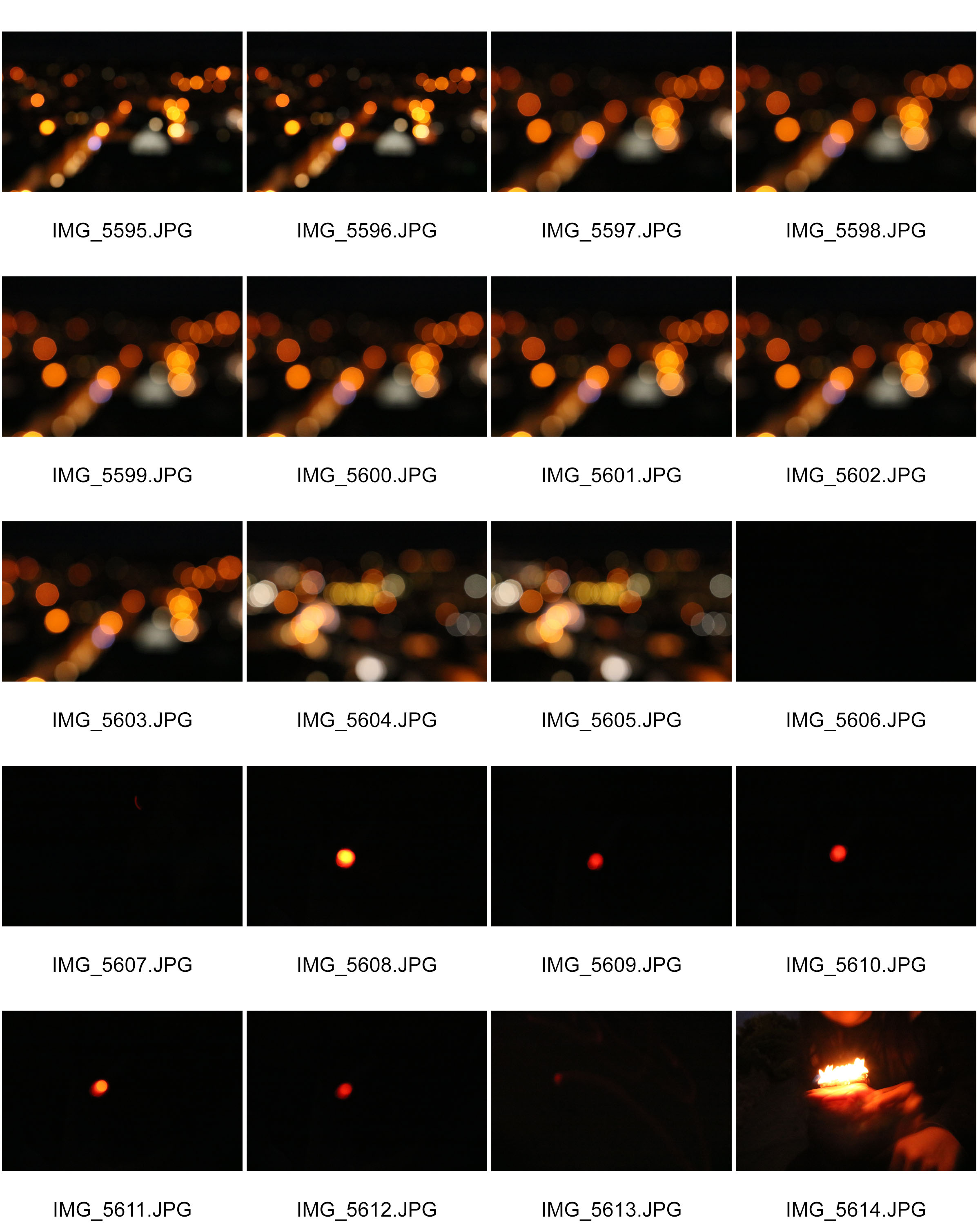
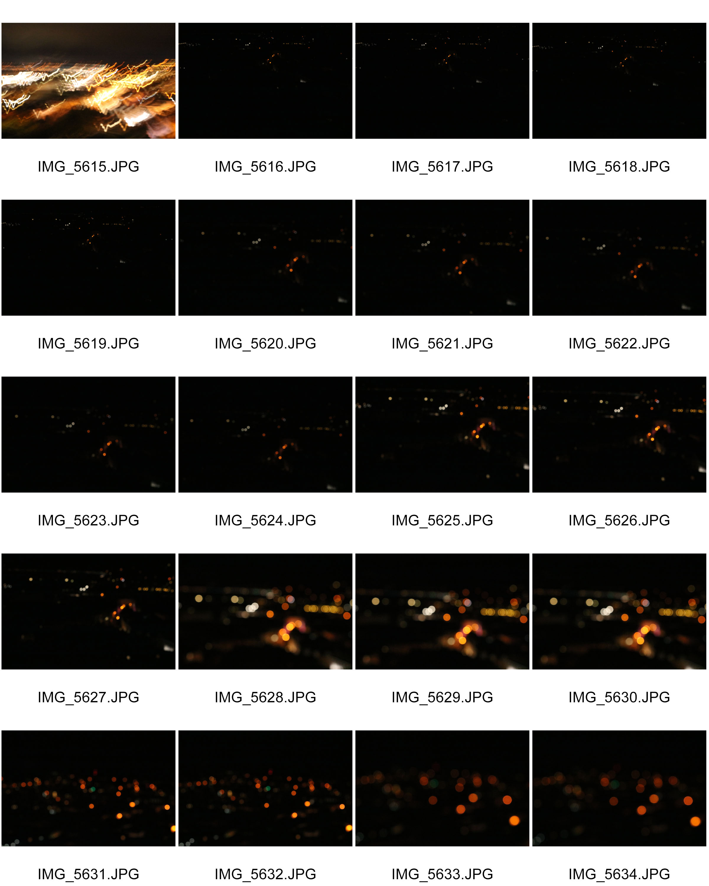
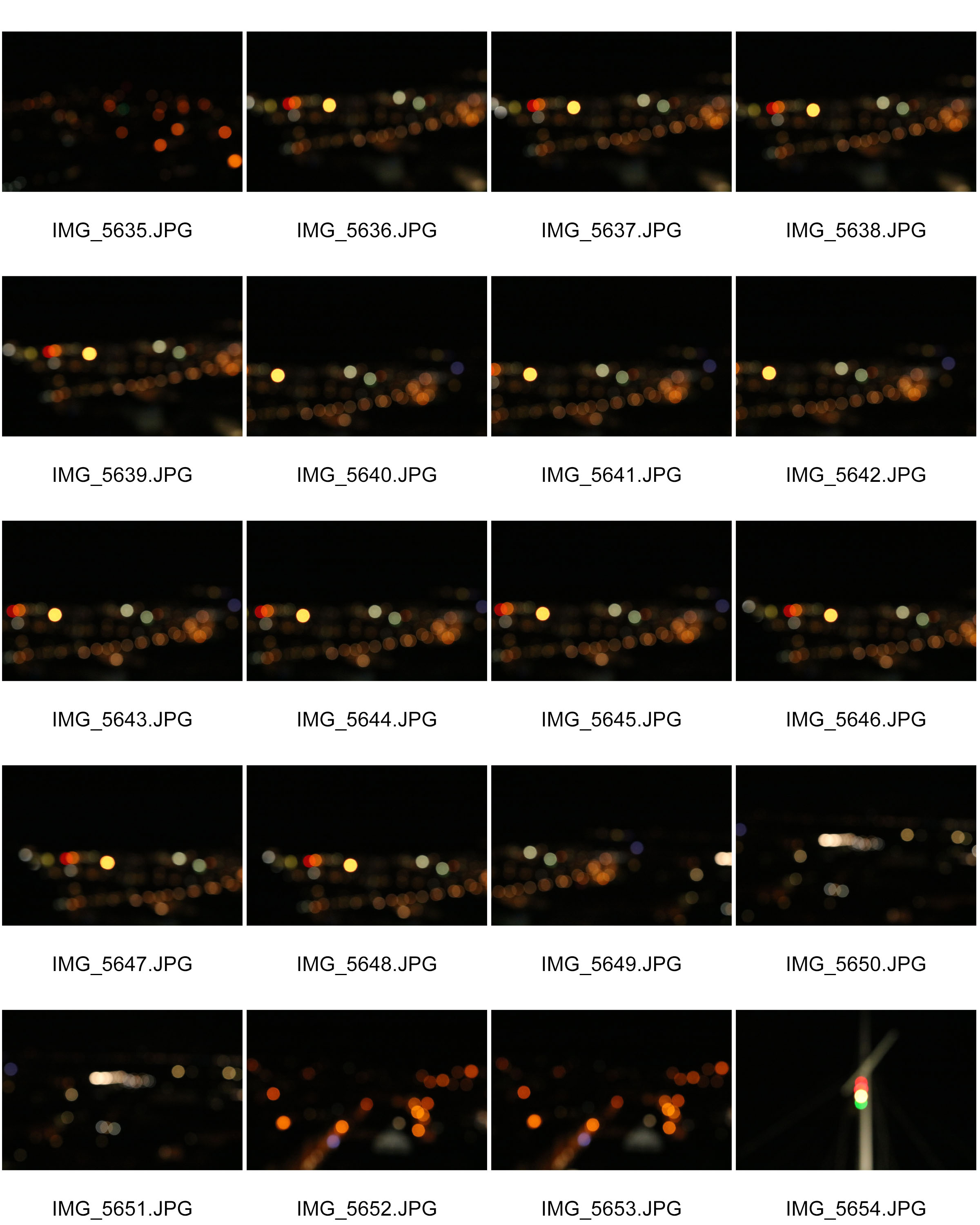
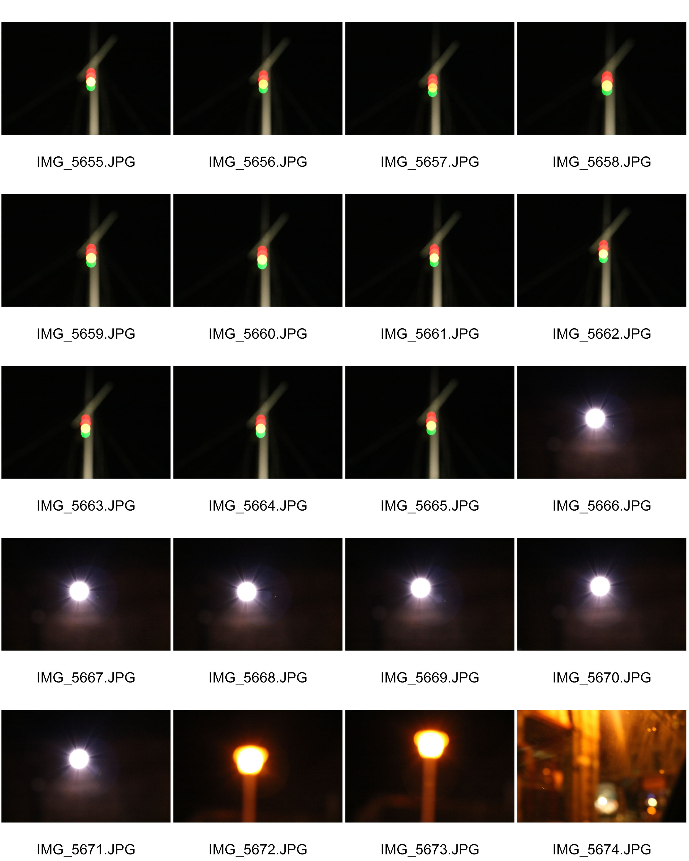
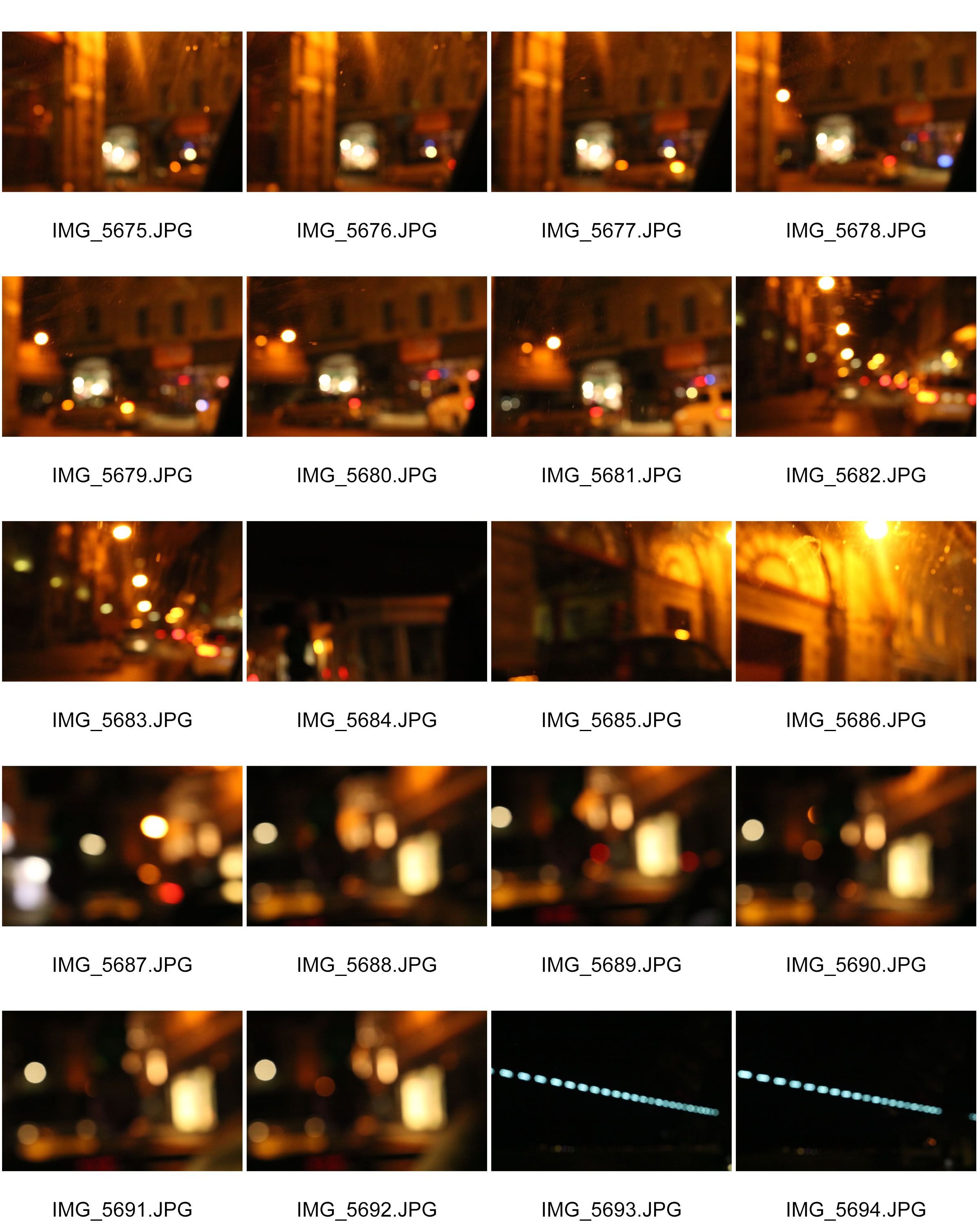
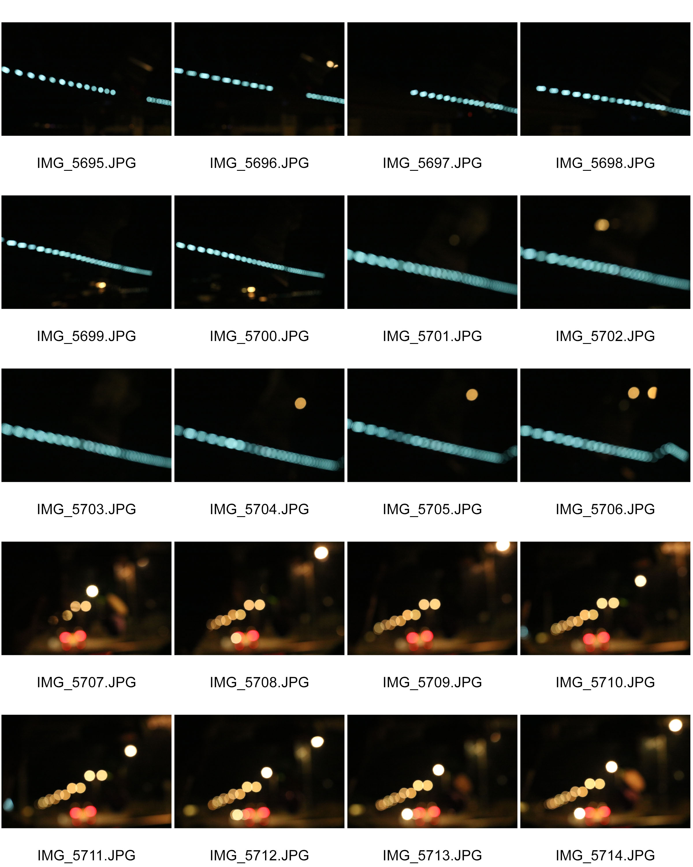

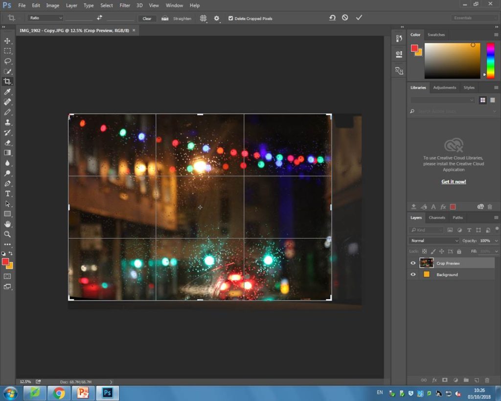
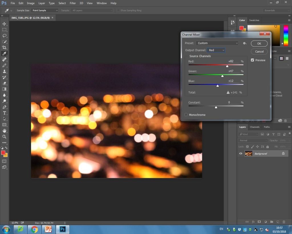
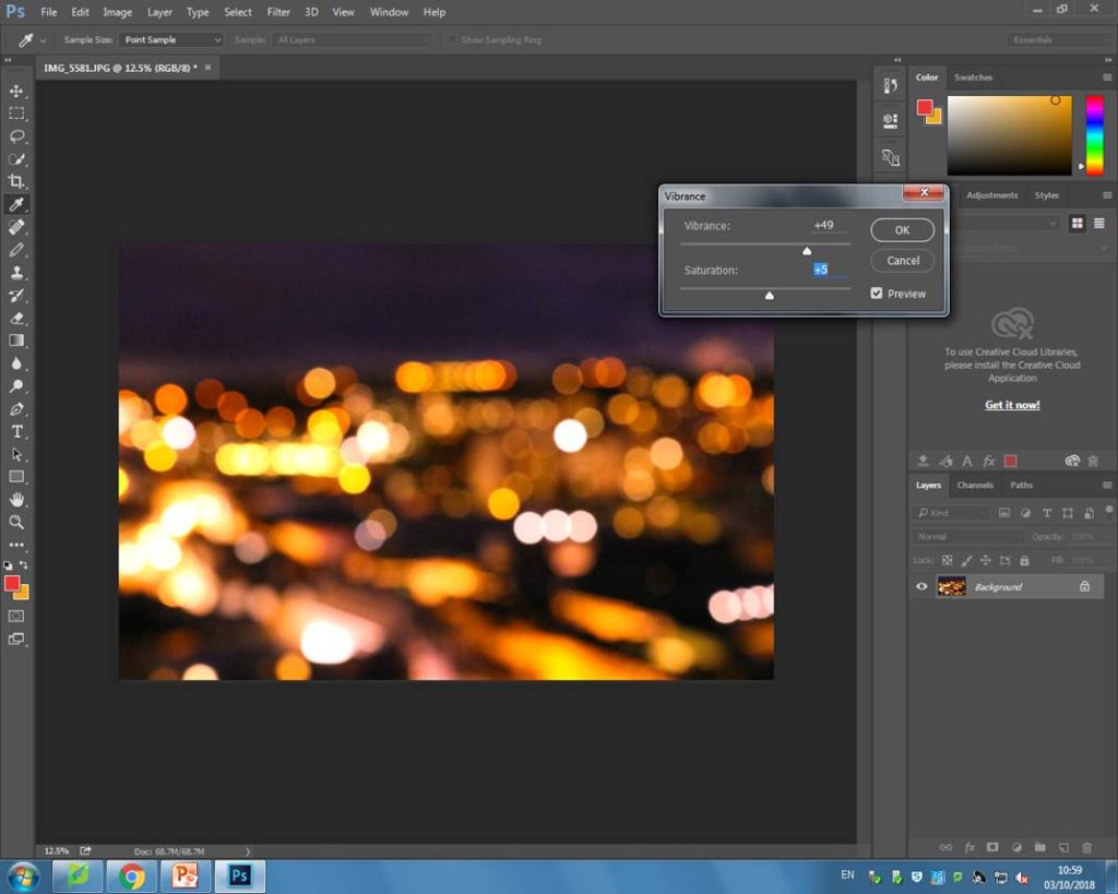
Editing my images
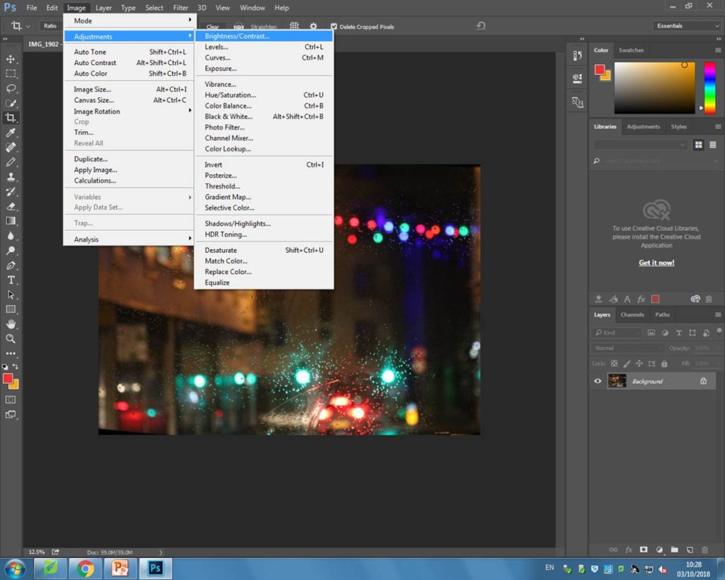
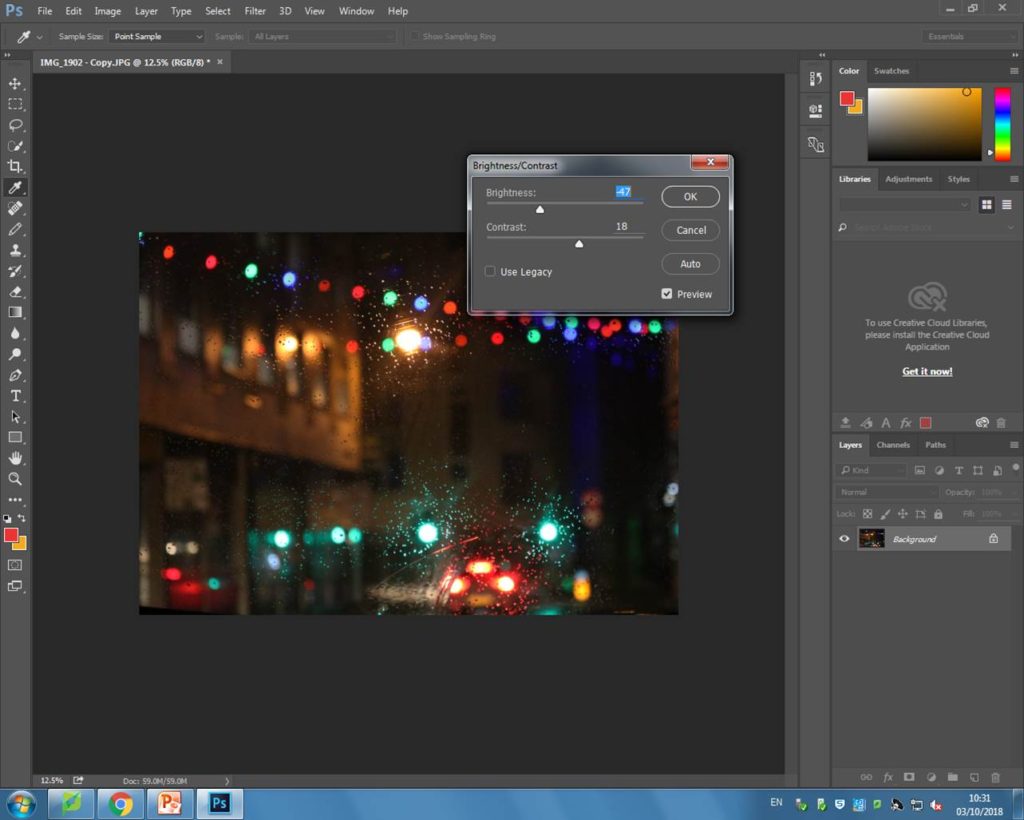
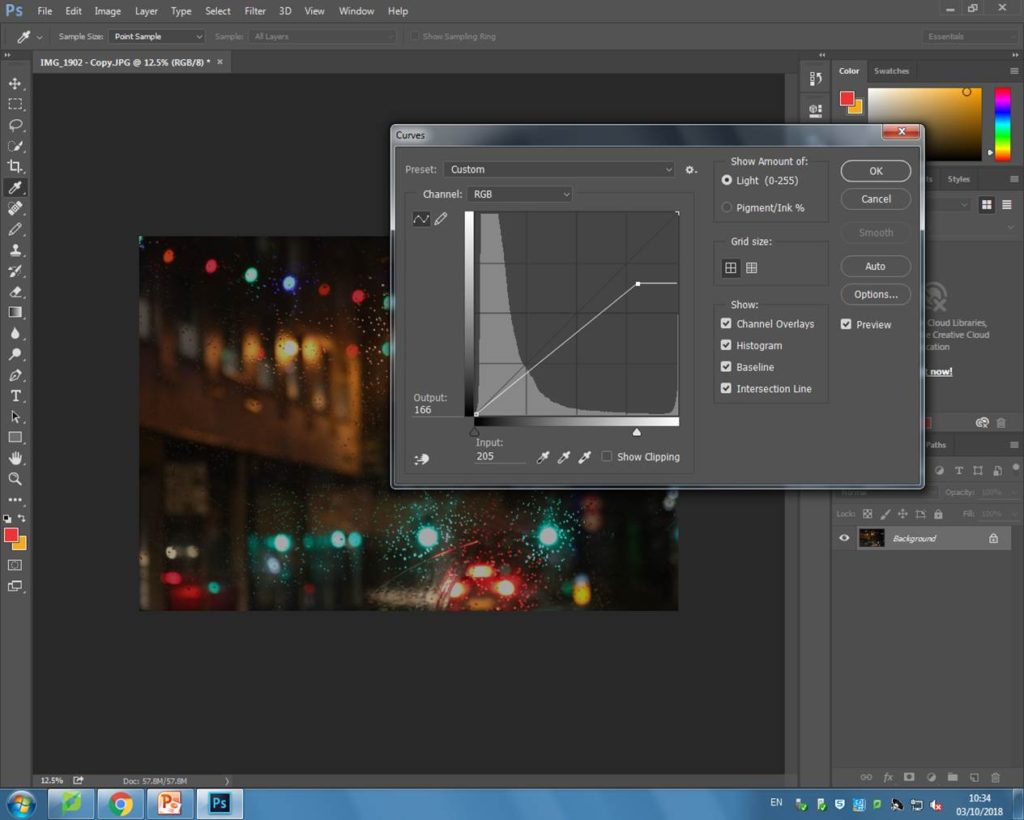

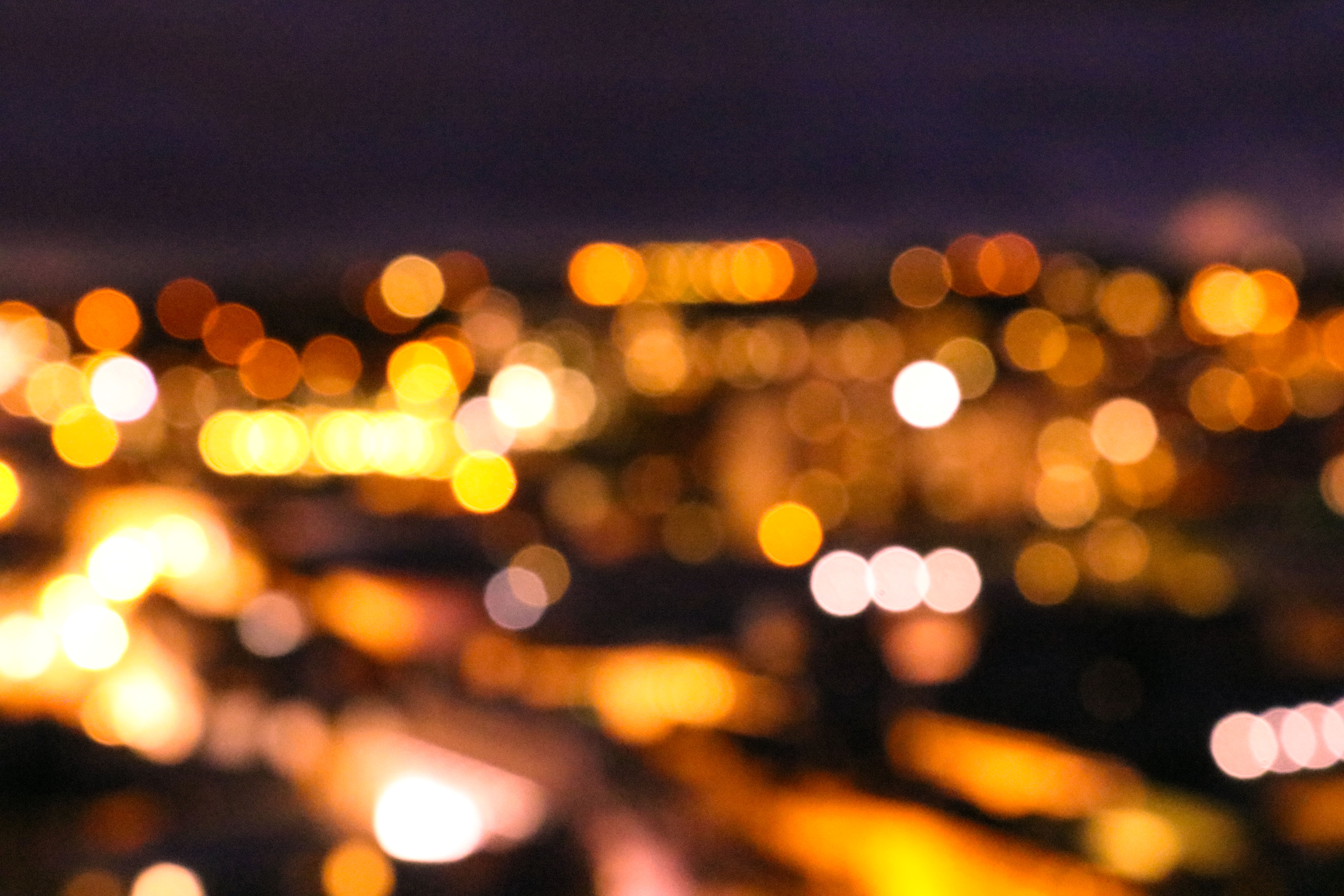
My final 3 outcomes

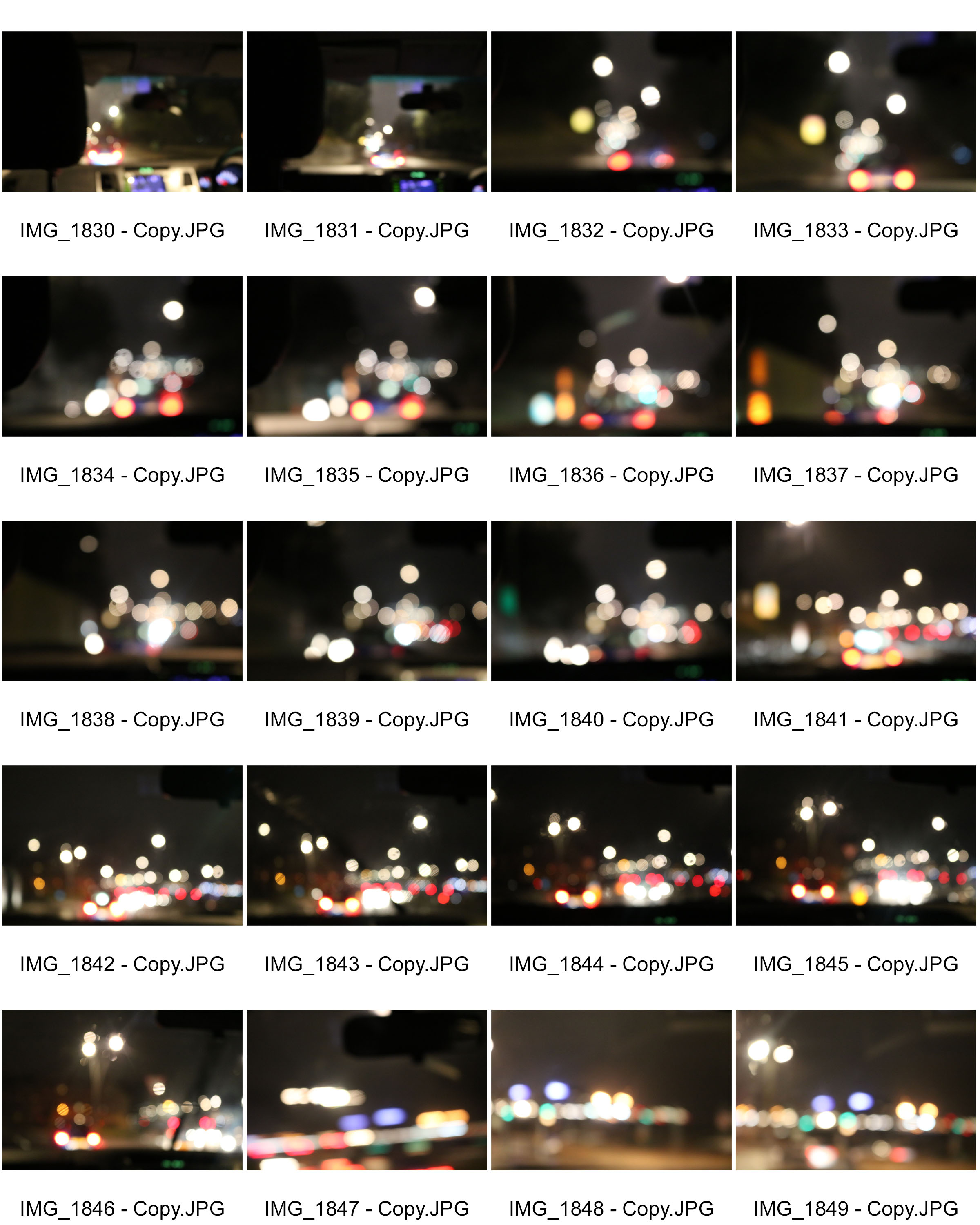
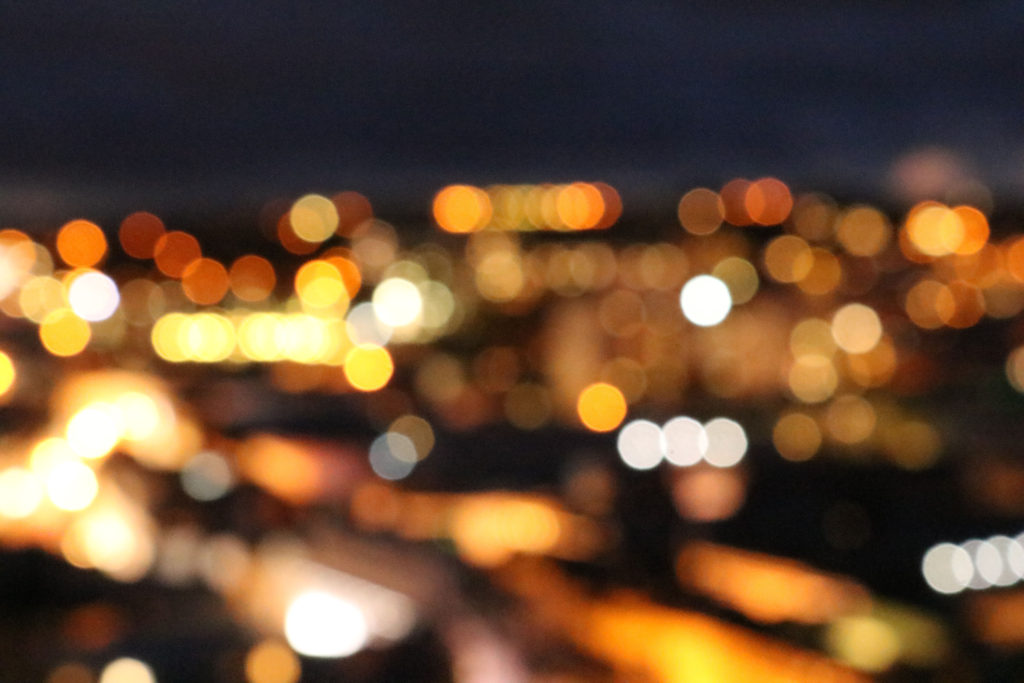
This image contains many technical elements. This image was taking at night, when it was dark. This helps make my image successful as it meant that the lights coming from the town were even brighter in contrast to the black sky. The image was taken using manual focus, which allowed me to purposely make it blurry in order to achieve the bokeh affect. The ISO was set at 12800. This helped make the lights in my image stand out even more because the higher ISO helps to make light more noticeable in the image.
The visual aspects of this picture are also interesting. This image contains a lot of light. All the colors seem to blend in together nicely, as they are similar shades and tones. This means that the photograph is very pleasing on the eye, as it all seems to go well together nicely. Because the photo is also blurry and out of focus, it has an interesting overall “soft” looking texture.

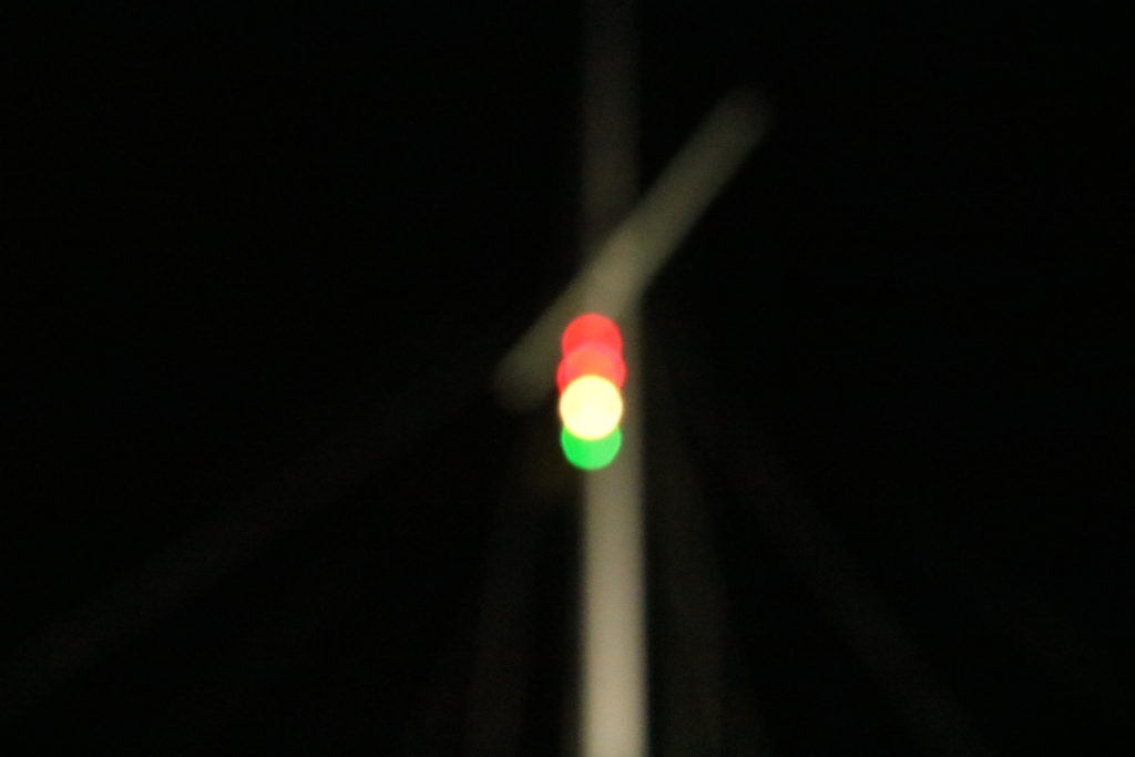
This image also includes many technical elements. Like the other images, it was taken at night in the darkness as this helps to emphasis the small specs of light as it highly contrasts with the darkness. I also used manual focus on this, to be able to blur everything within the frame.
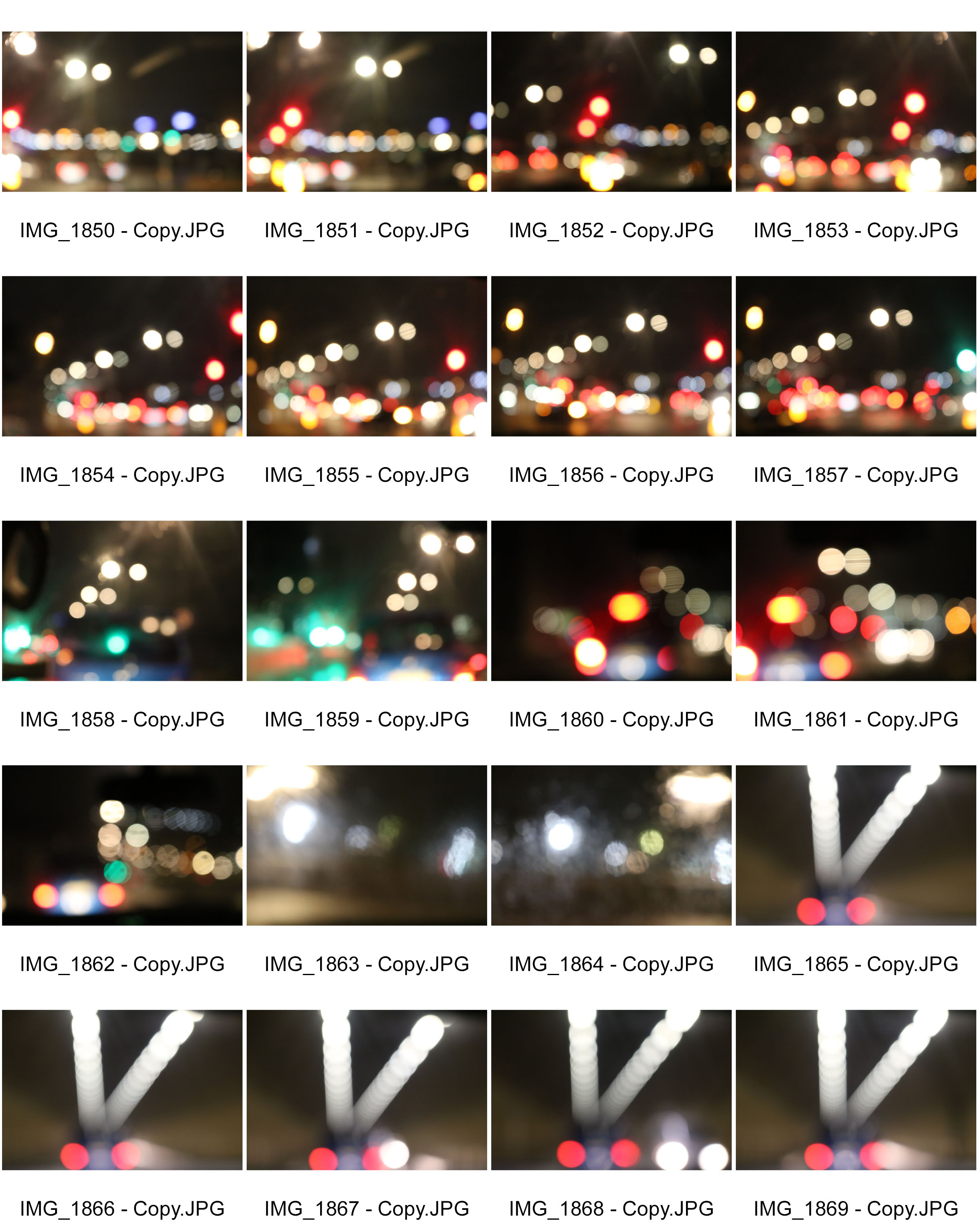
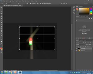
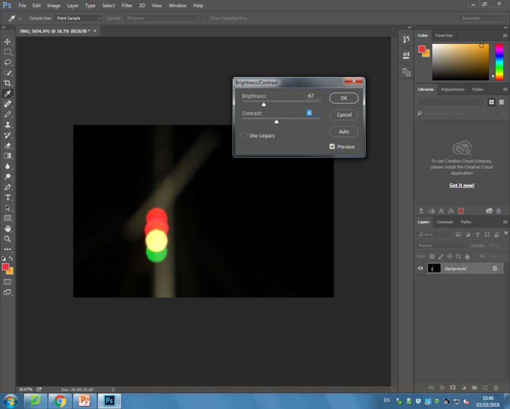
This image is very visually simplistic compared to the others. This is due to small amount of light captured. In a way, although there is less light, this image almost stands out more than the others due to the darkness surrounding it. I also cropped this image on Photoshop so that the object pictured was on the first third of the image. I think the rule of thirds helps to make this image more successful as it will attract more of my audience’s attention.
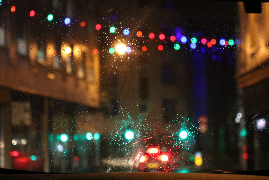
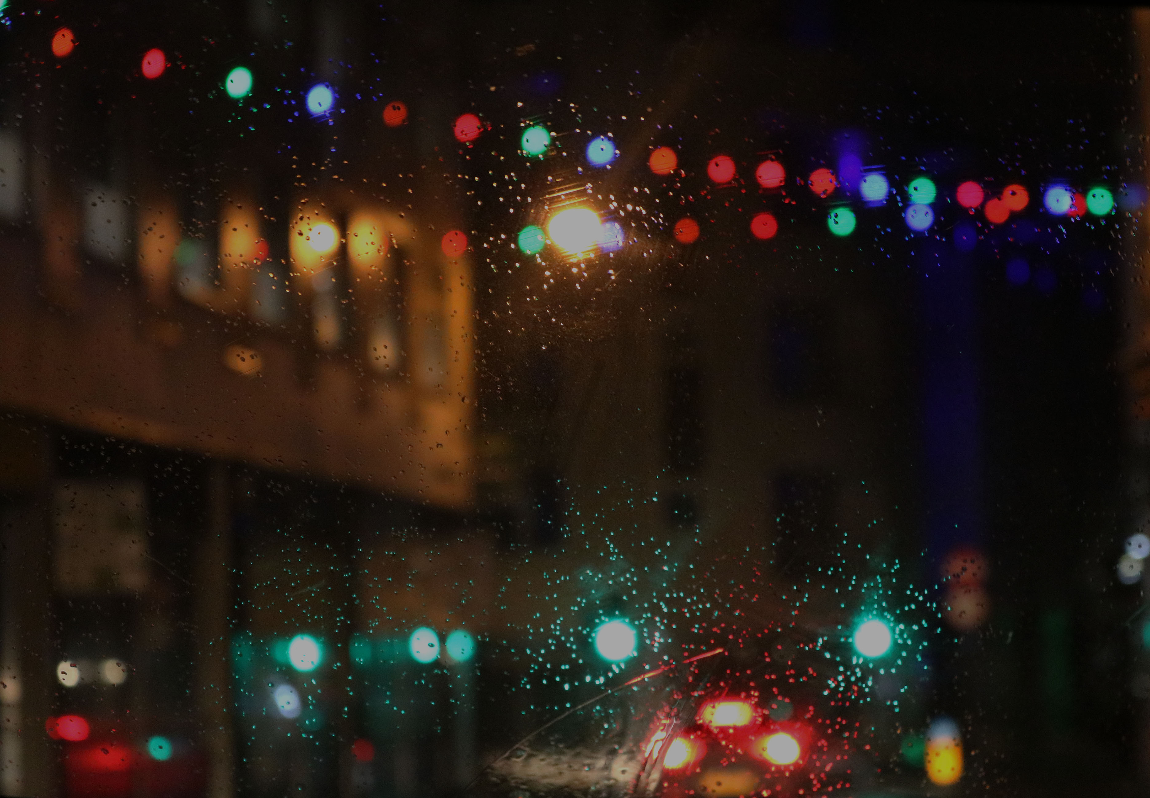
 The technical skills used to take this image really help to make is successful. To begin with, I took this image using manual focus, this allowed me to focus my lens on the rain drops, while creating the Bokeh affect in the background. My ISO was set at 6400, as it was dark outside, and I wanted as much light to be seen as possible. I also had an f/5.6 for this image. This helped let a medium amount of light it, and also helped slightly blur the background. The shutter speed was set at 1/60 meaning that it didn’t have much of a long exposure, which allowed the image to come out focused.
The visual composition of the photograph is also very interesting. The colors captured in the photo are very captivating, as they are bright and they stand out. This makes my image successful as it is eye catching, and will attract peoples attention. There is also a contrast in colors within my image due to the colorful lights and the plain, dark background. This further helps the colored lights stand out. The rain on the glass is also very helpful in making the light more prominent.
