THE PROCESS:
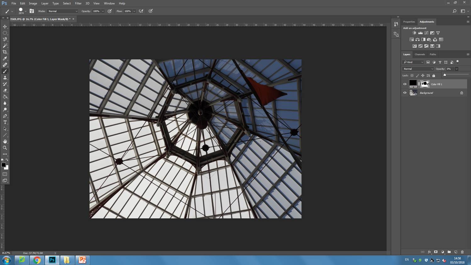
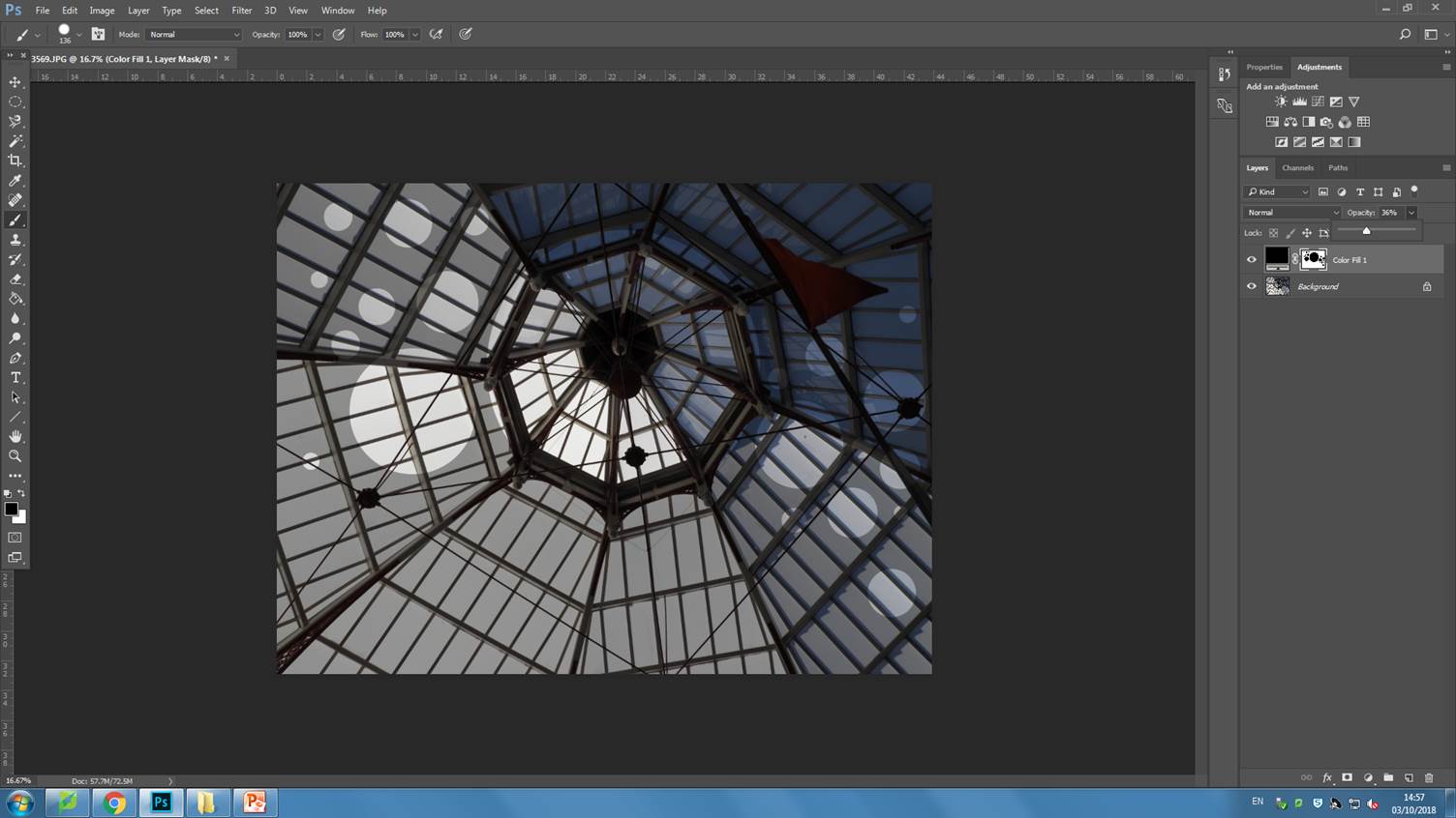
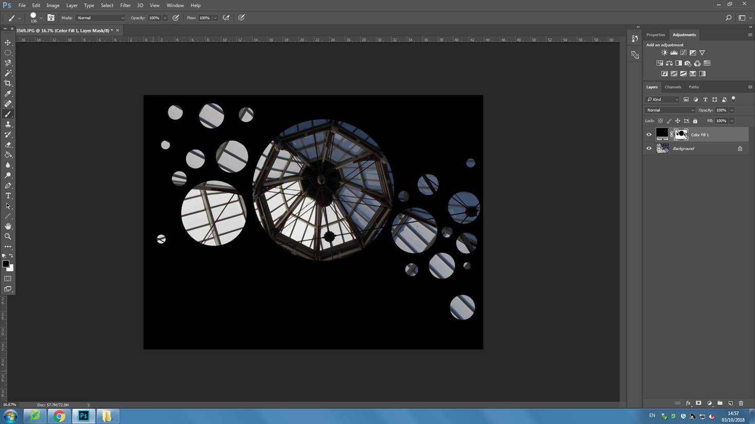
In order to create this final piece I followed the instructions provided to me in order to achieve this conceal/reveal image which is composed of a photo which has a panel layer added to it. Then using the brush tool, i was able to achieve varying sizes of revealing circles that show the original photo. The final outcome is very unique and brings up multiple questions for the viewer of the image.


ANALYSIS:
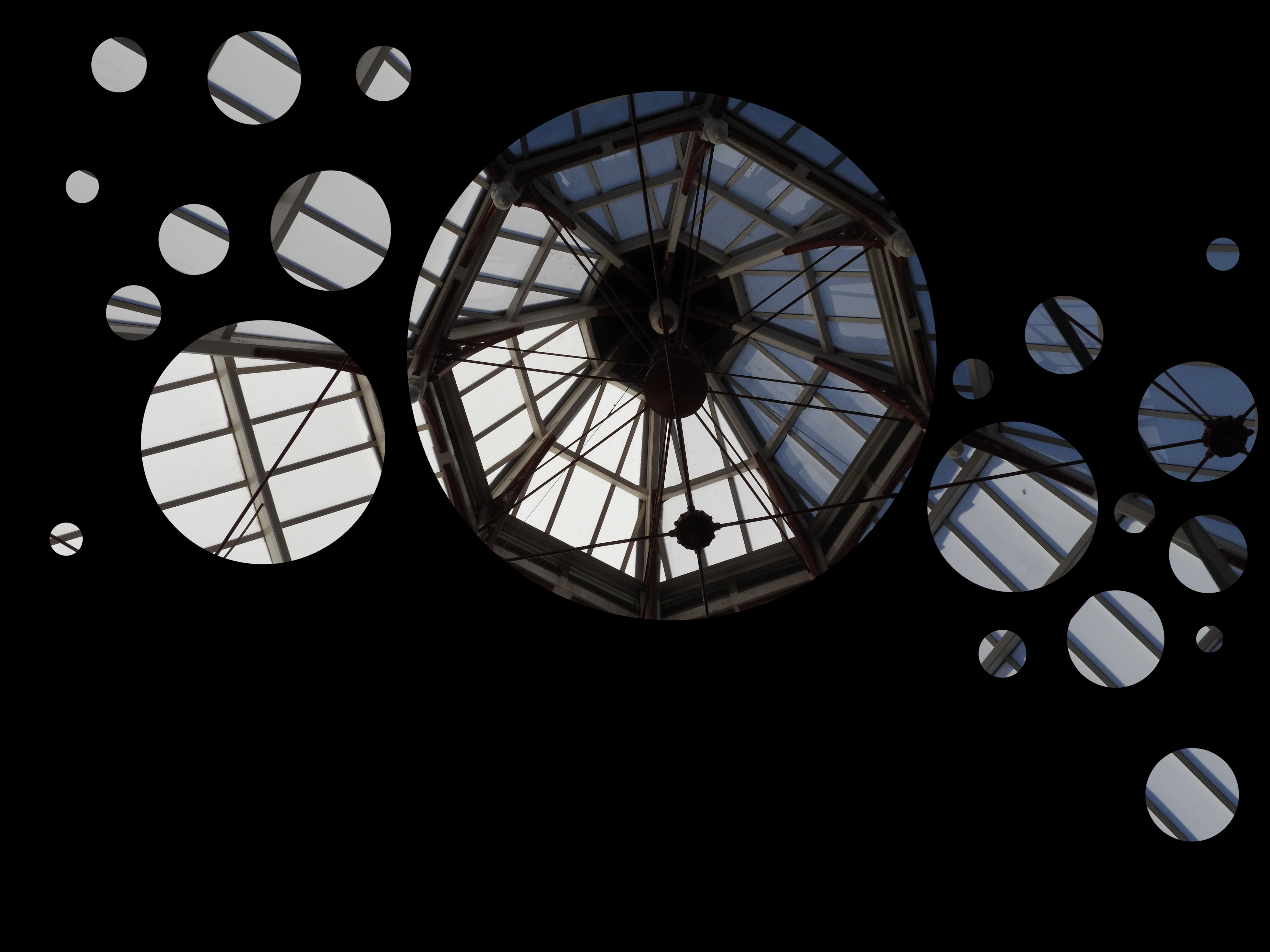
This is the final image which I produced from the conceal/reveal task. As the title suggests, much of the image is concealed with a black panel layer. It puts many ideas into the head of the viewer. What is hidden behind the black? Why did they choose to only show certain parts of the image? The revealed parts of the image all allude to different things. I chose to reveal the circular structure, central in the image because i felt that this would create a sense of pattern and unity within the image. It is the area of the image which draws the most attention. I kept the circles in a linear pattern as this creates flow and movement within the image. I did not want to decrease the opacity of the black panel as I wanted to retain that question in the viewers mind of, what is behind the concealed parts?
Coming through the glass is a very soft and diffused light which varies in intensity in different parts of the image, the bottom left hand corner being more strong and the top right more soft. The composition in this image is very simple and is purely made up of strong, symmetrical, repeating lines that come towards a singular point central in the image. There is a lot of geometrical patters that play together to create a very harmonious photo. The co lour range of this image is fairly simple, being mostly composed of soft grays, blacks and subtle blues. The photo has a warm hue to it as can be seen in the lighter areas of the image. The photo lacks any sort of foreground, mid ground or background therefore it is quite flat and 2D.
In order to take this image, I zoomed in, decreasing the field of view and increasing the focal length as it was quite far up and could not be seen clearly from a stationary position. I kept the ISO fairly low, at 400, as it was a bright day and i wanted to avoid overexposing the image. I used auto focus whilst taking this image as it is very flat and did not require much attention to get it in focus. I used a fairly low shutter speed due to the strong light coming through the glass, which prevented the image from becoming overexposed.

