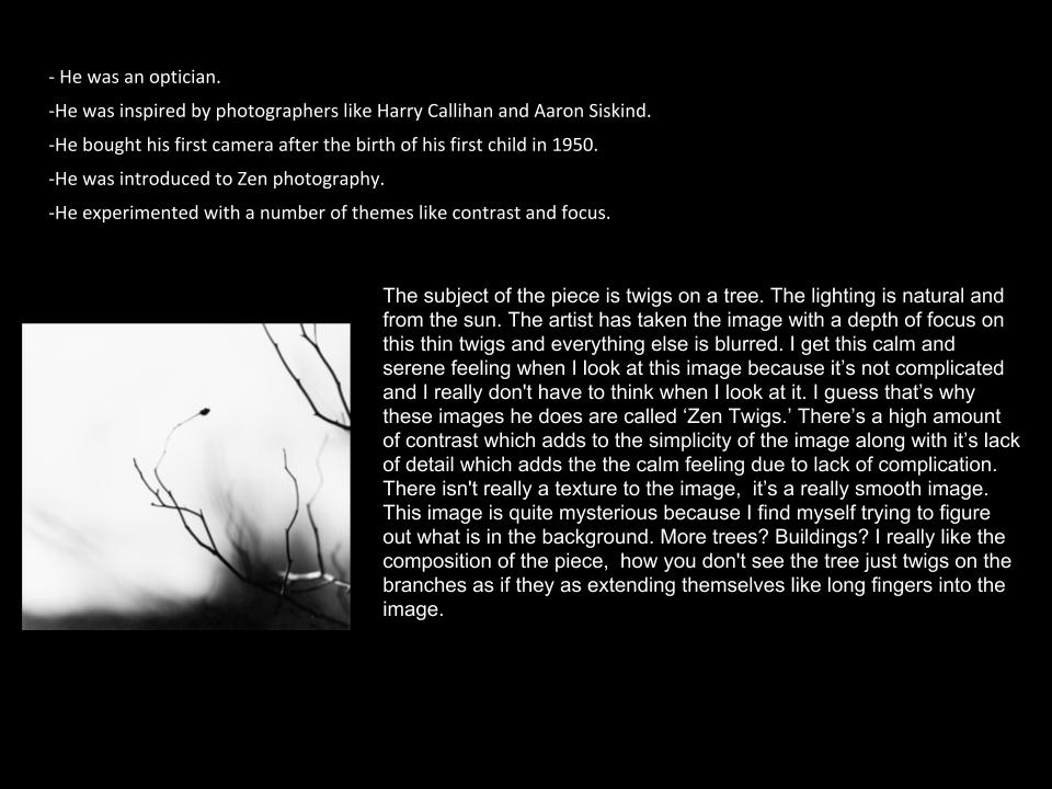
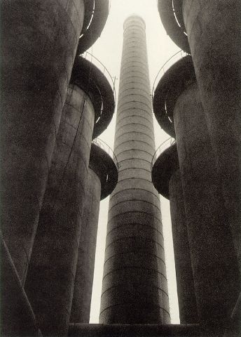
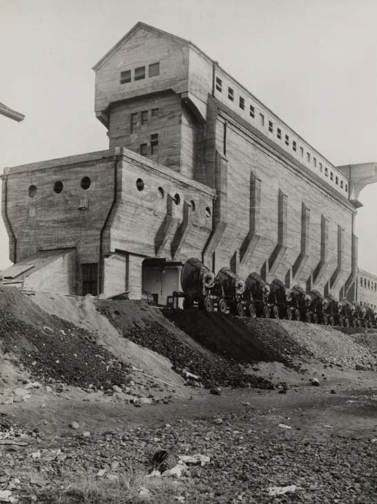
Keld Helmer-Petersen was a danish photographer who achieved a wide spread recognition in the 1940-1950’s, he was known for his color abstract photography. But in this project I focused on his black and white contrasting images. In his black and white photos there is a lot of empty space in the photos and he focuses on lines, texture and pattern. Petersen ended up opening up his own studios.
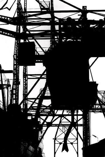
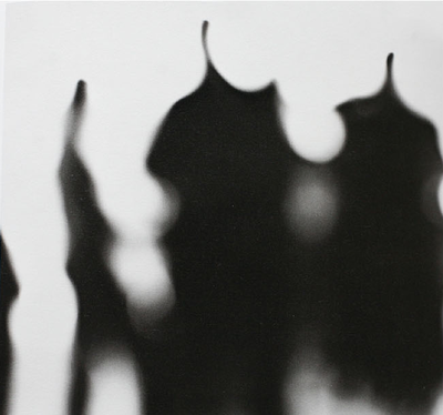
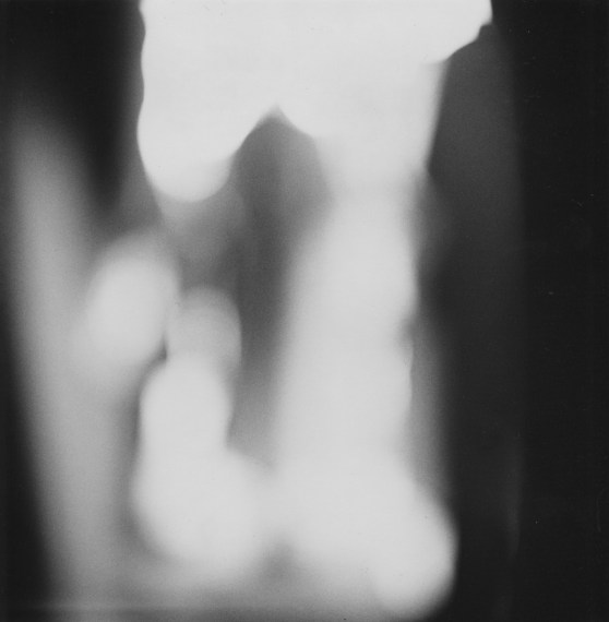
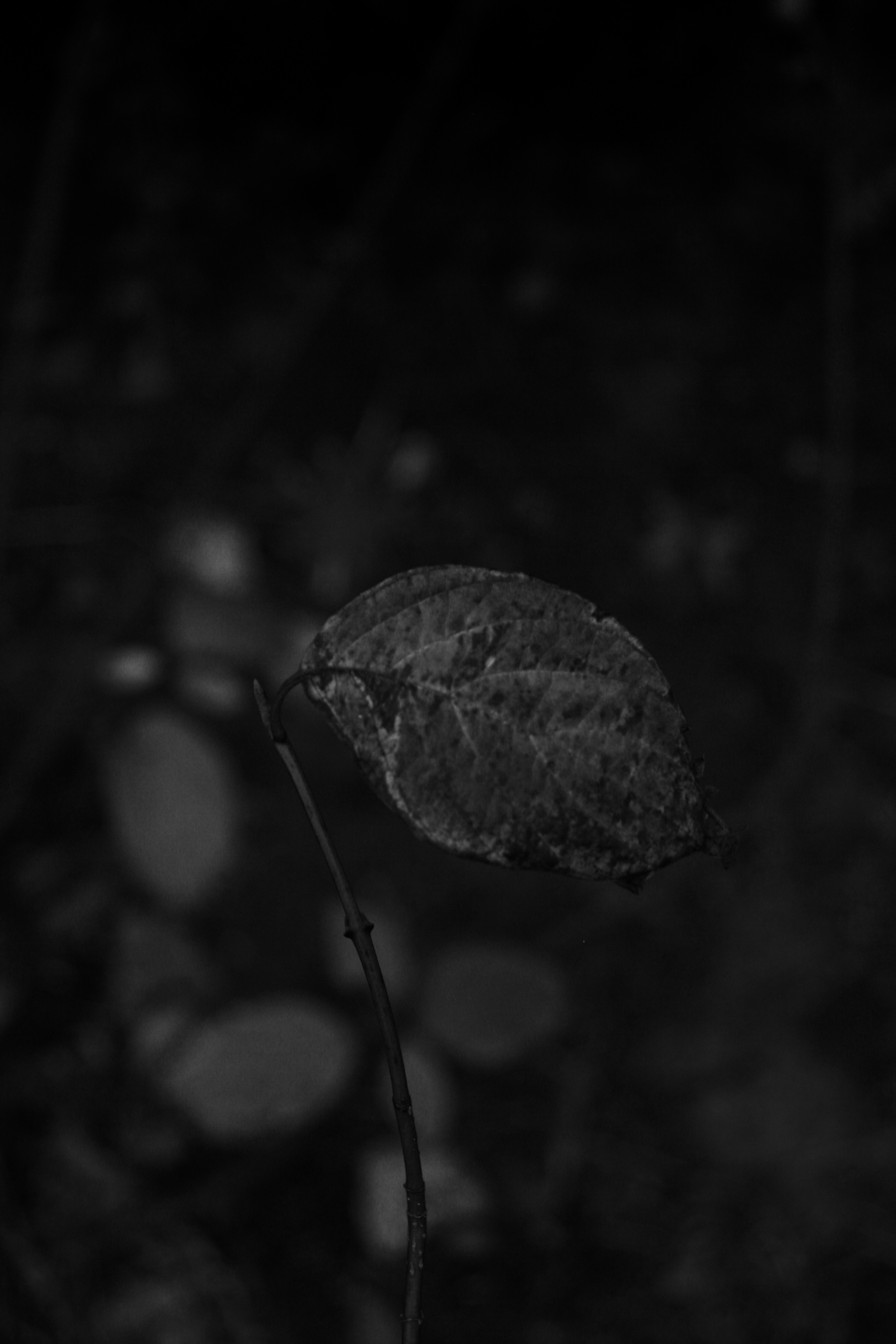
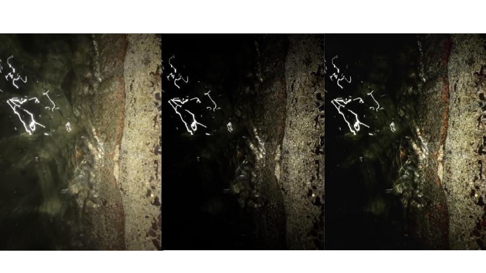
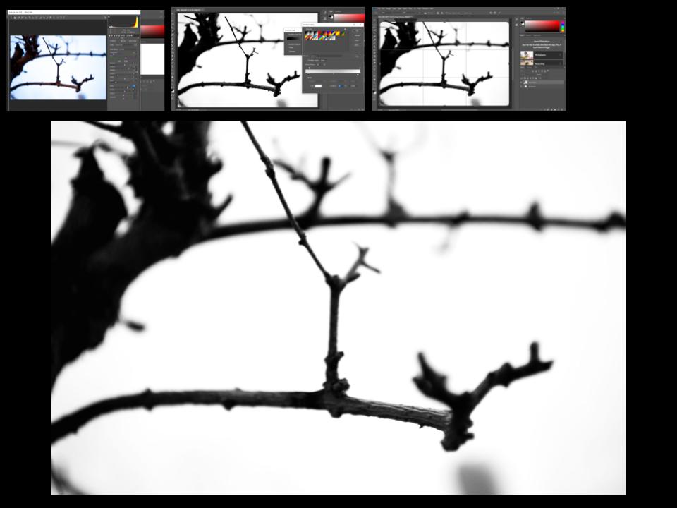
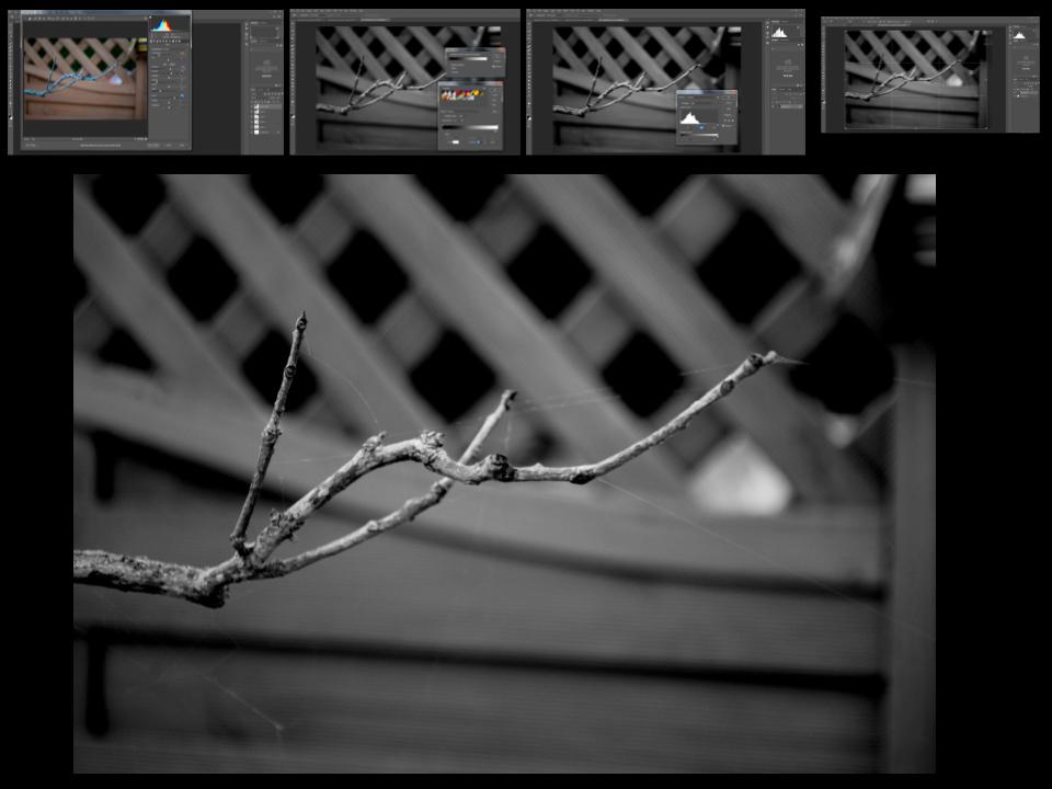
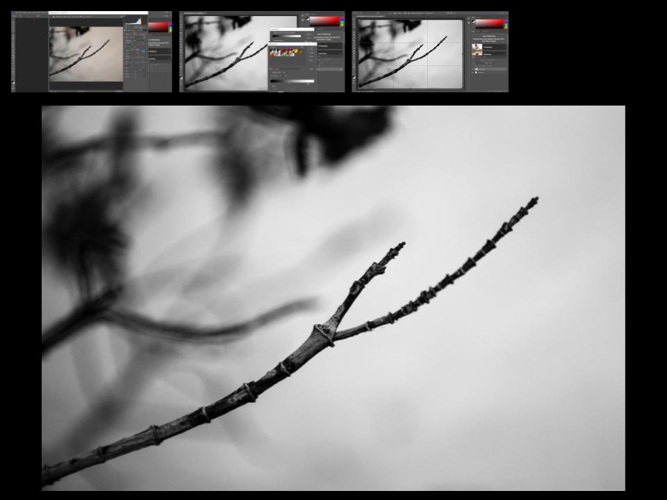
In this image Peterson has sued the natural light as the image has been take outside, but he has edited this image by changing the threshold and making the images more distinct with more empty spaces, shown by the block of either black or white in the image. The range of tone is limited in this image this is because of the way Peterson has edited his image and made it bold and simple. He also has a range of focus and depth in this image, the things at the front of the image are more focused and bold, but as you look further back into the image things become less clearer and less bold. Visually this image looks like a cold image because of the bold black areas taking over the photo, and the lines in all directions give it a chilling feeling.
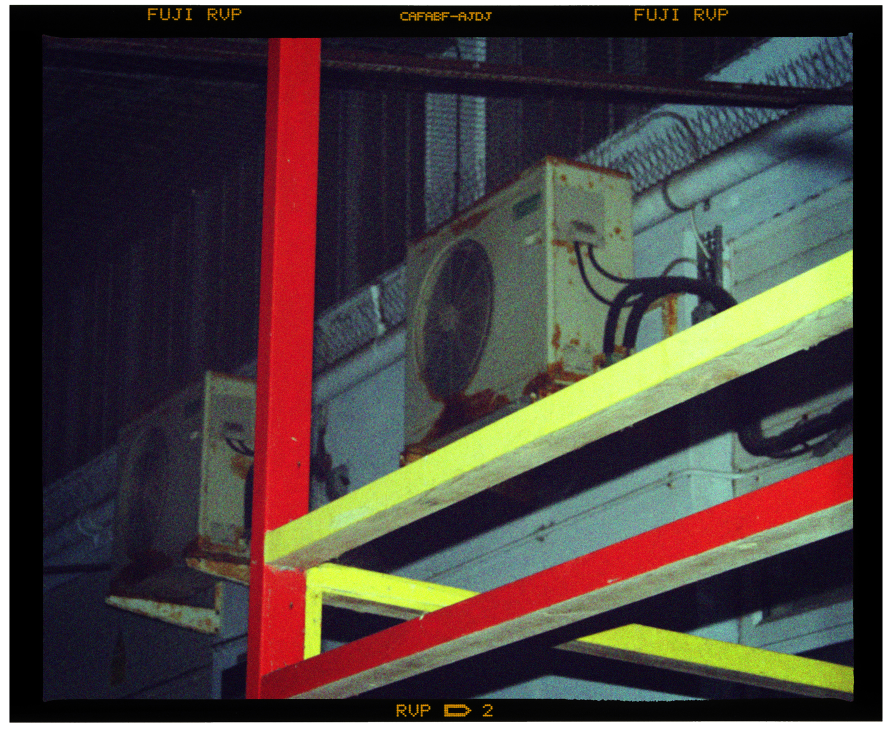
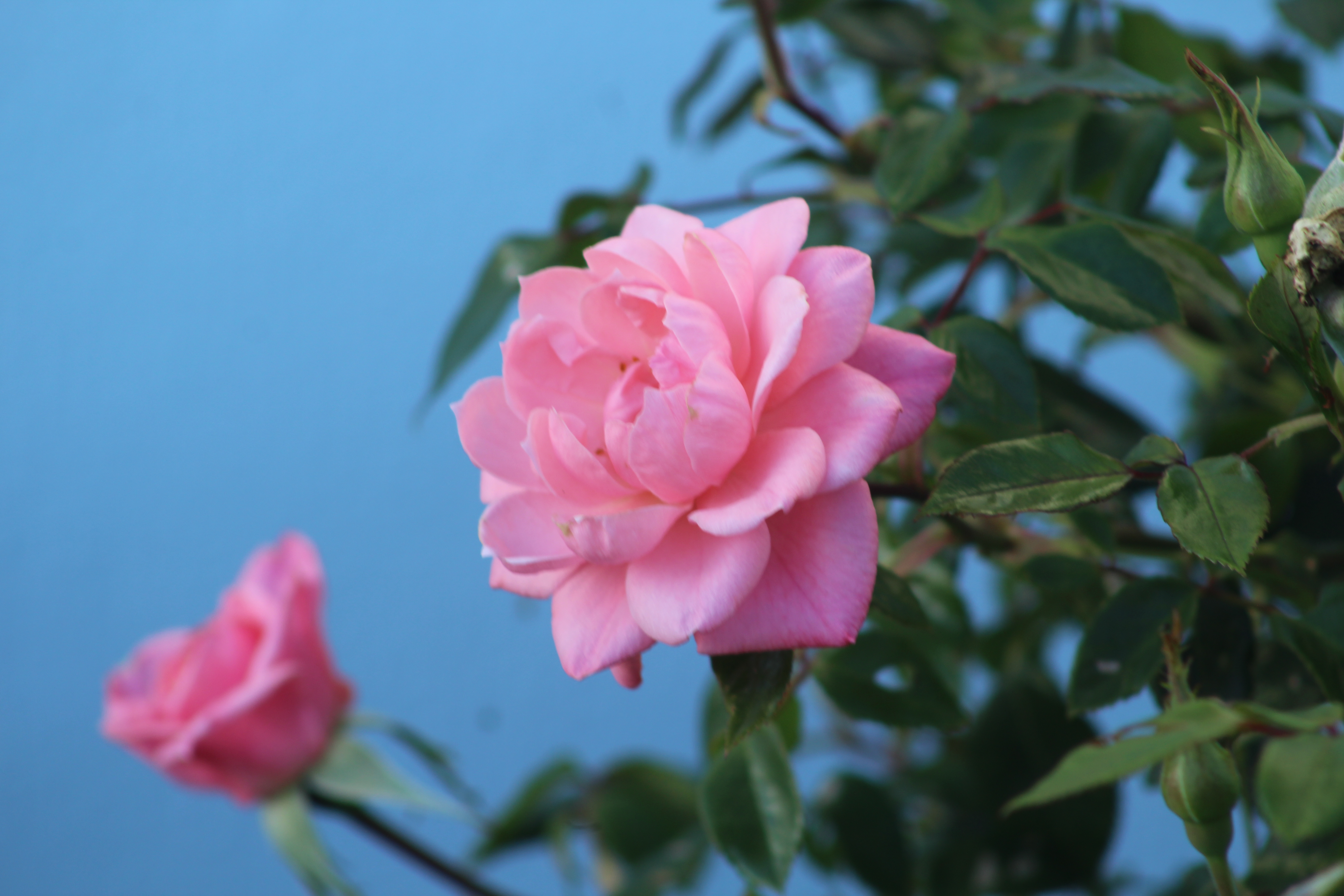
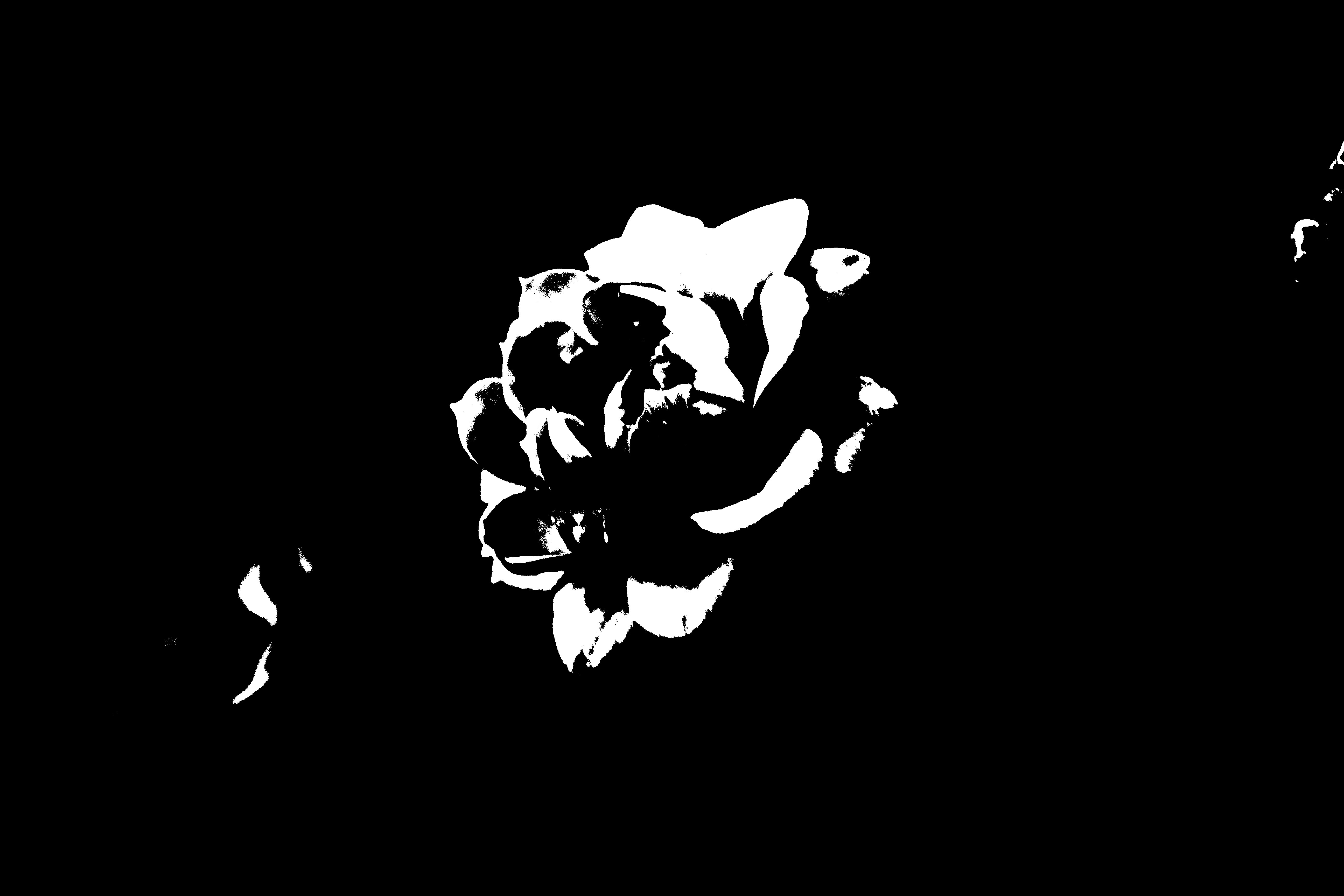
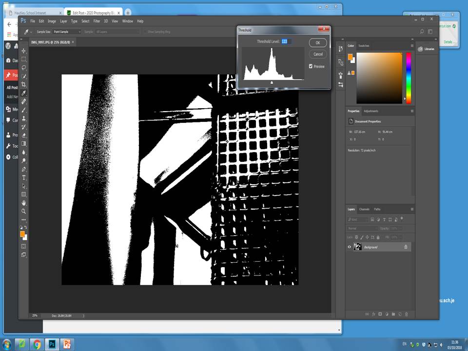
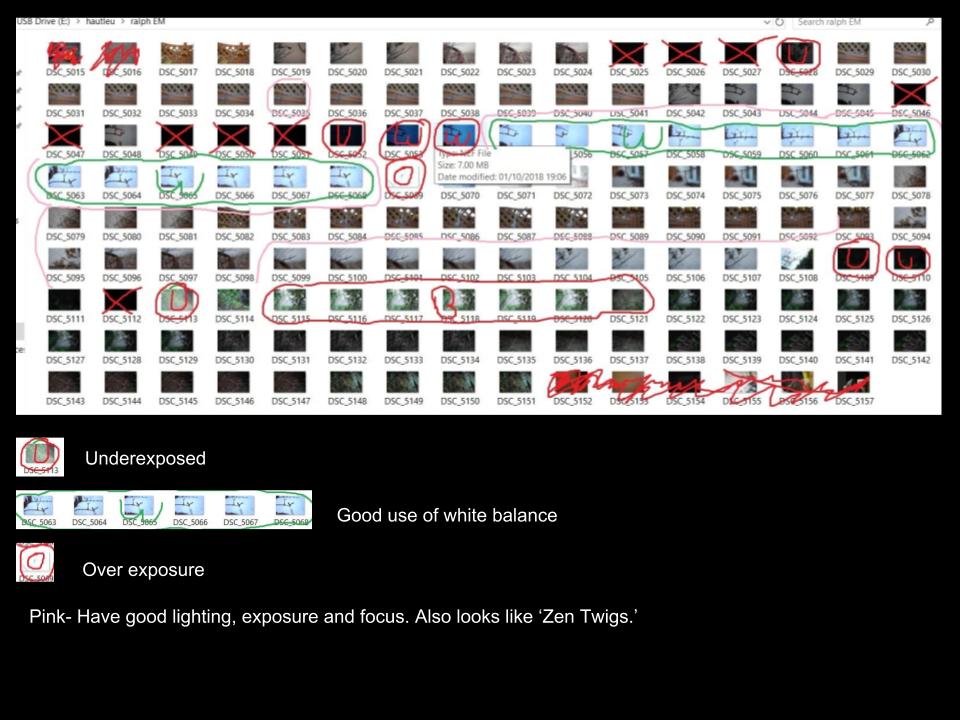
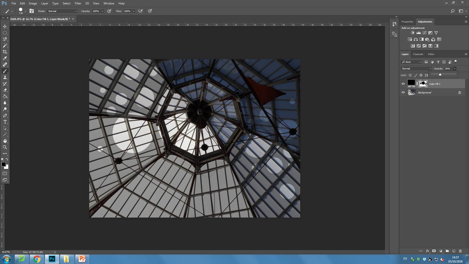
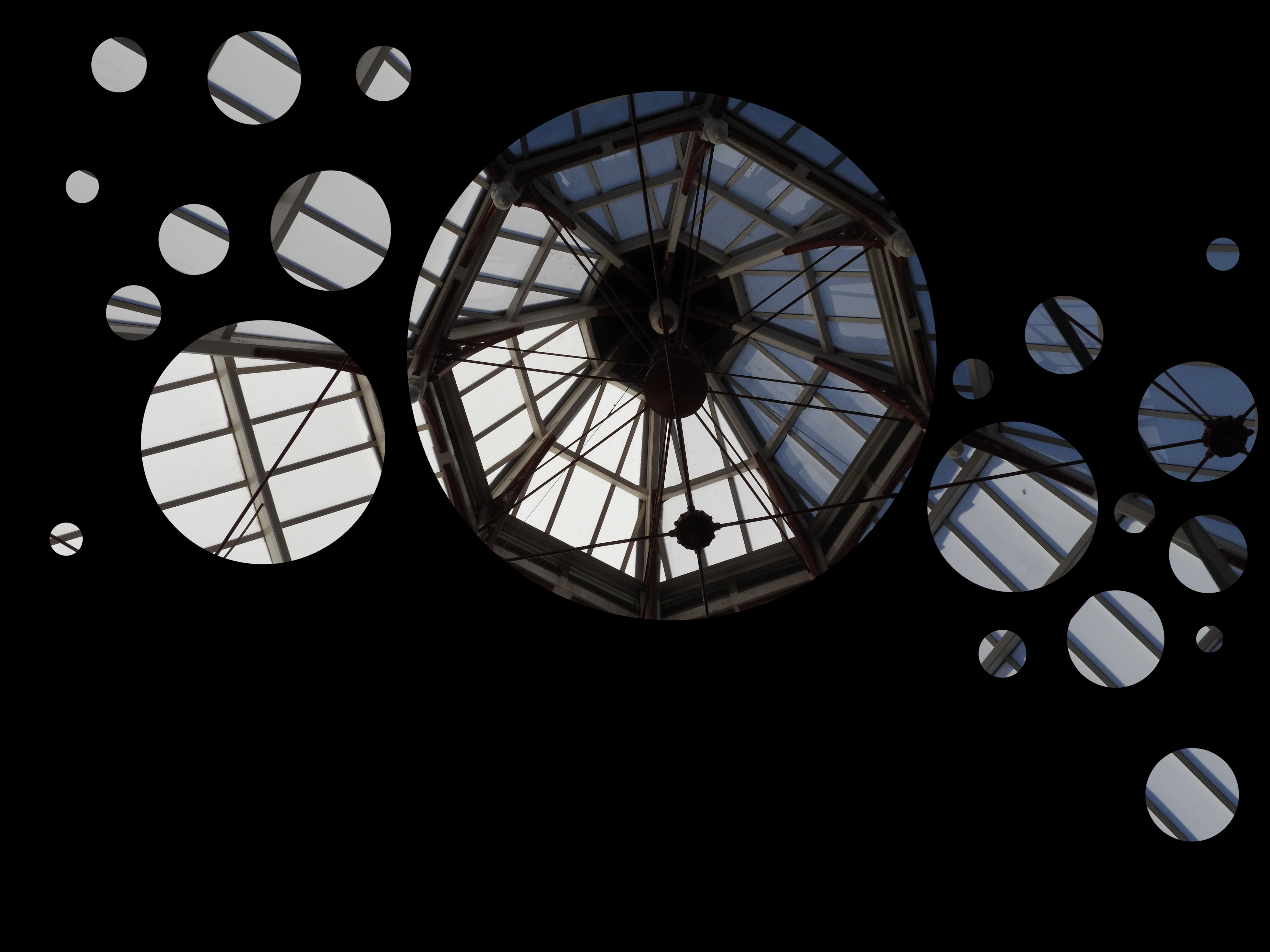
I then decided to responded to Keld Helmer-Petersen’s work, I did this by using images I had previously taken and then editing them in Photoshop. When editing the images i mainly focuses on changing the threshold of the images, to either increase the amount of white or black in the image, and making the represent the work Petersen did.
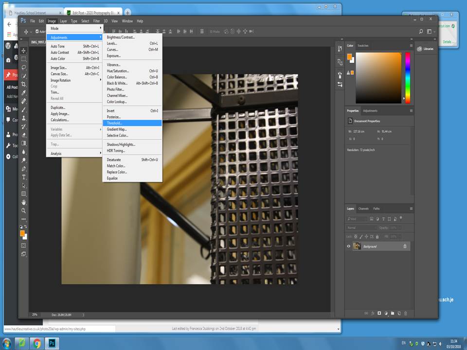
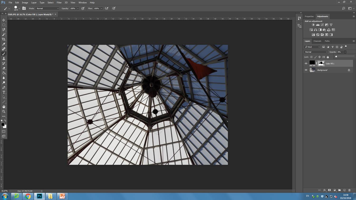
I firstly started with the original image in Photoshop and took these steps in order to change the threshold.
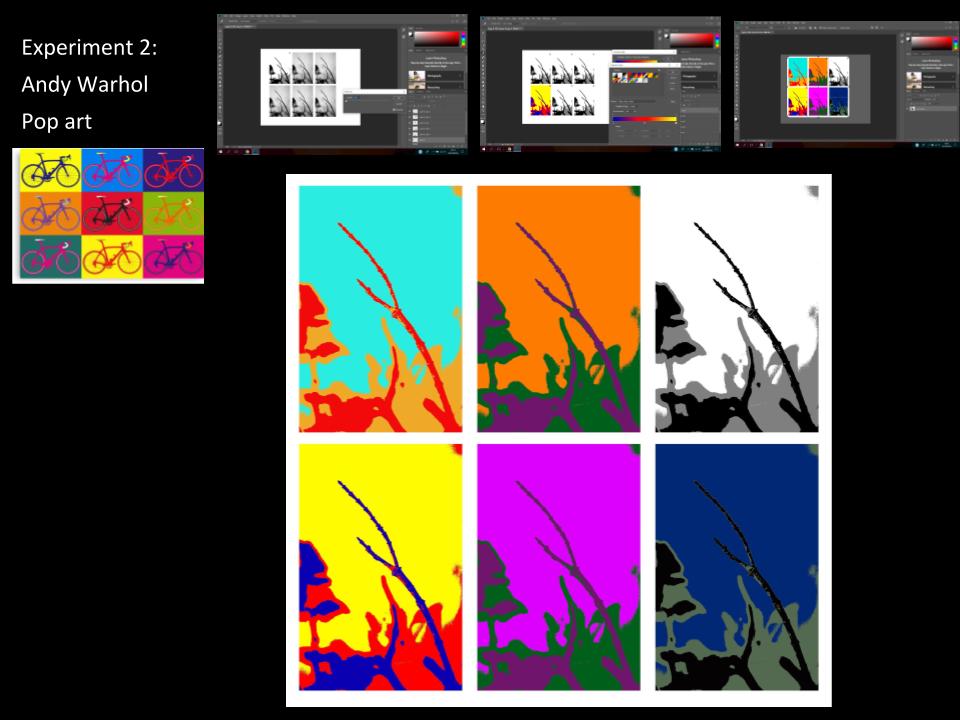
I did these step for each of my 4 images, I then copied them all over onto one page and created a gallery of these 4 final images. These are my 4 final images.
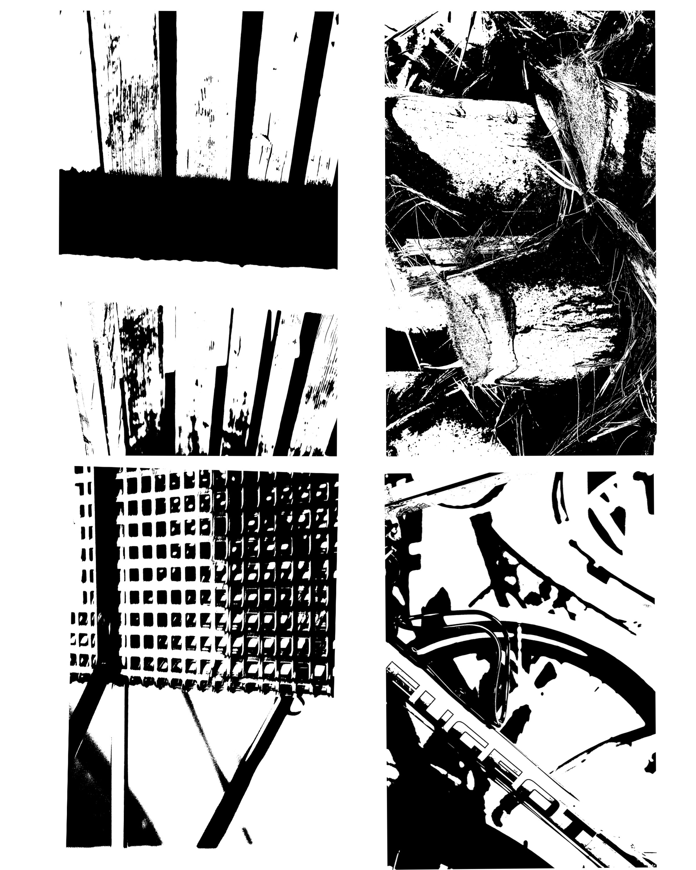
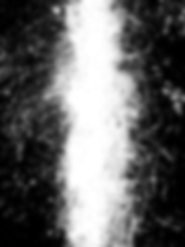
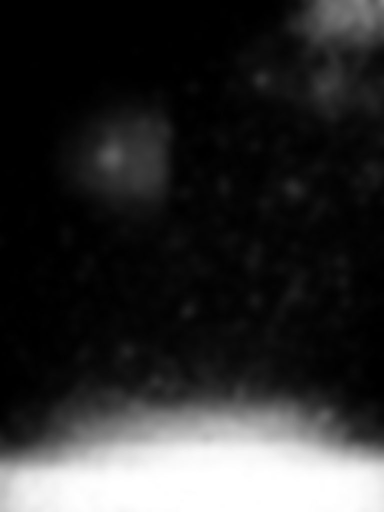
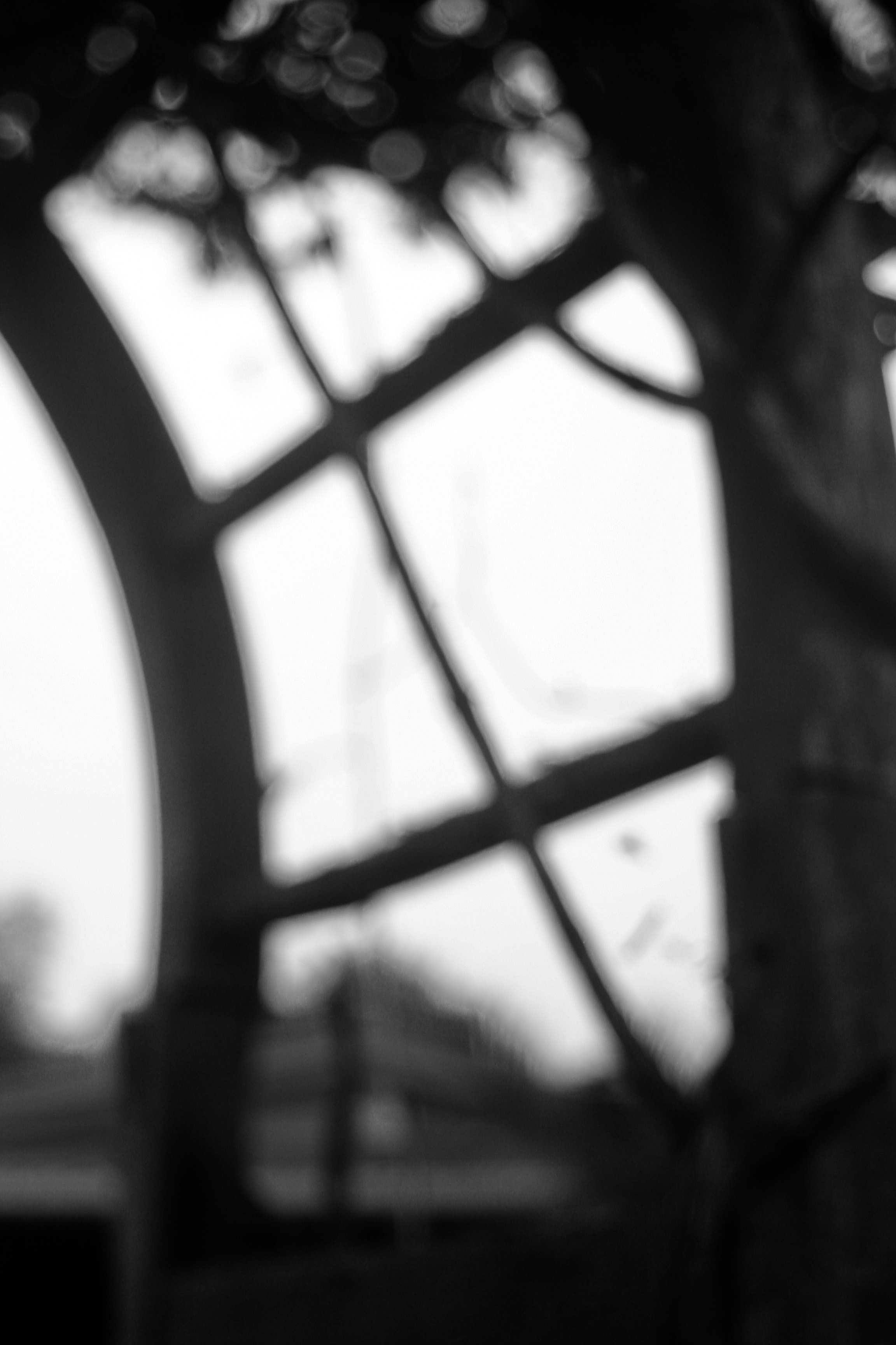
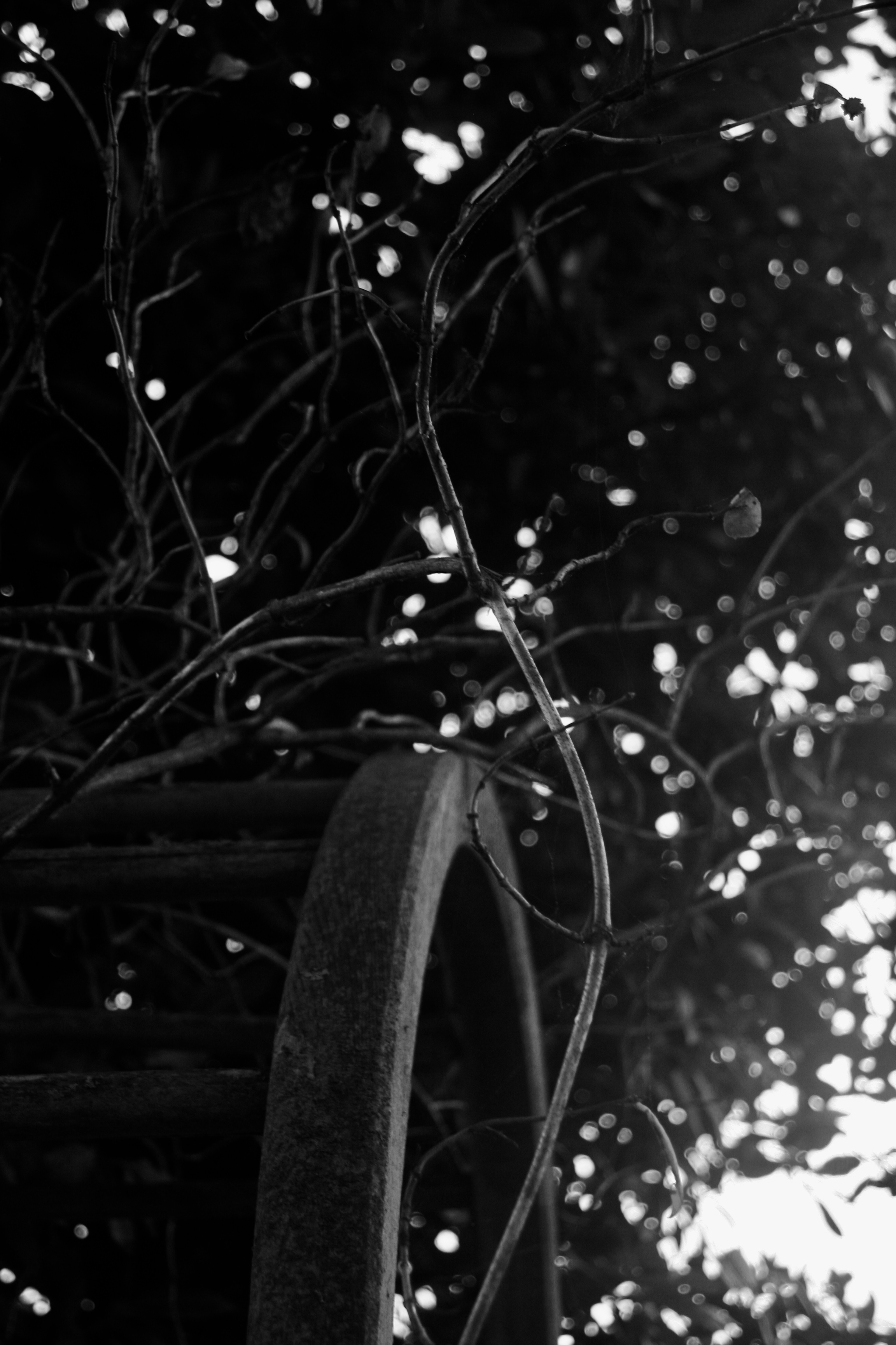
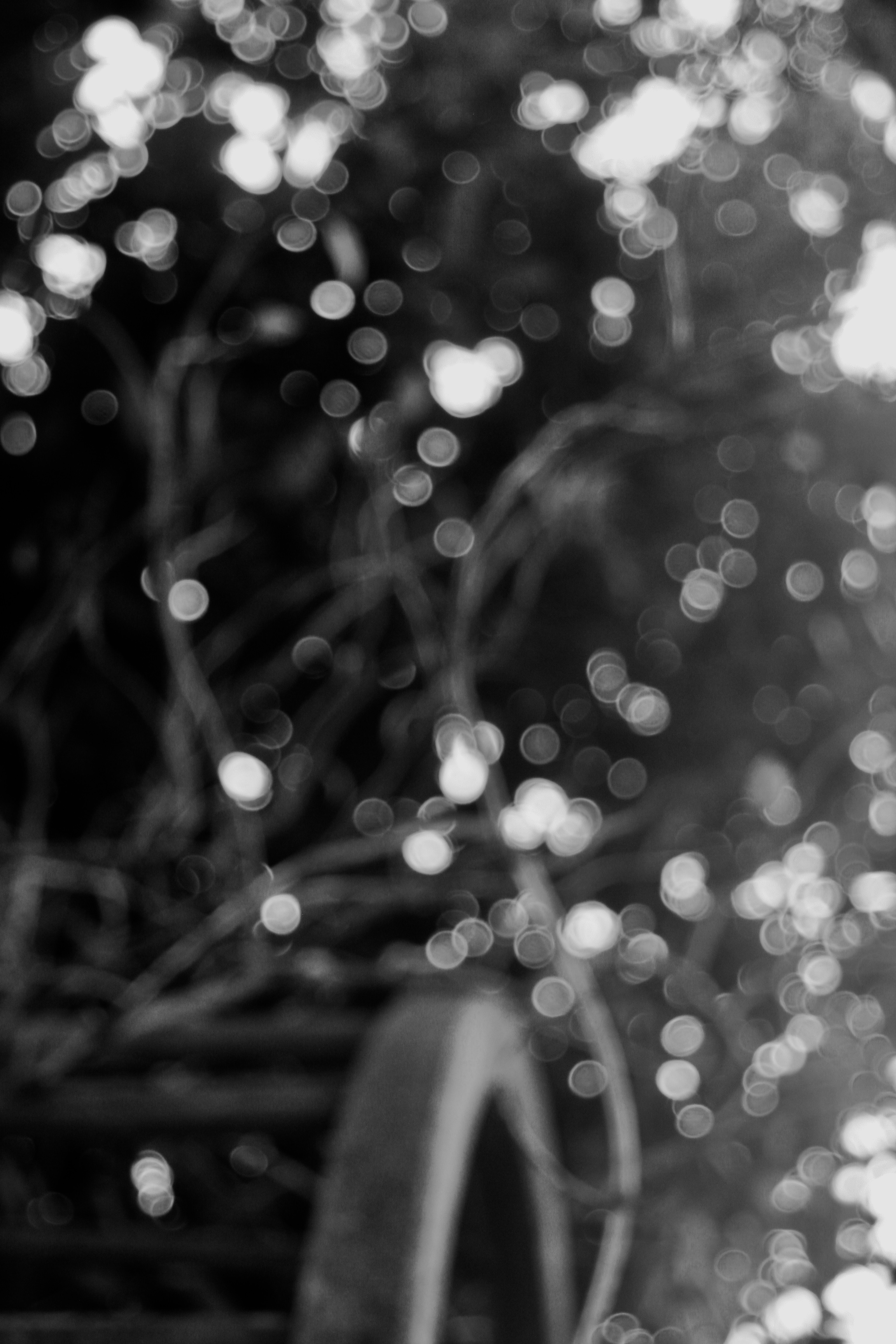
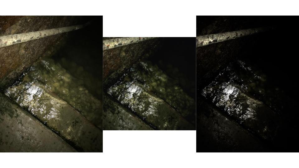
Each of these images were originally taken in natural light. All images have a range of depth and focus. The image in the top left hand corner is mainly focused on the black blocked line across the upper part of the photo and them the majority of the image is in white, where as the bottom right hand image has many more white blocks in the images and there is no real focus in the image, but there is depth, the text is at the front of the photo and then the vague lines behind the text really show off the depth of the image.

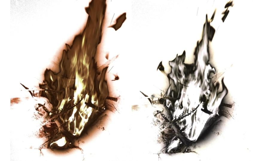


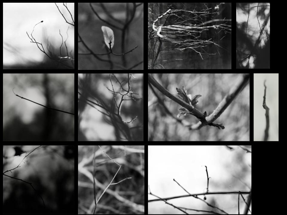


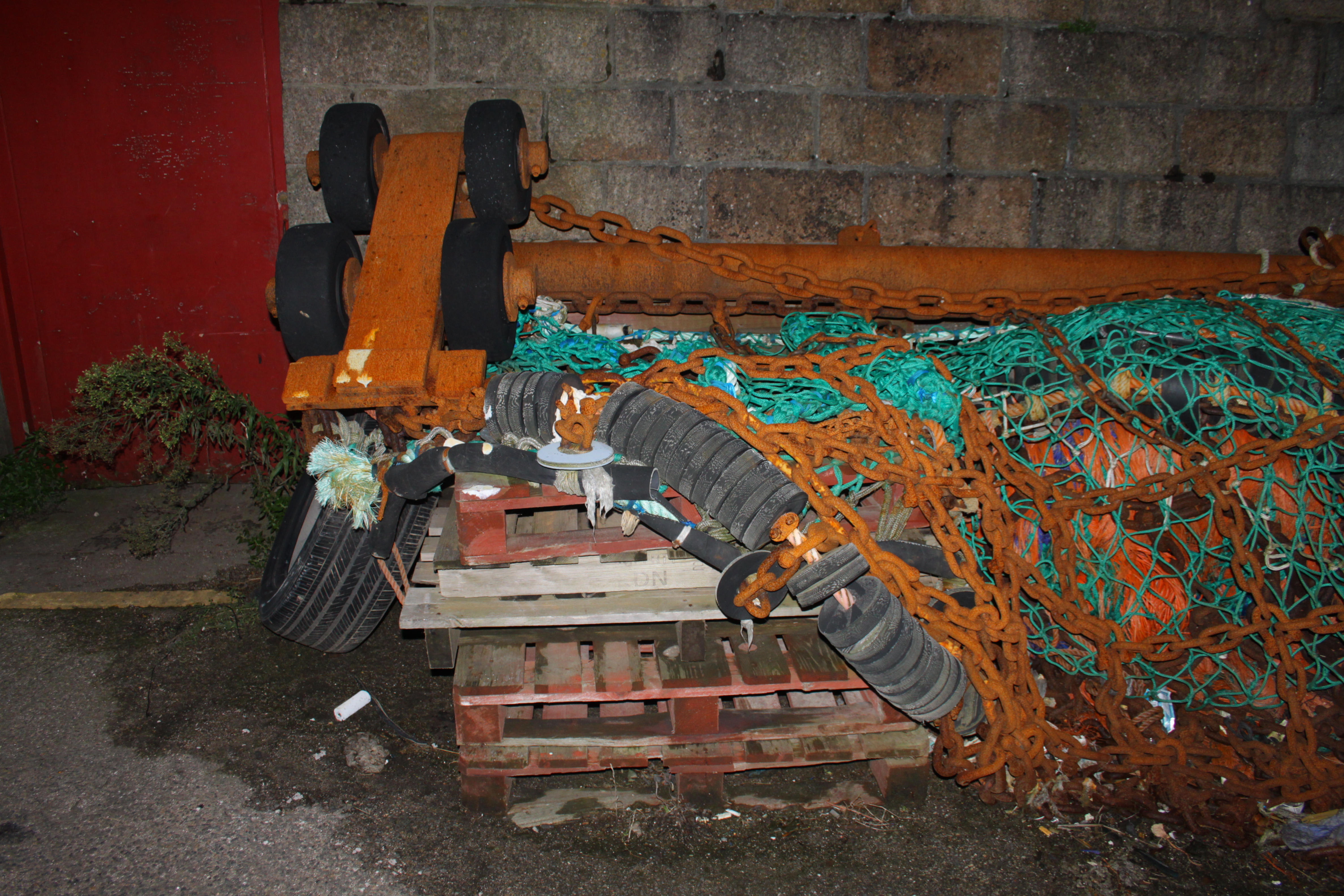
 Personal Favorite Images:
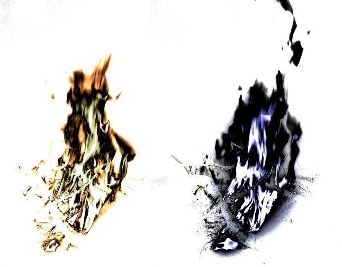