RALPH MEATYARD’S WORK AND LIFE:
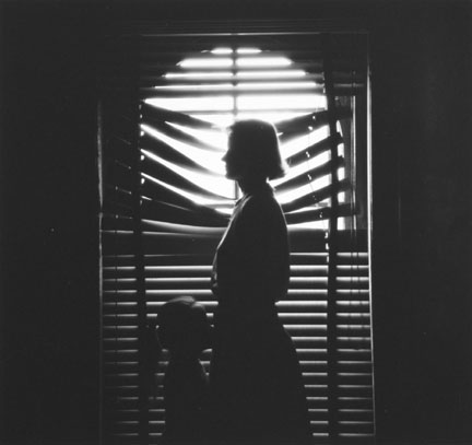
Ralph Eugene Meatyard (1925–1972) lived in Lexington, Kentucky, where he made his living as an optician while creating an impressive and enigmatic body of photographs. Meatyard’s creative circle included mystics and poets, such as Thomas Merton and Guy Davenport, as well as the photographers Cranston Ritchie and Van Deren Coke, who were mentors and fellow members of the Lexington Camera Club. Meatyard’s work spanned many genres and experimented with new means of expression, from dreamlike portraits—often set in abandoned places—to multiple exposures, motion-blur, and other methods of photographic abstraction. He also collaborated with his friend Wendell Berry on the 1971 book The Unforeseen Wilderness, for which Meatyard contributed photographs of Kentucky’s Red River Gorge. Meatyard’s final series, The Family Album of Lucybelle Crater, are cryptic double portraits of friends and family members wearing masks and enacting symbolic dramas.


WORK ANALYSIS:
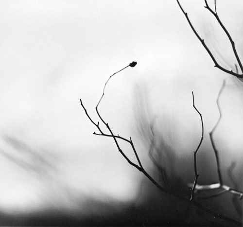
Meatyard stated in a lecture to the Louisville Photographic Society, he was involved in working on no fewer than 12 “methods, series, subjects.” Among them were what he called “photographs made under the influence of Zen,” shown here with the title “Zen Twigs.” While the images are very minimalist, they deal with growth and decay, is impressive, they are familiar enough to be looked over lightly. A particularly beautiful one (untitled, like much of Meatyard’s work) shows a young trunk sprouting — or seeming to sprout — a branch that curls around it in a wiry loop, the whole almost a visual haiku. The simplistic tonal range of the image is effective in portraying the theme of deterioration and degeneration. Meatyard has clearly used a very narrow field o view, with a singular branch being in focus and the rest of the backdrop is extremely blurry. The images are in a mid-range of exposure, not too overexposed or underexposed. The light grey tones from the backdrop of the photo, highlight they unsophisticated, dead branch. The upwards growth of the branches, have strong and dark lines which cut through the sea of blurriness. The image also contains various shades of white, black, and grey, all working together to create a harmonious image. The contrast between the blurry backdrop and the foreground give the image a real sense of depth and space.

MY OWN WORK:
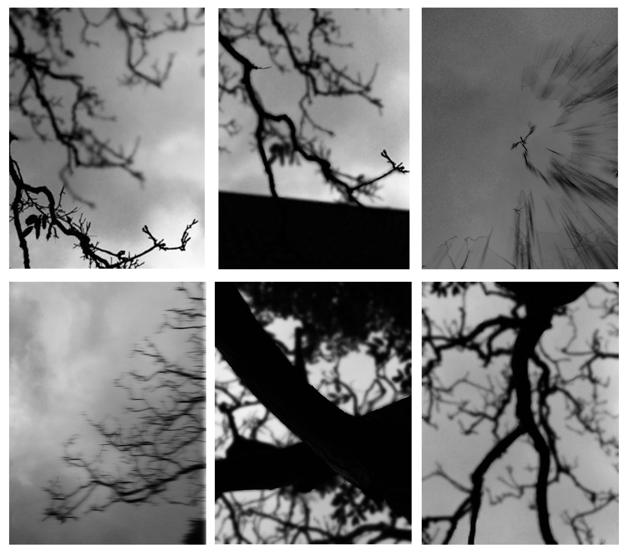
During this photo shoot, I focused mostly of the formal elements which i had to include but also capturing the Gothic nature of Meatyard’s work: dark, still, and simplistic. A dark evening, used in conjunction with editing resulted in a grey dark grey tonal range of the images.

MY WORK ANALYSIS:
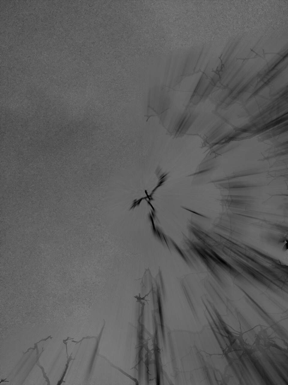
For this photo shoot I attempted as much as possible to recreate Meatyard’s “zen sticks” series. I particularly focused on exposure settings, focus control, and depth of field. The photograph below was taken of a dead tree, of the branches facing upwards towards the sky. Meatyard’s images are all very dark and dramatic therefore I chose to do my photo shoot during the evening, on a stormy, grey day. I increased the exposure to 800 in order to capture the branches in a dark setting yet still have some highlights and shadows. The dark night, and mid-range ISO setting meant that the image contracted a lot of motion blur, the effect which i was aiming to get. It resembles the work of Meatyard in many ways. The dark evening also meant that the resolution of the images decreased and became more grainy. The branches of the tree were also quite far up meaning i had to decrease the depth of field and zoom in, again compromising the quality of the image. The grainy texture of the image I feel adds to the overall aesthetic of Meatyard’s work: old and worn. The differences in motion blur also create a focal point in the image, with the central branch being less blurred than the outermost parts of the image. The image is also quite underexposed which further adds to the dramatic and intense tone, giving it almost a Gothic aura. There is a very apparent sense of space in the photo as the lack of branches in the top left hand corner of the image freeing up space. There is also a lack of light in this image due to both the time of day the image was taken and the lack of exposure adjustments made on the image during editing as i wanted to retain the dark theme.

