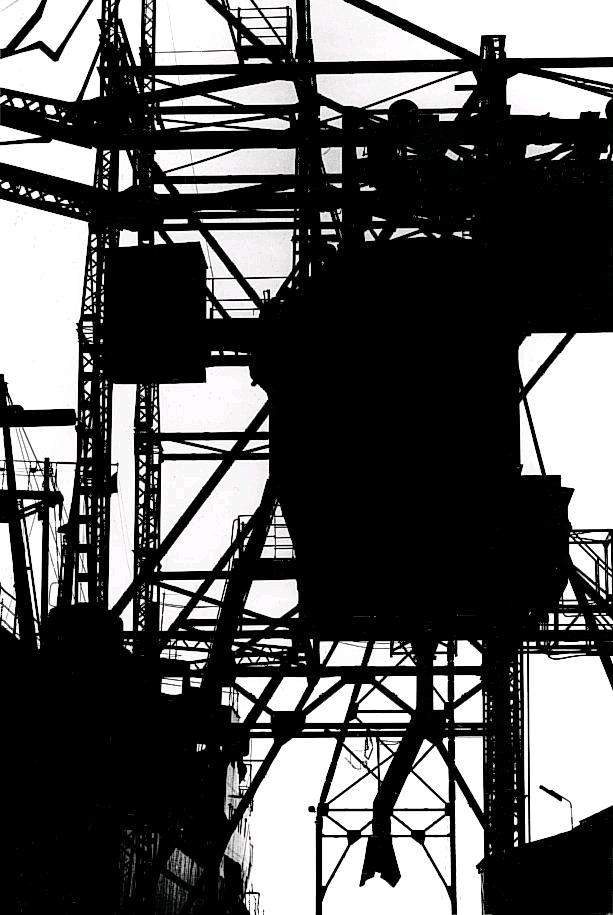
Keld Helmer-Peterson is a Danish photographer, who took inspiration from Albert Ranger-Patzsch (who I previously researched). Peterson began his passion of photograph in 1938, where he received his first camera as a gift for graduating. In 1940 Helmer decided to try out and become familiar with war photography // new objectivity as it was a recent concept at the time

The aim of the images in this series was to get rid of mid tones, He took a normal image, which usually images of industrial machines and places, and turned it completely black and white, making the images more in contrast. In his images there is also a lot of negative space, which has allowed he structure of the metal work to really stand out to us and helps to create a sense of emptiness. The clear formal elements which are presented in this image are tone, shape and line, which are all clearly shown through the structure. The lines are also used to guide the viewers eyes around the frame of the image, starting from the bottom and then making our way to the top. The lighting is most likely to be natural as industrial images are usually taken outside, as you can not place the tall machines inside. The ISO is not sensitive to the light, as there is no visible noise in the frame of the image, which suggests that the ISO is low. Moreover, the shutter speed is likely to be quick as the whole frame seems to be in focus, with no blur. Due to the whole frame being in focus it also means that this photograph has a large depth of field. The aperture of the camera is likely to be high, which helps makes the whole frame more in focus. Due to the nature of the image being completely black and white, it creates a cold temperature adding to the mood of the image. Peterson has cleverly used inspiration from Patzsch but has still managed to add his own ‘twist’ to make his images more unique. I really like the idea of getting rid of the mid tones as it makes the structures seem more isolated, which allows it to stand out more, captivating the viewers.
My Response
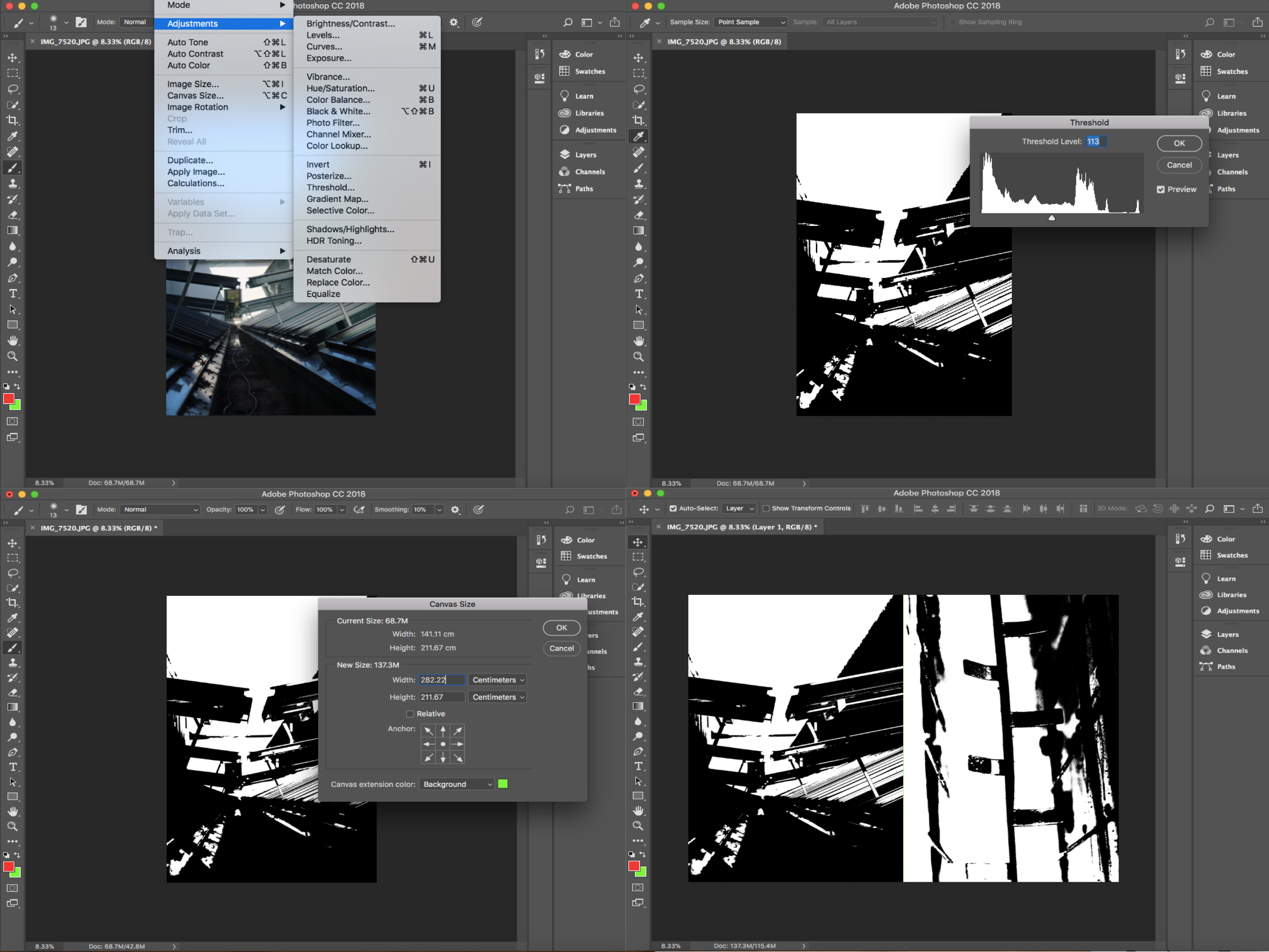
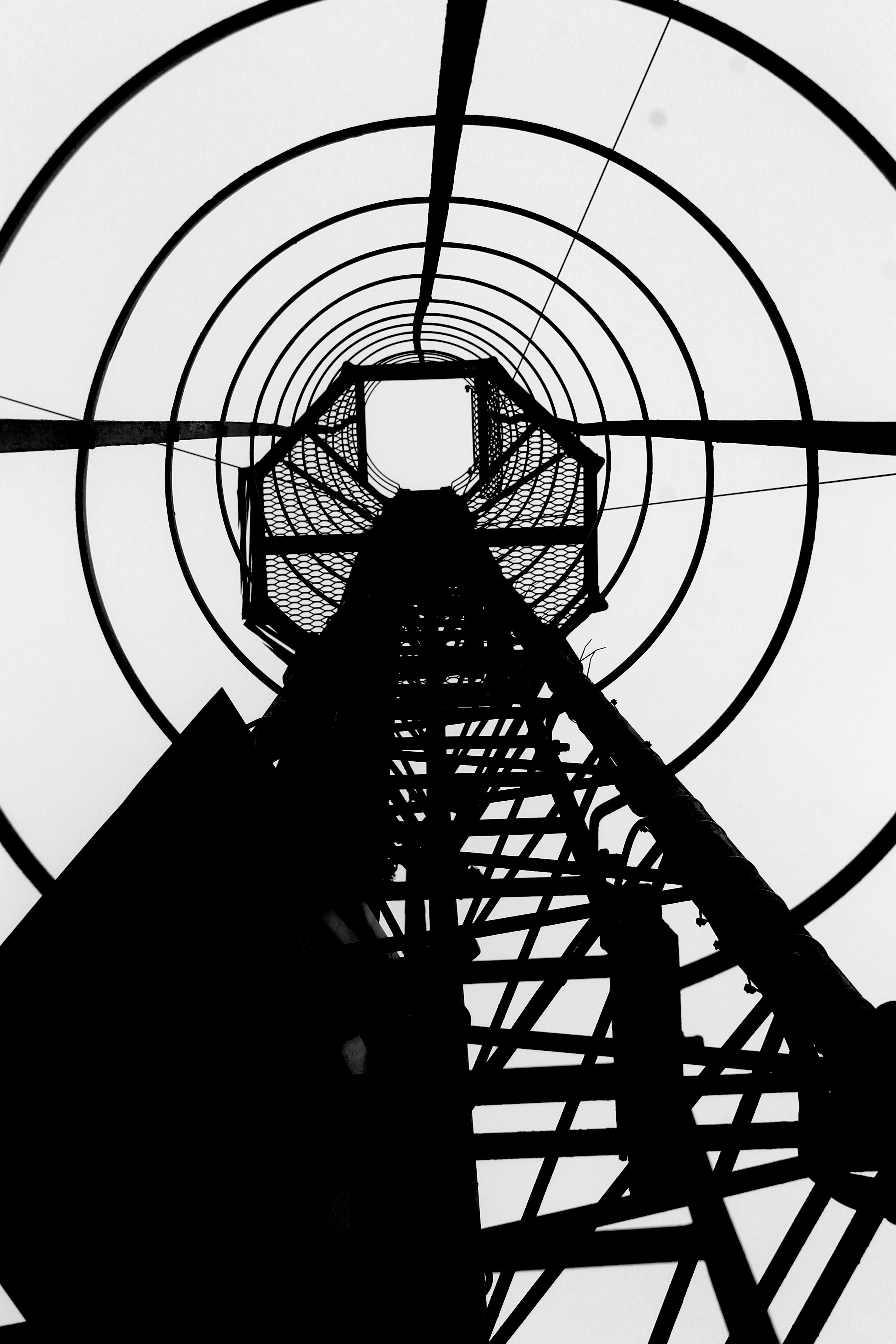
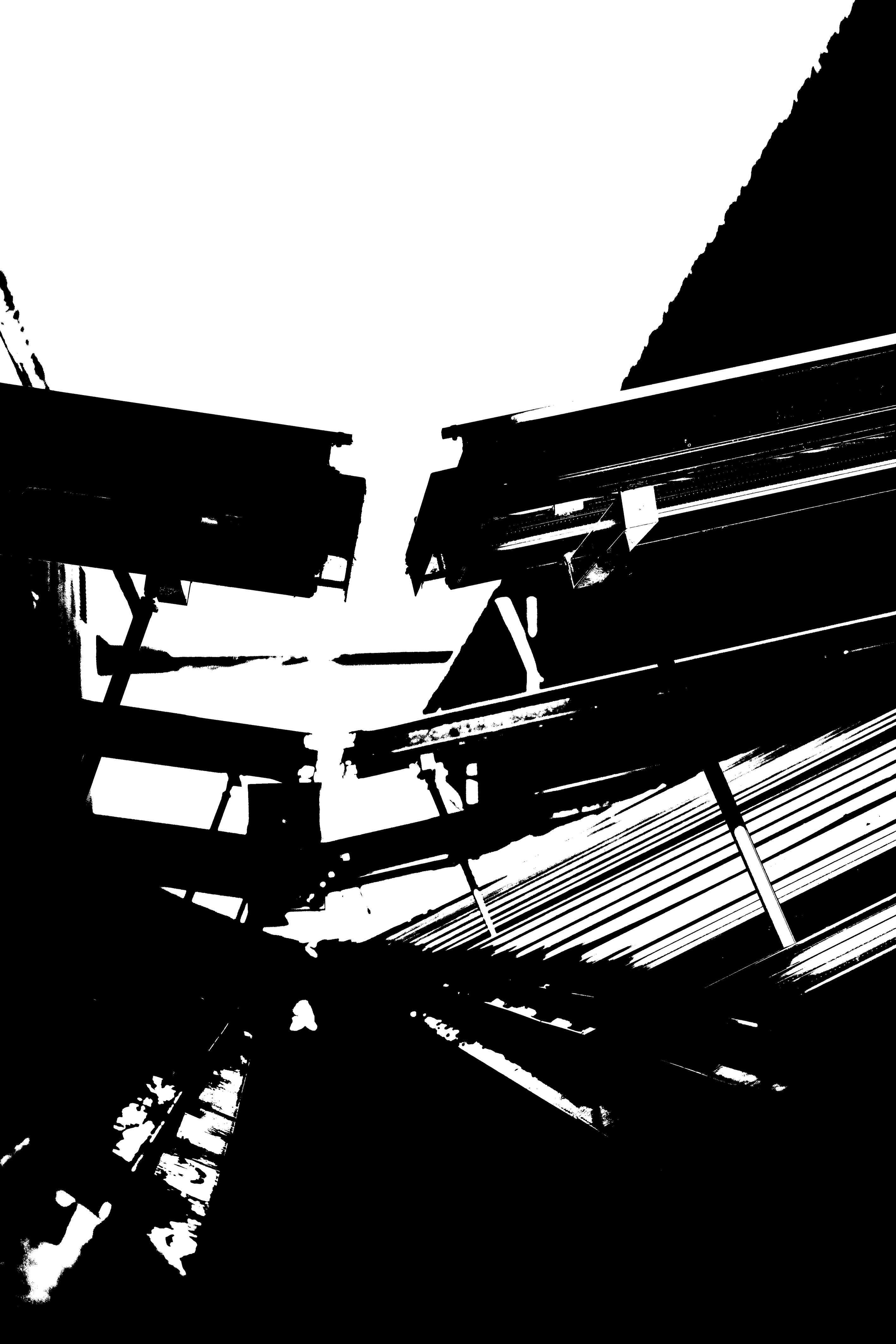
In order to recreate Peterson’s work, I went through previous photoshoots and selected four images which I thought would go well with this mid tone idea. I then opened them all up on photoshop and went up to image>adjusment>threshold. I then adjusted the slider until I was happy with the final outcome (These steps are shown below through the screen shots taken). I then changed the image sizes, in order to make them all the same size. Then on one of the images I doubled the width of the canvas sized and dragged another one of my images next to it. I then doubled the hight allowing me to place the other two edits onto the screen, creating a grid of four. I then saved this edit to the size of an A4 paper, allowing me to print it out.


Final Outcome

