Keld Helmer-Peterson

Keld Helmer-Peterson

Keld Helmer-Peterson is a Danish Modernist photographer born in 1920 and died in 2013. he was famous for his photography sue the structure of his images and the different types of pattern he used. His photos tended to be based in more industrial areas, city spaces and nature. Keld started photograph in the late 1930s in his late teens and first made his name with his a book ‘122 colour photographs’ in 1948. This particular book is extremely well known due its innovative use of colour patterned throughout in the landscape and building. Whilst in 1950s and 1960s he began to focus more on the idea of architecture and design photography, and his work began to lean to be present in a more abstract way. This happened as he began to look at other artist and began to get inspiration. He looked at German and American photography as well as other international abstract art that he liked. As well as many other artist Keld Helmer-Peterson was very much inspired by Albert Reneger-Patzsch, a German artist (previously spoken about).

From the 1970s, Keld Helmer-Peterson was busy working with figures found with objects using shadows and contrasts. Much like photographer Irving Penn (also famous at the time) Helmer-Peterson would walk along pavements, looking in different angles of different objects. This resulted in works  such as  the series Deformationer that was produced. Then from 1974 to1993 Keld Helmer-Peterson produced a large series of close-up abstract colour photographers of walls, timber socks etc. A few of these pieces were chosen and were published in the book ‘Danish beauty’, in 2004.

NativeNative

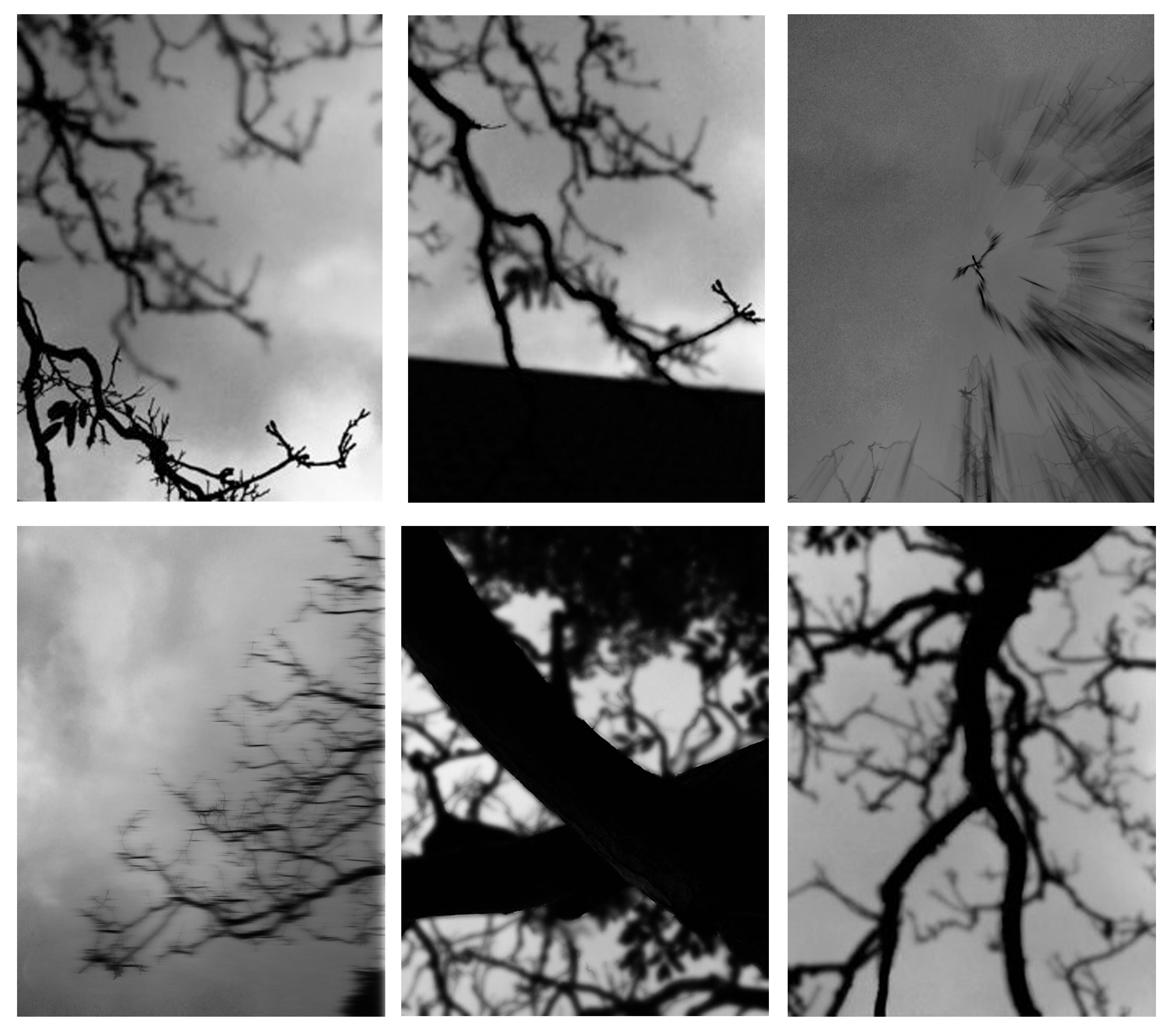
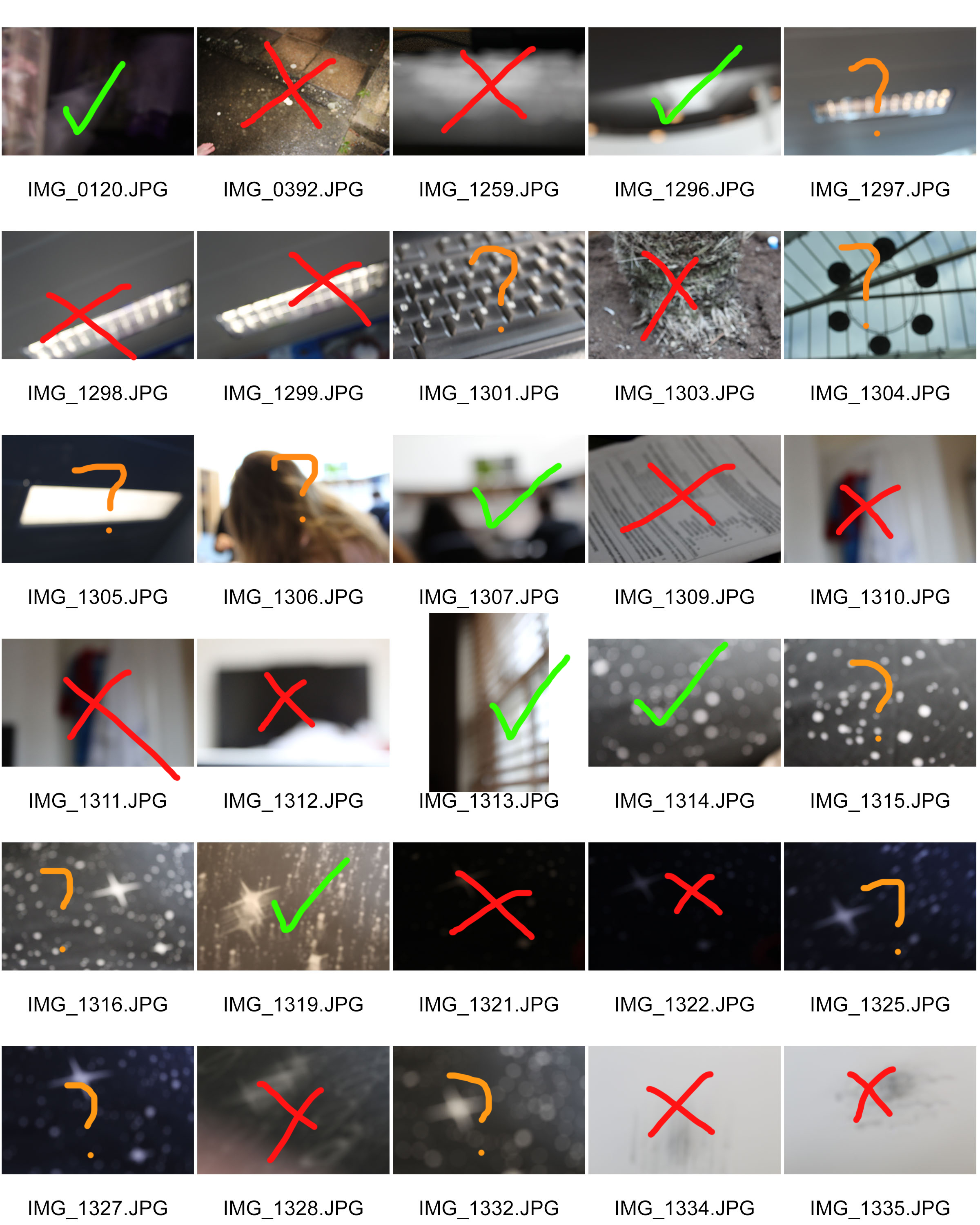
After closely looking at Keld Helmer-Peterson, it was clear that he wanted to focus on the idea of black and white images and taking advantages of the negative space in photographs.


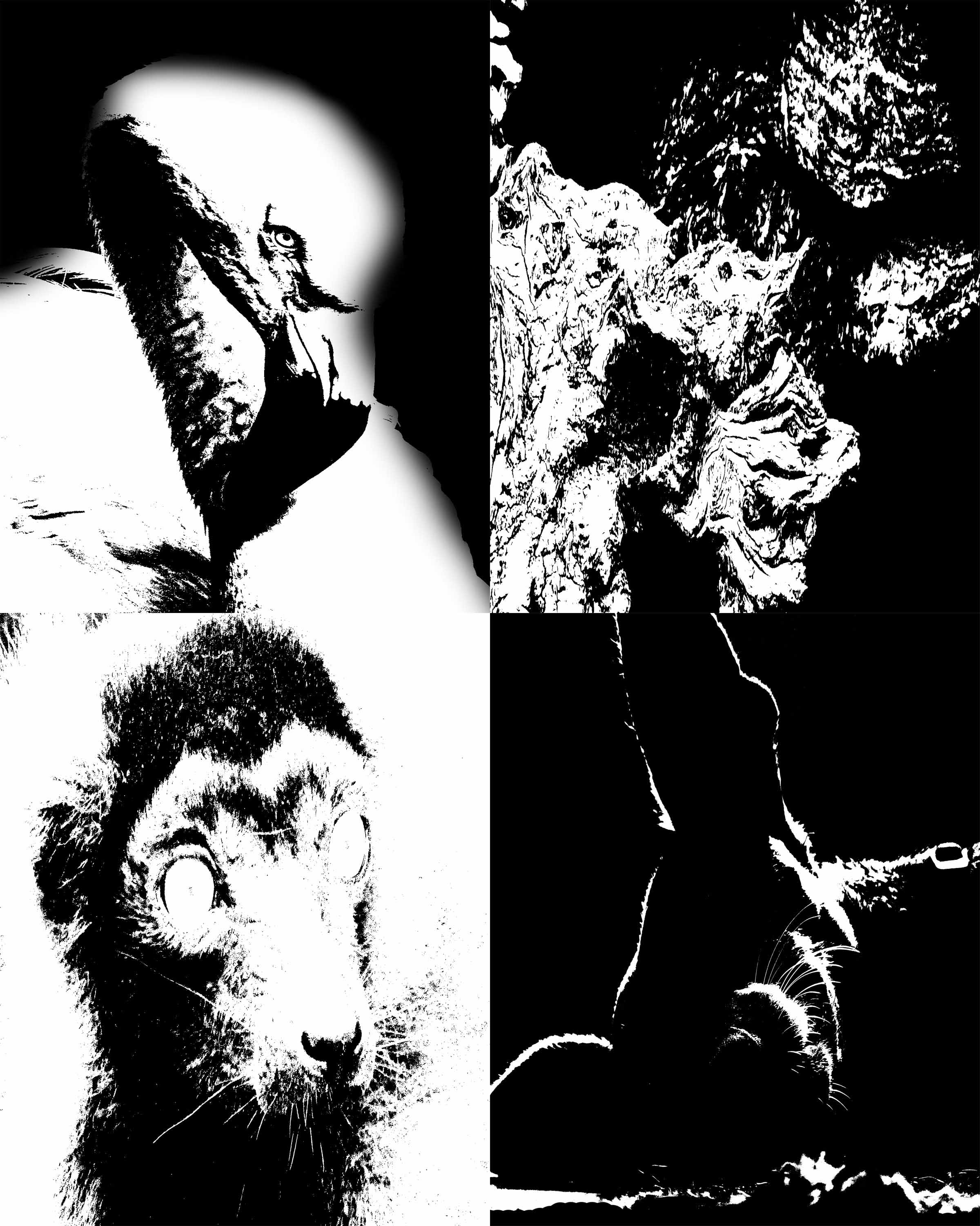
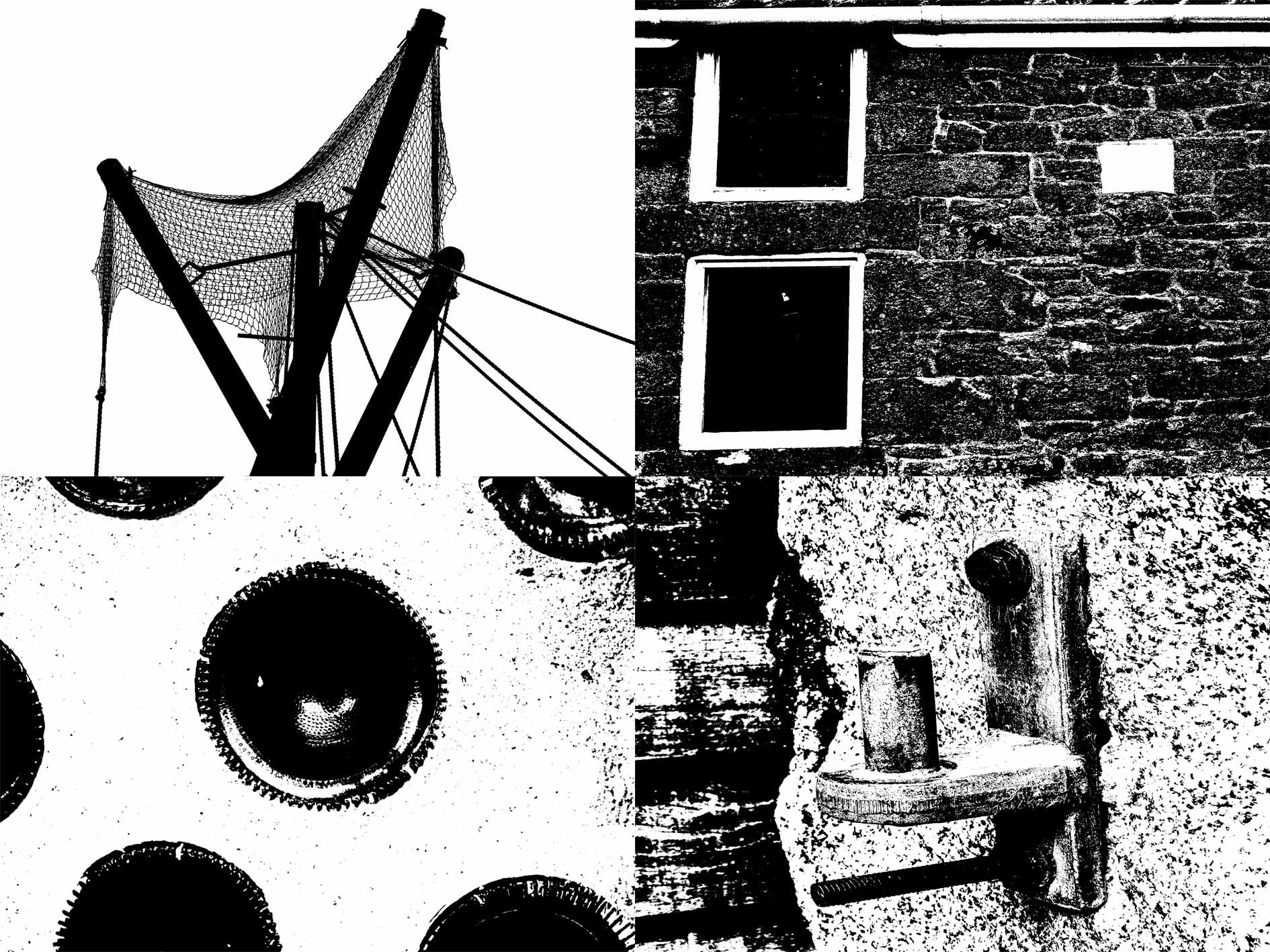
Experimenting with threshold and negative background


Ralph Meatyard response

RALPH MEATYARD’S WORK AND LIFE:

Ralph Eugene Meatyard (1925–1972) lived in Lexington, Kentucky, where he made his living as an optician while creating an impressive and enigmatic body of photographs. Meatyard’s creative circle included mystics and poets, such as Thomas Merton and Guy Davenport, as well as the photographers Cranston Ritchie and Van Deren Coke, who were mentors and fellow members of the Lexington Camera Club. Meatyard’s work spanned many genres and experimented with new means of expression, from dreamlike portraits—often set in abandoned places—to multiple exposures, motion-blur, and other methods of photographic abstraction. He also collaborated with his friend Wendell Berry on the 1971 book The Unforeseen Wilderness, for which Meatyard contributed photographs of Kentucky’s Red River Gorge. Meatyard’s final series, The Family Album of Lucybelle Crater, are cryptic double portraits of friends and family members wearing masks and enacting symbolic dramas.

WORK ANALYSIS:

Meatyard stated in a lecture to the Louisville Photographic Society, he was involved in working on no fewer than 12 “methods, series, subjects.” Among them were what he called “photographs made under the influence of Zen,” shown here with the title “Zen Twigs.” While the images are very minimalist, they deal with growth and decay, is impressive, they are familiar enough to be looked over lightly. A particularly beautiful one (untitled, like much of Meatyard’s work) shows a young trunk sprouting — or seeming to sprout — a branch that curls around it in a wiry loop, the whole almost a visual haiku. The simplistic tonal range of the image is effective in portraying the theme of deterioration and degeneration. Meatyard has clearly used a very narrow field o view, with a singular branch being in focus and the rest of the backdrop is extremely blurry. The images are in a mid-range of exposure, not too overexposed or underexposed. The light grey tones from the backdrop of the photo, highlight they unsophisticated, dead branch. The upwards growth of the branches, have strong and dark lines which cut through the sea of blurriness. The image also contains various shades of white, black, and grey, all working together to create a harmonious image. The contrast between the blurry backdrop and the foreground give the image a real sense of depth and space.


MY OWN WORK:

During this photo shoot, I focused mostly of the formal elements which i had to include but also capturing the Gothic nature of Meatyard’s work: dark, still, and simplistic. A dark evening, used in conjunction with editing resulted in a grey dark grey tonal range of the images.

six of my most successful photos

MY WORK ANALYSIS: 

For this photo shoot I attempted as much as possible to recreate Meatyard’s “zen sticks” series. I particularly focused on exposure settings, focus control, and depth of field. The photograph below was taken of a dead tree, of the branches facing upwards towards the sky. Meatyard’s images are all very dark and dramatic therefore I chose to do my photo shoot during the evening, on a stormy, grey day. I increased the exposure to 800 in order to capture the branches in a dark setting yet still have some highlights and shadows. The dark night, and mid-range ISO setting meant that the image contracted a lot of motion blur, the effect which i was aiming to get. It resembles the work of Meatyard in many ways. The dark evening also meant that the resolution of the images decreased and became more grainy. The branches of the tree were also quite far up meaning i had to decrease the depth of field and zoom in, again compromising the quality of the image. The grainy texture of the image I feel adds to the overall aesthetic of Meatyard’s work: old and worn. The differences in motion blur also create a focal point in the image, with the central branch being less blurred than the outermost parts of the image. The image is also quite underexposed which further adds to the dramatic and intense tone, giving it almost a Gothic aura. There is a very apparent sense of space in the photo as the lack of branches in the top left hand corner of the image freeing up space. There is also a lack of light in this image due to both the time of day the image was taken and the lack of exposure adjustments made on the image during editing as i wanted to retain the dark theme.

Week 4 Homework – Uta Barth

Uta Barth

Related image
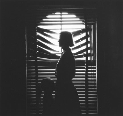
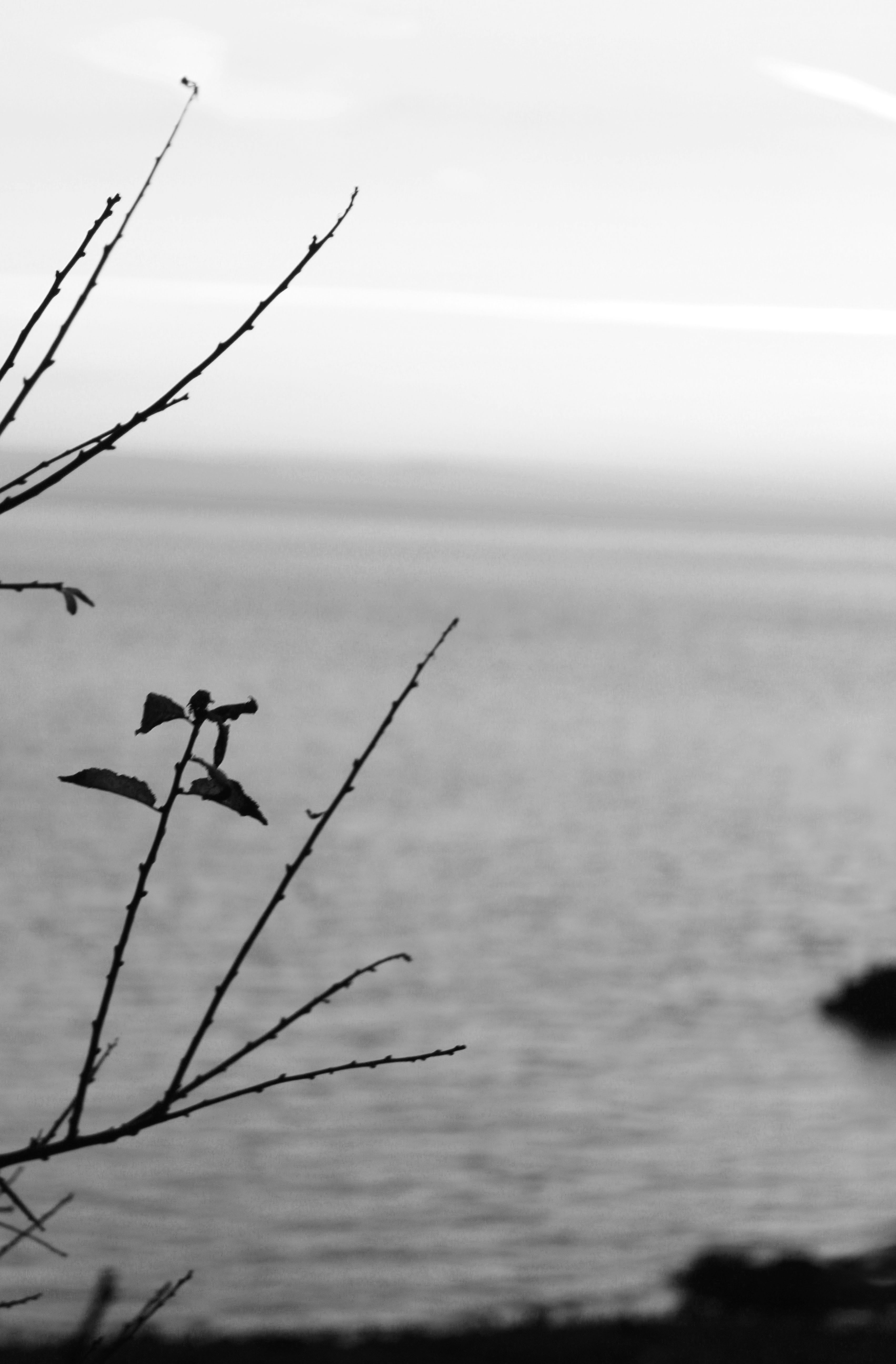
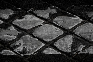
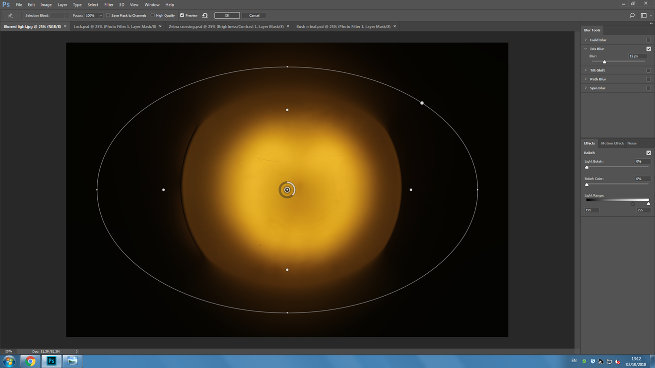
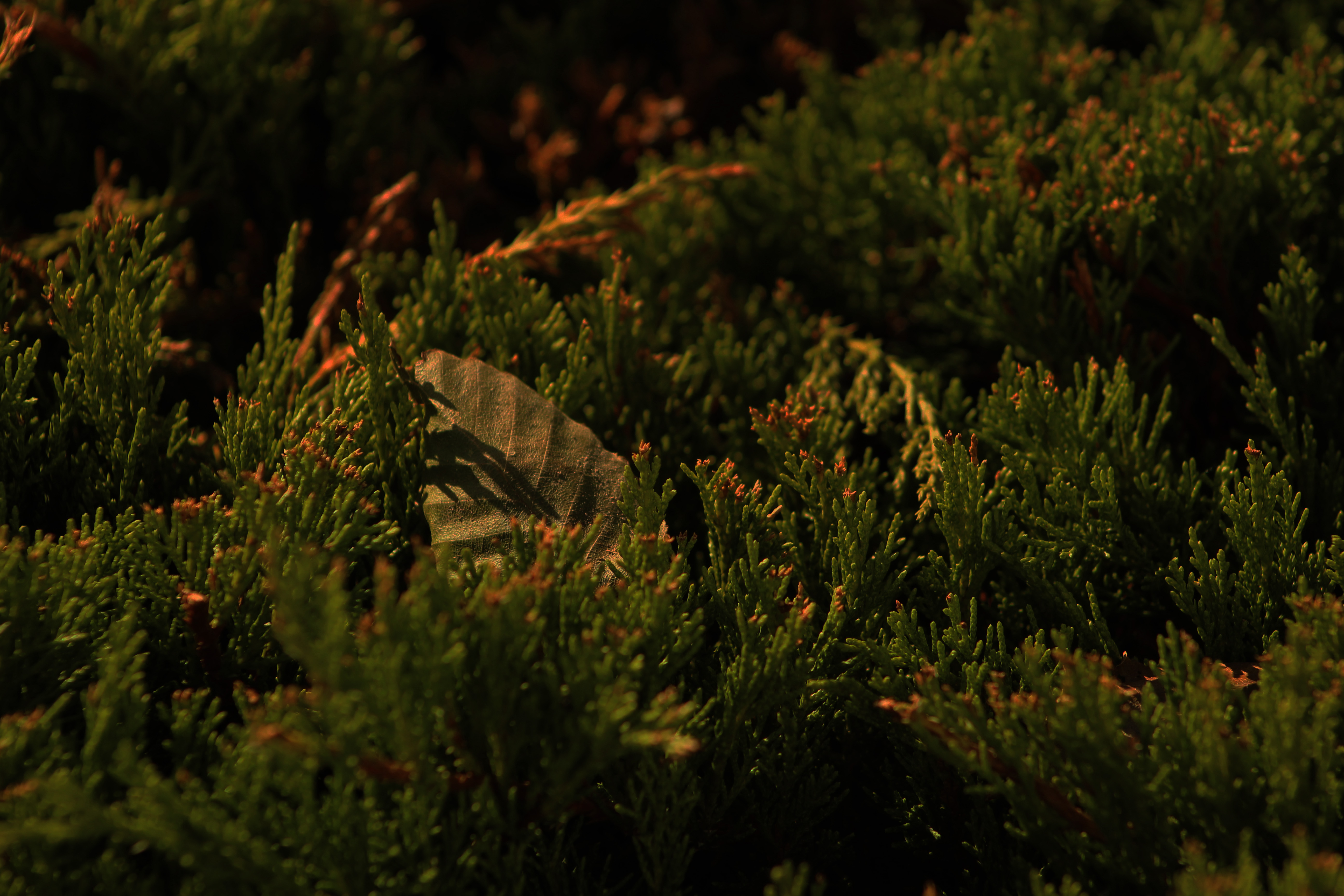
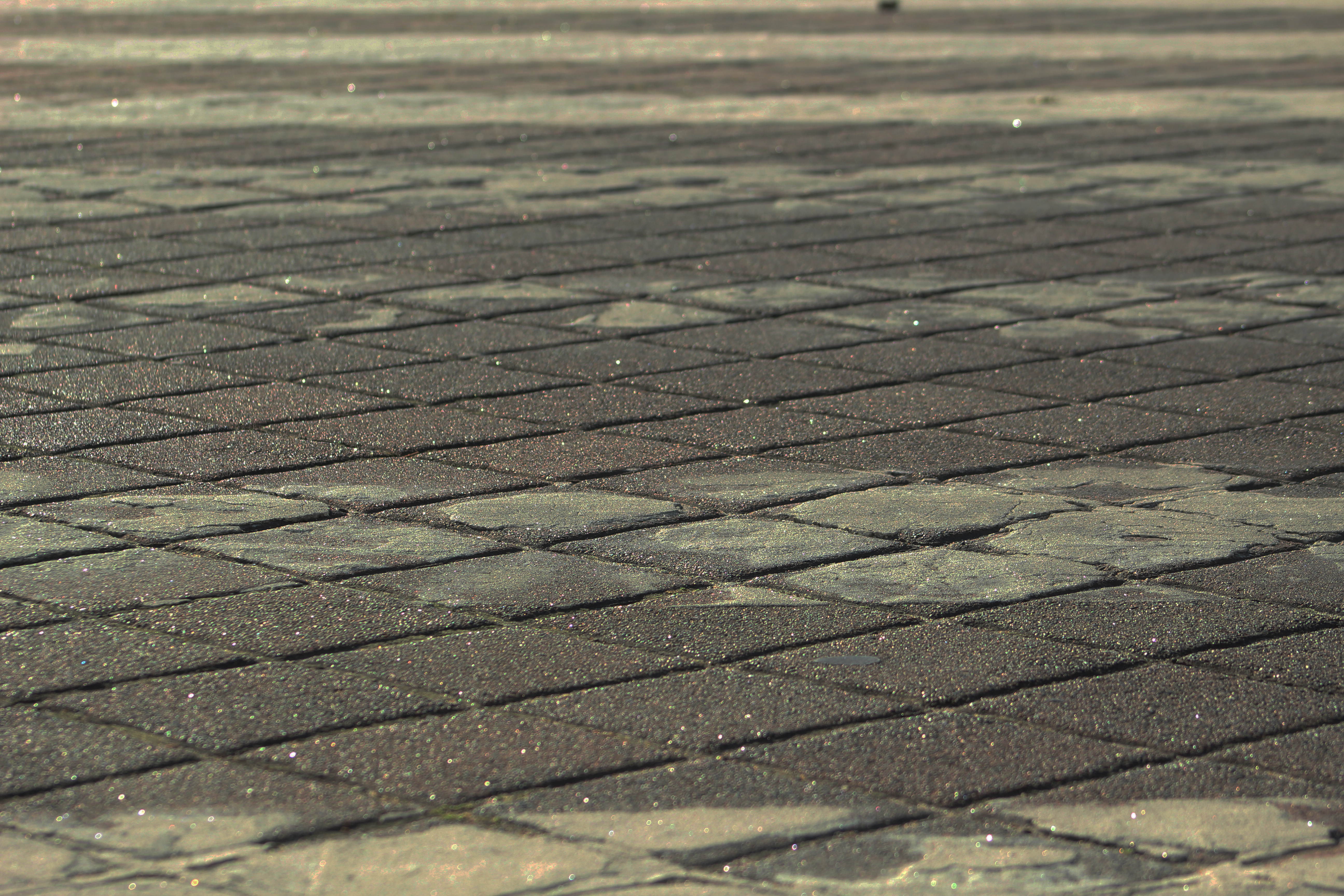
Uta Barth is a contemporary photographer who lives and works in Los Angeles, California. She is a 2012 MacArthur Fellow and a recipient of the John Simon Guggenheim Fellowship in 2004‑05. Barth experiments with blurred backgrounds, cropped frames and the natural qualities of light.

Uta Barth’s work is represented in numerous public and private collections worldwide, including the ‘Museum of Modern Art’, the ‘Metropolitan Museum of Art’, the ‘Solomon R. Guggenheim Museum’, and the ‘Whitney Museum of American Art’ in New York; the ‘Tate Gallery’ in London; the ‘Art Institute of Chicago’ and the ‘Museum of Contemporary Art’ in Chicago; and the ‘Los Angeles County Museum of Art’, the ‘Museum of Contemporary Ar’t, the ‘J. Paul Getty Museum’, and the ‘Hammer Museum’ in Los Angeles; the ‘San Francisco Museum of Modern Art’; the ‘Walker Art Center’ in Minneapolis; and ‘Massachusetts Museum of Contemporary Art’ in North Adams, Massachusetts.

Her work is exhibited regularly and has been shown in one-person and group exhibitions in galleries and museums throughout the United States and Europe, including New York, Los Angeles, San Francisco, London, Stockholm, Sweden, Düsseldorf, Germany, Bilbao, Spain, and Tokyo, Japan.

Example of her Work


Image result for uta barthImage result for uta barth
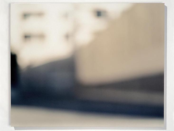
I really like how she takes her photos as it gives a very vintage and retro vibe, which I personally really enjoy

My work in the style of Uta Barth

For this homework I decided to experiment with white balance and manual exposure. I kept the ISO on 400 and I differentiated between different shutter speeds from 1/3-1/80. I also kept it on F5.6.Image result for white balance on camera


Contact Sheets

Green = Yes

Orange = Maybe

Red = No

Yellow = Edit

My Favourite Photos (Edited)

I edited all of my photos on Photoshop.

I decided to choose these images because I think they were taken very well and produced very good images. On every photo I used the level tool (Ctrl, alt, L) to achieve the look of these images. I also played around with brightness, contrast, vibrancy and saturation.

In this photo, I played with the levels tool to achieve this photo. I really like how the darkness of the people contrast with the light from the windows. I think this photo turned out really well and I really like it.

With this next photo, I again played with levels and brightness. I also put a photo filter on to make it look better. I really like the way this photo turned out because you cant really tell what the photo is. I also really like the contrast of the bright white structure against the the neutral colours of the furniture.

This photo has to be my favourite picture from the photo shoot. It almost looks like the the heads are being peeled apart kind of. I experimented with levels and photo filters. I also decided to add noise to make it look more retro and vintage. I really liked how this photo turned out and I hope to take a photo in this style again.

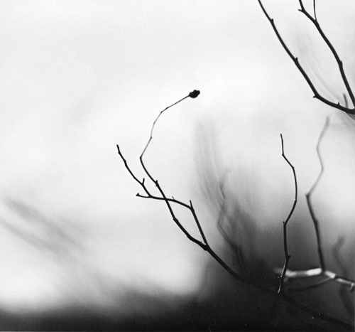
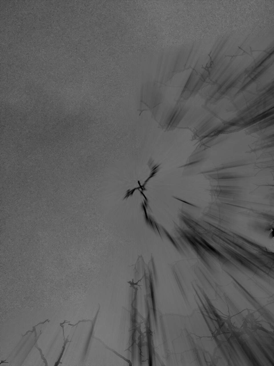
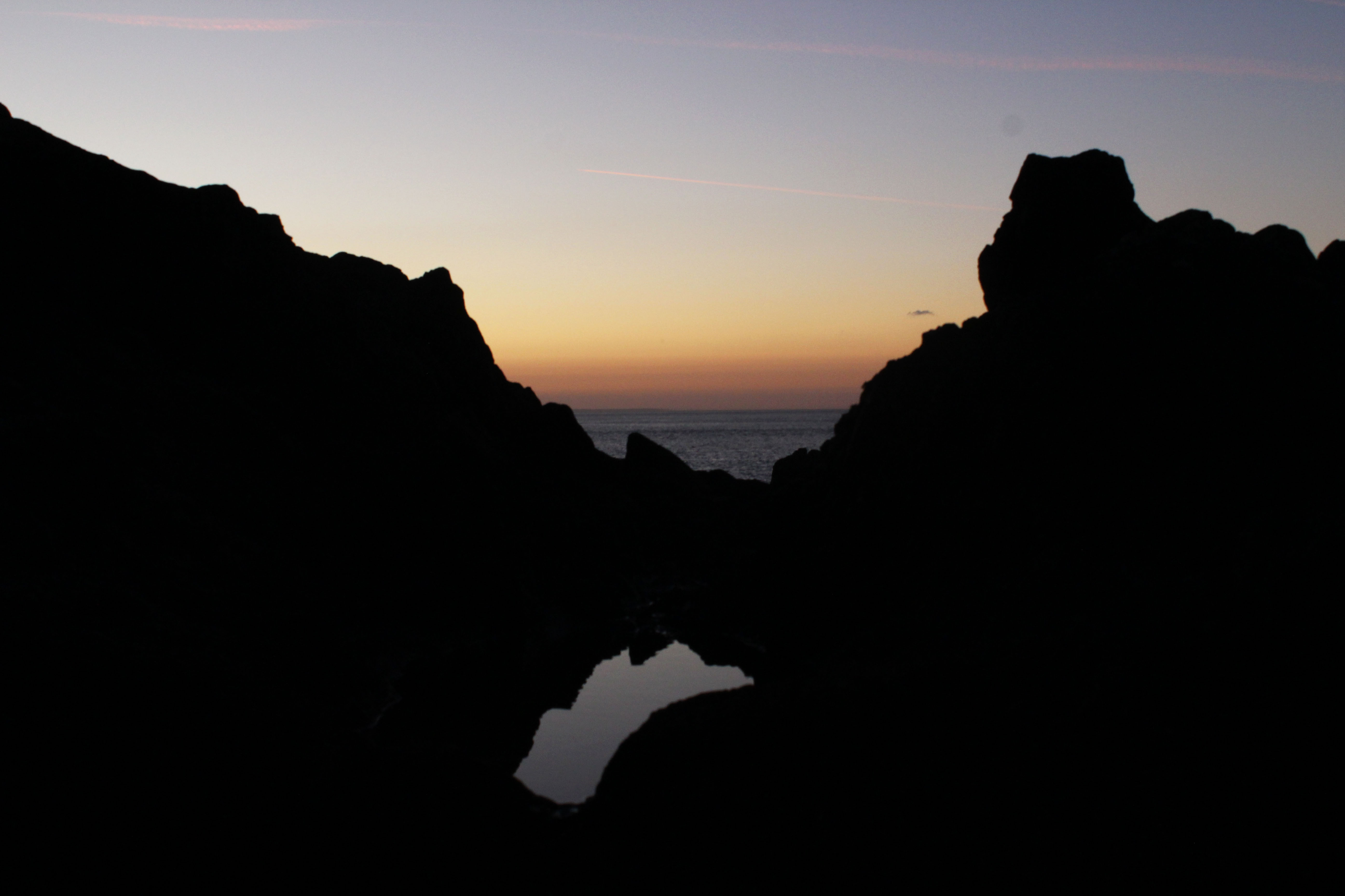
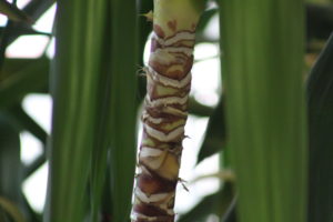
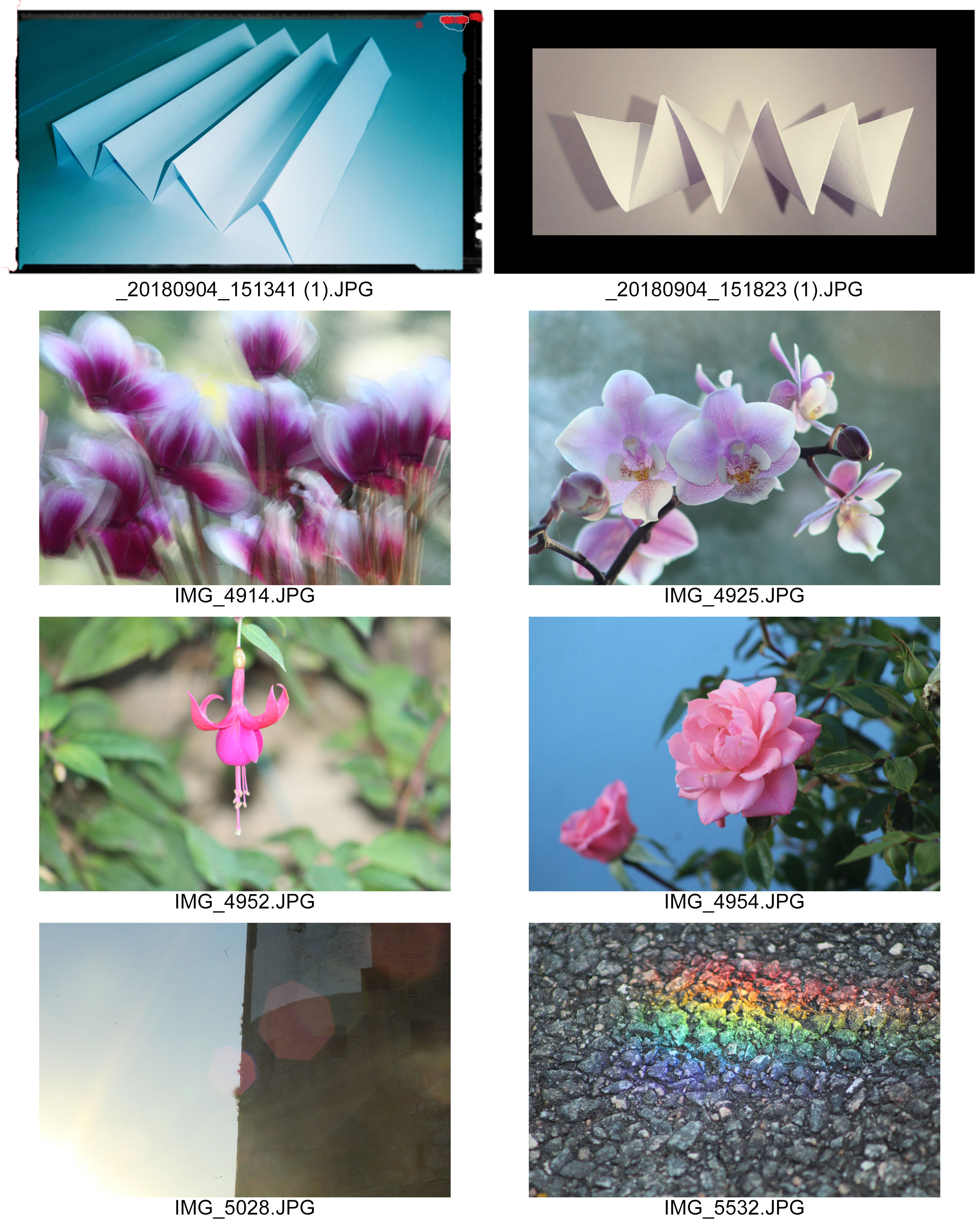
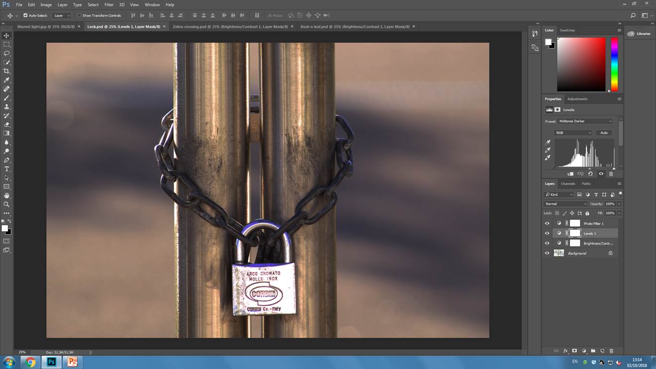
I am really pleased with how this photo turned out because it is in the style that I really like. I played around with photo filters, levels and brightness and contrast.  This photo has to be my second favourite out of this photo shoot.

Conclusion

In conclusion, I think this photo shoot went very well as I took many great photos. I think to make this better I would’ve taken photos somewhere else, but, I am happy with the results I got from taking it around the house. Next time I think I will try yo use this technique in my photos as I really like the outcome of the photos when you take it this way.

Ralph Meatyard & Uta Barth

Ralph Eugene Meatyard

Meatyard made his living as an optician but was a member of the Lexington Camera Club and pursued his passion for photography outside the mainstream. Meatyard’s work spanned many genres and  he experimented with various strategies including multiple exposures, motion blur and other methods of photographic abstraction. Two of his series are concerned with focus and depth of field. They both show the expressive potential of photography, film and cameras when looking at the ordinary world.

Zen strongly influenced Ralph Meatyard's photography works since his photos reflect a connection between nature and humans. His Zen twig series include close up detailed images of thin tree branches set against out of focus backgrounds. To respond to his photographic style, I will take photos zoomed in on twigs and make sure that the background is blurred so the subject is sharply focused.
Uta Barth

Uta Barth describes herself as an artist who works mostly with photographs. She is interested in light, drawing attention to the viewer’s perception and separating the image from the thing depicted. Although her images are blurred, they appear abstract. The works that brought her international attention is the photographic series Ground and Field. These photographs are blurred caused by focusing the camera on an unoccupied foreground. Uta Barth has made visual perception the subject of her work. She  carefully renders blurred backgrounds, cropped frames and the natural qualities of light to capture incidental moments.

Field #20 is a photograph of a street corner taken deliberately out of focus with a shallow depth of field. At a glance the image appears to look like an abstract design of muted browns and greys with red traffic lights that have been expanded by the out of focus effect. Close up they look like an abstract composition of coloured dots and from a distance the street scenes appear disorted as if seen through a partially opaque glass. To respond to her photography style, I will deliberately take images out of focus to create abstract photos with a merge of colour

Keld Helmer-Peterson Response

Keld Helmer-Peterson is a Danish photographer, who took inspiration from Albert Ranger-Patzsch (who I previously researched). Peterson began his passion of photograph in 1938, where he received his first camera as a gift for graduating. In 1940 Helmer decided to try out and become familiar with war photography // new objectivity as it was a recent concept at the time

The aim of the images in this series was to get rid of mid tones, He took a normal image, which usually images of industrial machines and places, and turned it completely black and white, making the images more in contrast. In his images there is also a lot of negative space, which has allowed he structure of the metal work to really stand out to us and helps to create a sense of emptiness. The clear formal elements which are presented in this image are tone, shape and line, which are all clearly shown through the structure. The lines are also used to guide the viewers eyes around the frame of the image, starting from the bottom and then making our way to the top.  The lighting is most likely to be natural as industrial images are usually taken outside, as you can not place the tall machines inside. The ISO is not sensitive to the light, as there is no visible noise in the frame of the image, which suggests that the ISO is low. Moreover, the shutter speed is likely to be quick as the whole frame seems to be in focus, with no blur. Due to the whole frame being in focus it also means that this photograph has a large depth of field. The aperture of the camera is likely to be high, which helps makes the whole frame more in focus. Due to the nature of the image being completely black and white, it creates a cold temperature adding to the mood of the image. Peterson has cleverly used inspiration from Patzsch but has still managed to add his own ‘twist’ to make his images more unique. I really like the idea of getting rid of the mid tones as it makes the structures seem more isolated, which allows it to stand out more, captivating the viewers.

My Response

In order to recreate Peterson’s work, I went through previous photoshoots and selected four images which I thought would go well with this mid tone idea. I then opened them all up on photoshop and went up to image>adjusment>threshold. I then adjusted the slider until I was happy with the final outcome (These steps are shown below through the screen shots taken). I then changed the image sizes, in order to make them all the same size. Then on one of the images I doubled the width of the canvas sized and dragged another one of my images next to it. I then doubled the hight allowing me to place the other two edits onto the screen, creating a grid  of four. I then saved this edit to the size of an A4 paper, allowing me to print it out.


Screenshots


Final Outcome


Keld Helmer-Peterson – Threshold adjustment experiments

Keld Helmer-Petersen is a photographer, using various formats, shows in his photographs “a strong leaning towards extreme simplicity and graphic clarity in carefully composed compositions, often silhouetted, but more often than not containing subtle greys in contrast to pure black and white.” He leans more towards simplicity, wanting there to be obvious contrast between the black and whites of the photo.

Image result for keld helmer petersen


I went and created my own photos by taking pictures and editing them using the threshold adjustment option, which will change the photos to black and white and will make it look like they’ve been inspired by Peterson’s works.

Original images:

These are the original photos which I chose to use for this assignment. I chose these because they are something I can turn into an abstract photo, and I also think that they would suit with Peterson and his work.


Edited final outcomes:

With these pictures all I used was the threshold adjustment option, and played around with it until I liked them. I like how they came out, however I don’t think they would be something that Kelm would produce. Most of them seem a bit too dark and don’t have near to equal black to white balance.

Aperture photo shoot

I took a photo of a lamp in the street which was all in-focus, then I artificially blurred it using the ‘iris blur’ tool. This helps achieve the proportions you want to have in and out of focus without moving your camera around for 10 minutes.
I made this photo a lot darker as the original was over-exposed, this helps bring out shadows, and the roundness of the poles. I also applied a warm photo filter and adjusted the light levels. All of this helps bring out the detail of the chain and the dirt on the poles.

In this photo I have only decreased the brightness to make the photo easier to see, and increased the contrast to make the details in the asphalt more visible.
This photo was taken at midday but I have applied an orange photo filter, decreased the brightness by a lot. I have also made the midtones darker by adjusting the light levels of the photo. These effects make the photo look as if it was taken at sunset or ‘the golden hour’. The background and foreground of the photo are out of focus which puts more emphasis on the branch tips and the leaf.

Keld Helmer-Petersen: Thresholds Experiments

Keld Helmer-Petersen was a Danish photographer who achieved widespread recognition for his abstract photographs.  He gained recognition through his coloured photographs but also published black and white photographs exploring the contrasts of the tones.  He was inspired by Albert Renger-Patzsch, the experiments at The Bauhuas in Germany and by Henry Callahan and Aron Siskind at the Art Institute of Chicago.

Keld Helmer-Petersen


My Own Experiments


Example of editing process
example of editing process

For all four of my experiments I took my photograph into Photoshop and I edited and experimented with the threshold of the image which adjusted the contrast of the black and white tones within my photographs.  From taking inspiration from Keld Helmer-Petersen my aim was to extenuate the dark’s and the lights of the photograph and editing and experimenting with the threshold of the photograph.

Final Four Photographs


Final Four

These are the final four photographs I produced from experimenting with the thresholds of the images being inspired by Keld Helmer-Petersen.  I feel my outcomes were quite successful as some are showing the geometric lines which Helmer-Petersen also produced and using the thresholds I have extenuated the contrasts of the black and whites.

Threshold adjustment. Nature Vs Man made

In this blog post I am trying to mimic the style of Keld Helmer-Petersen. Helmer-Petersen is most famous for his dramatic use of black and white features, where he explored dramatic contrast of tones.

Keld Helmer-Petersen was a Danish photographer who achieved widespread international recognition in the 1940s and 1950s for his abstract colour photographs. He was born in Denmark on 20th August  1920, and died 6th March 2013

Here is some of his work.

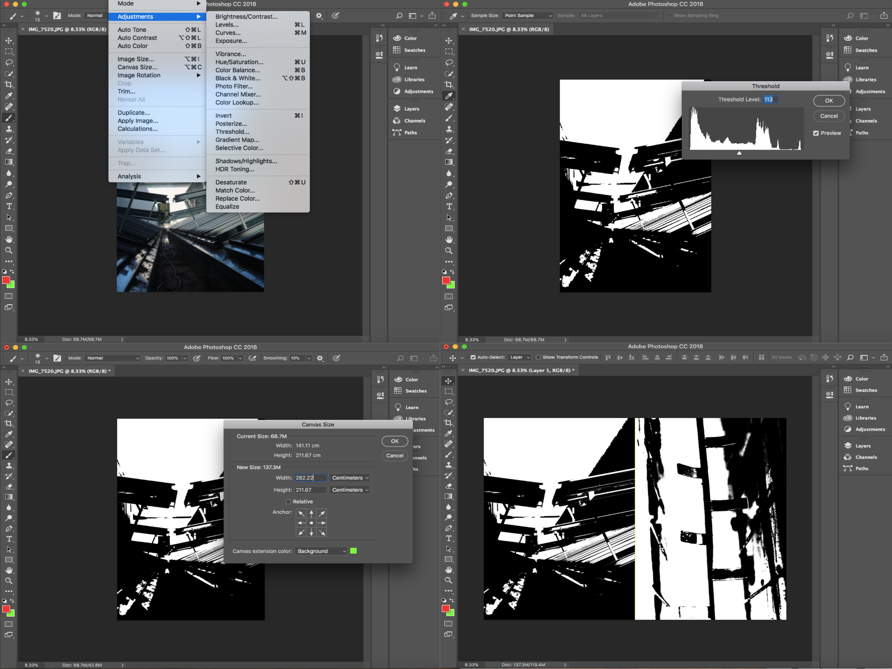
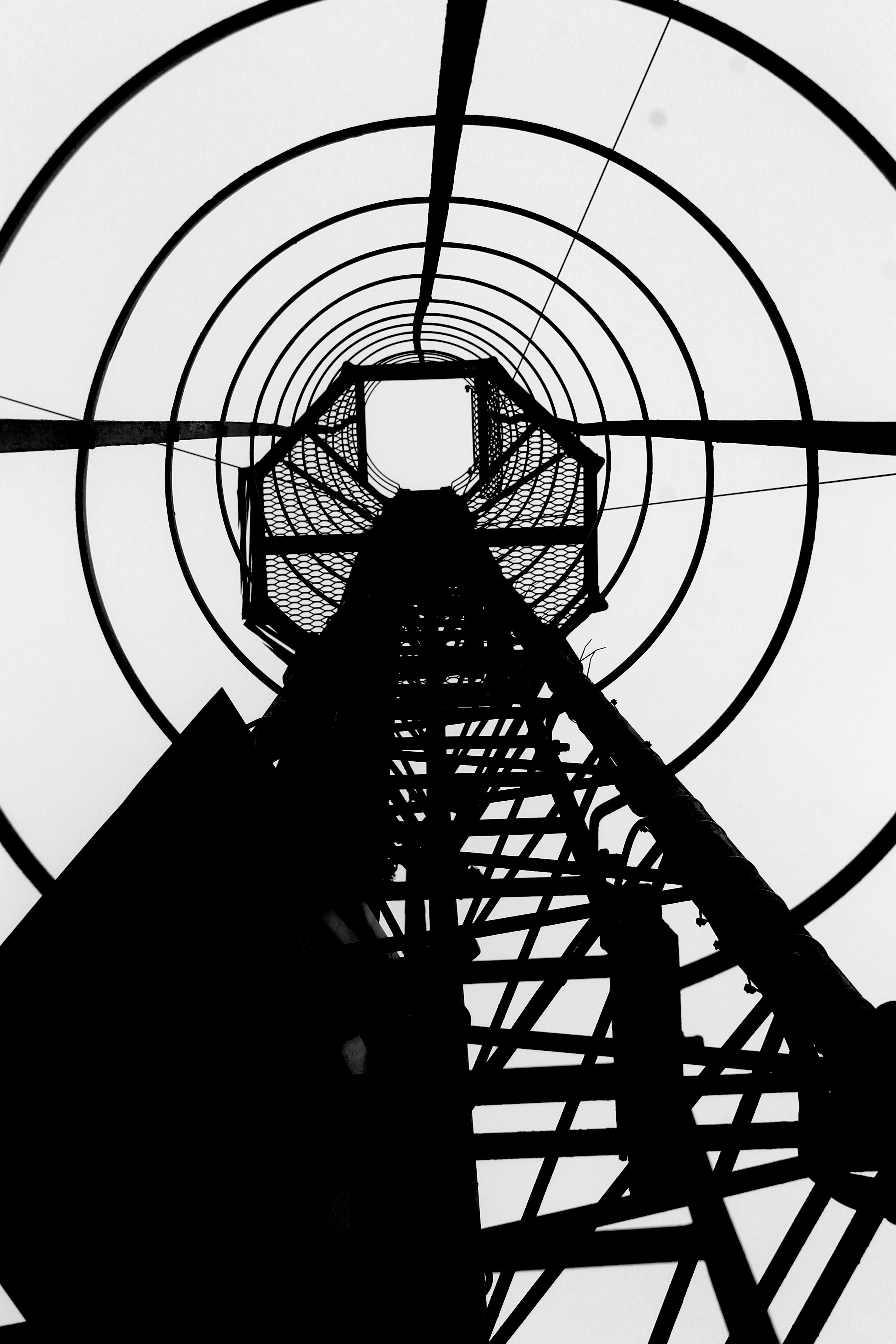
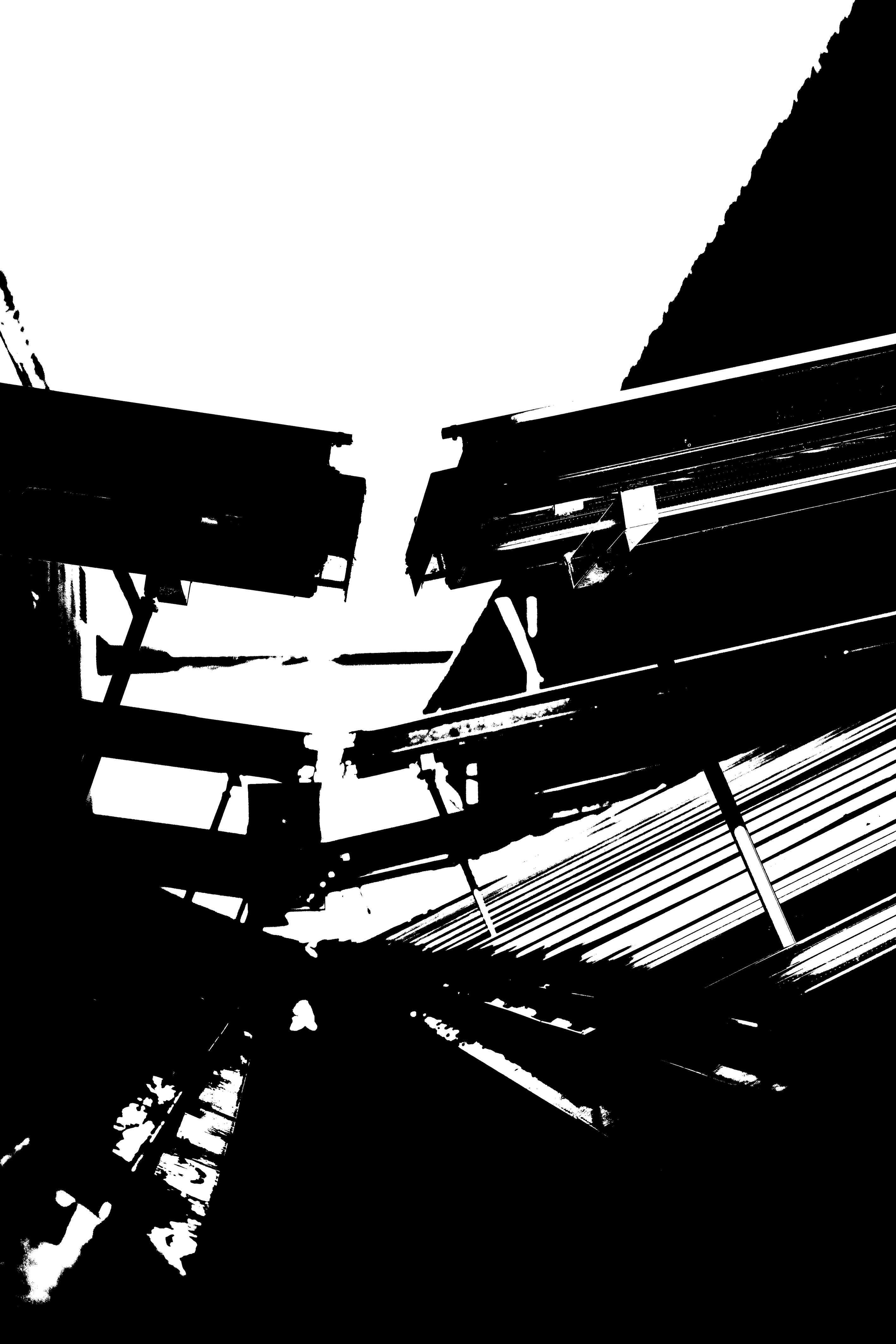
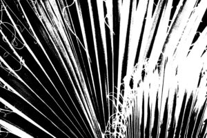
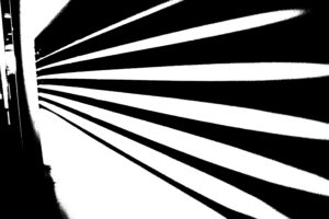
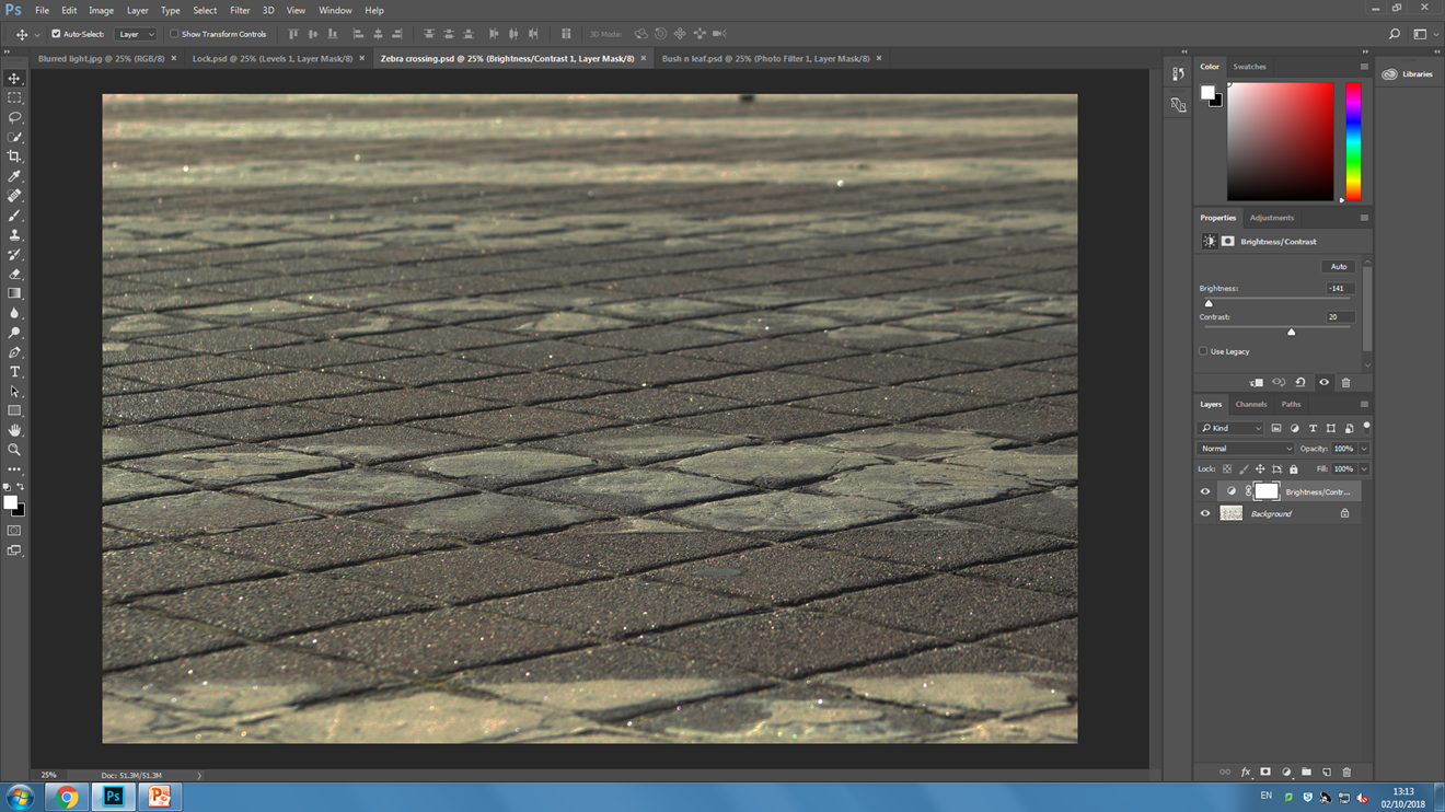
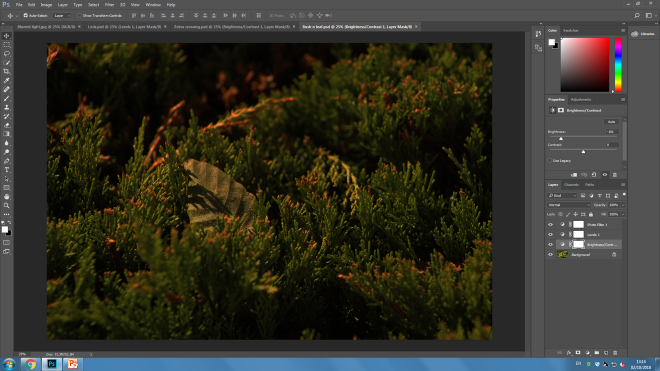
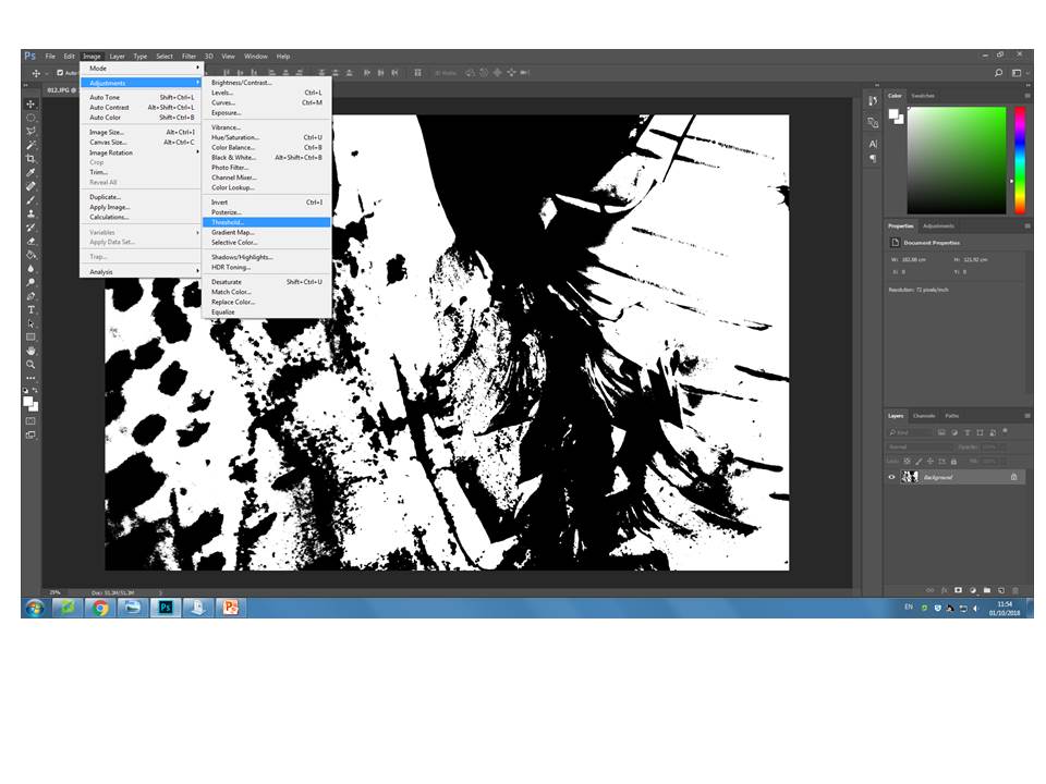
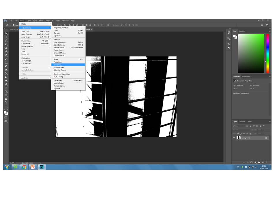
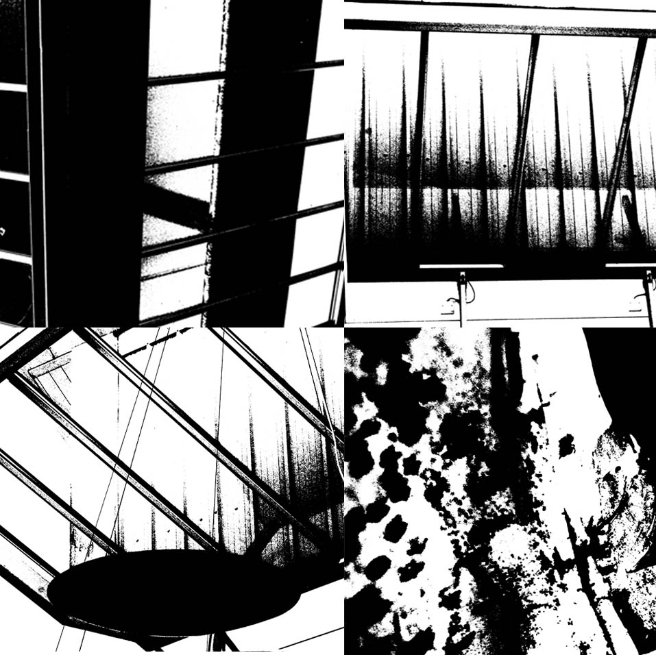
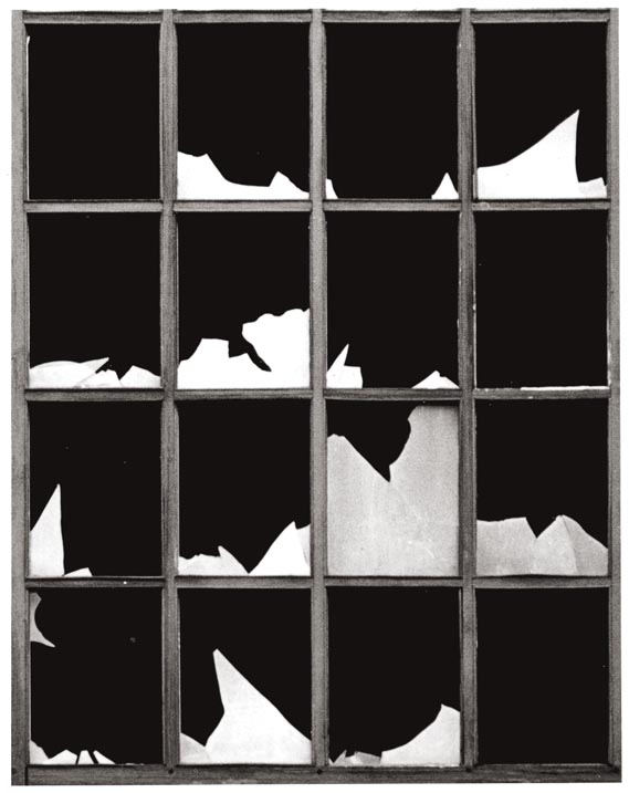
As you can see there is a massive contrast between the extreme white, and dark black within the colours.

I have tried to recreate his take on photography by using the  change on threshold within Photoshop, I feel I did really well with this task, I did two different sheets for this, each with 4 photos. My first attempt was an all natural version, with a Flamingo, some wood, a Lemur and a Whippet. I feel this went really well


My second attempt was more of a man made version, with a Climbing frame for Orangutans, the side of a building, a glass bottle within a wall, and an old hook for a large gate.

Personally I felt this was even better than my natural one as I found the perfect threshold for the contrasting tone, much like Helmer-Petersen.