Week 4 Homework Photoshoot – Uta Barth

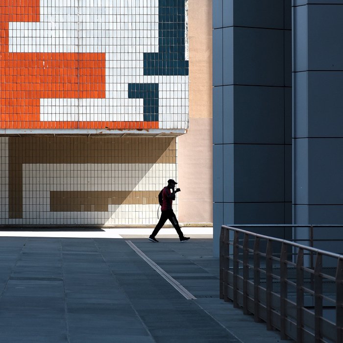
I have produced a photoshoot using some of the camera a skills that I have developed on during the first few weeks. After taking time to learn and practice skills such as depth of field, exposure and focus, I have incorporated these skills into my shoot, and have take inspiration from my chosen artist, Uta Barth, in order to produce a photoshoot that uses abstraction, as well as the other camera skills.

Uta Barth

Uta Barth is a contemporary photographer living and working in America, who focuses her photography on separating the subjects used in the photograph, from the photograph itself by using a mixture of blurred images, and bright light in her photographs, allowing the colours of her image to blend into one another, further distorting the image and creating an abstract effect. Barth often takes a minimalist approach to her work, using subjects such as walls, windows and bland natural scenes, in order to draw more attention to the light and colours used in her work. Barths work incorporates a mixture of minimalism and abstraction, and she combines this with a bright but simple colour theme to draw attention to the fact that her work goes against what many people consider to be good art.

I have chosen Barth to be my inspiration, as I believe that her work makes good use of colour, light and interesting subject matters, while also taking a minimalist approach to a lot of her photos, making them more unique, and allowing them to stand out.

My Response:

For my photoshoot, I took inspiration from Barth when it came to the type of subjects I used, and the lighting I used. For my camera settings, I made use of the manual focus, making sure that the image I was taking was out of focus to create the same effect as Barth. As well as this, I experimented with the exposure of my photos, in order to mimic the bright light used in Uta Barths work.

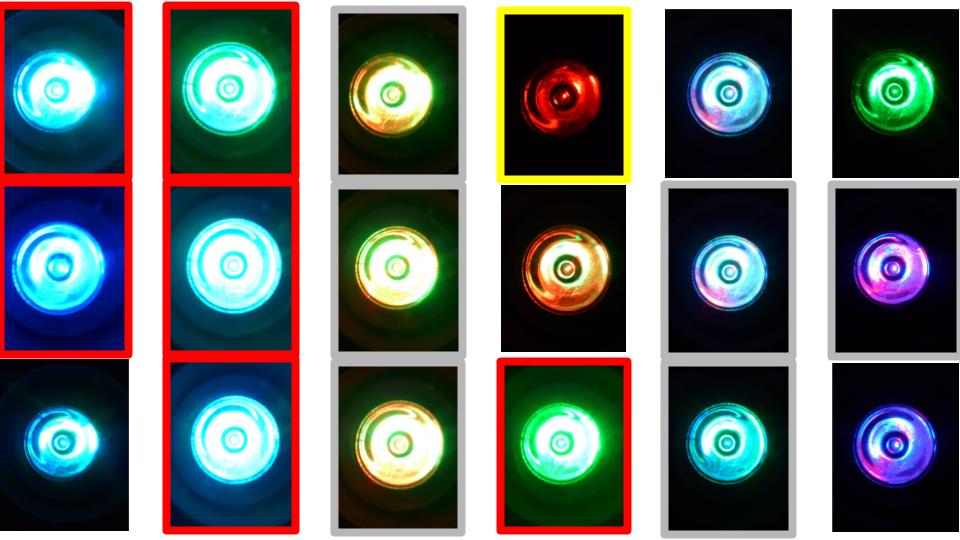
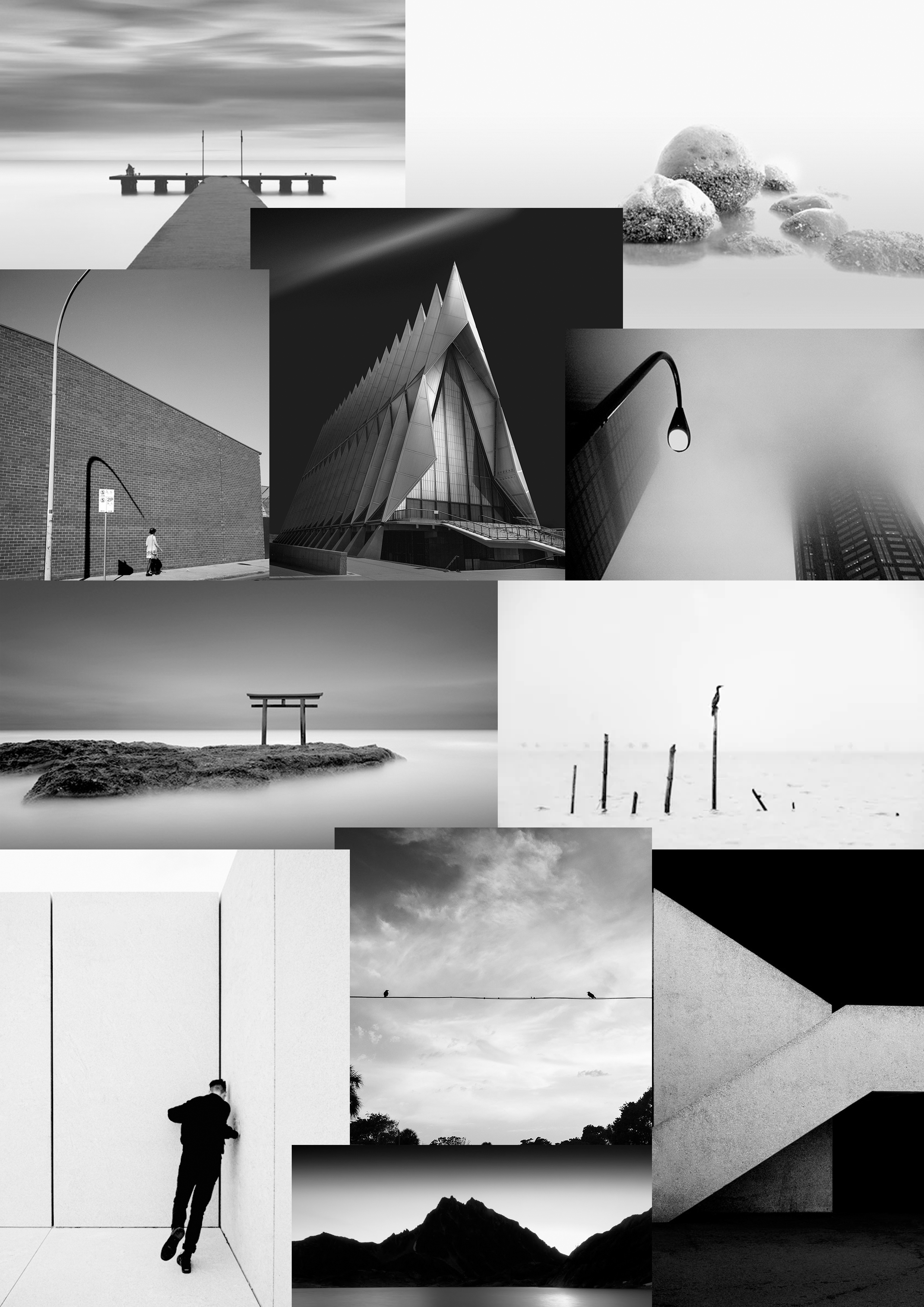
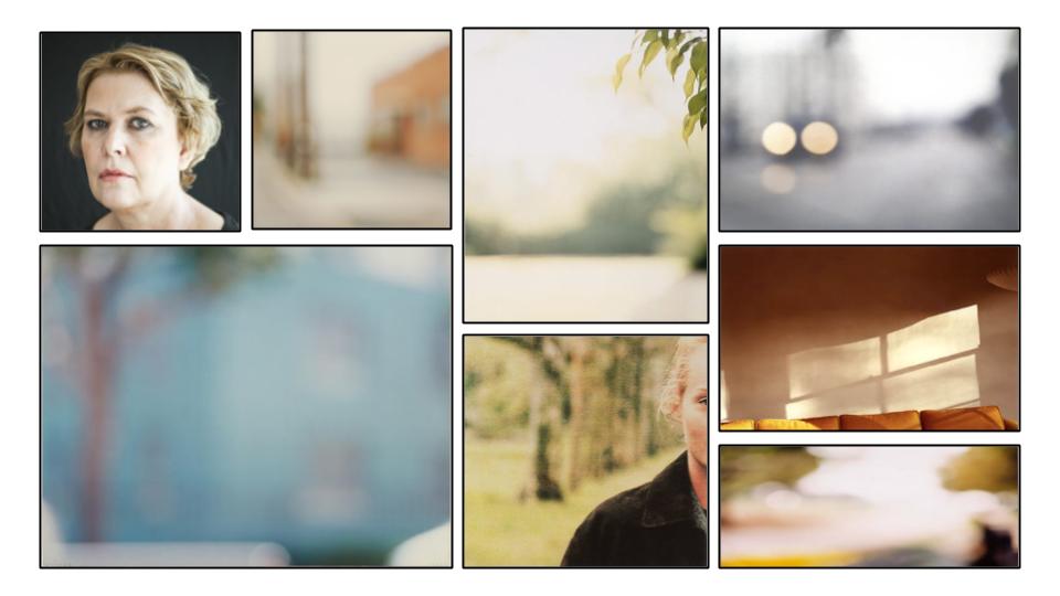
The following is a contact sheet containing images from my photoshoot:

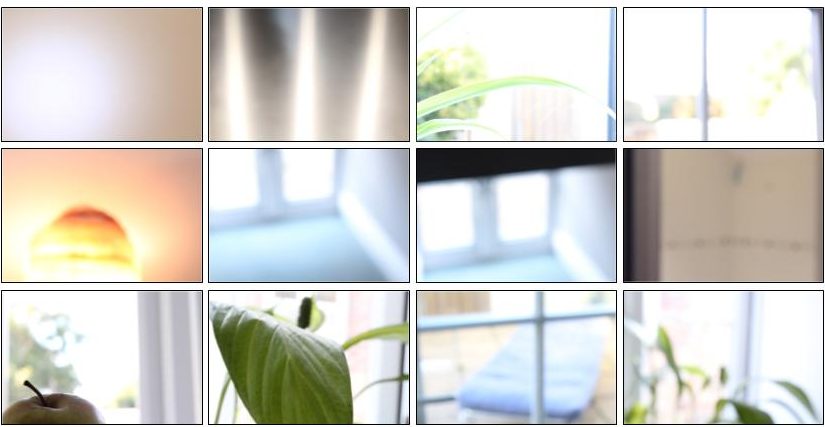
These are the photos that I was able to take after taking inspiration from Barth, and using the same techniques and processes as her. I made sure to focus on making sure the lighting resembled Uta’s work, and changed my camera settings to do so.

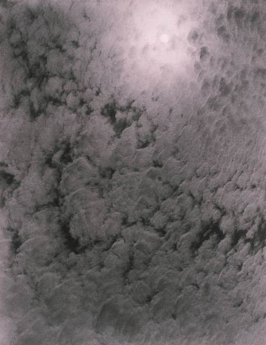
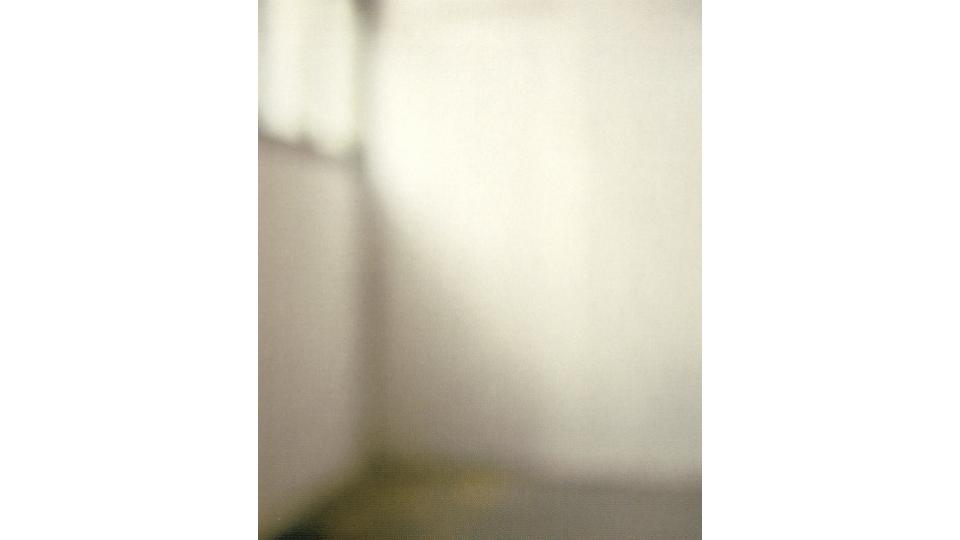
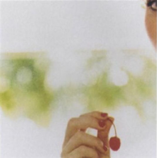
The above image is a good example of the different camera settings and techniques I used. For this image, I adjusted the manual focus of my camera so that the background was completely out of focus. I then adjusted the ISO setting to a high number (1600). By doing this, I was able to maximize the amount of light that the camera allowed, and because of this the image I took was extremely bright and light, which mimics the work of Uta Barth. By using this combination of out of focus images, with a high ISO setting, I was able to create images similar to that of Barth.

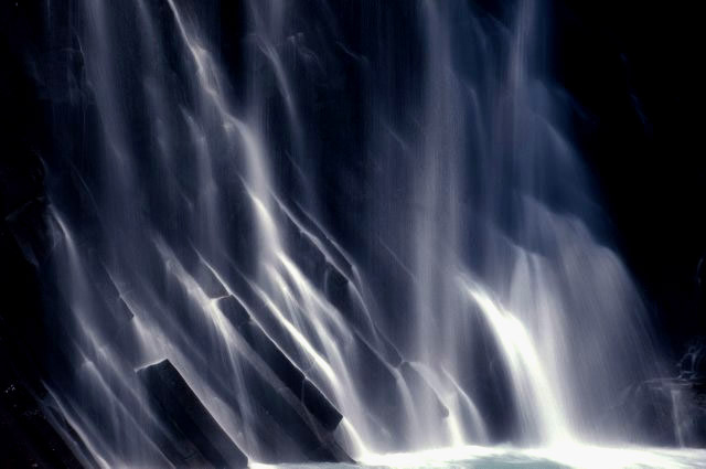
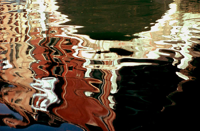
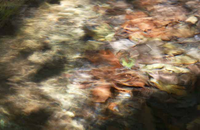
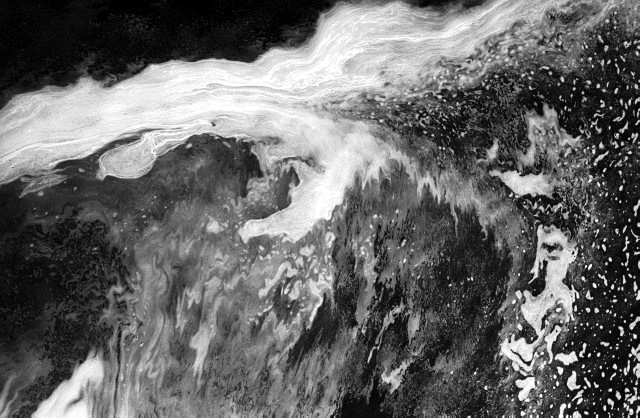
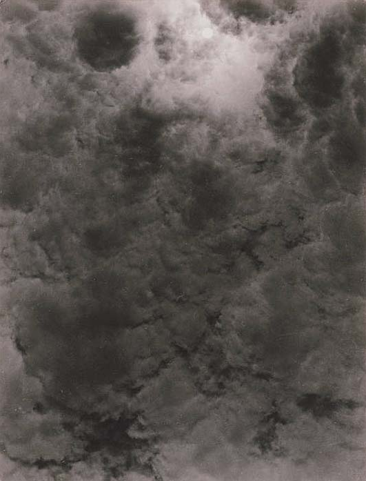
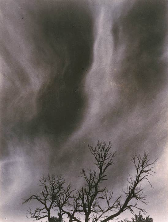
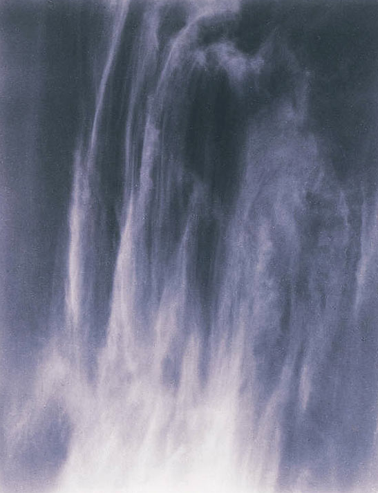
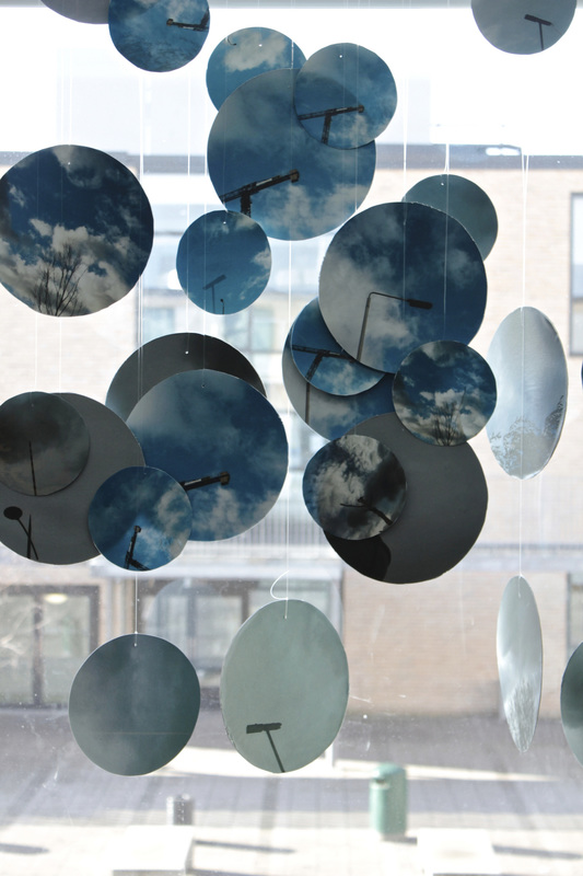
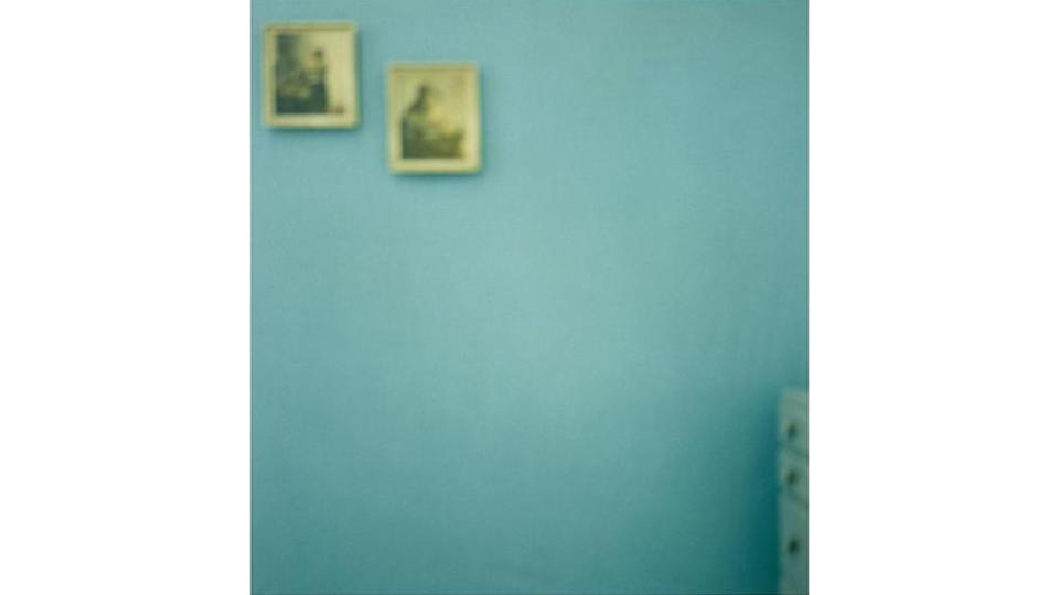
The following images are those that I have decided are the best from my photo shoot:

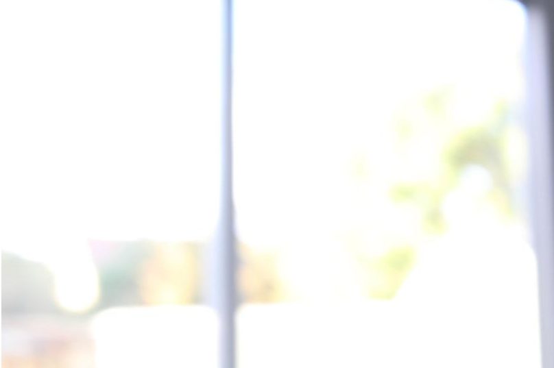
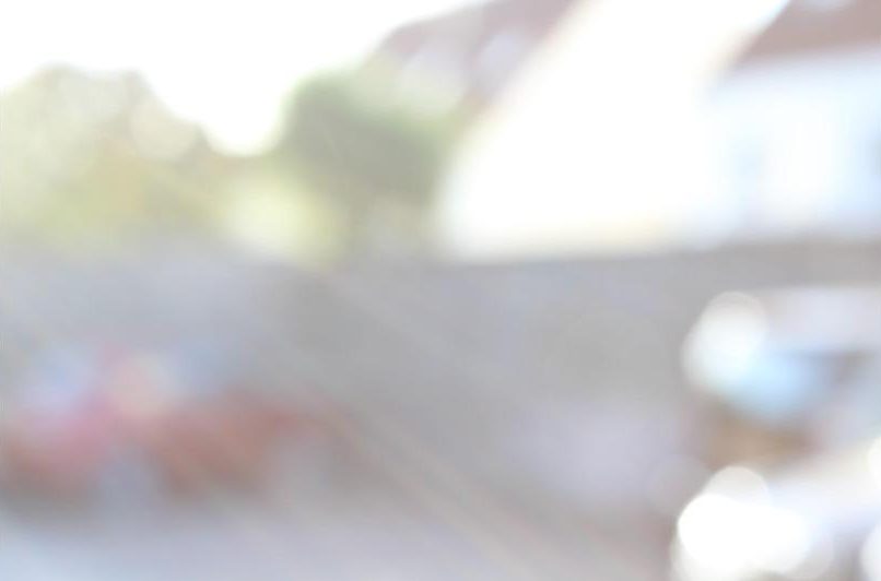
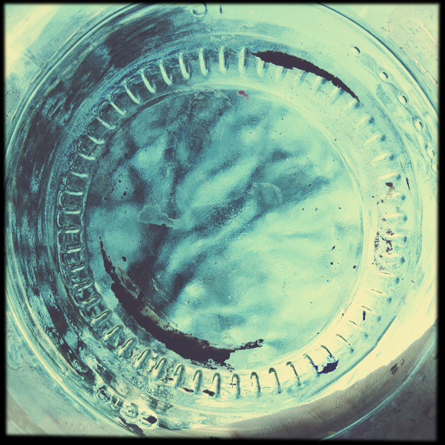
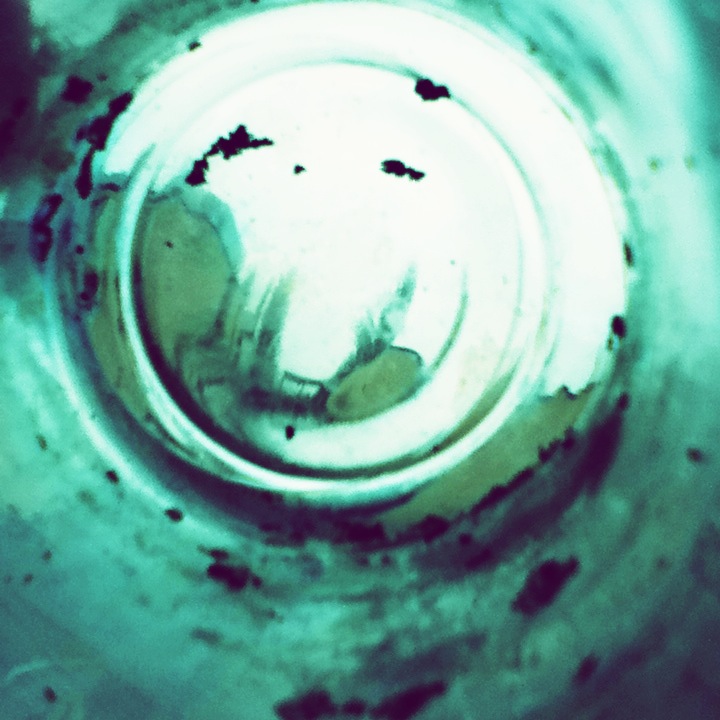
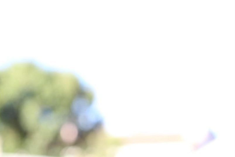
All of these images use the skills I developed after analysing the work of Uta Barth, including manually putting the camera out of focus, and adjusting the ISO setting to a higher number so that the images included the most light possible. All of these images used an ISO ranging from 3200 to 6400, and I manually adjusted the focus so that the subjects were as out of focus as possible.

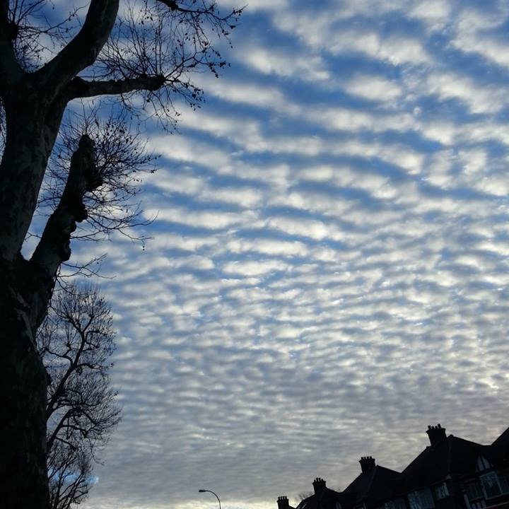
I tried to take most images of naturally lighter spaces, as well of adjusting the ISO, these places included outside, and out of windows, to mimic the very light effect that Barth’s images give.

The subject of the above image is the corner of a window, and I zoomed the camera in so that I was only framing the top corner, abstracting the window. A lot of Barths work centres around using subjects such as windows that produce natural light, to maximise the amount of light in the image.

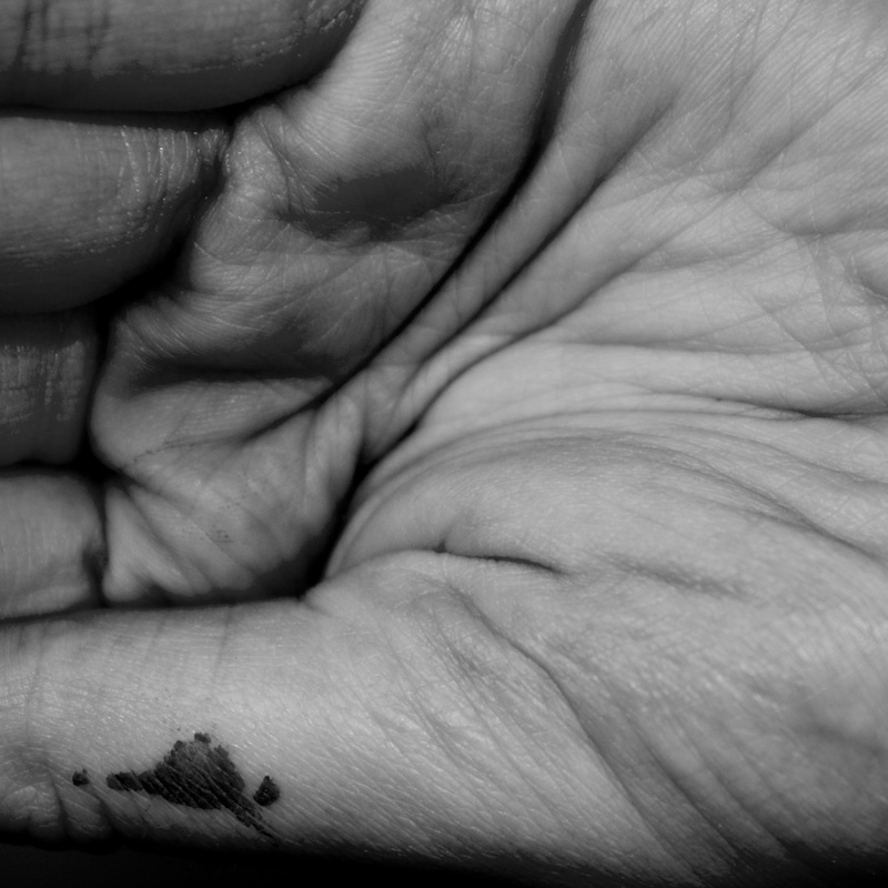
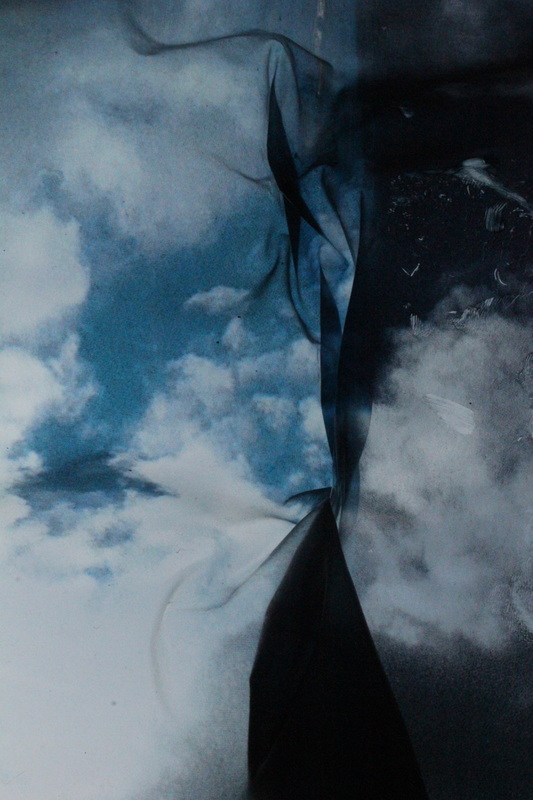
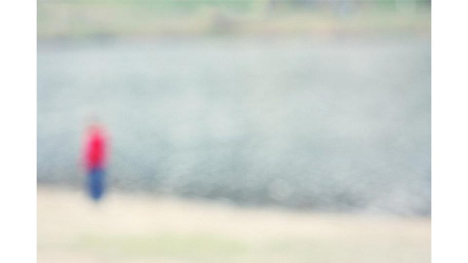
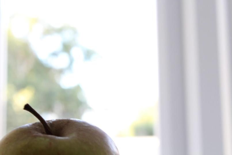
Barth sometimes uses subjects in her work that remain in focus, while throwing the background out of focus to draw maximum attention to the abstracted subject. The first image is my own, while the second is Barth’s, from which I took inspiration. This technique makes the image interesting, as it provides the viewer with a point to focus on, while also allowing them to remain curious about what is in the background.

Experiment – Coloured Light

Contact Sheet:

(Unfortunately due to the fact I increased the size of the contact sheet for this experiment the quality of each photo has decreased slightly making many frames look fuzzy and out of focus)

(I have attached two images below of what the photos looked like before being formatted in a contact sheet.)

I did this coloured light experiment to see how well my camera could capture different colours of light. Finding that some colours appeared under or over exposed simply due to the colour of light they appeared to be.

Yellow: indicates a frame that is underexposed.

Red: indicates a frame that is overexposed.

Grey: indicates a composition that is out of focus

Ralph Meatyard Mood board/Inspiration

I will be using this mood board in order to inspire and give me ideas for the upcoming homework, responding to Ralph Meatyard’s work. His work, is highly dramatic and produces only black and white imagery. It is simplistic and often up to the audiences interpretation, therefore when I do my own photo shoot, i will be focusing on capturing very minimalist photos that also show drama and mystery.

Abstract minimalist- Research

Abstract photography, sometimes called non-objective, experimental, conceptual or concrete photography, is a means of depicting a visual image that does not have an immediate association with the object world and that has been created through the use of photographic equipment, processes or materials. An abstract photograph may isolate a fragment of a natural scene in order to remove its inherent context from the viewer, it may be purposely staged to create a seemingly unreal appearance from real objects, or it may involve the use of color, light, shadow or texture.

I quite like the abstract minimalist photography as it involves the use of editing, warping, and making the photo seem unreal, or edited to an extent where it seems unnatural. In some examples of minimalist it makes the object in focus either seem larger than life or smaller than it should be.

I also like the use of changing the colors to make it seem neon, brighter or even electrified. This effect can be used on people for portraits and can be used on everyday objects.

Julian Schulze became a master of minimalism, his work is eye-catching and very impressive. He is focused on geometric abstraction and minimalistic compositions. His images can range from simple shots of everyday scenes made up of a small number of elements to mind-bending abstractions that will leave in confused as to which direction he took the shot. Each shot he takes is expertly composed using light, shadow and color to create 2D and 3D illusions and scenes.

I really like Schulze’s work as some of his work is simple by just taking of a photo with a wide range of colors in an everyday normal environment, whereas others involve black and white structures and taking them at obscure angles to change the interpretation and the way we look and understand the photographs.


Week 5 | Homework | Final Photoshoot | Abstract | Colour and Texture

Start Date : Wednesday 3rd October
Completion Date : Wednesday 10th October

Ernst Haas – water and reflections

Haas pioneered colour photography and is also famous for his images of movement using long shutter speeds. He photographed water throughout his career, fascinated by its ability to reflect light and its dynamic movement. He crops the subject to increase the sense of abstraction.

Aaron Siskind – natural and urban surfaces

Siskind was interested in surfaces and textures, both from the natural world but also the urban environment. He gets in close to his subjects and fills the frame with detail. There is always a strong sense of design and all over interest for the viewer.

Alfred Stieglitz – patterns in the sky

These pictures were an attempt to demonstrate how “to hold a moment, how to record something so completely, that all who see [the picture of it] will relive an equivalent of what has been expressed.” The ‘Equivalents’, as they are known, aim to create a sensation in the viewer similar to that experienced by the photographer. Is this possible, do you think?

Nick Albertson – repeated forms

These images explore the idea of repetition, rhythm, line, shape, texture and pattern. They are all created with everyday objects which are transformed through careful arrangement and photography. The edge to edge compositions help concentrate our eyes on the formal properties of the objects. Contrast is important. Sometimes we need to consult the title before we’re sure about exactly what we are looking at.
Some examples of student work:

Camera skills

Camera Skills

Auto Focus

Auto focus is the best time saver of the camera and is found in most cameras. Initially the auto focus helps clear up the quality of the images we take. It often uses a computers to run miniature motor that focuses the lens for you. Focusing is the lens means moving in and out until the sharpness of photo is at the highest level possible. Depending on the distance of the object you are trying to focus on, will affect the distance in the lens from the film to present a clear photograph.

Manual focus

As well as having an auto focus setting on your camera you have a manual setting for focusing images.  On the side of your lens there will me a switch labelled ‘’AF-MF’’ short for Auto focus and Manual focus. When you wish to use manual focus switch to manual on the camera. The main advantage over auto focus is the speed of the manual focus . All manual focus lenses have a gauge depicting the DOF at small aperture and the on the focus ring, the focal distance is depicted in metres

Image result for auto focus

White Balance

White balance (WB) is the process of removing unrealistic color casts, so that objects which appear white in person are rendered white in your photo. Proper camera white balance has to take into account the “color temperature” of a light source, which refers to the relative warmth or coolness of white light. Our eyes are very good at judging what is white under different light sources, but digital cameras often have great difficulty with auto white balance

Image result for white balance camera

Shutter speed

Shutter speed is the length of time your camera shutter is open, exposing light onto the camera sensor. Essentially, it’s how long your camera spends taking a photo. This has a few important effects in how your images will appear. When you use a long shutter speed, you end up exposing your sensor for a significant period of time. The first big effect of shutter speed is motion blur. If your shutter speed is long, moving subjects in your photo will appear blurred along the direction of motion. Shutter speeds are typically measured in fractions of a second, when they are under a second. For example 1/4 means a quarter of a second, while 1/250 means one two-hundred-and-fiftieth of a second (or four milliseconds).

Image result for shutter speed

Using Focus-points

Focus points are often shown as small squares when you look through the camera and is seen on the viewing screen. When you got to take a photo and lightly press down on the shutter button to focus on your image, the focus pint you are using will light up. A focus point can be virtually anything ranging from a person, to a building etc. other way in which will help with focusing on your image is also considering blurs, size colour, shape.

Image result for Focus-points camera

IOS

ISO stands for International Organization for Standardization. The IOS controls the expose by using software in the camera to make it extra sensitive to light. A high ISO such as ISO 1,600 will produce a brighter picture than a lower ISO such as ISO 100. The drawback to increasing the ISO is that it makes the picture noisier.  Digital noise is apparent when a photo looks grainy.

camera iso setting on lcd screen

Depth of field

A camera can only focus its lens at a single point, but there will be an area that stretches in front of and behind this focus point that still appears sharp. This zone is known as the depth of field. It’s not a fixed distance, it changes in size and can be described as either ‘shallow’ (where only a narrow zone appears sharp) or deep (where more of the picture appears sharp) Because depth of field has an impact on both the aesthetic and technical quality of a picture. Sometimes you’ll want to use an extensive depth of field in order to keep everything sharp. A classic example is when you’re photographing a landscape, where generally the most desirable outcome is to capture detail from the foreground to the horizon.

Image result for depth of field camera

Aperture

‘The opening of the lens’ The aperture is a small set of blades in the lens that controls how much light will enter the camera.  The blades create a octagonal shape that can be widened or closed down to a small hole. If you shoot with the aperture wide open, then more light is allowed into the camera than if the aperture is closed down to only allow a tiny hole of light to enter the camera

Image result for aperture camera

Albert Renger-Patzsch

Albert Renger-Patzsch was a German photographer highly associated with The Objectivity

Image result for Albert Renger-Patzsch

Born in 1897 Wurzburg and died in 1966. He lived and worked in Essen and Wamel, Germany. Renger-Patzsch was an inspiring photographer, because he branched away from the sentimentality and idealism of a previous generation.  In the 1920s, Neue Sachlichkeit (New objectivity) was produced in a German art, architecture and literature. Albert applied these ideas and attitudes towards certain things to his own work, and used these thoughts to adapt his camera to produce a true reflection of the world. In 1924 Albert Renger-Patzsch began his professional career as a photographer by producing the photographs for the first two books in a series named Die Welt der Pflanze  (The World of plants).Although his work went uncredited.  After being credited in the next book for his photographs he became an independent photographer and realised and exhibited his own photos for the first time. In 1928, Renger-Patzsch produced his most famous book titled ‘Die Welt ist Schon’ meaning The World is Beautiful. As well as producing his most famous year, Renger-Patzsch moved from Bad Harzburg to Essen and in the Folkwang Archives he set up a dark room and studio to exhibit his own work and produce images.

Image result for Albert Renger-Patzsch

The objectivity

The  new objectivity  or ‘Neue Sachlichkeit’ in German was a new style that rose in the 1920s it was something different that not many people had ever experienced before this is because it challenged the idea of expressionism. The ideas in the name, it opened the world, opened the idea of more abstract, romantic and idealistic tendencies of Expressionism, and is mostly associate with portraits

Image result for Albert Renger-Patzsch