Monthly Archives: September 2018
Filters
Paper Shoot


Experimenting In Photoshop
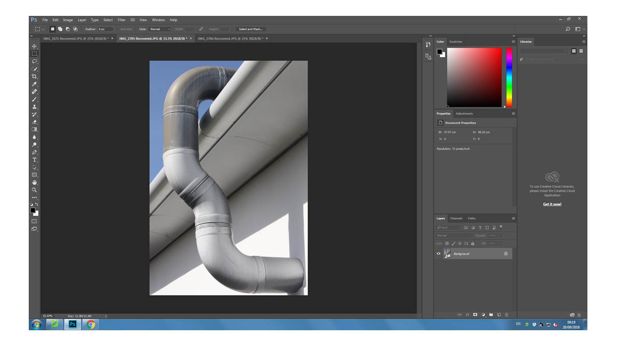
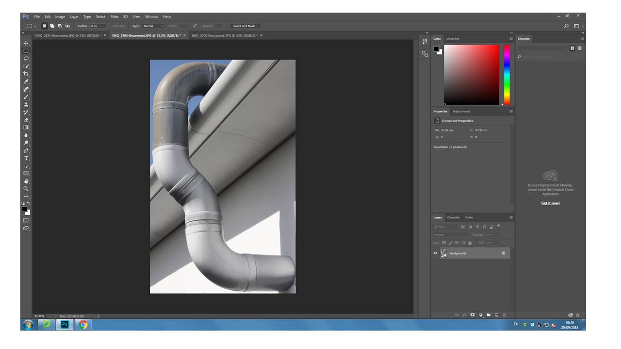
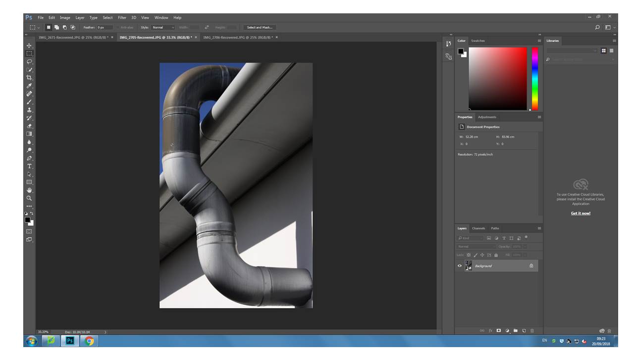
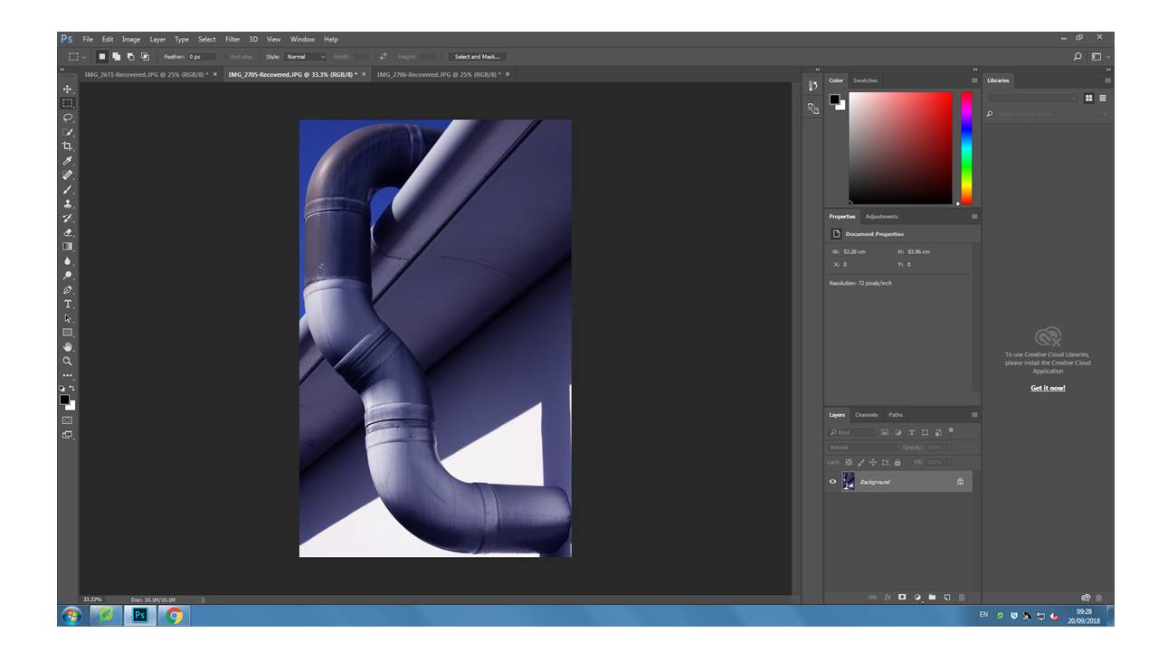
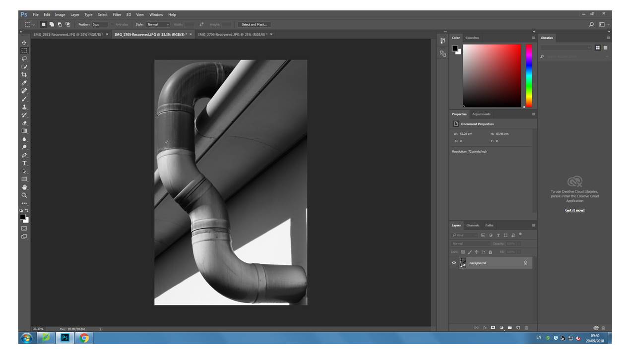
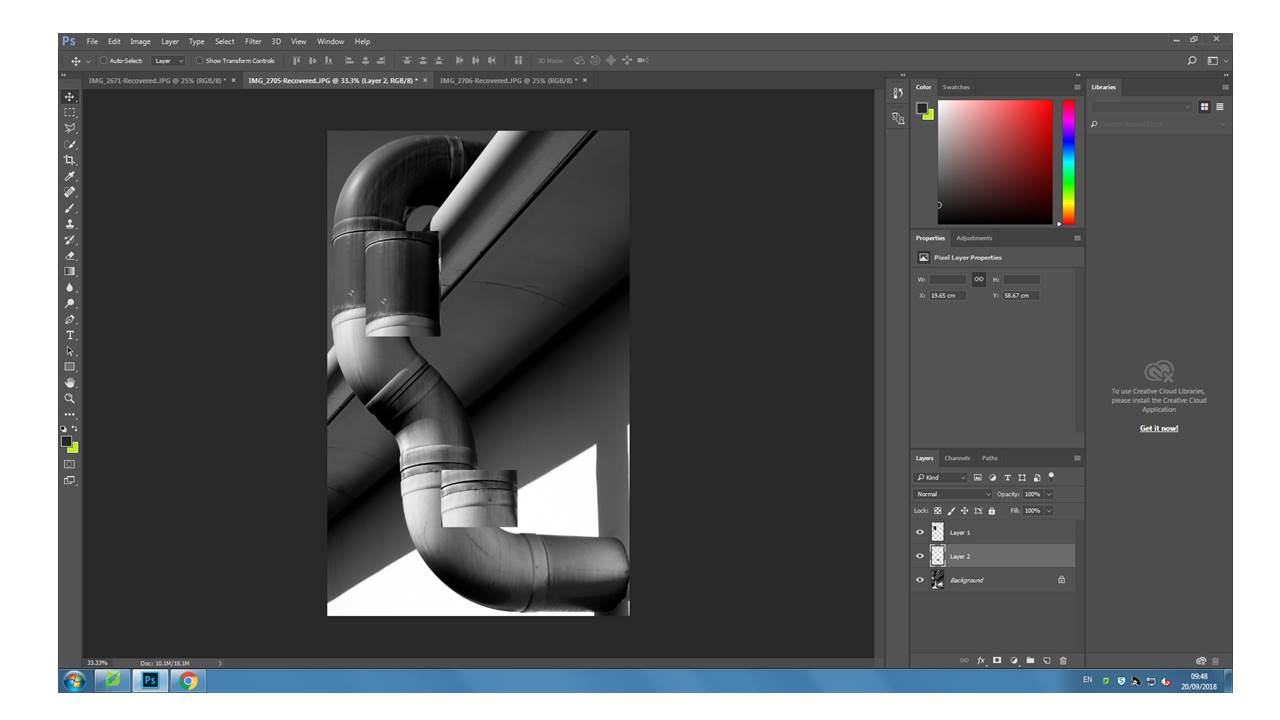
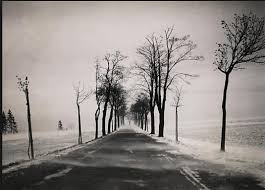
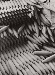
Albert Renger -Patzsch
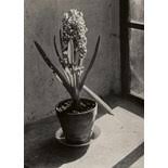
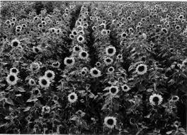
ALBERT RENGER- PATZCH WAS A GERMAN PHOTOGRAPHER OFTEN ASSOCIATED WITH THE TOPIC OF ABSTRACT PHOTOGRAPHY. HE WAS BORN ON JUNE 22ND 1897 IN WURZBURG. ALBERT BEGAN PHOTOGRAPHING BY THE AGE OF TWELVE. THE ERA HIS PHOTOS WAS BASED AROUND WAS WORLD WAR ONE TO WHICH HE SERVED IN THE MILITARY FOR THEN WENT ON TO STUDYING CHEMISTRY AT DRESDEN TECHNICAL COLLAGE.
Alberts interest in photography led him to creating his best well known book called ‘The world is beautiful’
Albert does not stick to one area of photography. His work consists of elements of wildlife,images of traditional craftsman,landscapes and architecture.
All of his work really captures his love for nature and how he sees the world as a beautiful place, Albert uses photography to show to the public his love for the camera.
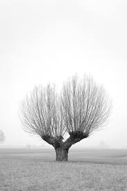
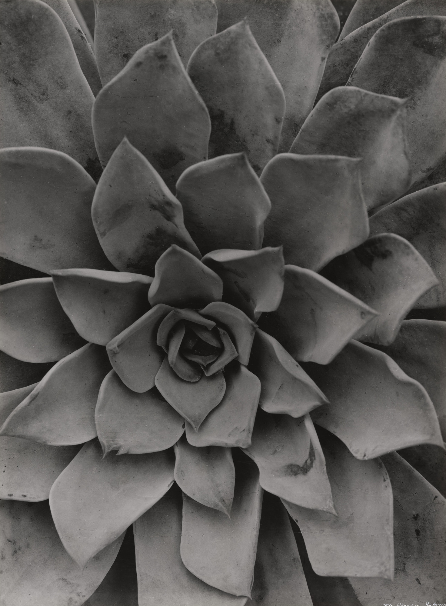
In 1928 his book ‘the world is beautiful’ he collected over 100 images with patterns of beauty and order but he does this by photographing through nature but only man- made patterns. Meaning that he did not alter anything to form something that was not there before.
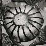
Renger-Patzsch work interested me because of the level of detail that he had included. Another reason i like his work is how lined up everything is. I can tell that Renger patzsch takes time to reflect on the setting before trying to capture the moment.
CCA Gallery Exhibition Visit & Analysis
“Entre Nous brings together the photographic works of Claude Cahun (1894-1954) and Clare Rae, presenting a conversation between two performative practices some 70 years apart.” – Entre Nous: Claude Cahun and Clare Rae Exhibition booklet.
The “Entre Nous” exhibition, presented by Clare Rae, featured two photographers and their similar works. Claude Cahun was a surrealist photographer who was based in Paris, France and moved to Jersey during the 1920’s and 40’s. She often depicted identity, challenged stereotypical gender roles, and featured mythology and legends in her works.
Clare Rae is a photographer and former “artist in residence” in Jersey who is from Australia. She is very well-known in her home country, however, with this exhibition, she has started to become internationally well-known. Clare Rae’s series of work which has been presented exclusively for this exhibition has been heavily influenced and inspired by Claude Cahun’s work.
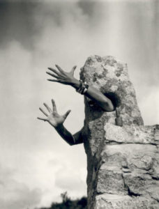
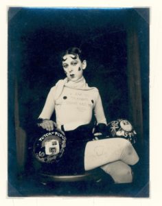
Claude Cahun “Je tends les bras” & “I am in training don’t kiss me”, respectively.
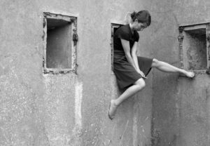
Clare Rae “Bunker near Petit Plemont”
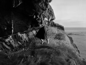
Clare Rae “Le Pinacle”
Clare Rae’s work features many of the same themes which Cahun covers. However, the most obvious theme is the ”Myths & Legends” where rocks would be portrayed as having human body parts. Other obvious similarities include both sets of images being in black and white as well. However, although both in black and white, Rae’s images are sharper and more detailed, this is due to the majority of Cahun’s images being taken in the 1920’s and 30’s, where cameras weren’t as developed.
My favourite image from Rae’s set of images is “Le Pinacle” due to the image being focused on Rae, as shown by her being centred in the image, although most of her body is being obstructed by the rock which is jutting out.
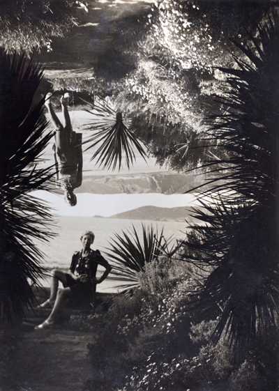
My favourite image from Cahun’s set of images is the image in which she is in her garden. What I like about this image is the splicing of the two images where Cahun is standing, and where she is sitting.
Week 4 | Homework Task # 4
Homework 4 | Practical / photoshoot
Due in WEDNESDAY 3RD OCTOBER (Week 5)
Minimum Expected frames/ exposures = 150-200 images
Choose from a range of camera skills that you have learned in Week 3 and 4 to complete a new photo-shoot…
We want to see that you can explore and extend your handling of
- exposure settings
- focus control
- depth of field
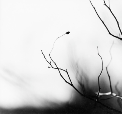
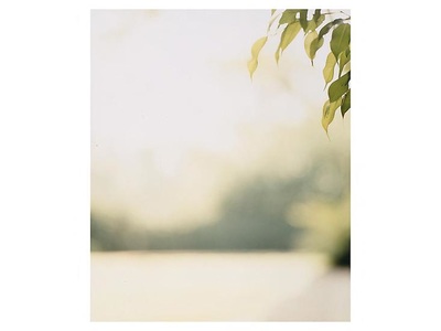
INSPIRATION >>> choose from the following to inspire your ideas.Look carefully at the examples and aim to produce similar images that work well as a group…together.
1. Ralph Eugene Meatyard:
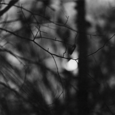
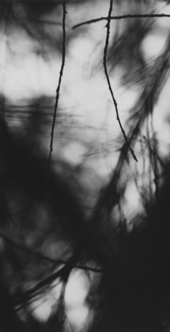
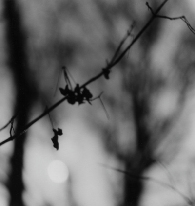
‘No Focus’
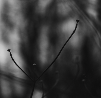
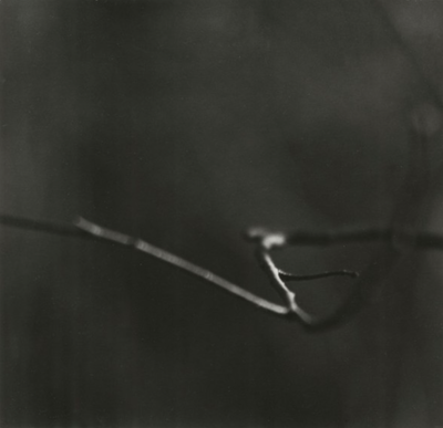
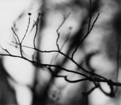
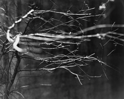
‘Zen Twigs’
2. Saul Leiter
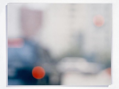
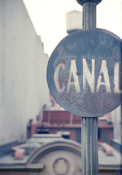
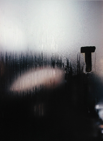
Leiter was foremost a painter who discovered the possibilities of colour photography. He created an extraordinary body of work, beginning in the 1940s. His images explore colour harmonies and often exploit unusual framing devices – shop signs, umbrellas, curtains, car doors, windows dripping with condensation – to create abstracted compositions of everyday street life in the city. Leiter was fond of using long lenses, partly so that he could remain unobserved, but also so that he could compress space, juxtaposing objects and people in unusual ways. Many of his images use negative space, with large out of focus areas, drawing our eye to a particular detail or splash of colour.
“When we do not know why the photographer has taken a picture and when we do not know why we are looking at it, all of a sudden we discover something that we start seeing. I like this confusion.”
— Saul Leiter

3. Uta Barth
|
|
— Tanya Bonakdar Gallery
You must:
- Research the work of Ralph Eugene Meatyard, Saul Leiter and Uta Barth. How have they experimented with focus and depth of field in their work? Choose specific images to comment on in detail. You could also find other photographers who are interested in experimenting with focus effects.
- Explore the effects of changing the aperture settings on your camera to alter depth of field. You could illustrate this with a series of photos of the same subject shot with different aperture settings.
- Create a series of deliberately out of focus images. Consider the degree of abstraction in the final image. How out of focus are the subjects and are they still recognisable? Experiment with colour and black and white. REMEMBER TO USE MANUAL FOCUS AND THE INFINITY SETTING (MAKING THE IMAGE OUT OF FOCUS)
- Create a series of images which explore dramatic depth of field (selective focus). Experiment with switching between foreground, middle ground and background focus. Remember, you will need to use a wide aperture (small number e.g. f2.8) and/or a longer lens for this. Remember to share all of the images you make (including those that you deem failures) in a gallery/contact sheet.
- Curate your images into different groupings (see below). Experiment with editing the images in each set differently. Give each set a title and write a short evaluation explaining your editorial decisions.
Other inspirations
Examples of student work:
Albert Renger-Patzsch – Edits
For these edits I wanted to play on the distorted and dark realism effect that Patzsch used for ‘The World is Beautiful’ series. (New Objectivity). Due to the fact I was following this idea, I did not want to do any extreme edits as I believe it would portray realism in the way Patzsch did. The edits I produced where of the top photographs from the photo shoot which I conducted based on the research made about Patzsch. For most of them I adjusted the levels and curves and lowered the saturation enough for it to be deemed black and white but still show a hint of colour. For some other edits I decided to adjust the hue in order for more colours to stand out, based on the colours within the photograph, on the images I decided to leave in colour.
I believe that my final outcomes of this research successful, as I have managed to ensure my editing matched the new objectivity idea, but still ensured that the photograph looks good. I managed to edit the photographs to allow their formal elements stand out more, making them more obvious to viewers. Moreover, I ensured the focal points of the images stood out clearly.
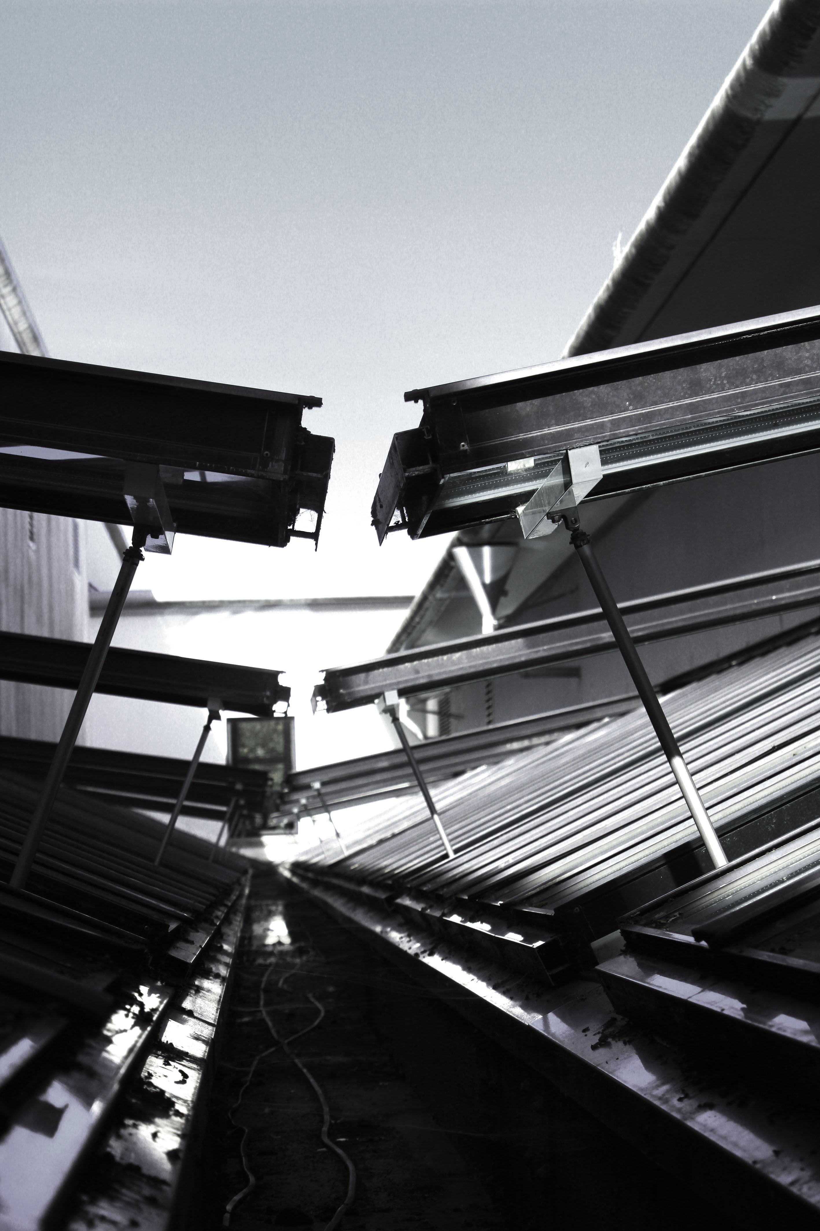
For my first edit I decided to adjust the levels and curves making the photograph darker than usual. I then lowered the saturation of the photograph, which has allowed different tonal regions to stand out. It has also allowed us to see where the natural source of lighting is coming from, which helps direct the viewers eyes around the frame of the photograph. This image also clearly represents the formal element of repetition and shape through the windows that are raised. Moreover, I used the technique leading lines to help guide the viewers eyes around the frame of the photograph. I really like how this edit has turned out as it matches the criteria of new objectivity.
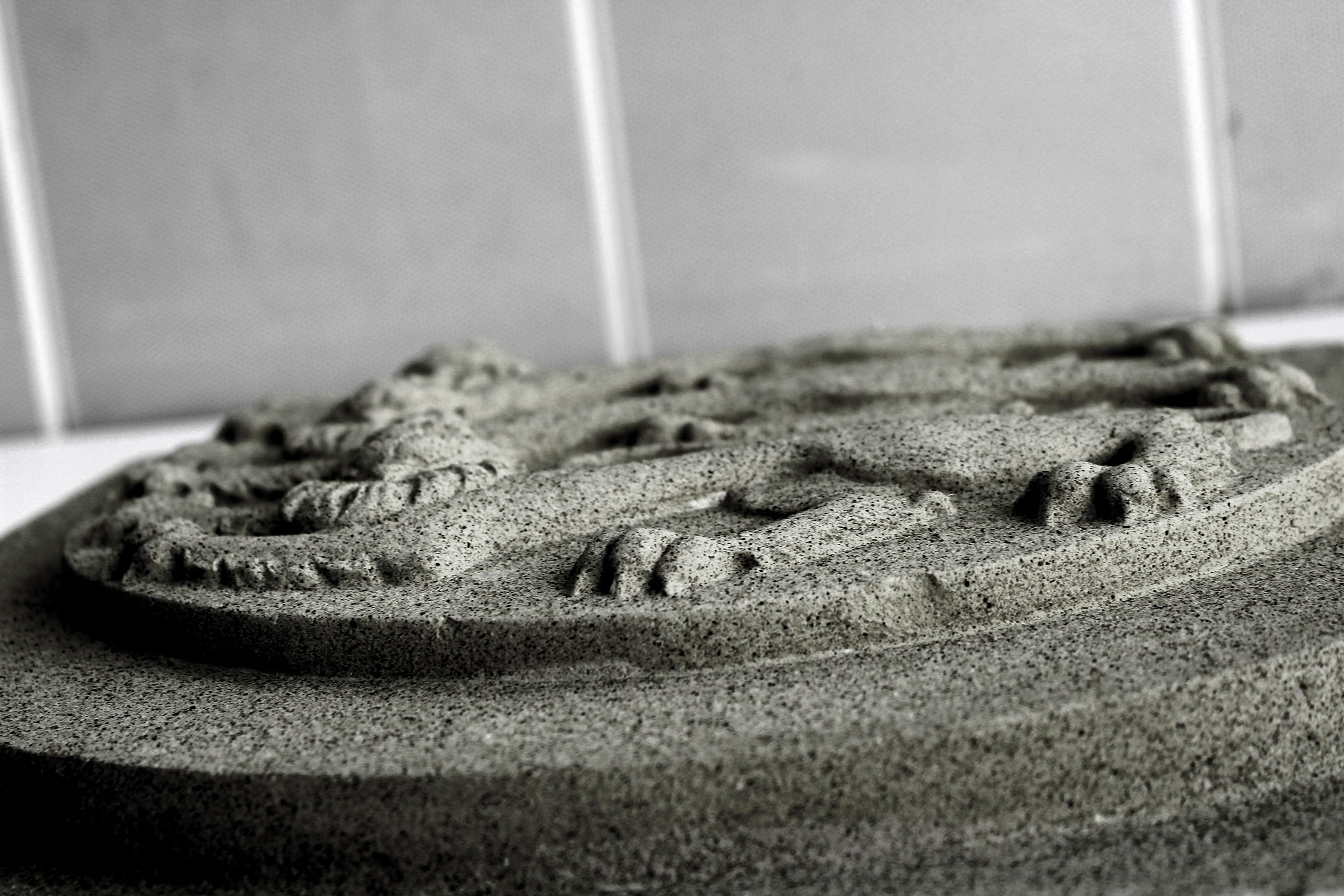
This next edit I decided to level the photograph, allowing the sharpness be clear which has allowed the detail of the subject to be visible. I then lowered the saturation but still allowed a hint of colour to seek through, making it more stimulating for viewers to look at. This image was taken at a worms eye view which allows us to see the formal elements of shape and line which is presented through the lions.
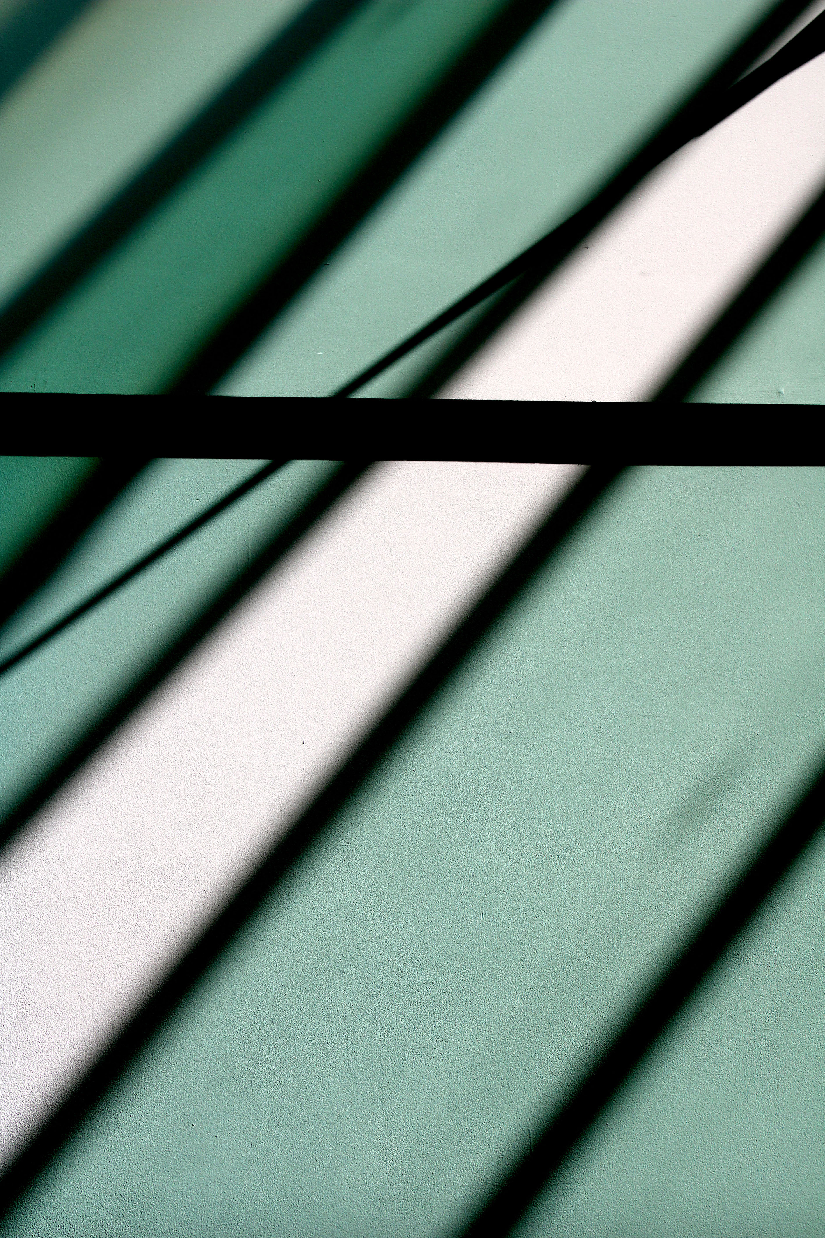
My next edit I decided to keep simple, which has allowed the simplistic overall effect to be created. I decided to level the image to allow it to seem darker than usual which has allowed the black shadows to really stand out, as well as the colours of the shadows which are casted on the wall. The formal element of line and repetition is clearly presented in the photograph, through the rectangular shadows on the wall.
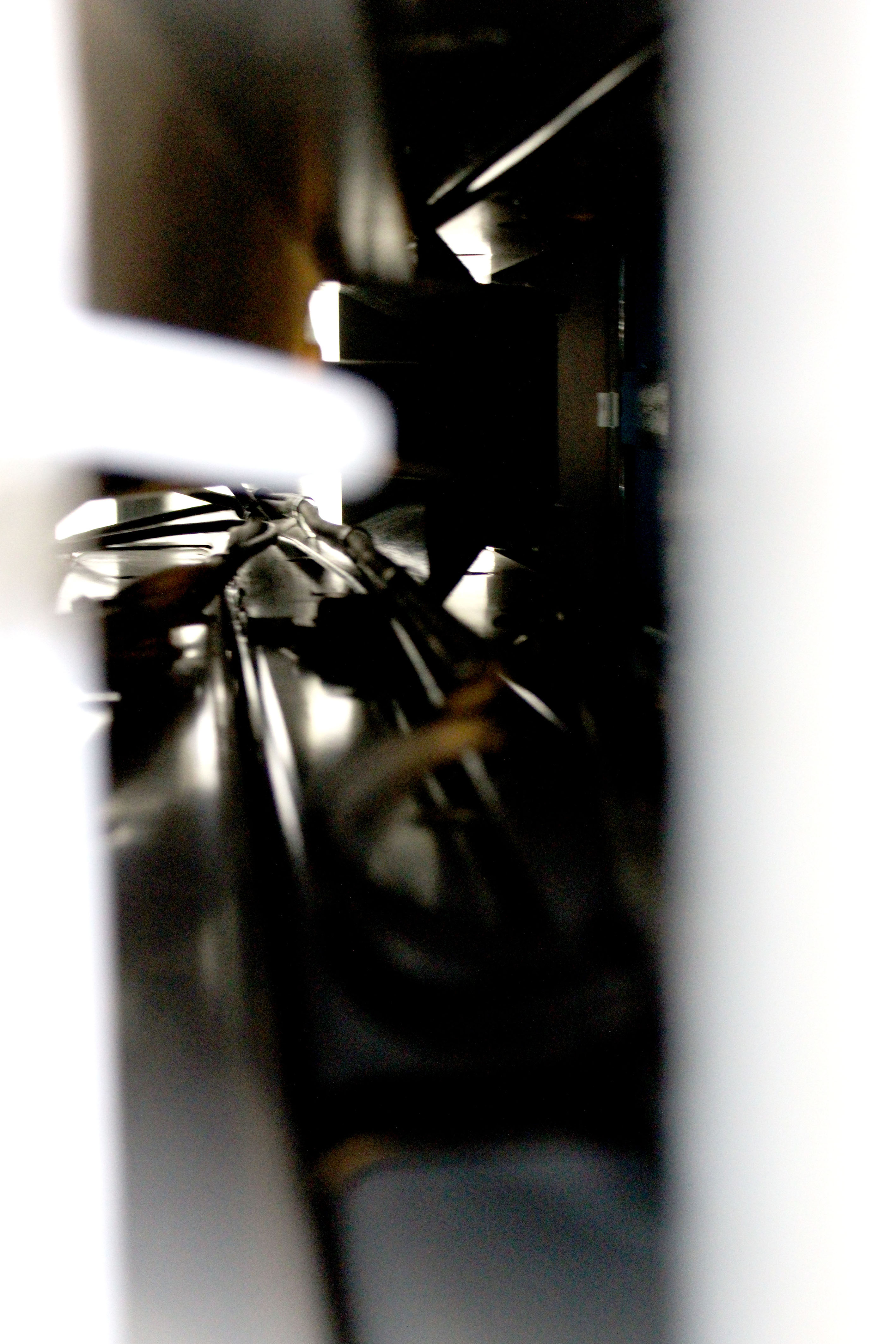
For this edit I decided to keep it simple like the previous one. I levelled the photograph to make it lighter than usual, which has allowed the cables through the tunnel to be visible. It has also added noise and vibrance to the photograph which has allowed a sense of texture to be presented as well. The cables are used to direct the viewers eyes around the frame of the photograph, leading lines, and created mystery as we wonder what is on the other side of the tunnel.
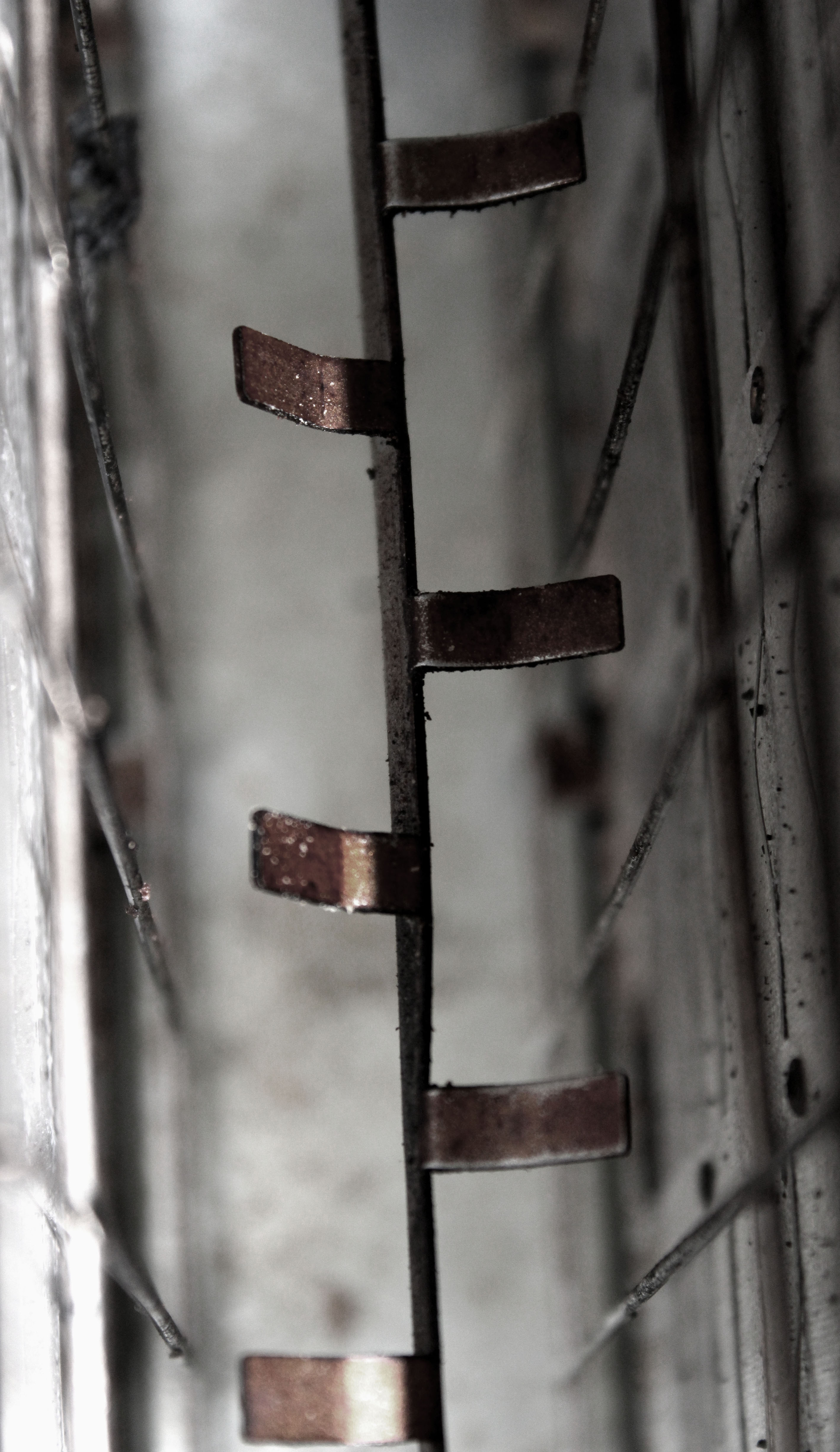
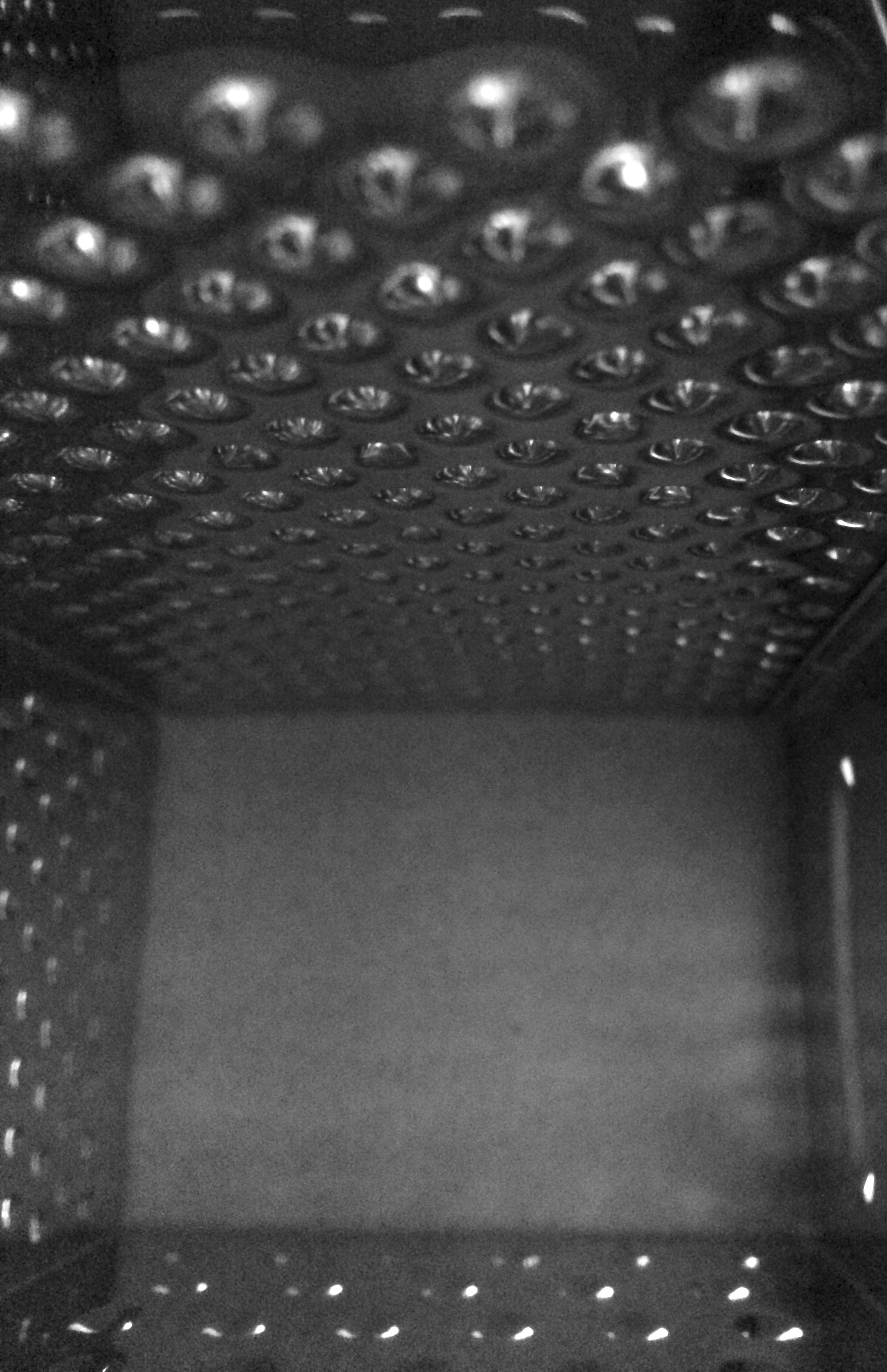
In this edit I started by adjusting the levels and the curves which has allowed the texture of inside the toaster to be presented. It has also helped to showcase the different tonal areas, making it more interesting for viewers to look at. I then turned down the saturation, but ensured the rusted metal rectangles where still in colour. Doing this has helped the context of the image to be presented, allowing viewers to have more of an understanding of where this image was taken. The formal element of line, shape and texture has been presented allowing this image to match the formal elements Patzsch’s work showed.
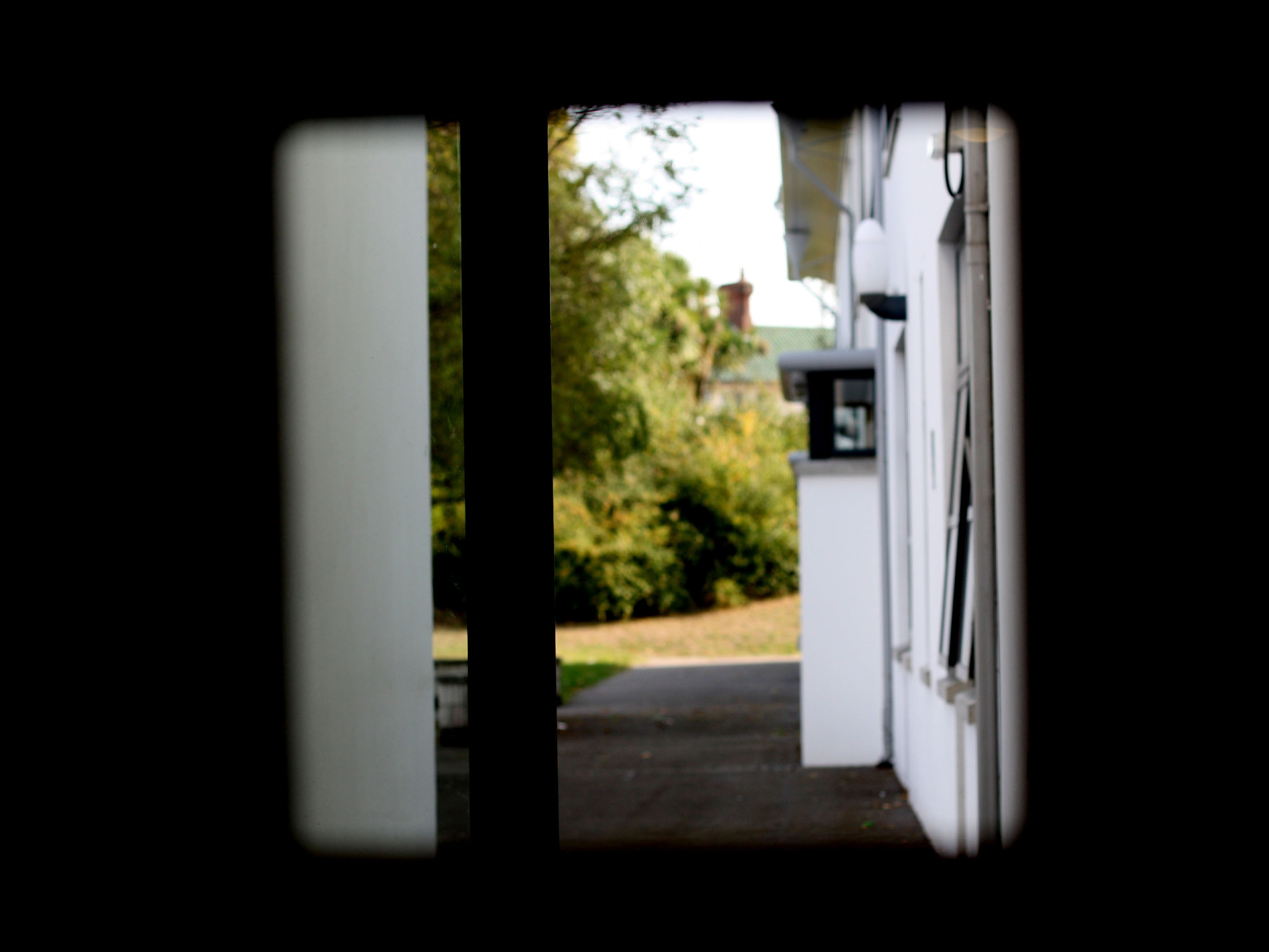
In my penultimat edit I decided to level the image, to make the foreground completely black only allowing the background to be visible. I attempted to use the technique of framing, which has allowed the subject of the image to be captured. I kept the image in colour as I felt it allowed the background to really stand out compared to the black frame work. The formal element of shape is presented through the frame which is capturing the semi-focused background.
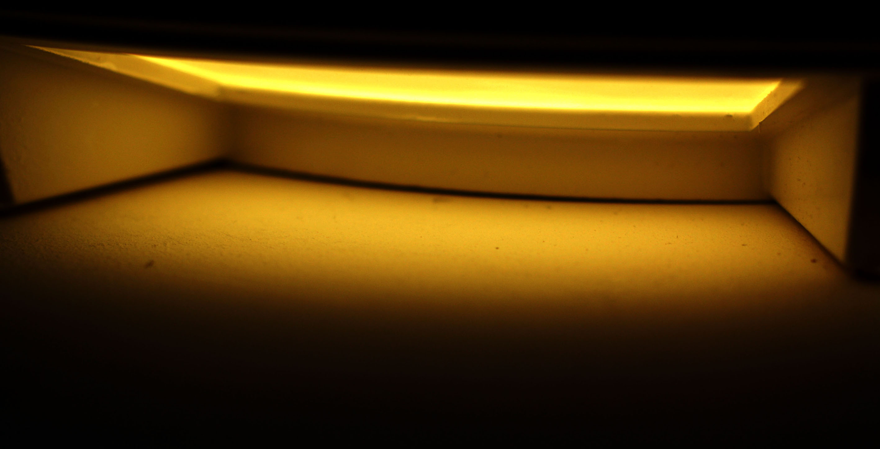
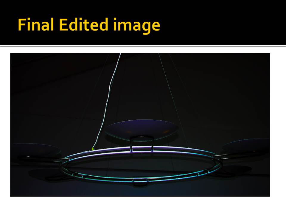
In my final edit I wanted to showcase this empty area, with a simplistic edit to add to the empty effect. For this I adjusted the levels and curves allowing the photograph to be naturally darker, which has allowed the light to stand out. I then adjusted the hue to allow the yellow to stand out more. Moreover, I adjusted the vibrance to create a bit of noise within the photograph but not enough to change the effect of the image. The formal elements of space and shape are clearly presented in the image.
Contact Sheet Research and Experimentation
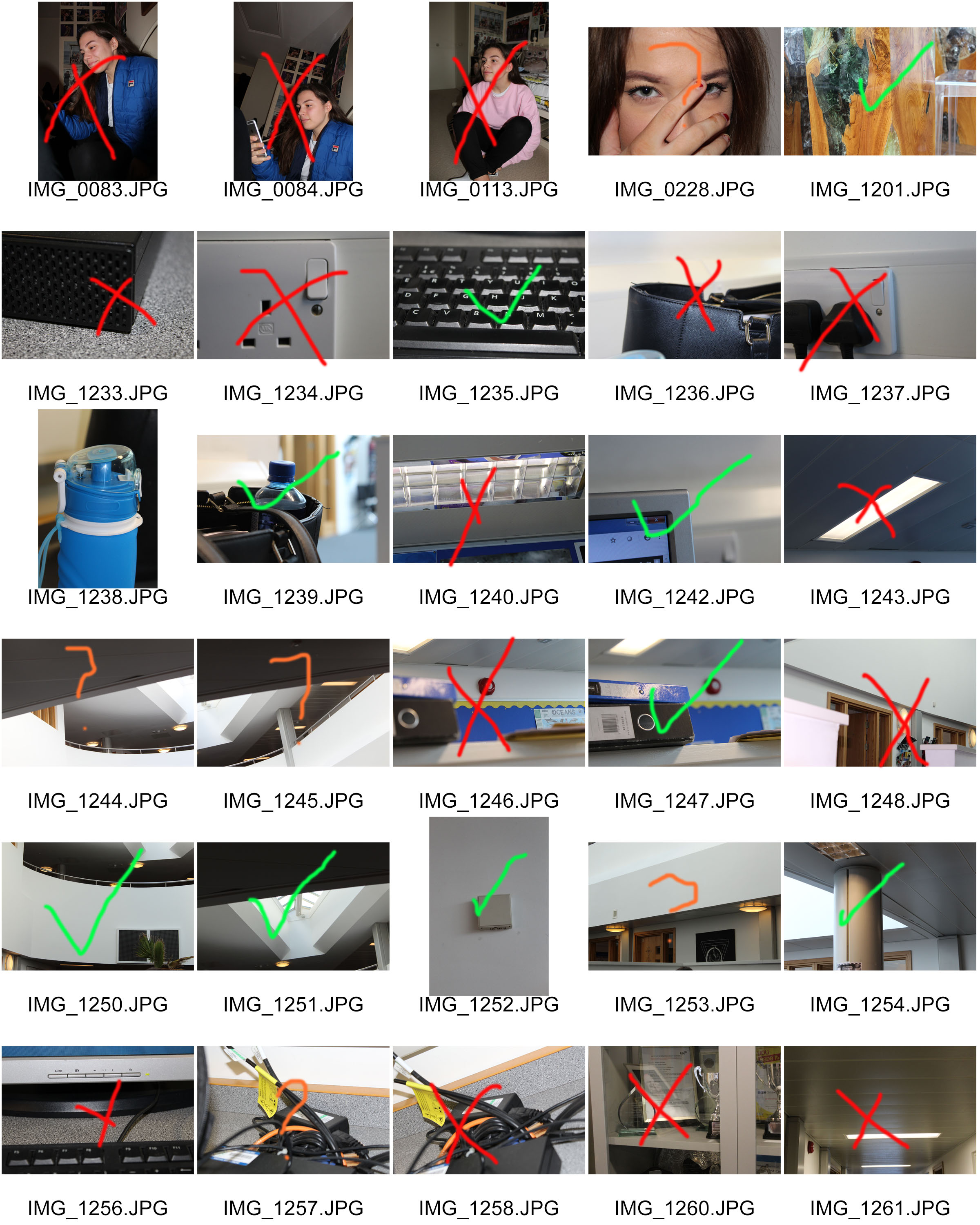
A contact sheet was originally a piece of photographic paper, on which all negatives from a photo shoot would be contact-printed. This would give both the photographer and potential buyers of the photograph, a chance to see the photographs printed before they were published in full size and full resolution.
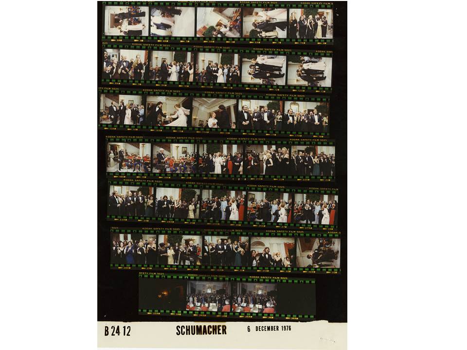
The above image is an example of a contact sheet, containing all of the negatives from a particular photo shoot. Contact sheets were once necessary to see the photograph before the image was printed properly, as it gave a less expensive, smaller sample, that the photographer could use to chose their best photos from the shoot.
The development of digital cameras led to contact sheets becoming less essential, as photos can now be viewed on the screen of a lot of cameras. However, contact sheets are still used in many instances where a photographer wants to be able to provide a potential buyer with a physical copy of the photographs, and can also be useful when a photographer is trying to build an idea of which photographs they do and do not want to use.
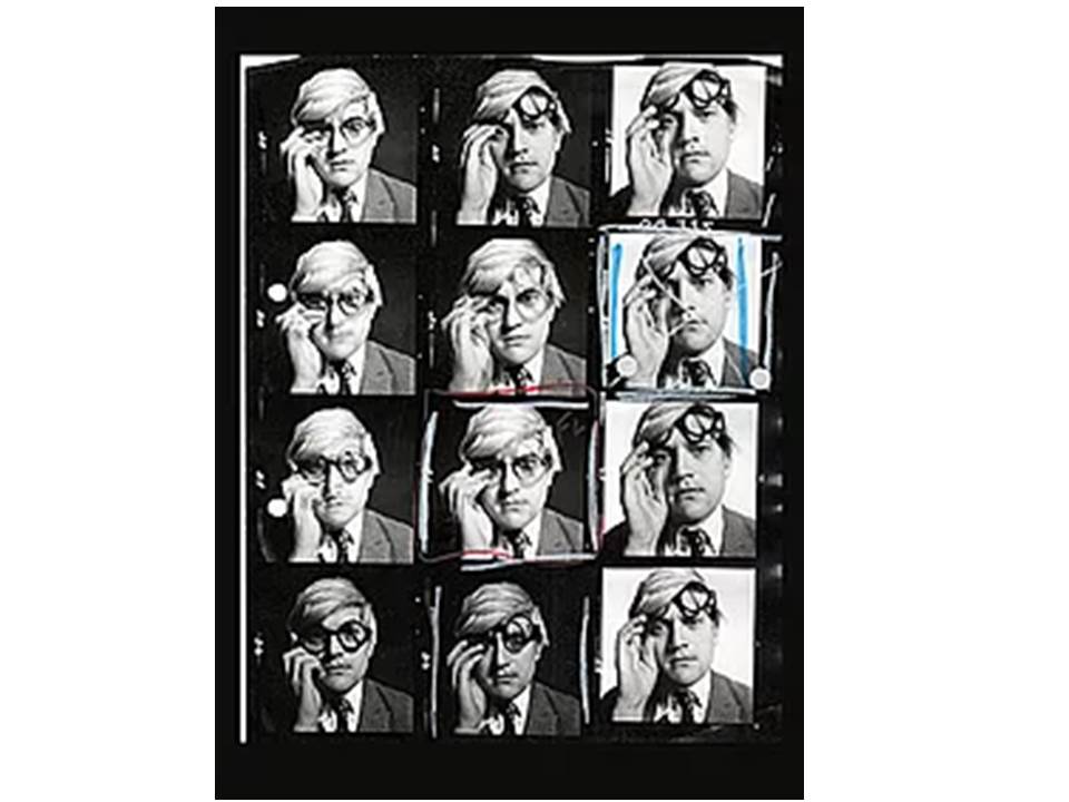
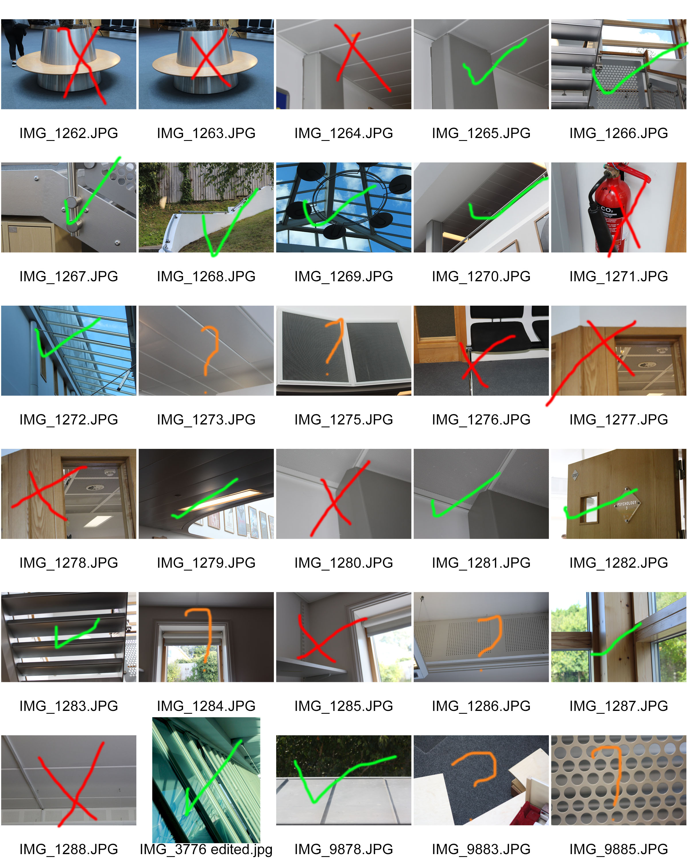
A contact sheet can be edited to make the photographers selections more obvious, and to shot their thought process when deciding on their best photos. The above image shows the selection process of the photographer, as they have clearly used different colour to indicate different selections and choices. Unfortunately a key hasn’t been provided, and so the different colours and shapes can’t be differentiated.
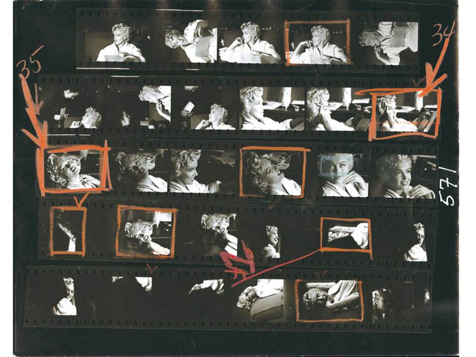
Some contact sheets can show multiple selections, as well as images that the photographer doesn’t want to work with (which are normally crossed out). More than one image can be processed into the editing phase, before a final selection is made.
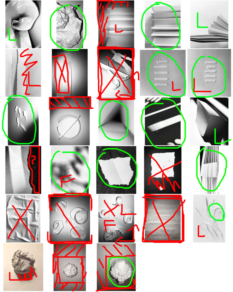
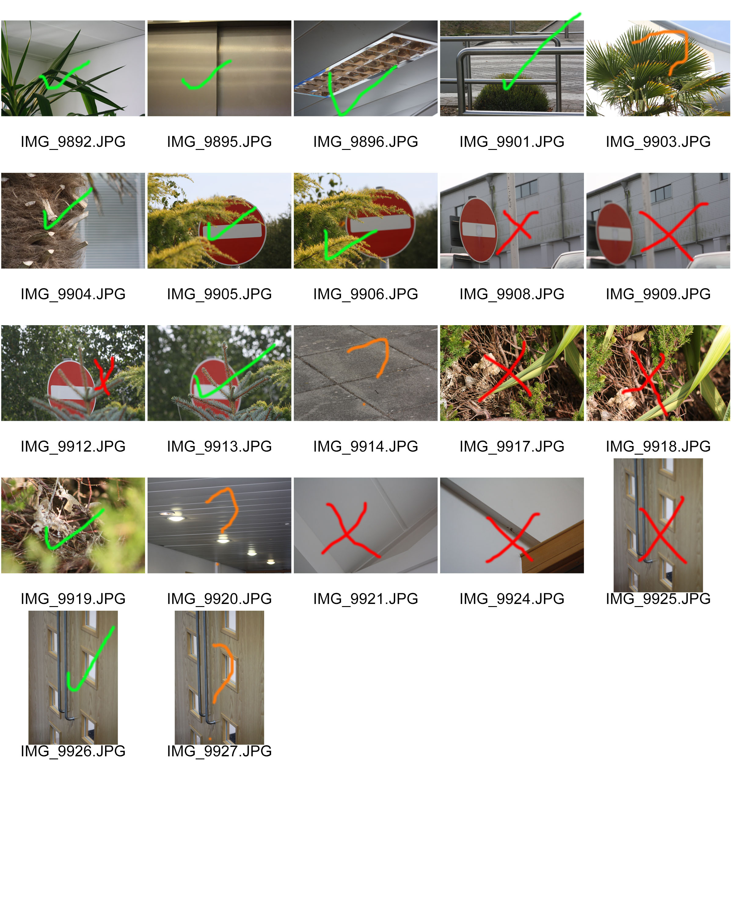
Above is an example of a contact sheet I created for my Paper Project, in which I took images from the photo shoot I completed, and used the software Adobe Bridge to create a contact sheet in Photoshop. From there, I edited the images using different colours and shapes to show my thought process, and I clearly stated which photographs i would be most likely to use in my final selection.
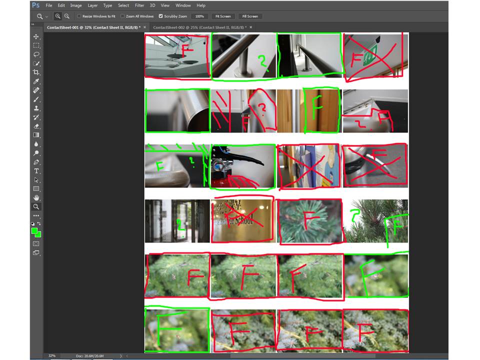
By uploading the photos taken in the photo shoot to Adobe Bridge, I then went to the Tools option, and the Photoshop option. After I selected Contact Sheet 2, a contact sheet was automatically created in Photoshop, and I was then able to edit my selections. The above image is an example of another contact sheet I created for my Camera Lens Experimentation.
Albert Renger- Patzsch
Albert Renger- Patzsch

Albert Renger- Patzch was a German photographer associated with the New Objectivity. Renger-Patzsch was born in Würzburg and began making photographs by age twelve. After military service in the First World War he studied chemistry at Dresden Technical College.
In its sharply focused and matter-of-fact style his work exemplifies the aesthetic of The New Objectivity that flourished in the arts in Germany during the Wiemar Republic. Like Edward Weston in the United States, Renger-Patzsch believed that the value of photography was in its ability to reproduce the texture of reality, and to represent the essence of an object.
I tried to capture the essence of his work and I think I got the best result I could get. I took the photos with my DLSR Canon Camera on the close up setting. Most of my photos were landscape but a few were portraits.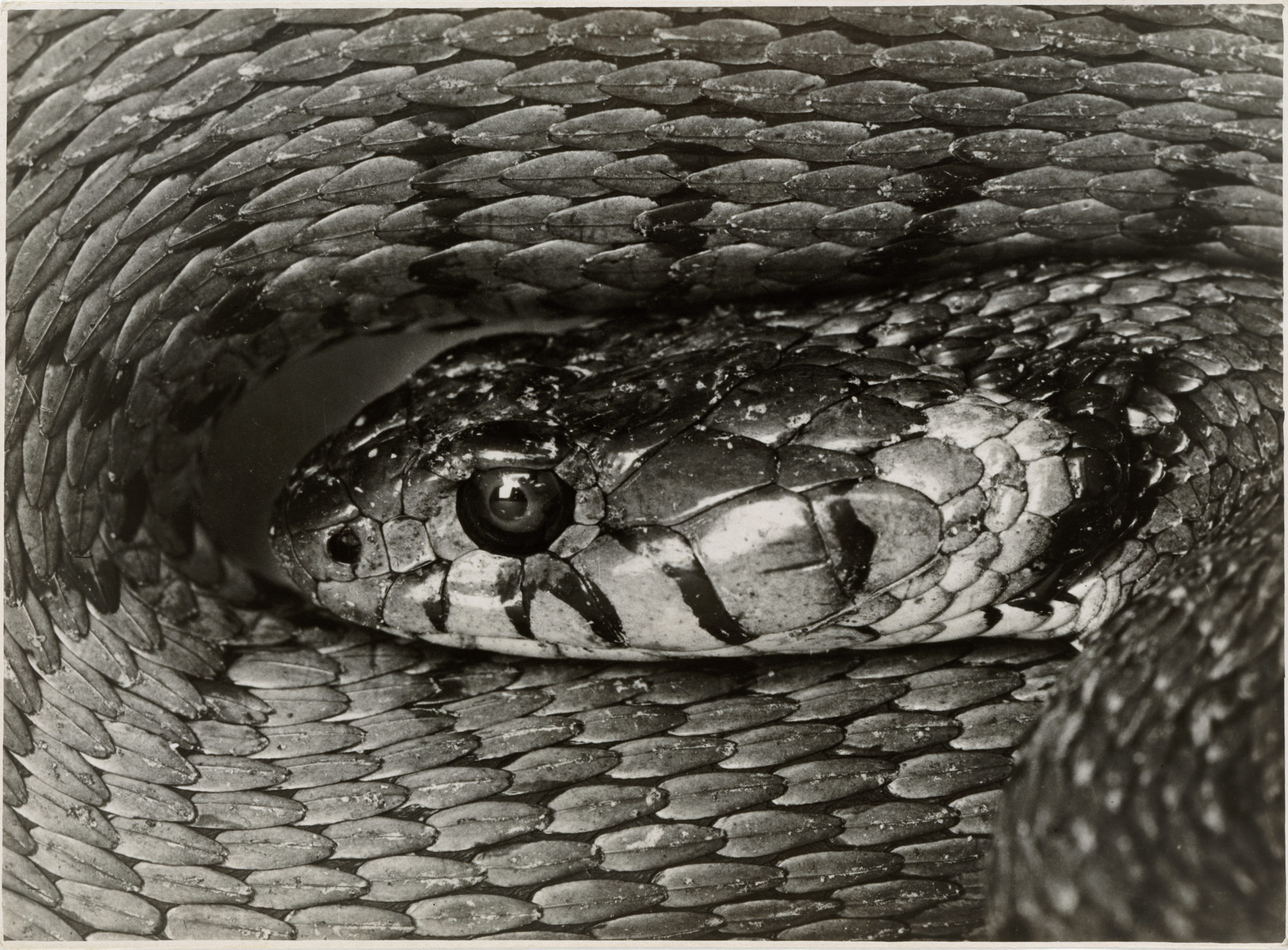
For my response to Albert’s photos I tried to take 100 photos, but only managed around 80 photos. Even though Albert’s photos were in black and white, I have a mixture of black and white and coloured photos edited photos.
Contact Sheets
Top Favourite Photos (Edited)
Edited all on Photoshop
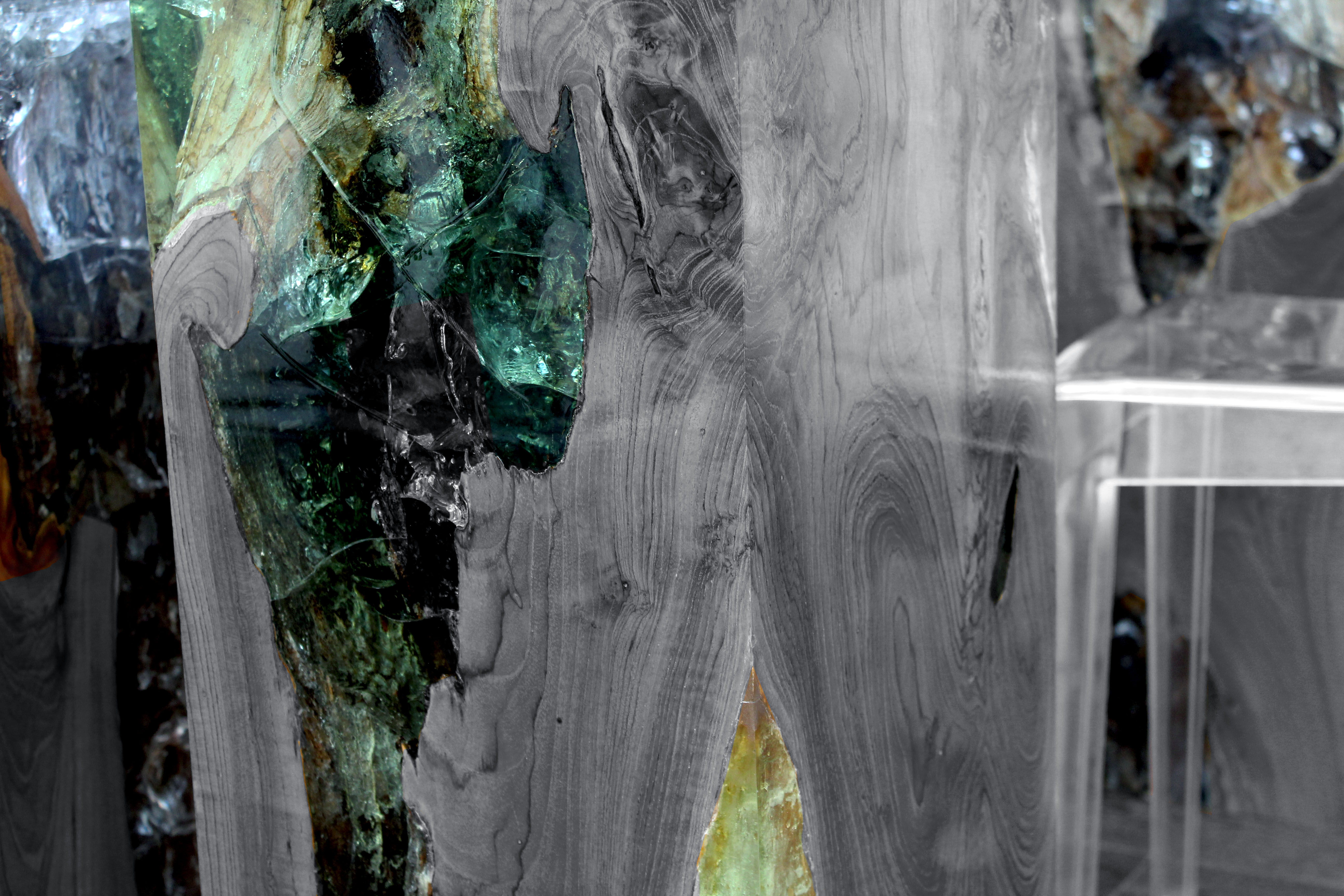
I chose to edit this photo because I really liked how the table had the unique and colourful marble in it. I decided to make the marble pop by making the wood and chairs black and white. I really like how this photo turned out and I will try this style of editing again.
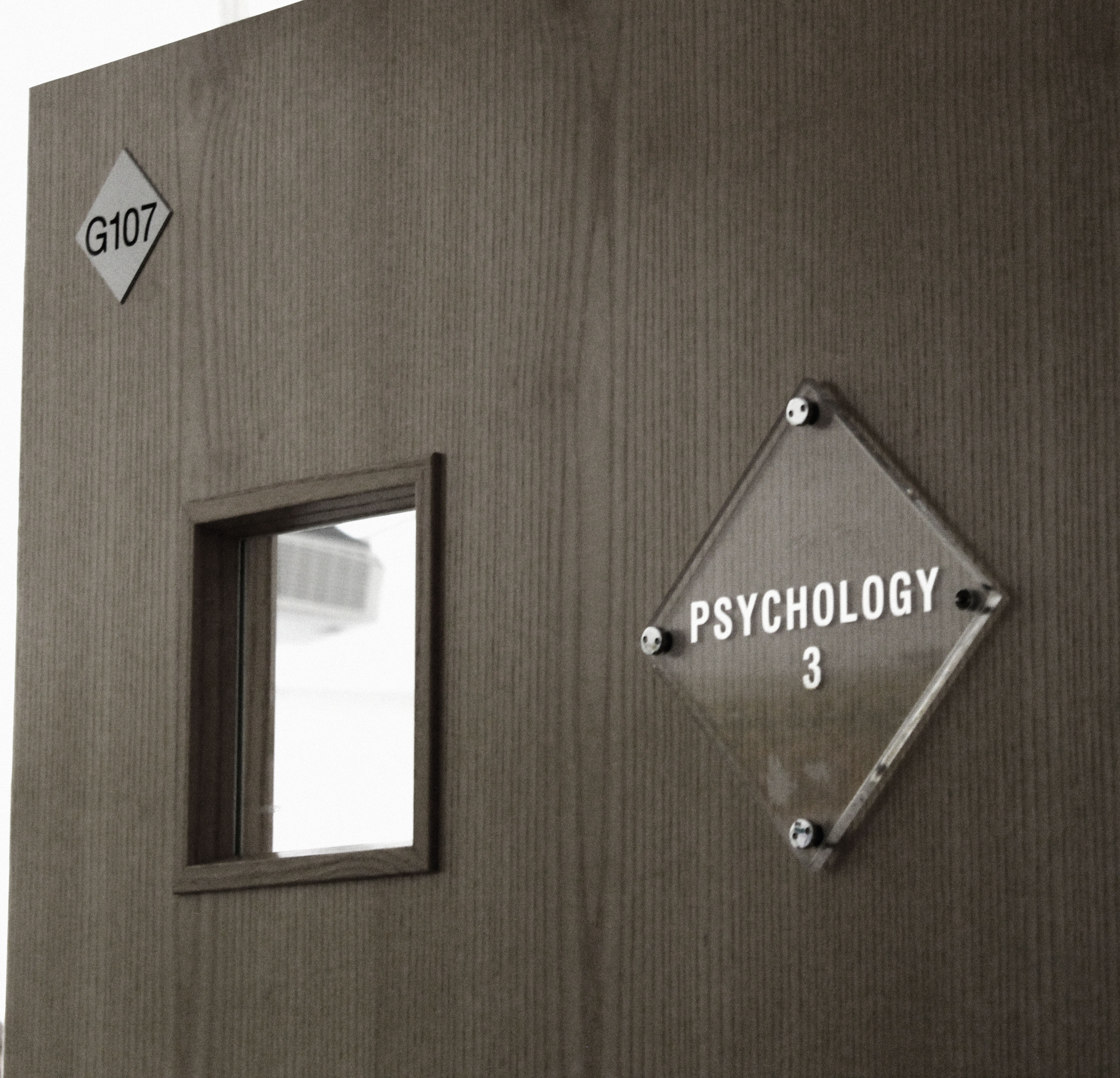
For this next photo I decided to make it more dull and dark as appose to it’s original bright photo. I played with the levels, contrast and saturation to achieve this photo. I’m really happy with how this turned out and I really like the difference of the original photo to the edited photo.
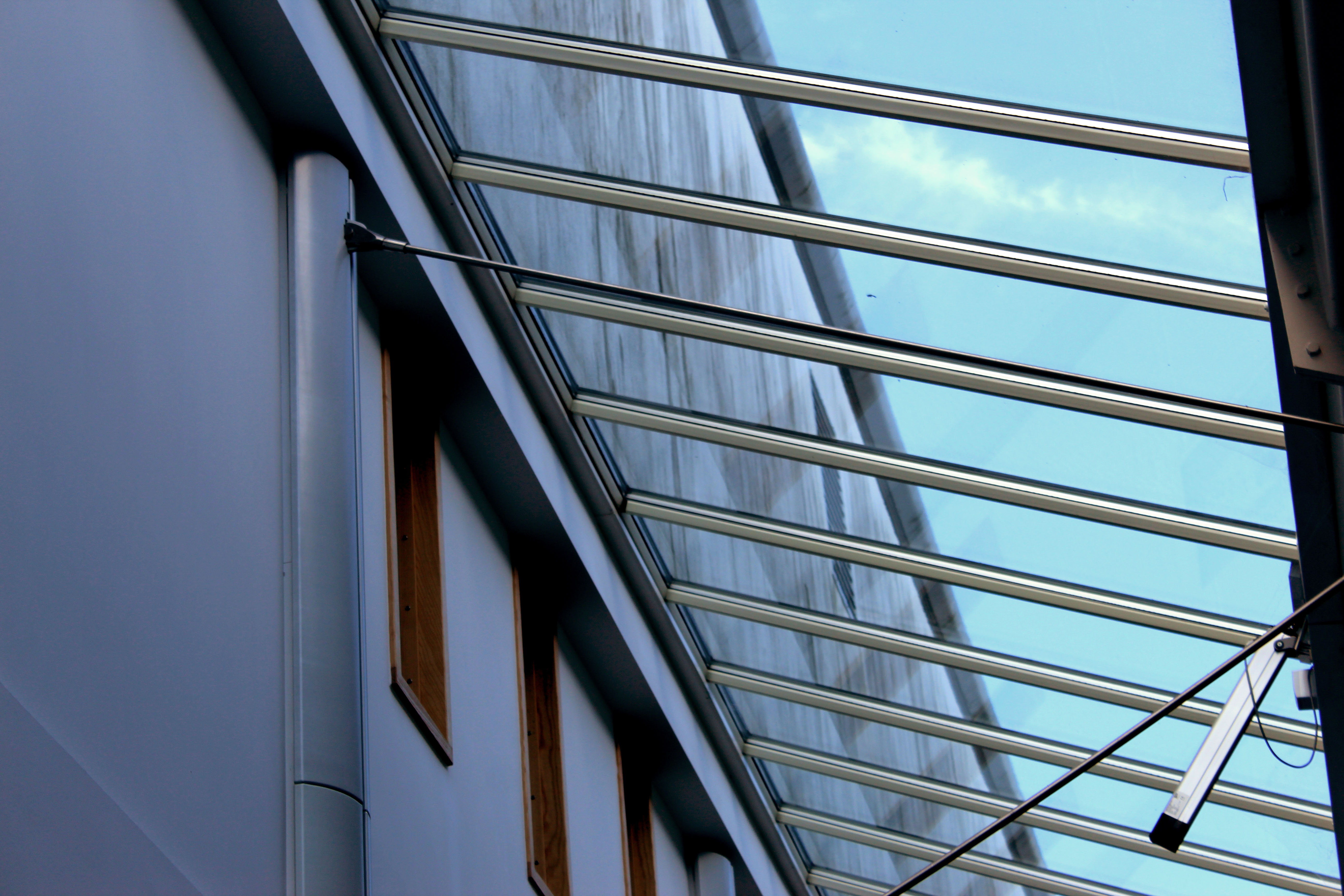
For this photo I decided to use levels, contrast, colour balance and photo filter to achieve this look. I really like how the light is almost shining into the room. I also like the contrast of the wooden windows and glass windows, it gives it a really nice look. I think I edited this photo very well.
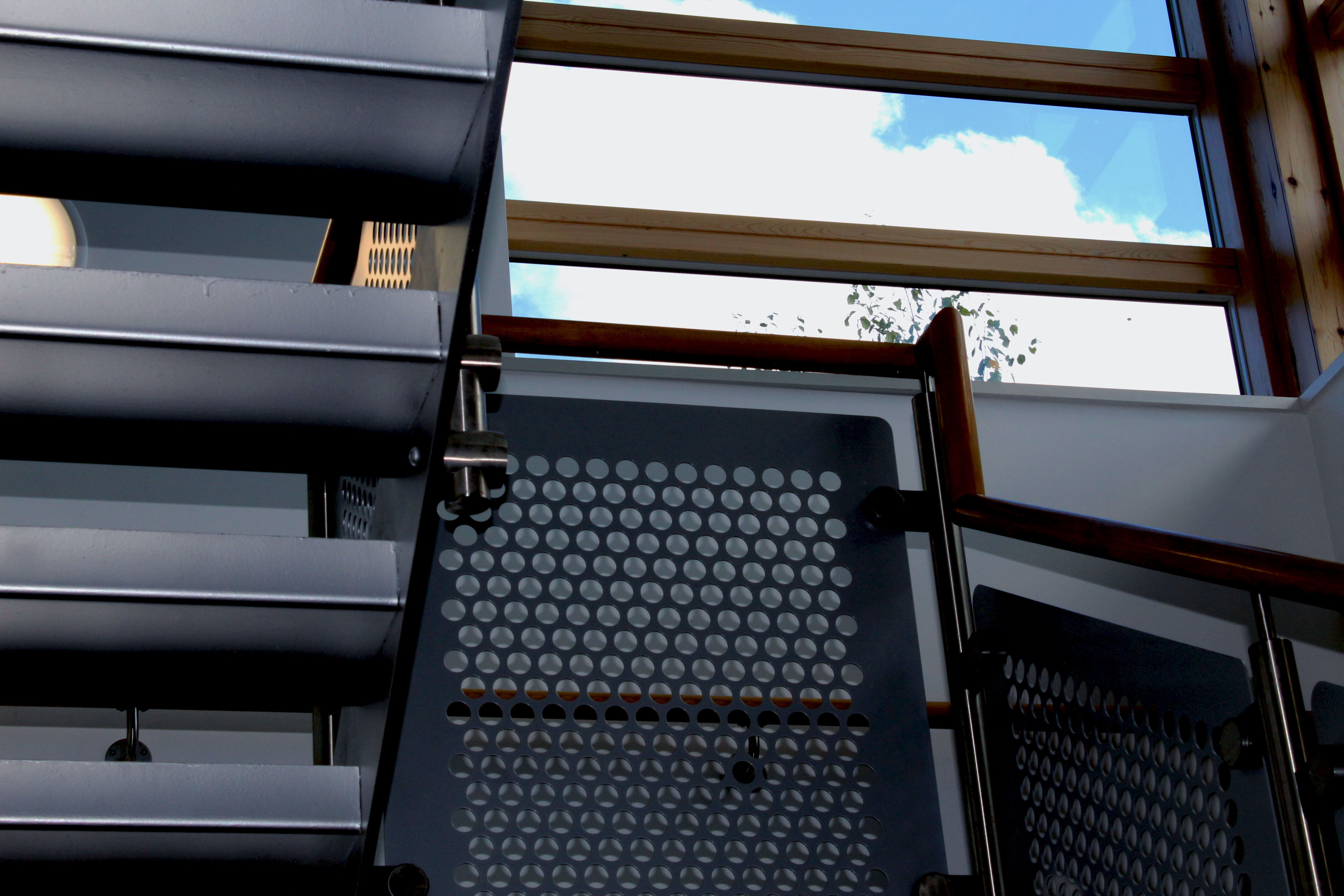
This next photo I used the contrast and exposure setting a lot. My vision was to make the sky brighter than the stairs, and I really like how I achieved this look. I think I got the overall idea of what I wanted for this photo, and it translates very well in the edited final picture.

For this next photo I used exposure, contrast and levels to get this final picture. I really like how the light is centered onto the middle of the keyboard. I think I edited this picture well and will try to use this style of editing in future projects.
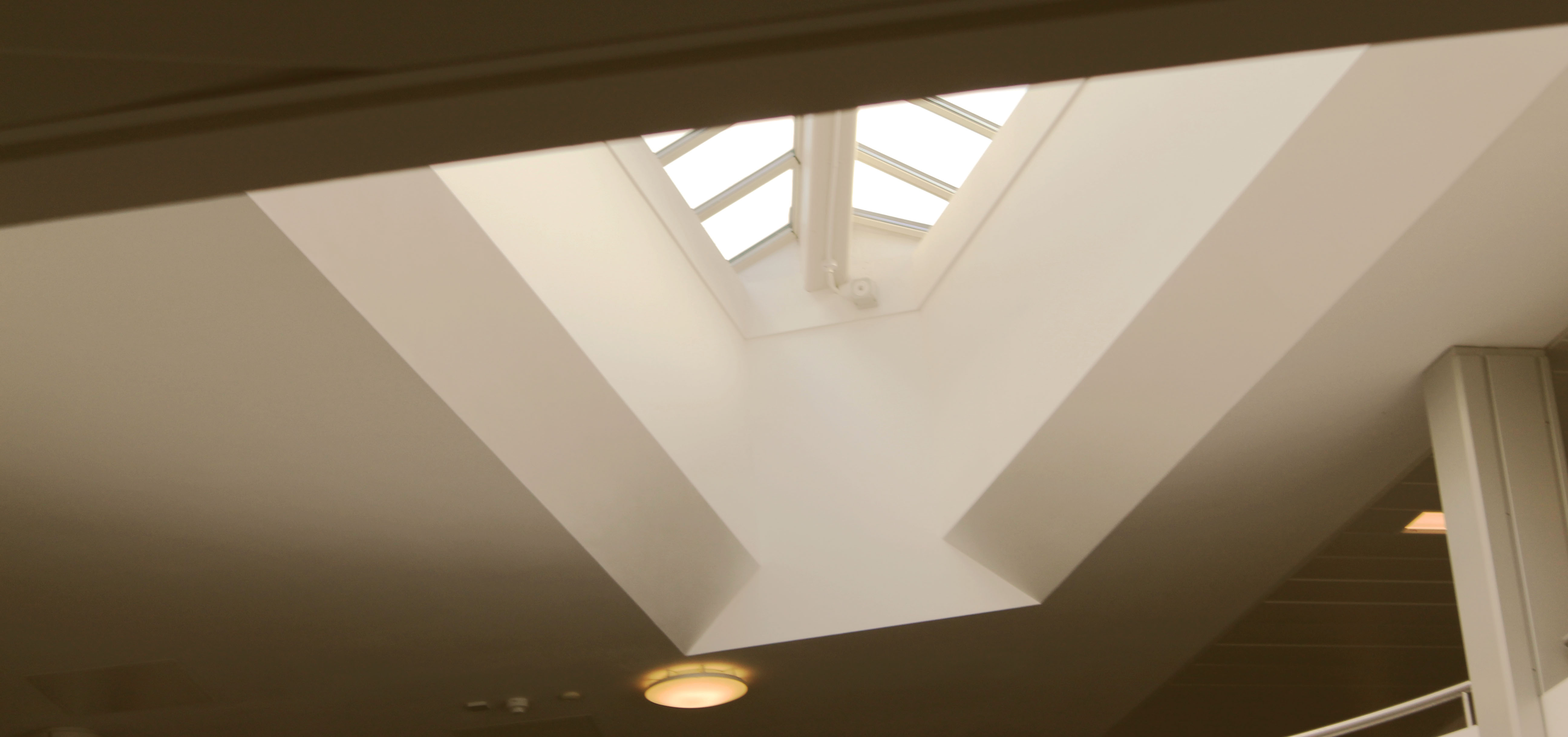
For this last photo I used photo filter, gradient, contrast and exposure. I’m really pleased with how this turned out. The way I edited it gives it a retro and vintage look to it which I personally really enjoy. I hope to also use the style of editing in future projects.
Evaluation
Overall I think a did a good job at recreating Albert Renger- Patzsch style of photography. I really enjoyed doing this project as it gave me inspiration and ideas for future photo shoots and projects. I hope to keep achieving photos that I like and to improve with my camera and photography skills. I would also like to explore more ideas with different photographers and look at work that isn’t my preferred style because I would like to expand my ideas and see other styles from my own.
Response to Albert Renger-Patzsch
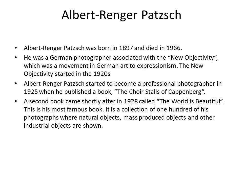
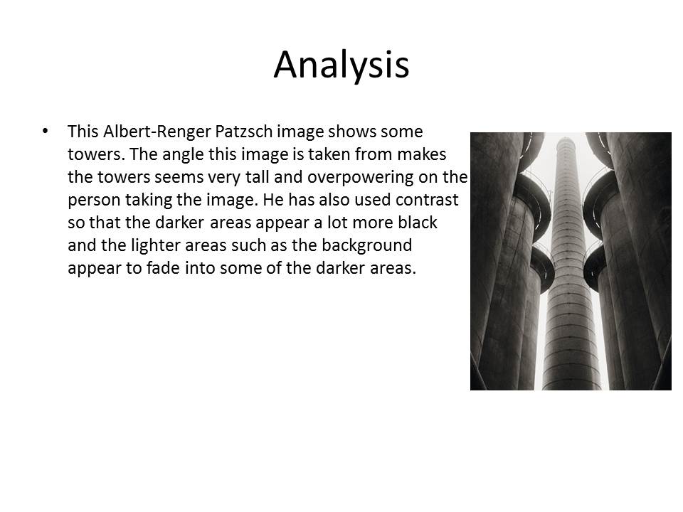


My response to Albert Renger-Patzsch:
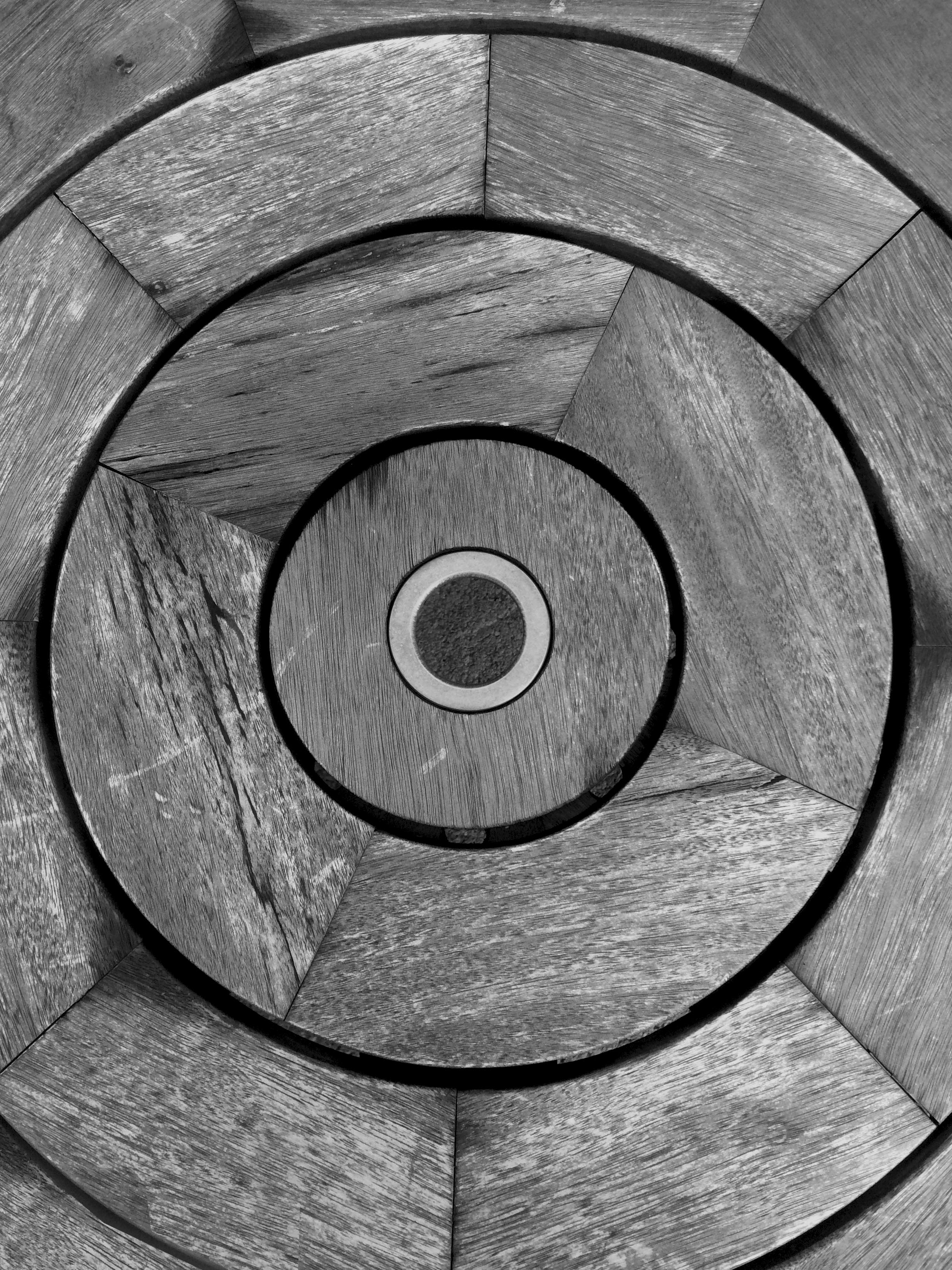
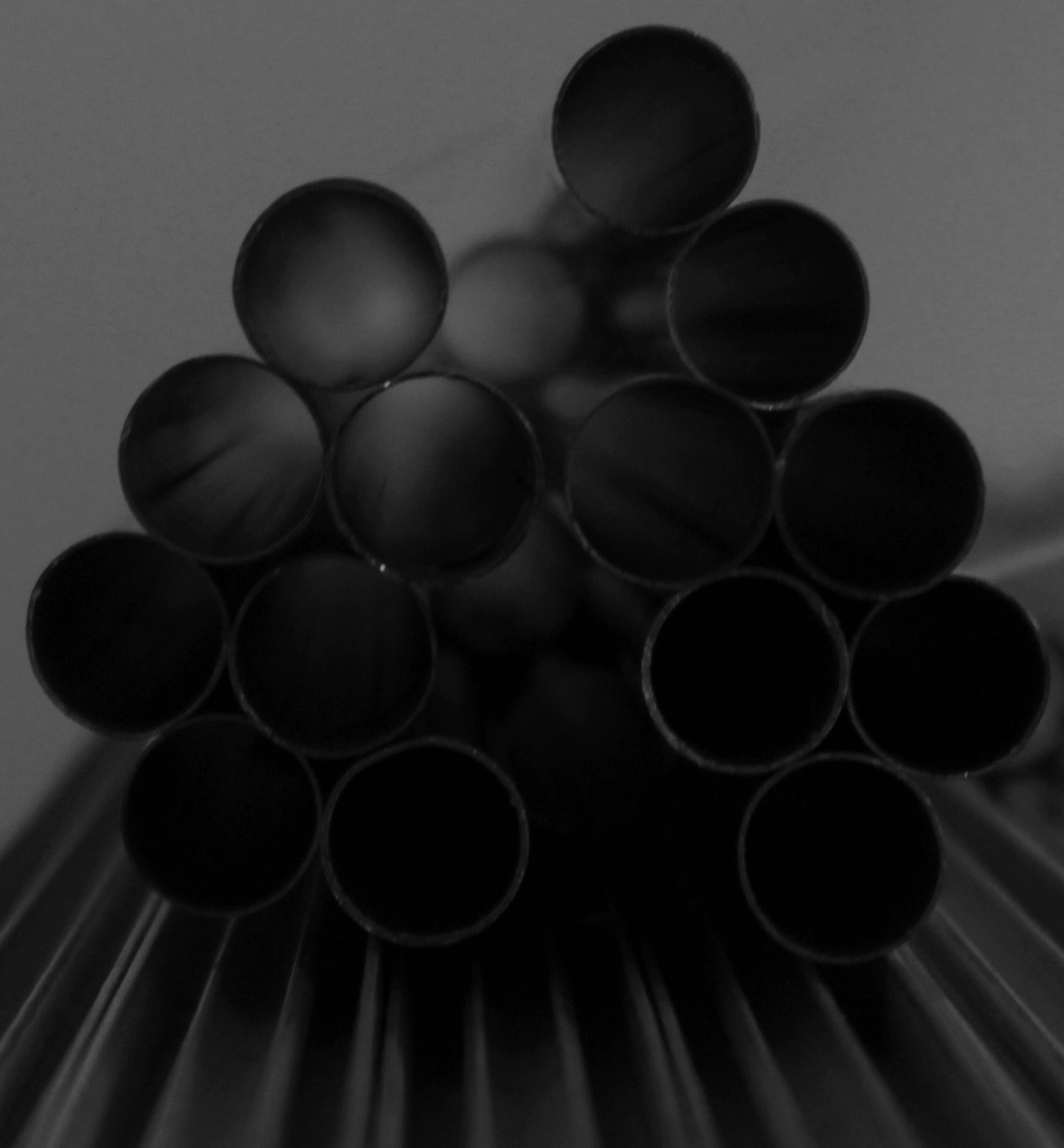
These are the best images I have taken after looking at how Albert Renger-Patzsch takes his images. I have taken images from weird angles and usually quite close up to make these images. I have then taken the best ones I took into photoshop and have made them black and white as Albert Renger-Patzsch always did his work in black and white. I have also cropped and adjusted the exposure settings on a few of these images to create contrast and to make the texture stand out.
