Monthly Archives: September 2018
Filters
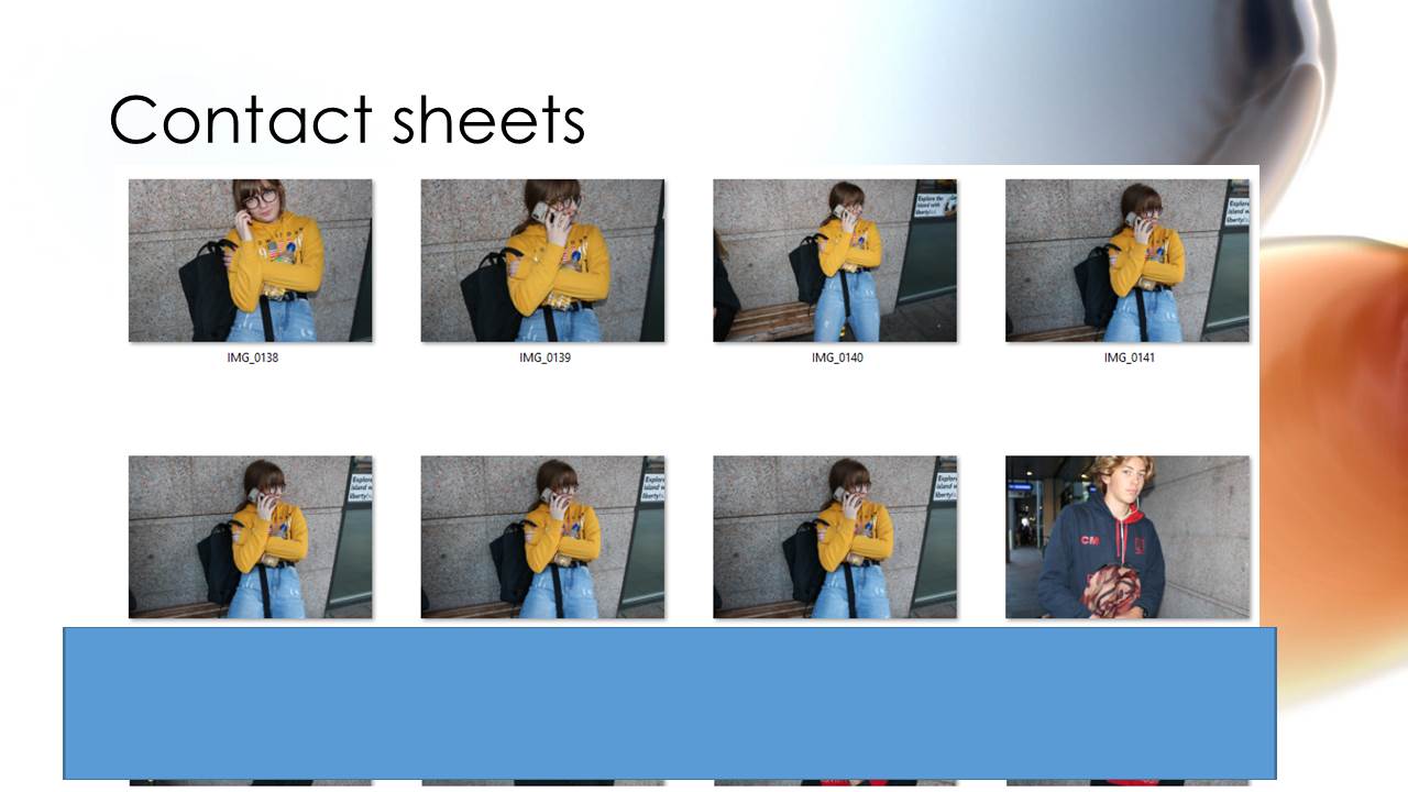
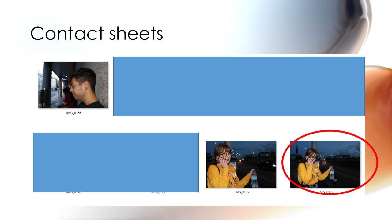
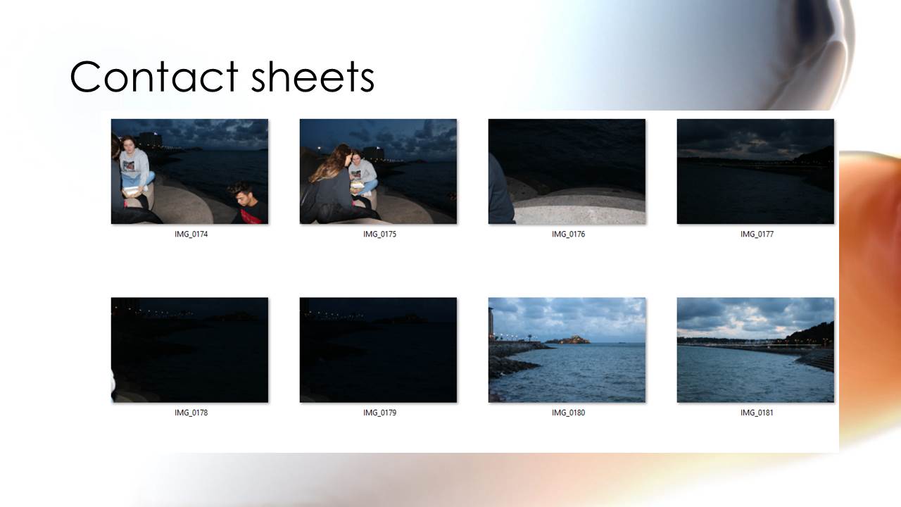
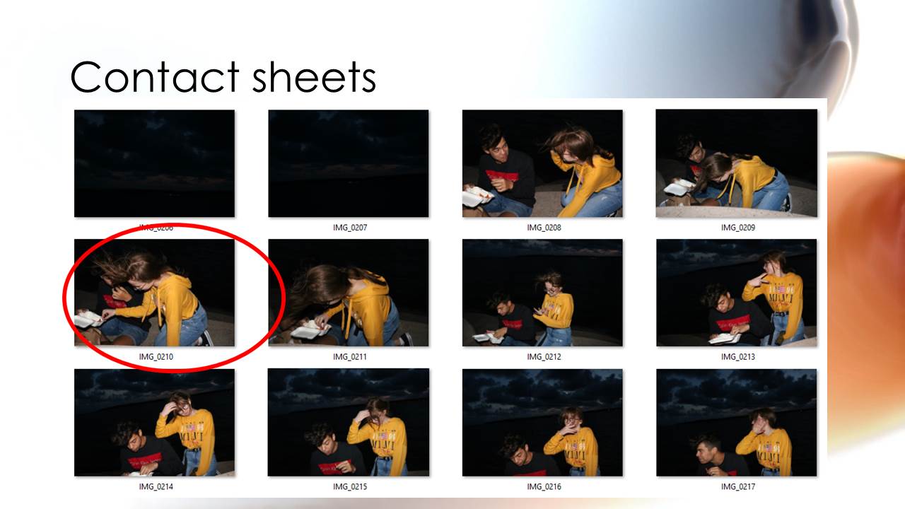
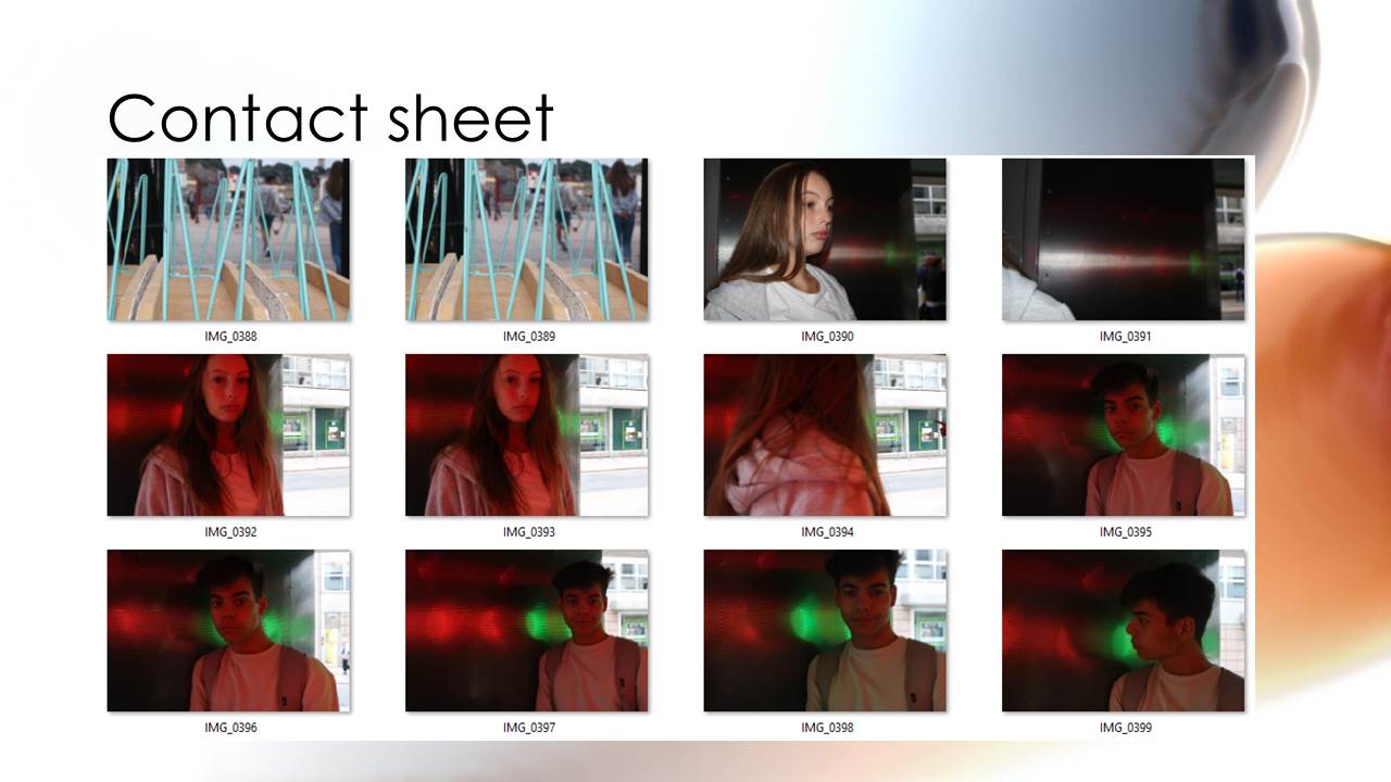
Contact Sheet
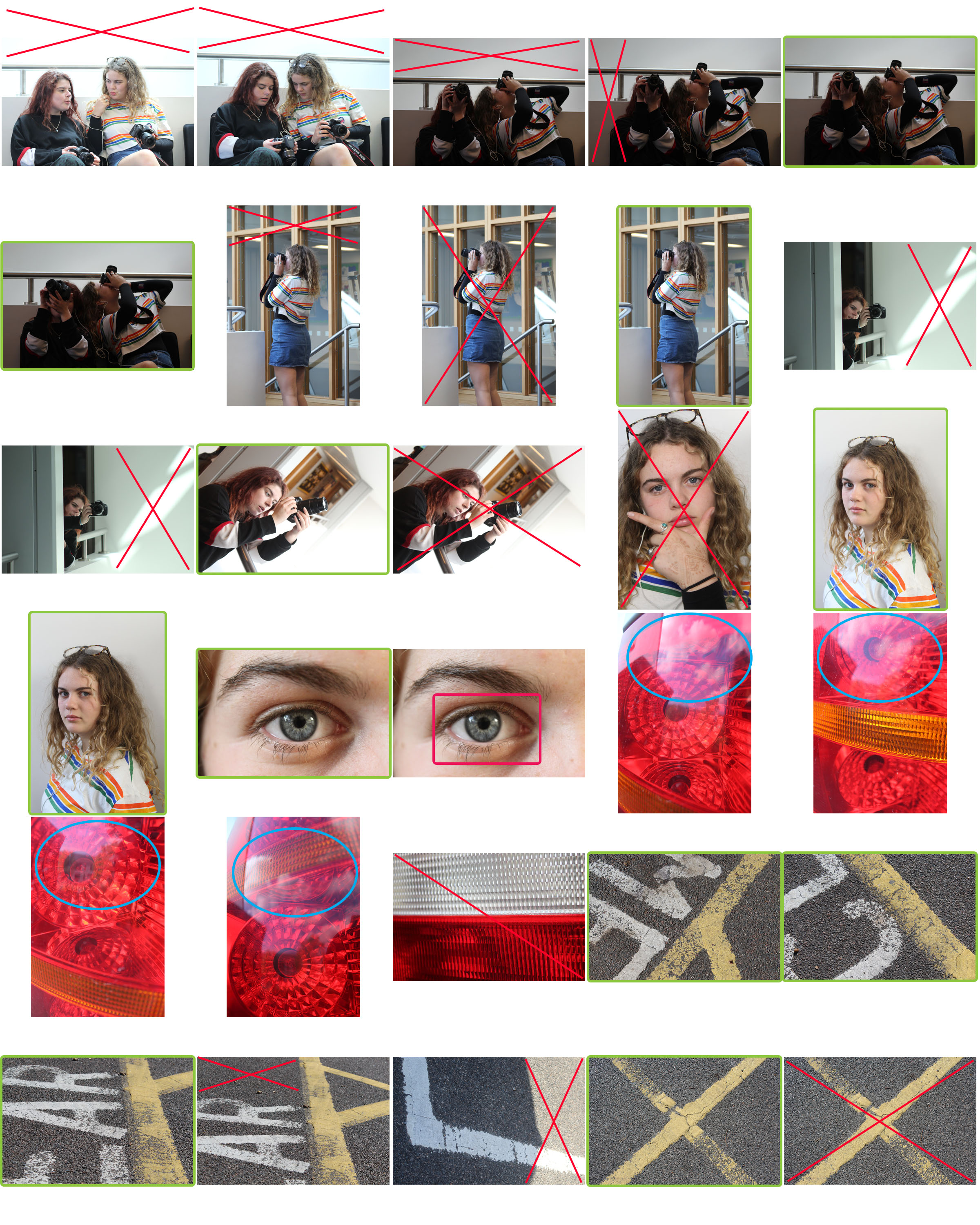
The meaning of each colour is:
Red: Indicates a photo or area I dislike. I would either discard the photo or crop the red areas to enhance the focal points of each frame.
Green: Indicates a composition that I am pleased with and would go on to edit to further improve the image.
Blue: Shows an area where there is an area of overexposure in the frame.
Pink: Shows an area that is out of focus where this was not my aim.
Abstract Photography Task
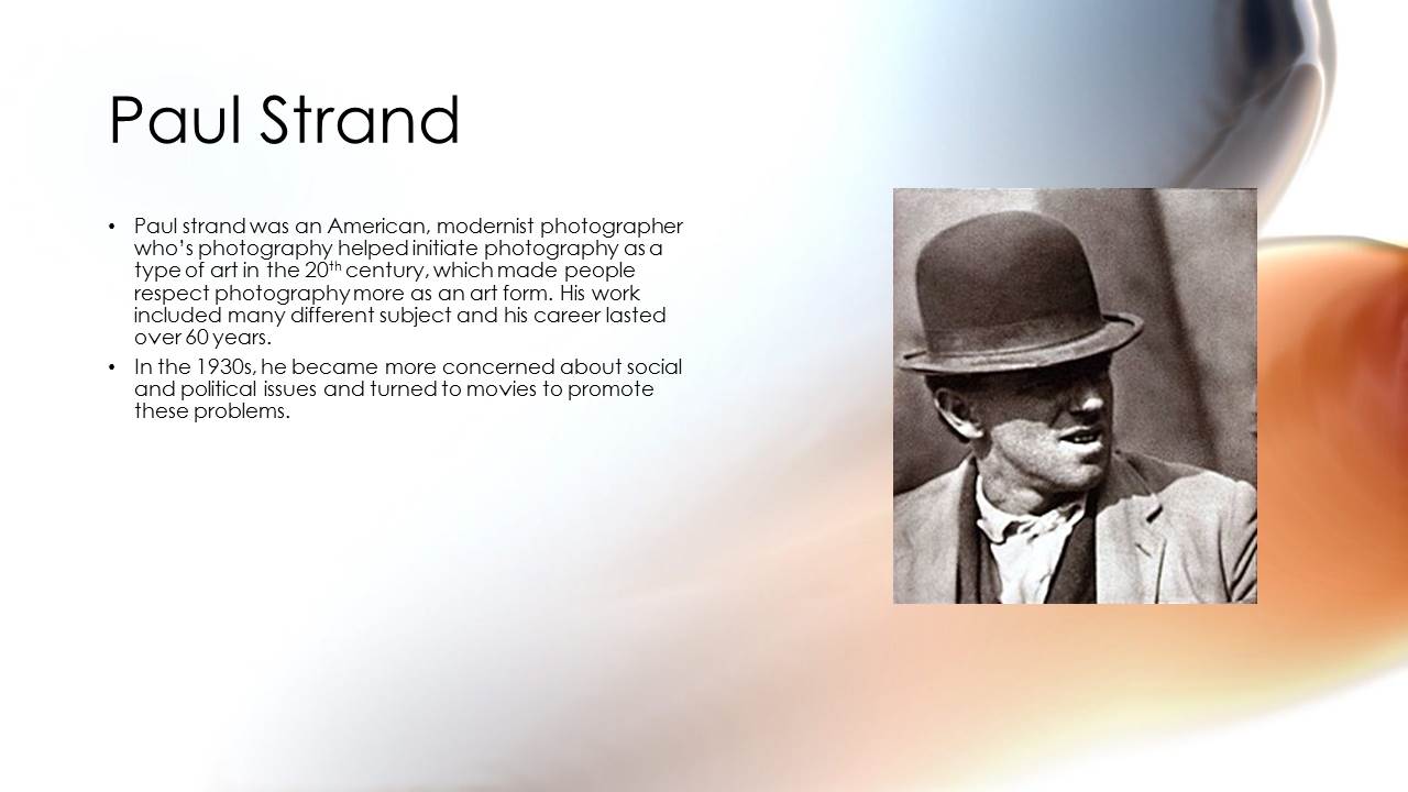
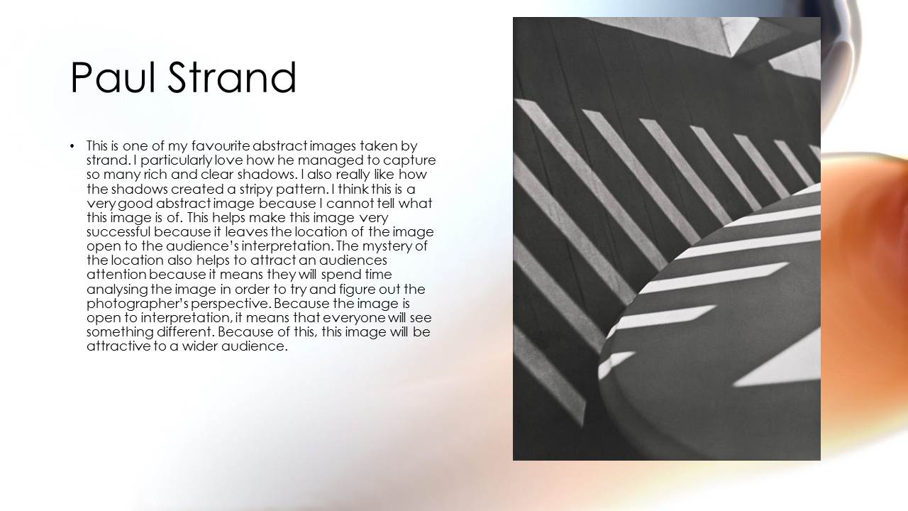
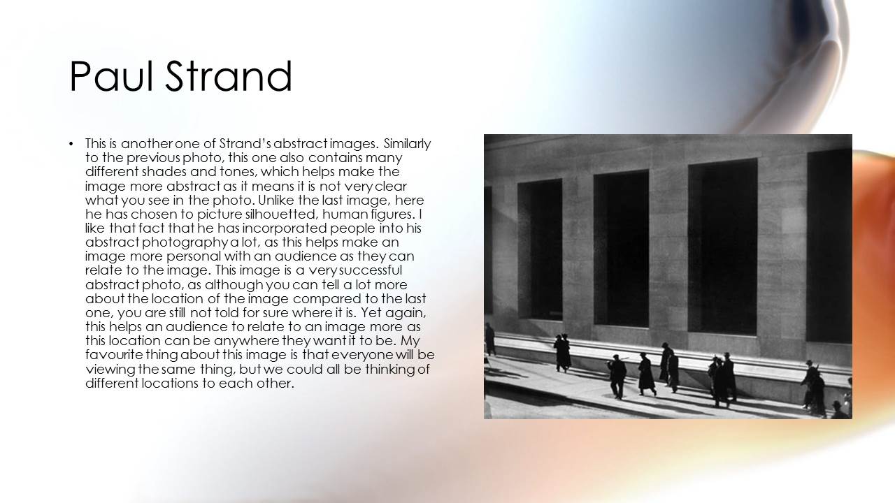
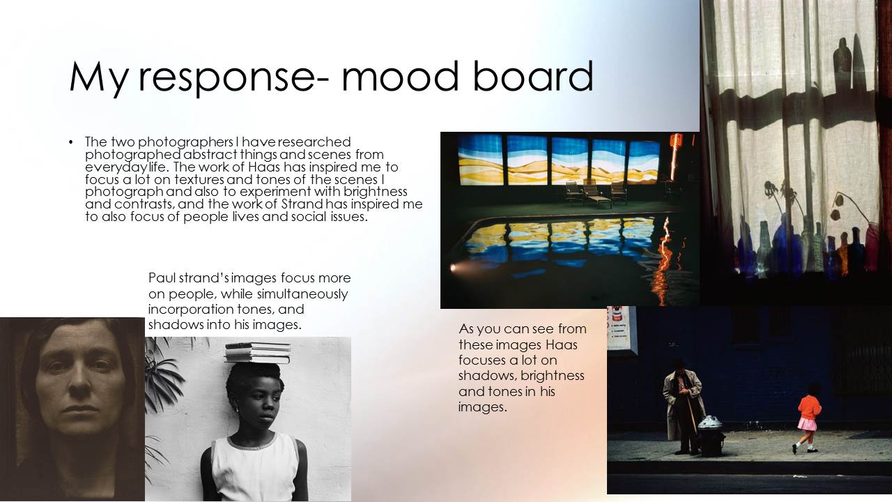
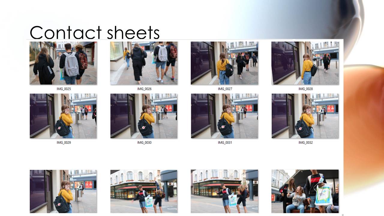
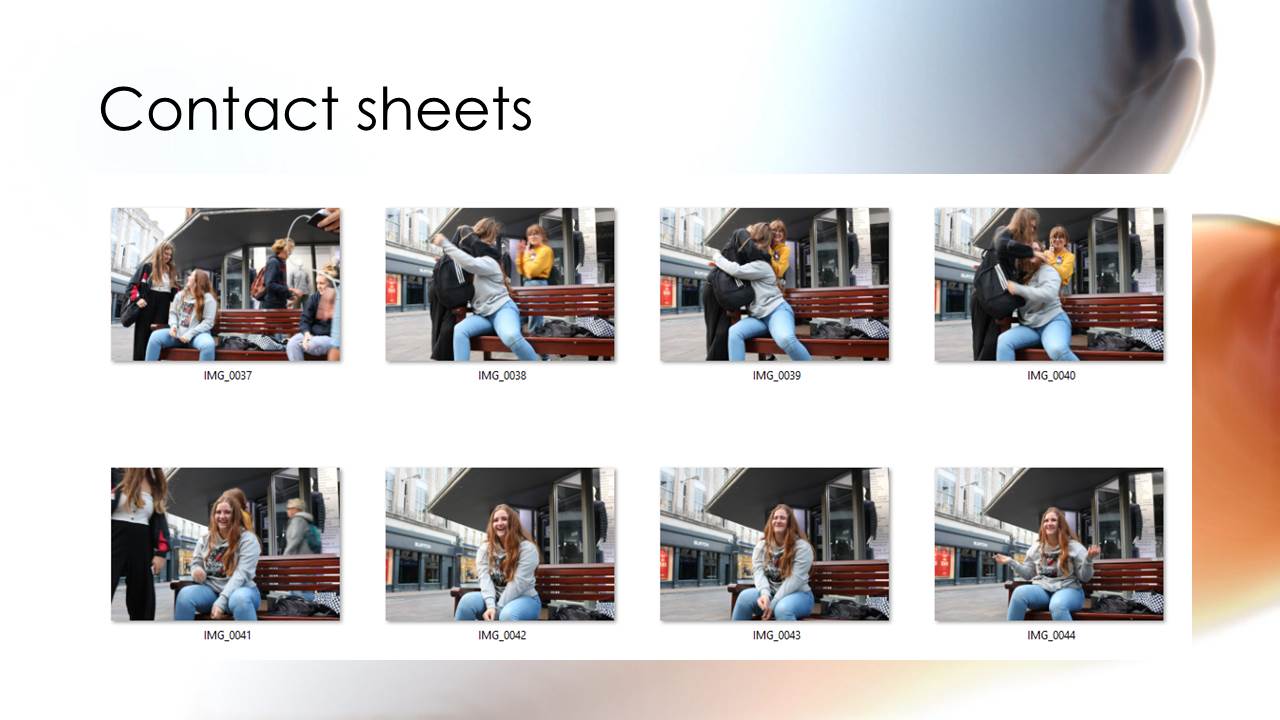
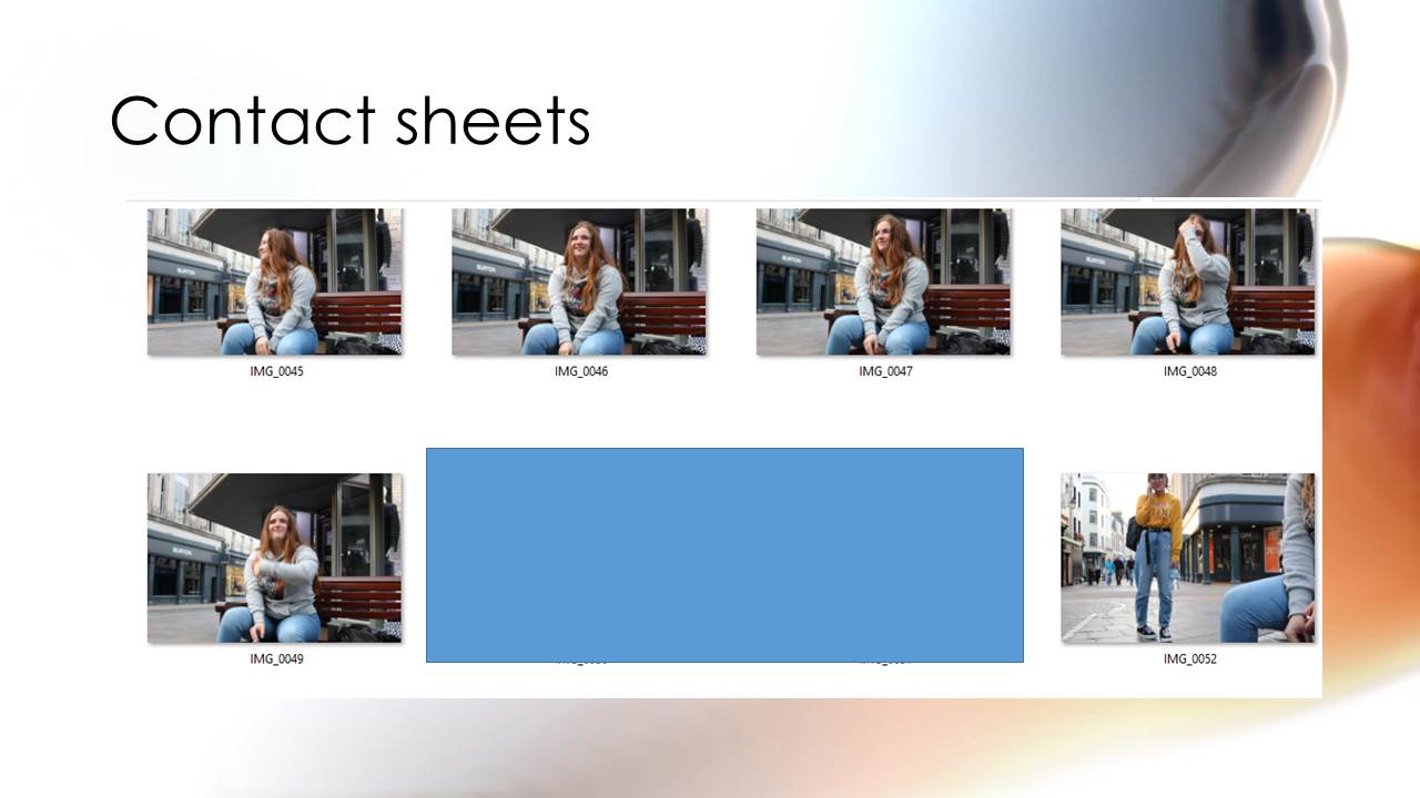
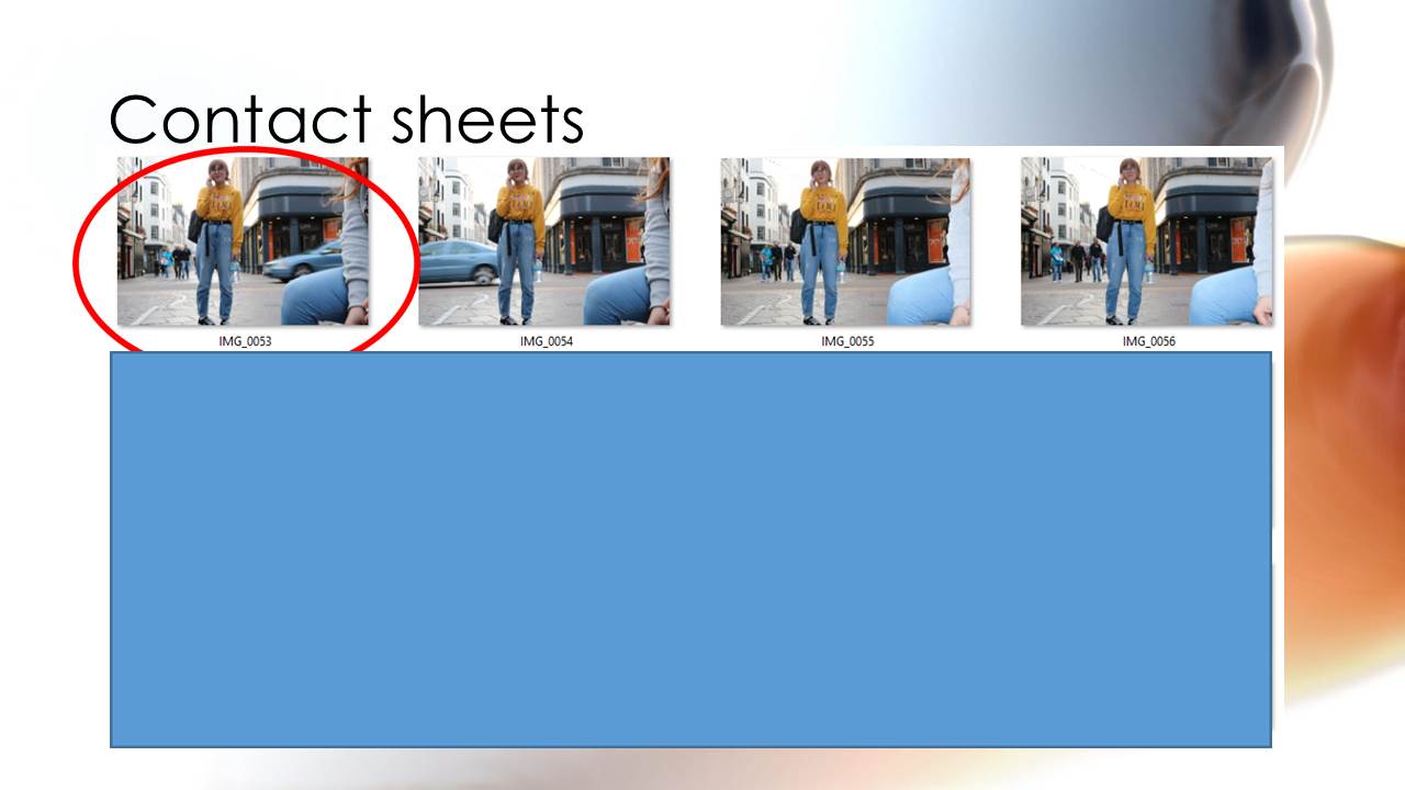
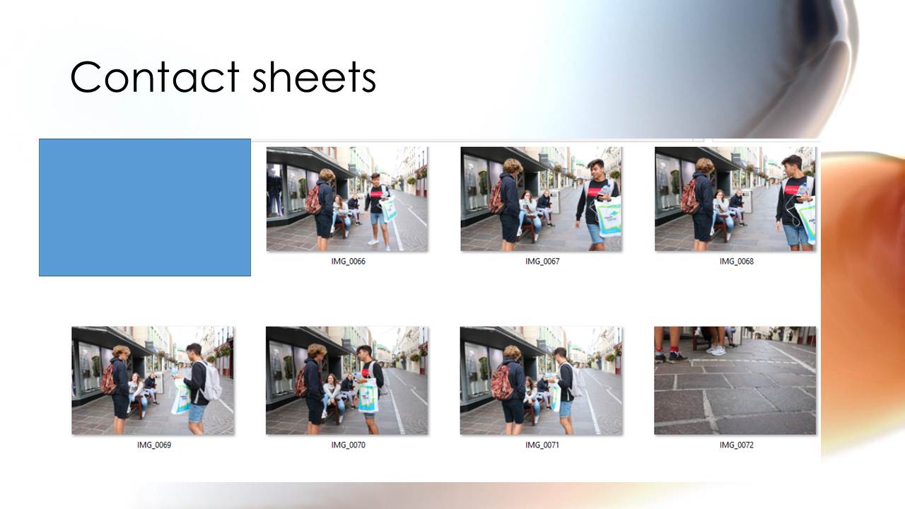
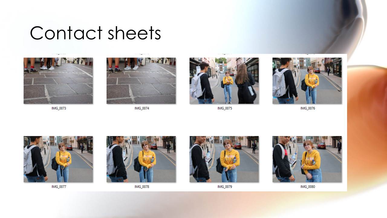
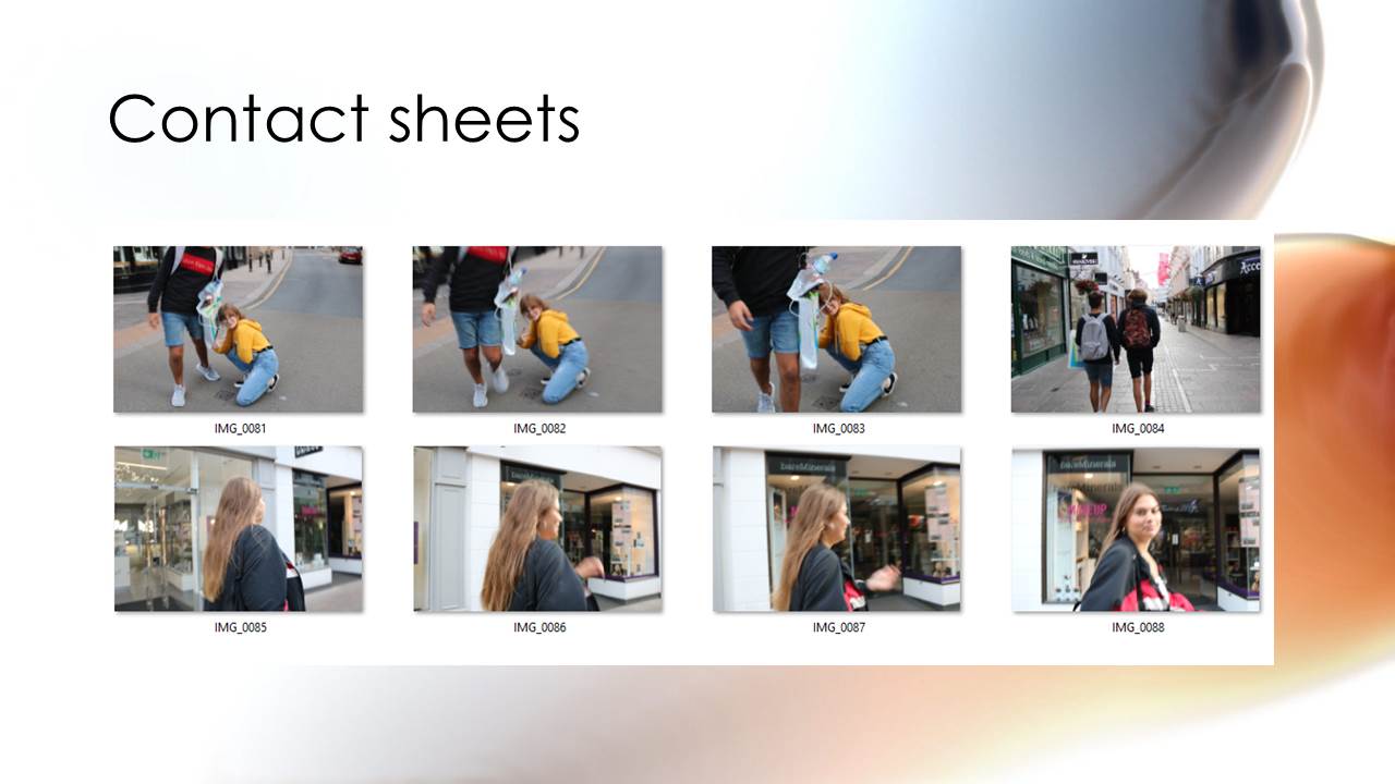
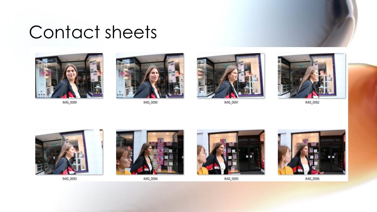
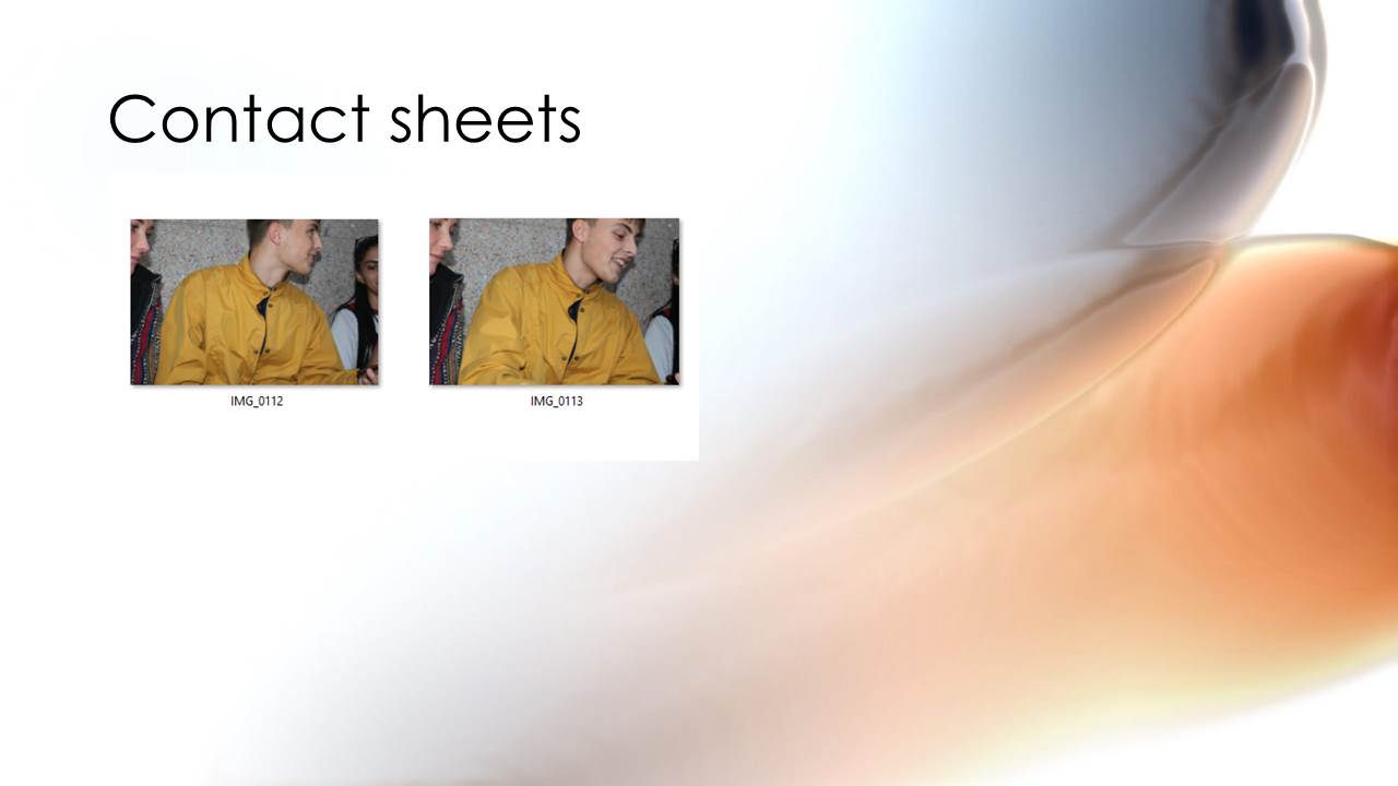
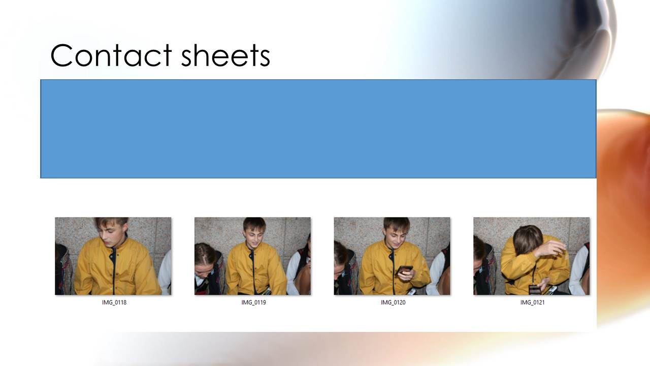
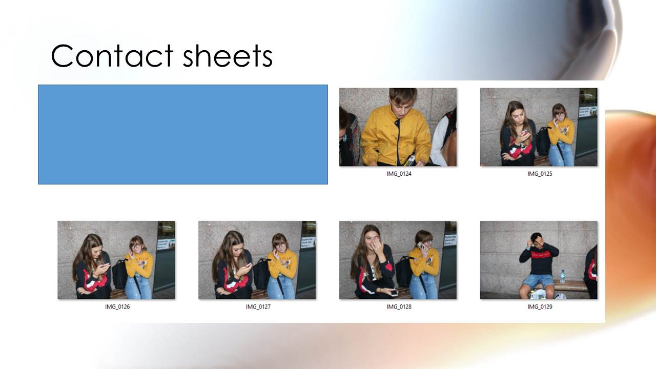
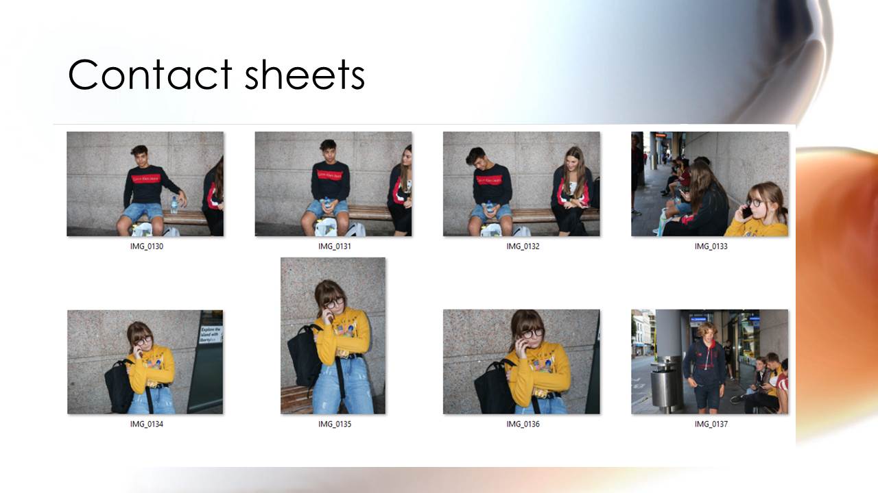
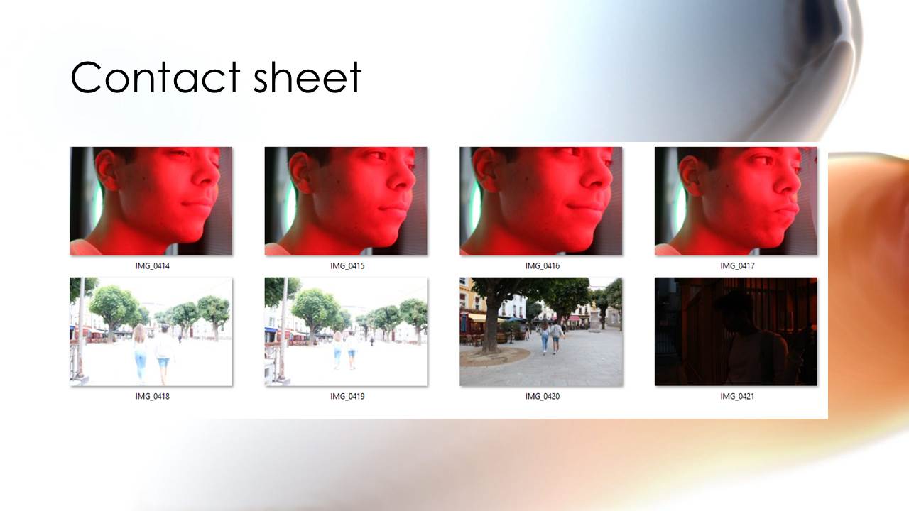
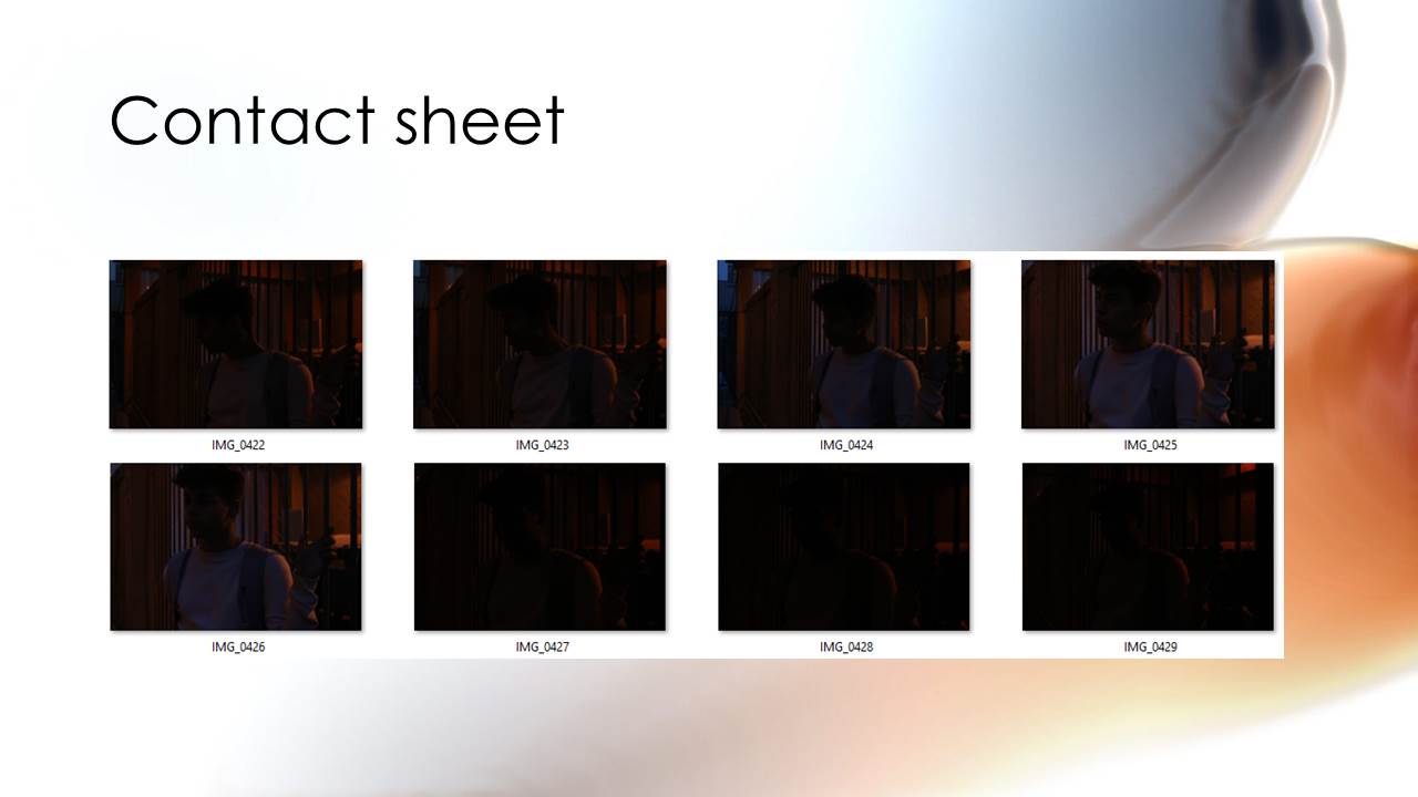
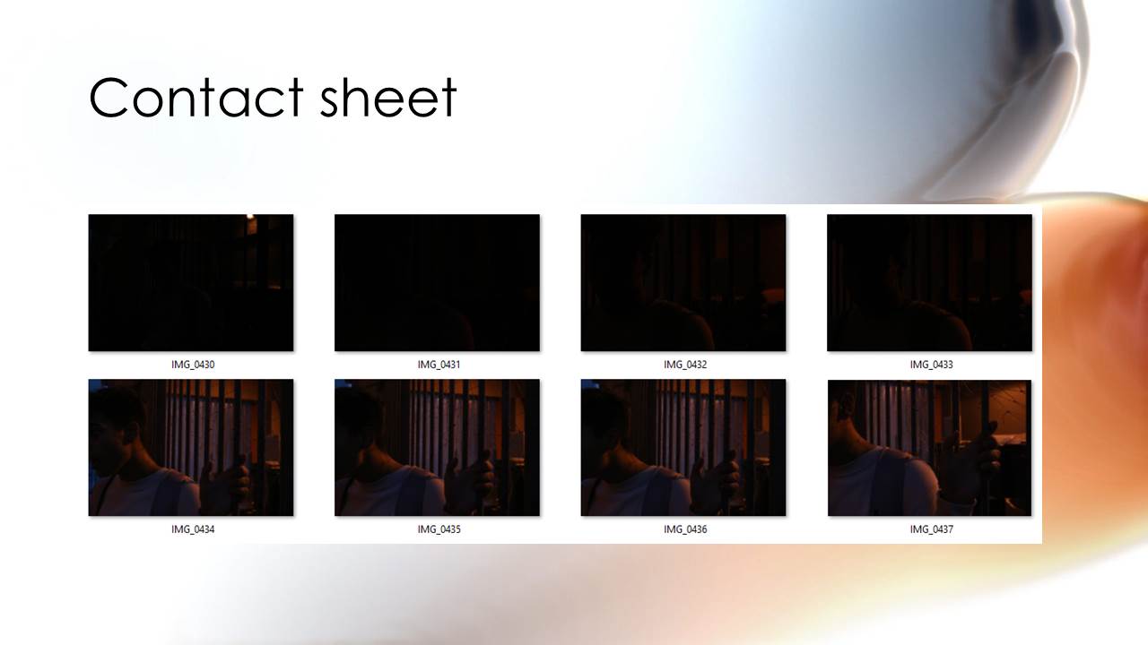
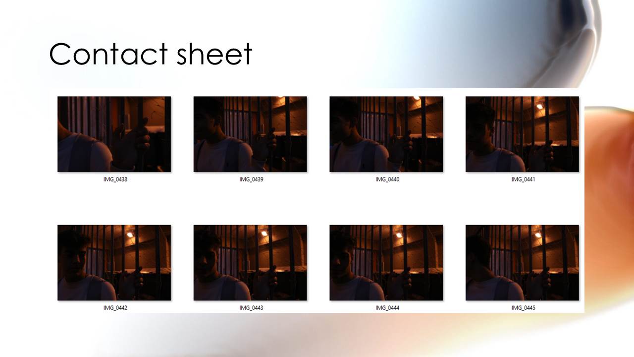
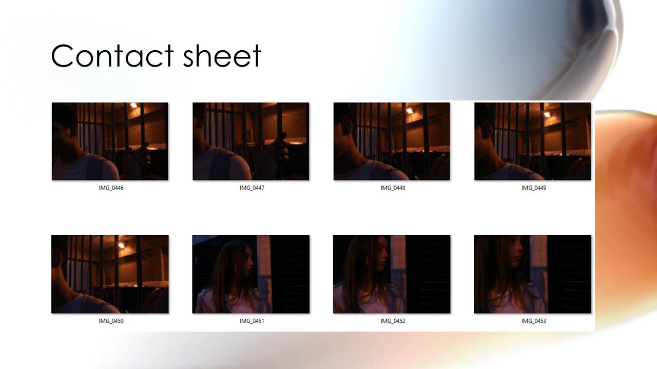
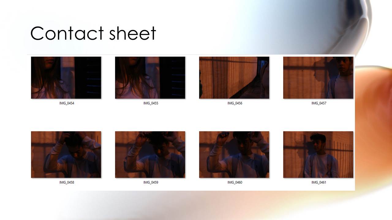
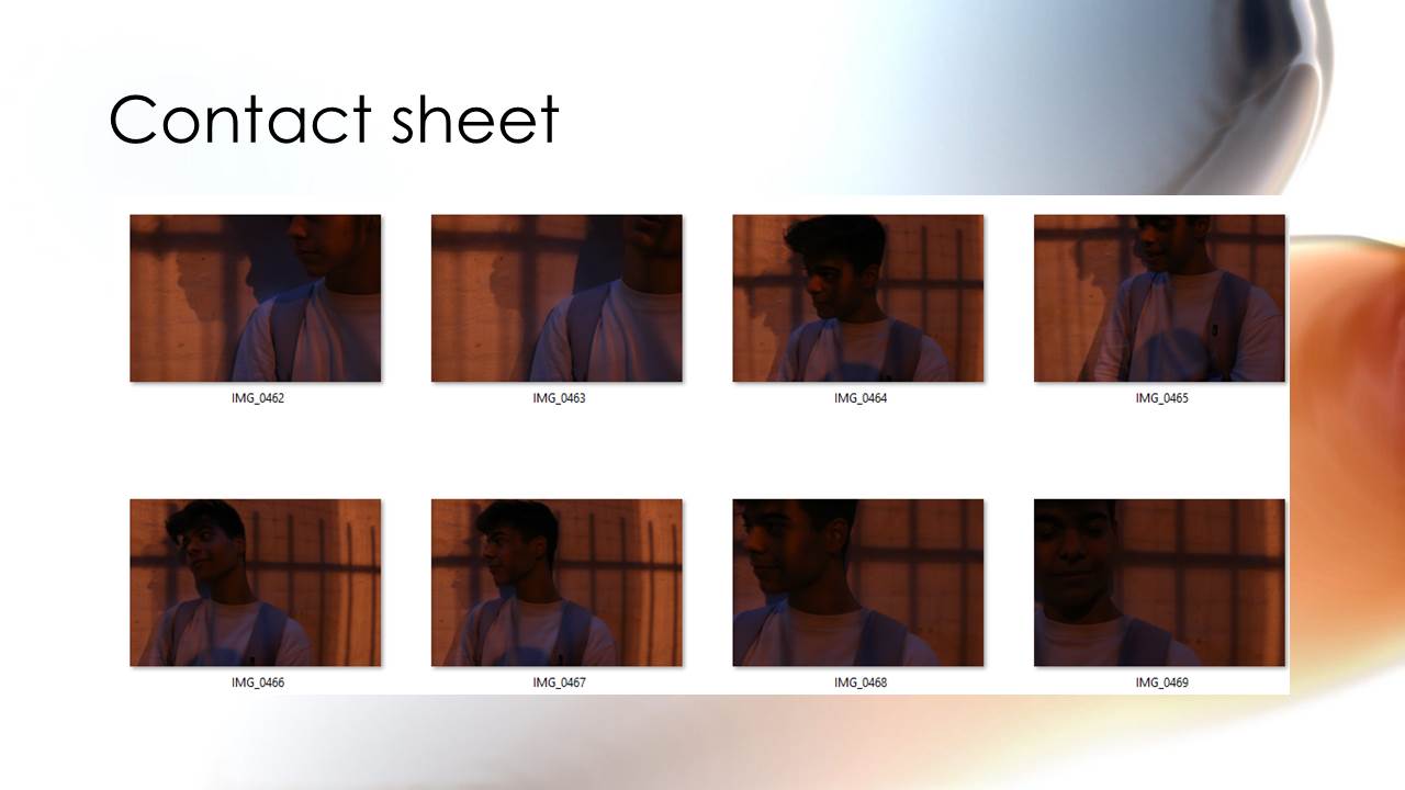
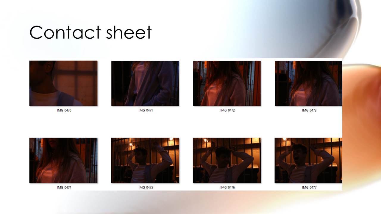
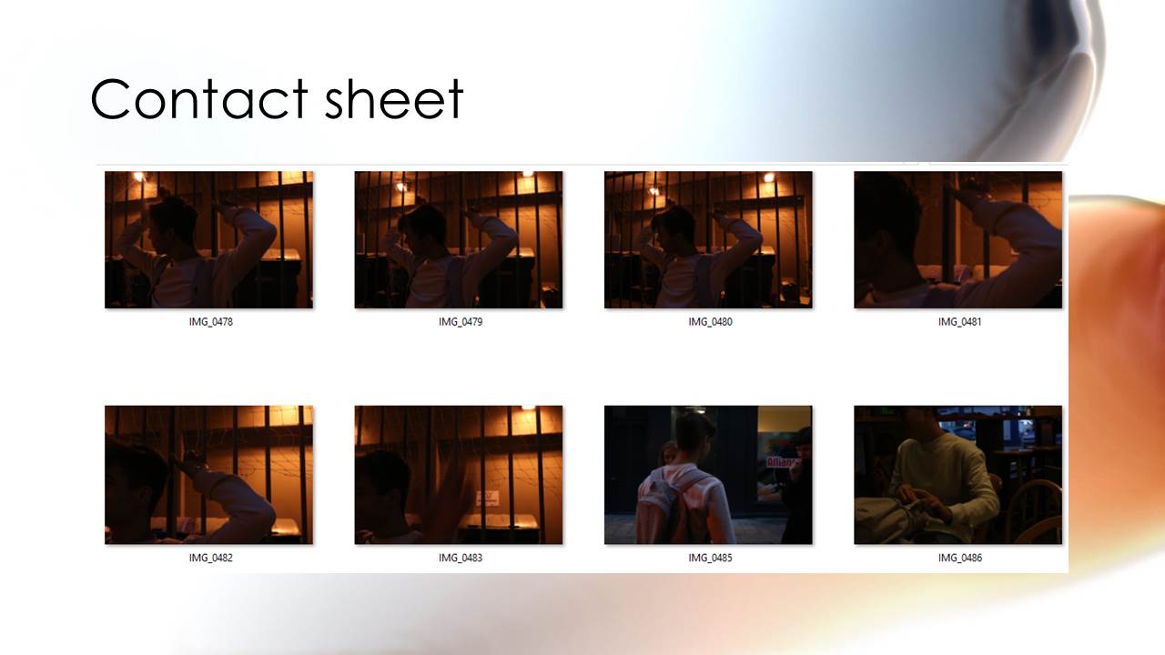
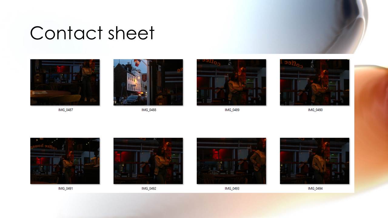
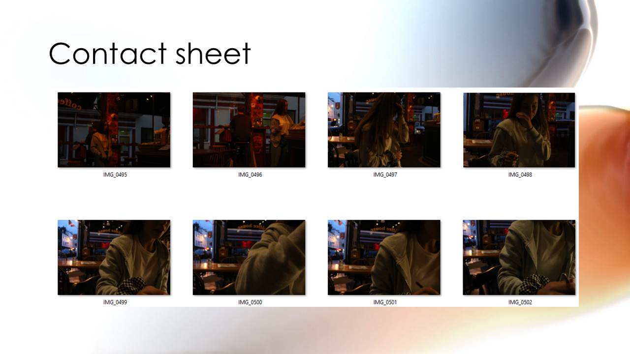
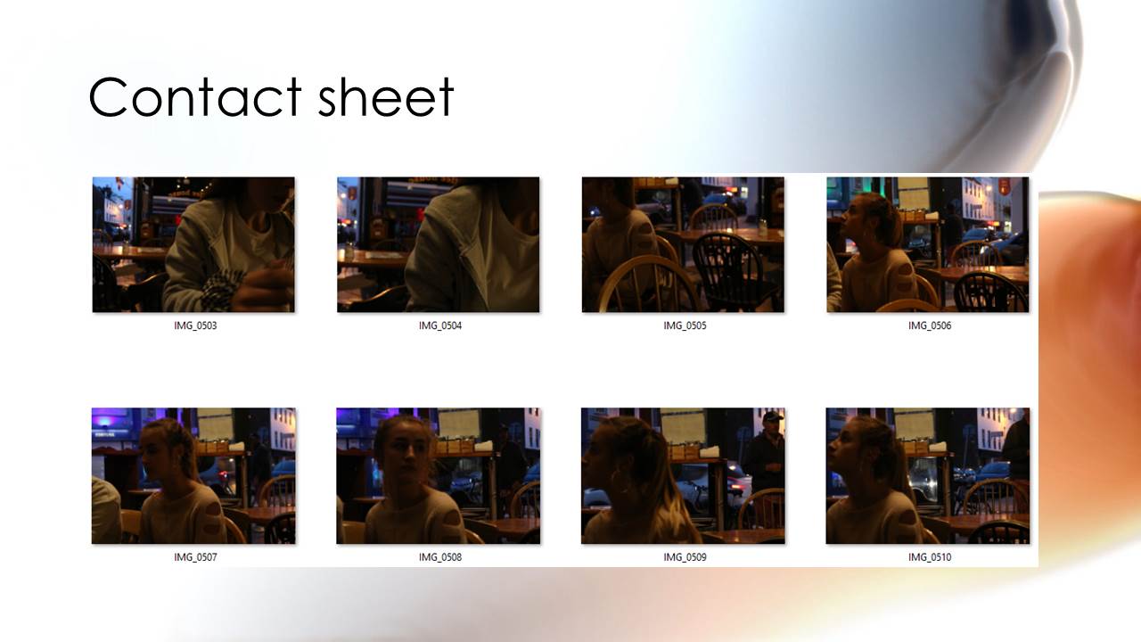
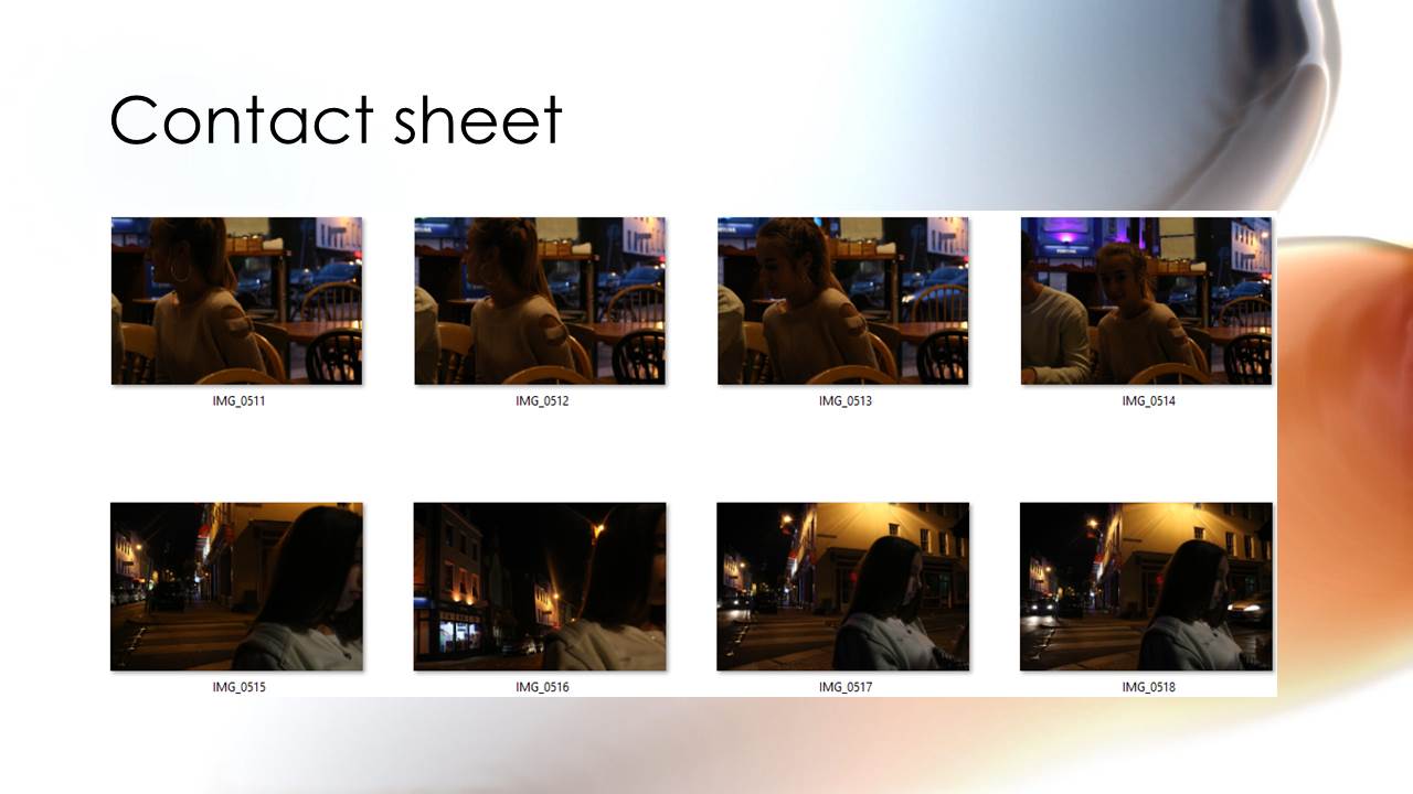
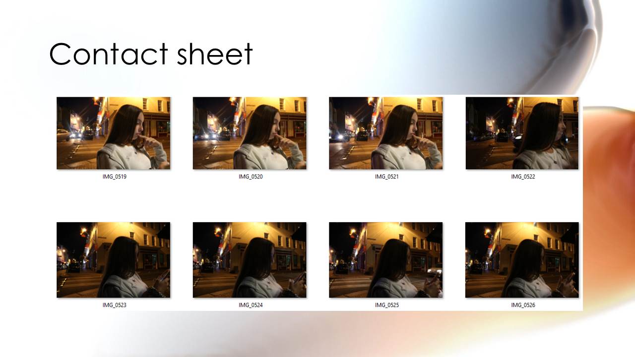

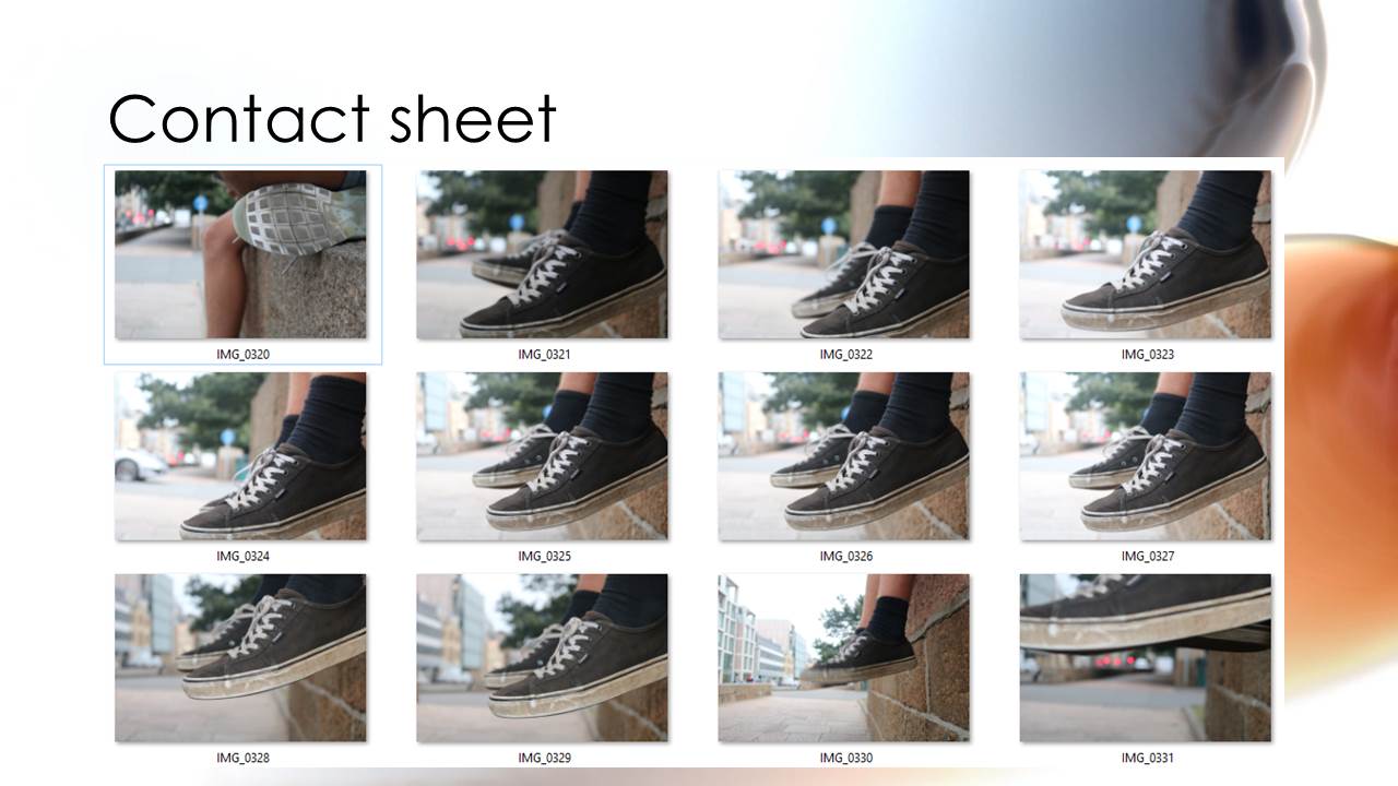
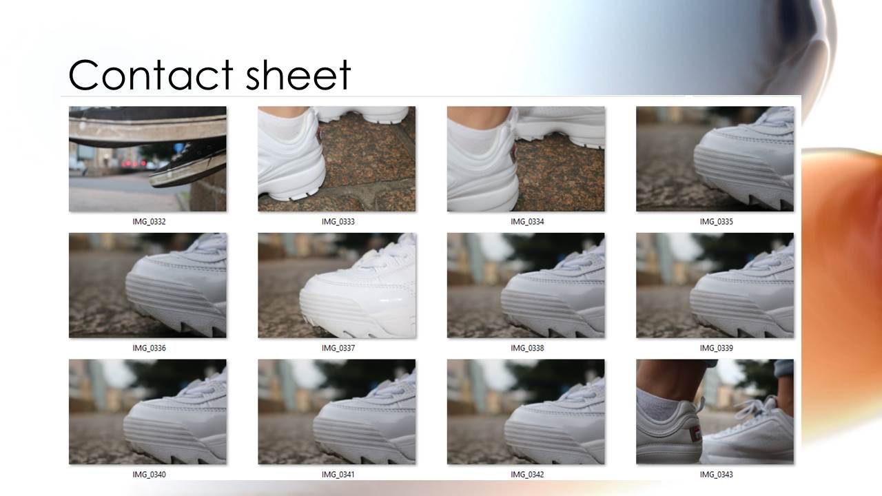
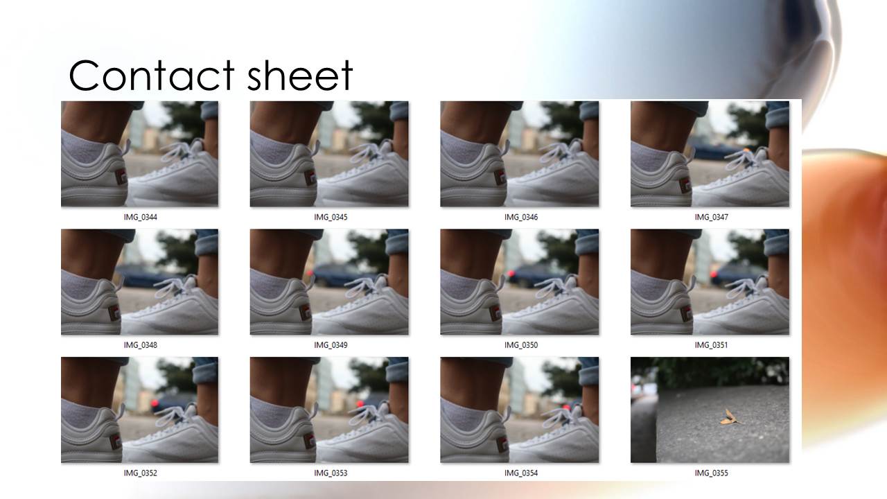
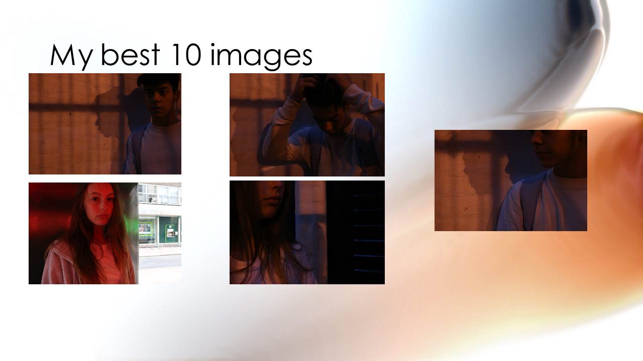
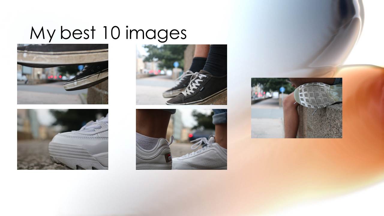
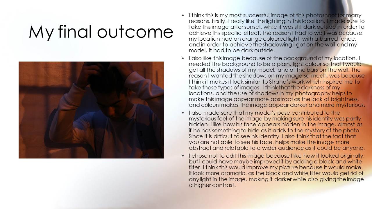
Paper Photos Contact Sheet
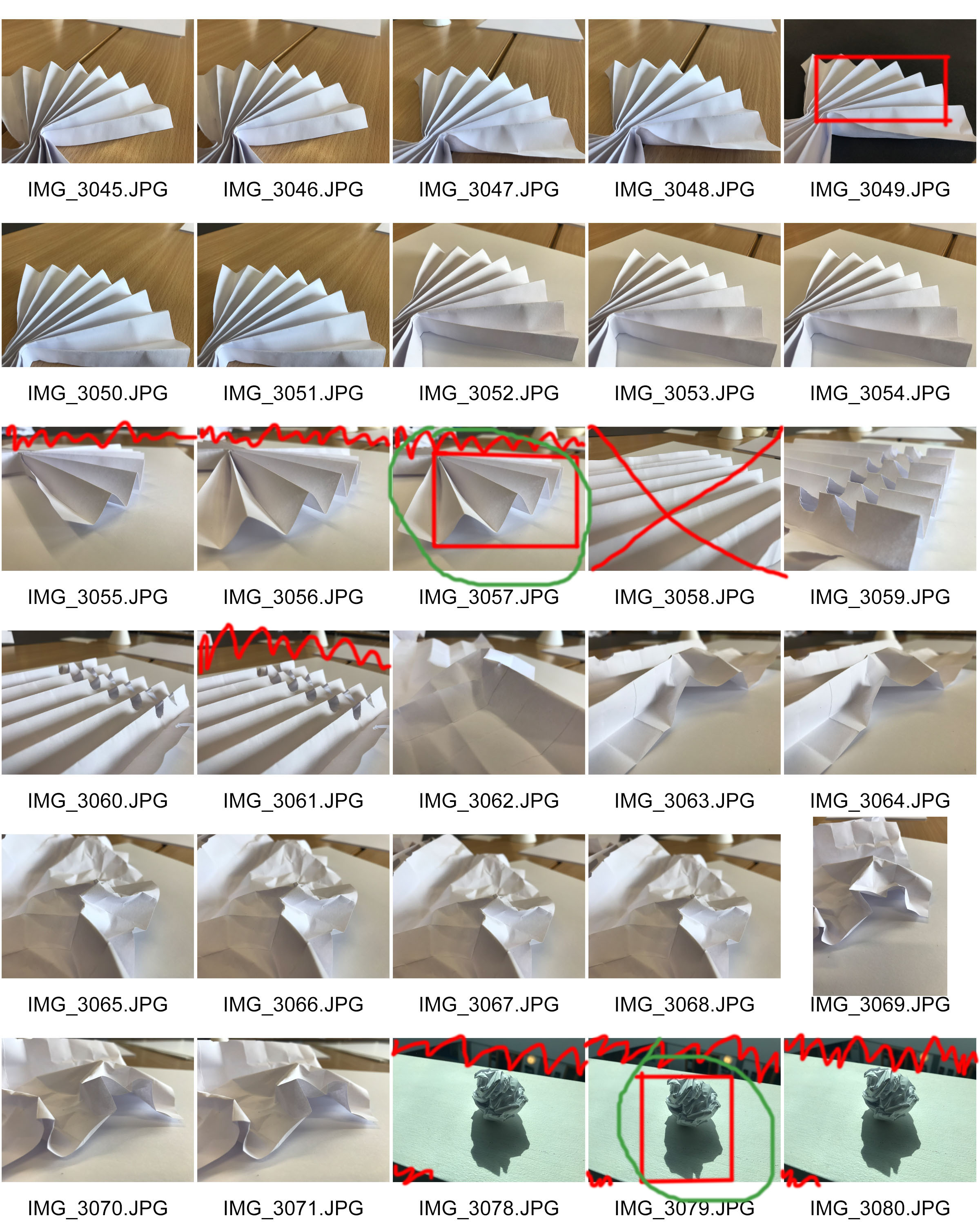
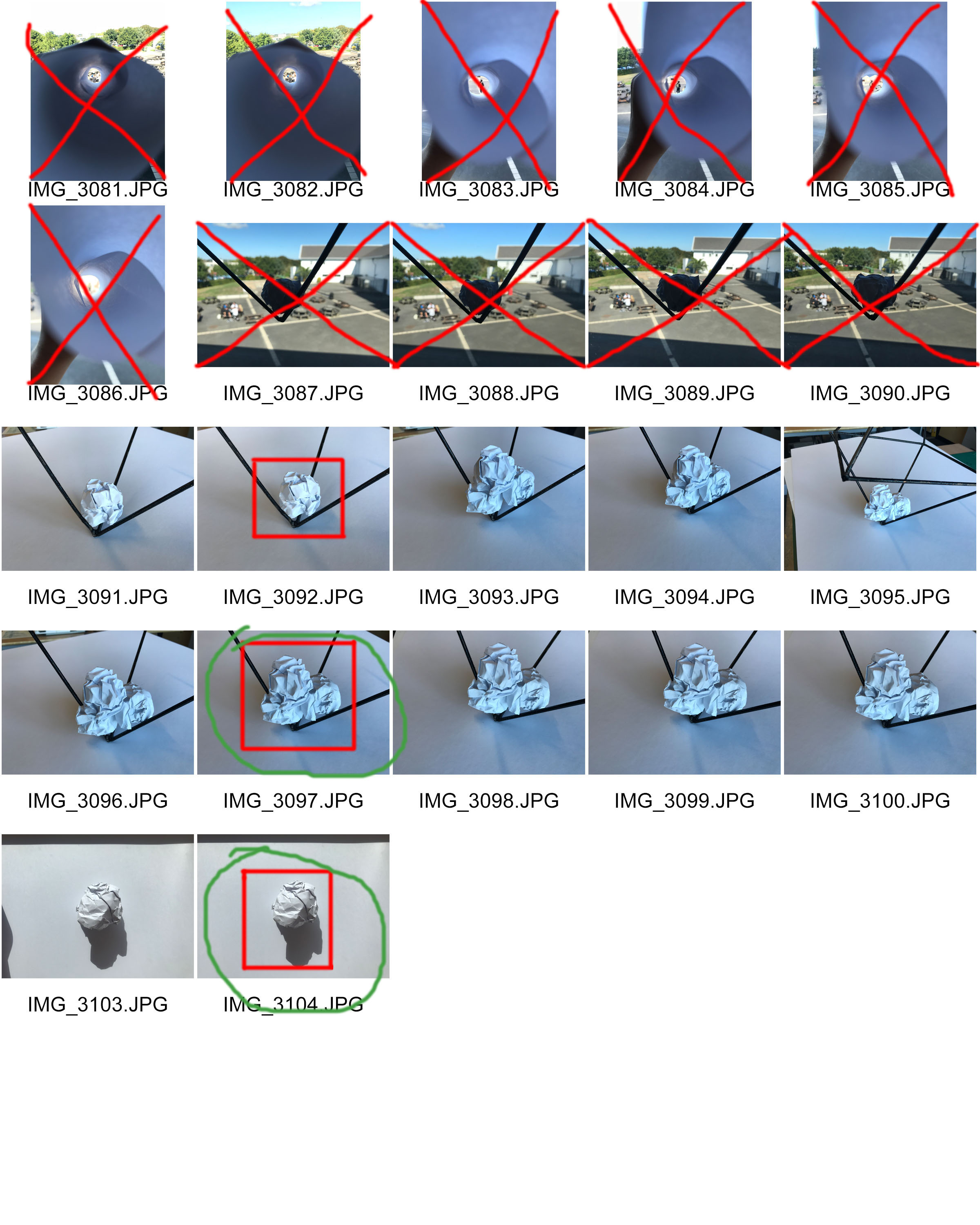
Abstract 14/09


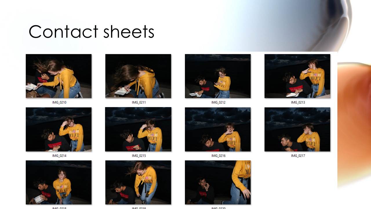
Contact Sheets
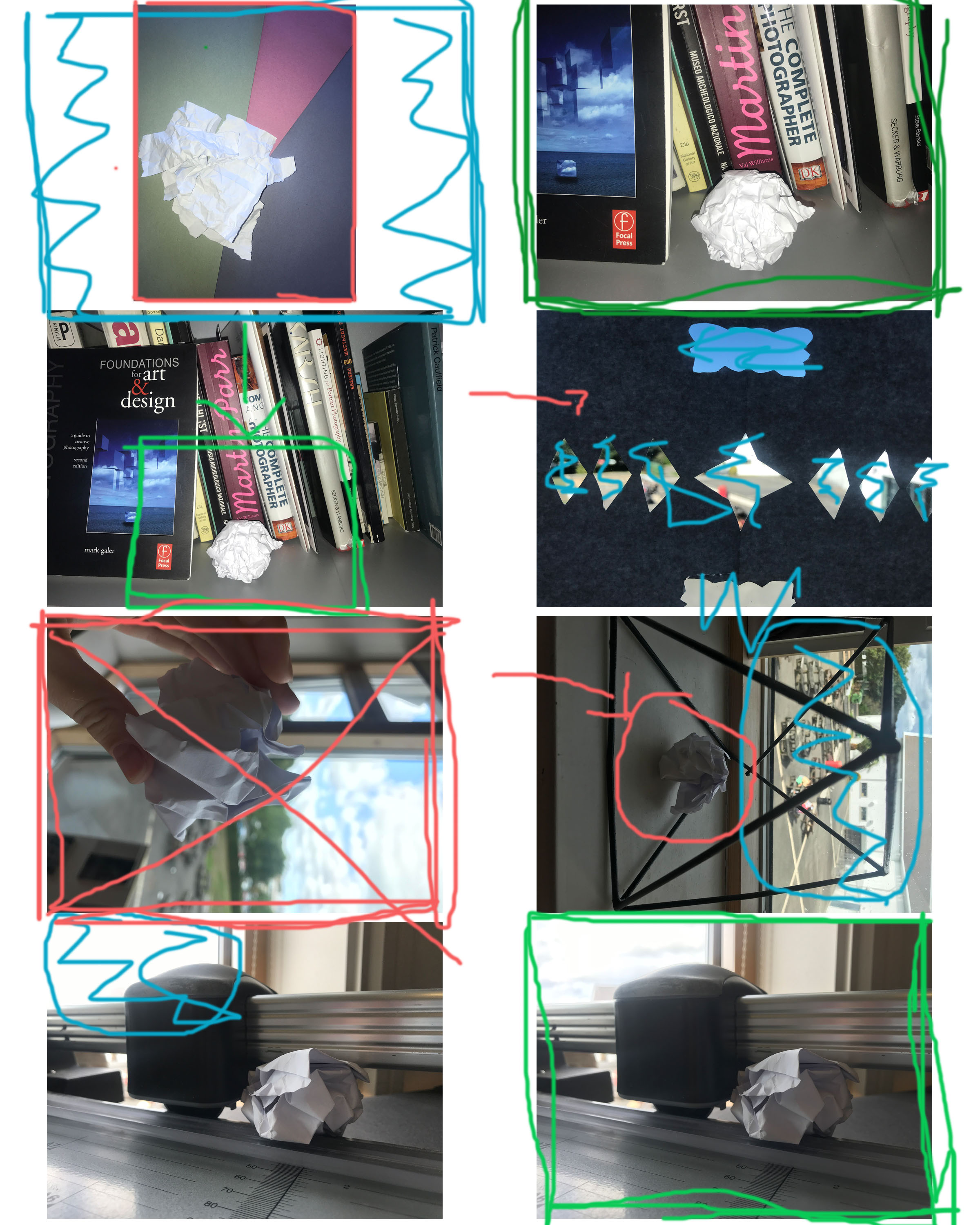
Why did I reject the ones I did?
I didn’t like the lighting in the one with me holding the paper and the one in the geometric shape. I also didn’t like how the light was coming in from the window in one of the photos. I didn’t like the background being featured in the one with the shapes cut out of the paper.
Examples of Contact Sheets
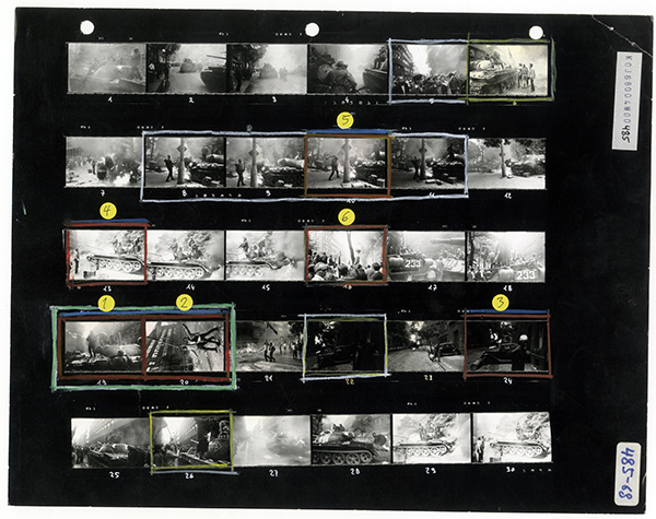
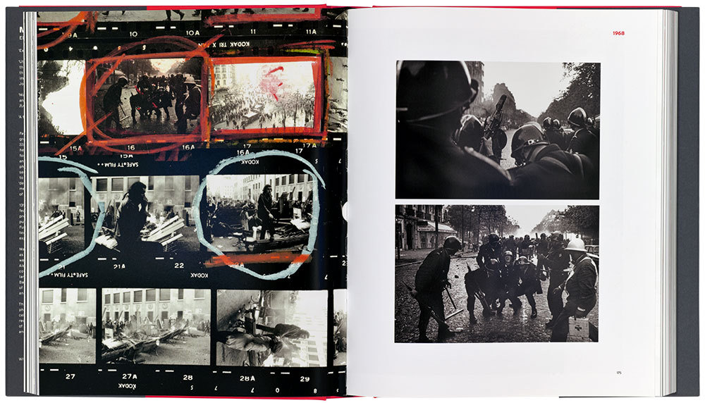
KEY:
Red X – Unwanted Photograph
Red Circle – Lighting Issue
Blue Scribbles – Unwanted things in the background (mise en scene issue)
Large Green Box – Wanted image
Small Green Box – Want everything within square
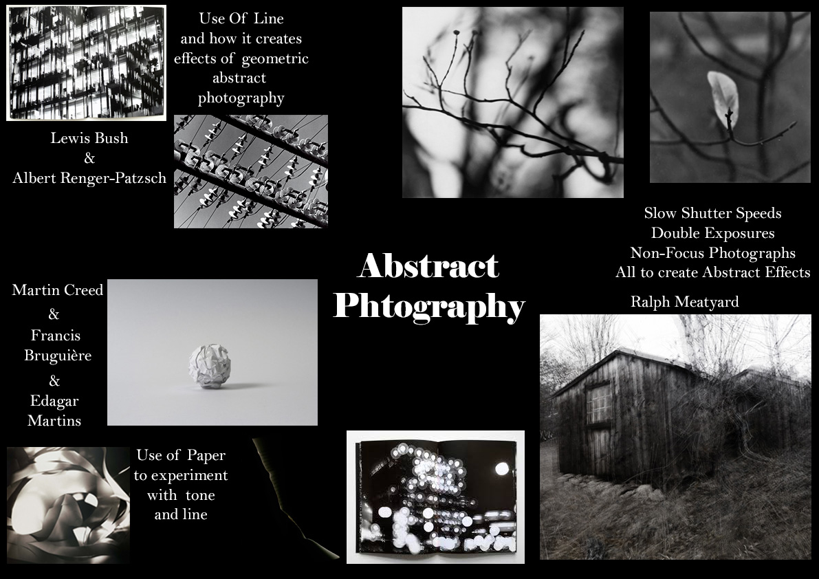
Abstract Mood Board
Paper Shoot – The Edits: VSCO App
Here are some of the edits of my paper shoot. My nest photoshoot I need to concentrate on the focus a lot more. Taking into consideration that I was using an iPhone camera which isn't amazing quality, I need to continually focus on the quality of the image and ensure the focus is correct.
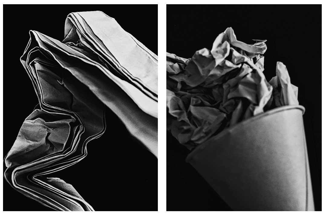
To manipulate these images, I used the app VSCO. I heightened the contrast and clarity, then lowered the exposure and applied a black and white filter.
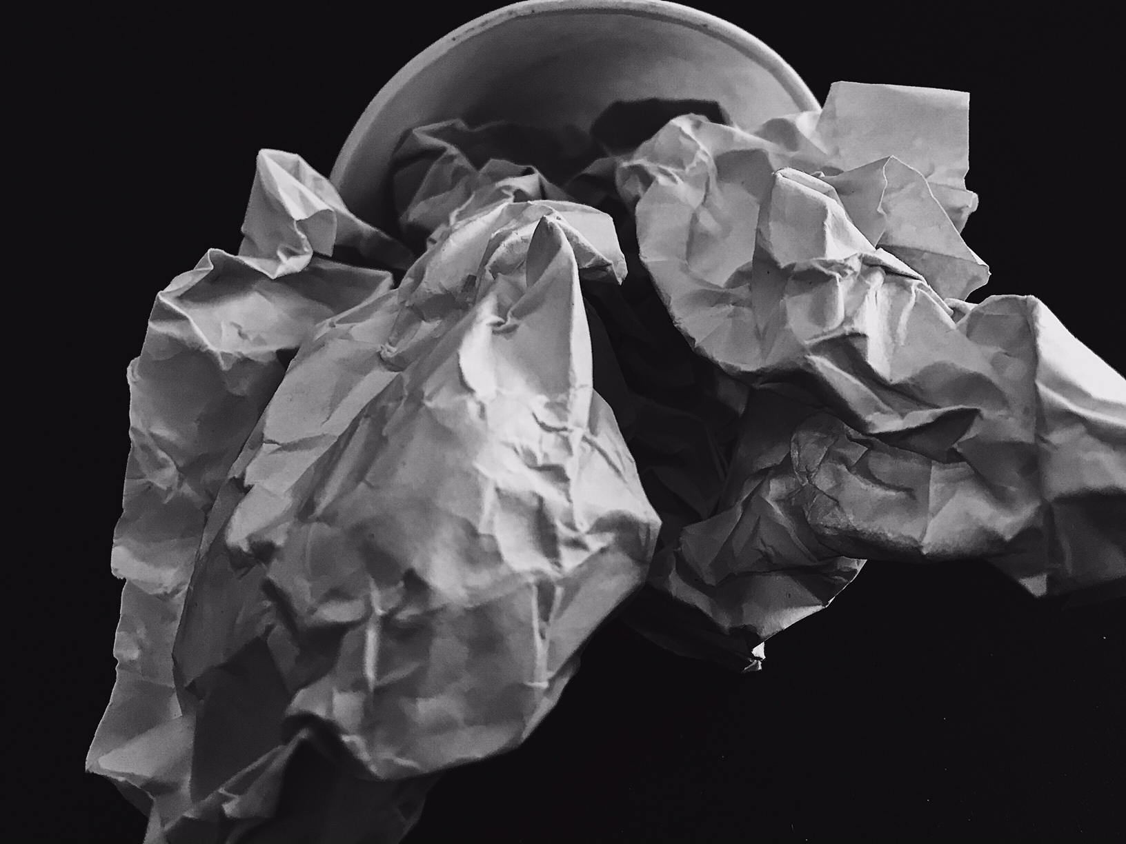
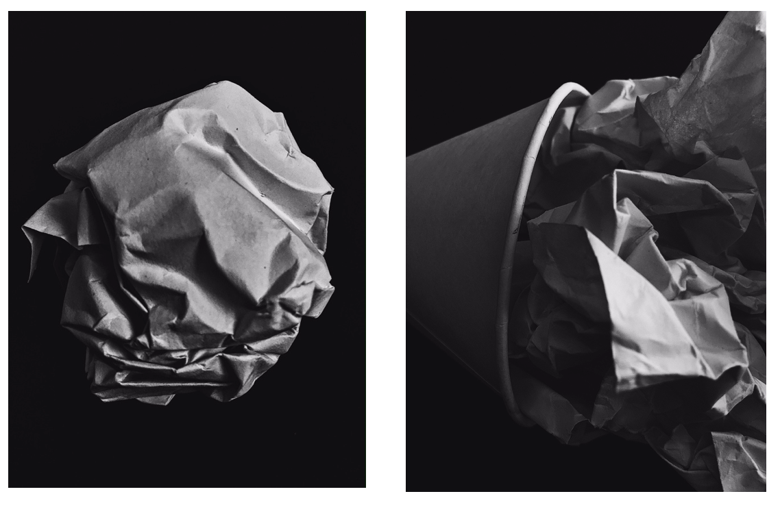
Experiment – Paper Task


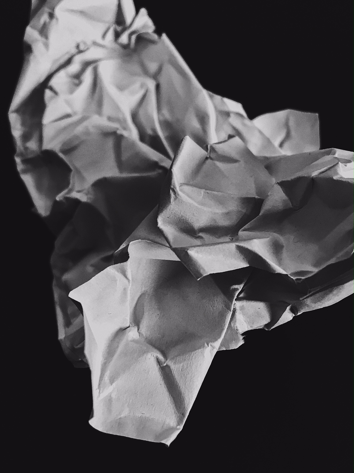
Paper Task – Photoshoot 1:
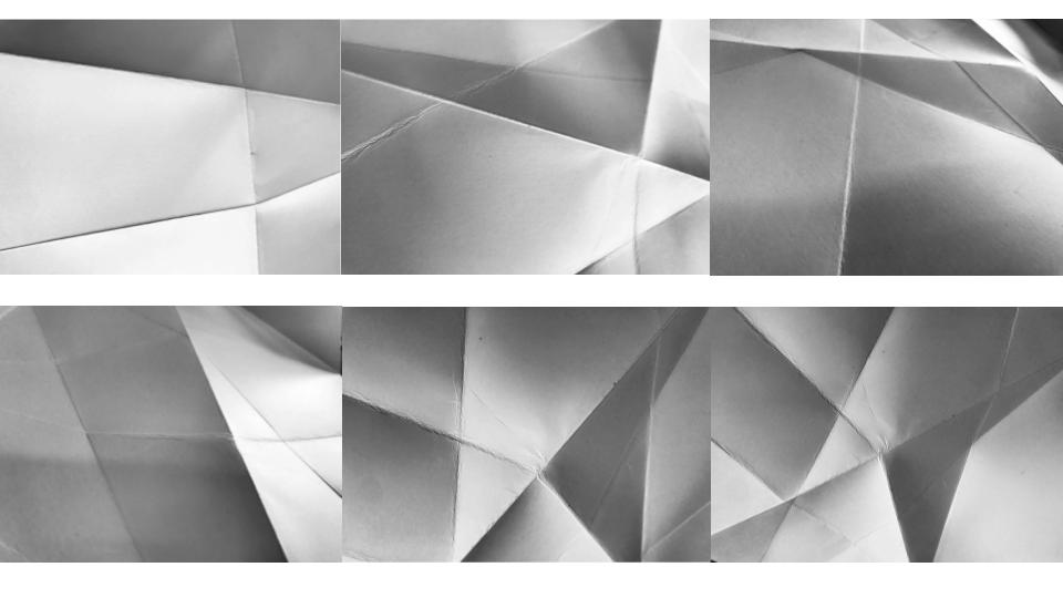

For this photoshoot i folded a single sheet of white paper to create areas of light and shade. I then enhanced the contrast slightly to increase the difference between the light and dark tones in the image without taking away from the natural feel. I found that this was a good example of subtle tone changes and showed texture with the dips and ridges of the paper being accentuated.
Paper Task – Photoshoot 2:


For this photoshoot I placed several pieces of flat or crumples paper onto a black backdrop to create a high contrast. I enhanced several setting during the editing process of these frames and found that this resulted in the dark parts of the image became highly textured and resulted in a sort of metallic or space-like finish to the images, while the white part of the images remained mostly unchanged.
Week 3 | Generating Ideas | Camera Skills | Using Photoshop
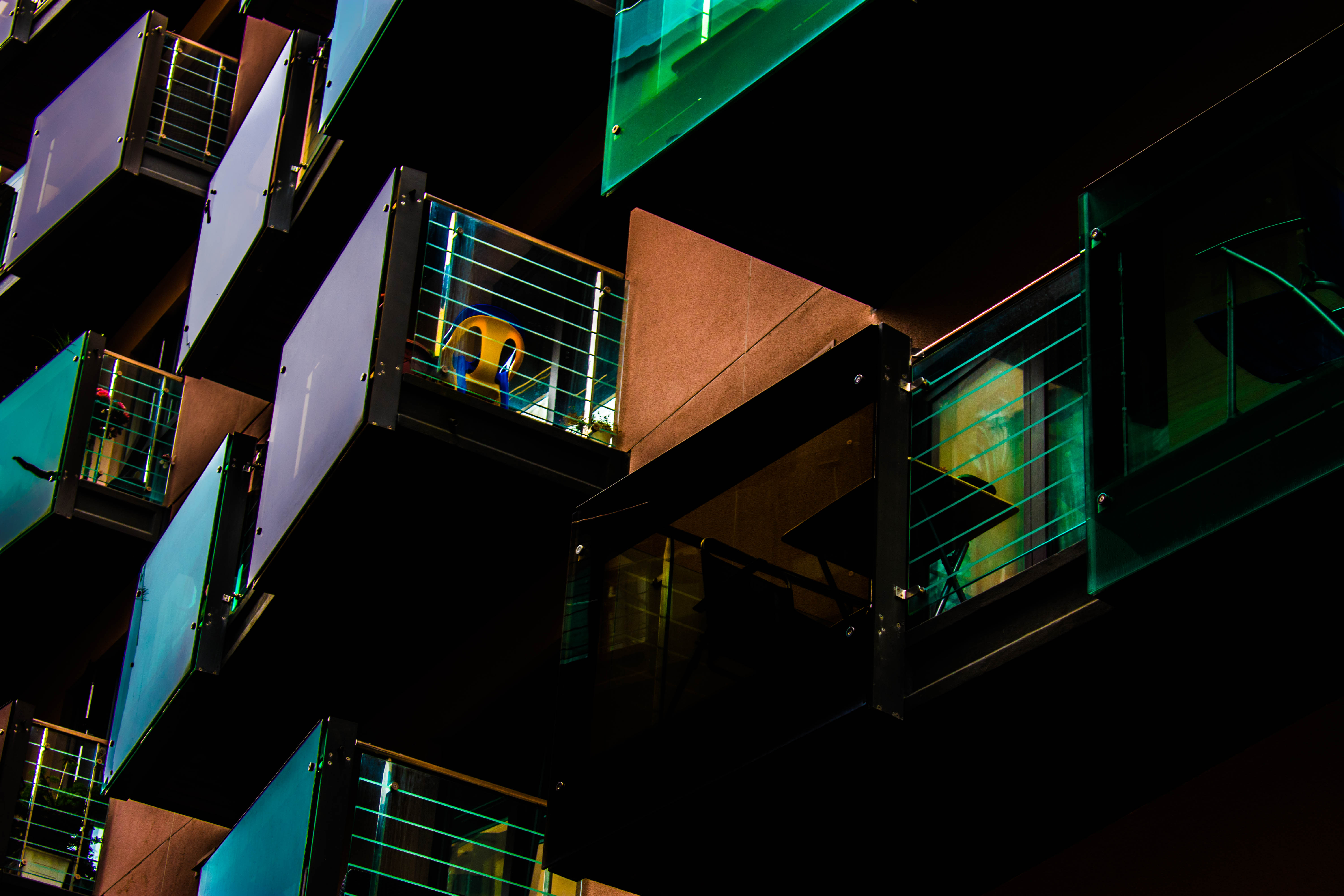
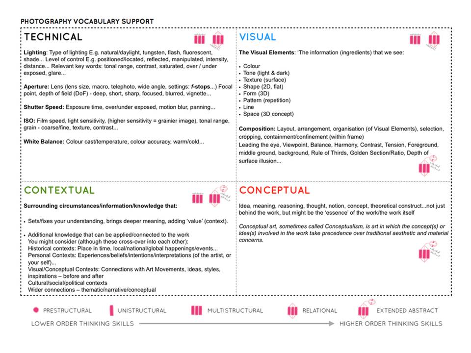
Click this PDF link for a range of resources and that we will be exploring to help you generate new and different ideas whilst learning what ABSTRACT PHOTOGRAPHY can be and how to use your camera and adapt your photographs…
AS Photography UNIT 1 resources
Camera Skills
You must experiment with ease of these skill areas and produce a blog post on each that includes evidence of your experiments and successes…
The images should be of an abstract nature, and show an appreciation of abstract qualities such as line, shape, colour, form, texture, pattern, repetition, symmetry
- Using Auto-Focus
- Using Manual Focus
- White Balance
- ISO
- Aperture
- Focal Length
- Depth of Field
- Show Shutter Speed
Photoshop Skills
- Cropping
- Selections
- Adjustments and corrections
- Transforming an image
- Layer control
- Image size / canvas size
- Double exposures
Working towards a vision…
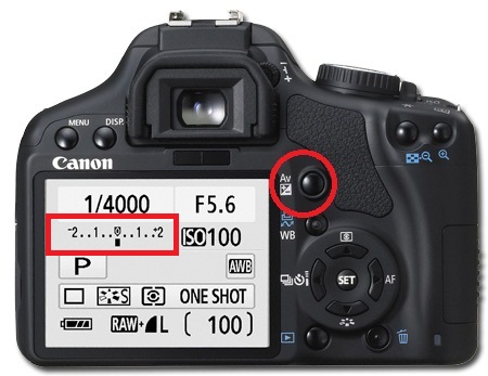
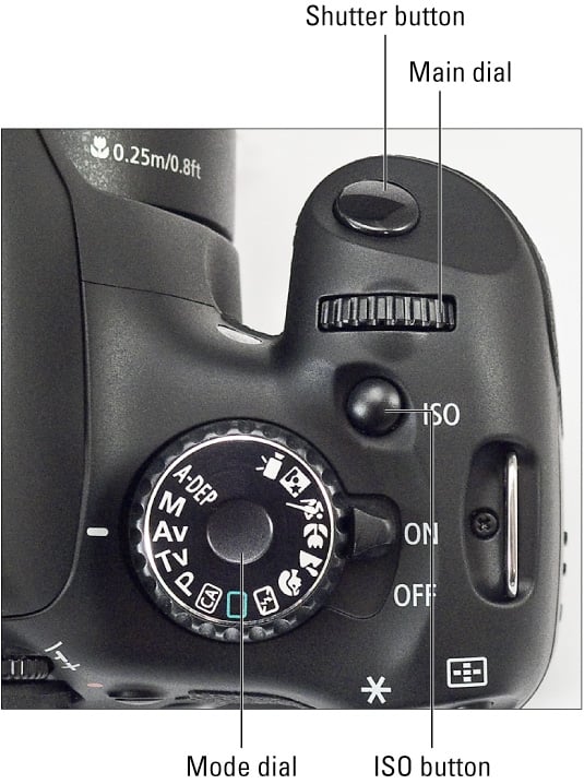
Use this method to analyse key images
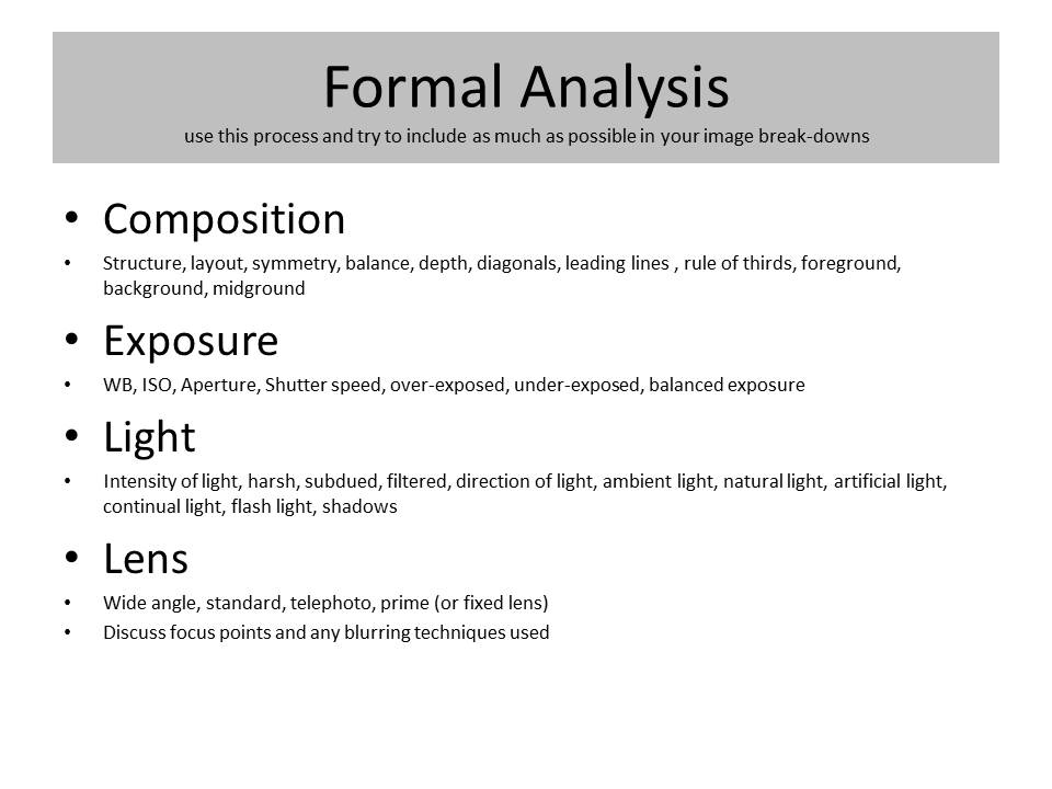
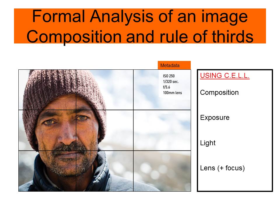
Rule of Thirds