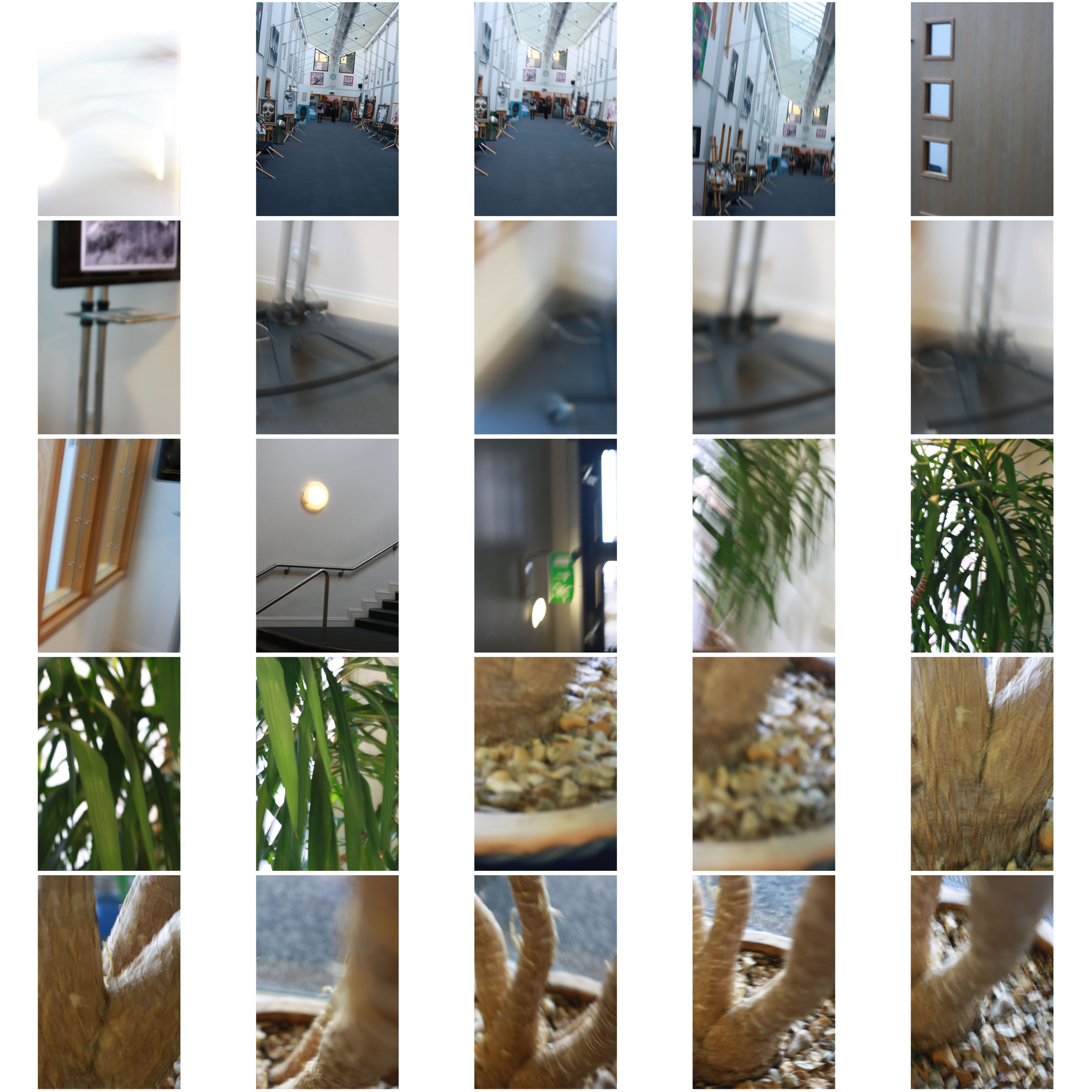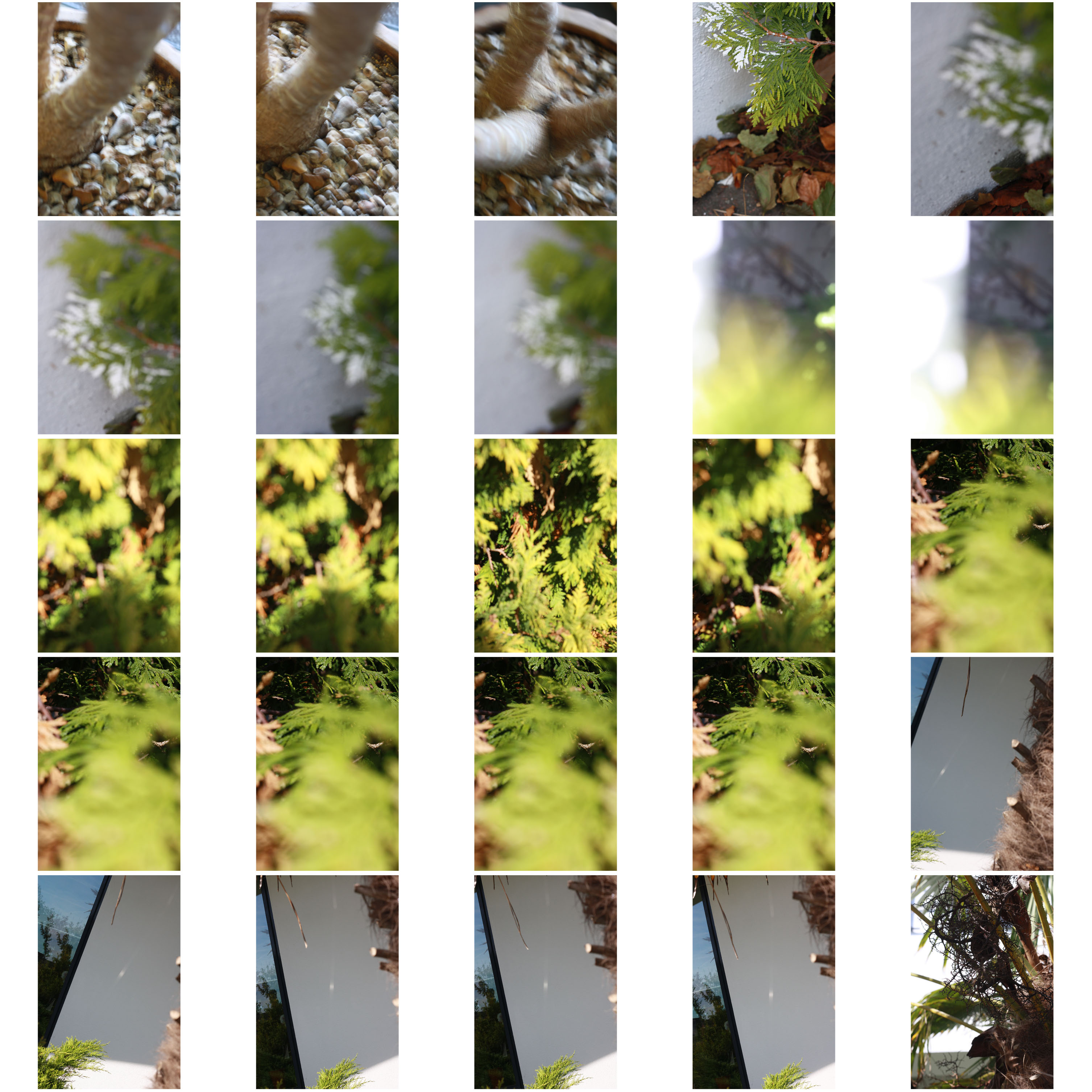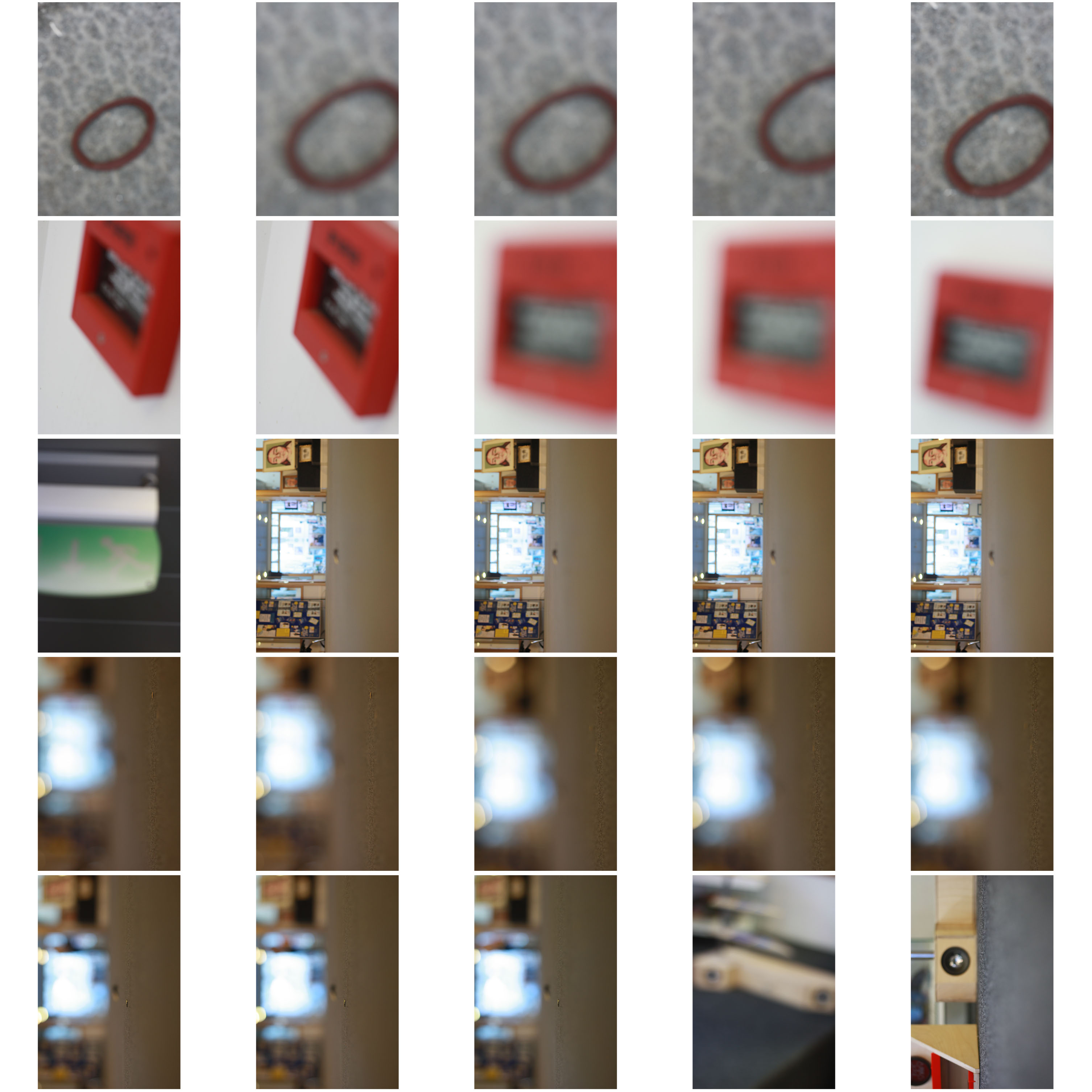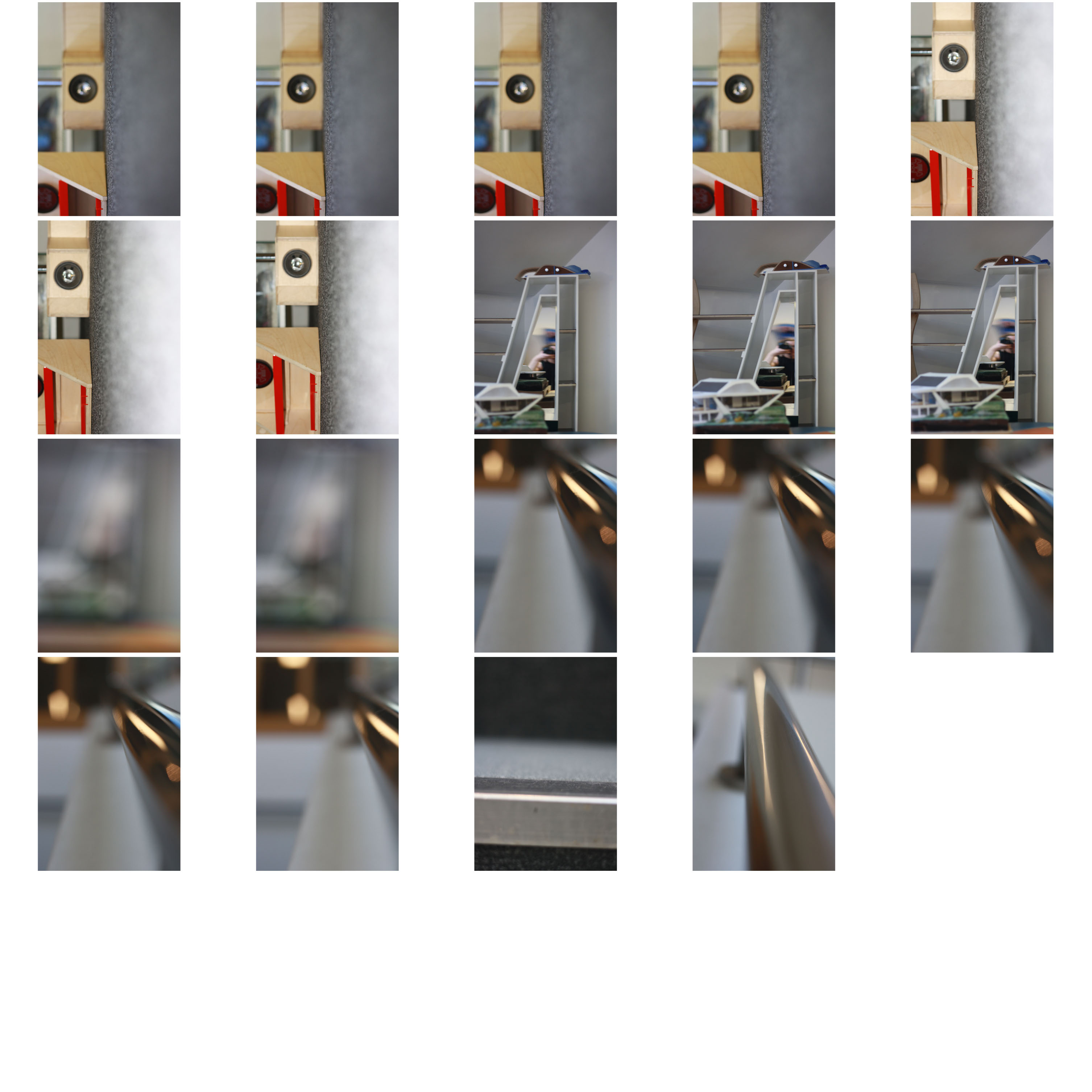


Here I have some of my contact sheets of all the pictures I took and the different types of photos but also how the focus was different in every picture.

here I have messed around playing with the inverted adjustment on the picture. I like it as there is a mixture of light and shadows and also it compares the original to the picture. I also messed around with the contrast making it brighter and darker so the tones of the metal becomes lighter and the background becomes darker so that you will only focus on the metal pole. I like this picture as it focus on the focus on the pole which I wanted. The light in the picture brings out the pole from the dark so it doesn’t get mixed up.

For this picture I messed around with several adjustments for example: I tried out changing the brightness and contrast however I didn’t like how that turned out so I went back to the original photo and started again this time I adjusted the colour levels within the picture and the saturation. This time I like the outcome as it has a variant of colours including bright pinks, blues, greens, browns, blacks, whites and red. It is also a good comparison to the original as I found that the original was blurry and it lacked detail however when I started editing the detail started to become better and it didn’t get more blurry. My favourite bit of the picture is the bright pink on the wood as it makes you focus on the pink and not on the background. This is the attention I wanted, I am really pleased with the outcome.
