For these edits I wanted to play on the distorted and dark realism effect that Patzsch used for ‘The World is Beautiful’ series. (New Objectivity). Due to the fact I was following this idea, I did not want to do any extreme edits as I believe it would portray realism in the way Patzsch did. The edits I produced where of the top photographs from the photo shoot which I conducted based on the research made about Patzsch. For most of them I adjusted the levels and curves and lowered the saturation enough for it to be deemed black and white but still show a hint of colour. For some other edits I decided to adjust the hue in order for more colours to stand out, based on the colours within the photograph, on the images I decided to leave in colour.
I believe that my final outcomes of this research successful, as I have managed to ensure my editing matched the new objectivity idea, but still ensured that the photograph looks good. I managed to edit the photographs to allow their formal elements stand out more, making them more obvious to viewers. Moreover, I ensured the focal points of the images stood out clearly.
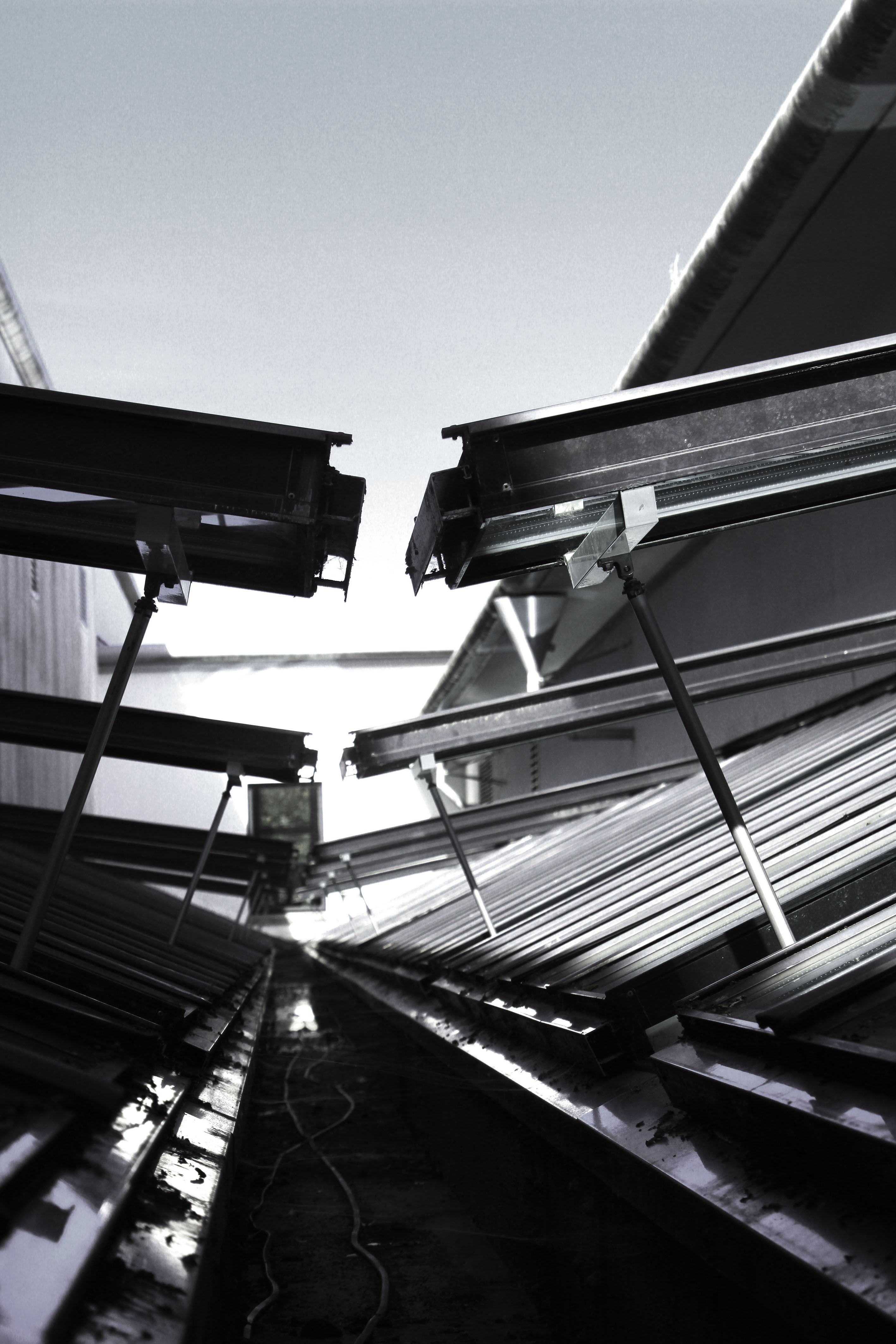
For my first edit I decided to adjust the levels and curves making the photograph darker than usual. I then lowered the saturation of the photograph, which has allowed different tonal regions to stand out. It has also allowed us to see where the natural source of lighting is coming from, which helps direct the viewers eyes around the frame of the photograph. This image also clearly represents the formal element of repetition and shape through the windows that are raised. Moreover, I used the technique leading lines to help guide the viewers eyes around the frame of the photograph. I really like how this edit has turned out as it matches the criteria of new objectivity.
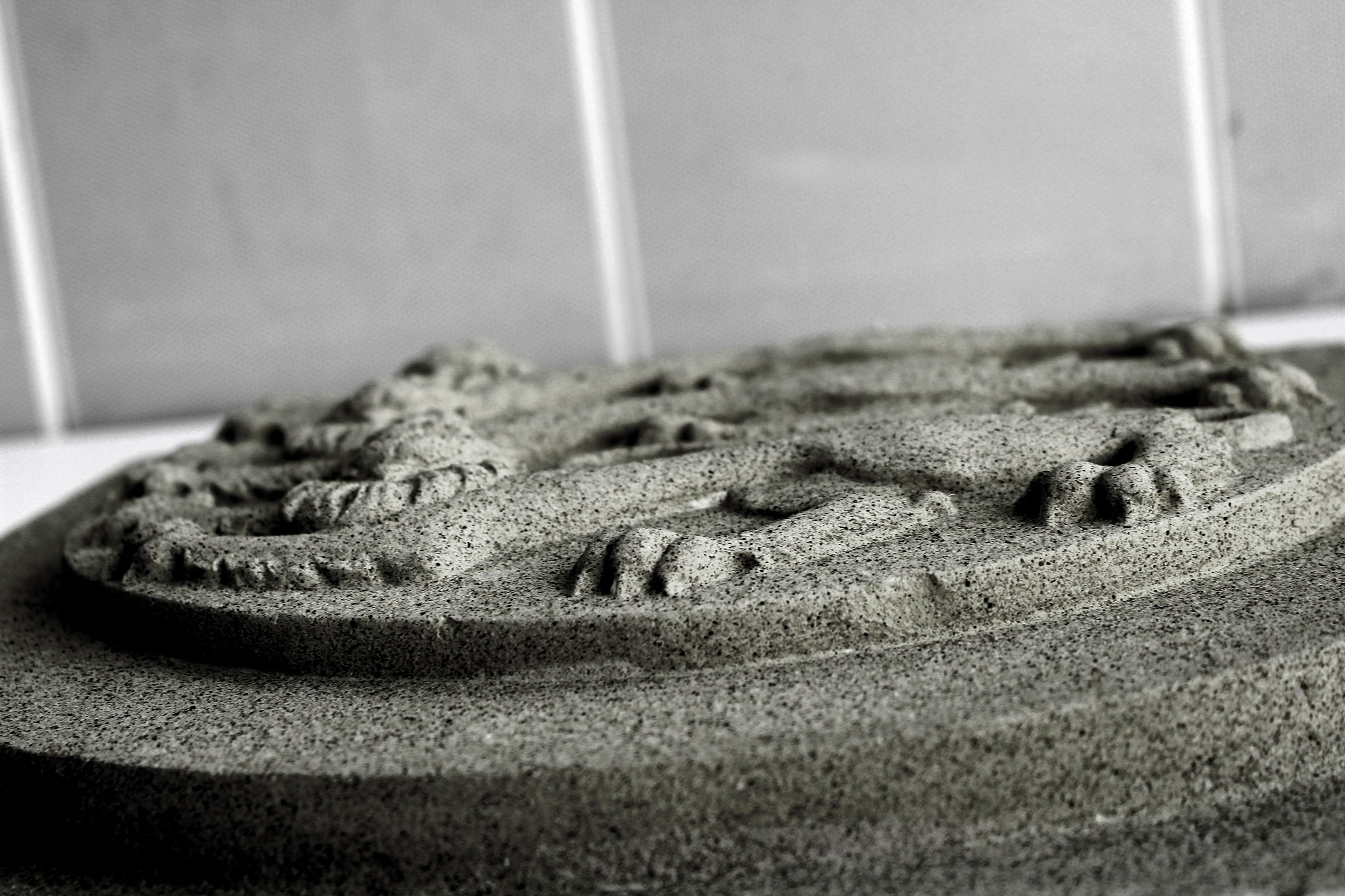
This next edit I decided to level the photograph, allowing the sharpness be clear which has allowed the detail of the subject to be visible. I then lowered the saturation but still allowed a hint of colour to seek through, making it more stimulating for viewers to look at. This image was taken at a worms eye view which allows us to see the formal elements of shape and line which is presented through the lions.
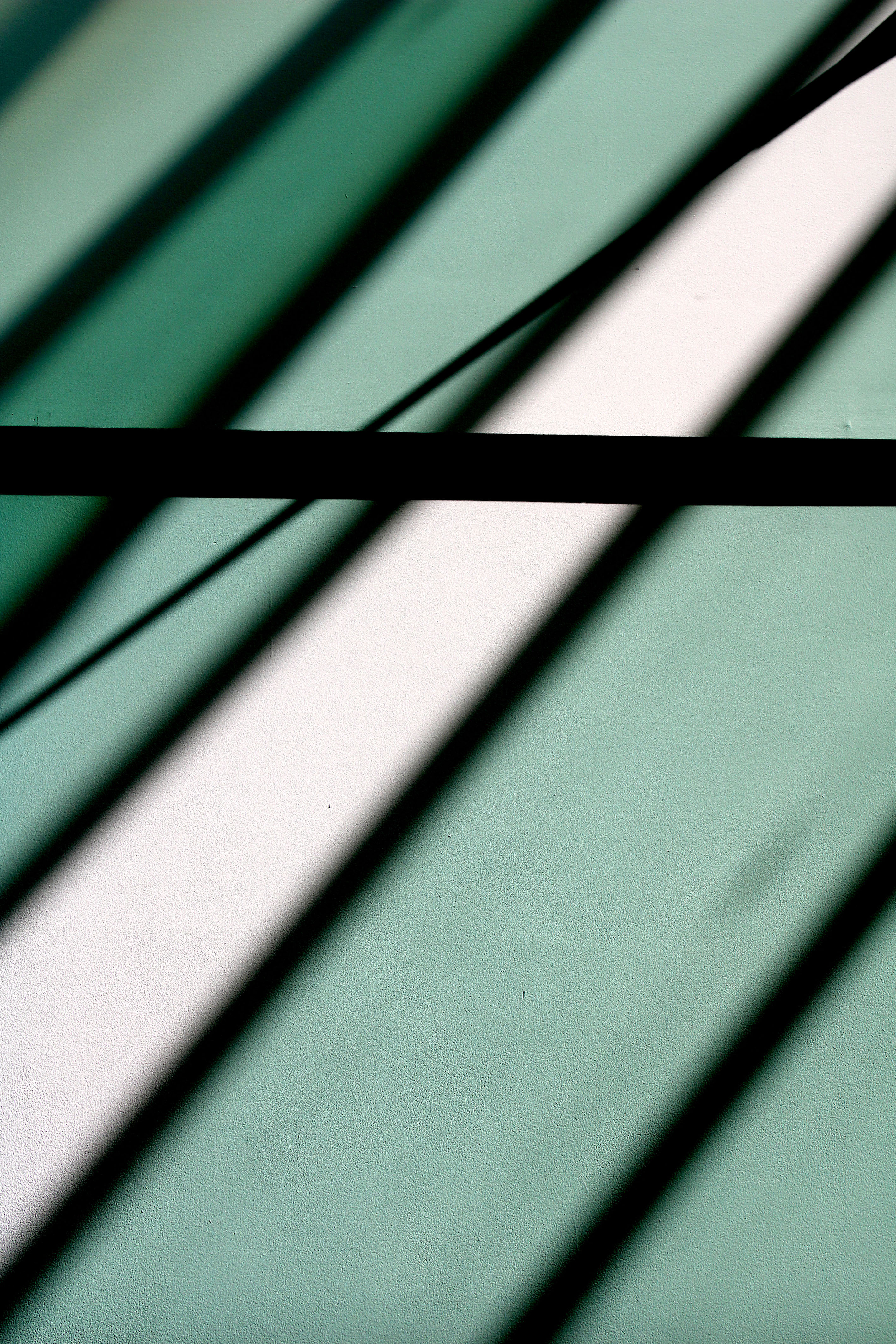
My next edit I decided to keep simple, which has allowed the simplistic overall effect to be created. I decided to level the image to allow it to seem darker than usual which has allowed the black shadows to really stand out, as well as the colours of the shadows which are casted on the wall. The formal element of line and repetition is clearly presented in the photograph, through the rectangular shadows on the wall.
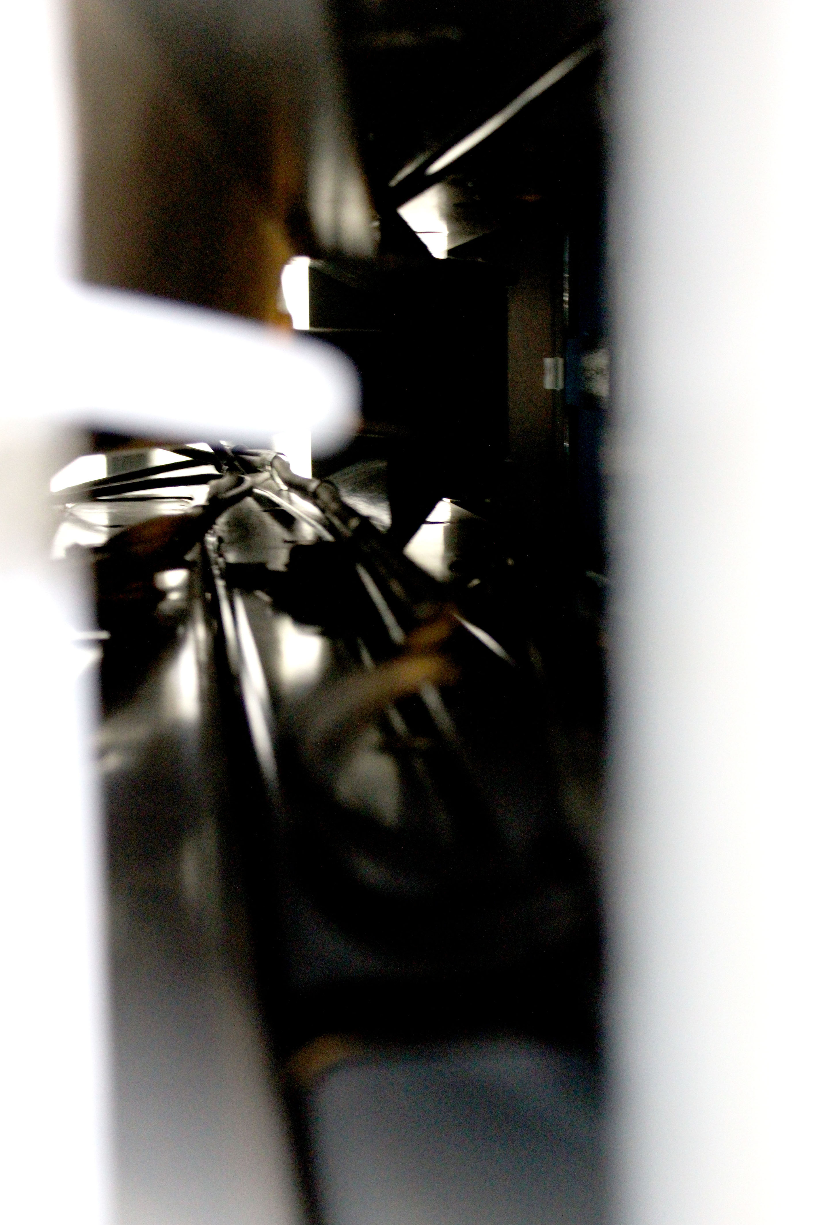
For this edit I decided to keep it simple like the previous one. I levelled the photograph to make it lighter than usual, which has allowed the cables through the tunnel to be visible. It has also added noise and vibrance to the photograph which has allowed a sense of texture to be presented as well. The cables are used to direct the viewers eyes around the frame of the photograph, leading lines, and created mystery as we wonder what is on the other side of the tunnel.
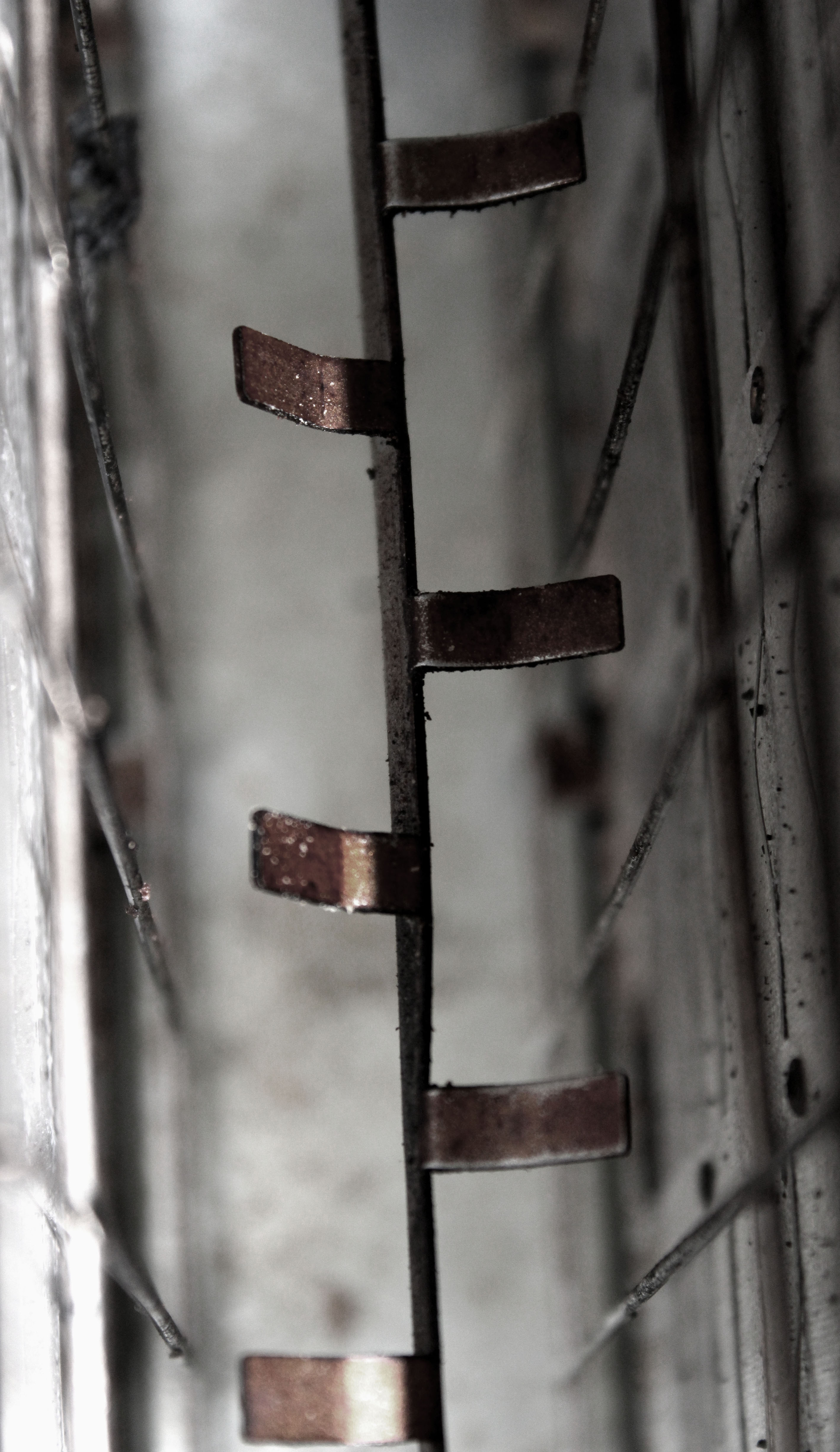
In this edit I started by adjusting the levels and the curves which has allowed the texture of inside the toaster to be presented. It has also helped to showcase the different tonal areas, making it more interesting for viewers to look at. I then turned down the saturation, but ensured the rusted metal rectangles where still in colour. Doing this has helped the context of the image to be presented, allowing viewers to have more of an understanding of where this image was taken. The formal element of line, shape and texture has been presented allowing this image to match the formal elements Patzsch’s work showed.
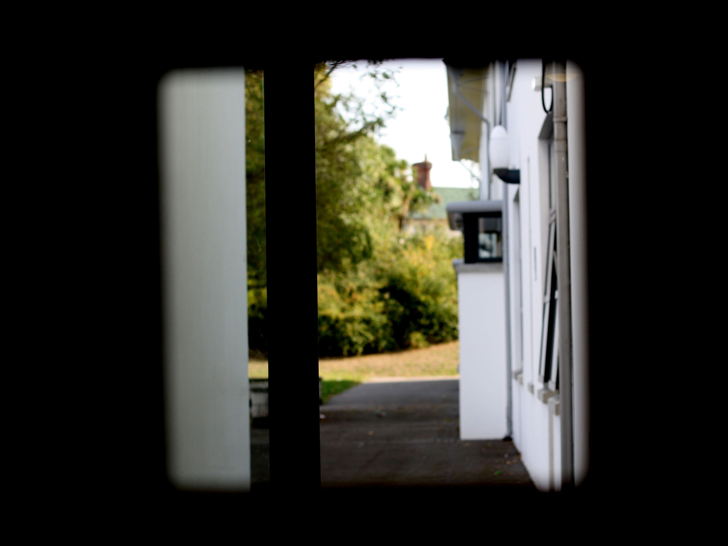
In my penultimat edit I decided to level the image, to make the foreground completely black only allowing the background to be visible. I attempted to use the technique of framing, which has allowed the subject of the image to be captured. I kept the image in colour as I felt it allowed the background to really stand out compared to the black frame work. The formal element of shape is presented through the frame which is capturing the semi-focused background.
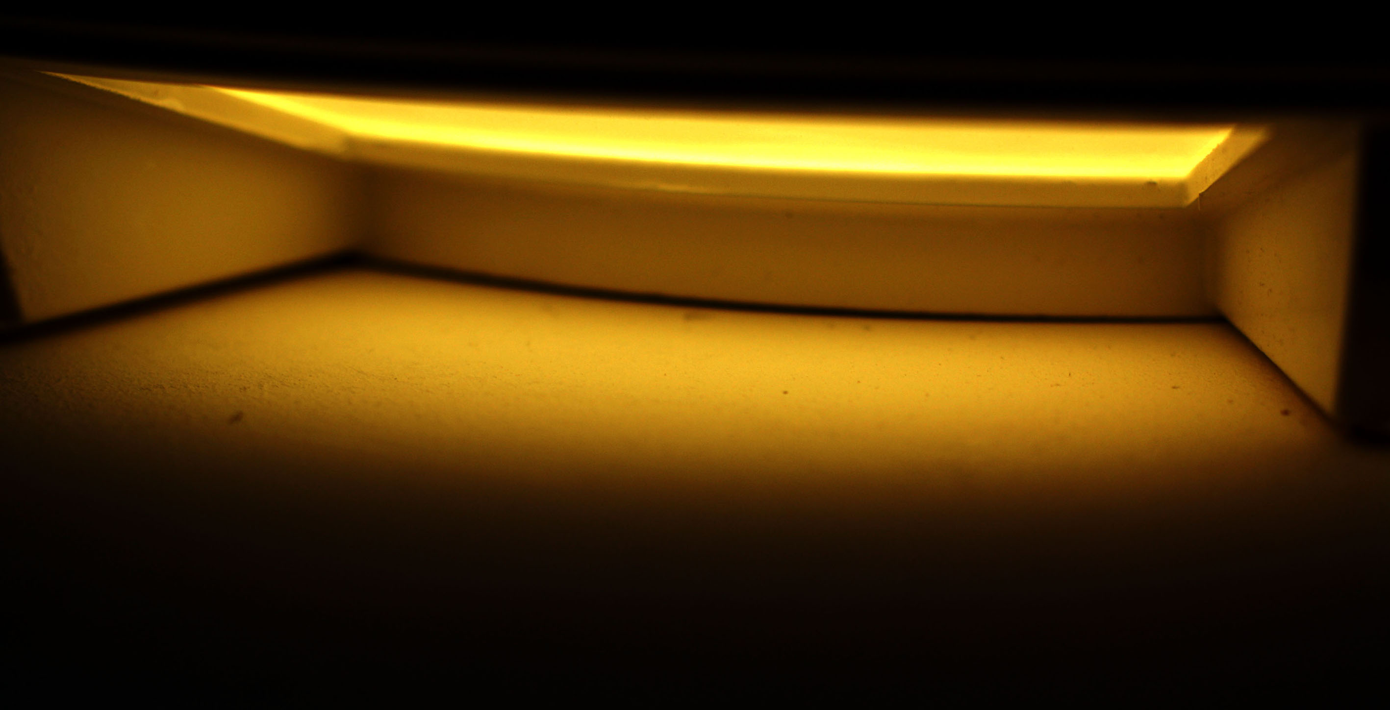
In my final edit I wanted to showcase this empty area, with a simplistic edit to add to the empty effect. For this I adjusted the levels and curves allowing the photograph to be naturally darker, which has allowed the light to stand out. I then adjusted the hue to allow the yellow to stand out more. Moreover, I adjusted the vibrance to create a bit of noise within the photograph but not enough to change the effect of the image. The formal elements of space and shape are clearly presented in the image.

Wonderful stuff Nathan…well done!