Claude Cahun x Clare Rae

Exhibition Critique

The Claude Cahun and Clare Rae exhibition was very inspiring and interesting to visit. There were two rooms that made up this exhibition, one containing each photographers work. I think that was a very good way of displaying the images as it meant that each photographers work was separated and couldn’t be confused. By displaying the images in separate rooms, it also allows visitors to clearly see in influence of Cahun in Rae’s work.
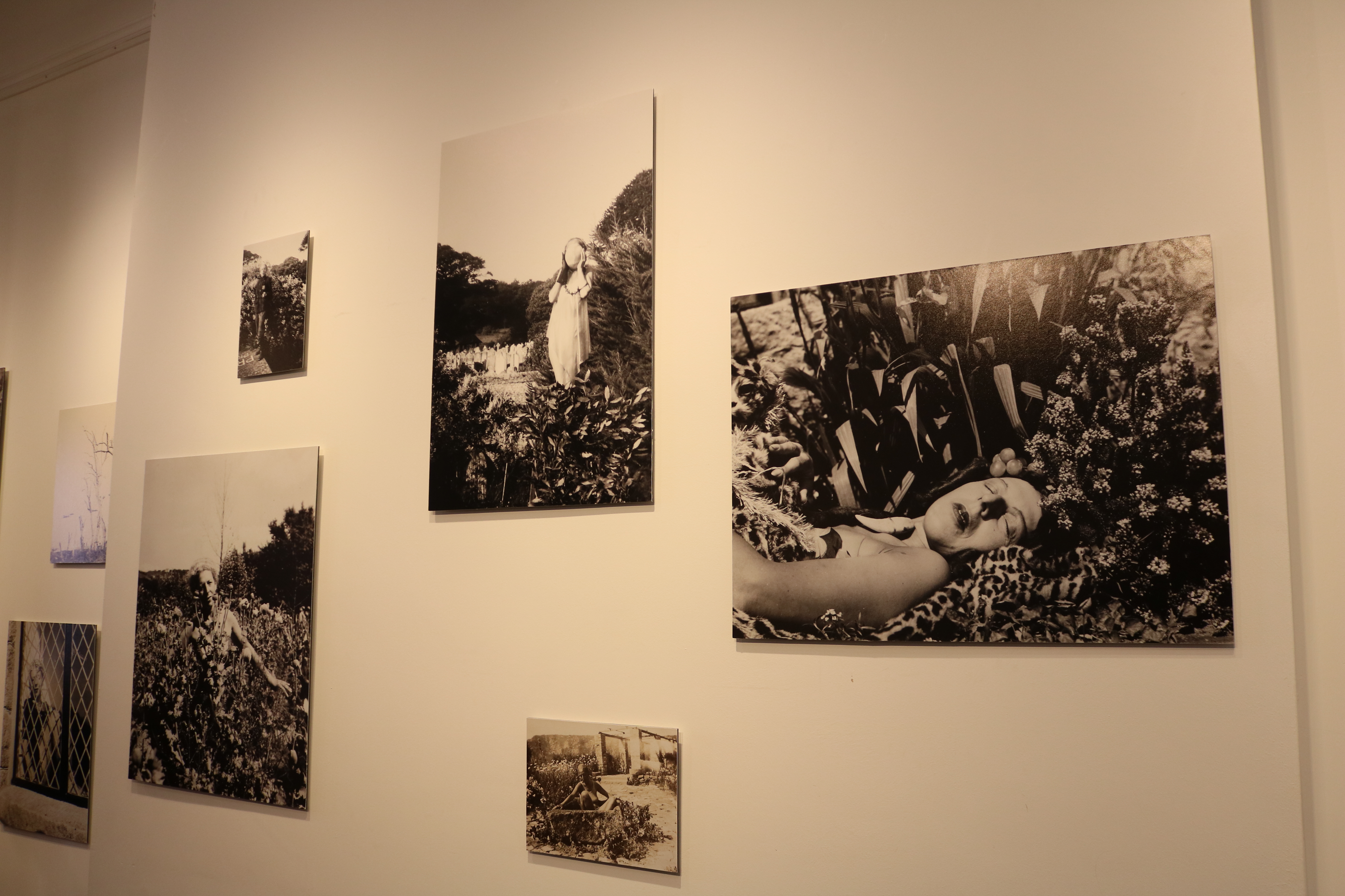
images by Claude Cahun

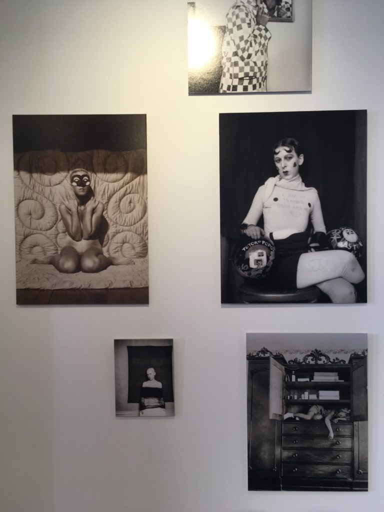
Cahun took many self portraits that are considered very advanced for her time. Her images show her challenging gender stereotypes by sometimes presenting herself as a “typical” male, or by wearing so much makeup that it was difficult to tell which gender she was. She also explored her body and sexuality in many of her self portraits by posing herself in different manors. I thought that her work was very inspiring because it must have taken a lot of bravery and confidence to be able to take those types of images during very conservative times, when people weren’t accepting of things that weren’t considered “normal”.
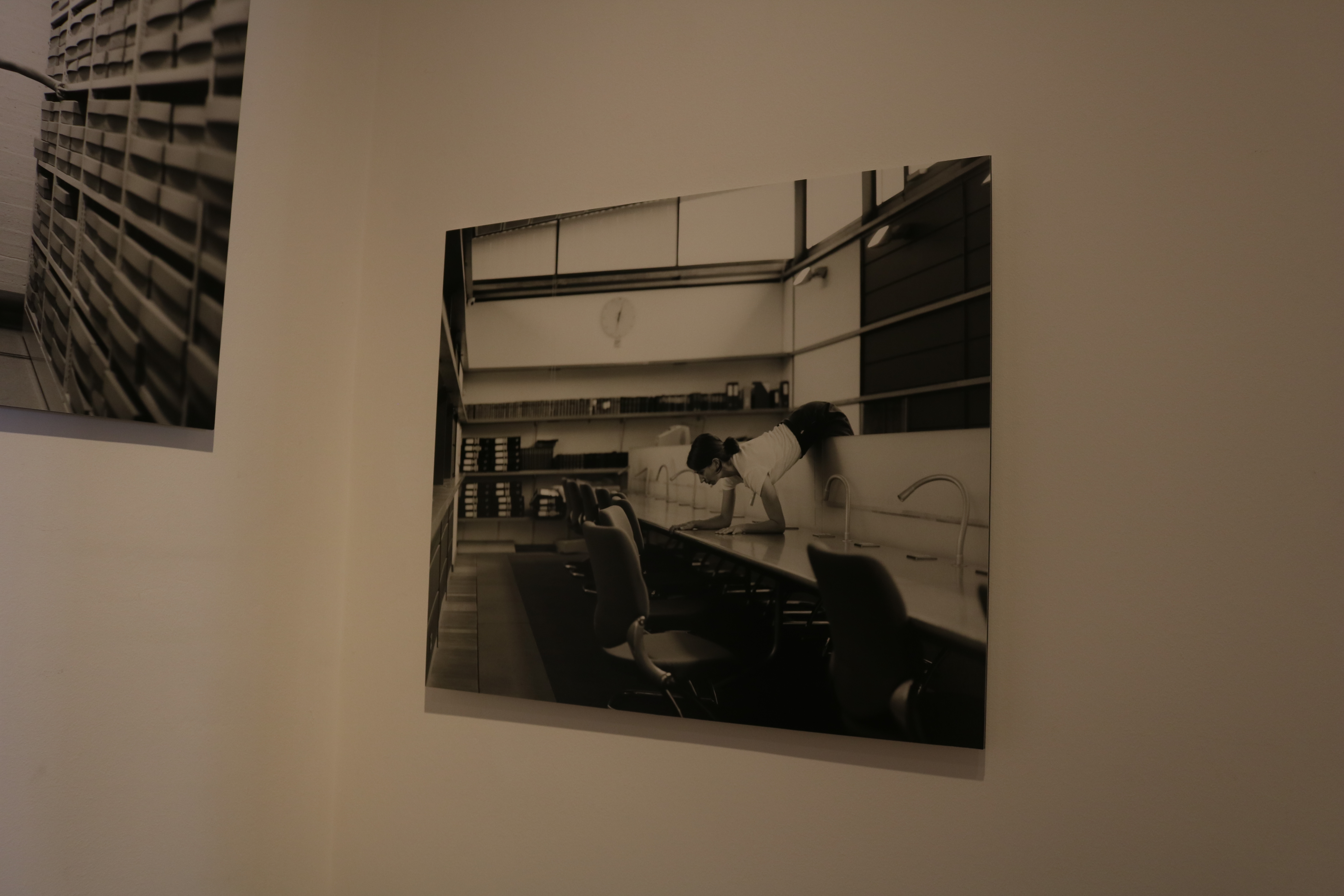
Image by Clare Rae

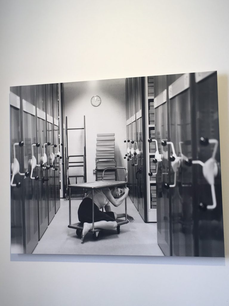
I also really liked Rae’s work in the exhibit. I could clearly see elements of Cahun’s work included in Rae’s images. For example, the use of black and white filters on all her images to make them look old and vintage like the self portraits Claude took. Rae also took self portraits in which she used her body to interact with Jersey’s local environment. I loved how Rae’s work shows some similarities from Cahun’s, but instead she uses more modern day, sterile environments like offices and archives. I think this is really successful as the change of environments reflects the change of times from each era the artist worked during.

Claude Cahun’s images
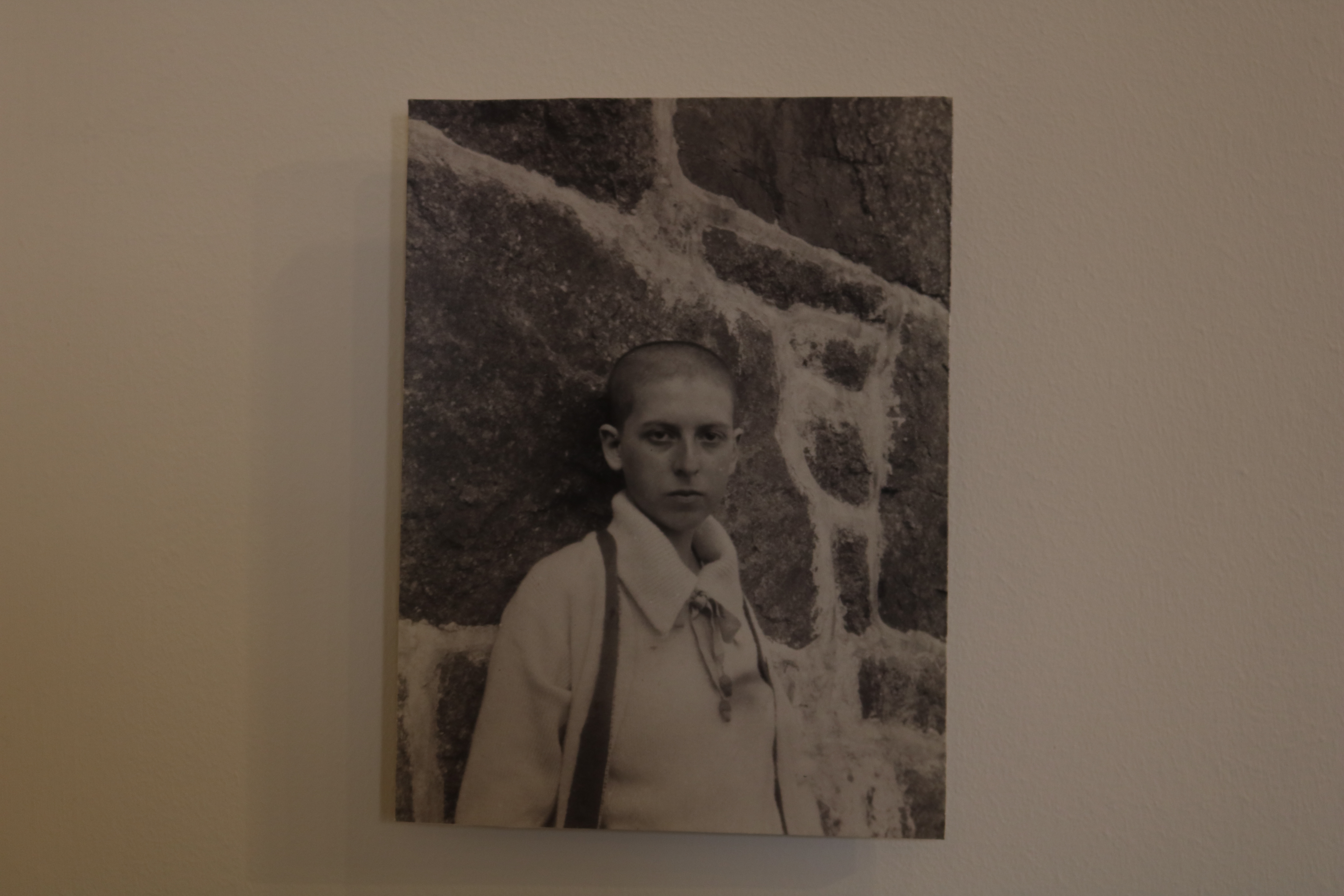
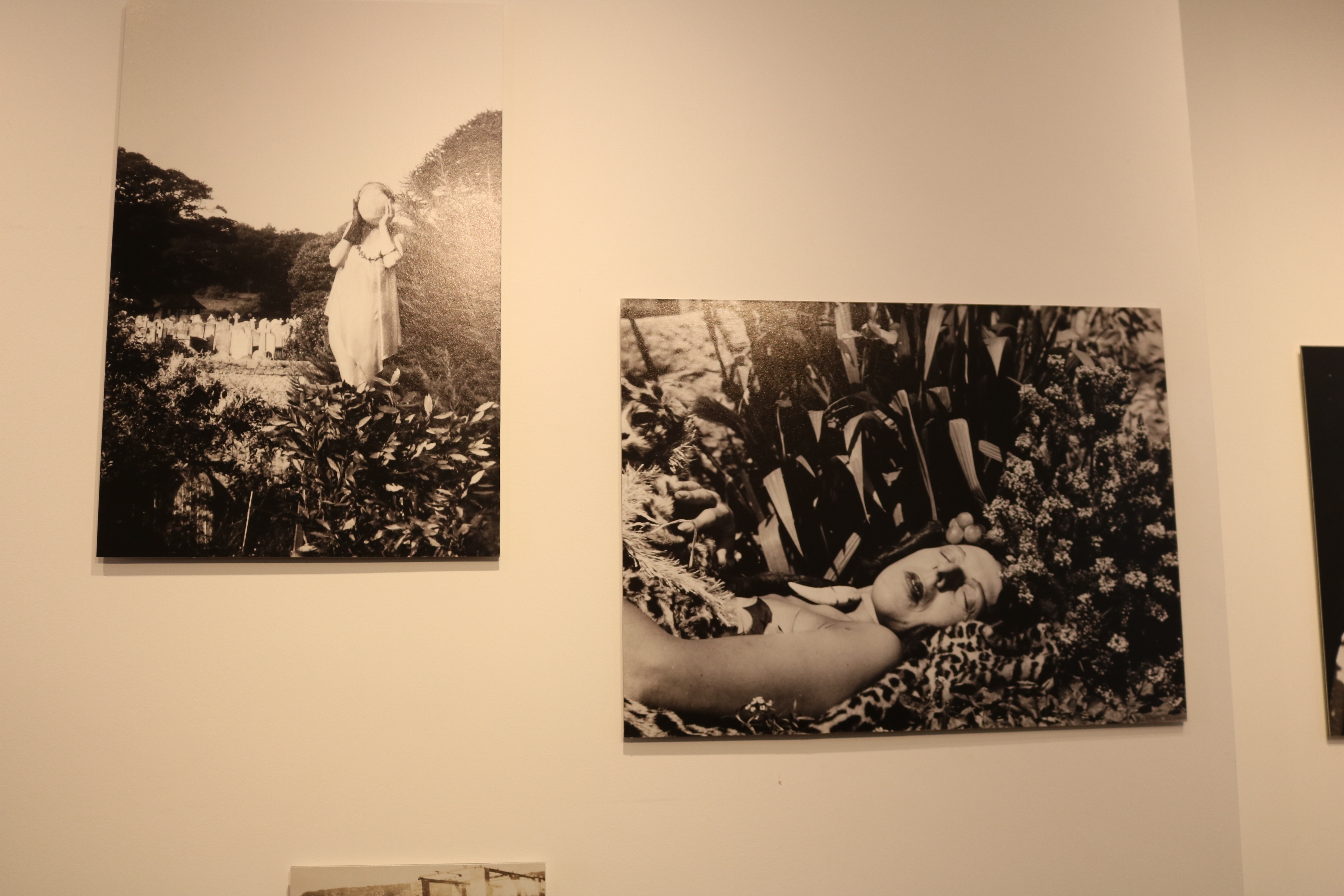
This is one of my favorite images seen in the exhibit. It was taken in 1916, and in this image we an see a self portrait of Cahun herself leaning against a granite background, while staring into the camera with a monotone facial expression.

I really like the concept of this image a lot.  This is because in the image she has her head shaved, which was very unusual for women during this era. I think this image is very powerful because it shows Cahun attempting to break gender stereotypes. This shows how far ahead of her time Cahun actually was.

The technical elements of this image are also very interesting. I like the lighting in it a lot as it means that everything in the image is clear view, and it is also in focus.


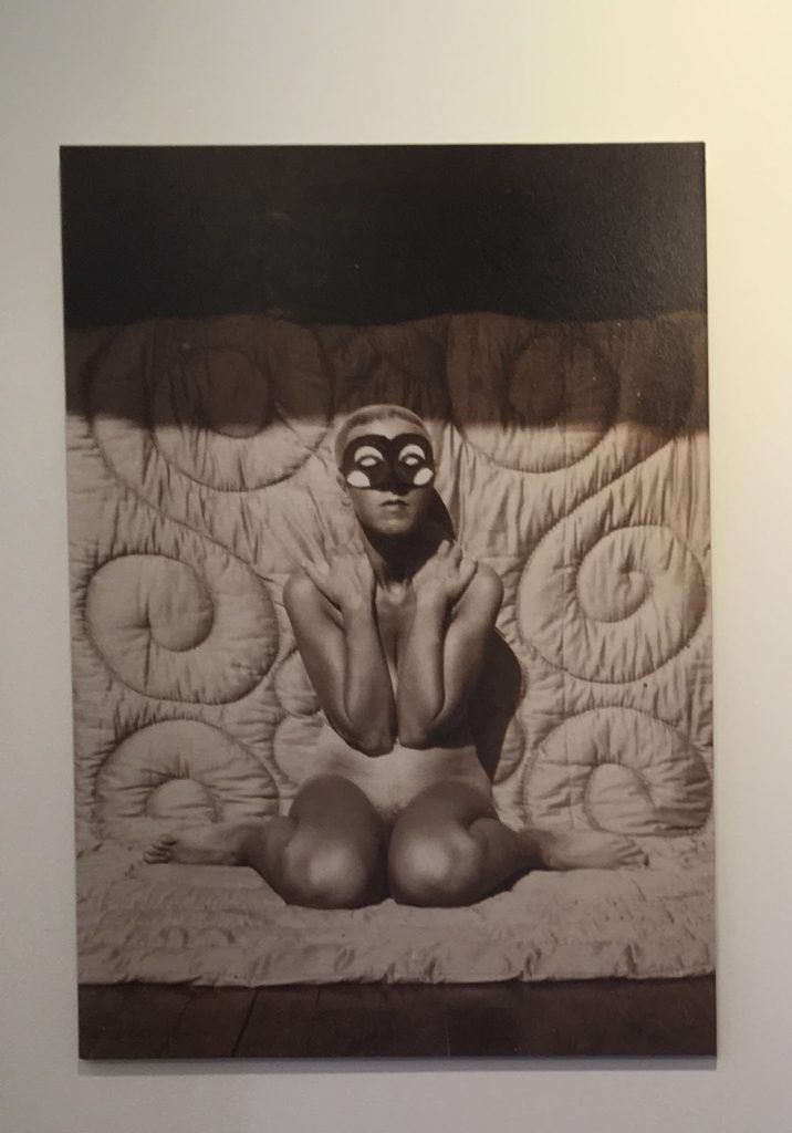
This is another on of Claude’s images. similar to the last one, it shows herself exploring her body and her identity. This image shows Cahun posed naked, with her arms also posed in a particular way while also wearing a mask.

A reason I really like this image is because again, like the last photo, it is really ahead of its time and not typical of the time it was taken in. I also really like all the tones and shading in the Picture, caused by the natural lighting.

Clare Rae’s work

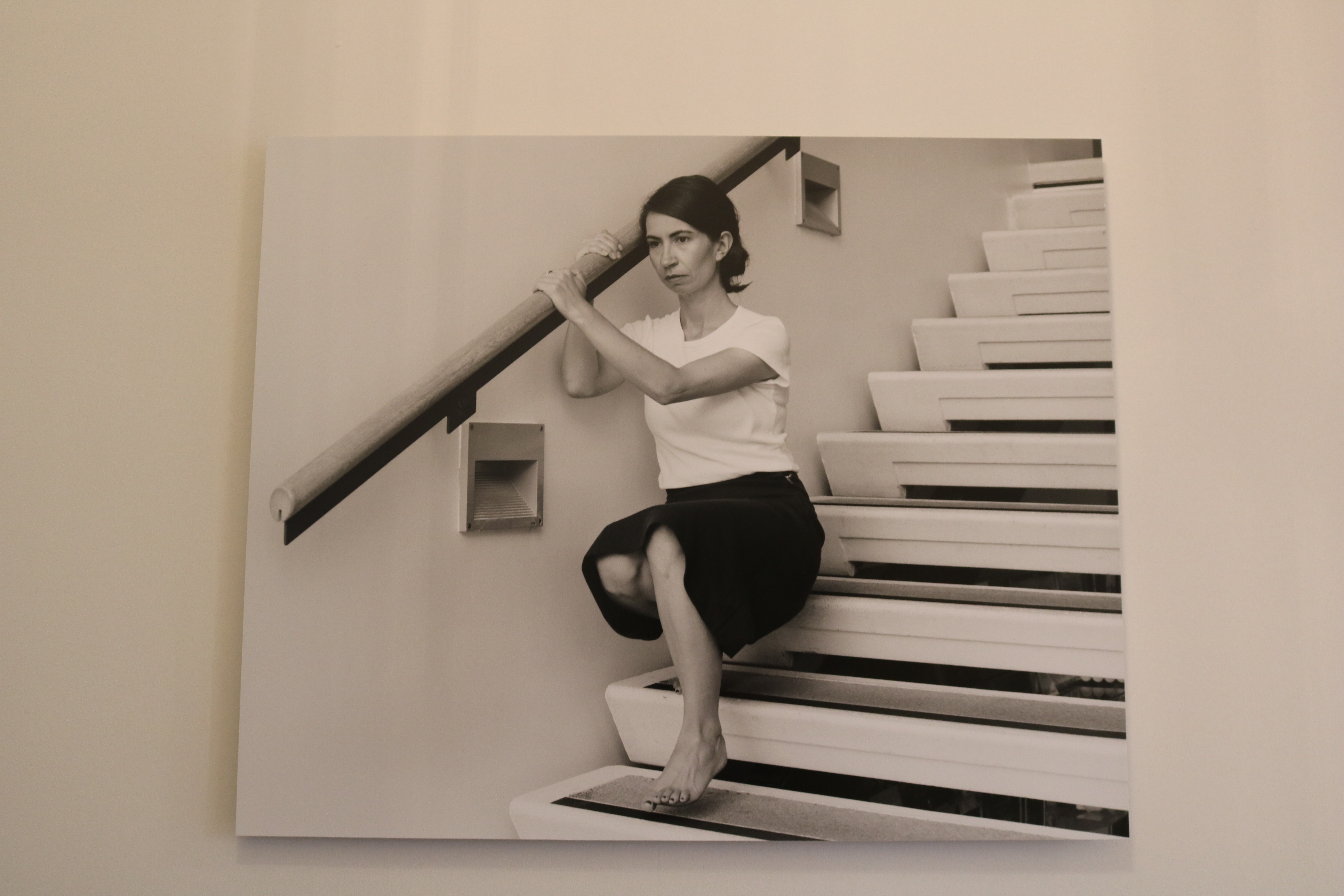
This is a an image of Rae’s that stood out to me. I like this image because you can clearly see where she has been influenced by Cahun, in the filter and in the way she poses herself in the image also. But I also like the way she has made this image fit into 21st century life. The way she has modernized the image while still taken inspiration from a past photographer makes the image very appealing to a modern day audience. The way she has done this is by posing her body of a busy office table. I also like the way the background is purposefully messy as I think this could represent how busy and complicated modern day life can be.

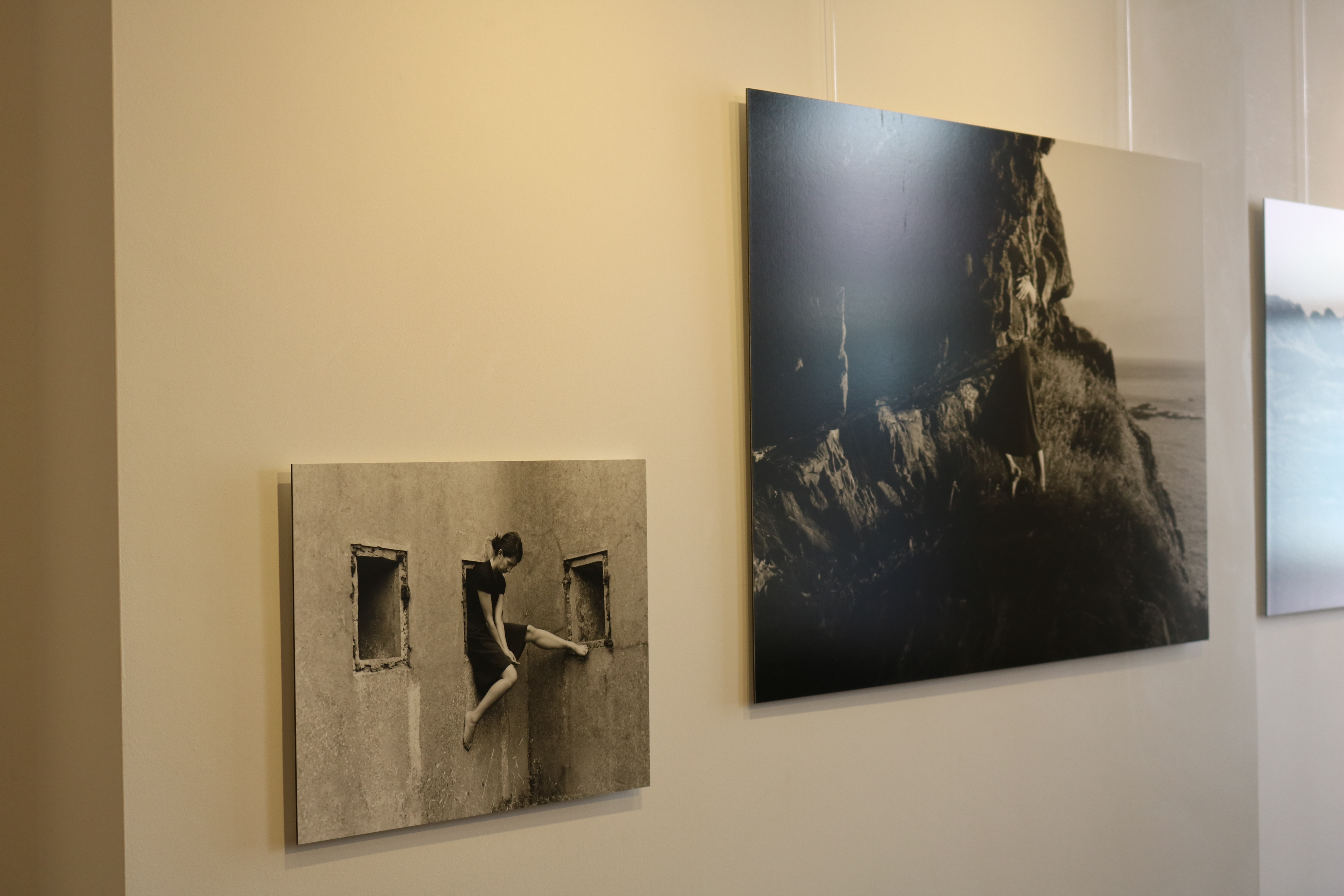
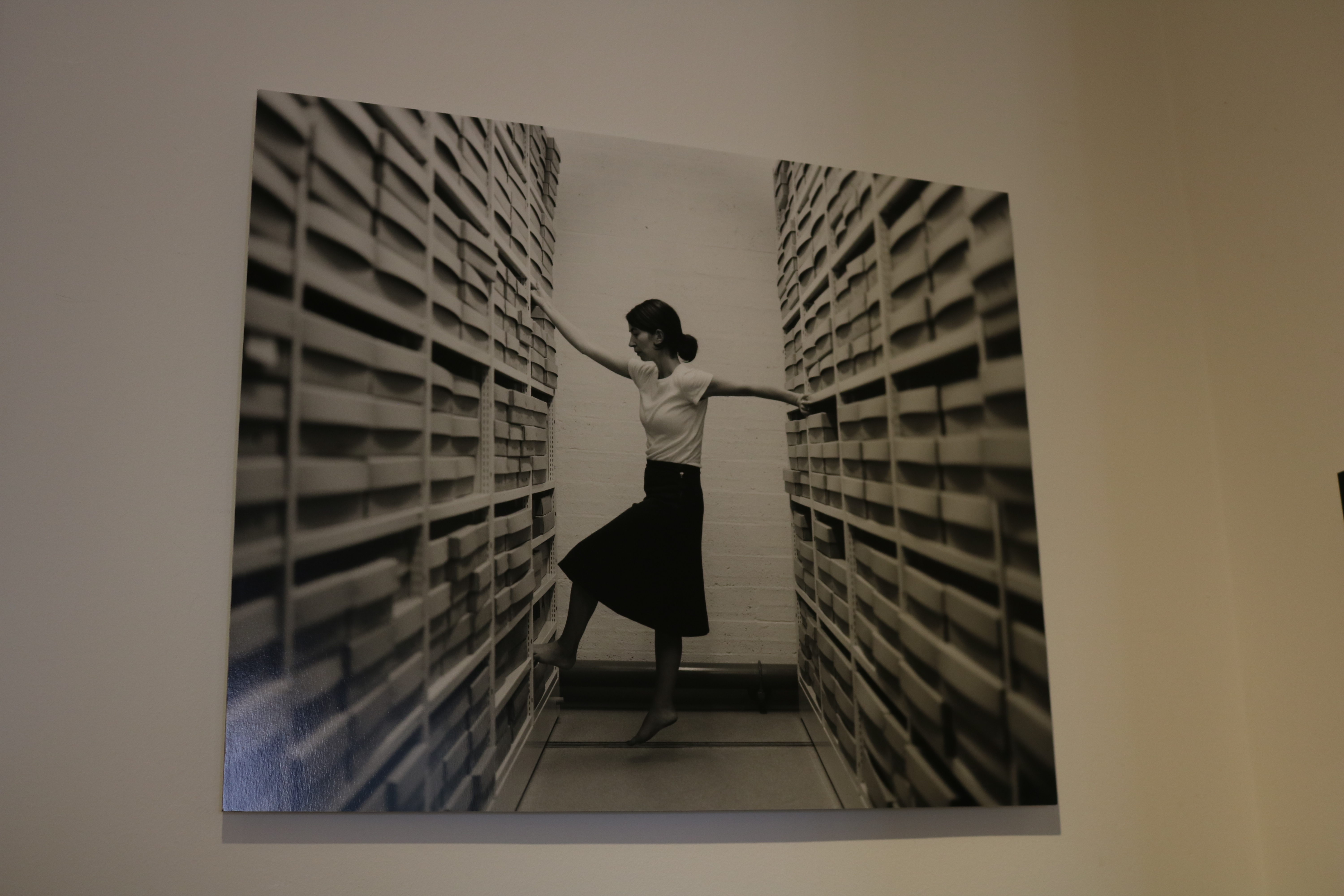
This image taken by Rae is slightly more simple. I contains no extremely posed body language compared to the previous image, as instead of being lent over a table she is comfortable sitting on a window frame with her legs together, and her had supporting her body behind her. This image is very interesting to due to many aspects.  The lighting of this image is very interesting and complements the vibe of the photo. I like the way the light is only coming in from behind her as it means the part of her body facing the camera is slightly darker and less visible. I think this helps add a sense of mystery to the photo. I also like how the lack of light in the image means that the photograph contains a  lot of darker tones, which highly contrast the light tones coming from where we do see the light by the window.

More images of the exhibition
 

Photographing Paper

Martin Creed

Martin creed was born in 1968 in Wakefield, England. He went to The Slade School of Art in London for 4 years in the late 80s. He has done a lot of work, and many exhibitions all over the world. Along with being an artist, Creed is also a musician and has a band.
He mostly photographs simple, everyday items in very effective manors so that all his images look aesthetically pleasing. The specific pictures of his that I will be focusing on are the images of paper he has previously taken.
Creed currently lives, and works in London.


WEEK 2- CLARE RAY AND CLAUDE CAHUN- EXHIBITION CRITIQUE

Clare Ray and Claude Cahun Exhibition critique

When visiting the CCA gallery to analyse Clare Ray and Claude Cahuns abstract photography i had noticed that both exhibitions very simple and unique in their own ways. The Claude Cahun and Clare Rae exhibition was very inspiring and interesting to visit. There were two rooms that made up this exhibition, one containing each photographers work. I think that the layout for this exhibition was very well thought out as there was no way the audience could get the who photographers work mixed up.

Clare Ray is a self- portrait photographer which i found very inspiring as her images were very unique however you could clearly see the elements of Cahun’s work included in Rae’s images . All of Ray’s images proved to be in only black and white which intensified the light and dark colouring in the images which added a lot of tone to the photographs, which made the images look old like the self portraits Claude took. Clare tends to bend her body in many different positions for her self portraits which has been used to help her interact with the Jersey environment. I think Ry using modern day sterile environments reflects the change of era in contrast to Cahun’s exhibition. 

Claude Cahuns exhibition was very unique in the way that the photographs all had different patterns, coloring and different sceery. However, somehow they all complimented each other when placed together. During the time the self portrait pictures at the exhibition were taken when Claude was a lesbian and an activist against the WW2 war. I think this is portrayed in Claude’s work as she posed naked in a lot of her work which implies that she’s trying to let her sexuality free as it wasn’t proper to be a lesbian in WW2 times. The fact that she was posing naked also was not allowed during WW2. All of this shows that Claude was a bit of a rebel and just wanted to be herself. All her pictures proved to be very advanced from her time as she was very unique.

I think that Claude’s background adds a lot of story to her pictures which i really like as it helps us to seek what she was thinking/ feeling in her abstract photos.

Clare Ray

I think this self- portrait of Clare Ray is my favourite piece from the exhibition, this being because i love how abstract the piece is. The image stood out to me as you can see that Ray has been clearly influenced my Cahun due to the black and white filter. However the range of brightness used throughout the image adds tone to the image and shows the reflections on the side doors which are included in the picture. The brightness also adds contrast to the image due to it adding a sterile feel to the image. You can tell Ray’s intentions was to add a sterile feel to the image due to the plain location shes in, the lighting she is using, the prop she is using in the image and the way in which she has shaped her body to the prop and the facial expression she is using. The overall image is very simple but someone gives off a very complicated effect. 

Claude Cahun

I think this self- portrait of Claude Cahun is one of the most interesting from the exhibition as the picture is ahead of time with the shaved head and the nudity of the  image.

Claude being naked while posing in the picture adds a lost of abstract feel to the very simple picture as her nudity and the flowers in the open space is showing freedom. This freedom is also shown by tones in the image instead of usual colour. Not using colour in the images also adds maturity as the black and white adds tone through brightness.  I really like the concept of this image in the image she has her head shaved, which was very unusual for women during this era (1916) . I think this image is very powerful because it shows Cahun attempting to break gender stereotypes. This shows how far ahead of her time Cahun actually was. Using black and white also helps to contrast the different brightness’s adding more depth to the picture.

I think that Claude’s plan was to show her thoughts through the picture as the nudity and open field could be her wanting to be free of the Nazis punishments of being lesbian and transgender which i think is a great concept to convey.

Influensation

I think Clare has been heavily influenced by Claude’s work as both the photographers images are extremely similar.

Both are self- portrait photographers which means that they share that in common. However, i think that Clare has been influenced by Claude’s unique editing in the black and white theme as well as the brightness of the photos. Clares images have a lot of tone and texture in them due to the similar editing s Claude’s pictures also have a lot of texture in them.

I think that Clare has also extended Claude’s unique way of taking her photographs, as Clare has used her body in many different ways in her photos which add a more abstract feel. Where as Claude has a lot of photos which have the same feel to them as she is naked in most of them.

I overall think that it was good for Clare to be inspired by Claude as it has made her better at editing self portrait while still using her own ideas of the positions she chooses to pose for.

Exhibition overall

I think that the overall layout of the exhibition was really good as it was very simple and the photos were presented on plain white walls which means there was no distraction from the images. The layout of the different photos was also aesthetically pleasing to the eye due to the alignment of the images in the frames against some of the random other images which were a smaller or larger size image.
Claude Cahun x Clare Rae

a mixture of Cahun and Rae’s work


Claude Cahun

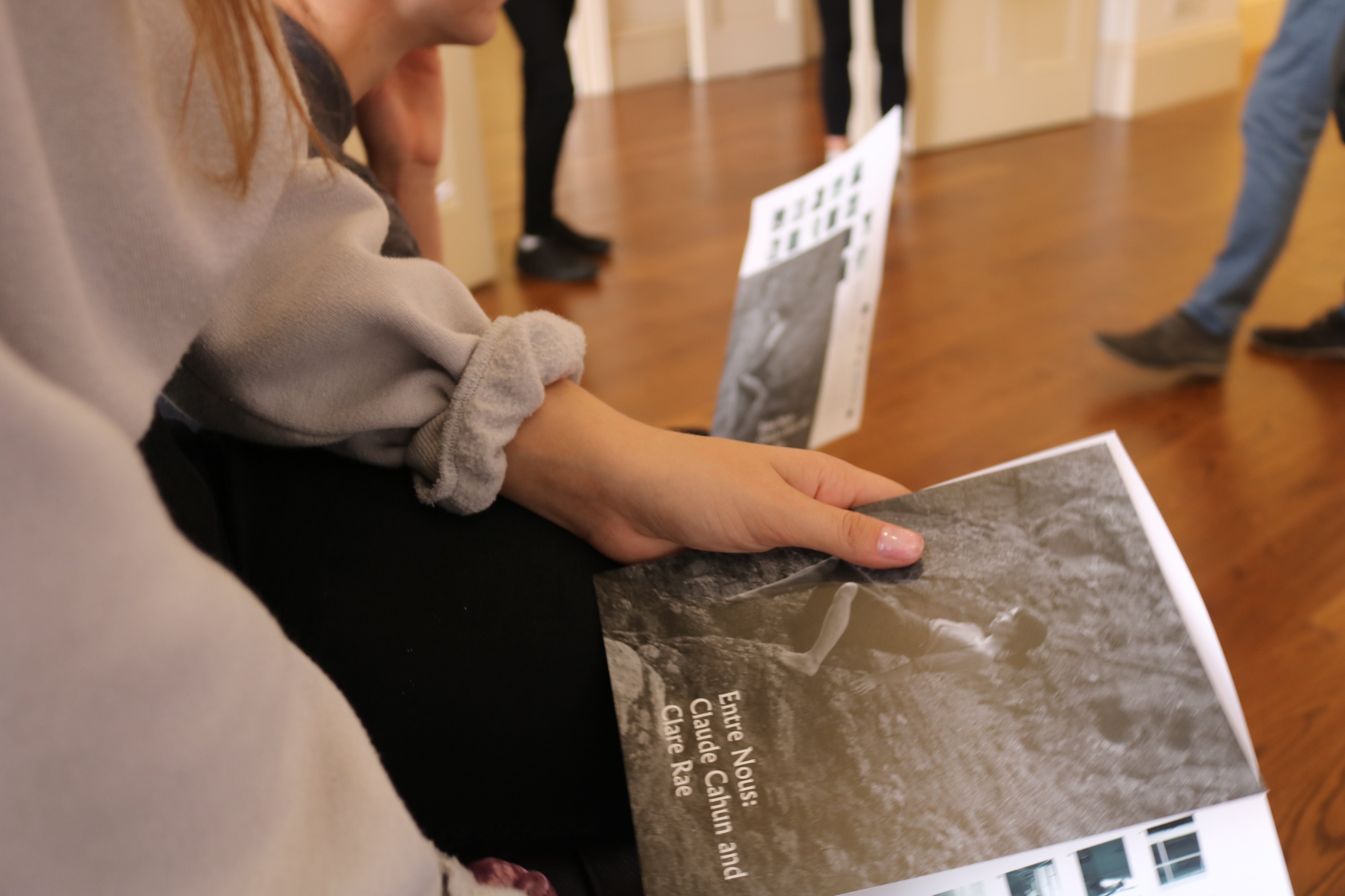
Claude Cahun’s photographic self-portraits present a dizzying kaleidoscopic mix of mystery, exuberance, and sobriety. Born in France, she lived most of her life on the island of Jersey with her stepsister and long-term love, Marcel Moore. Also known as Lucy Schwob and Suzanne Malherbe, both women adopted their preferred gender-neutral pseudonyms during early adulthood. Moore, although often invisible, was always present – typically taking the photographs and also authoring collages – and in this sense was as much artist collaborator as she was Cahun’s personal support. Described in her own words as a “hunt”, through a combination of text and imagery, Cahun’s exploration of self is relentless and at times unsettling. From circus performer, clothed in layers of artifice, to a stripped-down Buddhist monk grounded by integrity, Cahun is engaged in an ongoing dialogue with multiplicity. Tragically in line with the fragmentary nature of her outlook, much of the artist’s work was destroyed following her arrest and subsequent imprisonment for resistance against the Nazis. What remains bares interesting parallel to the title of Cahun’s diaristic publication Aveux Non Avenus, translated as Disavowels, which enigmatically suggests that for all that is revealed and given, much is still hidden or has been lost.

Themes of melancholy, futility, and uncertainty run deep through Cahun’s career. She does not make ‘complete’ artworks but rather all of her photographs and writings combine to become part of a bigger and yet still unfinished whole. She says herself that she does not have the answers to her questions, and as such unusually makes visible the rawness, torment, and distress of not knowing.

There is an obscurity surrounding Cahun that has made her an isolated figure. In character she was an obsessive loner, and yet she was also inextricable from Moore. From 1937 onwards, moving away from the artistic circles of Paris to the remote island of Jersey, the couple became somewhat awkward, ostracized, and inaccessible. Furthermore, with much of Cahun’s work destroyed in 1944, the overall body of her production became relatively small further heightening her mystery. The original works that survive are very small, as though they have been left as clues for a much bigger treasure hunt.


Clare Rae

In her photographic practice Clare explores ideas of performance and gesture to interrogate and subvert dominant modes of representation. Her work is informed by feminist theory, and presents an alternate and often awkward experience of subjectivity and the female body, usually the artists’ own.

Recent projects have engaged with site specificity, involving works that are captured and displayed within the same environment. A central interest within her practice is the exploration of performance documentation, specifically how the camera can act as a collaborator, rather than mute witness, to the performer.


Both collections of work were displayed along side each other, as Rae took inspiration from the works of Cahun. She hoped to pursue the idea of individuality and self expression like Cahun did.


WEEK ONE- PHOTOGRAPHING PAPER

Martin Creed

Martin creed was born in 1968 in Wakefield, England. He went to The Slade School of Art in London for 4 years in the late 80s. He has done a lot of work, and many exhibitions all over the world.
He mostly photographs simple, everyday items in very effective manors so that all his images look aesthetically pleasing. The specific pictures of his that I will be focusing on are the images of paper he has previously taken.

MOOD BOARD

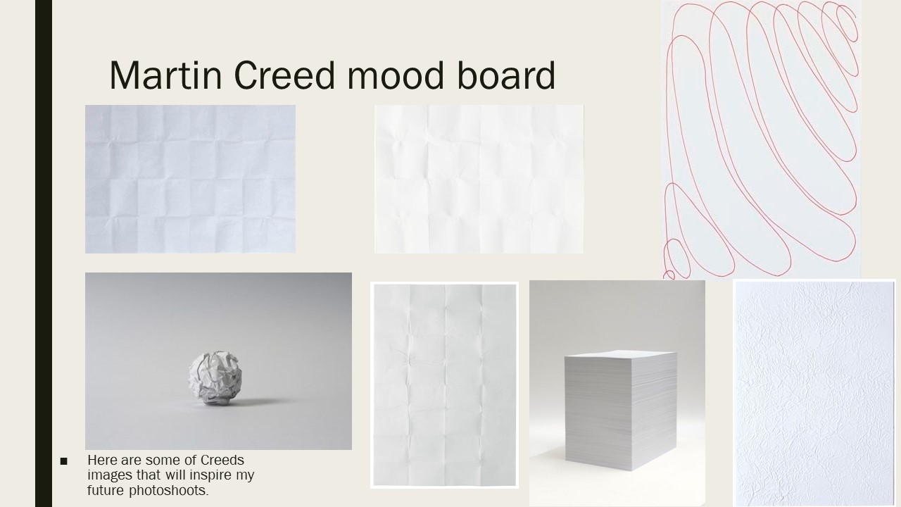
  • Shadowing- used to enhance contrast
  • Simple elements
  • Different ways of folding paper
  • Lighting used in different ways
Analysation 

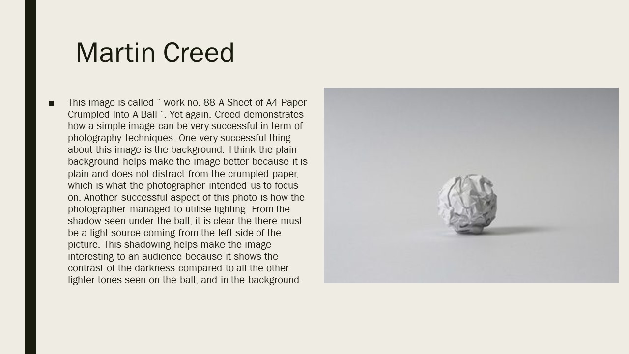
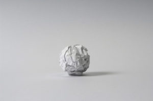
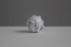
This image is named image No.88, this image shows how simple elements in a photograph can be very successful. One very successful element in this image is the background of the image as it is again very simple and also plain which doesn’t distract from the very detailed crumpled paper. I also really like the use of the lighting used to photograph the paper ball as it creates a small shadow of the right hand side which is clear to the audience that there is a light source coming from the left hand side. This shadowing adds contrast to the image because of the darker coloring.

This image is also part of the no.88 collection and is very similar to the other picture i had analysed from the collection. However, Creed has used a darker background which helps to emphasise the detail on the crumpled paper. A right hand side light has also been used to create a shadowing on the left hand side which again adds contrast to the image due to the different brightness’s in the image.

Planning my photo shoot 

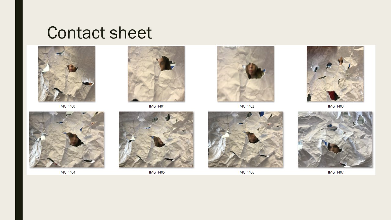
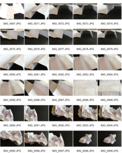
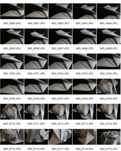
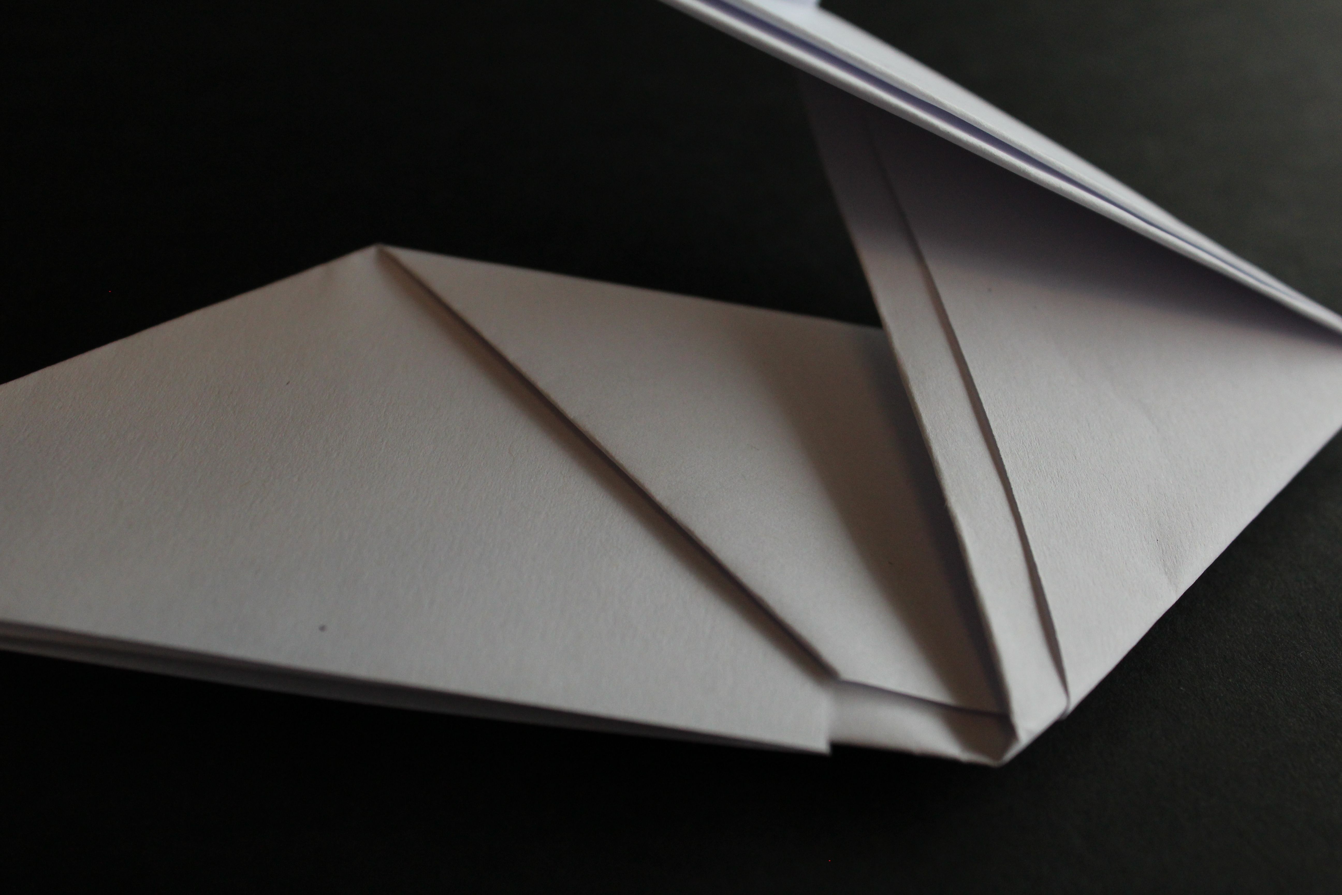
After taking inspiration from Creed i have decided to take pictures of paper. I personally really like the way that he used paper balls as well as crumpled paper and therefore my images will be based on those. I plan to use different lighting in order to create textures and contrasts.

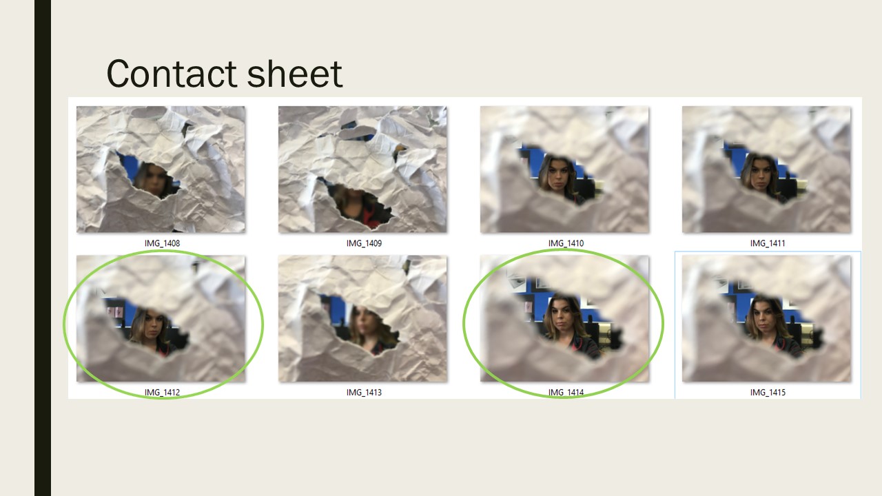
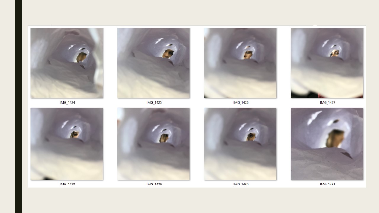
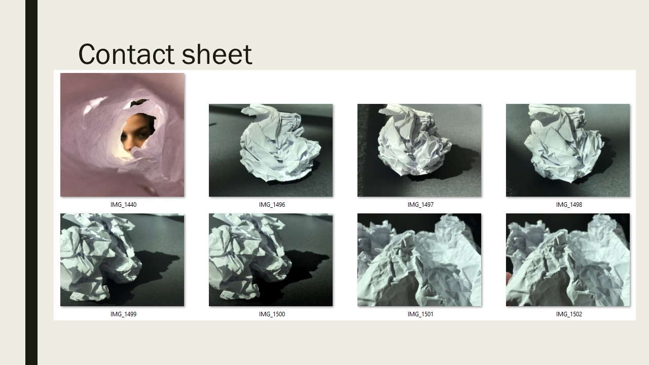
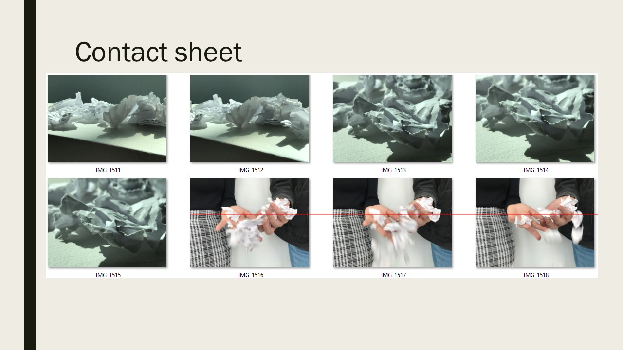
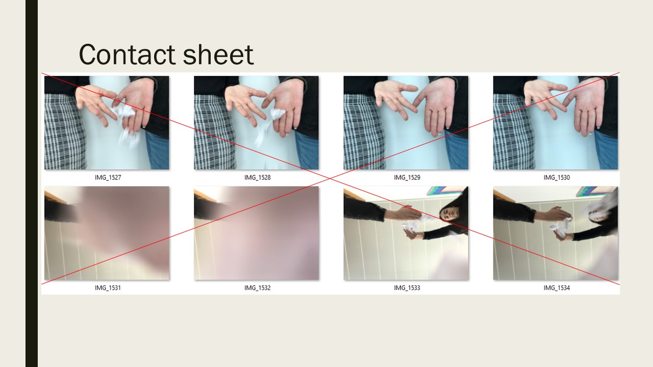
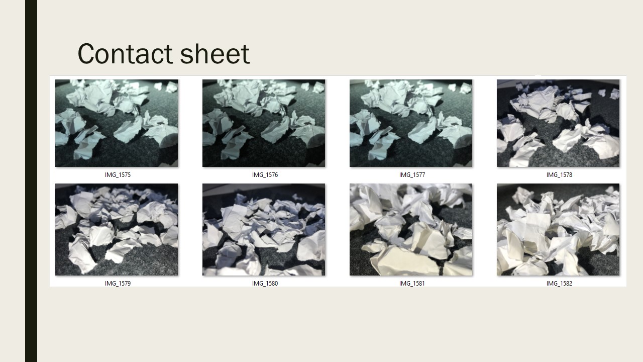
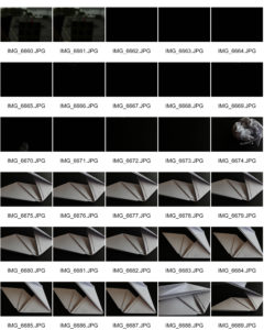
Contact sheets

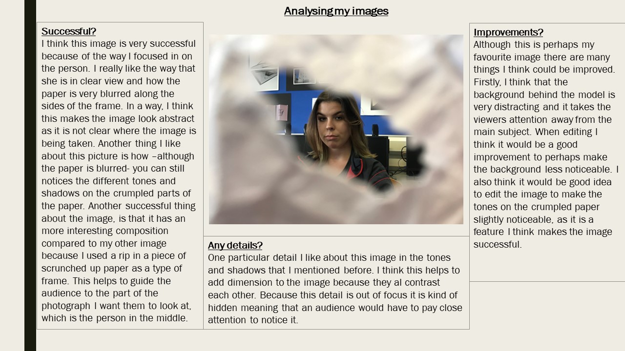
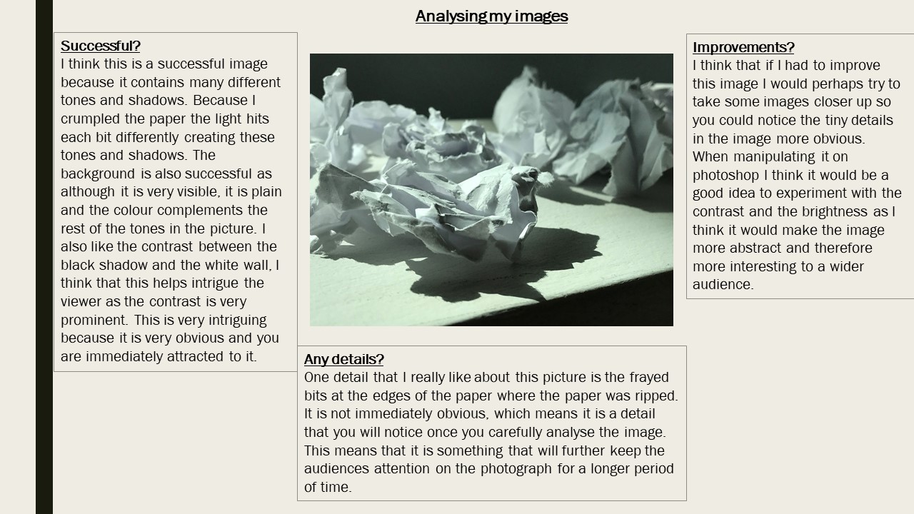
Best images 

I think this image is very successful because of the contrast between the light and dark in the picture. I think the black background helps the white paper ball to stand out which was an aim of mine when starting this photo shoot.

Even thought i really like the contrast of the white and dark, in order to improve the image I would use a white background and use  light from a right hand side which would create shadows which was another aim of mine.

A detail i really like about this image is the freshly scrumped paper as this relates a lot to Creed’s no.88 work as he used the same technique.

I really like this image as i like the small shadowing shown on the right hand side from the natural light from the window. This helps to add tone into the image due to the contrast in the shadowing, white paper and black background.

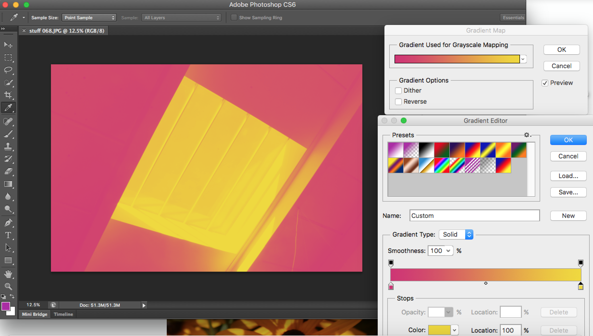
In order to improve this image I would use Adobe Photoshop to enhance subject of the image ( the paper) and make it lighter which would then help contrast between the shadowing and darkness of the image.