CCA Galleries: Claude Cahun and Clare Rae Exhibition

Claude Cahun:

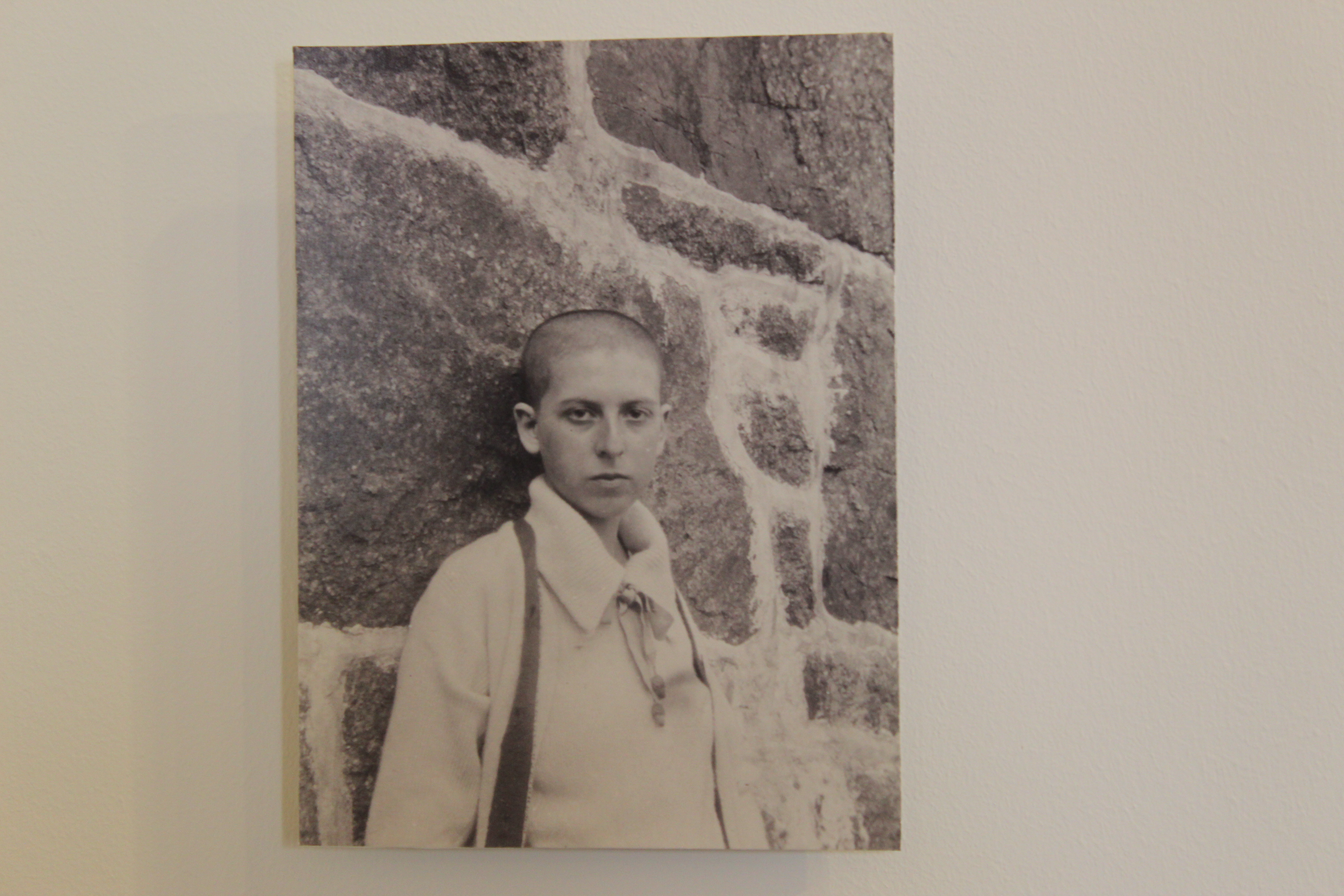
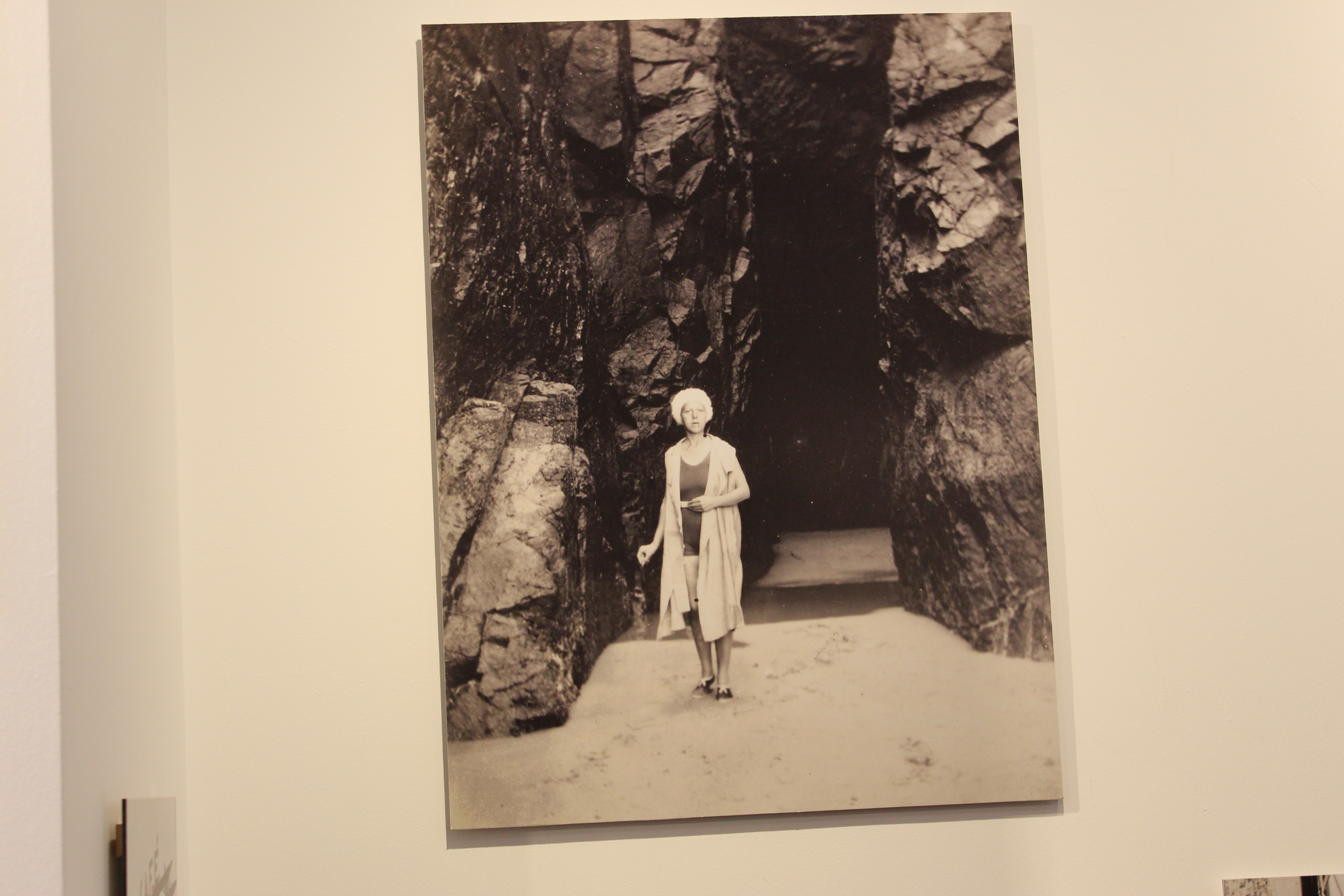
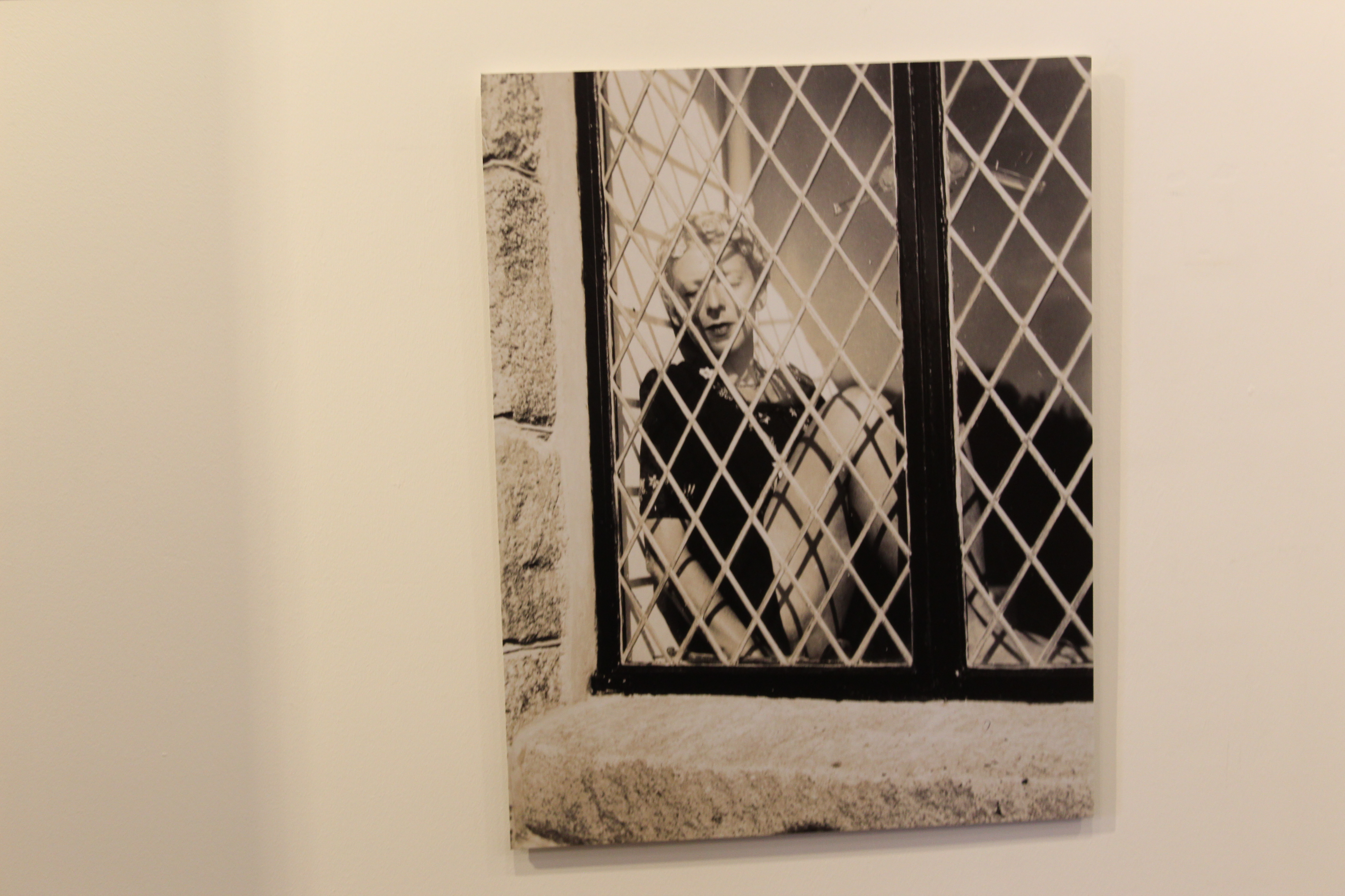
Claude Cahun is a French-Jewish photographer that grew up in Nates (western France) with her mother but ended up living with her grandmother after at a young age, Cahun’s mother, Mary-Antoinette Courbebaisse, was institutionalised. Cahun faced anti-semitism at her high school in Nates, therefor she joined a private school during her time in Surrey.

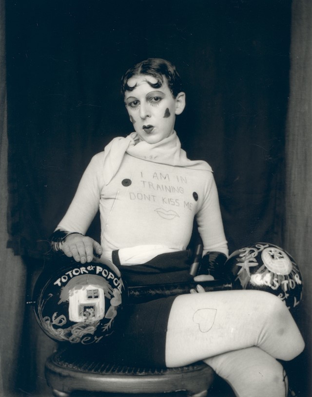
Her work reflects her sexuality and ideas of gender-ambiguity. Much of her work involves self-portraits in which she usually looked directly at the viewer, showing her shaved head and shoulders, blurring an indicators of her gender.


Clare Rae:

Clare Rae is an artist based in Melbourne (Australia). In her photos she explores ideas of performance and gesture. A lot of her work is informed by feminist theory and usually presents an alternate experience of subjectivity and the female body.

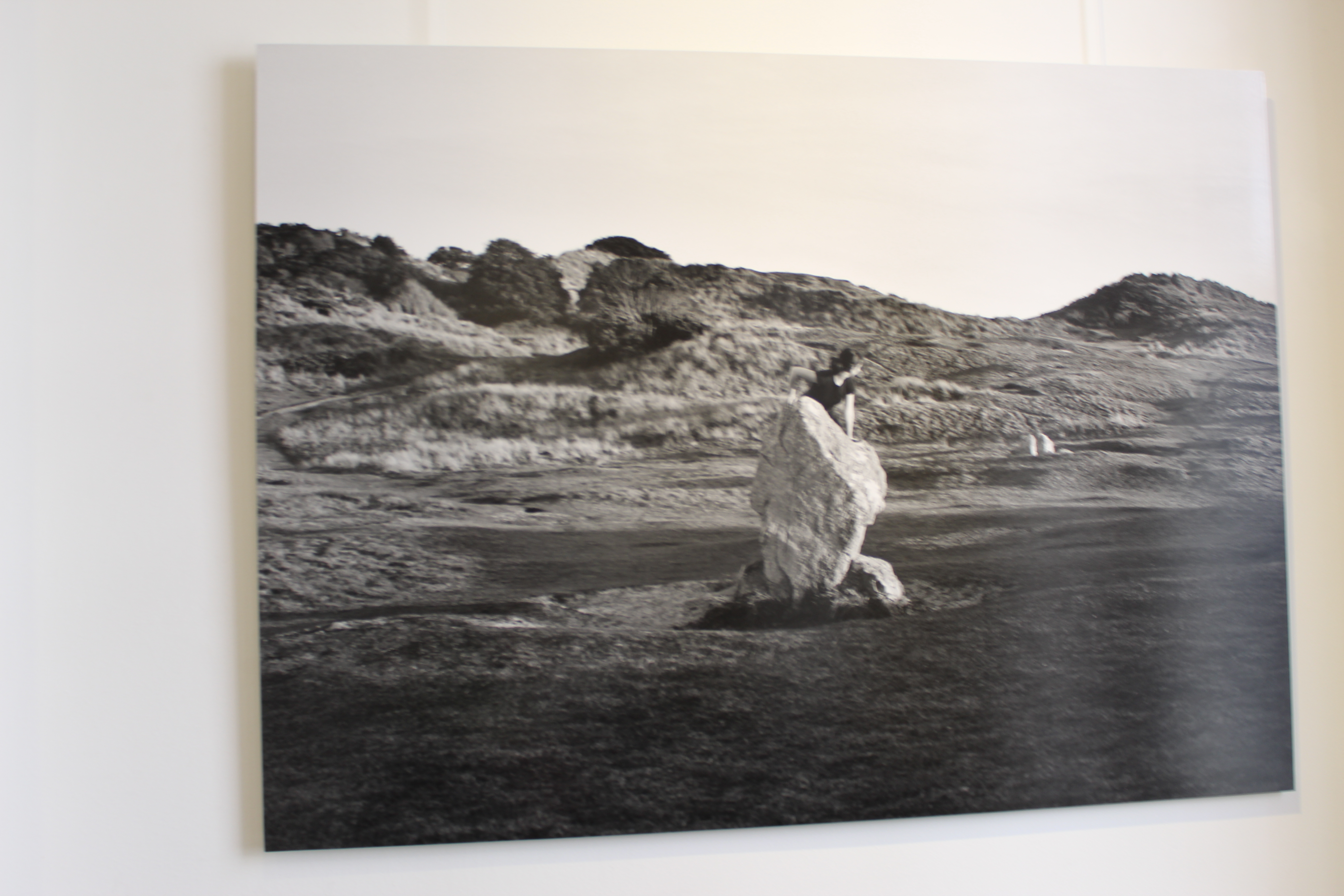
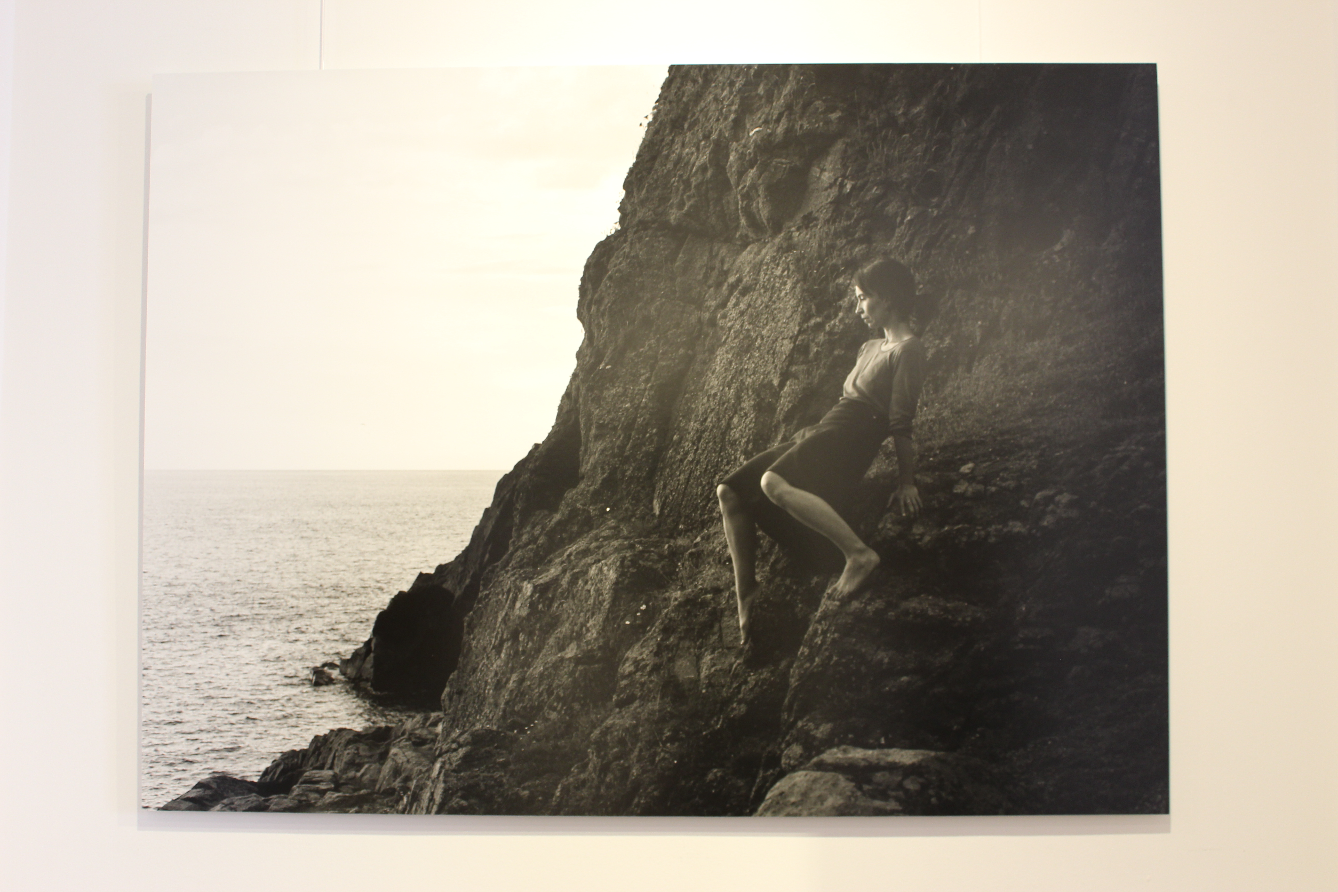
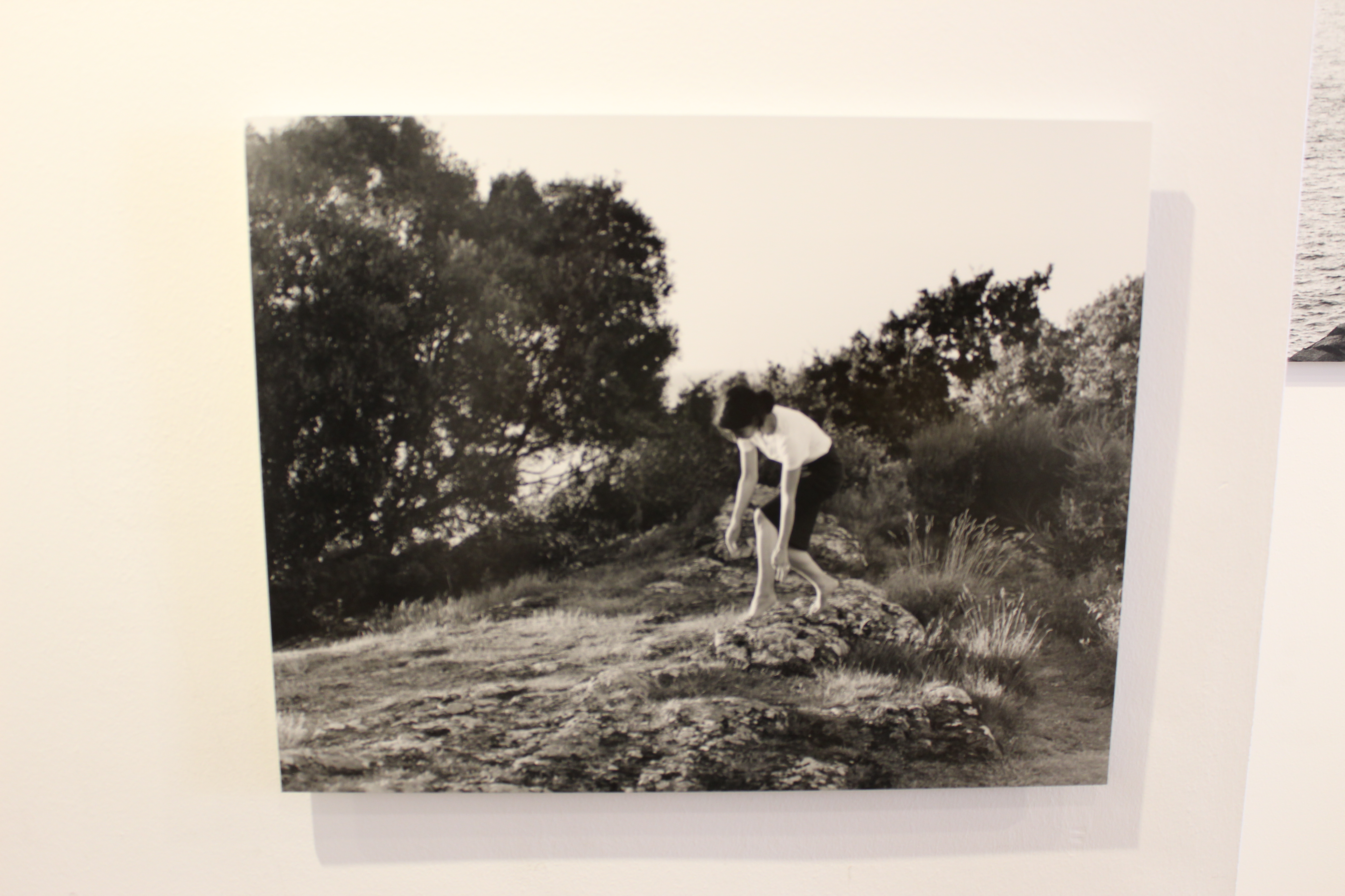
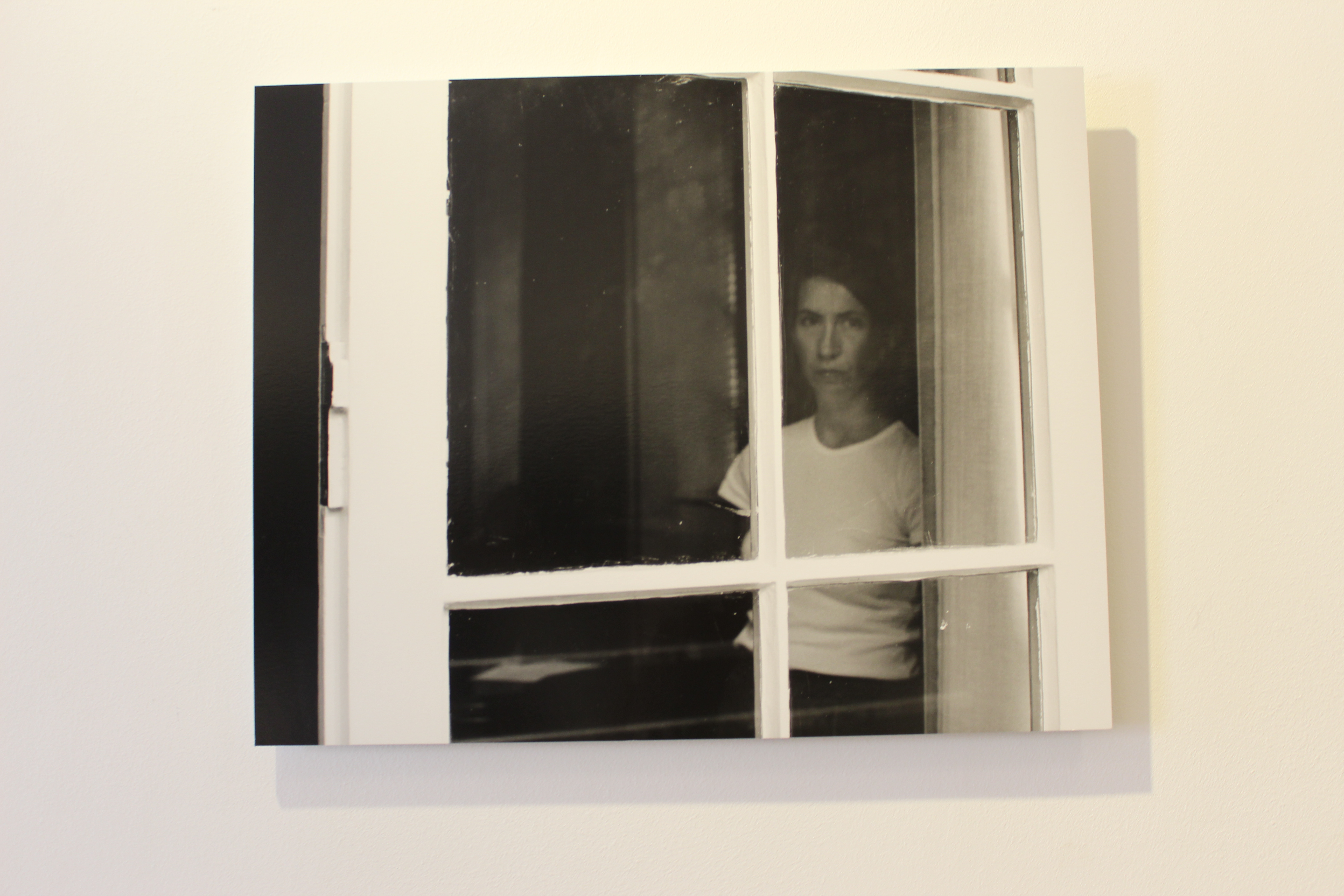
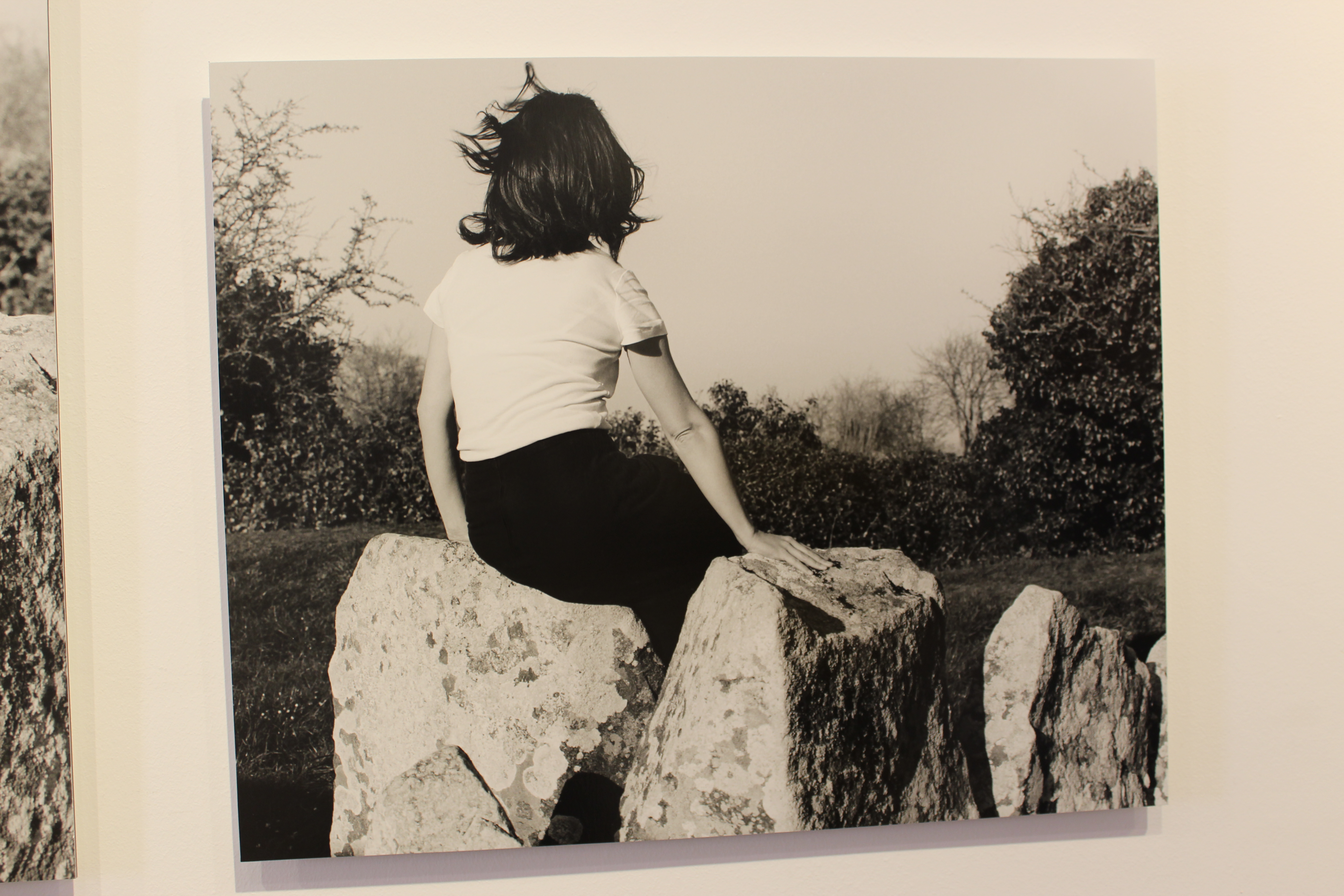
Her work, a response to the earlier work of Claude Cahun, is defined by the main aspect of all the frames being of the artists body. Clare Rae understood that Cahun produced many intimate photographs in Jersey. Rae followed in this aspect by depicting her body in many of the photos, utilising gesture and the performing body to contrast traditional representations of the female figure and attract the male eye to the landscape rather than the body.

Clare Rae X Claude Cahun

Hw- task 2 -CCA Galleries International

Claude Cahun X Clare Rae Exhibition 

Clare Rae- Exhibition

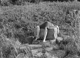
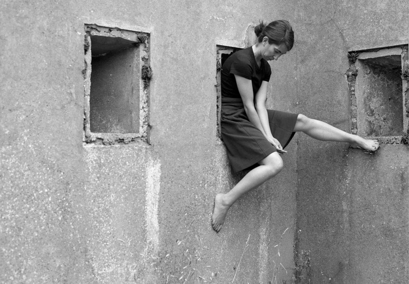
I chose this image by Clare rae due to how it stood out compared to the rest of her images, although her images all stick to a theme of portraits clare seems to try and adapt to the environment around her. She does this by positioning herself inside holes in buildings or by climbing onto rocks at the beaches or the sand dunes. This image she has physically lied across a rock this i found particularly weird as i had never seen an artist do that before. I particularly like her images because she works with black and white. For me i think the images that have quite a lot going on in the photo as in the surrounding that she has chosen, it creates more shading which also brings out certain detail that maybe if she hadn’t done it in black and white we would not have been able to spot due to sunlight or if the image was too bright.


Clare Rae Block


Claude Cahun

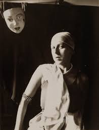
This is an example of Claude Cahun work. This was my favorite image due to the elements of weirdness in the picture.  I think this picture is unique due to the fact its not simply sticking to the idea of just normal portraiture photography. Cahun works with black and white so therefore she relies on the heavy shades and contrasts between colours to adapt to the type of image she wants as an outcome. Every photo that Claude takes has a story she tends to explore out of the box ideas which in her age would have been seen as a brave but challenging thing to do. Cahun works around the theme of identity. This is shown not only in this photo but many others. She was looked up on as she was known for her exploration of sexuality and she shows that in her photographs.

Overall both artists create ideas of expression of identity and allowing and not being ashamed of showing off the female body. Both artists are expressive and work well in what there trying to create when someone is looking at their images as all images have a story so once understanding the context I realised why their images might have been seen as strange.


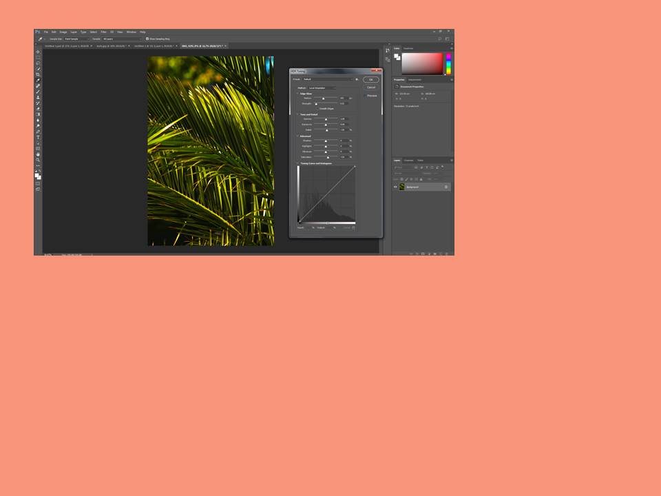
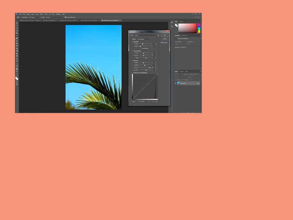
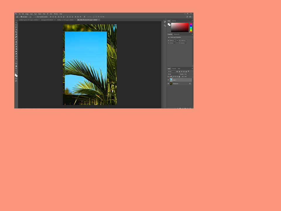
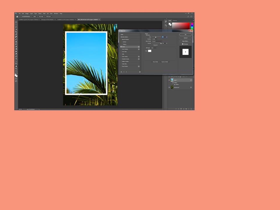
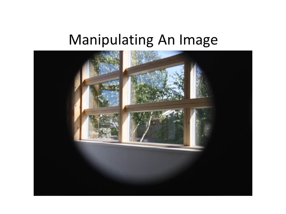
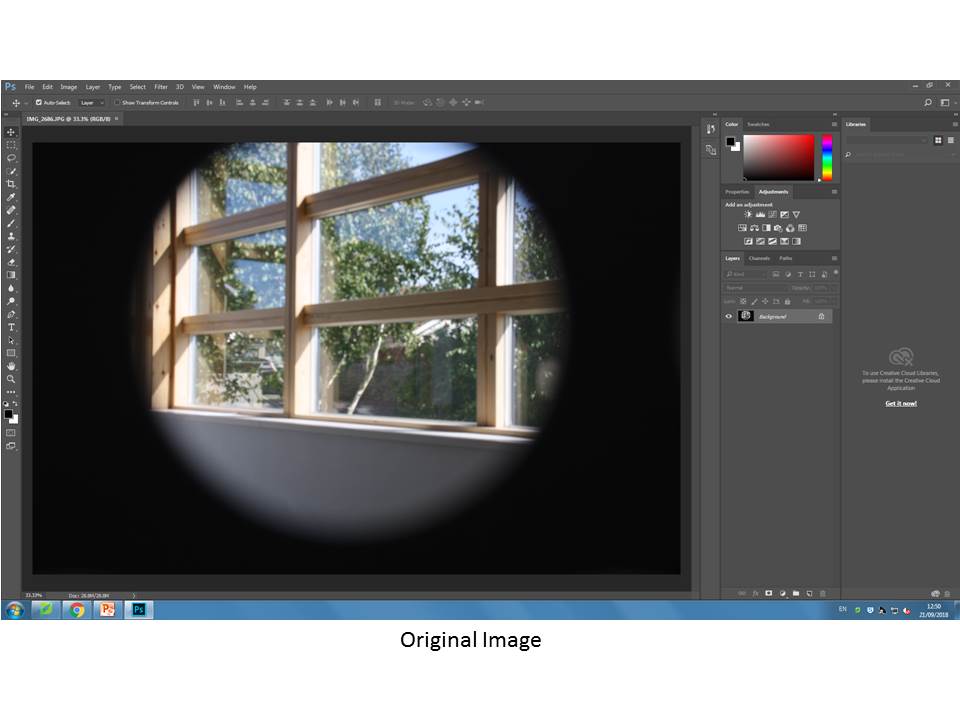
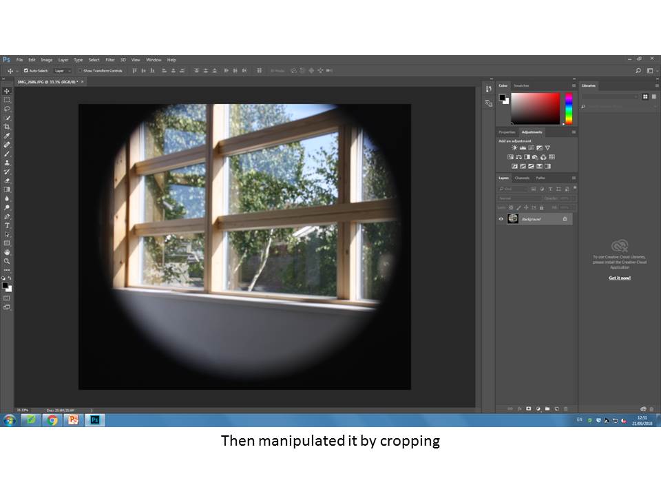
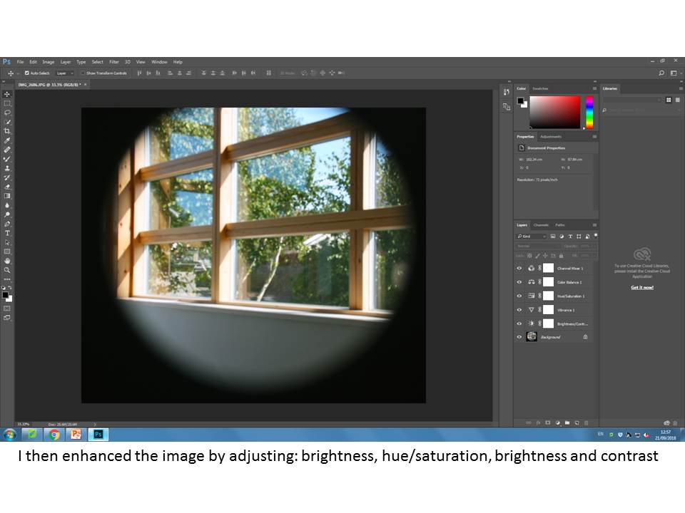
First time using photoshop

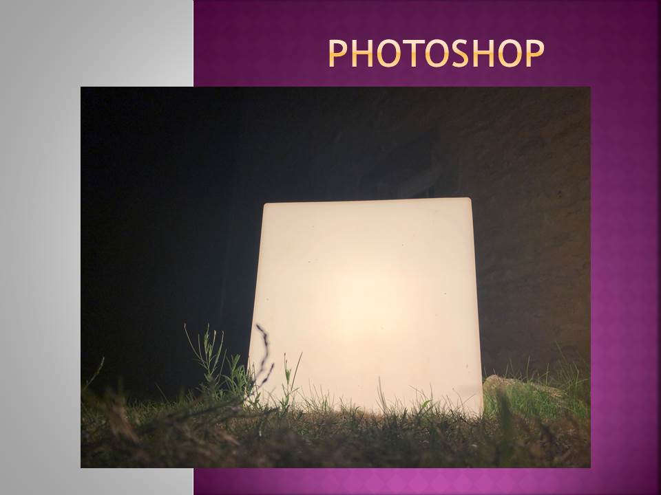
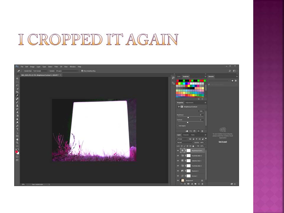
Here is a small demonstration of how i first used Photoshop and edited one of my own photos.

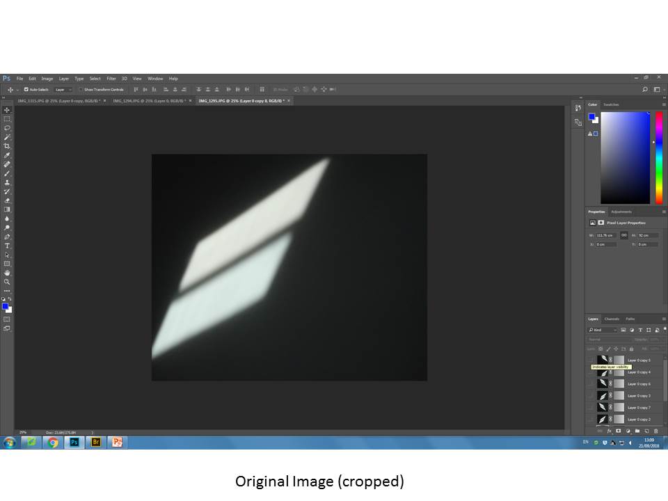
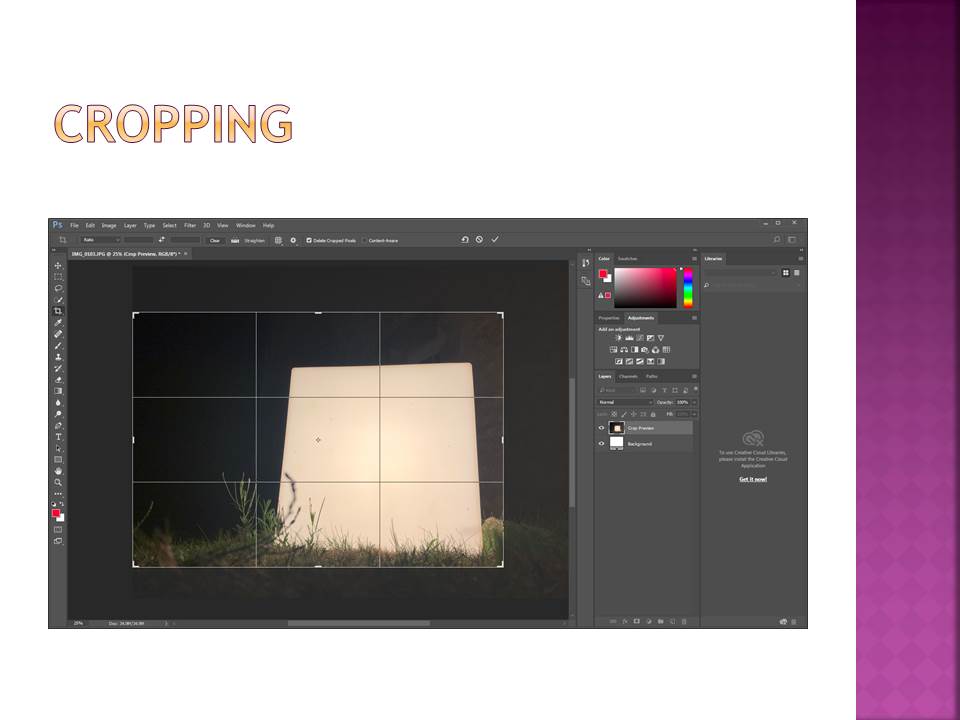
With this picture i was really trying to over exaggerate the effect of the light block, therefore i cropped the image to make the block more central and in the focus of the image.

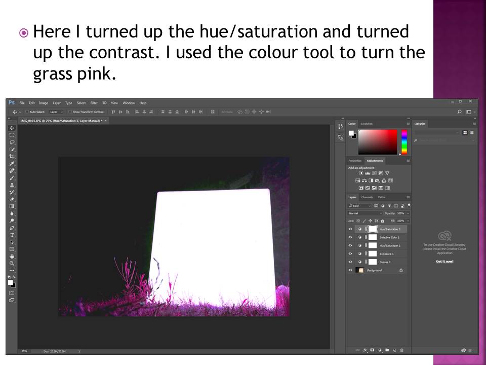
I also increased the brightness of the block and the contrast against the background to give the image a greater depth and again to highlight the block.

I then turned the pink/purple hue up to change the color of the grass giving it the luminous effect it has now. This increases the contrast between the colour of the grass and the cube which makes the image more powerful.

White Paper Challenge

Intro

The idea of abstract photography revolves around perception. The eyes perception of a given object. In this exercise, I have explored the idea of manipulating the appearance of a plain white piece of A4 paper and creating many different looks to it and ways of viewing it. I have utilised studio lighting to create shadows and I have either folded, Scrunched up or torn the paper in order to create images that show a wide range of shape, texture and contrast.

I have decided to desaturate every image in Photoshop and alter the brightness, contrast and exposure separately on each image to really highlight the shape, texture and shadows given off by this effect

Here are my outcomes from the Project below presented in a contact sheet

Contact sheet

I used an off-white coloured table with a black wall as the background. I utilised a box light and altered the white and yellow lighting from shot to shot to give off the effect of natural and artificial lighting.

Outcomes and analysis

I like the minimalistic values of this image, Mainly due to the shadow cast by the piece of paper and it generally creating a nice aesthetic.

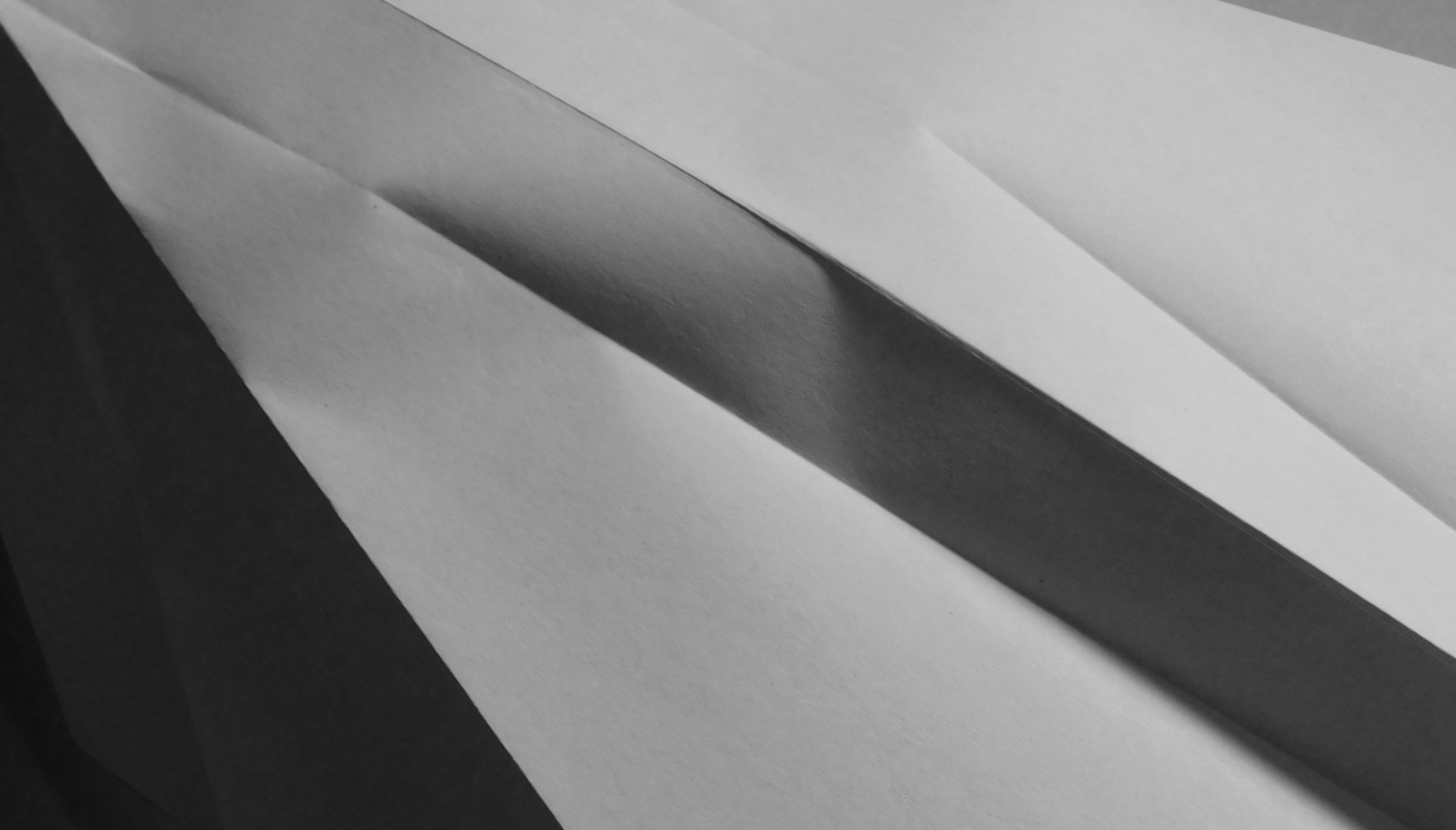
With this image, I am particularly drawn into the neat folds in the paper and the sharpness of the image. The folds are almost there to separate darker parts of the paper from the light and creates a very nice contrast and rich tone.


For this image, I decided to pinch the piece of paper and twist it around, Which has created an interesting blend of contrast within the paper itself as well as provided an interesting shape and shadows.

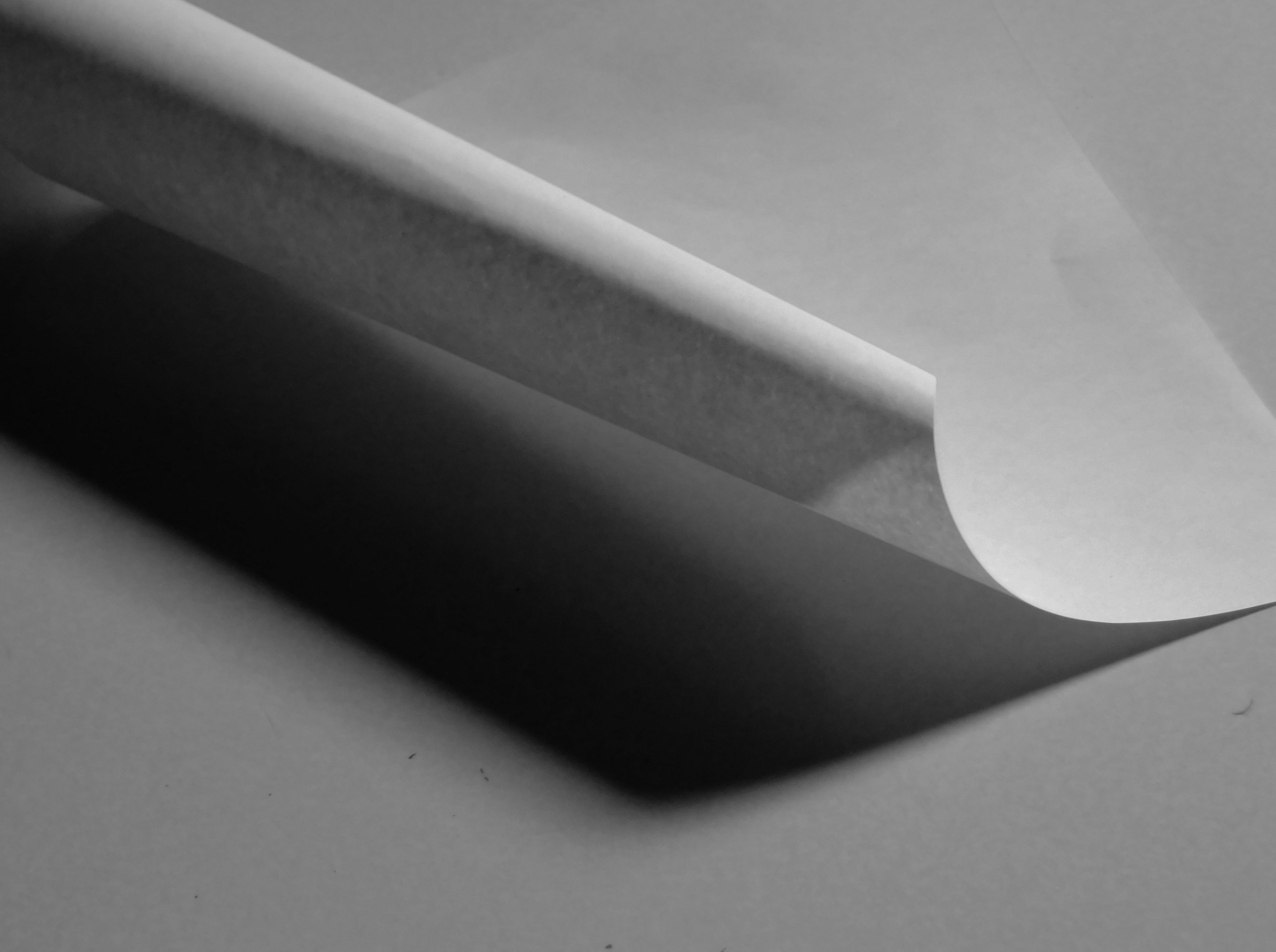
The paper has been rolled adn let to unroll and the resulting curl provides quite a dramatic image with a very good blend of shadows and light levels.


Claude Cahun and Clare Rae Exhibition

Clare Rae is a photographer based in Melbourne, Australia. Her work is inspired by feminist theory, and presents an alternate and often awkward experience of subjectivity and the female body, usually the artists’ own.

Claude Cahun was an avant-garde queer artist and writer based in Jersey CI. She was a self-portrait photographer and writer, and these photos and texts heavily influenced artists dealing with questions of gender identity.

Our photography group went to the CCA Gallery to look at both artists photos, and I was very impressed. I really loved both artists interpretations in abstract photography.

Top 4 Favourite Claude Cahun photos
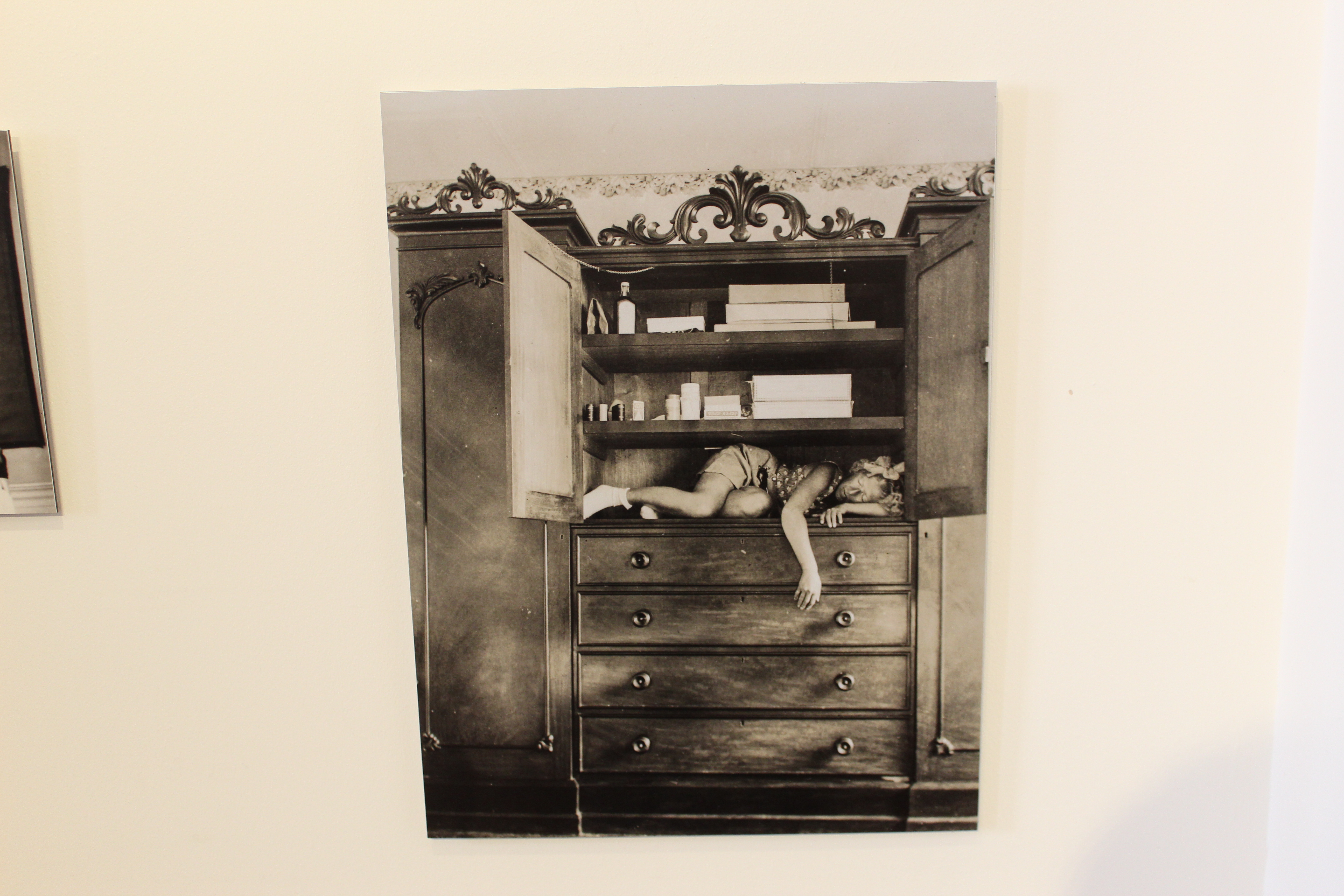
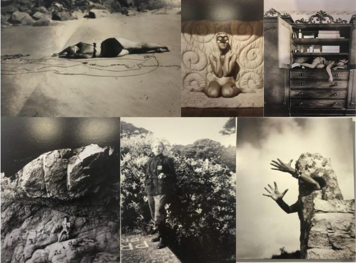
Claude Cahun – ‘Self portrait (in cupboard)’

This first photo really stood out to me because of how the girl is placed in the cupboard. She seems to be very squished and uncomfortable, which gives it a eerie and sad look to the photo. I think this photo was taken and executed very well.
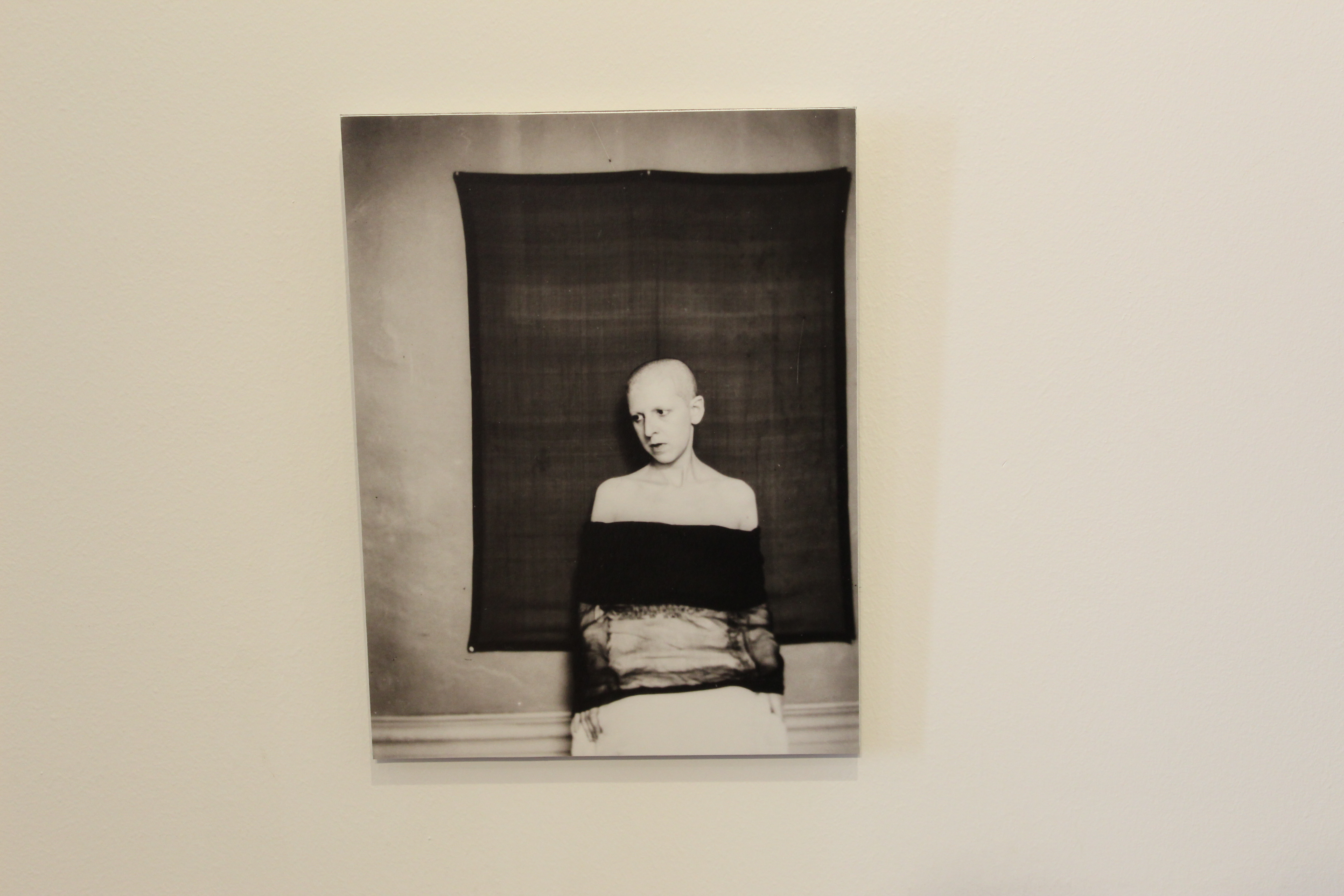

Claude Cahun – ‘Self portrait (shaved head, material draped over body)’

This next photo is very different and unique and I really like it.  I really like the contrast of the white wall and the black sheet behind her. Her expression also works well because it is very neutral and black, so it compliments the feel of her clothes and the background.
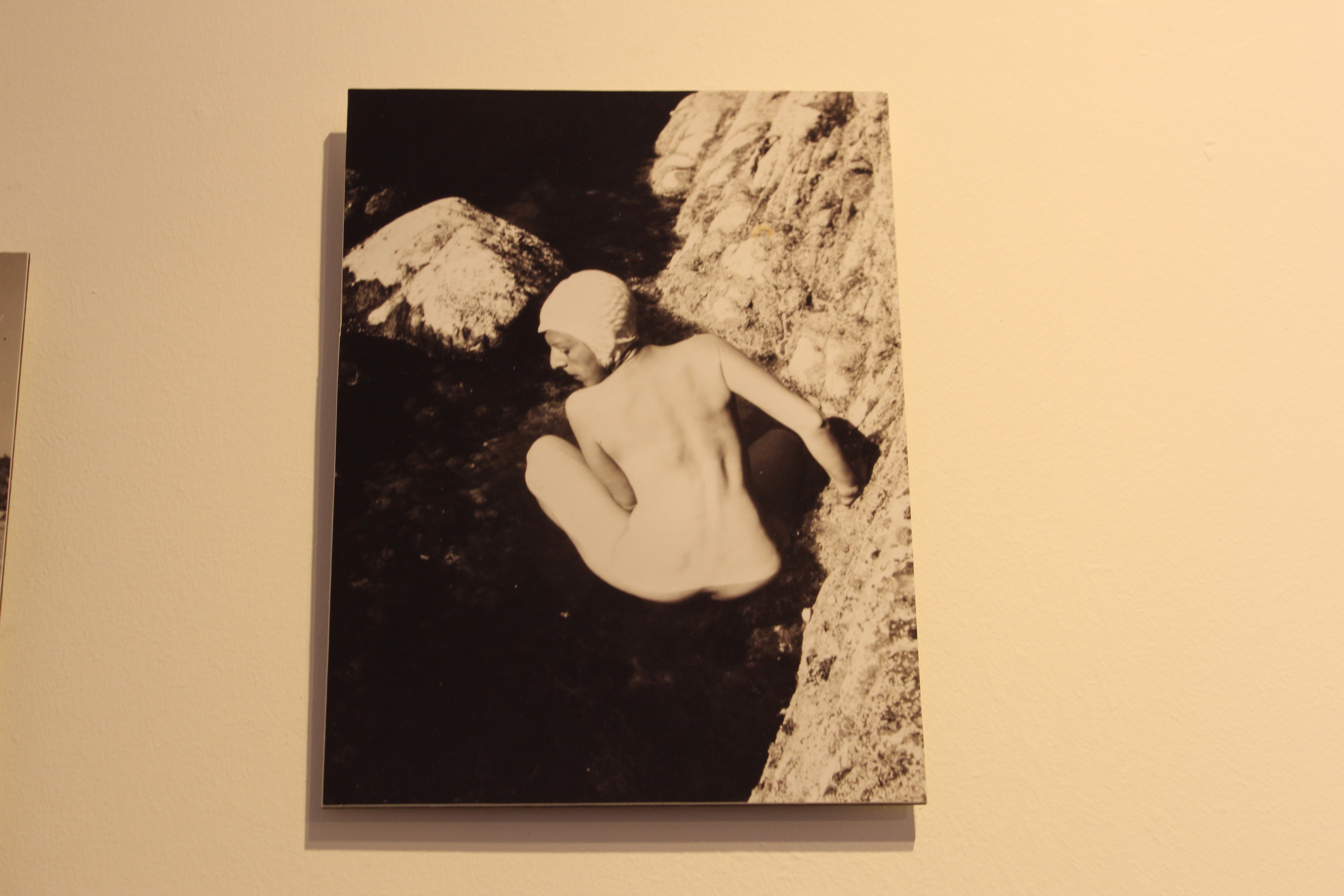
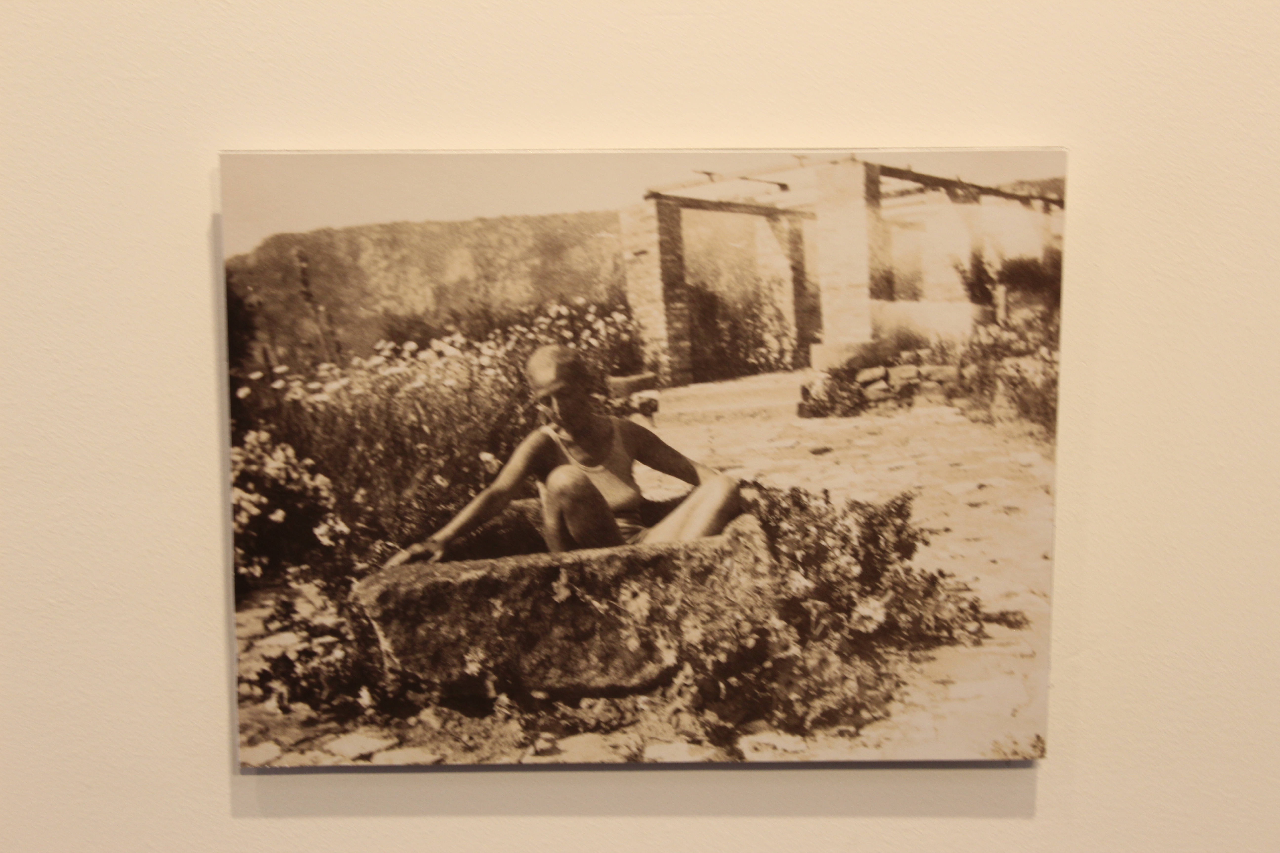
Claude Cahun – ‘Self portrait – crouched naked in rock pool)’

This photo really stands out to me because she is not afraid to be naked and express herself, which I really like because in those times expressing yourself wasn’t really “normal”. This photo works really well because her expression and stance is very soft compared to the rigid and sharp rocks, it gives a very good contrast.
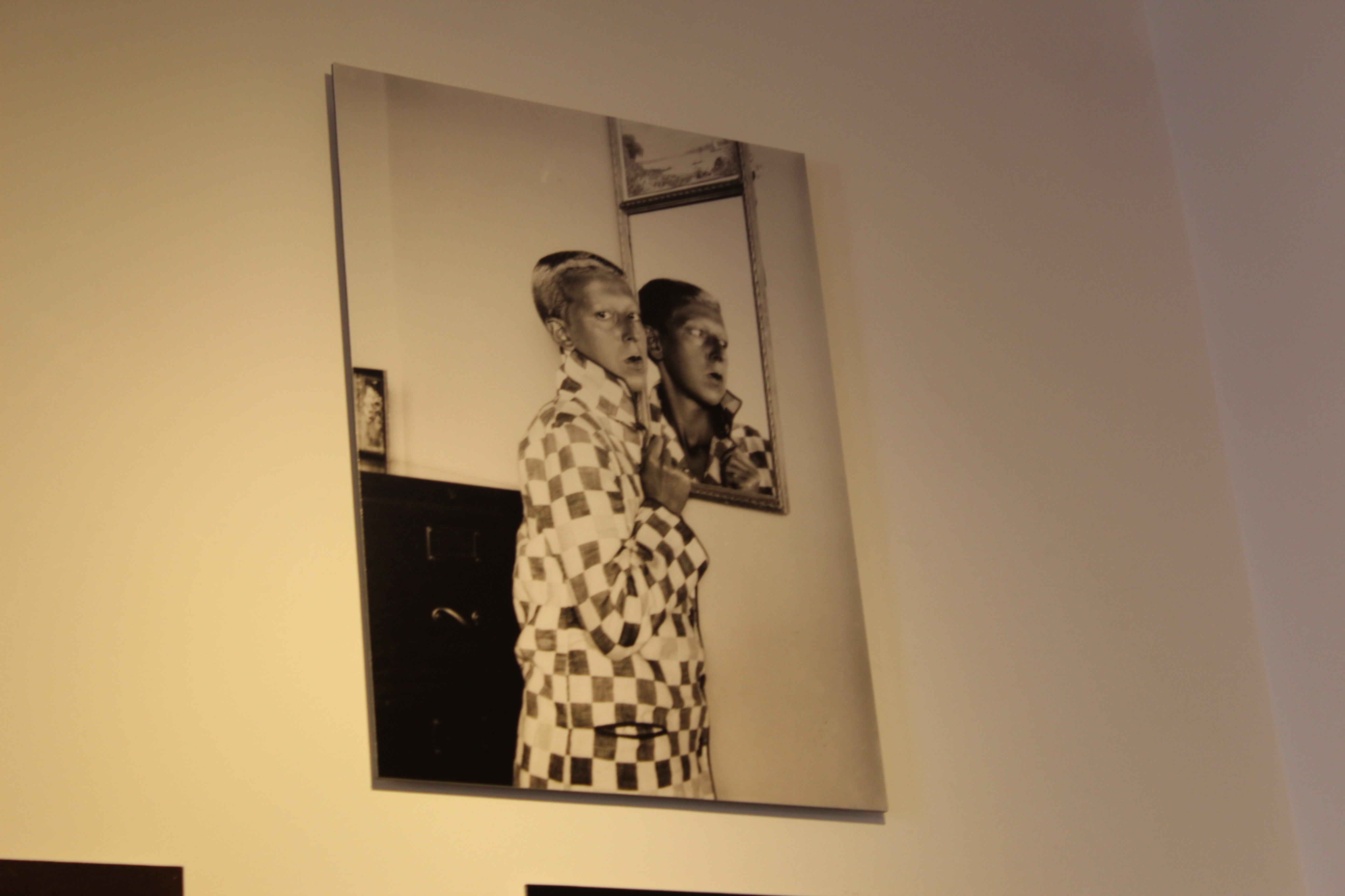
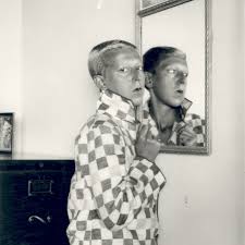
This last photo was very well executed and captured very well. I really like how she looks at the camera with a blank expression (which she does in most of her photos). I also really love the use of the mirror in this photo.

Top 4 Favourite Clare Rae Photos
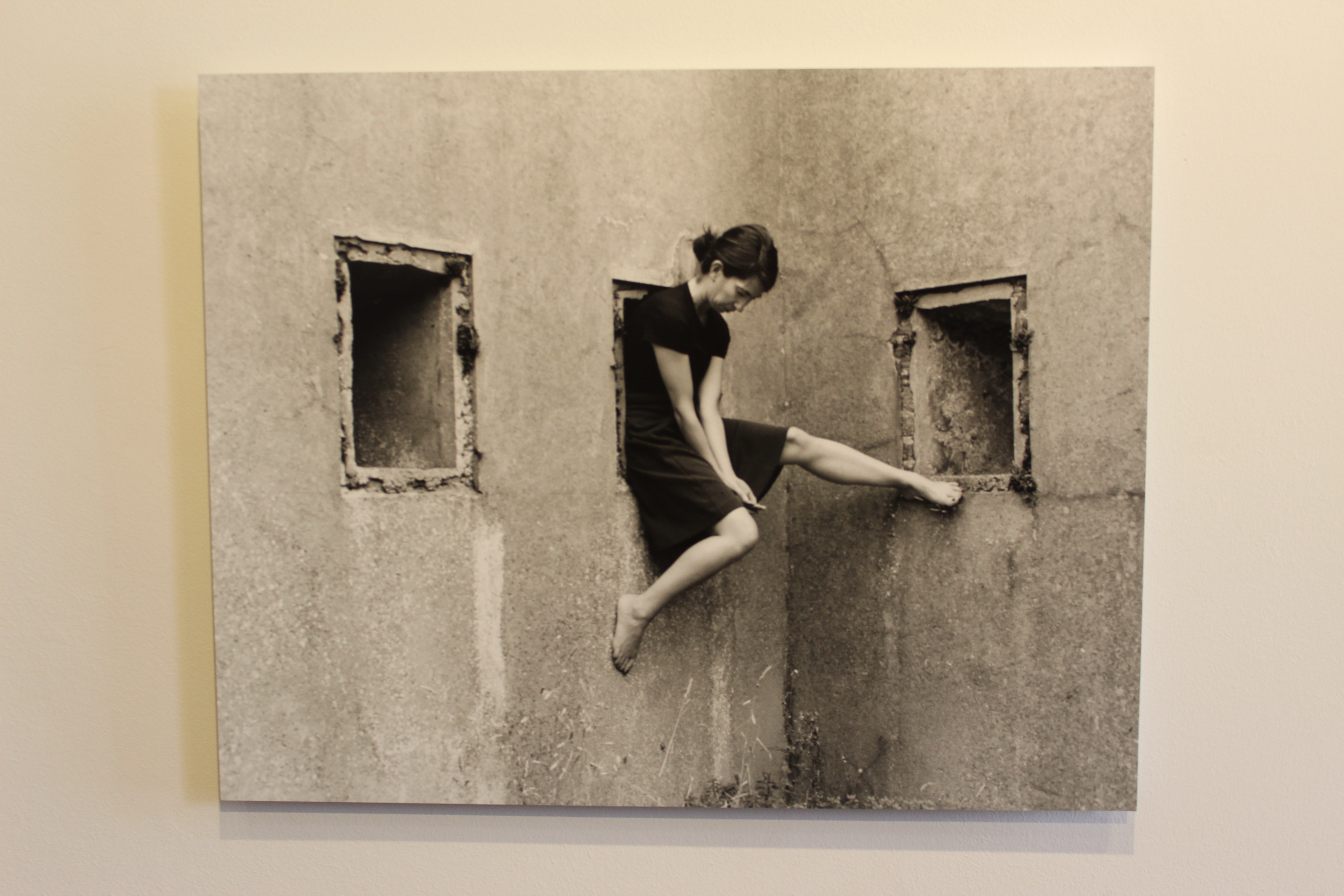
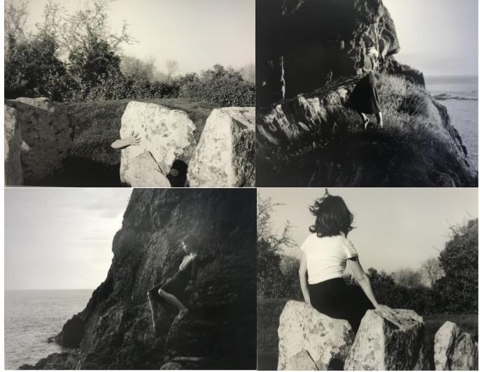
This photo works very well because the way she sits in the hole makes her look uncomfortable, but her body seems to maintain a very graceful and soft posture. I really like this photo.
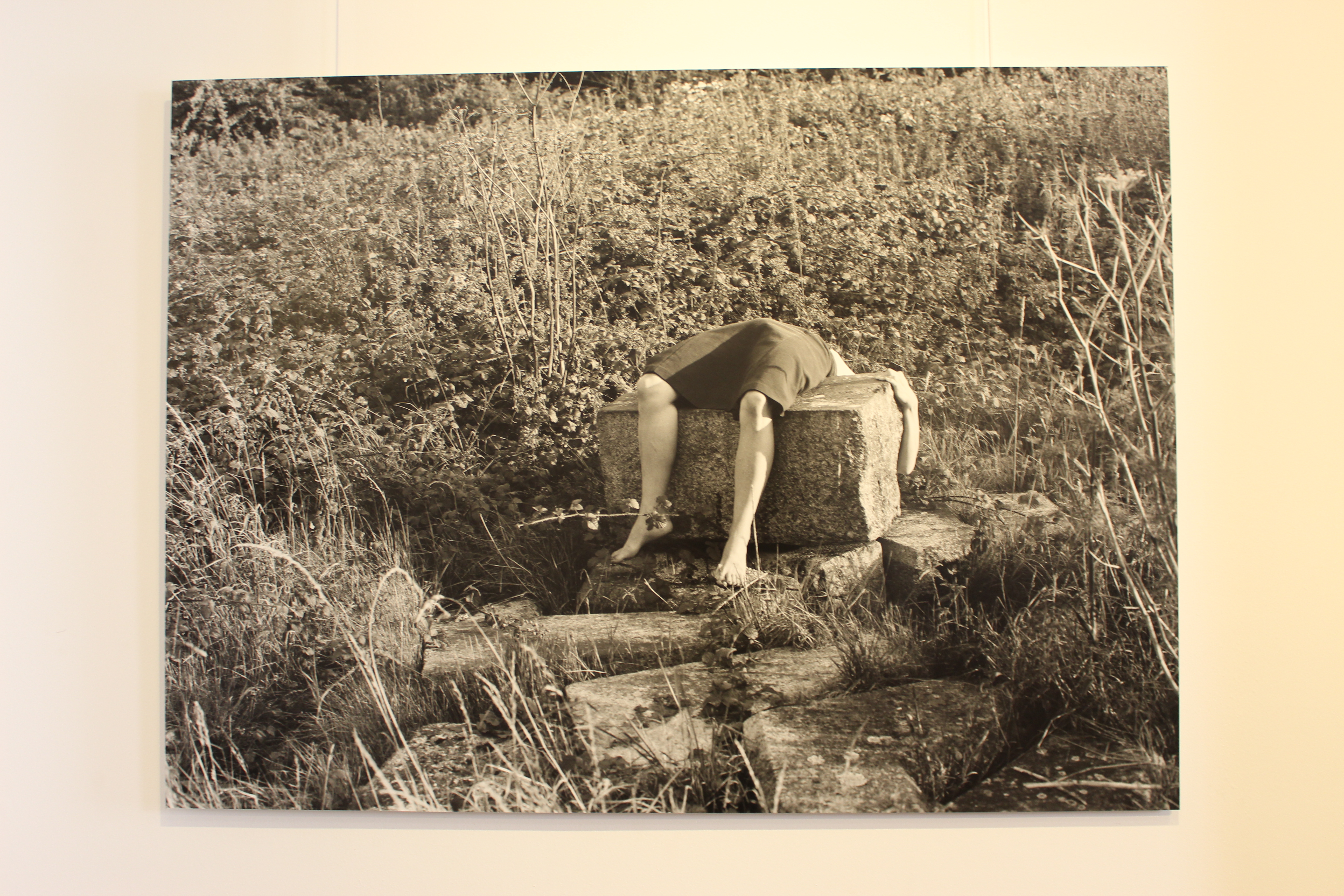
This photo is one of my favourites from Rae. I really like the way she is almost draped across the rocks. The position of her body again looks uncomfortable which works really well.
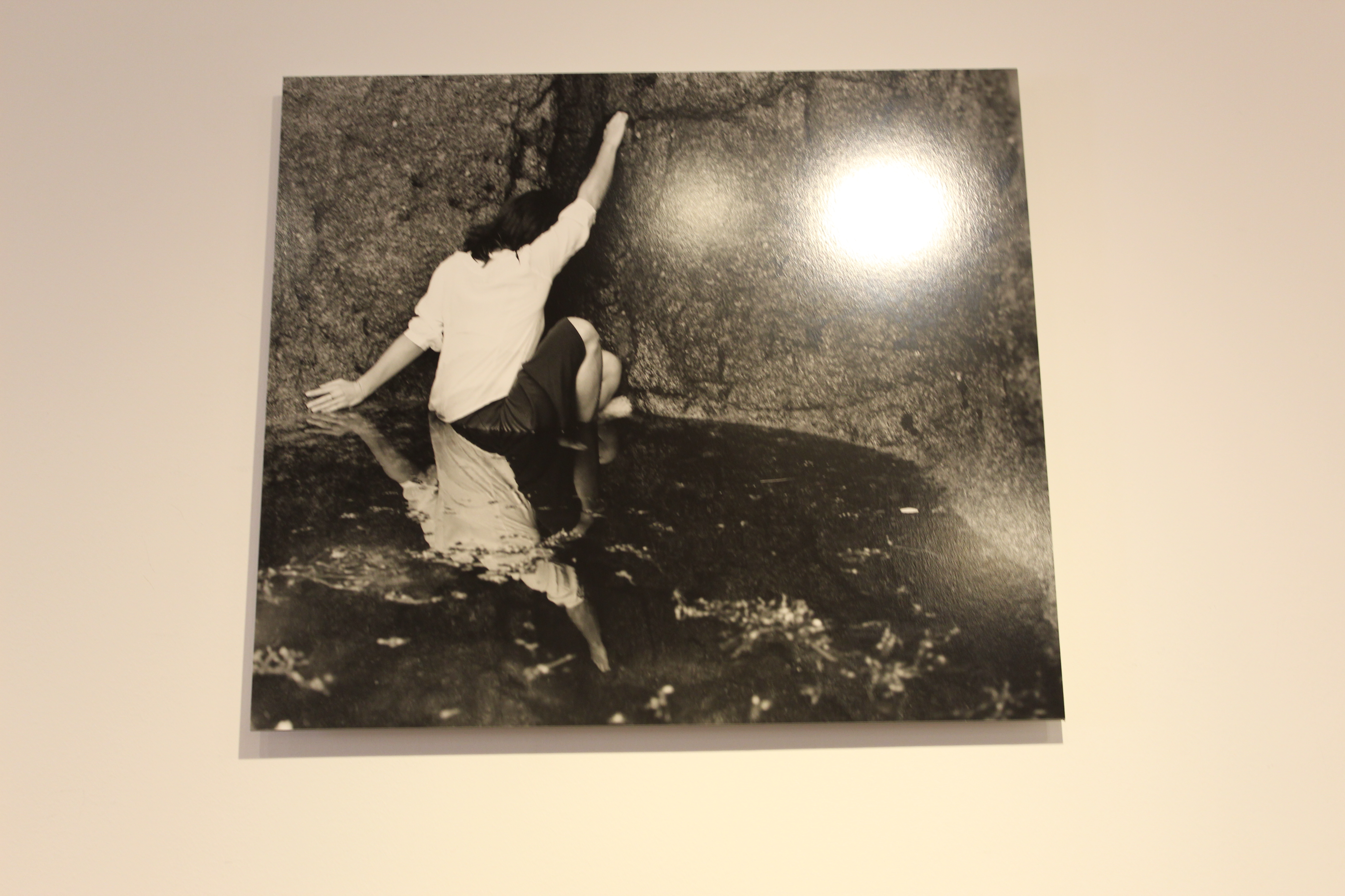
This photo is a very good interpretation of Cahun’s photo of her in the rock pool. I like this photo better than Cahun’s because she looks like shes in danger or that she’s struggling to get out. This photo was taken very well.
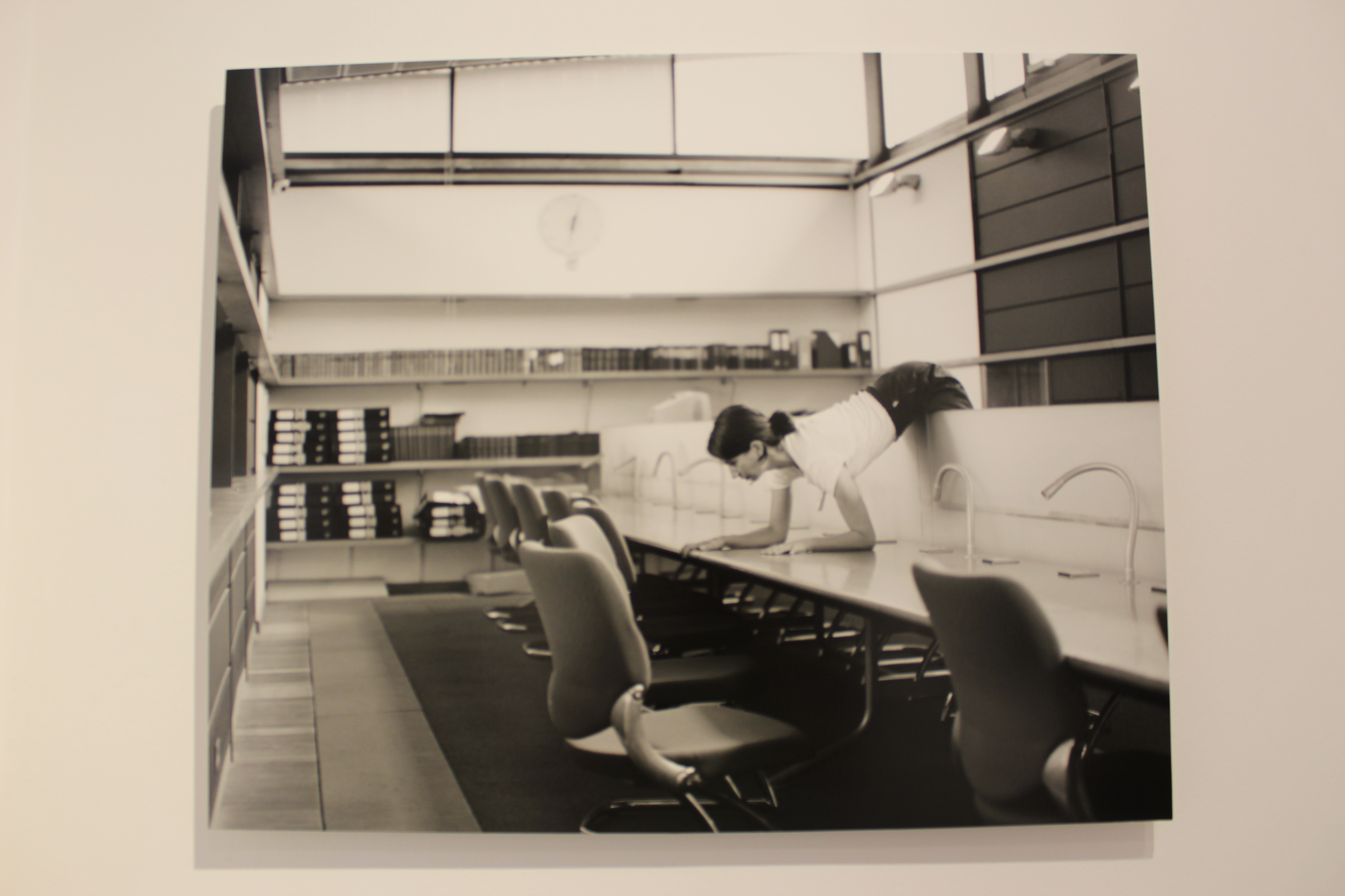
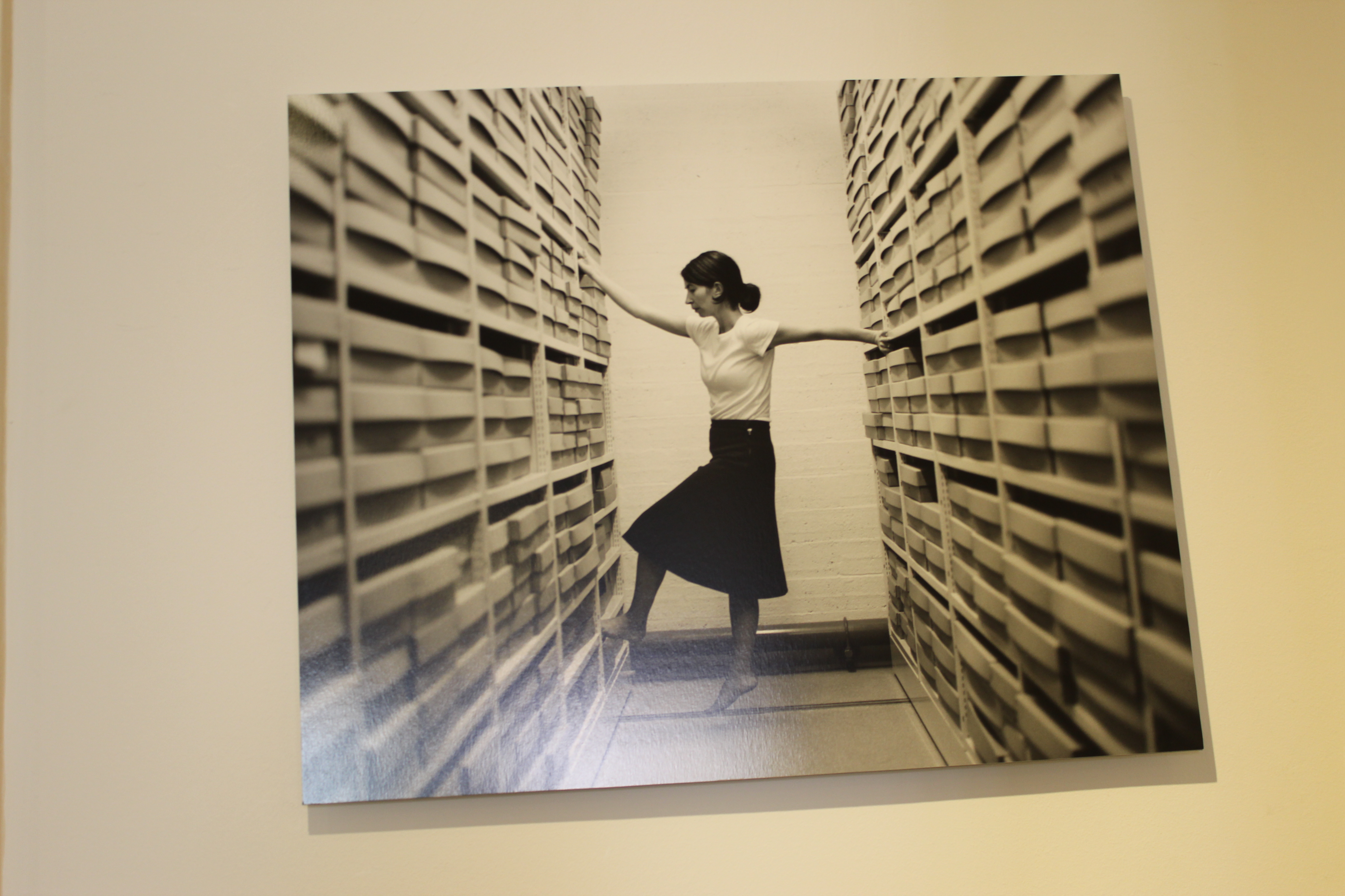
This last photo really stands out to me as it appears that she is in an office. I think this photo is implying the struggles of working in offices that are always busy and packed. The position her body is in is very abstract and contorted, it kind of looks like she is pain. I really like this photo.

Other Photos
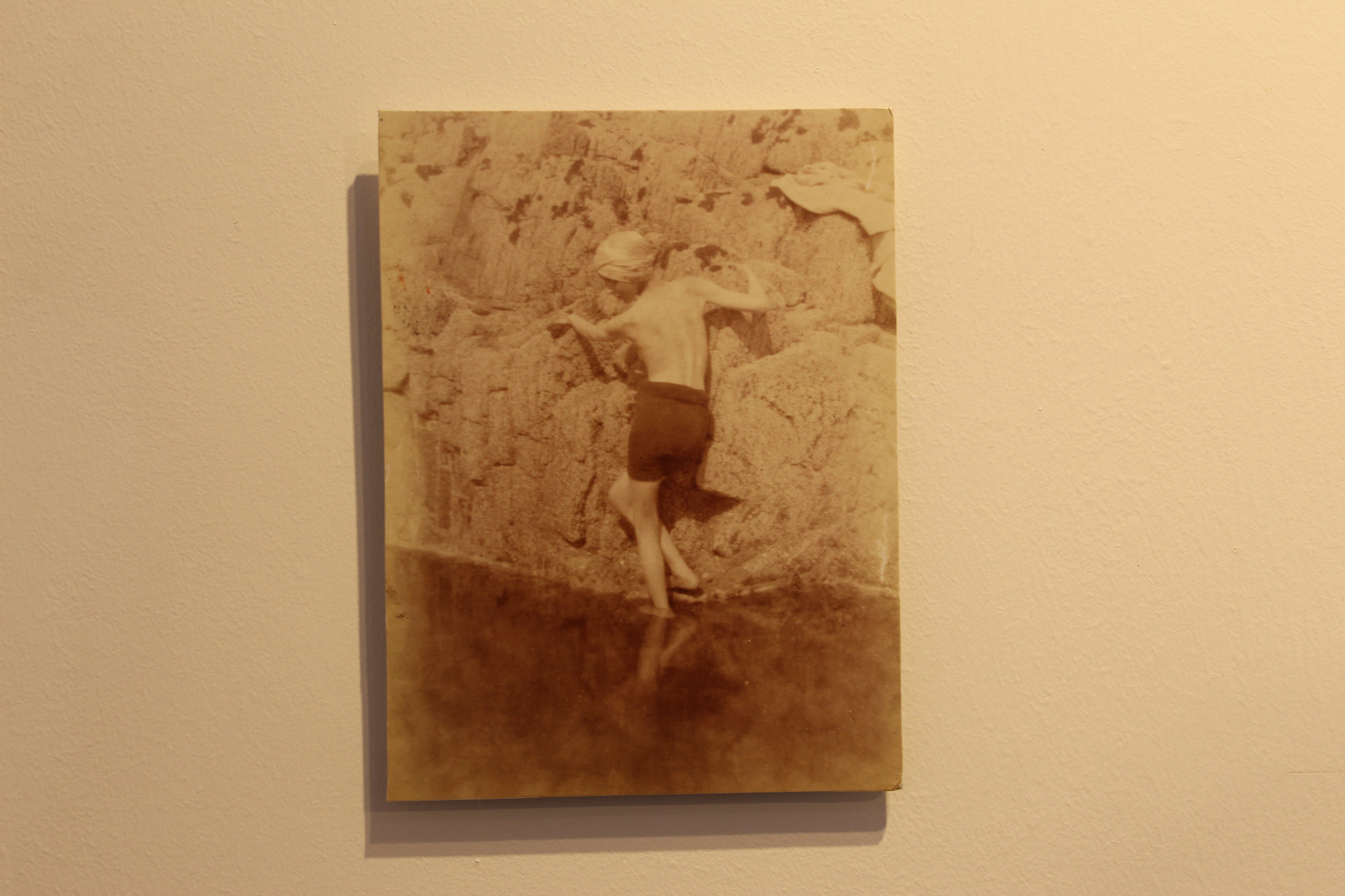
I really enjoy both artists photos and how they both interpret this style of taking photos. I think they both take very amazing and unique photos, I hope to try this style and get a similar vibe when I take my own photos.


Focus on Focus – Mini Hand Shoot 3

Here is another example of one of the hands that I photographed. I used a portrait lens and because I haven't used a portrait lens before I have just had to experiment with it. The autofocus was a bit strange on this camera so I had to shift between auto and manual focus throughout this shoot. I really liked the focused photos in this photo and like the depth given by the unfocused background.

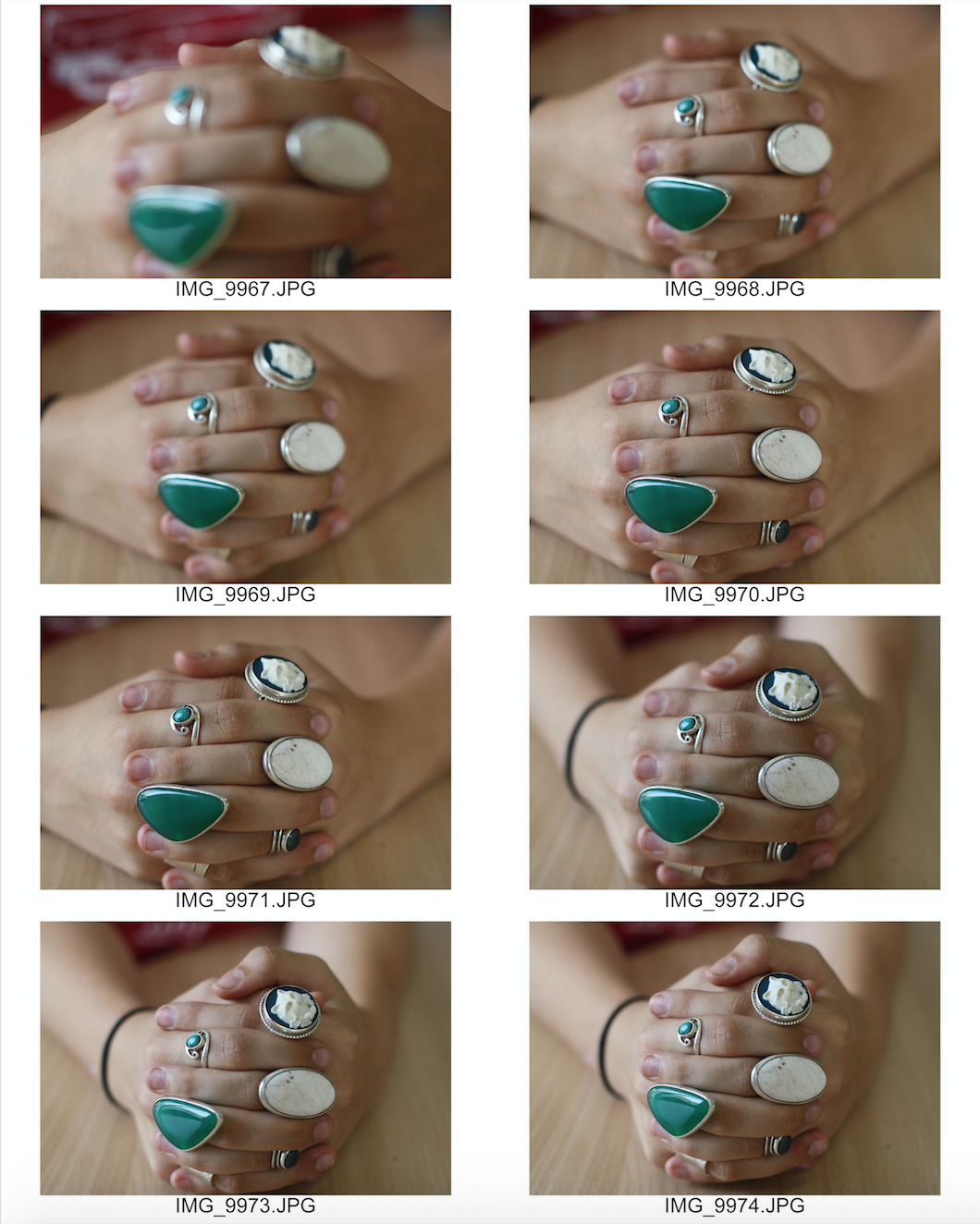
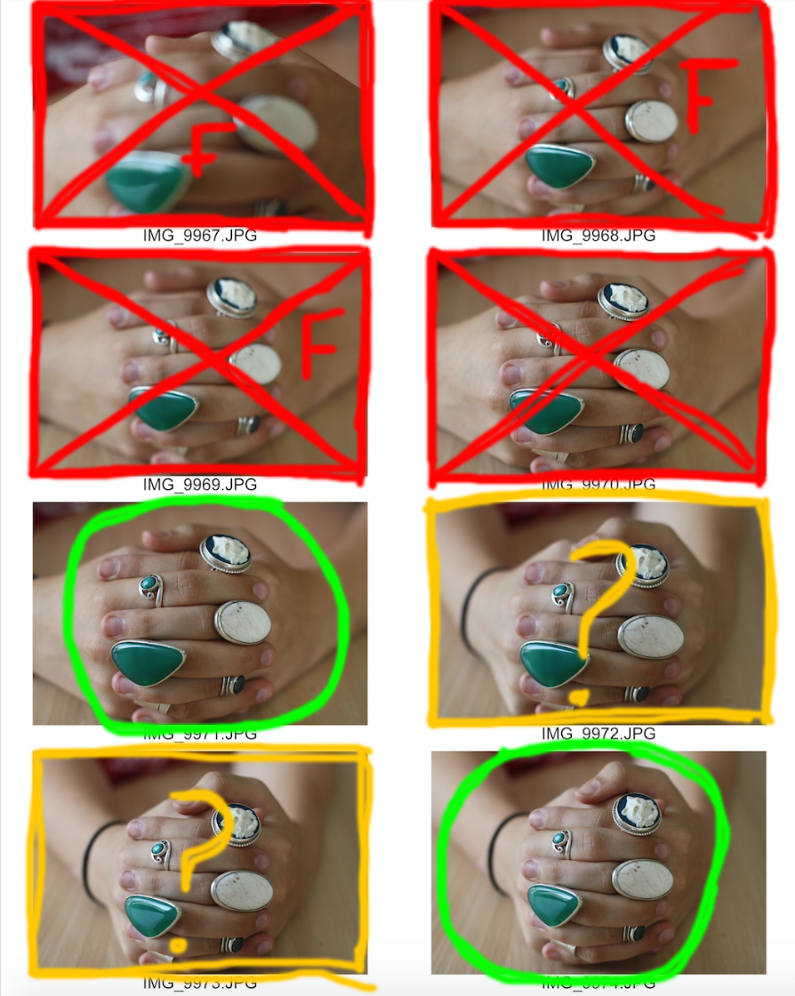
Here is my contact sheet on the images:

This is my contact sheet with the few images I have selected to edit. 

Green circle - An image I would like to further use. 

Red cross - An image I would not like to use. 

Red F - The image is out of focus. 

Red shading - The part of the image I would like to crop out. 

Yellow question mark: An image I am unsure whether to edit or not. 

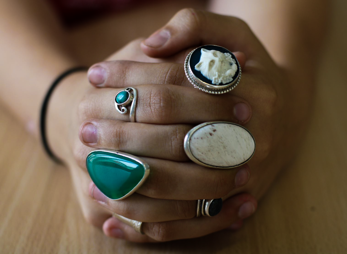
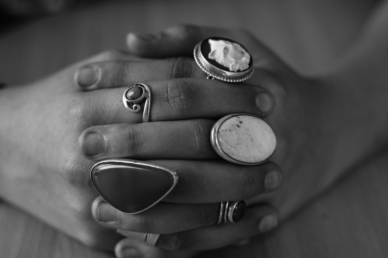
Here are my final images:

I manipulated these images using adobe lightroom. 

For the first image, I slightly increased the clarity and shadows of the image, then I lowered the exposure and highlights until I thought that the image was aesthetically pleasing I think the reduction in background highlights brought more attention to the focused hands and rings.

For the second image, I applied a black and white preset, reduced the exposure and highlights. I then slightly increased the clarity and shadows of the image.