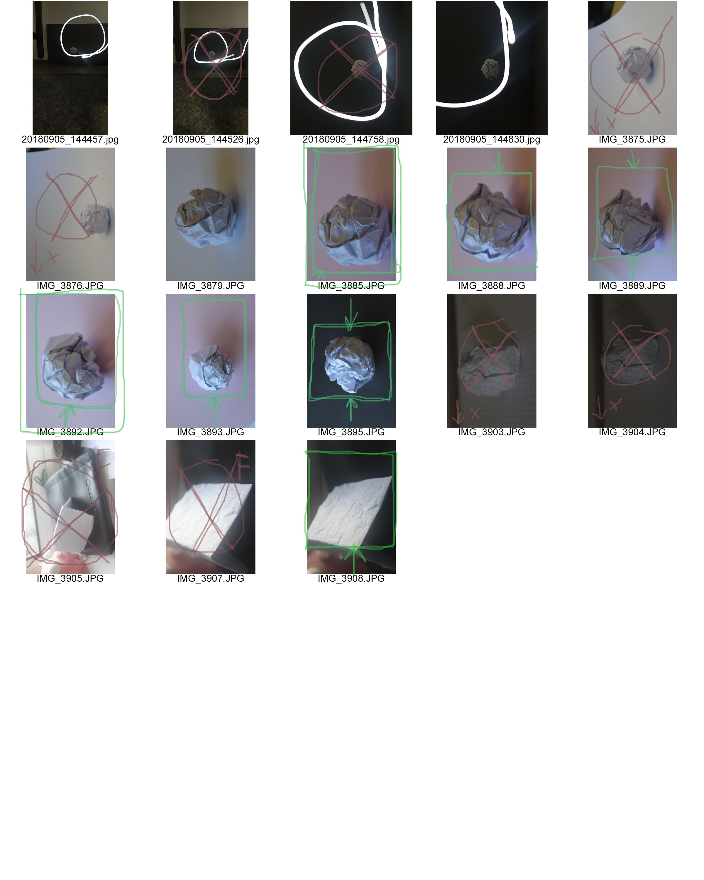
Contact sheets consist of several thumbnail photos printed on a single sheet of paper, so you can view them all at once; this can be useful as it allows you to help chose which of your photographs you want to keep/discard/edit
The RED represents the images I want to discard and I am not happy with.
The GREEN images are the photograph I am most happy with and that I believe do not need changing/editing
The YELLOW images are the photos I am not sure and possibly need editing.
- The YELLOW boxes are representing photos that I need to crop
- The YELLOW questions marks are the ones that I haven’t decided whether to keep
- The YELLOW circles are the images that need editing
Why do people produces contact sheets?
People create many contact sheets after a photo shoot in order to layout and see all images that they have created. this will help the photographer be organised with their images and help then figure out their best images from their worst images. Contact sheets make editing much easier. Editing is the process of the selection of images that will compose a photographic body, which will respond to the specific purpose of the works compete. By using contact sheets its giving editing a whole new experience of the photography workflow. Contact sheets are pages that contain thumb nails of your photo shoots all displayed so its much easier to see all your photos at once. This process is made image comparison much easier.

