The new objectivity was a movement in German art that arose during the 1920’s as a reaction against expressionism. The term was invented by Gustav Friedrich Hartlaub, the director of the Kunsthalle in Mannheim, who used it as the title of an art exhibition staged in 1925 to showcase artists who were working in a post-expressionist spirit. These artists included; Max Beckmann, Otto Dix, George Grosz, Christian Schad and Jeanne Mammen.
Although principally describing a tendency in German painting, the term took a life of its own and came to characterize the attitude of public life in Weimar, Germany as well as the art, literature, music and architecture created to adapt to it.
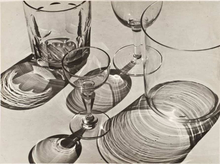
Albert Renger-Patzsch was a German photographer associated with the New Objectivity. Renger-Patzsch was born in Würzburg, Germany and began making photographs by the age of 12. In it’s sharply focused an matter of fact style of his work exemplifies the aesthetic of the New Objectivity movement that flourished in the arts of Germany.
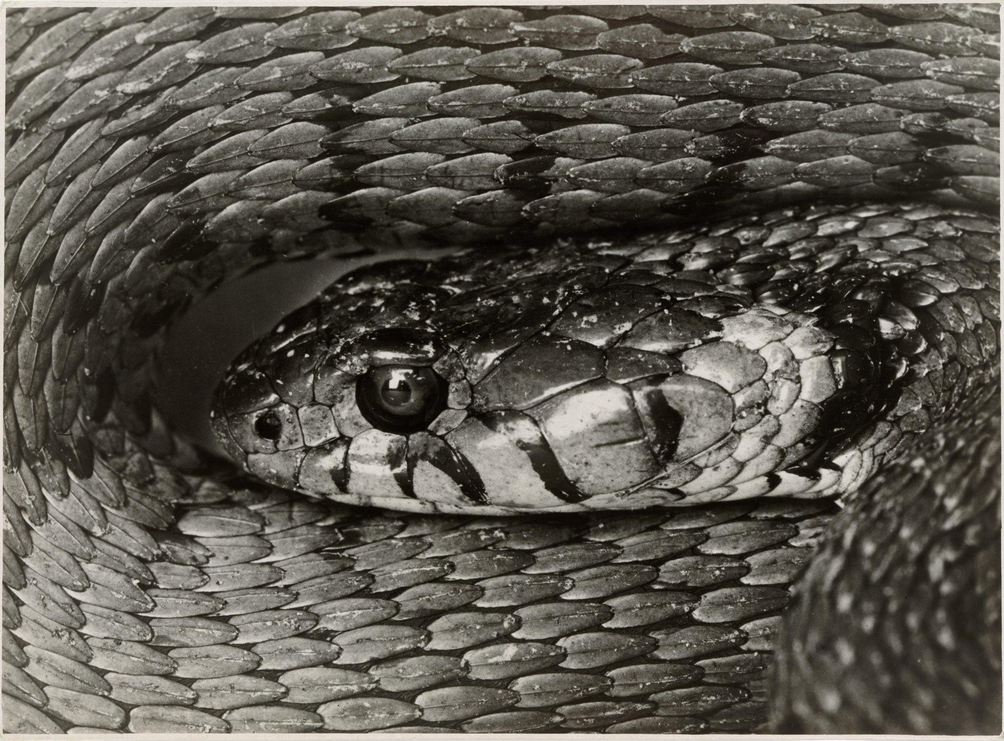
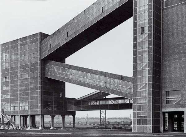
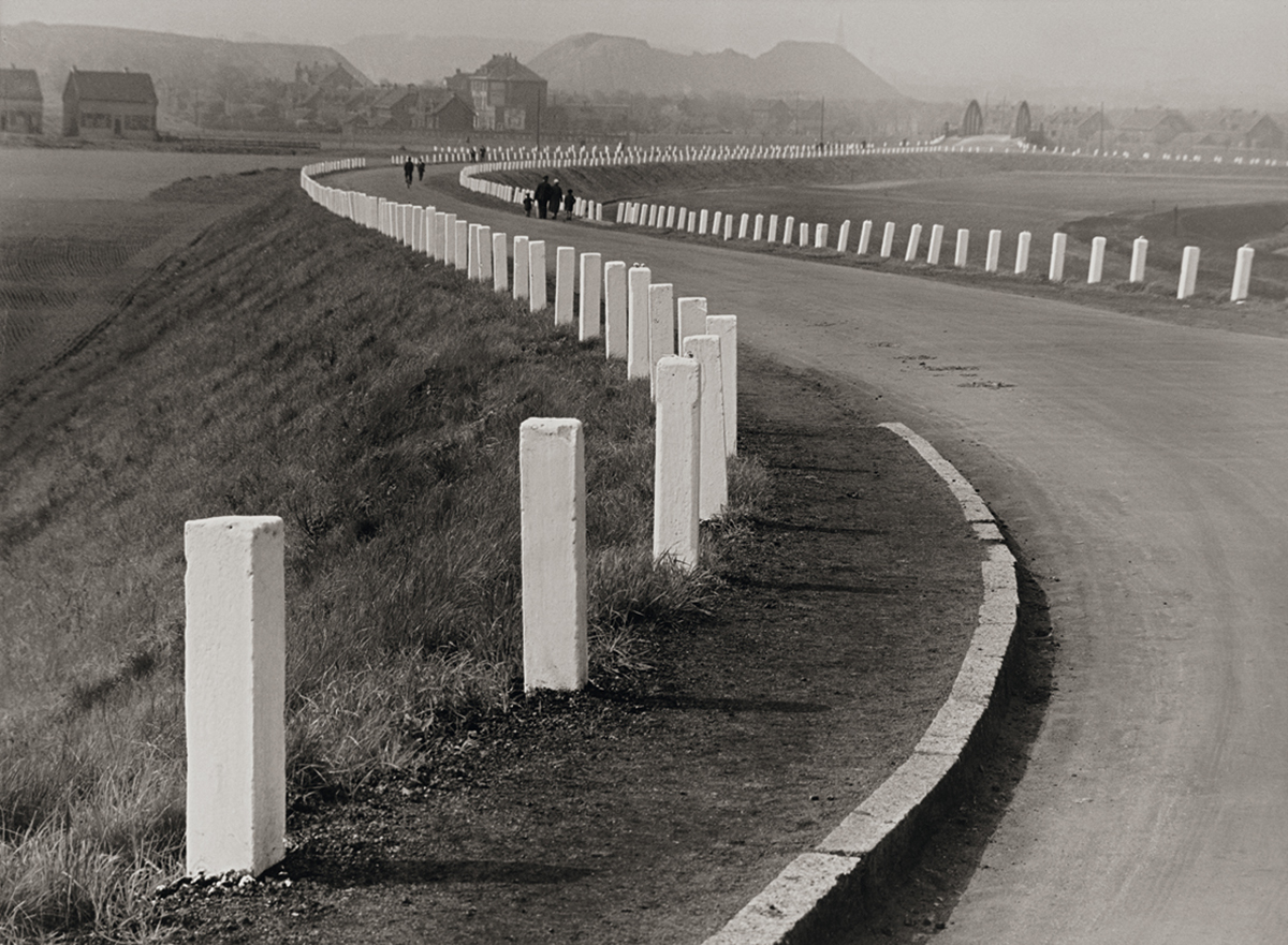
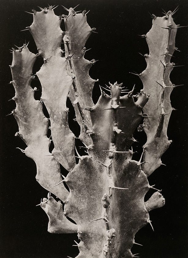
In this topic of New objectivity I started focussing on Albert Renger-Patzsch, this is because of his take on New objectivity. He mainly takes photos of inanimate objects such as; Plants, Buildings, roads and glasses, but has also taken photos of snakes. He then uses the expulsion of colour from his work to give the atmosphere an eerie and spooky feeling, this creates a dramatic feeling within the person looking at the photo.
I also like his work as it rejects the sentimentality and idealism of a previous generation emerged as a tendency in German art. Renger-Patzsch’s work demonstrates a his sustained interest in the camera’s relationship to the beauty and complexity of the modern world.
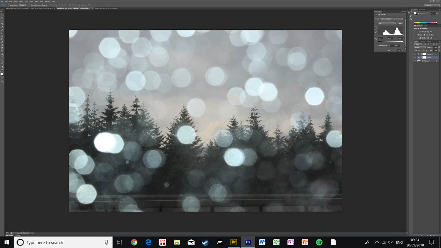
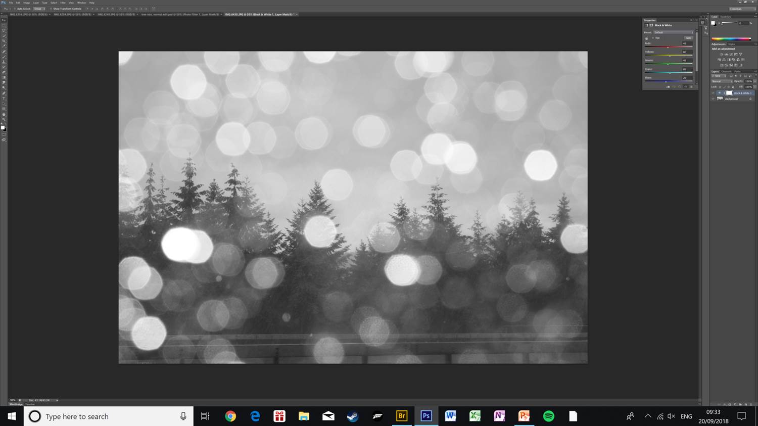
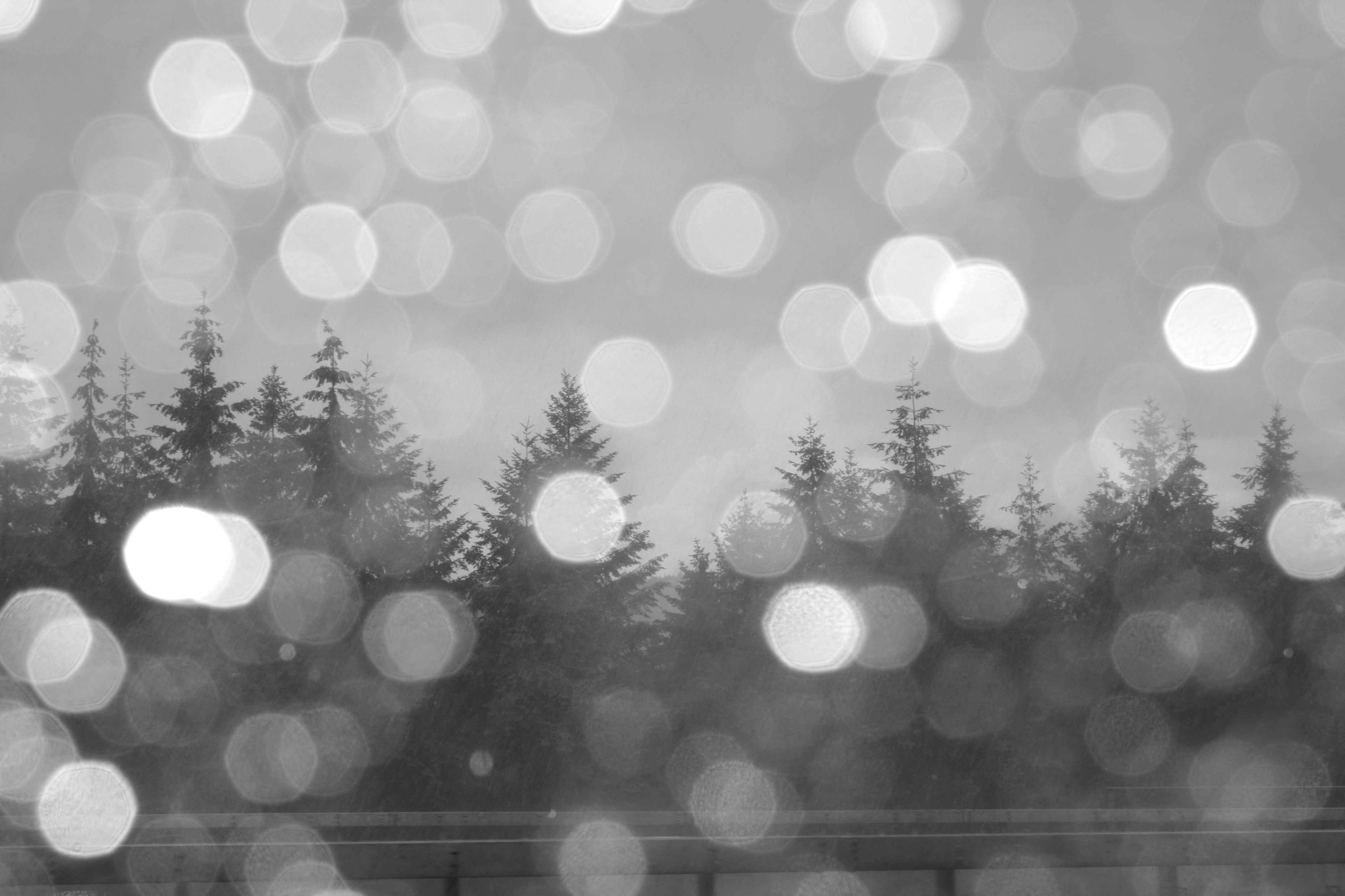
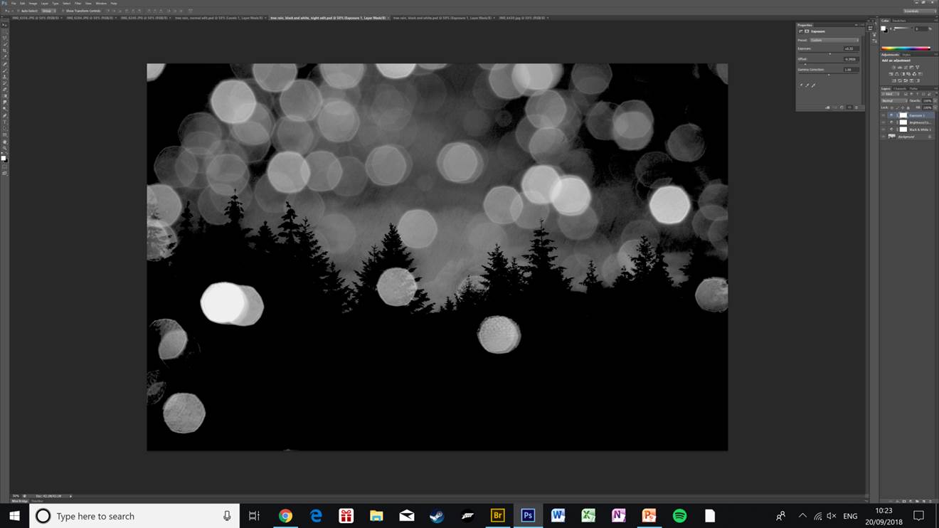
Here are some of my favourite photos of examples of New Objectivity.