Paper Photography

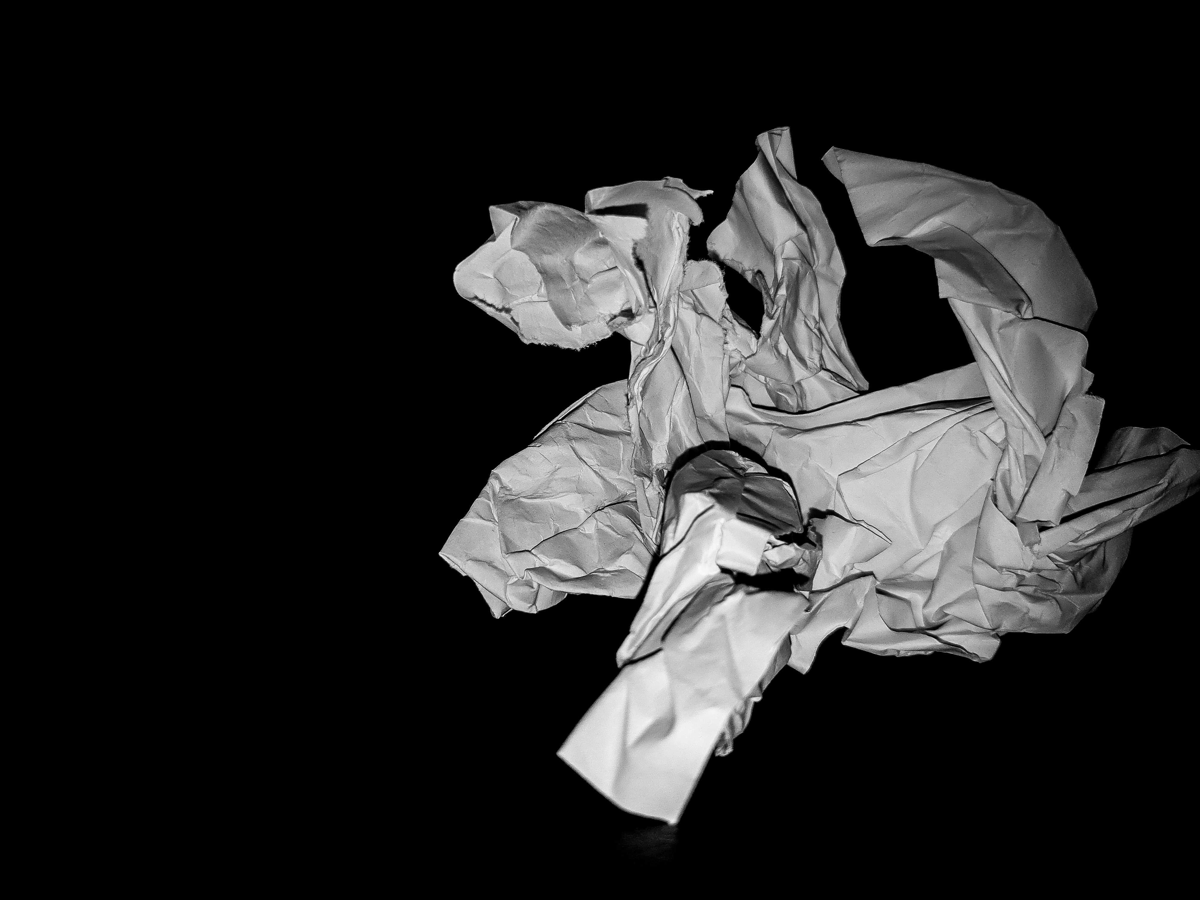
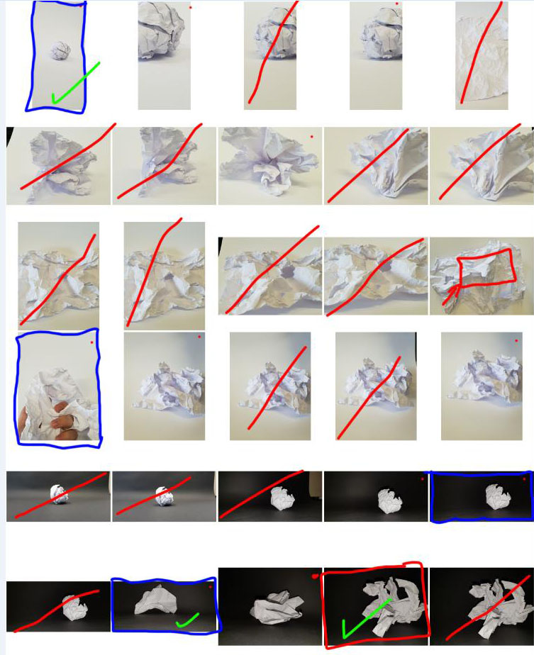
When i first started this project, i was not sure where to begin. i tried to emulate the work of Martin Creed using a scrunched up paper ball on a white background to emphasize the shadows and lines that it creates. I then tried taking pictures of ripped up paper but i feel like it didn’t give the ragged effect that i was looking for. the next day i decided to try it with a black background and i feel like this worked much better as there was a very high contrast between the black and white paper.

I wanted the lines and creases of the paper to be a similar shade to the black behind it to create a 3D image of sorts. As you can see below it worked with varying degrees of success.

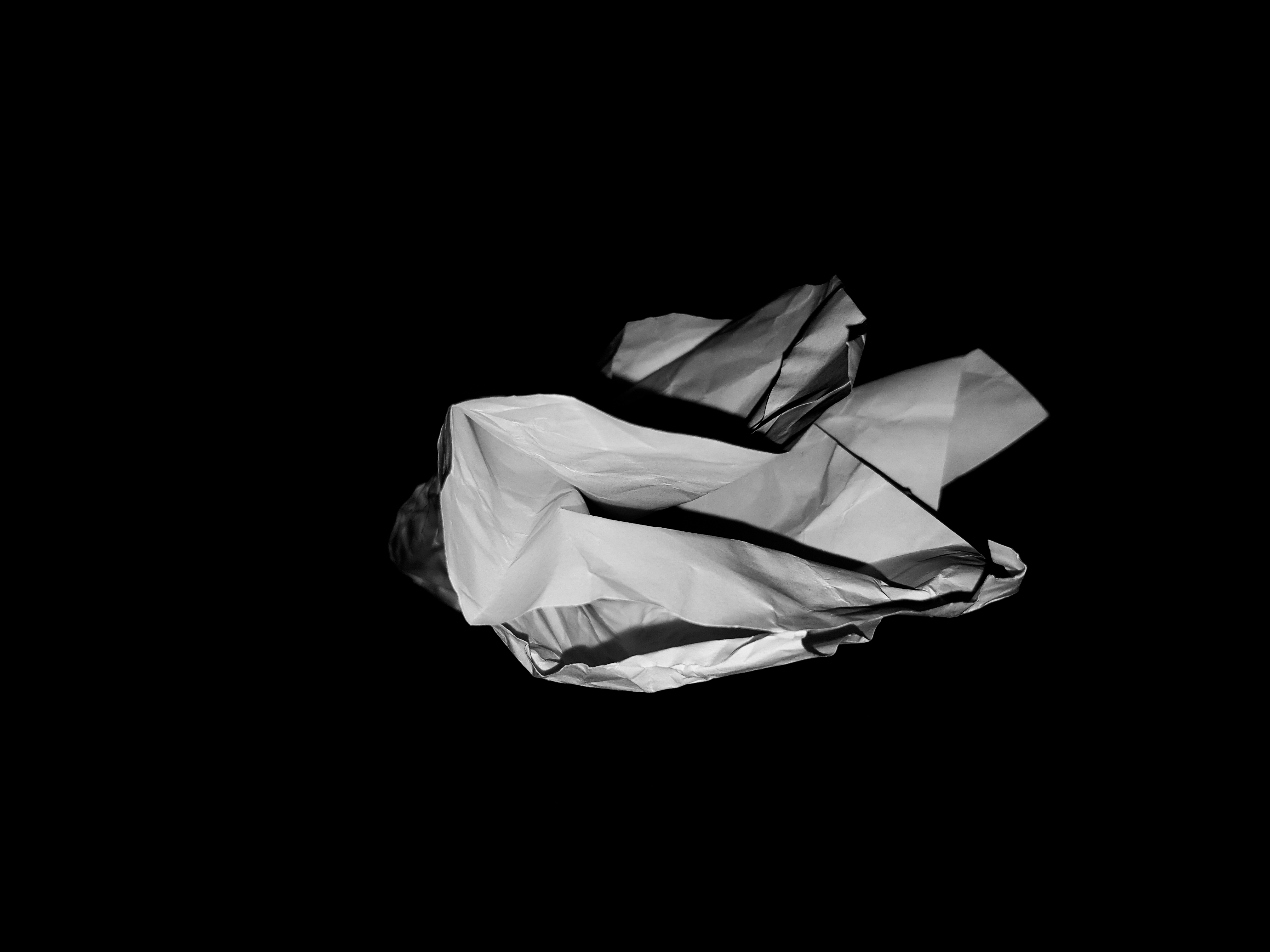
I decided to use the flash to take this picture and i like the effect of the shadows that make the paper look very 3D as you can see many of the subtle angles and creases of the paper. For many of the Pictures with a black background, i have increased the contrast and brought the exposure down slightly so that the paper looks like it is floating.

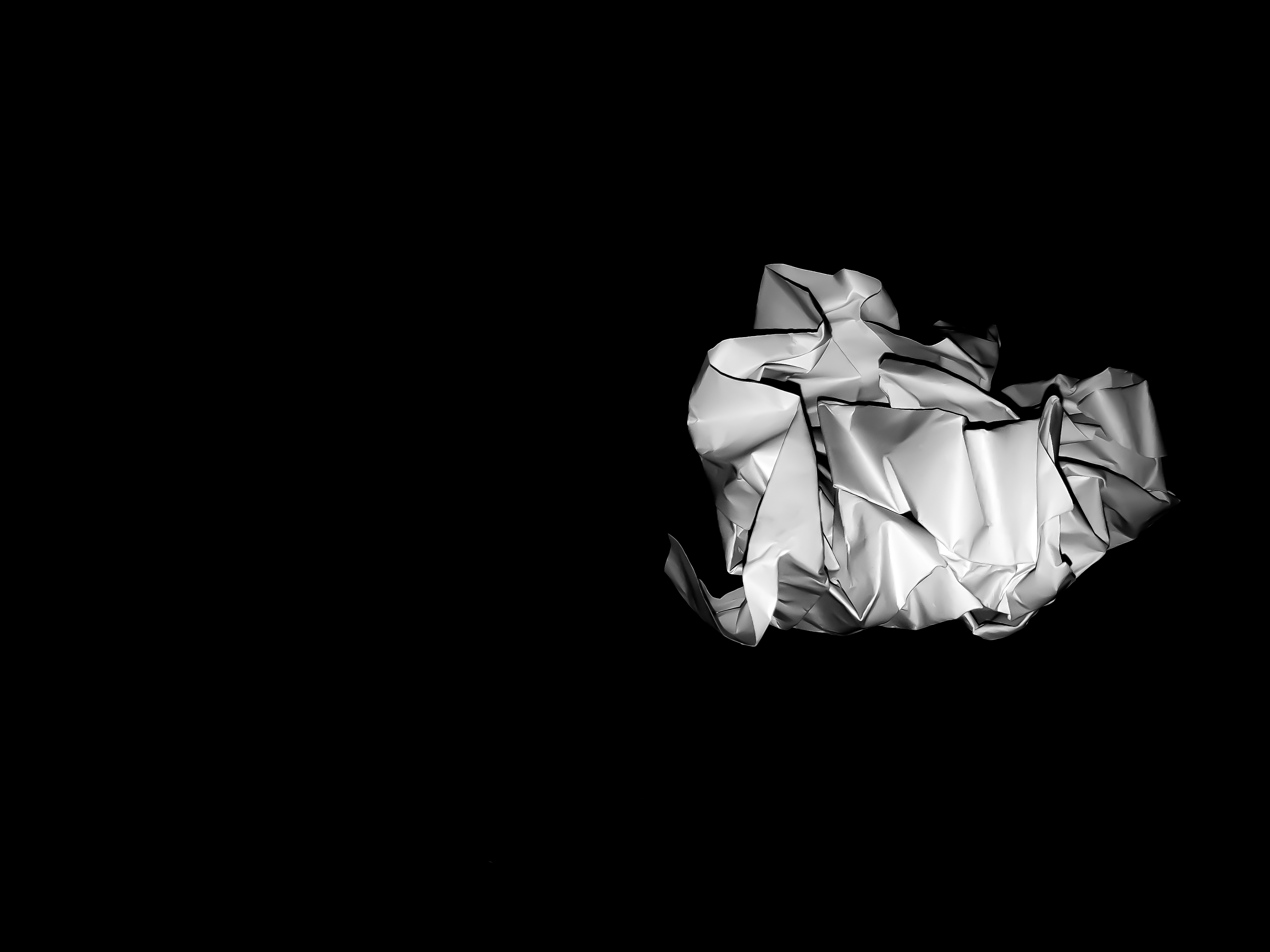
For this picture, i did the same as the previous photo and brought up the contrast, but decided to also decrease the color and vibrance noise, i liked the way it created the very smooth paper with no crinkles or as many imperfections as the previous one. i also like the way the paper was given a cell-shaded style by the reduction of noise and it creates a very unique looking image.

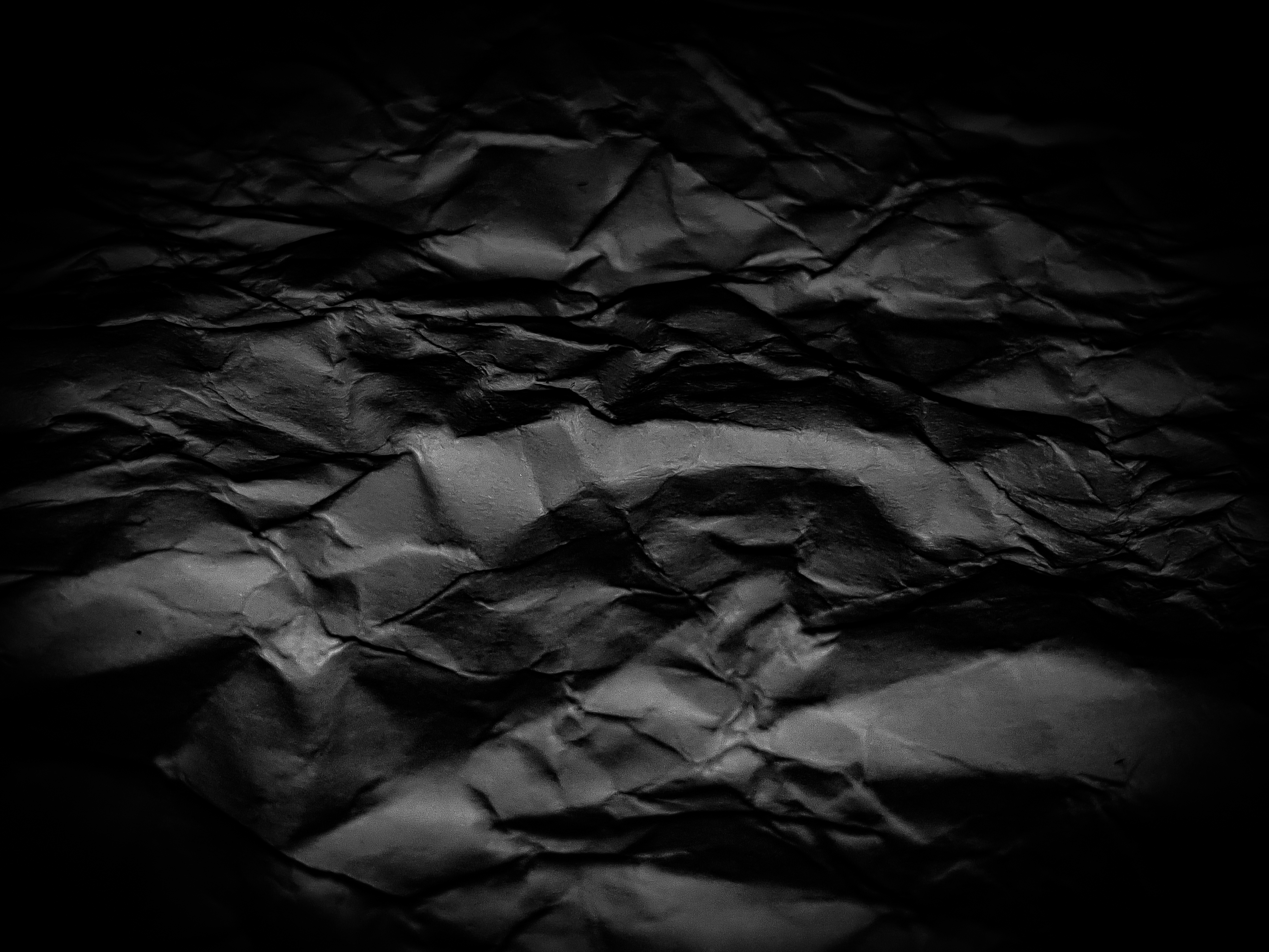
This image was one that i did not think would work as i simply didn’t think it looked particularly interesting. However, while editing, i decided to increase the amount of shadows and also contrast, then put a dark vignette around the edge to give it a more atmospheric look. i feel as though i have achieved the atmosphere that i wanted to create especially because of the abstract elements of the photo.

Pre-AS Summer Task

Aaron Siskind

Analysis:

– Uses close up framing to emphasise texture – this creates an abstract feel to real world objects.

– True to life yet also abstract photos.

– He found joy and tension in photographing subjects in such a way that other people were not used to.

– Used the rule of thirds in many of his photos – either symmetrical or main subject in each third.

– Combines straight photography with abstract means it creates a unique style of photo.

– Most photos have a high contrast between the black and white points.

– Many of his photos were taken using natural light

– His photos show a new way of looking at the world through a lens, and due to the nature of the framing, makes small details on the subject more pronounced.

– Often relies on shadows to create the darker points.
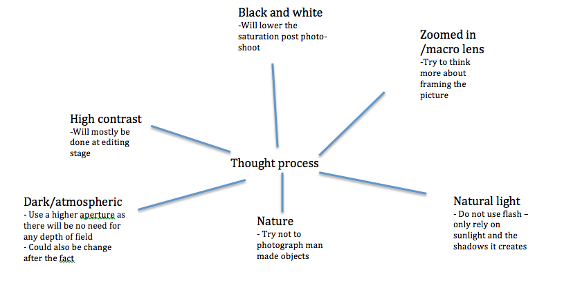
For the first shoot, I will try to capture subjects in a similar way to Siskind’s ‘straight’ photography, were there is only a subject in the foreground, but the image will still need some thought to try and decipher the abstract themes and ideas, portrayed by the close and tight framing. My concern is that I will not be able to capture shadows in the same way that Siskind manages to create in his photos, using a very high contrast. I want to try and challenge myself to think more about framing and not rely too heavily on editing. I want to make the picture seem alive without necessarily using multiple layers of foreground and background.


Final Images:
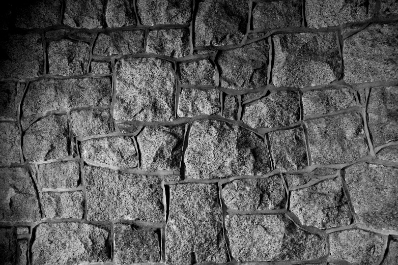
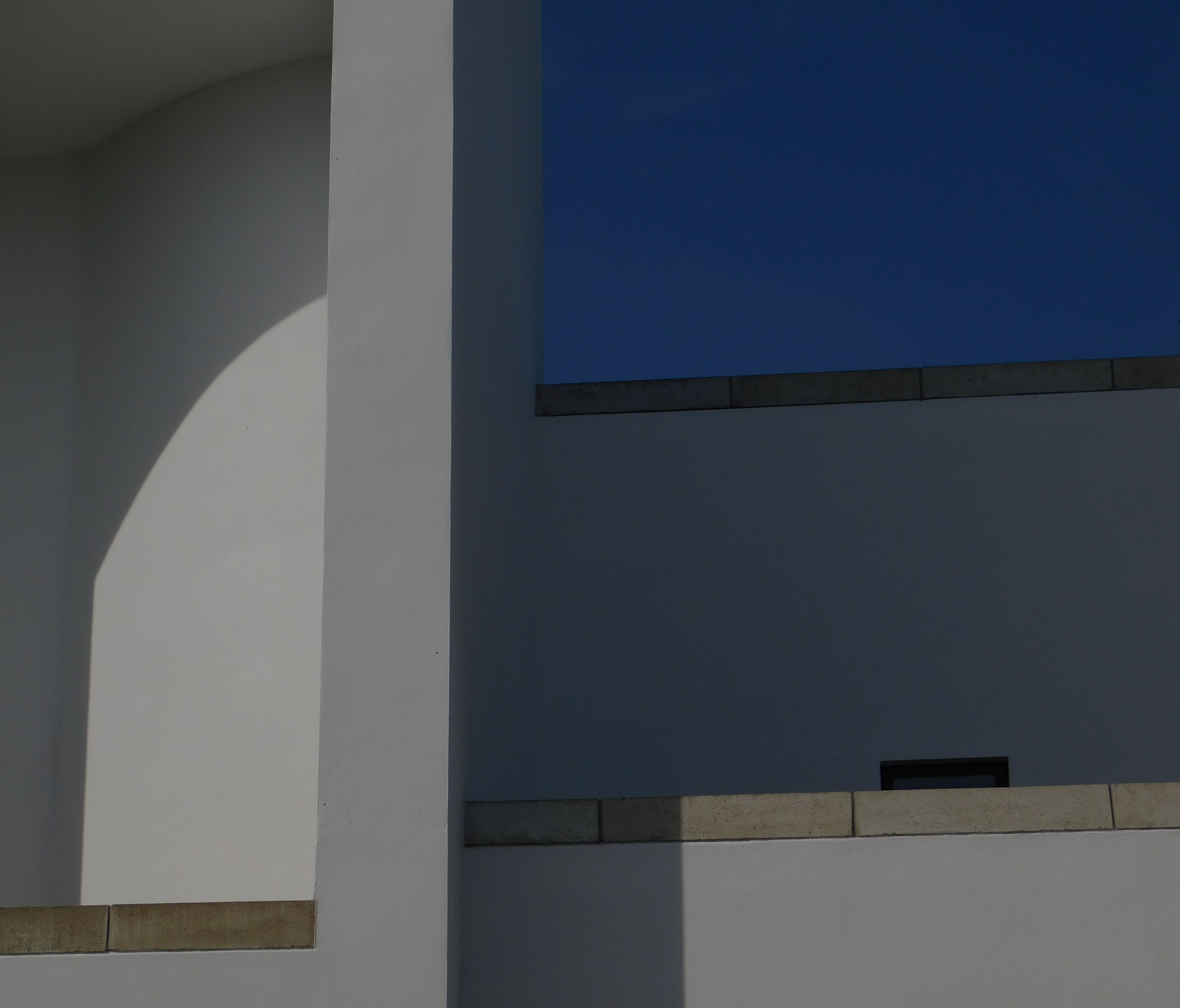
This photo was taken from my first shoot where I wanted to try and capture the style of Siskind by taking a picture directly facing a subject and creating a sense of depth using high contrast and shadows with the addition of only using natural light. I personally found this to be one of the better images from my first shoot as it showed a lot of the depth in the grooves and ridges of the granite.
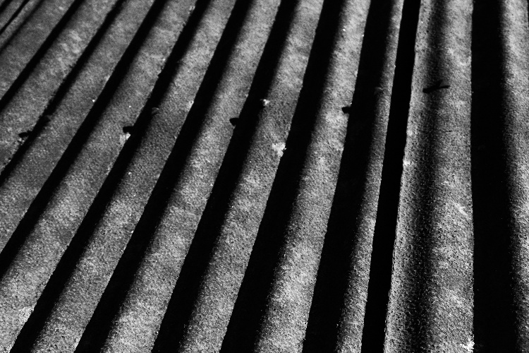
 This picture was also from my original shoot. I decided to shoot it at more of angle compared to other photos; however I decided to zoom in on the subject more than some of the other photos to give it more of an abstract feeling. It focuses on the part of Siskind’s photography that takes everyday things and focuses on a close up part of them, making the viewer think not only what the everyday item is, but also what the abstract nature of it represents.
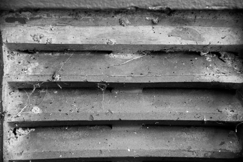
I wanted this photo of an air conditioning vent to show off a more ominous side of Siskind’s Photography. I wanted to show that even using a high aperture, it was possible to suggest that there was something behind the intended subject. I noticed that the spider webs around the outside of the image act almost as a vignette, providing an emphasis on the darkness behind the slats.
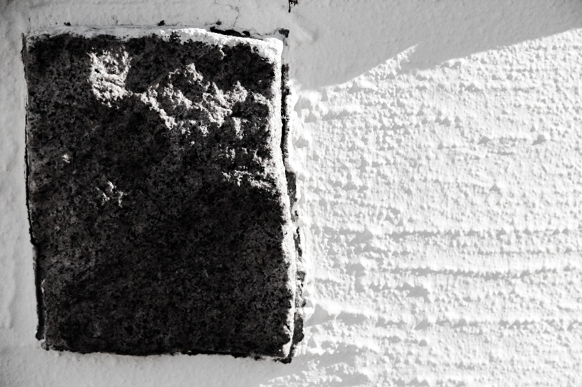
I wanted to play around with shadows in some of my pictures, and I feel like this one shows exactly what I wanted to capture; the contrast between light and dark, however when I was editing this specific photo, it dawned on me that it also represent the huge contrast between natural and man-made objects. The granite slab represents what remains of untouched nature, and the overpowering overexposure of the white painted wall represents man trying to control nature, to the point where the paint is starting to creep up the side of the rock.
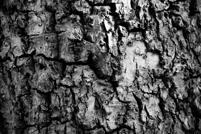
I wanted this picture to show the intricate details that a real life abstract object has when there is very tight framing. You can see all of the delicate lines which create a sense of complexity and make the viewer visualize patterns or shapes, which resembles the likes of abstract expressionist painters.
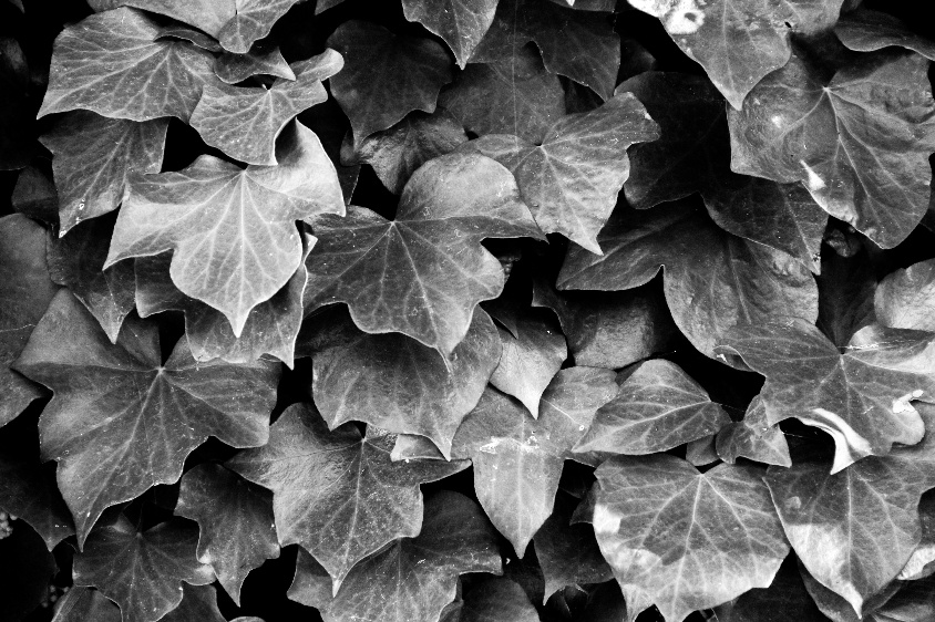
For this photo I was trying to emulate Siskind’s photo “Jerome, Arizona”(1949) but with my own style and take on it. Therefore instead of photographing peeling paint, I wanted to take something that would have a similar ‘curling’ effect that created unique shadows. I found an ivy bush on my 3rd shoot that I thought would be able to have a similar effect on the shadows cast on the layer below. Although it is easy to see what this is a picture of, as soon as you start looking at the small details and lines that the leaves create contrasting against the shadows, there is a whole new depth to the picture.

Evaluation:

I wanted to create a similar style of photography as Aaron Siskind, as I thought it would let me try out new styles from my normal photography. Siskind has a recognizable style of photography using straight on images that can show so much without needing an obvious foreground or background. I wanted to recreate this by using shadows and the main contrasting factor in all of my pictures, but retaining the familiar style of Siskind’s images.
Claude Cahun and Clare Rae Exhibition

Claude Cahun and Clare Rae Exhibition

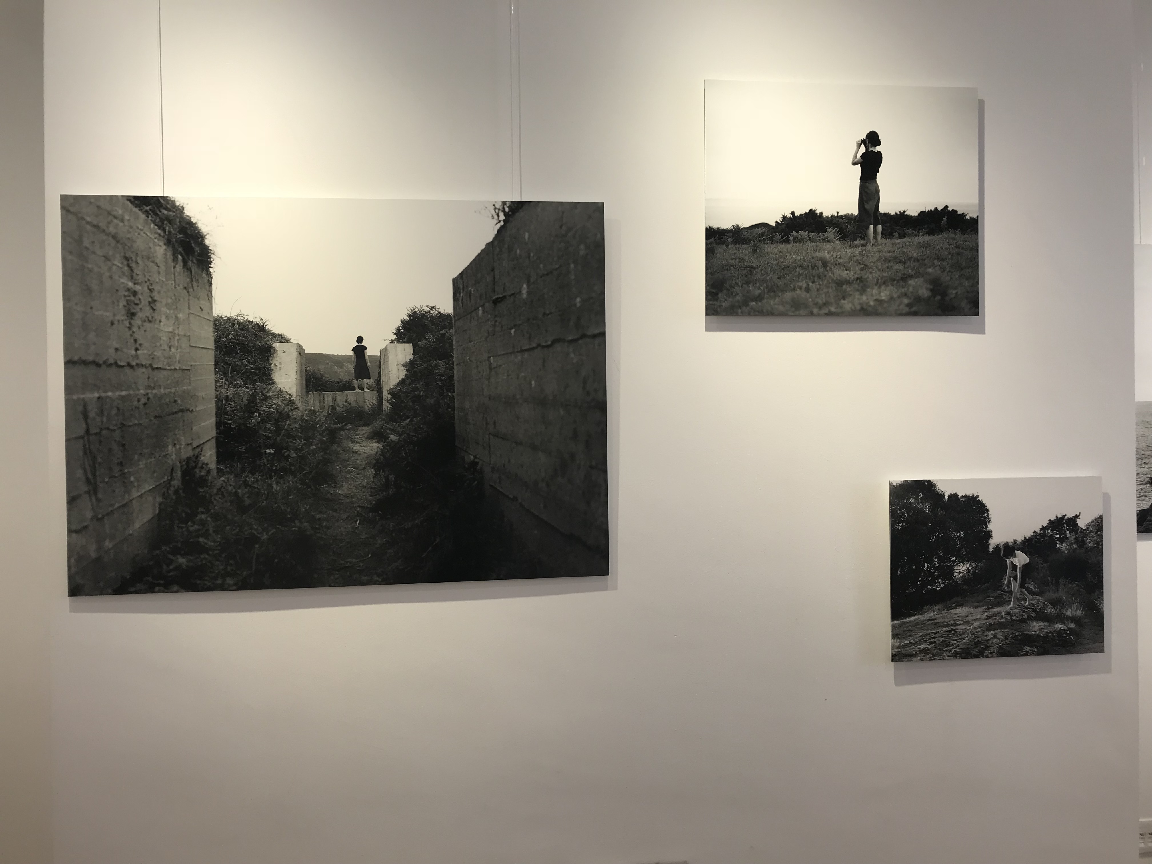
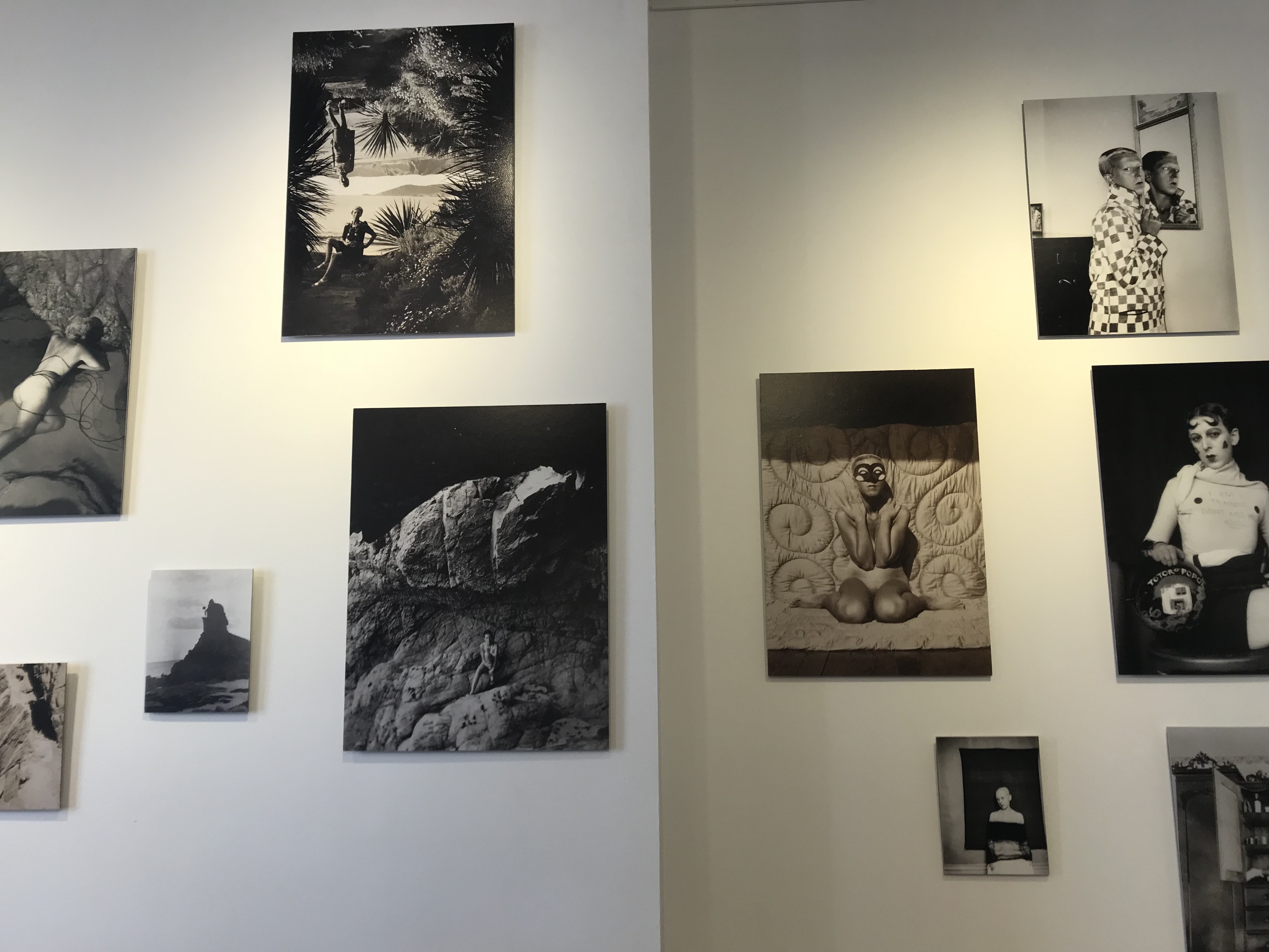
The Claude Cahun and Clare Rae exhibition were very inspiring, for a budding photographer to look at. You could see the clear link between the two photographers work, which showed how Rae has been inspired by Cahun. Both photographers had their own room which displayed their work. The photographs where printed on canvases and where hung on the walls of the room. The canvas sizes ranged in size and where hung randomly making them more interesting and unique to look at. I believe all photographs in the exhibition had a clear link to the theme and aim the photographer was trying to get at. Cahun’s photographs where taken roughly around the 30’s, where she could only capture photographs in black and white. Rae’s photographs are more recent, but she has been inspired Cahun, to make her photographs black and white and follow the same aims. This allows viewers to be able to see the contrast between old and modern day photography.

Claude Cahun

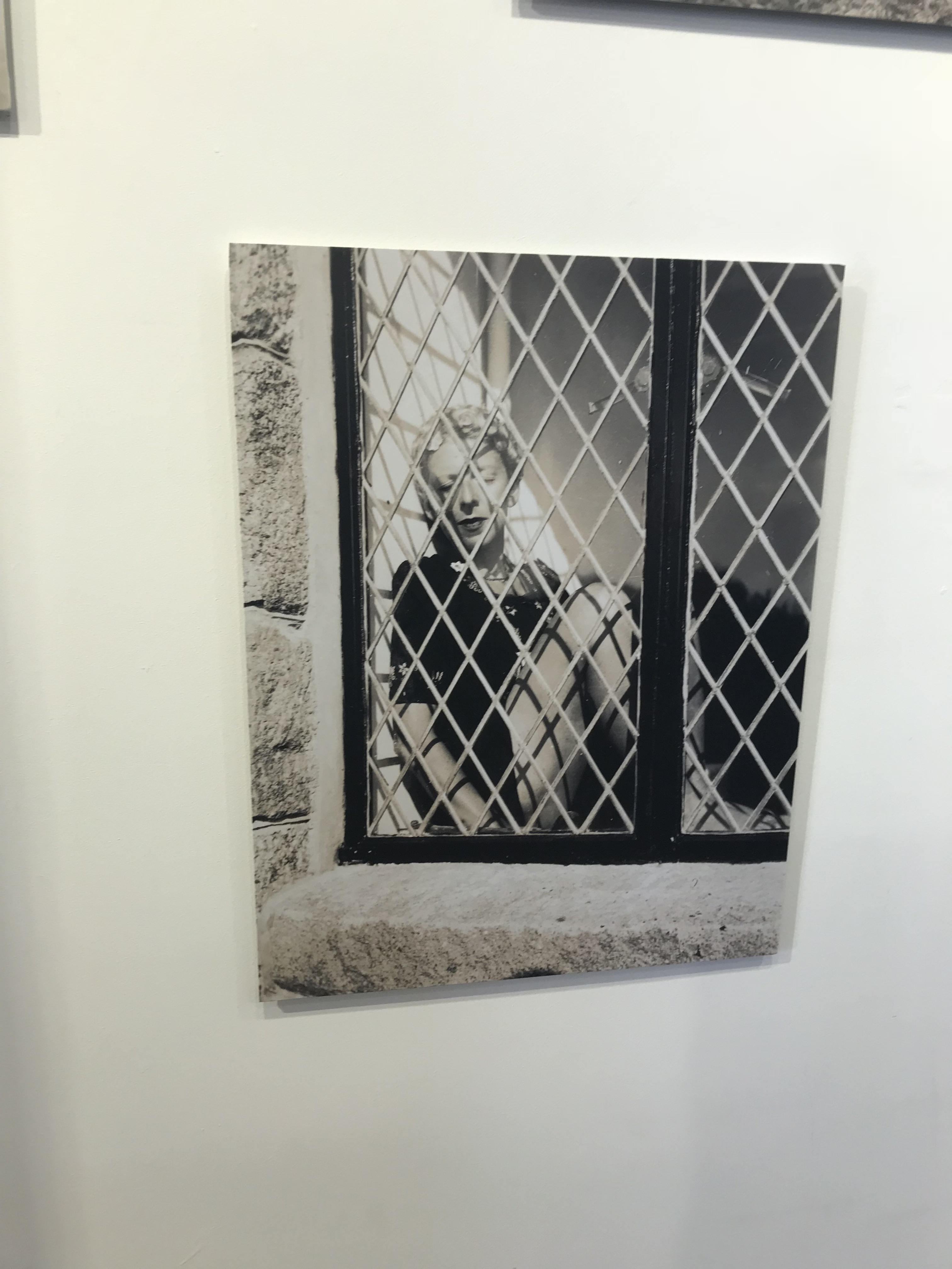
Claude’s first photograph which stood out to me was the one with the woman in the window. The image is presented in black and white which helps to create a cold feeling towards the image. The formal element of texture and shape, within this image, helps to create a sense of entrapment for the woman. The subject, main focus point, of this photograph seems to be the woman. She almost looks as if she is a doll placed in the window which makes it a bit sinister. The reflection of the scenic background on the window, also presents entrapment, as it seems like she is looking at something that she is not allowed. This image stood out to men as I felt an emotional attachment towards the subject of the image, making me more involved into the photograph.

Clare Rae

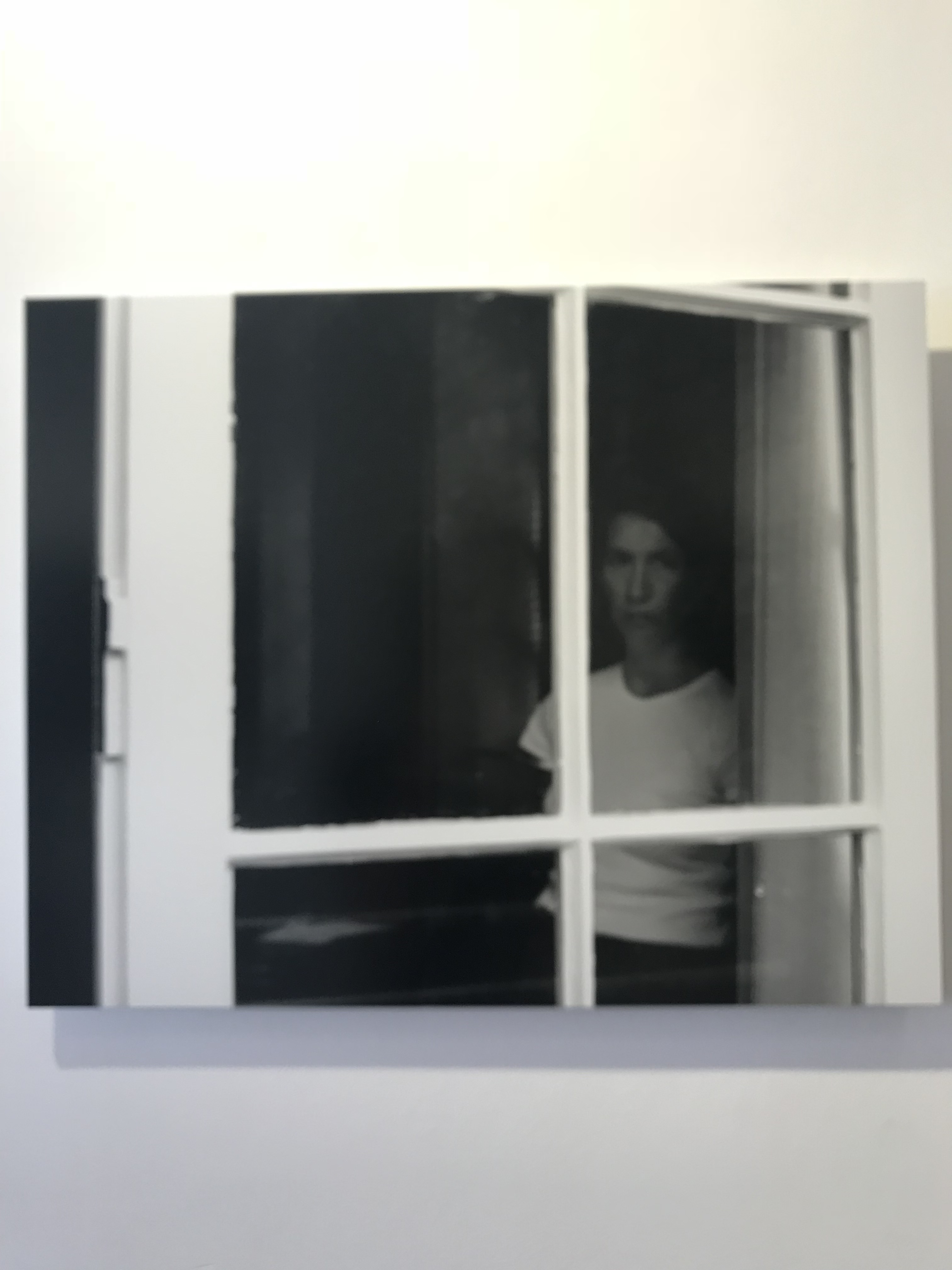
Clare Rae has clearly been inspired by Claude as it seems that she has recreated the woman in the window photograph. Although the two images are very similar there are many difference. One of them being that the overall photograph is much darker, and has multiple tones, making the image more eerie. Another difference is that the formal element of texture is not present, only shape. The woman in the window is like a silhouette staring at you making it seem ghostly. Another difference is that the woman seems to be the main focus point, however the image is almost out of focus also making an eerie atmosphere. This photograph also shows entrapment of a woman, in a similar but very different way.

Claude Cahun

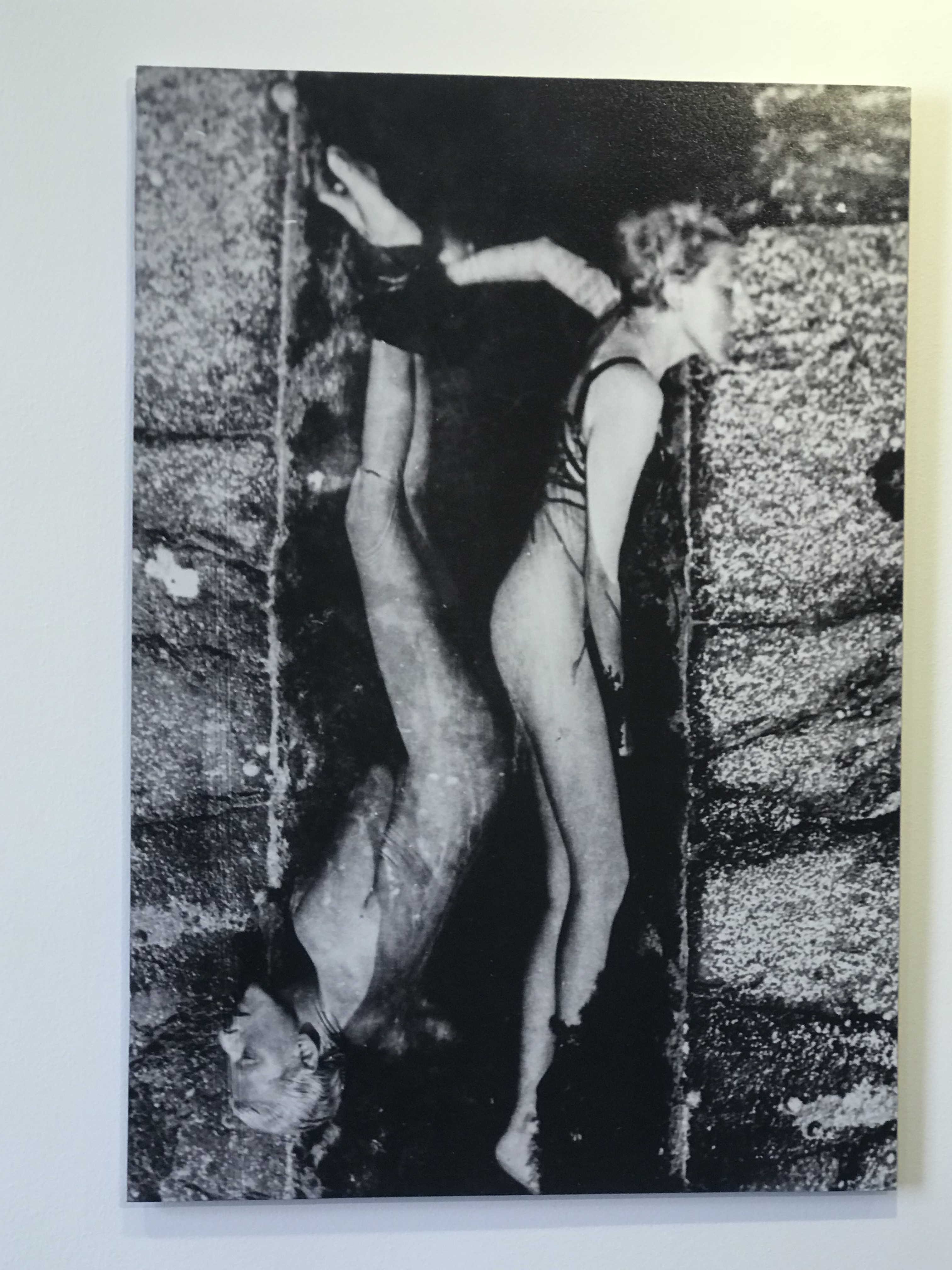
Another Claude Cahun photograph which stood out to me was this interesting piece. The woman who seems to be mirrored in the center of the photograph seems to have created a distorted effect. She seems very uncomfortable through her face being placed on a rock. The technique of leading lines is shown through the body figure of the woman, helping to guide the viewers eyes around the photograph. The is a variety of tones in this black and white photograph which makes it more interesting and detailed for the viewer to look at. A cold temperature is presented which goes with the fact that the model is nude, which makes the woman seem stranded, creating an emotional attachment. The main focus point is the two bodies which is located in the center of the image. The two bodies also seem very close together which also creates a sense of entrapment.

Clare Rae

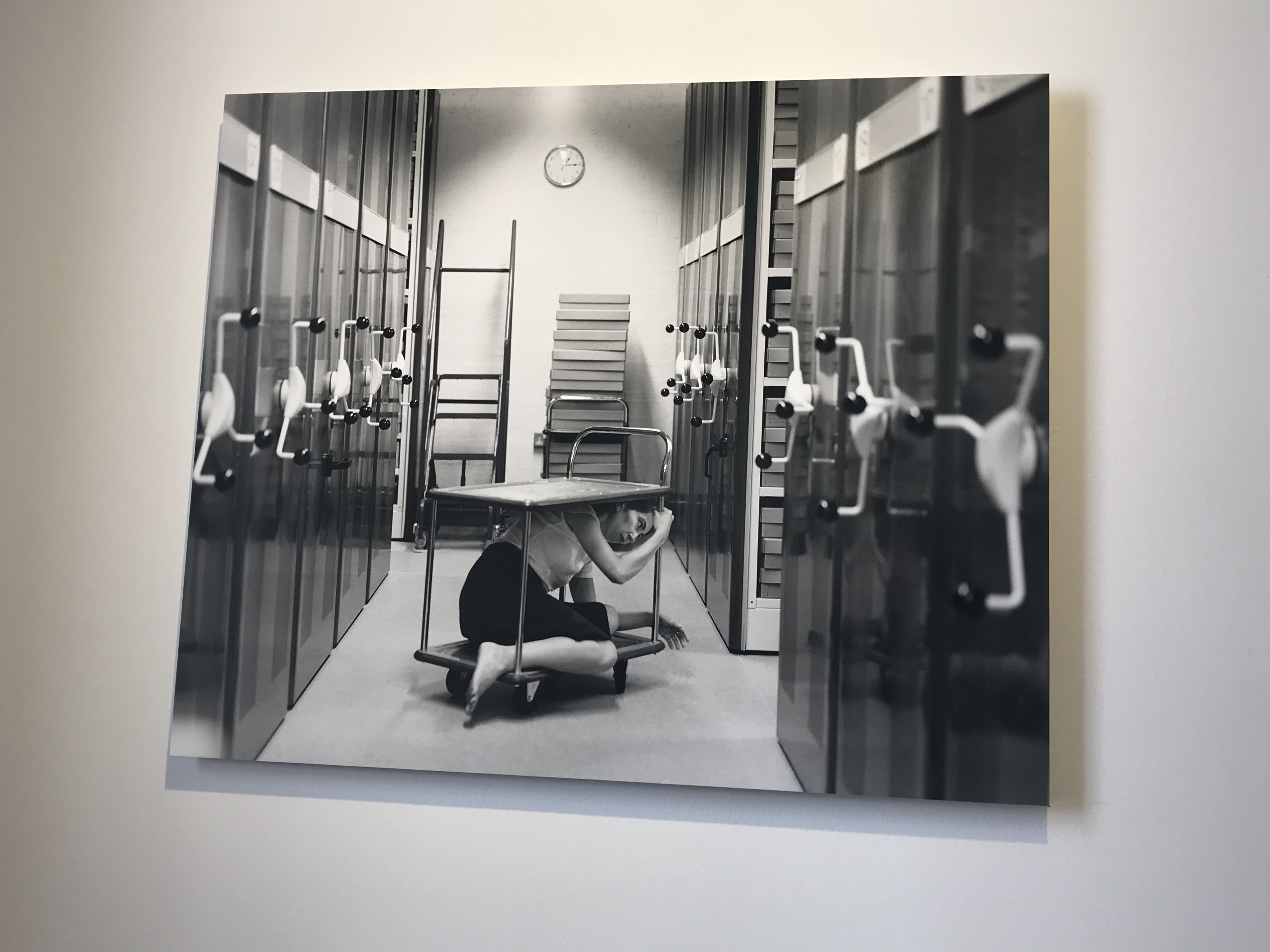
Clare Rae has taken inspiration of showing entrapment but in a very different way. She presented entrapment through the woman squeezing her body onto the cart in the archive room. The background is kept very simple, but also has items in which helps to present the context of the photograph. Rae has also used the leading lines techniques to guide the viewers eyes around the photograph. The eye starts at the front of the frame and the archive storage is used to make our way to the center and then towards the back. I believe that the main focus point of the photograph is the model on the cart. Her ‘office’ like clothing also presents the context of the photograph. The formal element of shape is presented through the cart and archive storage. Overall I really like the way in which Rae has presented the theme of entrapment in the photograph.

As shown above Rae has been inspired by Claude’s work, she has taken the same theme of entrapment but has explored it in a different way. Although some images are very much the same there are definitely some differences allowing us as the viewers to distinguish the work of both photographers. I really enjoyed visiting the exhibit as it inspired me to explore abstract in a very different way, and has shown me that black and white photographs can sometimes look a bit better than they do in color.

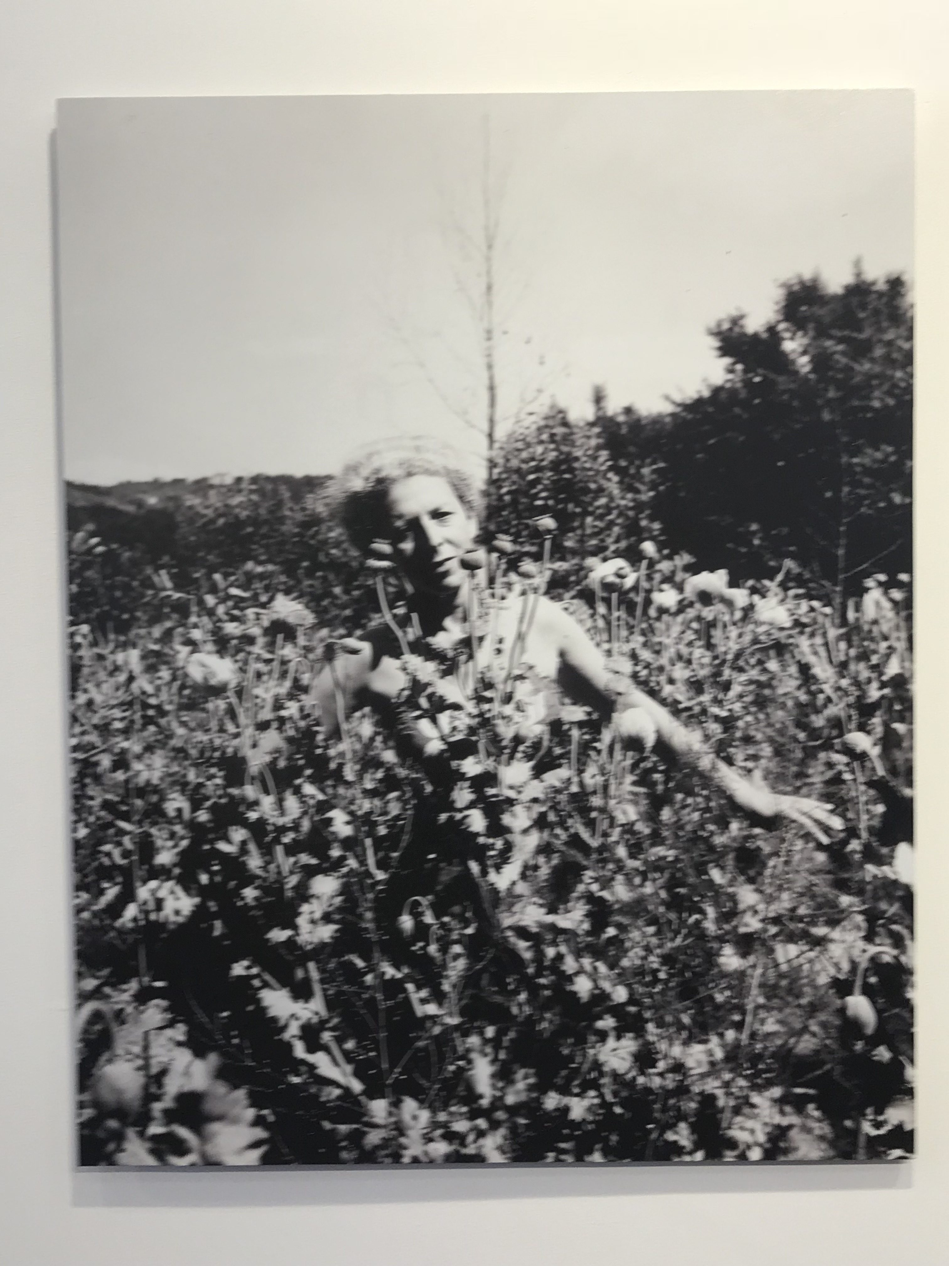
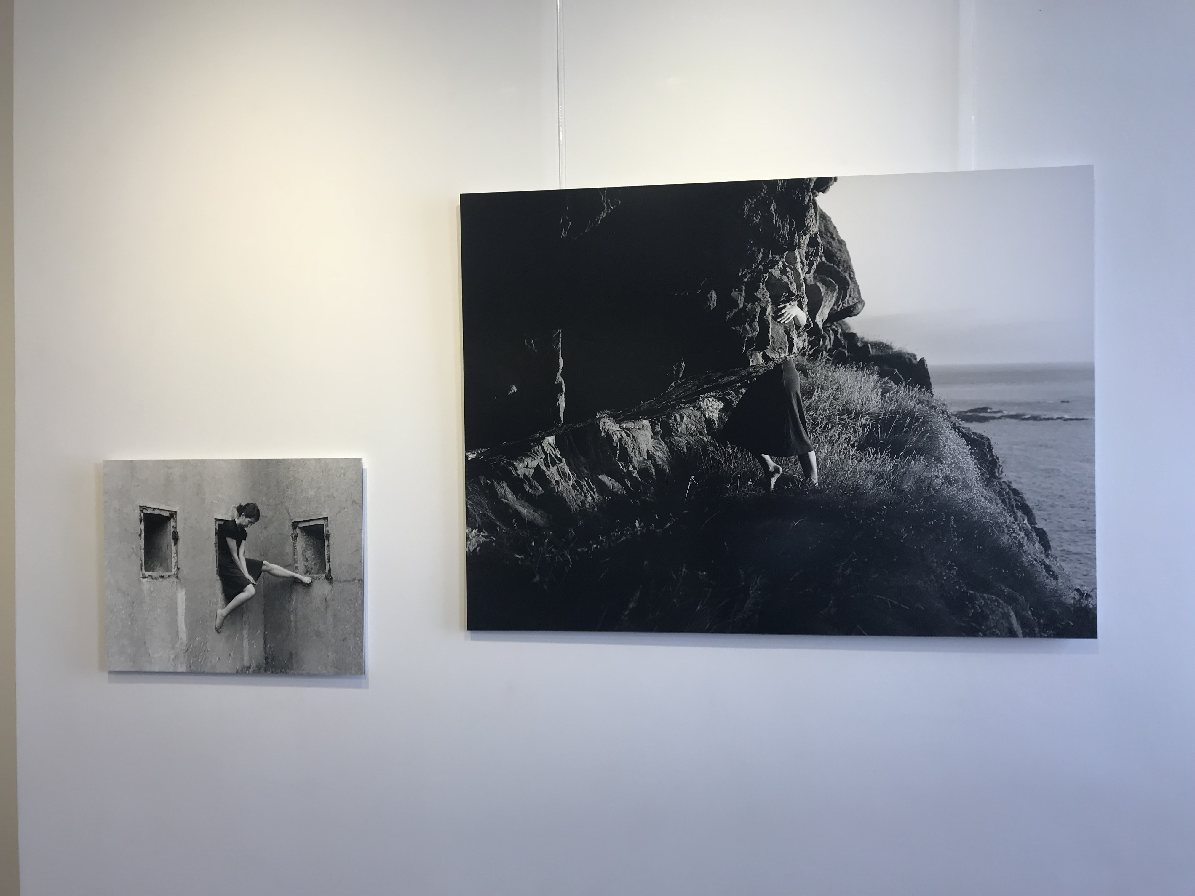
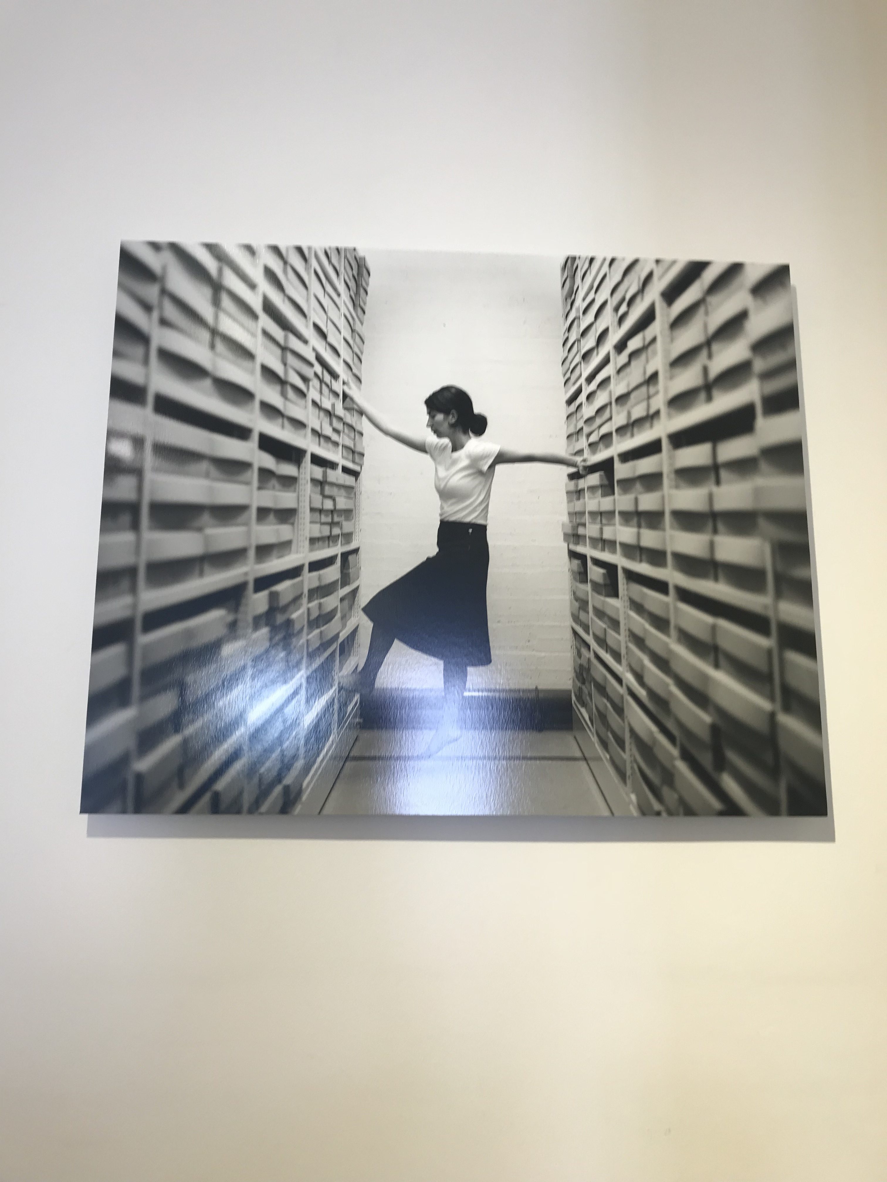
Other Photographs taken from the exhibition