Claude Cahun and Clare Rae Exhibition
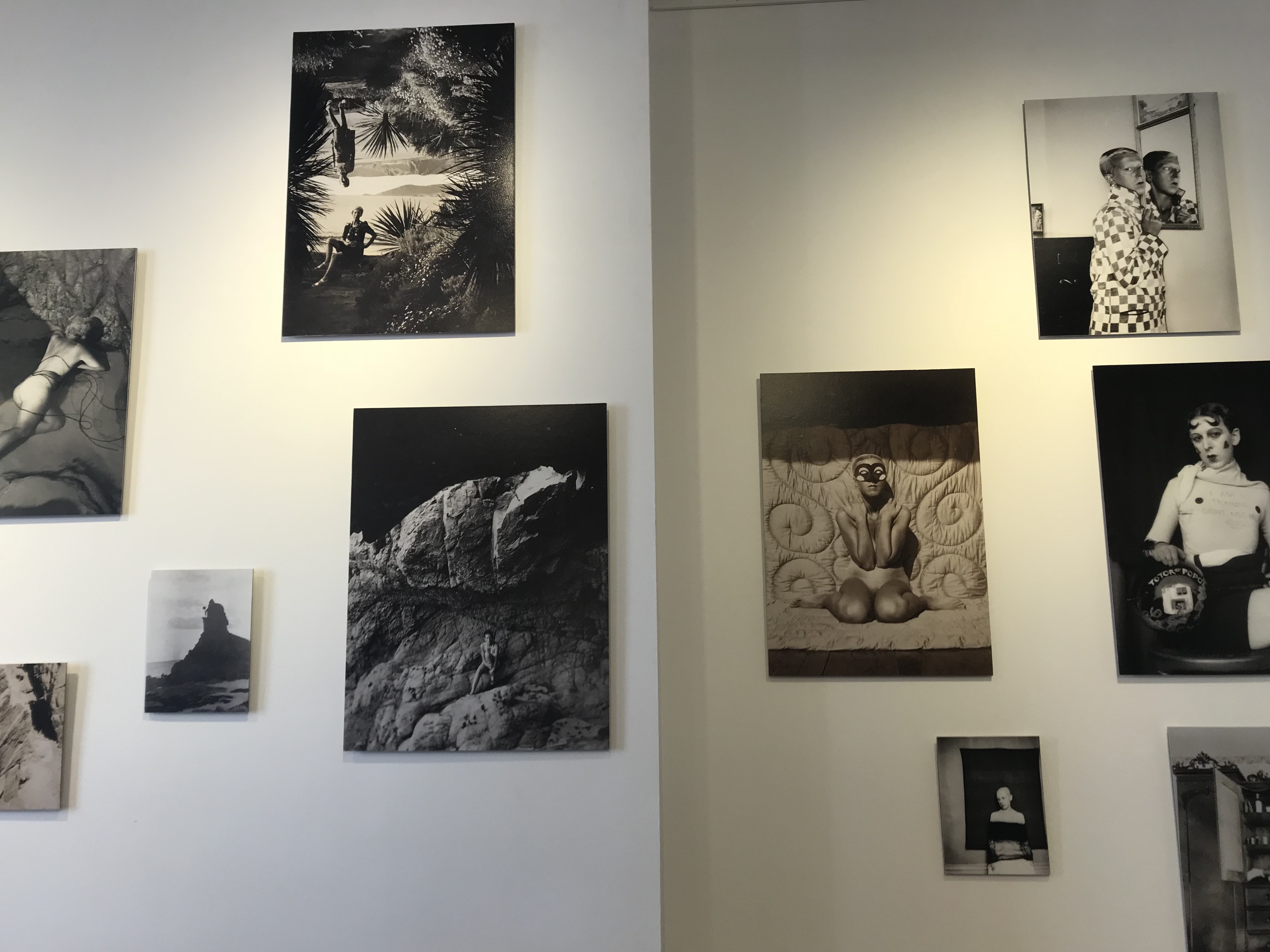
The Claude Cahun and Clare Rae exhibition were very inspiring, for a budding photographer to look at. You could see the clear link between the two photographers work, which showed how Rae has been inspired by Cahun. Both photographers had their own room which displayed their work. The photographs where printed on canvases and where hung on the walls of the room. The canvas sizes ranged in size and where hung randomly making them more interesting and unique to look at. I believe all photographs in the exhibition had a clear link to the theme and aim the photographer was trying to get at. Cahun’s photographs where taken roughly around the 30’s, where she could only capture photographs in black and white. Rae’s photographs are more recent, but she has been inspired Cahun, to make her photographs black and white and follow the same aims. This allows viewers to be able to see the contrast between old and modern day photography.
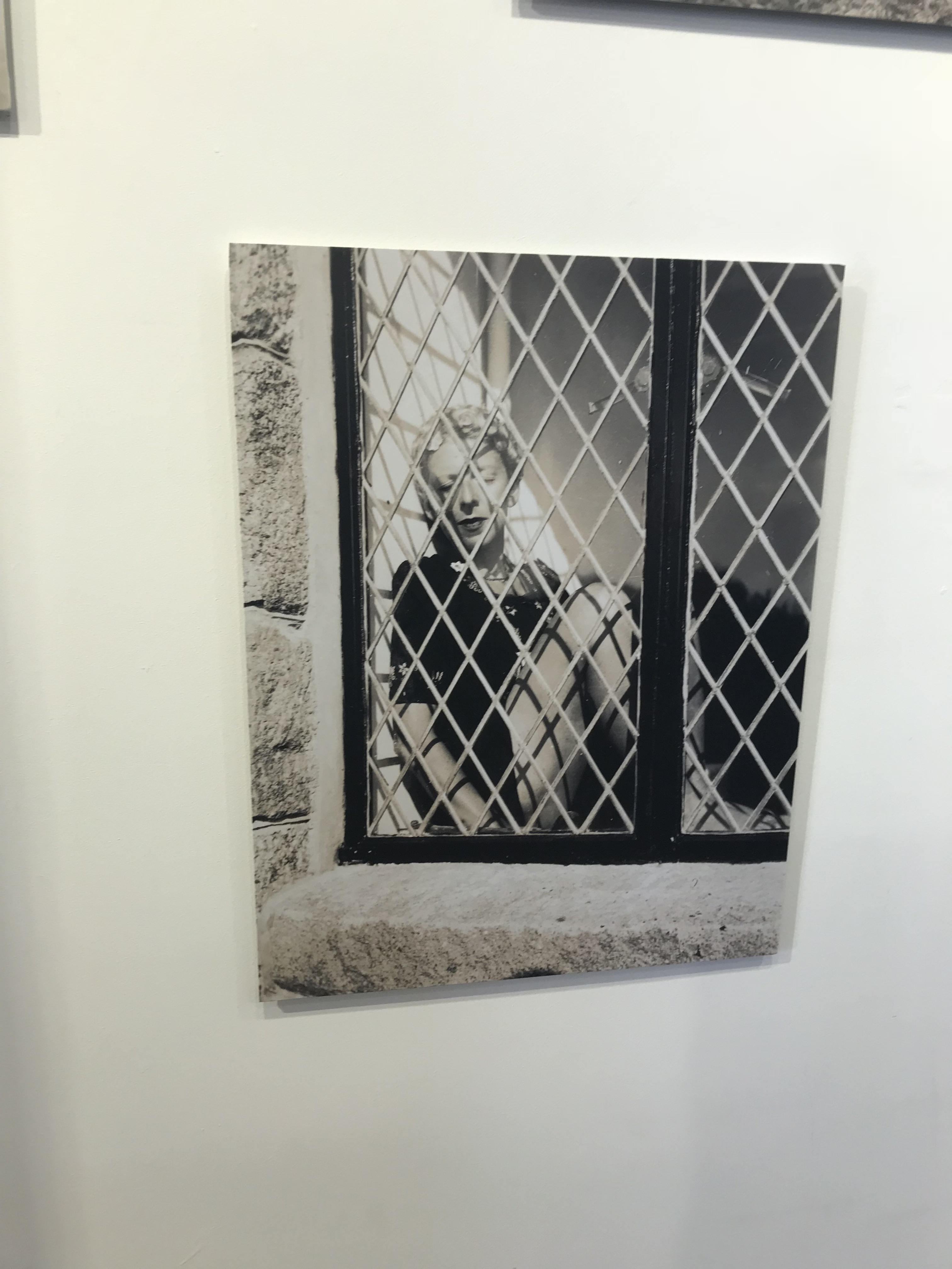
Claude’s first photograph which stood out to me was the one with the woman in the window. The image is presented in black and white which helps to create a cold feeling towards the image. The formal element of texture and shape, within this image, helps to create a sense of entrapment for the woman. The subject, main focus point, of this photograph seems to be the woman. She almost looks as if she is a doll placed in the window which makes it a bit sinister. The reflection of the scenic background on the window, also presents entrapment, as it seems like she is looking at something that she is not allowed. This image stood out to men as I felt an emotional attachment towards the subject of the image, making me more involved into the photograph.
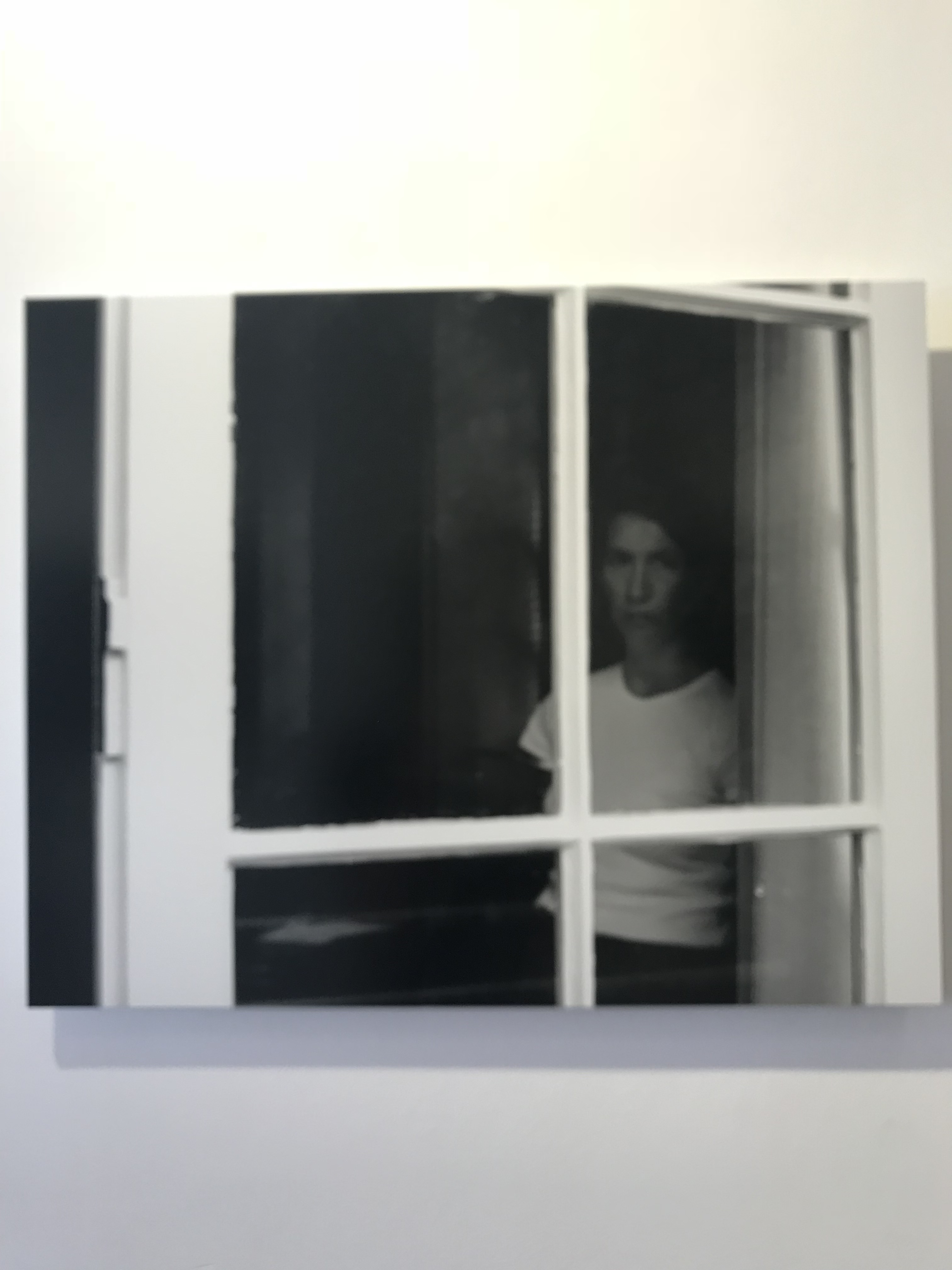
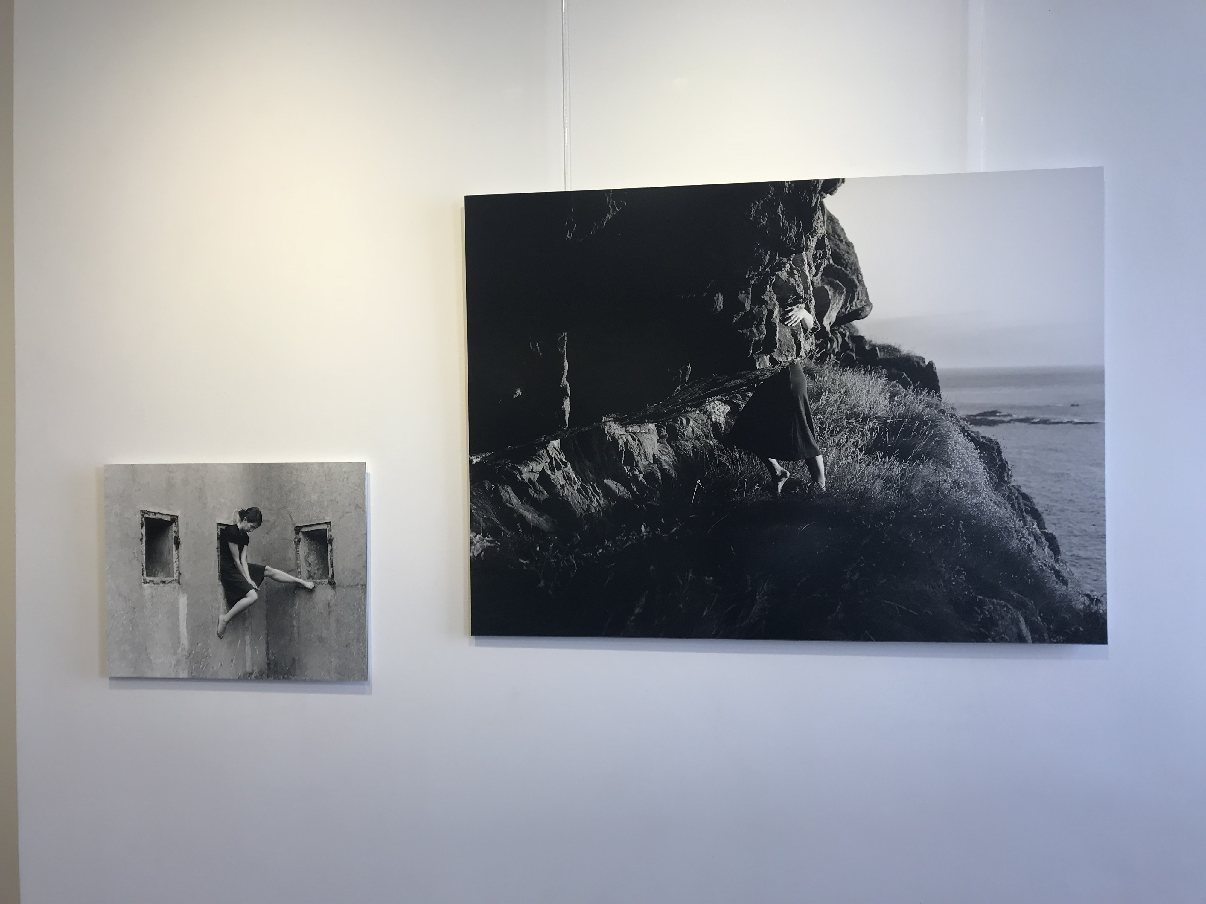
Clare Rae has clearly been inspired by Claude as it seems that she has recreated the woman in the window photograph. Although the two images are very similar there are many difference. One of them being that the overall photograph is much darker, and has multiple tones, making the image more eerie. Another difference is that the formal element of texture is not present, only shape. The woman in the window is like a silhouette staring at you making it seem ghostly. Another difference is that the woman seems to be the main focus point, however the image is almost out of focus also making an eerie atmosphere. This photograph also shows entrapment of a woman, in a similar but very different way.
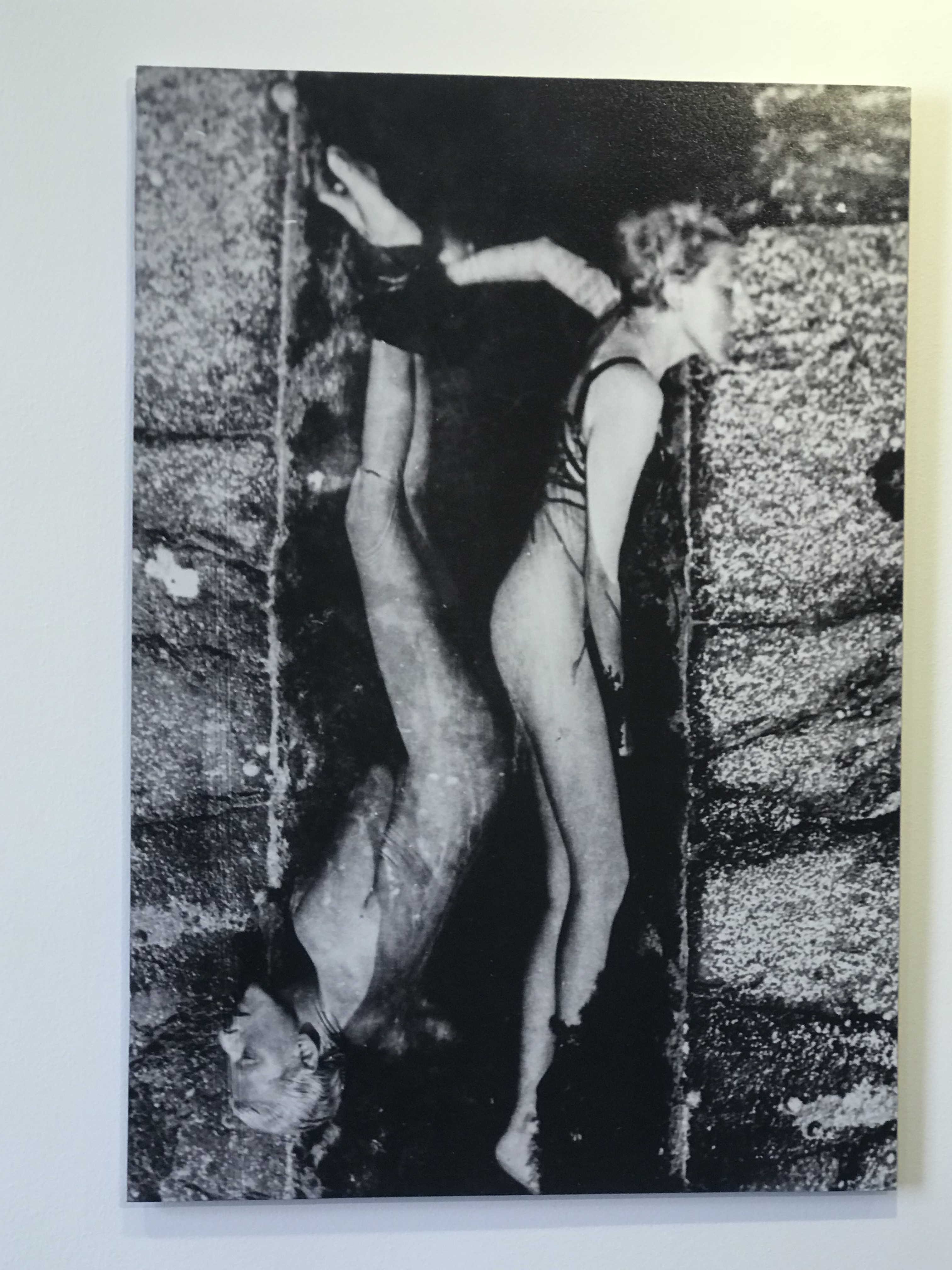
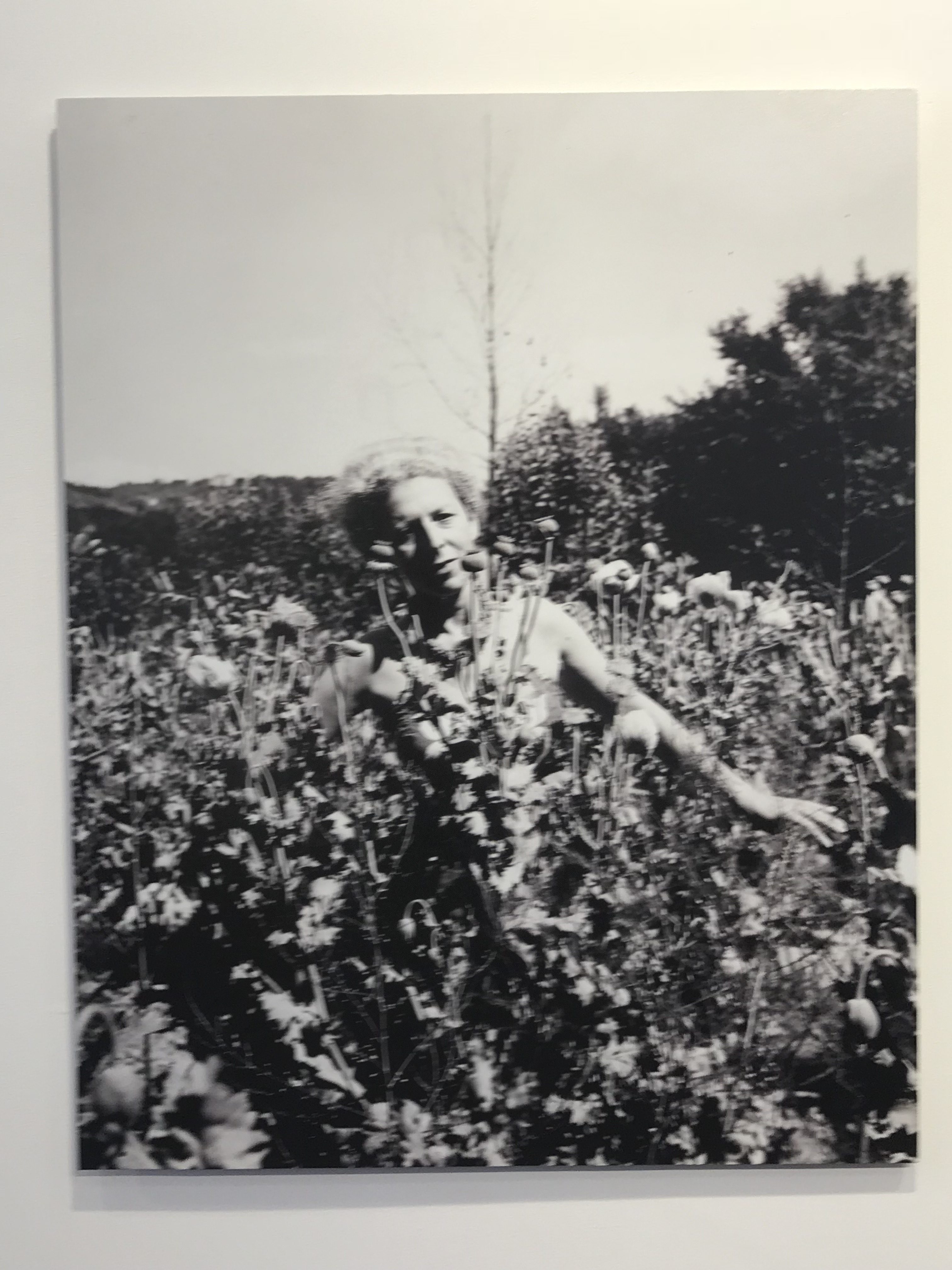
Another Claude Cahun photograph which stood out to me was this interesting piece. The woman who seems to be mirrored in the center of the photograph seems to have created a distorted effect. She seems very uncomfortable through her face being placed on a rock. The technique of leading lines is shown through the body figure of the woman, helping to guide the viewers eyes around the photograph. The is a variety of tones in this black and white photograph which makes it more interesting and detailed for the viewer to look at. A cold temperature is presented which goes with the fact that the model is nude, which makes the woman seem stranded, creating an emotional attachment. The main focus point is the two bodies which is located in the center of the image. The two bodies also seem very close together which also creates a sense of entrapment.
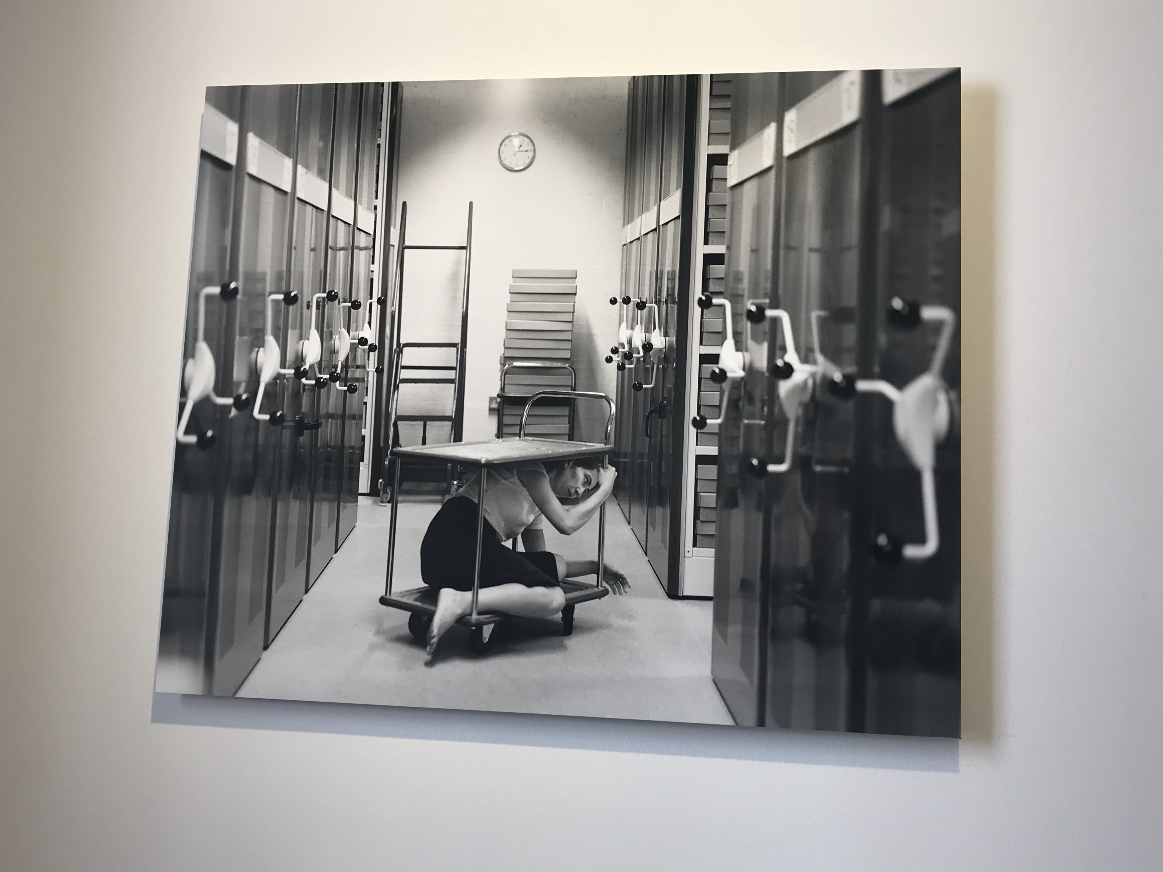
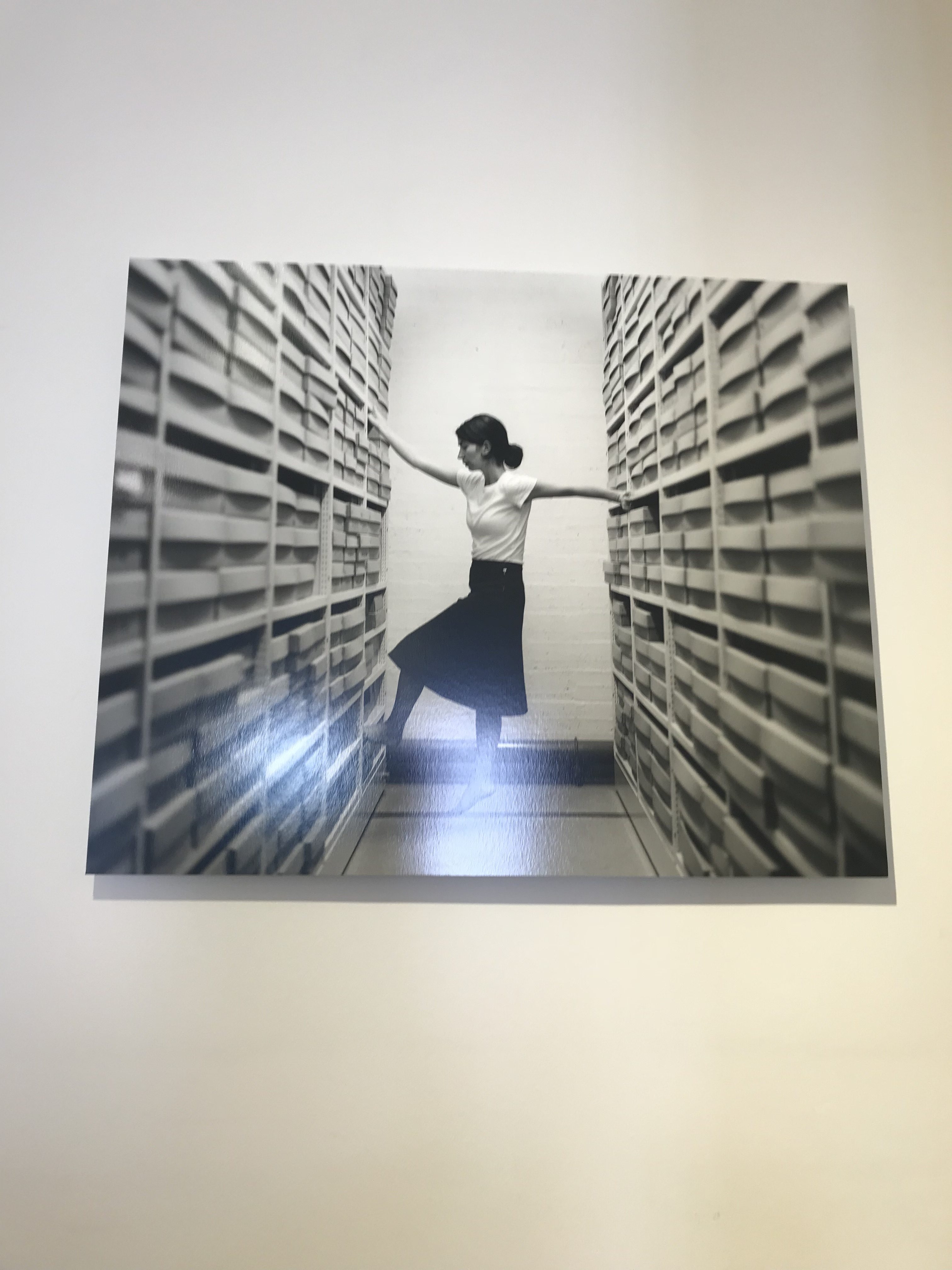
Clare Rae has taken inspiration of showing entrapment but in a very different way. She presented entrapment through the woman squeezing her body onto the cart in the archive room. The background is kept very simple, but also has items in which helps to present the context of the photograph. Rae has also used the leading lines techniques to guide the viewers eyes around the photograph. The eye starts at the front of the frame and the archive storage is used to make our way to the center and then towards the back. I believe that the main focus point of the photograph is the model on the cart. Her ‘office’ like clothing also presents the context of the photograph. The formal element of shape is presented through the cart and archive storage. Overall I really like the way in which Rae has presented the theme of entrapment in the photograph.
As shown above Rae has been inspired by Claude’s work, she has taken the same theme of entrapment but has explored it in a different way. Although some images are very much the same there are definitely some differences allowing us as the viewers to distinguish the work of both photographers. I really enjoyed visiting the exhibit as it inspired me to explore abstract in a very different way, and has shown me that black and white photographs can sometimes look a bit better than they do in color.
Other Photographs taken from the exhibition

Good progress so far, well done…now you must ensure that your next photo-shoot is complete and ready to edit during Week 4 and that all blog posts are up to date.
Remember to check your tracking sheet to see what is required and when!