I went to Claude Cahun and Clare Rae’s art exhibition to view their photography. Their photos were very similar and you could see that Clare Rae has been inspired by Claude Cahun’s work, they has almost identical set ups in some of the photos and you could see their meanings of the photos so boldly and clearly behind the photos. However there were dissimilarities in the photos such as Claude Cahun’s photos were self-portraits and they were showing her emotions and struggles with gender identity, where as Clare Rae used other women than herself to portray women and her emotional views. Overall the art exhibition was an experience, it showed me new ways to photograph things and how to use other objects in the photos, without making it look setup.
These are a selection of photos by both photographers; 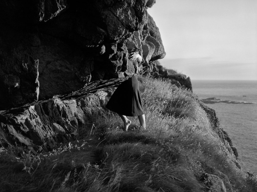 Clare Rae
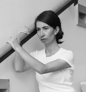 Clare Rae
 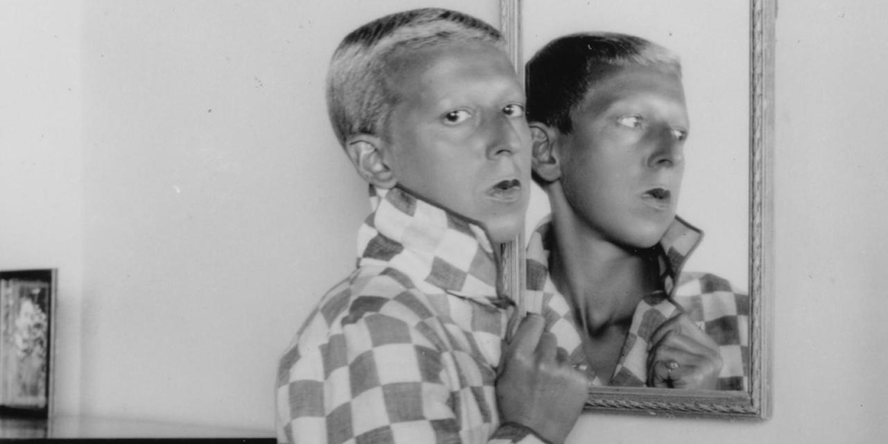 Claude Cahun
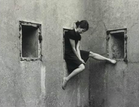 This photo by Clare Rae shows how she was inspired by Claude Cahun’s work, as she has taken this photo in a remote are and is showing female domination in this image of hers. I chose this photo because the mood in this photo is showing a women’s emotion. Her head is hanging low which shows how the gender equality has effected her in a way of having no confidence or no sense or worth. The was Clare Rae decided to have her foot propped up onto the wall gives the photo an extra element to it, it makes it more interesting to look at and effective.
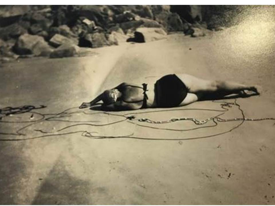 I chose this photo from Claude Cahun’s photographs because I like the way she has used the rope in the images, this adds something extra to the photo, instead of it just being a simple self portrait. This photo creates a sense of mystery, as you can’t see her face, but it makes it more intriguing as you wonder why she has decided to do this. I interpenetrate this photo as Claude Cahun going through a stage of unknowing and embarrassment as she has hidden her face almost as if she doesn’t want anyone to see her until she has figured out her gender
Clare Rae has mainly used females throughout her photos as did Claude Cahun but she also put herself in the photos. Clare Rae’s photos are showing that females are equal to men, by photographing them in an working environment, also in some of her photos she has covered women’s body parts, suggesting they are figuring out their identity and this is similar to Claude Cahun as she was trying to figure out her identity. Their photos helped get their emotions and opinions across to everyone through photography.


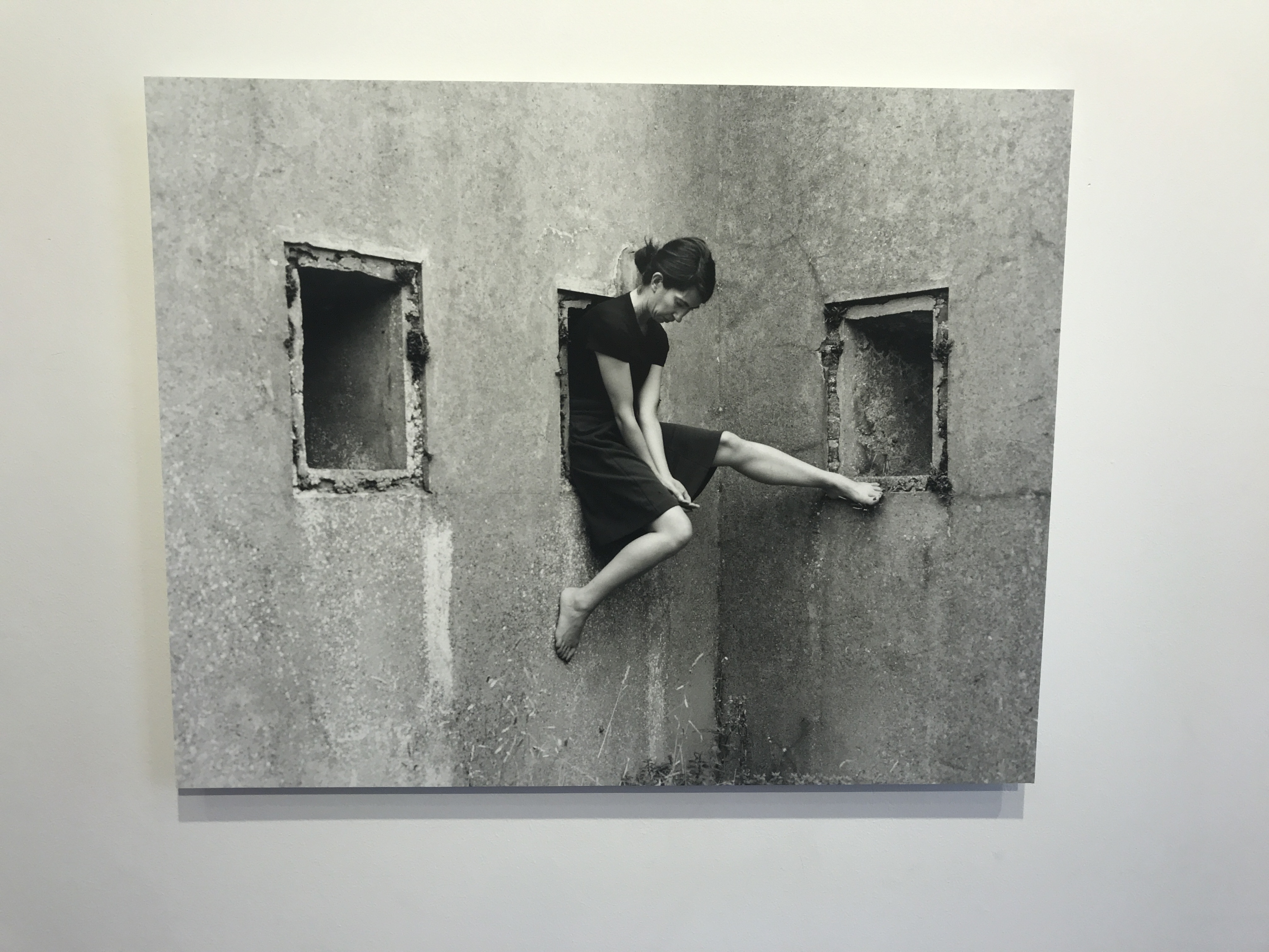 Similarly, here, Clare Rae keeps her head down and not looking at the camera. She also focuses on the architecture around her and the texture and shapes of the walls. Rather than this feeling claustrophobic, it’s feels comforting as she’s almost cocooned by the walls. However the ways she sits is awkward which could be a take on the ways Claude Cahun also used her body.
