Claude Cahun and Clare Rae Exhibition Analysis

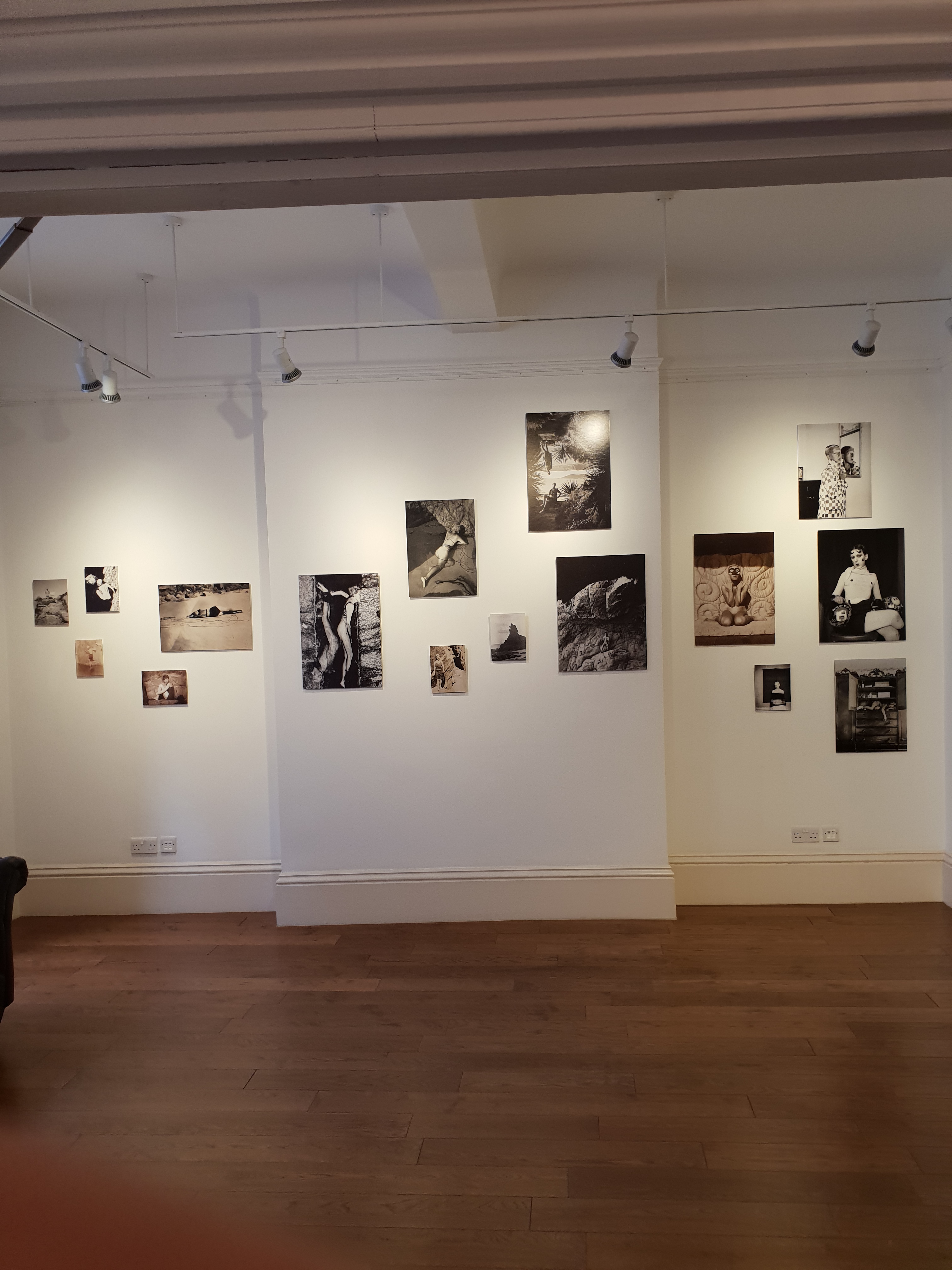
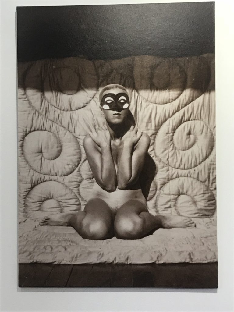
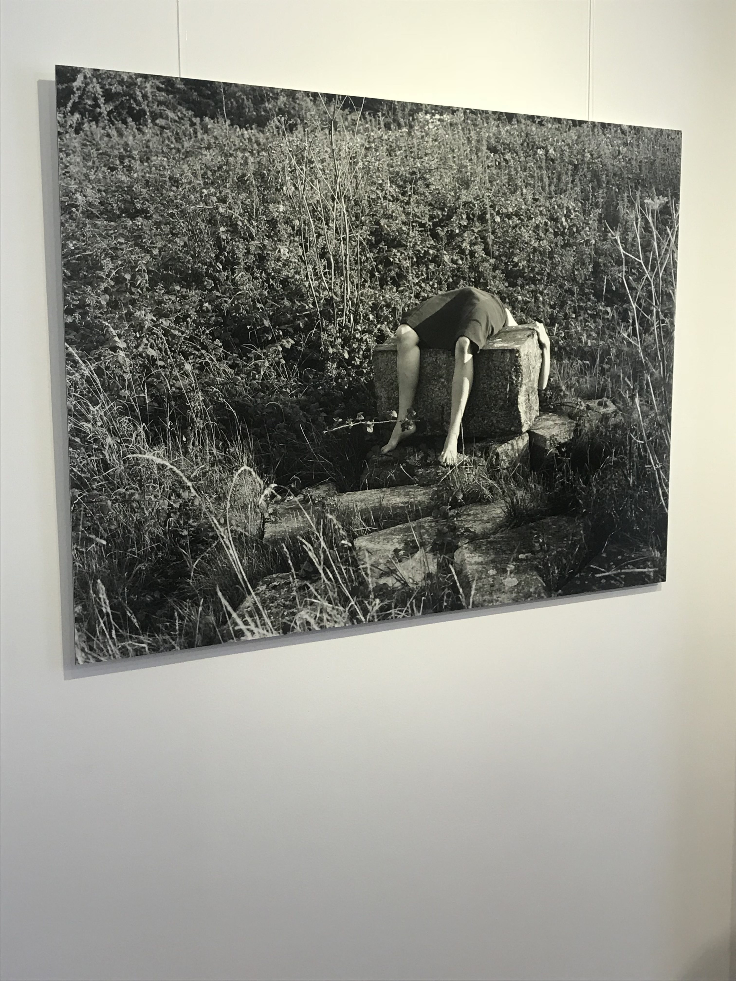
The exhibition showed the different ways that Australian photographer Clare Rae, the resident artist in Jersey, responded to the work of Claude Cahun, a French photographer who specialized in creating surreal self portraits, which often focused on topics such as gender and identity. The exhibition made it easy to compare the two artists work, and the influence that Rae took from Cahun was made obvious. Both Cahun and Rae have presented their photographs using black and white contrasting colour themes, which is the most obvious similarity between the two artists work.

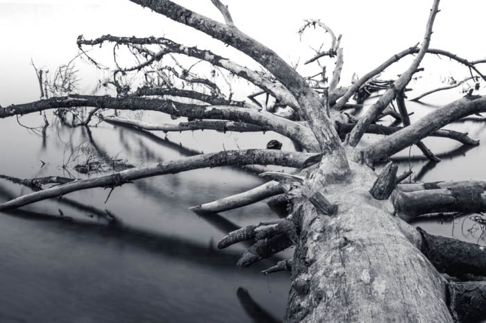
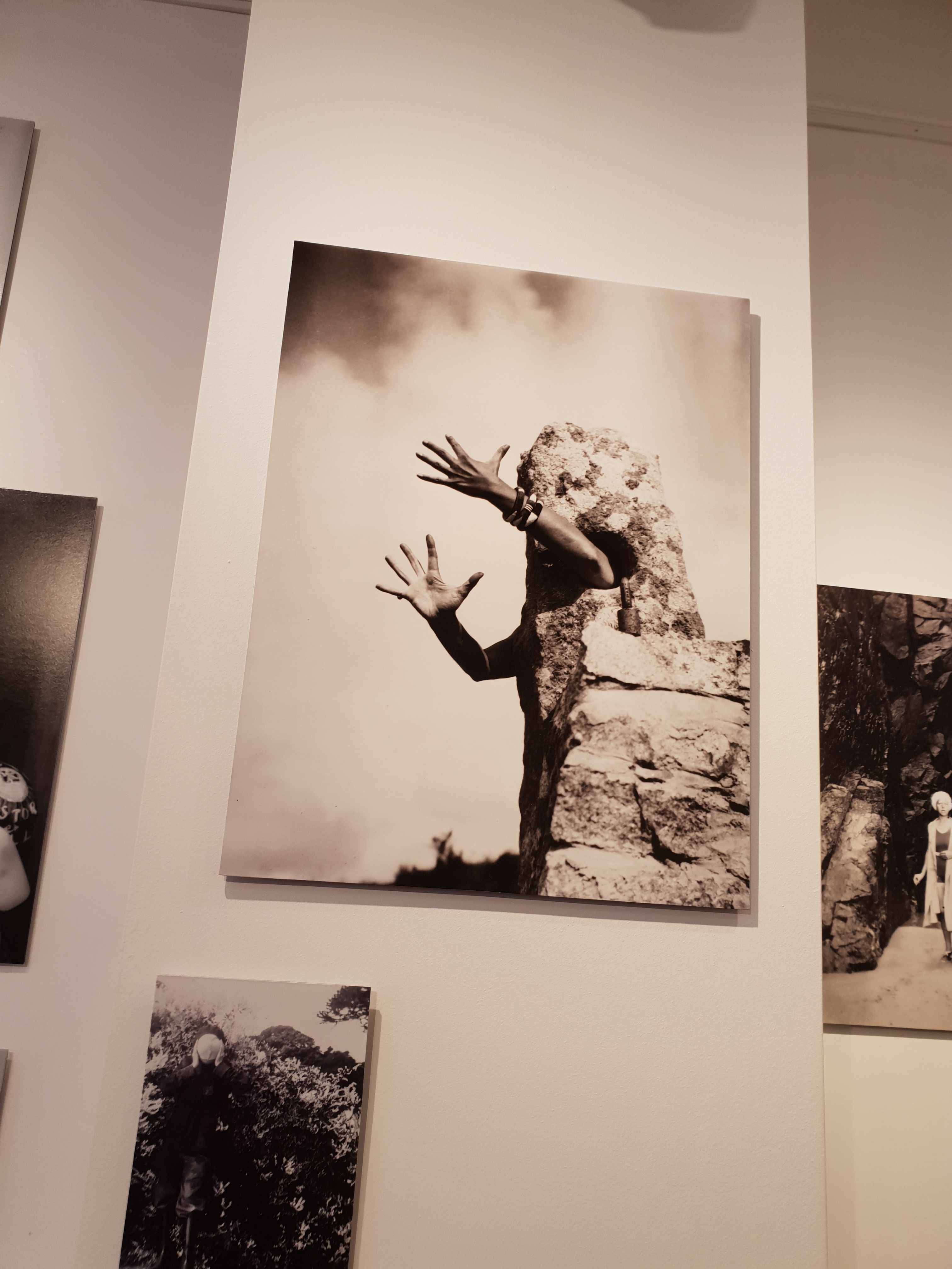
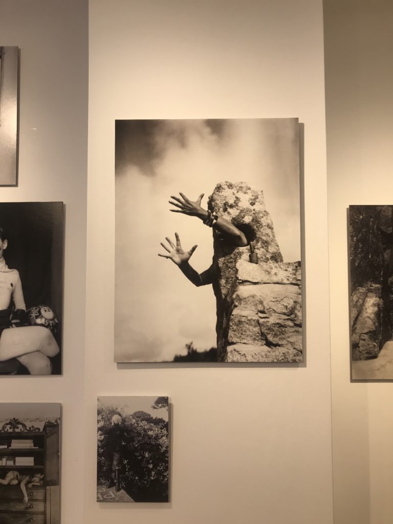
The following example is of a photograph taken by Cahun. This photograph explores the theme of identity, as the hands reaching out from the stone allow the viewer to question who the hands belong to, and so the missing identity of the subject makes the photograph more thought provoking. The use of the gesture the hands are making displays an emotion, but that emotion cannot be immediately recognised due to the lack of any other body parts that would usually be used to judge the emotions of a person. An unusual camera angle (facing slightly upwards) has also been used to add to the abstract and surreal theme of the photograph as a whole. In this image, Cahun has removed the identity of her subject, and has placed it in a surreal, abstract location in order to make her

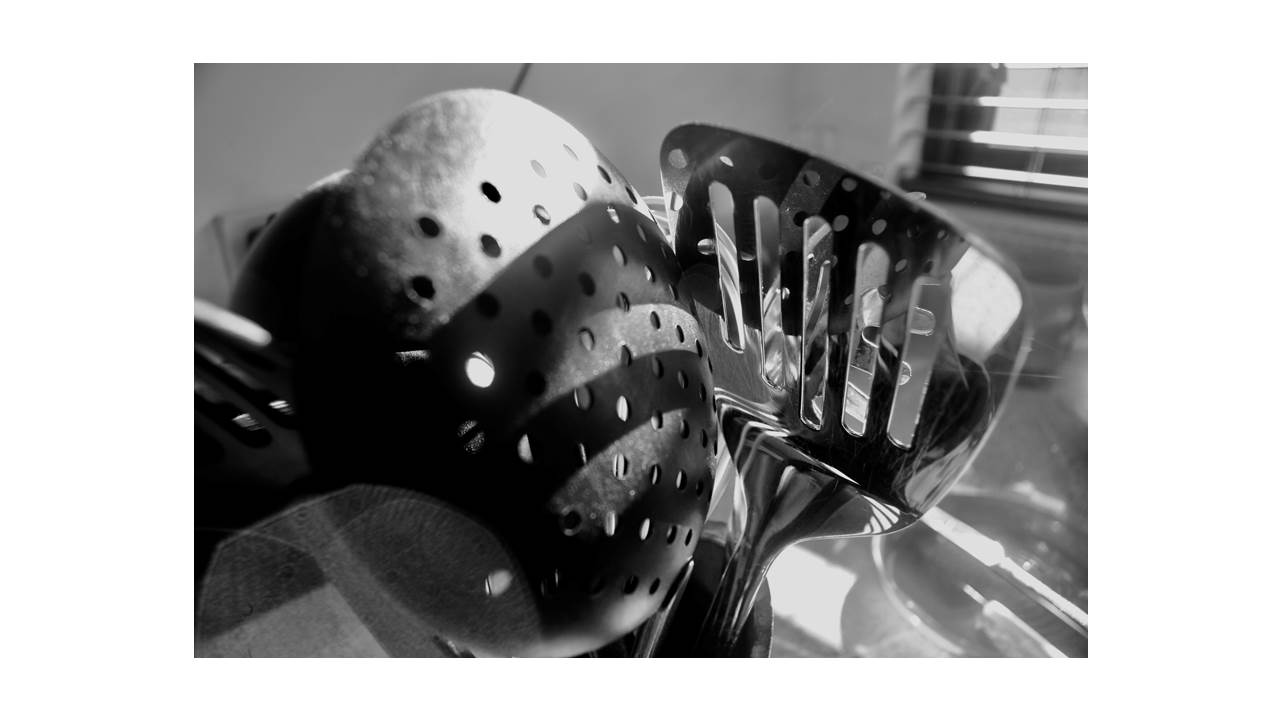
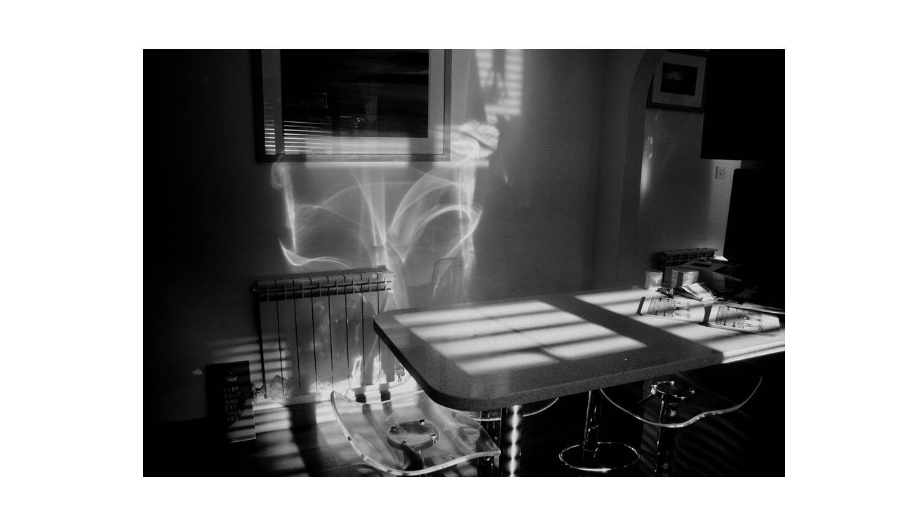
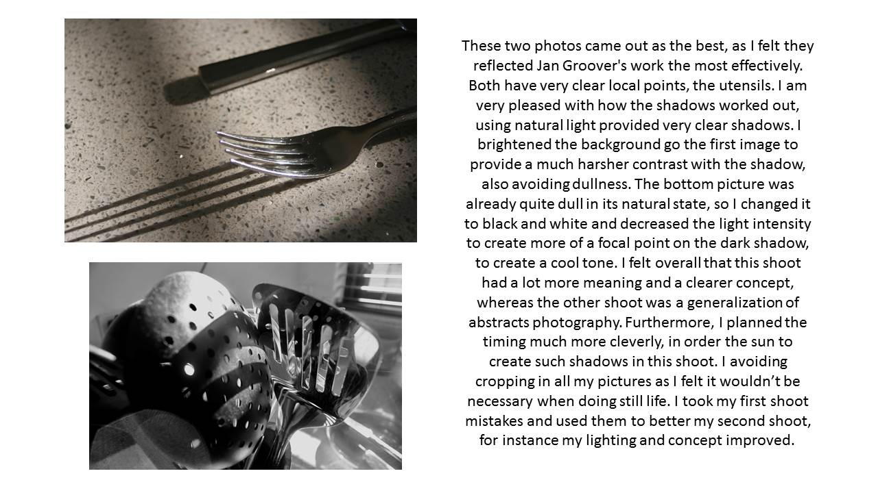
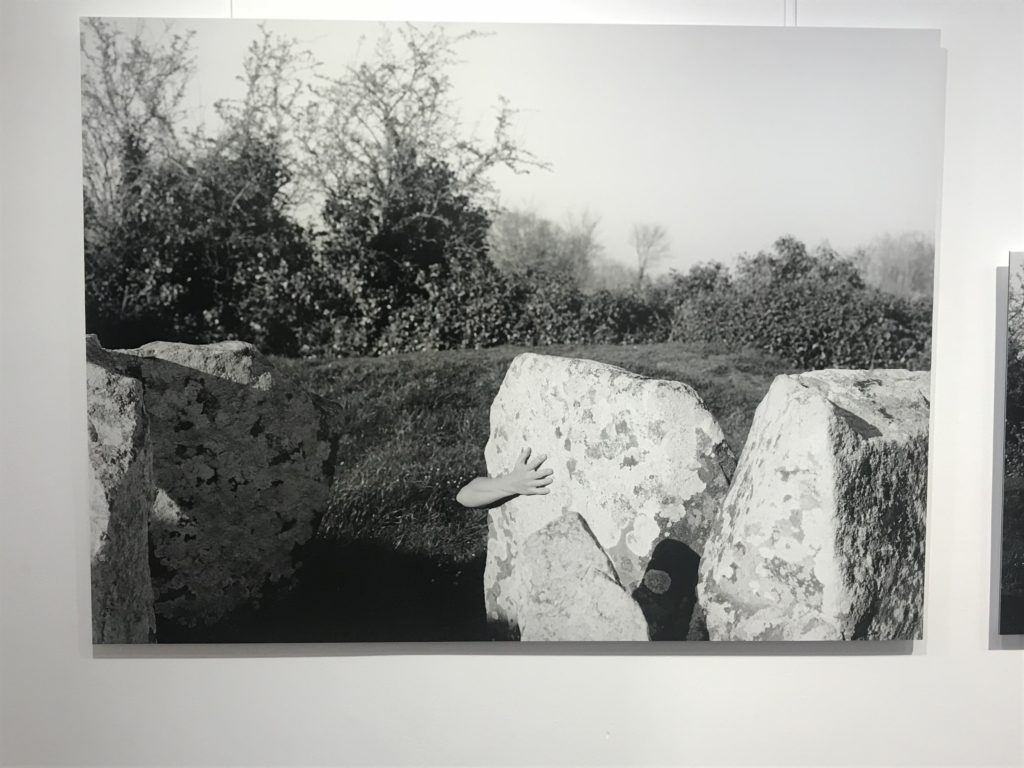
The following image was taken by Clare Rae, and was directly influenced by the photograph above taken by Cahun. For this image, Rae has been inspired by Cahoons theme of identity, and has responded by creating a photograph of a human arm in an abstract and surreal location (behind a stone). For this image, Rae has placed the subject (the arm) coming out from behind the rock. This makes the  viewer question the emotions and motives behind the positioning of the arm, in the same way that the open gesture of the arms in Cahun’s work makes the viewer question the emotions that the subject is showing. Because the viewer of Rae’s work has no way to know why the arm seems to be coming out from behind the rock, they are left to wonder the identity of the subject, and so Cahun’s abstract and surreal style of photography can be seen to influence Rae’s.

The way the exhibition was organised allowed for the viewer to clearly see the similarities and differences between the two artists, by placing their work in two separate but connected rooms. The exhibition provided a wide range of both Cahun and Rae’s work, so that the way that Rae had been influenced by Cahun could clearly be seen in multiple pieces of work. The exhibition was organised and presented well, and showed the work of both artists using a simple and effective layout.

Line, Shape and Form

Uses In Photography

Shape: A shape is two-dimensional. Yes, a photograph itself is two-dimensional, but a shape in a photograph doesn’t have any appearance of depth. Often, to make a 3D object appear to have no depth, front or back lighting is used. An object that appears to have depth either through lighting or perspective, is not a shape, but a form.

Form: Objects that appear to have depth, despite being part of a two-dimensional image, are part of the design elements of form. Forms usually appear to have depth through lighting that creates shadows, or by looking at the object from an angle, rather than straight onto one of the edges.

Line: Lines form the edges of shapes, but they also form shapes of their own. Lines can lead the eye in a photograph and serve as a powerful compositional tool.

Types Of Shape

Geometric: Geometric shapes have straight, defined edges. In photography, these types of shapes are most common in man-made structures, such as architectural photography.

Organic: Organic structures are full of curves and may not be geometrically perfect. These types of shapes are often most found in nature, the curve of a flower petal, for example.

Contact Sheet 1 (Entre Nous)

The meanings of each symbol are as follows:

Green Dots: One green dot symbolizes that it is a photo i believe could be useful and is a good representation of what I am trying to display. Therefore the more Green dots, mean the better i believe the photo is.

Black crosses: A black cross through the photo means i dont believe it is effective in displaying what i am trying to and i do not want to use it.

Red line and dashes: Areas that are shaded in red below or above the line with dashes are places i believe that photo should be cropped to, to improve its appearance.

Here are some examples of other contact sheets made by other photographers:


Homework 2 – CCA gallery visit

This photo is one of my favourites as it uses a variety of gradients, bold shapes and colours, as well sharp edges of the shapes in the foreground.


Abstract photography contact sheets

WHY WE DID THIS – 

The aim of this photo shoot was to capture the abstract shapes and forms which can be found all around us.Even when going through school, in mundane things, beauty can be found. I captured images which suit best the theme of “abstract”, incorporating simple shapes and forms in order to do so.

Claude Cahun X Clare Rae Exhibition

I found the interpretation of Claude Cahun’s work by Clare Rae incredibly interesting. The way she has captured the style and look of the photos makes it seem almost as though they were taken by the same person. There were obviously some differences in the models used, even some of the same locations were used. Both photographers focus of the surreal contrast, and also similarity, to nature and man.

Claude Cahun’s Work


The picture below was one of my favorites. Not only does it have a nice contrast between the blacks and whites, but it shows the connection between man(or in this case woman) and nature. The way that her arm reaches around the rock almost makes it seem like the rock is alive and the two are connected.

Clare Rae
Taken from Her book ‘Never Standing On Two Feet’ by Clare Rae

Another Photo From Never Standing On Two Feet – Clare Rae

Another piece of her work that caught my eye was this photograph(above). While it shows the clear disconnect between humans and nature, the color of the dress and physical connection to the rock represents how we are still connected with nature and that it is an important part of what makes us human. The reflection off of the rocks and the dress also seem to represent this idea.