Claude Cahun and Clare Rae
- Who is Claude Cahun:
Claude Cahun (1894-1954) : Claude Cahun was an avant-garde queer artist and writer associated with the Parisian surrealist movement in the 1920s, before she relocated with her female partner Marcel Moore to Jersey in the 1930s. Since her rediscovery in the 1980s, Cahun’s subversive self-portrait photographs and texts have become highly influential for artists dealing with questions of gender identity and representation of the female body. Claude was known for her self riveting photographic portraits that seem early ahead of her time, Claude has attracted and almost cult-like following,
- .Who is Clare Rae:
Clare Rae is an artist based in Melbourne, Australia who explores ideas of performance and gesture to interrogate and subvert dominant modes of representation. Her work is informed by feminist theory, and presents an alternate and often awkward experience of subjectivity and the female body, usually the artists’ own. Recent projects have engaged with site specificity, involving works that are captured and displayed within the same environment. A central interest within her practice is the exploration of performance documentation, specifically how the camera can act as a collaborator, rather than mute witness, to the performer.

On the trip to Entre Nous we looked at a recent exhibition on Clare’s in which she tired to immitiate similar themes of moving into the spaces around her in the landscapes, which some, previously, were inhabited and imaged by Claude Cahun. The theme of black and white was maintained throughout as well as the images predominantly being captured on coastal lanscapes, usually featuring objects such as large rocks and cliffs.
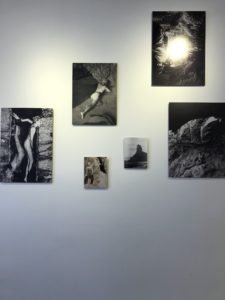
In the picture above the higher middle picture shows the model lying down on a patch of sand. This can symbolise the model trying to blend in with the natural environment around them which in this case is the beach.
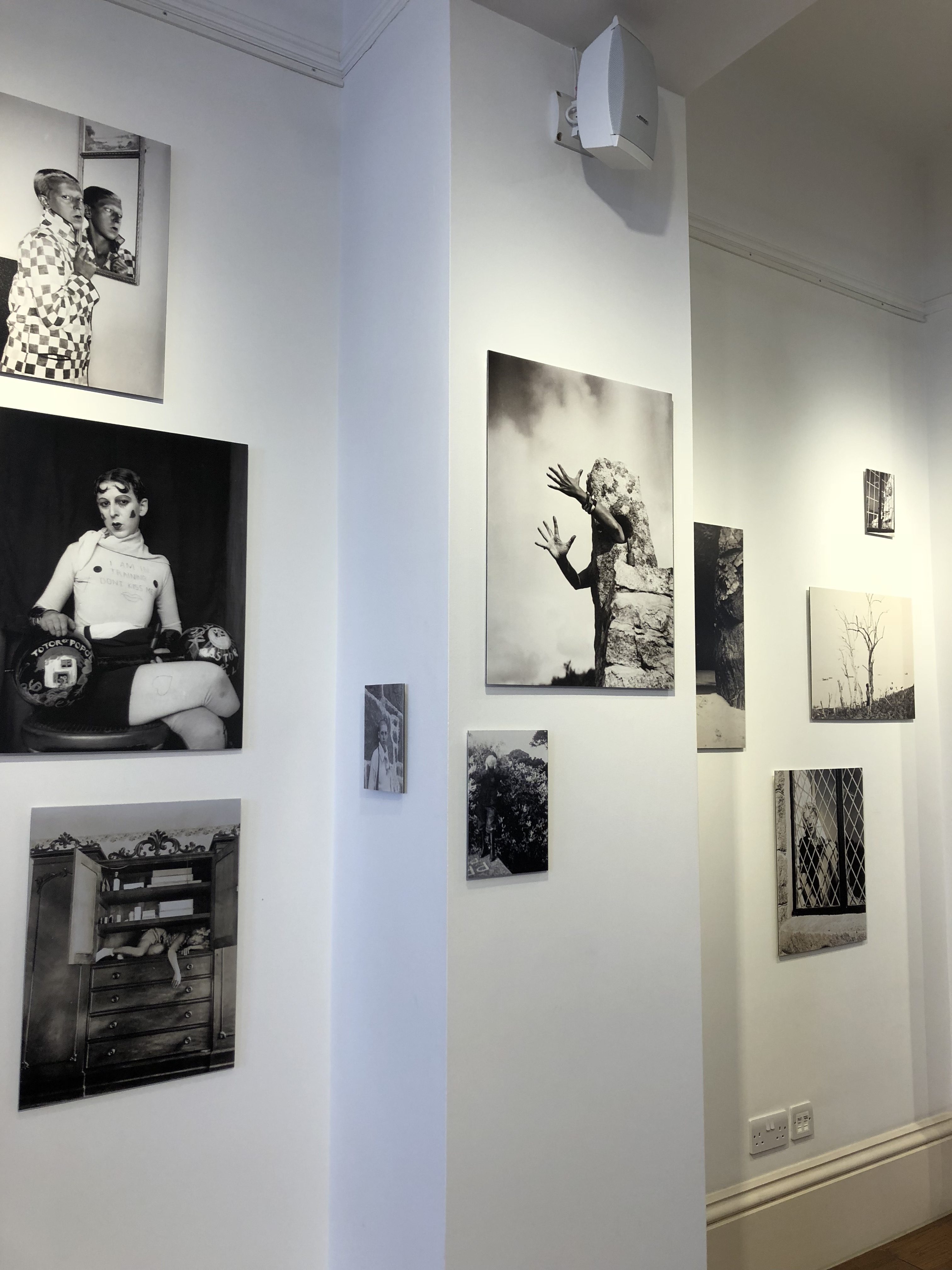
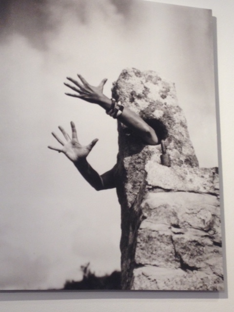
The middle picture in this image is another of Claude’s and shows a set of arms coming out of a pilar of rock. This follows Claude’s theme of blending into the natural environment as it is as if the photographer is trying to capture the model moulding their body and changing the way it is to fit in with the norm around it. Therefore some believe that Claude’s work has a deeper meaning that relates to Claude’s depicting herself in her environments in that day and age and how although she would try to blend into the natural surroundings, her sexuality preferences would stand her out from the crowd of ‘environment’ due to it being so uncommon at that time to be queer.
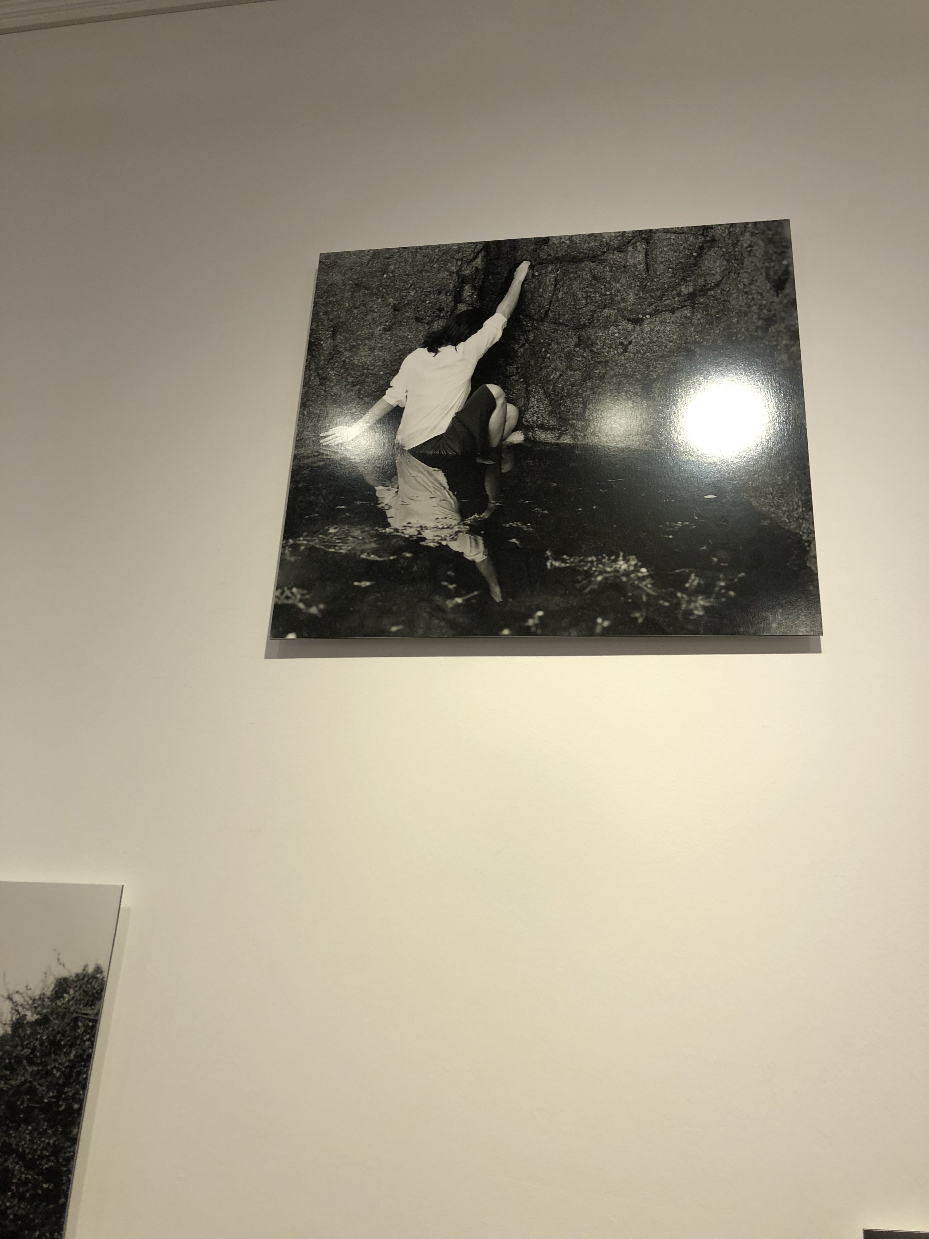
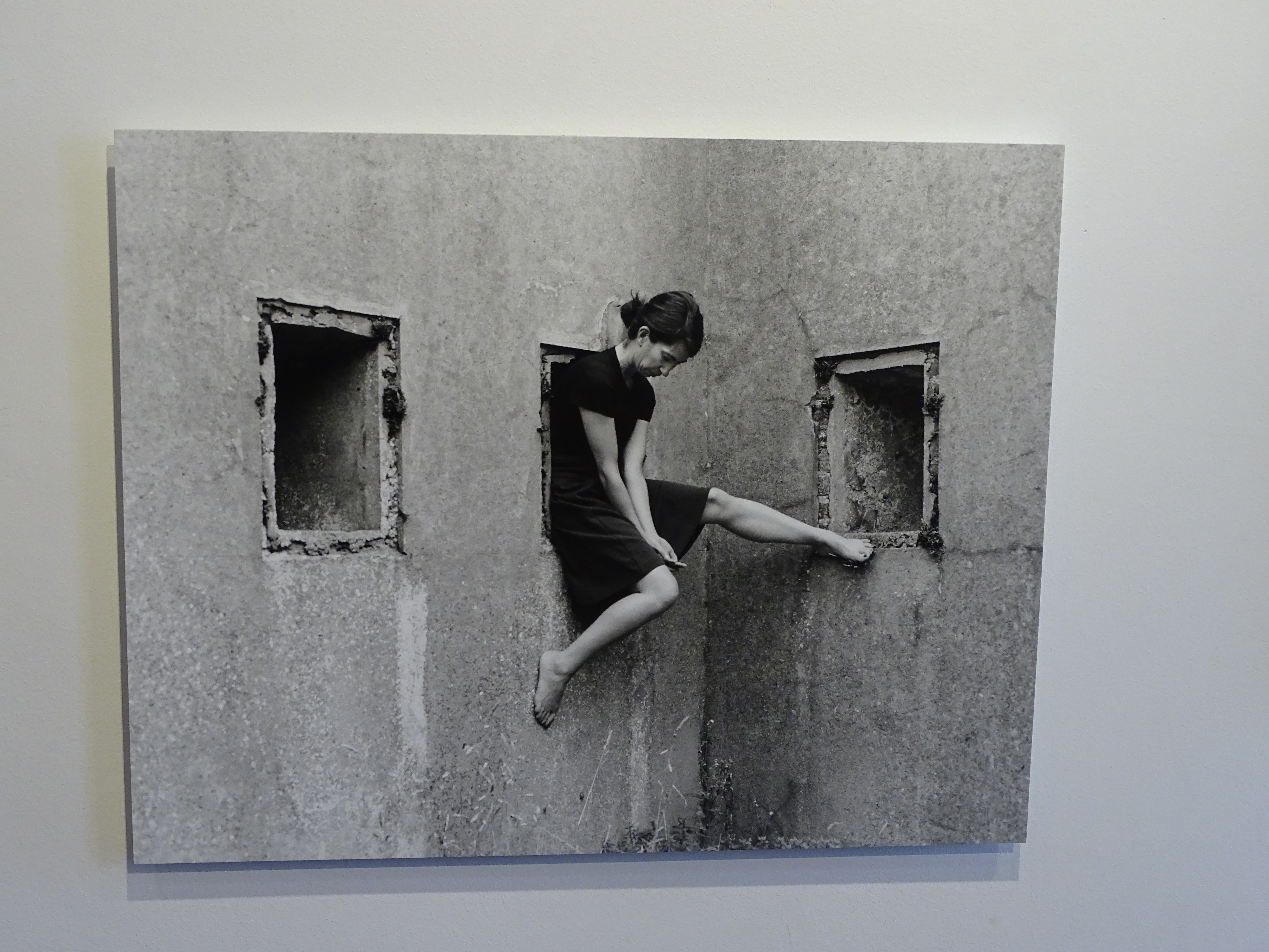
This is a photo of Clare Rae’s where she is trying to re-create the idea of the model moulding to and fitting in the the natural environment them. I think this replicates the first photo i described of Claude Cahun’s very well because this photo, like the first of Claude’s is located on a coastal location and more precisely, probably in a rock pool on a beach. Not only does this make it similar to Claude’s work, it also can be seen to be similar due to the model posing in an unusual way as if they are trying to become part of the surrounding environment. Which carries on the ideas and themes Claude created.
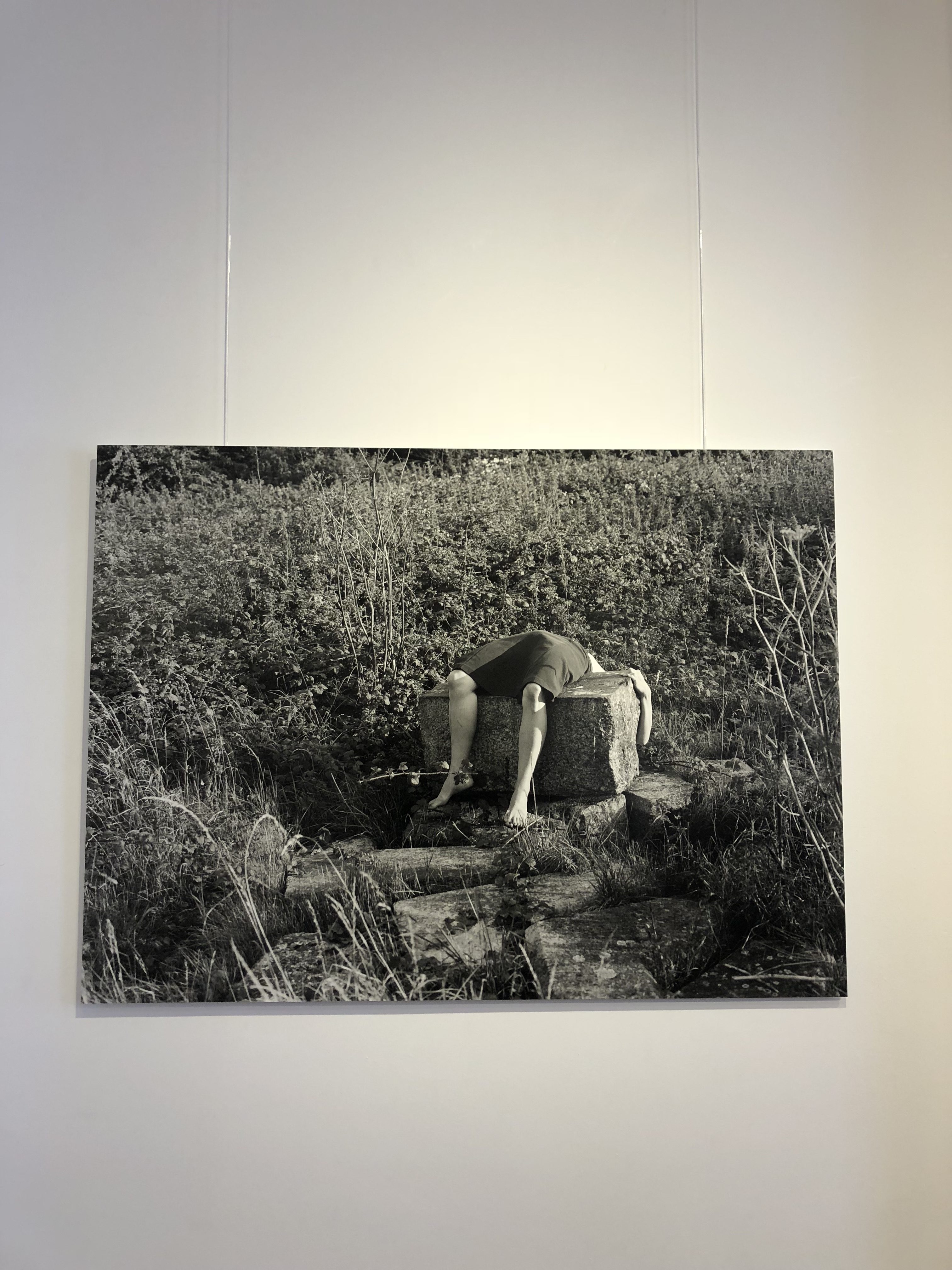
This is my favourite photo captured by Clare Rae due to its eerie and very weird nature that comes along with the carried on themes from Claude Cahun of moulding the body to fit in with the natural environment. As well as capturing the model moulding to the rock, this picture also captures the essence of how Clare could have perceived Claude’s experience of fitting into the norm back in her era and how hard she believed it could have ben for Claude to do this being queer. This is captured by the actual position the model is in and how uncomfortable this would be known to be by the interpreter.
Overall the trip taught me about the deeper meanings to a photographers work and how it can be related to their lifestyle, time era and personal thoughts and ideas. It also shows how themes of photography have remained consistent over time for example the Black and White feature and how modern photographers still enjoy capturing ideas that older generations had that still contain a strong message.

