Photo 1

Photo 2

Photo 3

Photo 4

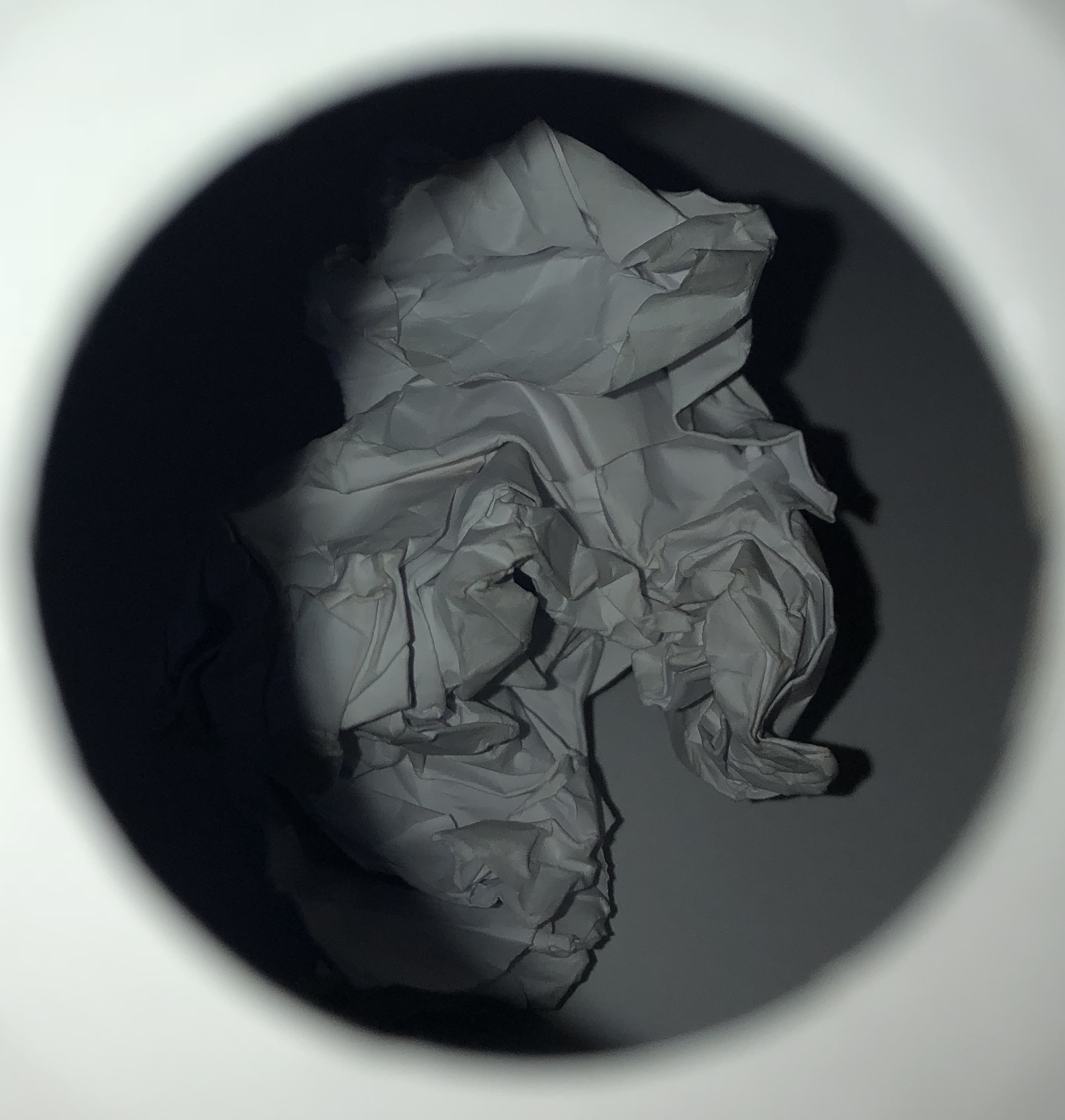
This is my favorite image from the shoot with the paper.
Technical:
Lighting – The photo was taken with flash the try and highlight the contrast between the white paper and black card.
Aperture – The aperture was F3 so a medium amount of light was being let into the camera.
Shutter Speed – Was around 1/15 of a second which gave the top photo in particular a slight blur. An improvement would be to maybe use a faster speed of 1/250 or use manual focus.
ISO – The ISO was around 800.
White Balance – The temperature and warmth was turned up when editing to give the paper a worn effect as if it had been left for some time and been used. The white balance was also turned up to help the paper stand out.
Visual:
The texture of this image has been greatly heightened to over exaggerate the crumples in the paper. I used the warmth tool to increase the worn look on the paper to make it look like it had been used or is old.
Conceptual:
The idea behind this work and image was to capture a raw and simplistic picture that can still be powerful and emphasize how such common items such as a crumpled piece of paper can be captured in unique and diverse ways, showing how photography can create a virtual presence of something so plain.

Good progress so far, well done…now you must ensure that your next photo-shoot is complete and ready to edit during Week 4 and that all blog posts are up to date.
Remember to check your tracking sheet to see what is required and when!