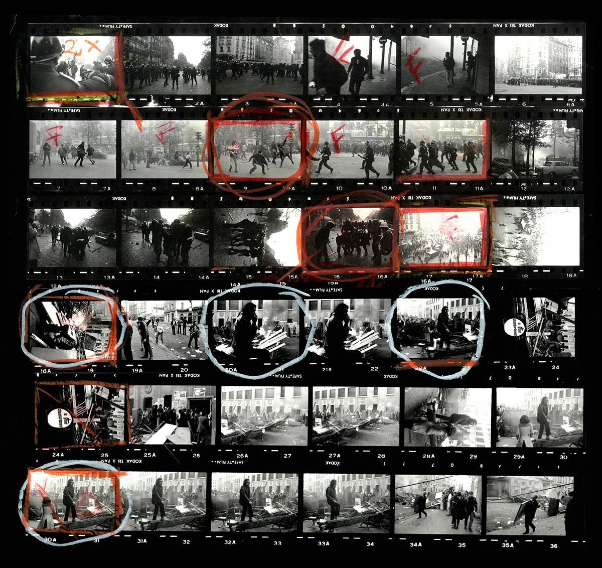
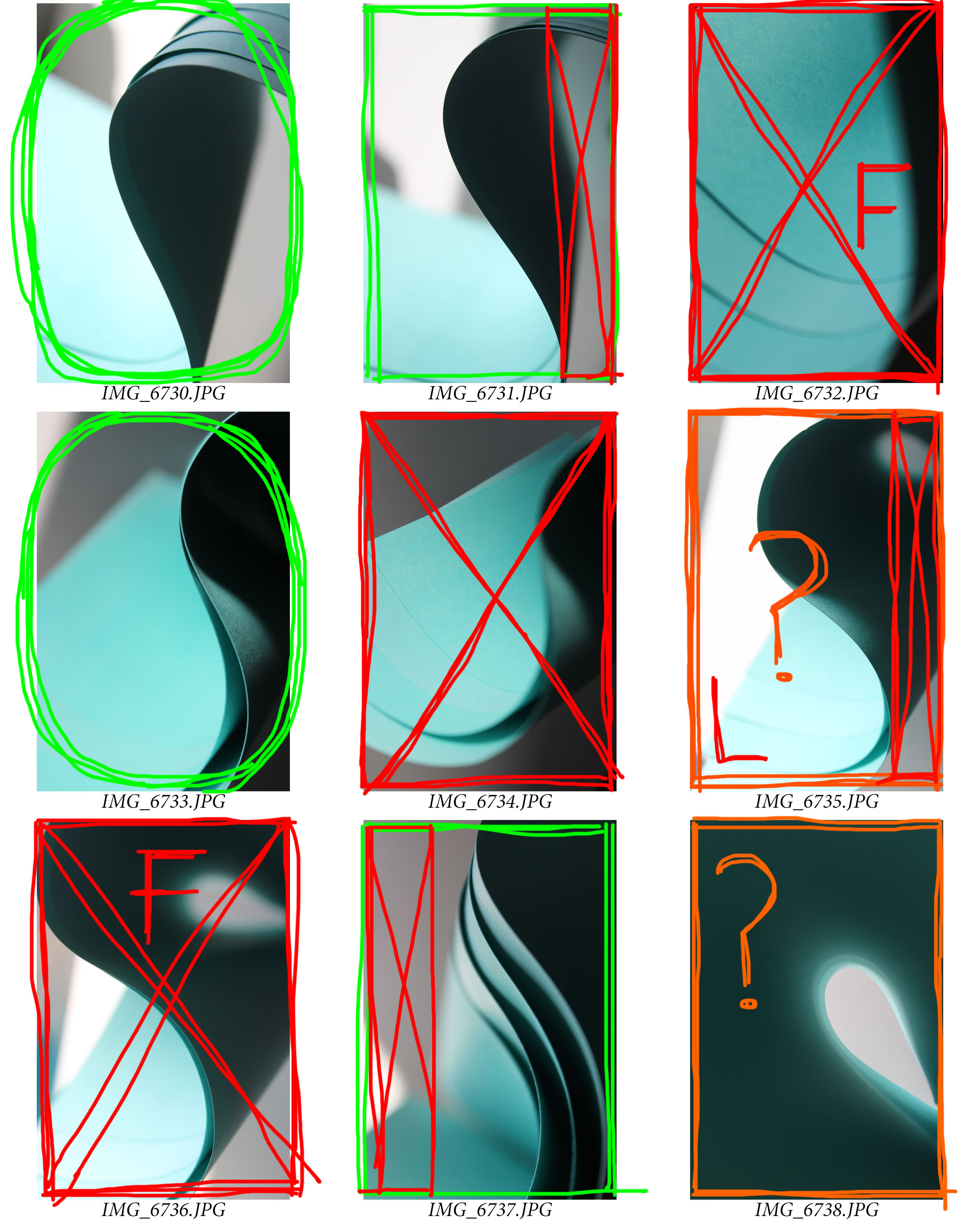
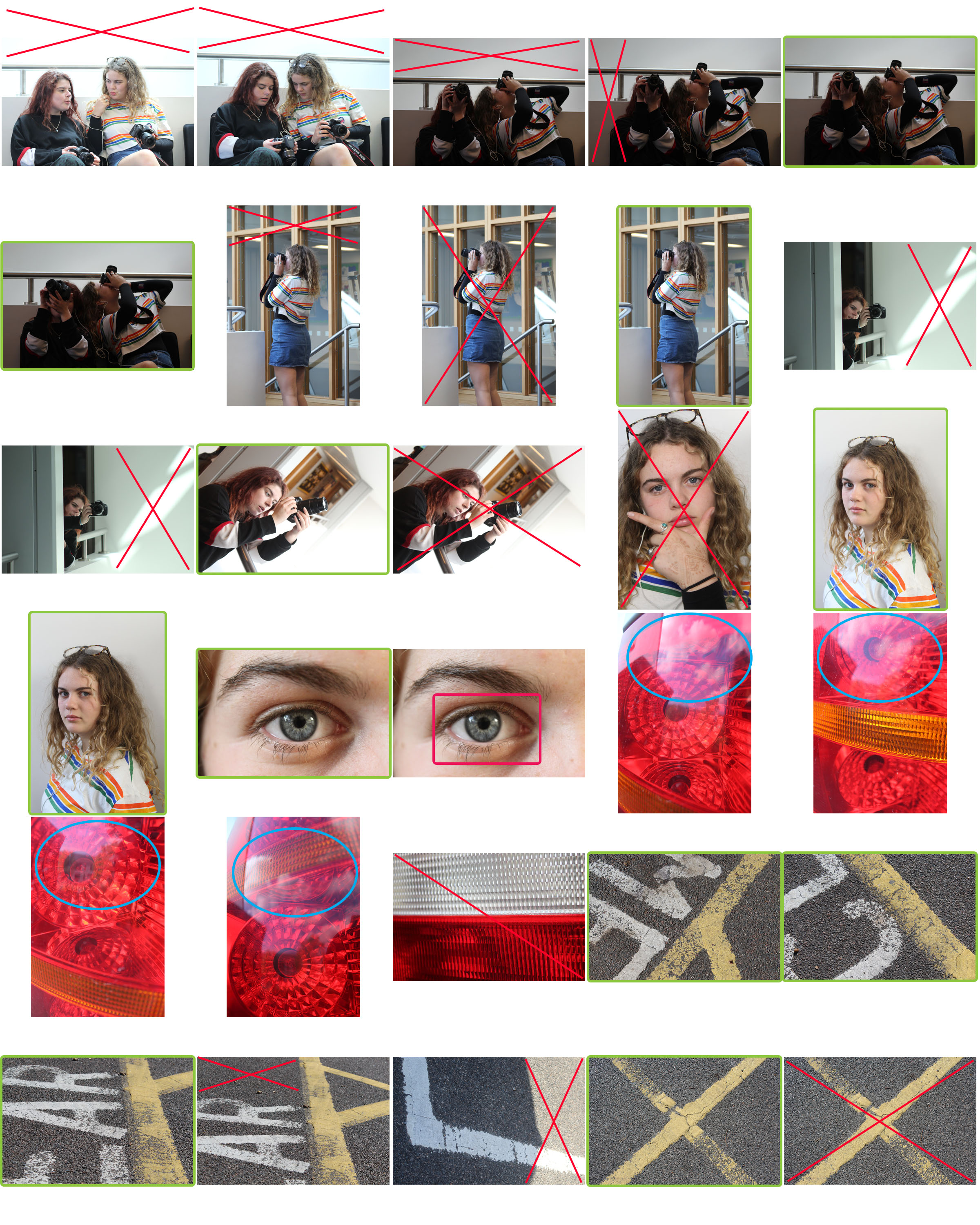
Contact sheets consists of many thumbnail photos which are printed on a single sheet of paper. They were regularly used in the days of film but their use went away when digital photography began. They can be used to review images so you can decide which ones you will delete, use and edit. I think that using contact sheets is an extremely intelligent way to start the editing process.

What each symbol means
Green circle: My favourite images

Green square: I will use this image

Red X: I do not want this image/section

Orange ?: I am not sure if I should use this image

F: This image is out of focus

L: The lighting is bad


